finally some architectural inspiration, and we’re back to somewhere we love: portugal!we have admired buildings lisbon before and yes, something something azulejo related should really coming to the blog… but this time we’re going to porto, and not even too far from the picturesque city centre, we’ll just walk a little westward through the architectural hotspot of boavista .
it’s largely a residential neighbourhood but it has a few interesting buildings such casa da musica (of none other than rem koolhaas) and the faculty of architecture (of course!). these are magnificient buildings, which, i feel, deserve their own blog posts later, trust me they’re coming.
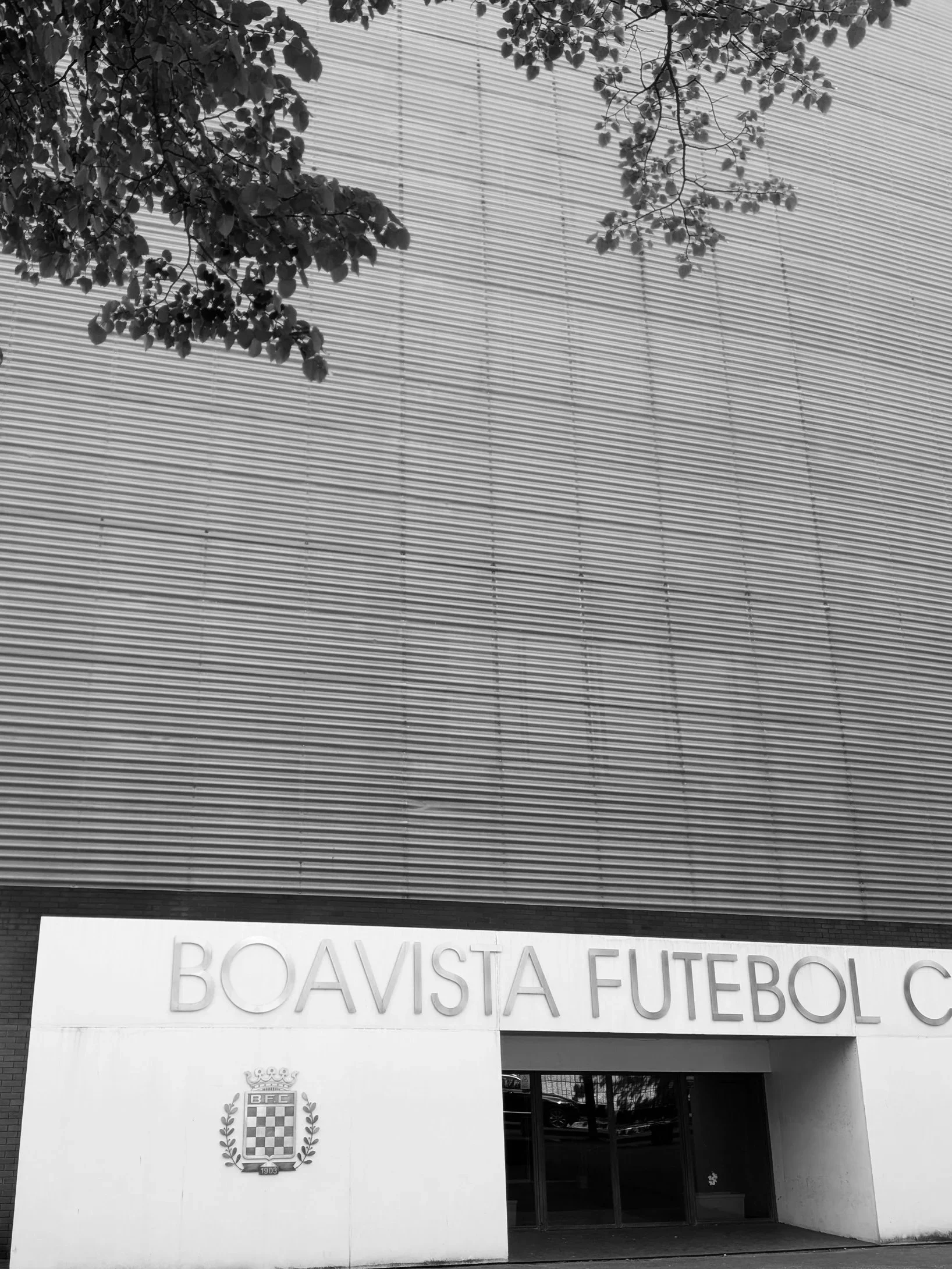
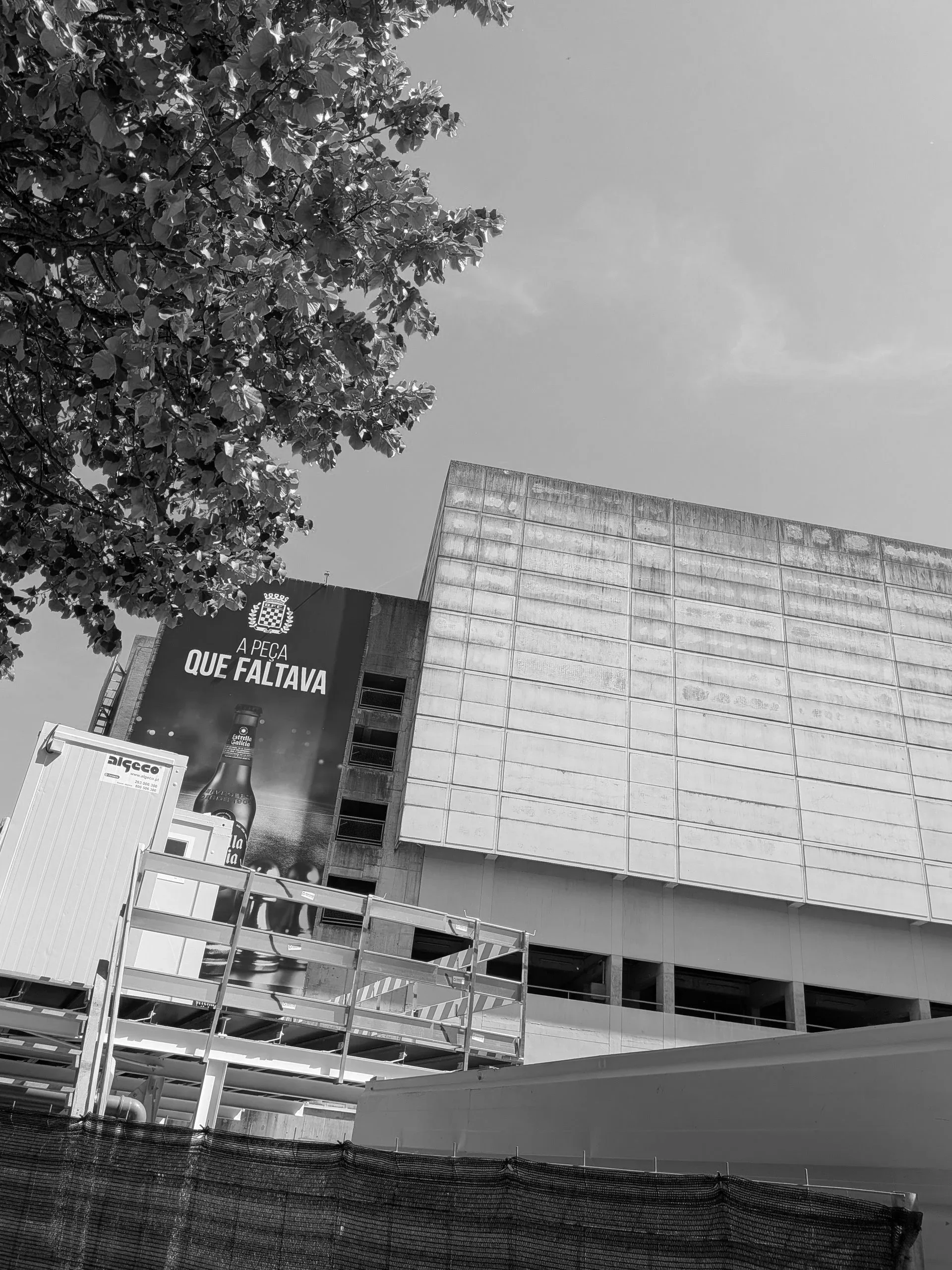
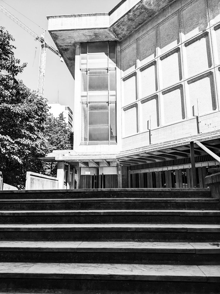
however before we visit these, we’ll just walk through a little bit of the residential streets to two lesser visited sights, one i discovered completely accidentally. i was in search of porto’s brutalist church, paróquia de nossa senhora boavista, when, the residential low-rise architecture suddenly gave way to an immense, towering slab of brutalism: estádio do bessa século XXI, home of boavista f.c.
the football club itself is currently non-operational at a professional level - although there was some visible activity, they do not participate in any of the leagues just now and of course visitors couldn’t go inside to inspect the pitch. but the football was entirely secondary to the vastness of the structure itself.
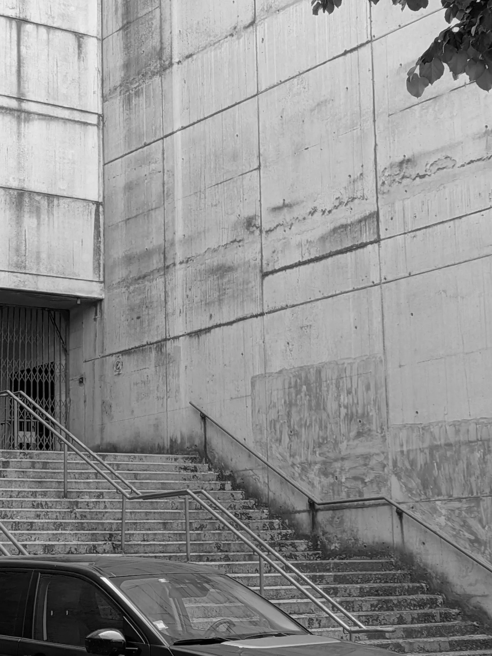
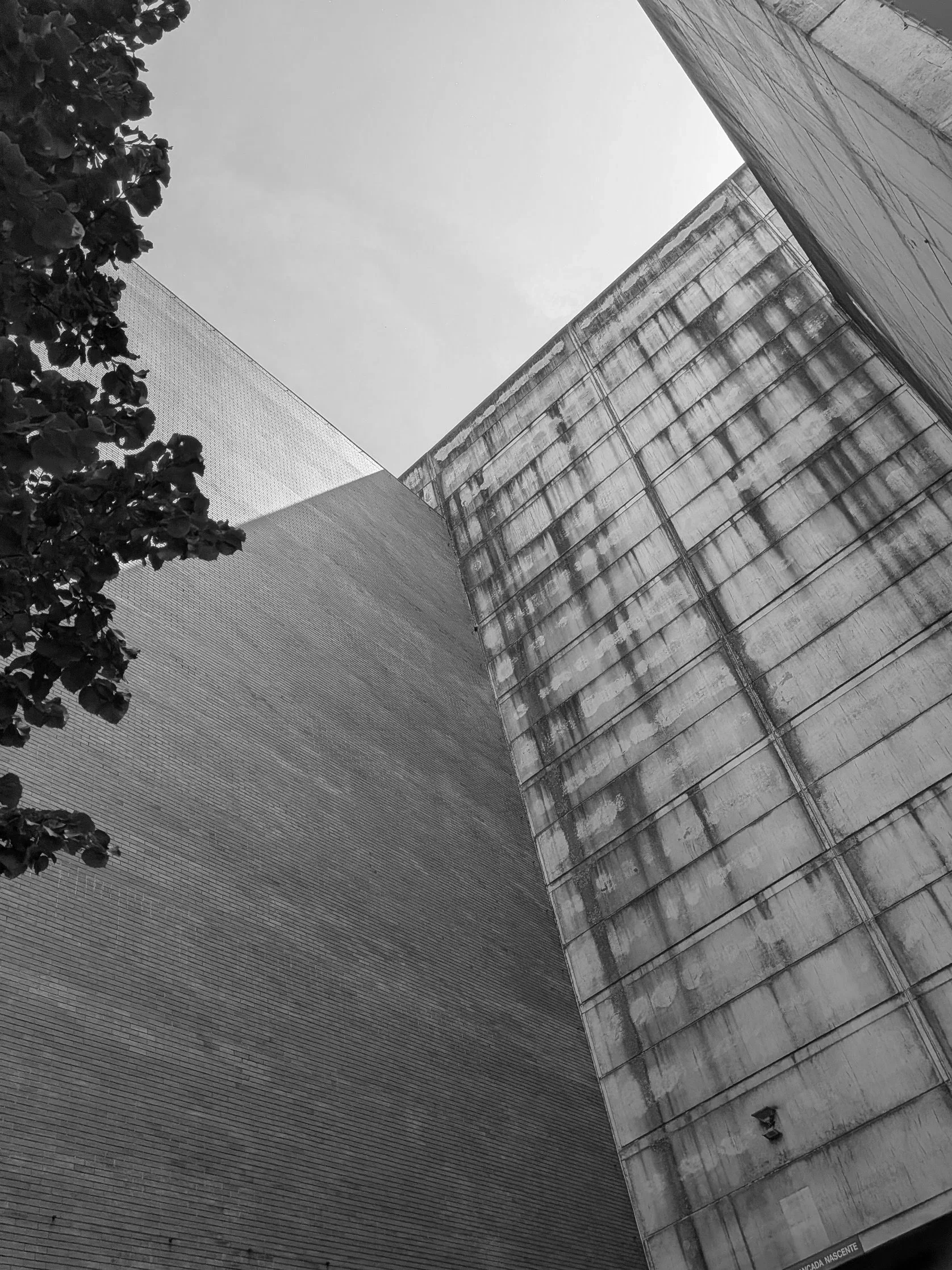
what makes it magnificent is the sheer, un-decorated scale of the exterior framework. massive, vertical board-marked concrete panels soar upward to hold an immense structural volume, using nothing but its own structure. there is a beautiful, organic honesty to how concrete ages under the sun and rain; a raw, weathered texture that commercial design processes spend years trying to artificially replicate. it was a brilliant reminder that when a grid is strong enough, it doesn't need to ask for attention.
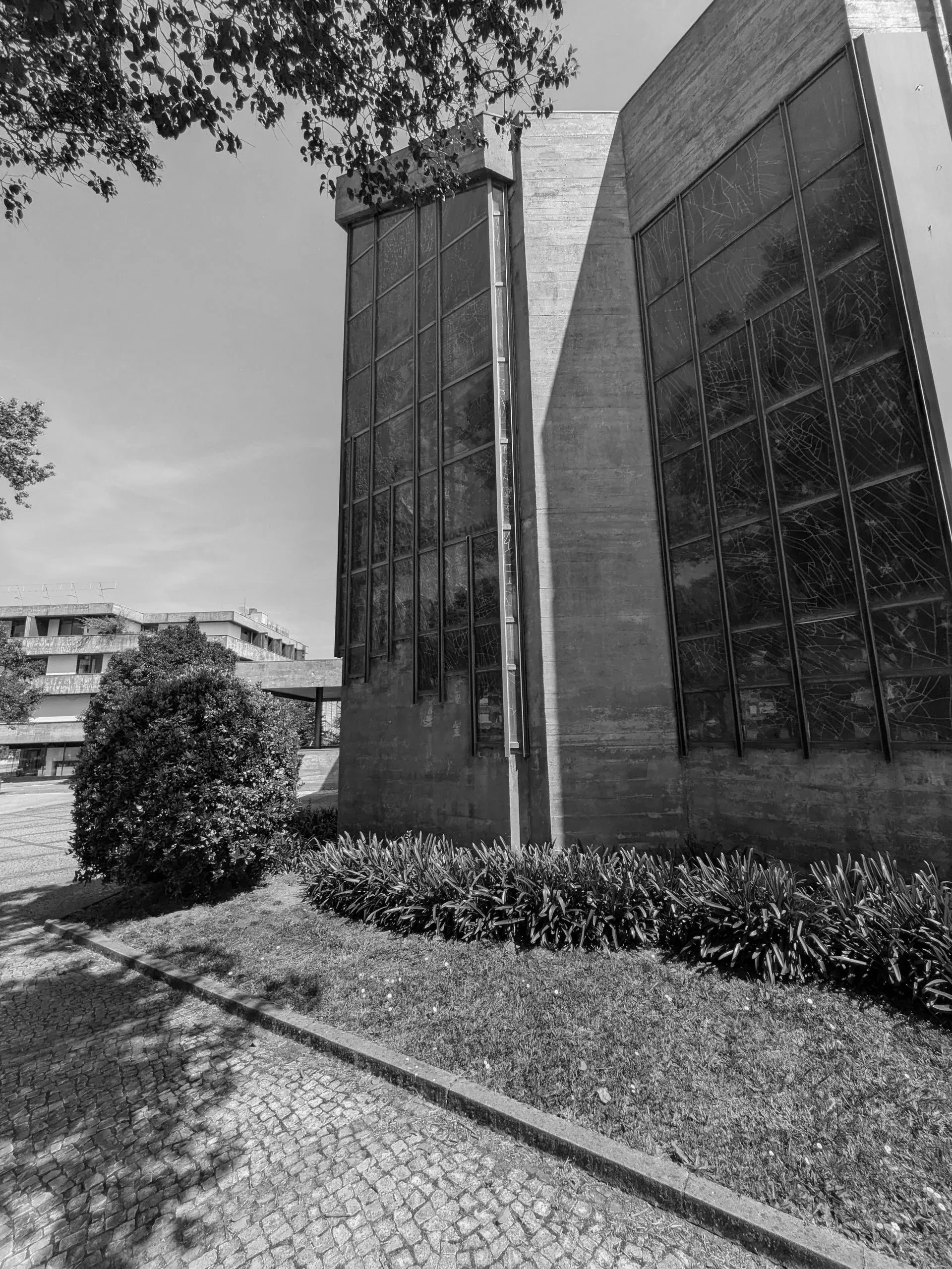
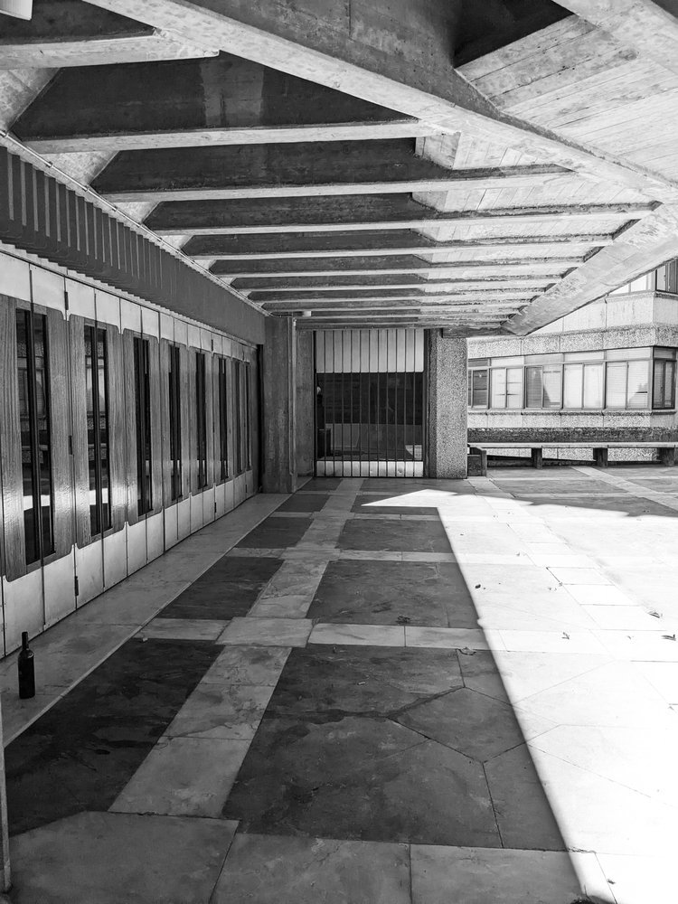
continuing further down the same street, he stark monolithic scale of the stadium shifts into a dense residential grid of modernist blocks. nestled right into the heart of this community, serving the surrounding apartment towers, sits our church, the paróquia de nossa senhora da boa vista. designed by the architect agostinho ricca, the church feels less like an isolated monument and more like a functional civic anchor for the local streets.
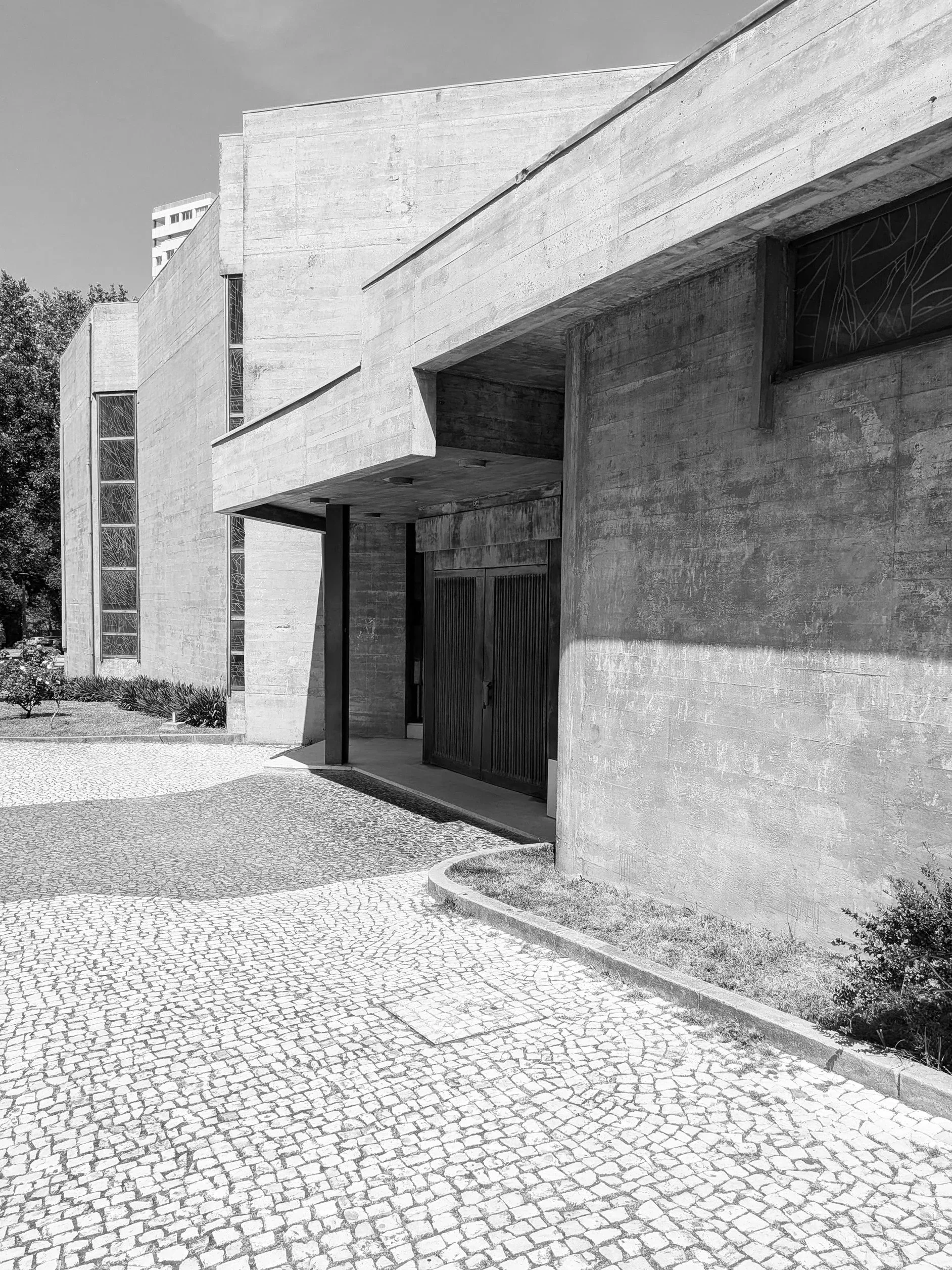
the doors were not open at the time of visit and as such an interior inspection was prevented but brutalism is rarely a style that hides its logic on the inside anyway. the building uses a staggering network of cantilevered concrete canopies and deep recesses that cut sharp, graphic shadows into the stone pavement. the ground beneath your feet isn't just a walkway; it is a meticulously laid out grid of traditional cobbles intersected by dark paving bands that frame the spatial navigation of the entire site.
standing directly under the main canopy, the overhead mass feels impossibly heavy, yet it is perfectly balanced by the strict linear staircase leading into the dark entrance. it is a lesson in how to create a physical transition, forcing you to acknowledge the structure before you even cross the threshold.
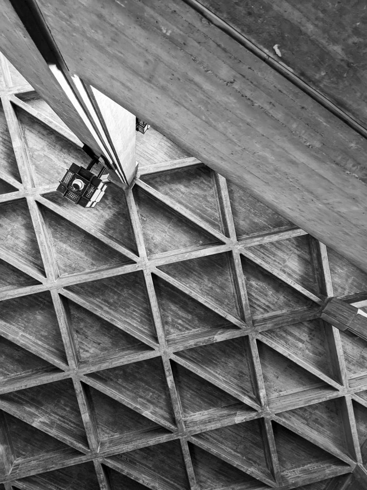
looking up, ricca’s genius becomes even clearer. the bell tower swaps traditional religious ornament for a series of vertical concrete fins that resemble a massive, modernist pipe organ. under the blazing sun, these fins break the light into a rhythmic pattern of high-contrast vertical lines. it is exactly what we mean at zitozza when we talk about a structural framework: the form itself is the decoration.
moving around the side of the nave, the concrete walls turn into a spectacular piece of abstract lead glass window of the entire corner building, which i wish i could have seen from the inside as the sunny day would have allowed for some amazing light through for sure.
the church does not exist in isolation of course, it sits surrounded by tidy, tended urban nature and residential blocks and shopping centres, neatly weaving together this part of the city - with a road leading to our next stop, casa da música.
this walk was a necessary recalibration for my mind. the rules do not change. you create a clean, honest, highly functional grid, and you step out of the way so the material can tell the truth. follow the journey for the next stop.
as a textile designer, i spend a lot of time thinking about surface — how it behaves, what it suggests, and how it feels. when i travel, i often photograph brutalist buildings not just for their form, but for their surface logic — how repetition, rhythm and materiality work together. the palace of justice in lisbon is one of the most quietly decorative buildings i’ve seen, and it’s shaped a lot of my thinking about how concrete and cloth can speak the same visual language.
it’s been a while since we’ve last embarked on an architectural inspiration journey, but holiday season is coming up, so i thought i’d give you a little tip, to visit a wonderful brutalist building in one of my favourite cities. the city is lisbon, portugal, where i showed you a beautiful church before, and this time we’re going to court! okay, nobody’s going to get sued, we are just going to admire the building. the palace of justice stands as a testament to the unique approach to brutalism by the portuguese. join me on a short walk around this gem!
the building was designed by januário godinho and joão henrique de breloes andresen and built between 1962 and 1970. it is in the SOS brutalism database but thankfully it is not currently in danger as it is used as the main court. it stands at the head of parque eduardo VII, a peaceful, green patch in the centre of the city.
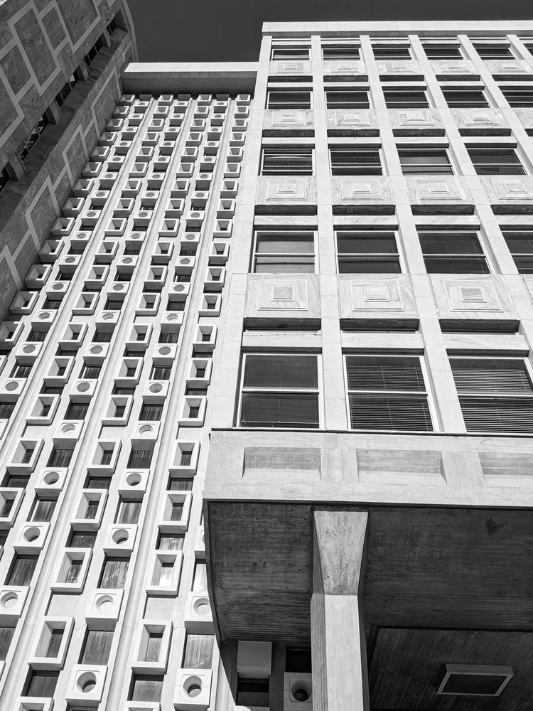
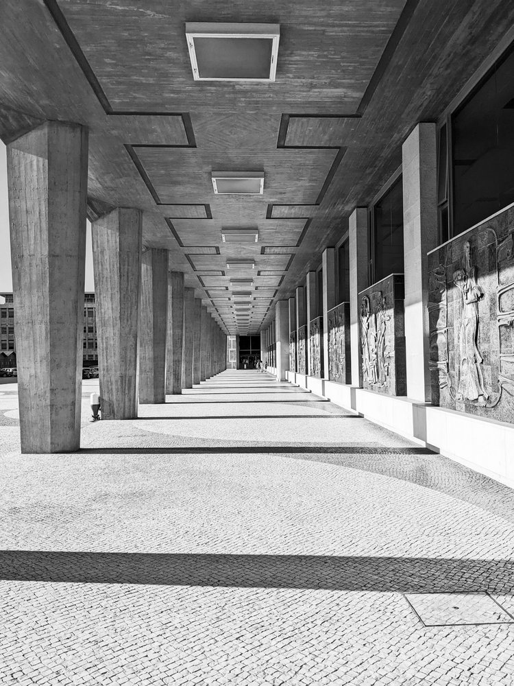
it has everything a brutalist marvel should have - the skillful blending of monumental proportions and robust materials - it is a long building with concrete columns supporting its cantilevered facade on all sides. because of that, it looks lightweight that is slightly lifted off the ground, and it does have this uniquely portuguese take on brutalism: the concrete facade here is not raw or imposing - it is incredibly decorated, light and airy, punctuated by geometric patterns and rhythmic textures, corresponding to the delightful tiled surfaces this country is so famous for.
the structure and the shape of the supporting columns create an interesting rhythm, and it is this frequency and rhythm that i find so relaxing. the concrete here is not raw, it is processed and organised into intricate, detailed patterns that pierce through the facade.
obviously it is the patterns i’m attracted to as a textile designer. the tile references in particular have a connection to my favourite way of creating geometric patterns and i love this building for showing that brutalism can be playful and decorative too. my main aim has always been to infuse this modernist spirit into textile designs and create a connection between the realms of architecture and interior decor. i want to bring it inside and bridge the gap between the monumental and the intimate, to translate the feeling of calm i get from these buildings to the feeling of calm at home.
i hope that you get to visit this beautiful building, in the lisbon sun it shines white, with the shadows adding an additional depth to this textured facade. and i hope you’re not tired of my ramblings yet, i always think that every building explains a little bit more about my mission!
if you’re interested in how architecture and surface design connect — or how brutalist texture can inspire calm, not coldness — explore how these ideas translate into our BÉTON collection or get your own block-printed textile pieces. these buildings don’t just inspire what I make — they shape how I think about design altogether.
it’s becoming a busy autumn / winter season here for us at zitozza, but we do manage to escape on the occasional break to take an inspirational trip to admire some great architecture and forms. there has been a recent trip to lisbon, portugal, and we have some fabulous brutalist buildings to cover as well as the country’s signature tile designs - surely that requires an article at some point in the future.
but we can start with an easy one, a true little 1960s gem in the heart of the city, a five minute walk from the square of marques de pombal, there is a little brutalist church in amongst the residential buildings - the sagrado coração church, on rua camilo castelo branco. it is hard to see it is a church from the outside, as it stands on an elevated level from the street, with stairs inviting up to a square embraced by offices and some residential units. on the sunny day of the visit, it felt like a relaxing island just off the busier streets, but it was by stepping inside it revealed its wonderfully peaceful and serene atmosphere.
inside, it is clear what the architects - nuno portas and nuno teotónio pereira - were trying to achieve. the use of concrete is consistent, but not in an overwhelming, intimidating way as the material is broken up and softened with textures. the wall has a bricklay texture to it, while the ceiling reveals an even rhythm of the angles of the structure. the ceiling does not seem to be at an uneasy height, yet the smoothness of the columns do make it appear quite heavenly.
it is however the light, that seems to play the main role of bringing the spiritual and the godly inside. the light comes in at angles that must have been very carefully designed and is parallel to the staircases, casting shadows on the textures inside, while at the chapel it comes through unfiltered and in full, as if it was almost ready to listen to the prayer.
this article on hidden architecture has the floor plan (along some sketches by the architects too), and it does reveal the scale of the open space, and the even proportions unlike the traditional aisles. the sketches also reveal the careful planning of lights and shadows - its role in reaching some kind of spiritual peace is universal and not dependent on religion, just think of junichiro tanizaki.
this church isn’t dimly lit, or dark, nor is it overwhelmingly clear and bright. concrete has its reflective quality on light but also has its own texture to break it, which the architects also played with here by adding more, and the artificial lights are also carefully placed to interact with it. atlas obscurarecommends a visit during night time too, to experience the different light circumstances.
lisbon is an amazing city and churches are found from every style and era. its famed cathedral is almost a millennium-old and some of its most famous sights are the gothic monasteries and the golden baroque altars - all worth a visit and appreciation. i hope you don’t mind me picking this brutalist gem though, as one of my favourites. the building won the Valmor prize in 1975 and in 2010 it was recognised as a national monument, so it earnt its place on the visitor attractions and please do visit when you get a chance in lisbon.
if you liked this, you can subscribe to our newsletter below and you’ll be amongst the first to be notified of any new inspirational tours (always with plenty of photos!) see you next time