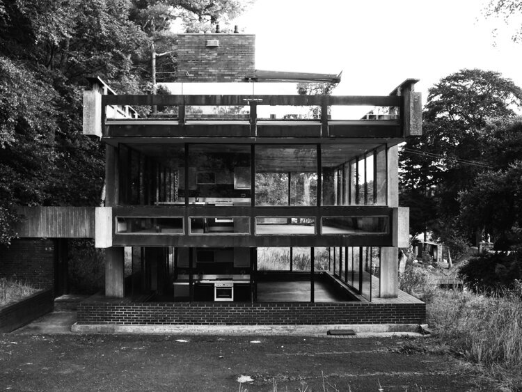
i wanted to write this blog post for a long time. a bit of an architectural inspiration one, but it’s not really about a specific building - it’s in fact about any of them. there’s a strange beauty in places designed for no one in particular.
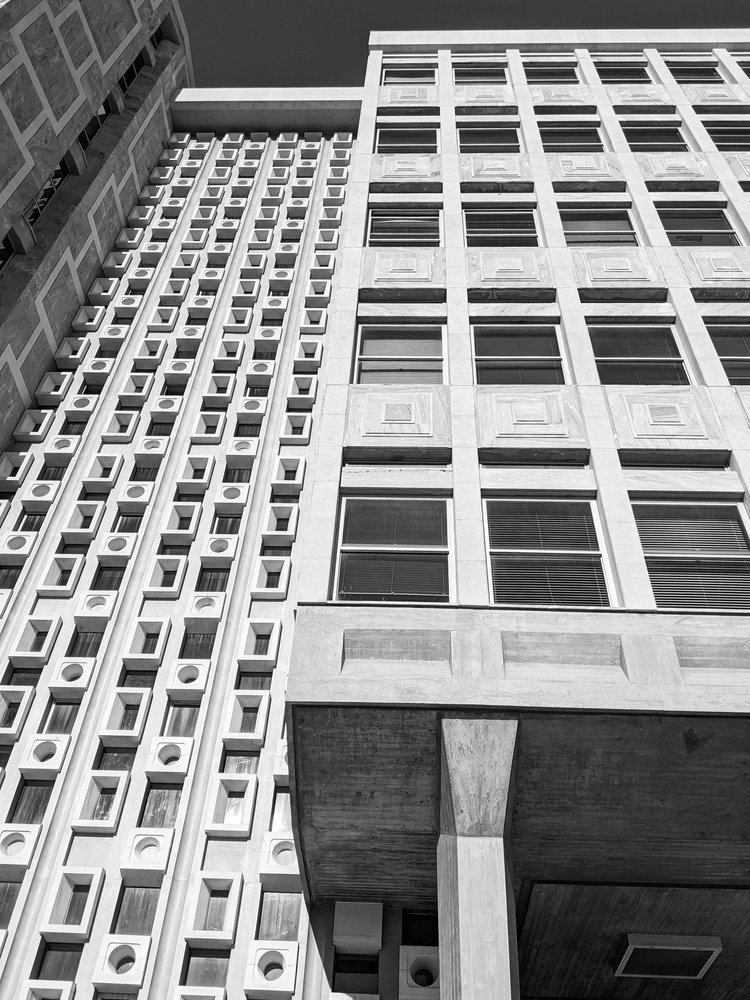
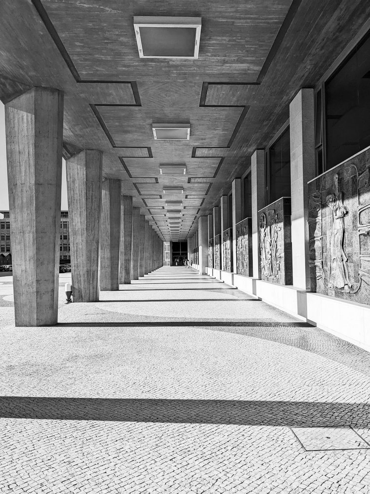
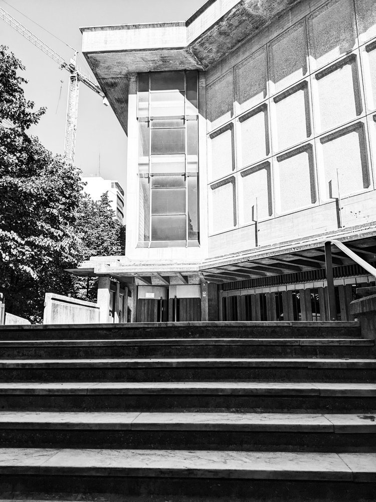
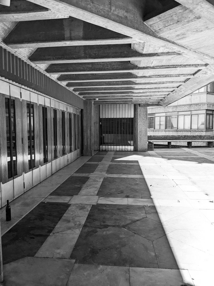
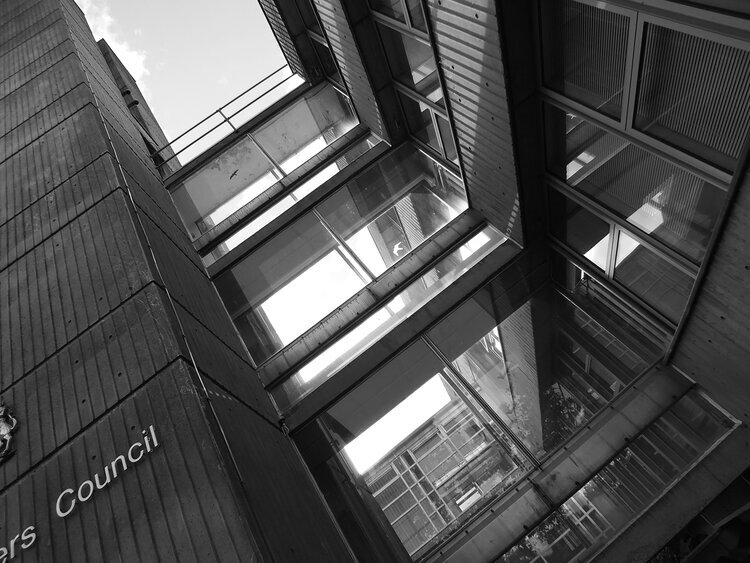
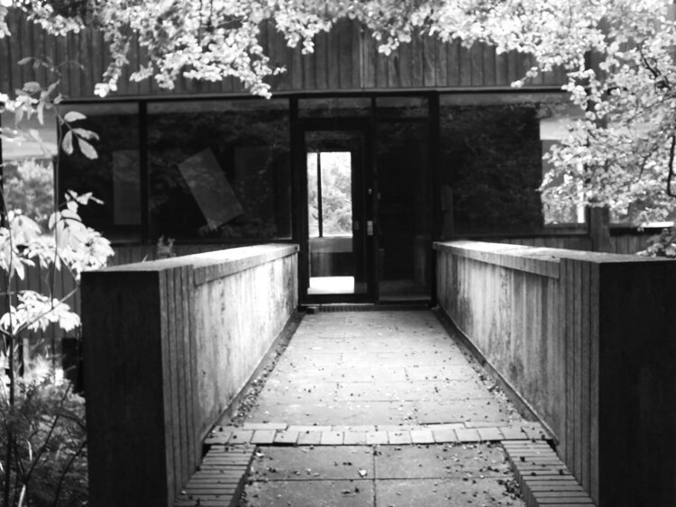
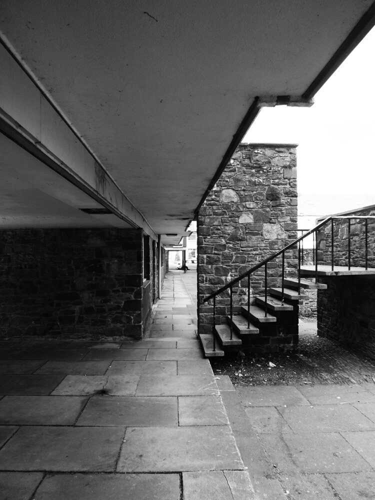
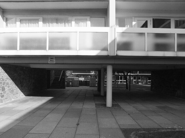
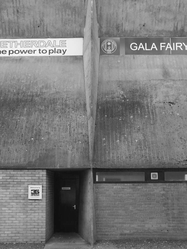
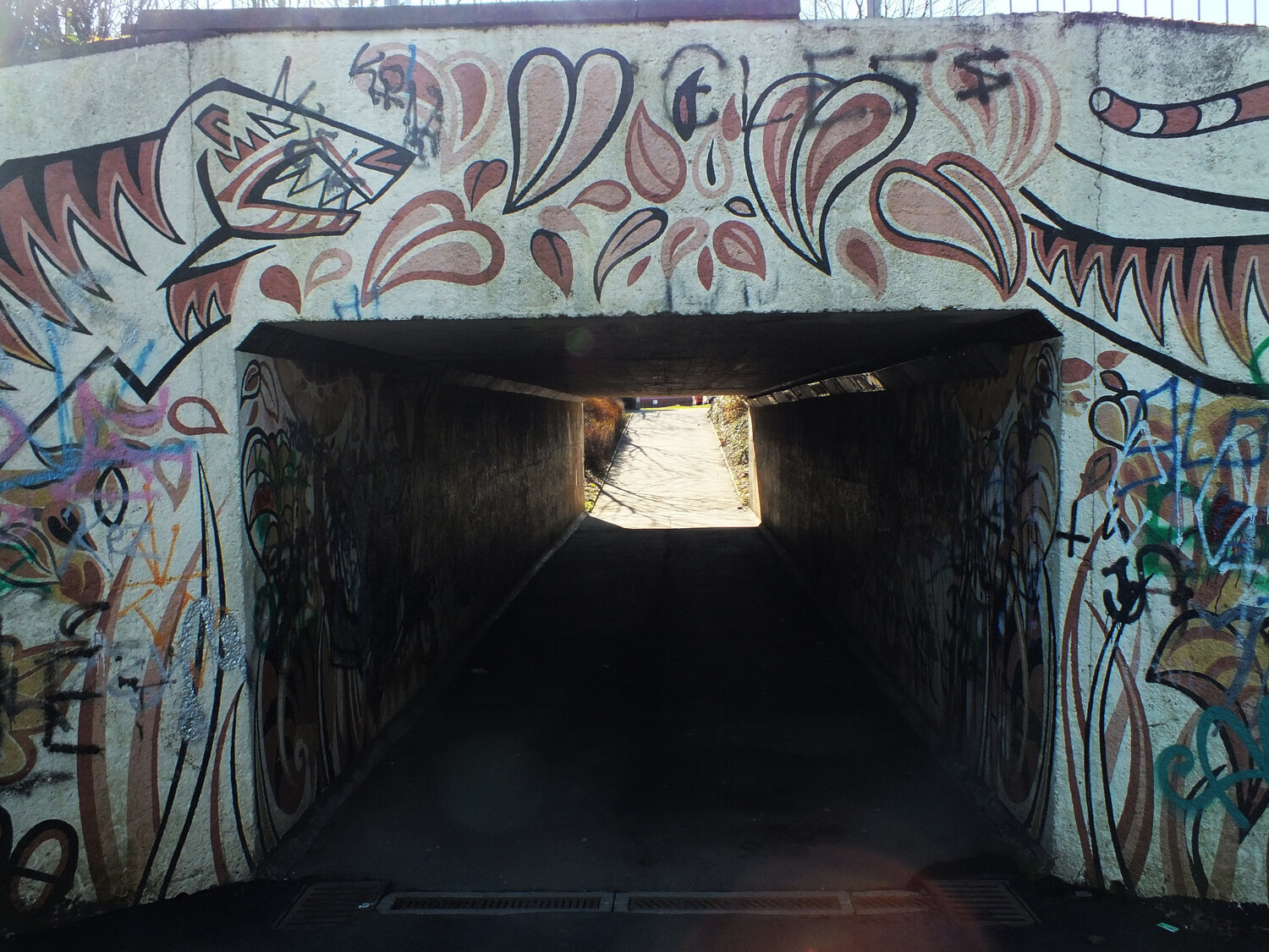
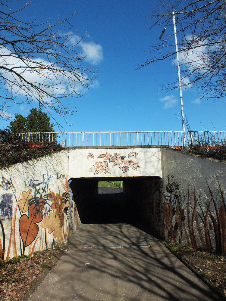
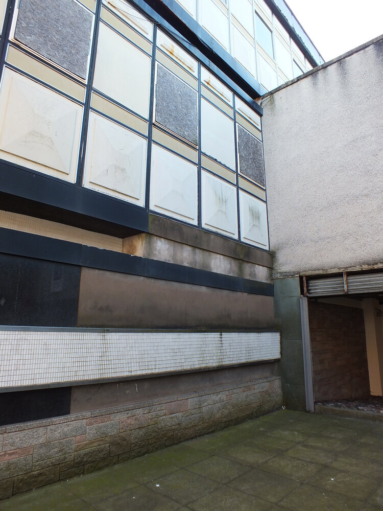
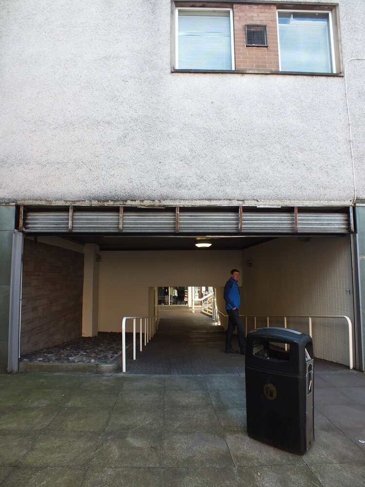
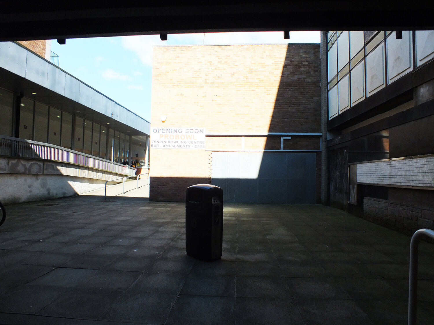
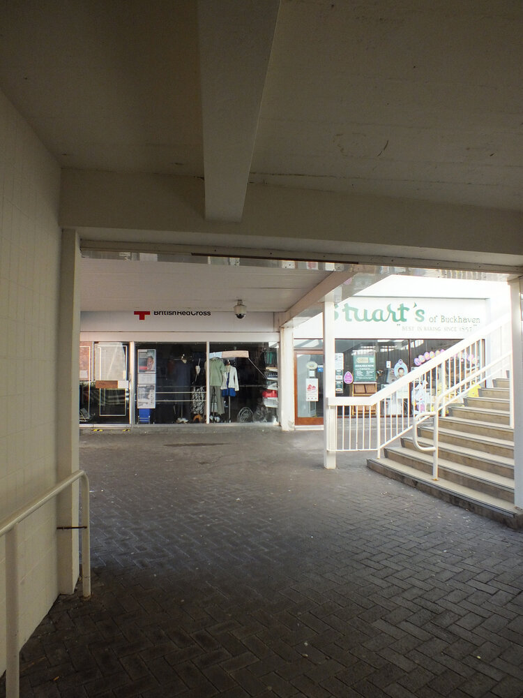
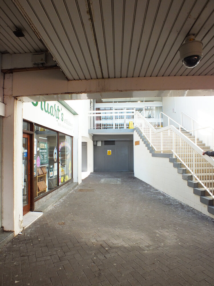
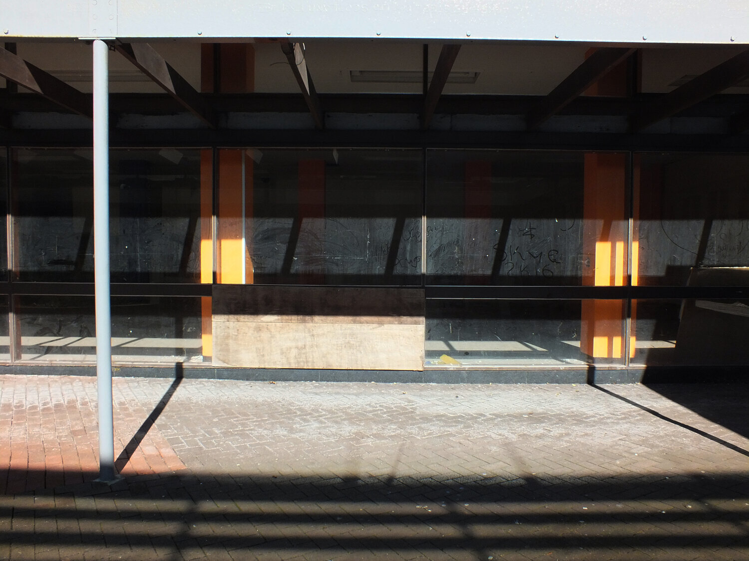
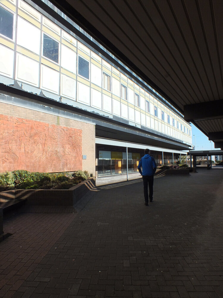
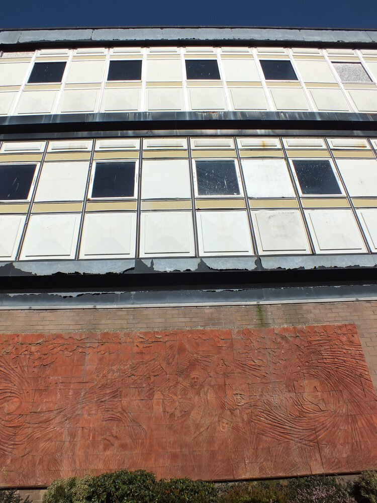
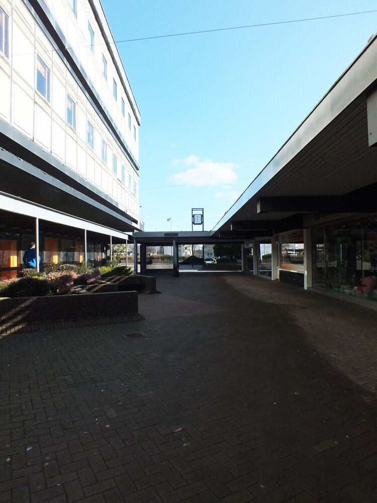
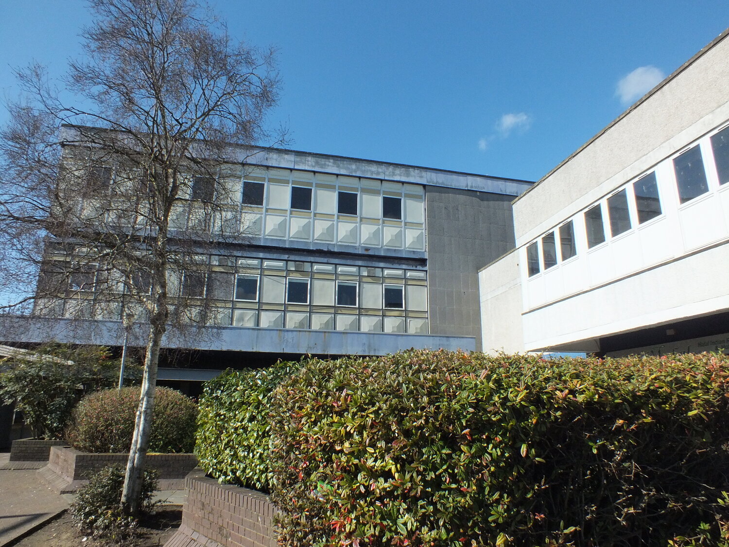
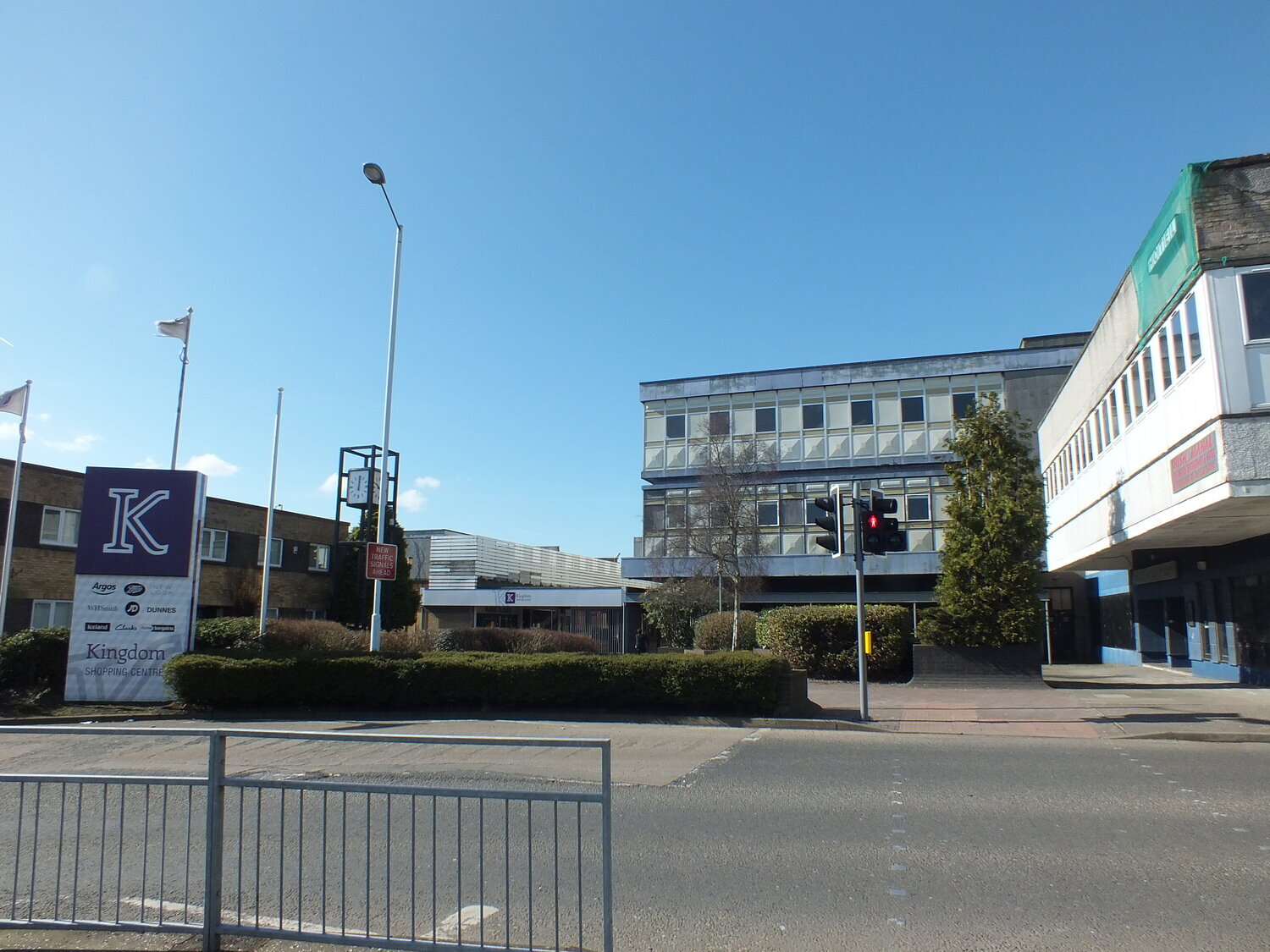
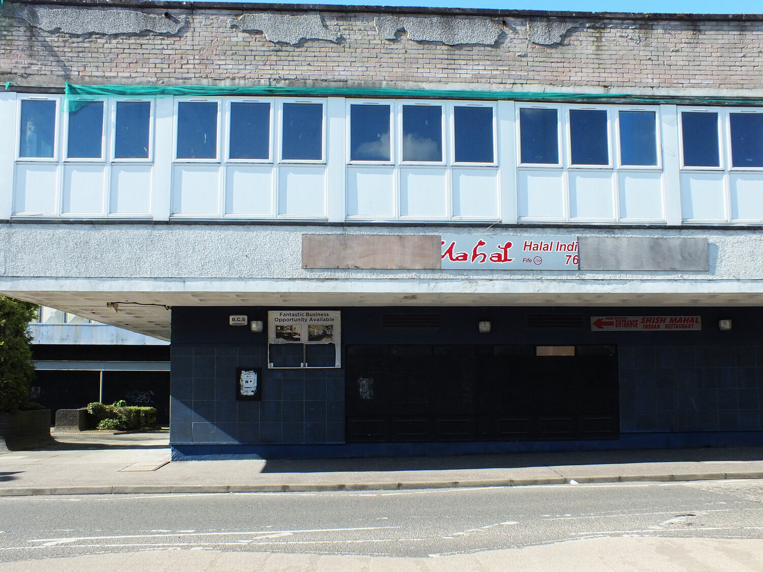
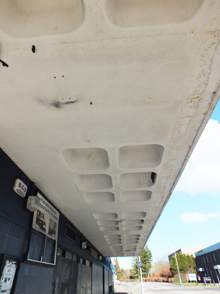
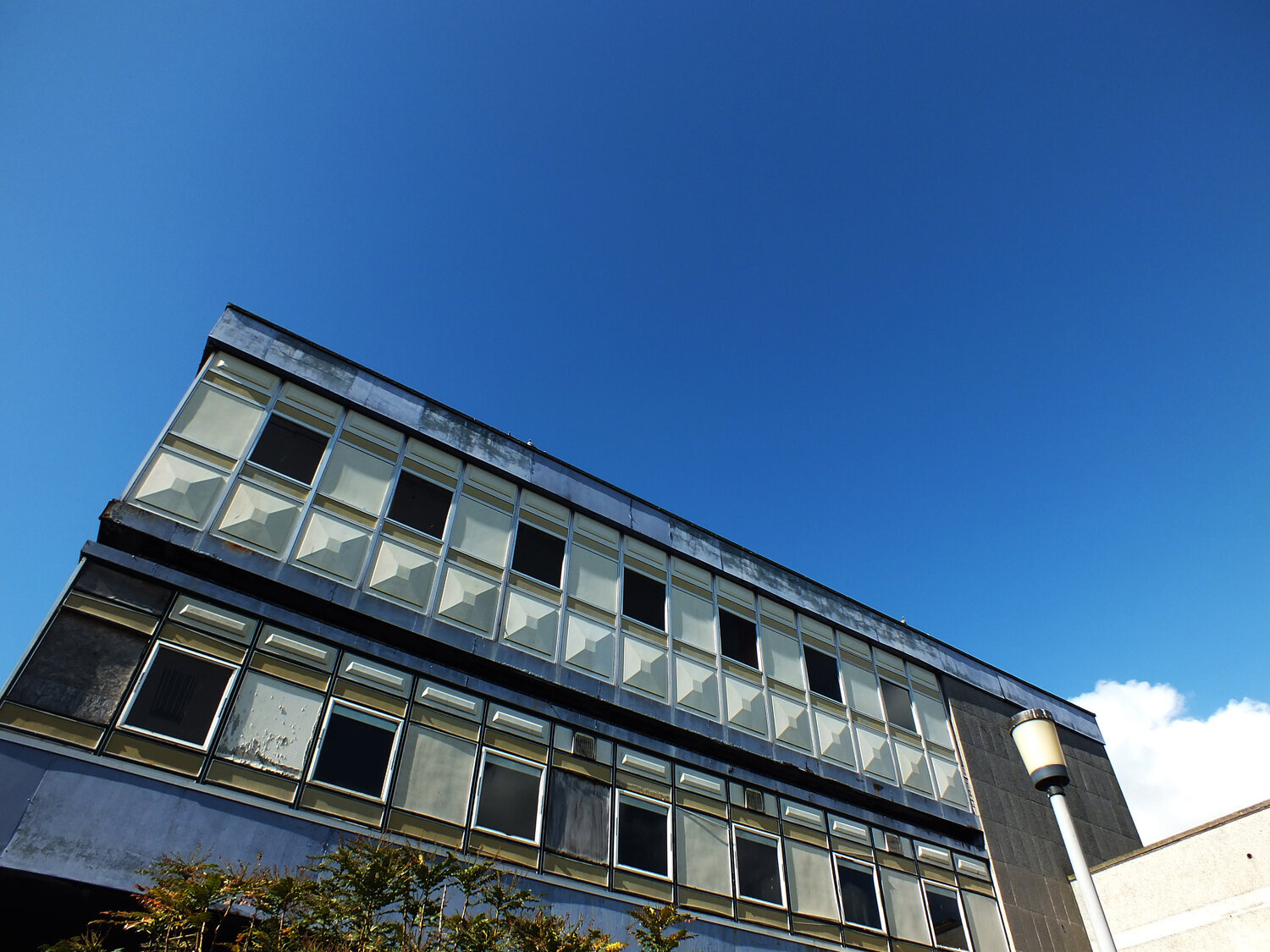
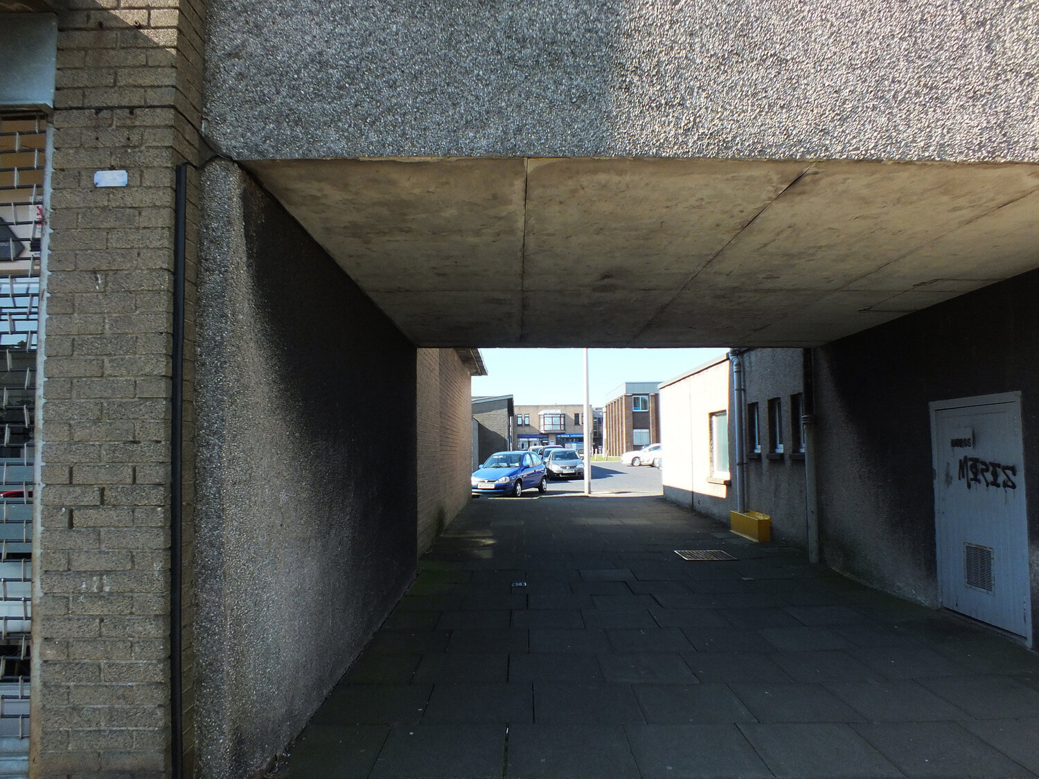
what i mean are airports, petrol stations, holiday resorts, motorway service areas. spaces where identity is deliberately flattened, design is systematised, and the experience is engineered for seamless transition. you could be anywhere — and that’s precisely the point. these environments are defined by uniformity, function, repetition. they exist not to be remembered, but to be moved through.
but for me personally, perhaps as a designer (one obsessed with modularity and order) they’re particularly thrilling.
we don’t often talk about placelessness as an aesthetic. it’s more often a criticism. yet as rem koolhaas explores in junkspace, placelessness is the architectural byproduct of a hyper-commercial modernity: spaces without memory, built fast, endlessly duplicated, designed to flow. these are not sentimental buildings. they are signage, surfaces, systems. environments for consumption, efficiency, and movement.
“if space-junk is the human debris that litters the universe, junk-space is the residue mankind leaves on the planet.”
— rem koolhaas, junkspace
but this isn’t a lament. on the contrary, i find these spaces conceptually liberating.
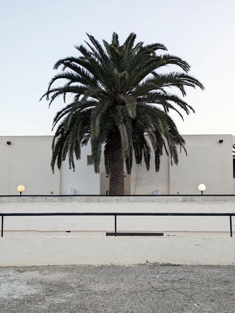
on a recent holiday, i re-read marc augé’s non-places, and his notion that modern life is increasingly lived in anonymous spaces: the airport lounge, the chain hotel, the supermarket aisle. these are spaces where individuality recedes, replaced by interchangeable familiarity. and it was exactly at such a place, the utter uniformity of a holiday resort designed to look like every other resort that i felt so free. there was something incredibly soothing about being in a place without narrative, without local “charm,” without any demand to engage with a story. it simply worked. it gave space for stillness, reflection, relaxation - exactly what holidays are for.

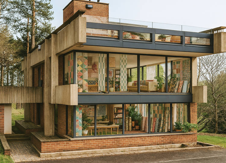
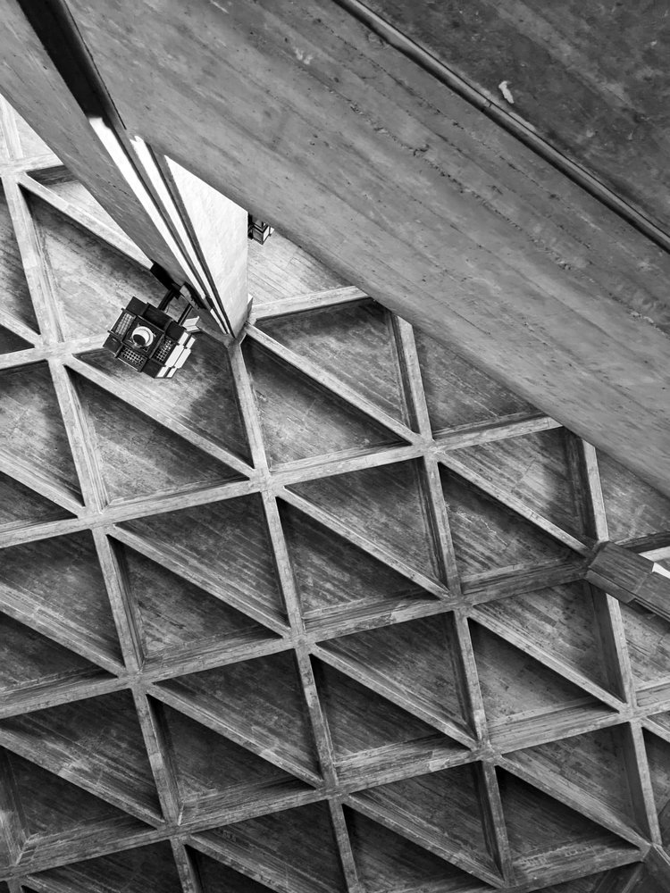
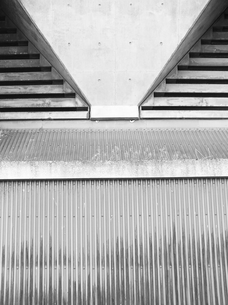
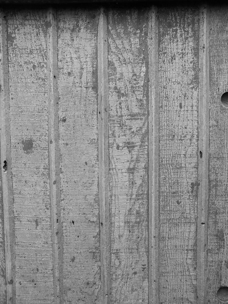
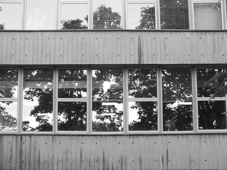
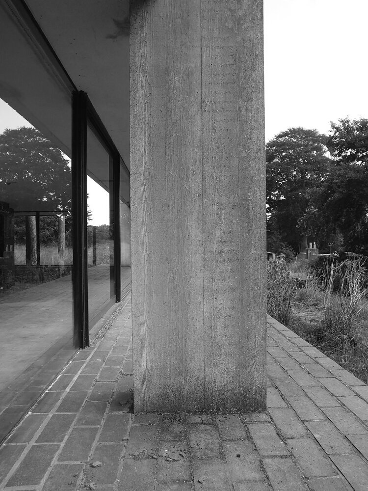
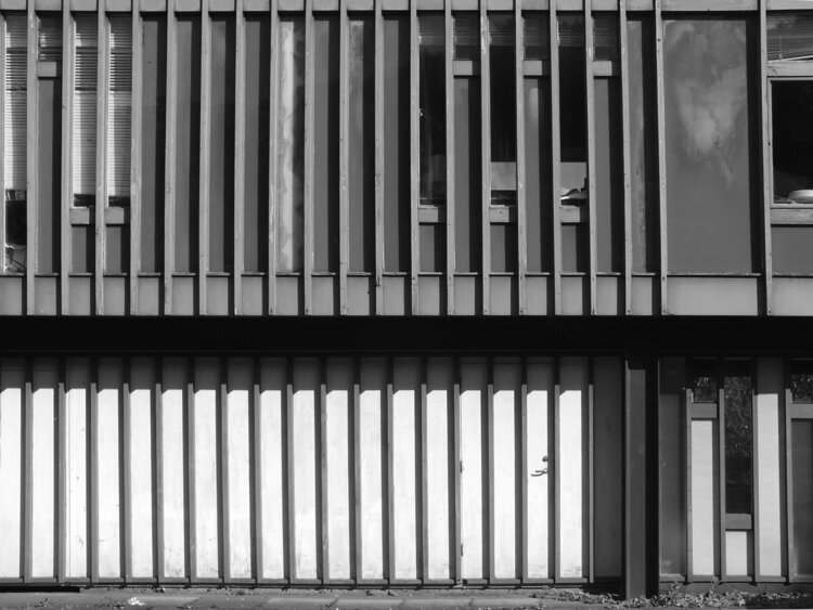
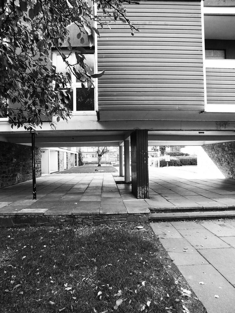
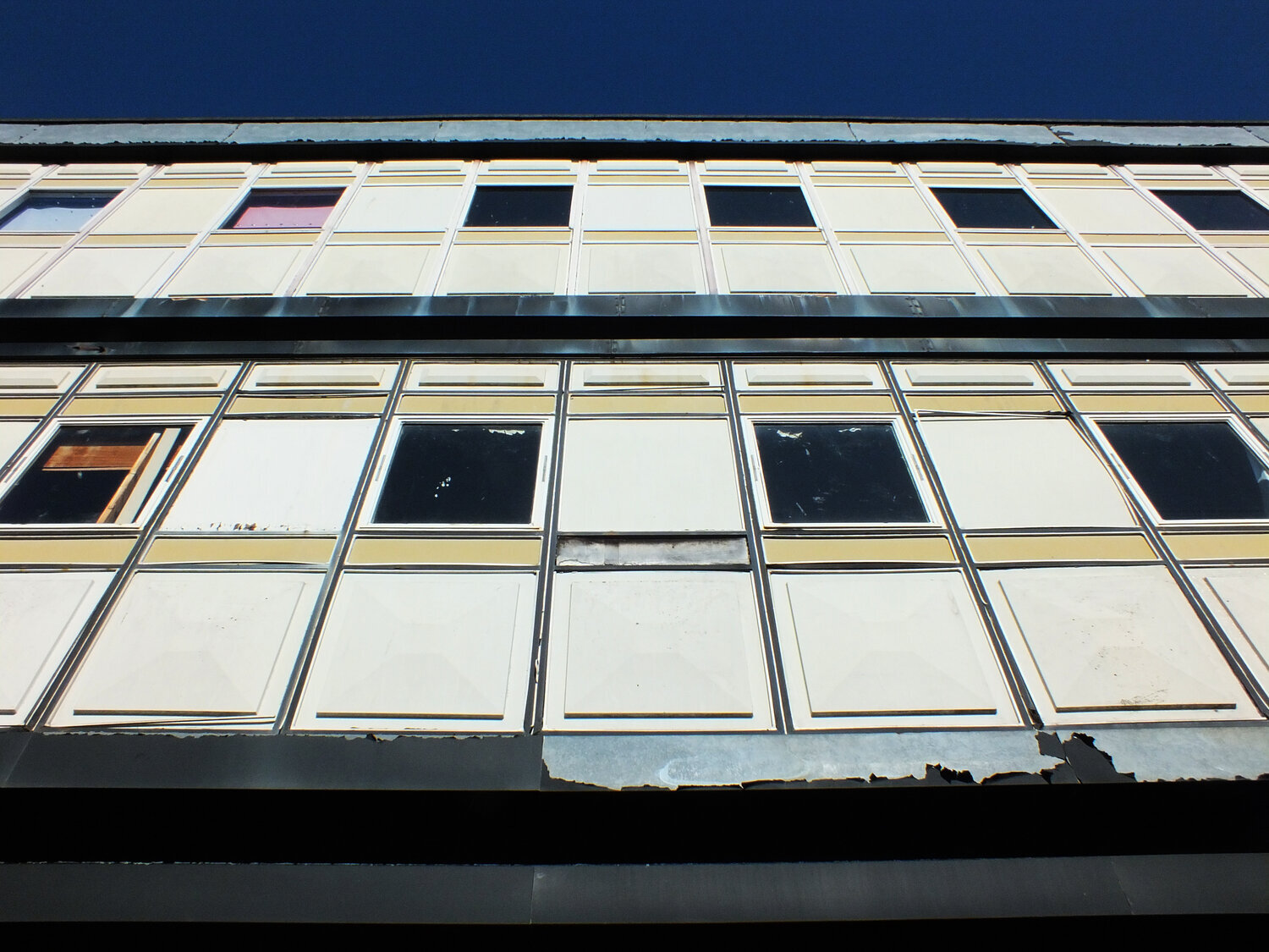
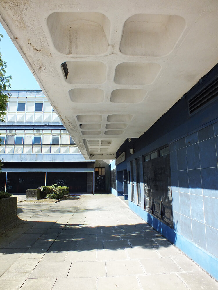
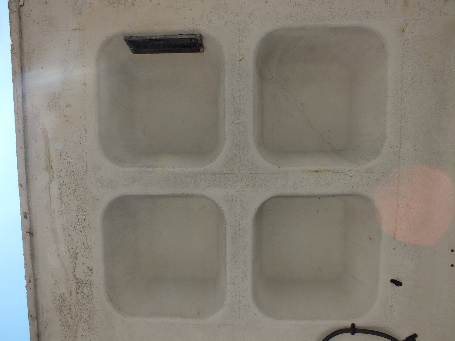
this idea - that placelessness allows a different kind of presence - is something i somehow intend to carry into zitozza’s textile design. i’m drawn to the visual systems that govern these functional spaces: the yellow directional arrows painted on concrete, he repeat rhythm of aluminium cladding, the ceiling grid in an airport terminal.
these forms are rarely intended to be aesthetic. but they are. they offer a kind of silent logic, a pattern language that is honest, liberating and somehow reflective. it does not try to tell its own story, it has no ghosts, no myths. it’s completely empty, ready to be filled in with your own thoughts and feelings.
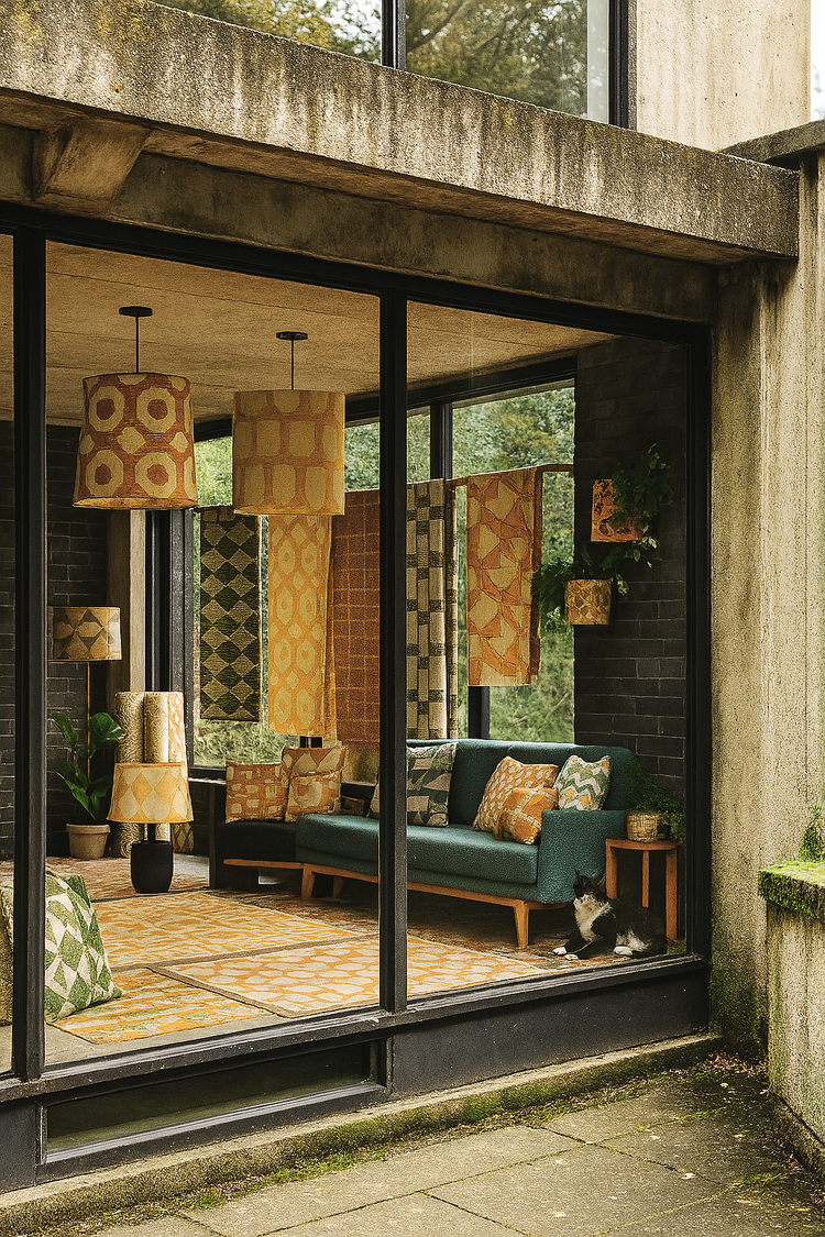
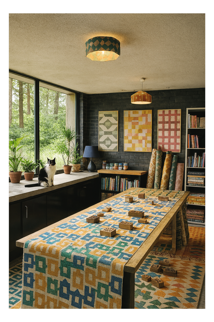
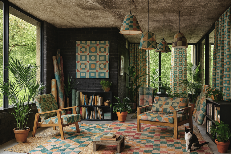
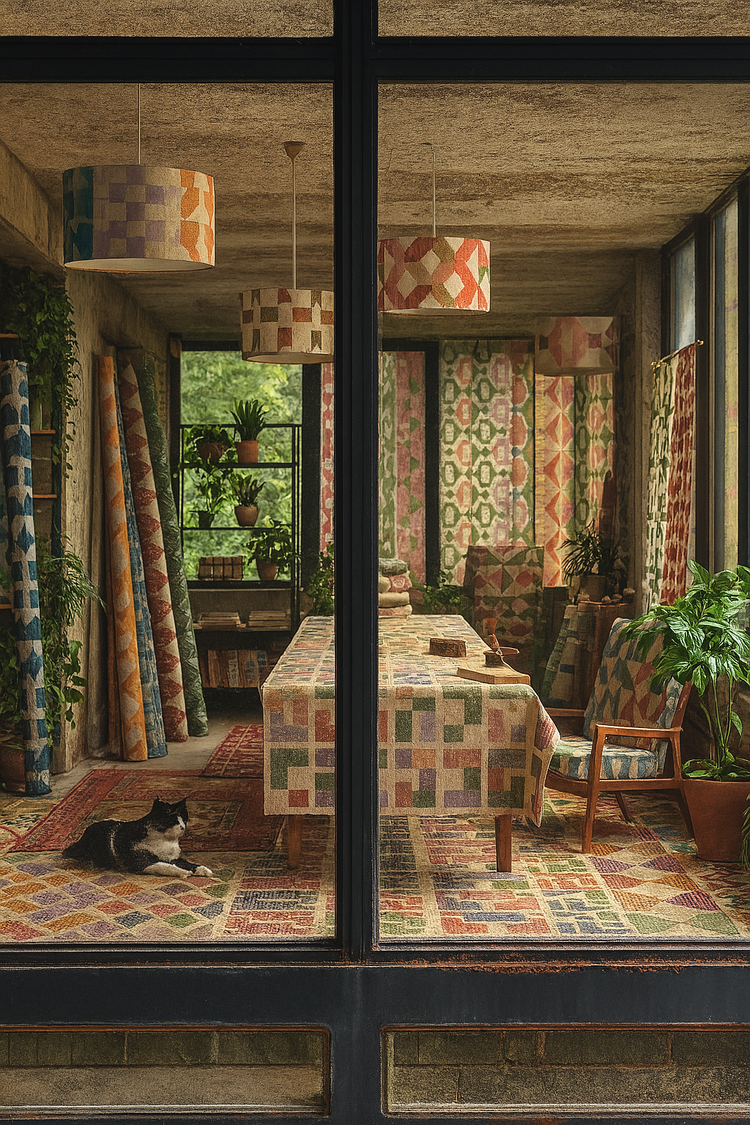
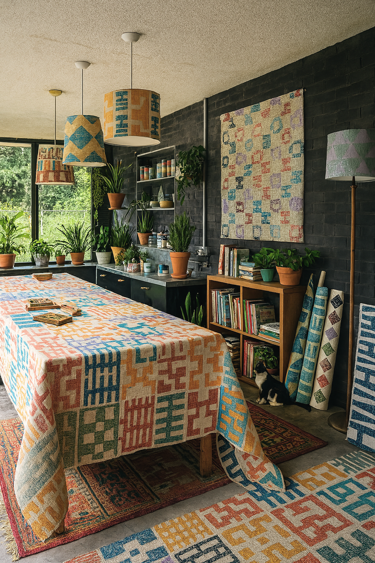
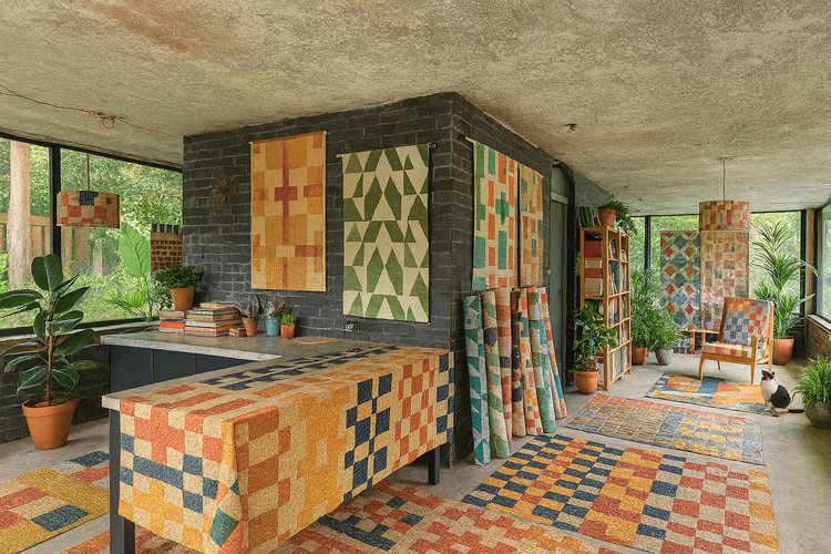
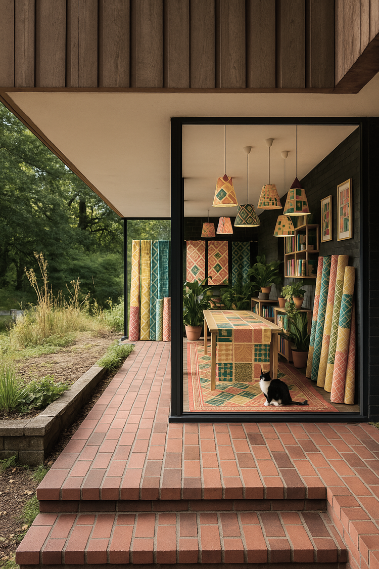
in zitozza’s collections, i echo this vocabulary through repeating blocks, hand-printed modules, and structured alignments. even in a hand-printed cushion, i want to retain something of that clarity — that system over sentiment. a printed rug inspired by motorway signage doesn’t just add colour, it organises space. it introduces a rhythm that you feel underfoot, often without even noticing.
of course, the hand does intervene. the ink runs, the tile drifts slightly. the colour overlaps. this is where placelessness meets presence, where the system is honoured but softened and a small sense of uniqueness is born out of the uniformity. a little bit of character, but not to tell its own story.
so yes, it’s possible to find solace on a package holiday and yes, i do find inspiration in petrol stations. and airports. and anonymous resorts. not because they’re “ugly” or “bland,” but because they stand empty, ready to be filled in. they represent a visual order that is free from nostalgia — and therefore full of possibility.