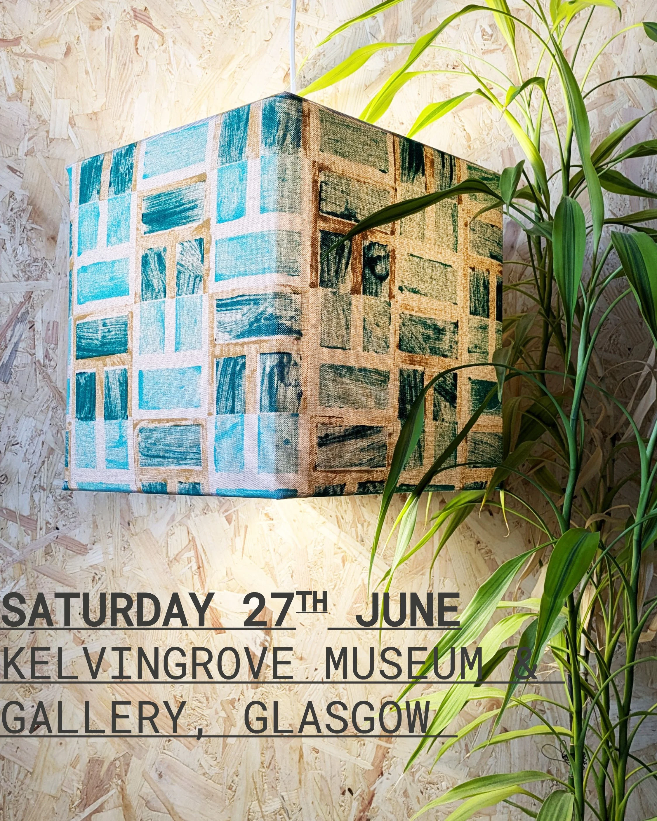
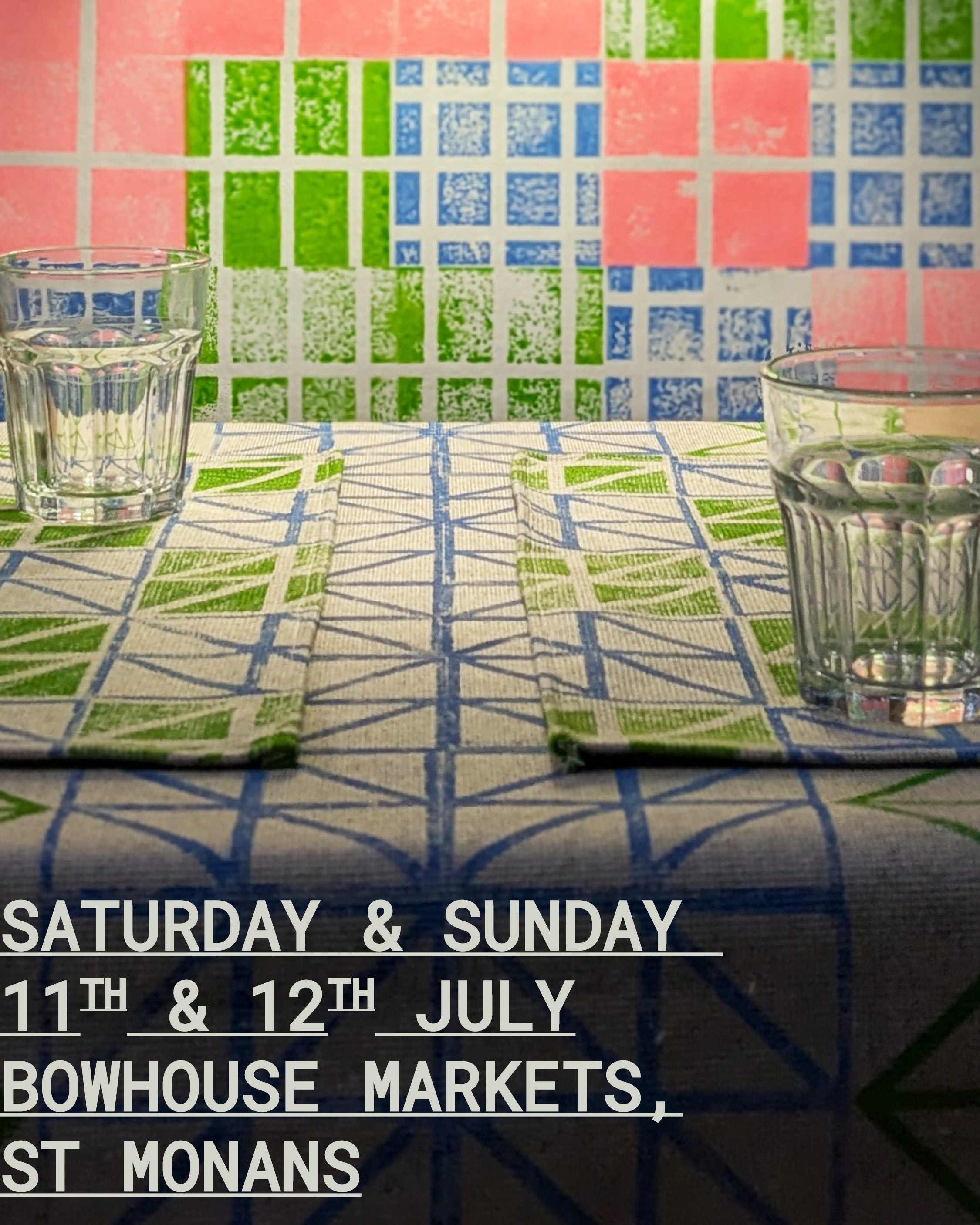
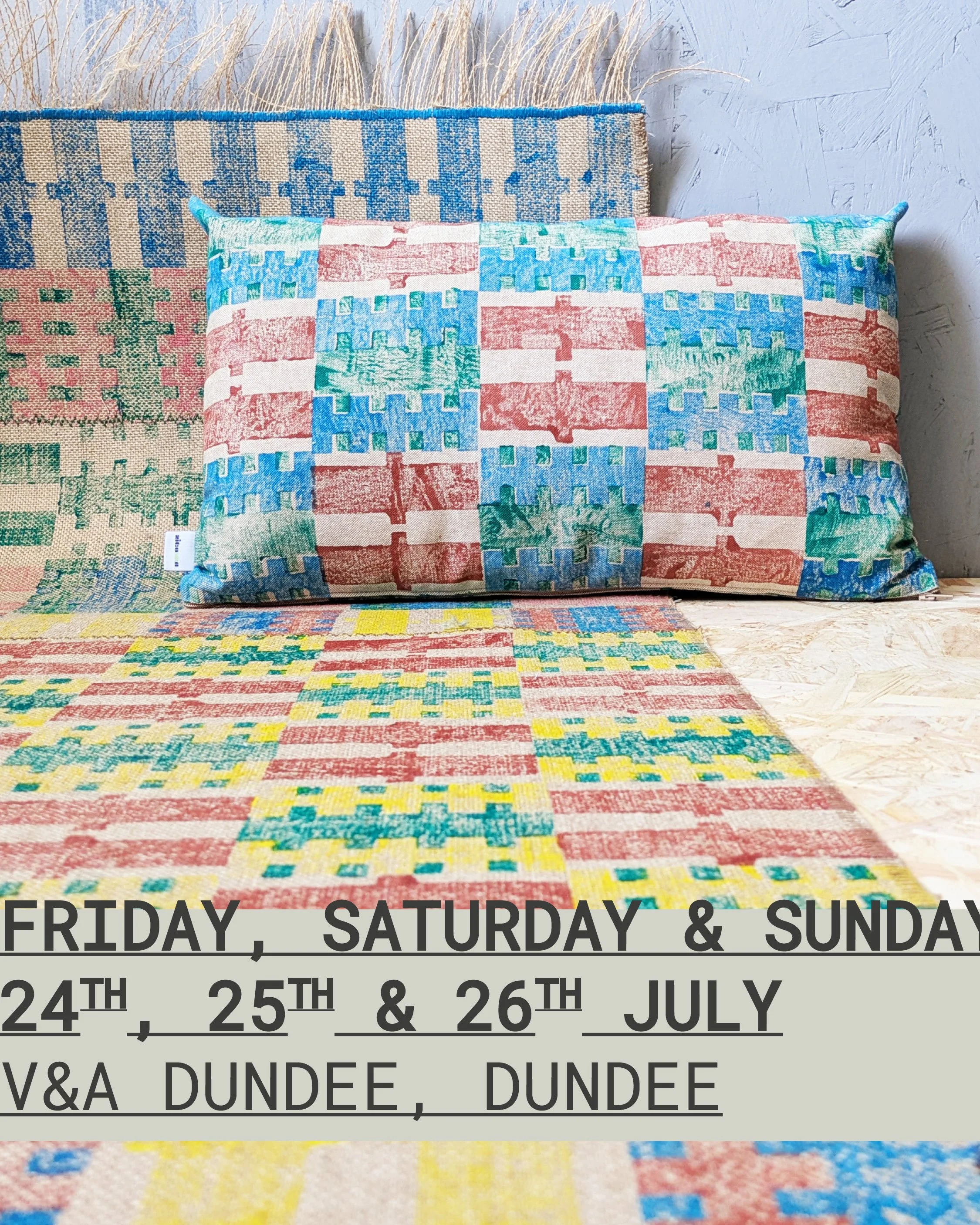
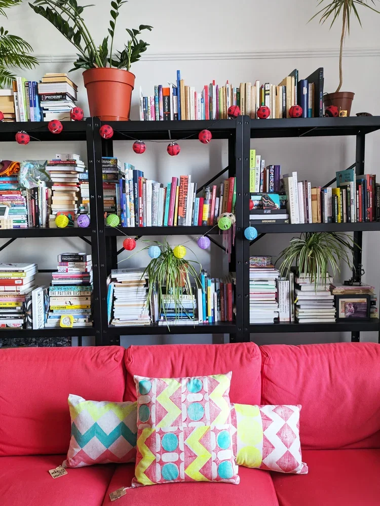
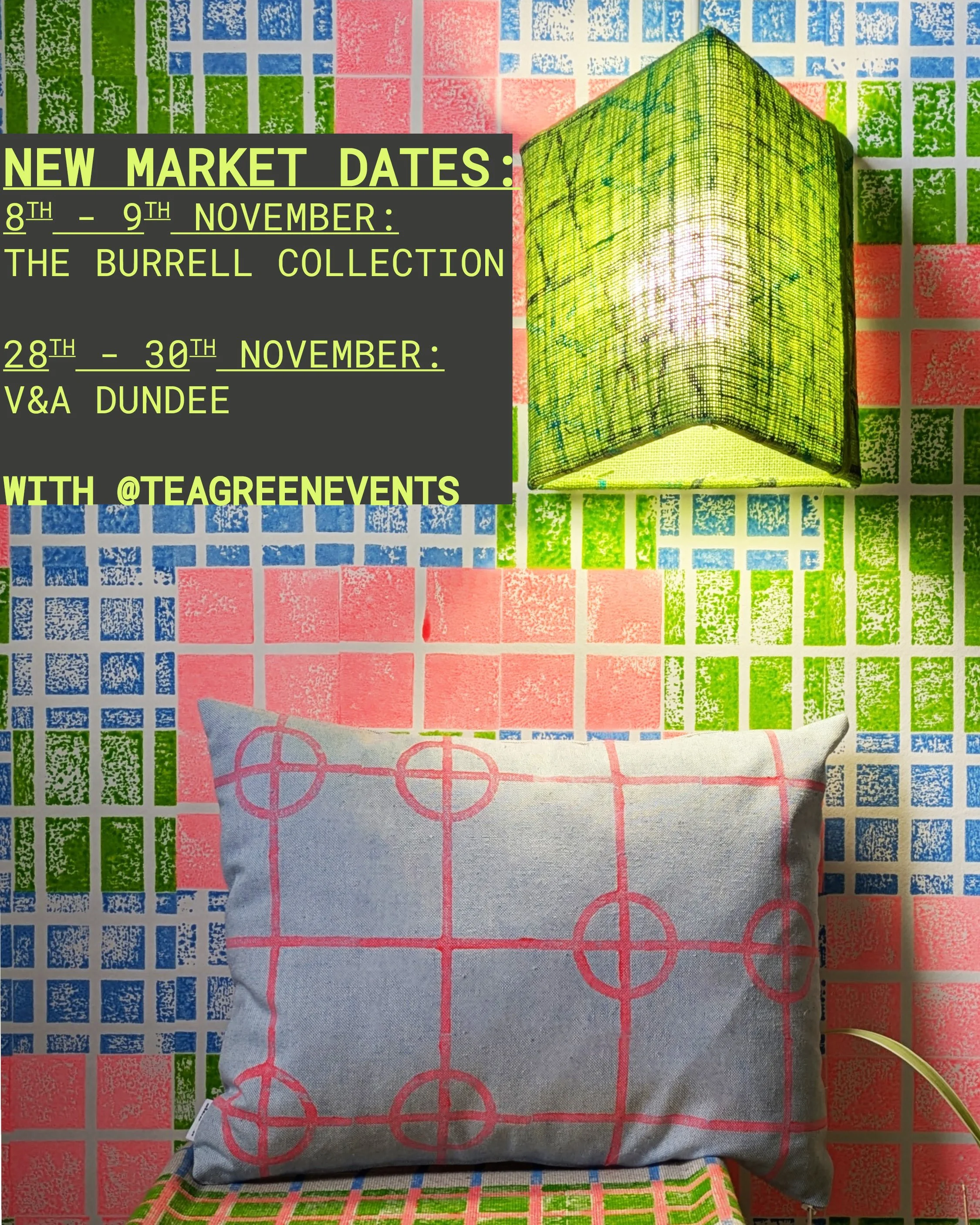
hello sunshine, summer is finally here and we are popping up again, this year at three venues across scotland, all organised by the wonderful tea green events which makes the quality of the curated lineup pretty much guaranteed. come and see it, touch and buy - we will not be anywhere else live this year!
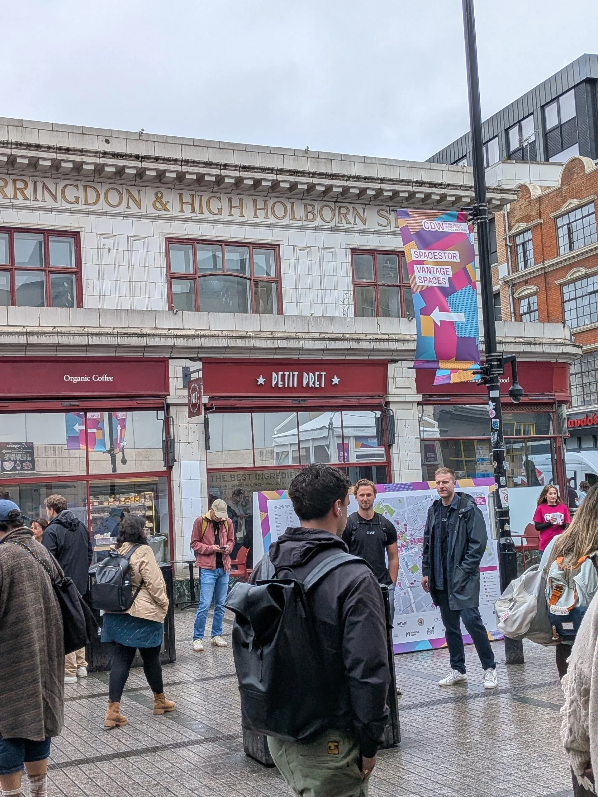
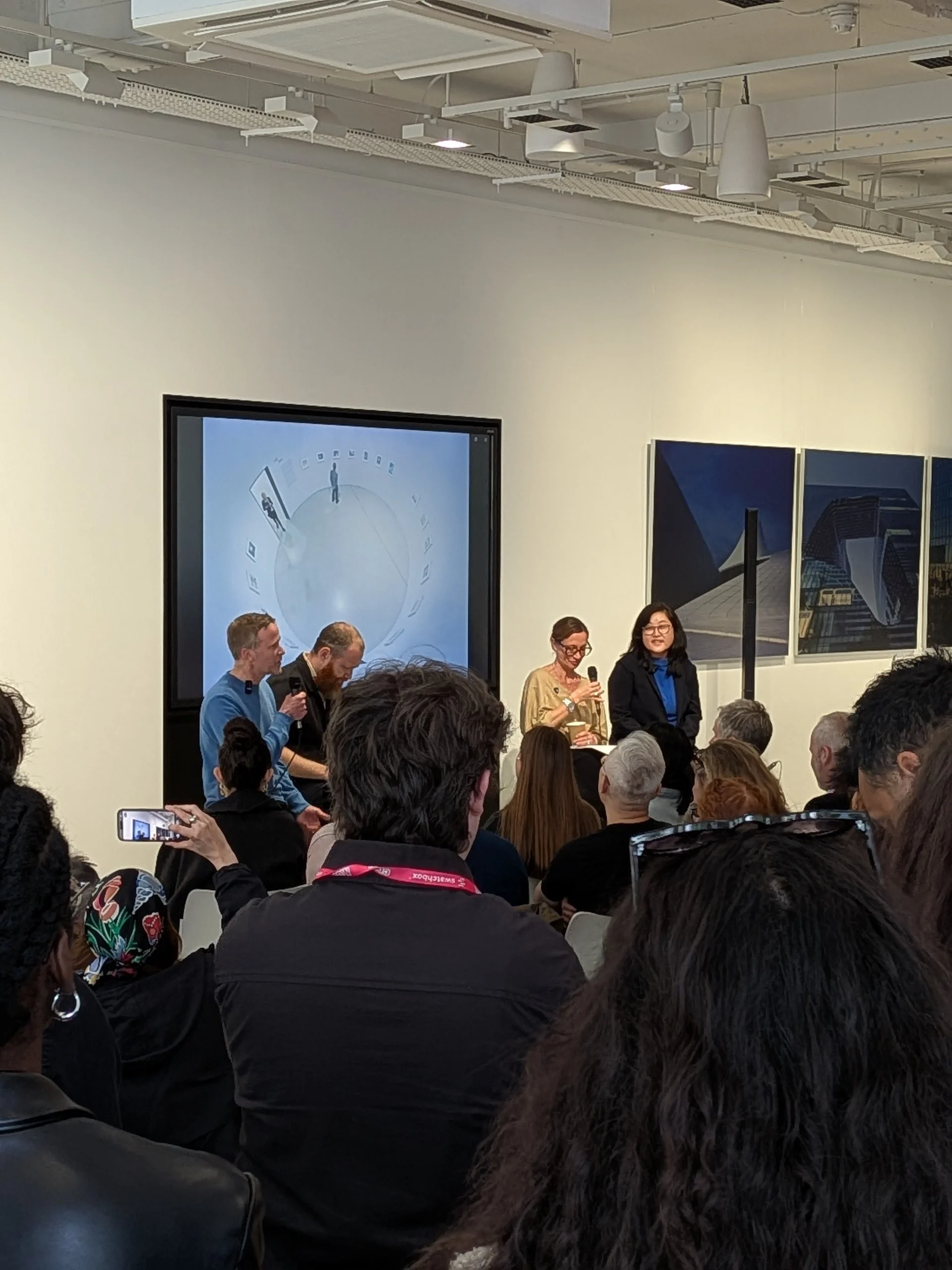
you may remember that last year at clerkenwell design week i took zitozza to the platform venue in the hope to introduce it to london’s design scene. in hindsight, for zitozza, it was not a particularly successful show as due to the festival set-up, visitors needed to know where they were going and brands needed to be wanted to be found by name. so this year, i went into it freely without obligations and decided to explore what’s really happening at other venues. on the tuesday i executed a high-efficiency, no-hotel, low-baggage tactical strike on london, which left me feeling logistically flawless, but conceptually exhausted.
it might be a global burnout i’ve been noticing for a while, but it seems like there is quite a bit of tiredness creeping into the design trade show machine. walking the showrooms at 10:00 am on day one, the energy felt remarkably flat. salespeople looked tired before the footfall had even arrived, venues stood quiet and empty, and the usual cowcross street platform venue didn't even open its doors (presumably they could not fully book it out but if the decision to put the new designer in the charterhouse was deliberate, then it probably worked out for the better as this type of multi-venue, festival type set-up only works if you have a pulling name to your venue which new designers aren’t.) hopefully they did better out of it then.
but to me, the industry feels like it is running on the fumes of safe, predictable products, terrified of economic risk and, and entirely lacking in imagination. nowhere was this exhaustion more obvious than in the basic infrastructure of the event itself.
last year, i remember being furious that exhibitors had to pay £300 just to rent a basic barcode scanner for visitor badges. this year, they eliminated physical badges entirely, forcing everyone onto a mobile app so exhibitors had to awkwardly ask their potential leads to be scanned, perhaps this lead to higher quality leads but also felt like a point of friction has been introduced.
the festival app also had a map which showed where the venues were located but didn't show street names with it. as someone not massively familiar with the EC1 layout, i spent the day relying on google and a folded piece of paper (thank goodness for the printed map they still handed out at the corners) which functioned perfectly because it respected basic graphic logic.
we are constantly told that digital integration streamlines human experience but in reality, when digital tools are designed for data harvesting rather than spatial navigation, they simply introduce friction and become annoying obstacles. this theme of passive, compromised design carried straight onto the panel stages.
i went to an exciting talk on the future of museums and the new cultural landscape by zaha hadid architects and erco lighting, where the architects on stage argued that modern museum spaces have become an important third space, meaning not home, or work, but somewhere else to be and socialise. the southbank centre was cited as a great example of a “creative hub” that “you don’t even need to check what’s on” for, you just go there to “hang out”, trusting there’ll be programs you might enjoy and it was debated as a model to be exported to other institutions.
being involved in the v&a dundee’s learning programme, i have observed as much but i was a little gobsmacked to hear this take from architects themselves as something to celebrate, because i view the role of architecture (and the cultural institutions housed by them) as something that should lead, rather than follow. i think we should be able to expect from these multi million pound projects to not just follow and adapt to our behavioural changes but actually lead. it is design’s job to, erm, design for better engagement. when institutions design exclusively for passive consumption, turning a museum into a glorified lounge or a public mall where people sit without engaging much with the intellectual substance of the building, they surrender their cultural authority. i don’t think we need more spaces designed for passive lingering; we need frameworks that actively invite intellectual engagement. design should not be a reactive service that mirrors lazy social habits; it should be a proactive catalyst that elevates human curiosity.
i would have loved to have stayed and listen to the questions and perhaps ask about this one but it veered off about the use of AI and i had to rush to attend another one.
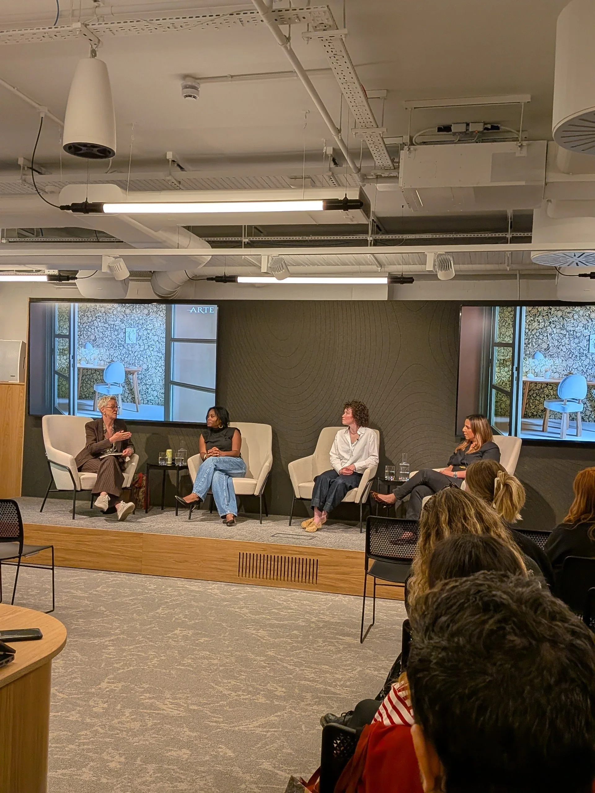
on the following talk about wall coverings with ARTE and house of black design i kept hearing similarly challengeable ideas. one of the industry trends seems to be a new found appreciation of hand crafted surfaces (a huge win and hope for zitozza) however the reason for this is simply because it “tells a story” and when asked how to prevent a pattern from becoming dated over time, the answer given was to ignore trends and "design for emotions, because emotions are permanent."
i could not disagree more, in my view, emotions are the least permanent thing we possess; they are volatile, seasonal, and easily manipulated by marketing campaigns. a space designed around a fleeting emotional narrative is guaranteed to date the moment that emotion shifts. true aesthetic durability does not come from forcing a story onto a wall or a floor; it comes from rhythm, proportion, and structural logic. a grid remains honest long after the emotions shift or a narrative becomes told and tiresome.
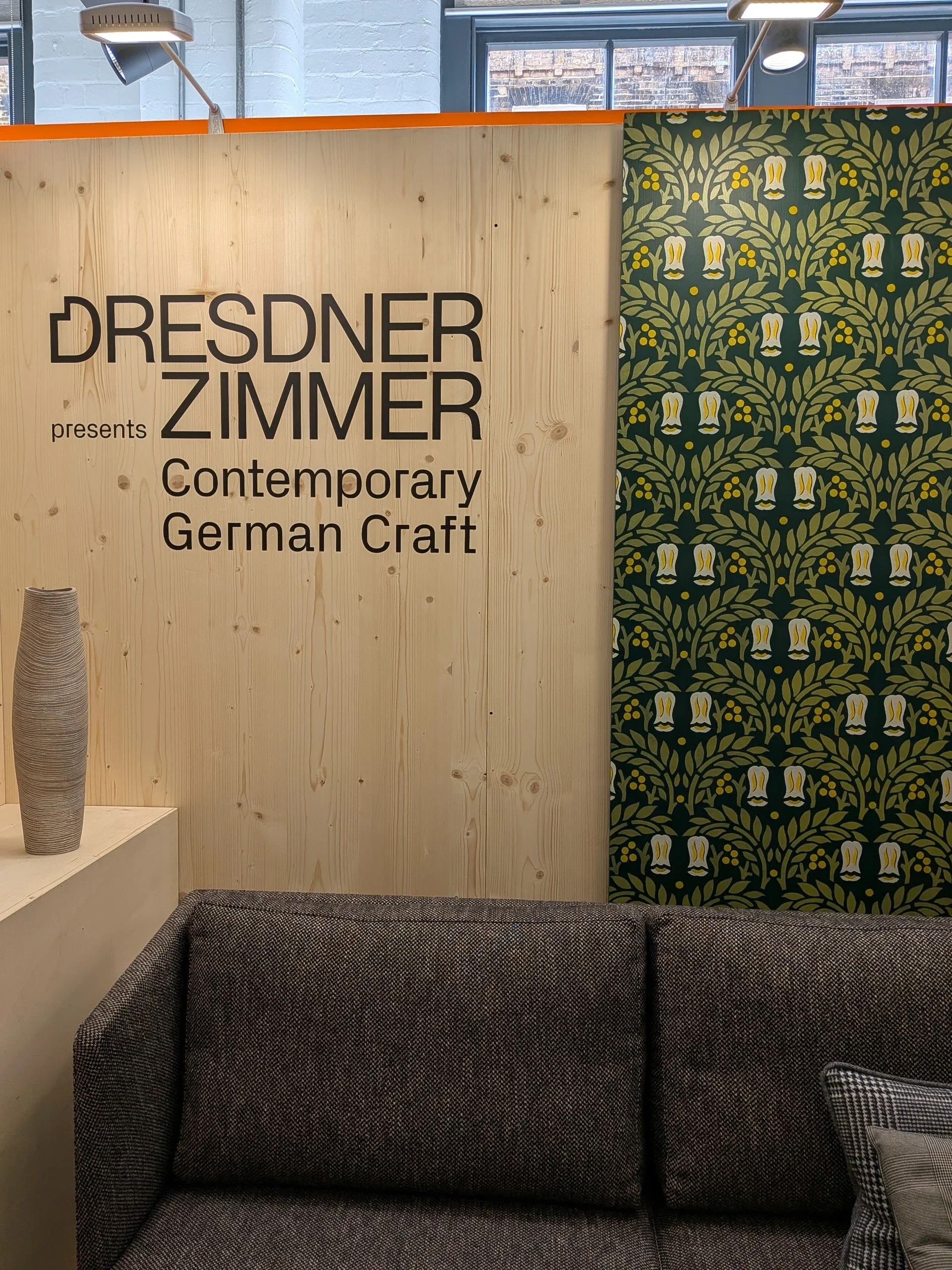
i found this point ironic to listen to after i met a representative from the dresdner zimmer design collective, and we discussed the systemic struggle of the modern studio: the reality that today's market has completely lost its understanding of material value. when consumer culture conditions people to expect a chair to cost £50 (the price of a flatpack factory unit) the immense structural value of a handmade, material-first object becomes invisible and despite it having the “storytelling” power, it becomes significantly harder to market it and find the buying power for it. it remains to be seen whether this is a struggle we can overcome but i wholeheartedly support the idea of smaller studios grouping together and gaining support of the national chamber of commerce to promote their craft at design festival.
i was really rooting for the german pavilion to get busier over the course of the festival, but maybe their mistake was that they thought they came for a trade show and not to offer free food. jane’s london identifies the root cause of the empty venues being simply the other showrooms offering free pizza and prosecco. if that is true, i find it hilarious that even showrooms have essentially become their own version of a "third space" to “hang out” rather than work and do trade. when a design week turns into a big, corporate jolly, the products and innovations become entirely incidental.
ironically, while this was happening, the most tangible win of my detour happened because of the exact opposite philosophy. in the charterhouse (where new designers were packed into now), i crossed paths with a freeweaver studios, who are currently collaborating on a project with the v&a dundee where i work as a freelance design educator and it was a stark reminder of what real cultural leadership looks like. at the v&a dundee, the learning programmes don't sit back and wait for people to passively "hang out" in the foyer. the institution actively takes the lead, deploying design education directly into the community, bringing the structural logic of making closer to people. it is an active framework for curiosity, not a passive room to consume a coffee in. it treats the audience as active participants in design and thinking, rather than passive consumers of a pre-packaged narrative.
designing for use, whether it is a museum learning programme, an information map, or a modular textile system, requires a certain level of modest self-confidence. it means creating a clean, honest, highly functional grid and then stepping out of the way so that human engagement can actually happen.
the contemporary design scene in the capital feels tired because it has forgotten how to build those frameworks. it is too busy trying to sell an emotion (with free canapes) or program an app to notice that the people on the street just need to know the name of the road they are standing on.
i have come to the conclusion that if the industry wants to reverse its current stagnation, it must stop looking to corporate trade shows and commercial marketing panels for answers. the industry is running on empty clichés and broken digital tools. real inspiration seemingly isn't happening on the exhausted showroom floors; it is being formed in regional education hubs where people are invited to look at the world through the honest, un-decorated logic of the grid.
london was a necessary reminder: design happens for use, for education, and for structural clarity. the rest is just noise.
back in february, i wrote about why i find the term “storytelling” so exhausting when applied to pattern design, and i really do believe that a pattern doesn’t (and shouldn’t) guide you through a linear narrative; rather, it surrounds you, as in, all of it exists all at once. i wanted to expand on this thought a little bit further and make the case for curiosity, something that’s at the core of zitozza.
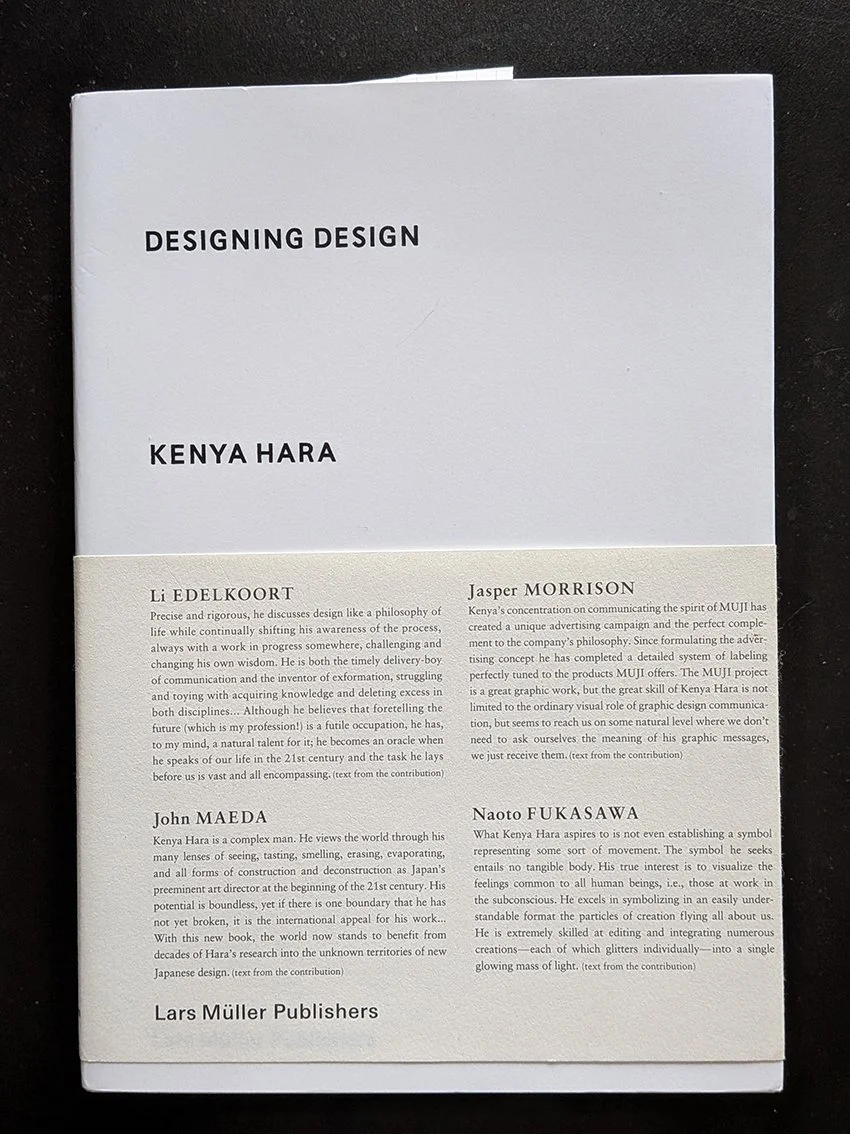
the explanation is actually not mine, it lies in a concept coined by the japanese designer kenya hara:exformation.
in his book designing design, hara argues that our modern world is entirely obsessed with information, with throwing broken pieces of knowledge at people until they feel they "know" everything. we see this everywhere in contemporary interiors. spaces are styled to look like a specific narrative, a carefully curated scrapbook of a person’s supposed lifestyle. the design leaves nothing to chance, forcing a pre-packaged biography onto the inhabitant.
“basically, knowledge is no more than an entrance to thought (...) to know something is not a goal, but a starting point for our imagination. (...) the information-dispatch side is engrossed only with throwing broken pieces of information at the recipient, and the recipient has begun to consider catching information as the goal. (...) i wonder if this is where the problem of stagnating creativity in communication lurks?” (hara, 2007)
“exformation” is the exact reverse of this process. it is the art of making something known not by over-explaining it, but by awakening the viewer to how much is left to be discovered. it is about converting the known back into the unknown, creating an entrance for curiosity.
“the “in”, of “information” is an affix. attached to the beginning of a word, sometimes it adds a negative implication. but in most cases, it intensifies the root meaning, or adds meanings like “directed within, on and toward”. this is the case with “inform”. the word “form” means to shape, organise, or arrange in order, but implies the movement vector involved in taking a definite shape. accordingly, “inform”, with the background meaning, “giving a certain form”, carries meanings like, “to make known”, “to tell”, “to imbue (with a feeling)”. then, in noun form “information”, it takes on meanings such as communication, knowledge, information and scholarship, and further refers to the service of giving information, as in “information booth”. in the word “exformation”, the prefix is changed from “in”, to “ex”, reversing the meaning of “in”. the meanings of “ex” include “not”, “out of”, “outside”, “eliminated”, “prior”, and others. this is the source of the concept of converting the known to the unknown. Notice that “exterior” is already widely used as the counterpart to “interior”, so my coined term, “exformation”, may well make sense to the general public.”
so by his logic, when we apply this to the spaces we live in, the implications are profound. an interior does not need to communicate a story; it needs to create the conditions for experience.
this is where the architectural grid and the repeating textile system come into play. to some, a modular grid might seem cold, rigid, or overly rational. but in reality, the grid is the ultimate tool of exformation.
the grid does not dictate a narrative. it doesn't tell you how to feel, nor does it demand that you admire its personal history. instead, a repeating system establishes rhythm, scale, and tempo. it sets a clear, visual boundary line that provides stability, and then - crucially - it stops talking.
by remaining emotion-free and focused purely on proportion, a modular textile system leaves what kenya hara calls a "productive emptiness." it creates a framework that waits for the inhabitant to fill it in. the meaning of the space isn't prescribed by the designer; it is constructed by the person moving through it, watching the light shift across the floorboards, or holding a conversation over a table.
this philosophy is the exact blueprint behind the digital pattern design tool i’ve been developing for zitozza. when i design a printing block based on an architectural reference, i am not trying to narrate the building's “biography” as such. i am extracting its spatial logic. when a designer or architect uses the tool to rotate, repeat, and configure those blocks, they aren’t receiving a finished story from me. they are using a language of forms to create their own framework.
losing the compulsive forcing of stories in design is nothing to fear. stripping away the sentimental fluff doesn't make a room cold; it makes it spacious. it shifts the designer's role from a loud storyteller to a quiet translator of rhythm.
after all, a rug shouldn’t be a biography. it should be a foundation. it should simply clear enough visual noise out of the way so that life has enough room to happen inside it.
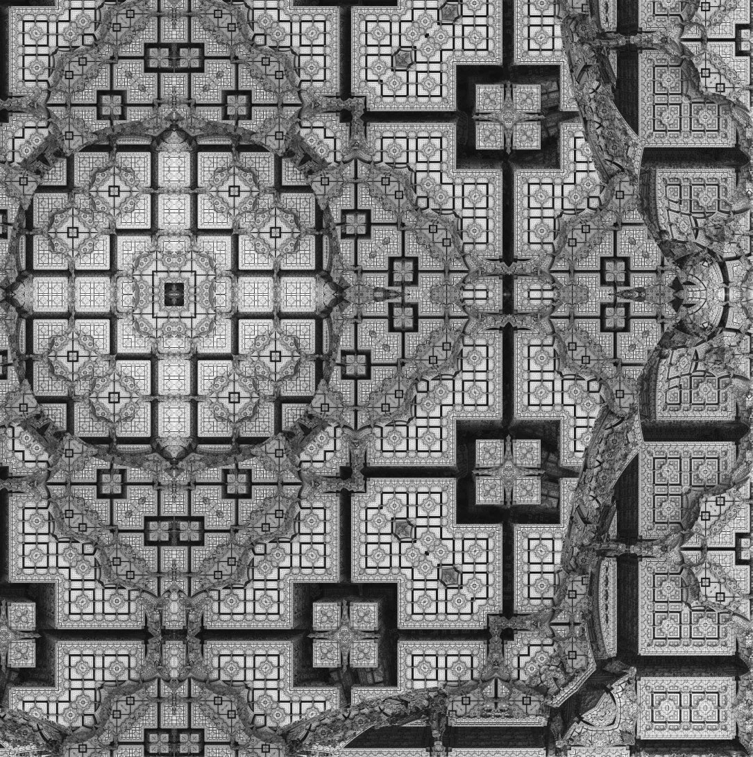
the last month has been quite a reflective time as i have been busy with a new portfolio website(for all the projects outside zitozza - yes they do exist!) and going through all this work has brought up some memories i thought zitozza readers could be interested in too. in early 2018, i found myself deep in the design project of an astonishingly expensive luxury hotel in the gulf. i was hired for this prestigious project at marcel wanders, tasked with creating a modern take on the mathematically rigorous, geometric patterns of middle eastern tradition.
to achieve the most spectacular details, we weren't hand drawing; we were employing computers to do the generating. the 3D designers used the mandelbulb software to program and create incredible fractals - infinitely complex, computer-generated patterns that no human hand could plot alone. the role of our graphics team was to translate that digital infinity into the real world. we spent months and months of tracing them to translate them to material realities, negotiating with suppliers, navigating this delicate field of "digital craftsmanship" and selecting hundreds of colours for pom sets to turn a a screen's output into a tactile carpet.
mandelbulb generated fractal detail
interestingly, at the time, AI as we know it now was years away, it was perhaps being talked about as a niche interest but definitely not capable of creating what it can do today. yet, working like this, even then, the writing was on the wall: the traditional relationship between human and machine was reversing.
historically, the human did the "creative" drawing and the machine did the repetitive "analogue" manufacturing. today, that is flipping. the computer is becoming the primary generator of complex form, leaving the human to do the heavy, tactile, and time-consuming labour of physical execution. i found it ironic at the time that the “fun”, creative bits of creating the vision is what we outsourced even all those years ago, while the painstaking material bits were relying on the human expertise. this might not be the future we wanted but with generative AI entering the conversation, it certainly has become what we got.
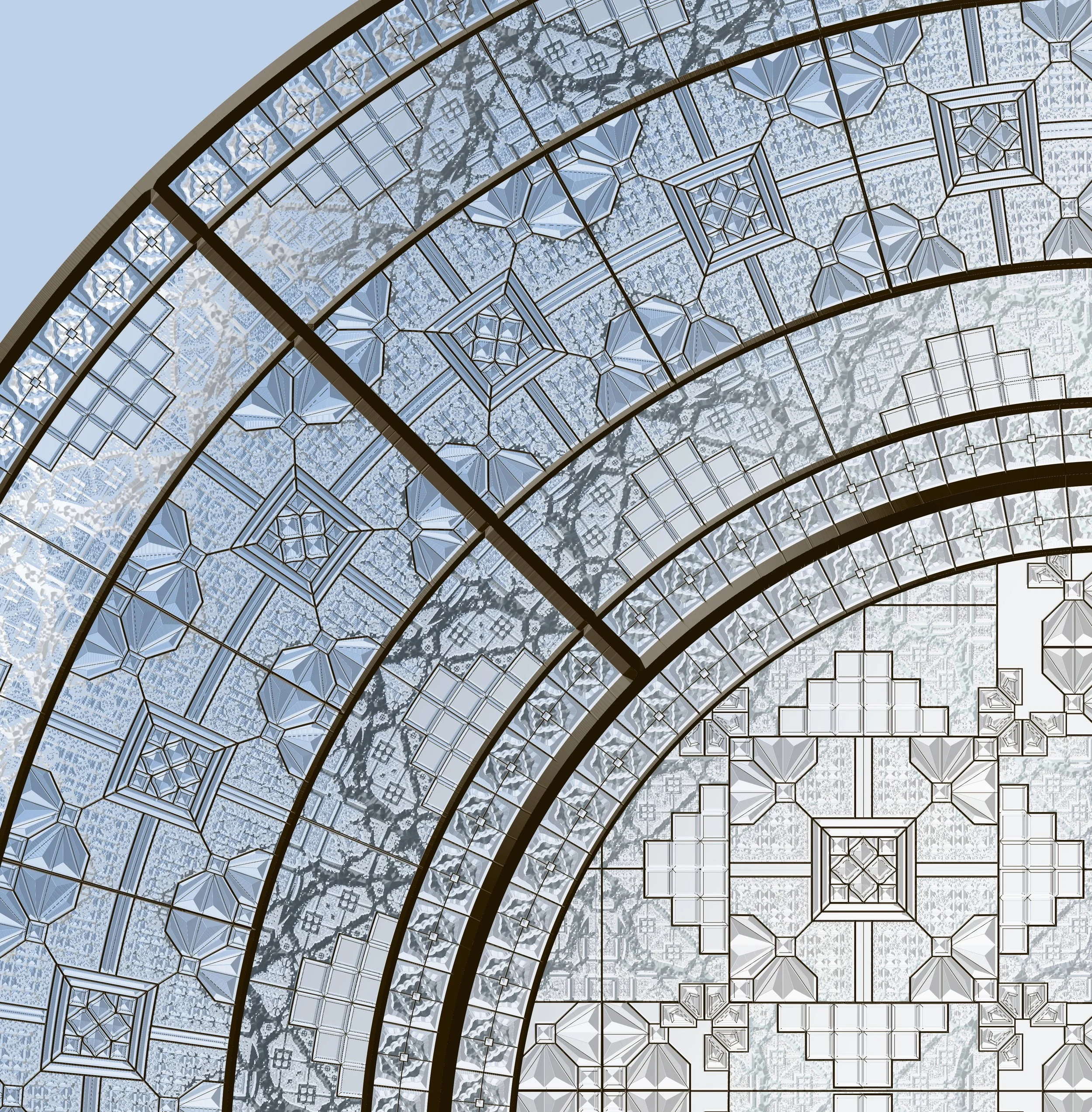
glass panel visualisation based on fractal details
this brings me back to the zitozza design tool. in a way, the tool (which was itself a collaboration of code between myself and AI) is like a digital box of legos. it allows you to play with infinite configurations and "generate" a personal logic. but the end bit - the actual printing of your rug or the construction of a lampshade - remains stubbornly, beautifully manual.
as i’ve been in the studio this week finishing a made to order lampshade, i’ve felt this reversal quite acutely! the design is a result of a digital system, but the "uniqueness" comes from the friction of the hand-press.
in a world where screens can generate perfection in a second, the value has shifted. the "craft" is no longer in the ability to draw a straight line, the computer has won that race ages ago. the craft is also not so much in making the vision visible any more as generative AI is becoming able to visualise any output in seconds (as a somewhat tongue-in-cheek experiment, illustrated by the banner - created by google gemini, based on the text of this blog post for zitozza.) so the craft is now in the analogue endurance: the labour-intensive process of pressing ink into linen, the subtle variation in pressure, and the time it takes to let things dry.
it seems that it remains the material reality, the expertise, and that artisanal touch is what (by its very nature) cannot be automated. or maybe just not yet, but maybe never, because the handmade would lose its very essence. the machine is already busy doing the “creative'“ part but we still are the ones left with the joy, and also the pain of the puzzle.
breaking news! if you’ve followed the zitozza blog for a while, you’ll know we’ve been vocal about our opposition to the proposed 2023 updates to the uk furniture and furnishings (fire) (safety) regulations.
the proposed changes were, in a word, overkill. they would have expanded open-flame testing to a wider range of products and placed an impossible administrative and chemical burden on small businesses. for a studio like ours, it would have meant permanent labeling and mandatory chemical treatments for any cushion over 45 x 45cm (a move that felt entirely at odds with the move toward a circular economy and healthy interiors.)
well, the entire industry said "no thanks." and it appears we have been listened to!
The Shift Toward Smoulder Testing
the uk government has indicated a significant pivot. instead of the high-barrier open flame resistance (which often necessitates the use of toxic fire retardants), the conversation is shifting toward requiring smoulder testing only.
this is a massive win for natural fibres and independent makers. it acknowledges that the "toxic" approach to safety isn't the only way forward. by focusing on smoulder resistance and batch testing, the government is potentially removing the heavy administrative weight that was threatening to crush the re-upholstery sector and independent textile designers alike.
Why This Matters for Zitozza
we believe in materials that breathe. our hand-block printed fabrics—including our recycled linens and heavyweight cotton blends—currently pass cigarette (smoulder) testing naturally, without the need for harmful chemical coatings. we may even get our jute used for upholstery too!
this regulatory shift means our fabrics can continue to be specified for upholstery projects without compromising the health of the home or the environment. it allows the beauty of the fibre to remain at the forefront.
The Final Push: We Need Your Voice
it is important to note: this is not yet law!
a new, and hopefully final, consultation is now open. the government needs to hear that the industry supports this move toward sensible, smoulder-based safety and away from toxic FR treatments.
responses are expected by 23rd june. please take five minutes to fill out the consultation and ensure we move toward a future that is both safe and sustainable. thank you!
the era of "take it or leave it" design is over. we are currently living in a period of hyper-customisation, but most of what is offered is superficial, like changing a thread colour or adding a monogram. at zitozza, we wanted to go deeper. we wanted to give you the blocks.
we built our online pattern designer because we believe that the person living in a space should have the ultimate agency over the rhythms within it. i do always call it the "LEGO of pattern design" but it isn't just a catchy tagline; it is a genuine commitment to a modular way of thinking.
from passive consumer to active builder
when you enter the bespoke designer on our site, you aren't really "shopping", you are essentially prototyping. by using our original physical printing blocks (digitised into a precise javascript tool) you can test the limits of a grid before we ever touch ink to fabric.
there is a specific, freeing joy in building a pattern. it starts with one tile. a single decision. then a repeat. then a shift in the palette. suddenly, you aren't just looking at a rug; you are looking at a system you constructed.
i do remain the main designer at zitozza and the collections, curated looks will not stop. however i have always struggled to limit the system of printing blocks into commercially neat packages and trying to pre-made and pre-guess what clients want. so the answer to this problem is quite simple: we’ll let you play. play is the most efficient way to discover logic. by "playing" with our modular sets (and remember, they’re interchangeable between each-other too), you will find the proportions that feel right for your specific architectural context.
how to use your agency:
construct: use the grid to build a sequence that responds to your furniture, your windows, your light.
play: iterate. download the PNGs. put them in your digital moodboards. see how the "logic" holds up.
decorate: once the digital grid is perfect, we translate it back into the physical world using our machine-cut blocks and sustainable fabrics.
customisation shouldn't be a luxury add-on; it should be the starting point. the grid is waiting. go play.
we have another exhibition recommendation for you - this time at the v&a dundee (where i have recently joined the team as a freelance design educator so expect more exhibition visits later!) but even without this link, when you title your exhibition “maggies: architecture that cares”, it surely is a call to visit for this architecture lover.
at zitozza, the built environment is usually viewed through a lens of deconstruction: we look for the geometry in the utilitarian and the overlooked, but this new exhibition shifted the focus from form to feeling. the small, but tightly packed display on the upper foyer documents the history of maggie’s centres in the UK and beyond - they are cancer support sanctuaries designed not as clinical annexes, but as intentional pieces of architecture.
the system of sanctuary
the exhibition showcases a range of approaches to the "architecture of care," from the clean, glazed precision of foster + partners to the timber-heavy, tactile structures that prioritise light and nature. it isn't just a collection of buildings; it is a study in how a physical environment can be designed to feel humane.
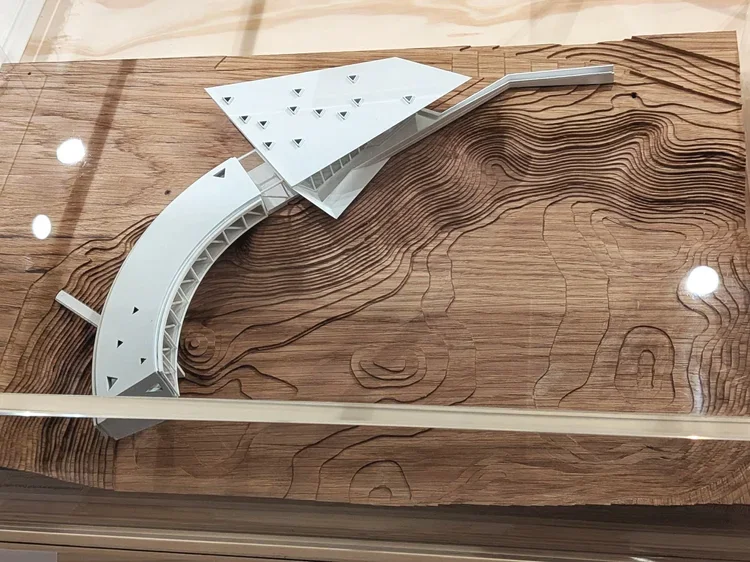
what is most striking is the light and the openness. many of the centres feature glass walls that dissolve the boundary between the interior and the surrounding gardens. the models in the centre of the foyer demonstrate how these buildings are designed to breathe, offering a direct contrast to the often built-up surroundings of a hospital site.
textiles as a structural tool
for a textile designer, the wall displays offer a fascinating glimpse into the interior logic of these spaces too. alongside architectural sketches are stories of how materials are selected to ground the inhabitant.
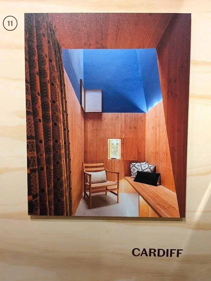
in the documentation for the cardiff centre, for instance, traditional welsh woven patterns are highlighted. it's a reminder that textiles aren't "decoration" in these contexts; they are a necessary tactile layer that provides warmth and familiarity. the presence of a tapestry by edoardo paolozzi (on loan from one of the centres) further reinforces this. it shows how a bold, modern building needs the rhythmic, woven interruption of art to feel truly "resolved."
a recalibration of the "wow"
as someone finding spiritual solace in the “soulless”, uniform spaces of hypermodernity, i have historically been sceptical, if not downright suspicious of "gimmick" architecture. when i looked at the expressive curves of architects like frank gehry or the sculptural forms of heatherwick studio, i often felt like they are prioritising the photograph over the inhabitant, that the spectacle is empty or even hiding something sinister.
however, maggie keswick jencks (a landscape designer herself) founded these centres on the belief that the environment is a core part of the treatment. the "wow" factor isn't about the architect's ego; it’s about giving the inhabitant a sense of agency. in a clinical world where you are often a passive recipient of care, these bold, often absurdly beautiful spaces demand that you remain a curious, active participant in the world.
because let’s face it, when you are going through endless medical appointments, series of gruelling surgeries and various forms of therapies with exhausting side-effects, you will get quickly tired of the rigid, sterile “order”, and navigating the windowless corridors and white waiting rooms very soon becomes a miserable chore for survival. in this context, a zaha hadid curve or a gehry roof isn't the award-seeking spectacle i used to think about it as; it becomes a lifeline. it’s a moment of wonder and beauty in a time that is otherwise so horribly bleak. it made me understand it much better where this type of architecture belongs and why they win many of these kind of projects. this is clearly what they do best.
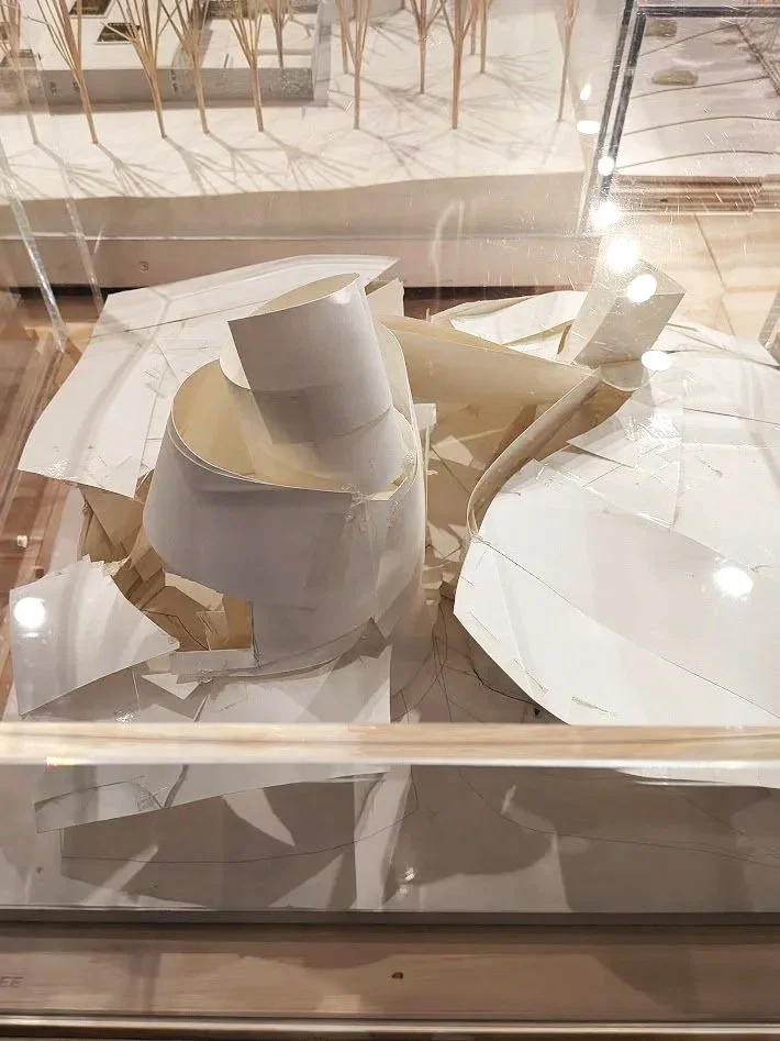
the models themselves are interesting, there are a few different standards from perfectly scaled to ceramic sculpture models. frank gehry’s original paper model is displayed (borrowed from the permanent galleries next door.) there is a great anecdote shared about how he hacked at this first paper concept with scissors when he felt it wasn't "open" enough and it’s a proud piece in the permanent galleries for precisely this imperfect, battered appearance as you can absolutely see the compromises to this paper vision in the resolved structure that was eventually built. but it still highlights the raw energy of the intent, and the exhibition, and particularly the accompanying video room which captures the lived experience of these buildings, gives the perfect explanation of where this vision works best.
i feel that in an era of low-budget architecture, the uncompromising, human-centred mission of maggie’s centres needs to be doubly celebrated. the exhibition makes it clear how the organisation takes great pride in these wonderful spaces and the experiences they can provide to their visitors.
beyond the foyer
the display extends to a wall opposite the learning studios, placing maggie’s in a historical lineage of care-based design, referencing everything from the nightingale hospitals to alvar aalto’s paimio sanatorium.
it’s a beautiful, thoughtful exhibition that reminds us to look at our environment with curiosity. whether a building has clean, straight foster-esque lines or the "gimmicky" waves of a celebrity architect, its success ultimately lies in whether it makes the person inside feel cared for.
maggie’s: architecture that cares is on at the v&a dundee until 1st november. michelin design gallery, v&a dundee, 1 riverside esplanade, dd1 4ez
february is a strange month. nothing is quite new anymore, yet nothing has properly begun. it’s cold, functional, slightly grey, all a bit blergh but at least short. and for that reason, perhaps the best time to reassess what a studio actually consists of.
over the past few years zitozza has accumulated many layers. new collections, experimental colourways, limited runs, market editions, trade show pieces. each one served a purpose at the time. each one taught me something about scale, proportion, colour, texture. but accumulation on its own did not necessarily create clarity or systems much and accumulate, it did. so a studio spring clean felt very well due.
i’ve also been thinking more deliberately about who this work speaks to most fluently. architects and interior designers have always recognised the modular logic immediately: the fact that every block is the same size, that patterns are assembled rather than illustrated, that rotation and proportion matter more than motif. that shared language of grids, ratios and repetition makes specification natural. the textile becomes another layer of construction rather than an afterthought. architecture works because it is resolved. because decisions are made.
that realisation does not change my work itself, but it sharpens the framing i think. when the system is clear, it becomes easier to see which pieces belong at its centre and which are better understood as experiments along the way.
a studio like ours benefits from rationalisation. there are lengths of fabrics, sample runs, end cuts and test prints that still carry the same hand-printing and material weight, yet sit slightly outside the current direction. many, many pieces that were printed perhaps at the very start of our journey, many years ago have become somewhat peripheral to where the structure is tightening. so, opening a material library clearance felt like the most honest way to let those pieces find their context - whether as framed studies, upholstery panels, or small interventions within larger interiors.
this kind of editing has less to do with tidying shelves and more to do with aesthetic durability. i have written before about resisting the constant generation of new desire. durability comes from coherence. from collections that can sit comfortably in a modern interior without announcing themselves too loudly, yet holding their own against concrete, timber and steel.
what i am aiming for this year is not expansion for its own sake, but refinement. a clearer system. stronger alignment between architecture and cloth. patterns that feel placed rather than applied. and the pleasure of knowing exactly why something is there.
this post is something that has long been ready to get off my chest. in design conversations, one phrase appears with remarkable frequency: “telling a story.” designers are told to tell stories, brands are told to tell stories, and increasingly it seems that if a piece of work isn’t narrating something explicitly, it risks being seen as incomplete.
the overuse of “storytelling” like this has irked me for a long time, and i’m certainly not the only one (just ask stefan sagmeister!)
even so, when i place one of my textile patterns next to a building that inspired it, i was told a few times that this was actually “storytelling”, it is, however, and i cannot emphasise this loud enough, absolutely not the case. what i’m doing is providing context. the pattern is not a narrative illustration of the architecture; it is an abstraction, a translation of rhythm, proportion, and geometry into another material. the meaning that follows is not something i dictate. it’s something the viewer constructs for themselves.
a story, by definition, has a beginning, a middle, and an end. design education also often encourages students to present their work as a clear sequence: research, sketches, development, final outcome. it makes sense as a teaching method, but in practice creative thinking rarely behaves so politely. many of the patterns i developed during university arrived first as fairly complete ideas (sometimes emerging through digital experiments, sometimes fully formed in my head) and only afterwards did the sketchbook pages appear, carefully reconstructing a linear “process” that satisfied academic expectations. i decided to use these faked sketches to illustrate my point because i find it funny how strongly we expect creativity to move like a neatly unfolding sequence, a step by step process, when in reality it often moves in leaps, loops, and sudden recognitions.
it’s true though, i never thought of design, and certainly not of patterns as stories at all. a repeating motif does not guide you through a linear experience; it surrounds you. it exists all at once. trying to treat pattern as a narrative object can sometimes be like insisting that a brick should also function as a sentence. it is simply the wrong unit of meaning.
what design does instead is create frameworks. they establish rhythm, scale, and atmosphere. they provide visual conditions within which people live their own lives. the “story,” if we insist on using the word, happens in the room: in the conversations held around a table, the light shifting across a wall, the slow accumulation of everyday use. design is not the storyteller; it is the stage set.
this is one of the reasons i work with modular systems. each printing block is designed to combine, rotate, and repeat, forming structures rather than scenes. the result is not an image with a fixed message but a language of forms that can adapt to different interiors and different users. the same pattern can feel calm in one space, energetic in another. none of these readings is prescribed, and that openness is intentional.
context, however, still matters. placing a textile next to an architectural reference is not an attempt to narrate a building’s biography. it is simply a way of showing where certain formal decisions originate. a façade grid might influence the spacing of a pattern. a row of windows might suggest a vertical rhythm. these relationships are structural rather than narrative.
i think the pressure for every piece of design to “tell a story” often comes from branding culture, where narrative clarity is treated as the primary route to meaning. pop-culture now also mostly speaks in films and literature, quite often at the expense of visual thinking (see also the brutalist…) but objects have other ways of communicating. material weight, surface texture, proportion, and repetition all shape how we experience a space, often more profoundly than any written explanation. a heavy linen curtain filtering afternoon light communicates something immediate and sensory, long before anyone explains its conceptual background.
in fact, insisting too strongly on storytelling can sometimes limit how people engage with design. if the designer declares what the story is supposed to be, the viewer’s role becomes passive: they are asked to receive the message rather than interpret it. abstraction offers the opposite possibility. it invites participation. it leaves room for personal associations that may have nothing to do with the designer’s original reference point, and that is not a failure of communication; it is the success of open-ended design.
this does not mean narrative has no place in creative work. many designers use storytelling brilliantly, especially when working with figurative imagery or historical references. but it is worth remembering that design can operate through multiple modes of meaning. sometimes a chair is interesting because of its ergonomic logic. sometimes a building is compelling because of its structural clarity. sometimes a textile matters because of the quiet order it introduces into a room.
patterns do not need to speak in sentences to be meaningful. they function more like music: repetition, variation, tempo, pauses. we do not ask a piece of instrumental music what “story” it tells, yet we still experience it as expressive, emotional, and deeply communicative. textiles can work in the same way.
so when i show a pattern alongside the architecture that influenced it, i am not telling a story. i am showing a relationship. what happens next — what memories, associations, or interpretations emerge — belongs to the person living with the piece. the narrative is theirs to write, not mine to dictate.
and perhaps that is the real advantage of abstraction: it leaves enough space for life to happen inside it.
happy new year everyone. i hope you all feel rested and ready to start 2026. as usual by now, we like starting the year on our journal with rounding up the industry trends this year and as we get into 2026, there are shifts we indeed notice getting talked about more. the design conversation feels less about fleeting visuals and more about how spaces actually feel and function.
over recent year there’s been a clear move from insta-ready looks toward interiors that reward touch, proportion and material logic. this is something we appreciate a lot because it resonates with architectural textiles: pattern as structure, not surface decoration; material honesty over effect; and tactile designs, built to live with, not just be seen.
1. lived-in, human environments
with that in mind, the biggest thing in 2026 seems to be about interiors that are being designed for how people actually use them. the “perfectly curated, picture-ready” room is definitely losing ground to spaces that feel genuinely lived-in and personal; places that carry life, use and comfort without compromising on thoughtfulness.
designers note that this lived-in approach is less about clutter but about proportion, atmosphere and genuine engagement with space over time. and for zitozza, this echoes clearly: architectural textiles are decoration as well as reinforcing the logic of a space, so when they age and get lived with, they feel like they were always meant to be there.
2. materials with presence and longevity
sustainability has been “in” since designers realised the importance of it… and in 2026, it first and foremost means materials that remain repairable and have inherent performance; tactile, honest, natural matter that doesn’t hide or disguise itself but interacts with light and wear over time.
expect to see deeper use of bio-based fabrics (seaweed textiles, hemp substitutes) and a continued gravitation toward materials that feel real e.g. jute, linen, stone, wood with grain, and hand-finished surfaces - which we love seeing at zitozza. this is consistent with broader forecasts that interior design is leaning into texture and authenticity over perfectionism.
3. warmth through colour and confidence in palette
the appetite for deep, earthy tones (terracotta, mossy green, chocolate brown) is relentless and does not seem to stop or slow down. designers talk about “earthy vibrancy,” a palette rooted in nature yet energetic and expressive.
in parallel, nuanced saturated hues like rich blues or muted plums are gaining traction for their ability to bring the brighter contrast. earthy colour combinations sit well with structured pattern languages (grids, modular repeats) but of course we’ll be unlikely to abandon the brightness completely.
4. tailored comfort and structural calm
you will know by now that our idea of warmth is not about plush maximalism, but about calmness through order. it is also a trend in 2026 though and watchers have dubbed this period warm minimalism: the softening of minimalism with materials that invite touch (our favourites such as linen, wool, brass, warm wood) without disrupting the order.
this is not some kind of abstract “fuzziness”, and seems to be less about ornament and more about presence: spaces that feel calm because they are designed with intention. architectural textiles fit neatly here: they bring tactility and rational frameworks but with the hand crafted, tactile touch.
5. bespoke, hybrid and adaptive spaces
even beyond traditional interior finishes, we’re seeing a desire for bespoke elements: cabinetry with unique grain and character (think burl wood), hybrid storage systems and modular pieces that respond to how people live and the unique spaces that surround them.
this aligns with a larger cultural shift away from “fast furniture” and toward investment pieces, where customization, whether in architecture, millwork, or (yes!) surface pattern becomes a marker of longevity over trendiness.
from a zitozza perspective, this is what we live for! modular pattern systems and fabrics can flex across scales and speak directly to clients and designers looking for investment textiles that feel both personal and architectural.
6. pattern as structure, not surface
one of the less prominent but still significant threads in early 2026 forecastingis a renewed appreciation for pattern that makes architectural sense rather than just aesthetic sense. interior editors are increasingly pointing to pattern drenching, large prints, and textile wall hangings as ways to give rooms rhythm without ornamentation which we absolutely love to see.
for textiles rooted in block systems, this trend is more than stylistic: it’s conceptual. well-made pattern should operate like a facade grid — clarifying spatial logic, giving scale to surfaces, and reinforcing proportion.
that’s exactly the design proposition behind architectural textiles for modern interiors: patterns that echo the architecture of a room while adding texture and tactility.
so what does this mean for makers and designers?
2026 is shaping up to be a year where purposeful choice outlasts impulse trend, where materials become more honest and tactile; interiors become places for real life.
for a design studio focused on structural pattern, modular logic, and architectural integration, these are trends that we love to see the shift towards across the whole industry. follow us through 2026 as we work towards our new collections and our exciting hyper-customisation tool for unique block printed patterns.
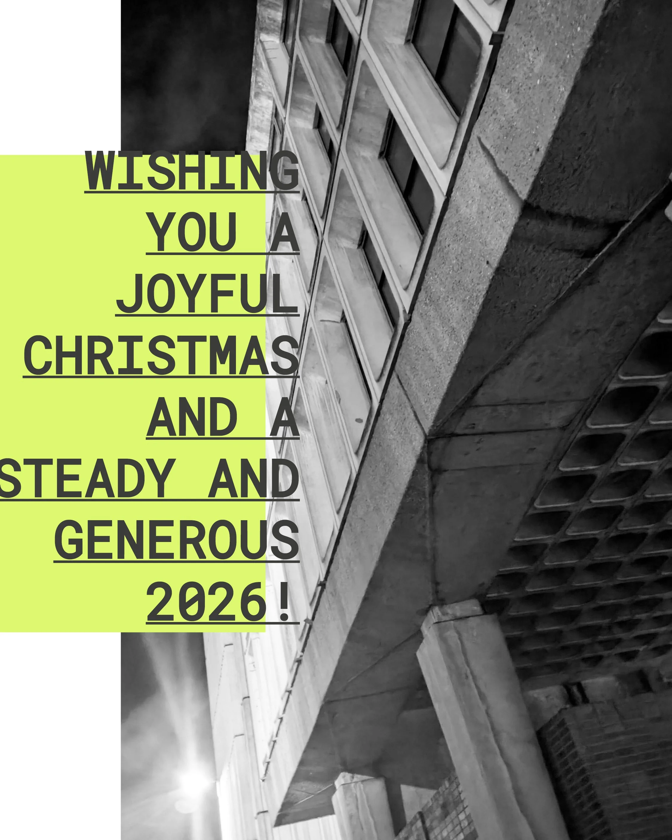
thank you for all your orders, projects, enquiries, conversations and inspirations - we were delighted to have you onboard in 2025 with zitozza. we look forward to having you around in what we hope to be a generous, kind, prosperous, productive, creative, curious, steady and all happy 2026!
as yet another year closes, i think a lot about time, i guess that’s part of getting older, but some things only get interesting once they’ve stopped pretending to be new. a façade darkened by rain, a jute fibre frayed at the edge, paint softening on steel - marks left by time. designers often call this patina, but that word is a little superficial to me, what time does isn’t decoration. it’s participation.
materials in conversation
the modernist world has always been oddly conflicted about ageing. le corbusier spoke about architecture as a “machine for living,” yet machines rust, fade, and require care. in japan, the concept of wabi-sabi embraced this truth long before modernism tried to streamline it: finding harmony in imperfection, dignity in transience.
ernő goldfinger’s trellick tower, denys lasdun’s national theatre, even the modest housing blocks of glenrothes all share something accidental yet profound: their surfaces record weather, pollution, human use. they’ve become topographies of touch. the stains, the moss, the soft greying - proof that buildings are not finished objects. they are ongoing negotiations with the elements.
the hand of time, or of the maker
when i print, i think about this a lot. the brushstrokes i add to my blocks are deliberate interruptions, these are of course not so much about decay but adding individuality. the texture of ink brushed by hand can never be repeated twice. the smallest movement alters the weight, the rhythm, the outcome. each print becomes a fragment of time in its own right: unrepeatable, slightly imperfect, quietly alive.
there’s a strange comfort in knowing that a surface can’t be copied. the same logic that makes an old wall fascinating makes a textile human. both bear traces of their making (of process, not perfection.)
the industrial sublime
as much as i’m obsessed with the new, and its constructions sites in ambitiously high-reaching cranes, i do also like a bit of the odd demolition. scaffolding, half-poured concrete, peeled paint - this choreography of decay and regeneration, particularly because it’s difficult to build in new. there usually was something else before. perhaps it’s the same impulse that drew me to brutalism in the first place: the beauty of things in progress and the kind of resistance to polish.
artists like rachel whiteread or gordon matta-clark come to mind in a way, cutting, casting, or revealing voids as a form of understanding architecture through absence. they teach us that every layer removed or revealed is part of a story of use.
in design, as in cities, change is the only constant material.
designing for impermanence
this is why i find the idea of “timeless design” slightly absurd. nothing is timeless, nor should it be. what matters is whether something ages well - whether it accumulates life gracefully. good materials evolve rather than resist.
printing by hand is, in a way, a small rehearsal of that truth. each block presses its own memory; each brushstroke leaves its mark. what results is never uniformity, but rhythm, the same kind of rhythm that time itself applies to architecture.
texture as memory
so perhaps the goal isn’t to preserve perfection but to let things breathe. to allow colour to fade, surfaces to soften, patterns to settle. the beauty of impermanence lies in that generosity in letting the world contribute to the design after you’ve stepped away.
buildings weather, fabrics crease, and the hand that made them is long gone, but the marks remain. it’s not nostalgia. it’s continuity.
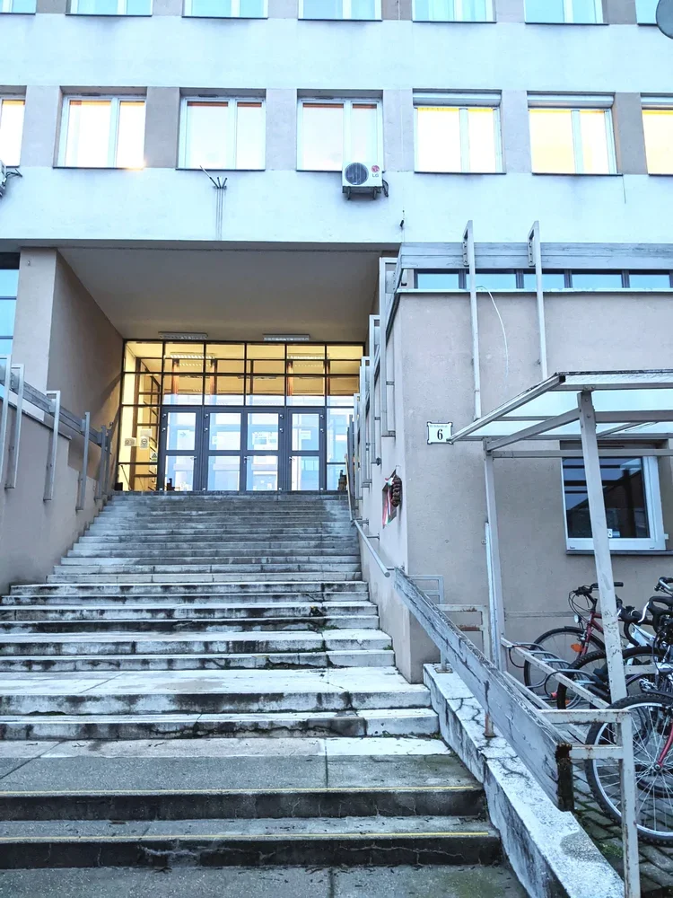
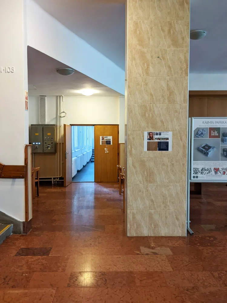
after a few tours at various student halls in edinburgh and st andrews, it’s time to bring you something quite special, in line with my new year’s resolution to bring you more buildings from hungary. we’re going to my alma mater, the óbuda university building on doberdó út – home of the rejtő sándor faculty of light industry and environmental engineering and the building itself too shaped how i think about structure, material and use.
this is where i studied light industry and product design. and no, “light industry engineeering” does not mean “electrical engineering but with nicer lamps”. in hungary, we use this term as an opposite of heavy industry. light industry is the world of textiles, paper, packaging, printing, plastics – all the things that actually touch your skin, your shelves, your coffee table. the soft infrastructure of everyday life.
the building fits that brief in a surprisingly literal way.
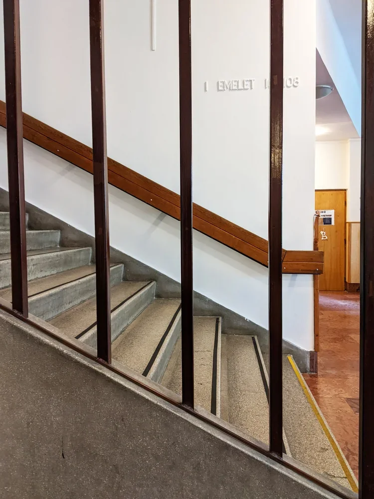
built into a hillside
approaching from the street, you walk up towards the entrance. it’s a long flight of stairs to go up on the first floor, and as soon as you’re inside, the uphill continues.
because it sits on a steep slope between doberdó út and the kiscelli park edge, the whole structure works like a split-level diagram someone decided to extrude into reality. there is a back building of half floors attached to the long, street facing facade. offices and admin spaces occupy the half-floors stepping up along the hillside while the larger rooms – auditoriums, drawing studios, labs, the library – drop down on the other side parallel with the street.
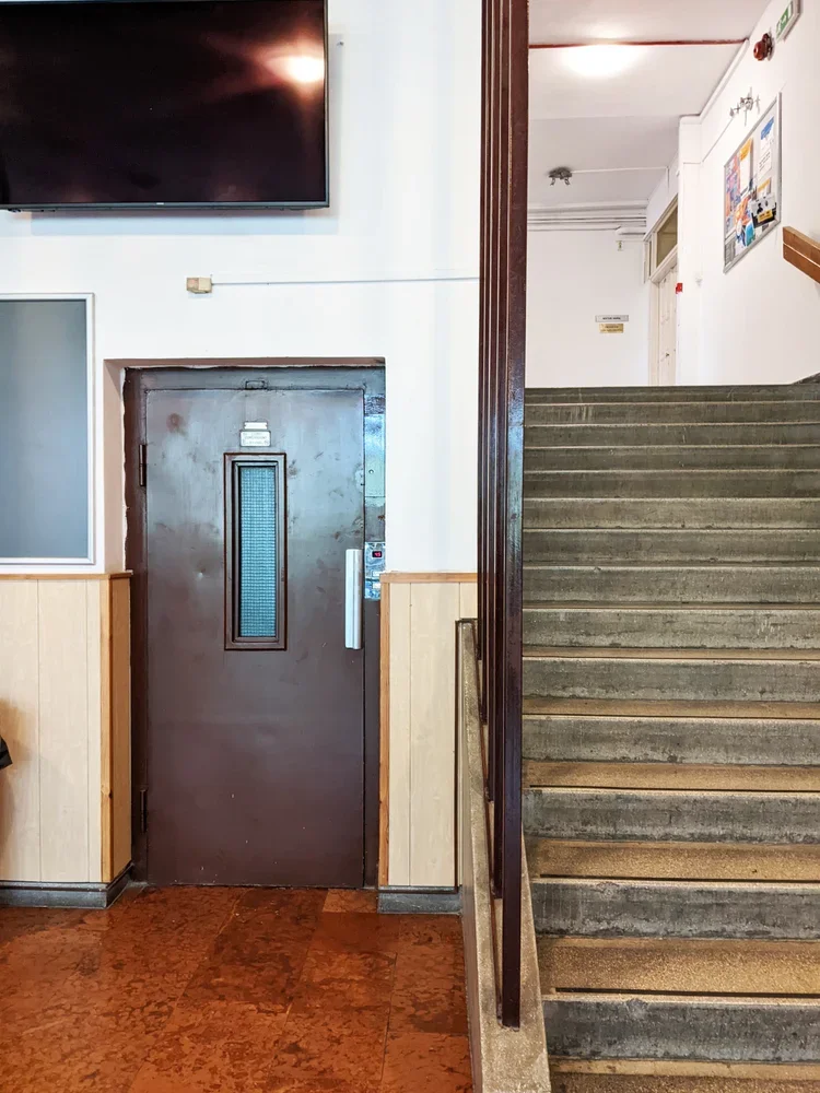
the middle is connected by a lift only teachers were allowed to use (with the same 1970s typography still intact), and a seemingly endless flight of stairs that always ended somewhere interesting. it reads like a very economical way of using topography: every shift in ground level becomes usable volume.
big rooms downstairs, views upstairs
the split-level logic isn’t just a structural trick. it organises how people think and work inside. the big, communal spaces – lecture halls, drawing studios, labs – sit on the lower side, stacked along the hillside. you walk “down” to the important rooms, which is a nice reversal of the usual academic hierarchy. rather than climbing a tower of theory, you descend into the machinery.
upstairs, along the hill-facing half-floors, are the smaller offices, admin corners, and quieter rooms. the hierarchy is sideways instead of vertical: teaching, admin, labs, all neatly lined up next to each other on the long corridors.
the best spaces were the paper labs at the top. they sat just high enough that, once you crossed through the corridors (with lace curtain windows and houseplants like a truly cosy socialist modernist home), the city suddenly opened up from the top floors of the building. there is something strangely grounding about testing grammage, opacity and fibre direction while a whole urban landscape sits just outside the window, built from concrete, brick and glass – large-scale material systems echoing the small samples in your hand.
bannisters, terrazzo, and accidental details
like many late modern educational buildings in budapest, the doberdó út campus does not perform for the camera. but the details are better than they strictly need to be. the stair bannisters are classic 70s: sturdy tubes, consistent spacing, no theatrics. the floors are often terrazzo tiles or hard-wearing stone, the kind designed to survive thousands of students a year and still look vaguely composed.
even while rushing to a mechanics exam, i would enjoy the way the handrail meets the landing, the way light falls along a corridor and it has been storing itself away somewhere in my brain, ready to reappear in your own work. structure, then surface. order first, pattern later.
light industry, heavy shifts
studying light industry here meant learning the mechanics of materials that are often dismissed as “secondary”: textiles, paper, packaging, media technologies. the degree sits at an interesting intersection – somewhere between engineering, design and production.
in reality, it also meant studying in a period when much of that industry in hungary had already shifted, shrunk or moved. factories were closing, retooling, or turning into logistics hubs. the building on doberdó út, with its labs and test rigs and print rooms, became a kind of time capsule of a less material-based economy – but also a test bed for whatever would come next.
that tension – between the physical plant and the changing world outside – is something i carried with me. it’s probably no coincidence that i now work with textiles and printing blocks in a way that is both very old (ink, cloth, pressure) and quietly new (cad-designed modular systems, contemporary interiors, small-batch production).
how this filtered into zitozza
when i design printing blocks now, i think in sections, not just in surface. patterns have to behave the way that buildings behave: stepping, shifting, accommodating different uses without losing coherence. a rug in one room, a lampshade in another, a cushion on a sofa – all part of the same “light industry”, just at domestic scale.
the split-level logic of the doberdó building also shows an interesting and practical system of repetition: instead of a perfect, flat grid, you can think about it as offsets and half-steps – units that interlock like floors on a hillside. the materials matter too: recycled linen, cotton, jute. not glamorous on paper, but very real under the hand.
and the views from those upper labs? they were a useful reminder that design is never just happening in the studio. it’s always in conversation with the city, the economy, and the infrastructures that support both. you don’t forget that when you’ve spent three years measuring paper in a room that looks out over an entire urban cross-section.
a modern kind of alma mater
there are many more photogenic buildings in budapest, and certainly more famous ones. but this one, at doberdó út 6, did its job in more than one way. no grand gestures, just good use of a hill, sensible circulation, and rooms that are genuinely fit for the activities inside them.
as with many of the structures i keep coming back to, its real value is not in being iconic, but in being clear. clear in plan, clear in section, clear in purpose. and i suppose that’s what i’m still chasing with textiles too: clarity in pattern, clarity in material, clarity in how something is meant to be lived with.
from hillside labs to block-printed cushions is not as big a leap as it sounds. in both cases, it’s about making sense of materials in a world that refuses to stay still.
every year the festive season arrives (earlier, louder, shinier), insisting we must find the perfect gift. something meaningful, but not sentimental. practical, yet aesthetic, personal, but not weirdly intimate. if you’ve ever tried to buy for someone who despises “stuff” (like the design-minded friend with the oddly particular taste, or the shopaholic who already bought everything they need), you’ll know the problem.
with our markets coming up, rather than pursuing some kind of a futile fight against time, i decided to fully lean into the festive spirit so i put together some ideas for gifts that don’t shout “GIFT,” but still count as a thoughtful gesture and maybe even improve a life. objects with material integrity, purpose, and presence. things that work hard without asking for attention.
1. Textures rather than trinkets
think tactile, useful, design-sharp: small hand-printed cushion, lampshade that changes winter light, tea towel as miniature textile art or block-printed greeting card as tiny architecture
a soft way of saying: “why not treat your kitchen table with he same rigour as your bookshelf.
2. Tools of enjoyment
gifts that support daily rituals without screaming lifestyle: ceramic coffee cup from an independent maker (why not browse the wonderful line-up of tea green for the best of scotland!); linen napkins that feel like a restaurant stole them from you; a good brush (shoe brush, clothes brush, make-up brush, table brush — anything honest and wooden)
3. A book with spine (metaphorical and literal)
not coffee-table filler. real ideas, research (ahem, zupagrafika’s eastern blocks have a second part coming out…!)
for more serious suggestions (and personal favourites): designing design by kenya hara; raw concrete by barnabas calder; the comfort of things by daniel miller.
4. experiences — but with context
experiences are always great! but architecture people crave context. so why not gift: museum tickets (or why not a membership!); a day trip to a concrete treasure (free! mostly - and highly recommended); or - a breakfast somewhere with good chairs and terrible lighting (on purpose)!
5. Prints, but with intention
a small print framed simply, hung low, near somewhere lived-in. not a gallery wall. not statement art. just… presence. or even wearable - abstract, printed t-shirts, no witty slogans, no football logos, just a nice, geometric pattern.
(we do sell some of those at markets, coincidentally.)
6. Maintenance is a love language
fragrance is personal. but a solid shampoo or a proper,organic bar soap will always be used. or think about some high quality pens. refillable japanese notebook, thoughtful, organised stationery. objects that say “care” rather than “consume.”
7. The almost-perfect non-gift
a block-printed lampshade or cushion. not seasonal, not trend-led, not disposable. just structure, softness, and light: a quiet upgrade to everyday life.
so… if you’re gifting for someone allergic to fuss, you can browse our shop of architectural textiles — hand-printed, modular, modern, and tactile. the best gifts simply whisper: “i pay attention to what you value.”
so, with the clocks going back and the days getting darker, i chose a timely topic for our october blog post. some if you might know this about me but i used to live in the netherlands for a bit - the design culture of the country is just exceptional so i might bring more examples later. but there is a little fascination as well with the dutch word gezellig as it has become one of those untranslatable design-world favourites. it turns up in lifestyle pages, pinterest captions and café menus, usually next to fairy lights and hot chocolates. but like most cultural imports, it’s been flattened in translation.
so what it is then? because gezellig is not “cosy”, not entirely. ask a dutch person what gezellig means and they might talk about a social setting, a place or a moment shared, an evening, a conversation. something that feels just right, with the right companionship. it is not a design term although the somewhat related “hygge” was hijacked much the same way by interior lovers so we can think about this from that spatial perspective too. in that sense, you could see it as being surrounded with a pleasant atmosphere. this is always going to be coming from the company you enjoy but also being enclosed in a space you feel comfortable in - and it is this design sense we’re talking about today.
a spontaneous communal space for sharing evening moments with neighbours - haarlem (photo by zita)
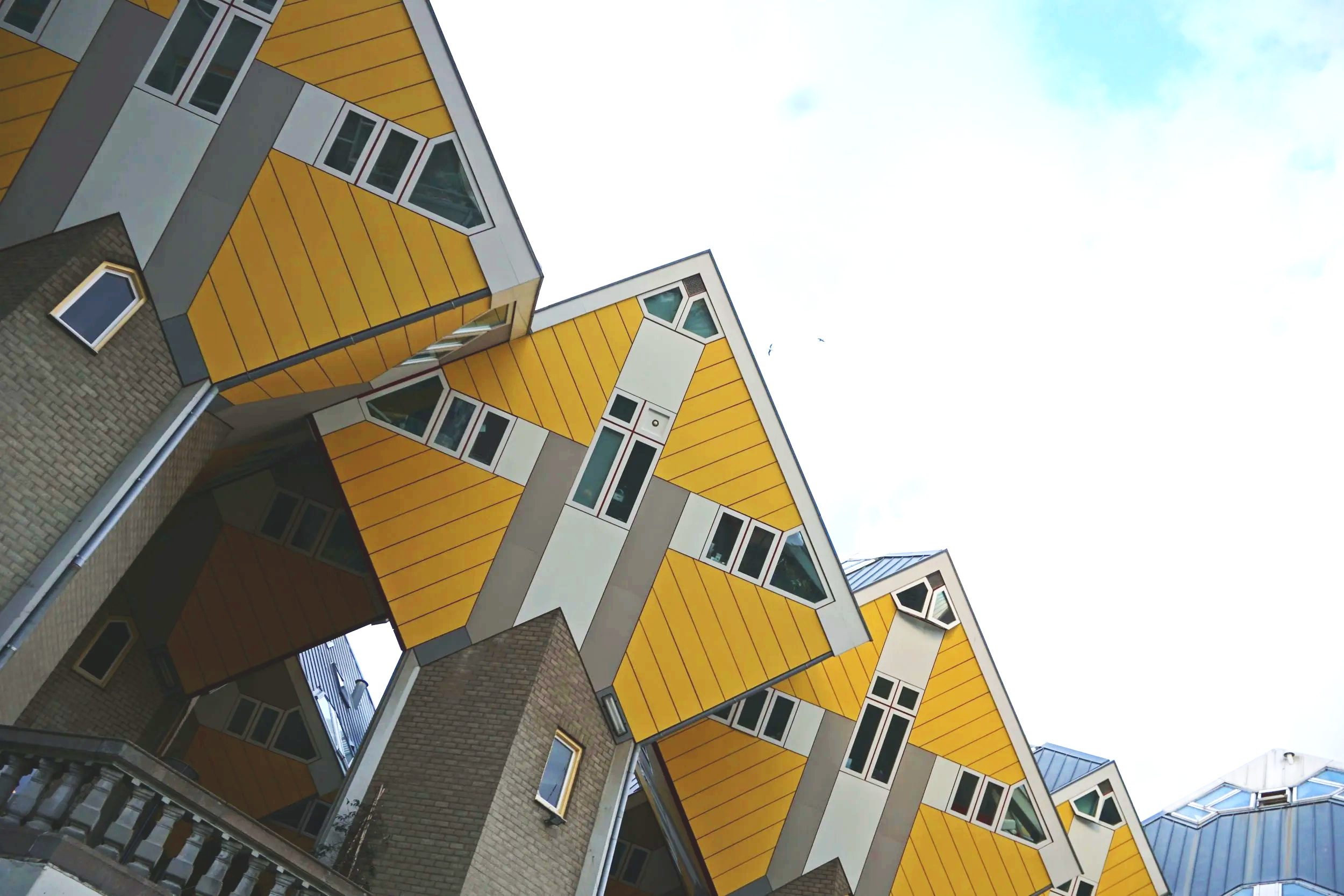
in that kind of hijacked-by-design sense, gezellig is as down to proportion as well as sentiment. it’s the pleasure of spatial logic functioning well - which explains why it appears so naturally in dutch design. you can think of the quiet, picturesque side streets off the main canals, but it’s a concept modernists take on too. think about gerrit rietveld’s schröder house, where planes slide and pivot to create a sense of adaptable intimacy. or, if you prefer a touch of the post-modern and you’re not afraid of a bit of the old cliché, you can also consider piet blom’s cube houses in rotterdam, which literally tilt domestic space into new geometries - but still feel surprisingly humane. these are environments that invite curiosity and domesticity at the same time.
the kubuswoningen in rotterdam (photo by zita)
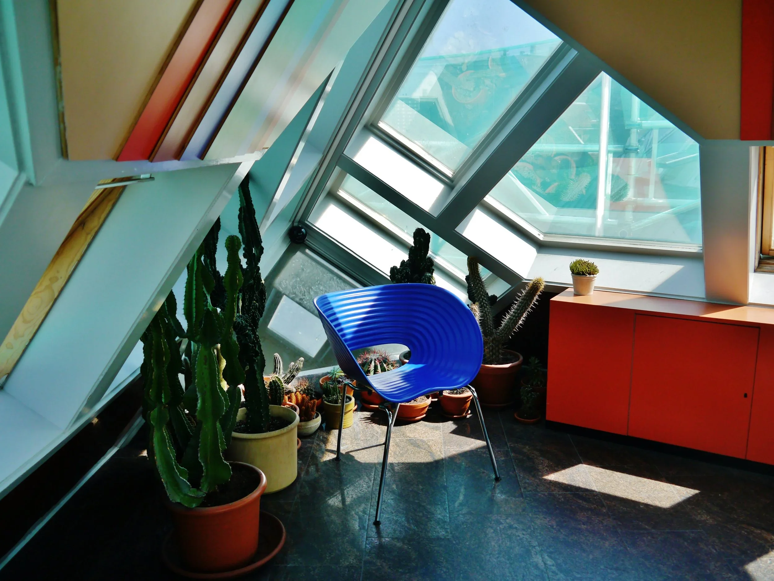
an interior scene in the kijk kubus (source: wikimedia commons)
the cultural reading of modernism has long painted it as cold, austere, emotionless and rational. yet many dutch and also nordic designers work from the opposite principle: that good order is itself empathy. a well-proportioned chair, a clear grid, a balanced room: these are not emotional voids, but frameworks for care and joy. if form follows function, and the function is living well, then it is good design.
in that sense then, a modernist space can feel completely “gezellig” (even though it isn’t inherently a design term and much less a decorating one.) yet, if you are surrounded by order in the right proportions, with room for the right company around you, you can completely feel this way.
we like to think warmth comes from softness — fabrics, string lights, cushions — but gezelligheid is rarely about clutter. it’s material honesty that makes a space feel grounded, and room for those shared moments.
this is where gezellig quietly overlaps with what i sometimes call cosy rationality in my love for modernism, and also my textiles. zitozza patterns begin with logic: a block, a grid, a plan. but through touch, repetition and imperfection, they turn structure into atmosphere. the pattern is so much more than surface decoration; it’s rhythm and proportion given a physical surface.
modernism understands this perfectly. warmth is achieved through light and material rather than ornament — brick, textile, tiles, all exist to give room to inhabit, rather than overwhelm. it’s why concrete in the right context can feel as gezellig as oak.
comfort in modernism - békéscsaba, hungary (photo by zita)
AI interpretation of a “gezellig” interior using zitozza textiles
perhaps gezellig offers a way to rethink modernism’s reputation. not as a style of severity, but as a practice of calm. the neat repetition of façades, the modular rhythm of housing blocks, even the shadow of a stairwell — all contain a kind of order that feels peaceful, if not “cosy” in the conventional sense.
in textile design, that same impulse translates into repeat, rhythm, and scale. a pattern that repeats just so, aligning form with material, becomes more than visual — it becomes spatial. maybe that’s where architecture and textiles quietly meet: in the shared pursuit of gezelligheid through proportion.
to me, gezellig sits somewhere between company and peace. it’s not emotional in the ornamental sense, but in the human one: proportion, care, attention to the tactile. it’s what happens when design supports life rather than dominates it. so perhaps it’s time we reclaimed gezellig from the coffee-table clichés (although i’m partial to one too many string lights). it’s not a moodboard, but a method. a spatial feeling built through light, texture, and structure. and if that sounds suspiciously modernist — well, maybe modernism was never as cold as we thought.
this is a short announcement: we’re on the road again. might not be christmas markets these year at all (or at least, in november, i refuse to call them that!) but we do have two selling events in the calendar already with the amazing tea green events which means that the quality of the line-up is guaranteed.
8th - 9th november at the burrell collection, glasgow.
i spent an afternoon at the dovecot studios in edinburgh visiting magical patterns, the ikea museum’s travelling exhibition celebrating sixty years of textile design. 180 fabrics, spanning collaborations with everyone from bitten højmark to zandra rhodes, were laid out in a riot of colour and geometry.
it is an absolute must-see for every pattern and print enthusiast and it’ll be particularly special if you’ve been shopping for ikea fabrics for a long time: i recognised fabrics i’d once had in my own home, now displayed as part of a lineage of “iconic design. what really struck me though was how clearly this exhibition became a celebration of women in design. like many design establishments, ikea was once overwhelmingly male-dominated. textiles, however, became a way for women designers to enter the system and make themselves indispensable. the show foregrounded this history: each designer was credited by name, with their tools, sketches and inspirations laid out. scissors, paper cut-outs, tracing paper: modest tools, but revealing how much painstaking labour sits behind something that looks deceptively effortless.
the pattern nerd in me loved seeing these paper cut-outs beside finished screen prints, but i couldn’t help wishing for more. how did those jagged paper edges become repeatable units? how did they translate into full-scale production? how do you separate colours for screens, and so on. this story wasn’t really told and i suppose one can’t expect a full technical breakdown at a tapestry studio, but the lack of process detail left me curious rather than fully satisfied.
what was also missing was any commentary on ikea’s shifting identity. the exhibition proudly shows its most experimental decades — the bold 1970s stripes, the broccoli motifs, the collaborations with 10-gruppen. yet, having just been to ikea edinburgh not long ago as well, the contrast was sharp: far more beige, far less risk, with the adverts promoting the exhibition all over the floor with much bolder designs and installations that almost said “hej, sorry about the actual stuff to buy, come and see this and remember when we were really cool!”
it left me wondering what really happened? ikea has always been the champion of the “middle crowd,” the “wonderful everyday”, the affordable but well-designed stuff that were simply made to serve a life well lived. but what does that mean in an economic climate where the middle is disappearing? when so many brands are either abandoning this middle crowd by trying to tap into the higher-end bracket with unreasonable pricing, or have resigned themselves to no longer lead but follow with low-quality, less cutting-edge designs. where does that leave brands like ikea? what does the future hold for the company and its bold textiles?
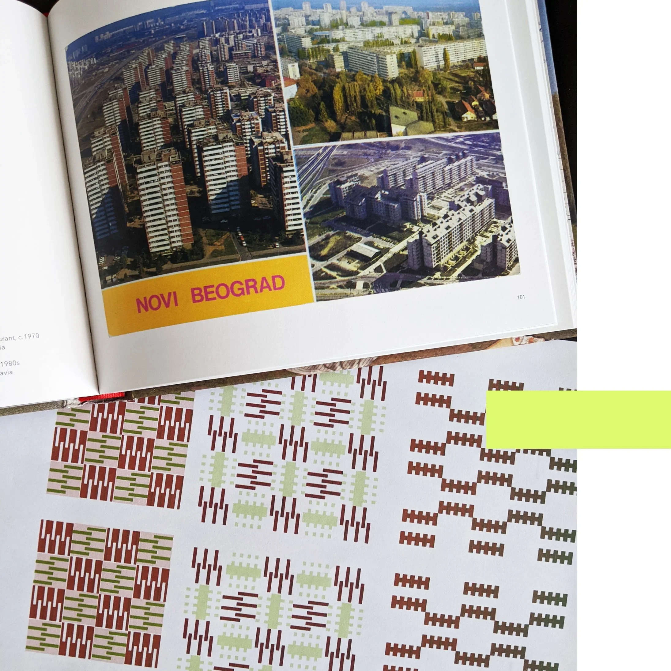
the exhibition has also made me think how skewed our current idea of “scandi design” has become. somewhere along the line, “scandinavian” was collapsed into plain, bare, minimalist in the mainstream. yet this exhibition shows a very different story: sweden has always embraced pattern. bold, abstract, colourful, playful. IKEA didn’t just follow that tradition, it helped define it. i know it is only one company from only one of the scandinavian countries, but i think exhibitions on the bold colours of IHAY or fritz hansen would actually tell a similar story.
so while magical patterns might not have answered all my questions, it was still a joy to wander through. it reminded me that pattern is rarely effortless, that design histories are sometimes gendered, and that “scandi minimalism” is a myth ikea’s own archive disproves. perhaps the real magic here is how a so-called middlebrow brand has quietly carried radical pattern work into millions of homes.
-
IKEA: magical patterns - until 17th january 2026 at dovecot studios, 10 infirmary street, edinburgh EH1 1LT
this is going to be a bit of a hot take but those who follow me on instragram has seen me make this point before. i’m going to argue today that brutalism is actually cosy and it merely has a reputation problem. controversial or what? it is in fact bare, raw and… well, concrete, duh. perceived to be cold, harsh and as a style that overwhelms rather than invites. but spend enough time in these buildings and you might notice something else: a surprising sense of warmth.
it won’t be that the concrete has grown a softer texture all of a sudden, it’ll be precisely because of the materiality.
material honesty
rough surfaces, textured finishes, exposed joints, unpolished edges: brutalism has always been about revealing materials as they are. nothing dressed up, nothing concealed. and that honesty creates a kind of liberation, and with it you find comfort.
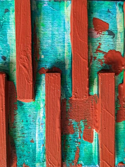
block printing works on a similar principle. every impression carries the grain of the fabric, the edge of the block, the rhythm of the hand. the result is never pristine, but it is always real. the imperfections aren’t flaws, they’re the thing that makes the pattern tactile and alive.
structure meets softness
what often goes underappreciated as well is how calming order is. the stark geometry of stacked, modular units leave no room for chaos. being enclosed by forms like that brings a sense of peace.
pairing block-printed textiles with brutalist or modernist interiors makes sense for this reason. the patterns mirror the structural logic of façades (repeated, modular, rational) while the fabrics introduce tactility and warmth. the concrete provides weight and permanence; the textiles provide softness and touch. together, they balance each other out.
warmth through materiality
so perhaps brutalism isn’t as uncosy as it seems. it’s not about decoration or ornament, but about surfaces that tell the truth, forms that cut through chaos and create order. if you add the softness of textiles that share the same philosophy — honest, textured, imperfect — you will get interiors that feel grounded and, yes, cosy.
cosiness doesn’t always come from softness, or softness alone. sometimes it comes from order, calmness, a sense of peace and from the way materials meet and interact. and brutalism, surprisingly, has plenty of that.
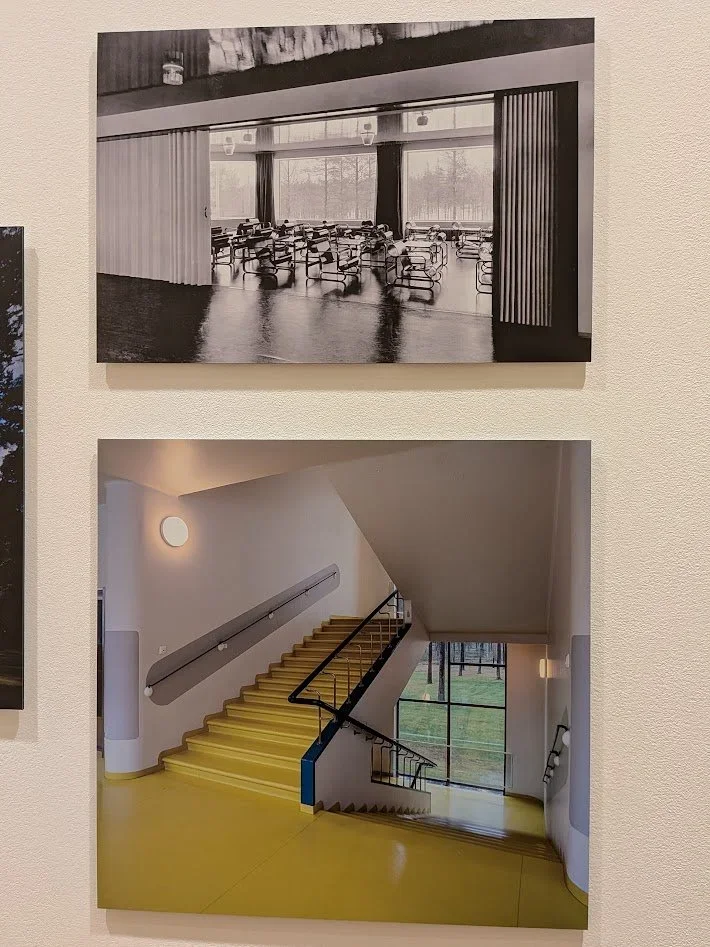
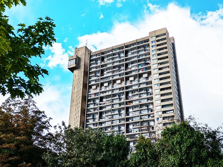
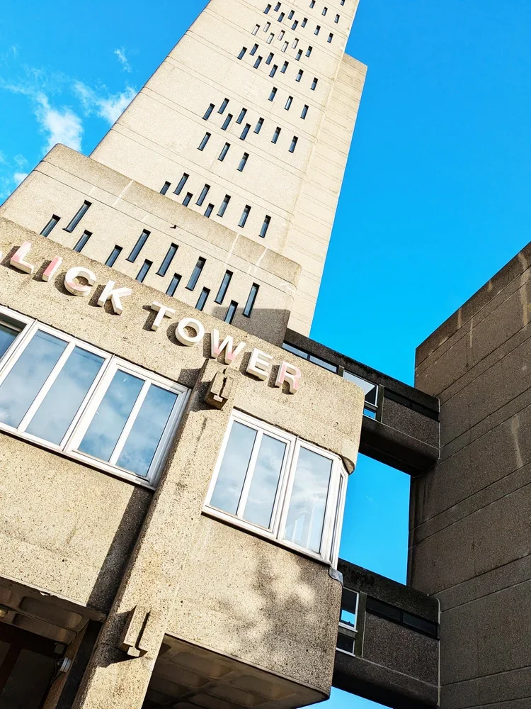
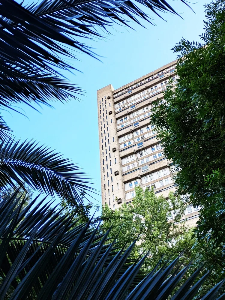
just like with the barbican, i have kept postponing blogging about trellick tower for a long time. what could i possibly say about this building - especially to fans of brutalism - that hasn’t been said before? every building is visited with textiles in mind though, so i decided to have this special “architectural inspiration” post, in continuation with our previous post about turning buildings into interior fabrics.
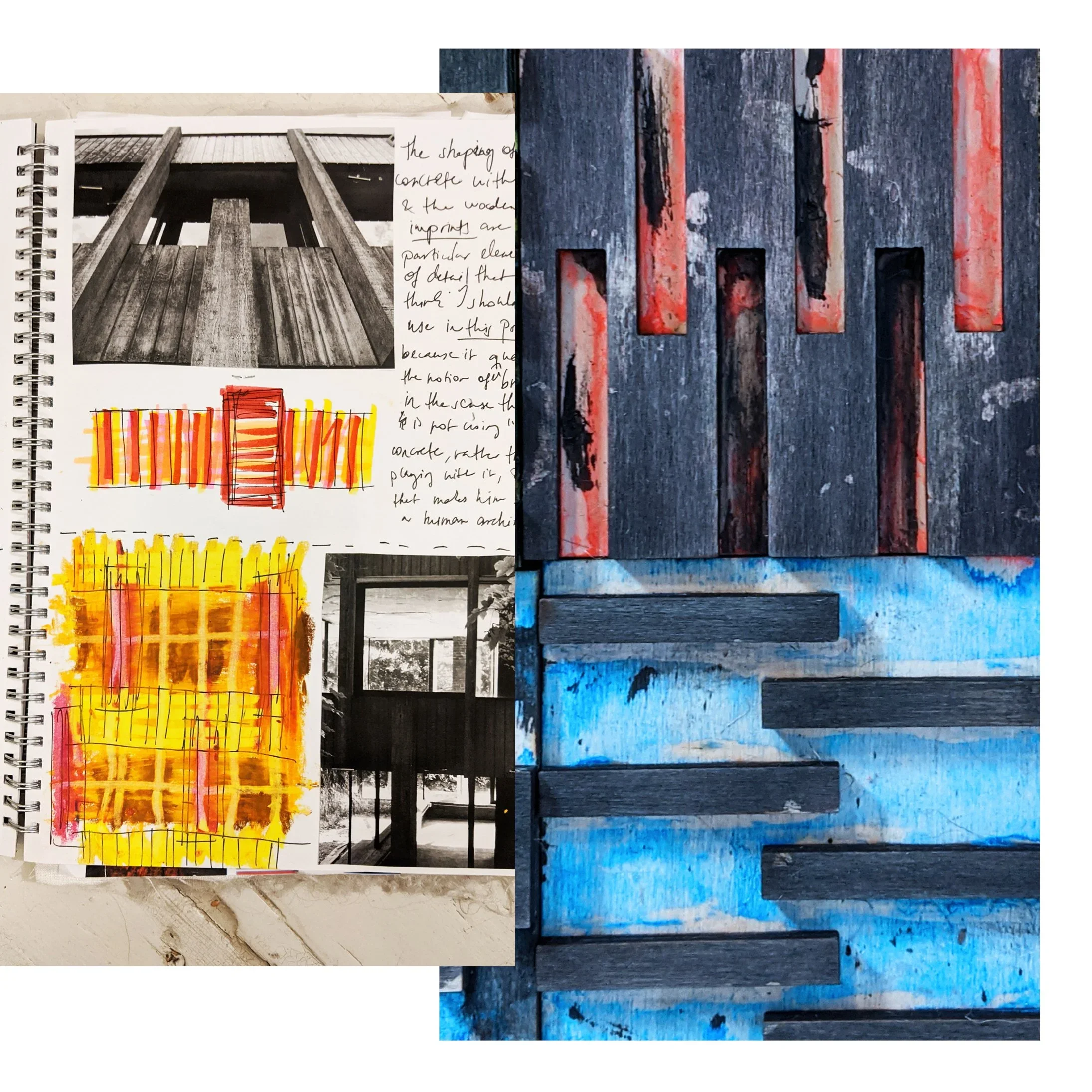
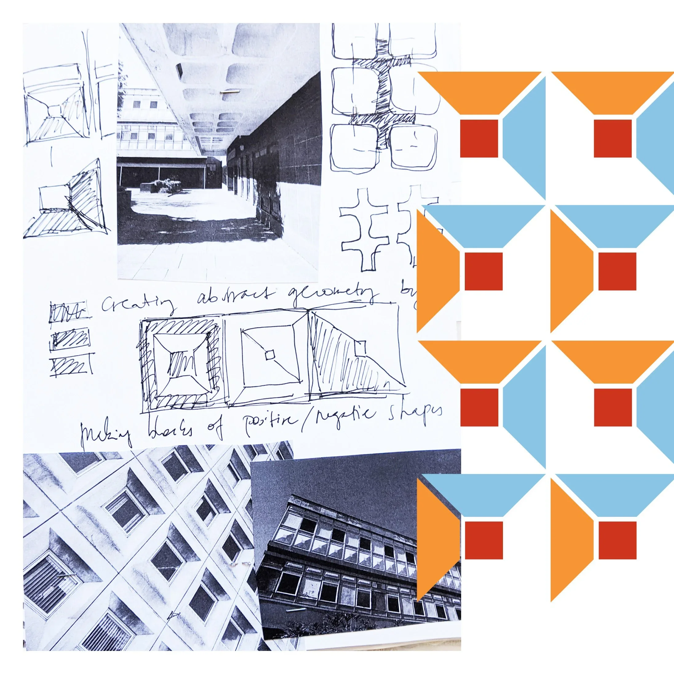
trellick tower is the icon of british brutalism (designed by a hungarian!) and ever since it completed in 1972, the public has been in a love and hate relationship with it. if you peel that emotional layer off though and look closer - it will reveal itself as a system. the vertical lines of the service tower, the repeating blocks of the residential units, the rhythm of balconies and windows: all of these details work together to form a precise, structural language. walking around it, the geometry is impressive and imposing. this building heavily contributed to our PANEL printing block set, directly inspiring a pair of tiles too - a direct translation from architecture to textile.
vertical logic
the printing blocks in question come from the service tower. this housed the oil-fired boiler and has lift access to every third floor - it is now defunct as the flats have electric heating but the tower is part of the iconic structure and it is the lean, vertical windows that became our motifs.
the service tower rises like a spine, attached to the housing block at a neat logic of every third floor. when i translate this into pattern, each unit also becomes a block — rotated, repeated, layered — to capture the same vertical rhythm. my printing blocks aren’t meant to be identical copies of the building; they’re an abstraction, a reduction of the structure into a repeatable unit. this is what makes the pattern modular, repeatable and flexible enough to inhabit different surfaces, from rugs to cushions - so far removed from ernő goldfinger that you perhaps not even want to know the origin - nonetheless i hope you find it interesting!
repeating blocks
everything here is very abstract of course, and the the other blocks within the PANEL section come from different buildings, less directly related to the facade but you can think of trellick tower too of course, the residential units themselves offer another layer of inspiration: clusters of windows and balconies create a clear, repeating grid. don’t be fooled by the neat facade, the flats have surprising variations between them. there is a deeply human scale within the monumentality of the building, and they do influence my printing blocks. when printed, these grids maintain their structural integrity, but the tactility of jute, linen, or cotton softens the rigid form. the repetition is comforting, methodical, and quietly playful — a domestic echo of the tower’s public-facing logic.
from public to private
trellick tower is both loved and hated — its enormous and imposing, raw and almost alien and yet the rhythm of its facades is surprisingly intimate and enclosing, and, dare i say cosy, just like textiles for the home interior.
translating this into textiles allows the same architectural thinking to live in interiors. a cushion, a rug, or a framed print carries the rhythm of the building, but at a scale and material that invites touch and domestic interaction. it’s architecture reinterpreted, rather than reduced.
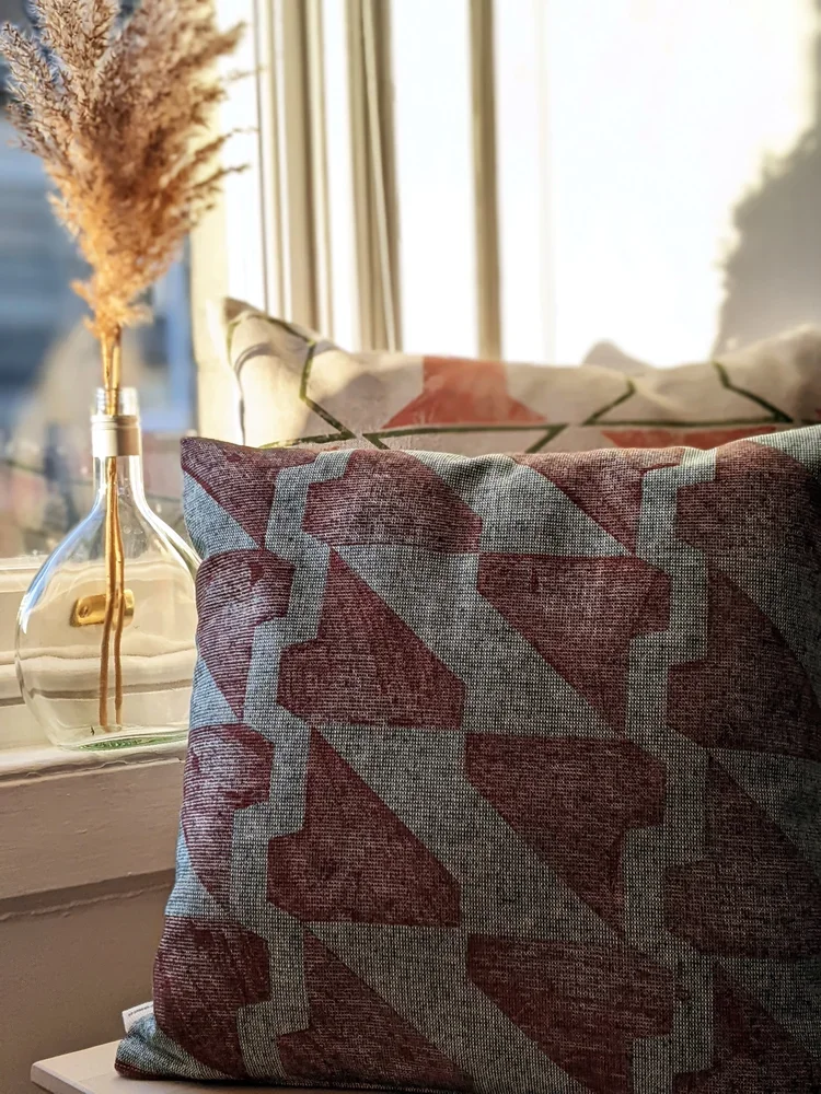
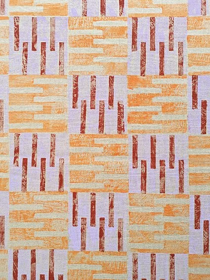
another brutalist rug - inspired by another london landmark. a busy, geometric print with soft, on-trend pastel purple and darker terracotta tones. it’s a beautiful and interesting accent piece in a cosy and colourful modern home, this rug was printed in the most architecturally inspired PANEL tileset evoking the housing units that inspired them. on one side of the rug there is a one-tile-wide column attached (with a pastel purple stitch) to resemble the boiler house and its facade of the iconic trellick tower by hungarian-born architect erno goldfinger.
it’s 70 cm wide and 158 cm long, including the 11 cm tassels at the short edges, stitched with a dark purple accent trim. a perfect addition into a contemporary, boldly styled home decor. top layer and backing material: 100% jute. wipe clean only. handmade in scotland
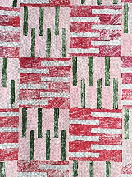
who says brutalism has to be grey and monotone? embrace the pastel sugar colours with this cute little stitched rug, made up of four parts, all printed in our housing block inspired PANEL tileset. it’s a dynamic, architectural print in pretty spring colours - mint green, pastel pink, and contrasting terracotta and lush green. a sweet accent piece in a modern home.
it’s 80 cm wide and 162 cm long, including the 11 cm tassels at the short edges, stitched with a pale pink accent trim on the short edges. wipe clean only. top layer and backing material: 100% jute. handmade in scotland.
a hard, brick-like look but a soft, comforting touch. this recycled cotton blend cushion is a perfect little accent piece, printed in our PANEL tileset, inspired by brutalist housing blocks. it’s an interesting repeat in pastel pink, brick red and olive green colours for a warm, earthy, contemporary touch. the perfect design addition to complete a modern home.
the cushion is 50cm x 30cm and printed on both sides. you can purchase with the pad, or just the cover only. cover: 87% recycled cotton, 13% recycled polyester. machine wash at 30C, do not tumble dry.
materiality in translation
just as architects consider how concrete interacts with light and weather, the choice of textile matters. ink on rough linen, for example, reveals layers of pattern in the same way light falls on raw concrete. modular blocks can be repeated, layered, and rotated, and different fabrics give each iteration a unique depth.
walking around trellick tower, one begins to see it less as a singular object and more as a system of relationships — verticals and horizontals, solids and voids, human scale and monumental scale. the challenge in the studio is to preserve that logic while making it useful in domestic interiors. the resulting patterns are structural, repeatable, and thoughtful, but also soft and tactile: a domestic dialogue with a building designed to be cosy yet monumental.
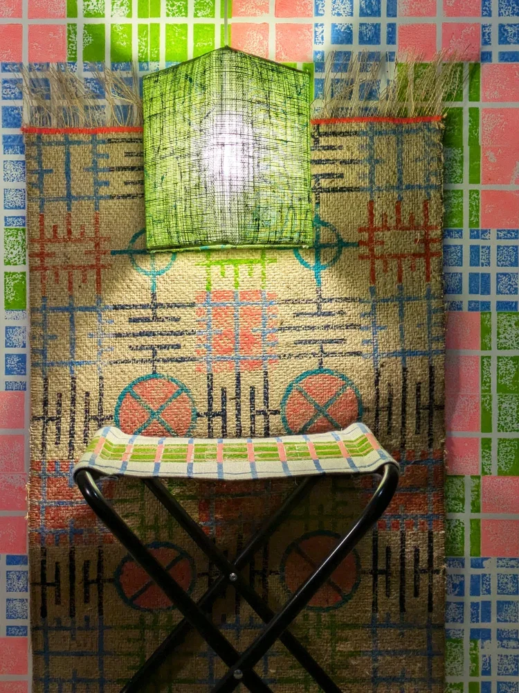
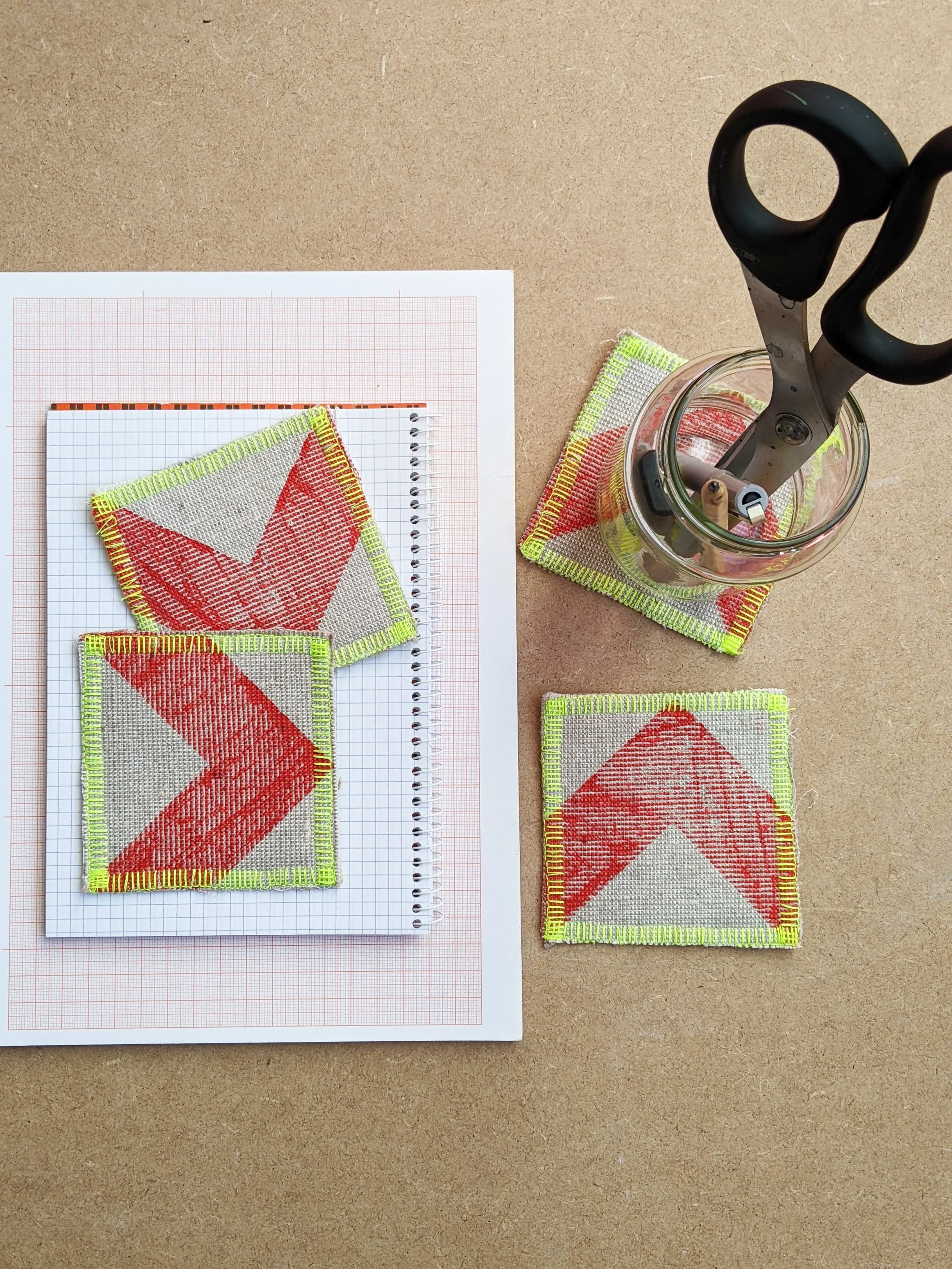
at zitozza, every pattern begins with a system — not a sketch. the blocks are precision-cut, CAD-designed, and made to combine, rotate, and repeat without friction. that logic underpins everything we do, from large-format rugs and cushions to smaller, quieter formats that have recently made their way into focus: mounted prints and cards.
these small editions aren’t an afterthought. they’re made from the same blocks, printed with the same hands, and follow the same structural rhythm as the rest of our textiles. the difference is just scale. they’re printed on the same jute, cotton, linen, and wallpaper from the studio. leftovers perhaps, offcuts, yes, but purposeful ones. every piece is cropped and composed with the same care.
the mounted prints in fact are slightly different and more purposeful: i have been using jute wallpaper for some of these. not mine, but a very high-end, premium line from an upmarket company that never made it to commercial production. they came in six deep, beautiful base colours with a tactile surface for block printing. colourful, textured already, so i turned them quietly architectural too. they became a foundation for many of our early framed pieces.
it also gave me ideas for using my own wallpaper off-cuts too. because, by the way, you can have zitozza prints on wallpaper now too! okay, well not on jute (yet…!) but on a simple fibre-based, non-woven, uncoated paper. if you visitedclerkenwell design week earlier this year, you may have seen them on display and they were not experiments, but a clear suggestion of where this pattern system should really be. and what’s left over? it can go in a mounted frame. or a card.
the cards followed the prints soon after. i designed them to be picked up at markets, to work as a “sample print” (and a not-so-hidden purpose of furthering our zero-waste goals) but also with an intent to be gifted, in an abstract way. none of them says happy birthday or congrats on passing your driving test, obviously. they’re modernist and abstract with the idea that you can fill in the blank and give it your own meaning.
each one is printed on real fabric: linen remnants, recycled cottons, and the same wallpaper offcuts used elsewhere in the studio. they’re not mass-produced print or throwaways, they’re fragments of the larger system. small, tactile, and considered.
each piece is part of the same modular language, it is just trimmed down. whether framed, posted, or pinned to a wall, they carry the same structure, the same design logic, and the same attention to material. not simplifications, just a scaled down versions of the same idea - construct, play, decorate!