we’re back and finally able to sit down with our thoughts after having watched (and somewhat forgotten about) the brutalist movie. in that review i encouraged the research into the work of the real-life hungarians and brutalists whose lives the fictional story was based on - and i decided to start with marcel breuer since i received a great book about his work for last christmas.
those into design will know this already but i always like starting with the facts, he was born in 1902 in pécs, southern hungary and was one of the youngest students (and mentors) at bauhaus. he went on to establish his own practice in berlin, and after a two-year stint in london he moved to the states in the 1930s, first to teach architecture at harvard, then later to new york city where he continued to practice until the late 1970s.
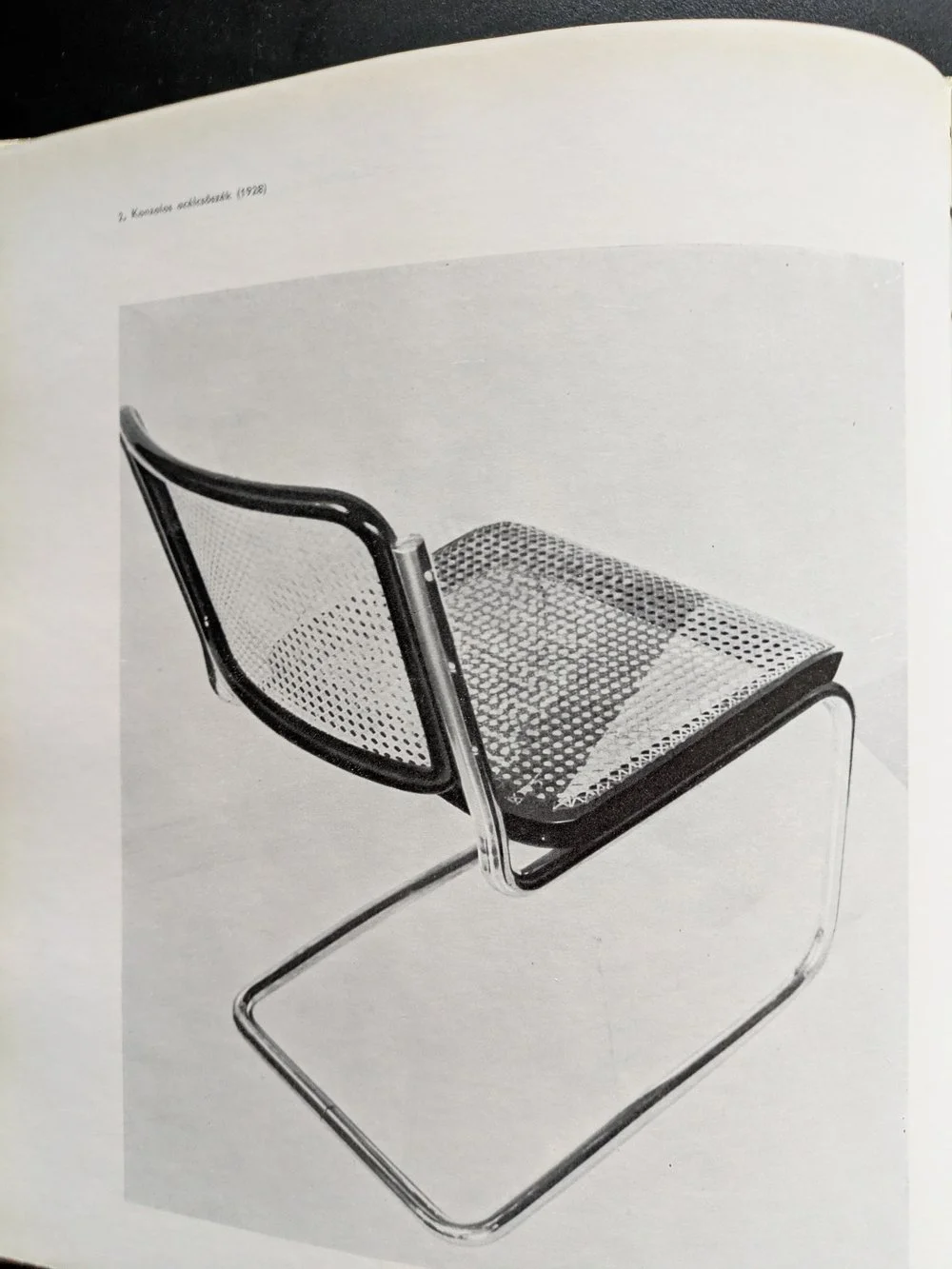
the cesca chair, 1928
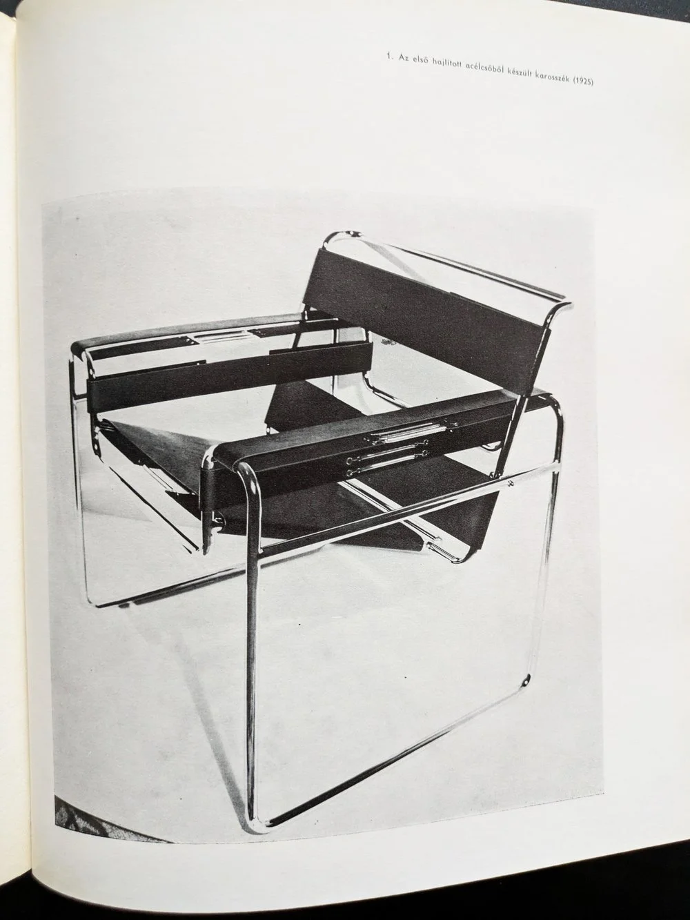
the wassily chair, 1925
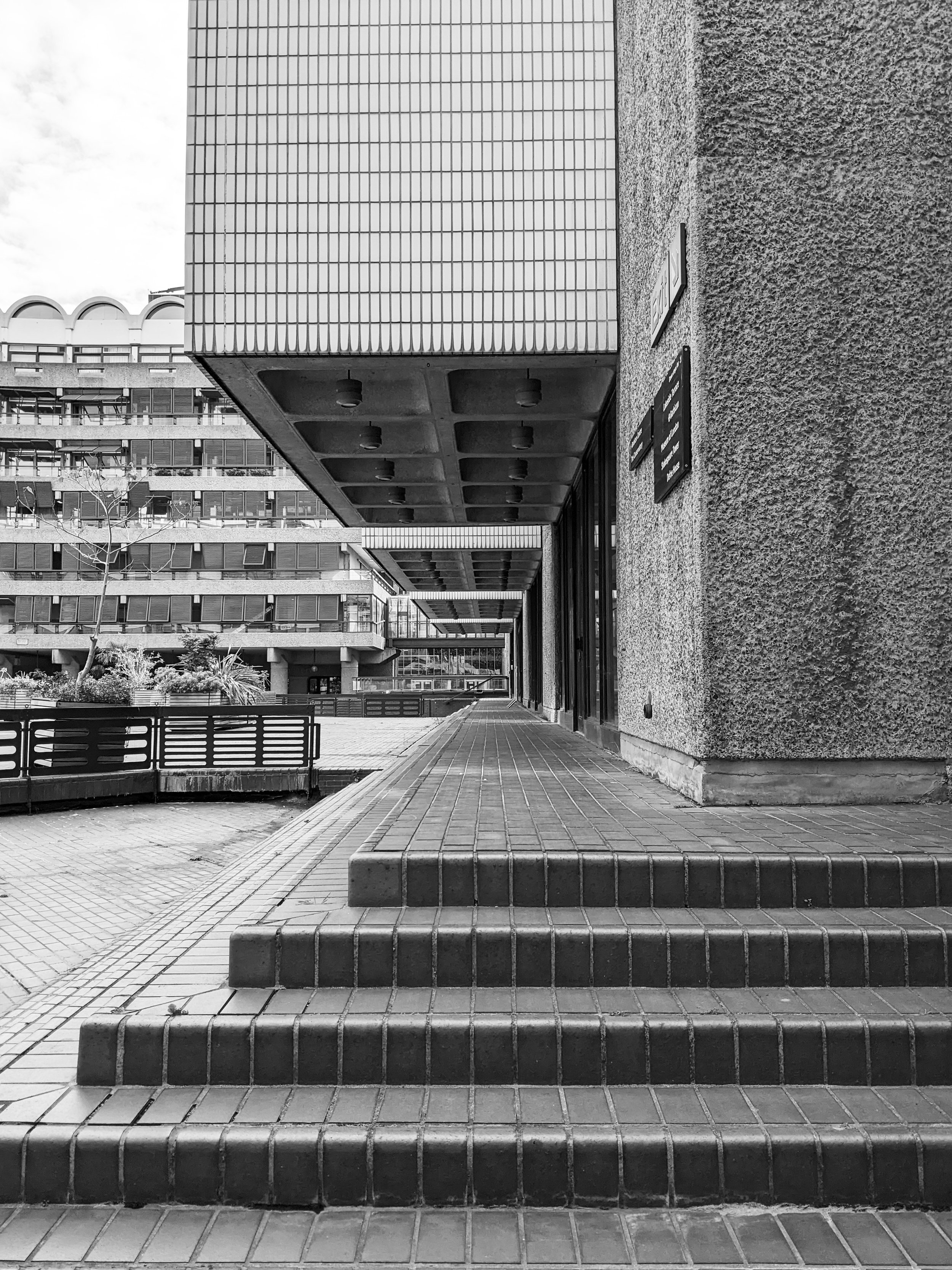
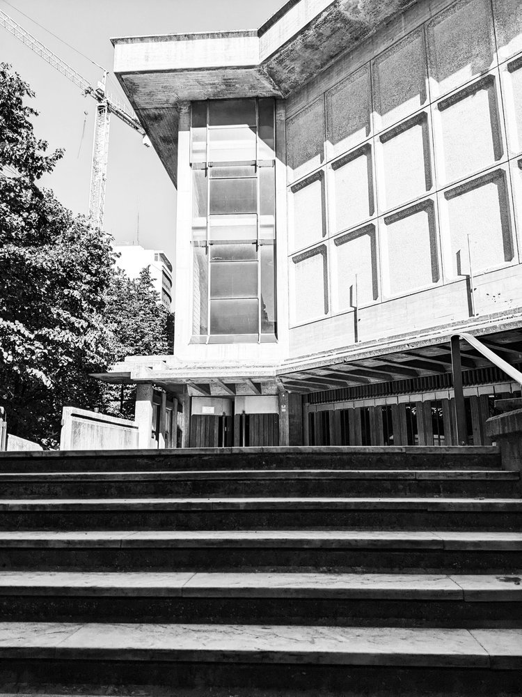
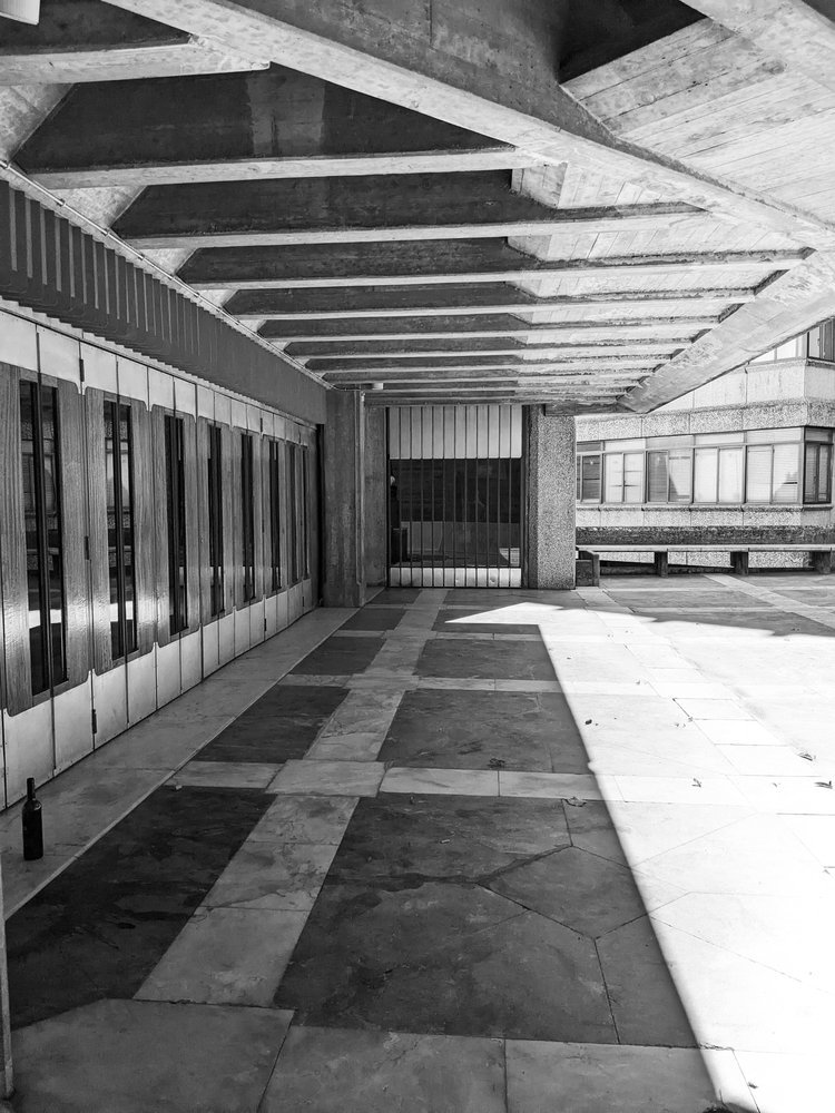
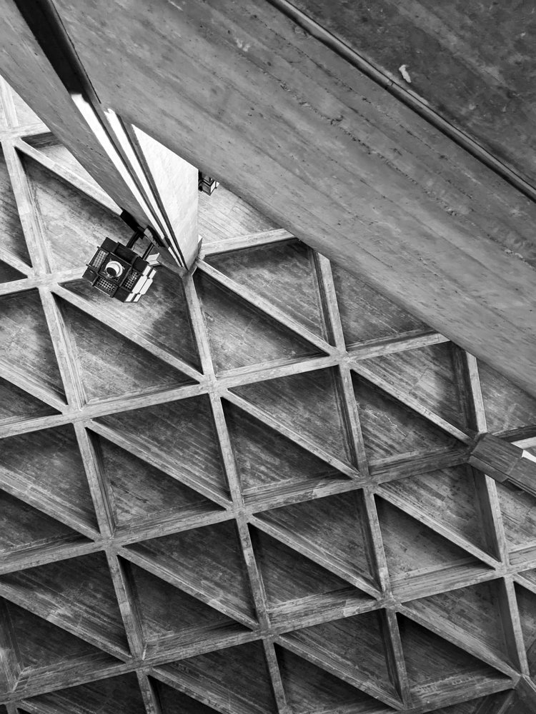
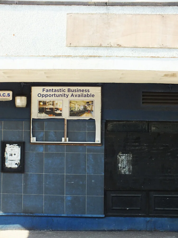
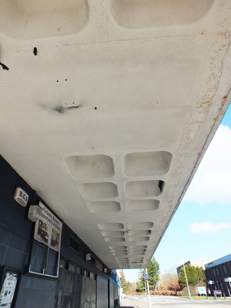
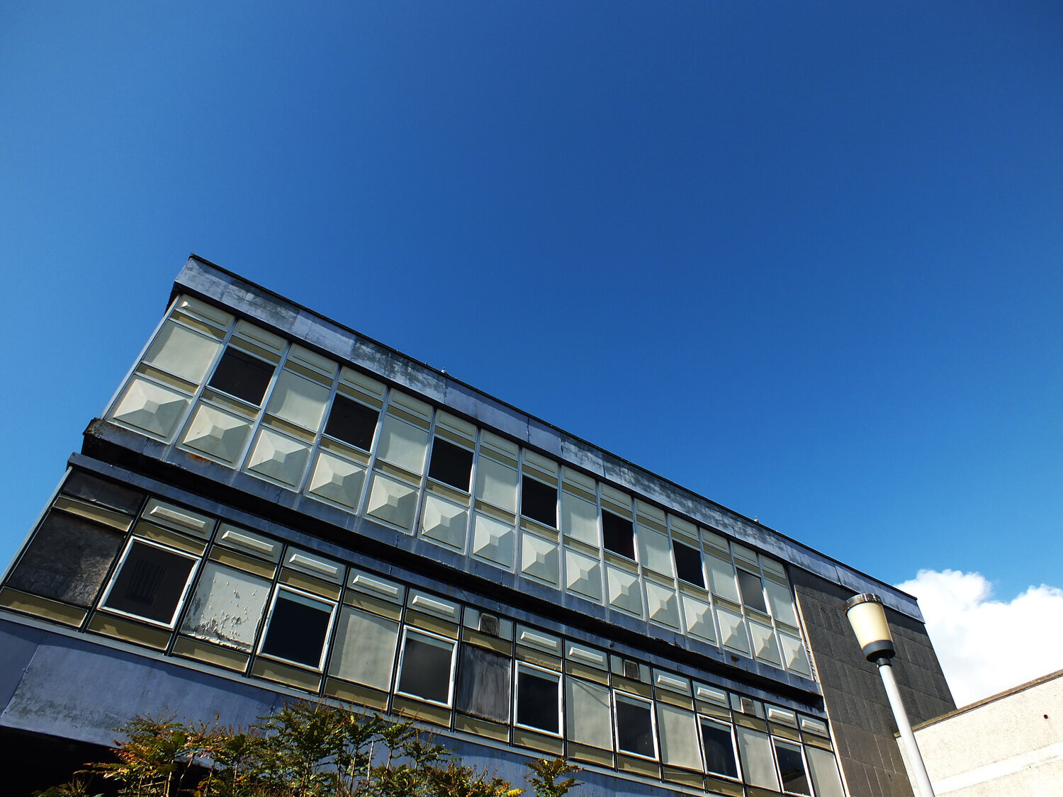
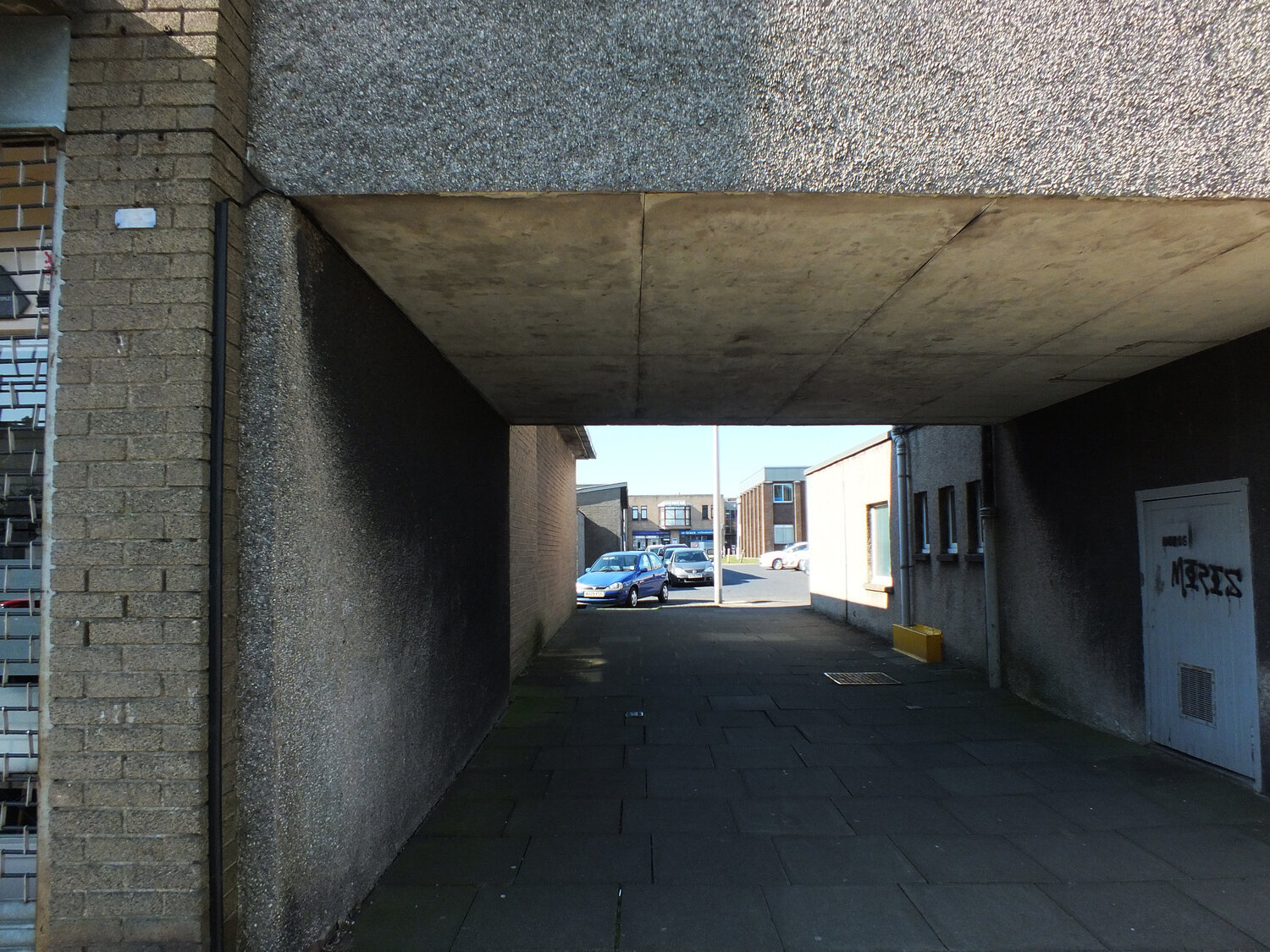
for those into design, it’s also easy to recognise the heavy concrete masses of marcel breuer’s brutalist buildings — the hulking cantilevers and deep shadows of the 1960s and 70s that have since become icons of modernist architecture. but what’s more compelling than their visual impact is the thread that connects them to breuer’s earliest work. his design logic didn’t emerge suddenly in béton brut — it evolved from an obsession with functionality, structure, and modularity that was evident from the very start.
before architecture of course, there was furniture. in the 1920s, as a young bauhaus student, breuer designed the wassily chair using steel tubing — a radical departure from traditional craft at the time. lightweight, repeatable, and industrial, the chair wasn’t just functional: it was a system. breuer’s approach treated each part as a modular unit, capable of being assembled into something greater than its parts. this thinking didn’t just define his early designs — it forecast an entire architectural philosophy.

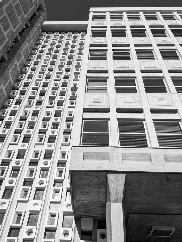
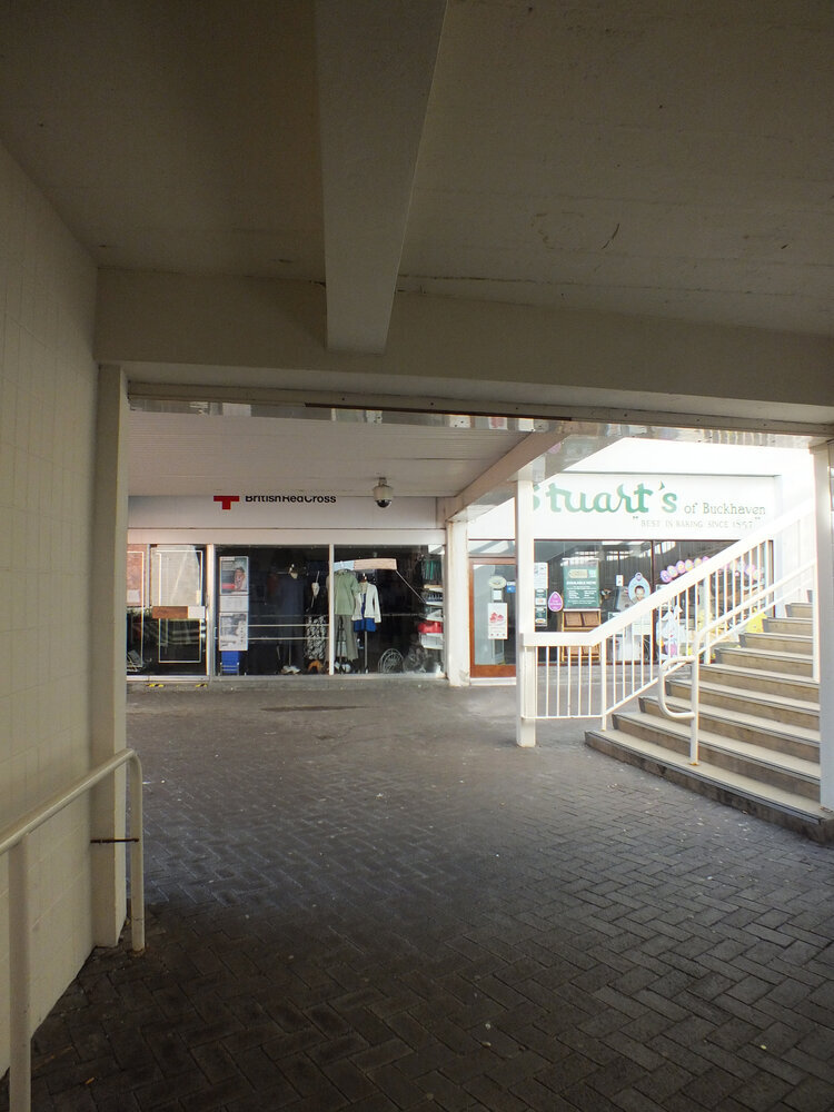
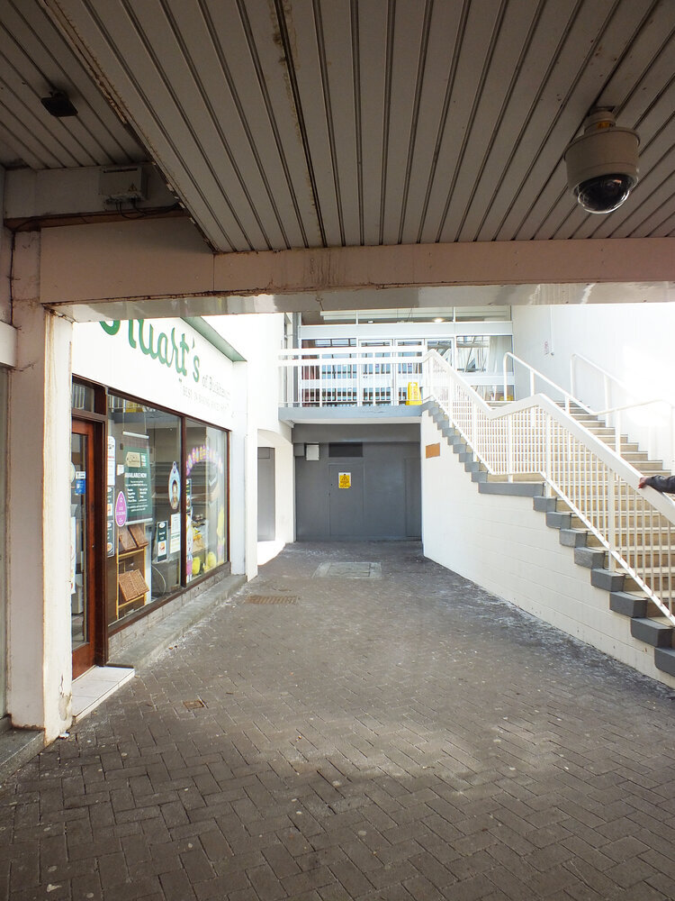
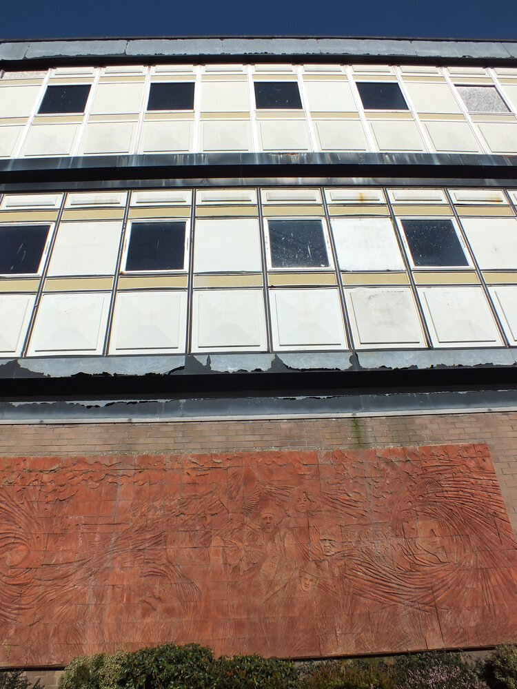
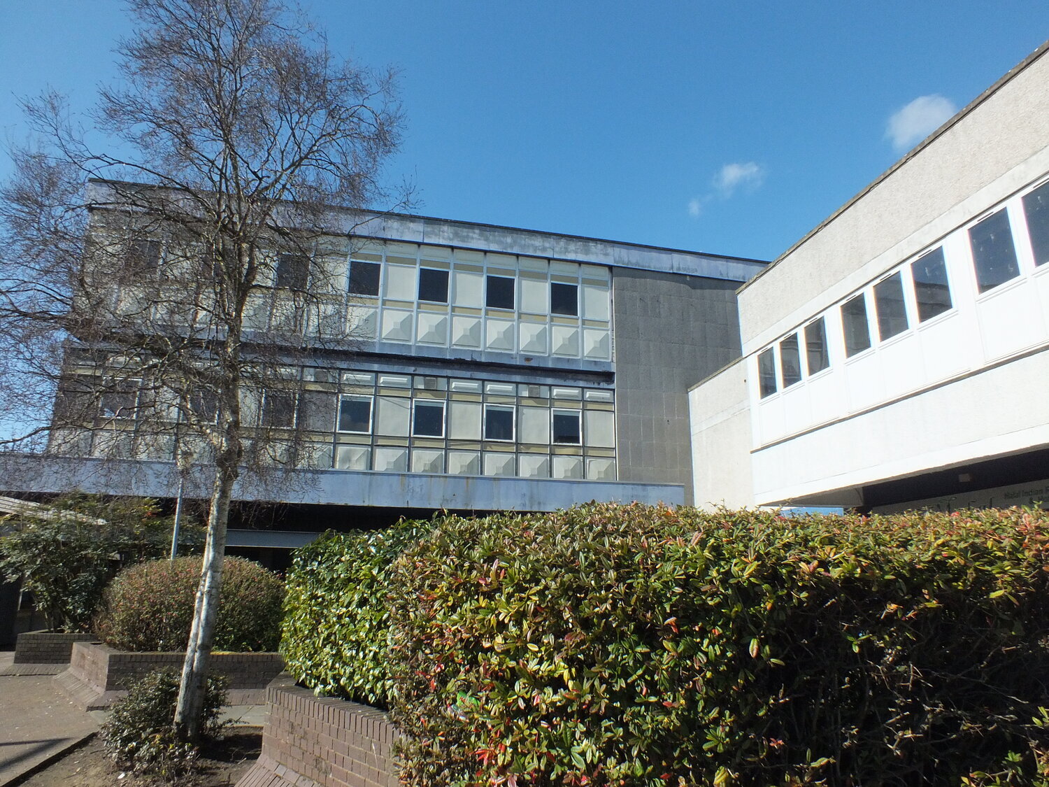
IBM research centre, la gaude, france

IBM research centre, la gaude, france

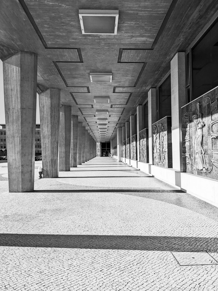
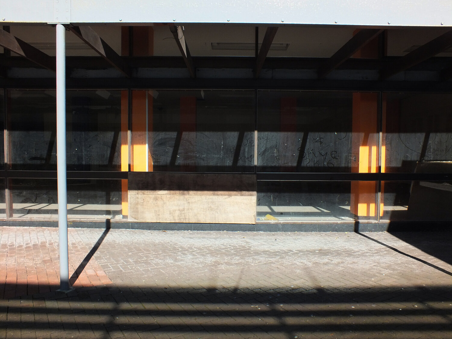
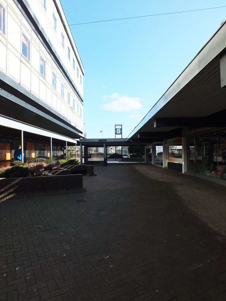
UNESCO headquarters, paris

UNESCO headquarters, paris
fast forward a few decades of immense architectural output (his practice designed more than 100 buildings), and the same logic manifests on a much larger scale. buildings like the UNESCO headquarters in paris (1951-1958), the IBM research centre in la gaude (1960-1961) or the iconic whitney museum in new york (1963-1966) carry the same DNA — modular systems, articulated forms, and a deep respect for material honesty. breuer’s concrete isn’t decorative. it’s structural, expressive, and fundamentally rational.
the book i’ve been reading — published in 1970s, written by máté major, long out of print, with that peculiar warmth of faded paper and sans serif fonts — documents this journey. the photographs, drawings, and models inside don’t romanticise his work; instead, they reinforce the relentless clarity of his method. whether designing a chair or a cultural institution, breuer asked the same questions: how can material, form, and repetition serve both function and expression?

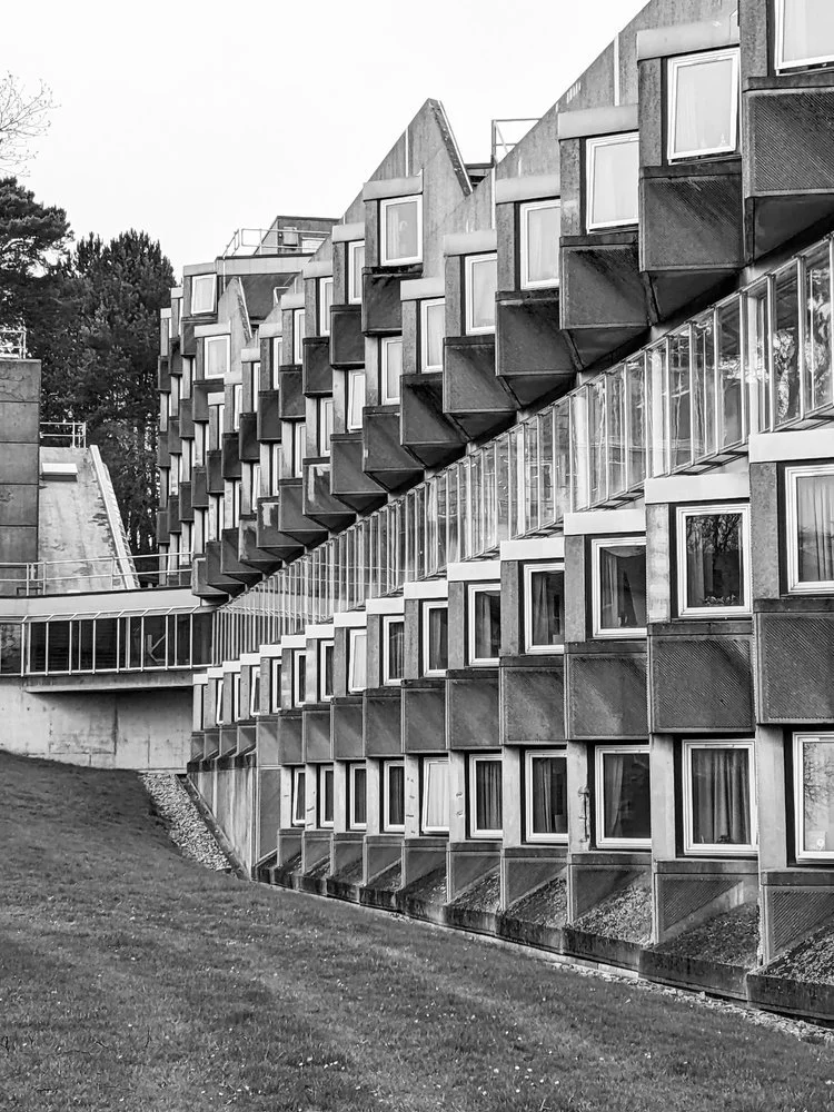
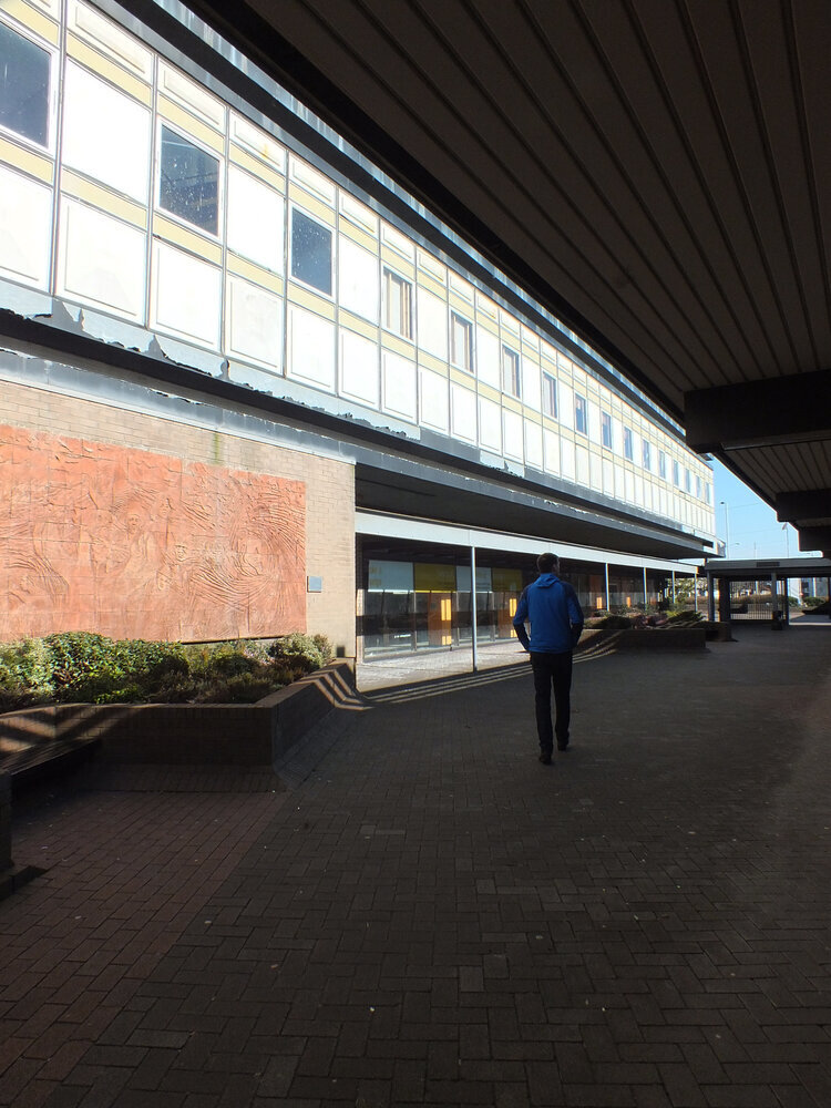
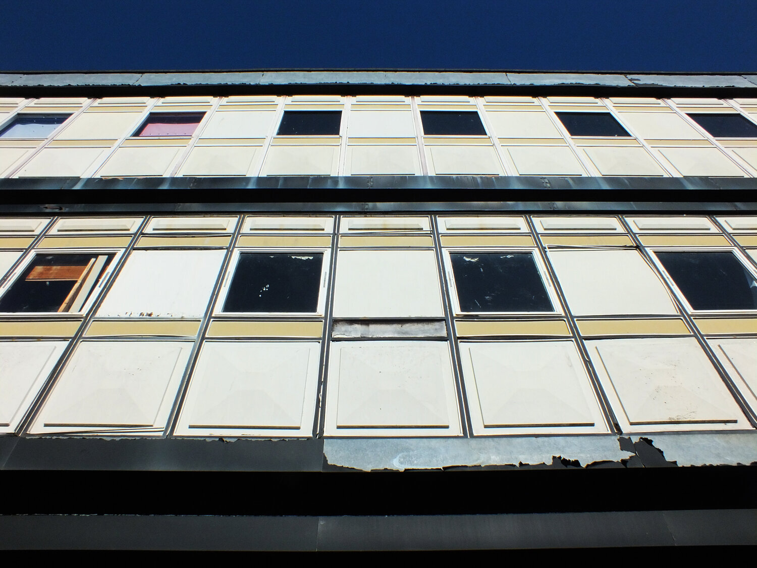
whitney museum, new york

whitney museum, new york
as someone with a hungarian background myself, i’ve always felt a connection to breuer — not just because of the cultural context of course (despite our country being somewhat late and reluctant to recognise him), but because of how he saw the world through systems. that kind of thinking, for me, translates into surface design: building pattern from modules, constructing rhythm, shaping repetition. of course, my materials are softer, but the logic is not so different.
breuer reminds us that beauty can be found in structure — in the clarity of parts assembled with intention. whether it’s furniture, architecture, or textiles, that modular imagination still resonates.
-
links:
the marcel breuer digital archive
dezeen profile (bauhaus 100 series)