finally some architectural inspiration, and we’re back to somewhere we love: portugal!we have admired buildings lisbon before and yes, something something azulejo related should really coming to the blog… but this time we’re going to porto, and not even too far from the picturesque city centre, we’ll just walk a little westward through the architectural hotspot of boavista .
it’s largely a residential neighbourhood but it has a few interesting buildings such casa da musica (of none other than rem koolhaas) and the faculty of architecture (of course!). these are magnificient buildings, which, i feel, deserve their own blog posts later, trust me they’re coming.
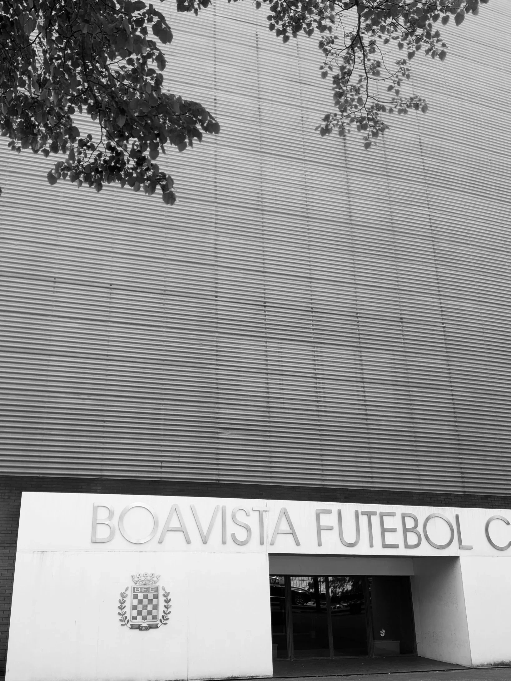
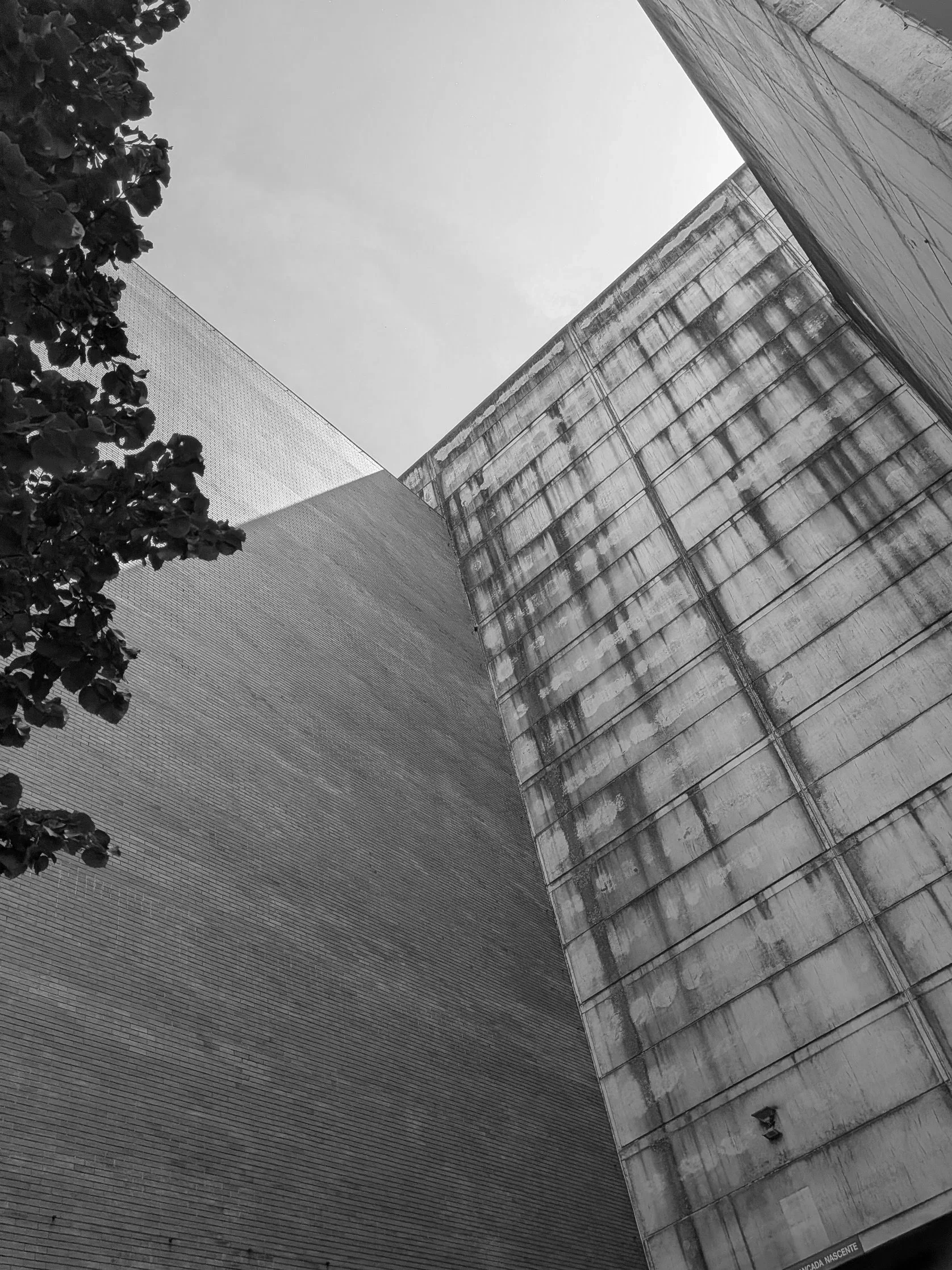
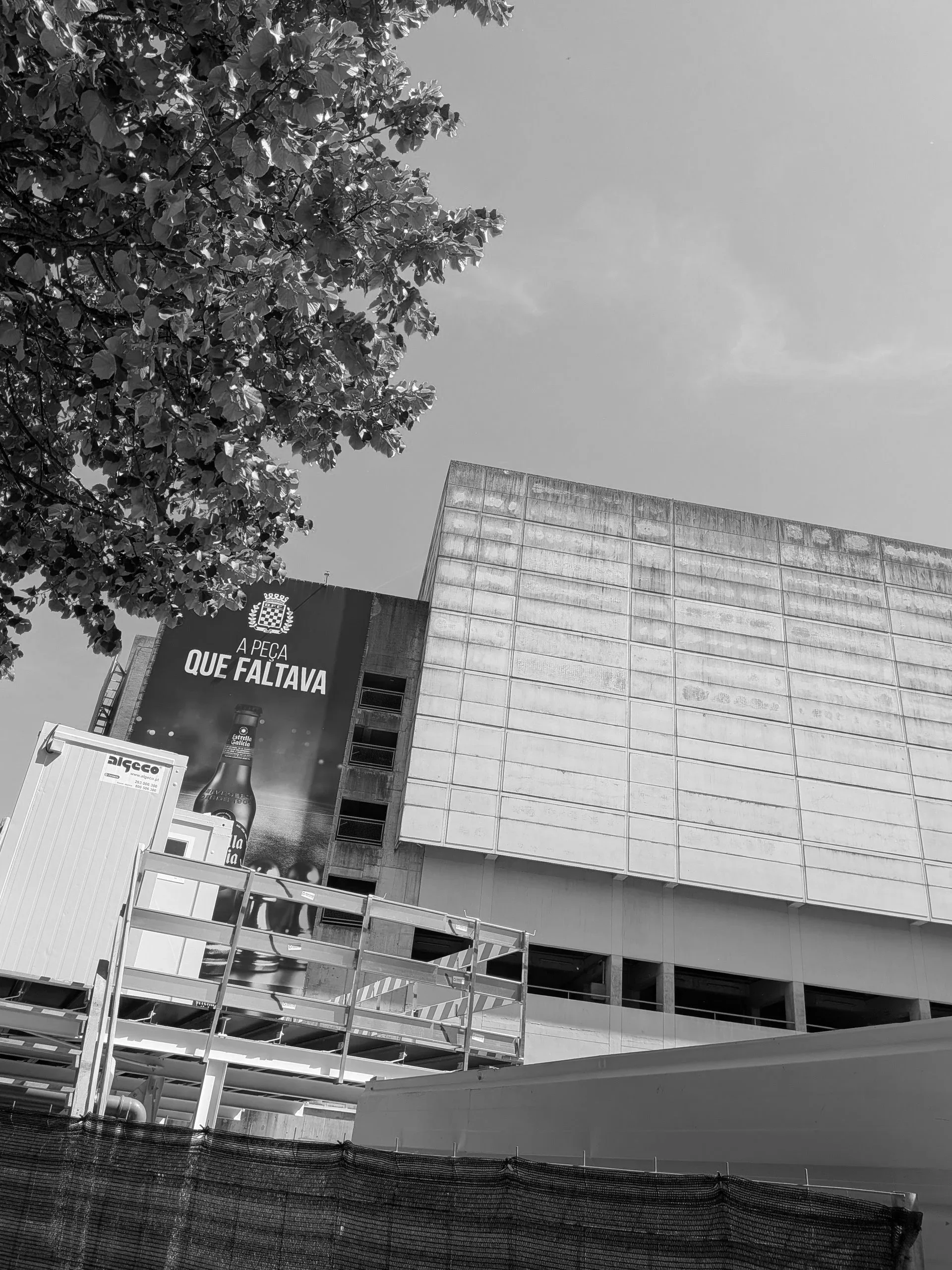
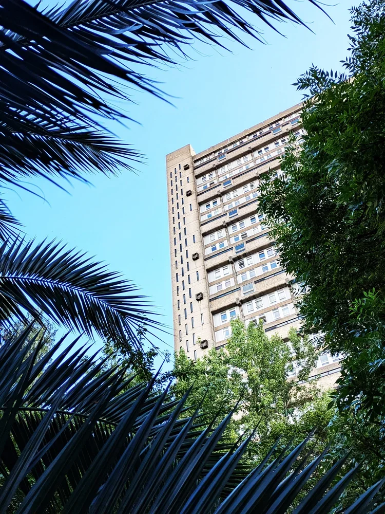
however before we visit these, we’ll just walk through a little bit of the residential streets to two lesser visited sights, one i discovered completely accidentally. i was in search of porto’s brutalist church, paróquia de nossa senhora boavista, when, the residential low-rise architecture suddenly gave way to an immense, towering slab of brutalism: estádio do bessa século XXI, home of boavista f.c.
the football club itself is currently non-operational at a professional level - although there was some visible activity, they do not participate in any of the leagues just now and of course visitors couldn’t go inside to inspect the pitch. but the football was entirely secondary to the vastness of the structure itself.
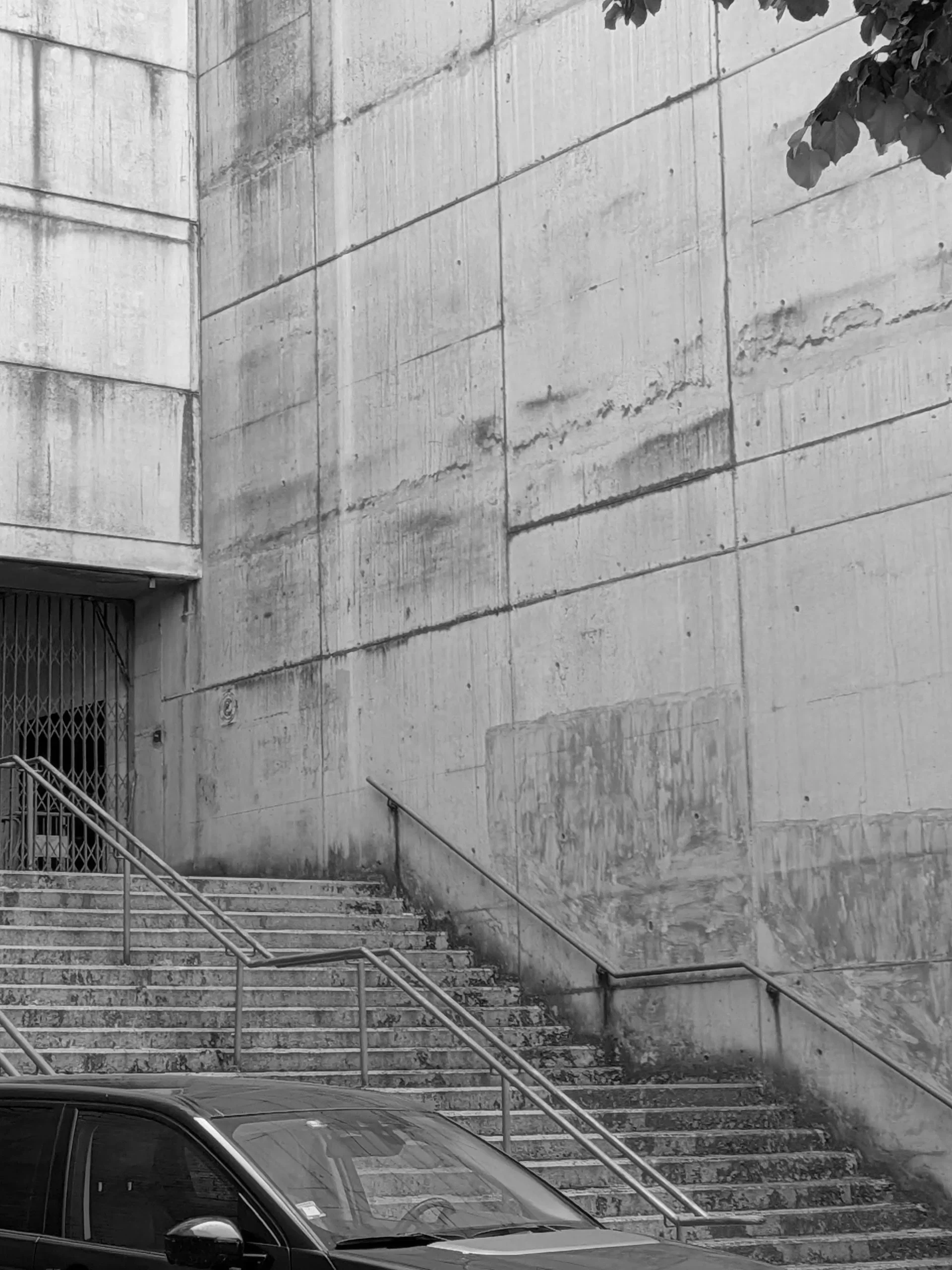
what makes it magnificent is the sheer, un-decorated scale of the exterior framework. massive, vertical board-marked concrete panels soar upward to hold an immense structural volume, using nothing but its own structure. there is a beautiful, organic honesty to how concrete ages under the sun and rain; a raw, weathered texture that commercial design processes spend years trying to artificially replicate. it was a brilliant reminder that when a grid is strong enough, it doesn't need to ask for attention.
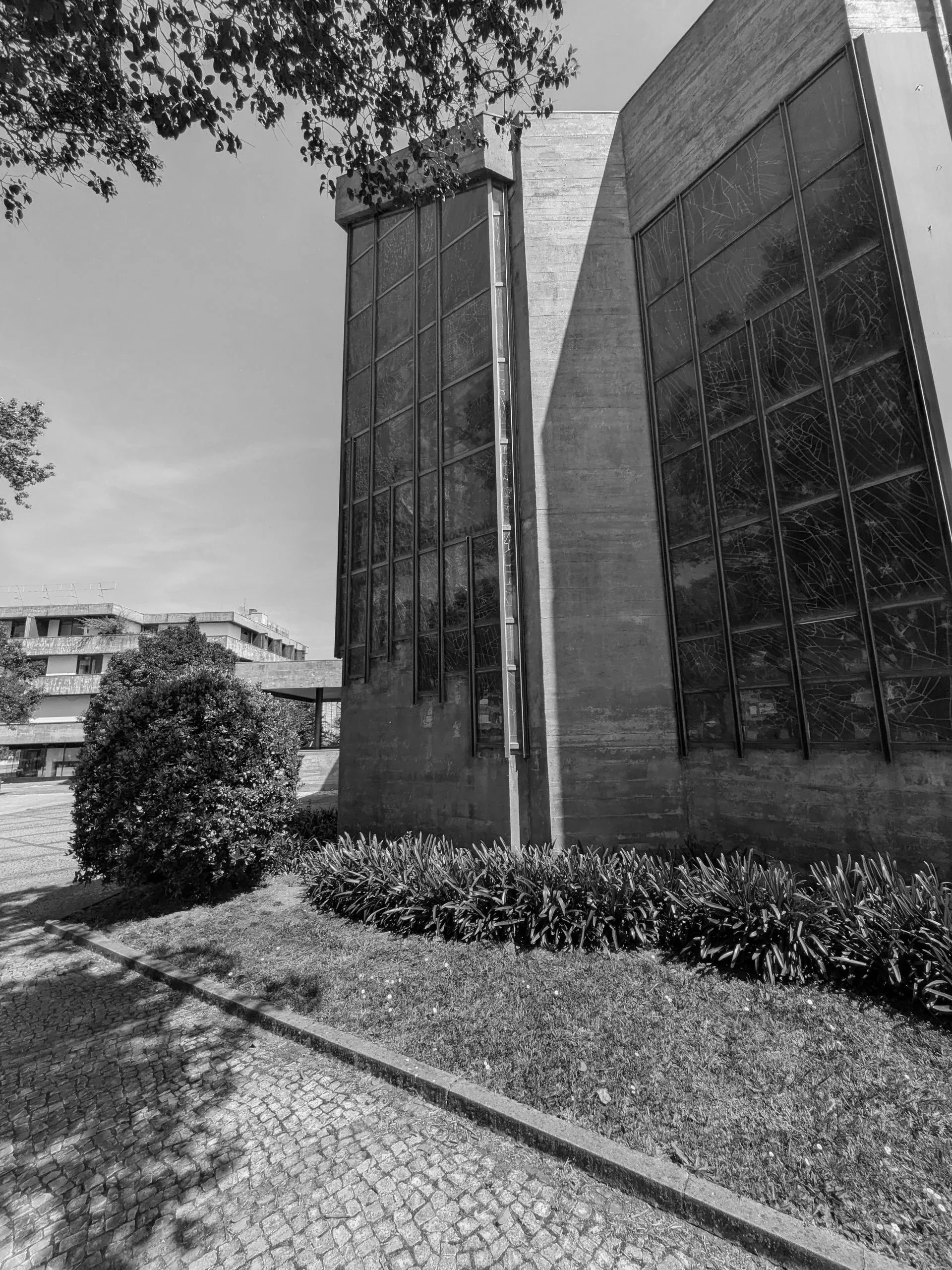
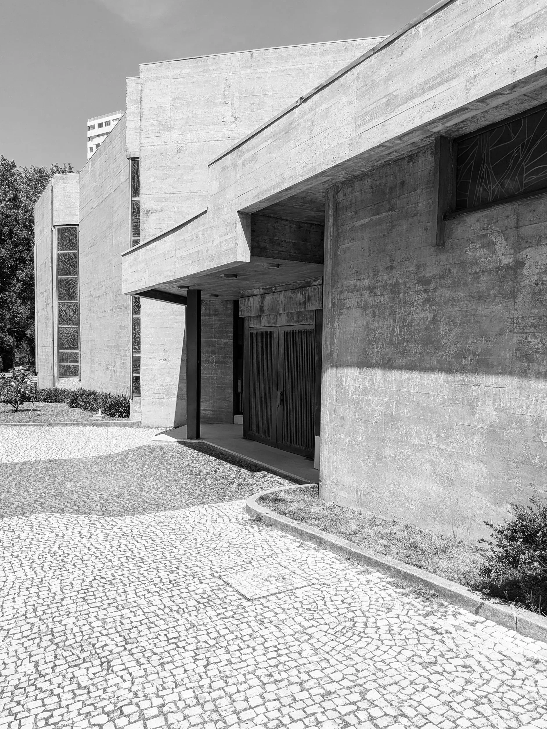
continuing further down the same street, he stark monolithic scale of the stadium shifts into a dense residential grid of modernist blocks. nestled right into the heart of this community, serving the surrounding apartment towers, sits our church, the paróquia de nossa senhora da boa vista. designed by the architect agostinho ricca, the church feels less like an isolated monument and more like a functional civic anchor for the local streets.
the doors were not open at the time of visit and as such an interior inspection was prevented but brutalism is rarely a style that hides its logic on the inside anyway. the building uses a staggering network of cantilevered concrete canopies and deep recesses that cut sharp, graphic shadows into the stone pavement. the ground beneath your feet isn't just a walkway; it is a meticulously laid out grid of traditional cobbles intersected by dark paving bands that frame the spatial navigation of the entire site.
standing directly under the main canopy, the overhead mass feels impossibly heavy, yet it is perfectly balanced by the strict linear staircase leading into the dark entrance. it is a lesson in how to create a physical transition, forcing you to acknowledge the structure before you even cross the threshold.
looking up, ricca’s genius becomes even clearer. the bell tower swaps traditional religious ornament for a series of vertical concrete fins that resemble a massive, modernist pipe organ. under the blazing sun, these fins break the light into a rhythmic pattern of high-contrast vertical lines. it is exactly what we mean at zitozza when we talk about a structural framework: the form itself is the decoration.
moving around the side of the nave, the concrete walls turn into a spectacular piece of abstract lead glass window of the entire corner building, which i wish i could have seen from the inside as the sunny day would have allowed for some amazing light through for sure.
the church does not exist in isolation of course, it sits surrounded by tidy, tended urban nature and residential blocks and shopping centres, neatly weaving together this part of the city - with a road leading to our next stop, casa da música.
this walk was a necessary recalibration for my mind. the rules do not change. you create a clean, honest, highly functional grid, and you step out of the way so the material can tell the truth. follow the journey for the next stop.
back in february, i wrote about why i find the term “storytelling” so exhausting when applied to pattern design, and i really do believe that a pattern doesn’t (and shouldn’t) guide you through a linear narrative; rather, it surrounds you, as in, all of it exists all at once. i wanted to expand on this thought a little bit further and make the case for curiosity, something that’s at the core of zitozza.
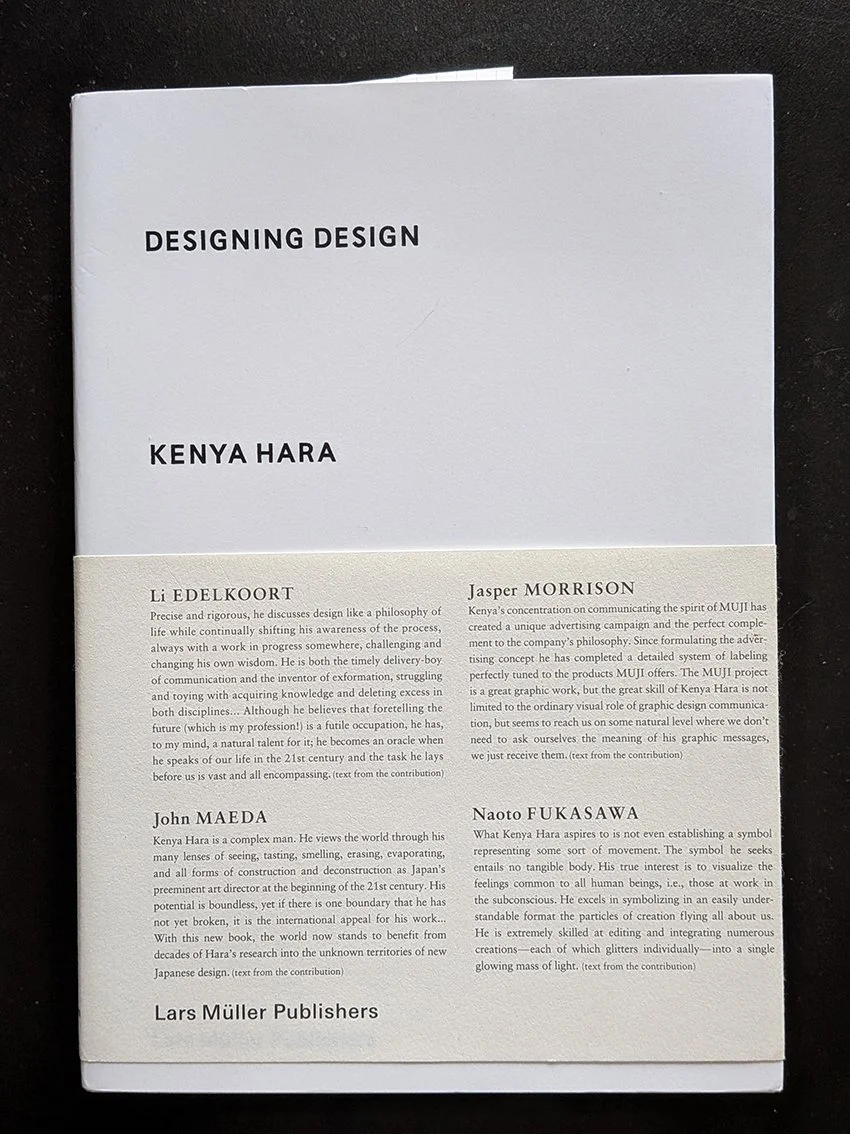
the explanation is actually not mine, it lies in a concept coined by the japanese designer kenya hara:exformation.
in his book designing design, hara argues that our modern world is entirely obsessed with information, with throwing broken pieces of knowledge at people until they feel they "know" everything. we see this everywhere in contemporary interiors. spaces are styled to look like a specific narrative, a carefully curated scrapbook of a person’s supposed lifestyle. the design leaves nothing to chance, forcing a pre-packaged biography onto the inhabitant.
“basically, knowledge is no more than an entrance to thought (...) to know something is not a goal, but a starting point for our imagination. (...) the information-dispatch side is engrossed only with throwing broken pieces of information at the recipient, and the recipient has begun to consider catching information as the goal. (...) i wonder if this is where the problem of stagnating creativity in communication lurks?” (hara, 2007)
“exformation” is the exact reverse of this process. it is the art of making something known not by over-explaining it, but by awakening the viewer to how much is left to be discovered. it is about converting the known back into the unknown, creating an entrance for curiosity.
“the “in”, of “information” is an affix. attached to the beginning of a word, sometimes it adds a negative implication. but in most cases, it intensifies the root meaning, or adds meanings like “directed within, on and toward”. this is the case with “inform”. the word “form” means to shape, organise, or arrange in order, but implies the movement vector involved in taking a definite shape. accordingly, “inform”, with the background meaning, “giving a certain form”, carries meanings like, “to make known”, “to tell”, “to imbue (with a feeling)”. then, in noun form “information”, it takes on meanings such as communication, knowledge, information and scholarship, and further refers to the service of giving information, as in “information booth”. in the word “exformation”, the prefix is changed from “in”, to “ex”, reversing the meaning of “in”. the meanings of “ex” include “not”, “out of”, “outside”, “eliminated”, “prior”, and others. this is the source of the concept of converting the known to the unknown. Notice that “exterior” is already widely used as the counterpart to “interior”, so my coined term, “exformation”, may well make sense to the general public.”
so by his logic, when we apply this to the spaces we live in, the implications are profound. an interior does not need to communicate a story; it needs to create the conditions for experience.
this is where the architectural grid and the repeating textile system come into play. to some, a modular grid might seem cold, rigid, or overly rational. but in reality, the grid is the ultimate tool of exformation.
the grid does not dictate a narrative. it doesn't tell you how to feel, nor does it demand that you admire its personal history. instead, a repeating system establishes rhythm, scale, and tempo. it sets a clear, visual boundary line that provides stability, and then - crucially - it stops talking.
by remaining emotion-free and focused purely on proportion, a modular textile system leaves what kenya hara calls a "productive emptiness." it creates a framework that waits for the inhabitant to fill it in. the meaning of the space isn't prescribed by the designer; it is constructed by the person moving through it, watching the light shift across the floorboards, or holding a conversation over a table.
this philosophy is the exact blueprint behind the digital pattern design tool i’ve been developing for zitozza. when i design a printing block based on an architectural reference, i am not trying to narrate the building's “biography” as such. i am extracting its spatial logic. when a designer or architect uses the tool to rotate, repeat, and configure those blocks, they aren’t receiving a finished story from me. they are using a language of forms to create their own framework.
losing the compulsive forcing of stories in design is nothing to fear. stripping away the sentimental fluff doesn't make a room cold; it makes it spacious. it shifts the designer's role from a loud storyteller to a quiet translator of rhythm.
after all, a rug shouldn’t be a biography. it should be a foundation. it should simply clear enough visual noise out of the way so that life has enough room to happen inside it.
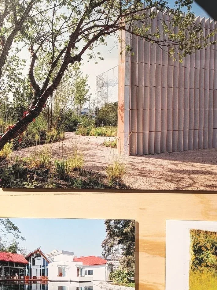
we have another exhibition recommendation for you - this time at the v&a dundee (where i have recently joined the team as a freelance design educator so expect more exhibition visits later!) but even without this link, when you title your exhibition “maggies: architecture that cares”, it surely is a call to visit for this architecture lover.
at zitozza, the built environment is usually viewed through a lens of deconstruction: we look for the geometry in the utilitarian and the overlooked, but this new exhibition shifted the focus from form to feeling. the small, but tightly packed display on the upper foyer documents the history of maggie’s centres in the UK and beyond - they are cancer support sanctuaries designed not as clinical annexes, but as intentional pieces of architecture.
the system of sanctuary
the exhibition showcases a range of approaches to the "architecture of care," from the clean, glazed precision of foster + partners to the timber-heavy, tactile structures that prioritise light and nature. it isn't just a collection of buildings; it is a study in how a physical environment can be designed to feel humane.
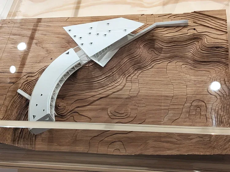
what is most striking is the light and the openness. many of the centres feature glass walls that dissolve the boundary between the interior and the surrounding gardens. the models in the centre of the foyer demonstrate how these buildings are designed to breathe, offering a direct contrast to the often built-up surroundings of a hospital site.
textiles as a structural tool
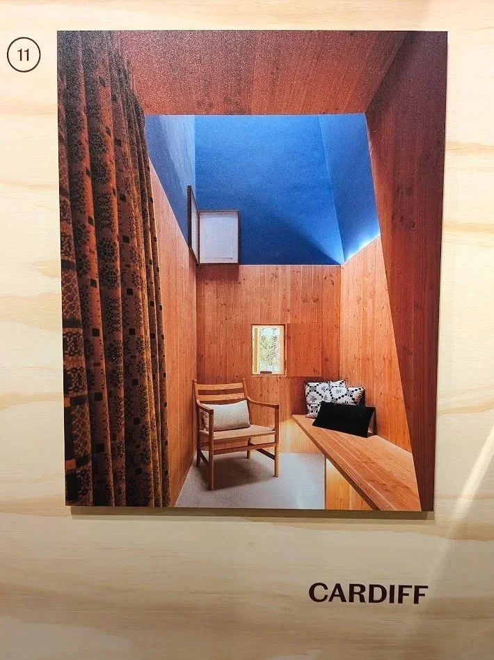
for a textile designer, the wall displays offer a fascinating glimpse into the interior logic of these spaces too. alongside architectural sketches are stories of how materials are selected to ground the inhabitant.
in the documentation for the cardiff centre, for instance, traditional welsh woven patterns are highlighted. it's a reminder that textiles aren't "decoration" in these contexts; they are a necessary tactile layer that provides warmth and familiarity. the presence of a tapestry by edoardo paolozzi (on loan from one of the centres) further reinforces this. it shows how a bold, modern building needs the rhythmic, woven interruption of art to feel truly "resolved."
a recalibration of the "wow"
as someone finding spiritual solace in the “soulless”, uniform spaces of hypermodernity, i have historically been sceptical, if not downright suspicious of "gimmick" architecture. when i looked at the expressive curves of architects like frank gehry or the sculptural forms of heatherwick studio, i often felt like they are prioritising the photograph over the inhabitant, that the spectacle is empty or even hiding something sinister.
however, maggie keswick jencks (a landscape designer herself) founded these centres on the belief that the environment is a core part of the treatment. the "wow" factor isn't about the architect's ego; it’s about giving the inhabitant a sense of agency. in a clinical world where you are often a passive recipient of care, these bold, often absurdly beautiful spaces demand that you remain a curious, active participant in the world.
because let’s face it, when you are going through endless medical appointments, series of gruelling surgeries and various forms of therapies with exhausting side-effects, you will get quickly tired of the rigid, sterile “order”, and navigating the windowless corridors and white waiting rooms very soon becomes a miserable chore for survival. in this context, a zaha hadid curve or a gehry roof isn't the award-seeking spectacle i used to think about it as; it becomes a lifeline. it’s a moment of wonder and beauty in a time that is otherwise so horribly bleak. it made me understand it much better where this type of architecture belongs and why they win many of these kind of projects. this is clearly what they do best.
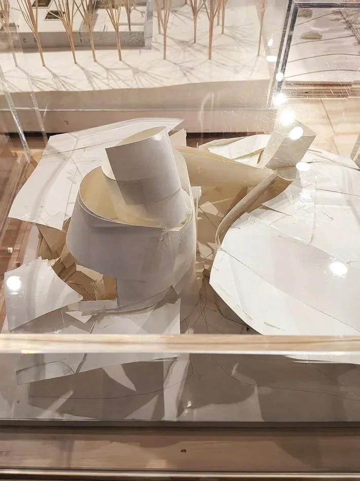
the models themselves are interesting, there are a few different standards from perfectly scaled to ceramic sculpture models. frank gehry’s original paper model is displayed (borrowed from the permanent galleries next door.) there is a great anecdote shared about how he hacked at this first paper concept with scissors when he felt it wasn't "open" enough and it’s a proud piece in the permanent galleries for precisely this imperfect, battered appearance as you can absolutely see the compromises to this paper vision in the resolved structure that was eventually built. but it still highlights the raw energy of the intent, and the exhibition, and particularly the accompanying video room which captures the lived experience of these buildings, gives the perfect explanation of where this vision works best.
i feel that in an era of low-budget architecture, the uncompromising, human-centred mission of maggie’s centres needs to be doubly celebrated. the exhibition makes it clear how the organisation takes great pride in these wonderful spaces and the experiences they can provide to their visitors.
beyond the foyer
the display extends to a wall opposite the learning studios, placing maggie’s in a historical lineage of care-based design, referencing everything from the nightingale hospitals to alvar aalto’s paimio sanatorium.
it’s a beautiful, thoughtful exhibition that reminds us to look at our environment with curiosity. whether a building has clean, straight foster-esque lines or the "gimmicky" waves of a celebrity architect, its success ultimately lies in whether it makes the person inside feel cared for.
maggie’s: architecture that cares is on at the v&a dundee until 1st november. michelin design gallery, v&a dundee, 1 riverside esplanade, dd1 4ez
this post is something that has long been ready to get off my chest. in design conversations, one phrase appears with remarkable frequency: “telling a story.” designers are told to tell stories, brands are told to tell stories, and increasingly it seems that if a piece of work isn’t narrating something explicitly, it risks being seen as incomplete.
the overuse of “storytelling” like this has irked me for a long time, and i’m certainly not the only one (just ask stefan sagmeister!)
even so, when i place one of my textile patterns next to a building that inspired it, i was told a few times that this was actually “storytelling”, it is, however, and i cannot emphasise this loud enough, absolutely not the case. what i’m doing is providing context. the pattern is not a narrative illustration of the architecture; it is an abstraction, a translation of rhythm, proportion, and geometry into another material. the meaning that follows is not something i dictate. it’s something the viewer constructs for themselves.
a story, by definition, has a beginning, a middle, and an end. design education also often encourages students to present their work as a clear sequence: research, sketches, development, final outcome. it makes sense as a teaching method, but in practice creative thinking rarely behaves so politely. many of the patterns i developed during university arrived first as fairly complete ideas (sometimes emerging through digital experiments, sometimes fully formed in my head) and only afterwards did the sketchbook pages appear, carefully reconstructing a linear “process” that satisfied academic expectations. i decided to use these faked sketches to illustrate my point because i find it funny how strongly we expect creativity to move like a neatly unfolding sequence, a step by step process, when in reality it often moves in leaps, loops, and sudden recognitions.
it’s true though, i never thought of design, and certainly not of patterns as stories at all. a repeating motif does not guide you through a linear experience; it surrounds you. it exists all at once. trying to treat pattern as a narrative object can sometimes be like insisting that a brick should also function as a sentence. it is simply the wrong unit of meaning.
what design does instead is create frameworks. they establish rhythm, scale, and atmosphere. they provide visual conditions within which people live their own lives. the “story,” if we insist on using the word, happens in the room: in the conversations held around a table, the light shifting across a wall, the slow accumulation of everyday use. design is not the storyteller; it is the stage set.
this is one of the reasons i work with modular systems. each printing block is designed to combine, rotate, and repeat, forming structures rather than scenes. the result is not an image with a fixed message but a language of forms that can adapt to different interiors and different users. the same pattern can feel calm in one space, energetic in another. none of these readings is prescribed, and that openness is intentional.
context, however, still matters. placing a textile next to an architectural reference is not an attempt to narrate a building’s biography. it is simply a way of showing where certain formal decisions originate. a façade grid might influence the spacing of a pattern. a row of windows might suggest a vertical rhythm. these relationships are structural rather than narrative.
i think the pressure for every piece of design to “tell a story” often comes from branding culture, where narrative clarity is treated as the primary route to meaning. pop-culture now also mostly speaks in films and literature, quite often at the expense of visual thinking (see also the brutalist…) but objects have other ways of communicating. material weight, surface texture, proportion, and repetition all shape how we experience a space, often more profoundly than any written explanation. a heavy linen curtain filtering afternoon light communicates something immediate and sensory, long before anyone explains its conceptual background.
in fact, insisting too strongly on storytelling can sometimes limit how people engage with design. if the designer declares what the story is supposed to be, the viewer’s role becomes passive: they are asked to receive the message rather than interpret it. abstraction offers the opposite possibility. it invites participation. it leaves room for personal associations that may have nothing to do with the designer’s original reference point, and that is not a failure of communication; it is the success of open-ended design.
this does not mean narrative has no place in creative work. many designers use storytelling brilliantly, especially when working with figurative imagery or historical references. but it is worth remembering that design can operate through multiple modes of meaning. sometimes a chair is interesting because of its ergonomic logic. sometimes a building is compelling because of its structural clarity. sometimes a textile matters because of the quiet order it introduces into a room.
patterns do not need to speak in sentences to be meaningful. they function more like music: repetition, variation, tempo, pauses. we do not ask a piece of instrumental music what “story” it tells, yet we still experience it as expressive, emotional, and deeply communicative. textiles can work in the same way.
so when i show a pattern alongside the architecture that influenced it, i am not telling a story. i am showing a relationship. what happens next — what memories, associations, or interpretations emerge — belongs to the person living with the piece. the narrative is theirs to write, not mine to dictate.
and perhaps that is the real advantage of abstraction: it leaves enough space for life to happen inside it.
as yet another year closes, i think a lot about time, i guess that’s part of getting older, but some things only get interesting once they’ve stopped pretending to be new. a façade darkened by rain, a jute fibre frayed at the edge, paint softening on steel - marks left by time. designers often call this patina, but that word is a little superficial to me, what time does isn’t decoration. it’s participation.
materials in conversation
the modernist world has always been oddly conflicted about ageing. le corbusier spoke about architecture as a “machine for living,” yet machines rust, fade, and require care. in japan, the concept of wabi-sabi embraced this truth long before modernism tried to streamline it: finding harmony in imperfection, dignity in transience.
ernő goldfinger’s trellick tower, denys lasdun’s national theatre, even the modest housing blocks of glenrothes all share something accidental yet profound: their surfaces record weather, pollution, human use. they’ve become topographies of touch. the stains, the moss, the soft greying - proof that buildings are not finished objects. they are ongoing negotiations with the elements.
the hand of time, or of the maker
when i print, i think about this a lot. the brushstrokes i add to my blocks are deliberate interruptions, these are of course not so much about decay but adding individuality. the texture of ink brushed by hand can never be repeated twice. the smallest movement alters the weight, the rhythm, the outcome. each print becomes a fragment of time in its own right: unrepeatable, slightly imperfect, quietly alive.
there’s a strange comfort in knowing that a surface can’t be copied. the same logic that makes an old wall fascinating makes a textile human. both bear traces of their making (of process, not perfection.)
the industrial sublime
as much as i’m obsessed with the new, and its constructions sites in ambitiously high-reaching cranes, i do also like a bit of the odd demolition. scaffolding, half-poured concrete, peeled paint - this choreography of decay and regeneration, particularly because it’s difficult to build in new. there usually was something else before. perhaps it’s the same impulse that drew me to brutalism in the first place: the beauty of things in progress and the kind of resistance to polish.
artists like rachel whiteread or gordon matta-clark come to mind in a way, cutting, casting, or revealing voids as a form of understanding architecture through absence. they teach us that every layer removed or revealed is part of a story of use.
in design, as in cities, change is the only constant material.
designing for impermanence
this is why i find the idea of “timeless design” slightly absurd. nothing is timeless, nor should it be. what matters is whether something ages well - whether it accumulates life gracefully. good materials evolve rather than resist.
printing by hand is, in a way, a small rehearsal of that truth. each block presses its own memory; each brushstroke leaves its mark. what results is never uniformity, but rhythm, the same kind of rhythm that time itself applies to architecture.
texture as memory
so perhaps the goal isn’t to preserve perfection but to let things breathe. to allow colour to fade, surfaces to soften, patterns to settle. the beauty of impermanence lies in that generosity in letting the world contribute to the design after you’ve stepped away.
buildings weather, fabrics crease, and the hand that made them is long gone, but the marks remain. it’s not nostalgia. it’s continuity.
every year the festive season arrives (earlier, louder, shinier), insisting we must find the perfect gift. something meaningful, but not sentimental. practical, yet aesthetic, personal, but not weirdly intimate. if you’ve ever tried to buy for someone who despises “stuff” (like the design-minded friend with the oddly particular taste, or the shopaholic who already bought everything they need), you’ll know the problem.
with our markets coming up, rather than pursuing some kind of a futile fight against time, i decided to fully lean into the festive spirit so i put together some ideas for gifts that don’t shout “GIFT,” but still count as a thoughtful gesture and maybe even improve a life. objects with material integrity, purpose, and presence. things that work hard without asking for attention.
1. Textures rather than trinkets
think tactile, useful, design-sharp: small hand-printed cushion, lampshade that changes winter light, tea towel as miniature textile art or block-printed greeting card as tiny architecture
a soft way of saying: “why not treat your kitchen table with he same rigour as your bookshelf.
2. Tools of enjoyment
gifts that support daily rituals without screaming lifestyle: ceramic coffee cup from an independent maker (why not browse the wonderful line-up of tea green for the best of scotland!); linen napkins that feel like a restaurant stole them from you; a good brush (shoe brush, clothes brush, make-up brush, table brush — anything honest and wooden)
3. A book with spine (metaphorical and literal)
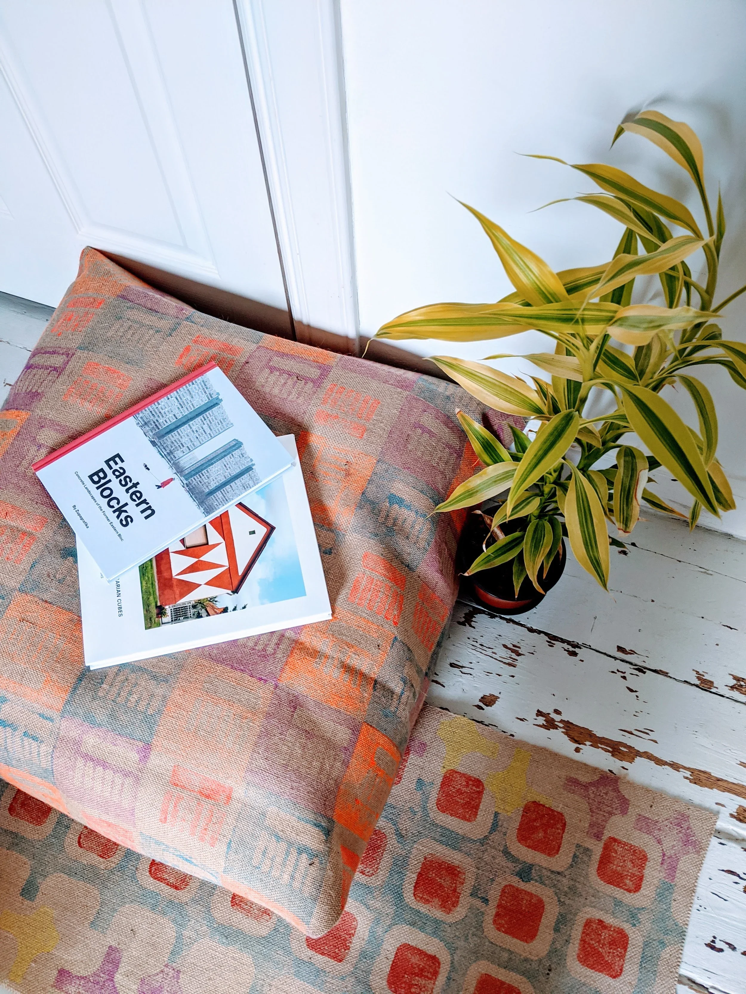
not coffee-table filler. real ideas, research (ahem, zupagrafika’s eastern blocks have a second part coming out…!)
for more serious suggestions (and personal favourites): designing design by kenya hara; raw concrete by barnabas calder; the comfort of things by daniel miller.
4. experiences — but with context
experiences are always great! but architecture people crave context. so why not gift: museum tickets (or why not a membership!); a day trip to a concrete treasure (free! mostly - and highly recommended); or - a breakfast somewhere with good chairs and terrible lighting (on purpose)!
5. Prints, but with intention
a small print framed simply, hung low, near somewhere lived-in. not a gallery wall. not statement art. just… presence. or even wearable - abstract, printed t-shirts, no witty slogans, no football logos, just a nice, geometric pattern.
(we do sell some of those at markets, coincidentally.)
6. Maintenance is a love language
fragrance is personal. but a solid shampoo or a proper,organic bar soap will always be used. or think about some high quality pens. refillable japanese notebook, thoughtful, organised stationery. objects that say “care” rather than “consume.”
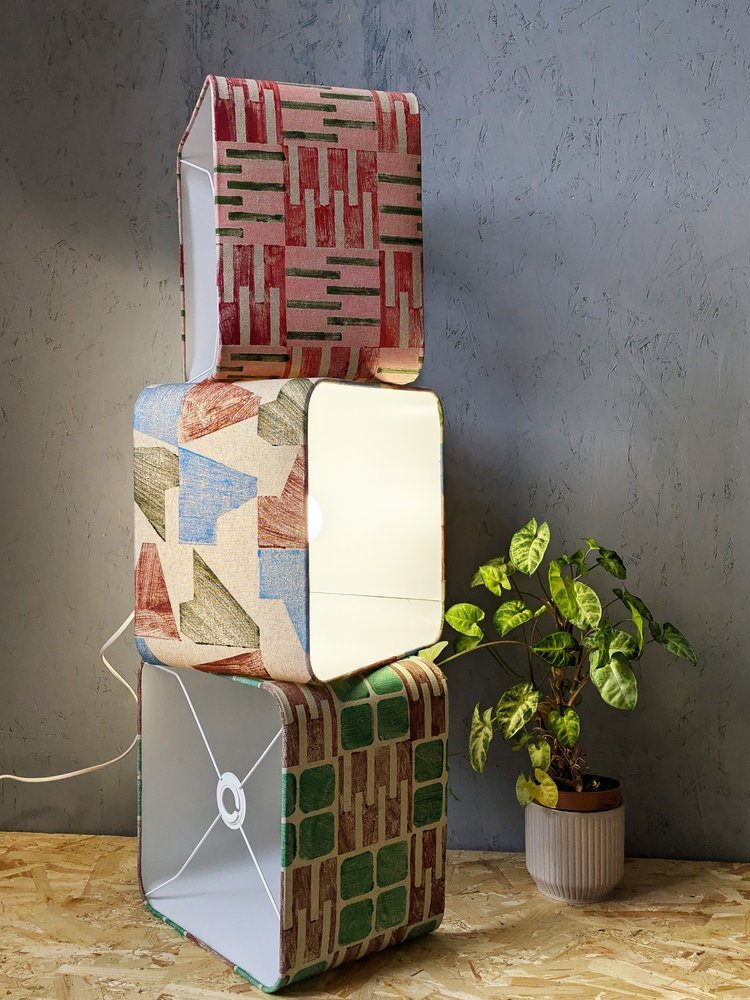
7. The almost-perfect non-gift
a block-printed lampshade or cushion. not seasonal, not trend-led, not disposable. just structure, softness, and light: a quiet upgrade to everyday life.
so… if you’re gifting for someone allergic to fuss, you can browse our shop of architectural textiles — hand-printed, modular, modern, and tactile. the best gifts simply whisper: “i pay attention to what you value.”
i spent an afternoon at the dovecot studios in edinburgh visiting magical patterns, the ikea museum’s travelling exhibition celebrating sixty years of textile design. 180 fabrics, spanning collaborations with everyone from bitten højmark to zandra rhodes, were laid out in a riot of colour and geometry.
it is an absolute must-see for every pattern and print enthusiast and it’ll be particularly special if you’ve been shopping for ikea fabrics for a long time: i recognised fabrics i’d once had in my own home, now displayed as part of a lineage of “iconic design. what really struck me though was how clearly this exhibition became a celebration of women in design. like many design establishments, ikea was once overwhelmingly male-dominated. textiles, however, became a way for women designers to enter the system and make themselves indispensable. the show foregrounded this history: each designer was credited by name, with their tools, sketches and inspirations laid out. scissors, paper cut-outs, tracing paper: modest tools, but revealing how much painstaking labour sits behind something that looks deceptively effortless.
the pattern nerd in me loved seeing these paper cut-outs beside finished screen prints, but i couldn’t help wishing for more. how did those jagged paper edges become repeatable units? how did they translate into full-scale production? how do you separate colours for screens, and so on. this story wasn’t really told and i suppose one can’t expect a full technical breakdown at a tapestry studio, but the lack of process detail left me curious rather than fully satisfied.
what was also missing was any commentary on ikea’s shifting identity. the exhibition proudly shows its most experimental decades — the bold 1970s stripes, the broccoli motifs, the collaborations with 10-gruppen. yet, having just been to ikea edinburgh not long ago as well, the contrast was sharp: far more beige, far less risk, with the adverts promoting the exhibition all over the floor with much bolder designs and installations that almost said “hej, sorry about the actual stuff to buy, come and see this and remember when we were really cool!”
it left me wondering what really happened? ikea has always been the champion of the “middle crowd,” the “wonderful everyday”, the affordable but well-designed stuff that were simply made to serve a life well lived. but what does that mean in an economic climate where the middle is disappearing? when so many brands are either abandoning this middle crowd by trying to tap into the higher-end bracket with unreasonable pricing, or have resigned themselves to no longer lead but follow with low-quality, less cutting-edge designs. where does that leave brands like ikea? what does the future hold for the company and its bold textiles?
the exhibition has also made me think how skewed our current idea of “scandi design” has become. somewhere along the line, “scandinavian” was collapsed into plain, bare, minimalist in the mainstream. yet this exhibition shows a very different story: sweden has always embraced pattern. bold, abstract, colourful, playful. IKEA didn’t just follow that tradition, it helped define it. i know it is only one company from only one of the scandinavian countries, but i think exhibitions on the bold colours of IHAY or fritz hansen would actually tell a similar story.
so while magical patterns might not have answered all my questions, it was still a joy to wander through. it reminded me that pattern is rarely effortless, that design histories are sometimes gendered, and that “scandi minimalism” is a myth ikea’s own archive disproves. perhaps the real magic here is how a so-called middlebrow brand has quietly carried radical pattern work into millions of homes.
-
IKEA: magical patterns - until 17th january 2026 at dovecot studios, 10 infirmary street, edinburgh EH1 1LT
this is going to be a bit of a hot take but those who follow me on instragram has seen me make this point before. i’m going to argue today that brutalism is actually cosy and it merely has a reputation problem. controversial or what? it is in fact bare, raw and… well, concrete, duh. perceived to be cold, harsh and as a style that overwhelms rather than invites. but spend enough time in these buildings and you might notice something else: a surprising sense of warmth.
it won’t be that the concrete has grown a softer texture all of a sudden, it’ll be precisely because of the materiality.
material honesty
rough surfaces, textured finishes, exposed joints, unpolished edges: brutalism has always been about revealing materials as they are. nothing dressed up, nothing concealed. and that honesty creates a kind of liberation, and with it you find comfort.
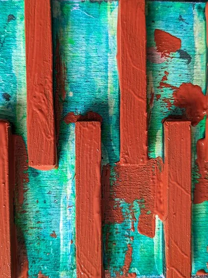
block printing works on a similar principle. every impression carries the grain of the fabric, the edge of the block, the rhythm of the hand. the result is never pristine, but it is always real. the imperfections aren’t flaws, they’re the thing that makes the pattern tactile and alive.
structure meets softness
what often goes underappreciated as well is how calming order is. the stark geometry of stacked, modular units leave no room for chaos. being enclosed by forms like that brings a sense of peace.
pairing block-printed textiles with brutalist or modernist interiors makes sense for this reason. the patterns mirror the structural logic of façades (repeated, modular, rational) while the fabrics introduce tactility and warmth. the concrete provides weight and permanence; the textiles provide softness and touch. together, they balance each other out.
warmth through materiality
so perhaps brutalism isn’t as uncosy as it seems. it’s not about decoration or ornament, but about surfaces that tell the truth, forms that cut through chaos and create order. if you add the softness of textiles that share the same philosophy — honest, textured, imperfect — you will get interiors that feel grounded and, yes, cosy.
cosiness doesn’t always come from softness, or softness alone. sometimes it comes from order, calmness, a sense of peace and from the way materials meet and interact. and brutalism, surprisingly, has plenty of that.
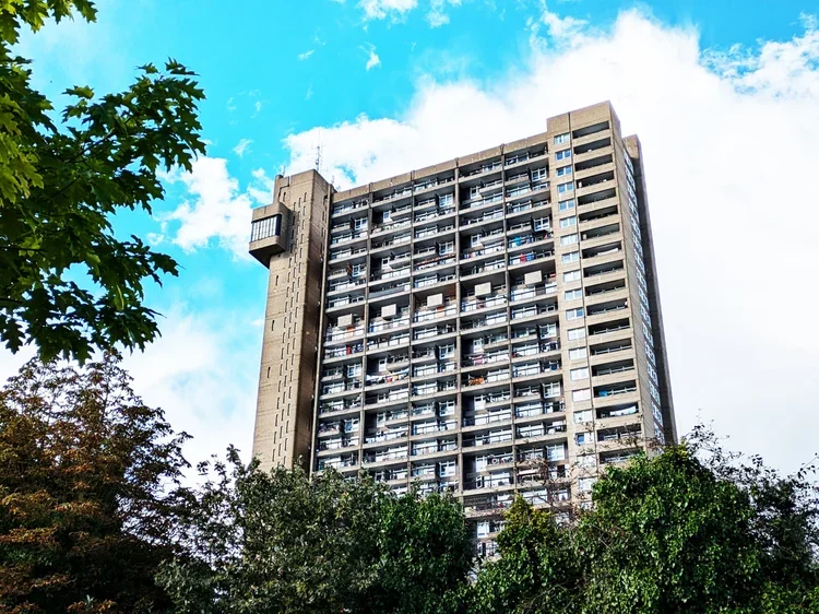
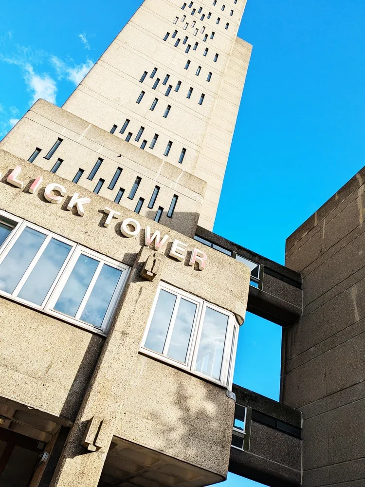
just like with the barbican, i have kept postponing blogging about trellick tower for a long time. what could i possibly say about this building - especially to fans of brutalism - that hasn’t been said before? every building is visited with textiles in mind though, so i decided to have this special “architectural inspiration” post, in continuation with our previous post about turning buildings into interior fabrics.
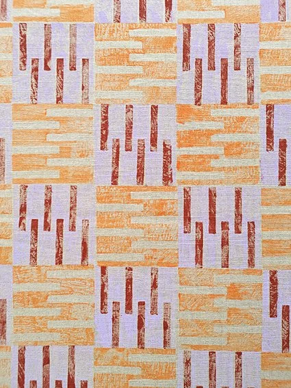
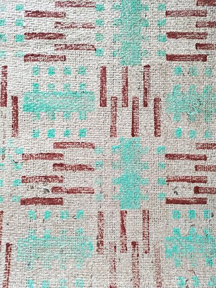
trellick tower is the icon of british brutalism (designed by a hungarian!) and ever since it completed in 1972, the public has been in a love and hate relationship with it. if you peel that emotional layer off though and look closer - it will reveal itself as a system. the vertical lines of the service tower, the repeating blocks of the residential units, the rhythm of balconies and windows: all of these details work together to form a precise, structural language. walking around it, the geometry is impressive and imposing. this building heavily contributed to our PANEL printing block set, directly inspiring a pair of tiles too - a direct translation from architecture to textile.
vertical logic
the printing blocks in question come from the service tower. this housed the oil-fired boiler and has lift access to every third floor - it is now defunct as the flats have electric heating but the tower is part of the iconic structure and it is the lean, vertical windows that became our motifs.
the service tower rises like a spine, attached to the housing block at a neat logic of every third floor. when i translate this into pattern, each unit also becomes a block — rotated, repeated, layered — to capture the same vertical rhythm. my printing blocks aren’t meant to be identical copies of the building; they’re an abstraction, a reduction of the structure into a repeatable unit. this is what makes the pattern modular, repeatable and flexible enough to inhabit different surfaces, from rugs to cushions - so far removed from ernő goldfinger that you perhaps not even want to know the origin - nonetheless i hope you find it interesting!
repeating blocks
everything here is very abstract of course, and the the other blocks within the PANEL section come from different buildings, less directly related to the facade but you can think of trellick tower too of course, the residential units themselves offer another layer of inspiration: clusters of windows and balconies create a clear, repeating grid. don’t be fooled by the neat facade, the flats have surprising variations between them. there is a deeply human scale within the monumentality of the building, and they do influence my printing blocks. when printed, these grids maintain their structural integrity, but the tactility of jute, linen, or cotton softens the rigid form. the repetition is comforting, methodical, and quietly playful — a domestic echo of the tower’s public-facing logic.
from public to private
trellick tower is both loved and hated — its enormous and imposing, raw and almost alien and yet the rhythm of its facades is surprisingly intimate and enclosing, and, dare i say cosy, just like textiles for the home interior.
translating this into textiles allows the same architectural thinking to live in interiors. a cushion, a rug, or a framed print carries the rhythm of the building, but at a scale and material that invites touch and domestic interaction. it’s architecture reinterpreted, rather than reduced.
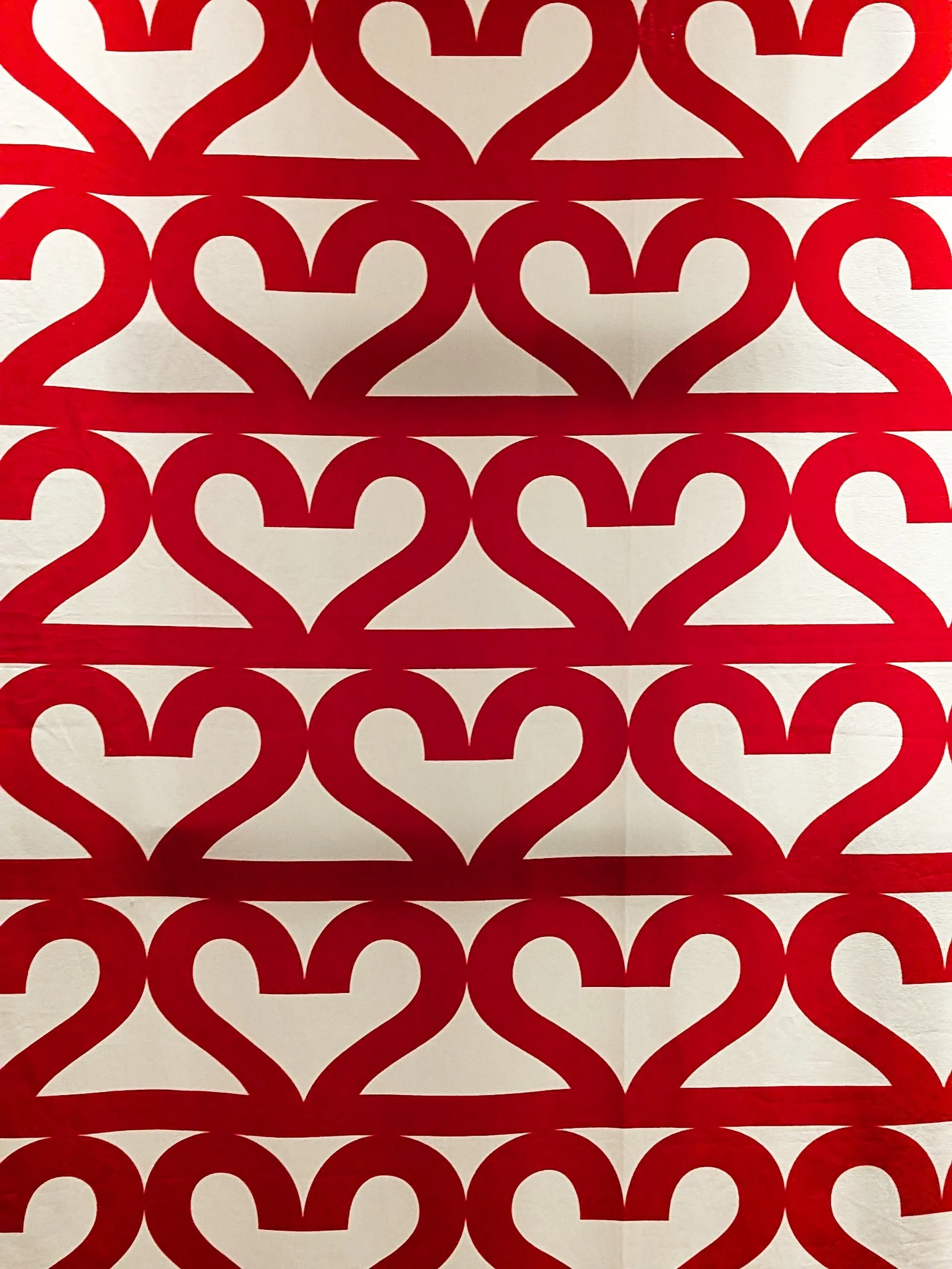
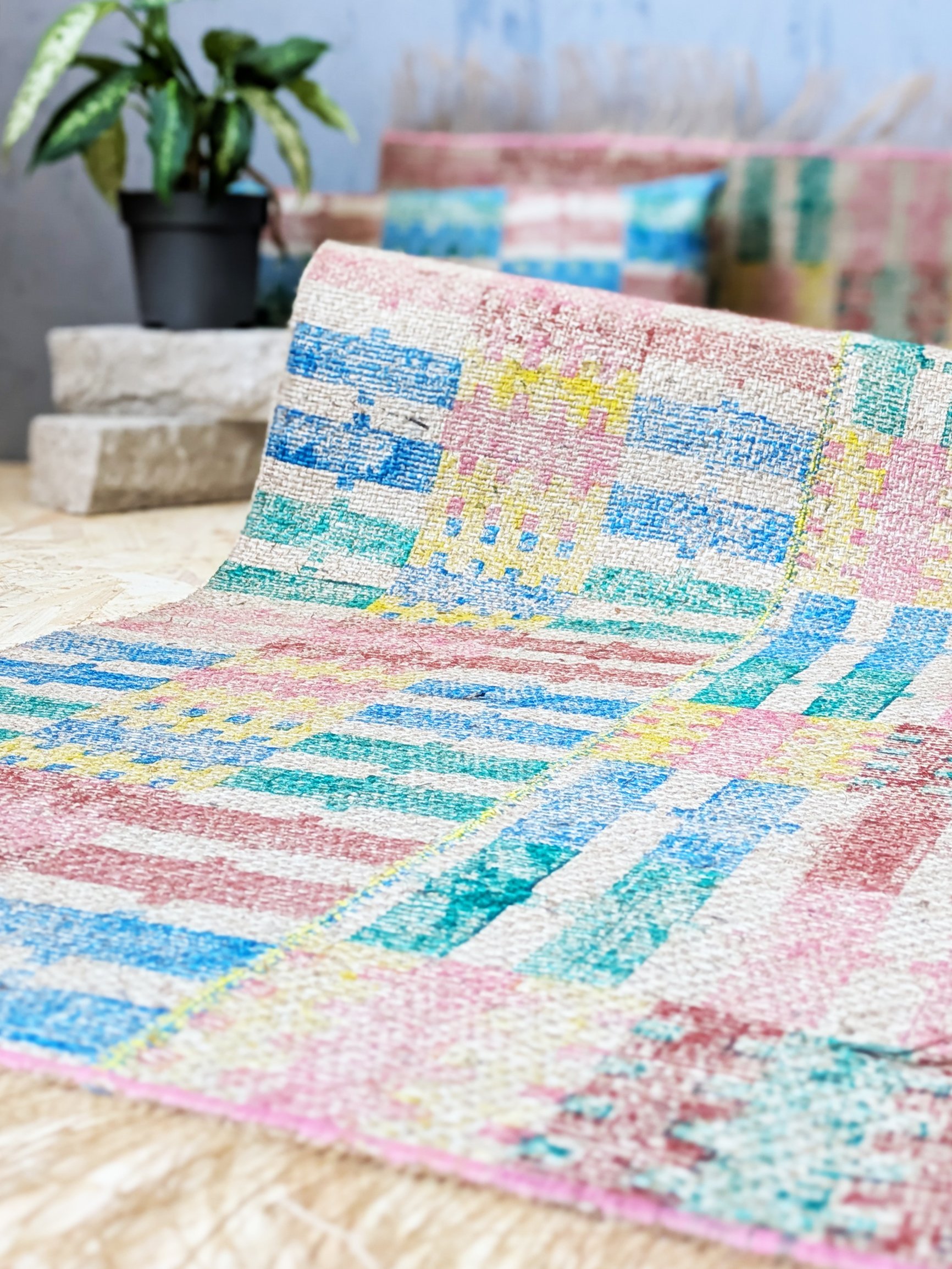
another brutalist rug - inspired by another london landmark. a busy, geometric print with soft, on-trend pastel purple and darker terracotta tones. it’s a beautiful and interesting accent piece in a cosy and colourful modern home, this rug was printed in the most architecturally inspired PANEL tileset evoking the housing units that inspired them. on one side of the rug there is a one-tile-wide column attached (with a pastel purple stitch) to resemble the boiler house and its facade of the iconic trellick tower by hungarian-born architect erno goldfinger.
it’s 70 cm wide and 158 cm long, including the 11 cm tassels at the short edges, stitched with a dark purple accent trim. a perfect addition into a contemporary, boldly styled home decor. top layer and backing material: 100% jute. wipe clean only. handmade in scotland
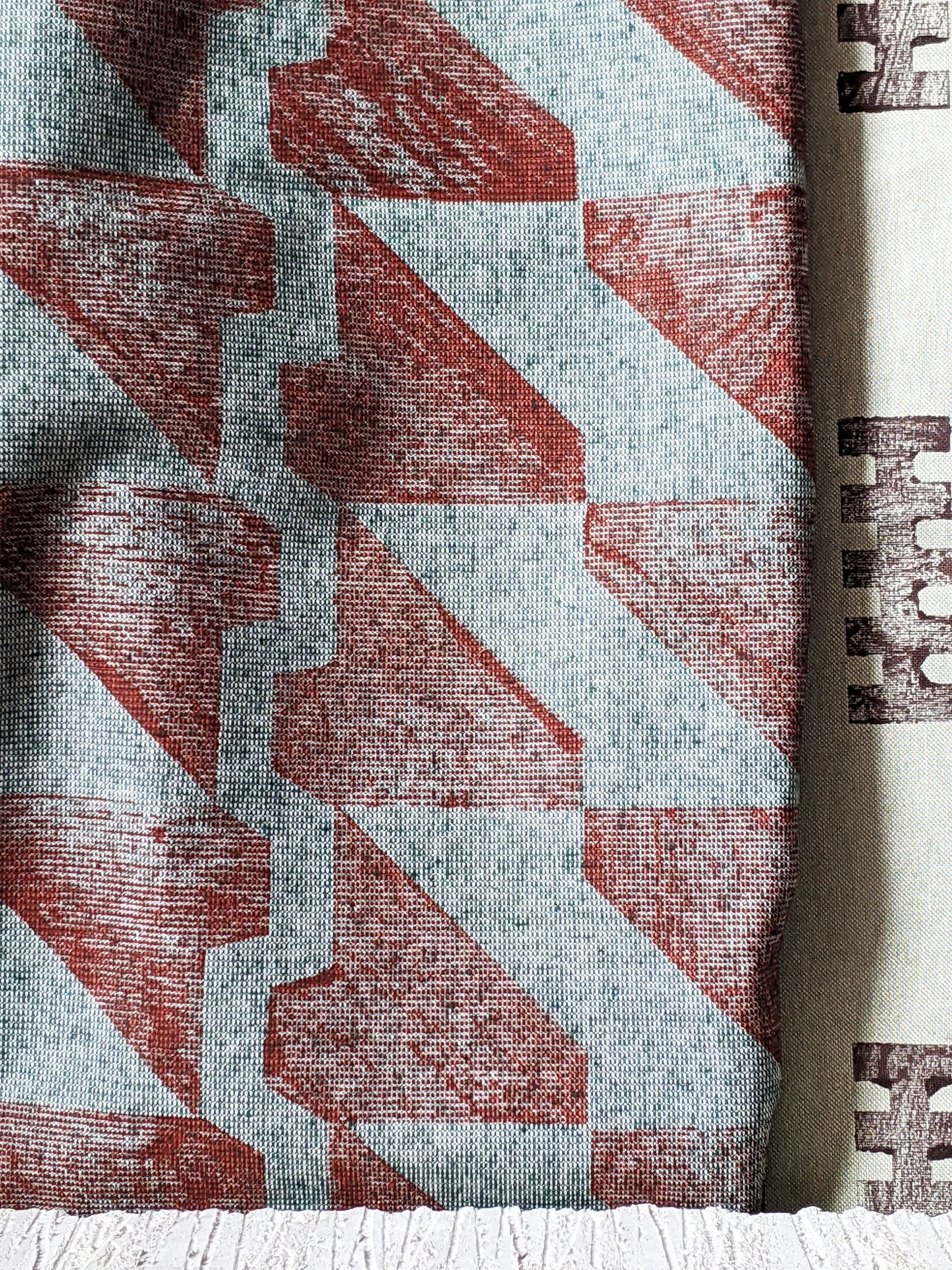
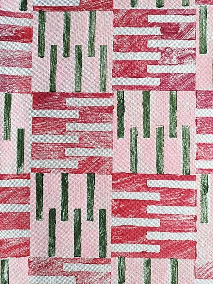
who says brutalism has to be grey and monotone? embrace the pastel sugar colours with this cute little stitched rug, made up of four parts, all printed in our housing block inspired PANEL tileset. it’s a dynamic, architectural print in pretty spring colours - mint green, pastel pink, and contrasting terracotta and lush green. a sweet accent piece in a modern home.
it’s 80 cm wide and 162 cm long, including the 11 cm tassels at the short edges, stitched with a pale pink accent trim on the short edges. wipe clean only. top layer and backing material: 100% jute. handmade in scotland.
a hard, brick-like look but a soft, comforting touch. this recycled cotton blend cushion is a perfect little accent piece, printed in our PANEL tileset, inspired by brutalist housing blocks. it’s an interesting repeat in pastel pink, brick red and olive green colours for a warm, earthy, contemporary touch. the perfect design addition to complete a modern home.
the cushion is 50cm x 30cm and printed on both sides. you can purchase with the pad, or just the cover only. cover: 87% recycled cotton, 13% recycled polyester. machine wash at 30C, do not tumble dry.
materiality in translation
just as architects consider how concrete interacts with light and weather, the choice of textile matters. ink on rough linen, for example, reveals layers of pattern in the same way light falls on raw concrete. modular blocks can be repeated, layered, and rotated, and different fabrics give each iteration a unique depth.
walking around trellick tower, one begins to see it less as a singular object and more as a system of relationships — verticals and horizontals, solids and voids, human scale and monumental scale. the challenge in the studio is to preserve that logic while making it useful in domestic interiors. the resulting patterns are structural, repeatable, and thoughtful, but also soft and tactile: a domestic dialogue with a building designed to be cosy yet monumental.
i wanted to write this blog post for a long time. a bit of an architectural inspiration one, but it’s not really about a specific building - it’s in fact about any of them. there’s a strange beauty in places designed for no one in particular.
what i mean are airports, petrol stations, holiday resorts, motorway service areas. spaces where identity is deliberately flattened, design is systematised, and the experience is engineered for seamless transition. you could be anywhere — and that’s precisely the point. these environments are defined by uniformity, function, repetition. they exist not to be remembered, but to be moved through.
but for me personally, perhaps as a designer (one obsessed with modularity and order) they’re particularly thrilling.
we don’t often talk about placelessness as an aesthetic. it’s more often a criticism. yet as rem koolhaas explores in junkspace, placelessness is the architectural byproduct of a hyper-commercial modernity: spaces without memory, built fast, endlessly duplicated, designed to flow. these are not sentimental buildings. they are signage, surfaces, systems. environments for consumption, efficiency, and movement.
“if space-junk is the human debris that litters the universe, junk-space is the residue mankind leaves on the planet.” — rem koolhaas, junkspace
but this isn’t a lament. on the contrary, i find these spaces conceptually liberating.
on a recent holiday, i re-read marc augé’s non-places, and his notion that modern life is increasingly lived in anonymous spaces: the airport lounge, the chain hotel, the supermarket aisle. these are spaces where individuality recedes, replaced by interchangeable familiarity. and it was exactly at such a place, the utter uniformity of a holiday resort designed to look like every other resort that i felt so free. there was something incredibly soothing about being in a place without narrative, without local “charm,” without any demand to engage with a story. it simply worked. it gave space for stillness, reflection, relaxation - exactly what holidays are for.
this idea - that placelessness allows a different kind of presence - is something i somehow intend to carry into zitozza’s textile design. i’m drawn to the visual systems that govern these functional spaces: the yellow directional arrows painted on concrete, he repeat rhythm of aluminium cladding, the ceiling grid in an airport terminal.
these forms are rarely intended to be aesthetic. but they are. they offer a kind of silent logic, a pattern language that is honest, liberating and somehow reflective. it does not try to tell its own story, it has no ghosts, no myths. it’s completely empty, ready to be filled in with your own thoughts and feelings.
in zitozza’s collections, i echo this vocabulary through repeating blocks, hand-printed modules, and structured alignments. even in a hand-printed cushion, i want to retain something of that clarity — that system over sentiment. a printed rug inspired by motorway signage doesn’t just add colour, it organises space. it introduces a rhythm that you feel underfoot, often without even noticing.
of course, the hand does intervene. the ink runs, the tile drifts slightly. the colour overlaps. this is where placelessness meets presence, where the system is honoured but softened and a small sense of uniqueness is born out of the uniformity. a little bit of character, but not to tell its own story.
so yes, it’s possible to find solace on a package holiday and yes, i do find inspiration in petrol stations. and airports. and anonymous resorts. not because they’re “ugly” or “bland,” but because they stand empty, ready to be filled in. they represent a visual order that is free from nostalgia — and therefore full of possibility.
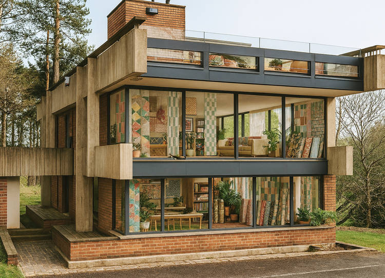
if you’re up to date with your modernism, i’m sure you will have heard the news already about the heralded bernat klein studio by peter womersley. if you’re new, let me break it to you: it is up for auctionfor a guide price of just £18,000. camper vans are more expensive than that.
but this is a grade A lised building in the scottish borders, currently on scotland’s buildings at risk register - it was already in an awful state in 2016 when i first visited and i can only imagine the state it is in now. as sat derelict since the early 2000s and like so many modernist gems, it’s not only been neglected but overlooked. with its protected status, i do wonder about the real amount of funds required to restore it into anything structurally sound. but one can dream, right?
as many of you already know, i visited this building during my university days as part of a project exploring womersley’s work. it left a deep impression, the proportions, the materiality, the quiet authority of its modernist geometry while retaining the human scales and the airy, cantilevered forms that is such a signature style of womersley’s genius.
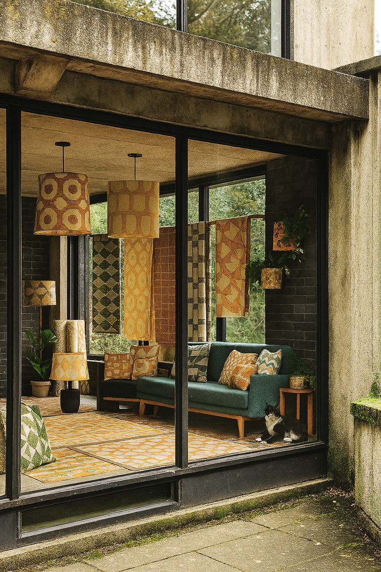
and so, naturally, as a brutalist and modernism-obsessed textile designer, it feels like it’s my duty to fantasise about it a little. so i’ve been daydreaming and i’ve created a series of speculative interior visualisations using AI – don’t shoot me for using it, i know fine well these renders are a not a replacement for reality (some prints really do not resemble zitozza at all and don’t even get me started on the cat..), nor is this a serious, budgeted proposal. it’s just a little bit of fun to put some ideas out to the universe and help stimulate the imagination about the building’s future. (or as the kids would call it, “manifesting”…)
in this parallel universe, the studio is lovingly restored not into an airbnb or a “writer’s retreat” (sorry barnabas calder, love your books but we really can do better here.) so in my head i turned it back into a working textile studio instead. my vision is an idea that is only half-selfish, and it would also contribute to the economy and give back to the scottish borders. i’m obviously thinking about zitozza here, but also a space for creative jobs, education, apprenticeships, and professional development. it could be quite a serious place for the textile industry with not only a space for designing, printing and production but there could also be workshops, residencies and exhibitions – continuing the building’s original purpose and klein’s spirit of thoughtful and considered, sustainable design.
okay, yes, the millions required to make it happen are currently in the realm of fantasy… but hey, everyone tells you that to do well in business you need to dream big so that’s exactly what i’m doing.
so, here’s a (completely unbudgeted) proposal. we don't need more holiday houses – we need permanent homes for making and creativity. modernist ideas - egalitarian notions of simplicity, abstraction and rational proportions - need to make a comeback and become mainstream again. spaces where design isn’t just theorised and talked about but physically made to furnish real spaces. achitecture, at its best, can enable that.
these are my ai generated fantasies, but it’s also a bit of food for thought. and hey, if you don’t have the money but want to keep the dream alive you can always just buy a teatowel… but if you do happen to have a few million pounds to spare and a soft spot for brutalist textile utopias, well, you know where to find me!
***edit: serious news! you can actually donate to bring it back to life, open to the public as a design centre - the bernat klein foundation along with the national trust and the scottish historic buldings trust have joined together in a bid to raise funds to acquire it and you can contribute to the cause.***
this is going to be another one of those meandering blog posts but those who know zitozza will appreciate how much i value tactile, haptic design and i often explore this further — even on the buildings i frequently post about. in interior design, it’s often the surface that gets the glory. glossy interior magazines, pinterest kitchens, machine-mixed, precisely matched wall paints — all of these speak first and foremost to the eye. but do they speak to the hand? we decorate our homes by looking, mostly. but living happens through touch.
why touch matters
this re-discovering of tactile design has been going on for a while, finnish architect juhani pallasmaa argued in the eyes of the skin that modern design has lost its connection to the body. “architecture” he wrote, has become “an art of the printed image” — increasingly flat and ocular, distant from the sensory depth it once held. we experience spaces with our skin as much as with our eyes, but you wouldn’t know it from most interiors magazines.
touch is the forgotten sense of design — until you step onto a coarsely woven jute rug barefoot, or brush your hand against a natural linen fabric. that fleeting physical experience tells us more about comfort, quality, and materiality than a thousand words of product copy.
at zitozza, this is something we take seriously. every hand block printed cushion, rug, or lampshade is an invitation to feel as well as see. the patterns may be graphic — influenced by architecture, brutalism, modernist grid systems — but the textures are deliberately tangible. you don’t just see the ink sitting on the weave. you can feel it, the texture is within the patterns and the way it is applied by brush too.
materials are more than surfaces
i want to make a clear distinction here between “surface” and “material.” although as a surface pattern designer, i have designed hard finish surfaces such as floor patterns and carvings, surface to me means something visual, often cosmetic. material carries structure, meaning, weight, and i don’t think you can design for any kind of surfaces without understanding how materials behave.
in her book thinking with things, art historian esther pasztory proposes that objects — and their materials — are not passive. we use them to think with. they shape how we relate to space, culture, and ourselves. in design, this means we don’t just use things to build with, or decorate; we also use them to express what we value.
a hand-printed lampshade might say “i believe in craft.” a concrete-textured cushion might say “i value raw honesty over perfection.” material, in other words, does not just have physical weight but also a subjective kind of significance.
this is why surface-led decorating often feels fleeting. trends change, finishes date, colours come in and out of favour. but materials with presence (e.g. stone, wood to raw jute and block-printed textures) carry weight and can be adapted to outlast different fashions.
the material as Architectural element
our work at zitozza comes from the intersection of graphic design and material design. our blocks aren’t carved by hand — they’re precision-cut from digital vector drawings, a nod to order and modernity. but once that design hits the textile, once it’s printed, imperfectly, by hand — it becomes something else. it becomes a tactile surface. a material transformation.
this is why we speak of our textiles not just as “homewares” but as architectural materials. wallpaper, for example, becomes more than wall decoration — it becomes part of the structure’s language. our newly released AGGREGATE collection for instance, can be printed by hand on non-woven wallpaper rolls and it embraces this exact idea: bold modular graphics that are not only seen but felt, shifting as light and touch interact with the ink.
what does this mean when you decorate?
it means you don’t just choose based on colour schemes. you choose based on how something feels, both physically and emotionally. that’s why the texture of a printed cushion, the density of a handwoven rug, or the grip of a paper-mounted fabric print matters. these are materials that invite interaction. they’re not background, they’re architecture in soft form.
so next time you consider updating a room, ask: what do i want to touch every day? what kind of surface do i want to live with — not just look at?
explore tactile design
if you’d like to explore zitozza's approach to materials, here are a few places to start: printed rugs (for pattern underfoot.) cushions (for texture on the sofa or bed.) mounted prints (for a feel of the cloth without needing upholstery) fabrics and wallpapers (for sampling our prints.)
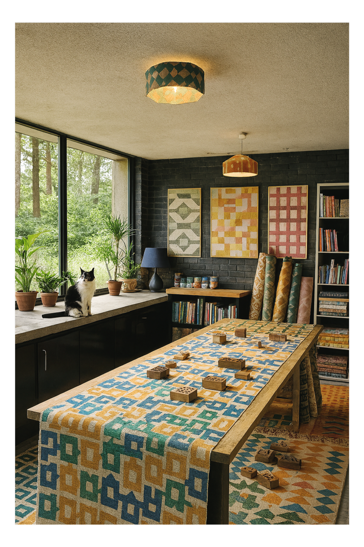
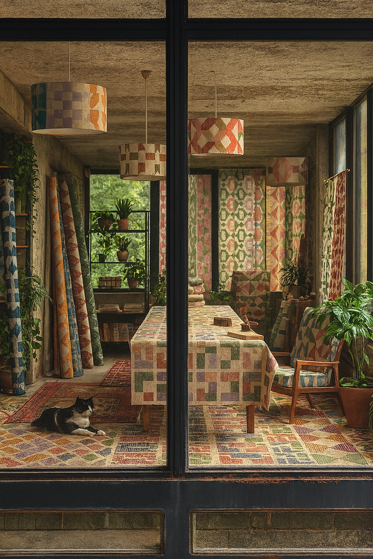
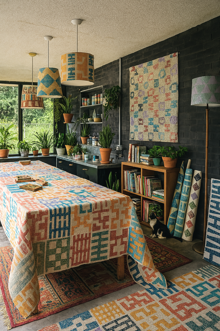
after a bit of a biggie (three launches and clerkenwell design week) it’s now time for a bit of a breather. i’ve wanted to blog more about architecture but the link between the concrete buildings and the jute rugs isn’t always obvious to everyone so i thought i’d write something about it as a bit of an explainer. when we think about architecture, we often think vertically — facades, elevations, materials rising around us. but the floor is where spatial experience begins. It’s where rhythm is established, circulation is guided, and texture makes its first tactile impression.
at zitozza, i’ve always been drawn to this horizontal plane of architecture - afterall, everything gets built from the ground up. it always starts with a floor plan and i’m thinking about the layout a lot. my printed jute rugs are designed not simply as soft furnishings, but as modular surface patterns for the ground. they take inspiration from the repeat logic of tiling systems, urban grids, and brutalist detailing — and reimagine them in natural fibre and pigment.
Modular Rugs, Architectural Logic
the design of each zitozza rug begins with a modular block tile - designed on the computer, precision-cut by a machine. these blocks are based on repeating geometric systems (steps, bricks, windows, columns) which you might recognise from pavement markings, concrete formwork, or mid-century cladding systems.
the prints themselves, when repeated across a jute base, create patterns that feel both structured and handmade and rustic — mathematical but never mechanical. these aren’t rugs that “fade into the floor”; they articulate it.
The Beauty of Soft Geometry
so why print, not weave? because print allows for crisper, graphic interventions on natural texture. block printing on jute brings a grainy tactility that reflects the rough honesty of these sustainable materials — not unlike exposed aggregate or board-marked concrete. it’s a dialogue between graphic clarity and material softness, one i find particularly rich when designing for interiors.
zitozza rugs aren’t trying to mimic tradition — they’re rooted in contemporary spatial language, designed to support interiors that favour simplicity, repetition, and material integrity. In homes with architectural ambition, they become not an accent but a foundation.
Designing From the Ground Up
there’s a reason architects often start their drawings with the floor plan: the floor defines flow. at zitozza i think of printed rugs as a continuation of that principle — a tactile, visible layer of design that offers rhythm, grounding, and visual structure to a space.
whether you’re designing a gallery-like living room, a textural study, or a quiet corner (of maybe a brutalist building), i invite you to explore the possibility of printed rugs as spatial tools — not just decor, but material floor drawings.
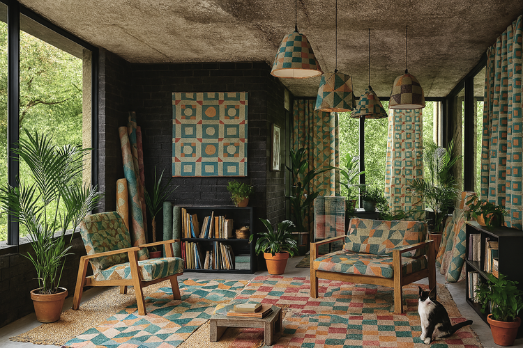
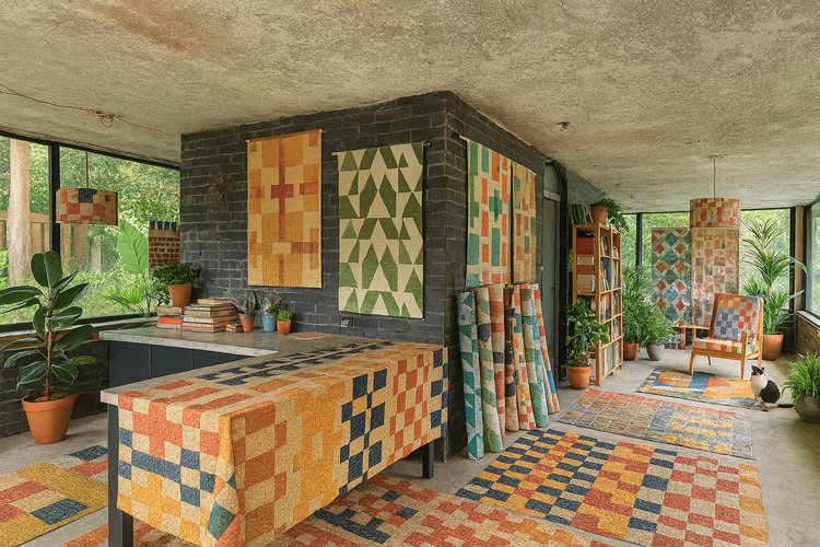
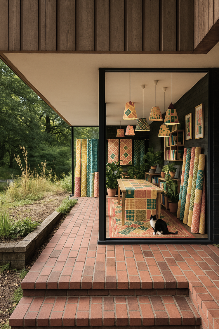
what does it mean to build a collection? to assemble not just products, but ideas — shared textures, values, and visual systems?
this month, zitozza launches three new collections at clerkenwell design week: AGGREGATE, TOYTOWN, and RAJZ. at first glance, they couldn’t be more different. one is sun-bleached and structural, the next graphic and playful, the third modular and abstract. but beneath the surface, they speak the same design language — one rooted in architectural rhythm, material honesty, and the tactile potential of the printed block.
let’s start with AGGREGATE. this is a lookbook, a surface collection. it doesn’t rely on a single repeating motif but offers a suite of block-printed designs in bright, contemporary colours — from punchy blue to sof pastels and warm oranges. the name comes from the material that forms concrete and holds it together “aggregate” as a general term also means something composed of many different parts which is exactly what this lookbook is - a consistent, contemporary interiors look with many geometric components, all built up block by block.
individual units that do not ever come out the same, building something whole. the results are minimal but expressive, grounded in texture and tonal contrast. designed to be versatile, AGGREGATE is for modern interiors that favour order without coldness.
TOYTOWN, by contrast, is a little cheekier. it’s our summer collection, responding to the stripes and checks trend with bold colours. these prints feel stacked, balanced, almost like diagrams of imaginary cities. inspired by the geometry of play — toy blocks, funfair architecture, early modernist colourways — this collection embraces high contrast and graphic shape. it’s not childish, but it’s full of character. think grids gone rogue.
what really is special about these is that the entire collection has been designed with two blocks only. one element from our recently released TÉGLA set and a pair of the ever-so-architectural PANEL. it just shows how combineable these elements are and the endless creativity that can serve interiors. lines that loop, punch, repeat. it’s for spaces that don’t take themselves too seriously, and for people who still see joy in the abstract.
and then there’s RAJZ — our newest block tile set. named after the hungarian word for “drawing”, this series reimagines the blueprint as ornament. with references to architectural plans, elevations, and notational marks, RAJZ is modular at its core. each tile is a language of arrows, pathways, and boundaries.
like everything in our systems, they can be combineable with each other and with all the other MODERN blocks (we have over 130+ of these now.) you can use them seamlessly in endless configurations and colourways, creating layered narratives across textiles. it’s a set made for customisation — for architects, designers, and pattern obsessives who want to build with their hands.
together, these three collections reflect what zitozza has always done: design at the intersection of architecture and craft. they are built, not drawn. printed, not produced. and they all begin with one simple gesture — the press of a precision-cut block, inked with intention, aligned with care.
if you want to come and see them in person, please say hello at clerkenwell design week, at the platform venue (70 cowcross street, ec1m 6ej) throughout 20-22 may - register for your free tickets here.
we are ready to show it all and we do hope you love them. for custom samples, please get in touch. if you’re interested in our bespoke design services, you can find more information here.
a short while after we discussed our love for modular systems, we are talking about grids again. this isn’t just a graphic-designer-turned-textile-person’s obsession — they structure our cities, inform our screens, and quietly underpin almost every page layout and pattern we encounter. but beyond their role in organising space, grids can be a springboard for creativity, allowing designers to build complexity from simplicity. this post explores the grid not as a constraint, but as a tool of liberation — from early modernism to contemporary practice, including how zitozza plays with modularity in its textiles.
The Grid as Modernist Foundation
grids found their spiritual home in early modernist movements. bauhaus, and de stijl artists in particular, like piet mondrian reduced visual language to the essential: horizontals, verticals, primary colours. continuing the idea after the war, the swiss style emerged in the mid-20th century, with designers like josef müller-brockmann using grids to create visual harmony in posters and editorial layouts.
this was design as a rational act — about clarity, neutrality, and structure. the swiss grid system created a framework where typography and imagery could be arranged with precision. it was less about decoration and more about logic, a way to strip back the unnecessary and design a hierarchy of information.
speaking of the swiss — we love brutalism here, so now is the time to mention le corbusier, one of the most influential figures of architecture in the 20th century. in his seminal work towards a new architecture, 1923), he argues for a new visual order grounded in function, technology, and standardisation.
le corbusier's urban visions, particularly the ville radieuse and the controversial plan voisin, proposed cities built on a grid: modular, repetitive, efficient. these were not just aesthetic gestures but ideological ones, attempts to impose order on the chaos of industrialised life.
the city becomes a machine for living. blocks of buildings aligned on rigid axes, roads intersected at clean right angles (and roundabouts - think about glenrothes!), and light, air, and greenery were prioritised through geometric planning. the social and emotional consequences of these ideas are still felt today, but their influence on modern urban environments is undeniable.
the outskirts of bratislava, by SI Imaging Services / Imazins (source: getty images)
the outskirts of bratislava, by SI Imaging Services / Imazins (source: getty images)
Grids in Graphic and Interface Design
in contemporary graphic design, the legacy of the swiss grid lives on in everything from magazine layouts to responsive web design. grids provide consistency across platforms and allow for flexibility within a rational structure.
as a traditional, old school graphic designer, this is something i have less experience with but it has translated on from print to digital, and in UI/UX design, it is the grids that make digital interfaces feel coherent and navigable. the hidden scaffolding of columns and gutters supports typographic hierarchies and interactive elements, creating experiences that are intuitive without drawing attention to their structure.
The Balance Between Structure and Creativity
but the grid isn’t just about order. it can also serve as a space for subversion. architects and designers often use grids to set expectations — then disrupt them. breaking the grid, or the grid itself, can both become a statement - think about the iconic tables of superstudio.
in textile design, modularity offers a similar tension. zitozza's approach to block printing starts with fixed elements—repeating tiles, geometric forms — but introduces variation through placement, layering, and colour. a grid may begin the composition, but it rarely contains the outcome. it's not unlike building a city out of toy blocks: rules exist, but imagination ultimately dictates the layout.
Grids as a Living Language
grids, like language, evolve. they provide a shared syntax for designers, architects, and urbanists, but are constantly reinterpreted across time and context. from the pure geometry of modernism to the playful modularity of contemporary practice, the grid remains one of design's most enduring tools.
at zitozza, we embrace this legacy. our new collections explore grids as both framework and provocation. they are starting points, not boundaries.
after all, there is joy in structure. and sometimes, the most surprising creativity begins with a line drawn straight.
ahead of our new collection launches, i want to revisit a core idea behind zitozza: the joy of modular design. it’s at the heart of how we create patterns — and why our textiles bring so much flexibility, structure, and character to modern interiors. we talked about this before, in our very first blog post - but we’ve come a looong way since then so it’s perhaps time to revisit these thoughts because i feel like it’s at the core of everything here, yet there is so little written about on these pages.
there’s something quietly satisfying about a system that lets you build from the ground up — pattern by pattern, block by block. at zitozza, modularity has always been at the heart of what we do. it’s more than a method; it’s a mindset.
the act of printing by hand using custom-made blocks invites a kind of architectural thinking. each motif becomes a unit — a brick, a tile, a module — capable of being repeated, rearranged, or rotated to form something larger. the process echoes the very structures that inspire our designs: functional, concrete, geometric. it’s a design language rooted in the modernist ideal that beauty comes not from decoration, but from clarity, rhythm, and purpose.
and yet, there’s so much play in it too.
modularity allows for variation — for reassembly, surprise, even subversion. every print starts with a simple shape, but it rarely ends there. colours collide, edges misalign, and new patterns emerge unexpectedly. it’s not about perfection, but about the whole picture, richness that comes from composition. the hand-printed surface becomes a space of improvisation. each textile becomes a landscape, or rather, a cityscape with buildings and structures.
our new tiles, the RAJZ set (to be released soon!) takes this even further. designed for modern interior spaces - we printed this on wallpaper for the first time ever! - and inspired by the abstract logic of architectural plans and schematic drawings, these blocks are designed for movement and multiplicity. they're not just shapes, but visual cues — arrows, intersections, corridors, walls. they suggest flow. they ask to be built with. as part of the MODERN set of course, these will go seamlessly with other blocks, allowing you to create even more patterns.
the upcoming TOYTOWN and AGGREGATE collections (also coming in may) are just our way of creating with our existing sets. they embrace this philosophy in different ways — one playfully, the other structurally — but both grounded in the joy of repetition and reconstruction. you’ll see echoes of grid systems and city plans, the raw tactility of concrete, the subtle logic of elevation lines. and you’ll also see softness, colour, and warmth. because modularity doesn’t mean rigidity — it means possibility.
i designed these two very different new collections for this summer, to emphasise the variety of moods, colour schemes, looks that you can create with the same handmade process, the same handmade texture, yet very different interiors can be achieved. i love this kind of versatility and if you want to create your own look with these systems, start here.
in an age of ready-made looks and fast consumption, there's something refreshing about design that invites creativity and such freedom of thought. modular design is never final. it welcomes revision, addition, and layering. it lets people participate in the pattern.
and that’s the joy of it.
if you want to be among the first to browse our collections when they’re released, sign up below to our newsletter. it comes with a free downloadable poster every month. stay tuned for our release!
we’re back and finally able to sit down with our thoughts after having watched (and somewhat forgotten about) the brutalist movie. in that review i encouraged the research into the work of the real-life hungarians and brutalists whose lives the fictional story was based on - and i decided to start with marcel breuer since i received a great book about his work for last christmas.
those into design will know this already but i always like starting with the facts, he was born in 1902 in pécs, southern hungary and was one of the youngest students (and mentors) at bauhaus. he went on to establish his own practice in berlin, and after a two-year stint in london he moved to the states in the 1930s, first to teach architecture at harvard, then later to new york city where he continued to practice until the late 1970s.
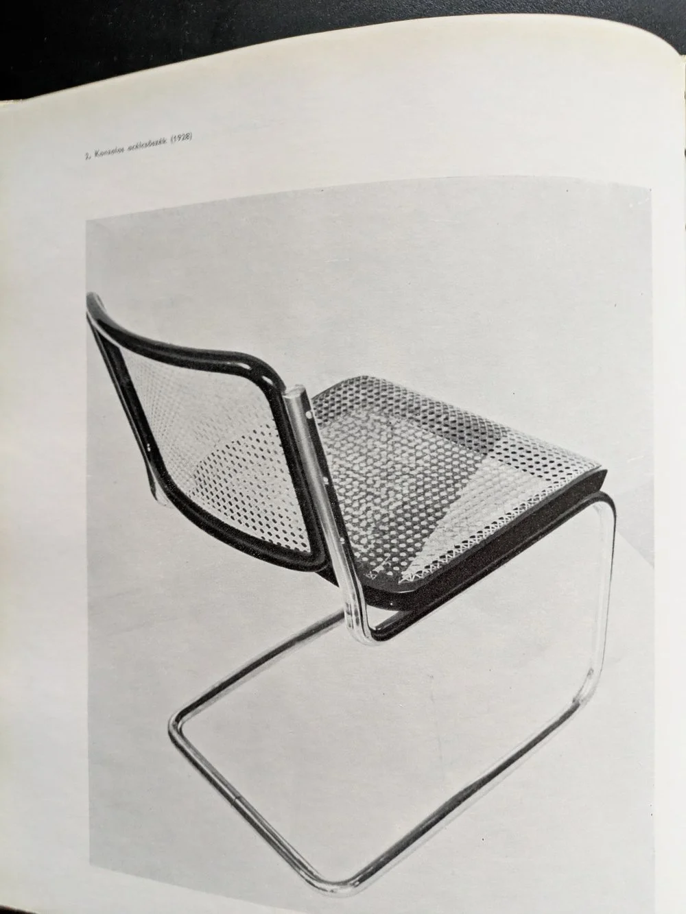
the cesca chair, 1928
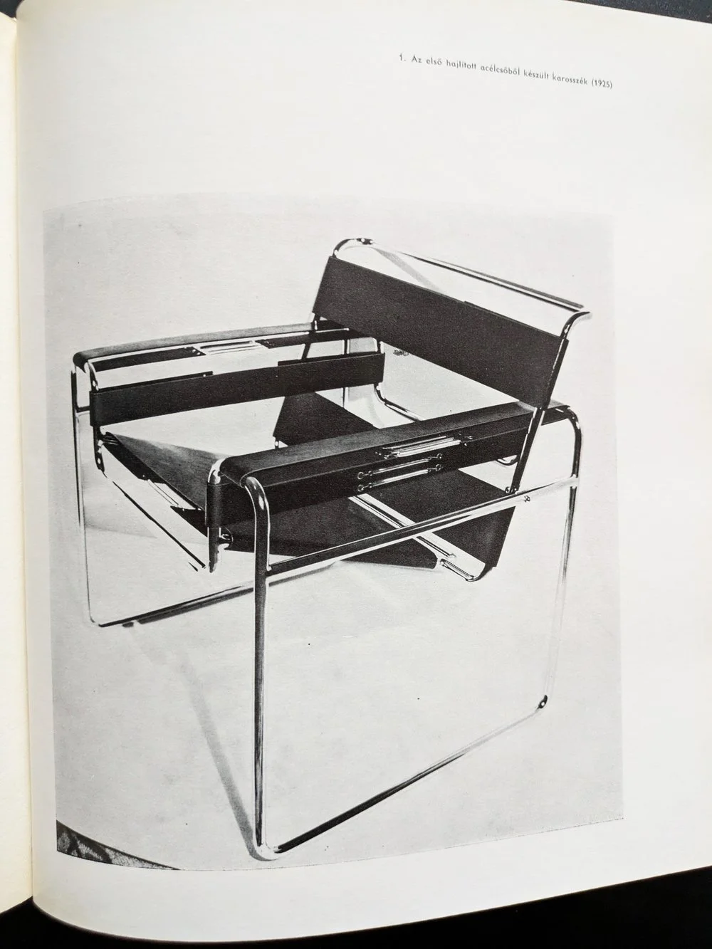
the wassily chair, 1925
for those into design, it’s also easy to recognise the heavy concrete masses of marcel breuer’s brutalist buildings — the hulking cantilevers and deep shadows of the 1960s and 70s that have since become icons of modernist architecture. but what’s more compelling than their visual impact is the thread that connects them to breuer’s earliest work. his design logic didn’t emerge suddenly in béton brut — it evolved from an obsession with functionality, structure, and modularity that was evident from the very start.
before architecture of course, there was furniture. in the 1920s, as a young bauhaus student, breuer designed the wassily chair using steel tubing — a radical departure from traditional craft at the time. lightweight, repeatable, and industrial, the chair wasn’t just functional: it was a system. breuer’s approach treated each part as a modular unit, capable of being assembled into something greater than its parts. this thinking didn’t just define his early designs — it forecast an entire architectural philosophy.
IBM research centre, la gaude, france
IBM research centre, la gaude, france
UNESCO headquarters, paris
UNESCO headquarters, paris
fast forward a few decades of immense architectural output (his practice designed more than 100 buildings), and the same logic manifests on a much larger scale. buildings like the UNESCO headquarters in paris (1951-1958), the IBM research centre in la gaude (1960-1961) or the iconic whitney museum in new york (1963-1966) carry the same DNA — modular systems, articulated forms, and a deep respect for material honesty. breuer’s concrete isn’t decorative. it’s structural, expressive, and fundamentally rational.
the book i’ve been reading — published in 1970s, written by máté major, long out of print, with that peculiar warmth of faded paper and sans serif fonts — documents this journey. the photographs, drawings, and models inside don’t romanticise his work; instead, they reinforce the relentless clarity of his method. whether designing a chair or a cultural institution, breuer asked the same questions: how can material, form, and repetition serve both function and expression?
whitney museum, new york
whitney museum, new york
as someone with a hungarian background myself, i’ve always felt a connection to breuer — not just because of the cultural context of course (despite our country being somewhat late and reluctant to recognise him), but because of how he saw the world through systems. that kind of thinking, for me, translates into surface design: building pattern from modules, constructing rhythm, shaping repetition. of course, my materials are softer, but the logic is not so different.
breuer reminds us that beauty can be found in structure — in the clarity of parts assembled with intention. whether it’s furniture, architecture, or textiles, that modular imagination still resonates.
hello again! we have some news for you, or more like, a review. not a building or a book this time, but a fictional story which i’m not that used to. however when something titled “the brutalist” came onto the scene about a hungarian, of course i felt obliged to visit the cinema for the third time in the decade and i thought i’d share my thoughts with you.
i want to emphasise though, that i am not a story person, it’s probably personally my fault that cinemas are dying, i can’t keep up with any series and, despite loving books and reading, the last piece of fiction i read was probably in high school. i am not proud of this, i am just providing some context for this review so you can safely ignore my take and go view it yourself. the first thing i want to say that it is beautifully made and you can tell that everyone involved in the making of this film took their craft extremely seriously. it is rather spectacular, filmed with a 1950s technique called vistavision, and it’s quite something i recommend watching in the cinema. there is an interesting score throughout, the writing moves at a decent pace despite the long runtime and the actors all do a fantastic job (with a bit of ai enhancement- the hungarian did sound fluent mind you.)
the second thing i want to say about this film though that if you were expecting to see a lot of cool design and beautiful architecture, you will be disappointed. when i first read about the story, following a hungarian-born brutalist architect finding his feet in america after the war, i was hoping it would be more closely inspired by icons such as marcel breuer, lászló moholy-nagy, or even ernő goldfinger but it is a different story. most crucially, our fictional hero, lászló tóth (adrien brody) was unfortunately not able to escape the horrors of the holocaust and moves to america only after having survived it, in 1947, having to start his life and career all over again.
the long runtime is split across two halves, and in the first half, taking place from 1947 to 1952, we see him taken in by a relative (alessandro nivola) who gives him a job in his furniture shop in a small town in pennsylvania, where he meets a wealthy businessman (guy pearce) who will later hire him to design as a sort of memorial to his family for the community, a cultural and sports centre with a library and a church (yes, all that in one building.)
watching this half of the movie i thought this film should be titled “the modernist” instead, as we see him in a quite contemporary struggle of being radical and different in a somewhat more conservative environment. this would be fairly relatable to any millennial i’d imagine, but i’m not sure how true to the depicted age it really is. at one point he creates a steel frame furniture set, reminiscent of something by marcel breuer, only to be met with indifference and rejection. in real life the cesca chair for instance, was a huge hit that would influence furniture design for the rest of the century and further, and, by 1948, it was already a 20-year old design. i’d imagine even in small town pennsylvania it would not be seen that unusual - this is still the country of charles and ray eames. for more context, the new bauhaus, founded by the very real lászló moholy-nagy, was already open in chicago for about a decade by then.
instead of joining them, his supposed ex-colleagues, our hero shovels coal until he gets hired by guy pearce’s unscrupulous character - if this is a metaphor of the loneliness of the average 2010s creative trying to get by in a foreign country with an evening job whilst on an unpaid internship in the hope of securing their first temporary contract at a big-name studio surviving on lawsuit payouts over half-built vanity projects, then i guess it works - i can assure you that an entire generation got the t-shirt.
however as a believable story set in a golden age of industry and building, it does not work as much, although i only have the word of art history books as i was not alive at the time. i do accept that cutting edge modernism wasn’t ever truly “mainstream” as such, but during the time the film was set, it was at least desired, aspirational, and, i’d imagine, decidedly cool. the second half of the movie picks up in 1952 - modernism is massive in the states by now, and for a bit of global context, despite still the rationing, festival of britain is already happening across the atlantic, chandigarh is being built by le corbusier in india and the plans for brasil’s new capital will also be drawn up in a few years time. the film completely forgets about this enormous, global movement of hope and optimism. eyewatering budgets are approved for huge projects to be built, celebrated for generations afterwards. this is a unique era in history of unmatched ambition and prosperity, with a real creative buzz in the air - and this context, this positive mood is entirely, and sorely left out of this miserable story.
then it falls apart a little bit more and there is a revelation in the epilogue that i will spoil below, so please do not read further if you have not seen it yet and want to.
it turns out that the main concrete building (which we never get to see in full) is a replica of the architect’s and his family’s suffering in the concentration camps. no, it is not explained as some kind of visual metaphor, we are explicitly told that it is a near-exact representation. now i understand why a filmmaker, a storyteller might think it works - of course, there are many stories of awful, unimaginable suffering that are told beautifully. but i do not think that spatial design can be like that and i struggle to accept that you can physically recreate the worst known hell on earth and offer it as a sanctuary and place of relaxation and learning for the community. if you really believe that form follows function, then you simply cannot take a building where the function was the extermination of people and give it a different function, especially not of recreation. in fact i find it really quite distasteful towards the memory of the holocaust. i also think it is strengthening this lazy and misunderstood idea about brutalism, that it equals brutality and that the raw surfaces and austere interiors can only come from a place of oppression, imprisonment and suffering. this is quite damaging towards this style of architecture and it might not help the celebration and preservation of these buildings - although if the movie wins awards hopefully it becomes a bit more recognised.
so despite all the miserable nature of the film, i hope that you will still get inspired and will want to explore the work of the real-life hungarians and the real buildings of this era - and find the hope and optimism in the works along the way. i have just got my hands on a hungarian book about marcel breuer from 1970 (when he was still alive) and i will write about this next. subscribe below to be the first to read about this and more brutalist wonders.
new year, new trends! yes, it’s that time of the year when we survey the home interior decorating trends and pick our favourites, that we simply love or would love to serve. 2025 seems to be the year of big, bold decisions as we move away from overly curated spaces and wavy decor in favour of cleaner lines. is the comeback of brutalism on the cards? here are our picks from this year’s roundup:
indivudalism and creativity
it appears that 2025 might be a year of free-flowing creativity and a definite, distinct move beyond minimalism and cookie-cutter curation. it’s the year to be free and make bold decisions to truly express your individual style. pattern clashing, colour clashing, scale clashing, and bespoke designs - it’s 2025, just go for it! if you want custom printed anything - check outwhat we can do for you!
statement hallways
yes! it’s confirmed, no more neglected hallways - despite not spending too much time in them, they do tend to be one of the most frequently used, frequently seen parts of the house and it’s time to breathe some life into them, or go all out. make that first impression! and boy do we just happen to have the runners for you!
it’s still earth tones
yes, brown, terracotta, and of course, mocha mousse. jute, clay, warm, soft textures and colours are still very much in. it doesn’t matter what surfaces you use them on they’re all so comforting and calming, a safe haven from the brutal harshness of the outside world. it’s time to use them, really use them bravely and freely!
vintage & retro
this one is a sweet spot at zitozza! we love mid-century modernism and as the brutalist is at the top of the nominations in the award season for movies we keep our fingers crossed this is our time for the style to make a comeback as we have lots of prints to offer. other sources mention the slick, simplified forms of the 1970s and a comeback of vintage furniture - we love seeing it!
at home spa
remember the covid years and the home office? times have changed, we want to rest at home now, and rest fully and in ever-more indulgent ways. the bathroom is a safe haven for the ultimate me-time and if you kept putting off that bathroom renovation or have always wanted the quiet corner, maybe this is the year to do it, and go all-out on the feature tiles, yoga mats and meditation alcoves.
yellow
oh we love this one. aside of the earth tones mentioned above, yellow is promised to make a comeback in 2025 and we are here for it. it is not the shouty, neon yellows we’re talking about here but the soft, inoffensive kind of mellow-yellow that can be applied in large quantities for maximum happiness. we are solar-powered, desperate modernists here who want the bright, cheerful hues here to stay!
today is a special day as this is going to be my first ever post about hungarian brutalism. i’m not entirely sure why i haven’t blogged about anything in my home country before - perhaps the pressure to know more about these buildings than i do is too much! but i guess the time has come to present something cool and exciting and interesting - this is one of the more famous ones and as such, an internationally more accessible and digestable example - that is the OKISZ offices in budapest, hungary.
built between 1971 and 1973, this office complex is located in a particularly leafy pocket of zugló, the 14th disctrict of budapest, almost exclusively surrounded by art nouveau villas and churches. the architect is recordedas jános mónus - who won an ybl-award (a sort of hungarian pritzker prize i guess) for the “high quality fusion of structure, technology and form” demonstrated in this very building. the company was ÁÉTV at the time, the state development company (according to the construction archives, operational from the late 50s until the late 90s) tasked to build public-use buildings for budapest: schools, hospitals and of course, offices - this one to house the countrywide union of small-scale industry bodies (the acronym is the OKISZ in the building name) and i’m really sorry that the language of the economic structures of socialist hungary does not necessarily translate too well to my engllish language readers but hey i’m trying my best!
it is a striking, fine piece of brutalism that understands and seamlessly fits into its environment without losing its character, not trying to be imposing without being too modest. a review from 1984 claims - and i’m paraphrasing somewhat, that “it would have been shameless and impolite to try and compete with its surroundings, however you should also live up to such an environment full of notable buildings” and it does do a remarkable job at that.
it has an exciting elevation of five floors stacked upon each-other in a dynamic, stair-like manner and a somewhat L-shaped plan. the facade continues this rhythm of protruding concrete mullions between the slick windows - for those who love this style it’s a bit of a jackpot i think. i went on a freezing cold january day in thick heavy snowfall - the white contrast it created with the concrete was really eye-catching from a pattern point of view too, but it also somehow emphasised the spatial nature of this building.
obviously, this is a textile designer’s blog, so i’m a layperson when it comes to the ins and outs of the structural geniuses of such architecture, but eye-pleasing proportions are, i think, a universal language that can be appreciated by everyone.
brutalism is also not necessarily inherently minimalist, you can notice fantastic details even outside - but this is also an interior textile blog so i was yearning to go inside. even though i could not (in fact, a security guard came out to check what i was up to outside too, haha!) however as a part of othernity, the hungarian project for the venice biennale for 2021, a series of guided walks by the centre of contemporary architecturewas organised back in 2020, several bloggers and journalists attended taking amazing photos of the inside. it looks very 1970s, cosy and very socialist (every building in my childhood memories has a similar details or typeface i think!) and it also has one of those ever-moving lifts that we call paternoster in hungary.
i’m going to recommend you two of these articles about this walk in 2020, both with brilliant photography - first hype&hyper (if you don’t know them, please get acquainted with this comprehensive cultural quarterly focused on eastern europe.) and also check out the blog post from welovebudapest, with fabulous indoor shots including of the roof terrace.
for the floor plan and elevations, and an interesting drawing on the accompanying furniture design, please see the previously quoted lechner centre article, it’s very insightful! the reason for this many resources available on this particuar building is of coruse the venice biennale project for 2021 - this building was one of the 12 selected to represent the hungarian pavilion. all 12 were focused entirely on this particular era of architecture and architects of our surrounding countries were invited to participate in their re-interpretation.
despite this celebratory re-discovery happening, brutalism in hungary is quite endangered and none of these buildings are under listed status, however many are loved and used and perhaps the attitudes are changing somewhat. after years of the somewhat over-politicised and emotionally fuelled attitudes the architecture of the socialist era in hungary, it’s refreshing to see it getting more appreciated and putting some of these buildings into a more recognised place. i hope to bring you more examples of hungary in the future.
if you liked this blog post, why don’t you subscribe to my monthly newsletter below to be the first to read our latest musings and updates.