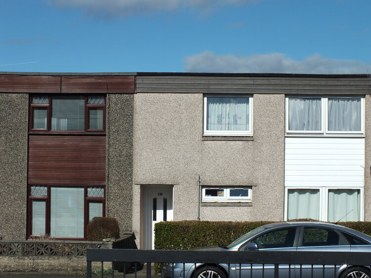
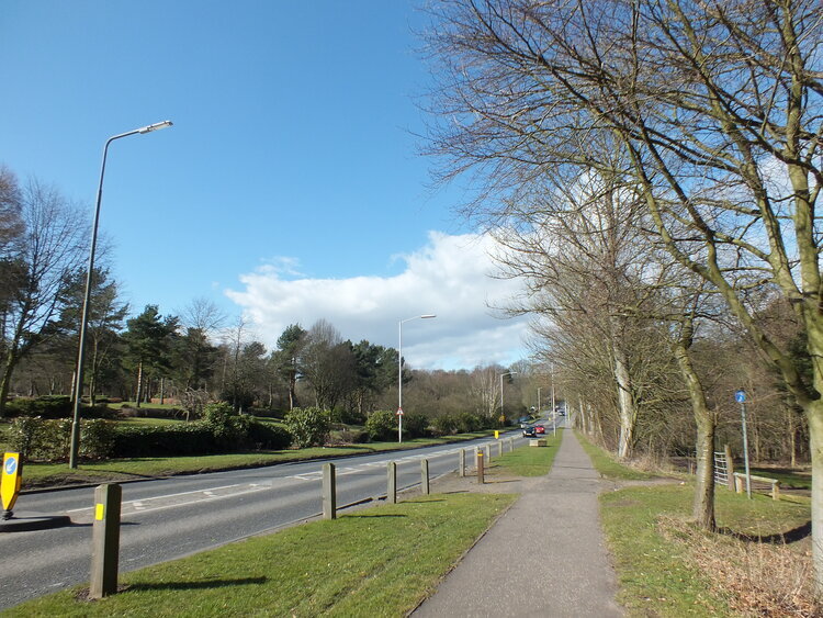
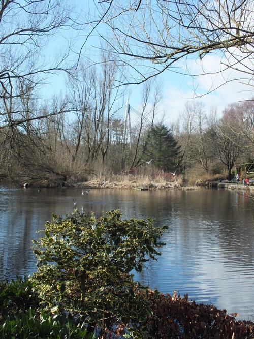
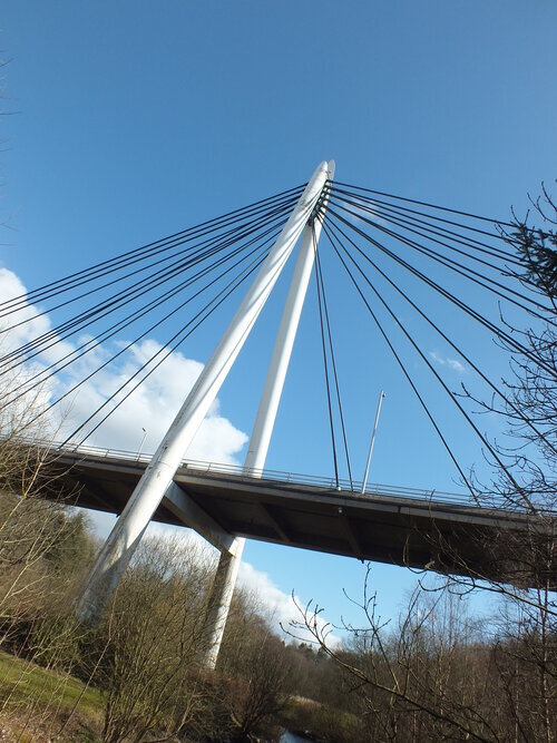
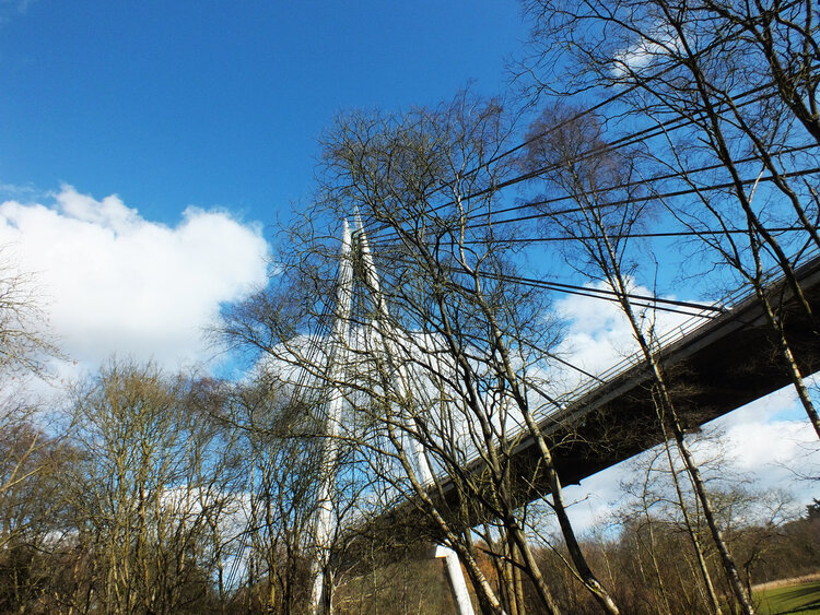
finally some architectural inspiration, and we’re back to somewhere we love: portugal!we have admired buildings lisbon before and yes, something something azulejo related should really coming to the blog… but this time we’re going to porto, and not even too far from the picturesque city centre, we’ll just walk a little westward through the architectural hotspot of boavista .
it’s largely a residential neighbourhood but it has a few interesting buildings such casa da musica (of none other than rem koolhaas) and the faculty of architecture (of course!). these are magnificient buildings, which, i feel, deserve their own blog posts later, trust me they’re coming.
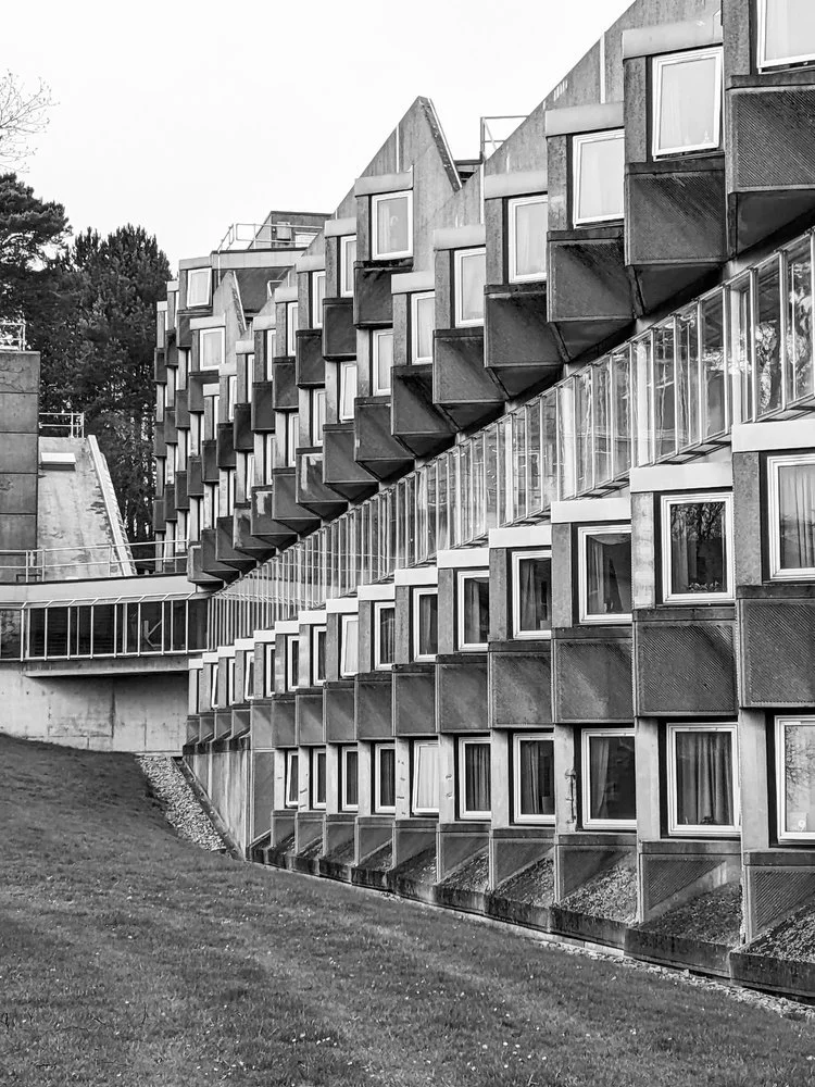
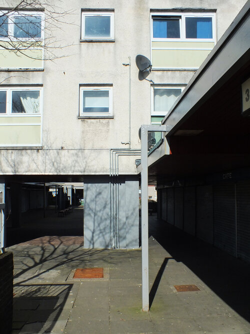
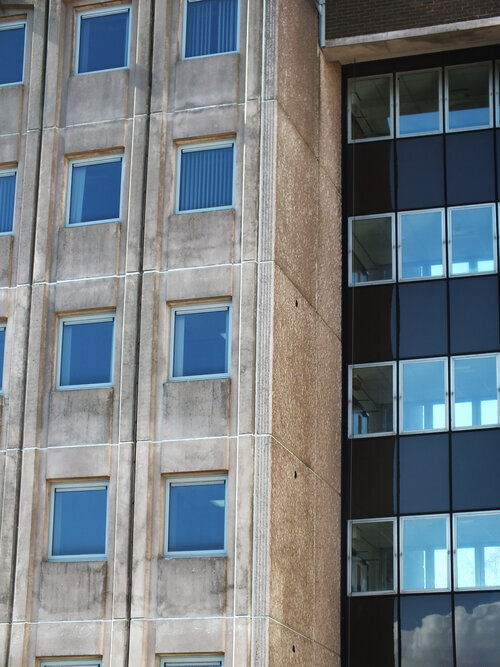
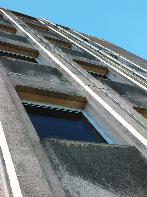
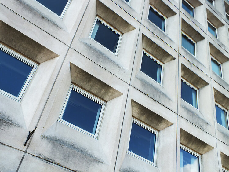
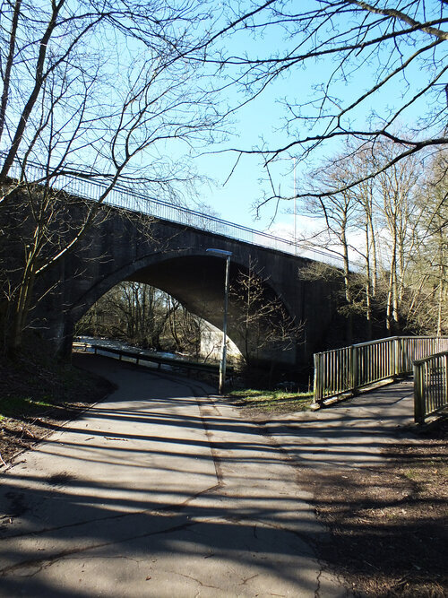
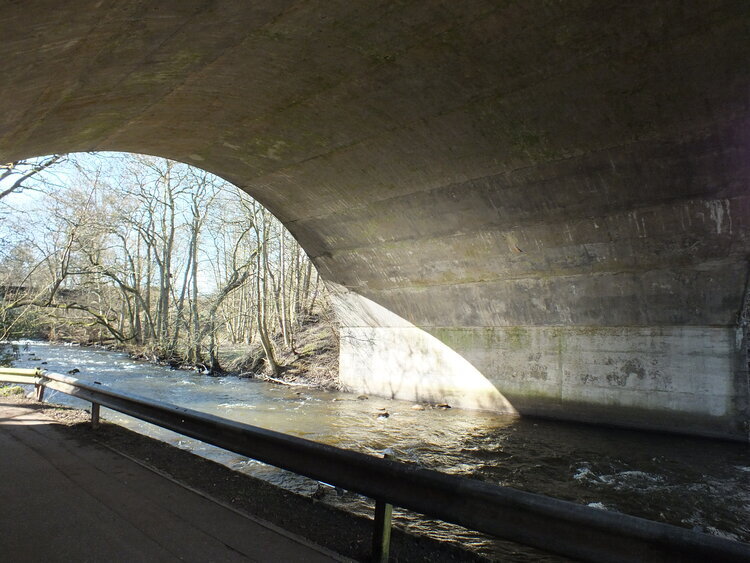
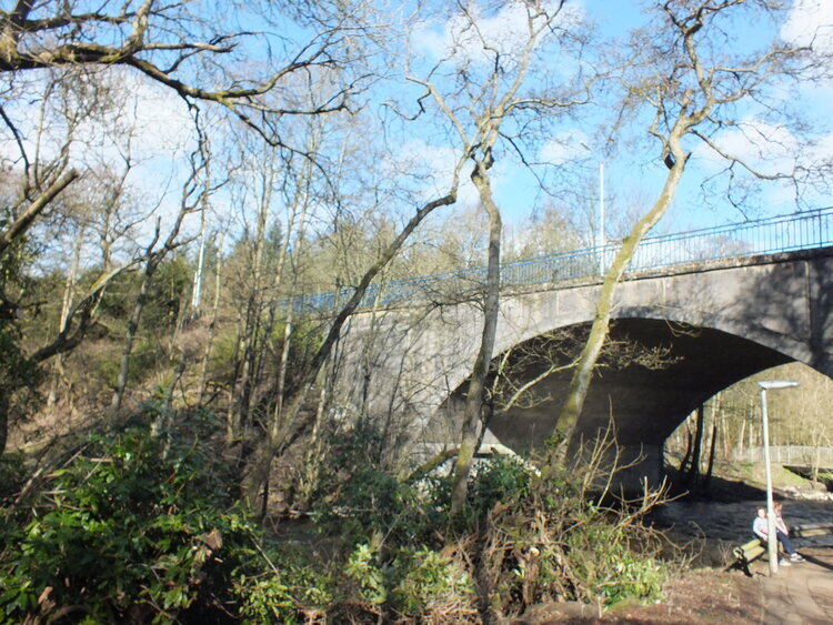
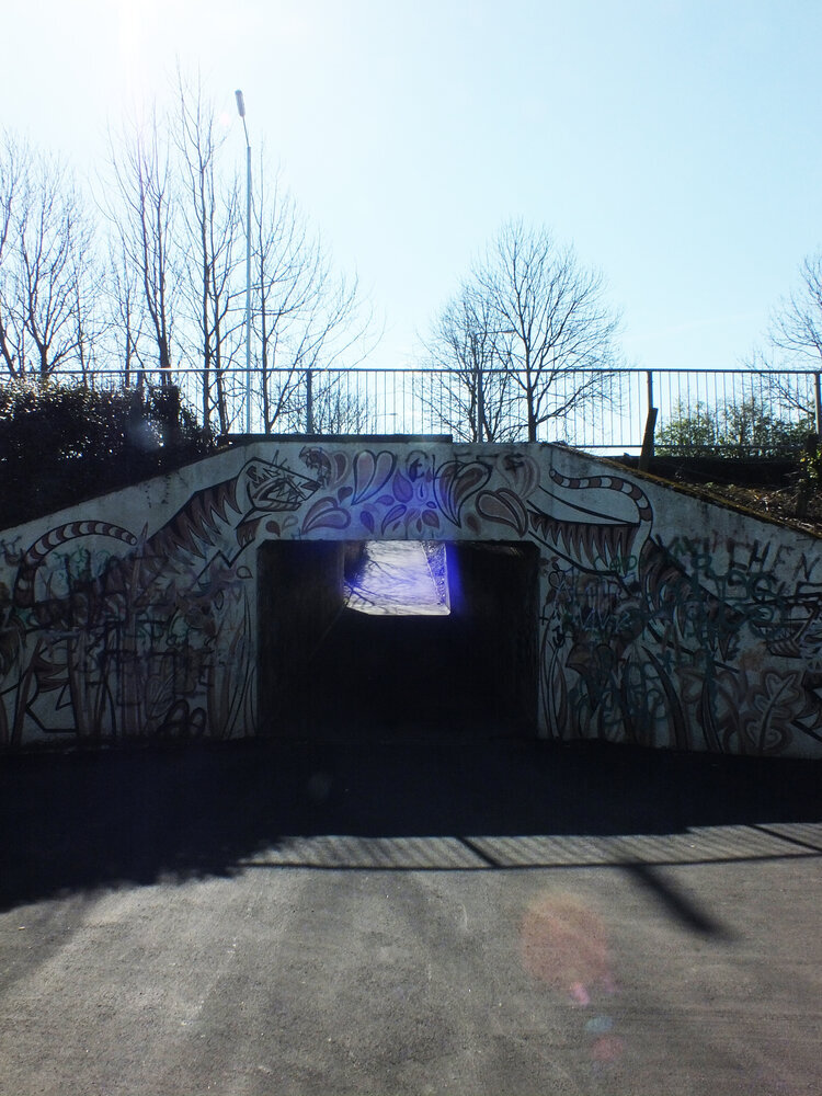
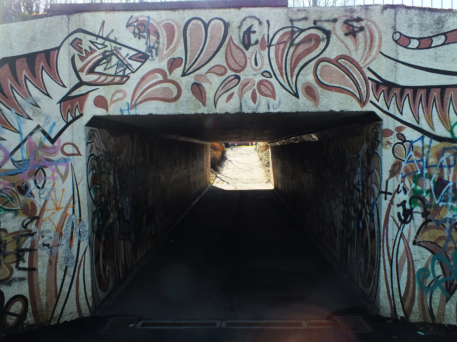
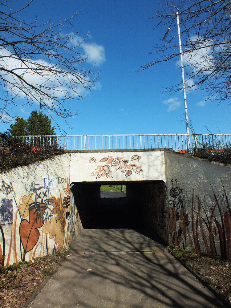
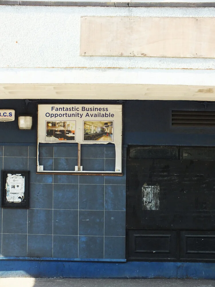
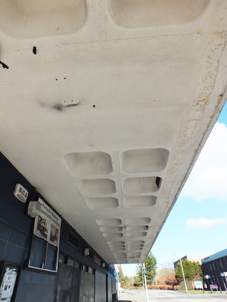
however before we visit these, we’ll just walk through a little bit of the residential streets to two lesser visited sights, one i discovered completely accidentally. i was in search of porto’s brutalist church, paróquia de nossa senhora boavista, when, the residential low-rise architecture suddenly gave way to an immense, towering slab of brutalism: estádio do bessa século XXI, home of boavista f.c.
the football club itself is currently non-operational at a professional level - although there was some visible activity, they do not participate in any of the leagues just now and of course visitors couldn’t go inside to inspect the pitch. but the football was entirely secondary to the vastness of the structure itself.
what makes it magnificent is the sheer, un-decorated scale of the exterior framework. massive, vertical board-marked concrete panels soar upward to hold an immense structural volume, using nothing but its own structure. there is a beautiful, organic honesty to how concrete ages under the sun and rain; a raw, weathered texture that commercial design processes spend years trying to artificially replicate. it was a brilliant reminder that when a grid is strong enough, it doesn't need to ask for attention.
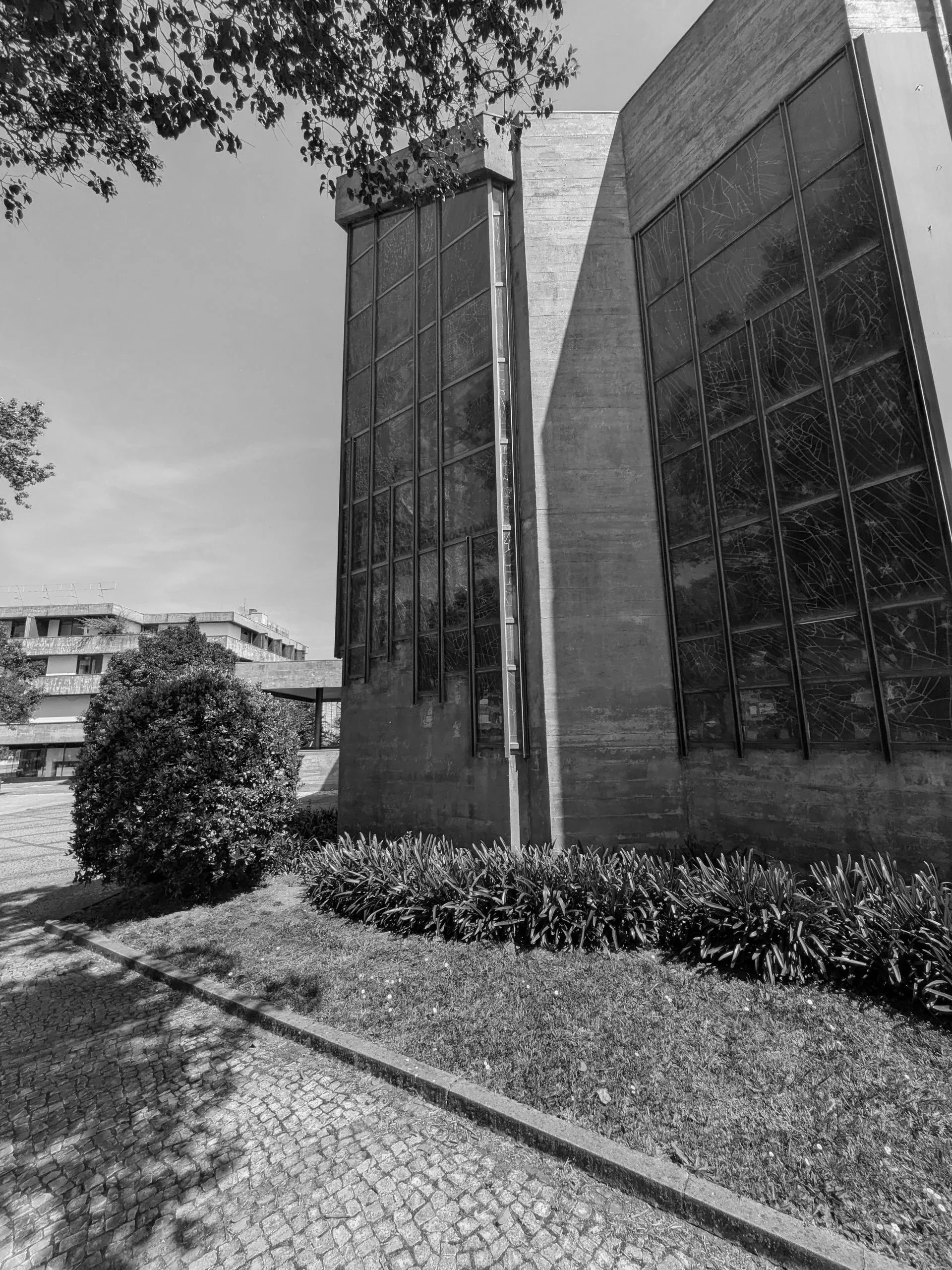
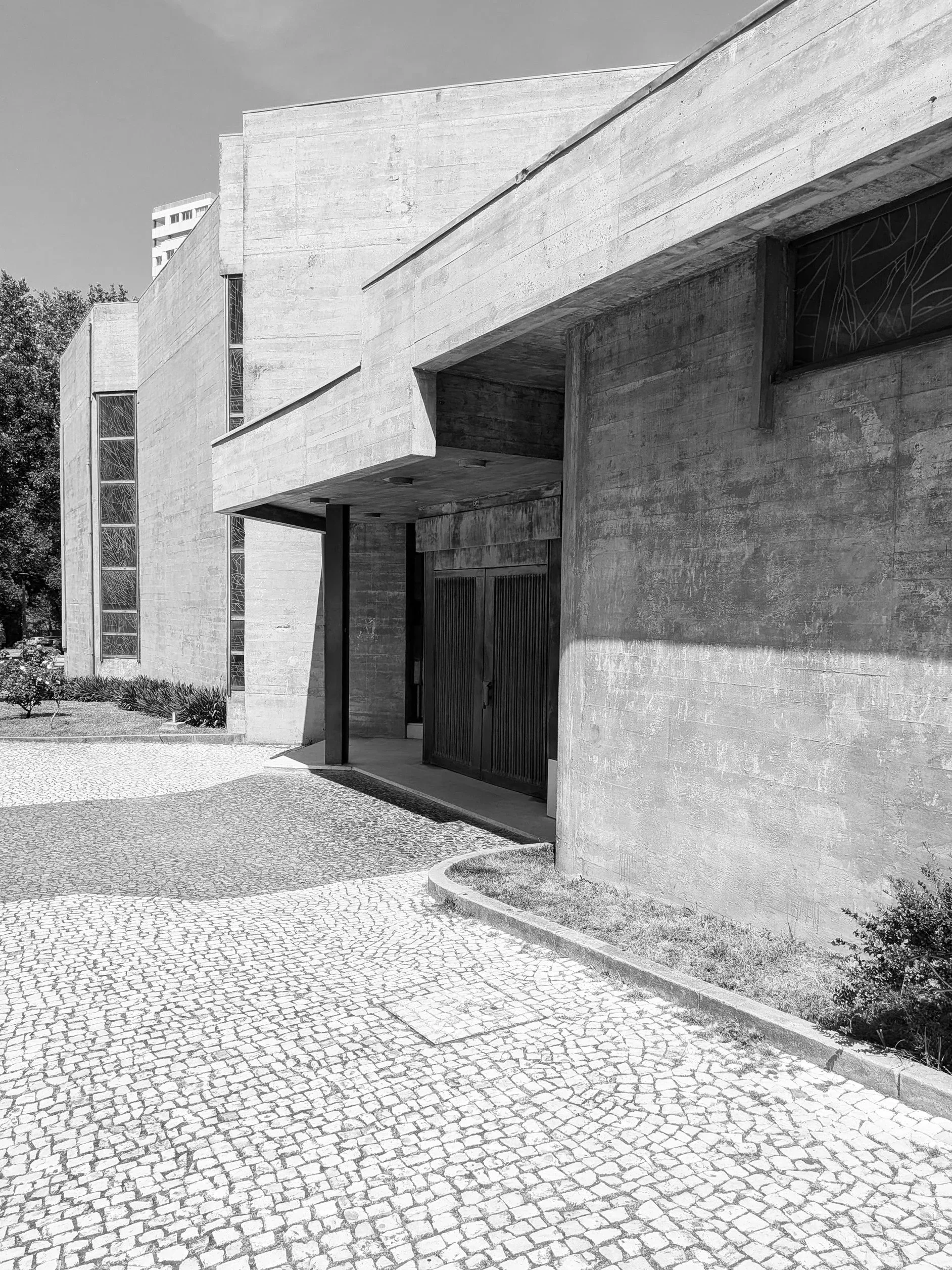
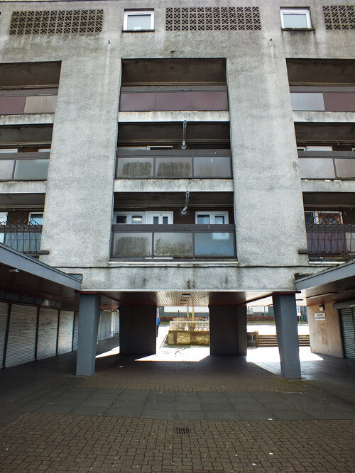
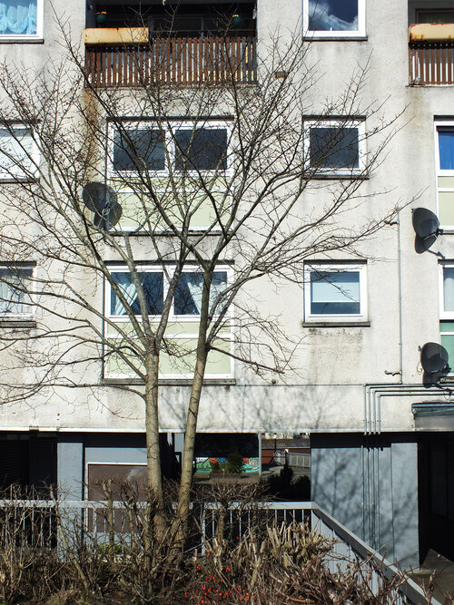
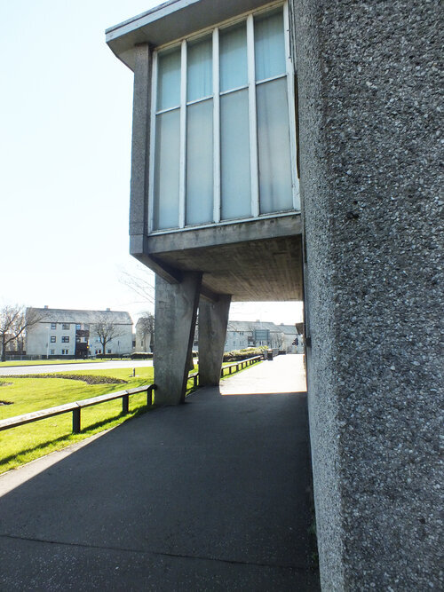
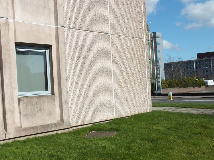
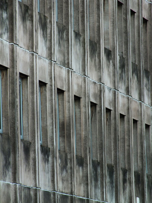
continuing further down the same street, he stark monolithic scale of the stadium shifts into a dense residential grid of modernist blocks. nestled right into the heart of this community, serving the surrounding apartment towers, sits our church, the paróquia de nossa senhora da boa vista. designed by the architect agostinho ricca, the church feels less like an isolated monument and more like a functional civic anchor for the local streets.
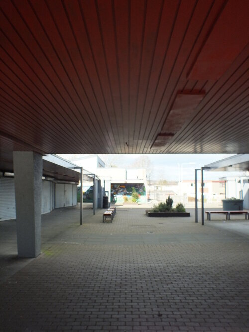
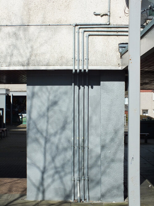
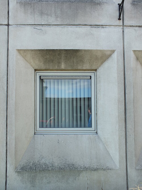
the doors were not open at the time of visit and as such an interior inspection was prevented but brutalism is rarely a style that hides its logic on the inside anyway. the building uses a staggering network of cantilevered concrete canopies and deep recesses that cut sharp, graphic shadows into the stone pavement. the ground beneath your feet isn't just a walkway; it is a meticulously laid out grid of traditional cobbles intersected by dark paving bands that frame the spatial navigation of the entire site.
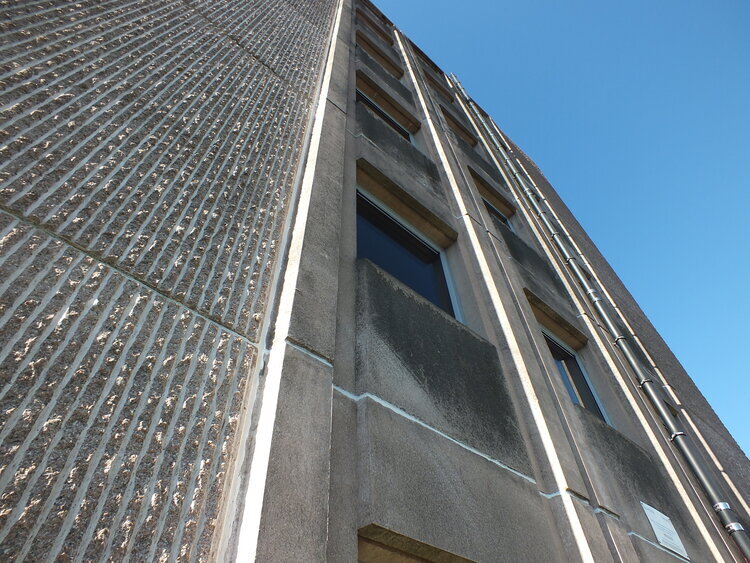
standing directly under the main canopy, the overhead mass feels impossibly heavy, yet it is perfectly balanced by the strict linear staircase leading into the dark entrance. it is a lesson in how to create a physical transition, forcing you to acknowledge the structure before you even cross the threshold.
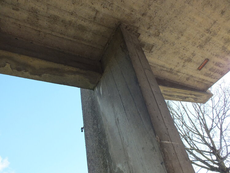
looking up, ricca’s genius becomes even clearer. the bell tower swaps traditional religious ornament for a series of vertical concrete fins that resemble a massive, modernist pipe organ. under the blazing sun, these fins break the light into a rhythmic pattern of high-contrast vertical lines. it is exactly what we mean at zitozza when we talk about a structural framework: the form itself is the decoration.
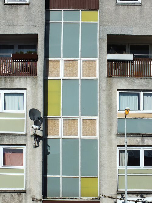
moving around the side of the nave, the concrete walls turn into a spectacular piece of abstract lead glass window of the entire corner building, which i wish i could have seen from the inside as the sunny day would have allowed for some amazing light through for sure.
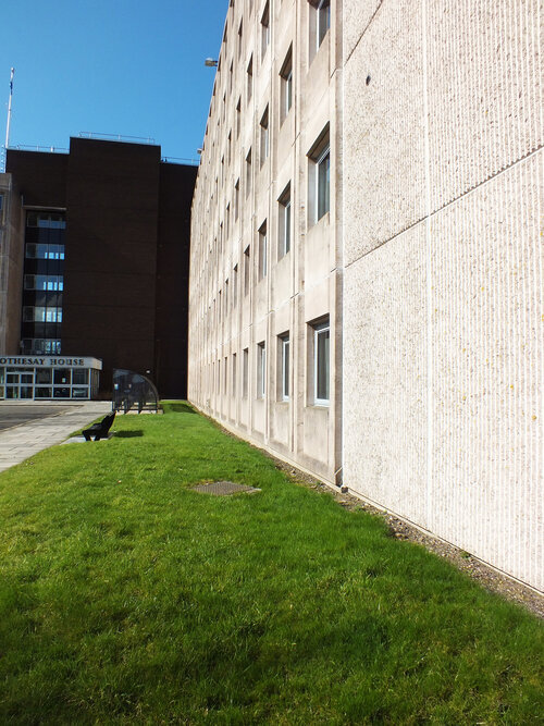
the church does not exist in isolation of course, it sits surrounded by tidy, tended urban nature and residential blocks and shopping centres, neatly weaving together this part of the city - with a road leading to our next stop, casa da música.
this walk was a necessary recalibration for my mind. the rules do not change. you create a clean, honest, highly functional grid, and you step out of the way so the material can tell the truth. follow the journey for the next stop.
this is going to be a bit of a hot take but those who follow me on instragram has seen me make this point before. i’m going to argue today that brutalism is actually cosy and it merely has a reputation problem. controversial or what? it is in fact bare, raw and… well, concrete, duh. perceived to be cold, harsh and as a style that overwhelms rather than invites. but spend enough time in these buildings and you might notice something else: a surprising sense of warmth.
it won’t be that the concrete has grown a softer texture all of a sudden, it’ll be precisely because of the materiality.
material honesty
rough surfaces, textured finishes, exposed joints, unpolished edges: brutalism has always been about revealing materials as they are. nothing dressed up, nothing concealed. and that honesty creates a kind of liberation, and with it you find comfort.
block printing works on a similar principle. every impression carries the grain of the fabric, the edge of the block, the rhythm of the hand. the result is never pristine, but it is always real. the imperfections aren’t flaws, they’re the thing that makes the pattern tactile and alive.
structure meets softness
what often goes underappreciated as well is how calming order is. the stark geometry of stacked, modular units leave no room for chaos. being enclosed by forms like that brings a sense of peace.
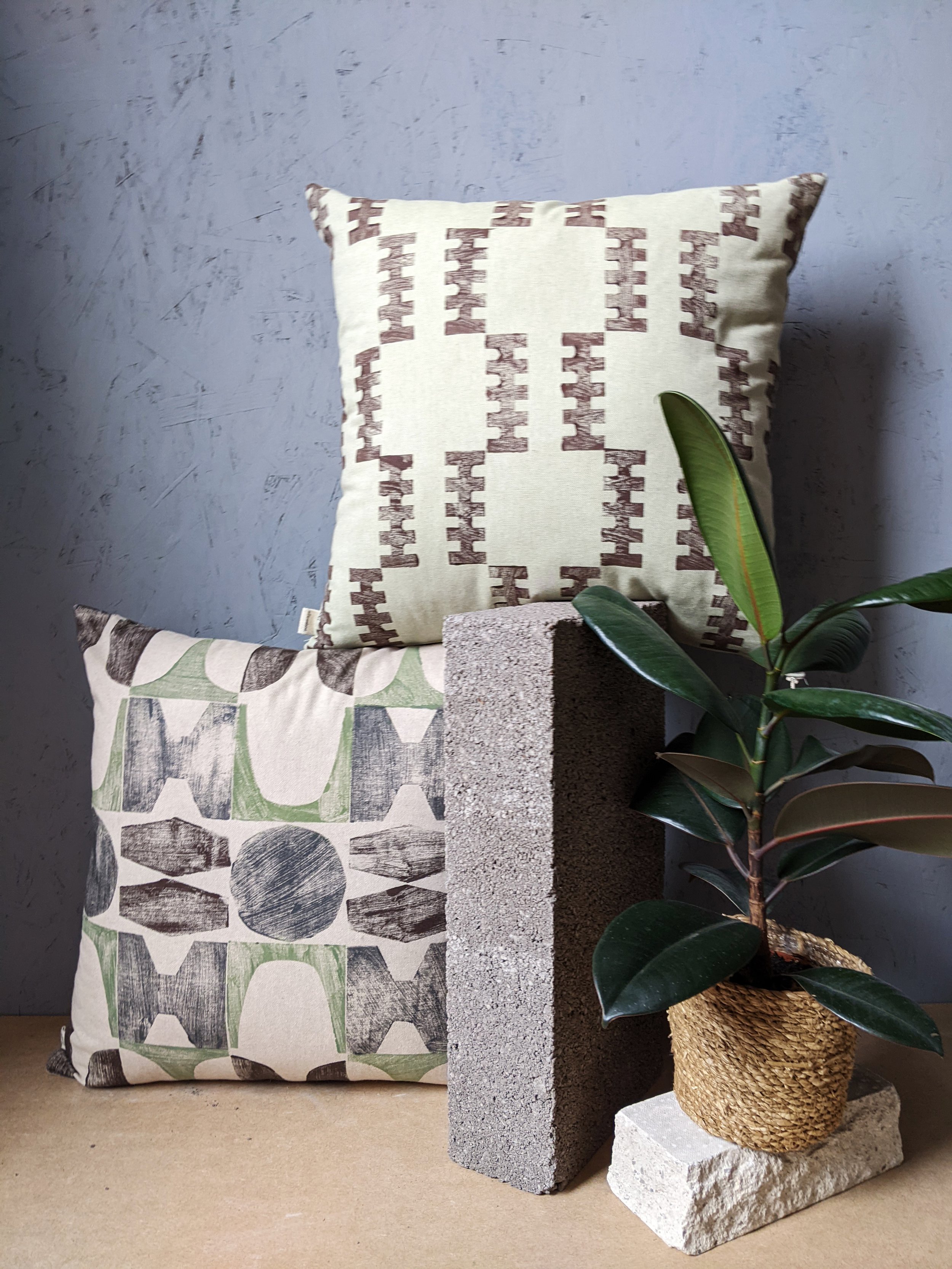
pairing block-printed textiles with brutalist or modernist interiors makes sense for this reason. the patterns mirror the structural logic of façades (repeated, modular, rational) while the fabrics introduce tactility and warmth. the concrete provides weight and permanence; the textiles provide softness and touch. together, they balance each other out.
warmth through materiality
so perhaps brutalism isn’t as uncosy as it seems. it’s not about decoration or ornament, but about surfaces that tell the truth, forms that cut through chaos and create order. if you add the softness of textiles that share the same philosophy — honest, textured, imperfect — you will get interiors that feel grounded and, yes, cosy.
cosiness doesn’t always come from softness, or softness alone. sometimes it comes from order, calmness, a sense of peace and from the way materials meet and interact. and brutalism, surprisingly, has plenty of that.
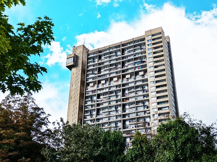
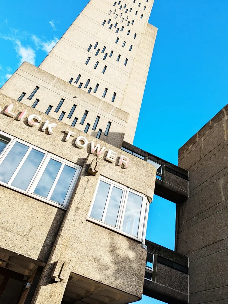
just like with the barbican, i have kept postponing blogging about trellick tower for a long time. what could i possibly say about this building - especially to fans of brutalism - that hasn’t been said before? every building is visited with textiles in mind though, so i decided to have this special “architectural inspiration” post, in continuation with our previous post about turning buildings into interior fabrics.
trellick tower is the icon of british brutalism (designed by a hungarian!) and ever since it completed in 1972, the public has been in a love and hate relationship with it. if you peel that emotional layer off though and look closer - it will reveal itself as a system. the vertical lines of the service tower, the repeating blocks of the residential units, the rhythm of balconies and windows: all of these details work together to form a precise, structural language. walking around it, the geometry is impressive and imposing. this building heavily contributed to our PANEL printing block set, directly inspiring a pair of tiles too - a direct translation from architecture to textile.
vertical logic
the printing blocks in question come from the service tower. this housed the oil-fired boiler and has lift access to every third floor - it is now defunct as the flats have electric heating but the tower is part of the iconic structure and it is the lean, vertical windows that became our motifs.
the service tower rises like a spine, attached to the housing block at a neat logic of every third floor. when i translate this into pattern, each unit also becomes a block — rotated, repeated, layered — to capture the same vertical rhythm. my printing blocks aren’t meant to be identical copies of the building; they’re an abstraction, a reduction of the structure into a repeatable unit. this is what makes the pattern modular, repeatable and flexible enough to inhabit different surfaces, from rugs to cushions - so far removed from ernő goldfinger that you perhaps not even want to know the origin - nonetheless i hope you find it interesting!
repeating blocks
everything here is very abstract of course, and the the other blocks within the PANEL section come from different buildings, less directly related to the facade but you can think of trellick tower too of course, the residential units themselves offer another layer of inspiration: clusters of windows and balconies create a clear, repeating grid. don’t be fooled by the neat facade, the flats have surprising variations between them. there is a deeply human scale within the monumentality of the building, and they do influence my printing blocks. when printed, these grids maintain their structural integrity, but the tactility of jute, linen, or cotton softens the rigid form. the repetition is comforting, methodical, and quietly playful — a domestic echo of the tower’s public-facing logic.
from public to private
trellick tower is both loved and hated — its enormous and imposing, raw and almost alien and yet the rhythm of its facades is surprisingly intimate and enclosing, and, dare i say cosy, just like textiles for the home interior.
translating this into textiles allows the same architectural thinking to live in interiors. a cushion, a rug, or a framed print carries the rhythm of the building, but at a scale and material that invites touch and domestic interaction. it’s architecture reinterpreted, rather than reduced.
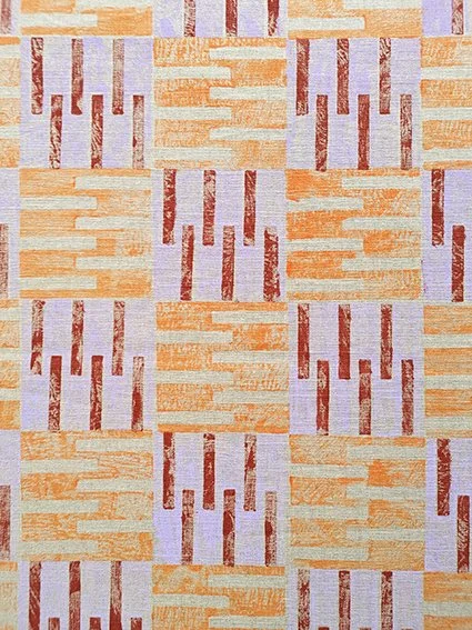
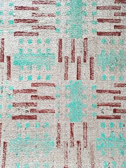
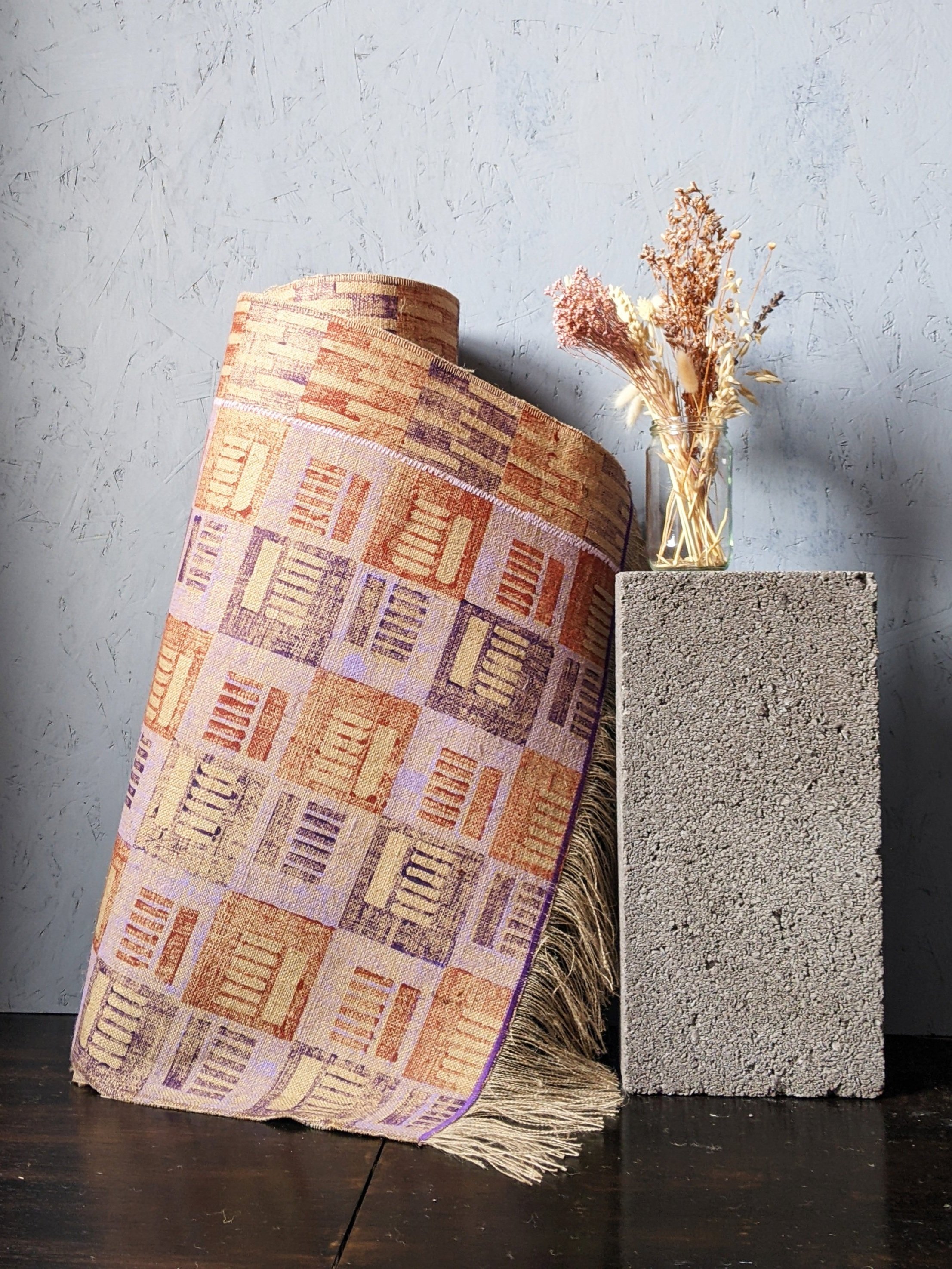
another brutalist rug - inspired by another london landmark. a busy, geometric print with soft, on-trend pastel purple and darker terracotta tones. it’s a beautiful and interesting accent piece in a cosy and colourful modern home, this rug was printed in the most architecturally inspired PANEL tileset evoking the housing units that inspired them. on one side of the rug there is a one-tile-wide column attached (with a pastel purple stitch) to resemble the boiler house and its facade of the iconic trellick tower by hungarian-born architect erno goldfinger.
it’s 70 cm wide and 158 cm long, including the 11 cm tassels at the short edges, stitched with a dark purple accent trim. a perfect addition into a contemporary, boldly styled home decor. top layer and backing material: 100% jute. wipe clean only. handmade in scotland
who says brutalism has to be grey and monotone? embrace the pastel sugar colours with this cute little stitched rug, made up of four parts, all printed in our housing block inspired PANEL tileset. it’s a dynamic, architectural print in pretty spring colours - mint green, pastel pink, and contrasting terracotta and lush green. a sweet accent piece in a modern home.
it’s 80 cm wide and 162 cm long, including the 11 cm tassels at the short edges, stitched with a pale pink accent trim on the short edges. wipe clean only. top layer and backing material: 100% jute. handmade in scotland.
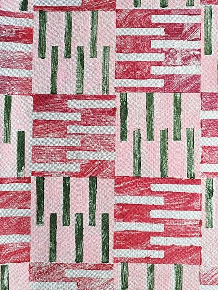
a hard, brick-like look but a soft, comforting touch. this recycled cotton blend cushion is a perfect little accent piece, printed in our PANEL tileset, inspired by brutalist housing blocks. it’s an interesting repeat in pastel pink, brick red and olive green colours for a warm, earthy, contemporary touch. the perfect design addition to complete a modern home.
the cushion is 50cm x 30cm and printed on both sides. you can purchase with the pad, or just the cover only. cover: 87% recycled cotton, 13% recycled polyester. machine wash at 30C, do not tumble dry.
materiality in translation
just as architects consider how concrete interacts with light and weather, the choice of textile matters. ink on rough linen, for example, reveals layers of pattern in the same way light falls on raw concrete. modular blocks can be repeated, layered, and rotated, and different fabrics give each iteration a unique depth.
walking around trellick tower, one begins to see it less as a singular object and more as a system of relationships — verticals and horizontals, solids and voids, human scale and monumental scale. the challenge in the studio is to preserve that logic while making it useful in domestic interiors. the resulting patterns are structural, repeatable, and thoughtful, but also soft and tactile: a domestic dialogue with a building designed to be cosy yet monumental.
we’re back and finally able to sit down with our thoughts after having watched (and somewhat forgotten about) the brutalist movie. in that review i encouraged the research into the work of the real-life hungarians and brutalists whose lives the fictional story was based on - and i decided to start with marcel breuer since i received a great book about his work for last christmas.
those into design will know this already but i always like starting with the facts, he was born in 1902 in pécs, southern hungary and was one of the youngest students (and mentors) at bauhaus. he went on to establish his own practice in berlin, and after a two-year stint in london he moved to the states in the 1930s, first to teach architecture at harvard, then later to new york city where he continued to practice until the late 1970s.
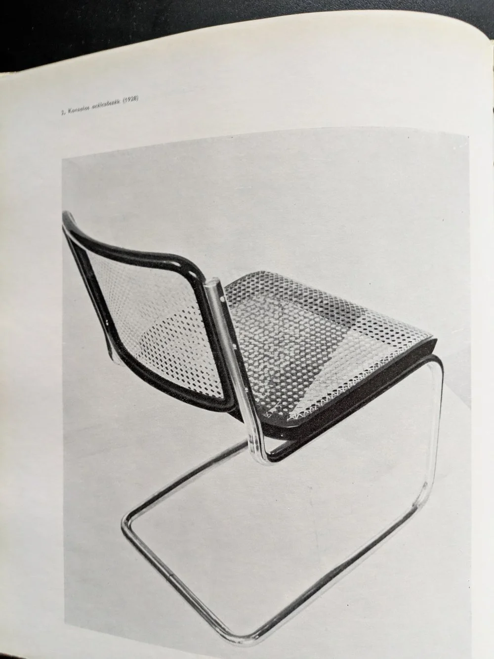
the cesca chair, 1928
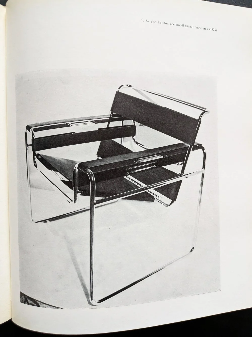
the wassily chair, 1925
for those into design, it’s also easy to recognise the heavy concrete masses of marcel breuer’s brutalist buildings — the hulking cantilevers and deep shadows of the 1960s and 70s that have since become icons of modernist architecture. but what’s more compelling than their visual impact is the thread that connects them to breuer’s earliest work. his design logic didn’t emerge suddenly in béton brut — it evolved from an obsession with functionality, structure, and modularity that was evident from the very start.
before architecture of course, there was furniture. in the 1920s, as a young bauhaus student, breuer designed the wassily chair using steel tubing — a radical departure from traditional craft at the time. lightweight, repeatable, and industrial, the chair wasn’t just functional: it was a system. breuer’s approach treated each part as a modular unit, capable of being assembled into something greater than its parts. this thinking didn’t just define his early designs — it forecast an entire architectural philosophy.
IBM research centre, la gaude, france
IBM research centre, la gaude, france
UNESCO headquarters, paris
UNESCO headquarters, paris
fast forward a few decades of immense architectural output (his practice designed more than 100 buildings), and the same logic manifests on a much larger scale. buildings like the UNESCO headquarters in paris (1951-1958), the IBM research centre in la gaude (1960-1961) or the iconic whitney museum in new york (1963-1966) carry the same DNA — modular systems, articulated forms, and a deep respect for material honesty. breuer’s concrete isn’t decorative. it’s structural, expressive, and fundamentally rational.
the book i’ve been reading — published in 1970s, written by máté major, long out of print, with that peculiar warmth of faded paper and sans serif fonts — documents this journey. the photographs, drawings, and models inside don’t romanticise his work; instead, they reinforce the relentless clarity of his method. whether designing a chair or a cultural institution, breuer asked the same questions: how can material, form, and repetition serve both function and expression?
whitney museum, new york
whitney museum, new york
as someone with a hungarian background myself, i’ve always felt a connection to breuer — not just because of the cultural context of course (despite our country being somewhat late and reluctant to recognise him), but because of how he saw the world through systems. that kind of thinking, for me, translates into surface design: building pattern from modules, constructing rhythm, shaping repetition. of course, my materials are softer, but the logic is not so different.
breuer reminds us that beauty can be found in structure — in the clarity of parts assembled with intention. whether it’s furniture, architecture, or textiles, that modular imagination still resonates.
hello again! we have some news for you, or more like, a review. not a building or a book this time, but a fictional story which i’m not that used to. however when something titled “the brutalist” came onto the scene about a hungarian, of course i felt obliged to visit the cinema for the third time in the decade and i thought i’d share my thoughts with you.
i want to emphasise though, that i am not a story person, it’s probably personally my fault that cinemas are dying, i can’t keep up with any series and, despite loving books and reading, the last piece of fiction i read was probably in high school. i am not proud of this, i am just providing some context for this review so you can safely ignore my take and go view it yourself. the first thing i want to say that it is beautifully made and you can tell that everyone involved in the making of this film took their craft extremely seriously. it is rather spectacular, filmed with a 1950s technique called vistavision, and it’s quite something i recommend watching in the cinema. there is an interesting score throughout, the writing moves at a decent pace despite the long runtime and the actors all do a fantastic job (with a bit of ai enhancement- the hungarian did sound fluent mind you.)
the second thing i want to say about this film though that if you were expecting to see a lot of cool design and beautiful architecture, you will be disappointed. when i first read about the story, following a hungarian-born brutalist architect finding his feet in america after the war, i was hoping it would be more closely inspired by icons such as marcel breuer, lászló moholy-nagy, or even ernő goldfinger but it is a different story. most crucially, our fictional hero, lászló tóth (adrien brody) was unfortunately not able to escape the horrors of the holocaust and moves to america only after having survived it, in 1947, having to start his life and career all over again.
the long runtime is split across two halves, and in the first half, taking place from 1947 to 1952, we see him taken in by a relative (alessandro nivola) who gives him a job in his furniture shop in a small town in pennsylvania, where he meets a wealthy businessman (guy pearce) who will later hire him to design as a sort of memorial to his family for the community, a cultural and sports centre with a library and a church (yes, all that in one building.)
watching this half of the movie i thought this film should be titled “the modernist” instead, as we see him in a quite contemporary struggle of being radical and different in a somewhat more conservative environment. this would be fairly relatable to any millennial i’d imagine, but i’m not sure how true to the depicted age it really is. at one point he creates a steel frame furniture set, reminiscent of something by marcel breuer, only to be met with indifference and rejection. in real life the cesca chair for instance, was a huge hit that would influence furniture design for the rest of the century and further, and, by 1948, it was already a 20-year old design. i’d imagine even in small town pennsylvania it would not be seen that unusual - this is still the country of charles and ray eames. for more context, the new bauhaus, founded by the very real lászló moholy-nagy, was already open in chicago for about a decade by then.
instead of joining them, his supposed ex-colleagues, our hero shovels coal until he gets hired by guy pearce’s unscrupulous character - if this is a metaphor of the loneliness of the average 2010s creative trying to get by in a foreign country with an evening job whilst on an unpaid internship in the hope of securing their first temporary contract at a big-name studio surviving on lawsuit payouts over half-built vanity projects, then i guess it works - i can assure you that an entire generation got the t-shirt.
however as a believable story set in a golden age of industry and building, it does not work as much, although i only have the word of art history books as i was not alive at the time. i do accept that cutting edge modernism wasn’t ever truly “mainstream” as such, but during the time the film was set, it was at least desired, aspirational, and, i’d imagine, decidedly cool. the second half of the movie picks up in 1952 - modernism is massive in the states by now, and for a bit of global context, despite still the rationing, festival of britain is already happening across the atlantic, chandigarh is being built by le corbusier in india and the plans for brasil’s new capital will also be drawn up in a few years time. the film completely forgets about this enormous, global movement of hope and optimism. eyewatering budgets are approved for huge projects to be built, celebrated for generations afterwards. this is a unique era in history of unmatched ambition and prosperity, with a real creative buzz in the air - and this context, this positive mood is entirely, and sorely left out of this miserable story.
then it falls apart a little bit more and there is a revelation in the epilogue that i will spoil below, so please do not read further if you have not seen it yet and want to.
it turns out that the main concrete building (which we never get to see in full) is a replica of the architect’s and his family’s suffering in the concentration camps. no, it is not explained as some kind of visual metaphor, we are explicitly told that it is a near-exact representation. now i understand why a filmmaker, a storyteller might think it works - of course, there are many stories of awful, unimaginable suffering that are told beautifully. but i do not think that spatial design can be like that and i struggle to accept that you can physically recreate the worst known hell on earth and offer it as a sanctuary and place of relaxation and learning for the community. if you really believe that form follows function, then you simply cannot take a building where the function was the extermination of people and give it a different function, especially not of recreation. in fact i find it really quite distasteful towards the memory of the holocaust. i also think it is strengthening this lazy and misunderstood idea about brutalism, that it equals brutality and that the raw surfaces and austere interiors can only come from a place of oppression, imprisonment and suffering. this is quite damaging towards this style of architecture and it might not help the celebration and preservation of these buildings - although if the movie wins awards hopefully it becomes a bit more recognised.
so despite all the miserable nature of the film, i hope that you will still get inspired and will want to explore the work of the real-life hungarians and the real buildings of this era - and find the hope and optimism in the works along the way. i have just got my hands on a hungarian book about marcel breuer from 1970 (when he was still alive) and i will write about this next. subscribe below to be the first to read about this and more brutalist wonders.
today is a special day as this is going to be my first ever post about hungarian brutalism. i’m not entirely sure why i haven’t blogged about anything in my home country before - perhaps the pressure to know more about these buildings than i do is too much! but i guess the time has come to present something cool and exciting and interesting - this is one of the more famous ones and as such, an internationally more accessible and digestable example - that is the OKISZ offices in budapest, hungary.
built between 1971 and 1973, this office complex is located in a particularly leafy pocket of zugló, the 14th disctrict of budapest, almost exclusively surrounded by art nouveau villas and churches. the architect is recordedas jános mónus - who won an ybl-award (a sort of hungarian pritzker prize i guess) for the “high quality fusion of structure, technology and form” demonstrated in this very building. the company was ÁÉTV at the time, the state development company (according to the construction archives, operational from the late 50s until the late 90s) tasked to build public-use buildings for budapest: schools, hospitals and of course, offices - this one to house the countrywide union of small-scale industry bodies (the acronym is the OKISZ in the building name) and i’m really sorry that the language of the economic structures of socialist hungary does not necessarily translate too well to my engllish language readers but hey i’m trying my best!
it is a striking, fine piece of brutalism that understands and seamlessly fits into its environment without losing its character, not trying to be imposing without being too modest. a review from 1984 claims - and i’m paraphrasing somewhat, that “it would have been shameless and impolite to try and compete with its surroundings, however you should also live up to such an environment full of notable buildings” and it does do a remarkable job at that.
it has an exciting elevation of five floors stacked upon each-other in a dynamic, stair-like manner and a somewhat L-shaped plan. the facade continues this rhythm of protruding concrete mullions between the slick windows - for those who love this style it’s a bit of a jackpot i think. i went on a freezing cold january day in thick heavy snowfall - the white contrast it created with the concrete was really eye-catching from a pattern point of view too, but it also somehow emphasised the spatial nature of this building.
obviously, this is a textile designer’s blog, so i’m a layperson when it comes to the ins and outs of the structural geniuses of such architecture, but eye-pleasing proportions are, i think, a universal language that can be appreciated by everyone.
brutalism is also not necessarily inherently minimalist, you can notice fantastic details even outside - but this is also an interior textile blog so i was yearning to go inside. even though i could not (in fact, a security guard came out to check what i was up to outside too, haha!) however as a part of othernity, the hungarian project for the venice biennale for 2021, a series of guided walks by the centre of contemporary architecturewas organised back in 2020, several bloggers and journalists attended taking amazing photos of the inside. it looks very 1970s, cosy and very socialist (every building in my childhood memories has a similar details or typeface i think!) and it also has one of those ever-moving lifts that we call paternoster in hungary.
i’m going to recommend you two of these articles about this walk in 2020, both with brilliant photography - first hype&hyper (if you don’t know them, please get acquainted with this comprehensive cultural quarterly focused on eastern europe.) and also check out the blog post from welovebudapest, with fabulous indoor shots including of the roof terrace.
for the floor plan and elevations, and an interesting drawing on the accompanying furniture design, please see the previously quoted lechner centre article, it’s very insightful! the reason for this many resources available on this particuar building is of coruse the venice biennale project for 2021 - this building was one of the 12 selected to represent the hungarian pavilion. all 12 were focused entirely on this particular era of architecture and architects of our surrounding countries were invited to participate in their re-interpretation.
despite this celebratory re-discovery happening, brutalism in hungary is quite endangered and none of these buildings are under listed status, however many are loved and used and perhaps the attitudes are changing somewhat. after years of the somewhat over-politicised and emotionally fuelled attitudes the architecture of the socialist era in hungary, it’s refreshing to see it getting more appreciated and putting some of these buildings into a more recognised place. i hope to bring you more examples of hungary in the future.
if you liked this blog post, why don’t you subscribe to my monthly newsletter below to be the first to read our latest musings and updates.
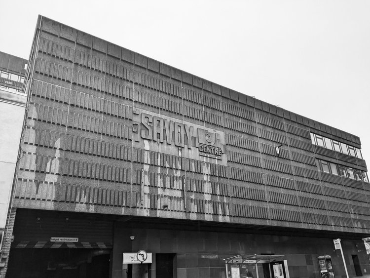
hello again - long time no see and long time without hugging some concrete! this month we finally brought to you TÉGLA, our brand new tileset (after many, many months of work and preparation). these were all inspired by brickworks and facades found on so i want to show you a building with an interesting texture and facade that reflects that inspiration. besides, i think we do deserve a trip now, don’t we? so let’s go on a short but sweet one, just to glasgow - as we’re visiting the savoy centre on sauchiehall street.
quite a striking example example of 1970s brutalism, it was built between ‘71 and ‘79 and designed by gavin paterson & sons, on the ruins of the old savoy theatre. it now consists of a shopping centre complete with an indoor market, and an 11 storey office block.
obviously, the purpose of writing these blog posts is to celebrate these concrete designs and bust thay common myth amongst the naysayers that these are depressing buildings - on a particularly overcast day in the glasgow winter it does unfortunately seem to be a bit of a task. rain-soaked or not though, the building has an impressive, exciting looking elevation walking up on hope street (connecting sauchiehall street and renfrew street.)
the glasgow weather must have been considered as the concrete clad facade is somewhat protruding, offering a bit of a shelter above head-hight. the cladding features a concrete pattern of narrow vertical rectangles, with a beautiful relief of the centre’s logo (in a typographic design of what i assume must have been, or perhaps inspired by the original 1910s theatre’s.) this logo repeats on the renfrew street side too, painted in blue - a fresh touch of colour amongst the imposing concrete.
the protection from the elements continues as there is a fully sheltered footbridge connecting the north side of renfrew street - taking you right to the first floor of the building. i did not manage to get inside, however i’m told it’s been refurbished and there are plans to further regenerate - not without controversy. you can follow this excellent and insightful timeline from glasgow heritage (who do happen to run a brutalism-related exhibition at the merchant city as well!)
the 11-floor office blocks towers above the more horizontally laying front of the building - the neatly arranged windows do make inspiring patterns (you might discover them on our printed goodies i’m sure!) - it’s a beautiful and interesting building that makes its surroundings a little bit more exciting.
if you enjoyed this trip, go visit yourself and join us on our next trip - subscribe to our newsletter below.
hello again, believe it or not, it’s been another month and a very, very long time since we posted anything architectural or photographic - things have been busy but actually, we needn’t always go on a long, exotic journey to find some good, inspiring facades. for this short little trip, we’re staying in edinburgh today to look at another student accommodation.
the building is at 8 roxburgh place (on the corner of west adam place), you can get to it by walking up the stairs behind the dovecot (this is very specific but if you’re a brutalist textile lover, it’s a highly recommended double trip to the textile studios as well as this concrete monster!)
the building belongs to the university of edinburgh and i can’t for the love of my life find the architect! if anyone knows, do reach out. i’m guessing it was built in the 1960s and recently renovated. by all accounts it is rated highly among students, mainly for the excellent location and the stunning views of the city, and i have zero doubt it’s an absolutely brilliant experience to stay there for your studies.
this is a textile design blog though, so as usual, we’re here for the patterns and the facade does not disappoint. it’s only five floors tall so it’s not an imposing monstrosity at all, and the human scale is made evident by the large window panels and the even facade - all floors are the same height, there is not a grand entrance or an all important ground floor, the seamless repeat of windows start immediately off the ground.
the near-square shaped windows sit in rounded rectangles with some relief details above them and it makes me imagine it inside in the style of futuristic space capsules. this panelling continues on all elevations, even without windows, the details are there, which is quite obviously a pleasing sight to the pattern lovers.
there is a bit of an extrusion on the front side, and due to that, it looks like there is a bit of an offset to the grid of windows, which breaks the monotony a bit and brings some excitement to the facade. i enjoyed walking around here - there is another lovely brutalist gem right across it, a university teaching centre recently renovated by reiach and hall. surrounded by the medieval churches of old edinburgh, they don’t look out of place at all in this living, breathing city.
if you liked this short trip, why don’t you sign up to our newsletter below to be the first to read these blog posts! (it even comes with a free poster you can print at home!)
if you came here looking for ideas for your student accommodation, come and browse our shop!
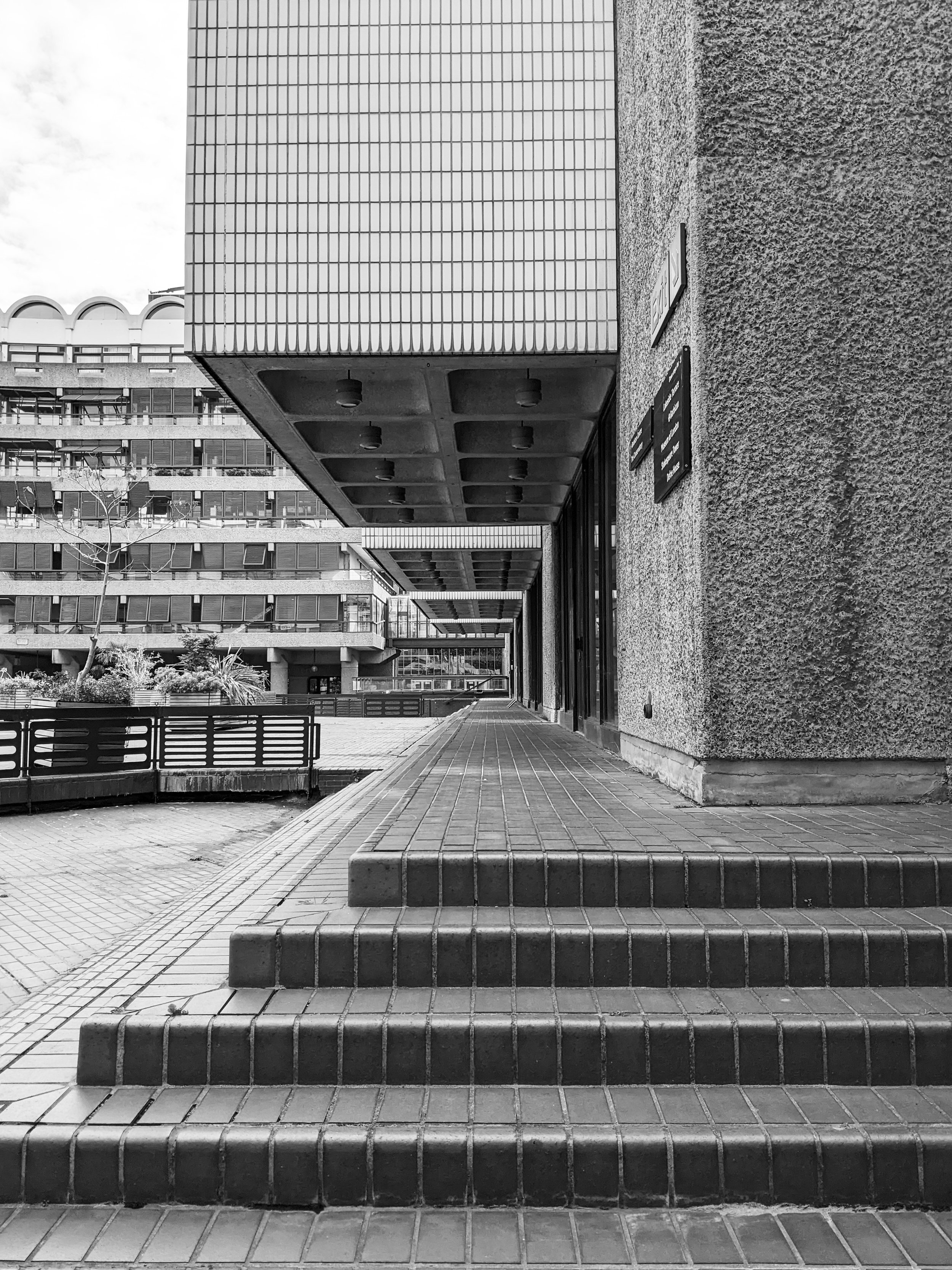
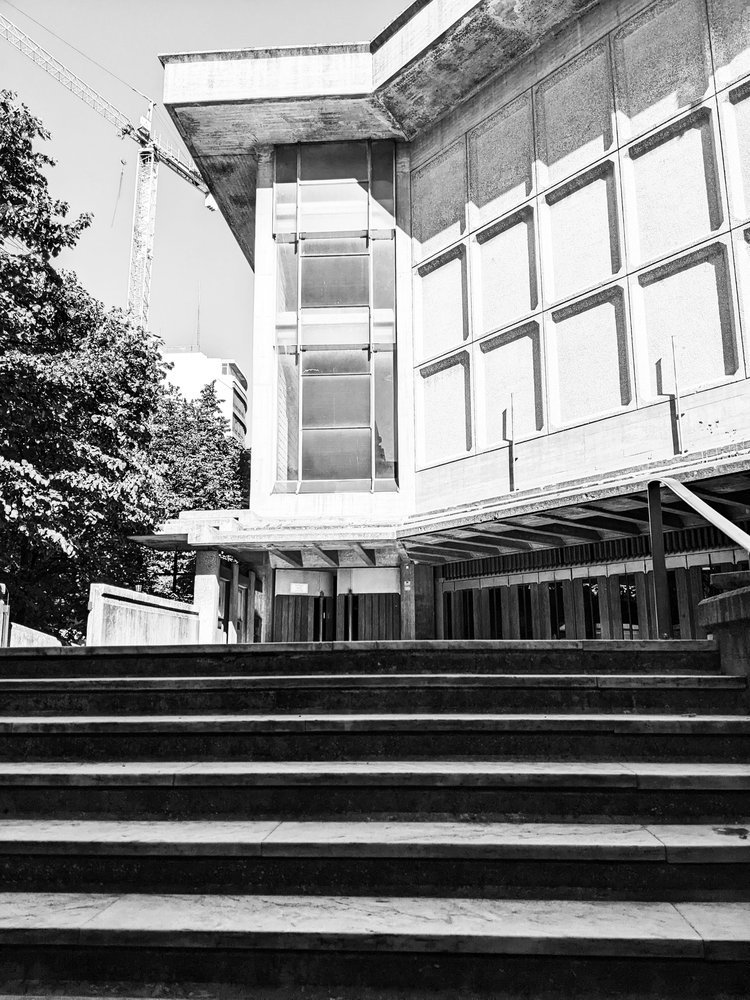
as we are cracking on with 2024, i’ve decided that of the many architectural inspiration series we planned, it’s probably best to tackle the beast first and share some images and thoughts of the barbican estate in london. i’m calling it a beast because it’s an enormous, expensive and very well-known icon of british brutalism. for this seasoned concrete-hugger, it then makes no sense to keep postponing this blog post any further (especially as our rug already exits and more stuff might come soon…), so do come with us to explore the place from a textile designer’s perspective.
i guess everyone somewhat interested in brutalism knows some of the basic facts - designed on a 35-acre ww2 bombsite by chamberlin, powell & bon for the corporation of the city of london, it opened its first flats in 1969 but the completion of the construction only really finished in the late 1970s, after a long and expensive process and it is now home to approx 4000 people in 2000 flats. of course the uniqueness of the estate comes from the fact that unlike many other brutalist projects in the uk, it was not built for social housing and the architects were not held by the typical council budget restraints -which resulted in one of the most free and complete architectural visions, achieved by some extremely time consuming and labour intensive processes.
if you want to know about these in more detail, my first recommendation is raw concrete by barnabas calder. quite early on in the book, he has a brilliant chapter about the barbican, with some focus on the social context around it, from conception throughout the whole of the construction process which makes for a very informative and interesting read as it touches on some of the tensions throughout the whole process of building it. he provides an important angle that does not often get mentioned on design blogs like these, as we tend to get lost in the form and the aesthetics - with good reason of course, but without context it would become rather meaningless.
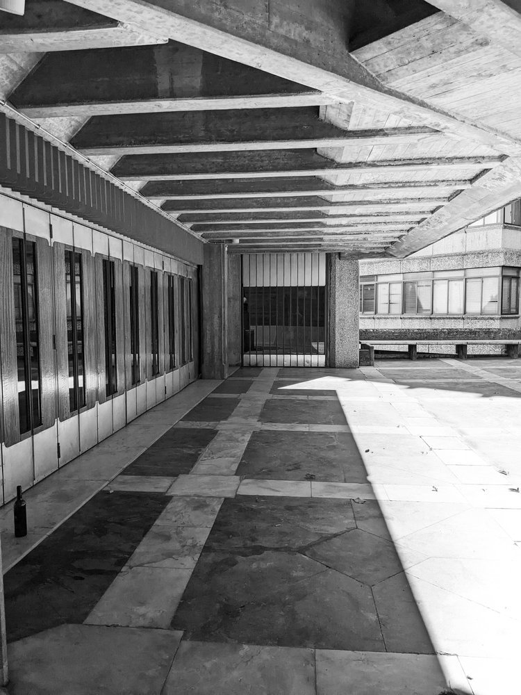
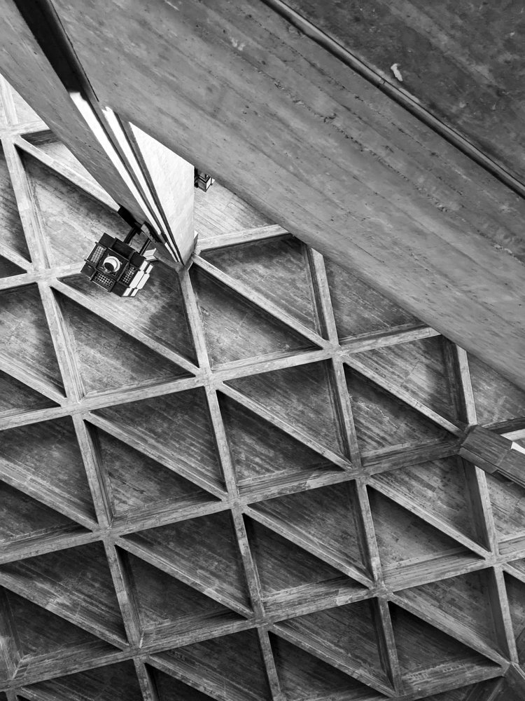
i first visited a couple of years ago and the first thing that really affected my perception was its sheer scale. of course it is at this enormous scale that these visions for the order of forms work the best, and i think this is why it’s such a brutalist mecca here, the complete, intact and vast system of space. i don’t exactly know where my search for a geometric order comes from, all i know is that the deceptively monotonous facade of the terraced blocks (arranged in neat squares of course) gives me a sense of enclosed cosiness and open clarity at the same time. in every one of these blog posts i’m attempting to describe this feeling but it’s so hard to explain - there is just this sense of calm that i only find in places such as this.
the three 42-floor tall tower blocks bring some exciting angles with a lean, triangular layout and column of balconies tightly stacked into the sky. of course, the repeating geometric forms serve a textile pattern designer well. it really helps that i visited on a sunny day and the shadows projected on the surfaces aid the imagination in reducing these sharp angles to two-dimensional shapes. but the surface itself, the slate and hammered concrete texture that really is on every surface, is equally important - i always say that i want the weave of my cloth to resemble the raw concrete itself, and the pattern to play with the form.
to explore a bit more about the material and the techy bits of the architecture, my second recommendation is my favourite podcast series, about buildings and cities - they have a brilliant episode about the estate, touching on some of these details of the surfaces too as they take you on a journey around the estate. they’re much better suited to explore a more architectural angle than i’d ever be able to so do have a listen to it.
what i found the most surprising about it that it was a lot less grey than i imagined - of course, the concrete surfaces are raw and beautifully grey, and the shapes and forms are varied and playful, but the pavements are tiled with maroon bricks all over, and the ponds with the surrounding greenery reflect with a very strong teal and green everywhere. it is surprisingly colourful and stimulating in its order, the “oasis” comparisons do seem to be very fitting - not in small part due to the tropical garden accessible to residents only.
but we can’t quite go away of course without stepping foot in the arts centre, home to a concert hall, cinema and exhibition halls amongst others. seeing how the columns and the concrete coffered ceilings repeat and continue inside is an exciting exploration that i really enjoyed even if some of might not work that well today or may be in need of renovation.
for the last recommendation, i want to bring you an article from the rics blog, as it’s quite fresh and talks a bit about some of the repairs as well as bringing you some amazing pictures that hopefully will inspire you to appreciate it if you haven’t visited already - and if you have, i hope you’ll now see it from a surface pattern design angle too.
if you liked this trip, you can subscribe to our newsletter below - we’re only sending these monthly with a free downloadable graphic print, and you’ll always be amongst the first to notify of a new architectural journey, or new prints inspired by them.
hello again, it’s been another month long pause at the blog (sorry!) as we’re trying to prepare for the festive period while juggling a lot of things at the same time, including a new collection that might come before the end of the year and will be our most brutalist one yet! one of our cushions have also been included in a fabulous brutalist selection by gadget magazine t3.com, so the trend forecast was correct and it’s officially in again. i thought that to celebrate this and to get in the mood for the up and coming new collection, it’s time to share some interior tips on how to bring the brutalist forms indoors, with its bold forms and raw, industrial aesthetics. it is more than just an architectural trend; it's a statement. if you're looking to infuse your living space with character and go bold and brave, embracing the brutalism trend might be the answer. in this blog post, we'll take you through some interior design tips to help you achieve that unique, edgy look while maintaining comfort and warmth in your home.
simplify and minimise
this isn’t a call to go full-blown minimalist, but decluttering your space will give the accent pieces the “main character” status they deserve. brutalism thrives on simplicity and clean lines. remove the noise and leave room for your bold furniture pieces and some accent accessories to shine. if you have exposed concrete walls, you’re already there. bring in some stark geometric shapes, and a muted color palette.
hug the concrete (duh, obviously!)
this isn’t exactly breaking news, but concrete is the hallmark of brutalism. if you can't expose your walls or floors, consider concrete-inspired wallpapers or textured paint finishes. you can also introduce concrete furniture or accessories to capture the essence of this trend.
lighting drama
i think this is my favourite. i’m a huge fan of interesting shadows and you can add great depths and warmth to your space by illuminating it with statement lighting fixtures. oversized pendant lights, angular sconces, or floor lamps with sharp lines, and similar. these not only provide ample illumination but also serve as eye-catching focal points and ambience.
honesty to structures and materials
brutalism is part of the form follows function school, so this should be extend to furniture too. choose furniture with structural honesty and that will mean strong, angular designs. consider pieces with metal frames or exposed structural elements. a bit of tactile upholstery will balance the harshness of the concrete and metal elements.
abstract expressions
bare walls need not be alone. if you have room, a few, colourful pieces would both compliment the room and have the art stand out too. brutalism often celebrates artistic expression. large-scale paintings with bold, graphic compositions can add a touch of creativity to your space and celebrate the multidisciplinary nature of the modernist movements.
human touch
a lot of the bad rap brutalism gets comes from a perceived lack of human scale and harshness - but that’s not really what the movement stood for at all. do soften the hard edges, introduce textures and tactile qualities. cozy rugs, cushions, and soft throws in earthy tones can make your space more homely without compromising the trend's integrity. it can also mean hand crafted, imperfect elements against the more pure forms. (yes, i do mean hand block printed textiles, how did you know!)
green up
another misunderstanding about brutalism is the rejection of nature. it is absolutely not. the forms may not be organic, but city planners and architects used to have grand visions for huge parks, greenery under buildings and the like. so having lots of plants in your house is just an homage to that, really.
focus, focus!
in all this starkness, it’s quite a natural wish to have a designated a focal point in the room, like an impressive brutalist-style fireplace or a bold wall covered in textured panels. this draws attention and creates a sense of purpose within the space.
colour it in
brutalist buildings are raw and stark outside, but don’t forget about colours, they do have their role (unité d’habitation, anyone?!) so don't be afraid to experiment with occasional bursts of color. a vibrant artwork or a bold, colourful rug or lamp piece can be a striking contrast against the more stark backdrops.
so there you go, brutalism is certainly not for the faint of heart, but when done right, it can transform your living space into a dynamic, artful haven. it's a trend that encourages self-expression, challenges the norm, and celebrates the beauty of raw, unapologetic design. so, if you're ready to take a daring step in interior design, embrace the brutalist trend, and watch your home undergo a bold and beautiful transformation. we have a lot of things to offer you to achieve that, so do shop around!
there’s a building here in st andrews that quietly unites two very different worlds: centuries-old academic tradition, and raw, rhythmic modernism. as a textile designer obsessed with surface pattern, i’m always drawn to the overlooked beauty of brutalism — and this particular student accommodation block is a hidden gem. if you're a design student, architecture fan, or just someone who appreciates visual rhythm in everyday places, this short tour is for you.
it has been a month since we last have updated our blog and even longer since we last had a little tour of brutalism… so it is time to get out of hibernation now and get the boots on for some well-due concrete hugging. don’t worry, we’re not going very far - in fact, staying right here in east fife, as we visit one of the student halls of the university of st andrews.
surrounded by lots of greenery in the north haugh, it is a short walk away from the town centre and the golf course. it was designed by james stirling and it opened in 1967 - it is a beautiful brutalist gem in a town and university that’s rather renowned and cherished for its mostly much older architecture going back to medieval times. it was judged to be 12th in urban realm’s top 100 scottish modernist buildings, and it has been category A listed since 2011 - it is a popular building that’s here to stay.
the building has an V shaped plan of two large wings, embracing a relaxing, wide green space in between. brutalism often gets reduced to “grey concrete,” but that’s a shallow reading. here, the design balances sharp geometry with soft landscaping — a vital contrast that creates a calming, grounded space for student life. the elevations of both wings incorporate the increasing ground height as the hill beneath slopes upwards. it has a striking, hypnotic rhythm to the modular facade - the zigzagging row of windows only reveal themselves from the east.
what fascinates me most is the textural patterning: 45-degree diagonal textures rotate across the tessellated concrete panels, forming a two-dimensional zigzag print that almost reads like texture-within-texture kind of printed textile. it’s a modular, repeating geometry — exactly the kind of form reduction that inspires my block-printed designs. apologies for the pre-occupation of the concrete surfaces - this is a textile design blog afterall. i don’t read buildings like an architect; i see them as surfaces. i’m always looking for rhythms, repetitions, and subtle asymmetries that could translate into interior textiles — prints, cushions, even fabric-based wall art. the façade of this residence block, with its directional patterning and textural wear, is a visual goldmine.
it is a busy-looking unit with lots of life - housing approx 250 students divided across five residential blocks. the original plan was for 1000 students but the other buildings planned never came to be.
i did not study at st andrews so i have to rely on the university’s own website for a peek inside. it is much loved by students - partly for its rich social life, but also the quirky, octagonal room layouts. the building’s wikipedia page mentions that the stairwells of three blocks have glass enclosures for natural light, student crowd rates it 7th out of 17 halls at the university and i’d like to think that the architecture plays some role in it too.
if you liked this short tour, stay with us for more inspiration as we plan to visit more sites in the near future and bring you more posts and photos about them - and of course subscribe to our newsletter to be always the first to read! until next time!
whether you’re moving into halls or just need to make your flat feel a bit more like home, our handmade block-printed cushions and fabric prints bring bold texture to any space — with a modernist edge.
🎓 10% student discount available
Email us at postbox@zitozza.com with your uni name to get your code. No minimum spend — just good design, made locally.
it’s becoming a busy autumn / winter season here for us at zitozza, but we do manage to escape on the occasional break to take an inspirational trip to admire some great architecture and forms. there has been a recent trip to lisbon, portugal, and we have some fabulous brutalist buildings to cover as well as the country’s signature tile designs - surely that requires an article at some point in the future.
but we can start with an easy one, a true little 1960s gem in the heart of the city, a five minute walk from the square of marques de pombal, there is a little brutalist church in amongst the residential buildings - the sagrado coração church, on rua camilo castelo branco. it is hard to see it is a church from the outside, as it stands on an elevated level from the street, with stairs inviting up to a square embraced by offices and some residential units. on the sunny day of the visit, it felt like a relaxing island just off the busier streets, but it was by stepping inside it revealed its wonderfully peaceful and serene atmosphere.
inside, it is clear what the architects - nuno portas and nuno teotónio pereira - were trying to achieve. the use of concrete is consistent, but not in an overwhelming, intimidating way as the material is broken up and softened with textures. the wall has a bricklay texture to it, while the ceiling reveals an even rhythm of the angles of the structure. the ceiling does not seem to be at an uneasy height, yet the smoothness of the columns do make it appear quite heavenly.
it is however the light, that seems to play the main role of bringing the spiritual and the godly inside. the light comes in at angles that must have been very carefully designed and is parallel to the staircases, casting shadows on the textures inside, while at the chapel it comes through unfiltered and in full, as if it was almost ready to listen to the prayer.
this article on hidden architecture has the floor plan (along some sketches by the architects too), and it does reveal the scale of the open space, and the even proportions unlike the traditional aisles. the sketches also reveal the careful planning of lights and shadows - its role in reaching some kind of spiritual peace is universal and not dependent on religion, just think of junichiro tanizaki.
this church isn’t dimly lit, or dark, nor is it overwhelmingly clear and bright. concrete has its reflective quality on light but also has its own texture to break it, which the architects also played with here by adding more, and the artificial lights are also carefully placed to interact with it. atlas obscurarecommends a visit during night time too, to experience the different light circumstances.
lisbon is an amazing city and churches are found from every style and era. its famed cathedral is almost a millennium-old and some of its most famous sights are the gothic monasteries and the golden baroque altars - all worth a visit and appreciation. i hope you don’t mind me picking this brutalist gem though, as one of my favourites. the building won the Valmor prize in 1975 and in 2010 it was recognised as a national monument, so it earnt its place on the visitor attractions and please do visit when you get a chance in lisbon.
if you liked this, you can subscribe to our newsletter below and you’ll be amongst the first to be notified of any new inspirational tours (always with plenty of photos!) see you next time
well, it’s been another long pause between blog posts, but it’s not been forgotten, only postponed, due to, uhm, general life happening at a pace, i guess. but when things get busy and exhausting, there comes the need to take a break and go somewhere else to recharge. so let’s take a road trip. let’s go, from scotland, to somewhere nice in the sunny south of great britain. anywhere. if you like going fast, you’ll take the motorway, the m6. it’s not the most scenic of routes, so it gets monotonous, and since tiredness can kill, there will be a time to take a break. and there, you’ll eventually come across a fabulous concrete tower emerging in the landscape with a futuristic footbridge arching over the motorway, and suddenly you feel compelled to indicate your exit to spend some time in this fascinating piece of architecture - we’ve arrived to forton services!
i have always been obsessed with logistics. the excitement of logistics and infrastructure never gets boring – perhaps it’s no surprise that some of zitozza’s block printed fabrics are directly inspired by road signs and wayfinding systems.
i just love it when everything and everyone in the system has its place and function, a well oiled machine itself that can take care of millions of people and things getting where they are meant to be when they are meant to be. but while the architecture that serves this system has to be purely functional, for curious travellers who are excited to be somewhere new soon, the associations fill all of this functional stuff with positive meanings, the typefaces on vans and reg plates, the smell of the handwash soap, the hot touch of the disposable coffee cup are all symbols of the anticipation of getting there. so from this point of view, a well designed, interesting motorway station is a piece of happiness on earth, and ...for someone who makes textile prints of road signs – like SOROMPÓ or any number of grid-based modular patterns – it’s a piece of inspiration too, doubly so if it’s brutalist of course!
forton services today belongs to the moto bk chain, and you’ll find it on the m6 between junction 32 and 33. it opened in 1965, and according to SOSbrutalism, the designers were bill galloway and ray anderson of the architecture firm tp bennett and son. (yes, that’s of the same thomas bennett of the saville theatre, amongst other things - today they do a lot of interesting commercial projects - totally worth a look!)
there are some two-storey buildings on both sides of the motorway with restaurants and cafes, connected by a high-tech looking footbridge forming a light arch over the motorway. to walk across it is a great exercise to stretch the legs a little and the eyes to the distance too. the timber ceiling panels of the inside of the bridge somehow creates a very nostalgic mood in the warmth of this texture reflecting the light directly below it. that just further excites about the travel - i’m not sure how materials do it but’s definitely the timber. the tunnel view of the inside of the bridge has an octagonal frame with the joins at each window panel cutting your corners diagonally. the outside view of course is the endless motorway and the crowds of cars going somewhere.
of course, it’s most distinctive point is the pennine tower, emerging from the landscape on the northbound side with its cantilevered hexagon at the top. it used to be some accommodation and a restaurant - this blog has some archive images of the fabulous decor in its full glory (as well as the whole structure when it was pristine white!) it reminds me of the early decor of the UFO bridge in bratislava a little bit (more of that in another blog post i think…) and i would have loved to enjoy a meal there, the views across then countryside must have been breathtaking on a sunny day.
unfortunately due to the strict fire regulations, it is now closed to the general public and it is now grade II listed, even though it might be hard work to re-open it.
it was intentionally designed to resemble an airport’s traffic control tower and that all i can feel is the anticipation of getting somewhere, perhaps it’s succeeded in its job. it is a cliché to say that we must enjoy the journey as much as the destination, but in the case of how motorway stations ought to be, there is definitely truth in it!
if you enjoy exploring the crossroads of architecture and textiles, you might like ourcollections – heavily influenced by modernist infrastructure and brutalist forms. see you next time - and don’t forget, tiredness can kill, take a break.
happy new year! and so sorry it has been such a slow start, this is a bit of an admin-heavy time of the year with an ever-increasing to-do list. it is also a time to make new plans and reflect a bit on the past. in that spirit, i wanted to continue my series on books, but looking through my bookshelf and my past influences, i decided to go a little bit more personal, and share some of my graphic design inspirations.
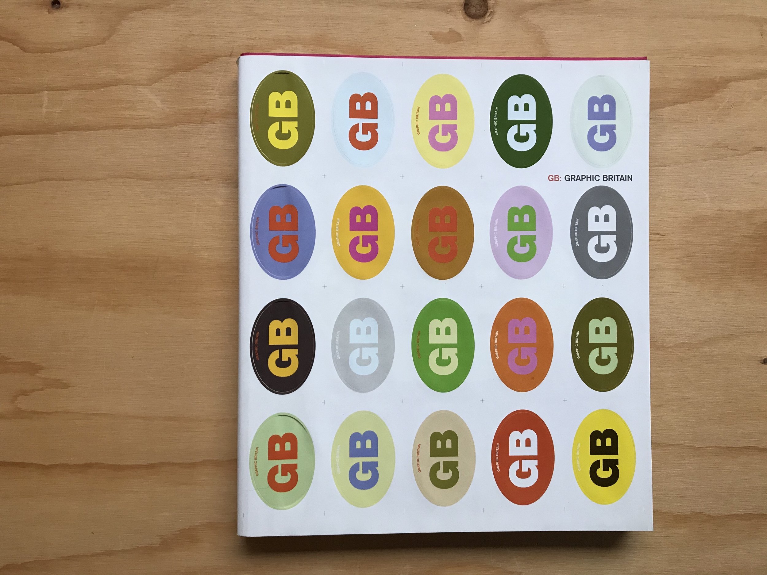
yes, i am also a graphic designer, and as far as skills and interests go, i certainly got into typography before i got into patterns. let me take you back 20 years, as continental european high-school student, it was also the time i was trying to master english and soak up as much of uk culture as i could. to combine these two main interests, a convenient place to go to in budapest was the book shop where they stocked some of the great coffee table books. today i’d like to talk about in particular titled “GB: graphic britain” (burgoyne, p. 2002 laurence king, london) with the aim to line-up some of the coolest up and coming graphic design works produced in the uk at the time.
the book was designed by a london-based agency called bark, founded by tim hutchinson and jason edwards and i used to really hunt for their bold and colourful work and i did find them - in another book, “graphic originals: designers who work beyond the brief”(austin, j 2002 rotovision, mies) they talk a little bit about their process through a prospectus they designed for portsmouth university where hutchinson was a lecturer. the project itself was a map, a clever visualisation of the course journeys, but what really caught my eye was that it wasn’t just an raw information graphic, but focused a lot on using a lot of photographs of the built environment, the documentation of very mundane things that reflected on everyday life at the university. it was the first time i’ve ever really seen anything like that but that really was speaking my language. it was just inspiring to see real, successful people in the industry do this - take the built environment, and create a feeling of home and belonging in it by graphic, “2D” means. that’s exactly how i wanted to do design and it was a great contemporary example, right in front of me.
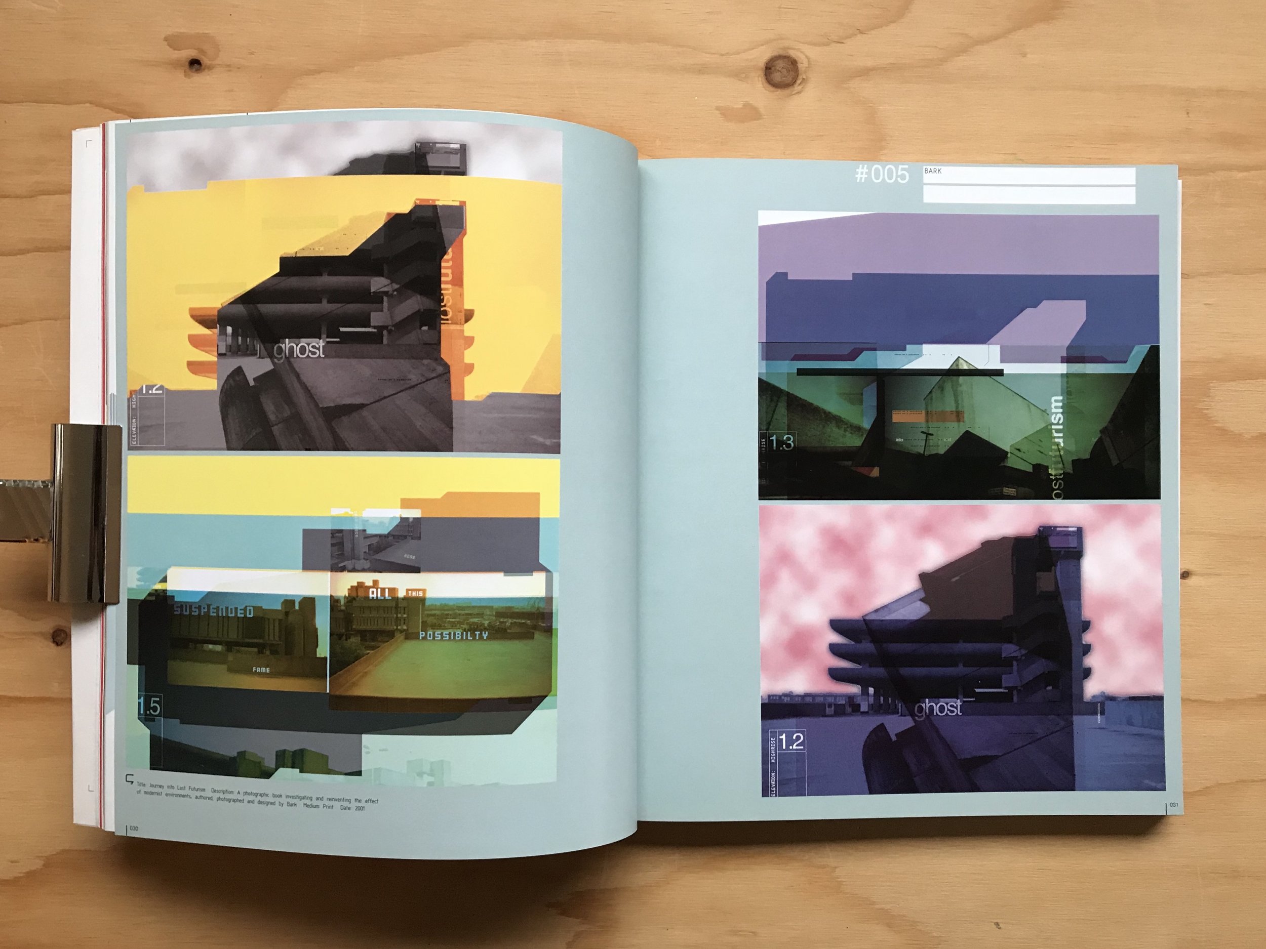
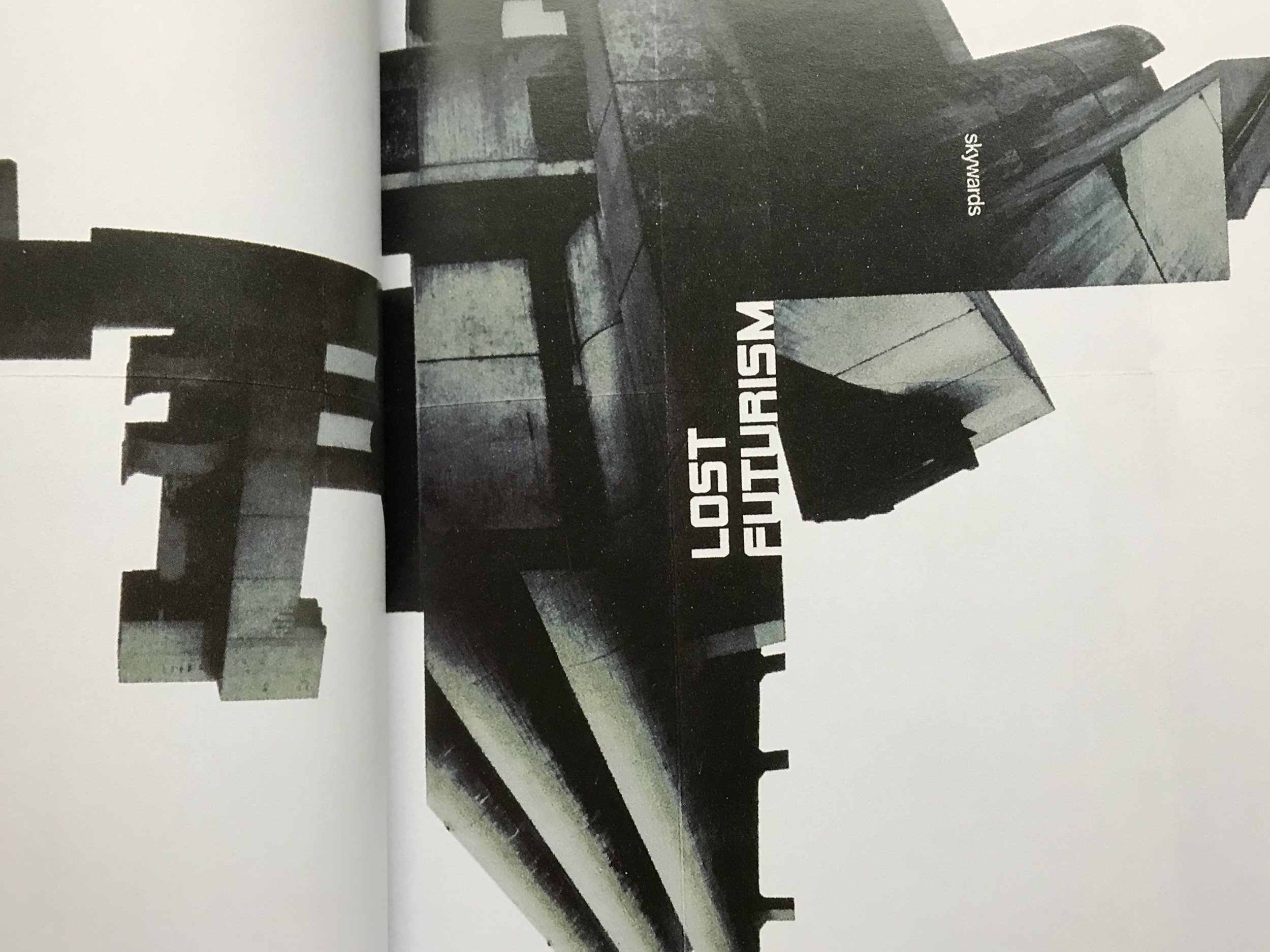
but there is another project of theirs that i would like to show you - i’m still hunting it, i believe it must have been self-published at the time. it is one titled lost futurism (according to the caption in GB: graphic britain, it is a book that was printed in 2001 - please do get in touch if you know anything about it.)
the project examines brutalist architectural heritage in a graphic design language - having mentioned portsmouth, this obviously means the tricorn centre, mostly, which i have never seen in real-life but somehow in this graphic interpretation, felt nostalgic and futuristic, alien at the same time. i used to stare at these pages for ages. it was really fun discovering about the building itself but also the graphic representation of it - it was just really, really cool and simple, and it spoke my language of taking a three dimensional form and reducing, or rather, deconstructing it to its image and basic form.
to this day i’m still obsessed with that sort of thing. i used to do a lot of my own experiments with my own photos of my favourite buildings when practicing my computer skills (a useful habit to get into) but it also transpired to other work and i firmly believe they have a place on textiles too. obviously, graphic design is different, it is visual communication, but if the result is decorative, then why should it not be used on textiles too?
so i hope you didn’t mind learning a little bit about this background behind the architecturally inspired textile patterns of zitozza. and if you know anything more about this work, if it exists on its own as a separate book, please, please do get in touch, i think i want a copy! thank you!
-
links:
GB: graphic britain - by patrick burgoyne, 2002 laurence king, london, uk (on worldcat.org)
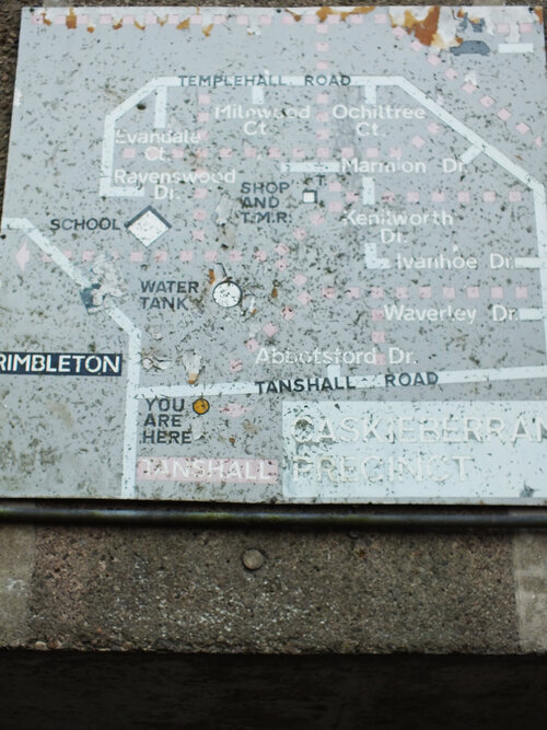
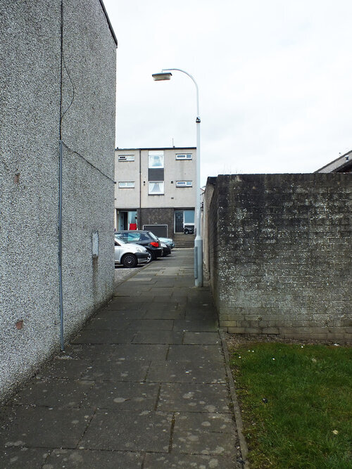
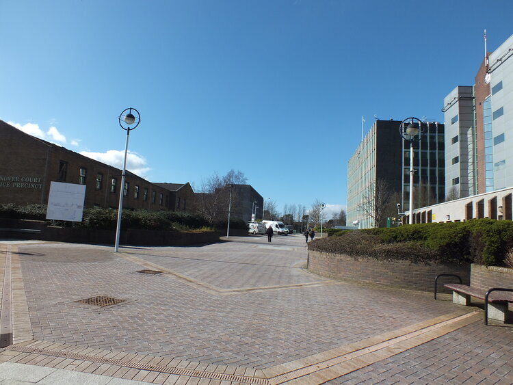
this is it, our architectural journey is coming to an end in glenrothes, the last part will take us through the residential areas - macedonia (yes, really!), the glenwood centre, caskieberran and back to the town centre where we started.
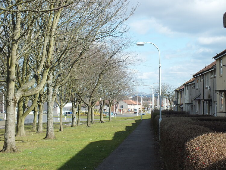
we left at the green riverside park and just out of it, a steep set of steps lead to macedonia, a residential area consisting of smaller individual housing units with gardens. the area has a reputation for being deprived and a bit sketchy, however, on a bright sunday morning none of it is visible, they actually reminded me of holiday homes in hungary around the lake balaton (cube shaped single units were a huge thing in the hungarian countryside by the way, happy to write about them in a later blog!)
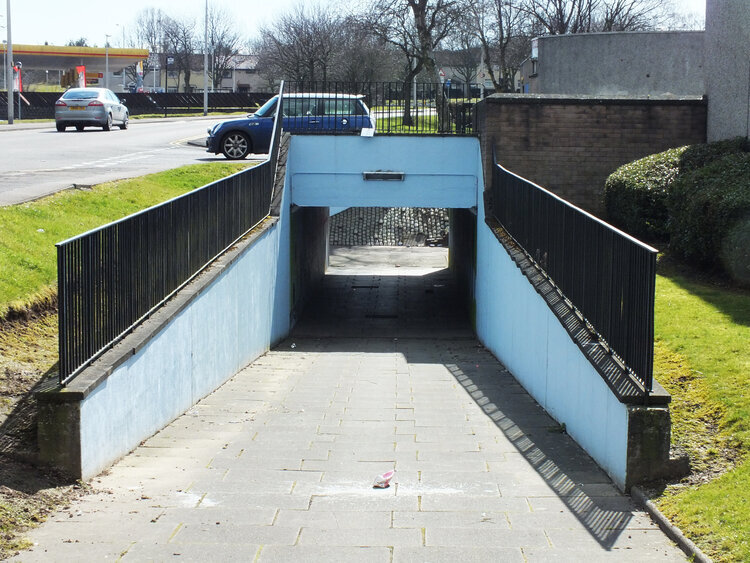
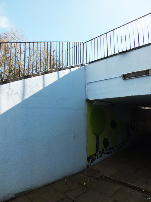
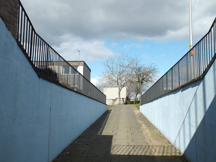
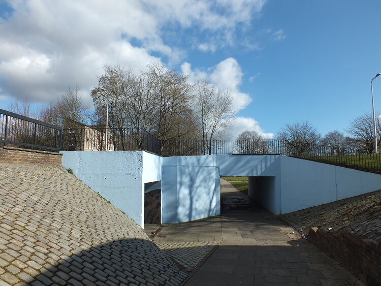
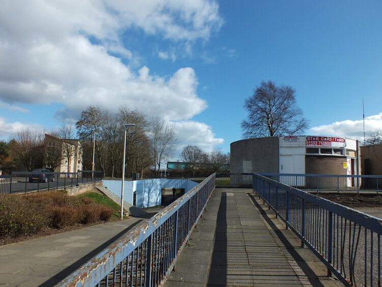
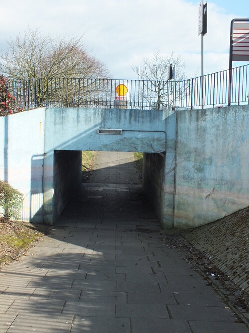
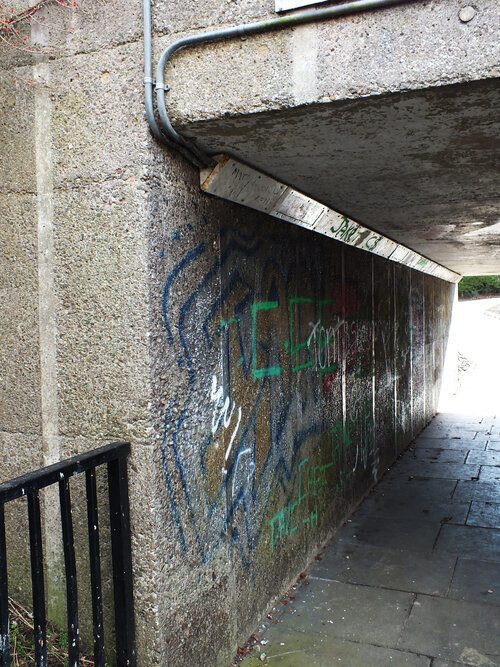
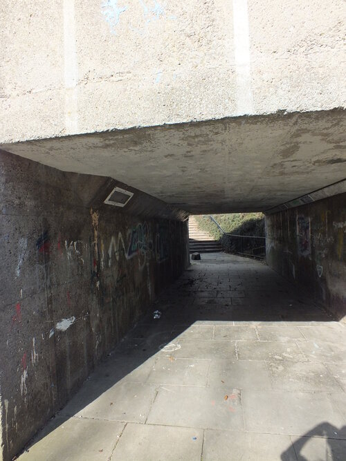
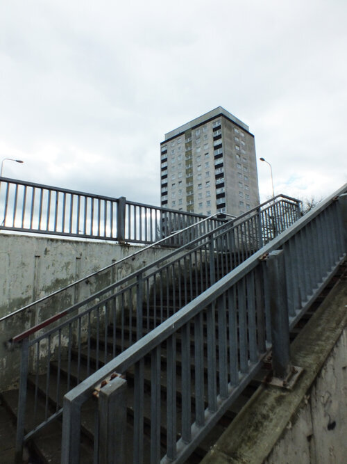
all the residential areas around glenrothes also have a number of underpasses and pedestrianised areas, these separated walking paths form bridges, underpasses and all these layers and their railings give interesting patterns and layouts - super inspiring to incorporate into textiles and i was often thinking about them as layered textures on the town - all these geometric, concrete shapes themselves can inspire more large scale, modernist designs.
the vision of dividing pedestrians from the car traffic sounds utopian on paper but have proved to be impractical and has probably contributed to the decline of the retailers in the town to be honest. the big building here is glenwood centre, a residential complex with a shopping centre underneath. you can notice some more of the planning mistakes here - there is an underpass that is filled in due to frequent flooding and there is a huge supermarket right outside the small retail units - guess what happened to these... because of how all these things turned out, the area has a sketchy, deprived reputation - and is now destined for demolition (there was an episode of the bbc’s “the council” (a very good series following the workings of fife council) in which a resident of the area was asked if he’d be happy if the council used some extra money to paint the staircases inside and he answered “what’s the point?”. the answer shocked me, although i understand that the improvement would have been tiny on the grander scale of things and probably temporary, but i also found it quite sad.)
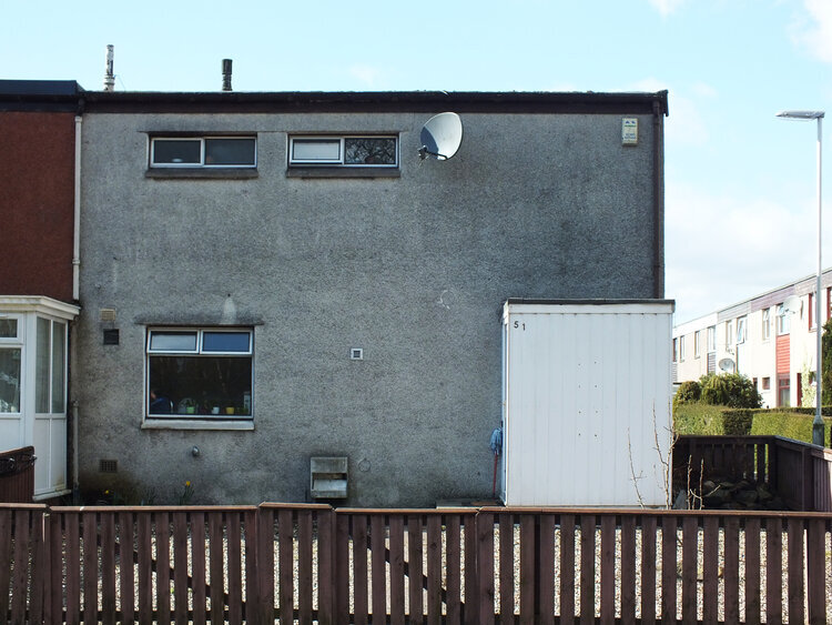
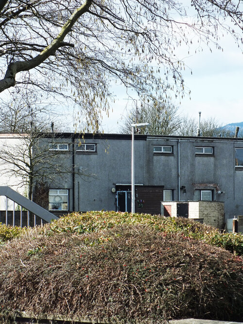
through the underpasses the journey continues to caskieberran with more raised cubical units. while they are uniform in shape and size, there are individual differences and surface details between them. they do seem to have a little personality attached (and another such detail is the shape of street lights that change from street to street.) i always enjoy imagining the life inside such buildings and how different they must look inside too.
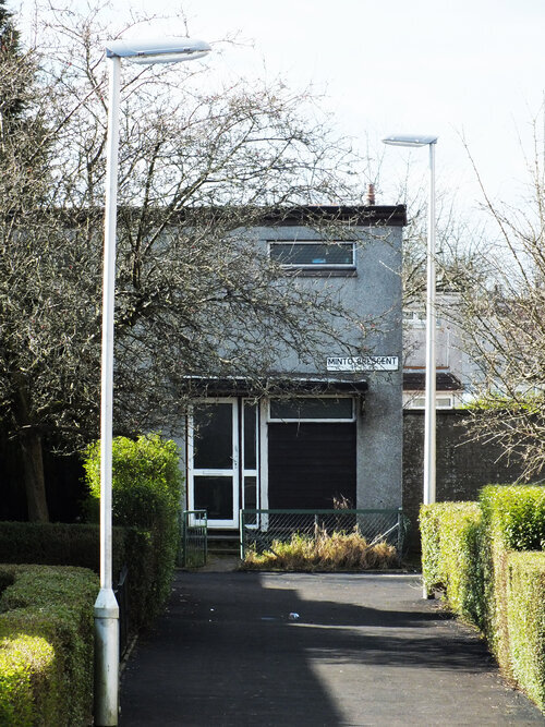
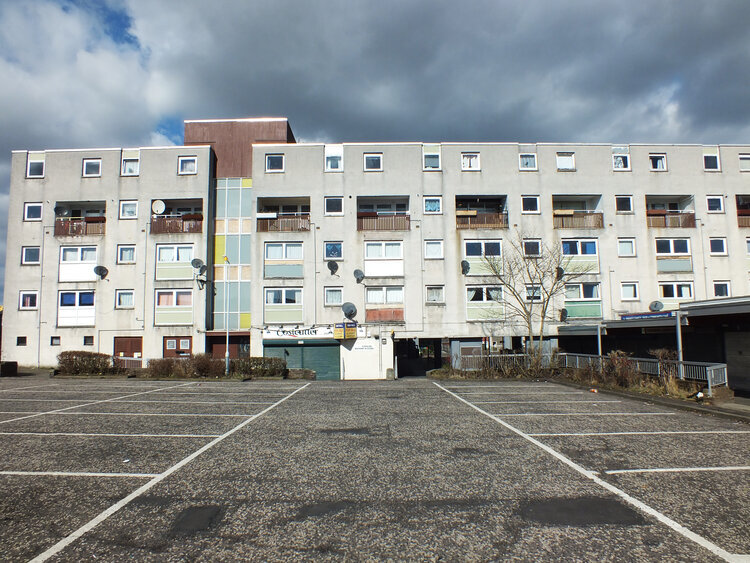
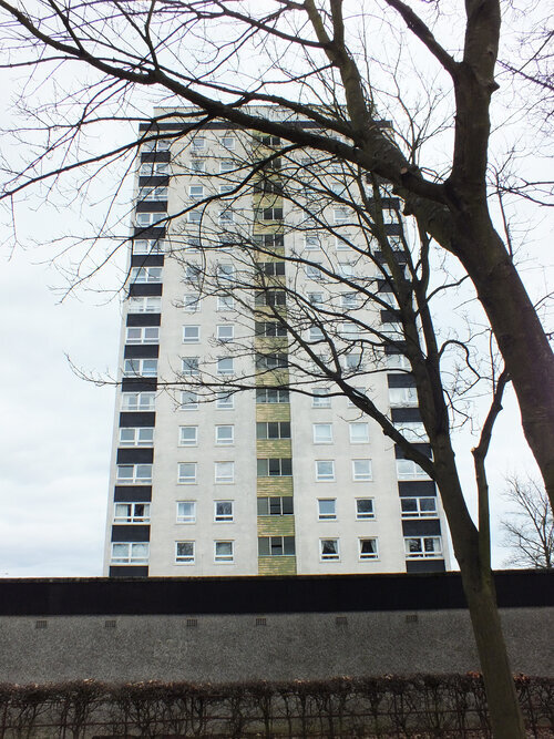
on this walk through the residential areas lead us back to the town centre where you could take a closer look to raeburn heights, a single residential tower block in glenrothes, looking tidy and renovated, surrounded by spacious car parks and i can’t help but wonder what the views must be like from the top floor. as we walk past, we come back to the town centre, the roundabouts, the underpasses and the strange layout of this new town.
on a final point, please let me link a study, okay this is not from scotland but norway, but it’s relevant - it was conducted with residents of an oslo housing estate. as the authors point out, the residents’ responses were focused on “what the landscape offers as home”, contrasting with “how experts often describe housing estates as what these landscapes lack”. let this be the concluding thought to this tour through this strange, quirky town! i hope you enjoyed this and please join me through the other new towns - if things go well, in a couple of months we can travel more across scotland and i can’t wait for another walking tour.
soooo…. here’s another new blog post series because there are too many forms of inspiration that i want to discuss on the pages of this little journal. i guess it’s only obvious that apart from making things, walking amongst buildings and talking to people, i also like reading books so i’m going to share some of my recommendations and thoughts about inspiring books as well.
i’d like to warn you though that they are entirely personal and biased and every single thought i share about these books will always be heavily from the angle of my own work and what i do and make, so please don’t expect objective, academic reviews because my inspirations are so intertwined with my making. this is going to be more of a series about the thoughts that are influencing my work but let’s start with an easy and visual one - eastern blocks by zupagrafika (2019). this is an absolutely non-comprehensive little collection of photographs of eastern european housing blocks (yes, some from my city, budapest too.)
zupagrafika are an independent publisher/design studio - founded by david navarro and martyna sobecka in poznan, poland and i’m a bit of a fan since they almost single-handedly occupy the niche market for celebratory publications of brutalist architecture in the former eastern bloc and they do it well with a beautiful range behind them - i first got my hands on eastern blocks when it first got published in 2019.
as a predominantly visual work there is very little amount of words, we get a short foreword by christopher beanland from a western perspective and then we can dive right into the photographs, many taken by the design duo themselves. the chapters are divided by locations - we get to visit prefab blocks and estates in berlin, moscow, warsaw, kyiv, budapest and st petersburg. the photography is beautiful work and it’s not from a fixed angle or aesthetics, and that is the greatest benefits i think.
while i don’t completely agree with beanland’s foreword that housing blocks in eastern europe were all about the spectacle, it is true and it applied to all aspects of life, including housing, that image (that of the regime’s) enjoyed the highest priority and it came before any other practicality of real life. for this reason though brutalist architecture nowadays often appears manipulated into either unrealistic, utopian/dystopian depictions of uniformity and scales that never existed, or as exaggerated clichés and close-up metaphors of hardship and suffering. here in this book there is neither, the photographs are simply curious and the reality of the architecture seems to be there as they are - the buildings are obviously the main characters, but the people aren’t invisible. this book is about homes, we don’t get to see inside them but glimpses can be caught of the lives in them and the building’s relationship with the people can also be guessed, neglect or preservation, renovation is all on the photos. we are not to forget that these building blocks aren’t standing on their own but are intertwined with their cities places and people’s lives - there is a human scale and element in even the grandest of scales on all the photos. or perhaps it’s just how i see them because i share the authors’ curiosity about them.
they have another related title that is more connected to my work, panelki. i might reserve a more detailed review for this later but let me just explain how it relates - this book explains a little bit more context on the prefab housing but half the pages are literally a modular set of beautifully illustrated pop-out paper blocks, of which you can assemble your own little prefab house with it. they do have other architectural pop-up books but it’s the one that’s modular and it is very much like how you can create your own pattern here - it’s a bit like how i print so i enjoyed discovering this one.
because of the visible curiosity of eastern blocks though, this remains an inspiring little book after years of looking through it. not only i keep finding new details on the photos themselves, in the close-ups or the facade or the shape, but also it is incredibly well indexed for the architects - all the names are there, the search rabbit hole is ready and inviting to disappear into. there is a lot to enjoy and for those who like my block prints and want to understand more about their inspirations, i totally recommend this book.
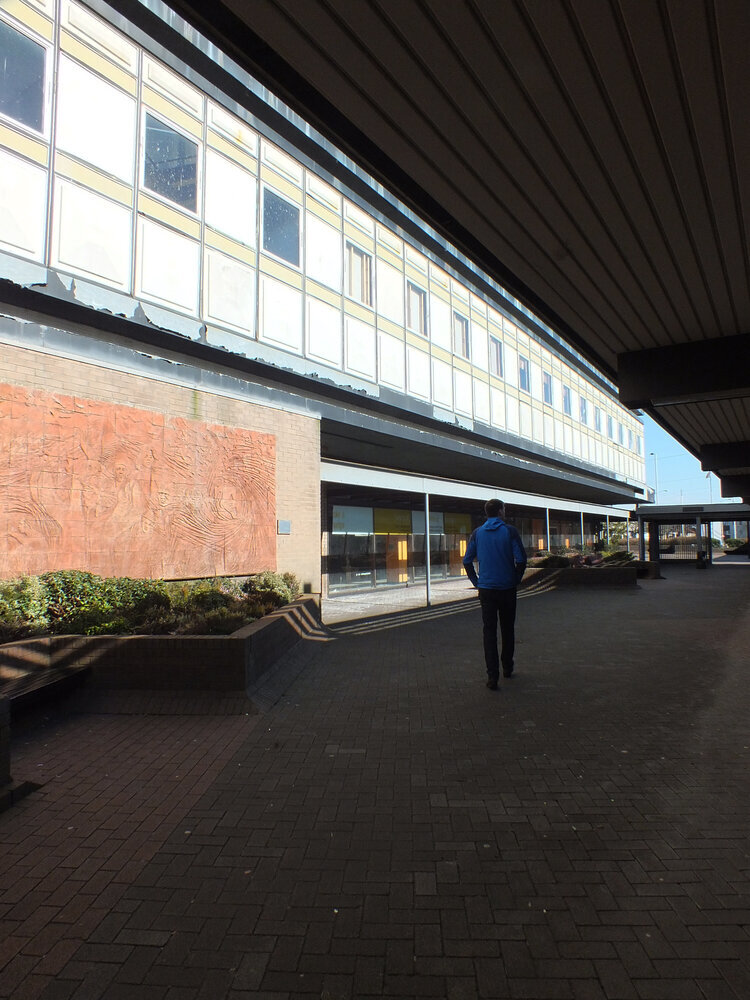
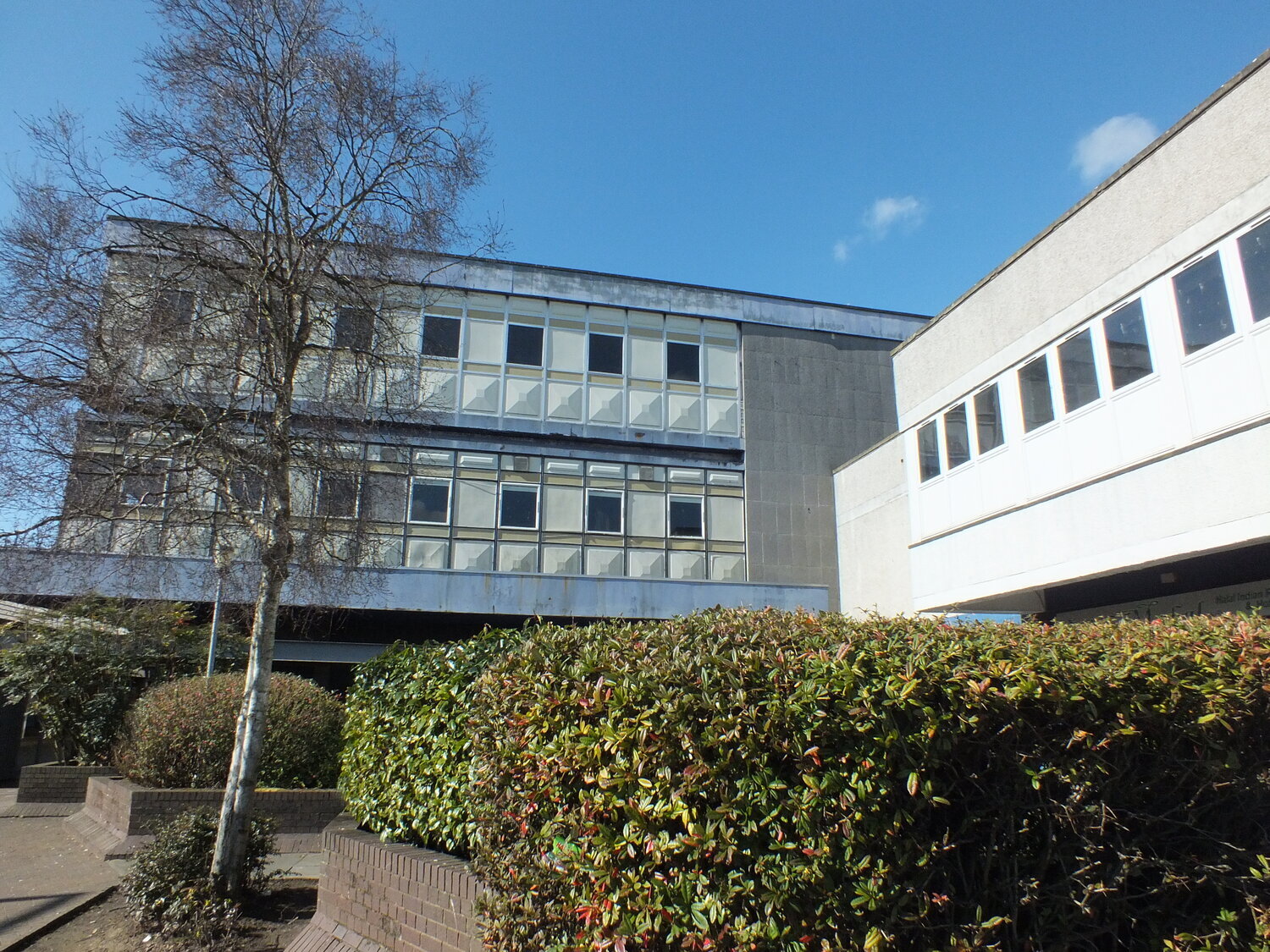
not having forgotten where we left off with our walk in glenrothes (read the previous part here), we are now ready to continue into the new year, aren’t we? let’s be curious and keep exploring our brutalist architectural journey through glenrothes. if i recall correctly, last time we were at the co-op and the kingdom centre, so let’s come out to the end of the street where the council buildings are - this is the focal point of the town and these buildings form one of the most spectacular landmarks of the town, sadly with a few ones already fallen.
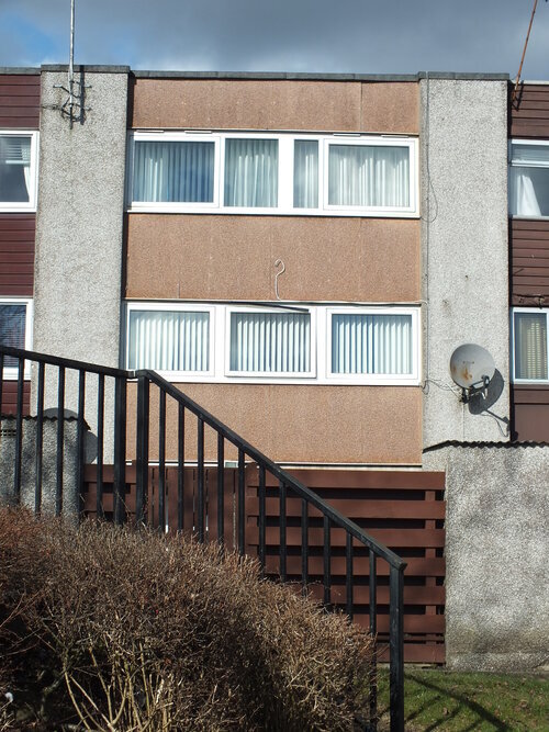
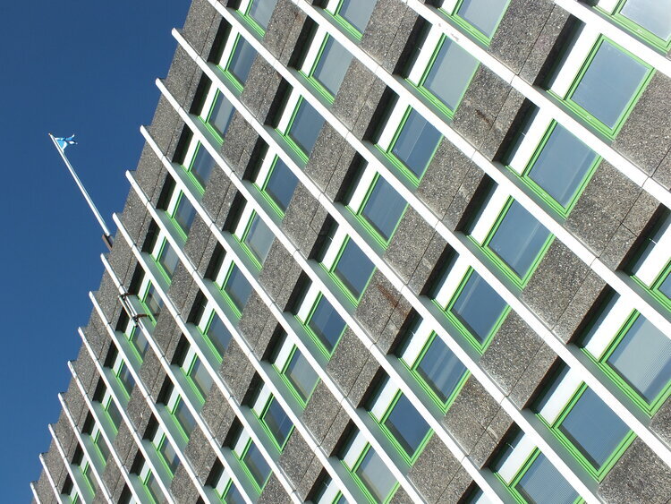
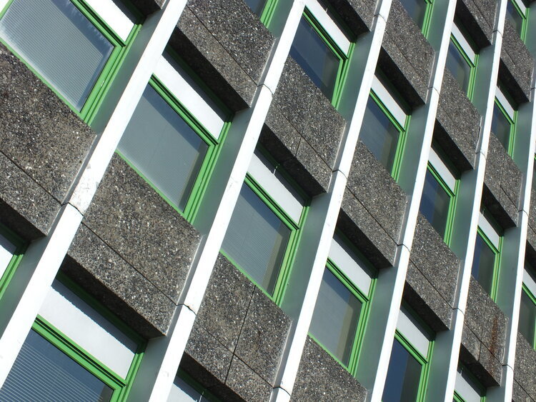
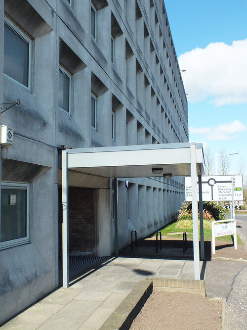
there was glenrothes house (demolished in 2012) and kingdom house (demolished in 2020), and there is still rothesay house and fife house standing. together they form the headquarters of fife council, scotland’s third largest council, governing about 300.000 of us. my favourite buildings were actually the ones gone now - they were the original ones from 1967, first built to house the glenrothes development corporation (in 1967), which later became the office for fife council’s architectural services. of course architects will build the best ones for themselves (and of course my taste goes with theirs.) luckily i managed to catch kingdom house in its full beautiful form on my photos and i’m sharing below for you to enjoy. it’s the windows that got me, the sleek geometry, the angles, the smooth concrete and the not quite symmetric arrangement, that makes up a 3D pattern, a large-scale texture of smooth modules. and i also love the vertical blinds behind the windows and the neon lights that come out in a dark winter afternoon. i just love a modern facade and imagining the kind of work taking place behind it. i would have loved to go inside but it’s gone now and the “obituary” is just a dry warning on road closures to expect as the beautiful building gets taken away. so sad.
what’s remaining are the newer additions, the still concrete, grey and brutalist rothesay house and the more colourful-looking, extended fife house. the former is grey and textured, the latter has some white and green accents on the concrete facade which makes it interesting and is an intriguing pattern inspiration. i’m really not a fan of the postmodernist additions though, especially not the clocktower thing - nevertheless it’s all part of the townscape now and at least the mirrors reflect and double up the brutalist surroundings.
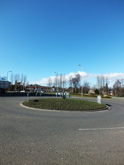
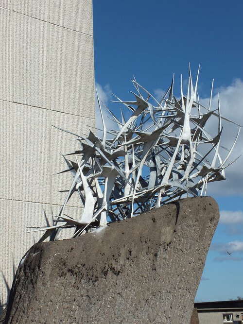
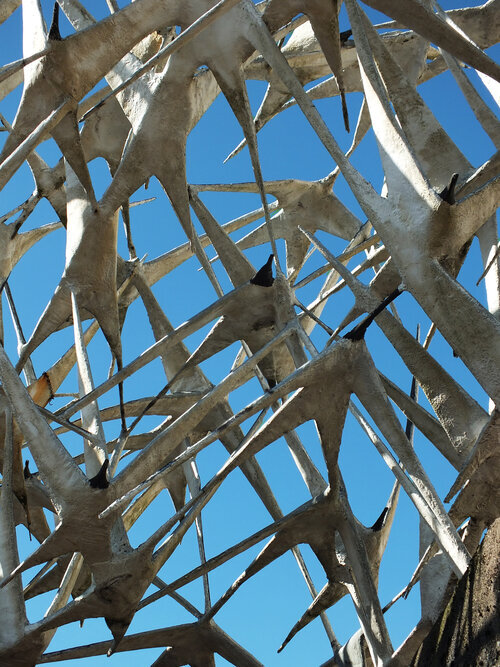
it's all very open and bright though, it certainly feels spacious and airy to me with the open car parks and roundabouts at the centre - i tried to emphasise this sense of openness with my photos, it probably helped that i visited on a sunny day. if a postcard is ever made of glenrothes (unlikely i know but why the hell not), i would pick these photos above - raw concrete window patterns and open, spacious roundabouts with tidy green centres is possibly the most accurate summary of this town. everyone who even has heard about glenrothes will mention roundabouts, they’re almost more famous landmarks than the buildings themselves. it’s very typical of the new town layout of course to separate cars from pedestrians and let cars take up the open, spacious roads. they are also perfect to place public sculptures too - glenrothes was the first town to employ a town artist and is known for its public art (and i might cover this in another blogpost because it’s super interesting!)
the sculptures used to be scattered across the town (and some still are of course) but a lot of it now has been moved to riverside park, just across the road from the council buildings. it’s large, spacious and green - if the road is for the cars, this is for the pedestrians, a massive green space for people to enjoy freely. apart from the sculptures and skateboard park, there are flowerbeds and duck ponds and woodlands - this is the largest green area of the town. the river of which its named after is the river leven - with bridges and obligatory philosophical graffiti - the latest addition being the creatively named river leven bridge, built in 1997, leading the B969 road over the park.
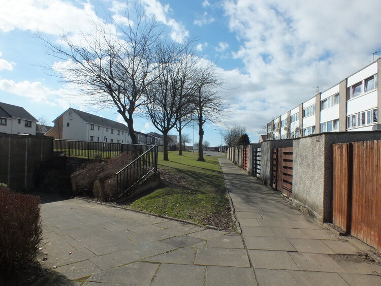
not far from the bridge, a steep set of steps lead out of the park into the residential areas where i’ll take you to next time in the final part of our tour. i hope you enjoyed this and are feeling inspired by the rich, deep facades and the open, inviting free space.
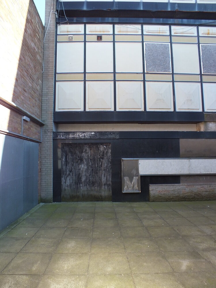
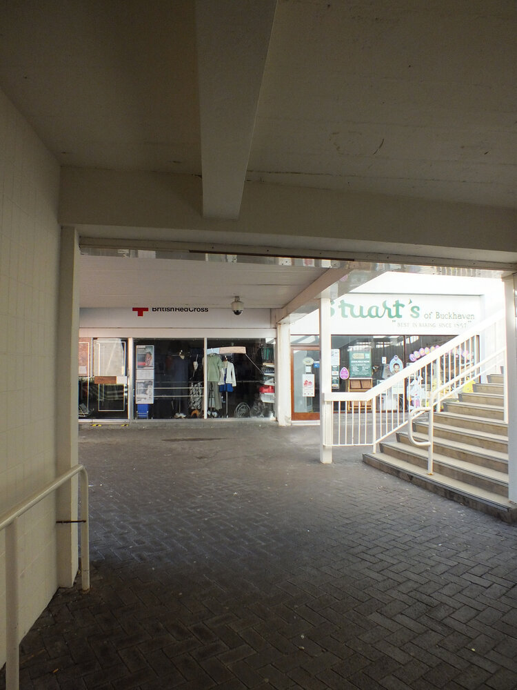
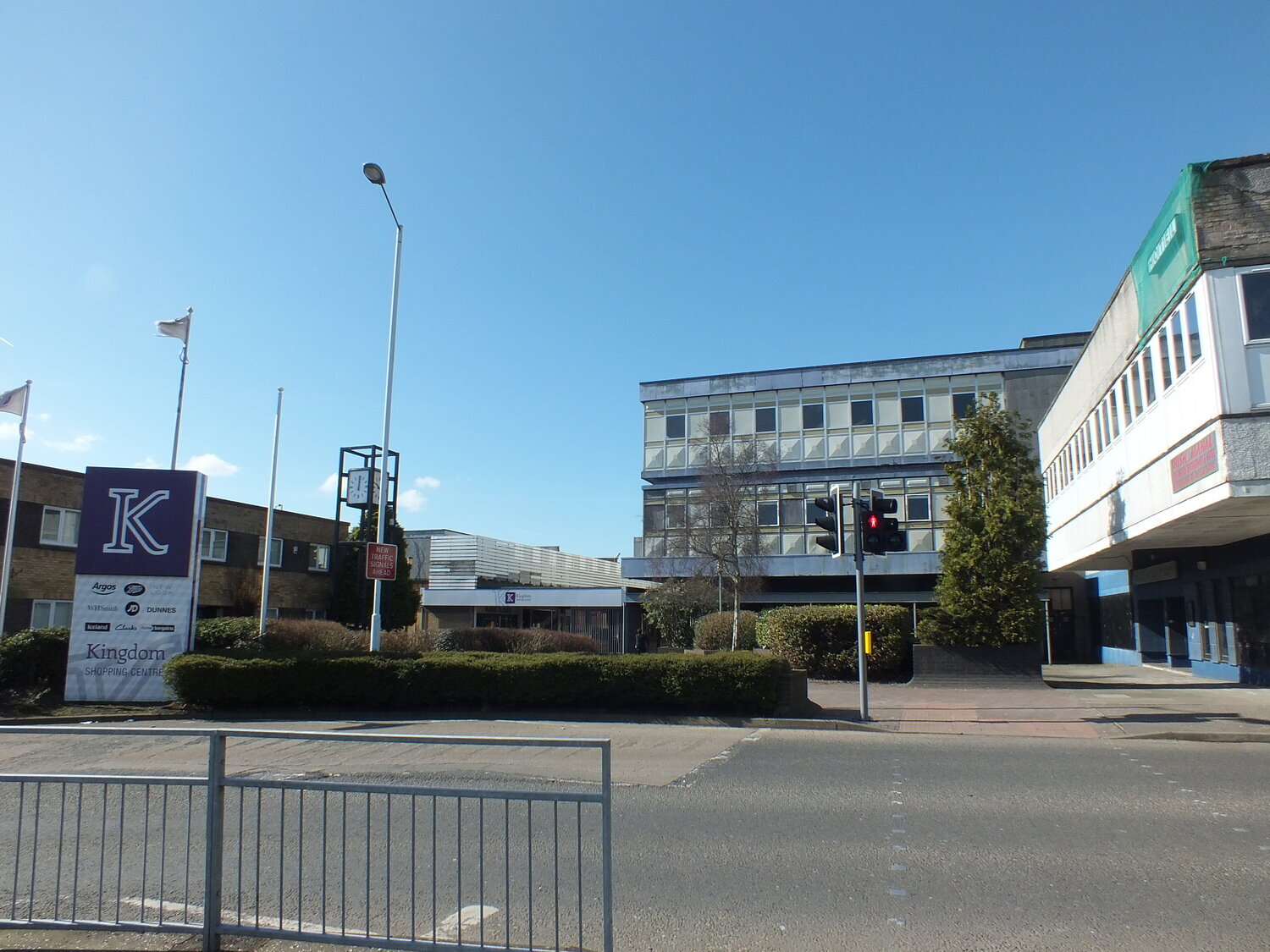
for those of you in fife this will be the familiar - yup, this one will be about glenrothes. i’m really into this town (the only new town on the east), so much so that i’m going to split my photo blogs into groups and go through this in more than one tour - please come with me for the first one through the town centre.
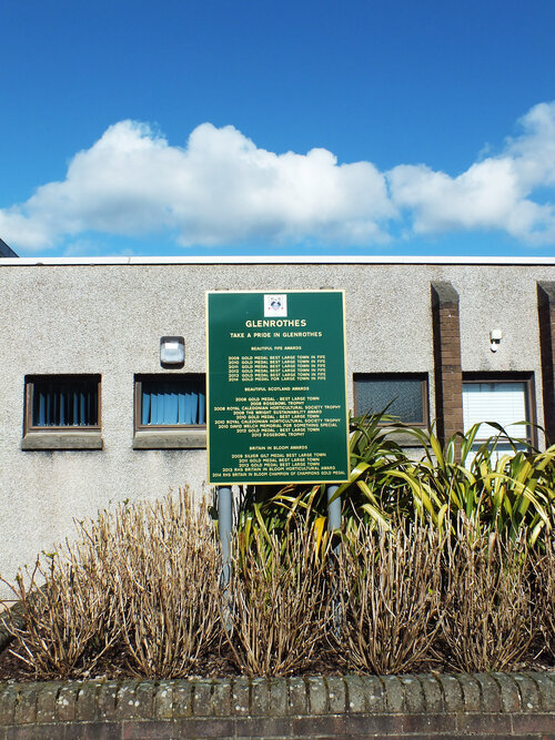
glenrothes is a new town in scotland, designated in 1948 and built and developed throughout the following years. the area has a history of industry in paper mills, and the new town was largely built for workers of a new coal mine, which, only after 7 years of operation had to close in 1965 due to technological difficulties. some industrial presence continued in the town though and fife council also moved their headquarters there.
as one of the earliest new towns in scotland, glenrothes was built and developed with a mixture of ideas leaving their visual impacts on its surfaces. the town won the disputed “carbuncle award” muiltiple times however glenrothes also received multiple awards in the beautiful Scotland competition - perhaps as a response to the negative publicity (and because the many open spaces and roundabouts are indeed quite floral)
these architectural walks often feed directly into my textile design practice – especially the bold geometry and surfaces that define many post-war buildings in the UK. i know a few locals, who find humour and affection in their upbringing in this setting and i basically just aim to show the fabric of this place in a positive light. i have a lot of material though so i’m going to start right at the centre.
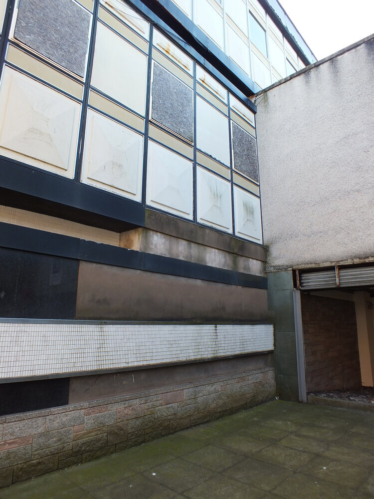
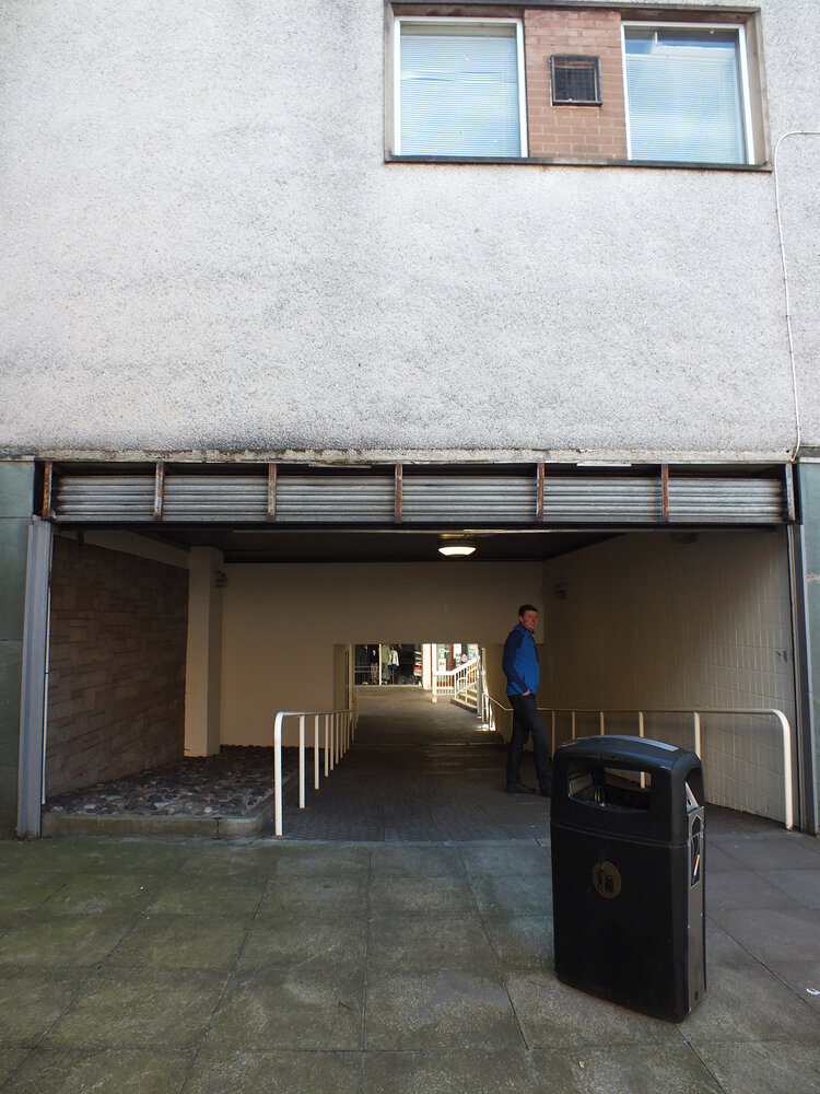
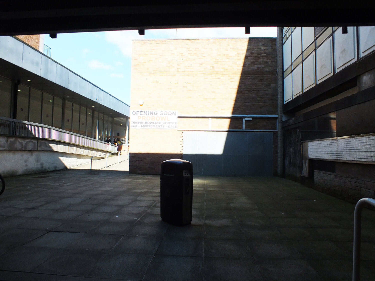
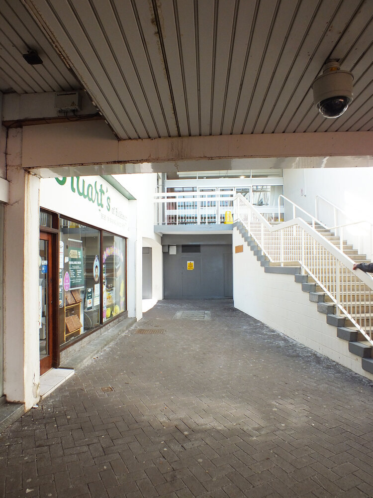
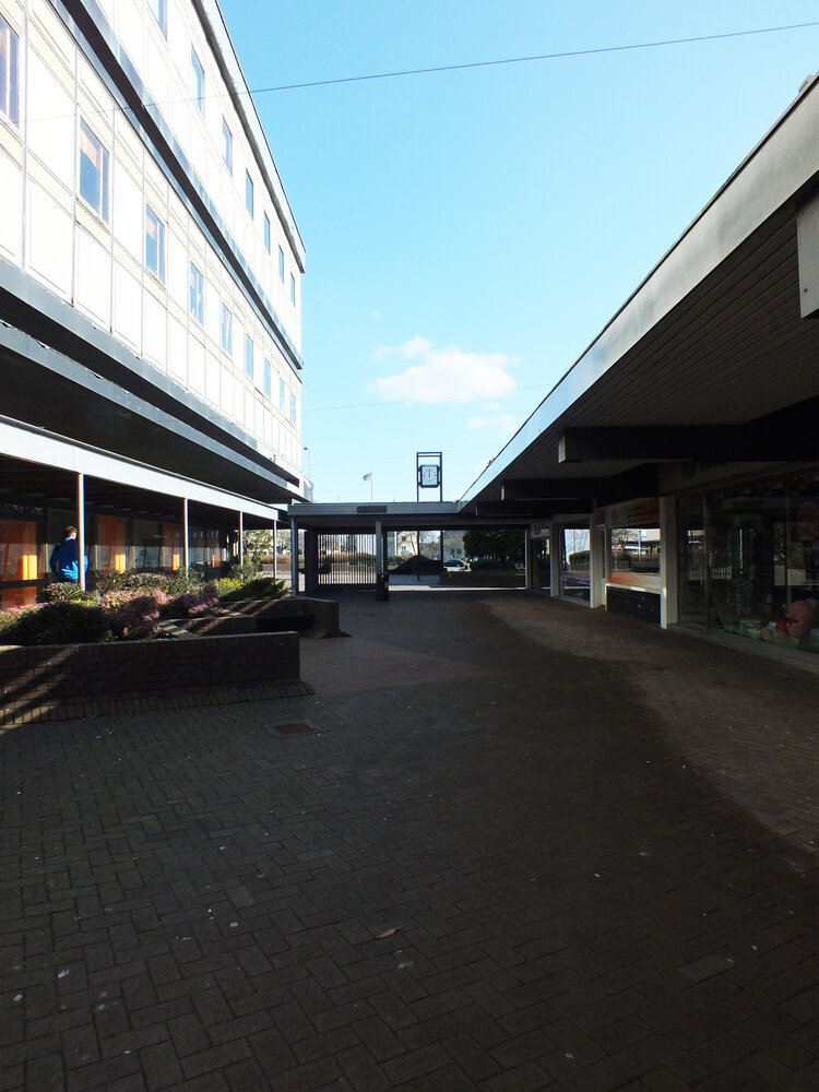
the town centre itself is a small pedestrianised area for shopping named “kingdom centre”, consisting of concrete alleys and arcades. the “old” town centre was once busier with shoppers, however, many of the premises today are unoccupied - like everywhere else, glenrothes has welcome suburban supermarkets on its outskirts and the car-friendly layout of the town has infact probably made it more attractive than elsewhere in the area. as in most brutalist new towns, roads for motorists and pedestrians were consciously separated, which resulted in many roundabouts and underpasses (the latter now a canvas for artists - official and unofficial ones alike).
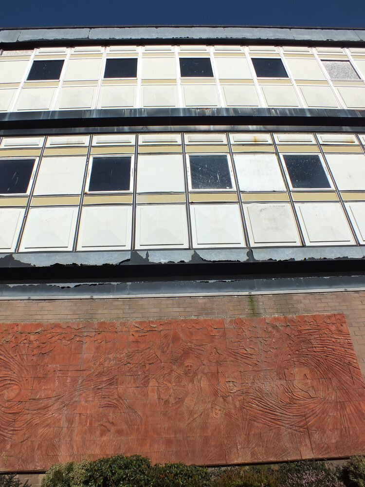
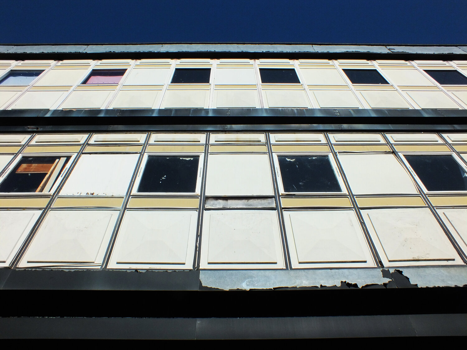
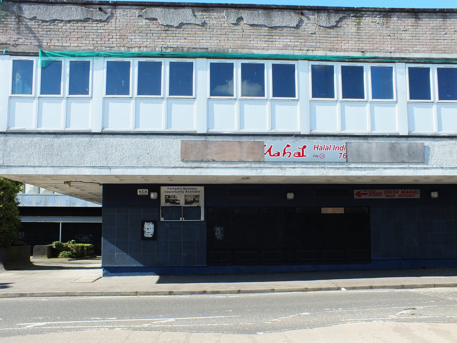
out of albany gate at the main street of the kingdom stands the co-op building, an old department store opened in 1964. i’m not sure if this was built by separate architects or not - the kingdom centre and much of the town’s architecture is a product of the glenrothes development corporation which employed many architects at the time (with glasgow-born peter tinto as chief architect.)
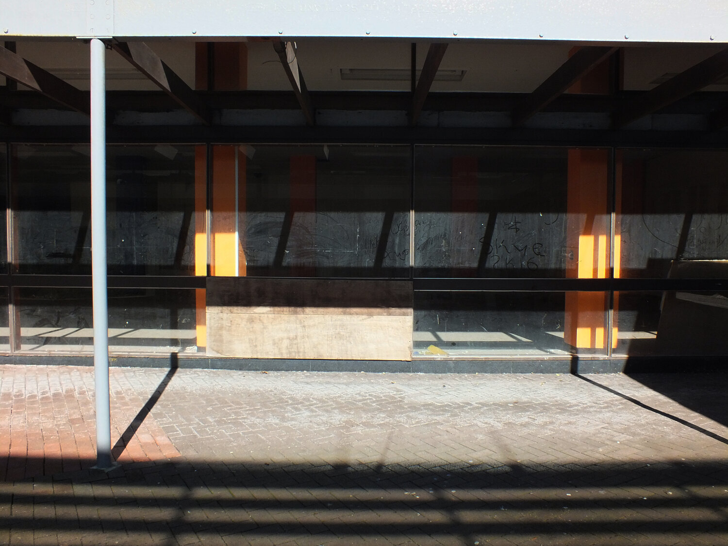
the co-op this is also now empty and is destined for demolition although the plans were scrapped later. partly because of its asbestos problem (it’s now unsafe to enter too.) it’s also really interesting (in an obviously bleak way) to look at the decaying surfaces and imagine what they may have been like in the past.
it’s not my past and these are not my memories, yet i think i would miss this building a little bit, because i find it genuinely and objectively beautiful. (lord knows i hate the word “eyesore” and i find it so insulting and cheap.)
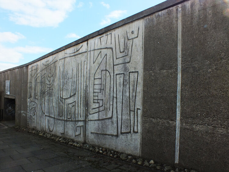
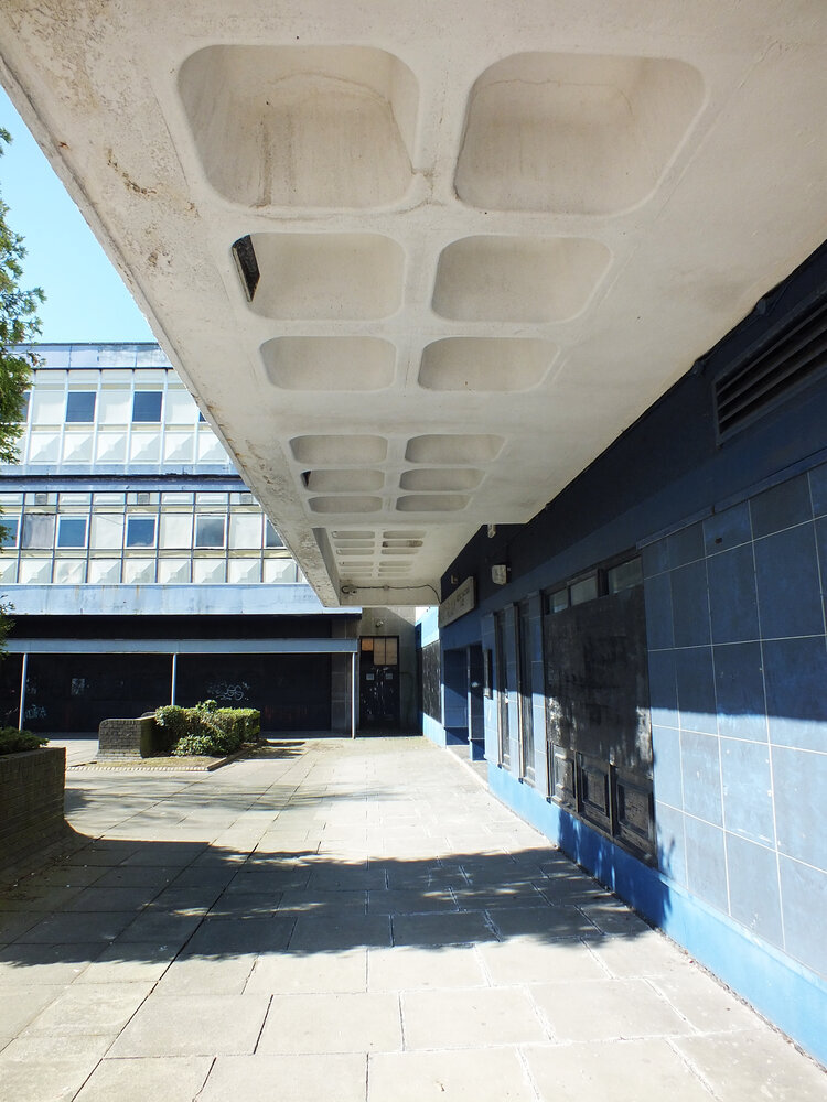
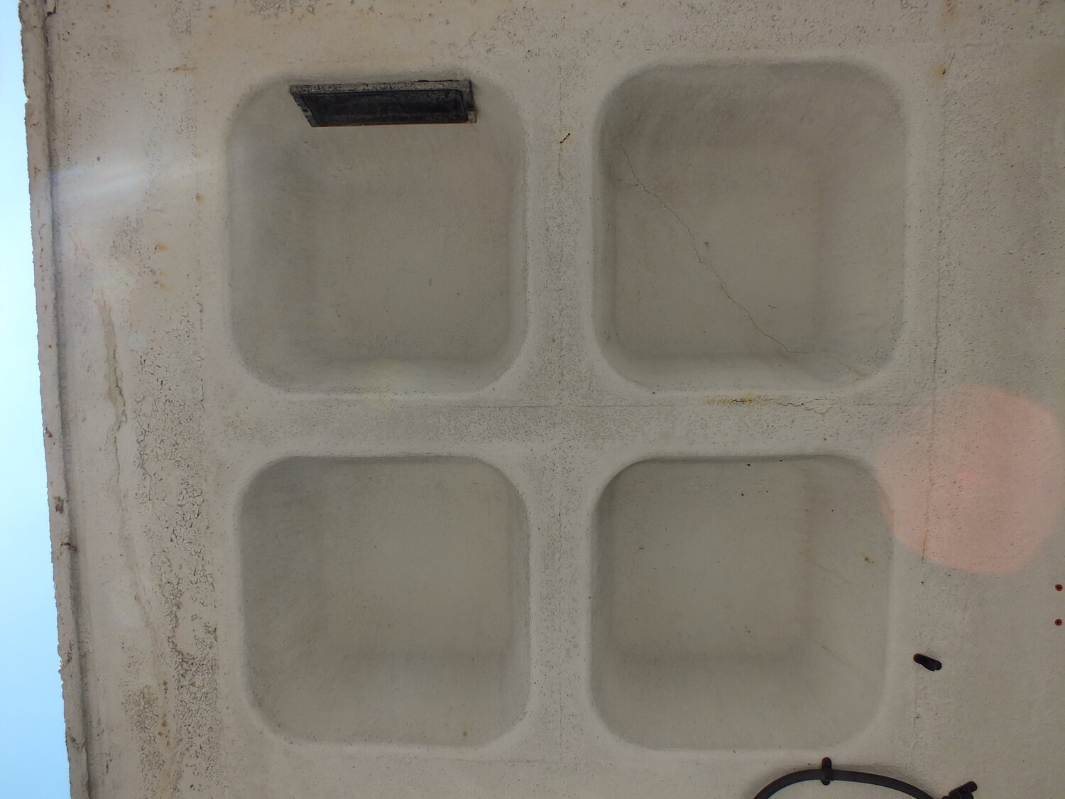
hey look here instead - the coffers on the concrete ceilings of the arcades was what inspired theco-op tileset. it’s a futuristic and human centred pattern with those edges rounded down. and the geometry of its upper facade is shiny and colourful, busy and geometric - playful and orderly at the same time. it was built for this town and its people and somehow these buildings still radiate the optimistic vision of its creators some decades later. i’m not a preservationist though and i believe in embracing the present - if it’s unsafe and unsuitable now to how we live, we can change it or make something else of it. but even if the building itself isn’t worth saving, perhaps the ideas that built them should be.
with the demolition halted, the future remains to be seen.there are now callsto use the building as murals for public art - something glenrothes has form on (i might just have an idea of a future blog post) for now, some works have begun on improvements to the exterior to make it safer while the long-term future remains to be seen. i hope you are now curious to continue this walk - stay tuned for the next tour!