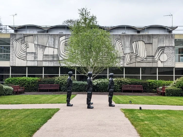
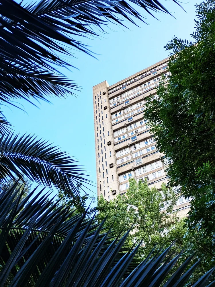
just like with the barbican, i have kept postponing blogging about trellick tower for a long time. what could i possibly say about this building - especially to fans of brutalism - that hasn’t been said before? every building is visited with textiles in mind though, so i decided to have this special “architectural inspiration” post, in continuation with our previous post about turning buildings into interior fabrics.
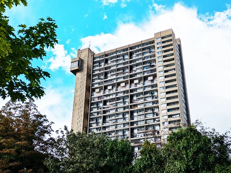
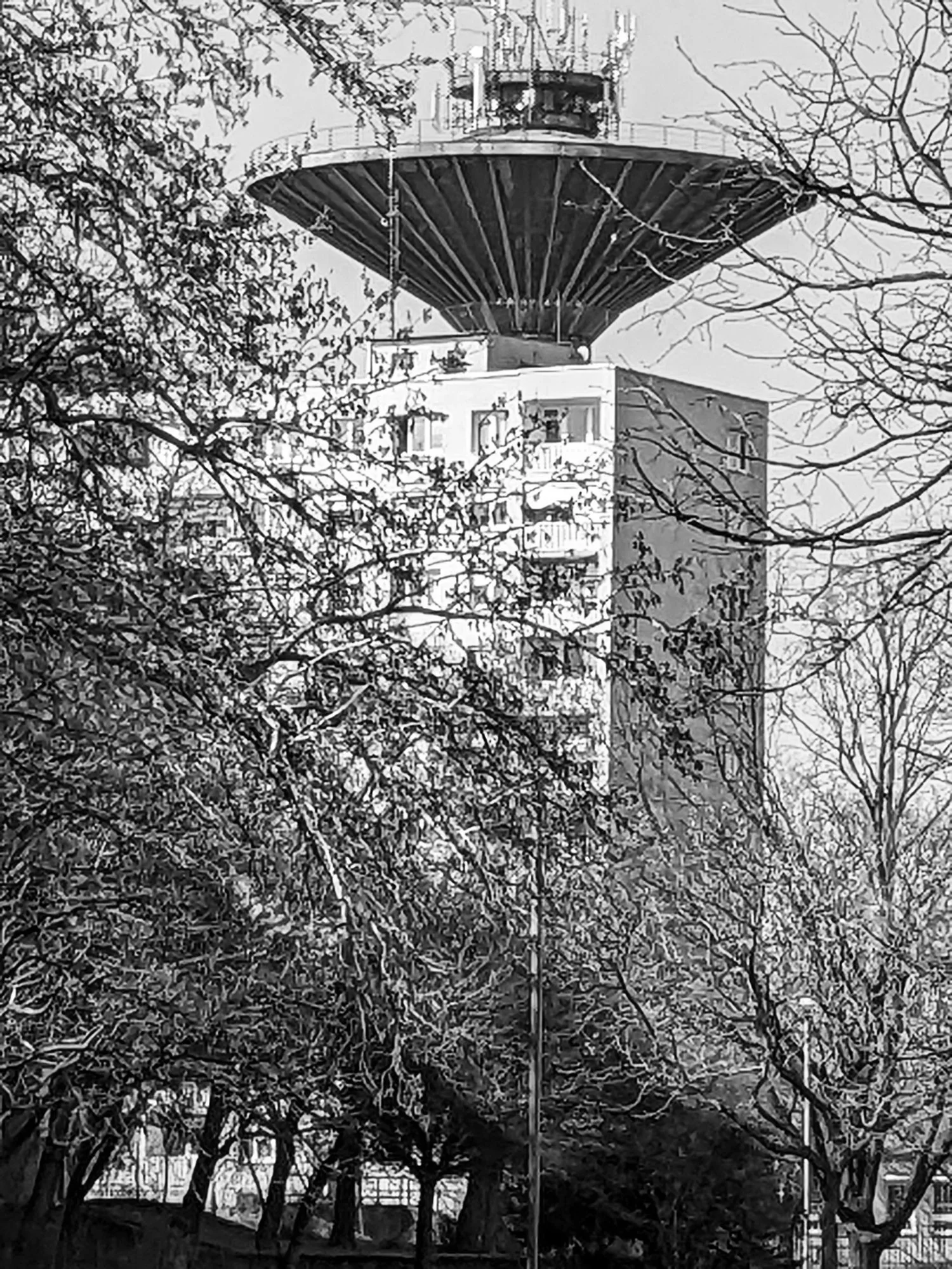
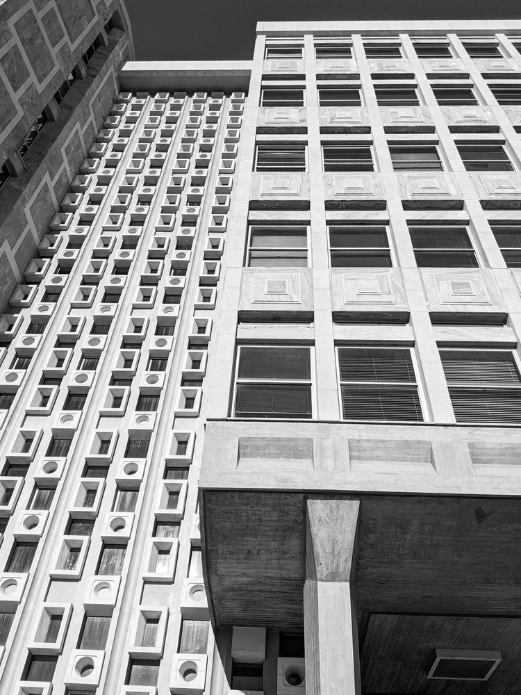
trellick tower is the icon of british brutalism (designed by a hungarian!) and ever since it completed in 1972, the public has been in a love and hate relationship with it. if you peel that emotional layer off though and look closer - it will reveal itself as a system. the vertical lines of the service tower, the repeating blocks of the residential units, the rhythm of balconies and windows: all of these details work together to form a precise, structural language. walking around it, the geometry is impressive and imposing. this building heavily contributed to our PANEL printing block set, directly inspiring a pair of tiles too - a direct translation from architecture to textile.
vertical logic
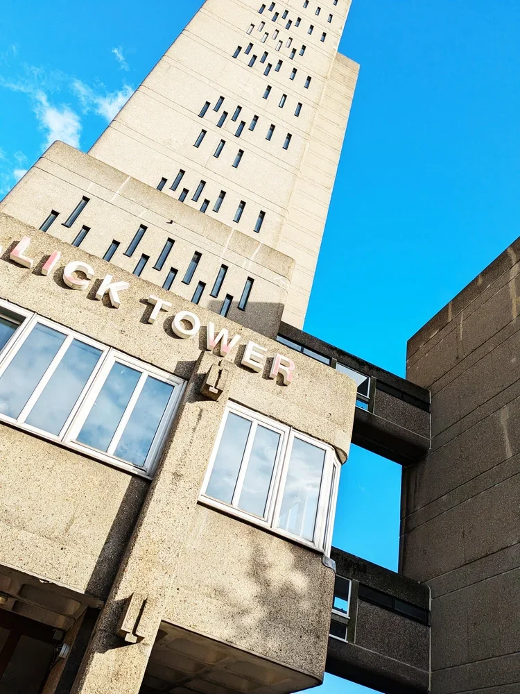
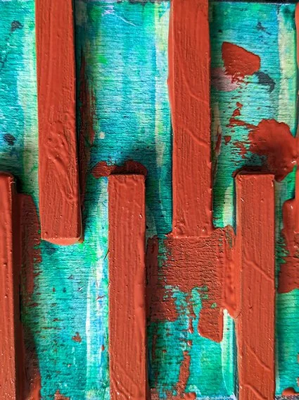
the printing blocks in question come from the service tower. this housed the oil-fired boiler and has lift access to every third floor - it is now defunct as the flats have electric heating but the tower is part of the iconic structure and it is the lean, vertical windows that became our motifs.
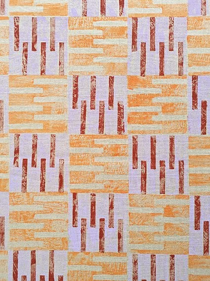
the service tower rises like a spine, attached to the housing block at a neat logic of every third floor. when i translate this into pattern, each unit also becomes a block — rotated, repeated, layered — to capture the same vertical rhythm. my printing blocks aren’t meant to be identical copies of the building; they’re an abstraction, a reduction of the structure into a repeatable unit. this is what makes the pattern modular, repeatable and flexible enough to inhabit different surfaces, from rugs to cushions - so far removed from ernő goldfinger that you perhaps not even want to know the origin - nonetheless i hope you find it interesting!
repeating blocks
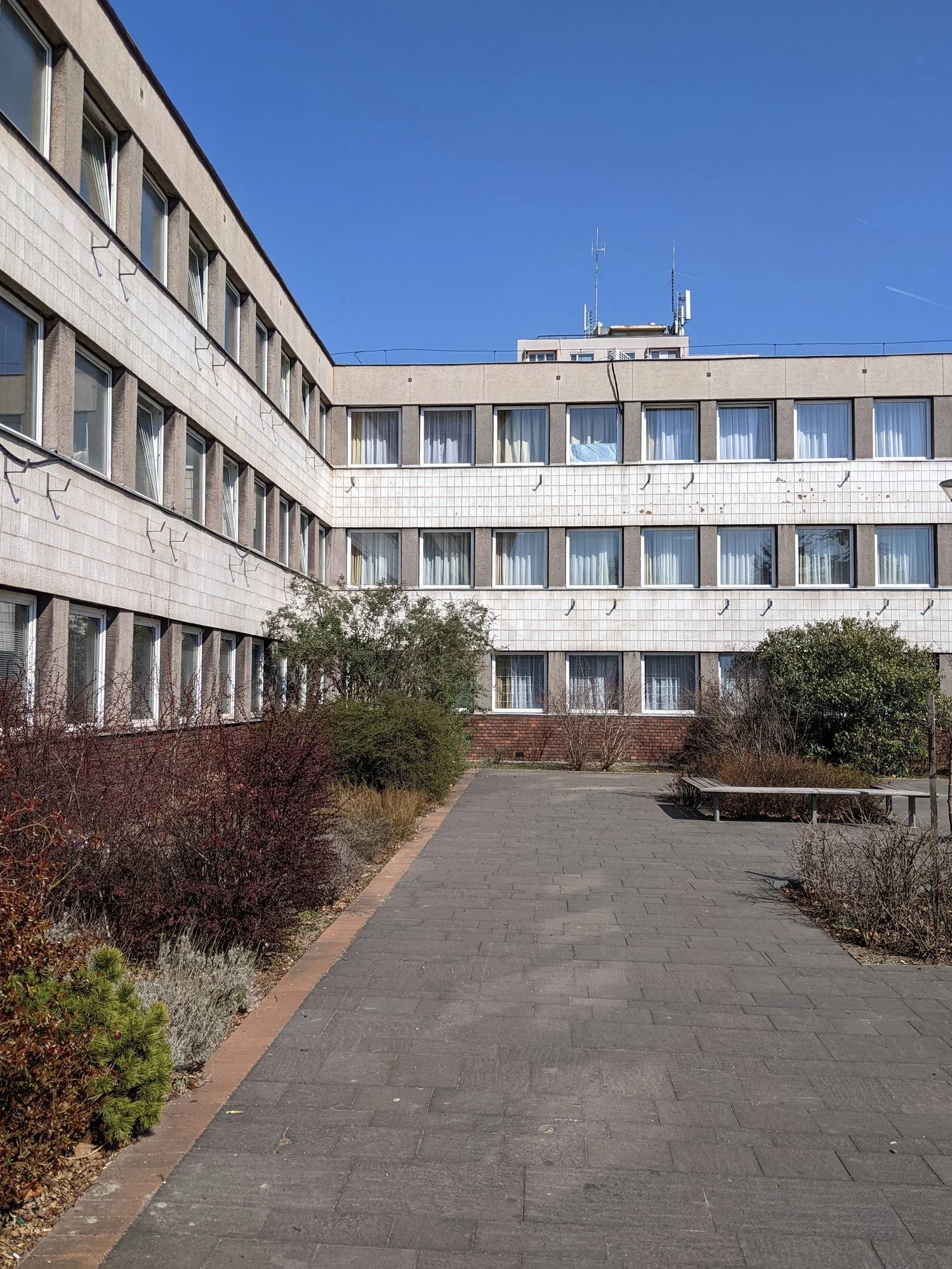
everything here is very abstract of course, and the the other blocks within the PANEL section come from different buildings, less directly related to the facade but you can think of trellick tower too of course, the residential units themselves offer another layer of inspiration: clusters of windows and balconies create a clear, repeating grid. don’t be fooled by the neat facade, the flats have surprising variations between them. there is a deeply human scale within the monumentality of the building, and they do influence my printing blocks. when printed, these grids maintain their structural integrity, but the tactility of jute, linen, or cotton softens the rigid form. the repetition is comforting, methodical, and quietly playful — a domestic echo of the tower’s public-facing logic.
from public to private
trellick tower is both loved and hated — its enormous and imposing, raw and almost alien and yet the rhythm of its facades is surprisingly intimate and enclosing, and, dare i say cosy, just like textiles for the home interior.
translating this into textiles allows the same architectural thinking to live in interiors. a cushion, a rug, or a framed print carries the rhythm of the building, but at a scale and material that invites touch and domestic interaction. it’s architecture reinterpreted, rather than reduced.

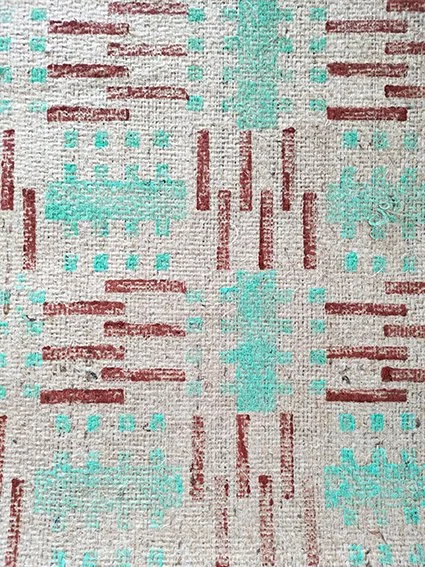
another brutalist rug - inspired by another london landmark. a busy, geometric print with soft, on-trend pastel purple and darker terracotta tones. it’s a beautiful and interesting accent piece in a cosy and colourful modern home, this rug was printed in the most architecturally inspired PANEL tileset evoking the housing units that inspired them. on one side of the rug there is a one-tile-wide column attached (with a pastel purple stitch) to resemble the boiler house and its facade of the iconic trellick tower by hungarian-born architect erno goldfinger.
it’s 70 cm wide and 158 cm long, including the 11 cm tassels at the short edges, stitched with a dark purple accent trim. a perfect addition into a contemporary, boldly styled home decor. top layer and backing material: 100% jute. wipe clean only. handmade in scotland

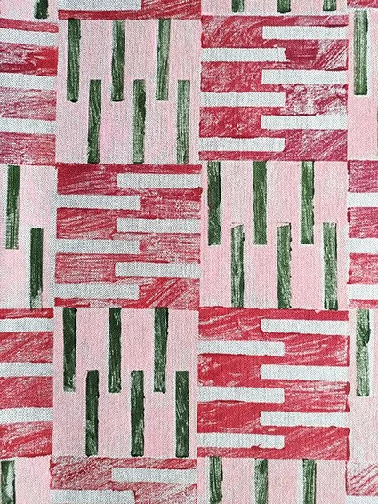
who says brutalism has to be grey and monotone? embrace the pastel sugar colours with this cute little stitched rug, made up of four parts, all printed in our housing block inspired PANEL tileset. it’s a dynamic, architectural print in pretty spring colours - mint green, pastel pink, and contrasting terracotta and lush green. a sweet accent piece in a modern home.
it’s 80 cm wide and 162 cm long, including the 11 cm tassels at the short edges, stitched with a pale pink accent trim on the short edges. wipe clean only. top layer and backing material: 100% jute. handmade in scotland.

a hard, brick-like look but a soft, comforting touch. this recycled cotton blend cushion is a perfect little accent piece, printed in our PANEL tileset, inspired by brutalist housing blocks. it’s an interesting repeat in pastel pink, brick red and olive green colours for a warm, earthy, contemporary touch. the perfect design addition to complete a modern home.
the cushion is 50cm x 30cm and printed on both sides. you can purchase with the pad, or just the cover only. cover: 87% recycled cotton, 13% recycled polyester. machine wash at 30C, do not tumble dry.
materiality in translation
just as architects consider how concrete interacts with light and weather, the choice of textile matters. ink on rough linen, for example, reveals layers of pattern in the same way light falls on raw concrete. modular blocks can be repeated, layered, and rotated, and different fabrics give each iteration a unique depth.
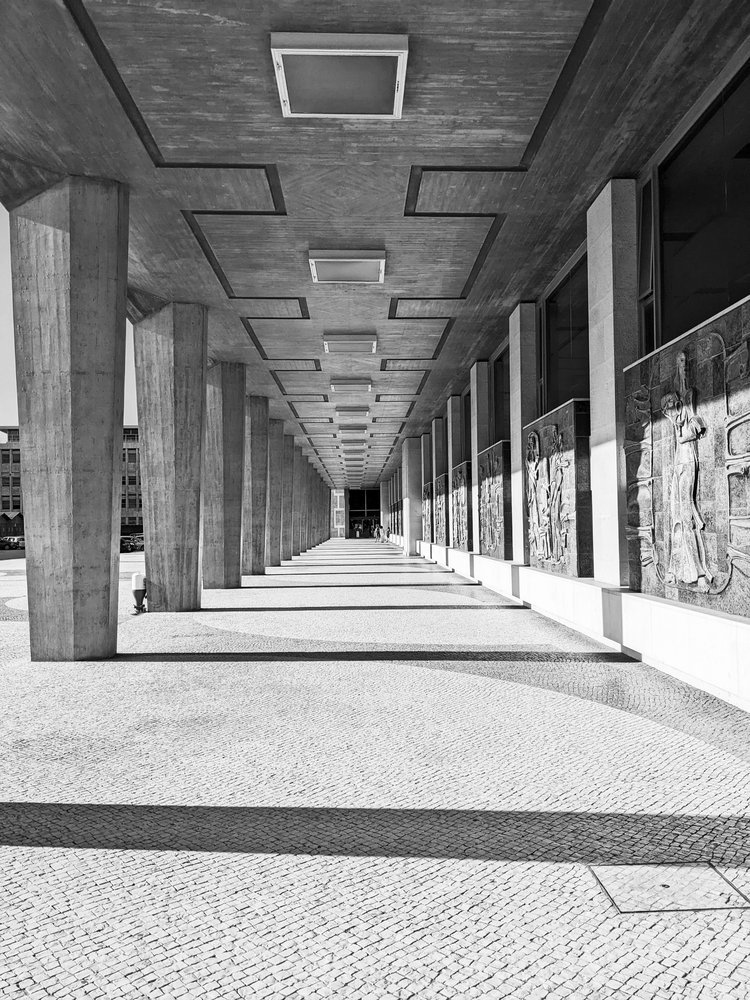
walking around trellick tower, one begins to see it less as a singular object and more as a system of relationships — verticals and horizontals, solids and voids, human scale and monumental scale. the challenge in the studio is to preserve that logic while making it useful in domestic interiors. the resulting patterns are structural, repeatable, and thoughtful, but also soft and tactile: a domestic dialogue with a building designed to be cosy yet monumental.