finally some architectural inspiration, and we’re back to somewhere we love: portugal!we have admired buildings lisbon before and yes, something something azulejo related should really coming to the blog… but this time we’re going to porto, and not even too far from the picturesque city centre, we’ll just walk a little westward through the architectural hotspot of boavista .
it’s largely a residential neighbourhood but it has a few interesting buildings such casa da musica (of none other than rem koolhaas) and the faculty of architecture (of course!). these are magnificient buildings, which, i feel, deserve their own blog posts later, trust me they’re coming.
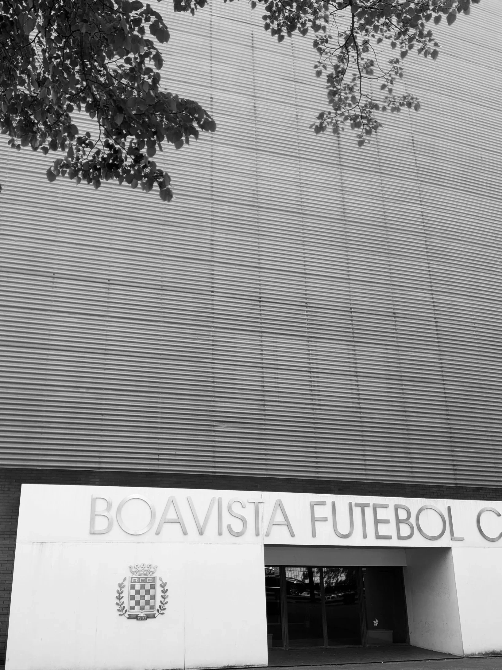
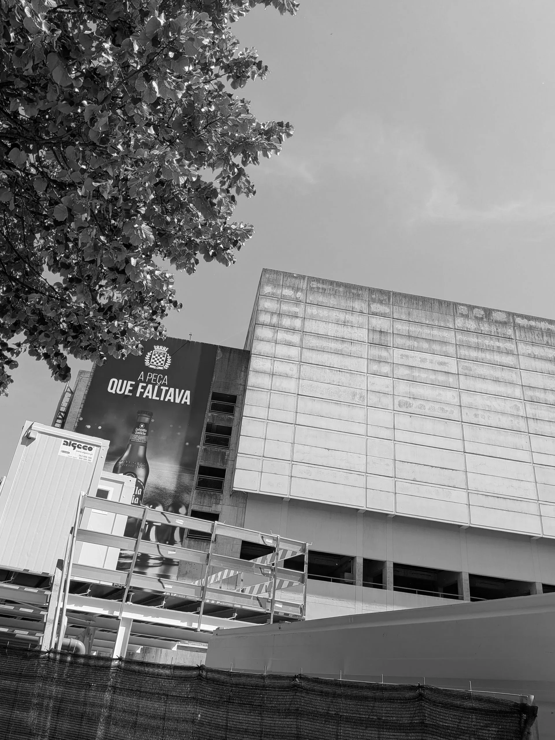
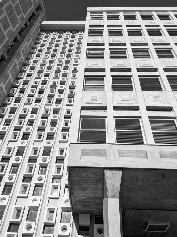
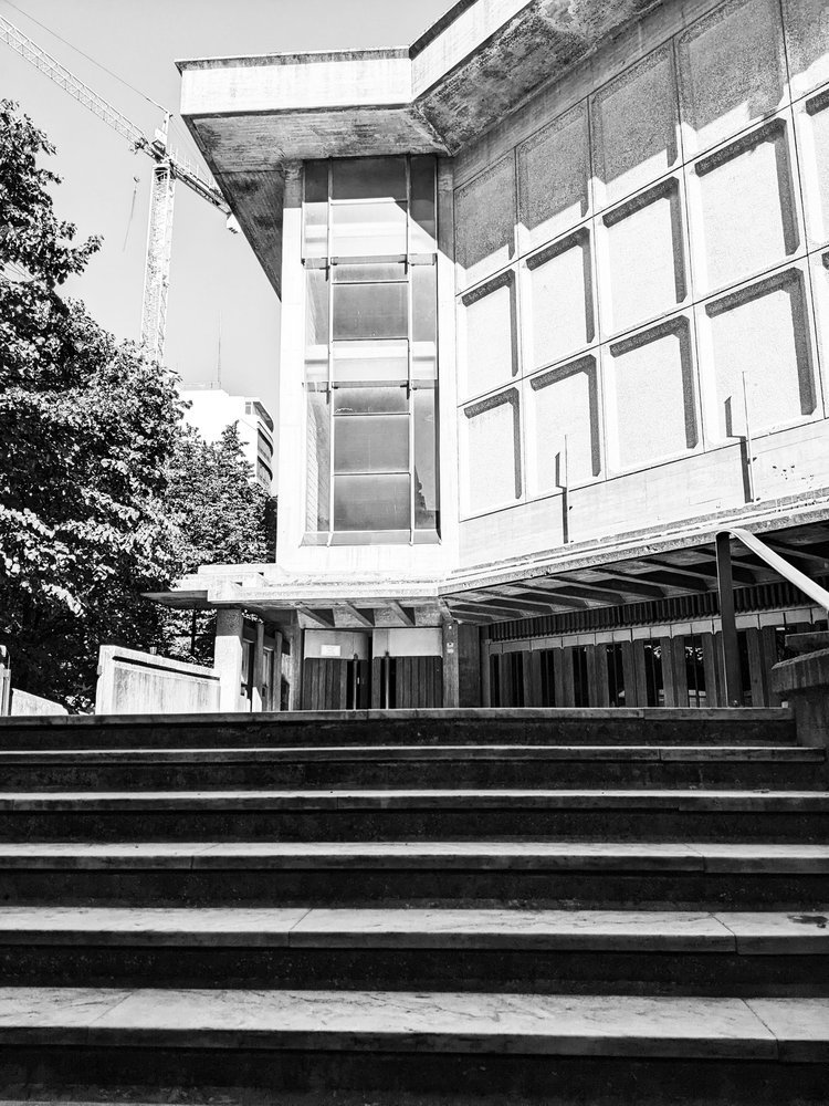
however before we visit these, we’ll just walk through a little bit of the residential streets to two lesser visited sights, one i discovered completely accidentally. i was in search of porto’s brutalist church, paróquia de nossa senhora boavista, when, the residential low-rise architecture suddenly gave way to an immense, towering slab of brutalism: estádio do bessa século XXI, home of boavista f.c.
the football club itself is currently non-operational at a professional level - although there was some visible activity, they do not participate in any of the leagues just now and of course visitors couldn’t go inside to inspect the pitch. but the football was entirely secondary to the vastness of the structure itself.
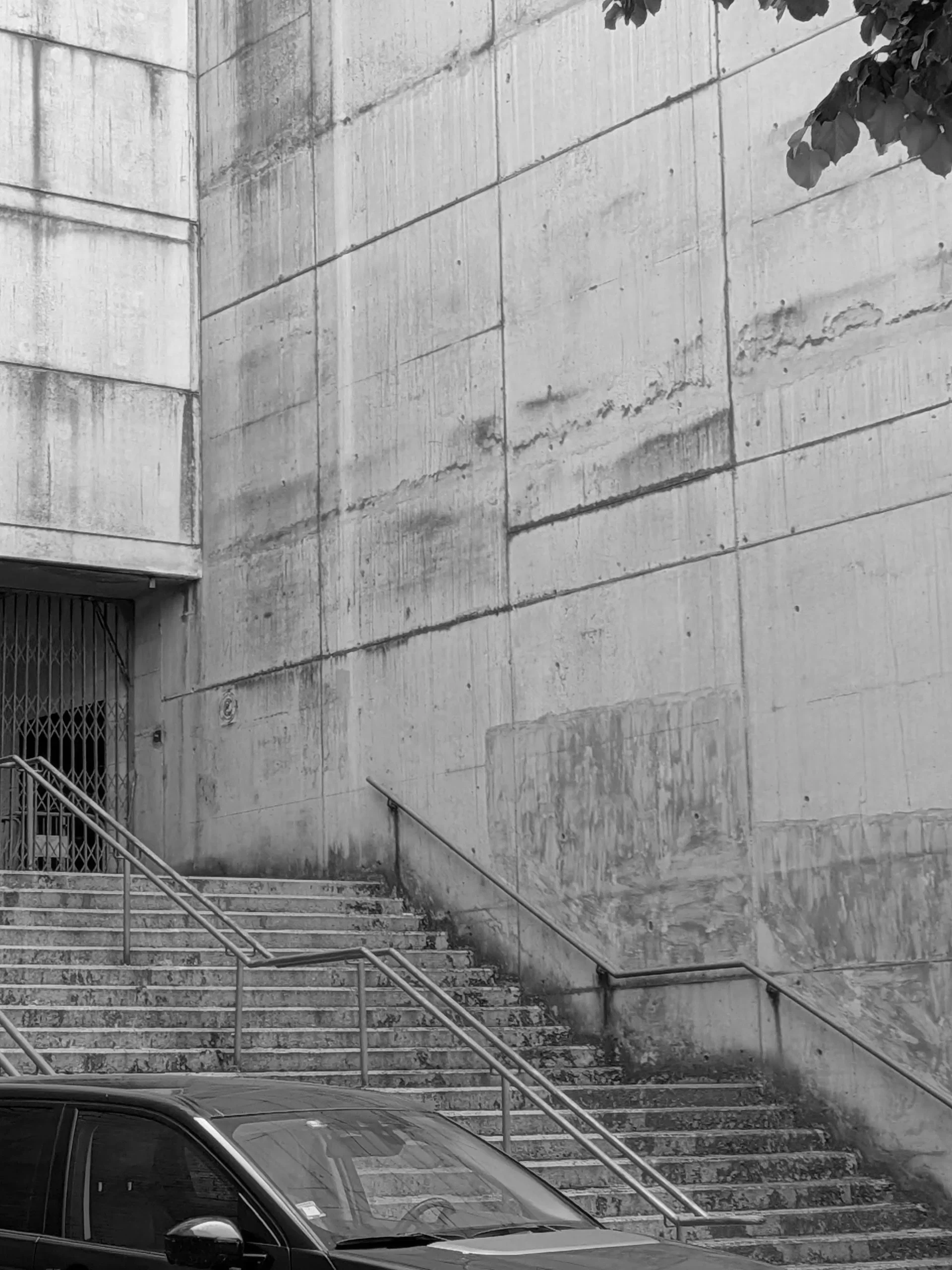
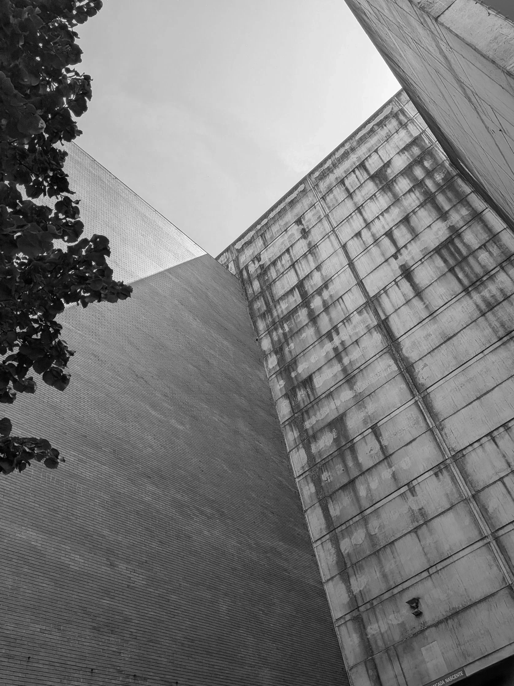
what makes it magnificent is the sheer, un-decorated scale of the exterior framework. massive, vertical board-marked concrete panels soar upward to hold an immense structural volume, using nothing but its own structure. there is a beautiful, organic honesty to how concrete ages under the sun and rain; a raw, weathered texture that commercial design processes spend years trying to artificially replicate. it was a brilliant reminder that when a grid is strong enough, it doesn't need to ask for attention.
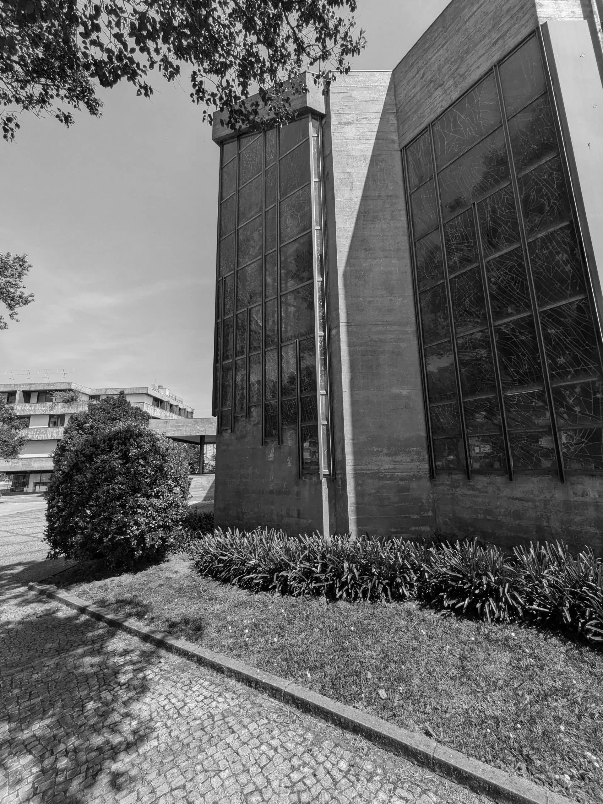
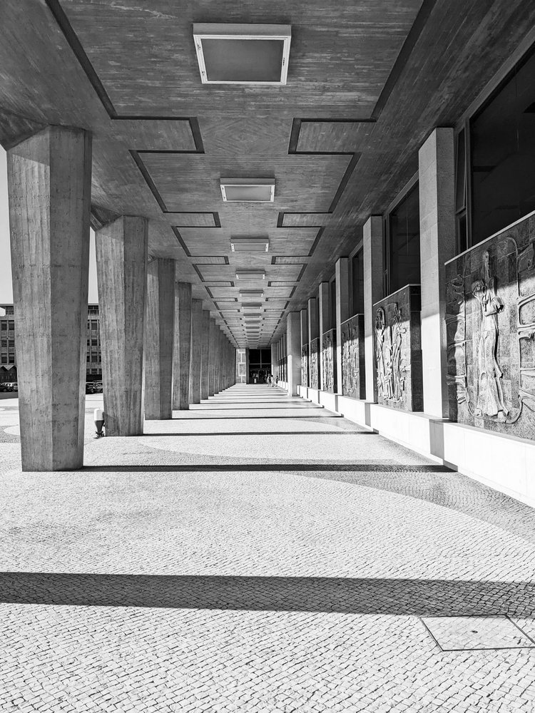
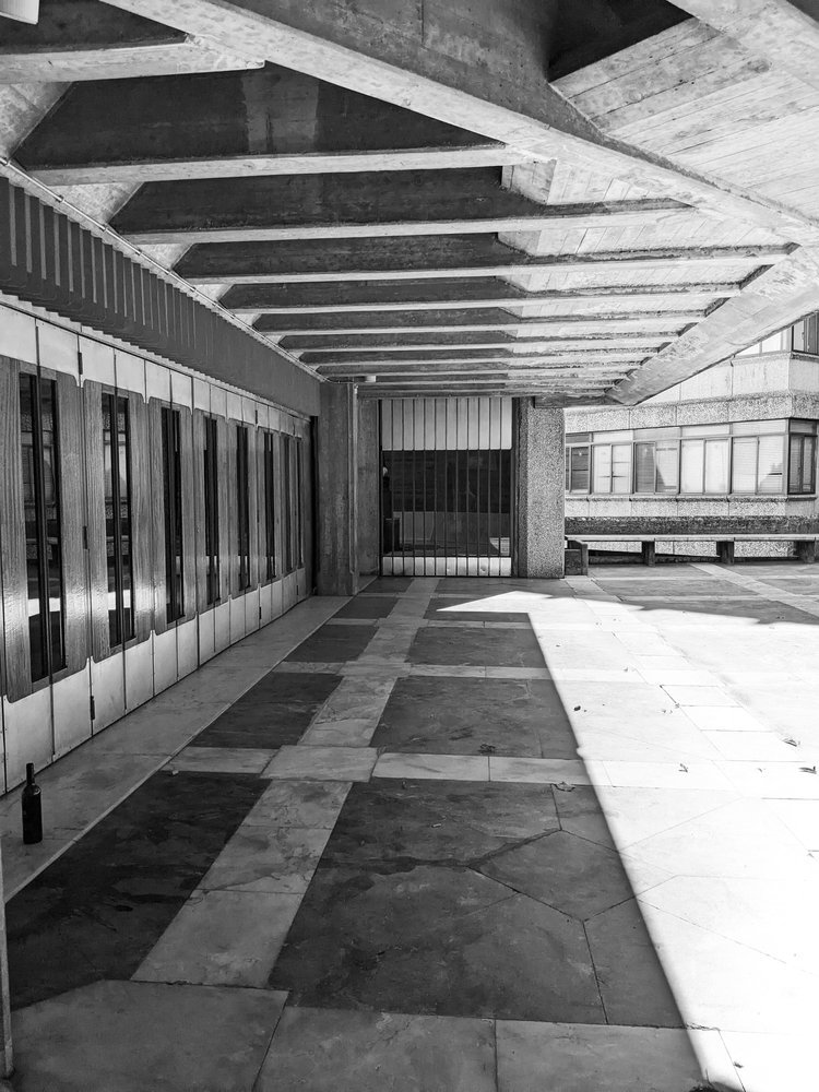
continuing further down the same street, he stark monolithic scale of the stadium shifts into a dense residential grid of modernist blocks. nestled right into the heart of this community, serving the surrounding apartment towers, sits our church, the paróquia de nossa senhora da boa vista. designed by the architect agostinho ricca, the church feels less like an isolated monument and more like a functional civic anchor for the local streets.
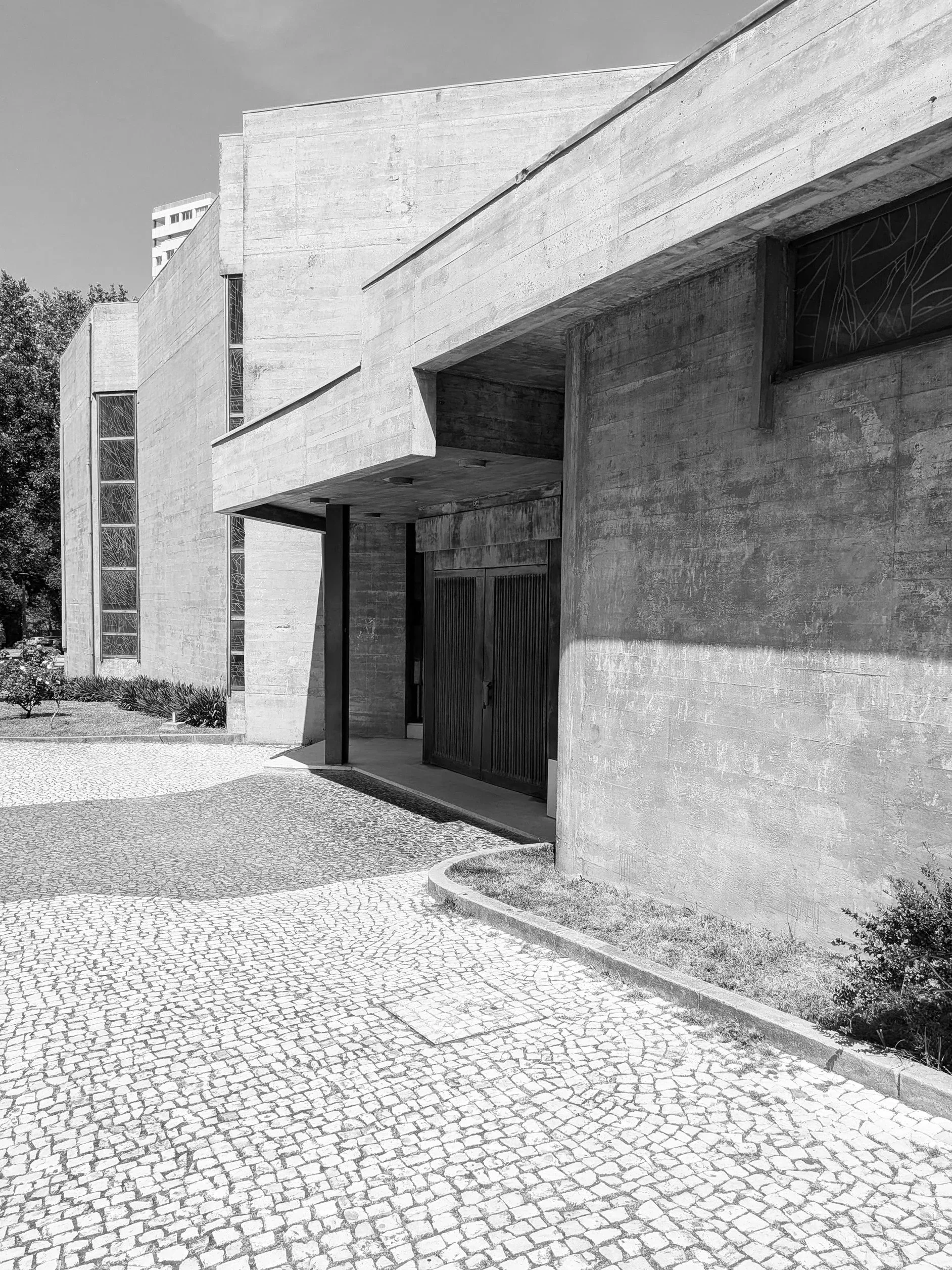
the doors were not open at the time of visit and as such an interior inspection was prevented but brutalism is rarely a style that hides its logic on the inside anyway. the building uses a staggering network of cantilevered concrete canopies and deep recesses that cut sharp, graphic shadows into the stone pavement. the ground beneath your feet isn't just a walkway; it is a meticulously laid out grid of traditional cobbles intersected by dark paving bands that frame the spatial navigation of the entire site.
standing directly under the main canopy, the overhead mass feels impossibly heavy, yet it is perfectly balanced by the strict linear staircase leading into the dark entrance. it is a lesson in how to create a physical transition, forcing you to acknowledge the structure before you even cross the threshold.
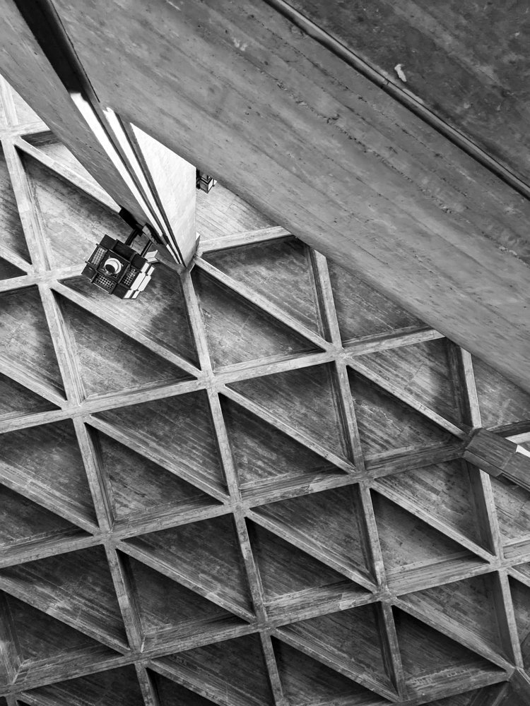
looking up, ricca’s genius becomes even clearer. the bell tower swaps traditional religious ornament for a series of vertical concrete fins that resemble a massive, modernist pipe organ. under the blazing sun, these fins break the light into a rhythmic pattern of high-contrast vertical lines. it is exactly what we mean at zitozza when we talk about a structural framework: the form itself is the decoration.
moving around the side of the nave, the concrete walls turn into a spectacular piece of abstract lead glass window of the entire corner building, which i wish i could have seen from the inside as the sunny day would have allowed for some amazing light through for sure.
the church does not exist in isolation of course, it sits surrounded by tidy, tended urban nature and residential blocks and shopping centres, neatly weaving together this part of the city - with a road leading to our next stop, casa da música.
this walk was a necessary recalibration for my mind. the rules do not change. you create a clean, honest, highly functional grid, and you step out of the way so the material can tell the truth. follow the journey for the next stop.
back in february, i wrote about why i find the term “storytelling” so exhausting when applied to pattern design, and i really do believe that a pattern doesn’t (and shouldn’t) guide you through a linear narrative; rather, it surrounds you, as in, all of it exists all at once. i wanted to expand on this thought a little bit further and make the case for curiosity, something that’s at the core of zitozza.
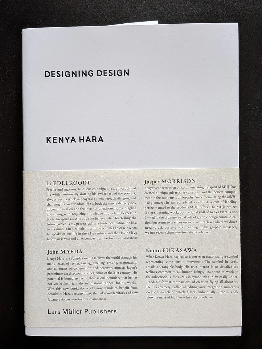
the explanation is actually not mine, it lies in a concept coined by the japanese designer kenya hara:exformation.
in his book designing design, hara argues that our modern world is entirely obsessed with information, with throwing broken pieces of knowledge at people until they feel they "know" everything. we see this everywhere in contemporary interiors. spaces are styled to look like a specific narrative, a carefully curated scrapbook of a person’s supposed lifestyle. the design leaves nothing to chance, forcing a pre-packaged biography onto the inhabitant.
“basically, knowledge is no more than an entrance to thought (...) to know something is not a goal, but a starting point for our imagination. (...) the information-dispatch side is engrossed only with throwing broken pieces of information at the recipient, and the recipient has begun to consider catching information as the goal. (...) i wonder if this is where the problem of stagnating creativity in communication lurks?” (hara, 2007)
“exformation” is the exact reverse of this process. it is the art of making something known not by over-explaining it, but by awakening the viewer to how much is left to be discovered. it is about converting the known back into the unknown, creating an entrance for curiosity.
“the “in”, of “information” is an affix. attached to the beginning of a word, sometimes it adds a negative implication. but in most cases, it intensifies the root meaning, or adds meanings like “directed within, on and toward”. this is the case with “inform”. the word “form” means to shape, organise, or arrange in order, but implies the movement vector involved in taking a definite shape. accordingly, “inform”, with the background meaning, “giving a certain form”, carries meanings like, “to make known”, “to tell”, “to imbue (with a feeling)”. then, in noun form “information”, it takes on meanings such as communication, knowledge, information and scholarship, and further refers to the service of giving information, as in “information booth”. in the word “exformation”, the prefix is changed from “in”, to “ex”, reversing the meaning of “in”. the meanings of “ex” include “not”, “out of”, “outside”, “eliminated”, “prior”, and others. this is the source of the concept of converting the known to the unknown. Notice that “exterior” is already widely used as the counterpart to “interior”, so my coined term, “exformation”, may well make sense to the general public.”
so by his logic, when we apply this to the spaces we live in, the implications are profound. an interior does not need to communicate a story; it needs to create the conditions for experience.
this is where the architectural grid and the repeating textile system come into play. to some, a modular grid might seem cold, rigid, or overly rational. but in reality, the grid is the ultimate tool of exformation.
the grid does not dictate a narrative. it doesn't tell you how to feel, nor does it demand that you admire its personal history. instead, a repeating system establishes rhythm, scale, and tempo. it sets a clear, visual boundary line that provides stability, and then - crucially - it stops talking.
by remaining emotion-free and focused purely on proportion, a modular textile system leaves what kenya hara calls a "productive emptiness." it creates a framework that waits for the inhabitant to fill it in. the meaning of the space isn't prescribed by the designer; it is constructed by the person moving through it, watching the light shift across the floorboards, or holding a conversation over a table.
this philosophy is the exact blueprint behind the digital pattern design tool i’ve been developing for zitozza. when i design a printing block based on an architectural reference, i am not trying to narrate the building's “biography” as such. i am extracting its spatial logic. when a designer or architect uses the tool to rotate, repeat, and configure those blocks, they aren’t receiving a finished story from me. they are using a language of forms to create their own framework.
losing the compulsive forcing of stories in design is nothing to fear. stripping away the sentimental fluff doesn't make a room cold; it makes it spacious. it shifts the designer's role from a loud storyteller to a quiet translator of rhythm.
after all, a rug shouldn’t be a biography. it should be a foundation. it should simply clear enough visual noise out of the way so that life has enough room to happen inside it.
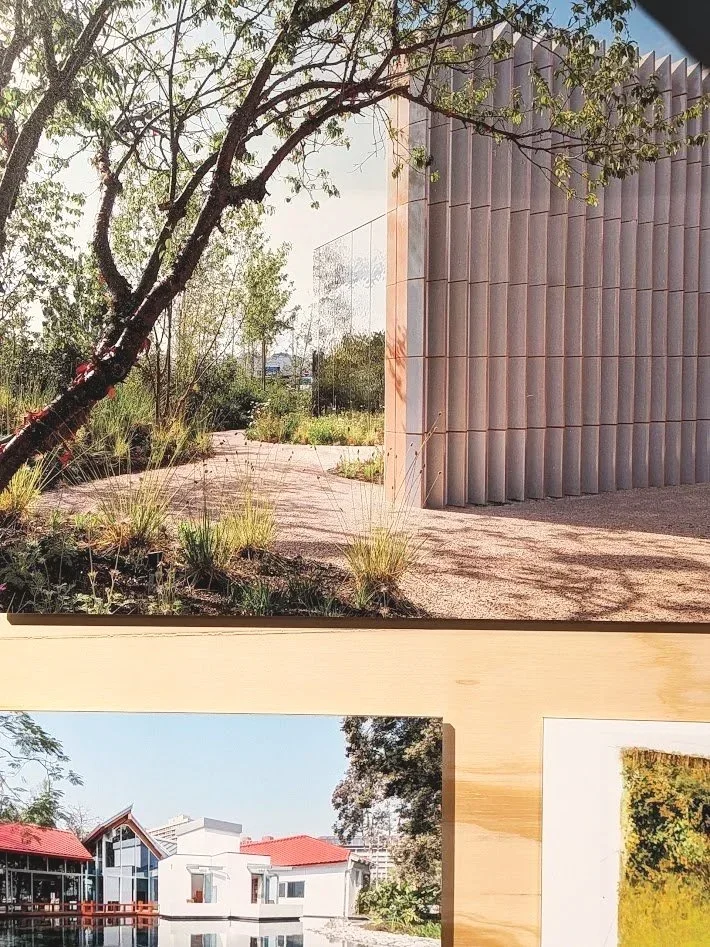
we have another exhibition recommendation for you - this time at the v&a dundee (where i have recently joined the team as a freelance design educator so expect more exhibition visits later!) but even without this link, when you title your exhibition “maggies: architecture that cares”, it surely is a call to visit for this architecture lover.
at zitozza, the built environment is usually viewed through a lens of deconstruction: we look for the geometry in the utilitarian and the overlooked, but this new exhibition shifted the focus from form to feeling. the small, but tightly packed display on the upper foyer documents the history of maggie’s centres in the UK and beyond - they are cancer support sanctuaries designed not as clinical annexes, but as intentional pieces of architecture.
the system of sanctuary
the exhibition showcases a range of approaches to the "architecture of care," from the clean, glazed precision of foster + partners to the timber-heavy, tactile structures that prioritise light and nature. it isn't just a collection of buildings; it is a study in how a physical environment can be designed to feel humane.
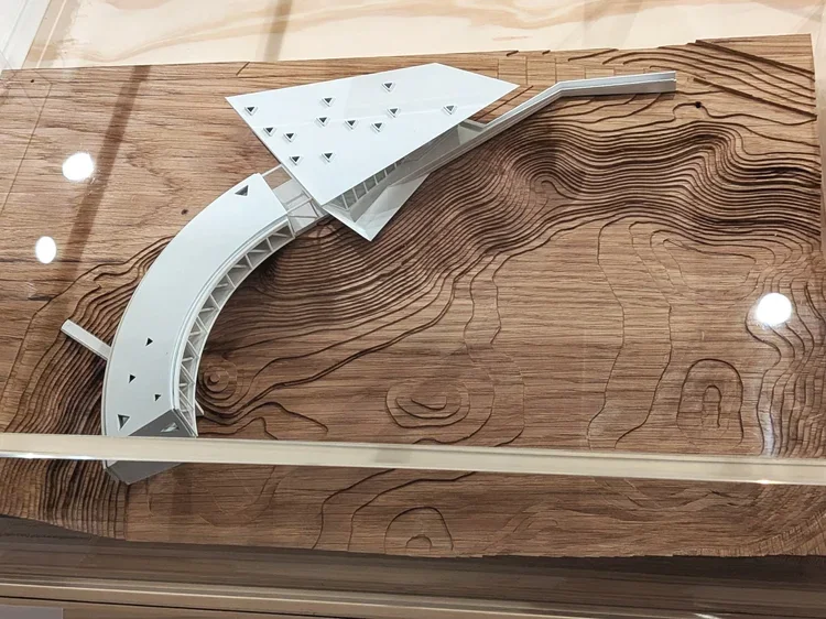
what is most striking is the light and the openness. many of the centres feature glass walls that dissolve the boundary between the interior and the surrounding gardens. the models in the centre of the foyer demonstrate how these buildings are designed to breathe, offering a direct contrast to the often built-up surroundings of a hospital site.
textiles as a structural tool
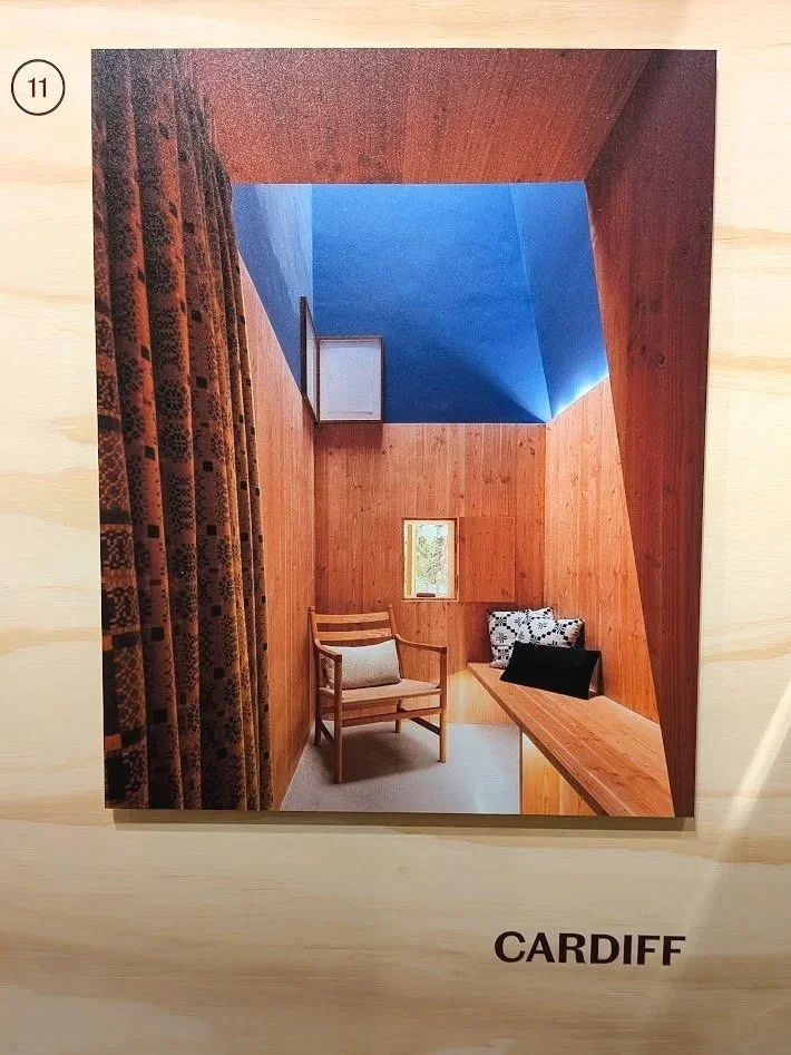
for a textile designer, the wall displays offer a fascinating glimpse into the interior logic of these spaces too. alongside architectural sketches are stories of how materials are selected to ground the inhabitant.
in the documentation for the cardiff centre, for instance, traditional welsh woven patterns are highlighted. it's a reminder that textiles aren't "decoration" in these contexts; they are a necessary tactile layer that provides warmth and familiarity. the presence of a tapestry by edoardo paolozzi (on loan from one of the centres) further reinforces this. it shows how a bold, modern building needs the rhythmic, woven interruption of art to feel truly "resolved."
a recalibration of the "wow"
as someone finding spiritual solace in the “soulless”, uniform spaces of hypermodernity, i have historically been sceptical, if not downright suspicious of "gimmick" architecture. when i looked at the expressive curves of architects like frank gehry or the sculptural forms of heatherwick studio, i often felt like they are prioritising the photograph over the inhabitant, that the spectacle is empty or even hiding something sinister.
however, maggie keswick jencks (a landscape designer herself) founded these centres on the belief that the environment is a core part of the treatment. the "wow" factor isn't about the architect's ego; it’s about giving the inhabitant a sense of agency. in a clinical world where you are often a passive recipient of care, these bold, often absurdly beautiful spaces demand that you remain a curious, active participant in the world.
because let’s face it, when you are going through endless medical appointments, series of gruelling surgeries and various forms of therapies with exhausting side-effects, you will get quickly tired of the rigid, sterile “order”, and navigating the windowless corridors and white waiting rooms very soon becomes a miserable chore for survival. in this context, a zaha hadid curve or a gehry roof isn't the award-seeking spectacle i used to think about it as; it becomes a lifeline. it’s a moment of wonder and beauty in a time that is otherwise so horribly bleak. it made me understand it much better where this type of architecture belongs and why they win many of these kind of projects. this is clearly what they do best.
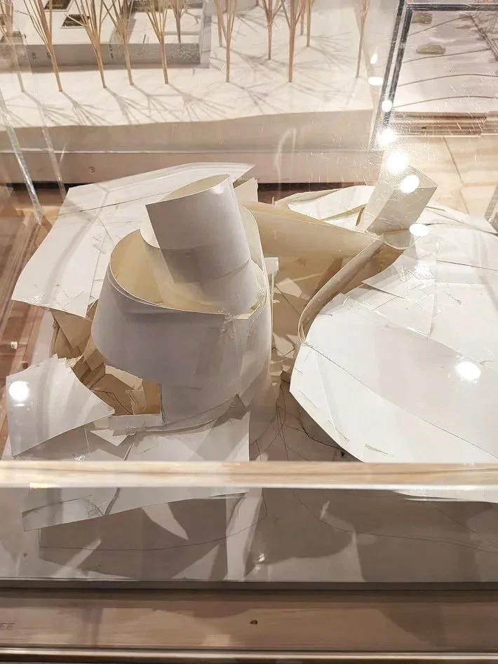
the models themselves are interesting, there are a few different standards from perfectly scaled to ceramic sculpture models. frank gehry’s original paper model is displayed (borrowed from the permanent galleries next door.) there is a great anecdote shared about how he hacked at this first paper concept with scissors when he felt it wasn't "open" enough and it’s a proud piece in the permanent galleries for precisely this imperfect, battered appearance as you can absolutely see the compromises to this paper vision in the resolved structure that was eventually built. but it still highlights the raw energy of the intent, and the exhibition, and particularly the accompanying video room which captures the lived experience of these buildings, gives the perfect explanation of where this vision works best.
i feel that in an era of low-budget architecture, the uncompromising, human-centred mission of maggie’s centres needs to be doubly celebrated. the exhibition makes it clear how the organisation takes great pride in these wonderful spaces and the experiences they can provide to their visitors.
beyond the foyer
the display extends to a wall opposite the learning studios, placing maggie’s in a historical lineage of care-based design, referencing everything from the nightingale hospitals to alvar aalto’s paimio sanatorium.
it’s a beautiful, thoughtful exhibition that reminds us to look at our environment with curiosity. whether a building has clean, straight foster-esque lines or the "gimmicky" waves of a celebrity architect, its success ultimately lies in whether it makes the person inside feel cared for.
maggie’s: architecture that cares is on at the v&a dundee until 1st november. michelin design gallery, v&a dundee, 1 riverside esplanade, dd1 4ez
this post is something that has long been ready to get off my chest. in design conversations, one phrase appears with remarkable frequency: “telling a story.” designers are told to tell stories, brands are told to tell stories, and increasingly it seems that if a piece of work isn’t narrating something explicitly, it risks being seen as incomplete.
the overuse of “storytelling” like this has irked me for a long time, and i’m certainly not the only one (just ask stefan sagmeister!)
even so, when i place one of my textile patterns next to a building that inspired it, i was told a few times that this was actually “storytelling”, it is, however, and i cannot emphasise this loud enough, absolutely not the case. what i’m doing is providing context. the pattern is not a narrative illustration of the architecture; it is an abstraction, a translation of rhythm, proportion, and geometry into another material. the meaning that follows is not something i dictate. it’s something the viewer constructs for themselves.
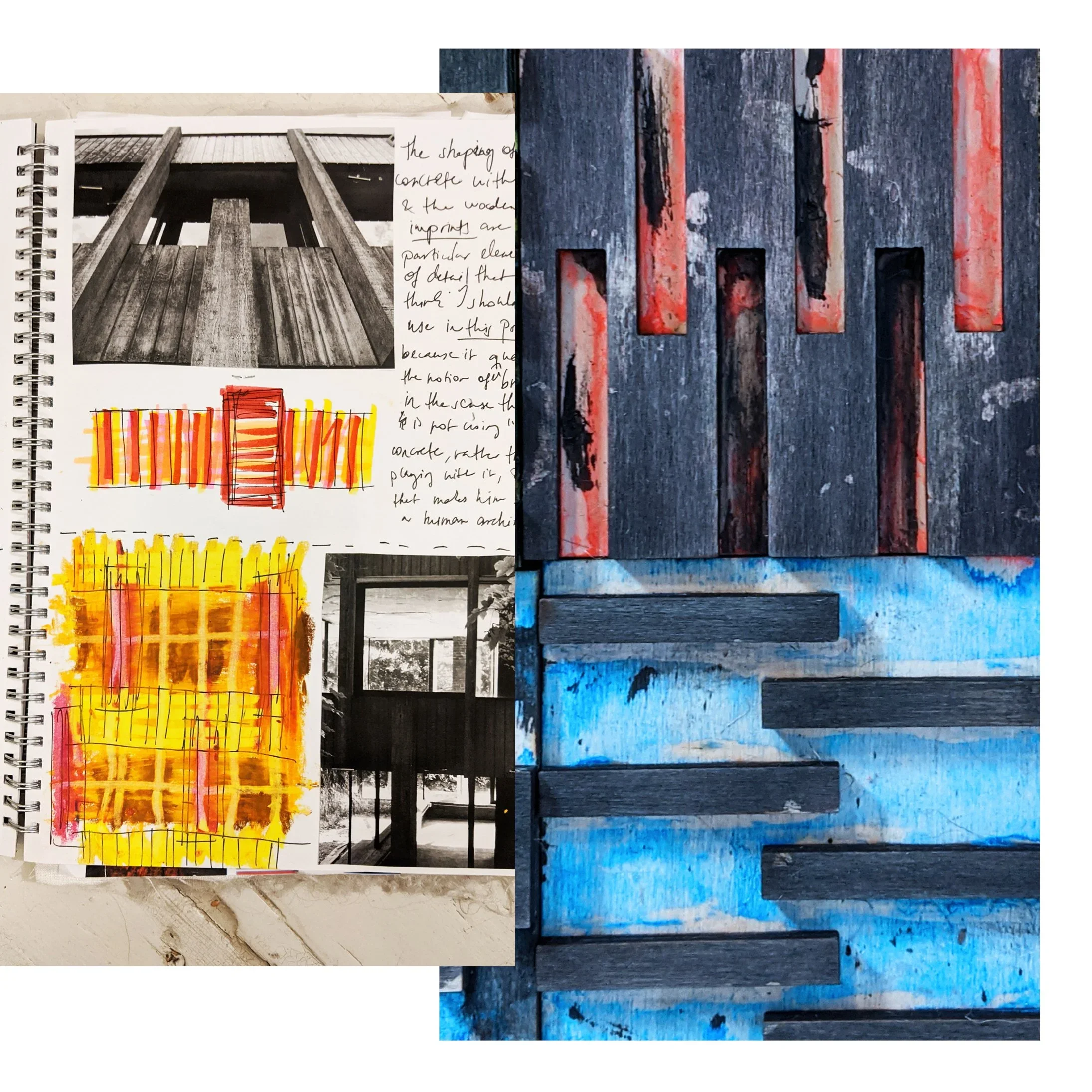
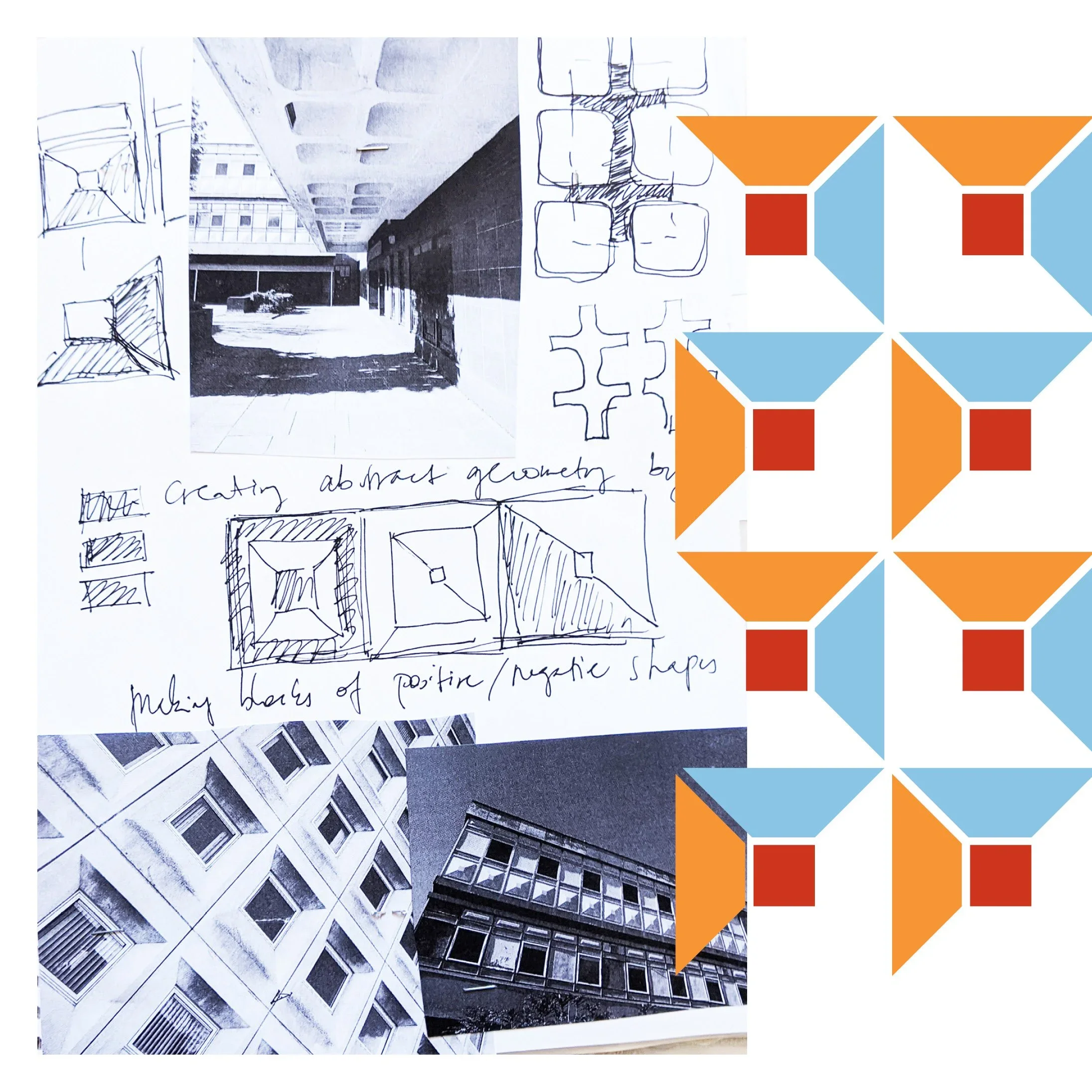
a story, by definition, has a beginning, a middle, and an end. design education also often encourages students to present their work as a clear sequence: research, sketches, development, final outcome. it makes sense as a teaching method, but in practice creative thinking rarely behaves so politely. many of the patterns i developed during university arrived first as fairly complete ideas (sometimes emerging through digital experiments, sometimes fully formed in my head) and only afterwards did the sketchbook pages appear, carefully reconstructing a linear “process” that satisfied academic expectations. i decided to use these faked sketches to illustrate my point because i find it funny how strongly we expect creativity to move like a neatly unfolding sequence, a step by step process, when in reality it often moves in leaps, loops, and sudden recognitions.
it’s true though, i never thought of design, and certainly not of patterns as stories at all. a repeating motif does not guide you through a linear experience; it surrounds you. it exists all at once. trying to treat pattern as a narrative object can sometimes be like insisting that a brick should also function as a sentence. it is simply the wrong unit of meaning.
what design does instead is create frameworks. they establish rhythm, scale, and atmosphere. they provide visual conditions within which people live their own lives. the “story,” if we insist on using the word, happens in the room: in the conversations held around a table, the light shifting across a wall, the slow accumulation of everyday use. design is not the storyteller; it is the stage set.
this is one of the reasons i work with modular systems. each printing block is designed to combine, rotate, and repeat, forming structures rather than scenes. the result is not an image with a fixed message but a language of forms that can adapt to different interiors and different users. the same pattern can feel calm in one space, energetic in another. none of these readings is prescribed, and that openness is intentional.
context, however, still matters. placing a textile next to an architectural reference is not an attempt to narrate a building’s biography. it is simply a way of showing where certain formal decisions originate. a façade grid might influence the spacing of a pattern. a row of windows might suggest a vertical rhythm. these relationships are structural rather than narrative.
i think the pressure for every piece of design to “tell a story” often comes from branding culture, where narrative clarity is treated as the primary route to meaning. pop-culture now also mostly speaks in films and literature, quite often at the expense of visual thinking (see also the brutalist…) but objects have other ways of communicating. material weight, surface texture, proportion, and repetition all shape how we experience a space, often more profoundly than any written explanation. a heavy linen curtain filtering afternoon light communicates something immediate and sensory, long before anyone explains its conceptual background.
in fact, insisting too strongly on storytelling can sometimes limit how people engage with design. if the designer declares what the story is supposed to be, the viewer’s role becomes passive: they are asked to receive the message rather than interpret it. abstraction offers the opposite possibility. it invites participation. it leaves room for personal associations that may have nothing to do with the designer’s original reference point, and that is not a failure of communication; it is the success of open-ended design.
this does not mean narrative has no place in creative work. many designers use storytelling brilliantly, especially when working with figurative imagery or historical references. but it is worth remembering that design can operate through multiple modes of meaning. sometimes a chair is interesting because of its ergonomic logic. sometimes a building is compelling because of its structural clarity. sometimes a textile matters because of the quiet order it introduces into a room.
patterns do not need to speak in sentences to be meaningful. they function more like music: repetition, variation, tempo, pauses. we do not ask a piece of instrumental music what “story” it tells, yet we still experience it as expressive, emotional, and deeply communicative. textiles can work in the same way.
so when i show a pattern alongside the architecture that influenced it, i am not telling a story. i am showing a relationship. what happens next — what memories, associations, or interpretations emerge — belongs to the person living with the piece. the narrative is theirs to write, not mine to dictate.
and perhaps that is the real advantage of abstraction: it leaves enough space for life to happen inside it.
as yet another year closes, i think a lot about time, i guess that’s part of getting older, but some things only get interesting once they’ve stopped pretending to be new. a façade darkened by rain, a jute fibre frayed at the edge, paint softening on steel - marks left by time. designers often call this patina, but that word is a little superficial to me, what time does isn’t decoration. it’s participation.
materials in conversation
the modernist world has always been oddly conflicted about ageing. le corbusier spoke about architecture as a “machine for living,” yet machines rust, fade, and require care. in japan, the concept of wabi-sabi embraced this truth long before modernism tried to streamline it: finding harmony in imperfection, dignity in transience.
ernő goldfinger’s trellick tower, denys lasdun’s national theatre, even the modest housing blocks of glenrothes all share something accidental yet profound: their surfaces record weather, pollution, human use. they’ve become topographies of touch. the stains, the moss, the soft greying - proof that buildings are not finished objects. they are ongoing negotiations with the elements.
the hand of time, or of the maker
when i print, i think about this a lot. the brushstrokes i add to my blocks are deliberate interruptions, these are of course not so much about decay but adding individuality. the texture of ink brushed by hand can never be repeated twice. the smallest movement alters the weight, the rhythm, the outcome. each print becomes a fragment of time in its own right: unrepeatable, slightly imperfect, quietly alive.
there’s a strange comfort in knowing that a surface can’t be copied. the same logic that makes an old wall fascinating makes a textile human. both bear traces of their making (of process, not perfection.)
the industrial sublime
as much as i’m obsessed with the new, and its constructions sites in ambitiously high-reaching cranes, i do also like a bit of the odd demolition. scaffolding, half-poured concrete, peeled paint - this choreography of decay and regeneration, particularly because it’s difficult to build in new. there usually was something else before. perhaps it’s the same impulse that drew me to brutalism in the first place: the beauty of things in progress and the kind of resistance to polish.
artists like rachel whiteread or gordon matta-clark come to mind in a way, cutting, casting, or revealing voids as a form of understanding architecture through absence. they teach us that every layer removed or revealed is part of a story of use.
in design, as in cities, change is the only constant material.
designing for impermanence
this is why i find the idea of “timeless design” slightly absurd. nothing is timeless, nor should it be. what matters is whether something ages well - whether it accumulates life gracefully. good materials evolve rather than resist.
printing by hand is, in a way, a small rehearsal of that truth. each block presses its own memory; each brushstroke leaves its mark. what results is never uniformity, but rhythm, the same kind of rhythm that time itself applies to architecture.
texture as memory
so perhaps the goal isn’t to preserve perfection but to let things breathe. to allow colour to fade, surfaces to soften, patterns to settle. the beauty of impermanence lies in that generosity in letting the world contribute to the design after you’ve stepped away.
buildings weather, fabrics crease, and the hand that made them is long gone, but the marks remain. it’s not nostalgia. it’s continuity.
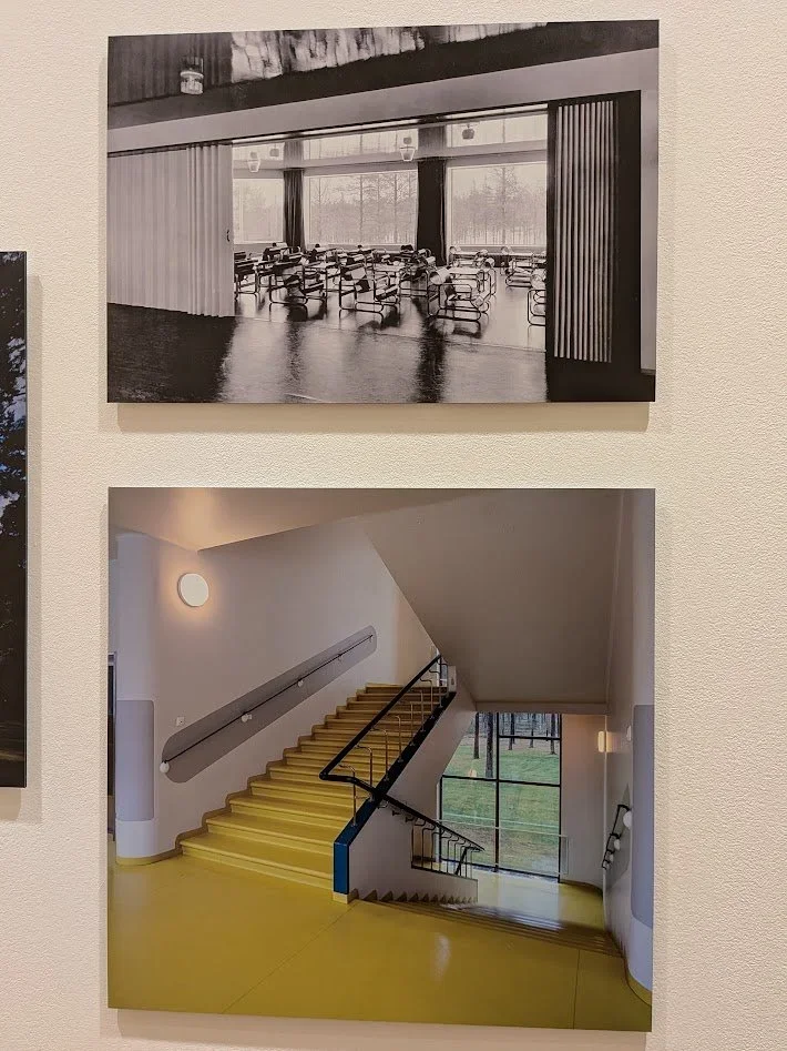
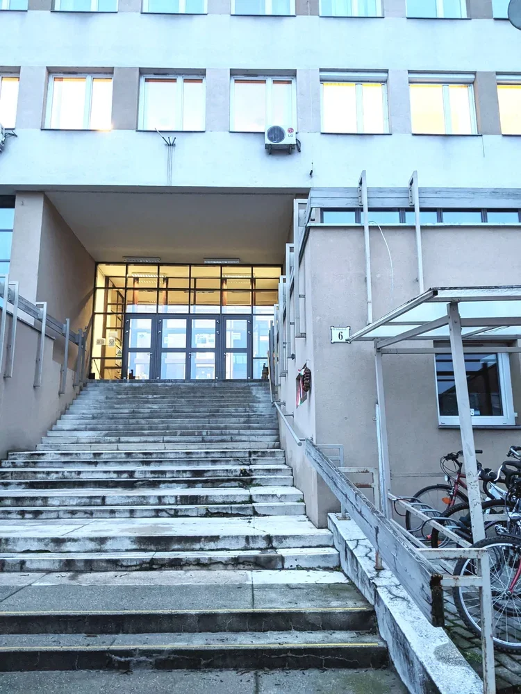
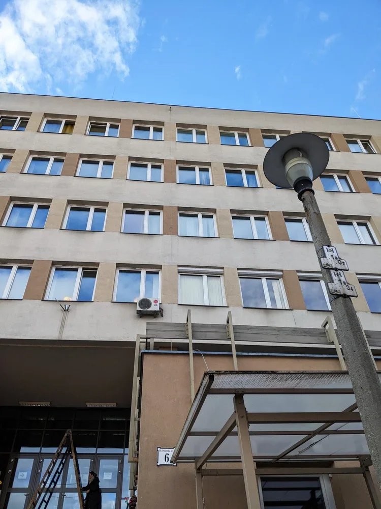
after a few tours at various student halls in edinburgh and st andrews, it’s time to bring you something quite special, in line with my new year’s resolution to bring you more buildings from hungary. we’re going to my alma mater, the óbuda university building on doberdó út – home of the rejtő sándor faculty of light industry and environmental engineering and the building itself too shaped how i think about structure, material and use.
this is where i studied light industry and product design. and no, “light industry engineeering” does not mean “electrical engineering but with nicer lamps”. in hungary, we use this term as an opposite of heavy industry. light industry is the world of textiles, paper, packaging, printing, plastics – all the things that actually touch your skin, your shelves, your coffee table. the soft infrastructure of everyday life.
the building fits that brief in a surprisingly literal way.
built into a hillside
approaching from the street, you walk up towards the entrance. it’s a long flight of stairs to go up on the first floor, and as soon as you’re inside, the uphill continues.
because it sits on a steep slope between doberdó út and the kiscelli park edge, the whole structure works like a split-level diagram someone decided to extrude into reality. there is a back building of half floors attached to the long, street facing facade. offices and admin spaces occupy the half-floors stepping up along the hillside while the larger rooms – auditoriums, drawing studios, labs, the library – drop down on the other side parallel with the street.
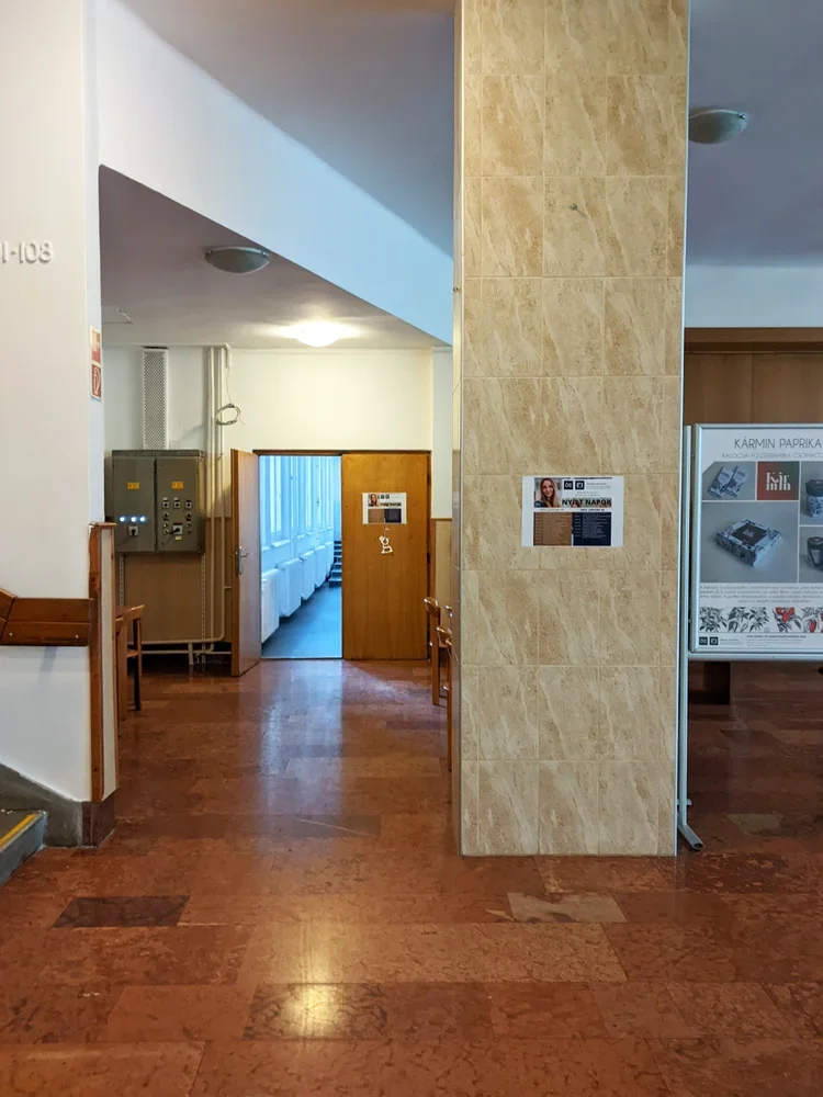
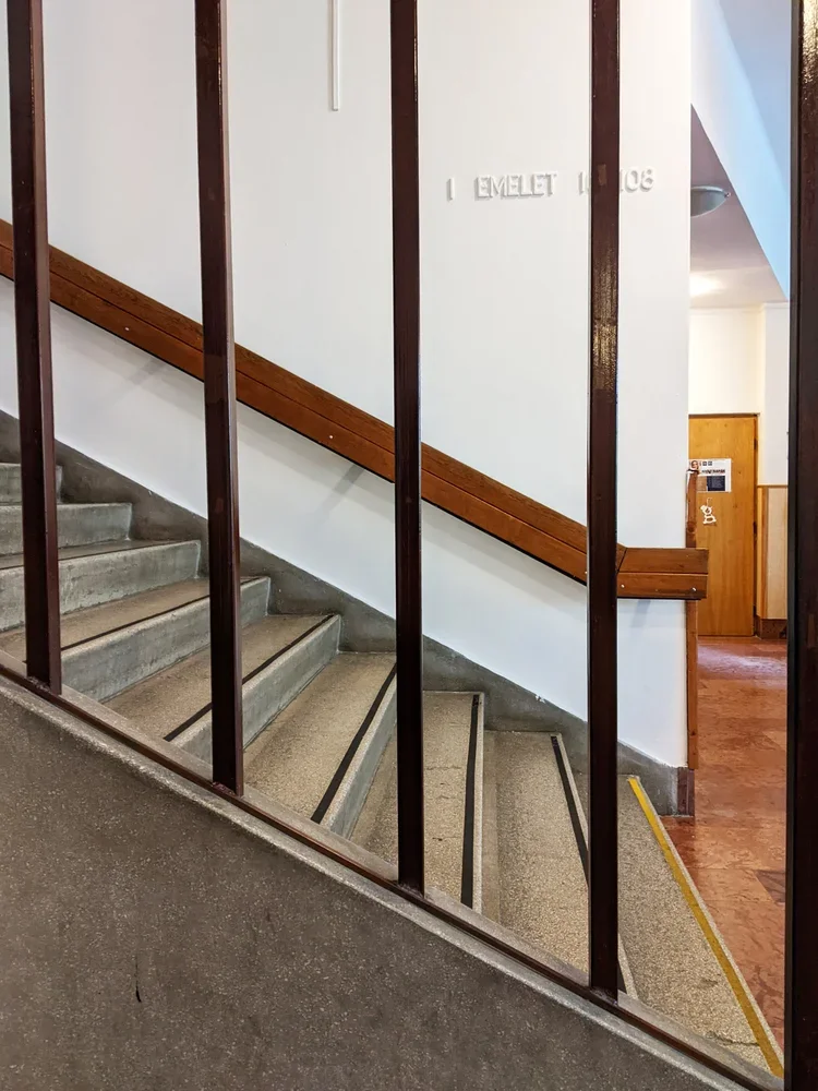
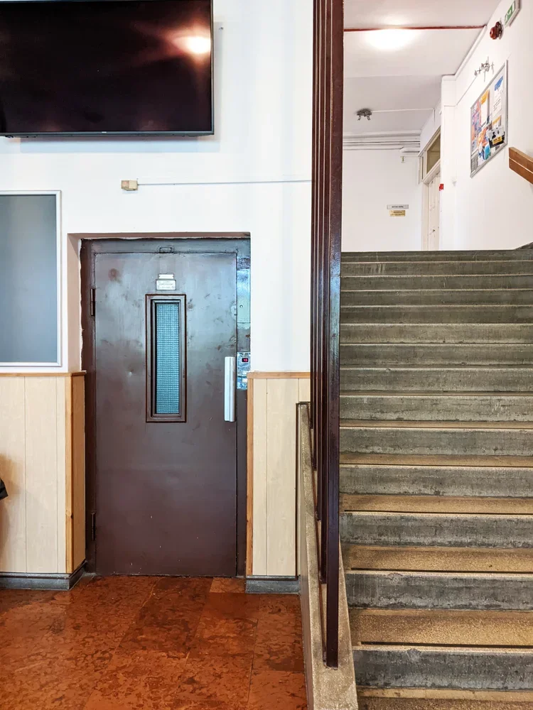
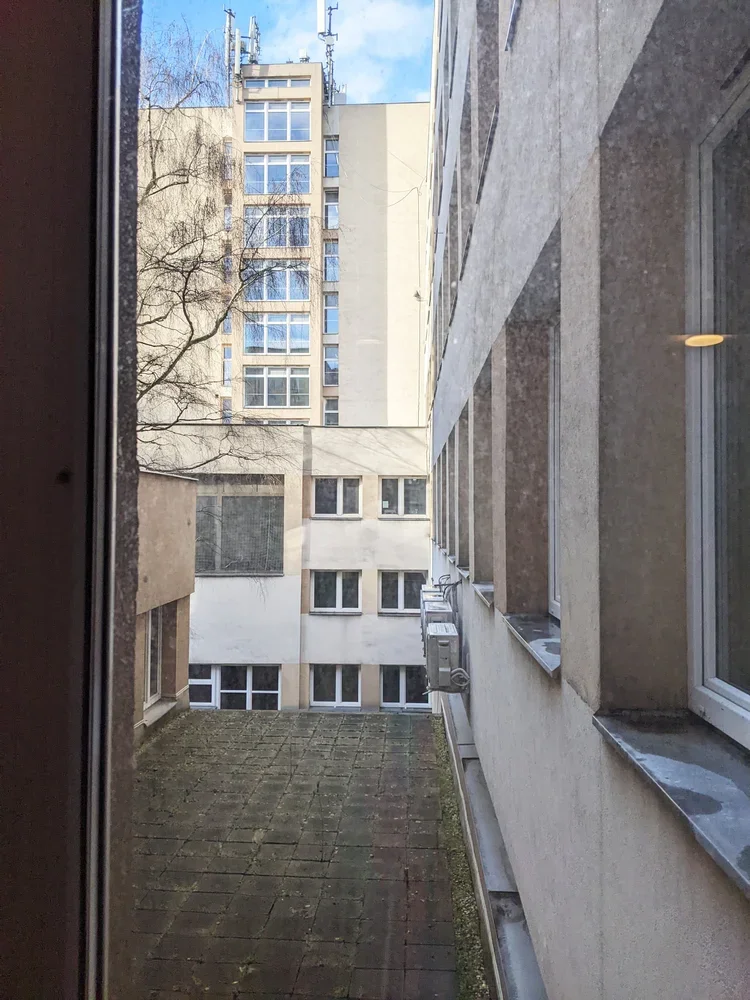
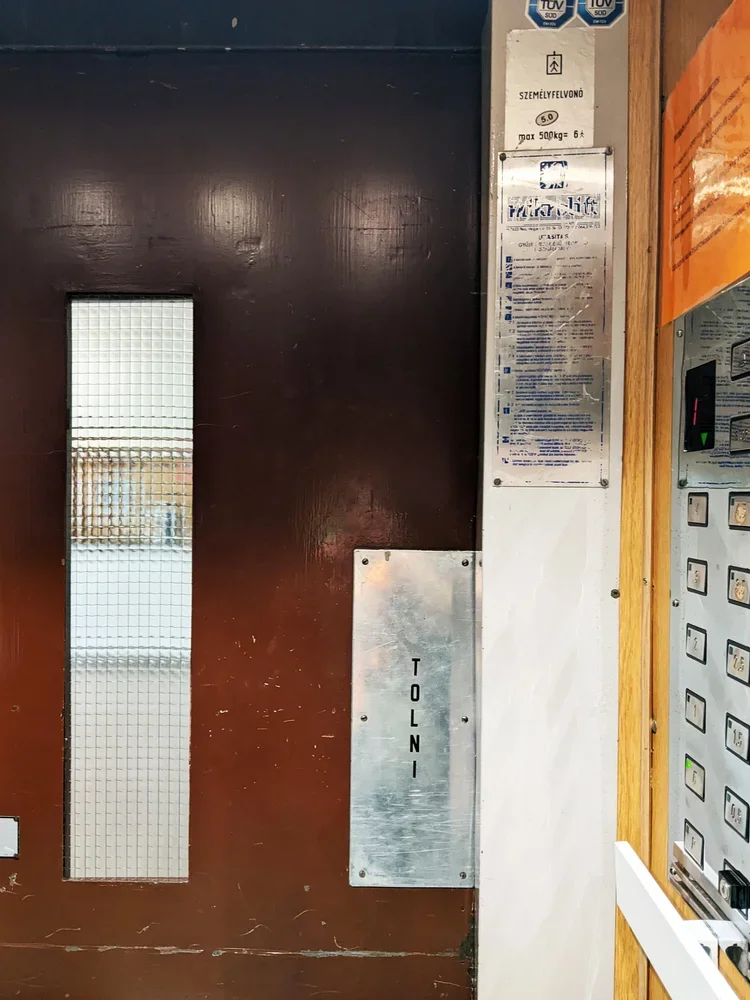
the middle is connected by a lift only teachers were allowed to use (with the same 1970s typography still intact), and a seemingly endless flight of stairs that always ended somewhere interesting. it reads like a very economical way of using topography: every shift in ground level becomes usable volume.
big rooms downstairs, views upstairs
the split-level logic isn’t just a structural trick. it organises how people think and work inside. the big, communal spaces – lecture halls, drawing studios, labs – sit on the lower side, stacked along the hillside. you walk “down” to the important rooms, which is a nice reversal of the usual academic hierarchy. rather than climbing a tower of theory, you descend into the machinery.
upstairs, along the hill-facing half-floors, are the smaller offices, admin corners, and quieter rooms. the hierarchy is sideways instead of vertical: teaching, admin, labs, all neatly lined up next to each other on the long corridors.
the best spaces were the paper labs at the top. they sat just high enough that, once you crossed through the corridors (with lace curtain windows and houseplants like a truly cosy socialist modernist home), the city suddenly opened up from the top floors of the building. there is something strangely grounding about testing grammage, opacity and fibre direction while a whole urban landscape sits just outside the window, built from concrete, brick and glass – large-scale material systems echoing the small samples in your hand.
bannisters, terrazzo, and accidental details
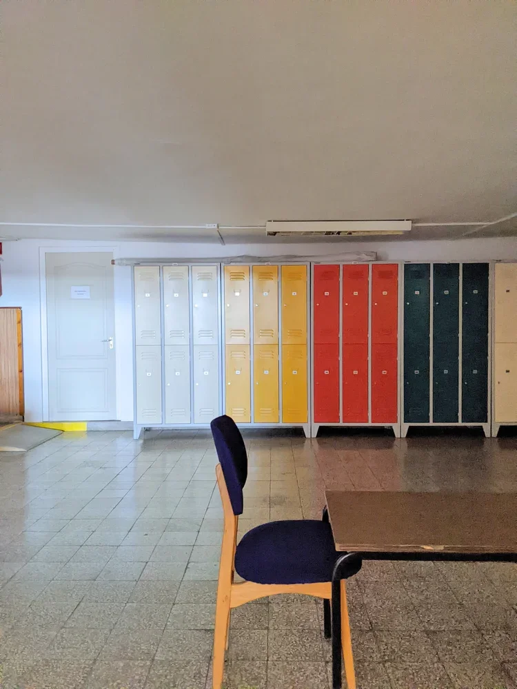
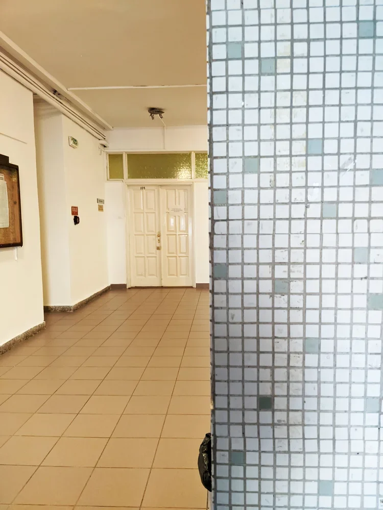
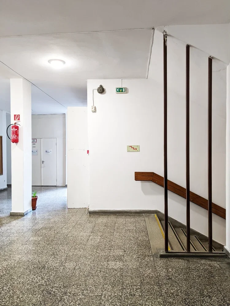
like many late modern educational buildings in budapest, the doberdó út campus does not perform for the camera. but the details are better than they strictly need to be. the stair bannisters are classic 70s: sturdy tubes, consistent spacing, no theatrics. the floors are often terrazzo tiles or hard-wearing stone, the kind designed to survive thousands of students a year and still look vaguely composed.
even while rushing to a mechanics exam, i would enjoy the way the handrail meets the landing, the way light falls along a corridor and it has been storing itself away somewhere in my brain, ready to reappear in your own work. structure, then surface. order first, pattern later.
light industry, heavy shifts
studying light industry here meant learning the mechanics of materials that are often dismissed as “secondary”: textiles, paper, packaging, media technologies. the degree sits at an interesting intersection – somewhere between engineering, design and production.
in reality, it also meant studying in a period when much of that industry in hungary had already shifted, shrunk or moved. factories were closing, retooling, or turning into logistics hubs. the building on doberdó út, with its labs and test rigs and print rooms, became a kind of time capsule of a less material-based economy – but also a test bed for whatever would come next.
that tension – between the physical plant and the changing world outside – is something i carried with me. it’s probably no coincidence that i now work with textiles and printing blocks in a way that is both very old (ink, cloth, pressure) and quietly new (cad-designed modular systems, contemporary interiors, small-batch production).
how this filtered into zitozza
when i design printing blocks now, i think in sections, not just in surface. patterns have to behave the way that buildings behave: stepping, shifting, accommodating different uses without losing coherence. a rug in one room, a lampshade in another, a cushion on a sofa – all part of the same “light industry”, just at domestic scale.
the split-level logic of the doberdó building also shows an interesting and practical system of repetition: instead of a perfect, flat grid, you can think about it as offsets and half-steps – units that interlock like floors on a hillside. the materials matter too: recycled linen, cotton, jute. not glamorous on paper, but very real under the hand.
and the views from those upper labs? they were a useful reminder that design is never just happening in the studio. it’s always in conversation with the city, the economy, and the infrastructures that support both. you don’t forget that when you’ve spent three years measuring paper in a room that looks out over an entire urban cross-section.
a modern kind of alma mater
there are many more photogenic buildings in budapest, and certainly more famous ones. but this one, at doberdó út 6, did its job in more than one way. no grand gestures, just good use of a hill, sensible circulation, and rooms that are genuinely fit for the activities inside them.
as with many of the structures i keep coming back to, its real value is not in being iconic, but in being clear. clear in plan, clear in section, clear in purpose. and i suppose that’s what i’m still chasing with textiles too: clarity in pattern, clarity in material, clarity in how something is meant to be lived with.
from hillside labs to block-printed cushions is not as big a leap as it sounds. in both cases, it’s about making sense of materials in a world that refuses to stay still.
this is going to be a bit of a hot take but those who follow me on instragram has seen me make this point before. i’m going to argue today that brutalism is actually cosy and it merely has a reputation problem. controversial or what? it is in fact bare, raw and… well, concrete, duh. perceived to be cold, harsh and as a style that overwhelms rather than invites. but spend enough time in these buildings and you might notice something else: a surprising sense of warmth.
it won’t be that the concrete has grown a softer texture all of a sudden, it’ll be precisely because of the materiality.
material honesty
rough surfaces, textured finishes, exposed joints, unpolished edges: brutalism has always been about revealing materials as they are. nothing dressed up, nothing concealed. and that honesty creates a kind of liberation, and with it you find comfort.
block printing works on a similar principle. every impression carries the grain of the fabric, the edge of the block, the rhythm of the hand. the result is never pristine, but it is always real. the imperfections aren’t flaws, they’re the thing that makes the pattern tactile and alive.
structure meets softness
what often goes underappreciated as well is how calming order is. the stark geometry of stacked, modular units leave no room for chaos. being enclosed by forms like that brings a sense of peace.
pairing block-printed textiles with brutalist or modernist interiors makes sense for this reason. the patterns mirror the structural logic of façades (repeated, modular, rational) while the fabrics introduce tactility and warmth. the concrete provides weight and permanence; the textiles provide softness and touch. together, they balance each other out.
warmth through materiality
so perhaps brutalism isn’t as uncosy as it seems. it’s not about decoration or ornament, but about surfaces that tell the truth, forms that cut through chaos and create order. if you add the softness of textiles that share the same philosophy — honest, textured, imperfect — you will get interiors that feel grounded and, yes, cosy.
cosiness doesn’t always come from softness, or softness alone. sometimes it comes from order, calmness, a sense of peace and from the way materials meet and interact. and brutalism, surprisingly, has plenty of that.
after a bit of a biggie (three launches and clerkenwell design week) it’s now time for a bit of a breather. i’ve wanted to blog more about architecture but the link between the concrete buildings and the jute rugs isn’t always obvious to everyone so i thought i’d write something about it as a bit of an explainer. when we think about architecture, we often think vertically — facades, elevations, materials rising around us. but the floor is where spatial experience begins. It’s where rhythm is established, circulation is guided, and texture makes its first tactile impression.
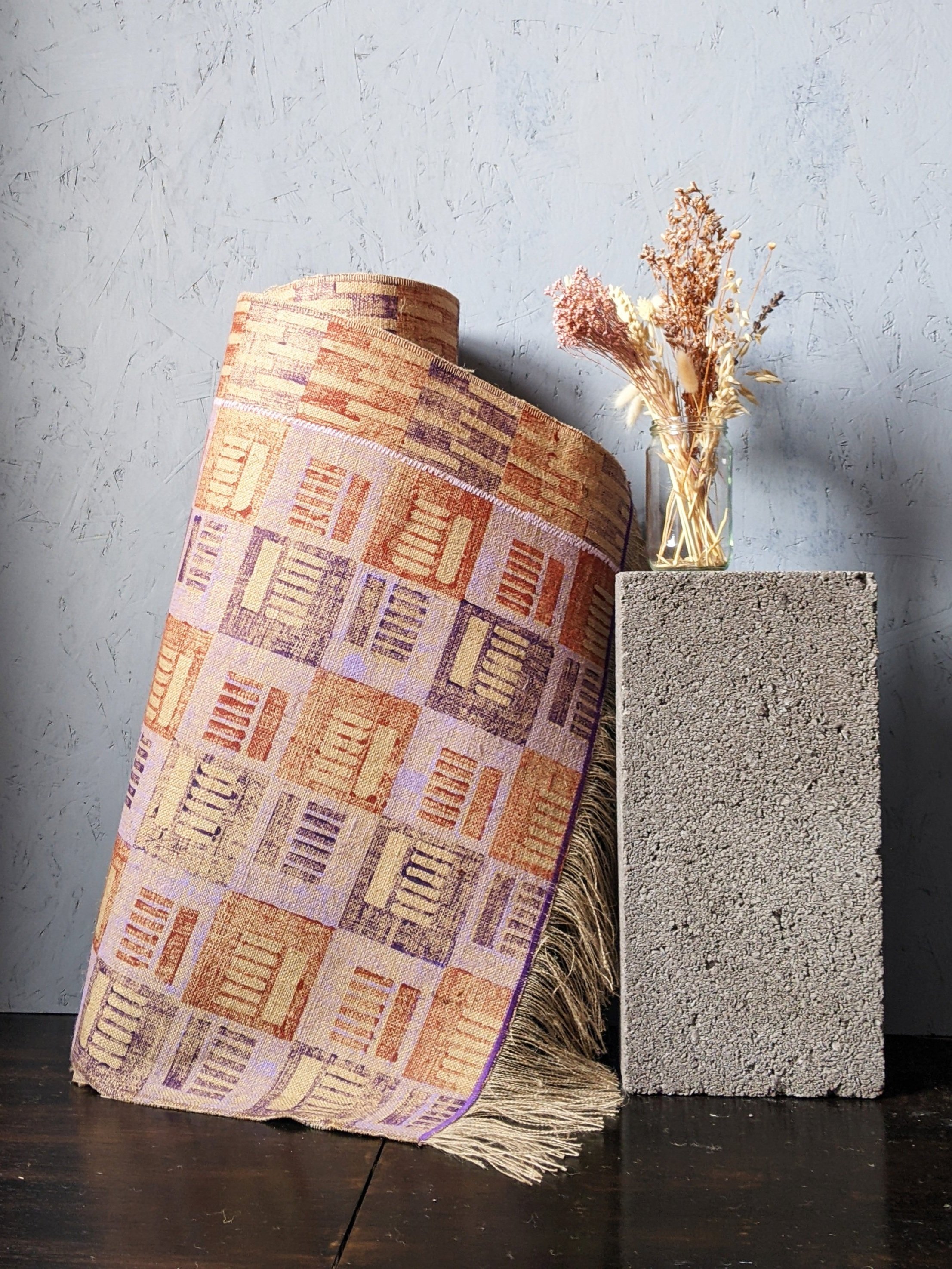
at zitozza, i’ve always been drawn to this horizontal plane of architecture - afterall, everything gets built from the ground up. it always starts with a floor plan and i’m thinking about the layout a lot. my printed jute rugs are designed not simply as soft furnishings, but as modular surface patterns for the ground. they take inspiration from the repeat logic of tiling systems, urban grids, and brutalist detailing — and reimagine them in natural fibre and pigment.
Modular Rugs, Architectural Logic
the design of each zitozza rug begins with a modular block tile - designed on the computer, precision-cut by a machine. these blocks are based on repeating geometric systems (steps, bricks, windows, columns) which you might recognise from pavement markings, concrete formwork, or mid-century cladding systems.
the prints themselves, when repeated across a jute base, create patterns that feel both structured and handmade and rustic — mathematical but never mechanical. these aren’t rugs that “fade into the floor”; they articulate it.
The Beauty of Soft Geometry
so why print, not weave? because print allows for crisper, graphic interventions on natural texture. block printing on jute brings a grainy tactility that reflects the rough honesty of these sustainable materials — not unlike exposed aggregate or board-marked concrete. it’s a dialogue between graphic clarity and material softness, one i find particularly rich when designing for interiors.
zitozza rugs aren’t trying to mimic tradition — they’re rooted in contemporary spatial language, designed to support interiors that favour simplicity, repetition, and material integrity. In homes with architectural ambition, they become not an accent but a foundation.
Designing From the Ground Up
there’s a reason architects often start their drawings with the floor plan: the floor defines flow. at zitozza i think of printed rugs as a continuation of that principle — a tactile, visible layer of design that offers rhythm, grounding, and visual structure to a space.
whether you’re designing a gallery-like living room, a textural study, or a quiet corner (of maybe a brutalist building), i invite you to explore the possibility of printed rugs as spatial tools — not just decor, but material floor drawings.
we’re back and finally able to sit down with our thoughts after having watched (and somewhat forgotten about) the brutalist movie. in that review i encouraged the research into the work of the real-life hungarians and brutalists whose lives the fictional story was based on - and i decided to start with marcel breuer since i received a great book about his work for last christmas.
those into design will know this already but i always like starting with the facts, he was born in 1902 in pécs, southern hungary and was one of the youngest students (and mentors) at bauhaus. he went on to establish his own practice in berlin, and after a two-year stint in london he moved to the states in the 1930s, first to teach architecture at harvard, then later to new york city where he continued to practice until the late 1970s.
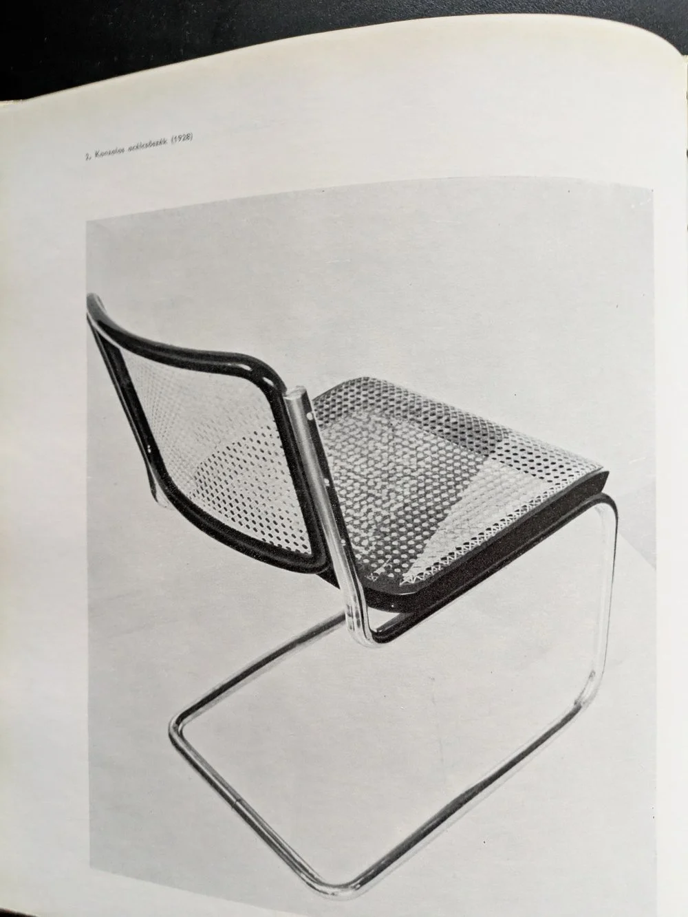
the cesca chair, 1928
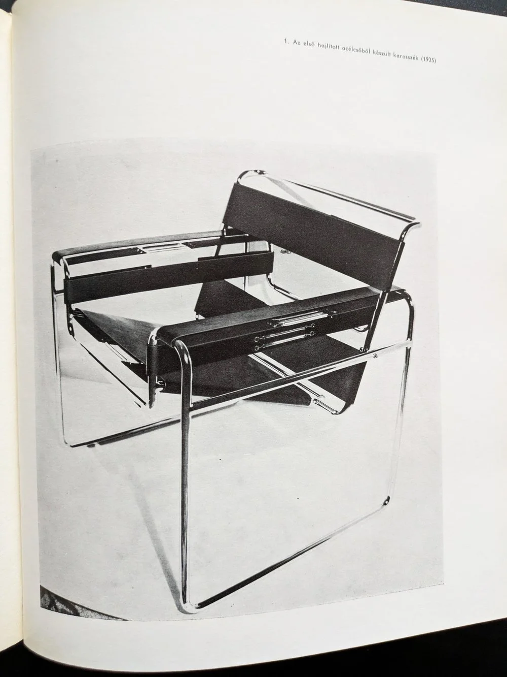
the wassily chair, 1925
for those into design, it’s also easy to recognise the heavy concrete masses of marcel breuer’s brutalist buildings — the hulking cantilevers and deep shadows of the 1960s and 70s that have since become icons of modernist architecture. but what’s more compelling than their visual impact is the thread that connects them to breuer’s earliest work. his design logic didn’t emerge suddenly in béton brut — it evolved from an obsession with functionality, structure, and modularity that was evident from the very start.
before architecture of course, there was furniture. in the 1920s, as a young bauhaus student, breuer designed the wassily chair using steel tubing — a radical departure from traditional craft at the time. lightweight, repeatable, and industrial, the chair wasn’t just functional: it was a system. breuer’s approach treated each part as a modular unit, capable of being assembled into something greater than its parts. this thinking didn’t just define his early designs — it forecast an entire architectural philosophy.
IBM research centre, la gaude, france
IBM research centre, la gaude, france
UNESCO headquarters, paris
UNESCO headquarters, paris
fast forward a few decades of immense architectural output (his practice designed more than 100 buildings), and the same logic manifests on a much larger scale. buildings like the UNESCO headquarters in paris (1951-1958), the IBM research centre in la gaude (1960-1961) or the iconic whitney museum in new york (1963-1966) carry the same DNA — modular systems, articulated forms, and a deep respect for material honesty. breuer’s concrete isn’t decorative. it’s structural, expressive, and fundamentally rational.
the book i’ve been reading — published in 1970s, written by máté major, long out of print, with that peculiar warmth of faded paper and sans serif fonts — documents this journey. the photographs, drawings, and models inside don’t romanticise his work; instead, they reinforce the relentless clarity of his method. whether designing a chair or a cultural institution, breuer asked the same questions: how can material, form, and repetition serve both function and expression?
whitney museum, new york
whitney museum, new york
as someone with a hungarian background myself, i’ve always felt a connection to breuer — not just because of the cultural context of course (despite our country being somewhat late and reluctant to recognise him), but because of how he saw the world through systems. that kind of thinking, for me, translates into surface design: building pattern from modules, constructing rhythm, shaping repetition. of course, my materials are softer, but the logic is not so different.
breuer reminds us that beauty can be found in structure — in the clarity of parts assembled with intention. whether it’s furniture, architecture, or textiles, that modular imagination still resonates.
thank you for your orders, commissions and enquiries throughout 2024. we really appreciate your continued support and hope to serve you with more hand printed and bespoke homewares in the new year!
today is a special day as this is going to be my first ever post about hungarian brutalism. i’m not entirely sure why i haven’t blogged about anything in my home country before - perhaps the pressure to know more about these buildings than i do is too much! but i guess the time has come to present something cool and exciting and interesting - this is one of the more famous ones and as such, an internationally more accessible and digestable example - that is the OKISZ offices in budapest, hungary.
built between 1971 and 1973, this office complex is located in a particularly leafy pocket of zugló, the 14th disctrict of budapest, almost exclusively surrounded by art nouveau villas and churches. the architect is recordedas jános mónus - who won an ybl-award (a sort of hungarian pritzker prize i guess) for the “high quality fusion of structure, technology and form” demonstrated in this very building. the company was ÁÉTV at the time, the state development company (according to the construction archives, operational from the late 50s until the late 90s) tasked to build public-use buildings for budapest: schools, hospitals and of course, offices - this one to house the countrywide union of small-scale industry bodies (the acronym is the OKISZ in the building name) and i’m really sorry that the language of the economic structures of socialist hungary does not necessarily translate too well to my engllish language readers but hey i’m trying my best!
it is a striking, fine piece of brutalism that understands and seamlessly fits into its environment without losing its character, not trying to be imposing without being too modest. a review from 1984 claims - and i’m paraphrasing somewhat, that “it would have been shameless and impolite to try and compete with its surroundings, however you should also live up to such an environment full of notable buildings” and it does do a remarkable job at that.
it has an exciting elevation of five floors stacked upon each-other in a dynamic, stair-like manner and a somewhat L-shaped plan. the facade continues this rhythm of protruding concrete mullions between the slick windows - for those who love this style it’s a bit of a jackpot i think. i went on a freezing cold january day in thick heavy snowfall - the white contrast it created with the concrete was really eye-catching from a pattern point of view too, but it also somehow emphasised the spatial nature of this building.
obviously, this is a textile designer’s blog, so i’m a layperson when it comes to the ins and outs of the structural geniuses of such architecture, but eye-pleasing proportions are, i think, a universal language that can be appreciated by everyone.
brutalism is also not necessarily inherently minimalist, you can notice fantastic details even outside - but this is also an interior textile blog so i was yearning to go inside. even though i could not (in fact, a security guard came out to check what i was up to outside too, haha!) however as a part of othernity, the hungarian project for the venice biennale for 2021, a series of guided walks by the centre of contemporary architecturewas organised back in 2020, several bloggers and journalists attended taking amazing photos of the inside. it looks very 1970s, cosy and very socialist (every building in my childhood memories has a similar details or typeface i think!) and it also has one of those ever-moving lifts that we call paternoster in hungary.
i’m going to recommend you two of these articles about this walk in 2020, both with brilliant photography - first hype&hyper (if you don’t know them, please get acquainted with this comprehensive cultural quarterly focused on eastern europe.) and also check out the blog post from welovebudapest, with fabulous indoor shots including of the roof terrace.
for the floor plan and elevations, and an interesting drawing on the accompanying furniture design, please see the previously quoted lechner centre article, it’s very insightful! the reason for this many resources available on this particuar building is of coruse the venice biennale project for 2021 - this building was one of the 12 selected to represent the hungarian pavilion. all 12 were focused entirely on this particular era of architecture and architects of our surrounding countries were invited to participate in their re-interpretation.
despite this celebratory re-discovery happening, brutalism in hungary is quite endangered and none of these buildings are under listed status, however many are loved and used and perhaps the attitudes are changing somewhat. after years of the somewhat over-politicised and emotionally fuelled attitudes the architecture of the socialist era in hungary, it’s refreshing to see it getting more appreciated and putting some of these buildings into a more recognised place. i hope to bring you more examples of hungary in the future.
if you liked this blog post, why don’t you subscribe to my monthly newsletter below to be the first to read our latest musings and updates.
hello again - we have some more exciting brutalism-related news to share! zitozza are proud to be involved with a new exhibition, part of a wider series of events called concrete designs to thrive, exploring how good design can keep a city can fit and well, curated by journeys in design - with city walks, talks, workshops and exhibitions.
you can join the glasgow green and grey walks - sunday strolls around one of glasgow’s favourite parklands, to spaces and places with fascinating heritage, talking en route about thriving in the city (this walk was developed and delivered in 2023 with the help of a small group of guides with experience of homelessness); 2-4pm sundays 16th and 23rd.
we’re thrilled to be a part of the materials and modernism exhibition featuring the work of five scottish creatives, all inspired by modernist architecture, offering key works in mosaic, wood, ceramic, cast concrete and printed textile (that’s zitozza!); open 10am to 4pm monday to friday at the briggait in glasgow, from 12th - 27th june - please do come and visit!
part of this is also design for a city, fit and well- the latest in a series of twilight talks, when an expert panel presents the case for retrofit rather than wrecking ball, remodelling, repurposing, and reclaiming for the better. Extra time and refreshments will enhance the chance for good connection on the evening of thursday 20th june at the briggait.
finally, a call out to help craft healthy city, healthy citizen ‘zines in a set of wednesday workshops at the briggait, exploring well-being and urban design in ‘zine format, to include use of printed smart phone pics captured by our walk participants, posted using the hashtag #concretescotland, 2-4pm wednesdays 12th 19th and 26th june.
journeys in design founder dr john ennis said, “it’s a privilege to bring our concrete designs to thrive to the heart of glasgow in 2024 and to collaborate with such a diverse array of designers, artists and producers around glasgow green and the briggait: it’s very clear why this park and this venue are such treasured parts of the city’s culture.”
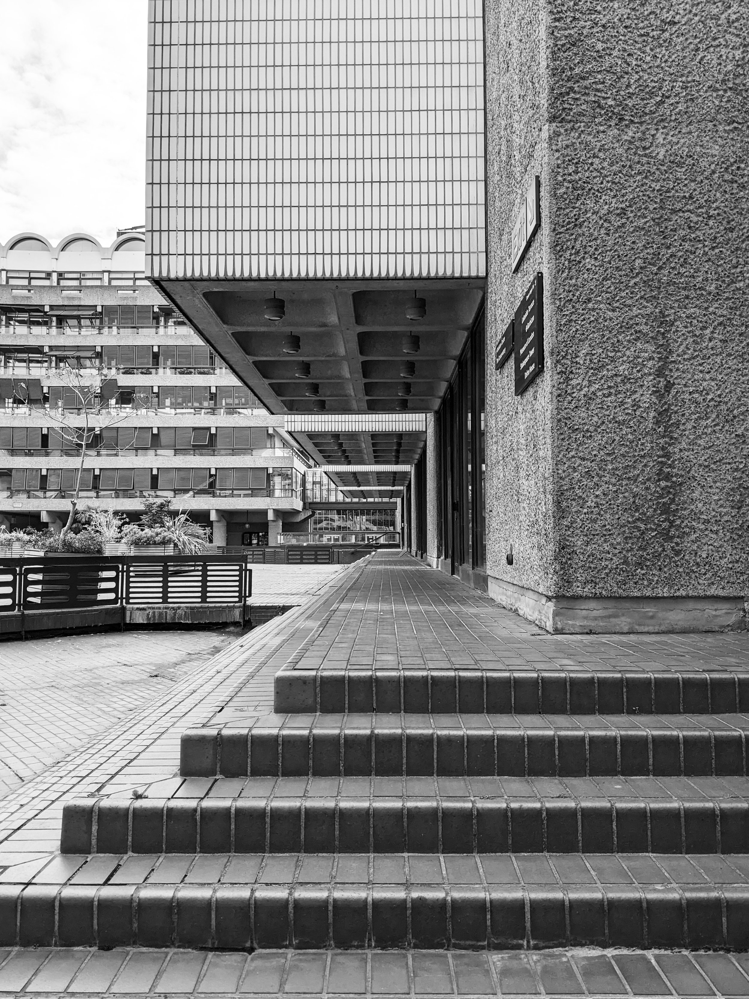
as we are cracking on with 2024, i’ve decided that of the many architectural inspiration series we planned, it’s probably best to tackle the beast first and share some images and thoughts of the barbican estate in london. i’m calling it a beast because it’s an enormous, expensive and very well-known icon of british brutalism. for this seasoned concrete-hugger, it then makes no sense to keep postponing this blog post any further (especially as our rug already exits and more stuff might come soon…), so do come with us to explore the place from a textile designer’s perspective.
i guess everyone somewhat interested in brutalism knows some of the basic facts - designed on a 35-acre ww2 bombsite by chamberlin, powell & bon for the corporation of the city of london, it opened its first flats in 1969 but the completion of the construction only really finished in the late 1970s, after a long and expensive process and it is now home to approx 4000 people in 2000 flats. of course the uniqueness of the estate comes from the fact that unlike many other brutalist projects in the uk, it was not built for social housing and the architects were not held by the typical council budget restraints -which resulted in one of the most free and complete architectural visions, achieved by some extremely time consuming and labour intensive processes.
if you want to know about these in more detail, my first recommendation is raw concrete by barnabas calder. quite early on in the book, he has a brilliant chapter about the barbican, with some focus on the social context around it, from conception throughout the whole of the construction process which makes for a very informative and interesting read as it touches on some of the tensions throughout the whole process of building it. he provides an important angle that does not often get mentioned on design blogs like these, as we tend to get lost in the form and the aesthetics - with good reason of course, but without context it would become rather meaningless.
i first visited a couple of years ago and the first thing that really affected my perception was its sheer scale. of course it is at this enormous scale that these visions for the order of forms work the best, and i think this is why it’s such a brutalist mecca here, the complete, intact and vast system of space. i don’t exactly know where my search for a geometric order comes from, all i know is that the deceptively monotonous facade of the terraced blocks (arranged in neat squares of course) gives me a sense of enclosed cosiness and open clarity at the same time. in every one of these blog posts i’m attempting to describe this feeling but it’s so hard to explain - there is just this sense of calm that i only find in places such as this.
the three 42-floor tall tower blocks bring some exciting angles with a lean, triangular layout and column of balconies tightly stacked into the sky. of course, the repeating geometric forms serve a textile pattern designer well. it really helps that i visited on a sunny day and the shadows projected on the surfaces aid the imagination in reducing these sharp angles to two-dimensional shapes. but the surface itself, the slate and hammered concrete texture that really is on every surface, is equally important - i always say that i want the weave of my cloth to resemble the raw concrete itself, and the pattern to play with the form.
to explore a bit more about the material and the techy bits of the architecture, my second recommendation is my favourite podcast series, about buildings and cities - they have a brilliant episode about the estate, touching on some of these details of the surfaces too as they take you on a journey around the estate. they’re much better suited to explore a more architectural angle than i’d ever be able to so do have a listen to it.
what i found the most surprising about it that it was a lot less grey than i imagined - of course, the concrete surfaces are raw and beautifully grey, and the shapes and forms are varied and playful, but the pavements are tiled with maroon bricks all over, and the ponds with the surrounding greenery reflect with a very strong teal and green everywhere. it is surprisingly colourful and stimulating in its order, the “oasis” comparisons do seem to be very fitting - not in small part due to the tropical garden accessible to residents only.
but we can’t quite go away of course without stepping foot in the arts centre, home to a concert hall, cinema and exhibition halls amongst others. seeing how the columns and the concrete coffered ceilings repeat and continue inside is an exciting exploration that i really enjoyed even if some of might not work that well today or may be in need of renovation.
for the last recommendation, i want to bring you an article from the rics blog, as it’s quite fresh and talks a bit about some of the repairs as well as bringing you some amazing pictures that hopefully will inspire you to appreciate it if you haven’t visited already - and if you have, i hope you’ll now see it from a surface pattern design angle too.
if you liked this trip, you can subscribe to our newsletter below - we’re only sending these monthly with a free downloadable graphic print, and you’ll always be amongst the first to notify of a new architectural journey, or new prints inspired by them.
hello again, it’s been another month long pause at the blog (sorry!) as we’re trying to prepare for the festive period while juggling a lot of things at the same time, including a new collection that might come before the end of the year and will be our most brutalist one yet! one of our cushions have also been included in a fabulous brutalist selection by gadget magazine t3.com, so the trend forecast was correct and it’s officially in again. i thought that to celebrate this and to get in the mood for the up and coming new collection, it’s time to share some interior tips on how to bring the brutalist forms indoors, with its bold forms and raw, industrial aesthetics. it is more than just an architectural trend; it's a statement. if you're looking to infuse your living space with character and go bold and brave, embracing the brutalism trend might be the answer. in this blog post, we'll take you through some interior design tips to help you achieve that unique, edgy look while maintaining comfort and warmth in your home.
simplify and minimise
this isn’t a call to go full-blown minimalist, but decluttering your space will give the accent pieces the “main character” status they deserve. brutalism thrives on simplicity and clean lines. remove the noise and leave room for your bold furniture pieces and some accent accessories to shine. if you have exposed concrete walls, you’re already there. bring in some stark geometric shapes, and a muted color palette.
hug the concrete (duh, obviously!)
this isn’t exactly breaking news, but concrete is the hallmark of brutalism. if you can't expose your walls or floors, consider concrete-inspired wallpapers or textured paint finishes. you can also introduce concrete furniture or accessories to capture the essence of this trend.
lighting drama
i think this is my favourite. i’m a huge fan of interesting shadows and you can add great depths and warmth to your space by illuminating it with statement lighting fixtures. oversized pendant lights, angular sconces, or floor lamps with sharp lines, and similar. these not only provide ample illumination but also serve as eye-catching focal points and ambience.
honesty to structures and materials
brutalism is part of the form follows function school, so this should be extend to furniture too. choose furniture with structural honesty and that will mean strong, angular designs. consider pieces with metal frames or exposed structural elements. a bit of tactile upholstery will balance the harshness of the concrete and metal elements.
abstract expressions
bare walls need not be alone. if you have room, a few, colourful pieces would both compliment the room and have the art stand out too. brutalism often celebrates artistic expression. large-scale paintings with bold, graphic compositions can add a touch of creativity to your space and celebrate the multidisciplinary nature of the modernist movements.
human touch
a lot of the bad rap brutalism gets comes from a perceived lack of human scale and harshness - but that’s not really what the movement stood for at all. do soften the hard edges, introduce textures and tactile qualities. cozy rugs, cushions, and soft throws in earthy tones can make your space more homely without compromising the trend's integrity. it can also mean hand crafted, imperfect elements against the more pure forms. (yes, i do mean hand block printed textiles, how did you know!)
green up
another misunderstanding about brutalism is the rejection of nature. it is absolutely not. the forms may not be organic, but city planners and architects used to have grand visions for huge parks, greenery under buildings and the like. so having lots of plants in your house is just an homage to that, really.
focus, focus!
in all this starkness, it’s quite a natural wish to have a designated a focal point in the room, like an impressive brutalist-style fireplace or a bold wall covered in textured panels. this draws attention and creates a sense of purpose within the space.
colour it in
brutalist buildings are raw and stark outside, but don’t forget about colours, they do have their role (unité d’habitation, anyone?!) so don't be afraid to experiment with occasional bursts of color. a vibrant artwork or a bold, colourful rug or lamp piece can be a striking contrast against the more stark backdrops.
so there you go, brutalism is certainly not for the faint of heart, but when done right, it can transform your living space into a dynamic, artful haven. it's a trend that encourages self-expression, challenges the norm, and celebrates the beauty of raw, unapologetic design. so, if you're ready to take a daring step in interior design, embrace the brutalist trend, and watch your home undergo a bold and beautiful transformation. we have a lot of things to offer you to achieve that, so do shop around!
as a textile designer, i spend a lot of time thinking about surface — how it behaves, what it suggests, and how it feels. when i travel, i often photograph brutalist buildings not just for their form, but for their surface logic — how repetition, rhythm and materiality work together. the palace of justice in lisbon is one of the most quietly decorative buildings i’ve seen, and it’s shaped a lot of my thinking about how concrete and cloth can speak the same visual language.
it’s been a while since we’ve last embarked on an architectural inspiration journey, but holiday season is coming up, so i thought i’d give you a little tip, to visit a wonderful brutalist building in one of my favourite cities. the city is lisbon, portugal, where i showed you a beautiful church before, and this time we’re going to court! okay, nobody’s going to get sued, we are just going to admire the building. the palace of justice stands as a testament to the unique approach to brutalism by the portuguese. join me on a short walk around this gem!
the building was designed by januário godinho and joão henrique de breloes andresen and built between 1962 and 1970. it is in the SOS brutalism database but thankfully it is not currently in danger as it is used as the main court. it stands at the head of parque eduardo VII, a peaceful, green patch in the centre of the city.
it has everything a brutalist marvel should have - the skillful blending of monumental proportions and robust materials - it is a long building with concrete columns supporting its cantilevered facade on all sides. because of that, it looks lightweight that is slightly lifted off the ground, and it does have this uniquely portuguese take on brutalism: the concrete facade here is not raw or imposing - it is incredibly decorated, light and airy, punctuated by geometric patterns and rhythmic textures, corresponding to the delightful tiled surfaces this country is so famous for.
the structure and the shape of the supporting columns create an interesting rhythm, and it is this frequency and rhythm that i find so relaxing. the concrete here is not raw, it is processed and organised into intricate, detailed patterns that pierce through the facade.
obviously it is the patterns i’m attracted to as a textile designer. the tile references in particular have a connection to my favourite way of creating geometric patterns and i love this building for showing that brutalism can be playful and decorative too. my main aim has always been to infuse this modernist spirit into textile designs and create a connection between the realms of architecture and interior decor. i want to bring it inside and bridge the gap between the monumental and the intimate, to translate the feeling of calm i get from these buildings to the feeling of calm at home.
i hope that you get to visit this beautiful building, in the lisbon sun it shines white, with the shadows adding an additional depth to this textured facade. and i hope you’re not tired of my ramblings yet, i always think that every building explains a little bit more about my mission!
if you’re interested in how architecture and surface design connect — or how brutalist texture can inspire calm, not coldness — explore how these ideas translate into our BÉTON collection or get your own block-printed textile pieces. these buildings don’t just inspire what I make — they shape how I think about design altogether.
there’s a building here in st andrews that quietly unites two very different worlds: centuries-old academic tradition, and raw, rhythmic modernism. as a textile designer obsessed with surface pattern, i’m always drawn to the overlooked beauty of brutalism — and this particular student accommodation block is a hidden gem. if you're a design student, architecture fan, or just someone who appreciates visual rhythm in everyday places, this short tour is for you.
it has been a month since we last have updated our blog and even longer since we last had a little tour of brutalism… so it is time to get out of hibernation now and get the boots on for some well-due concrete hugging. don’t worry, we’re not going very far - in fact, staying right here in east fife, as we visit one of the student halls of the university of st andrews.
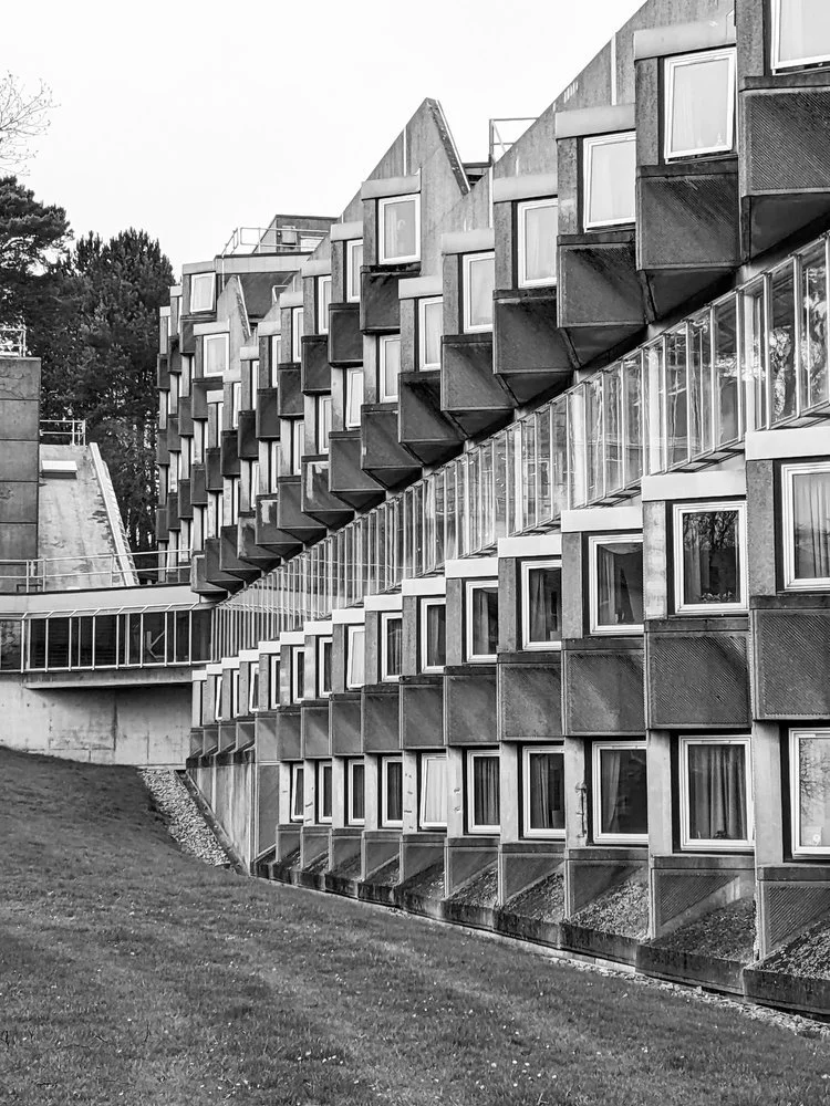
surrounded by lots of greenery in the north haugh, it is a short walk away from the town centre and the golf course. it was designed by james stirling and it opened in 1967 - it is a beautiful brutalist gem in a town and university that’s rather renowned and cherished for its mostly much older architecture going back to medieval times. it was judged to be 12th in urban realm’s top 100 scottish modernist buildings, and it has been category A listed since 2011 - it is a popular building that’s here to stay.
the building has an V shaped plan of two large wings, embracing a relaxing, wide green space in between. brutalism often gets reduced to “grey concrete,” but that’s a shallow reading. here, the design balances sharp geometry with soft landscaping — a vital contrast that creates a calming, grounded space for student life. the elevations of both wings incorporate the increasing ground height as the hill beneath slopes upwards. it has a striking, hypnotic rhythm to the modular facade - the zigzagging row of windows only reveal themselves from the east.
what fascinates me most is the textural patterning: 45-degree diagonal textures rotate across the tessellated concrete panels, forming a two-dimensional zigzag print that almost reads like texture-within-texture kind of printed textile. it’s a modular, repeating geometry — exactly the kind of form reduction that inspires my block-printed designs. apologies for the pre-occupation of the concrete surfaces - this is a textile design blog afterall. i don’t read buildings like an architect; i see them as surfaces. i’m always looking for rhythms, repetitions, and subtle asymmetries that could translate into interior textiles — prints, cushions, even fabric-based wall art. the façade of this residence block, with its directional patterning and textural wear, is a visual goldmine.
it is a busy-looking unit with lots of life - housing approx 250 students divided across five residential blocks. the original plan was for 1000 students but the other buildings planned never came to be.
i did not study at st andrews so i have to rely on the university’s own website for a peek inside. it is much loved by students - partly for its rich social life, but also the quirky, octagonal room layouts. the building’s wikipedia page mentions that the stairwells of three blocks have glass enclosures for natural light, student crowd rates it 7th out of 17 halls at the university and i’d like to think that the architecture plays some role in it too.
if you liked this short tour, stay with us for more inspiration as we plan to visit more sites in the near future and bring you more posts and photos about them - and of course subscribe to our newsletter to be always the first to read! until next time!
whether you’re moving into halls or just need to make your flat feel a bit more like home, our handmade block-printed cushions and fabric prints bring bold texture to any space — with a modernist edge.
🎓 10% student discount available
Email us at postbox@zitozza.com with your uni name to get your code. No minimum spend — just good design, made locally.
it’s becoming a busy autumn / winter season here for us at zitozza, but we do manage to escape on the occasional break to take an inspirational trip to admire some great architecture and forms. there has been a recent trip to lisbon, portugal, and we have some fabulous brutalist buildings to cover as well as the country’s signature tile designs - surely that requires an article at some point in the future.
but we can start with an easy one, a true little 1960s gem in the heart of the city, a five minute walk from the square of marques de pombal, there is a little brutalist church in amongst the residential buildings - the sagrado coração church, on rua camilo castelo branco. it is hard to see it is a church from the outside, as it stands on an elevated level from the street, with stairs inviting up to a square embraced by offices and some residential units. on the sunny day of the visit, it felt like a relaxing island just off the busier streets, but it was by stepping inside it revealed its wonderfully peaceful and serene atmosphere.
inside, it is clear what the architects - nuno portas and nuno teotónio pereira - were trying to achieve. the use of concrete is consistent, but not in an overwhelming, intimidating way as the material is broken up and softened with textures. the wall has a bricklay texture to it, while the ceiling reveals an even rhythm of the angles of the structure. the ceiling does not seem to be at an uneasy height, yet the smoothness of the columns do make it appear quite heavenly.
it is however the light, that seems to play the main role of bringing the spiritual and the godly inside. the light comes in at angles that must have been very carefully designed and is parallel to the staircases, casting shadows on the textures inside, while at the chapel it comes through unfiltered and in full, as if it was almost ready to listen to the prayer.
this article on hidden architecture has the floor plan (along some sketches by the architects too), and it does reveal the scale of the open space, and the even proportions unlike the traditional aisles. the sketches also reveal the careful planning of lights and shadows - its role in reaching some kind of spiritual peace is universal and not dependent on religion, just think of junichiro tanizaki.
this church isn’t dimly lit, or dark, nor is it overwhelmingly clear and bright. concrete has its reflective quality on light but also has its own texture to break it, which the architects also played with here by adding more, and the artificial lights are also carefully placed to interact with it. atlas obscurarecommends a visit during night time too, to experience the different light circumstances.
lisbon is an amazing city and churches are found from every style and era. its famed cathedral is almost a millennium-old and some of its most famous sights are the gothic monasteries and the golden baroque altars - all worth a visit and appreciation. i hope you don’t mind me picking this brutalist gem though, as one of my favourites. the building won the Valmor prize in 1975 and in 2010 it was recognised as a national monument, so it earnt its place on the visitor attractions and please do visit when you get a chance in lisbon.
if you liked this, you can subscribe to our newsletter below and you’ll be amongst the first to be notified of any new inspirational tours (always with plenty of photos!) see you next time
well, it’s been another long pause between blog posts, but it’s not been forgotten, only postponed, due to, uhm, general life happening at a pace, i guess. but when things get busy and exhausting, there comes the need to take a break and go somewhere else to recharge. so let’s take a road trip. let’s go, from scotland, to somewhere nice in the sunny south of great britain. anywhere. if you like going fast, you’ll take the motorway, the m6. it’s not the most scenic of routes, so it gets monotonous, and since tiredness can kill, there will be a time to take a break. and there, you’ll eventually come across a fabulous concrete tower emerging in the landscape with a futuristic footbridge arching over the motorway, and suddenly you feel compelled to indicate your exit to spend some time in this fascinating piece of architecture - we’ve arrived to forton services!
i have always been obsessed with logistics. the excitement of logistics and infrastructure never gets boring – perhaps it’s no surprise that some of zitozza’s block printed fabrics are directly inspired by road signs and wayfinding systems.
i just love it when everything and everyone in the system has its place and function, a well oiled machine itself that can take care of millions of people and things getting where they are meant to be when they are meant to be. but while the architecture that serves this system has to be purely functional, for curious travellers who are excited to be somewhere new soon, the associations fill all of this functional stuff with positive meanings, the typefaces on vans and reg plates, the smell of the handwash soap, the hot touch of the disposable coffee cup are all symbols of the anticipation of getting there. so from this point of view, a well designed, interesting motorway station is a piece of happiness on earth, and ...for someone who makes textile prints of road signs – like SOROMPÓ or any number of grid-based modular patterns – it’s a piece of inspiration too, doubly so if it’s brutalist of course!
forton services today belongs to the moto bk chain, and you’ll find it on the m6 between junction 32 and 33. it opened in 1965, and according to SOSbrutalism, the designers were bill galloway and ray anderson of the architecture firm tp bennett and son. (yes, that’s of the same thomas bennett of the saville theatre, amongst other things - today they do a lot of interesting commercial projects - totally worth a look!)
there are some two-storey buildings on both sides of the motorway with restaurants and cafes, connected by a high-tech looking footbridge forming a light arch over the motorway. to walk across it is a great exercise to stretch the legs a little and the eyes to the distance too. the timber ceiling panels of the inside of the bridge somehow creates a very nostalgic mood in the warmth of this texture reflecting the light directly below it. that just further excites about the travel - i’m not sure how materials do it but’s definitely the timber. the tunnel view of the inside of the bridge has an octagonal frame with the joins at each window panel cutting your corners diagonally. the outside view of course is the endless motorway and the crowds of cars going somewhere.
of course, it’s most distinctive point is the pennine tower, emerging from the landscape on the northbound side with its cantilevered hexagon at the top. it used to be some accommodation and a restaurant - this blog has some archive images of the fabulous decor in its full glory (as well as the whole structure when it was pristine white!) it reminds me of the early decor of the UFO bridge in bratislava a little bit (more of that in another blog post i think…) and i would have loved to enjoy a meal there, the views across then countryside must have been breathtaking on a sunny day.
unfortunately due to the strict fire regulations, it is now closed to the general public and it is now grade II listed, even though it might be hard work to re-open it.
it was intentionally designed to resemble an airport’s traffic control tower and that all i can feel is the anticipation of getting somewhere, perhaps it’s succeeded in its job. it is a cliché to say that we must enjoy the journey as much as the destination, but in the case of how motorway stations ought to be, there is definitely truth in it!
if you enjoy exploring the crossroads of architecture and textiles, you might like ourcollections – heavily influenced by modernist infrastructure and brutalist forms. see you next time - and don’t forget, tiredness can kill, take a break.
hello again - long time no see, in an architectural regard at least we haven’t really been able to publish a new post for a while. that’s all about to change as we have visited a few more sites and we’re keen to show you all the photos in several posts coming (as one-off episodes probably, so no more series for now.)
let’s start with the best - the building of leicestershire county council, also known as county hall. it is hiding behind leafy greens in glenfield, on the outskirts of leicester, next to the A50 leading into the city centre. it was built in 1967 and has been used as the county council headquarters since then. names are hard to find, but it was designed by the council’s own in-house architectural team - the RIBA picture database names the architect as thomas locke and the council’s architectural office.
seen from the road, the building emerges slowly from behind the lush trees, showing off its sleek facade. it is only by going closer where the site reveals its enormity - it expands across a huge field, many council departments are located here - but the layout is clear, spatious and airy. from the front, the slightly concave arches on the window frames remind me of a japanese pagoda towering above extending ground floors and an elevated wing standing on v-shaped legs that frame the green view below.
going under these we find a leafy court surrounded by shiny office windows, revealing a cast concrete mural of antony hollaway that depicts the river soar. his style reminds me of the town artists in the new towns of scotland, particularly the art of david harding in glenrothes.
in the centre of the court, there is also an armed forces memorial, added in 2012 titled ‘stand easy’ by kenny hunter - it’s a group of 1:1 life-size sculptures of young personnel. apart from being meaningful piece of art, somehow their placement in the centre also helps reveal the deeply human scale of the surrounding building and how the architects thought about the proportions - you get an inviting, peaceful sense of place here.
there are so many interesting and thoughtful details - the lightwell in the corridor roof above each window section (presumably to maximise the natural light inside) is not just functional but creates a slick, interesting spatial play - it’s a shame the day was not that sunny, i would have loved to see the shadows it creates. the extensive use of glazing overall did make me wonder about the light inside too.
on the left of the tower, there is a relief pattern in the arcade ceiling - here there are two small stairwells that lead to the outer end of this elevated corridor - from here you can take in a nice view of further out of the town, and what i presumed were fountains (i wish they were working that day.) it’s a really beautiful building and i’m happy to see it loved, maintained and functioning as it was intended to - i was not the only photographer on site on the day of my visit indeed!
it is in a remarkably good state compared to many other buildings of the same era i visited and it makes me slightly suspicious that a state of neglect in the case of brutalism could be in some cases a conscious or semi-conscious decision, to have these buildings replaced rather than renovated. but i’m glad that i managed to find one that’s working as it was intended to.
i hope you enjoyed this short visit, there are plans to travel to get out of scotland more often - subscribe to our newsletter to be the first to read about them here! take care.
happy new year! and so sorry it has been such a slow start, this is a bit of an admin-heavy time of the year with an ever-increasing to-do list. it is also a time to make new plans and reflect a bit on the past. in that spirit, i wanted to continue my series on books, but looking through my bookshelf and my past influences, i decided to go a little bit more personal, and share some of my graphic design inspirations.
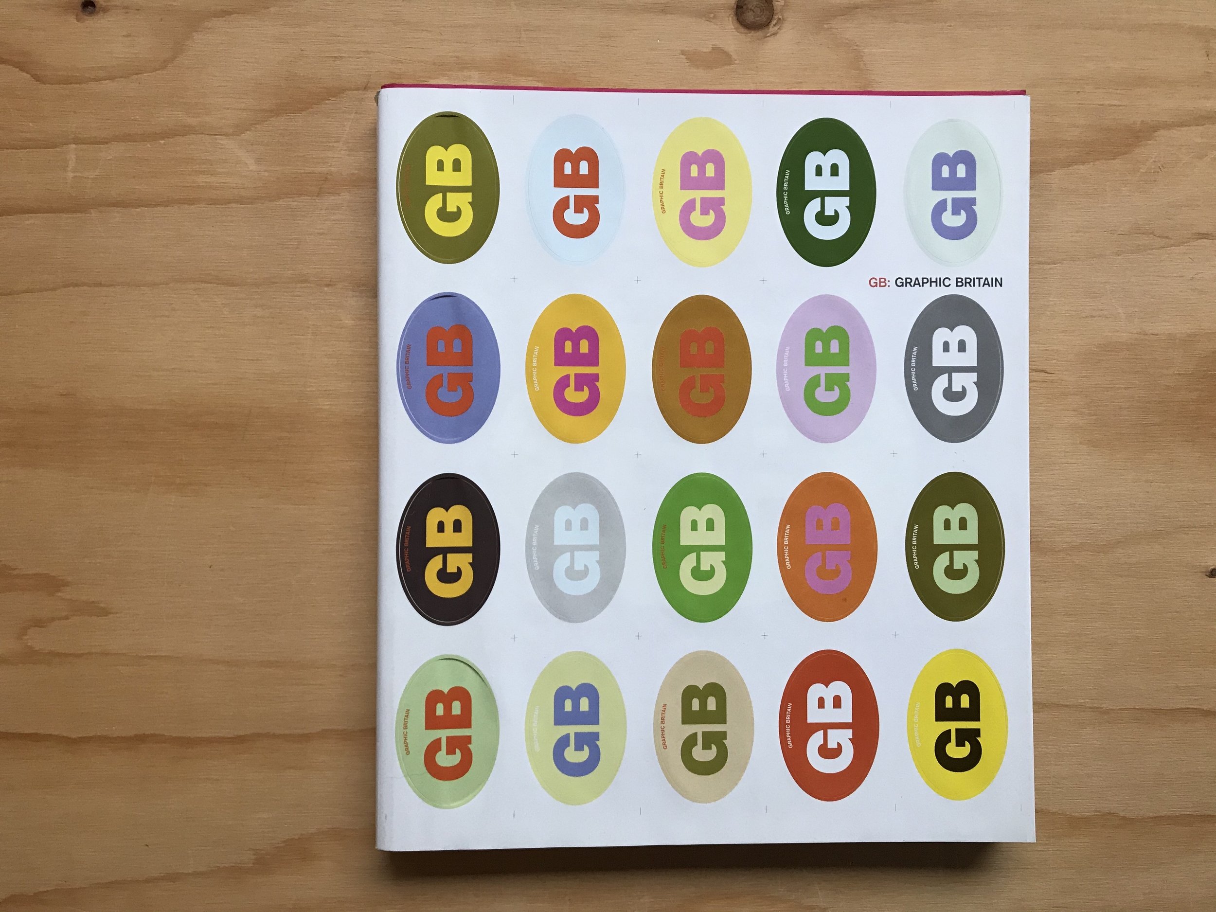
yes, i am also a graphic designer, and as far as skills and interests go, i certainly got into typography before i got into patterns. let me take you back 20 years, as continental european high-school student, it was also the time i was trying to master english and soak up as much of uk culture as i could. to combine these two main interests, a convenient place to go to in budapest was the book shop where they stocked some of the great coffee table books. today i’d like to talk about in particular titled “GB: graphic britain” (burgoyne, p. 2002 laurence king, london) with the aim to line-up some of the coolest up and coming graphic design works produced in the uk at the time.
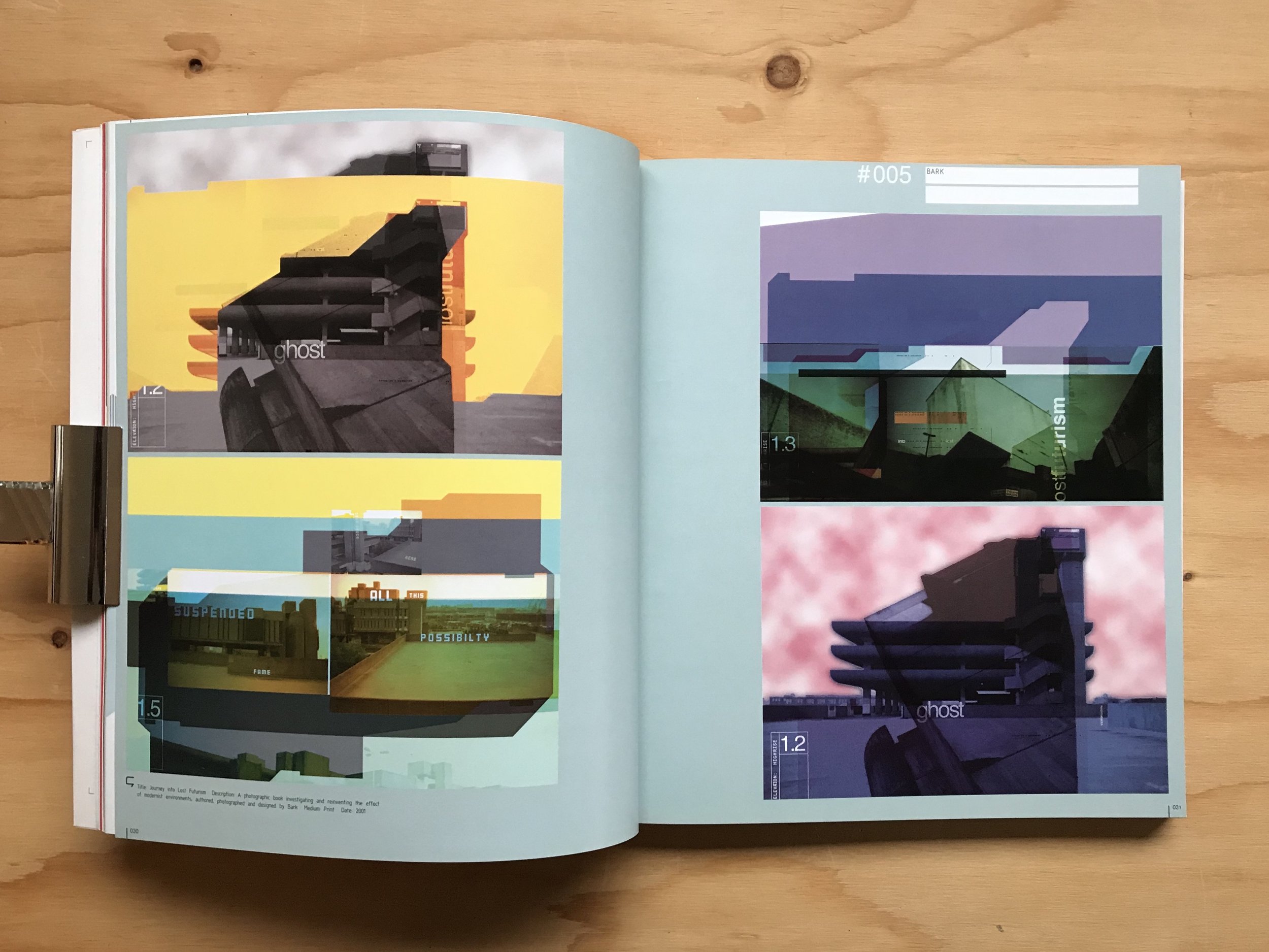
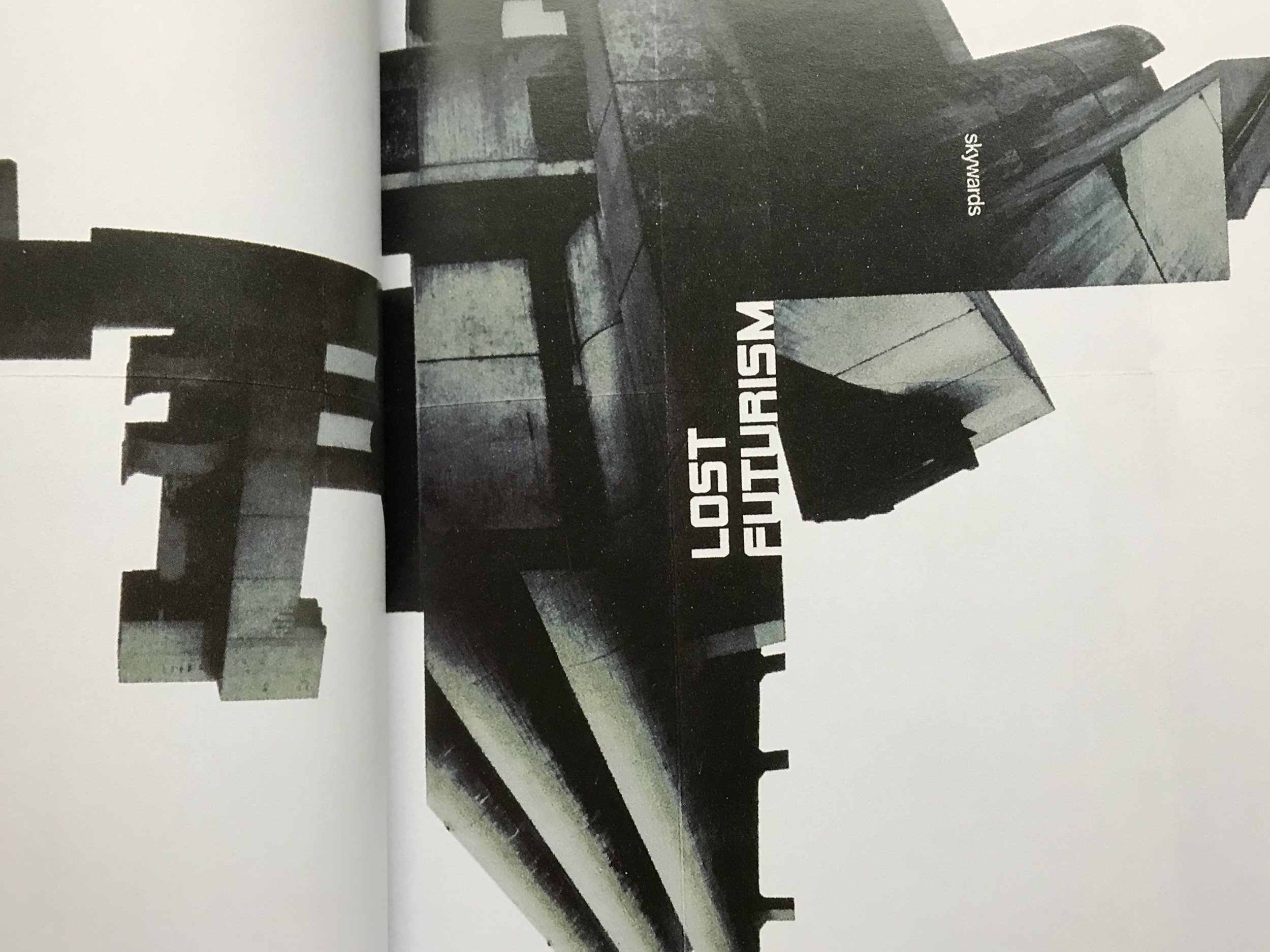
the book was designed by a london-based agency called bark, founded by tim hutchinson and jason edwards and i used to really hunt for their bold and colourful work and i did find them - in another book, “graphic originals: designers who work beyond the brief”(austin, j 2002 rotovision, mies) they talk a little bit about their process through a prospectus they designed for portsmouth university where hutchinson was a lecturer. the project itself was a map, a clever visualisation of the course journeys, but what really caught my eye was that it wasn’t just an raw information graphic, but focused a lot on using a lot of photographs of the built environment, the documentation of very mundane things that reflected on everyday life at the university. it was the first time i’ve ever really seen anything like that but that really was speaking my language. it was just inspiring to see real, successful people in the industry do this - take the built environment, and create a feeling of home and belonging in it by graphic, “2D” means. that’s exactly how i wanted to do design and it was a great contemporary example, right in front of me.
but there is another project of theirs that i would like to show you - i’m still hunting it, i believe it must have been self-published at the time. it is one titled lost futurism (according to the caption in GB: graphic britain, it is a book that was printed in 2001 - please do get in touch if you know anything about it.)
the project examines brutalist architectural heritage in a graphic design language - having mentioned portsmouth, this obviously means the tricorn centre, mostly, which i have never seen in real-life but somehow in this graphic interpretation, felt nostalgic and futuristic, alien at the same time. i used to stare at these pages for ages. it was really fun discovering about the building itself but also the graphic representation of it - it was just really, really cool and simple, and it spoke my language of taking a three dimensional form and reducing, or rather, deconstructing it to its image and basic form.
to this day i’m still obsessed with that sort of thing. i used to do a lot of my own experiments with my own photos of my favourite buildings when practicing my computer skills (a useful habit to get into) but it also transpired to other work and i firmly believe they have a place on textiles too. obviously, graphic design is different, it is visual communication, but if the result is decorative, then why should it not be used on textiles too?
so i hope you didn’t mind learning a little bit about this background behind the architecturally inspired textile patterns of zitozza. and if you know anything more about this work, if it exists on its own as a separate book, please, please do get in touch, i think i want a copy! thank you!
-
links:
GB: graphic britain - by patrick burgoyne, 2002 laurence king, london, uk (on worldcat.org)