
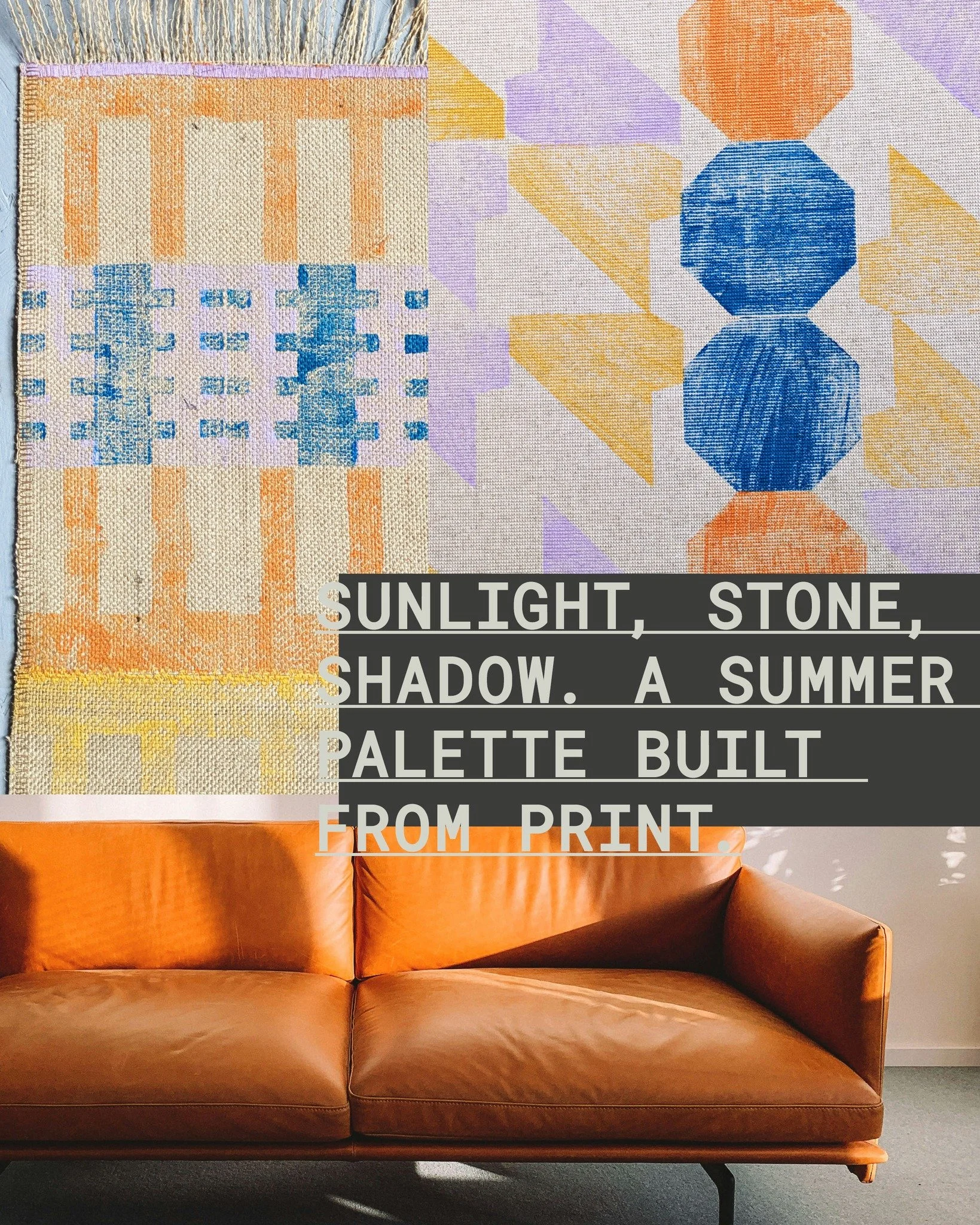
it’s been a pet peeve of mine for a long time how brutalism suffers from the stereotype of describing spaces and buildings in cold, grey climates. in a team building game i once asked someone to draw a brutalist bus station (fully thinking of preston) but they wrote moscow ‘86 on it so that was that, a brutalist bus station has to be in the soviet union, preferably in biting frost and bare trees.
but this could not be further from the truth - tropical modernism aside, there is a wonderful beauty of how concrete comes alive in the sun and here are four ways to bring summer into a structural home without surrendering your architectural authority.
1. swap heavy shadows for sharp contrast
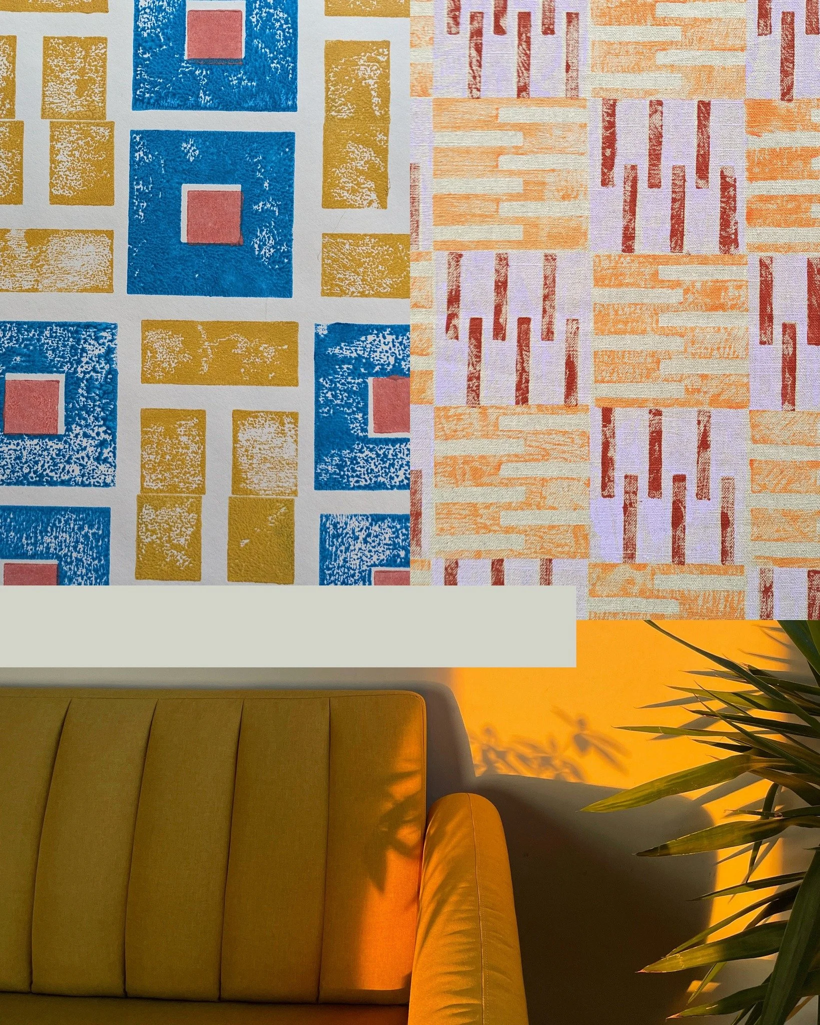
winter brutalism relies on deep, moody shadows. summer brutalism is all about high-contrast, graphic clarity. as the natural light brightens, look at how the sun hits your walls. this is the perfect time to introduce clean, monochrome block prints. a sharp black-and-white grid doesn’t try to make a room feel "cosy" or hidden; instead, it catches the harsh summer sun and mirrors the crisp, cast shadows of an exterior facade. it keeps the room looking deliberate and architectural, even on the longest days of the year.
2. introduce raw, breathable grit
inviting summer in shouldn't mean replacing your entire material library with flimsy fabrics. instead, shift toward raw, unbleached fibers that offer texture without heat. heavyweight jute is the ultimate summer material for a structural space. it is incredibly tough, highly durable, and completely breathable underfoot. because it is a natural, irregular fiber, a hand-printed jute rug brings a quiet, tactile warmth into a sunlit room, acting as a cooling, honest counterweight to smooth concrete or plaster walls.
3. look to southern brutalism for your colour script
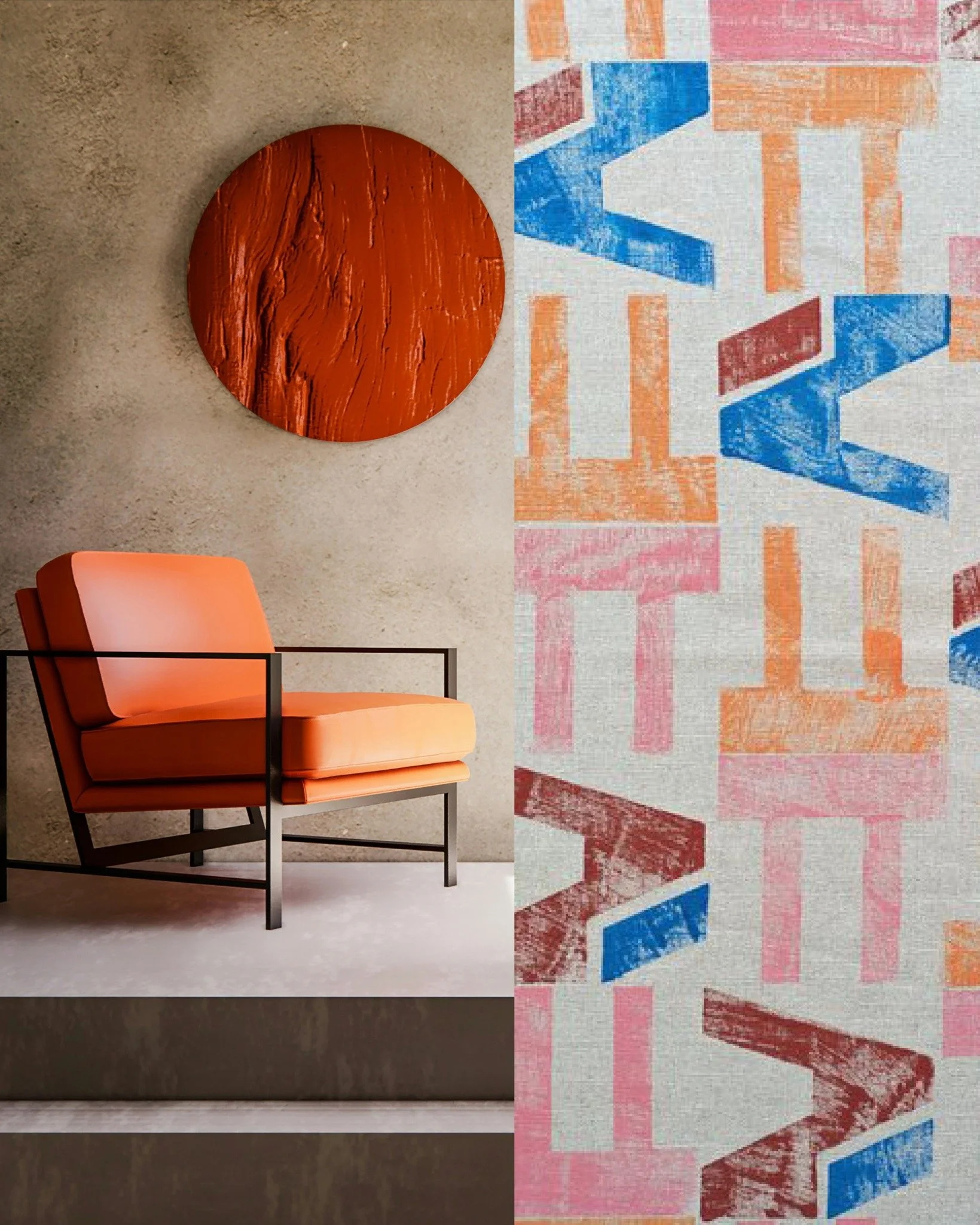
if you want to introduce colour for the warmer months, bypass the high-street trends and look at how architecture handles the sun in warmer climates. think of portuguese brutalism. summer colour for a structural space shouldn't be decorative; it should feel earth-born. lean into architectural ochres, muted terracottas, and raw sand tones. these shades don't sit on top of a room like a cheap accessory; they feel like they were poured directly into the foundation.
4. design for active air, not passive clutter
summer interiors often become cluttered with seasonal ephemera. a brutalist space needs to maintain its spatial navigation and airflow. instead of filling surfaces with decorative objects, focus on modular items that create a framework for summer living. a large, bespoke geometric lampshade system can completely redefine a high-ceilinged flat, drawing the eye upward and emphasizing volume and breeze rather than floor-level clutter. construct the layout so the air can move, and the human engagement will follow.
construct, play, decorate
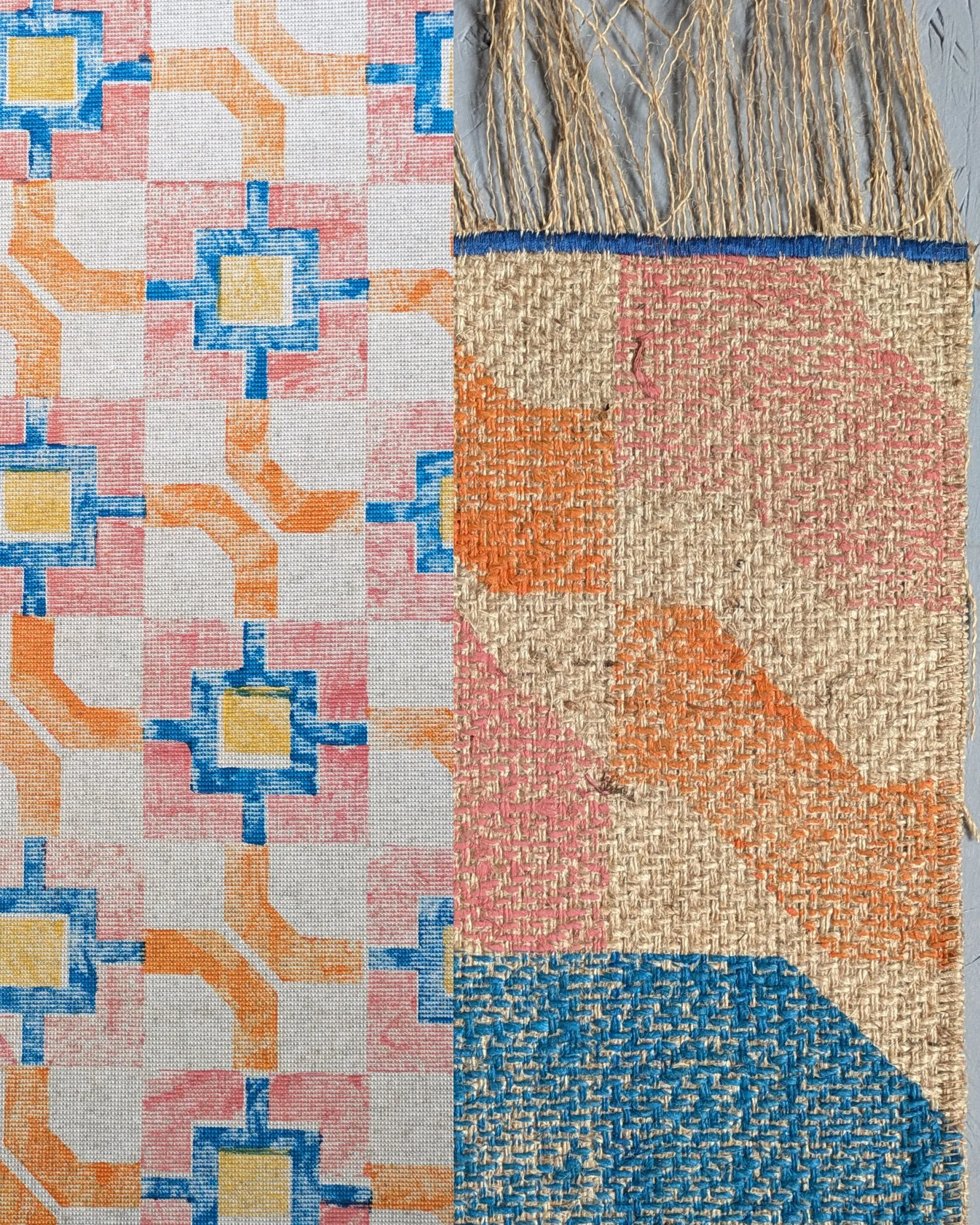
at zitozza, we love summer and we believe in modernism in all seasons. we don't design for fleeting emotional trends, and we don't make mass-produced throwaway items. we create modular textile systems and custom hand-printed jute pieces that respect the permanent laws of rhythm and proportion—whether it is mid-winter or the height of heatwave season.
if you are looking for tailored, high-contrast pattern system that lasts many years, do get in touch!