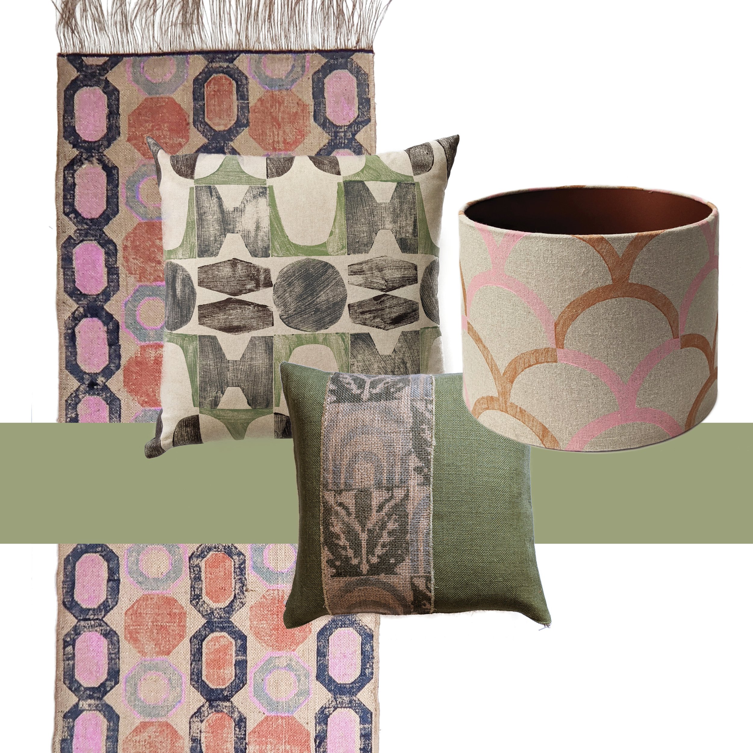
back in february, i wrote about why i find the term “storytelling” so exhausting when applied to pattern design, and i really do believe that a pattern doesn’t (and shouldn’t) guide you through a linear narrative; rather, it surrounds you, as in, all of it exists all at once. i wanted to expand on this thought a little bit further and make the case for curiosity, something that’s at the core of zitozza.
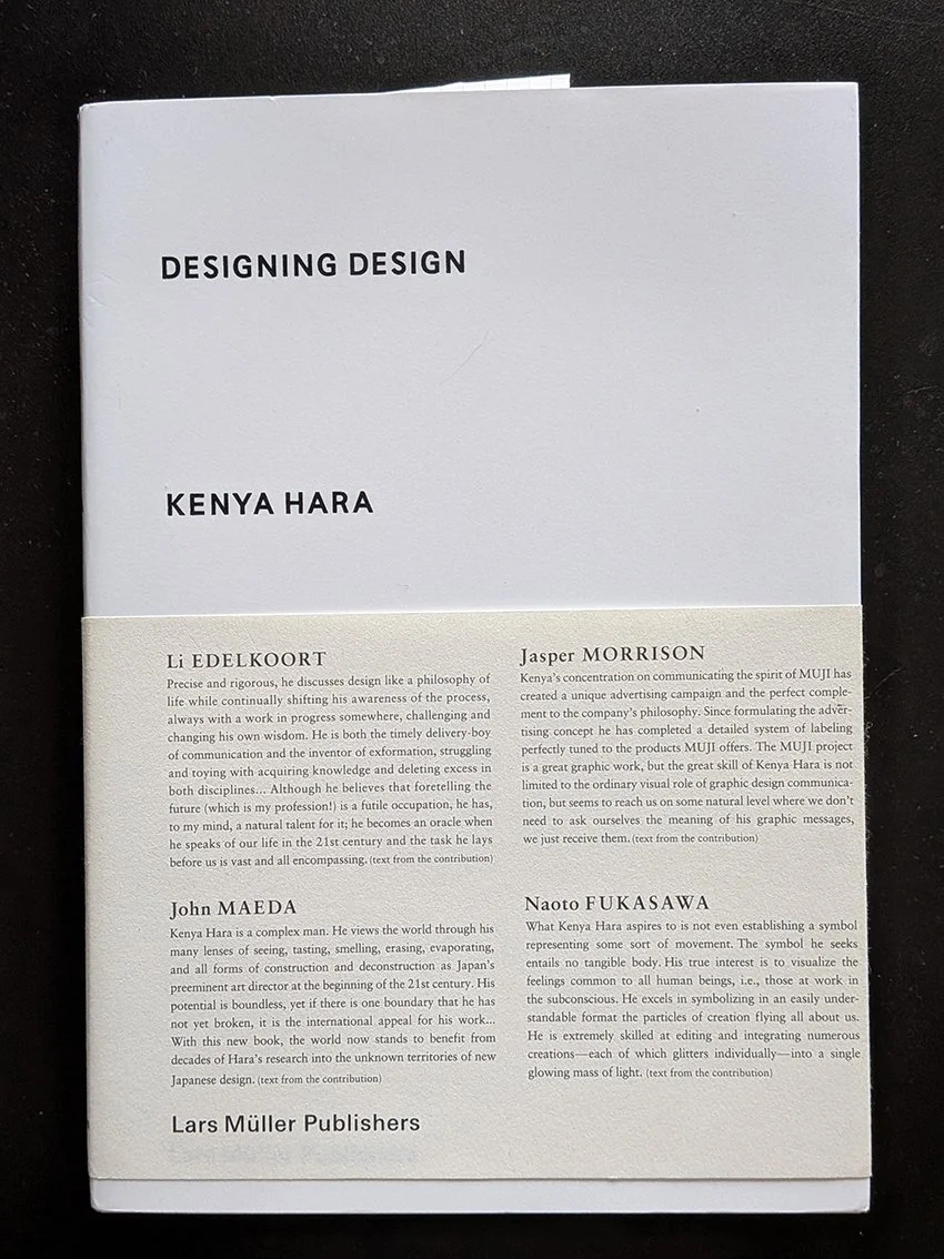
the explanation is actually not mine, it lies in a concept coined by the japanese designer kenya hara:exformation.
in his book designing design, hara argues that our modern world is entirely obsessed with information, with throwing broken pieces of knowledge at people until they feel they "know" everything. we see this everywhere in contemporary interiors. spaces are styled to look like a specific narrative, a carefully curated scrapbook of a person’s supposed lifestyle. the design leaves nothing to chance, forcing a pre-packaged biography onto the inhabitant.
“basically, knowledge is no more than an entrance to thought (...) to know something is not a goal, but a starting point for our imagination. (...) the information-dispatch side is engrossed only with throwing broken pieces of information at the recipient, and the recipient has begun to consider catching information as the goal. (...) i wonder if this is where the problem of stagnating creativity in communication lurks?” (hara, 2007)
“exformation” is the exact reverse of this process. it is the art of making something known not by over-explaining it, but by awakening the viewer to how much is left to be discovered. it is about converting the known back into the unknown, creating an entrance for curiosity.
“the “in”, of “information” is an affix. attached to the beginning of a word, sometimes it adds a negative implication. but in most cases, it intensifies the root meaning, or adds meanings like “directed within, on and toward”. this is the case with “inform”. the word “form” means to shape, organise, or arrange in order, but implies the movement vector involved in taking a definite shape. accordingly, “inform”, with the background meaning, “giving a certain form”, carries meanings like, “to make known”, “to tell”, “to imbue (with a feeling)”. then, in noun form “information”, it takes on meanings such as communication, knowledge, information and scholarship, and further refers to the service of giving information, as in “information booth”. in the word “exformation”, the prefix is changed from “in”, to “ex”, reversing the meaning of “in”. the meanings of “ex” include “not”, “out of”, “outside”, “eliminated”, “prior”, and others. this is the source of the concept of converting the known to the unknown. Notice that “exterior” is already widely used as the counterpart to “interior”, so my coined term, “exformation”, may well make sense to the general public.”
so by his logic, when we apply this to the spaces we live in, the implications are profound. an interior does not need to communicate a story; it needs to create the conditions for experience.
this is where the architectural grid and the repeating textile system come into play. to some, a modular grid might seem cold, rigid, or overly rational. but in reality, the grid is the ultimate tool of exformation.
the grid does not dictate a narrative. it doesn't tell you how to feel, nor does it demand that you admire its personal history. instead, a repeating system establishes rhythm, scale, and tempo. it sets a clear, visual boundary line that provides stability, and then - crucially - it stops talking.
by remaining emotion-free and focused purely on proportion, a modular textile system leaves what kenya hara calls a "productive emptiness." it creates a framework that waits for the inhabitant to fill it in. the meaning of the space isn't prescribed by the designer; it is constructed by the person moving through it, watching the light shift across the floorboards, or holding a conversation over a table.
this philosophy is the exact blueprint behind the digital pattern design tool i’ve been developing for zitozza. when i design a printing block based on an architectural reference, i am not trying to narrate the building's “biography” as such. i am extracting its spatial logic. when a designer or architect uses the tool to rotate, repeat, and configure those blocks, they aren’t receiving a finished story from me. they are using a language of forms to create their own framework.
losing the compulsive forcing of stories in design is nothing to fear. stripping away the sentimental fluff doesn't make a room cold; it makes it spacious. it shifts the designer's role from a loud storyteller to a quiet translator of rhythm.
after all, a rug shouldn’t be a biography. it should be a foundation. it should simply clear enough visual noise out of the way so that life has enough room to happen inside it.
breaking news! if you’ve followed the zitozza blog for a while, you’ll know we’ve been vocal about our opposition to the proposed 2023 updates to the uk furniture and furnishings (fire) (safety) regulations.
the proposed changes were, in a word, overkill. they would have expanded open-flame testing to a wider range of products and placed an impossible administrative and chemical burden on small businesses. for a studio like ours, it would have meant permanent labeling and mandatory chemical treatments for any cushion over 45 x 45cm (a move that felt entirely at odds with the move toward a circular economy and healthy interiors.)
well, the entire industry said "no thanks." and it appears we have been listened to!
The Shift Toward Smoulder Testing
the uk government has indicated a significant pivot. instead of the high-barrier open flame resistance (which often necessitates the use of toxic fire retardants), the conversation is shifting toward requiring smoulder testing only.
this is a massive win for natural fibres and independent makers. it acknowledges that the "toxic" approach to safety isn't the only way forward. by focusing on smoulder resistance and batch testing, the government is potentially removing the heavy administrative weight that was threatening to crush the re-upholstery sector and independent textile designers alike.
Why This Matters for Zitozza
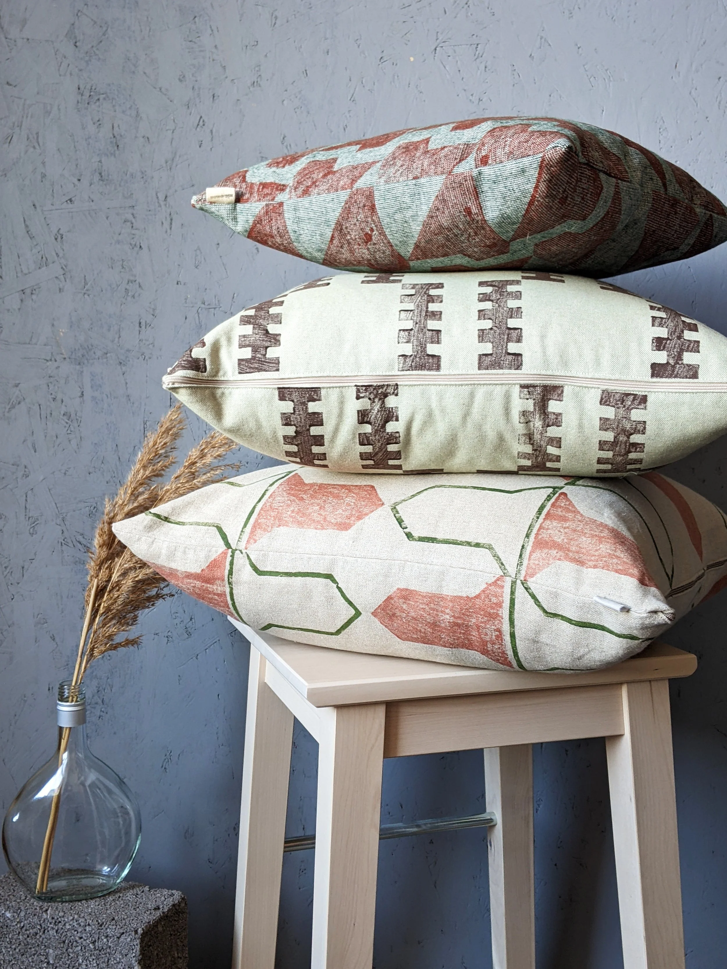
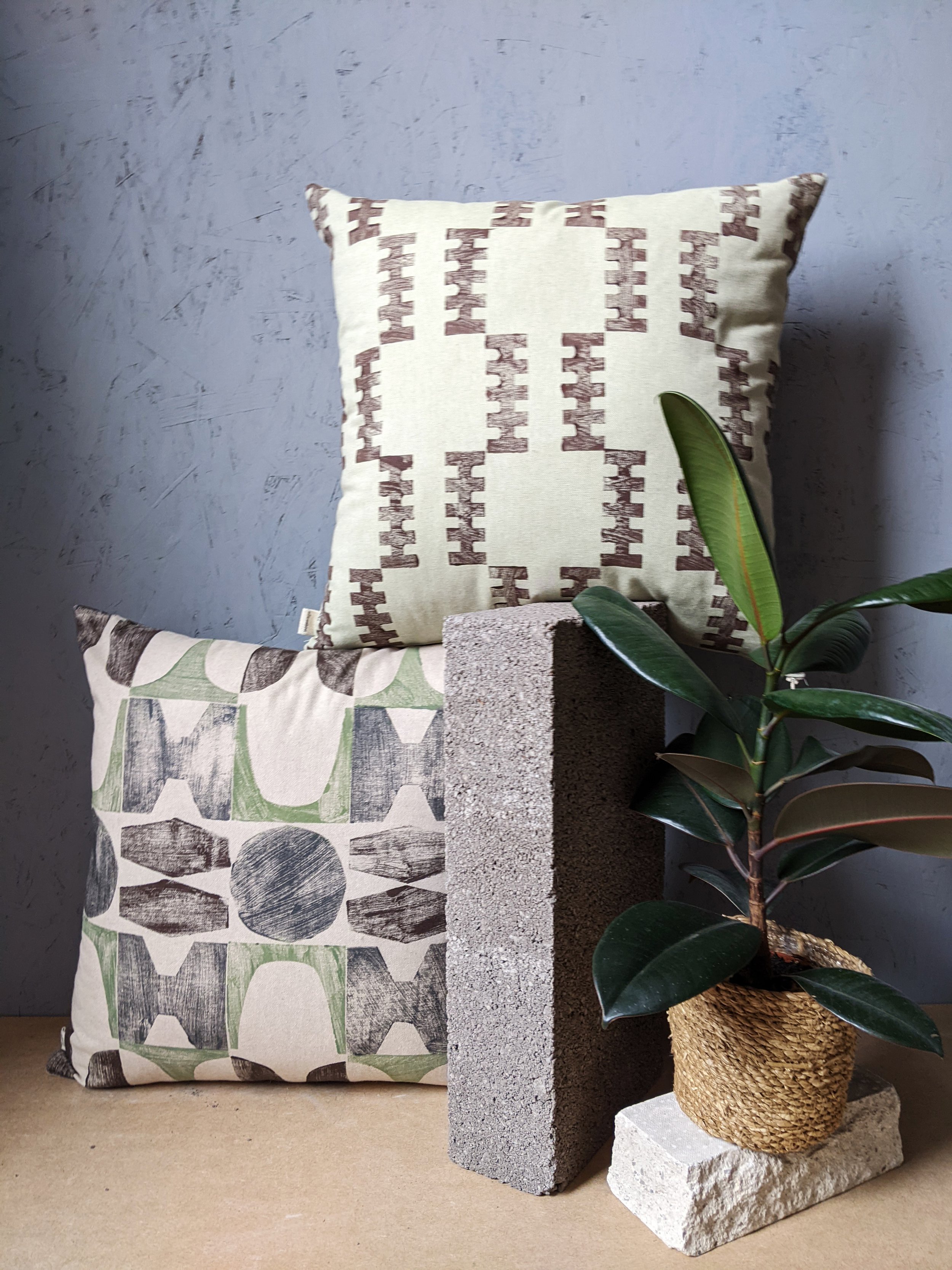
we believe in materials that breathe. our hand-block printed fabrics—including our recycled linens and heavyweight cotton blends—currently pass cigarette (smoulder) testing naturally, without the need for harmful chemical coatings. we may even get our jute used for upholstery too!
this regulatory shift means our fabrics can continue to be specified for upholstery projects without compromising the health of the home or the environment. it allows the beauty of the fibre to remain at the forefront.
The Final Push: We Need Your Voice
it is important to note: this is not yet law!
a new, and hopefully final, consultation is now open. the government needs to hear that the industry supports this move toward sensible, smoulder-based safety and away from toxic FR treatments.
responses are expected by 23rd june. please take five minutes to fill out the consultation and ensure we move toward a future that is both safe and sustainable. thank you!
happy new year everyone. i hope you all feel rested and ready to start 2026. as usual by now, we like starting the year on our journal with rounding up the industry trends this year and as we get into 2026, there are shifts we indeed notice getting talked about more. the design conversation feels less about fleeting visuals and more about how spaces actually feel and function.
over recent year there’s been a clear move from insta-ready looks toward interiors that reward touch, proportion and material logic. this is something we appreciate a lot because it resonates with architectural textiles: pattern as structure, not surface decoration; material honesty over effect; and tactile designs, built to live with, not just be seen.
1. lived-in, human environments
with that in mind, the biggest thing in 2026 seems to be about interiors that are being designed for how people actually use them. the “perfectly curated, picture-ready” room is definitely losing ground to spaces that feel genuinely lived-in and personal; places that carry life, use and comfort without compromising on thoughtfulness.
designers note that this lived-in approach is less about clutter but about proportion, atmosphere and genuine engagement with space over time. and for zitozza, this echoes clearly: architectural textiles are decoration as well as reinforcing the logic of a space, so when they age and get lived with, they feel like they were always meant to be there.
2. materials with presence and longevity
sustainability has been “in” since designers realised the importance of it… and in 2026, it first and foremost means materials that remain repairable and have inherent performance; tactile, honest, natural matter that doesn’t hide or disguise itself but interacts with light and wear over time.
expect to see deeper use of bio-based fabrics (seaweed textiles, hemp substitutes) and a continued gravitation toward materials that feel real e.g. jute, linen, stone, wood with grain, and hand-finished surfaces - which we love seeing at zitozza. this is consistent with broader forecasts that interior design is leaning into texture and authenticity over perfectionism.
3. warmth through colour and confidence in palette
the appetite for deep, earthy tones (terracotta, mossy green, chocolate brown) is relentless and does not seem to stop or slow down. designers talk about “earthy vibrancy,” a palette rooted in nature yet energetic and expressive.
in parallel, nuanced saturated hues like rich blues or muted plums are gaining traction for their ability to bring the brighter contrast. earthy colour combinations sit well with structured pattern languages (grids, modular repeats) but of course we’ll be unlikely to abandon the brightness completely.
4. tailored comfort and structural calm
you will know by now that our idea of warmth is not about plush maximalism, but about calmness through order. it is also a trend in 2026 though and watchers have dubbed this period warm minimalism: the softening of minimalism with materials that invite touch (our favourites such as linen, wool, brass, warm wood) without disrupting the order.
this is not some kind of abstract “fuzziness”, and seems to be less about ornament and more about presence: spaces that feel calm because they are designed with intention. architectural textiles fit neatly here: they bring tactility and rational frameworks but with the hand crafted, tactile touch.
5. bespoke, hybrid and adaptive spaces
even beyond traditional interior finishes, we’re seeing a desire for bespoke elements: cabinetry with unique grain and character (think burl wood), hybrid storage systems and modular pieces that respond to how people live and the unique spaces that surround them.
this aligns with a larger cultural shift away from “fast furniture” and toward investment pieces, where customization, whether in architecture, millwork, or (yes!) surface pattern becomes a marker of longevity over trendiness.
from a zitozza perspective, this is what we live for! modular pattern systems and fabrics can flex across scales and speak directly to clients and designers looking for investment textiles that feel both personal and architectural.
6. pattern as structure, not surface
one of the less prominent but still significant threads in early 2026 forecastingis a renewed appreciation for pattern that makes architectural sense rather than just aesthetic sense. interior editors are increasingly pointing to pattern drenching, large prints, and textile wall hangings as ways to give rooms rhythm without ornamentation which we absolutely love to see.
for textiles rooted in block systems, this trend is more than stylistic: it’s conceptual. well-made pattern should operate like a facade grid — clarifying spatial logic, giving scale to surfaces, and reinforcing proportion.
that’s exactly the design proposition behind architectural textiles for modern interiors: patterns that echo the architecture of a room while adding texture and tactility.
so what does this mean for makers and designers?
2026 is shaping up to be a year where purposeful choice outlasts impulse trend, where materials become more honest and tactile; interiors become places for real life.
for a design studio focused on structural pattern, modular logic, and architectural integration, these are trends that we love to see the shift towards across the whole industry. follow us through 2026 as we work towards our new collections and our exciting hyper-customisation tool for unique block printed patterns.
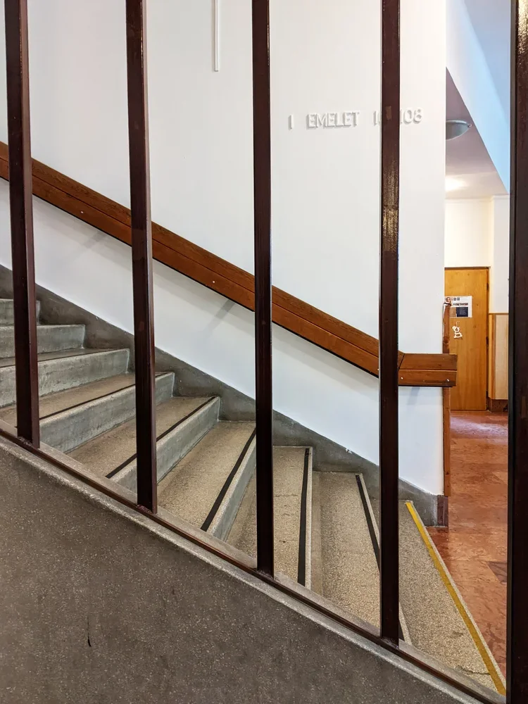
after a few tours at various student halls in edinburgh and st andrews, it’s time to bring you something quite special, in line with my new year’s resolution to bring you more buildings from hungary. we’re going to my alma mater, the óbuda university building on doberdó út – home of the rejtő sándor faculty of light industry and environmental engineering and the building itself too shaped how i think about structure, material and use.
this is where i studied light industry and product design. and no, “light industry engineeering” does not mean “electrical engineering but with nicer lamps”. in hungary, we use this term as an opposite of heavy industry. light industry is the world of textiles, paper, packaging, printing, plastics – all the things that actually touch your skin, your shelves, your coffee table. the soft infrastructure of everyday life.
the building fits that brief in a surprisingly literal way.
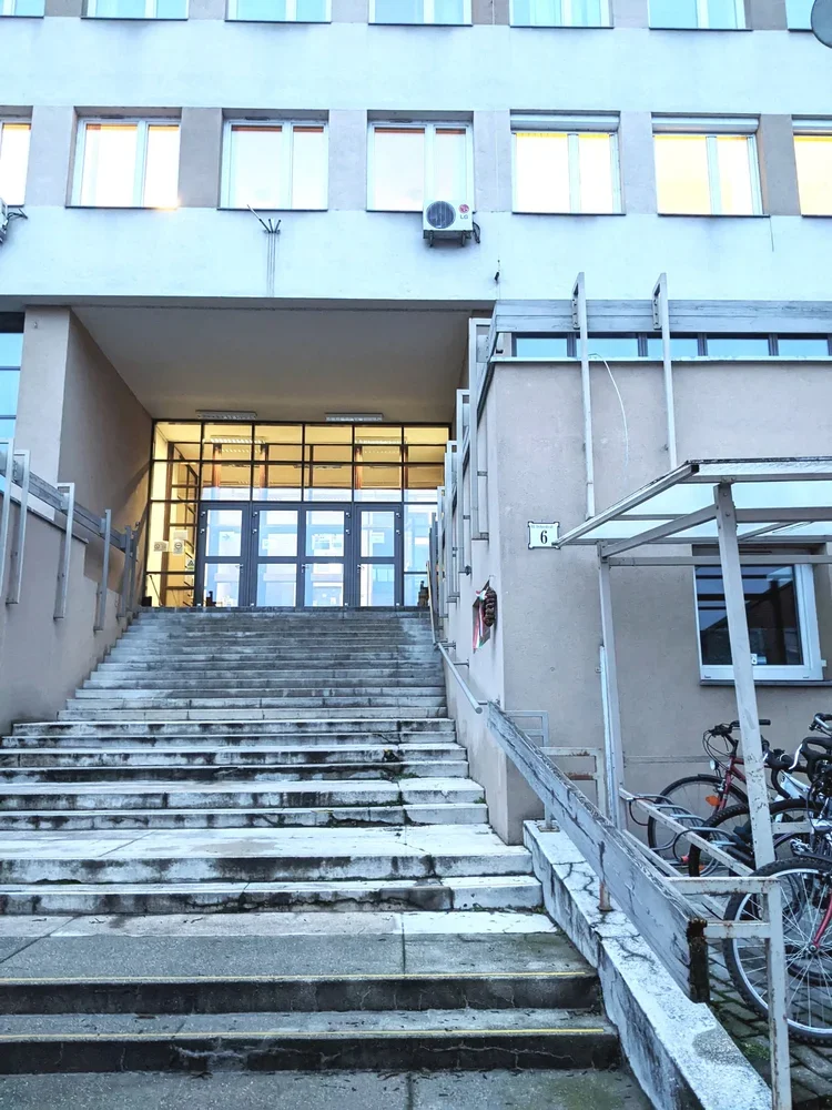
built into a hillside
approaching from the street, you walk up towards the entrance. it’s a long flight of stairs to go up on the first floor, and as soon as you’re inside, the uphill continues.
because it sits on a steep slope between doberdó út and the kiscelli park edge, the whole structure works like a split-level diagram someone decided to extrude into reality. there is a back building of half floors attached to the long, street facing facade. offices and admin spaces occupy the half-floors stepping up along the hillside while the larger rooms – auditoriums, drawing studios, labs, the library – drop down on the other side parallel with the street.
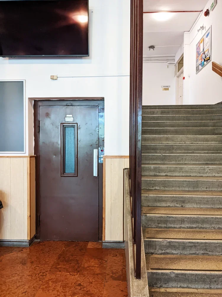
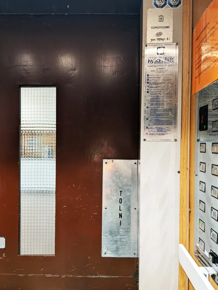
the middle is connected by a lift only teachers were allowed to use (with the same 1970s typography still intact), and a seemingly endless flight of stairs that always ended somewhere interesting. it reads like a very economical way of using topography: every shift in ground level becomes usable volume.
big rooms downstairs, views upstairs
the split-level logic isn’t just a structural trick. it organises how people think and work inside. the big, communal spaces – lecture halls, drawing studios, labs – sit on the lower side, stacked along the hillside. you walk “down” to the important rooms, which is a nice reversal of the usual academic hierarchy. rather than climbing a tower of theory, you descend into the machinery.
upstairs, along the hill-facing half-floors, are the smaller offices, admin corners, and quieter rooms. the hierarchy is sideways instead of vertical: teaching, admin, labs, all neatly lined up next to each other on the long corridors.
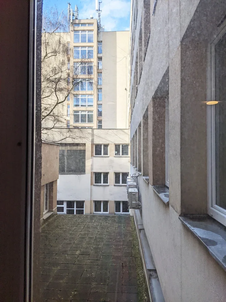
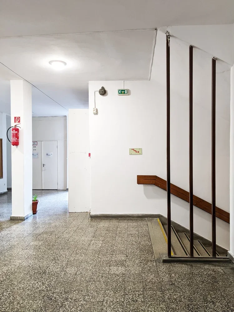
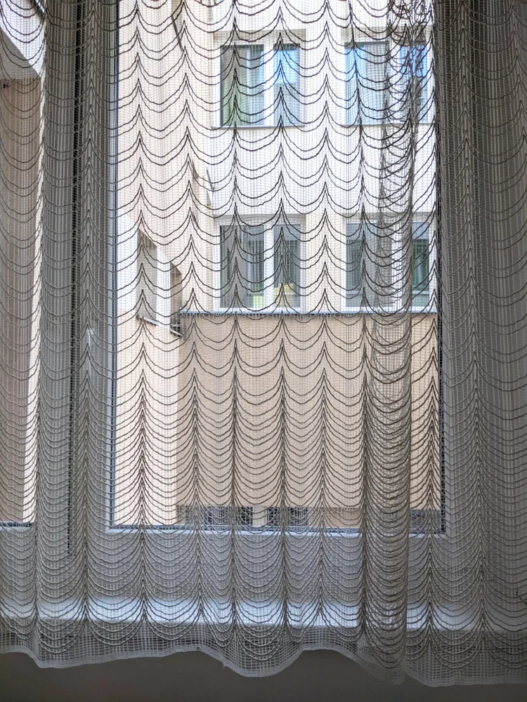
the best spaces were the paper labs at the top. they sat just high enough that, once you crossed through the corridors (with lace curtain windows and houseplants like a truly cosy socialist modernist home), the city suddenly opened up from the top floors of the building. there is something strangely grounding about testing grammage, opacity and fibre direction while a whole urban landscape sits just outside the window, built from concrete, brick and glass – large-scale material systems echoing the small samples in your hand.
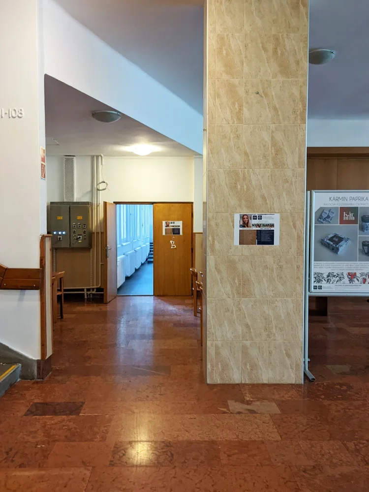
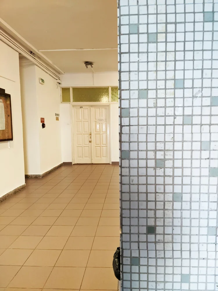
bannisters, terrazzo, and accidental details
like many late modern educational buildings in budapest, the doberdó út campus does not perform for the camera. but the details are better than they strictly need to be. the stair bannisters are classic 70s: sturdy tubes, consistent spacing, no theatrics. the floors are often terrazzo tiles or hard-wearing stone, the kind designed to survive thousands of students a year and still look vaguely composed.
even while rushing to a mechanics exam, i would enjoy the way the handrail meets the landing, the way light falls along a corridor and it has been storing itself away somewhere in my brain, ready to reappear in your own work. structure, then surface. order first, pattern later.
light industry, heavy shifts
studying light industry here meant learning the mechanics of materials that are often dismissed as “secondary”: textiles, paper, packaging, media technologies. the degree sits at an interesting intersection – somewhere between engineering, design and production.
in reality, it also meant studying in a period when much of that industry in hungary had already shifted, shrunk or moved. factories were closing, retooling, or turning into logistics hubs. the building on doberdó út, with its labs and test rigs and print rooms, became a kind of time capsule of a less material-based economy – but also a test bed for whatever would come next.
that tension – between the physical plant and the changing world outside – is something i carried with me. it’s probably no coincidence that i now work with textiles and printing blocks in a way that is both very old (ink, cloth, pressure) and quietly new (cad-designed modular systems, contemporary interiors, small-batch production).
how this filtered into zitozza
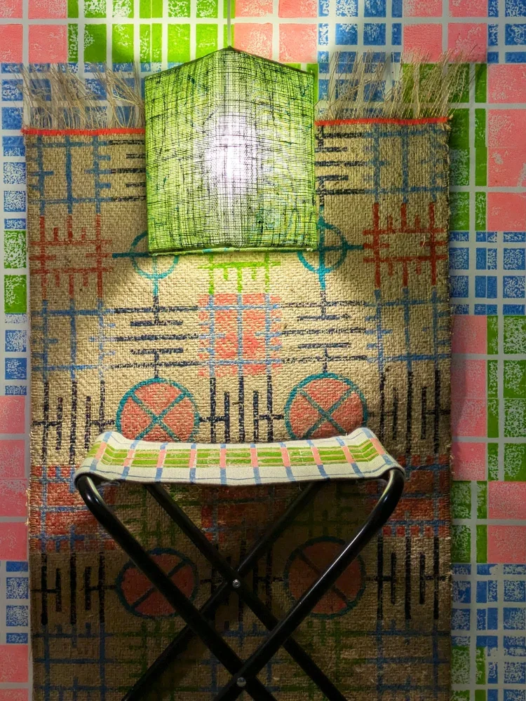
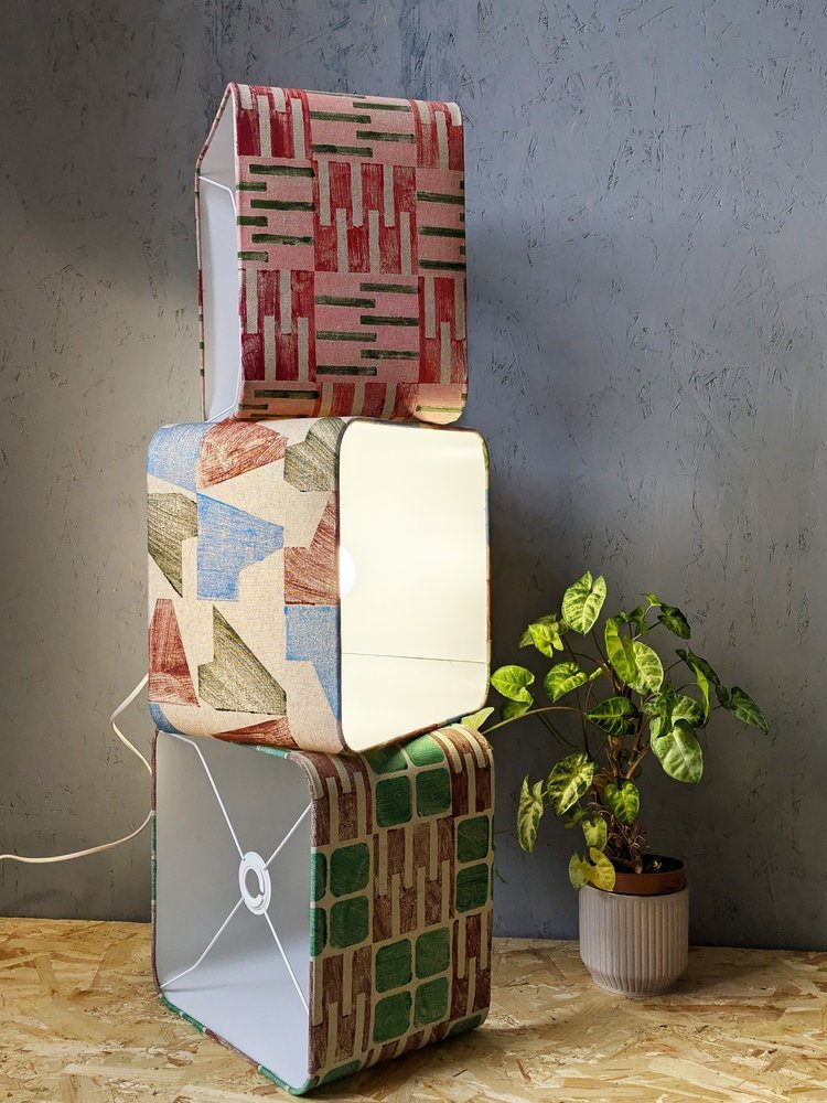
when i design printing blocks now, i think in sections, not just in surface. patterns have to behave the way that buildings behave: stepping, shifting, accommodating different uses without losing coherence. a rug in one room, a lampshade in another, a cushion on a sofa – all part of the same “light industry”, just at domestic scale.
the split-level logic of the doberdó building also shows an interesting and practical system of repetition: instead of a perfect, flat grid, you can think about it as offsets and half-steps – units that interlock like floors on a hillside. the materials matter too: recycled linen, cotton, jute. not glamorous on paper, but very real under the hand.
and the views from those upper labs? they were a useful reminder that design is never just happening in the studio. it’s always in conversation with the city, the economy, and the infrastructures that support both. you don’t forget that when you’ve spent three years measuring paper in a room that looks out over an entire urban cross-section.
a modern kind of alma mater
there are many more photogenic buildings in budapest, and certainly more famous ones. but this one, at doberdó út 6, did its job in more than one way. no grand gestures, just good use of a hill, sensible circulation, and rooms that are genuinely fit for the activities inside them.
as with many of the structures i keep coming back to, its real value is not in being iconic, but in being clear. clear in plan, clear in section, clear in purpose. and i suppose that’s what i’m still chasing with textiles too: clarity in pattern, clarity in material, clarity in how something is meant to be lived with.
from hillside labs to block-printed cushions is not as big a leap as it sounds. in both cases, it’s about making sense of materials in a world that refuses to stay still.
so, with the clocks going back and the days getting darker, i chose a timely topic for our october blog post. some if you might know this about me but i used to live in the netherlands for a bit - the design culture of the country is just exceptional so i might bring more examples later. but there is a little fascination as well with the dutch word gezellig as it has become one of those untranslatable design-world favourites. it turns up in lifestyle pages, pinterest captions and café menus, usually next to fairy lights and hot chocolates. but like most cultural imports, it’s been flattened in translation.
so what it is then? because gezellig is not “cosy”, not entirely. ask a dutch person what gezellig means and they might talk about a social setting, a place or a moment shared, an evening, a conversation. something that feels just right, with the right companionship. it is not a design term although the somewhat related “hygge” was hijacked much the same way by interior lovers so we can think about this from that spatial perspective too. in that sense, you could see it as being surrounded with a pleasant atmosphere. this is always going to be coming from the company you enjoy but also being enclosed in a space you feel comfortable in - and it is this design sense we’re talking about today.
a spontaneous communal space for sharing evening moments with neighbours - haarlem (photo by zita)
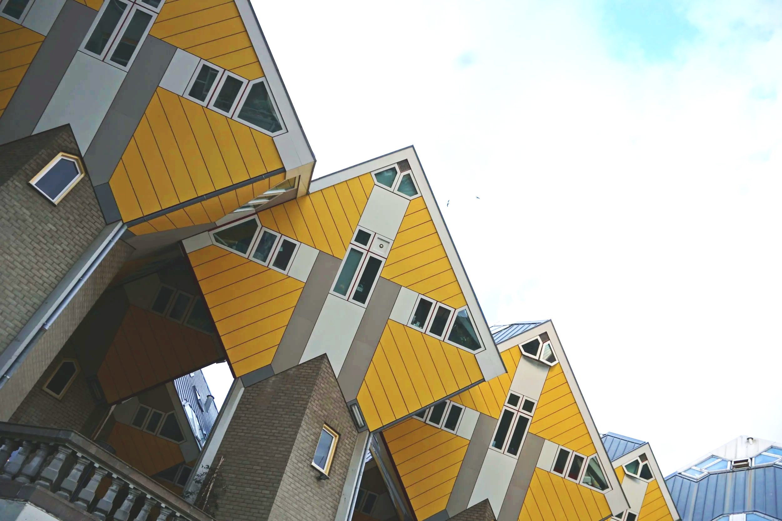
in that kind of hijacked-by-design sense, gezellig is as down to proportion as well as sentiment. it’s the pleasure of spatial logic functioning well - which explains why it appears so naturally in dutch design. you can think of the quiet, picturesque side streets off the main canals, but it’s a concept modernists take on too. think about gerrit rietveld’s schröder house, where planes slide and pivot to create a sense of adaptable intimacy. or, if you prefer a touch of the post-modern and you’re not afraid of a bit of the old cliché, you can also consider piet blom’s cube houses in rotterdam, which literally tilt domestic space into new geometries - but still feel surprisingly humane. these are environments that invite curiosity and domesticity at the same time.
the kubuswoningen in rotterdam (photo by zita)
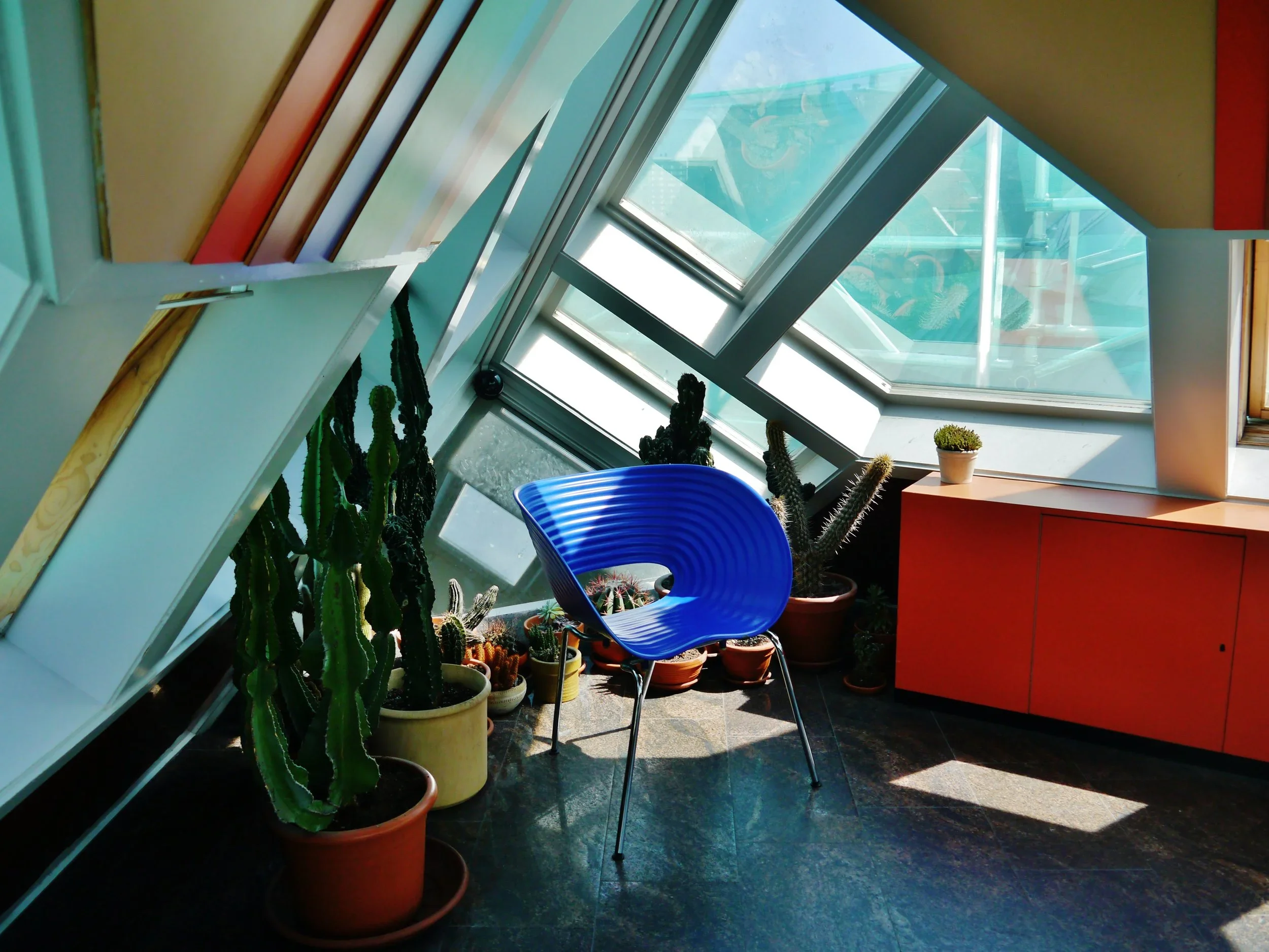
an interior scene in the kijk kubus (source: wikimedia commons)
the cultural reading of modernism has long painted it as cold, austere, emotionless and rational. yet many dutch and also nordic designers work from the opposite principle: that good order is itself empathy. a well-proportioned chair, a clear grid, a balanced room: these are not emotional voids, but frameworks for care and joy. if form follows function, and the function is living well, then it is good design.
in that sense then, a modernist space can feel completely “gezellig” (even though it isn’t inherently a design term and much less a decorating one.) yet, if you are surrounded by order in the right proportions, with room for the right company around you, you can completely feel this way.
we like to think warmth comes from softness — fabrics, string lights, cushions — but gezelligheid is rarely about clutter. it’s material honesty that makes a space feel grounded, and room for those shared moments.
this is where gezellig quietly overlaps with what i sometimes call cosy rationality in my love for modernism, and also my textiles. zitozza patterns begin with logic: a block, a grid, a plan. but through touch, repetition and imperfection, they turn structure into atmosphere. the pattern is so much more than surface decoration; it’s rhythm and proportion given a physical surface.
modernism understands this perfectly. warmth is achieved through light and material rather than ornament — brick, textile, tiles, all exist to give room to inhabit, rather than overwhelm. it’s why concrete in the right context can feel as gezellig as oak.
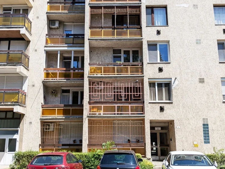
comfort in modernism - békéscsaba, hungary (photo by zita)
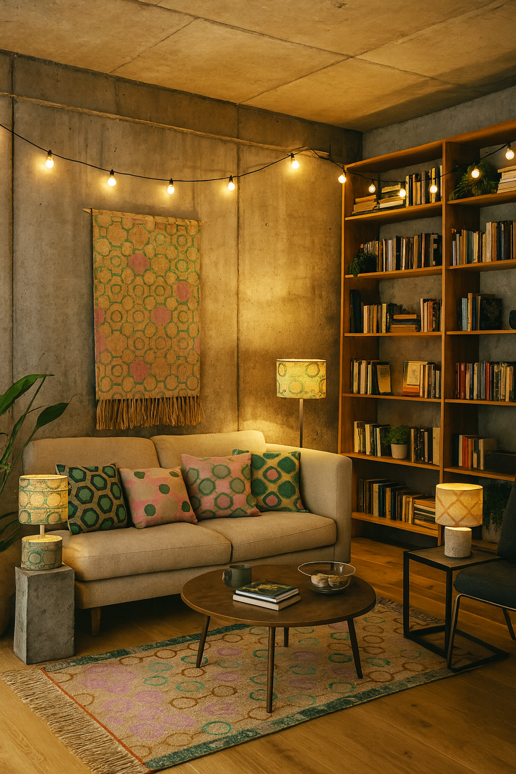
AI interpretation of a “gezellig” interior using zitozza textiles
perhaps gezellig offers a way to rethink modernism’s reputation. not as a style of severity, but as a practice of calm. the neat repetition of façades, the modular rhythm of housing blocks, even the shadow of a stairwell — all contain a kind of order that feels peaceful, if not “cosy” in the conventional sense.
in textile design, that same impulse translates into repeat, rhythm, and scale. a pattern that repeats just so, aligning form with material, becomes more than visual — it becomes spatial. maybe that’s where architecture and textiles quietly meet: in the shared pursuit of gezelligheid through proportion.
to me, gezellig sits somewhere between company and peace. it’s not emotional in the ornamental sense, but in the human one: proportion, care, attention to the tactile. it’s what happens when design supports life rather than dominates it. so perhaps it’s time we reclaimed gezellig from the coffee-table clichés (although i’m partial to one too many string lights). it’s not a moodboard, but a method. a spatial feeling built through light, texture, and structure. and if that sounds suspiciously modernist — well, maybe modernism was never as cold as we thought.
i spent an afternoon at the dovecot studios in edinburgh visiting magical patterns, the ikea museum’s travelling exhibition celebrating sixty years of textile design. 180 fabrics, spanning collaborations with everyone from bitten højmark to zandra rhodes, were laid out in a riot of colour and geometry.
it is an absolute must-see for every pattern and print enthusiast and it’ll be particularly special if you’ve been shopping for ikea fabrics for a long time: i recognised fabrics i’d once had in my own home, now displayed as part of a lineage of “iconic design. what really struck me though was how clearly this exhibition became a celebration of women in design. like many design establishments, ikea was once overwhelmingly male-dominated. textiles, however, became a way for women designers to enter the system and make themselves indispensable. the show foregrounded this history: each designer was credited by name, with their tools, sketches and inspirations laid out. scissors, paper cut-outs, tracing paper: modest tools, but revealing how much painstaking labour sits behind something that looks deceptively effortless.
the pattern nerd in me loved seeing these paper cut-outs beside finished screen prints, but i couldn’t help wishing for more. how did those jagged paper edges become repeatable units? how did they translate into full-scale production? how do you separate colours for screens, and so on. this story wasn’t really told and i suppose one can’t expect a full technical breakdown at a tapestry studio, but the lack of process detail left me curious rather than fully satisfied.
what was also missing was any commentary on ikea’s shifting identity. the exhibition proudly shows its most experimental decades — the bold 1970s stripes, the broccoli motifs, the collaborations with 10-gruppen. yet, having just been to ikea edinburgh not long ago as well, the contrast was sharp: far more beige, far less risk, with the adverts promoting the exhibition all over the floor with much bolder designs and installations that almost said “hej, sorry about the actual stuff to buy, come and see this and remember when we were really cool!”
it left me wondering what really happened? ikea has always been the champion of the “middle crowd,” the “wonderful everyday”, the affordable but well-designed stuff that were simply made to serve a life well lived. but what does that mean in an economic climate where the middle is disappearing? when so many brands are either abandoning this middle crowd by trying to tap into the higher-end bracket with unreasonable pricing, or have resigned themselves to no longer lead but follow with low-quality, less cutting-edge designs. where does that leave brands like ikea? what does the future hold for the company and its bold textiles?
the exhibition has also made me think how skewed our current idea of “scandi design” has become. somewhere along the line, “scandinavian” was collapsed into plain, bare, minimalist in the mainstream. yet this exhibition shows a very different story: sweden has always embraced pattern. bold, abstract, colourful, playful. IKEA didn’t just follow that tradition, it helped define it. i know it is only one company from only one of the scandinavian countries, but i think exhibitions on the bold colours of IHAY or fritz hansen would actually tell a similar story.
so while magical patterns might not have answered all my questions, it was still a joy to wander through. it reminded me that pattern is rarely effortless, that design histories are sometimes gendered, and that “scandi minimalism” is a myth ikea’s own archive disproves. perhaps the real magic here is how a so-called middlebrow brand has quietly carried radical pattern work into millions of homes.
-
IKEA: magical patterns - until 17th january 2026 at dovecot studios, 10 infirmary street, edinburgh EH1 1LT
this is going to be a bit of a hot take but those who follow me on instragram has seen me make this point before. i’m going to argue today that brutalism is actually cosy and it merely has a reputation problem. controversial or what? it is in fact bare, raw and… well, concrete, duh. perceived to be cold, harsh and as a style that overwhelms rather than invites. but spend enough time in these buildings and you might notice something else: a surprising sense of warmth.
it won’t be that the concrete has grown a softer texture all of a sudden, it’ll be precisely because of the materiality.
material honesty
rough surfaces, textured finishes, exposed joints, unpolished edges: brutalism has always been about revealing materials as they are. nothing dressed up, nothing concealed. and that honesty creates a kind of liberation, and with it you find comfort.
block printing works on a similar principle. every impression carries the grain of the fabric, the edge of the block, the rhythm of the hand. the result is never pristine, but it is always real. the imperfections aren’t flaws, they’re the thing that makes the pattern tactile and alive.
structure meets softness
what often goes underappreciated as well is how calming order is. the stark geometry of stacked, modular units leave no room for chaos. being enclosed by forms like that brings a sense of peace.
pairing block-printed textiles with brutalist or modernist interiors makes sense for this reason. the patterns mirror the structural logic of façades (repeated, modular, rational) while the fabrics introduce tactility and warmth. the concrete provides weight and permanence; the textiles provide softness and touch. together, they balance each other out.
warmth through materiality
so perhaps brutalism isn’t as uncosy as it seems. it’s not about decoration or ornament, but about surfaces that tell the truth, forms that cut through chaos and create order. if you add the softness of textiles that share the same philosophy — honest, textured, imperfect — you will get interiors that feel grounded and, yes, cosy.
cosiness doesn’t always come from softness, or softness alone. sometimes it comes from order, calmness, a sense of peace and from the way materials meet and interact. and brutalism, surprisingly, has plenty of that.
this is going to be another one of those meandering blog posts but those who know zitozza will appreciate how much i value tactile, haptic design and i often explore this further — even on the buildings i frequently post about. in interior design, it’s often the surface that gets the glory. glossy interior magazines, pinterest kitchens, machine-mixed, precisely matched wall paints — all of these speak first and foremost to the eye. but do they speak to the hand? we decorate our homes by looking, mostly. but living happens through touch.
why touch matters
this re-discovering of tactile design has been going on for a while, finnish architect juhani pallasmaa argued in the eyes of the skin that modern design has lost its connection to the body. “architecture” he wrote, has become “an art of the printed image” — increasingly flat and ocular, distant from the sensory depth it once held. we experience spaces with our skin as much as with our eyes, but you wouldn’t know it from most interiors magazines.
touch is the forgotten sense of design — until you step onto a coarsely woven jute rug barefoot, or brush your hand against a natural linen fabric. that fleeting physical experience tells us more about comfort, quality, and materiality than a thousand words of product copy.
at zitozza, this is something we take seriously. every hand block printed cushion, rug, or lampshade is an invitation to feel as well as see. the patterns may be graphic — influenced by architecture, brutalism, modernist grid systems — but the textures are deliberately tangible. you don’t just see the ink sitting on the weave. you can feel it, the texture is within the patterns and the way it is applied by brush too.
materials are more than surfaces
i want to make a clear distinction here between “surface” and “material.” although as a surface pattern designer, i have designed hard finish surfaces such as floor patterns and carvings, surface to me means something visual, often cosmetic. material carries structure, meaning, weight, and i don’t think you can design for any kind of surfaces without understanding how materials behave.
in her book thinking with things, art historian esther pasztory proposes that objects — and their materials — are not passive. we use them to think with. they shape how we relate to space, culture, and ourselves. in design, this means we don’t just use things to build with, or decorate; we also use them to express what we value.
a hand-printed lampshade might say “i believe in craft.” a concrete-textured cushion might say “i value raw honesty over perfection.” material, in other words, does not just have physical weight but also a subjective kind of significance.
this is why surface-led decorating often feels fleeting. trends change, finishes date, colours come in and out of favour. but materials with presence (e.g. stone, wood to raw jute and block-printed textures) carry weight and can be adapted to outlast different fashions.
the material as Architectural element
our work at zitozza comes from the intersection of graphic design and material design. our blocks aren’t carved by hand — they’re precision-cut from digital vector drawings, a nod to order and modernity. but once that design hits the textile, once it’s printed, imperfectly, by hand — it becomes something else. it becomes a tactile surface. a material transformation.
this is why we speak of our textiles not just as “homewares” but as architectural materials. wallpaper, for example, becomes more than wall decoration — it becomes part of the structure’s language. our newly released AGGREGATE collection for instance, can be printed by hand on non-woven wallpaper rolls and it embraces this exact idea: bold modular graphics that are not only seen but felt, shifting as light and touch interact with the ink.
what does this mean when you decorate?
it means you don’t just choose based on colour schemes. you choose based on how something feels, both physically and emotionally. that’s why the texture of a printed cushion, the density of a handwoven rug, or the grip of a paper-mounted fabric print matters. these are materials that invite interaction. they’re not background, they’re architecture in soft form.
so next time you consider updating a room, ask: what do i want to touch every day? what kind of surface do i want to live with — not just look at?
explore tactile design
if you’d like to explore zitozza's approach to materials, here are a few places to start: printed rugs (for pattern underfoot.) cushions (for texture on the sofa or bed.) mounted prints (for a feel of the cloth without needing upholstery) fabrics and wallpapers (for sampling our prints.)
after a bit of a biggie (three launches and clerkenwell design week) it’s now time for a bit of a breather. i’ve wanted to blog more about architecture but the link between the concrete buildings and the jute rugs isn’t always obvious to everyone so i thought i’d write something about it as a bit of an explainer. when we think about architecture, we often think vertically — facades, elevations, materials rising around us. but the floor is where spatial experience begins. It’s where rhythm is established, circulation is guided, and texture makes its first tactile impression.
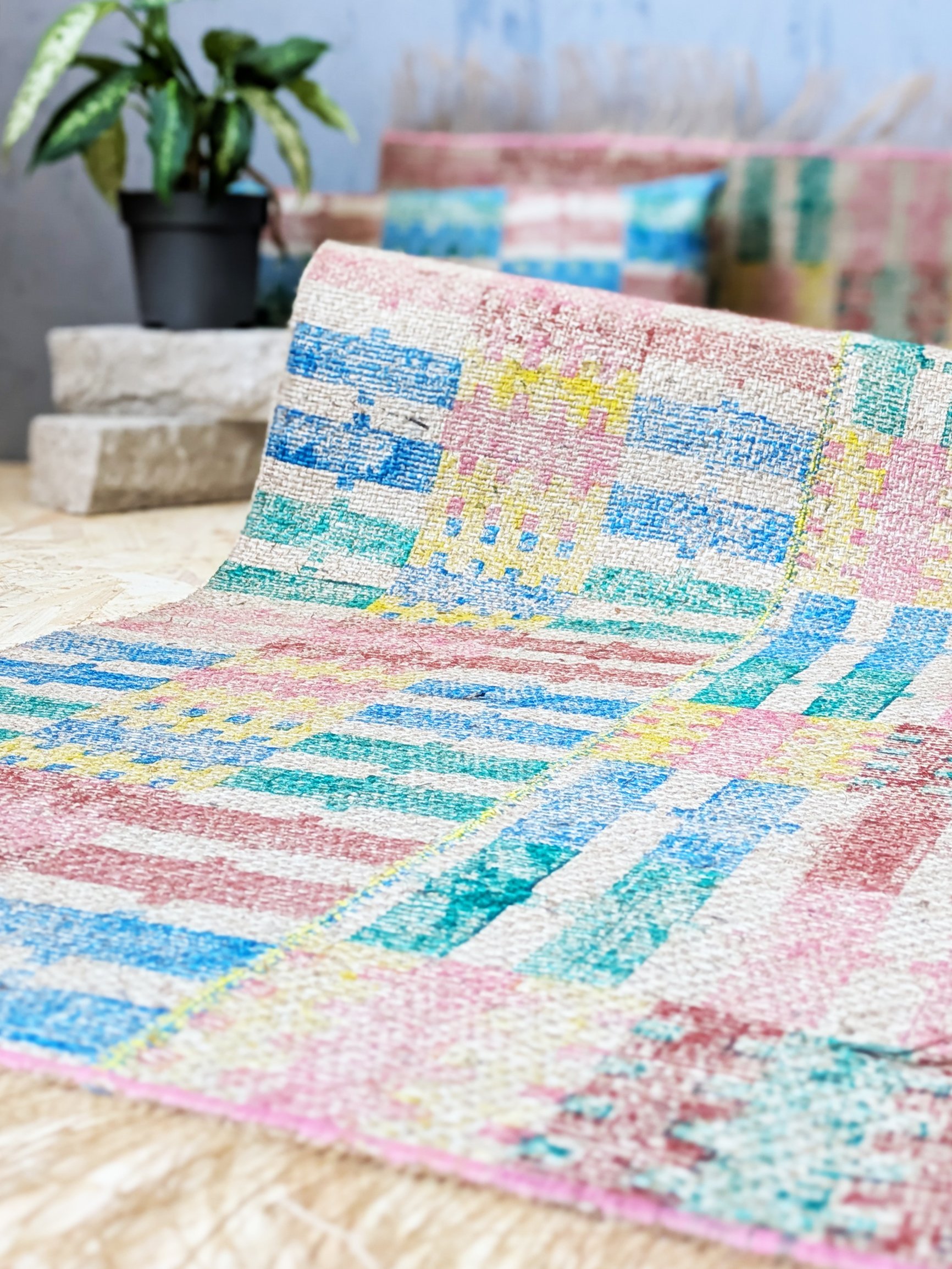
at zitozza, i’ve always been drawn to this horizontal plane of architecture - afterall, everything gets built from the ground up. it always starts with a floor plan and i’m thinking about the layout a lot. my printed jute rugs are designed not simply as soft furnishings, but as modular surface patterns for the ground. they take inspiration from the repeat logic of tiling systems, urban grids, and brutalist detailing — and reimagine them in natural fibre and pigment.
Modular Rugs, Architectural Logic
the design of each zitozza rug begins with a modular block tile - designed on the computer, precision-cut by a machine. these blocks are based on repeating geometric systems (steps, bricks, windows, columns) which you might recognise from pavement markings, concrete formwork, or mid-century cladding systems.
the prints themselves, when repeated across a jute base, create patterns that feel both structured and handmade and rustic — mathematical but never mechanical. these aren’t rugs that “fade into the floor”; they articulate it.
The Beauty of Soft Geometry
so why print, not weave? because print allows for crisper, graphic interventions on natural texture. block printing on jute brings a grainy tactility that reflects the rough honesty of these sustainable materials — not unlike exposed aggregate or board-marked concrete. it’s a dialogue between graphic clarity and material softness, one i find particularly rich when designing for interiors.
zitozza rugs aren’t trying to mimic tradition — they’re rooted in contemporary spatial language, designed to support interiors that favour simplicity, repetition, and material integrity. In homes with architectural ambition, they become not an accent but a foundation.
Designing From the Ground Up
there’s a reason architects often start their drawings with the floor plan: the floor defines flow. at zitozza i think of printed rugs as a continuation of that principle — a tactile, visible layer of design that offers rhythm, grounding, and visual structure to a space.
whether you’re designing a gallery-like living room, a textural study, or a quiet corner (of maybe a brutalist building), i invite you to explore the possibility of printed rugs as spatial tools — not just decor, but material floor drawings.
i wanted to write this blog post for a long time but never knew where or when to start - but if that’s the case, then any time is good i guess, so why not share these thoughts now. this is pretty much the main “why” of what i do, and it just explains why i’m so interested in architecture as an inspiration. when we think about home decor, and specifically textiles, the sharp geometries of modernist and brutalist architecture isn’t always the first influence that comes to mind. yet, at zitozza, it’s at the heart of every pattern. the geometry of a brutalist facade, the rhythm of windows on a high-rise, or the weathered texture of a concrete wall — all of these architectural details find their way into our hand-printed textiles. but how does a building become a rug?
Finding Beauty in Structure
architecture is all about structure, rhythm, and materiality — elements that also define textile design. just as an architect carefully considers proportions and spatial balance, a good pattern plays with repetition and symmetry. the block-printing process we use mirrors this approach: each block is a building block, quite literally, in the design.
From Facades to Fabric
consider, for example, our TÉGLA collection. inspired by the bold, repeating brickwork of modernist and brutalist buildings, the pattern distills architectural structure into textile form. what might seem cold or industrial in concrete becomes warm and tactile when printed on fabric. the transition from one material to another changes how we experience the design, bringing an unexpected softness to rigid geometric forms.
Materiality Matters
the choice of materials is just as deliberate in both fields. architects think about light, shadow, and surface—how materials weather over time, how they interact with their surroundings. with textiles, texture plays a similar role.a pattern printed on jute has a different presence than one printed on cotton; the roughness of the fabric enhances the depth of the ink, just like roughcast concrete reveals layers of shadow and light.
Bringing Architectural Thinking into Interiors
so how does this translate into interior design? architects and designers often work with a restrained, neutral palette, focusing on form and function. patterned textiles — especially those inspired by architecture — can complement this aesthetic by adding a layer of depth and storytelling. whether it’s a cushion that echoes the lines of a city skyline or a rug that captures the essence of a tiled facade, these pieces allow architectural appreciation to extend beyond the built environment and into the home.
A Living Connection to Design
so i guess how i want to create a dialogue between buildings and interiors, between public spaces and personal ones, the external and the internal: by bringing the architectural influences onto textiles. i really believe that the interior of a designed space can reflect the same thoughtfulness, structure, and material integrity that define great architecture on the exterior. and in doing so, it becomes not just a space to live in, but a place designed with intention.
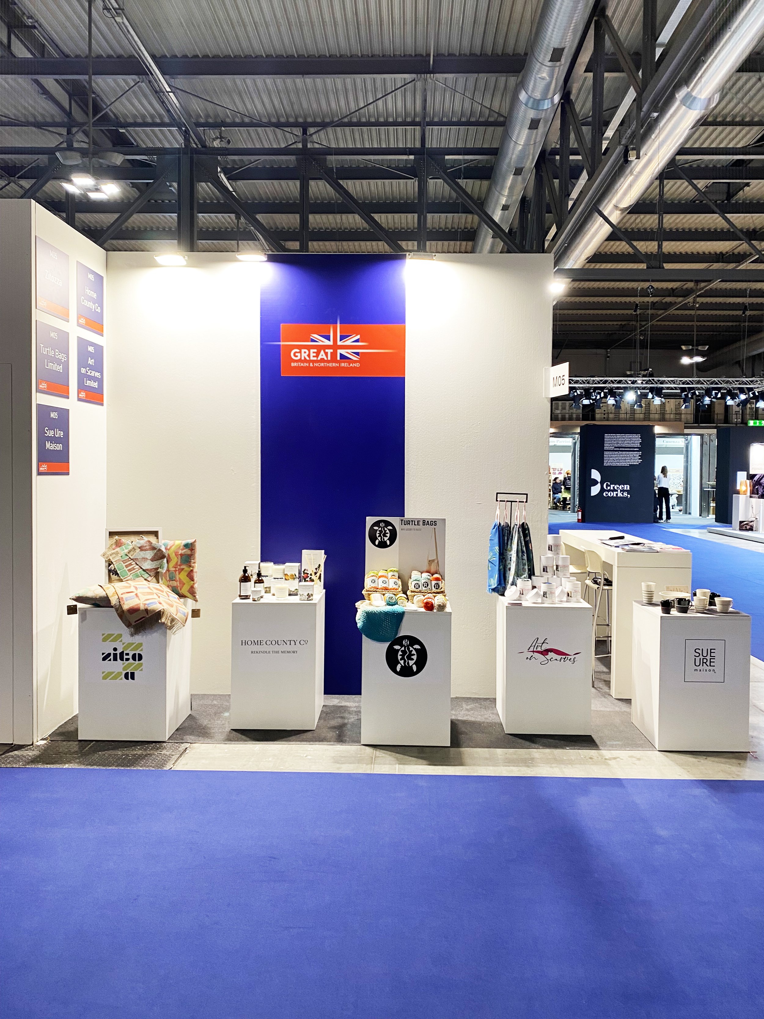
hello again - this is a short announcement that we will be debuting our little brand at london’s leading design festival. we are thrilled to announce our participation as we are extremely busy working towards the event where we’ll unveil our brand new tileset, a little summer collection and a lookbook for new patterns and prints. the festival will grow bigger and better this year with even more venues between 20-22 may 2025. visit our stand g3 at platform, 70 cowcross street EC1M 6EJ - a hotbed of emerging talent that gives space to emerging brands about to break into the industry (the perfect place to introduce zitozza to architects and interior designers!)
new year, new trends! yes, it’s that time of the year when we survey the home interior decorating trends and pick our favourites, that we simply love or would love to serve. 2025 seems to be the year of big, bold decisions as we move away from overly curated spaces and wavy decor in favour of cleaner lines. is the comeback of brutalism on the cards? here are our picks from this year’s roundup:
indivudalism and creativity
it appears that 2025 might be a year of free-flowing creativity and a definite, distinct move beyond minimalism and cookie-cutter curation. it’s the year to be free and make bold decisions to truly express your individual style. pattern clashing, colour clashing, scale clashing, and bespoke designs - it’s 2025, just go for it! if you want custom printed anything - check outwhat we can do for you!
statement hallways
yes! it’s confirmed, no more neglected hallways - despite not spending too much time in them, they do tend to be one of the most frequently used, frequently seen parts of the house and it’s time to breathe some life into them, or go all out. make that first impression! and boy do we just happen to have the runners for you!
it’s still earth tones
yes, brown, terracotta, and of course, mocha mousse. jute, clay, warm, soft textures and colours are still very much in. it doesn’t matter what surfaces you use them on they’re all so comforting and calming, a safe haven from the brutal harshness of the outside world. it’s time to use them, really use them bravely and freely!
vintage & retro
this one is a sweet spot at zitozza! we love mid-century modernism and as the brutalist is at the top of the nominations in the award season for movies we keep our fingers crossed this is our time for the style to make a comeback as we have lots of prints to offer. other sources mention the slick, simplified forms of the 1970s and a comeback of vintage furniture - we love seeing it!
at home spa
remember the covid years and the home office? times have changed, we want to rest at home now, and rest fully and in ever-more indulgent ways. the bathroom is a safe haven for the ultimate me-time and if you kept putting off that bathroom renovation or have always wanted the quiet corner, maybe this is the year to do it, and go all-out on the feature tiles, yoga mats and meditation alcoves.
yellow
oh we love this one. aside of the earth tones mentioned above, yellow is promised to make a comeback in 2025 and we are here for it. it is not the shouty, neon yellows we’re talking about here but the soft, inoffensive kind of mellow-yellow that can be applied in large quantities for maximum happiness. we are solar-powered, desperate modernists here who want the bright, cheerful hues here to stay!
it’s been a while since we last shared some interior tips but i do always enjoy this time of year for a good old fashioned clearout. in light of that, as autumn settles in, i think it's the perfect time to look at how to introduce bold patterns, deep colours, and plenty of cosy textures - of course with that flavour of modern architectural twist to seasonal decor. below you'll find some inspiring ideas to create a space that feels both snug and strikingly stylish this autumn—featuring our pattern blocks for a fresh architectural edge.
1. large scale, abstract prints
it's dark, it's cold, it's depressing, boo! i always thought autumn is an ideal time to be daring with your decor, and adding bold, abstract prints can cheer you up instantly. our newest TÉGLA tileset offers a modular way to introduce strong geometric patterns inspired by architectural forms. whether it’s through a statement rug, a striking lampshade, or a patterned cushion, these bold prints can bring a somewhat rigid, yet still very playful vibe to your living space. they’re perfect for adding a contemporary edge to classic autumn decor.
top tip: opt for a large printed rugs to ground the space and provide a stunning visual anchor for the room.
2. warm, cosy hues
cherry red is so in this year! and i don't know about you but this year in scotland we've been really lucky with a dry, sunny autumn that highlighted the rich foilage for us. nature's colour palette is all about deep, warm, earthy tones, and incorporating hues like burnt orange, terracotta, warm ochre, and rich burgundy creates an inviting atmosphere. layering these shades with neutral tones—like warm beige or soft grey—can soften the look while still making a bold statement.
top tip: mix and match textiles in complementary colours and patterns. try adding one of our cushions or kitchen towels in a bold burnt orange print to bring warmth to your space.
3. mix and match your layers
as the temperature drops, layering becomes essential—not only in your wardrobe but in your decor as well. this season, focus on combining different materials for a rich, tactile experience. our latest rugs, made from heavyweight jute, bring a more textured and rustic feel, perfect for the colder months. pair these with softer fabrics like wool or velvet to create depth and contrast.
top tip: place a printed jute runner in a hallway or layer it over a larger, softer rug for an added cosy effect that feels as good as it looks.
4. light, light, light!
the clocks have just gone back and far up north it means very, very early darkness unfortunately. in these circumstances, lighting becomes a focal point in autumn decor. you can create some really dramatic lighting effects with our architectural lampshades, designed to cast beautiful shadows and enhance the warmth of your space (especially the jute ones). look for lighting with warmer bulbs to create a cosy glow, or use your lamps as accent pieces that add a bit of visual intrigue during the day.
top tip: place a statement lamp with one of our geometric-patterned shades in a dim corner to create an eye-catching focal point and add warmth to the room.
5. make a bold statement
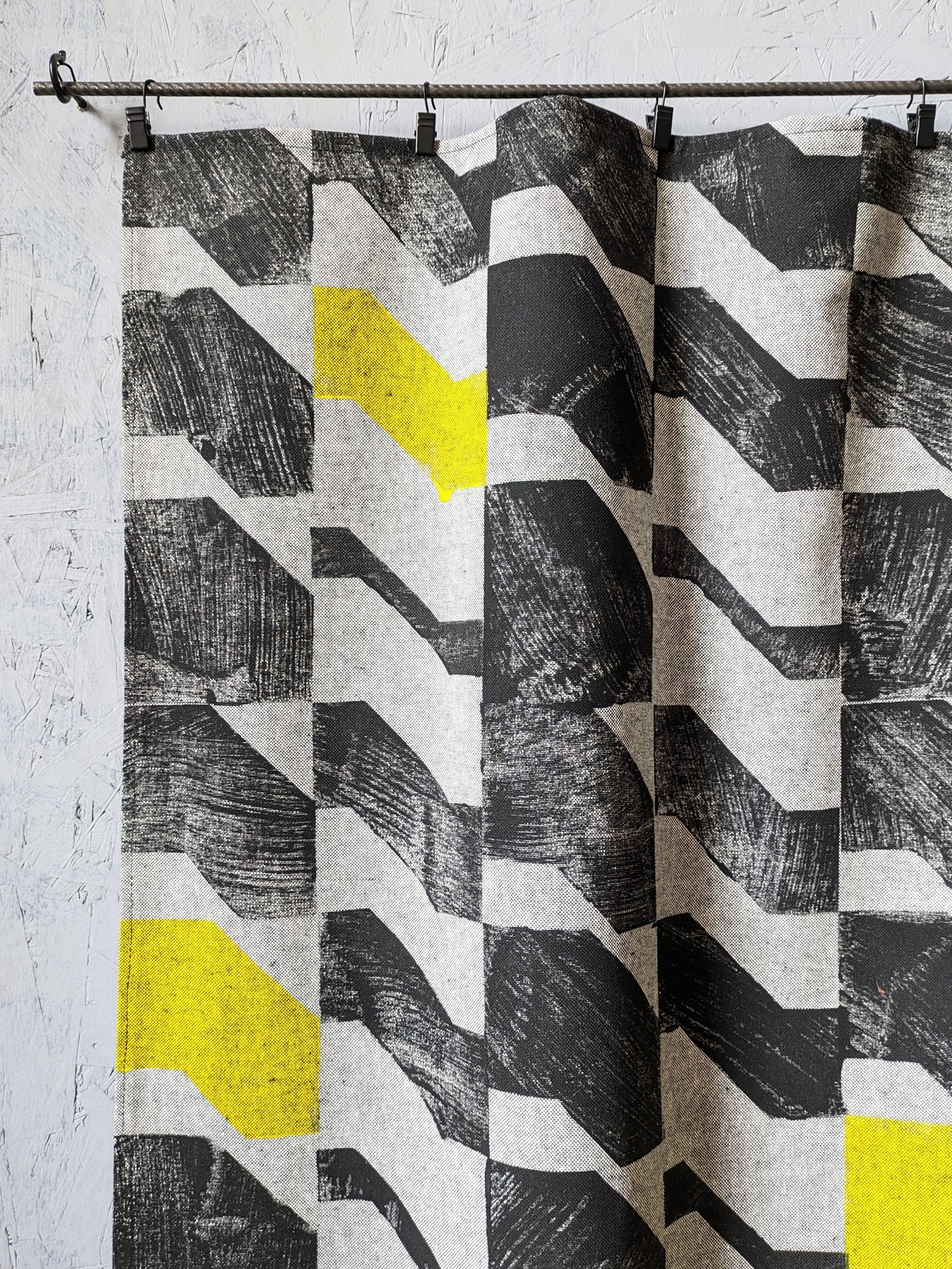
so this is something a bit leftfield, but if you really need that mood boost, then this could also be a great time to experiment with printed linen curtains, or even a statement wall. use our TÉGLA block prints to craft your own unique pattern, mixing and matching colours to suit your personal style. every piece in our collection is designed with versatility in mind, so you can coordinate different prints and sizes to form a cohesive look that’s bold, warm, and entirely your own.
top tip: why not try a bespoke wall hanging on our recycled linens? textured walls are so in this year - a large hanging would be simply a tactile way of introducing an exciting architectural pattern on a feature wall.
don’t be shy and bring out the bold side of autumn, and let your home reflect a cosy yet striking style that’s uniquely yours with our prints.
if you want more inspiration straight to your inbox, you can sign up to our monthly newsletter below - it comes with a free gift every month!
it’s february again… and it seems to be a particularly grey one, but that just makes it perfect time to read about decorating trends, colours, patterns and all the fun stuff. and, as we do it now every year, we’ve collected the main trends to focus on so do join us on a trip into the hottest new interior trends.
1. bOLD colours and brave combos
at zitozza, we have been waiting for this moment for a looong time, but even for the minimalists, it’s probably a good time to say goodbye to the all-beige aesthetic and the grey everything. in the mid-2020s, we are in desperate need for mood-boosting colours and the stranger, and more eye-catching, the better. close the itten book, there are no rules, more is more - we’re getting ready to make some bold, wild prints on new interior fabrics and we cannot wait.
2. hand crafted statement pieces
we have discussed this before - sustainability is not a trend, but an imperative for all industries now, as it should be. for sure, sustainable design processes and practices can be interpreted in many interesting ways and many are slowly seeping into interior trends. one that’s here to stay is how the luxury statement pieces now mean the high-quality, handmade objects made by artisans. exquisite hand crafted details, small imperfections, material honesty - what’s not to love and do we have the rugs for you!
3. luxury gezelligheid
this one is an entirely biased inclusion in the list since zitozza are dutch lovers, but that thing that house beautiful calls “cosy, quiet luxury” and those “real and memorable spaces” dezeen refers to - the dutch have a word for it and if you ever went through a bit of a hygge phase, you need to learn to say gezellig.
it means so much more than cosy - it is a social and friendly kind of contentness. in the home, it may express itself in the shape of ambient lighting (think about our jute lampshades!), warm, tactile textures (think of layers of rugs on the floor!), and open, inviting, sociable spaces ready to be filled with warm conversations. naturally, this means high quality, long-lasting materials and finishes as time well spent is the real luxury now!
4. BROWN (FOR real!)
no, it is not the 1970s anymore, don’t worry. that kind of brown is not making a new comeback. this is a grown-up version, evolved from the earth tone trends we’ve seen in the last few years. at zitozza, we’re particular fans of the almost-black kind of espresso browns, and elle decor mentions chocolate hues, but if that’s not your thing, woods and finishes such as shou sugi ban may bring that tone in your home by more natural means.
5. stripes and checks
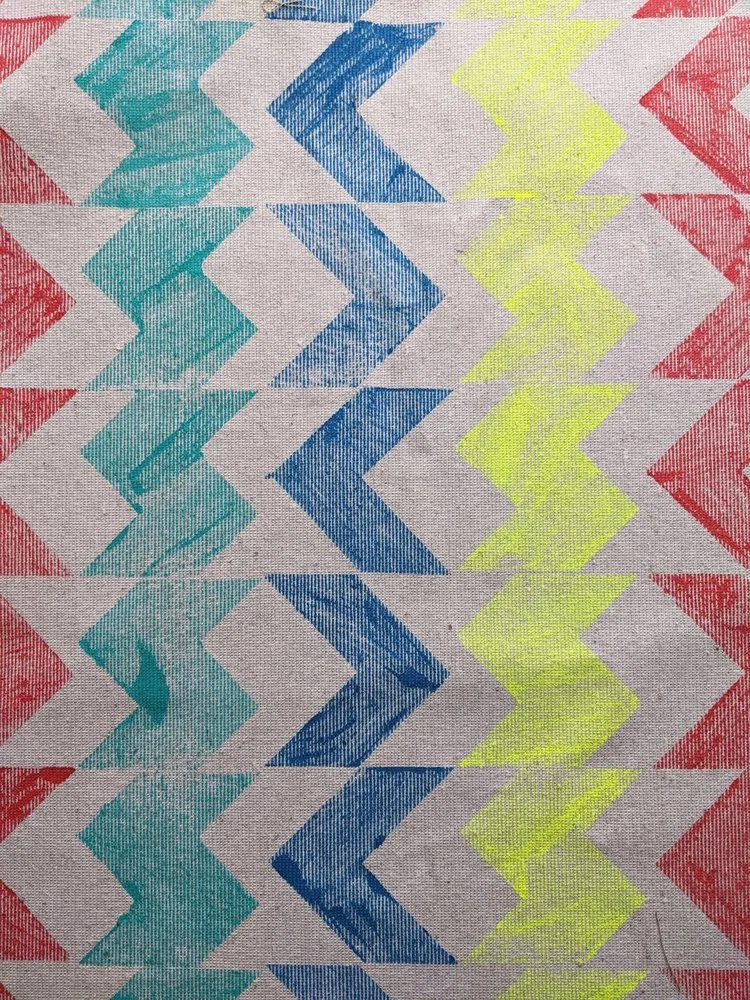
nothing we love more than patterns, of course and we’re so glad seeing them mentioned by vogue.horizontal or vertical, or have them clash and make a chequerboard - that’s right up our alley as our modular system of printing blocks can make up similar effects with that unique hand crafted appeal and we cannot wait to bring more of these prints to life - stay tuned!
6. mix and match
as we are all about tactile prints, we do always embrace a version of this kind of trend, but this year it really means a mix and match of all sorts of surfaces and patterns. textured walls are definitely a thing this year but it means a play with hard finishes - metals such silver and gold accents (and yes, stainless steel!) but also, of course, mixing coarse textiles (such as jute) with some soft linens too. exciting times!
if you’re ready to find something for your home, have a browse through our shop or request a sample to see what we’re able to do for your home!
below the articles we sourced these from are linked for further reading, and if you want to be the first to read about sustainable home decor and textiles, subscribe below (it comes with a freebie every month!)
-
links:
12 interior design trends we’ll see in 2024 (by amanda lauren, 4th january 2024, forbes)
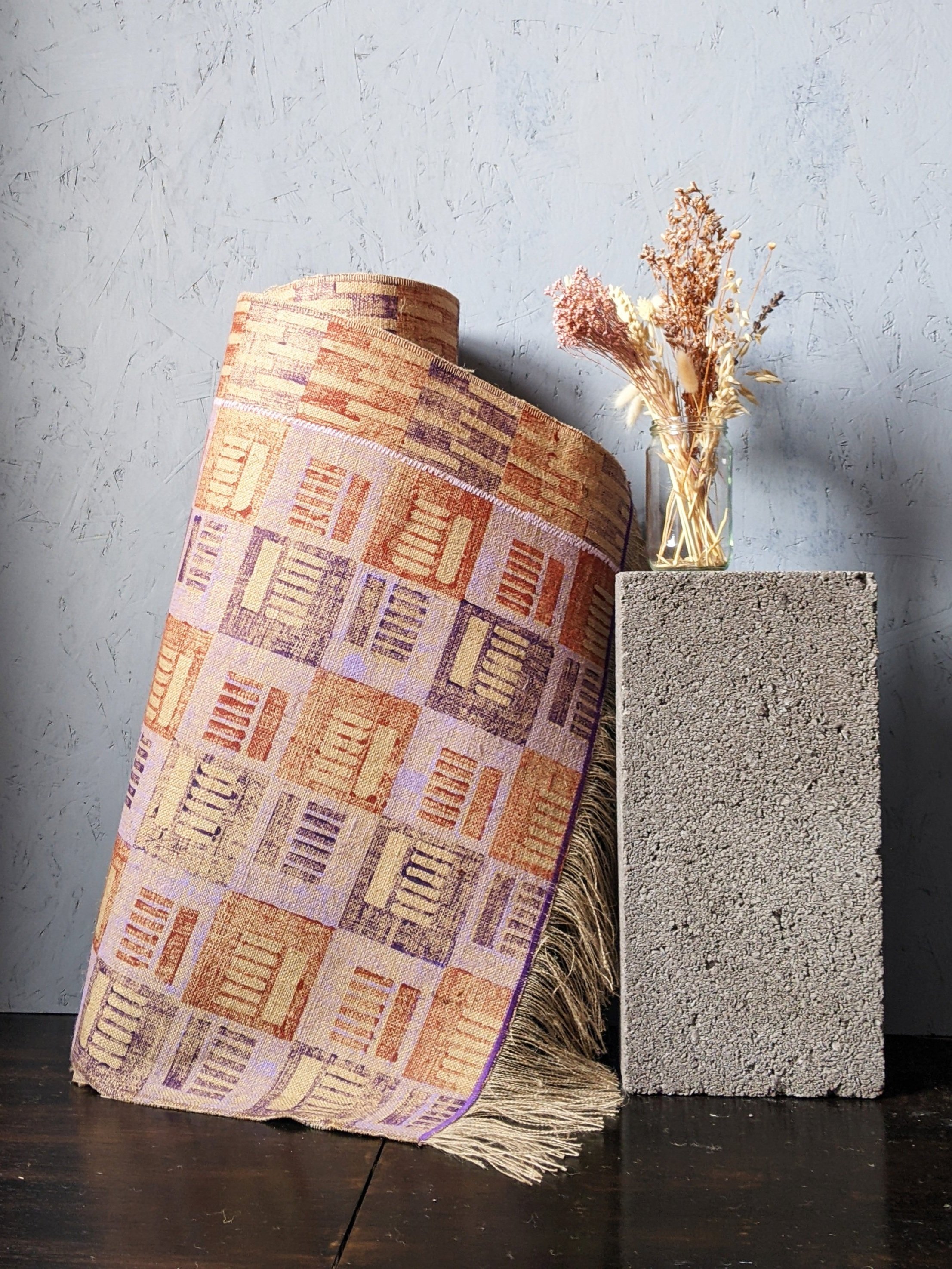
happy new year! i hope you’re all well and had a nice little break in the weeks before. we’re back, refreshed, rested and ready to rock and roll! the year could not start better as in the second week of 2024, we went to milano home - well, our fabric and rug samples did, with huge thanks to british jewellery and giftware international. amongst these rug samples is a brand new material so it’s a bit of a mini-debut of our super heavyweight jute as well, which will bring you some even more exciting rugs this year, so there’s already plenty to look forward to (not to mention all those other exciting things in the pipeline that we don’t want to reveal just yet…)
so do stay in touch - and if you can, please visit fiera milano - the expo closes on sunday 14th. zitozza’s plinth is found at the british pavilion amongst other brilliant designers and they’re manned by the BJGI team. they have order forms and everything so do visit and get in touch with a sample!
hello again, it’s been another month long pause at the blog (sorry!) as we’re trying to prepare for the festive period while juggling a lot of things at the same time, including a new collection that might come before the end of the year and will be our most brutalist one yet! one of our cushions have also been included in a fabulous brutalist selection by gadget magazine t3.com, so the trend forecast was correct and it’s officially in again. i thought that to celebrate this and to get in the mood for the up and coming new collection, it’s time to share some interior tips on how to bring the brutalist forms indoors, with its bold forms and raw, industrial aesthetics. it is more than just an architectural trend; it's a statement. if you're looking to infuse your living space with character and go bold and brave, embracing the brutalism trend might be the answer. in this blog post, we'll take you through some interior design tips to help you achieve that unique, edgy look while maintaining comfort and warmth in your home.
simplify and minimise
this isn’t a call to go full-blown minimalist, but decluttering your space will give the accent pieces the “main character” status they deserve. brutalism thrives on simplicity and clean lines. remove the noise and leave room for your bold furniture pieces and some accent accessories to shine. if you have exposed concrete walls, you’re already there. bring in some stark geometric shapes, and a muted color palette.
hug the concrete (duh, obviously!)
this isn’t exactly breaking news, but concrete is the hallmark of brutalism. if you can't expose your walls or floors, consider concrete-inspired wallpapers or textured paint finishes. you can also introduce concrete furniture or accessories to capture the essence of this trend.
lighting drama
i think this is my favourite. i’m a huge fan of interesting shadows and you can add great depths and warmth to your space by illuminating it with statement lighting fixtures. oversized pendant lights, angular sconces, or floor lamps with sharp lines, and similar. these not only provide ample illumination but also serve as eye-catching focal points and ambience.
honesty to structures and materials
brutalism is part of the form follows function school, so this should be extend to furniture too. choose furniture with structural honesty and that will mean strong, angular designs. consider pieces with metal frames or exposed structural elements. a bit of tactile upholstery will balance the harshness of the concrete and metal elements.
abstract expressions
bare walls need not be alone. if you have room, a few, colourful pieces would both compliment the room and have the art stand out too. brutalism often celebrates artistic expression. large-scale paintings with bold, graphic compositions can add a touch of creativity to your space and celebrate the multidisciplinary nature of the modernist movements.
human touch
a lot of the bad rap brutalism gets comes from a perceived lack of human scale and harshness - but that’s not really what the movement stood for at all. do soften the hard edges, introduce textures and tactile qualities. cozy rugs, cushions, and soft throws in earthy tones can make your space more homely without compromising the trend's integrity. it can also mean hand crafted, imperfect elements against the more pure forms. (yes, i do mean hand block printed textiles, how did you know!)
green up
another misunderstanding about brutalism is the rejection of nature. it is absolutely not. the forms may not be organic, but city planners and architects used to have grand visions for huge parks, greenery under buildings and the like. so having lots of plants in your house is just an homage to that, really.
focus, focus!
in all this starkness, it’s quite a natural wish to have a designated a focal point in the room, like an impressive brutalist-style fireplace or a bold wall covered in textured panels. this draws attention and creates a sense of purpose within the space.
colour it in
brutalist buildings are raw and stark outside, but don’t forget about colours, they do have their role (unité d’habitation, anyone?!) so don't be afraid to experiment with occasional bursts of color. a vibrant artwork or a bold, colourful rug or lamp piece can be a striking contrast against the more stark backdrops.
so there you go, brutalism is certainly not for the faint of heart, but when done right, it can transform your living space into a dynamic, artful haven. it's a trend that encourages self-expression, challenges the norm, and celebrates the beauty of raw, unapologetic design. so, if you're ready to take a daring step in interior design, embrace the brutalist trend, and watch your home undergo a bold and beautiful transformation. we have a lot of things to offer you to achieve that, so do shop around!
oops, another month went past way too quickly… sorry we haven’t noticed, we were too busy with our brand new lookbook, to get it all ready for the height of summer, when our corner of east fife comes to life… we have new nautical looking, industrially inspired home accessories for your summer house! how do you like it?
the thing is, during my research for the yearly article on interior trends, i encountered a few times the idea that he “industrial” (or “farmhouse” or “warehouse” or however-you-wanna-call-it) styles are losing their appeal. but fear not! in this article, as part of our newly launched interior design series, we’re going to bring you some tips on how to revive this look to keep it contemporary and up to date. so what can we do?
freshen up your colours
give the industrial style a burst of energy by infusing colours - be daring, go with primary! it’s an homage to the constructivist movement and the abstract expressionists, a perfect fit for this look. introduce elements of lemon yellow to the nautical theme, vibrant reds, or striking blues to add a contemporary twist. the interplay of bold hues against industrial backdrops creates a visually stunning and refreshed ambiance.
artisanal touches
embrace the artistry and authenticity of artisanal touches. incorporate handcrafted textiles, like cushions with geometric patterns or artisan-made wall hangings, to infuse a sense of human connection. these unique touches elevate your decor, adding a personal and timeless allure to your space and soften the harshness of the industrial look (e.g. if you have any exposed brickwork - hand printed fabrics or wall hangings would be a great way to soften that texture without hiding them!)
green up
breathe life into your industrial-style haven by introducing fresh greens and plants. potted plants, hanging gardens, or vibrant indoor greenery add a touch of nature to your urban oasis. the juxtaposition of greenery against industrial elements enhances the appeal of your decor. bringing the outdoors inside is very much “the thing” to do - so you can do it too. and you can also add green as a colour to your space by simply picking fabrics in these hues.
texture play
ok this is a bit like point 2 but a bit different. you can create a harmonious balance by blending raw and polished finishes. combine exposed brick walls and distressed wood surfaces with sleek metal or glossy accents. the marriage of rugged textures with refined elements adds depth and sophistication to your space.
statement pieces
go bold, go big, go personal. one way to avoid going your interior style out of date is simply make it yours, and yours only. express your individuality captivating statement pieces. add striking art, bold prints, statement rugs or unique sculptures that reflect your personality and style. a well-chosen statement piece becomes a focal point, drawing attention and injecting character into your industrial-inspired space.
cosy up
these trying times have grown the appetite for softness even in those with a hardcore taste in exposed structural beams and raw concrete. but you don’t have to bury it all for a touch of comfort - layer your rugs for warmth and invest in a soft, woolly throw to hug you on a hard day.
so i guess, while there are whispers about the industrial style going out of fashion, the truth is that you don’t have to embark on an expensive adventure of redecorating just yet. you can revitalise the look you fell in love with in the first place with a few well-chosen updates. embrace vibrant colours, add a hand crafted touch, fresh greens, and layer up for cosiness to keep your decor move with the times. let your creativity flow and enjoy the process of reinventing your space with a fresh and invigorated perspective. and i hope you enjoyed these tips - if you’d like to read more of these, subscribe to our newsletter below to be the first to read about our next one.
hello again, hello june. we’re really due a nice blog post again, but we just have a small, but rather exciting news to share. we’re absolutely delighted to announce that zitozza has been selected by british jewellery and giftware internationalto exhibit atinterior lifestyle tokyo 2023! while we won’t be personally present at the expo, we’re super excited to present a few of our block printed, sustainable homewares to a brand new audience!
the expo is on for three days between 14-16 june at tokyo big sight west exhibition park and the british lounge will be located at stand d015 filled with more than 20 amazing brands offering unique, designer homeware. if you’re in japan, please go and visit and we hope to report back with an amazing response!
new month, new blog post! wow, didn’t april just sweep past way too fast. it has been a busy month, and to our pleasant surprise, we have discovered our cushion in simply scandi magazine (which i was not aware before) but it’s a wonderful publication and it inspired a new blog post series - architectural tours are all well but i feel that for a homeware brand we neglect writing about interiors so we'll be doing that a bit more often.
in the first of this series then, we’ll have a look at how you can tweak the “scandinavian style” a bit to add some colours into it and make it uniquely yours. i don’t want to dwell too much on what even defines the “scandi” style, but it is often associated with clean lines and lots of natural light. but looking at the iconic mid-century designs coming from scandinavia, i also believe that it’s a mistake to see this style as anything too white or beige, and it’s really not that far from the modernist zitozza looks (and hey, brutalism!) so yes, yes, you can absolutely incorporate colours and patterns into a scandinavian style. while the traditional scandi aesthetic tends to emphasise light, airy spaces with a focus on white, grey and natural wood tones, there are lots of room to introduce some more colourful homewares in various ways.
pops of colour
the scandi style is not about using colour throughout the entire space, but that doesn’t mean it can’t be colourful! think about it more like using accessories of vibrant or bold colours as accents. this can be achieved through colourful accessories like cushions, throws, rugs, or artwork. select a few key pieces in complementary colours to add visual interest and create focal points in the room.
pastel tones
obviously, this is one of the more associated qualities of the scandi style - just pleasant and cosy! soft, muted pastel colours can work well within a scandinavian-style interior. pale shades of blue, pink, mint, or lavender can bring a subtle hint of colour without overpowering the space. use these colours on walls, textiles, or smaller decor items to maintain a light and airy atmosphere.
natural textures and elements
scandinavians are surrounded by some fantastic nature and they do like their outdoors, i think. so another way to introduce colour is through natural elements. incorporate plants and flowers to bring vibrant greenery and pops of natural colour into the space. additionally, consider wooden furniture or accessories with warm, natural wood tones that add warmth and texture while infusing the room with earthy hues.
patterns
scandinavian design can also feature patterns with colour (do you remember early 00s ikea huh?) so yes, my favourite advice - consider using patterned textiles, such as curtains, upholstery, or rugs, that incorporate colourful geometric or nature-inspired motifs. this can inject visual interest and personality into the space while still maintaining the overall scandinavian aesthetic.
statement pieces and fabrics
yes, this can mean the jacobsen chair, or anything else you may have in that category but there are lower-budget versions for this too. introduce a bold, colourful furniture piece or artwork as a focal point in the room. this can be a vibrant rug, a sofa, an accent chair, or a large colourful painting or wall hanging. by keeping the surrounding elements more neutral, you allow the statement piece to shine and bring a lively touch to the space.
overall, i guess the key is to maintain the finely tuned balance between colour, pattern, texture but in a calm, nordic manner, with the minimalistic, clean lines typically associated with scandinavian design. select colours that harmonise with the overall palette and aim for a cohesive look throughout the space, and don’t worry about a bit of clash - remember the colourful, contemporary looks of nordic brands like marimekko or hay - all is well with a splash of colour! by strategically incorporating bolder patterns, you can infuse your scandinavian-style interior with a touch of vibrancy and personal style - and we’re here to help you with that!
february is here and if you’re thinking of any decorating work to be done around your home, you’re probably ready to make your plans soon… so to help you a little bit with that, here’s our yearly research into the interior design trends that will dominate the home styling scene this year!
1. BRUTALISM! embrace raw concrete and tactile, industrial materials
hell yeah! finally, raw concrete is in. in a chaotic world, we need clear and calming interior spaces and this is the perfect opportunity of the bare functionality of brutalist forms to make a come back. so, expose the surface, reveal the structure and get a raw, utilitarian jute rug to to match it (we have just the thingsfor you…!) tactile surfaces have been around us for a while but finally it’s time for the raw materials to shine as they are.
“compared to the past, the new brutalist style results in a softer approach that incorporates natural elements like wood, stones, plants and sustainable materials resulting in a warmer and more welcoming aesthetic.” said giampiero tagliaferri for vogue.
2. BE BOLD AND BRAVE! embrace colours and patterns clashing
this is another one we absolutely love at zitozza - we’re all about patterns and colours here too. this is what house beautiful call ‘dopamine dressing’ and basically means just doing what you like, because it’s your home and your castle and who cares about rules anymore, right?!
so it’s time to dive into all the patterns, all the colours, and all the textures! more is more, less is a bore. it’s time to stop fretting about matching and embrace the clashing.
3. TEXTURES! embrace the tactile surfaces
yes, the bold and brave approach now extends to all the interesting textures too. "the recent pandemic deprived us of one of our most 'human' senses: touch. in response to that, i feel it will become increasingly important for designers to make use of materials that bring tactility to the interior scheme and to devise spaces that provoke an emotion in its users." interior designer tola oluojape told dezeen.
at zitozza, last year we have seriously extended our fabric range and we have a range of different textures from the soft and cosy recycled cotton blends to the coarsest jute and some interesting qualities in-between too, with bold, tactile prints too, to suit perfectly with the “hand-formed” textures trend predicted by elle decor.
4. sustainability! embrace the planet
i have always argued that this is not so much of a trend anymore but an imperative and it’s great to see now almost everyone jumping onboard. designers do have a huge responsibility in making products that don’t cost the earth and do last longer which is what we try to do at zitozza by using a lot of jute (one of the most sustainable fibres in the world) and recycled linens and recycled cotton blends (with recycled polyester and recycled polyester cushion inserts too!)
but it’s not just about fabrics, but a whole range of new materials from mushroom leather (by mylo unleather, as seen on dezeen’s selection), but also my personal favourite: bricks made of construction waste by kenoteq(discovered on material district). it’s genuinely exciting to see what the future brings in new materials to use for building and making homes.
5. HANDMADE! embrace the imperfections
and finally, here’s another fashionable decorating trend we can help you with - to embrace the handmade, crafted accessories with all their imperfections and naive charms. that handmade aesthetic is all over zitozza too, since, well, all our interior accesories are made by hand, slowly crafted with love and lots of passion for colour and texture.
“with thoughtful, sustainable design a key focus for 2023, as well as a nod to more nostalgic designs, these 'trends' will not only lead to us shopping more responsibly, but it will also see a rise in 'shopping small', and celebrating handmade, artisan designs and craftsmanship from all over the world.” writes jennifer ebert for homes and gardensand we take this fully onboard. shop small, buy handmade and cherish the object in your home with the same love as they were created with.
and if you want to stay in touch with the next lot of brutalist, colourful, pattern-clashing, tactile textured, sustainable handmade goodies, then do so by subscribing to our newsletter below and follow us on instagram.have a wonderful year and happy decorating!