breaking news! if you’ve followed the zitozza blog for a while, you’ll know we’ve been vocal about our opposition to the proposed 2023 updates to the uk furniture and furnishings (fire) (safety) regulations.
the proposed changes were, in a word, overkill. they would have expanded open-flame testing to a wider range of products and placed an impossible administrative and chemical burden on small businesses. for a studio like ours, it would have meant permanent labeling and mandatory chemical treatments for any cushion over 45 x 45cm (a move that felt entirely at odds with the move toward a circular economy and healthy interiors.)
well, the entire industry said "no thanks." and it appears we have been listened to!
The Shift Toward Smoulder Testing
the uk government has indicated a significant pivot. instead of the high-barrier open flame resistance (which often necessitates the use of toxic fire retardants), the conversation is shifting toward requiring smoulder testing only.
this is a massive win for natural fibres and independent makers. it acknowledges that the "toxic" approach to safety isn't the only way forward. by focusing on smoulder resistance and batch testing, the government is potentially removing the heavy administrative weight that was threatening to crush the re-upholstery sector and independent textile designers alike.
Why This Matters for Zitozza
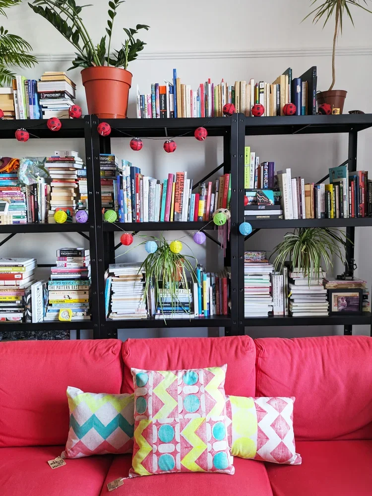
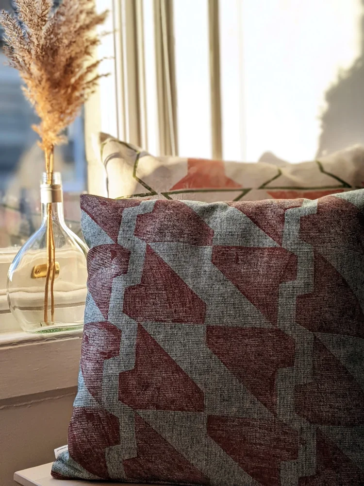
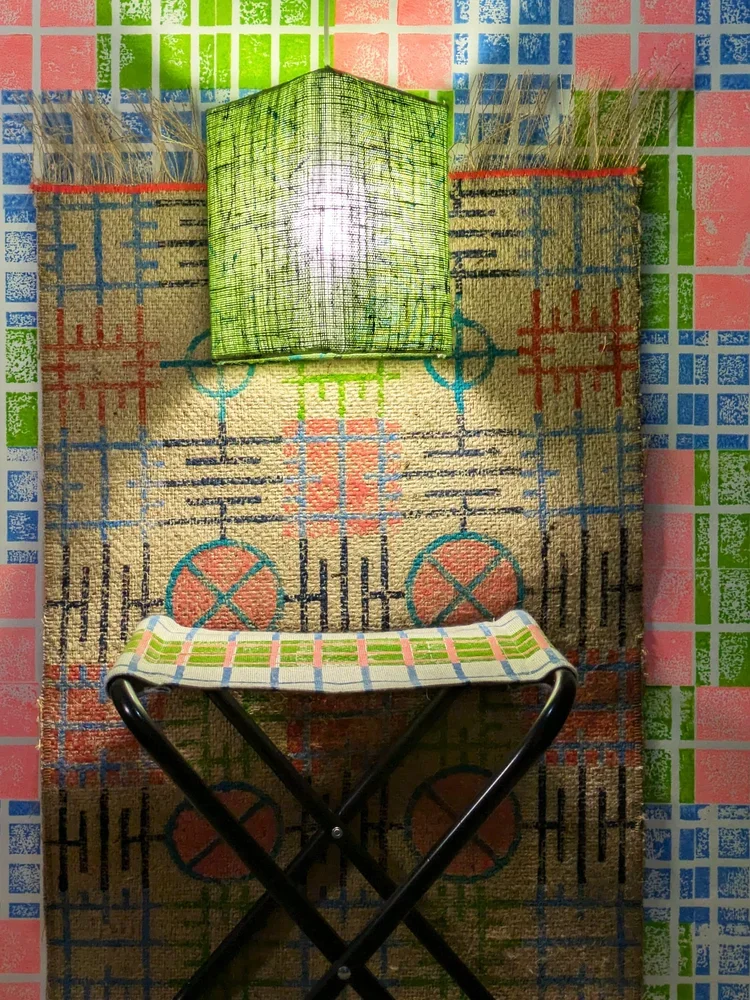
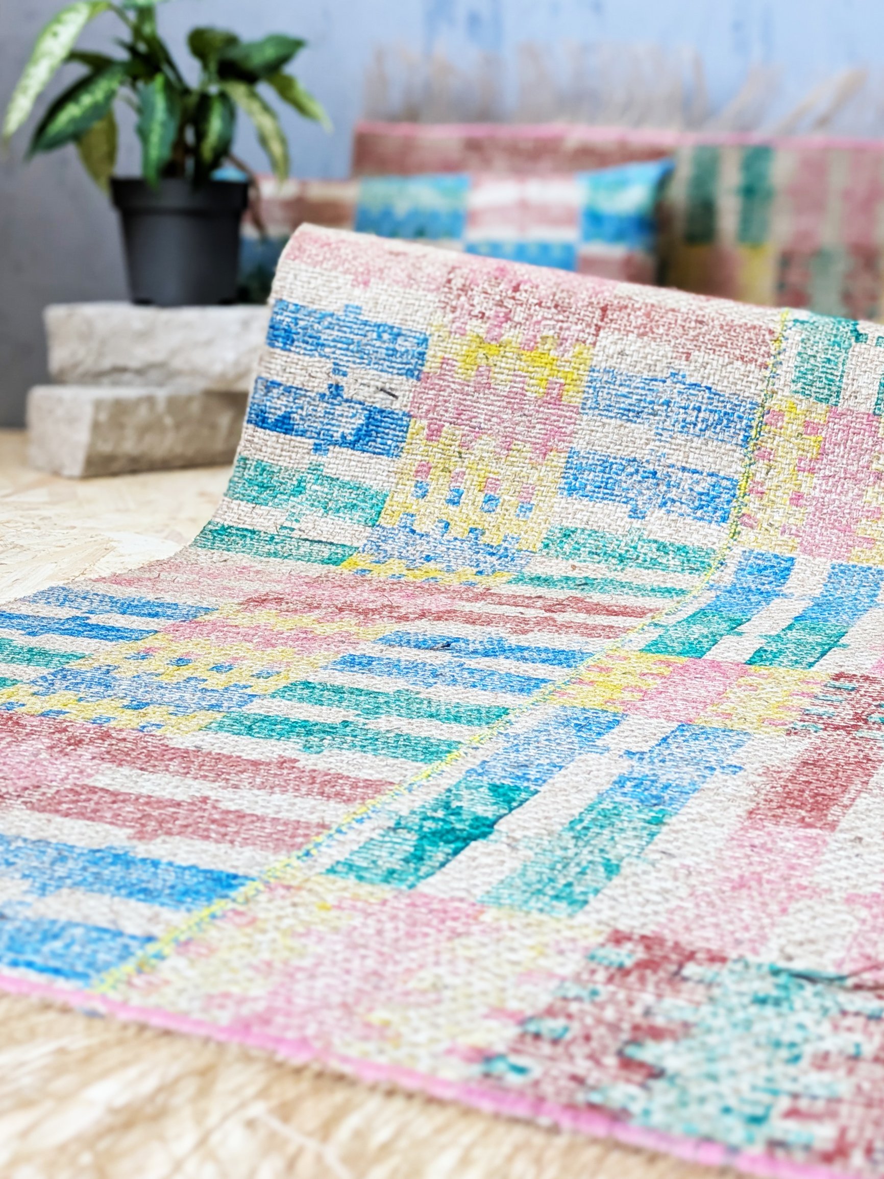
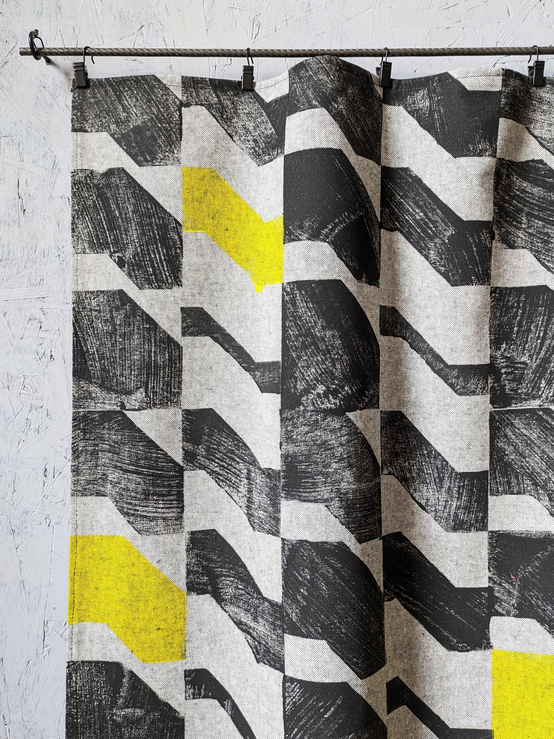
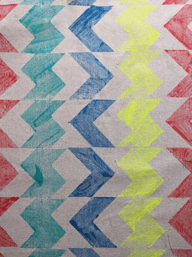
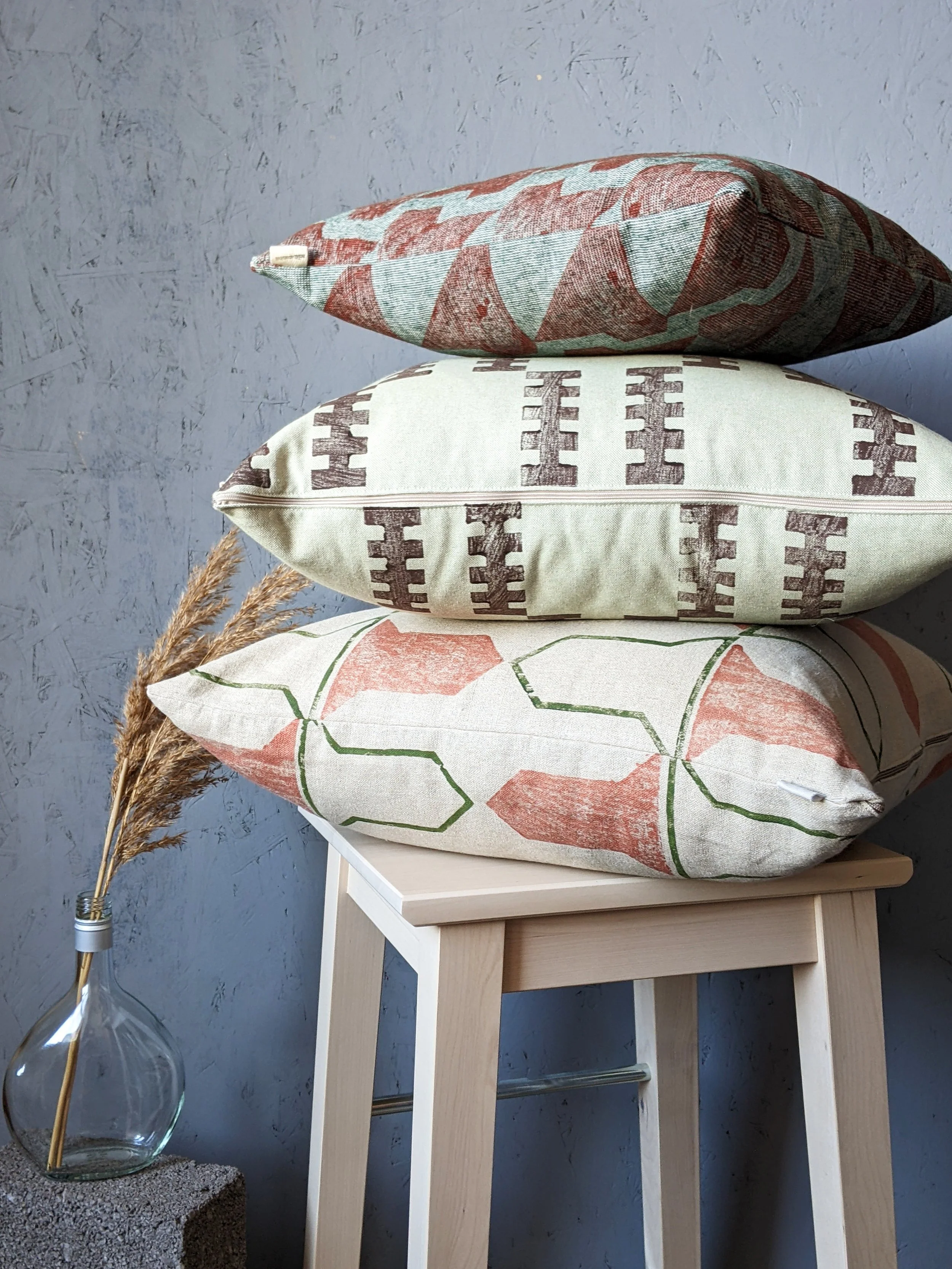
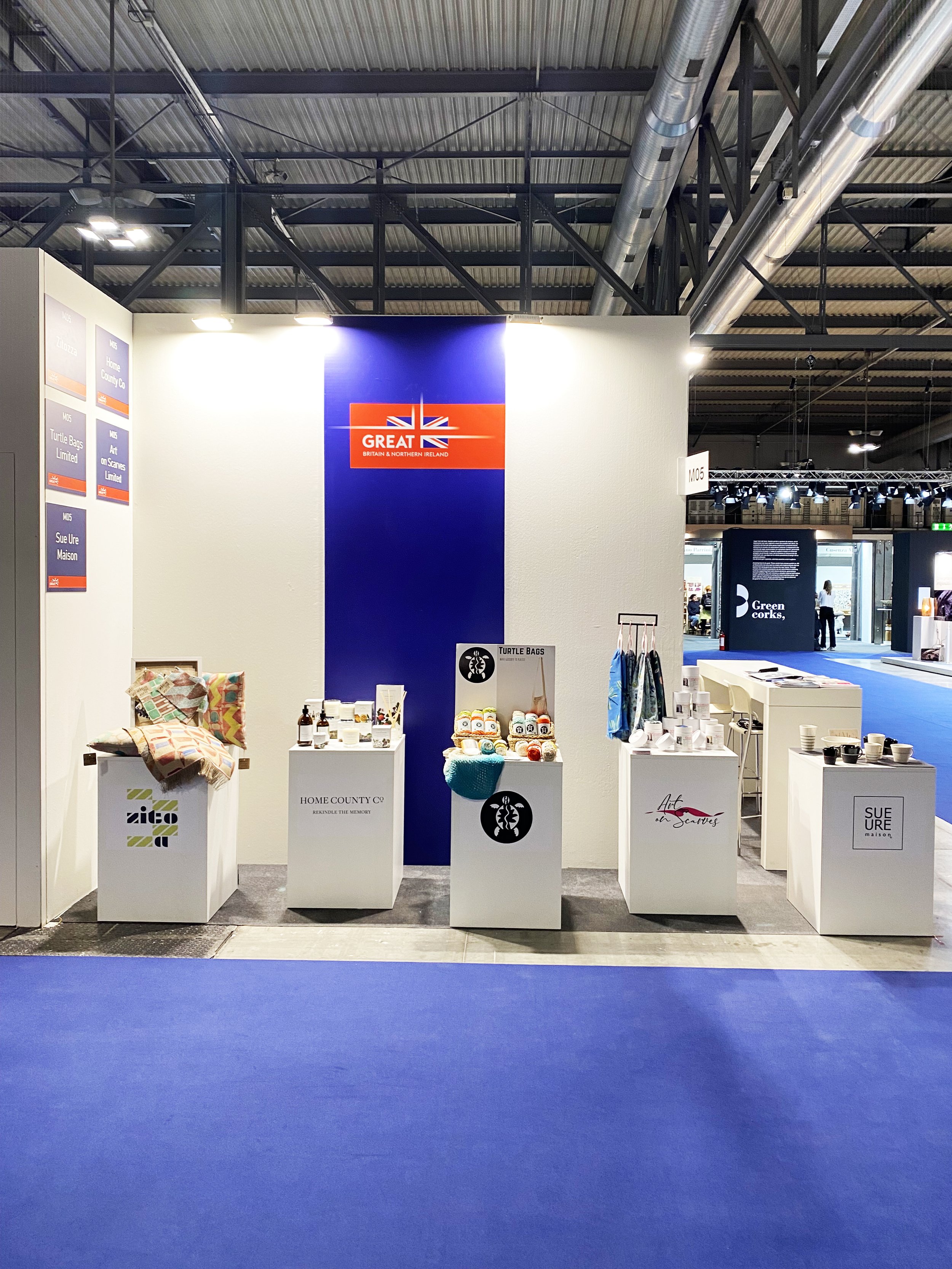
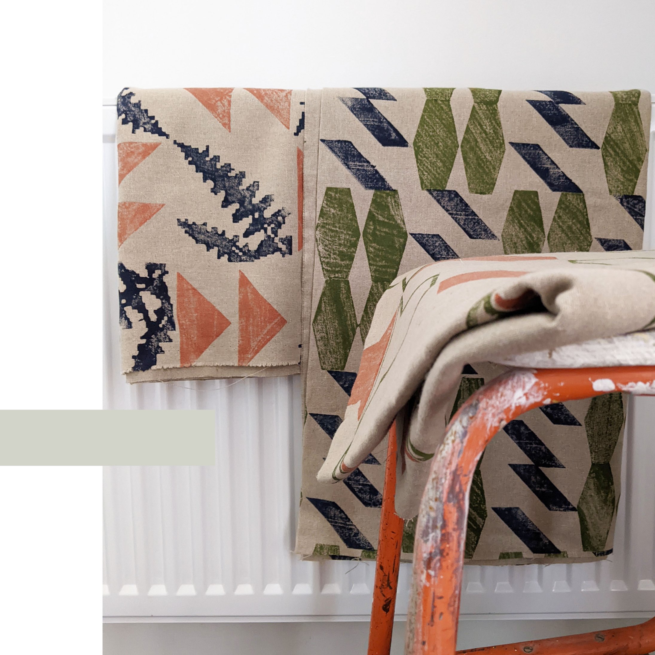
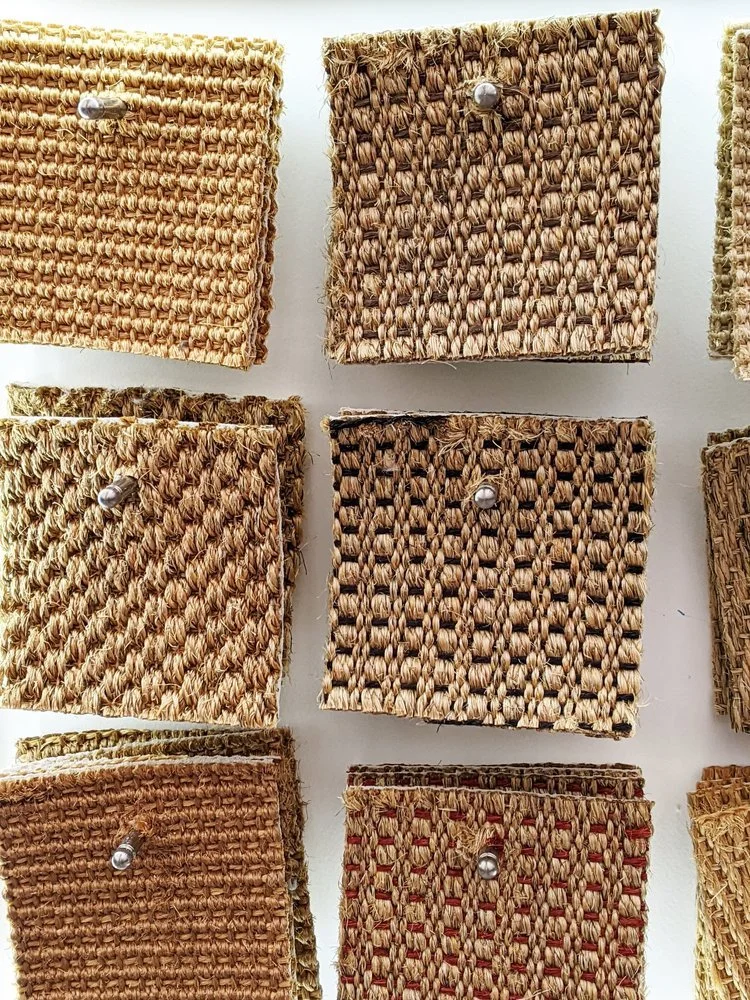
we believe in materials that breathe. our hand-block printed fabrics—including our recycled linens and heavyweight cotton blends—currently pass cigarette (smoulder) testing naturally, without the need for harmful chemical coatings. we may even get our jute used for upholstery too!
this regulatory shift means our fabrics can continue to be specified for upholstery projects without compromising the health of the home or the environment. it allows the beauty of the fibre to remain at the forefront.
The Final Push: We Need Your Voice
it is important to note: this is not yet law!
a new, and hopefully final, consultation is now open. the government needs to hear that the industry supports this move toward sensible, smoulder-based safety and away from toxic FR treatments.
responses are expected by 23rd june. please take five minutes to fill out the consultation and ensure we move toward a future that is both safe and sustainable. thank you!