home interior trends

INTERIOR DESIGN, INSPIRATION, BRUTALISM

the new brutalism - how to embrace the trend at your own home

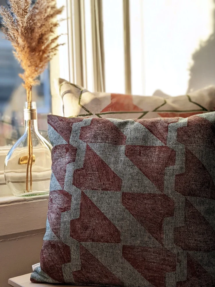
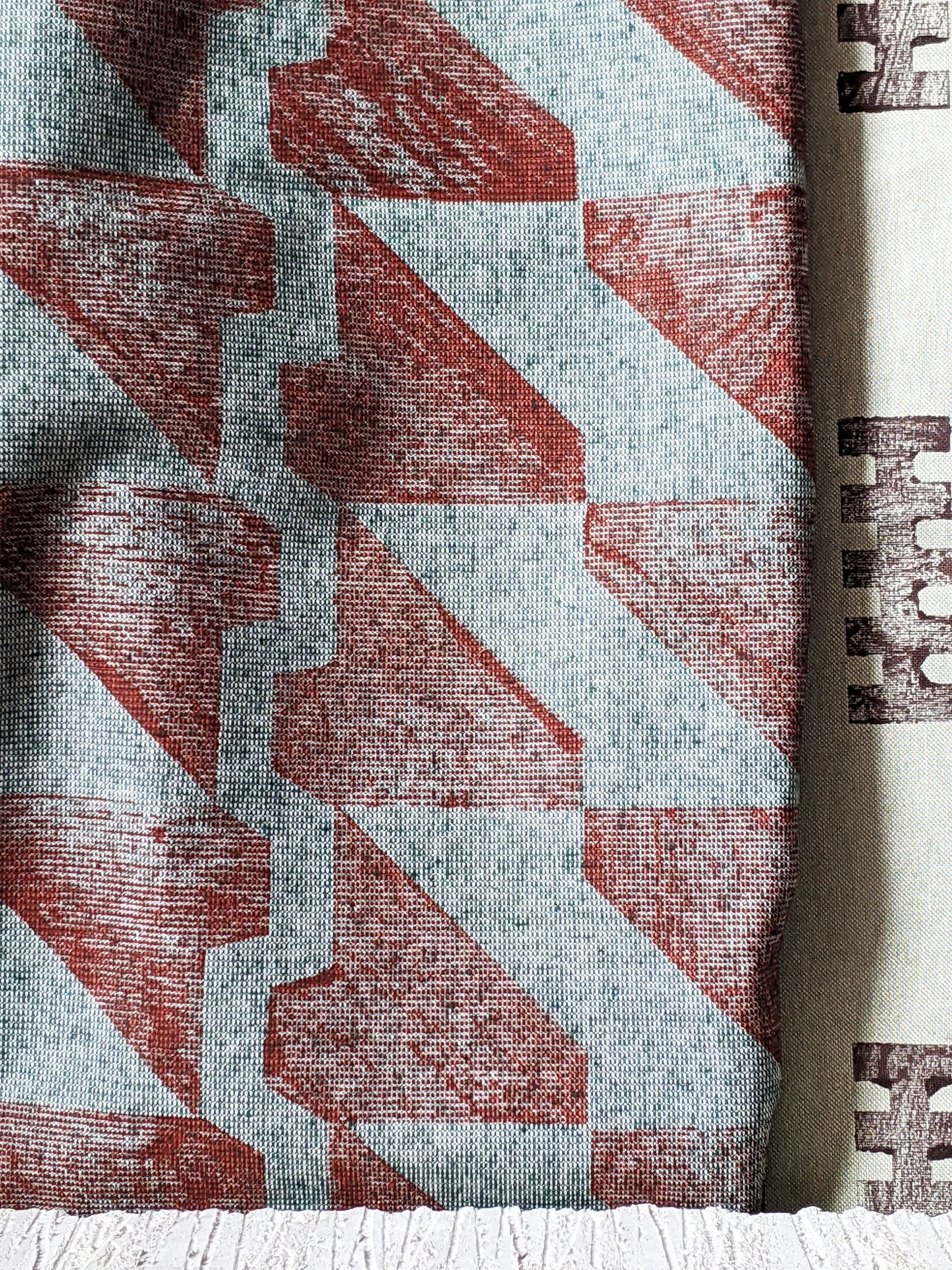
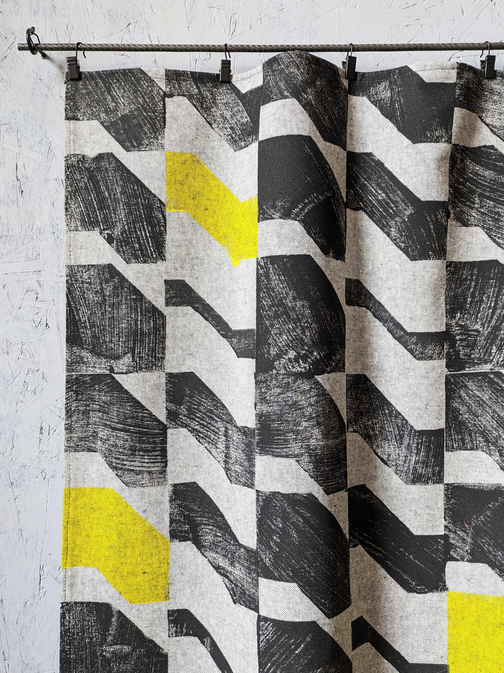
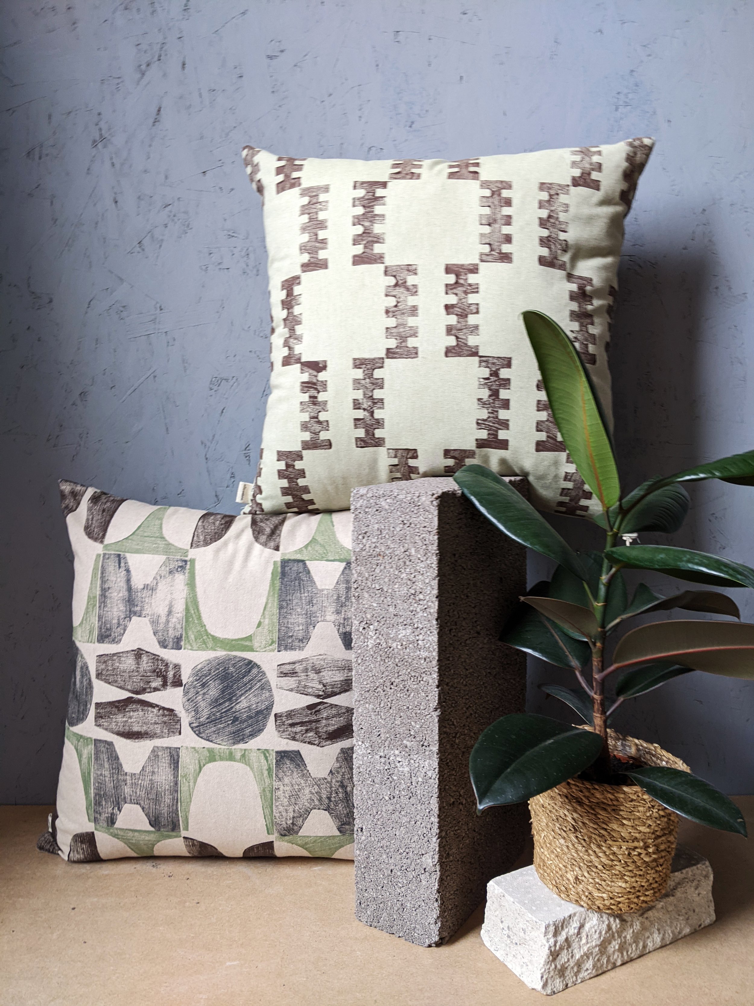
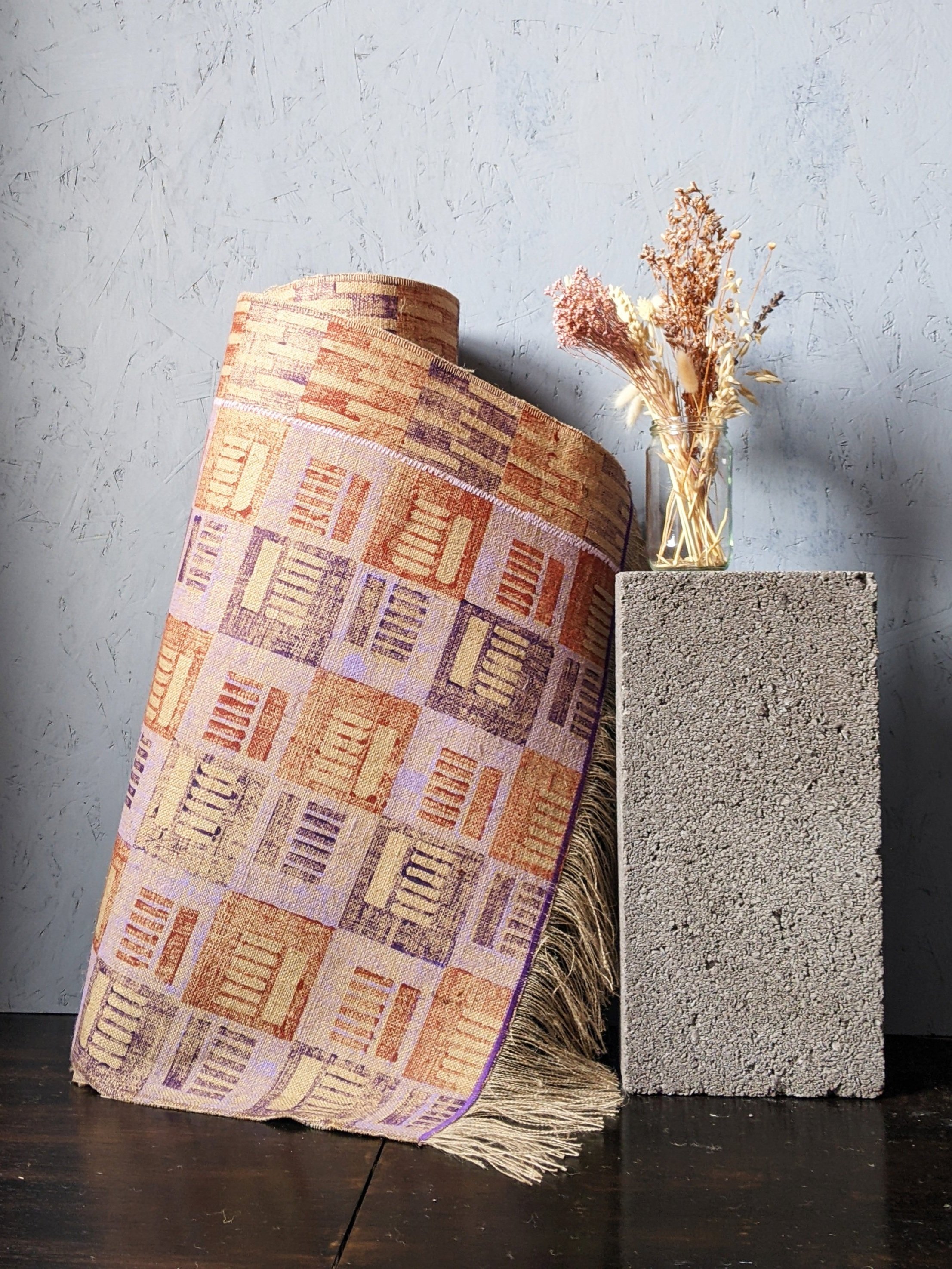
hello again, it’s been another month long pause at the blog (sorry!) as we’re trying to prepare for the festive period while juggling a lot of things at the same time, including a new collection that might come before the end of the year and will be our most brutalist one yet! one of our cushions have also been included in a fabulous brutalist selection by gadget magazine t3.com, so the trend forecast was correct and it’s officially in again. i thought that to celebrate this and to get in the mood for the up and coming new collection, it’s time to share some interior tips on how to bring the brutalist forms indoors, with its bold forms and raw, industrial aesthetics. it is more than just an architectural trend; it's a statement. if you're looking to infuse your living space with character and go bold and brave, embracing the brutalism trend might be the answer. in this blog post, we'll take you through some interior design tips to help you achieve that unique, edgy look while maintaining comfort and warmth in your home.

simplify and minimise

this isn’t a call to go full-blown minimalist, but decluttering your space will give the accent pieces the “main character” status they deserve. brutalism thrives on simplicity and clean lines. remove the noise and leave room for your bold furniture pieces and some accent accessories to shine. if you have exposed concrete walls, you’re already there. bring in some stark geometric shapes, and a muted color palette.

hug the concrete (duh, obviously!)

this isn’t exactly breaking news, but concrete is the hallmark of brutalism. if you can't expose your walls or floors, consider concrete-inspired wallpapers or textured paint finishes. you can also introduce concrete furniture or accessories to capture the essence of this trend.

lighting drama

i think this is my favourite. i’m a huge fan of interesting shadows and you can add great depths and warmth to your space by illuminating it with statement lighting fixtures. oversized pendant lights, angular sconces, or floor lamps with sharp lines, and similar. these not only provide ample illumination but also serve as eye-catching focal points and ambience.

honesty to structures and materials

brutalism is part of the form follows function school, so this should be extend to furniture too. choose furniture with structural honesty and that will mean strong, angular designs. consider pieces with metal frames or exposed structural elements. a bit of tactile upholstery will balance the harshness of the concrete and metal elements.

abstract expressions

bare walls need not be alone. if you have room, a few, colourful pieces would both compliment the room and have the art stand out too. brutalism often celebrates artistic expression. large-scale paintings with bold, graphic compositions can add a touch of creativity to your space and celebrate the multidisciplinary nature of the modernist movements.

human touch

a lot of the bad rap brutalism gets comes from a perceived lack of human scale and harshness - but that’s not really what the movement stood for at all. do soften the hard edges, introduce textures and tactile qualities. cozy rugs, cushions, and soft throws in earthy tones can make your space more homely without compromising the trend's integrity. it can also mean hand crafted, imperfect elements against the more pure forms. (yes, i do mean hand block printed textiles, how did you know!)

green up

another misunderstanding about brutalism is the rejection of nature. it is absolutely not. the forms may not be organic, but city planners and architects used to have grand visions for huge parks, greenery under buildings and the like. so having lots of plants in your house is just an homage to that, really.

focus, focus!

in all this starkness, it’s quite a natural wish to have a designated a focal point in the room, like an impressive brutalist-style fireplace or a bold wall covered in textured panels. this draws attention and creates a sense of purpose within the space.

colour it in

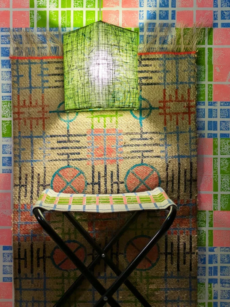
brutalist buildings are raw and stark outside, but don’t forget about colours, they do have their role (unité d’habitation, anyone?!) so don't be afraid to experiment with occasional bursts of color. a vibrant artwork or a bold, colourful rug or lamp piece can be a striking contrast against the more stark backdrops.

so there you go, brutalism is certainly not for the faint of heart, but when done right, it can transform your living space into a dynamic, artful haven. it's a trend that encourages self-expression, challenges the norm, and celebrates the beauty of raw, unapologetic design. so, if you're ready to take a daring step in interior design, embrace the brutalist trend, and watch your home undergo a bold and beautiful transformation. we have a lot of things to offer you to achieve that, so do shop around!

TEXTILE INDUSTRY, SUSTAINABILITY, INTERIOR DESIGN

zitozza in japan! - interior lifestyle tokyo 2023

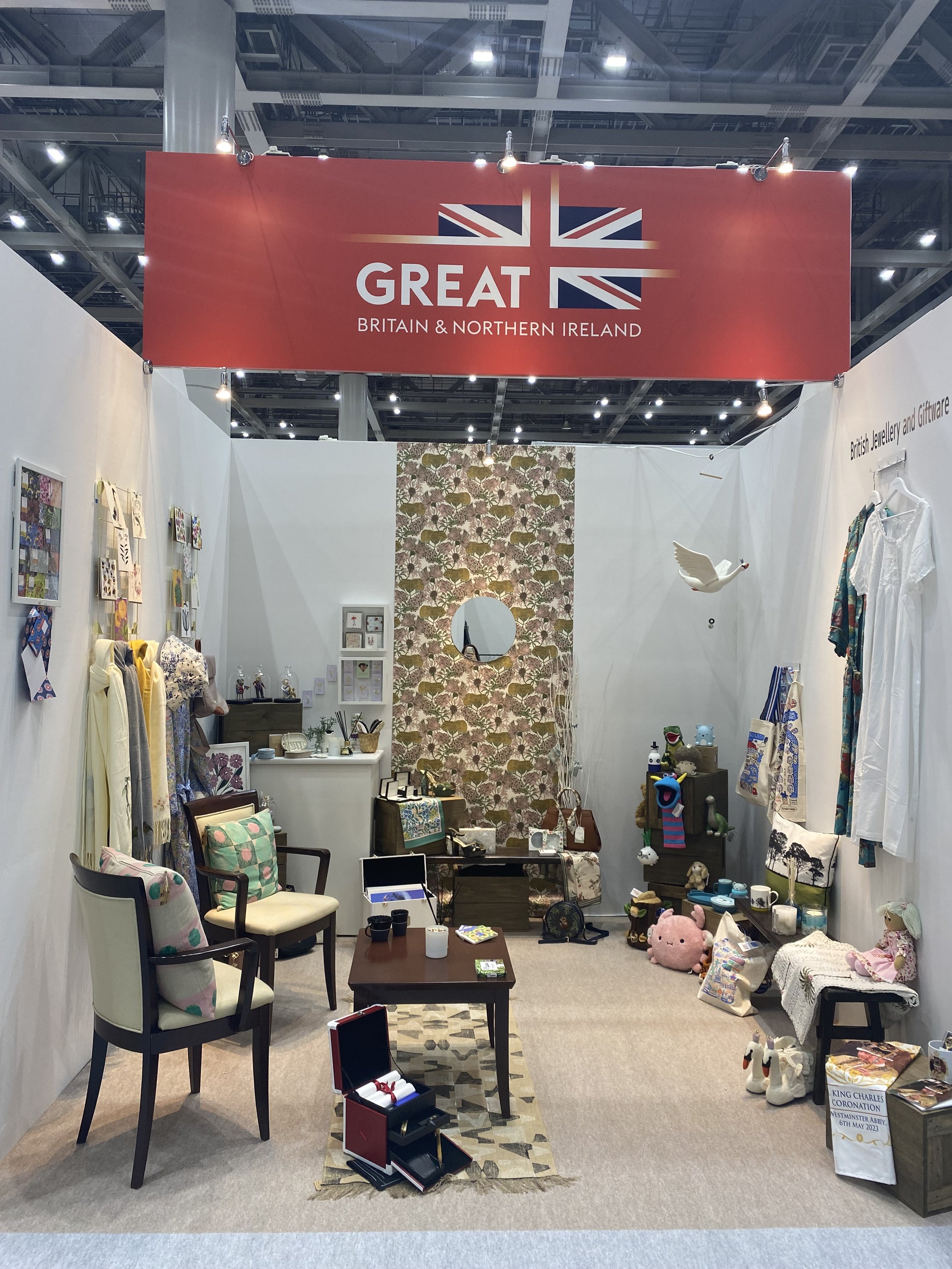
hello again, hello june. we’re really due a nice blog post again, but we just have a small, but rather exciting news to share. we’re absolutely delighted to announce that zitozza has been selected by british jewellery and giftware international to exhibit at interior lifestyle tokyo 2023! while we won’t be personally present at the expo, we’re super excited to present a few of our block printed, sustainable homewares to a brand new audience!

the expo is on for three days between 14-16 june at tokyo big sight west exhibition park and the british lounge will be located at stand d015 filled with more than 20 amazing brands offering unique, designer homeware. if you’re in japan, please go and visit and we hope to report back with an amazing response!

image credit: BJGI

INSPIRATION, INTERIOR DESIGN, SUSTAINABILITY, TEXTILE INDUSTRY

a report from the scottish interiors showcase 2022 (with good news on sustainability!)

first of all, please accept my sincere apologies for reporting on this event so late - as i promised about a month ago, i did indeed visit the scottish interiors showcase in late february and i was really looking forward to telling you all about it! but then, after managing to avoid it for nearly two years, i caught covid, and although luckily i escaped with mild symptoms, it was hard to concentrate in front of a screen for too long. isolating at home with little energy for anything whilst a horrific war breaks out in europe in a place close to my heart really annulled my motivation levels. i’m really sorry that blogging and posting has been a bit neglected.

however, life, and the love of beautiful things must, and will win under any circumstances, i really believe in that. so i’m trying to get back in shape and i’m finally ready to bring you what i promised, with highlights of what i found the most interesting developments from the world of interior design in scotland.

1 - SUSTAINABLE FAVOURITES

so, you know me by now, and as you’d have guessed, the one thing i kept asking every single sales rep that would talk to me was, “how much of this is sustainable?” the replies i got varied, but there was a growing interest and efforts by almost all brands and they mentioned that it’s a question that keeps getting asked. my first focus is on this angle, and here’s my top 3 that delivered:

1.1 william yeoward

the british household name had, as expected, some fabulous products on display. but the best news to report is the launch of a brand new rug collection, from 100% recycled PET. it didn’t look or feel synthetic at all, and the colourways are simply gorgeous. (link to visit)

1.2 designs of the time

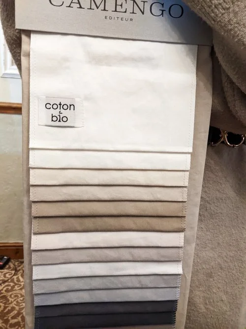
i’d say the linen offerings of yvan puylaert’s company was an absolute highlight of the show to me and the tactile qualities of their linens were just a joy to look at. everything is 100% natural and mostly linen. the rep mentioned that they have a hemp line too, but it wasn’t on display as “it’s not popular in the uk - much more so on continental europe”. who’s with me to change that and try to get that here? who’d love more hemp (and of course, jute!) in british interiors?! (link to visit)

1.3 casadeco

the french group has always been one of my favourite supplier at these events, as i do love their geometric pattern designs. their happy surface patterns were no exception this year either. their newest launch is their cushion line, but their wallpapers were also very popular - for good reason too. however, i’m pleased to report on their wide range of plain, natural and recycled fabrics. (link to visit)

2 - SURFACE PATTERN DESIGN FAVOURITES

perhaps unlike other material expos, this particular event tends to be quite fabric-heavy and the vast majority of the exhibits were an eye-popping display of colour and patterns. i really recommend visiting as it really is a total surface pattern feast! for this reason, the next top 3 is selected from this angle, although it was quite a challenge!

2.1 ohpopsi

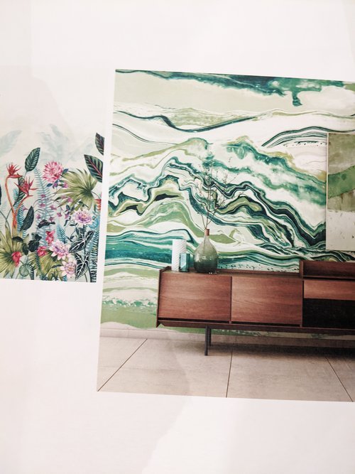
i have never heard of this company before, but their stand was beautifully arranged and proved to be very popular visitors. they also sent the friendliest reps to the fair, who were very keen on sharing some background info as well on their manchester-based company. they offer a wide range of wallcoverings, not only repeat patterns but also mural-style, non-repeating too, with really impactful effect on interiors. i did like some of the brutalist geometries but they do have some amazingly colourful patterns. (link to visit)

2.2 ian sanderson

now, if you are a regular reader, and you know the kind of homewares zitozza has, you know that it’s not a botanical type of brand at all. however, traditional, rich, heritage-based designs dominate this fair quite heavily, so it wouldn’t be fair not to mention at least one of these brands. i’m picking ian sanderson because they have everything you want, from the meticulous reworking of original block prints, through fabulous wovens and a collection of a versatile, cute range of coordinators that are made in the UK. (link to visit)

2.3 prestigious textiles

the pattern powerhouse delivers again, need i say more? i’ve been to a few fairs before and, as a lover of pattern, colour and texture, the pt display is always my favourite. in line with zitozza’s own aesthetics, i was looking for happy geometries and i wasn’t disappointed. the colourways are inspiring me to try some schemes that could work well with these! (link to visit)

3 - MATERIAL FAVOURITES

i keep mentioning that this is a very textile-heavy show usually, however, i want to mention a top three of flooring and hard finishes, because they are an important part of home interior styling. i enjoy looking at interesting surfaces and i can certainly get obsessive with where i want to lay my jute rugs.

3.1 crucial trading

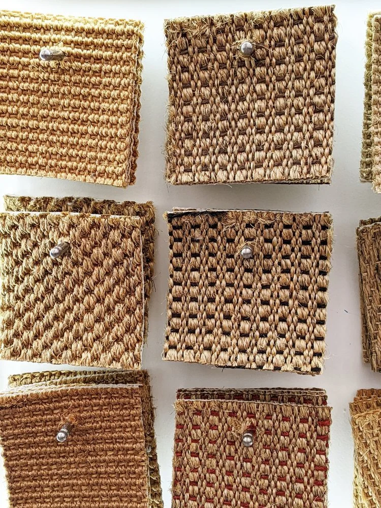
this company had a lovely display of sisal floor coverings in all possible textures and colours. sisal is a natural, sustainable fibre that is even more durable than jute. the gold colour is similar and i got really attracted to this abundance of tactile samples. (link to visit)

3.2 miller’s 1893

i’m currently on a mission for hardwood floors in my own house (also home to the zitozza studio) so i was very happy to find this company. my favourite of their offerings were these antiqued hardwood floors that although they looked like they were reclaimed, they are entirely purpose-made for this somewhat industrial look. really, really fell for these. (link to visit)

3.3 la fabbrica

there weren’t many suppliers of stone or ceramics present, so i feel obliged to mention the la fabbrica range that put lovely, lovely slabs on display of some very interesting surfaces, which i’m sure that fellow fans of brutalism would also appreciate. (link to visit)

4 - OTHER INTERESTING FINDS

overall, it was a great experience to visit, and it’s great to see what some of the best of british and international interior design brands are up to, without having to travel too far, so i do recommend visiting again next year. we’re nearly at the end of this roundup, but i want to mention a few more observations.

4.1 nautical is in!

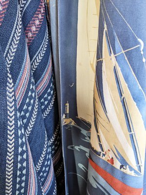
this one took me by surprise (a very pleasant one, may i add), as i do have my own range of nautical homewares. i do it because it matches the golden, raw jute materials i’m working with, but it was nice to see that quite a few brands, such as fryett’s (on left) and mulberry (middle and right) also offers interior fabrics and wallpapers to complete such looks. you love to see it!

4.2 ikat & travel inspired patterns

as i’ve written about before in my previous trend-forecasting post, travel inspired decor nand boho chic are going to dominate interior trends for a while. this can take a few interpretations, my personal favourites were from iliv fabrics (left), whose newly launched collection ‘kasbah’ has been evoking the ikat patterns (they also have a sustainable plains range!). for smaller accessories in travel-inspired style, glasgow-based premier housewares (right) had a room full!

4.3 happy geometries

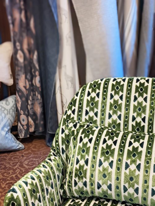
i already touched on a little bit how i was hunting for geometric surfaces in this jungle of floral and heritage-inspired prints, and i think there is a genuine desire for clear-cut shapes and abstract angles. i’m showing you my two favourites here. this wool sample by moon (on left) really made me think of bernat klein, and the geometry reminded me of the architecture of peter womersley. love this pattern and they also released it on throws! the second image is of a print by studio g of the sanderson group (on right) who were present with many collections. it’s the slight handmade, block printed effect on this particular collection that i really picked up on and i hope this proves to be popular!

well that’s it for this year’s roundup! i hope you enjoyed this visit with me, it certainly was a great experience and it’s always a pleasure to take a dip in a pool of pattern, print and lovely interiors.

to keep this already long post slightly more concise, there is no separate section for the links, but you’ll find them all in the text. for further questions, please don’t be afraid to get in touch and for future posts, feel free to subscribe below!

INSPIRATION, INTERIOR DESIGN, SUSTAINABILITY, TEXTILE INDUSTRY

the 5 must-watch colour & material trends in 2022 for interiors - and sustainable home decor is here to stay!

first of all, i apologise for the late post on interior trends, since we’re well into february already. to keep this post concise and focused, i’m going to concentrate specifically on colour and material trends that you might find easy enough to implement in your home (maybe with some zitozza stuff!) and i will expand on the current round-up suppliers and designers offer with a further post after having visited the scottish interiors showcase in a few weeks time. i’m really excited to visit (it’s been two years without trade fairs!), and i thought i’d share a little bit of research of the colour and material trends i expect to see.

1. RECYCLED & RECLAIMED

okay, sustainable design choices are not so much a “must-have-trend” but a pressing, urgent and permanent imperative change, so i shouldn’t really include this in the list but i do because it is getting embraced by more and more, and it may give some ideas to look further and think about what useless old thing you can turn into something cool. for us, it means, patchwork rugs and zero-waste, for others, this could be reclaimed wood, a bit of DIY upcycling, granny’s old nightstand-turned-houseplant shelf? all good and here to stay!

2. EARTH TONES

you may have observed that terracotta was kind of a big deal in 2021 - i hope you liked it, because it looks like it’s going nowhere, just growing and growing with many shades of earthy browns. expect to see plenty of fabulous, warm schemes usually paired with tactile surfaces and interesting shapes and textures, for a cosiness and warmth. it’s all about keeping it natural and down-to-earth - and it can result in a very serene, calming, loving home.

3. GREENS WITH GREENS

it seems that greens with greens in all possible shades are absolutely go this year. it may come in the form of breakfast room green by farrow and ball as one of their 2022 colour of the year, or a paler, more sagey october mist by benjamin moore. or you may achieve it simply with even more houseplants. or why not do all of them! the more green, the better. pale with deep jungle, dark teal with mint, dark olives with sage. they’re all in, and there is very little to go wrong with green!

4. WORLD PATTERNS

this is a very nice one - lord, how i missed travelling! but we are able to do so again so the travel-inspired details are back, with all the patterns from all the cultures and crafts of the world. of course there are more exotic interpretations of this trend than others, but the idea is to show off the individualities of the handmade, crafted details of traditional techniques. embroidery, print, weave - if inspired by experience and seeing the world, all good!

5. MIX & MATCH

the personal favourite has to be always the one that allows the greatest freedom. if you want to match geometric patterns with organic, modern with heritage, everything with everything, then you’re free to do so! this could mean all-out maximalism, colour blocking with bold, bright colours or perhaps cold, metallic details contrasting warm, earthy tones. or, my personal favourite, layering rugs with more rugs! there aren’t many rules here, it’s all about striking the right balance. it might take some brave choices and a little bit of thinking to pull it off, but it can result in the best looks!

this compilation was put together using the sources below, and the images illustrate zitozza’s interpretations, i hope we can show you that whichever way you wish to implement these trends in your home decor, we’ll be able to offer something useful. happy decorating in 2022!

-

link:

2022: our trend predictions in 2022 (farrow and ball, 6th january 2022)

7 interior trends that will dominate in 2022 (house beautiful, by rachel edwards, 5th december 2021)

colour trends 2022 (benjamin moore, no date)

interior design trends 2022: 15 key decorating looks for the year, from materials to moods (livingetc, 10th december 2022 by rohini wahy & rory robertson)

interior design trends to know in 2022 - and what’s on its way out (vogue, 3rd january 2022 by elise taylor)

interior design trends in 2022: styles, decor and color (the nordroom, no date)

the top interior trends for 2022 (sheerluxe, 24th january 2022)

INTERIOR DESIGN, SUSTAINABILITY, TEXTILE INDUSTRY, INSPIRATION

the 8 interior trends that will define 2021 - and the good news is, eco-conscious design is growing!

first of all, happy new year everyone! i guess we have all agreed not to talk about 2020, so i don’t want to say too much apart from how much i hope you all have an amazing new year with many well deserved, happy moments. for now, it seems as though we are stuck indoors for a little extra time again, and it’s all a bit grim. but here at zitozza indoors is what we’re good at, and with that in mind, you are invited to look through the interior trends of 2021 with our research glasses!


1. ECO CONSCIOUS DESIGN!

i was hesitating whether i should really call this a trend at all, when in fact it should be the standard really, but it’s just a fact that eco-consciousness has not been high on many agendas until recently. from the design industry’s perspective this has been imperatively rising though - and i’m 100% certain that it will be the most important one for decades to come. personally what i’m most excited about is the revolution collection by vondom - the first part of it (called “ibiza” by eugeni quitllet, made of plastic waste in the mediterranean) came out last year - read a little bit on design milk.

and this year we’re expected to see sustainability in many more ways - not just in durability and reusability but also in more innovative material choice such as foresso - the timber terrazzo, this beautiful surface. i love how it looks - texture within texture! made in the uk (birmingham) with bio-resin and timber waste, their sustainability credentials and transparency with their products and traceability are truly exemplary.

image and product design by foresso.


2. EARTH TONES AND TEXTURES

warm is the new cool, and interpreting a luxurious space as a kind, bracing cosiness has been growing and growing in recent years, resulting in a beautiful play with many textures and organic designs. clay, woodwork, boucle, velvets… this is very much about tactile qualities combined with warm colours and round, cocooning forms. coleur locale illustrates a rich, well-travelled take on this - below in the styling of the brilliant cleo scheulderman. it’s the comforting hug of mother earth that we crave!

photography by Jeroen van der Spek. styling by Cleo Scheulderman, 
client: Coleur Locale.


3. FRESH, OPEN BLUES

remember what free, open spaces used to be like? remember the summer breeze under the bright wide sky? remember the beach, the colour of the ocean? it’s hard to imagine it right now, scooped up inside in the midst of an ugly, grim january but those amazing blue hues are being brought indoors with rather spectacular results. as a fan of this colour i’m really excited about benjamin moore choosing it to be colour of the year. if you’re familiar with nicola harding and co. then you’ll know that she is an expert of using these shades for cool, thoughtful spaces with lots of charm and character. the below snippet is from this project (published in house & garden last year) - can we please take a moment to note the rugs too!

design by Nicola Harding & Co, photography by Paul Massey

4. ONE ROOM, MANY FUNCTIONS

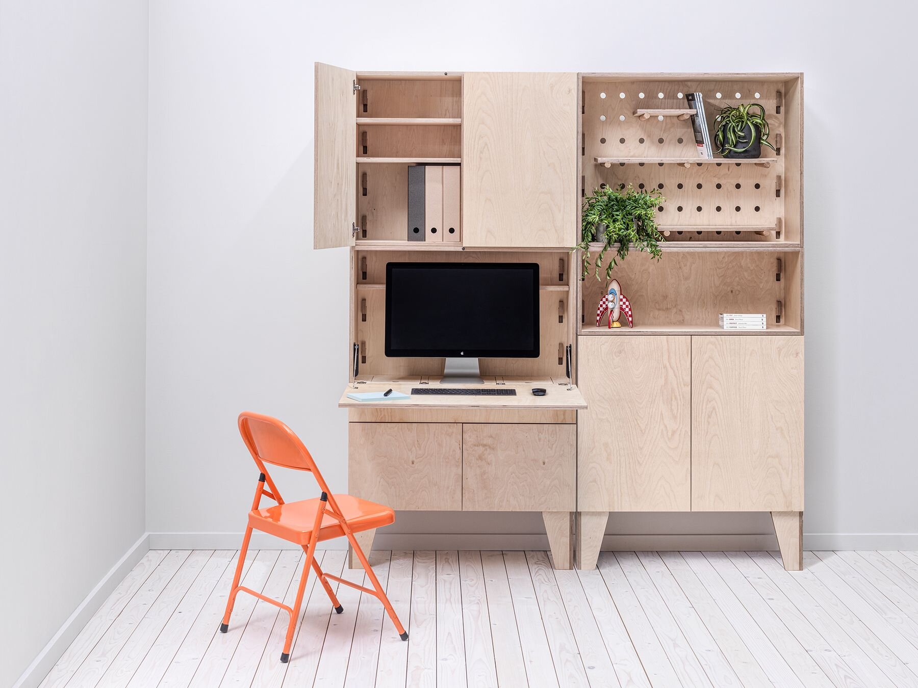
hands up, who’s surprised at this one? since we have spent pretty much all events of our life at home recently, this trend has risen perhaps out of necessity, but it’s here to stay because it’s immensely practical. while it has really been simple reality for many people, 2020 has certainly brought it to the surface and the market for functional solutions might expand as a result. expect to find space dividers and lots of clever home office furniture - the personal pick is this super smart, modular home office by arnie.m - the brainchild of angela and matt maurer. british made (in manchester), masterfully skilled, fully customisable and it’s sustainable too - made of 100% natural plywood (with beautiful wood pattern on the surface) and none of that awful mdf stuff.

kor0WWiQ.jpeg
WIuJk_Qg.jpeg
design by Arnie.M, photography by Paul Moffat Photography. 


5. FUNKY ACCENT RUGS

the one i’ve been waiting for! this one is for the pattern lovers out there and it’s just become barefoot-friendly. we have been layering upon layers upon layers for the past few years now, but increasingly we’re doing it to the floors as well and i’m 100% here for it. rugs outside, rugs in the kitchen, rugs on rugs, everything goes with everything. it’s the floor that makes the statement in 2021 so give it the love it deserves. london-based floor story always has some of the brightest and most exciting collaborations to look forward to - a great start to the year with the mediterranean collection by adam furman.

image by Floor Story, rug design by Adam Furman. 

6. NORDIC WABI SABI

minimalism has also taken a more inviting, warmer form in recent years. it’s still quite rustic and sparse but with plenty of thought-provoking richness in texture and imperfect, natural form. it still seeks that delicate contentment, and it still finds it in the peaceful serenity of warm, monochrome hues and natural surfaces, worked with the most skilled craftsmanship. but recently, it has all taken a more hugging, cosy, organic form in a somewhat scandinavian manner - or dutch as seen on this take by cleo scheulderman for vtwonen. it’s an artful creation of an unfilled but stimulating space where we want to go to to feel better about everything again.

photography by Jeroen van der Spek, styling by Cleo Scheulderman, 
assistance by Mette Sophie, client: vtwonen

7. VINTAGE LOVE

classic styles become such because they work, there is nothing new about that. however there are always new and ever more inventive ways to widen the boundaries and take braver, bolder twists on our cherished favourites. and if sustainability is chic, then surely, the glamorous way to do it is to give our vintage treasures the love and attention they deserve. it’s all about expression, maximalism, individuality and all the personal stories each object bears. i chose another take from nicola harding & co to illustrate this - a fabulous, opulent space that feels inviting and familiar at the same time.

interior design by Nicola Harding & Co, photography by Paul Massey


8. NATURE AND GREEN (and all the other colours)

maybe houseplants are not a “trend” so much, we just collect them because they are great and we love nature. but those of you with gardens and balconies have really hit the jackpot and a new appreciation certainly grew out of last year’s events. outdoor spaces are being increasingly valued as an extension of the living space and they’re now getting their rightfully earned, fully saturated upgrade with appropriate cosy cushions and floor covers. this one by mimi forrest is obviously not an outdoor rug but first of all it’s too beautiful not to be shared here and secondly, the styling might just give you the right idea - it is exactly the type of indoor space we want to see more of in 2021.

i hope you will all have an amazing, productive and successful 2021 with lots of colour and pattern - and more importantly please stay safe and healthy! although the start to the year feels worrying and sad, i’m hoping that it won’t be much longer until we can work more closely again and i’m looking forward to seeing more of your creative projects. happy new year!

image by Floor Story, rug design by Mimi Forrest


-

further reading

interior design trends 2021 – the 20 top looks for the new year (jennifer ebert, homes & gardens, 01/01/2021)

the biggest interior design trends for 2021 revealed (jacky parker, livingetc, 23/10/2020)

living room trends 2021 - top styling tips and trends to inspire (ruth doherty, ideal home, 09/10/2020)

pinterest predicts 2021’s interior trends: how to add them into your home, according to experts (eva waite-taylor, the independent, 15/12/2020)

interiors trends that will be big in 2021 :how to update your home for the year ahead (prudence ivey, homes & property, 31/12/2020)