this post is something that has long been ready to get off my chest. in design conversations, one phrase appears with remarkable frequency: “telling a story.” designers are told to tell stories, brands are told to tell stories, and increasingly it seems that if a piece of work isn’t narrating something explicitly, it risks being seen as incomplete.
the overuse of “storytelling” like this has irked me for a long time, and i’m certainly not the only one (just ask stefan sagmeister!)
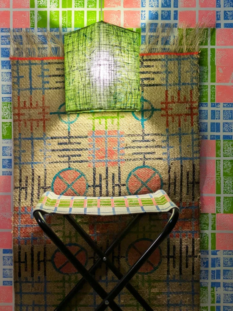
even so, when i place one of my textile patterns next to a building that inspired it, i was told a few times that this was actually “storytelling”, it is, however, and i cannot emphasise this loud enough, absolutely not the case. what i’m doing is providing context. the pattern is not a narrative illustration of the architecture; it is an abstraction, a translation of rhythm, proportion, and geometry into another material. the meaning that follows is not something i dictate. it’s something the viewer constructs for themselves.
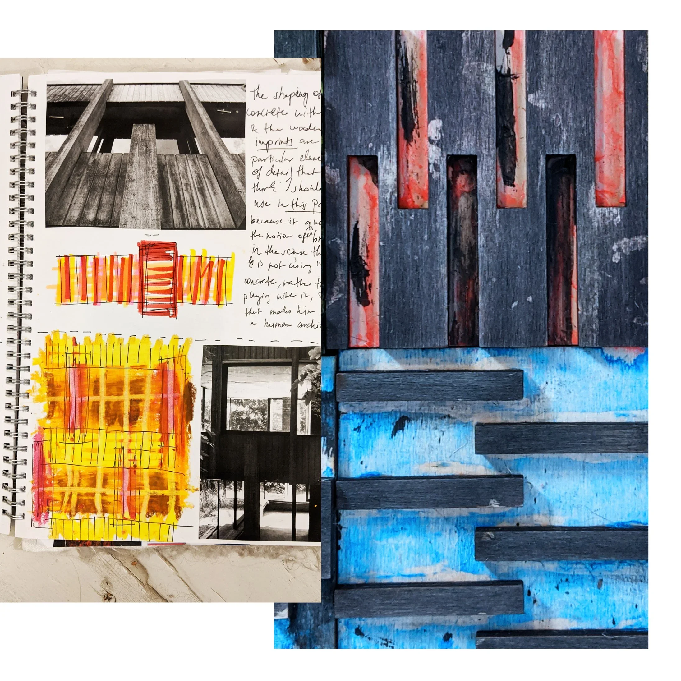
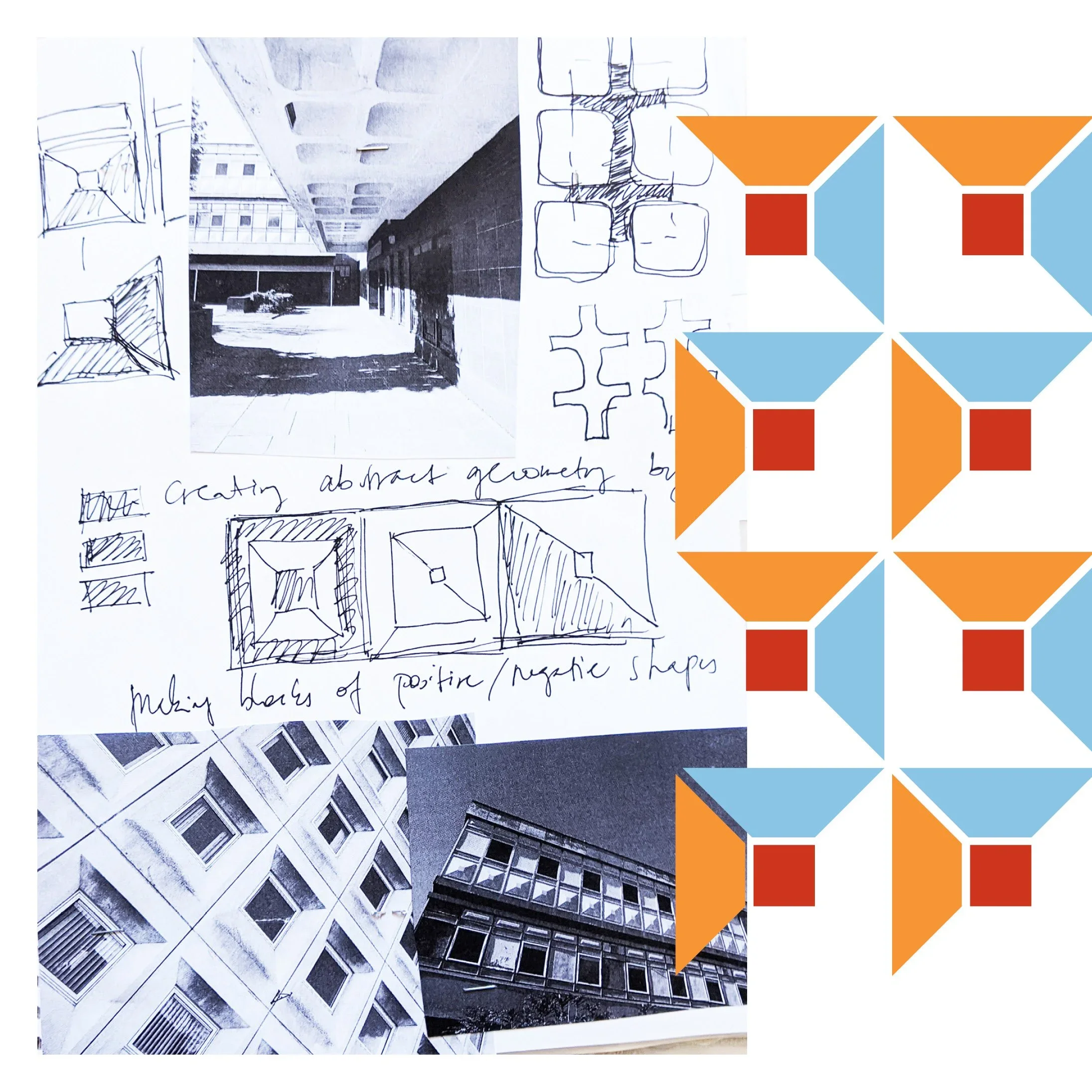
a story, by definition, has a beginning, a middle, and an end. design education also often encourages students to present their work as a clear sequence: research, sketches, development, final outcome. it makes sense as a teaching method, but in practice creative thinking rarely behaves so politely. many of the patterns i developed during university arrived first as fairly complete ideas (sometimes emerging through digital experiments, sometimes fully formed in my head) and only afterwards did the sketchbook pages appear, carefully reconstructing a linear “process” that satisfied academic expectations. i decided to use these faked sketches to illustrate my point because i find it funny how strongly we expect creativity to move like a neatly unfolding sequence, a step by step process, when in reality it often moves in leaps, loops, and sudden recognitions.
it’s true though, i never thought of design, and certainly not of patterns as stories at all. a repeating motif does not guide you through a linear experience; it surrounds you. it exists all at once. trying to treat pattern as a narrative object can sometimes be like insisting that a brick should also function as a sentence. it is simply the wrong unit of meaning.
what design does instead is create frameworks. they establish rhythm, scale, and atmosphere. they provide visual conditions within which people live their own lives. the “story,” if we insist on using the word, happens in the room: in the conversations held around a table, the light shifting across a wall, the slow accumulation of everyday use. design is not the storyteller; it is the stage set.
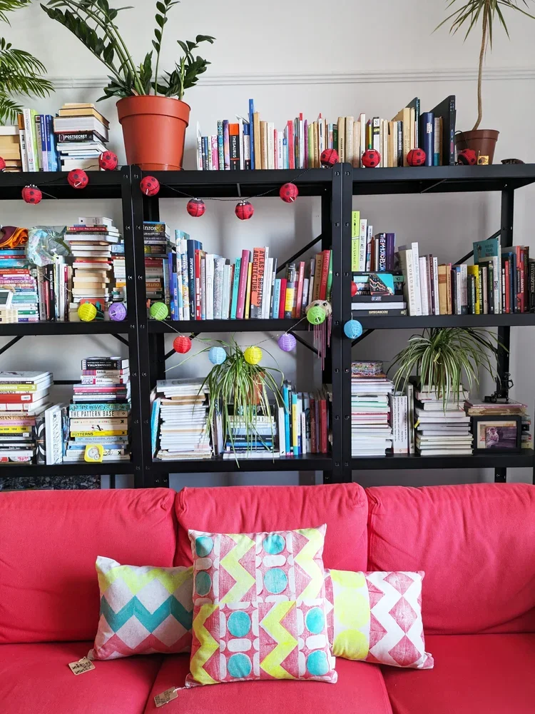
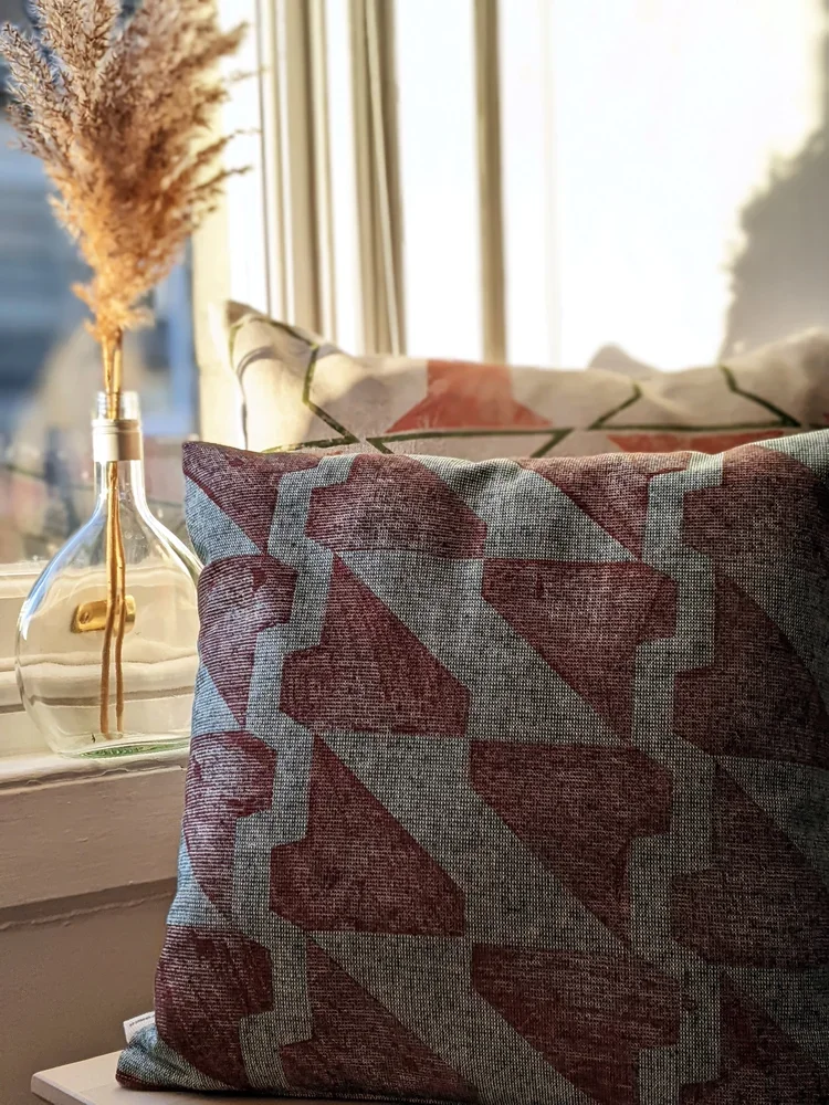
this is one of the reasons i work with modular systems. each printing block is designed to combine, rotate, and repeat, forming structures rather than scenes. the result is not an image with a fixed message but a language of forms that can adapt to different interiors and different users. the same pattern can feel calm in one space, energetic in another. none of these readings is prescribed, and that openness is intentional.

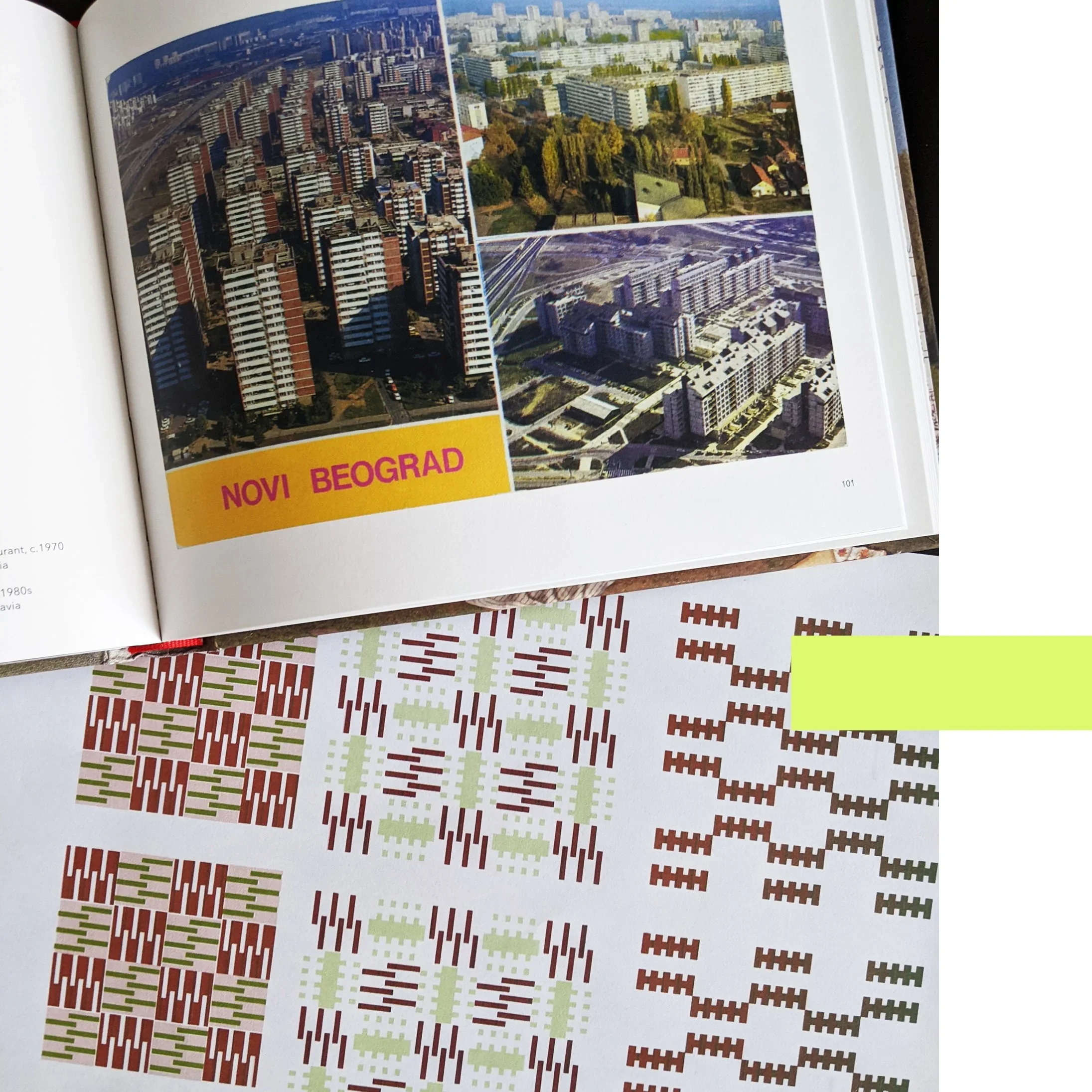
context, however, still matters. placing a textile next to an architectural reference is not an attempt to narrate a building’s biography. it is simply a way of showing where certain formal decisions originate. a façade grid might influence the spacing of a pattern. a row of windows might suggest a vertical rhythm. these relationships are structural rather than narrative.
i think the pressure for every piece of design to “tell a story” often comes from branding culture, where narrative clarity is treated as the primary route to meaning. pop-culture now also mostly speaks in films and literature, quite often at the expense of visual thinking (see also the brutalist…) but objects have other ways of communicating. material weight, surface texture, proportion, and repetition all shape how we experience a space, often more profoundly than any written explanation. a heavy linen curtain filtering afternoon light communicates something immediate and sensory, long before anyone explains its conceptual background.
in fact, insisting too strongly on storytelling can sometimes limit how people engage with design. if the designer declares what the story is supposed to be, the viewer’s role becomes passive: they are asked to receive the message rather than interpret it. abstraction offers the opposite possibility. it invites participation. it leaves room for personal associations that may have nothing to do with the designer’s original reference point, and that is not a failure of communication; it is the success of open-ended design.
this does not mean narrative has no place in creative work. many designers use storytelling brilliantly, especially when working with figurative imagery or historical references. but it is worth remembering that design can operate through multiple modes of meaning. sometimes a chair is interesting because of its ergonomic logic. sometimes a building is compelling because of its structural clarity. sometimes a textile matters because of the quiet order it introduces into a room.
patterns do not need to speak in sentences to be meaningful. they function more like music: repetition, variation, tempo, pauses. we do not ask a piece of instrumental music what “story” it tells, yet we still experience it as expressive, emotional, and deeply communicative. textiles can work in the same way.
so when i show a pattern alongside the architecture that influenced it, i am not telling a story. i am showing a relationship. what happens next — what memories, associations, or interpretations emerge — belongs to the person living with the piece. the narrative is theirs to write, not mine to dictate.
and perhaps that is the real advantage of abstraction: it leaves enough space for life to happen inside it.