interiors

ARCHITECTURE, INTERIOR DESIGN, TEXTILE INDUSTRY

design & interior trends for 2026: structure, material truth and the human scale

happy new year everyone. i hope you all feel rested and ready to start 2026. as usual by now, we like starting the year on our journal with rounding up the industry trends this year and as we get into 2026, there are shifts we indeed notice getting talked about more. the design conversation feels less about fleeting visuals and more about how spaces actually feel and function.

over recent year there’s been a clear move from insta-ready looks toward interiors that reward touch, proportion and material logic. this is something we appreciate a lot because it resonates with architectural textiles: pattern as structure, not surface decoration; material honesty over effect; and tactile designs, built to live with, not just be seen.

1. lived-in, human environments

with that in mind, the biggest thing in 2026 seems to be about interiors that are being designed for how people actually use them. the “perfectly curated, picture-ready” room is definitely losing ground to spaces that feel genuinely lived-in and personal; places that carry life, use and comfort without compromising on thoughtfulness.

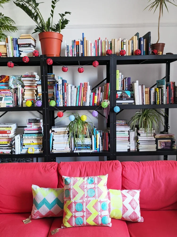
designers note that this lived-in approach is less about clutter but about proportion, atmosphere and genuine engagement with space over time. and for zitozza, this echoes clearly: architectural textiles are decoration as well as reinforcing the logic of a space, so when they age and get lived with, they feel like they were always meant to be there.

2. materials with presence and longevity

sustainability has been “in” since designers realised the importance of it… and in 2026, it first and foremost means materials that remain repairable and have inherent performance; tactile, honest, natural matter that doesn’t hide or disguise itself but interacts with light and wear over time.

expect to see deeper use of bio-based fabrics (seaweed textiles, hemp substitutes) and a continued gravitation toward materials that feel real e.g. jute, linen, stone, wood with grain, and hand-finished surfaces - which we love seeing at zitozza. this is consistent with broader forecasts that interior design is leaning into texture and authenticity over perfectionism.

3. warmth through colour and confidence in palette

the appetite for deep, earthy tones (terracotta, mossy green, chocolate brown) is relentless and does not seem to stop or slow down. designers talk about “earthy vibrancy,” a palette rooted in nature yet energetic and expressive.

in parallel, nuanced saturated hues like rich blues or muted plums are gaining traction for their ability to bring the brighter contrast. earthy colour combinations sit well with structured pattern languages (grids, modular repeats) but of course we’ll be unlikely to abandon the brightness completely.

4. tailored comfort and structural calm

you will know by now that our idea of warmth is not about plush maximalism, but about calmness through order. it is also a trend in 2026 though and watchers have dubbed this period warm minimalism: the softening of minimalism with materials that invite touch (our favourites such as linen, wool, brass, warm wood) without disrupting the order.

this is not some kind of abstract “fuzziness”, and seems to be less about ornament and more about presence: spaces that feel calm because they are designed with intention. architectural textiles fit neatly here: they bring tactility and rational frameworks but with the hand crafted, tactile touch.

5. bespoke, hybrid and adaptive spaces

even beyond traditional interior finishes, we’re seeing a desire for bespoke elements: cabinetry with unique grain and character (think burl wood), hybrid storage systems and modular pieces that respond to how people live and the unique spaces that surround them.

this aligns with a larger cultural shift away from “fast furniture” and toward investment pieces, where customization, whether in architecture, millwork, or (yes!) surface pattern becomes a marker of longevity over trendiness.

from a zitozza perspective, this is what we live for! modular pattern systems and fabrics can flex across scales and speak directly to clients and designers looking for investment textiles that feel both personal and architectural.

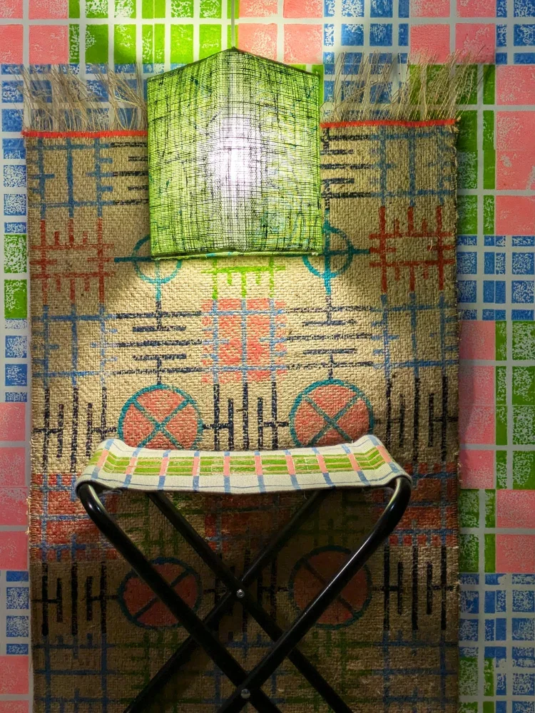
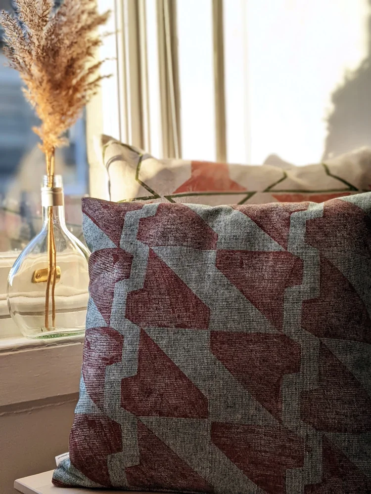
6. pattern as structure, not surface

one of the less prominent but still significant threads in early 2026 forecasting is a renewed appreciation for pattern that makes architectural sense rather than just aesthetic sense. interior editors are increasingly pointing to pattern drenching, large prints, and textile wall hangings as ways to give rooms rhythm without ornamentation which we absolutely love to see.

for textiles rooted in block systems, this trend is more than stylistic: it’s conceptual. well-made pattern should operate like a facade grid — clarifying spatial logic, giving scale to surfaces, and reinforcing proportion.

that’s exactly the design proposition behind architectural textiles for modern interiors: patterns that echo the architecture of a room while adding texture and tactility.

so what does this mean for makers and designers?

2026 is shaping up to be a year where purposeful choice outlasts impulse trend, where materials become more honest and tactile; interiors become places for real life.

for a design studio focused on structural pattern, modular logic, and architectural integration, these are trends that we love to see the shift towards across the whole industry. follow us through 2026 as we work towards our new collections and our exciting hyper-customisation tool for unique block printed patterns.


ARCHITECTURE, ARCHITECTURAL HERITAGE, HUNGARY, INTERIOR DESIGN, TEXTILE INDUSTRY

from the hillside: óbuda university, campus of doberdó út.

after a few tours at various student halls in edinburgh and st andrews, it’s time to bring you something quite special, in line with my new year’s resolution to bring you more buildings from hungary. we’re going to my alma mater, the óbuda university building on doberdó út – home of the rejtő sándor faculty of light industry and environmental engineering and the building itself too shaped how i think about structure, material and use.

this is where i studied light industry and product design. and no, “light industry engineeering” does not mean “electrical engineering but with nicer lamps”. in hungary, we use this term as an opposite of heavy industry. light industry is the world of textiles, paper, packaging, printing, plastics – all the things that actually touch your skin, your shelves, your coffee table. the soft infrastructure of everyday life.

the building fits that brief in a surprisingly literal way.

built into a hillside

approaching from the street, you walk up towards the entrance. it’s a long flight of stairs to go up on the first floor, and as soon as you’re inside, the uphill continues.

because it sits on a steep slope between doberdó út and the kiscelli park edge, the whole structure works like a split-level diagram someone decided to extrude into reality. there is a back building of half floors attached to the long, street facing facade. offices and admin spaces occupy the half-floors stepping up along the hillside while the larger rooms – auditoriums, drawing studios, labs, the library – drop down on the other side parallel with the street.

the middle is connected by a lift only teachers were allowed to use (with the same 1970s typography still intact), and a seemingly endless flight of stairs that always ended somewhere interesting. it reads like a very economical way of using topography: every shift in ground level becomes usable volume.

big rooms downstairs, views upstairs

the split-level logic isn’t just a structural trick. it organises how people think and work inside. the big, communal spaces – lecture halls, drawing studios, labs – sit on the lower side, stacked along the hillside. you walk “down” to the important rooms, which is a nice reversal of the usual academic hierarchy. rather than climbing a tower of theory, you descend into the machinery.

upstairs, along the hill-facing half-floors, are the smaller offices, admin corners, and quieter rooms. the hierarchy is sideways instead of vertical: teaching, admin, labs, all neatly lined up next to each other on the long corridors.

the best spaces were the paper labs at the top. they sat just high enough that, once you crossed through the corridors (with lace curtain windows and houseplants like a truly cosy socialist modernist home), the city suddenly opened up from the top floors of the building. there is something strangely grounding about testing grammage, opacity and fibre direction while a whole urban landscape sits just outside the window, built from concrete, brick and glass – large-scale material systems echoing the small samples in your hand.

bannisters, terrazzo, and accidental details

like many late modern educational buildings in budapest, the doberdó út campus does not perform for the camera. but the details are better than they strictly need to be. the stair bannisters are classic 70s: sturdy tubes, consistent spacing, no theatrics. the floors are often terrazzo tiles or hard-wearing stone, the kind designed to survive thousands of students a year and still look vaguely composed.

even while rushing to a mechanics exam, i would enjoy the way the handrail meets the landing, the way light falls along a corridor and it has been storing itself away somewhere in my brain, ready to reappear in your own work. structure, then surface. order first, pattern later.

light industry, heavy shifts

studying light industry here meant learning the mechanics of materials that are often dismissed as “secondary”: textiles, paper, packaging, media technologies. the degree sits at an interesting intersection – somewhere between engineering, design and production.

in reality, it also meant studying in a period when much of that industry in hungary had already shifted, shrunk or moved. factories were closing, retooling, or turning into logistics hubs. the building on doberdó út, with its labs and test rigs and print rooms, became a kind of time capsule of a less material-based economy – but also a test bed for whatever would come next.

that tension – between the physical plant and the changing world outside – is something i carried with me. it’s probably no coincidence that i now work with textiles and printing blocks in a way that is both very old (ink, cloth, pressure) and quietly new (cad-designed modular systems, contemporary interiors, small-batch production).

how this filtered into zitozza

when i design printing blocks now, i think in sections, not just in surface. patterns have to behave the way that buildings behave: stepping, shifting, accommodating different uses without losing coherence. a rug in one room, a lampshade in another, a cushion on a sofa – all part of the same “light industry”, just at domestic scale.

the split-level logic of the doberdó building also shows an interesting and practical system of repetition: instead of a perfect, flat grid, you can think about it as offsets and half-steps – units that interlock like floors on a hillside. the materials matter too: recycled linen, cotton, jute. not glamorous on paper, but very real under the hand.

and the views from those upper labs? they were a useful reminder that design is never just happening in the studio. it’s always in conversation with the city, the economy, and the infrastructures that support both. you don’t forget that when you’ve spent three years measuring paper in a room that looks out over an entire urban cross-section.

a modern kind of alma mater

there are many more photogenic buildings in budapest, and certainly more famous ones. but this one, at doberdó út 6, did its job in more than one way. no grand gestures, just good use of a hill, sensible circulation, and rooms that are genuinely fit for the activities inside them.

as with many of the structures i keep coming back to, its real value is not in being iconic, but in being clear. clear in plan, clear in section, clear in purpose. and i suppose that’s what i’m still chasing with textiles too: clarity in pattern, clarity in material, clarity in how something is meant to be lived with.

from hillside labs to block-printed cushions is not as big a leap as it sounds. in both cases, it’s about making sense of materials in a world that refuses to stay still.