after a few tours at various student halls in edinburgh and st andrews, it’s time to bring you something quite special, in line with my new year’s resolution to bring you more buildings from hungary. we’re going to my alma mater, the óbuda university building on doberdó út – home of the rejtő sándor faculty of light industry and environmental engineering and the building itself too shaped how i think about structure, material and use.
this is where i studied light industry and product design. and no, “light industry engineeering” does not mean “electrical engineering but with nicer lamps”. in hungary, we use this term as an opposite of heavy industry. light industry is the world of textiles, paper, packaging, printing, plastics – all the things that actually touch your skin, your shelves, your coffee table. the soft infrastructure of everyday life.
the building fits that brief in a surprisingly literal way.
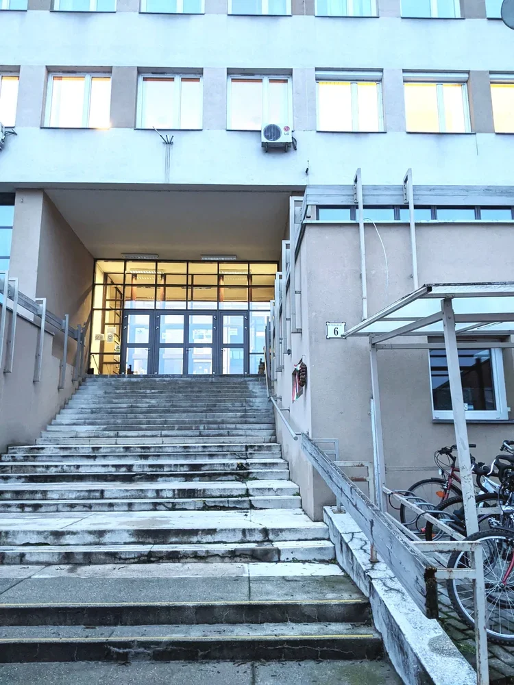
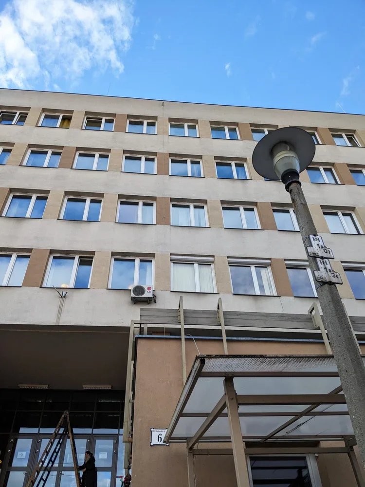
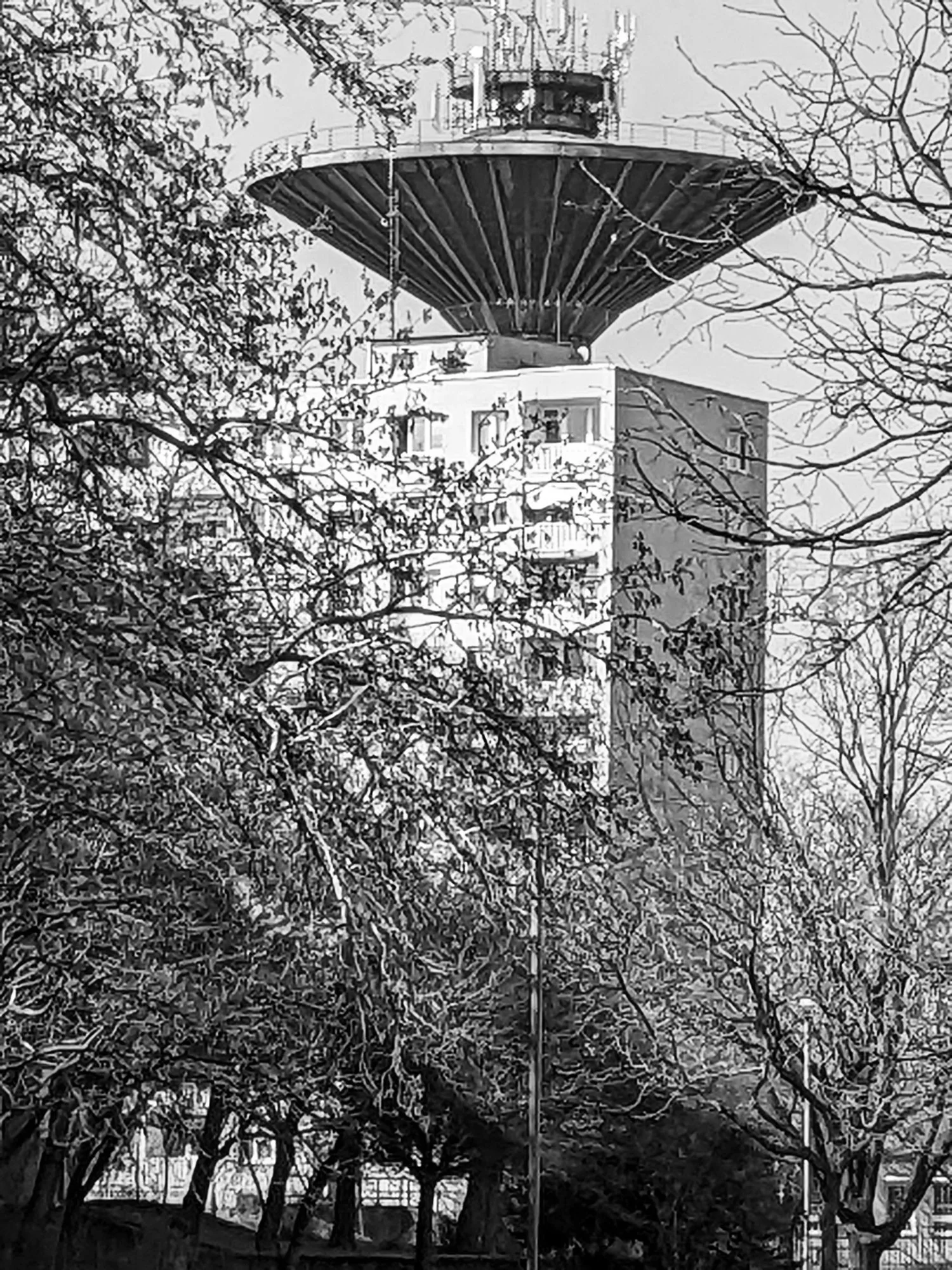
built into a hillside
approaching from the street, you walk up towards the entrance. it’s a long flight of stairs to go up on the first floor, and as soon as you’re inside, the uphill continues.
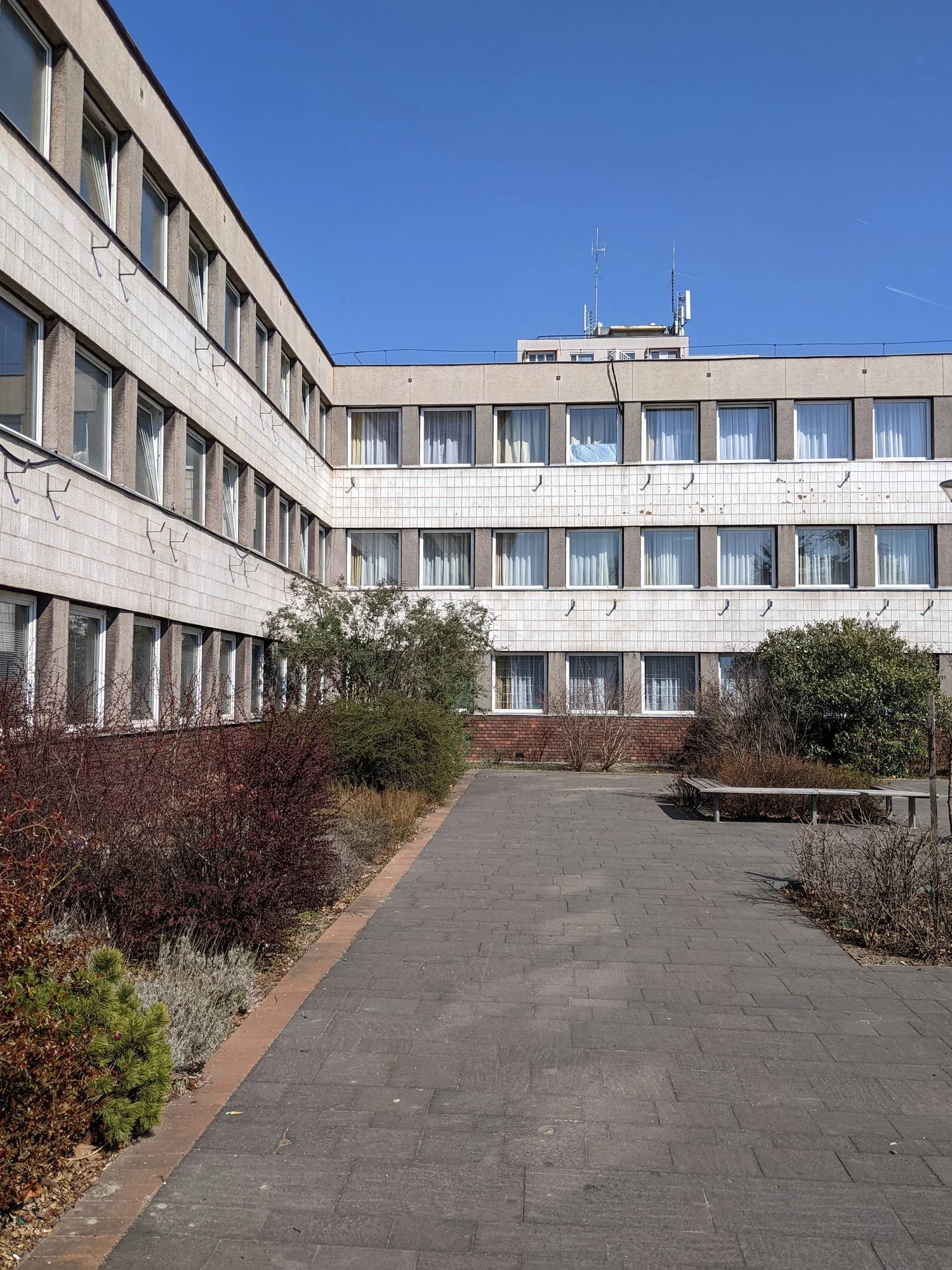
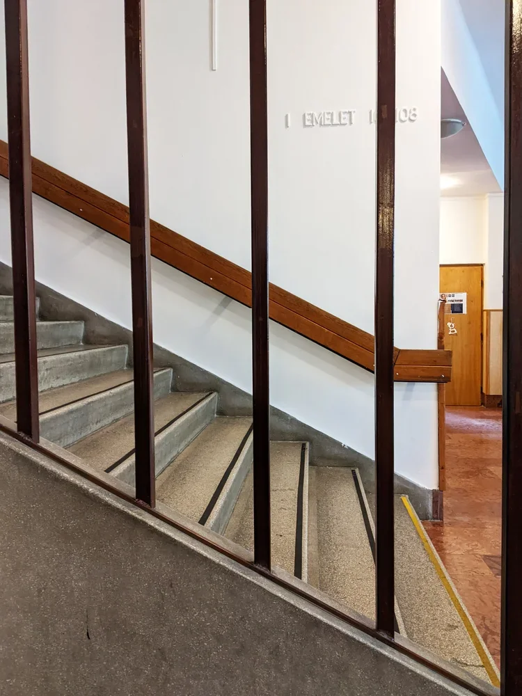
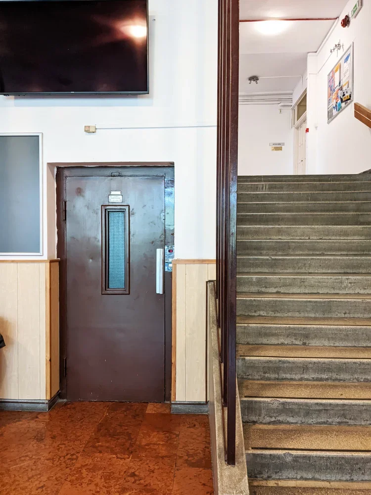
because it sits on a steep slope between doberdó út and the kiscelli park edge, the whole structure works like a split-level diagram someone decided to extrude into reality. there is a back building of half floors attached to the long, street facing facade. offices and admin spaces occupy the half-floors stepping up along the hillside while the larger rooms – auditoriums, drawing studios, labs, the library – drop down on the other side parallel with the street.
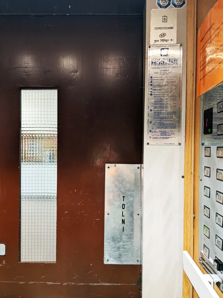
the middle is connected by a lift only teachers were allowed to use (with the same 1970s typography still intact), and a seemingly endless flight of stairs that always ended somewhere interesting. it reads like a very economical way of using topography: every shift in ground level becomes usable volume.
big rooms downstairs, views upstairs
the split-level logic isn’t just a structural trick. it organises how people think and work inside. the big, communal spaces – lecture halls, drawing studios, labs – sit on the lower side, stacked along the hillside. you walk “down” to the important rooms, which is a nice reversal of the usual academic hierarchy. rather than climbing a tower of theory, you descend into the machinery.
upstairs, along the hill-facing half-floors, are the smaller offices, admin corners, and quieter rooms. the hierarchy is sideways instead of vertical: teaching, admin, labs, all neatly lined up next to each other on the long corridors.
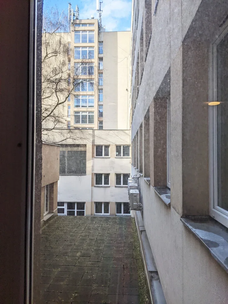
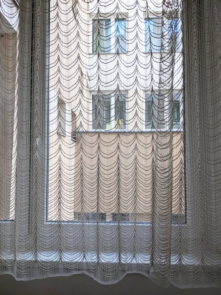
the best spaces were the paper labs at the top. they sat just high enough that, once you crossed through the corridors (with lace curtain windows and houseplants like a truly cosy socialist modernist home), the city suddenly opened up from the top floors of the building. there is something strangely grounding about testing grammage, opacity and fibre direction while a whole urban landscape sits just outside the window, built from concrete, brick and glass – large-scale material systems echoing the small samples in your hand.
bannisters, terrazzo, and accidental details
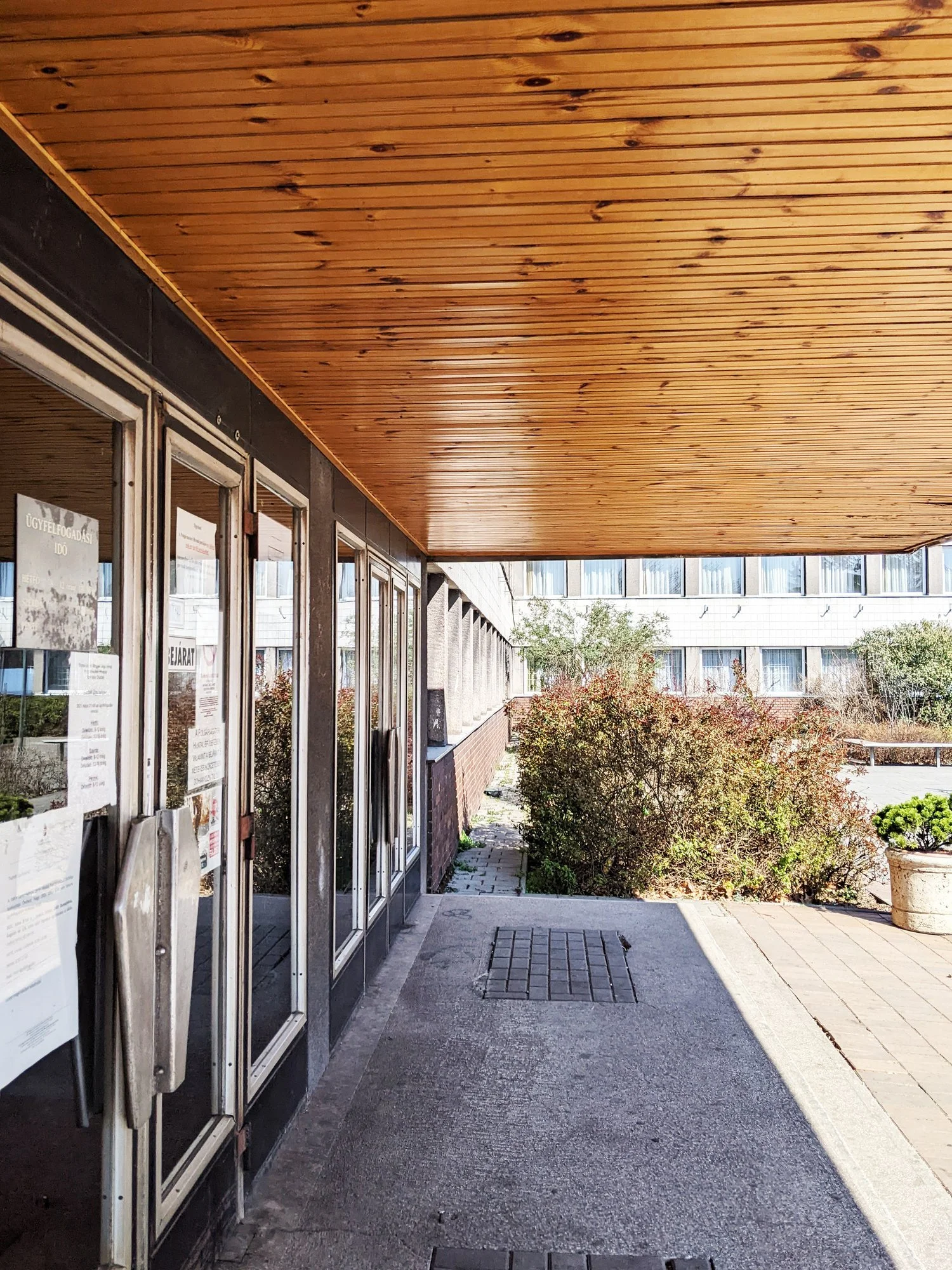
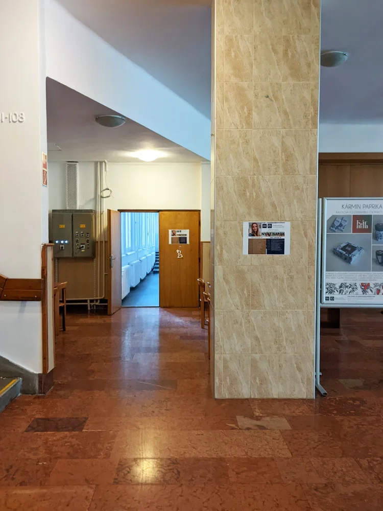
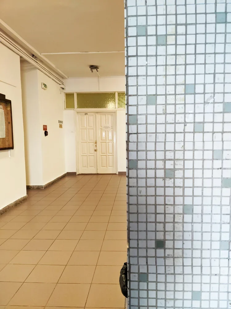
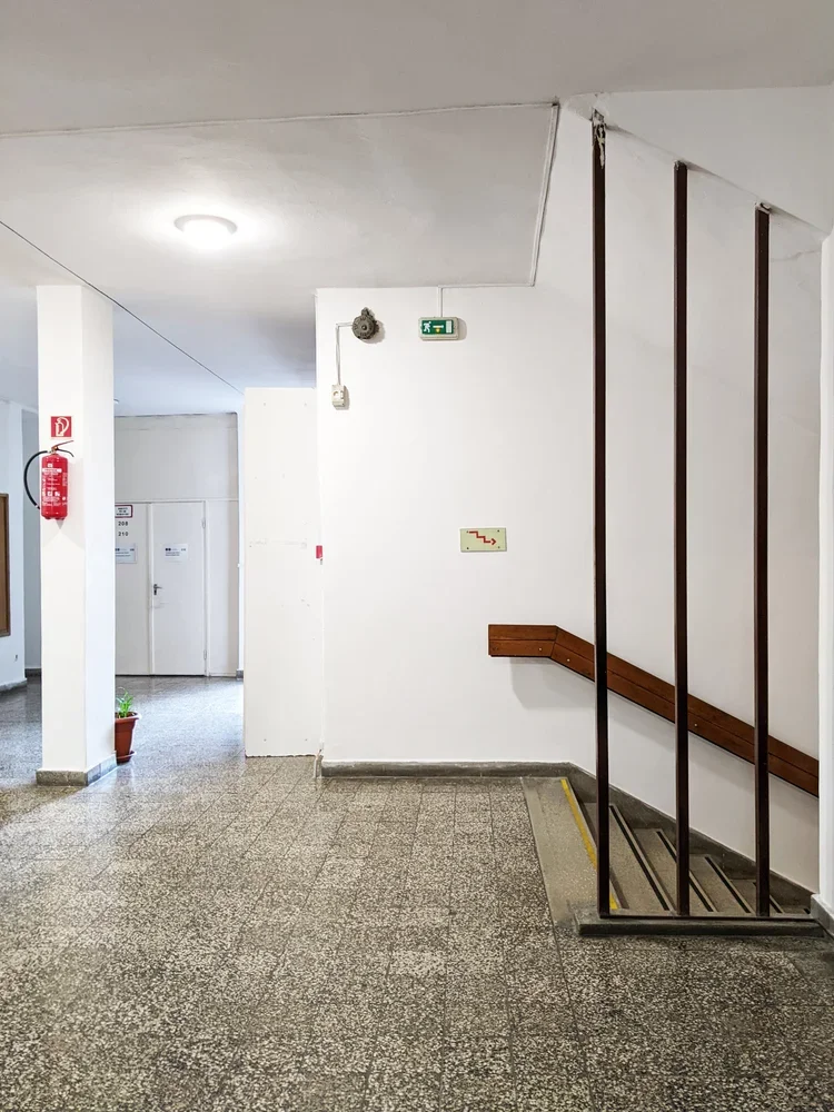
like many late modern educational buildings in budapest, the doberdó út campus does not perform for the camera. but the details are better than they strictly need to be. the stair bannisters are classic 70s: sturdy tubes, consistent spacing, no theatrics. the floors are often terrazzo tiles or hard-wearing stone, the kind designed to survive thousands of students a year and still look vaguely composed.
even while rushing to a mechanics exam, i would enjoy the way the handrail meets the landing, the way light falls along a corridor and it has been storing itself away somewhere in my brain, ready to reappear in your own work. structure, then surface. order first, pattern later.
light industry, heavy shifts
studying light industry here meant learning the mechanics of materials that are often dismissed as “secondary”: textiles, paper, packaging, media technologies. the degree sits at an interesting intersection – somewhere between engineering, design and production.
in reality, it also meant studying in a period when much of that industry in hungary had already shifted, shrunk or moved. factories were closing, retooling, or turning into logistics hubs. the building on doberdó út, with its labs and test rigs and print rooms, became a kind of time capsule of a less material-based economy – but also a test bed for whatever would come next.
that tension – between the physical plant and the changing world outside – is something i carried with me. it’s probably no coincidence that i now work with textiles and printing blocks in a way that is both very old (ink, cloth, pressure) and quietly new (cad-designed modular systems, contemporary interiors, small-batch production).
how this filtered into zitozza
when i design printing blocks now, i think in sections, not just in surface. patterns have to behave the way that buildings behave: stepping, shifting, accommodating different uses without losing coherence. a rug in one room, a lampshade in another, a cushion on a sofa – all part of the same “light industry”, just at domestic scale.
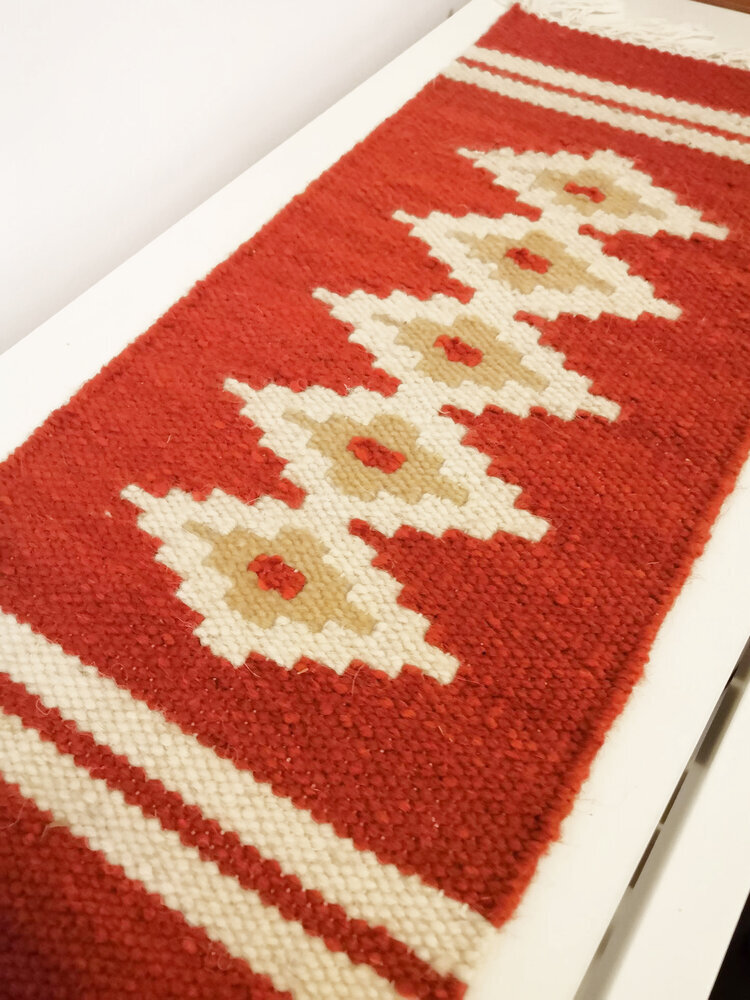
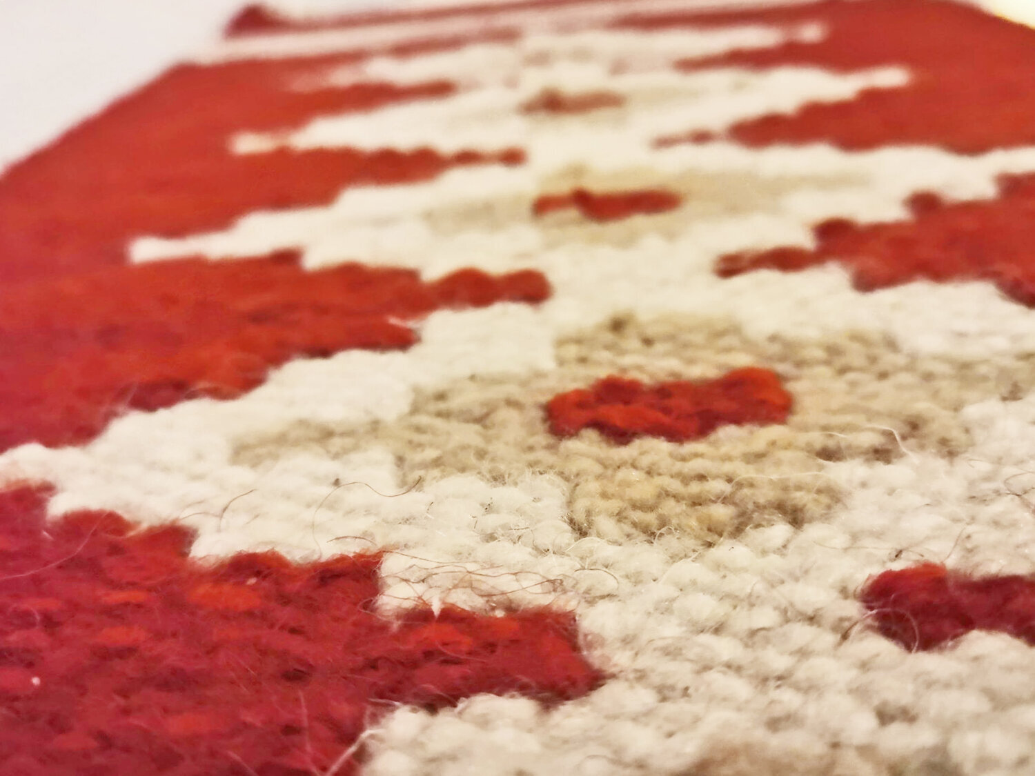
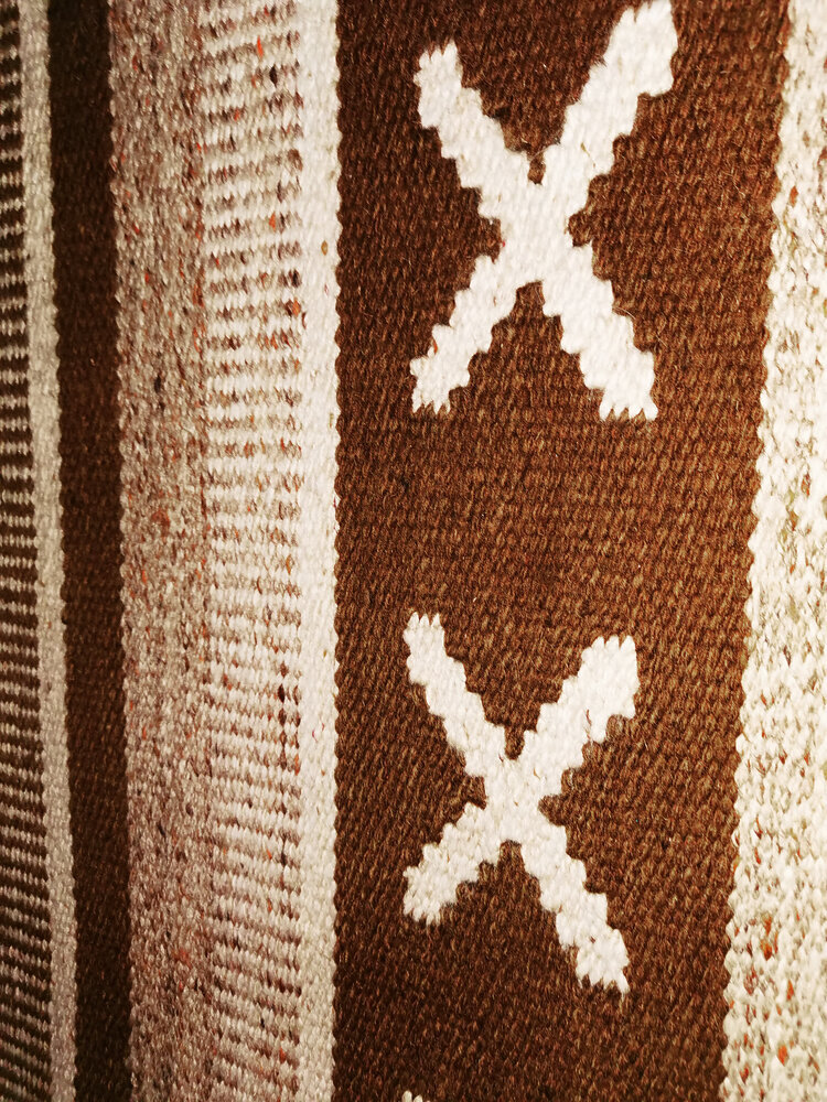
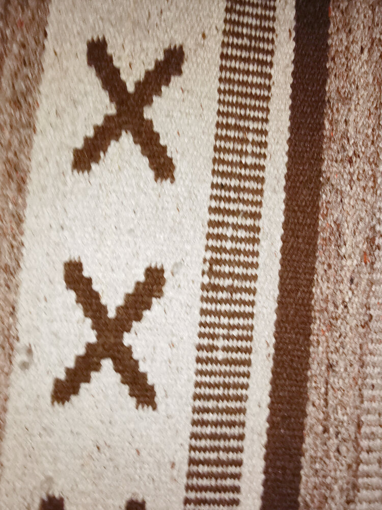
the split-level logic of the doberdó building also shows an interesting and practical system of repetition: instead of a perfect, flat grid, you can think about it as offsets and half-steps – units that interlock like floors on a hillside. the materials matter too: recycled linen, cotton, jute. not glamorous on paper, but very real under the hand.
and the views from those upper labs? they were a useful reminder that design is never just happening in the studio. it’s always in conversation with the city, the economy, and the infrastructures that support both. you don’t forget that when you’ve spent three years measuring paper in a room that looks out over an entire urban cross-section.
a modern kind of alma mater
there are many more photogenic buildings in budapest, and certainly more famous ones. but this one, at doberdó út 6, did its job in more than one way. no grand gestures, just good use of a hill, sensible circulation, and rooms that are genuinely fit for the activities inside them.
as with many of the structures i keep coming back to, its real value is not in being iconic, but in being clear. clear in plan, clear in section, clear in purpose. and i suppose that’s what i’m still chasing with textiles too: clarity in pattern, clarity in material, clarity in how something is meant to be lived with.
from hillside labs to block-printed cushions is not as big a leap as it sounds. in both cases, it’s about making sense of materials in a world that refuses to stay still.