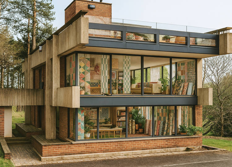
if you’re up to date with your modernism, i’m sure you will have heard the news already about the heralded bernat klein studio by peter womersley. if you’re new, let me break it to you: it is up for auctionfor a guide price of just £18,000. camper vans are more expensive than that.
but this is a grade A lised building in the scottish borders, currently on scotland’s buildings at risk register - it was already in an awful state in 2016 when i first visited and i can only imagine the state it is in now. as sat derelict since the early 2000s and like so many modernist gems, it’s not only been neglected but overlooked. with its protected status, i do wonder about the real amount of funds required to restore it into anything structurally sound. but one can dream, right?
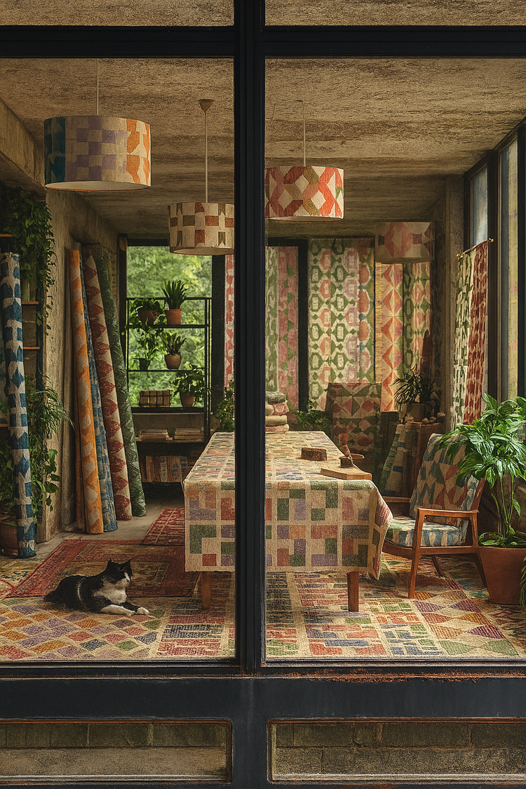
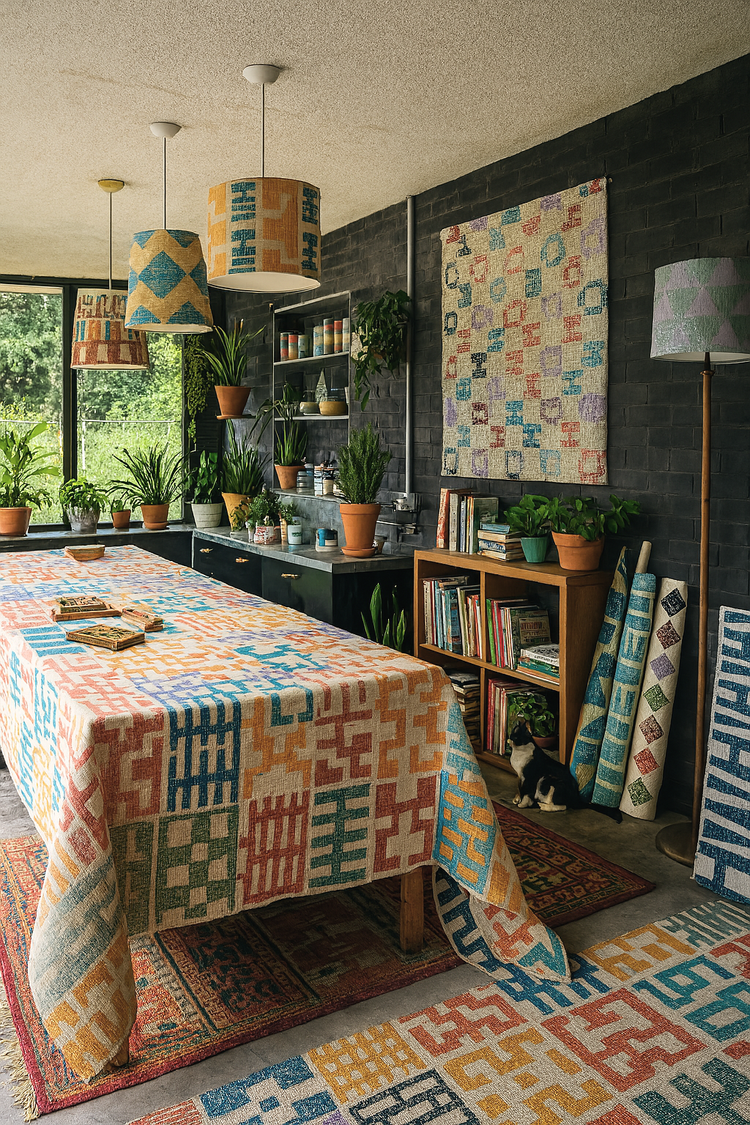
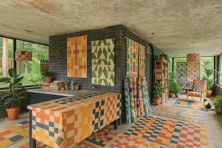
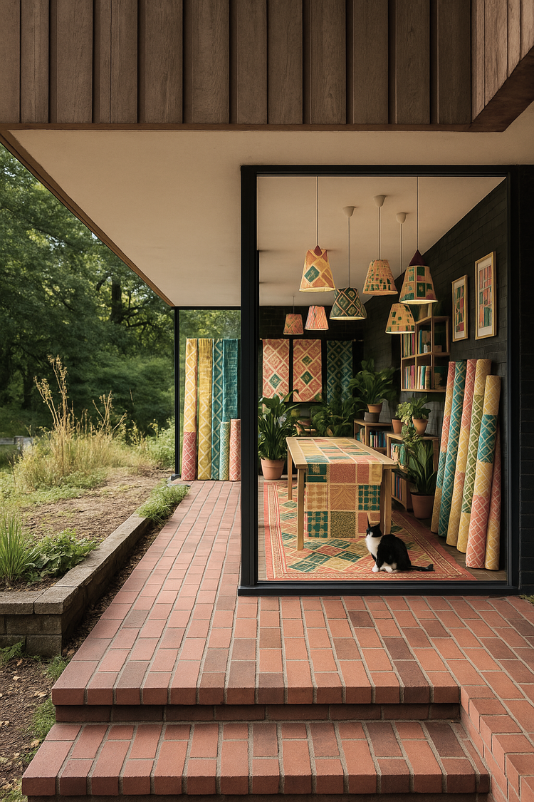
as many of you already know, i visited this building during my university days as part of a project exploring womersley’s work. it left a deep impression, the proportions, the materiality, the quiet authority of its modernist geometry while retaining the human scales and the airy, cantilevered forms that is such a signature style of womersley’s genius.
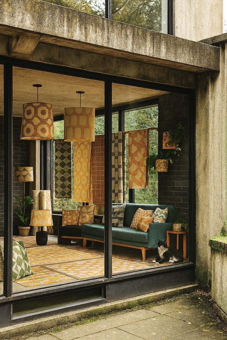
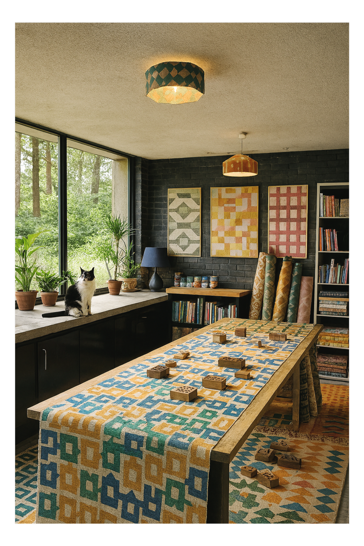
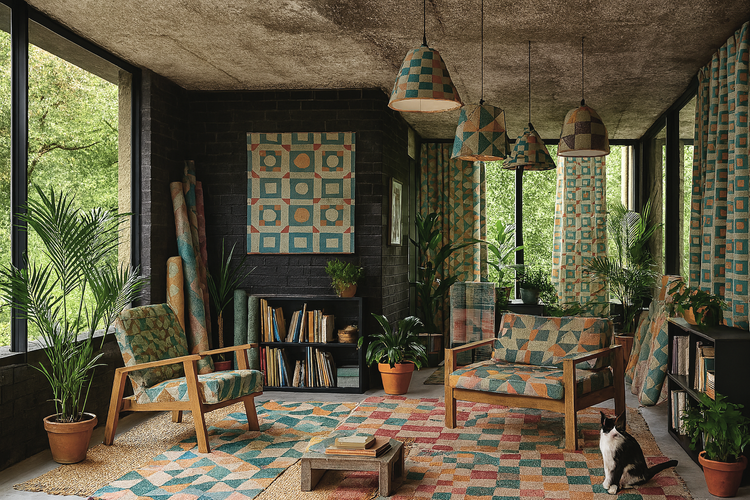
and so, naturally, as a brutalist and modernism-obsessed textile designer, it feels like it’s my duty to fantasise about it a little. so i’ve been daydreaming and i’ve created a series of speculative interior visualisations using AI – don’t shoot me for using it, i know fine well these renders are a not a replacement for reality (some prints really do not resemble zitozza at all and don’t even get me started on the cat..), nor is this a serious, budgeted proposal. it’s just a little bit of fun to put some ideas out to the universe and help stimulate the imagination about the building’s future. (or as the kids would call it, “manifesting”…)
in this parallel universe, the studio is lovingly restored not into an airbnb or a “writer’s retreat” (sorry barnabas calder, love your books but we really can do better here.) so in my head i turned it back into a working textile studio instead. my vision is an idea that is only half-selfish, and it would also contribute to the economy and give back to the scottish borders. i’m obviously thinking about zitozza here, but also a space for creative jobs, education, apprenticeships, and professional development. it could be quite a serious place for the textile industry with not only a space for designing, printing and production but there could also be workshops, residencies and exhibitions – continuing the building’s original purpose and klein’s spirit of thoughtful and considered, sustainable design.
okay, yes, the millions required to make it happen are currently in the realm of fantasy… but hey, everyone tells you that to do well in business you need to dream big so that’s exactly what i’m doing.
so, here’s a (completely unbudgeted) proposal. we don't need more holiday houses – we need permanent homes for making and creativity. modernist ideas - egalitarian notions of simplicity, abstraction and rational proportions - need to make a comeback and become mainstream again. spaces where design isn’t just theorised and talked about but physically made to furnish real spaces. achitecture, at its best, can enable that.
these are my ai generated fantasies, but it’s also a bit of food for thought. and hey, if you don’t have the money but want to keep the dream alive you can always just buy a teatowel… but if you do happen to have a few million pounds to spare and a soft spot for brutalist textile utopias, well, you know where to find me!
***edit: serious news! you can actually donate to bring it back to life, open to the public as a design centre - the bernat klein foundation along with the national trust and the scottish historic buldings trust have joined together in a bid to raise funds to acquire it and you can contribute to the cause.***
today is a special day as this is going to be my first ever post about hungarian brutalism. i’m not entirely sure why i haven’t blogged about anything in my home country before - perhaps the pressure to know more about these buildings than i do is too much! but i guess the time has come to present something cool and exciting and interesting - this is one of the more famous ones and as such, an internationally more accessible and digestable example - that is the OKISZ offices in budapest, hungary.
built between 1971 and 1973, this office complex is located in a particularly leafy pocket of zugló, the 14th disctrict of budapest, almost exclusively surrounded by art nouveau villas and churches. the architect is recordedas jános mónus - who won an ybl-award (a sort of hungarian pritzker prize i guess) for the “high quality fusion of structure, technology and form” demonstrated in this very building. the company was ÁÉTV at the time, the state development company (according to the construction archives, operational from the late 50s until the late 90s) tasked to build public-use buildings for budapest: schools, hospitals and of course, offices - this one to house the countrywide union of small-scale industry bodies (the acronym is the OKISZ in the building name) and i’m really sorry that the language of the economic structures of socialist hungary does not necessarily translate too well to my engllish language readers but hey i’m trying my best!
it is a striking, fine piece of brutalism that understands and seamlessly fits into its environment without losing its character, not trying to be imposing without being too modest. a review from 1984 claims - and i’m paraphrasing somewhat, that “it would have been shameless and impolite to try and compete with its surroundings, however you should also live up to such an environment full of notable buildings” and it does do a remarkable job at that.
it has an exciting elevation of five floors stacked upon each-other in a dynamic, stair-like manner and a somewhat L-shaped plan. the facade continues this rhythm of protruding concrete mullions between the slick windows - for those who love this style it’s a bit of a jackpot i think. i went on a freezing cold january day in thick heavy snowfall - the white contrast it created with the concrete was really eye-catching from a pattern point of view too, but it also somehow emphasised the spatial nature of this building.
obviously, this is a textile designer’s blog, so i’m a layperson when it comes to the ins and outs of the structural geniuses of such architecture, but eye-pleasing proportions are, i think, a universal language that can be appreciated by everyone.
brutalism is also not necessarily inherently minimalist, you can notice fantastic details even outside - but this is also an interior textile blog so i was yearning to go inside. even though i could not (in fact, a security guard came out to check what i was up to outside too, haha!) however as a part of othernity, the hungarian project for the venice biennale for 2021, a series of guided walks by the centre of contemporary architecturewas organised back in 2020, several bloggers and journalists attended taking amazing photos of the inside. it looks very 1970s, cosy and very socialist (every building in my childhood memories has a similar details or typeface i think!) and it also has one of those ever-moving lifts that we call paternoster in hungary.
i’m going to recommend you two of these articles about this walk in 2020, both with brilliant photography - first hype&hyper (if you don’t know them, please get acquainted with this comprehensive cultural quarterly focused on eastern europe.) and also check out the blog post from welovebudapest, with fabulous indoor shots including of the roof terrace.
for the floor plan and elevations, and an interesting drawing on the accompanying furniture design, please see the previously quoted lechner centre article, it’s very insightful! the reason for this many resources available on this particuar building is of coruse the venice biennale project for 2021 - this building was one of the 12 selected to represent the hungarian pavilion. all 12 were focused entirely on this particular era of architecture and architects of our surrounding countries were invited to participate in their re-interpretation.
despite this celebratory re-discovery happening, brutalism in hungary is quite endangered and none of these buildings are under listed status, however many are loved and used and perhaps the attitudes are changing somewhat. after years of the somewhat over-politicised and emotionally fuelled attitudes the architecture of the socialist era in hungary, it’s refreshing to see it getting more appreciated and putting some of these buildings into a more recognised place. i hope to bring you more examples of hungary in the future.
if you liked this blog post, why don’t you subscribe to my monthly newsletter below to be the first to read our latest musings and updates.
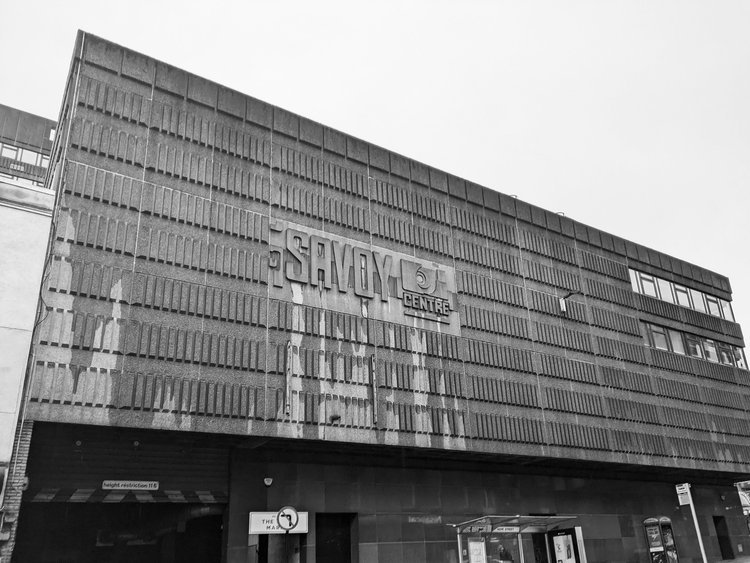
hello again - long time no see and long time without hugging some concrete! this month we finally brought to you TÉGLA, our brand new tileset (after many, many months of work and preparation). these were all inspired by brickworks and facades found on so i want to show you a building with an interesting texture and facade that reflects that inspiration. besides, i think we do deserve a trip now, don’t we? so let’s go on a short but sweet one, just to glasgow - as we’re visiting the savoy centre on sauchiehall street.
quite a striking example example of 1970s brutalism, it was built between ‘71 and ‘79 and designed by gavin paterson & sons, on the ruins of the old savoy theatre. it now consists of a shopping centre complete with an indoor market, and an 11 storey office block.
obviously, the purpose of writing these blog posts is to celebrate these concrete designs and bust thay common myth amongst the naysayers that these are depressing buildings - on a particularly overcast day in the glasgow winter it does unfortunately seem to be a bit of a task. rain-soaked or not though, the building has an impressive, exciting looking elevation walking up on hope street (connecting sauchiehall street and renfrew street.)
the glasgow weather must have been considered as the concrete clad facade is somewhat protruding, offering a bit of a shelter above head-hight. the cladding features a concrete pattern of narrow vertical rectangles, with a beautiful relief of the centre’s logo (in a typographic design of what i assume must have been, or perhaps inspired by the original 1910s theatre’s.) this logo repeats on the renfrew street side too, painted in blue - a fresh touch of colour amongst the imposing concrete.
the protection from the elements continues as there is a fully sheltered footbridge connecting the north side of renfrew street - taking you right to the first floor of the building. i did not manage to get inside, however i’m told it’s been refurbished and there are plans to further regenerate - not without controversy. you can follow this excellent and insightful timeline from glasgow heritage (who do happen to run a brutalism-related exhibition at the merchant city as well!)
the 11-floor office blocks towers above the more horizontally laying front of the building - the neatly arranged windows do make inspiring patterns (you might discover them on our printed goodies i’m sure!) - it’s a beautiful and interesting building that makes its surroundings a little bit more exciting.
if you enjoyed this trip, go visit yourself and join us on our next trip - subscribe to our newsletter below.