england

ARCHITECTURAL HERITAGE, ARCHITECTURE, BRUTALISM, INSPIRATION

the barbican estate, london

as we are cracking on with 2024, i’ve decided that of the many architectural inspiration series we planned, it’s probably best to tackle the beast first and share some images and thoughts of the barbican estate in london. i’m calling it a beast because it’s an enormous, expensive and very well-known icon of british brutalism. for this seasoned concrete-hugger, it then makes no sense to keep postponing this blog post any further (especially as our rug already exits and more stuff might come soon…), so do come with us to explore the place from a textile designer’s perspective.

i guess everyone somewhat interested in brutalism knows some of the basic facts - designed on a 35-acre ww2 bombsite by chamberlin, powell & bon for the corporation of the city of london, it opened its first flats in 1969 but the completion of the construction only really finished in the late 1970s, after a long and expensive process and it is now home to approx 4000 people in 2000 flats. of course the uniqueness of the estate comes from the fact that unlike many other brutalist projects in the uk, it was not built for social housing and the architects were not held by the typical council budget restraints -which resulted in one of the most free and complete architectural visions, achieved by some extremely time consuming and labour intensive processes.

if you want to know about these in more detail, my first recommendation is raw concrete by barnabas calder. quite early on in the book, he has a brilliant chapter about the barbican, with some focus on the social context around it, from conception throughout the whole of the construction process which makes for a very informative and interesting read as it touches on some of the tensions throughout the whole process of building it. he provides an important angle that does not often get mentioned on design blogs like these, as we tend to get lost in the form and the aesthetics - with good reason of course, but without context it would become rather meaningless.

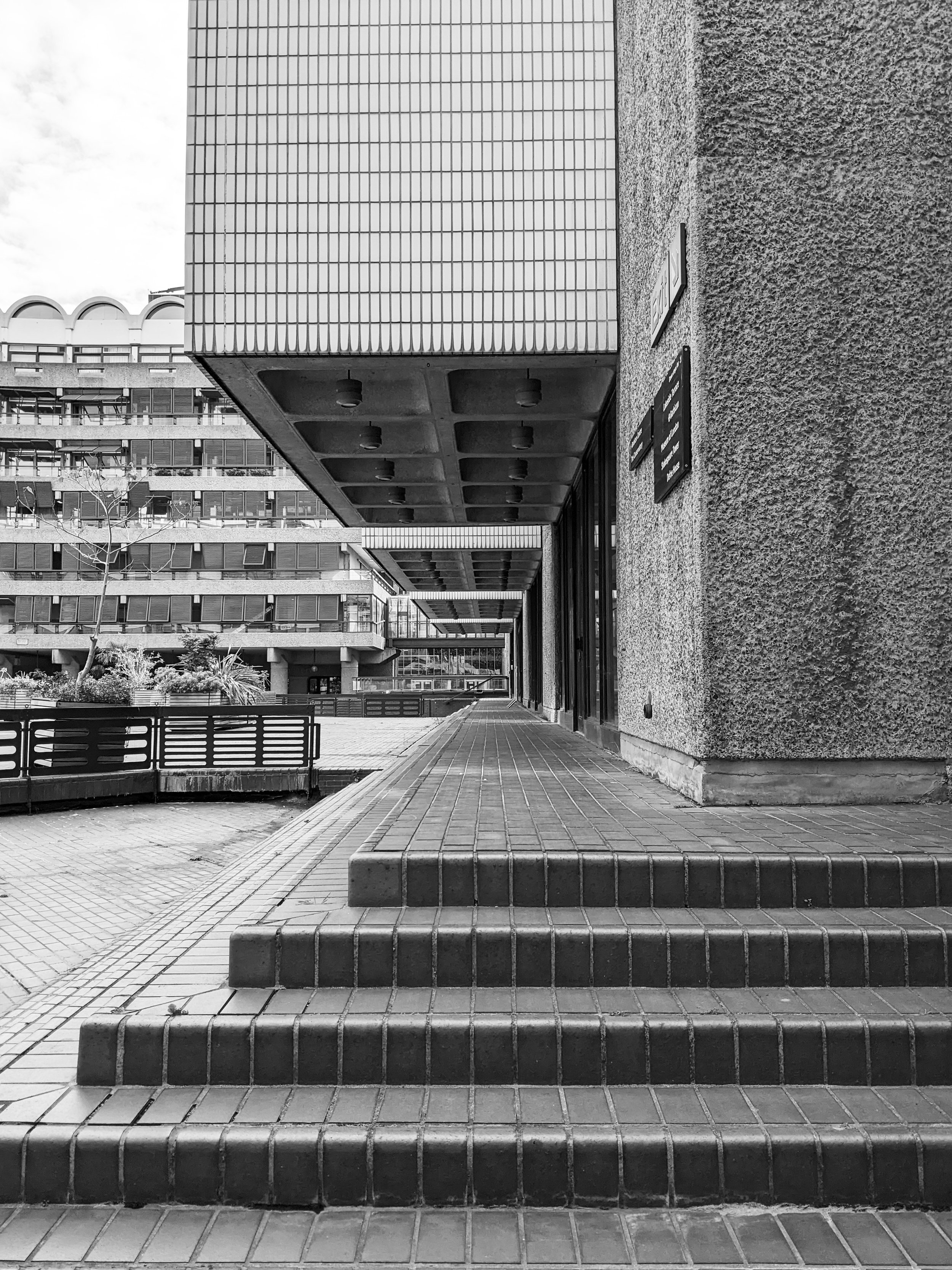
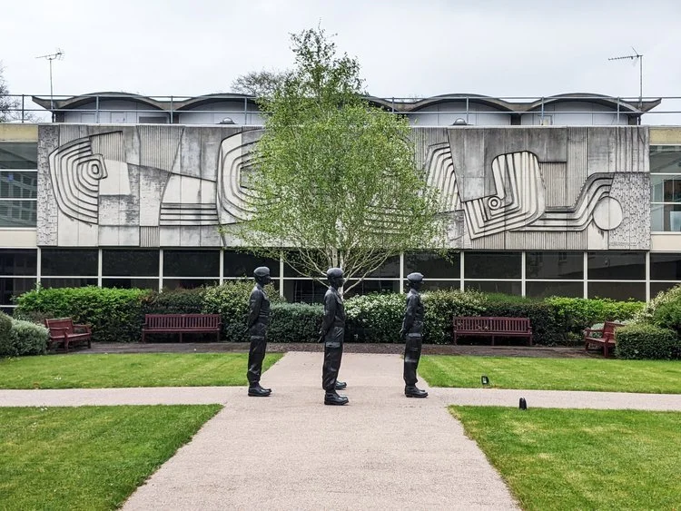
i first visited a couple of years ago and the first thing that really affected my perception was its sheer scale. of course it is at this enormous scale that these visions for the order of forms work the best, and i think this is why it’s such a brutalist mecca here, the complete, intact and vast system of space. i don’t exactly know where my search for a geometric order comes from, all i know is that the deceptively monotonous facade of the terraced blocks (arranged in neat squares of course) gives me a sense of enclosed cosiness and open clarity at the same time. in every one of these blog posts i’m attempting to describe this feeling but it’s so hard to explain - there is just this sense of calm that i only find in places such as this.

the three 42-floor tall tower blocks bring some exciting angles with a lean, triangular layout and column of balconies tightly stacked into the sky. of course, the repeating geometric forms serve a textile pattern designer well. it really helps that i visited on a sunny day and the shadows projected on the surfaces aid the imagination in reducing these sharp angles to two-dimensional shapes. but the surface itself, the slate and hammered concrete texture that really is on every surface, is equally important - i always say that i want the weave of my cloth to resemble the raw concrete itself, and the pattern to play with the form.

to explore a bit more about the material and the techy bits of the architecture, my second recommendation is my favourite podcast series, about buildings and cities - they have a brilliant episode about the estate, touching on some of these details of the surfaces too as they take you on a journey around the estate. they’re much better suited to explore a more architectural angle than i’d ever be able to so do have a listen to it.

what i found the most surprising about it that it was a lot less grey than i imagined - of course, the concrete surfaces are raw and beautifully grey, and the shapes and forms are varied and playful, but the pavements are tiled with maroon bricks all over, and the ponds with the surrounding greenery reflect with a very strong teal and green everywhere. it is surprisingly colourful and stimulating in its order, the “oasis” comparisons do seem to be very fitting - not in small part due to the tropical garden accessible to residents only.

but we can’t quite go away of course without stepping foot in the arts centre, home to a concert hall, cinema and exhibition halls amongst others. seeing how the columns and the concrete coffered ceilings repeat and continue inside is an exciting exploration that i really enjoyed even if some of might not work that well today or may be in need of renovation.

for the last recommendation, i want to bring you an article from the rics blog, as it’s quite fresh and talks a bit about some of the repairs as well as bringing you some amazing pictures that hopefully will inspire you to appreciate it if you haven’t visited already - and if you have, i hope you’ll now see it from a surface pattern design angle too.

if you liked this trip, you can subscribe to our newsletter below - we’re only sending these monthly with a free downloadable graphic print, and you’ll always be amongst the first to notify of a new architectural journey, or new prints inspired by them.

-

links:

raw concrete: the beauty of brutalism, barnabas calder, 2016, penguin books, london - purchase link to the barbican shop

establishment brutalism: the barbican estate, about buildings and cities ep 4, 2021 - youtube link to episode.

brutal or beautiful? the barbican estate, matthew williams, 2023, modus/rics - link to article on rics.org

the barbican arts centre website

city of london corporation website

DESIGN CONVERSATIONS, BEHIND THE SCENES, INSPIRATION, TEXTILE INDUSTRY

in conversation with jessica clements of JESS ANNE

my oh my, it’s been a while since we had a good, deep design conversation hasn’t it! the talent of course has always been there and shining, but we now finally had the time as well, to meet some and explore their fabulous work. i’m very excited to introduce jessica clements of JESS ANNE today. she is a woven textile designer whose gorgeous works, with incredibly bold and bright colourways caught my eye immediately, and we’ve gone into process, materials and inspiration to bring her vibrant textiles closer to you.

ZITA: hi jess! first things first - could you say a few words about yourself, what you do and how you got there?

JESS: of course! so hello everyone my name is jessica, i’m 26 years old and live in broadstairs in kent and i’m the founder of JESS ANNE! i started my brand in 2019, just before the pandemic and i really wanted to create a brand that explores woven cloth featuring bright colours that spark joy!

ZITA: and it’s working i think! the first thing that really catches the eye about your work i think are your vibrant colourways! i just love the high contrasts and the neons so much. could you share a little bit about the thoughts that go into putting your wonderful schemes together?

JESS: it’s hard to explain but typically i don’t have a source of inspiration as such, it’s more of a feeling that i have. when i look at colours i don’t tend to think of trends or “what’s in”. i tend to think do they spark anything within me, do these colours remind me of a pleasant memory or place, or do they make me feel like if i wore those colours, i would feel confident? pretty? bold? i just sense my way through the colour choices rather then trying to have an elaborate explanation behind them. if the colours feel right, it feels right! obviously, every individual will have different tastes or opinions on style, however, the colours i choose express who i am as a designer and just as a human being!

ZITA: as a fellow pattern lover, i find weaving – and your particularly geometric patterns fascinating, i guess weaving is very “mathematical”. can you explain a little bit about the process of designing your patterns? what does it look like when one of your colourful patterns come together – is it a long chain of trials and errors, or do you nail it most of the time?

JESS: so, weaving is definitely not for those who don’t enjoy maths. weaving is one of those processes where accuracy and maths is everything and could make or break a pattern or even the physical cloth. when i begin my design process i always start with the colours (obvs!). from there, i tend to experiment with whatever i feel like i need to personally conquer as a weaver who is always trying to progress. as i’ve said before i’m not too driven by trend or styles, but much rather just expressing who i am as a designer and where i am in my personal development as a young creative. the geometric patterns was a real test for me! however it was one I wanted to conquer and prove that i can push my limits (and my own confidence!). when developing a design, the maths has to be spot on, and the maths can shift/change depending on the types of yarns and patterns chosen. i experiment with smaller samples first, writing every calculation to make sure I have the right amount of yarn ends and that i’m using the correct size of equipment such as the reed for the cloth i desire.

it’s definitely a trial and error thing! i wish i could say i nailed it on the head every time but that wouldn’t be true. sometimes yarns do not want to cooperate, even if you double checked every calculation and detail. sometimes, even the smallest of details overlooked can dramatically change the look and feel of the cloth. however, once the sample is nailed and its something that i feel proud to put my name too, i would then expand on this sample to create a range of products!

ZITA: what a fascinating process. i find the abstract nature of your work very interesting – i particularly love your woven artworks, it’s like you deconstructed your own craft into something else, something a bit more abstract, they feel quite architectural to me but also remind me of op-art a little bit. can you share a few thoughts about these pieces?

JESS: oh the card windings! i love these little pieces. when studying, we were taught that these card windings were used initially as just a development stage, to try out colourways and warp patterns. however, I started to expand on these using different shapes of card and found they deserved to be mini pieces of art in their own right! carefully hand wrapping card with desired colours in any order?! who wouldn’t?! i think the woven structure will always have an element of being architecturally inspired because the typical woven form relies so heavily on being constructed in a way that it will structurally hold together! not only do they help inform the woven cloth designs but they create such dynamic little studies that are interesting enough to want to hang on the wall!

ZITA: i think they work brilliantly, i really love them. now, let’s talk materials! what kind of materials do you work with – do you mix them often, or do you stick to one or two that works? what works?

JESS: oh good one. i’m a typical creature of habit, however as i’ve been designing, i’ve been trying my hardest to break free from my comfort zones. i tend to weave mainly with lambswool, however, in my most recent collection i have really been trying to expand on my products and offer lighter alternatives to the heavier & warmer wools and been experimenting with cotton/linen blends. i tend to use cottons for my card windings and happen to find myself using these now in my newer designs as a supplementary yarn. i’m hoping the more i evolve as a designer, the more i will be adventurous and try more yarns! eek!

ZITA: have you found that sustainability and ethical sourcing has become more of a point with your customers as well as in your supply chain? how do you find this – have you always worked with such materials?

JESS: i think by now most consumers are concerned with the environment, as they should be! it’s so important for people to realise the impact the textile industry has on the environment, and this should definitely be more integrated into our buying habits. as an independent designer and so early on in my journey, i handweave all of my designs, eliminating the risk of buying into any sort of sub par factory conditions or any sort of exploitation (although, it’s of my understanding now these regulations are in place and finally the textile world is shifting into a much more ethical way of producing). the yarns i order are from smaller independent shops in the UK, who also do their own background investigations into where they source their yarns. the company that i purchase my lambswool from and the cottons are very transparent in their processes which makes the selection process much easier. it’s so difficult to navigate through the world of industry, however, i remain conscious of my purchases and in the future when i have built up my brand, i strive to be a designer who is part of the ever so important sustainability movement.

ZITA: i think it’s growing really quite fast, nearly all designers i know are now considering this. i got to know you as a fellow participant of a new TV Show and you’ve also been through some thorough mentoring and an intensive development process i guess! how has it been for you in the last few months? without any spoilers, can you share a little bit about how you have developed your work and maybe about some of the new pieces?

JESS: so the show really helped me become who I am today in just a short amount of time! the mentoring was pretty intense to say the least and it was difficult at times to break old habits and ways of thinking, but it was exactly what I needed to tap in to the potential for my woven designs! before filming i lacked confidence and found my development of designing was very slow, as i was always very nervous of trying new patterns/yarn in case they didn’t work out (yes, i am one of those people that if i don’t nail it first time, i get very frustrated!) however the mentoring on the show really helped me overcome that fear and removed the barrier between me as a designer and creating much more statement designs. the designs that will feature in the show really came from a place of needing to push my own boundaries rather then a specific source of inspiration. i view this collection as a natural progression from my previous broadstairs project and i think there something really lovely about my projects linking this way.

ZITA: this is very exciting and i can’t wait to see al this progress on TV soon. development is an interesting process, have you found any new sources of inspiration? where do you normally go to or look to? have you found it’s changed lately?

JESS: i think my design process and sources of inspiration changes almost constantly. as my practice and skills develop and as i continue to design, i find my inspiration shifts so frequently that’s its hard to even keep up with myself! i was inspired mostly by nature and my surroundings in my home town, however i found that more recently my work is more inspired by my own feelings and the feeling i wanted to provoke in people if they were to wear my design. i’m starting to really explore how fabric design and colour combinations can provoke different emotions.  

ZITA: fascinating! and where do you want to see your work most? what’s your dearest ambition, where do you want to take your work next?

JESS: i would absolutely adore to see my brand grow and eventually develop into a fashion brand. the dream has always been to see my fabrics on garments such as beautiful, tailored suits and dresses and feature in glossy magazines (i think most designers have this day dream!), TV, instagram… and just generally see my work being used by all over the world! the sky is the limit!

ZITA: yeah, you go girl! and now the question i ask from everyone - can you recommend a book? or an artist or a maker whose work is worth looking into? something or someone that keeps you thinking forward?

JESS: oh my goodness there’s so many artists and designers that inspire me from across the board i couldn’t possibly narrow It down! there’s so many amazing weavers out there such as margo selby, ptolemy mann, rita parniczky, theo rooden… the list is endless! i think any of these artist would be good start if you wanted to understand more about woven design and what is possible!

ZITA: and lastly but most importantly, where can we see your work next?

JESS: so as i’m typing this i have no current exhibitions or markets coming up, however my products are available through my website and i welcome emails or instagram DMs enquiring to commission or purchase. i’m currently still in the process of re-branding and re developing my website and i’m communicating with smaller retailers about becoming stockists. exciting! ahh!

ZITA: sounds like you have a lot on your plate, but i’m sure it will work out. thanks so much for talking with me!

-

Links:

JESS ANNE website

JESS ANNE instagram

‘make it at market(BBC media centre website)

margo selby website

ptolemy mann (crafts council website)

rita parniczky (saatchi art website)

theo rooden website

ARCHITECTURE, ARCHITECTURAL HERITAGE, BRUTALISM, INSPIRATION

a brutalist stop - forton services

well, it’s been another long pause between blog posts, but it’s not been forgotten, only postponed, due to, uhm, general life happening at a pace, i guess. but when things get busy and exhausting, there comes the need to take a break and go somewhere else to recharge. so let’s take a road trip. let’s go, from scotland, to somewhere nice in the sunny south of great britain. anywhere. if you like going fast, you’ll take the motorway, the m6. it’s not the most scenic of routes, so it gets monotonous, and since tiredness can kill, there will be a time to take a break. and there, you’ll eventually come across a fabulous concrete tower emerging in the landscape with a futuristic footbridge arching over the motorway, and suddenly you feel compelled to indicate your exit to spend some time in this fascinating piece of architecture - we’ve arrived to forton services!

i have always been obsessed with logistics. the excitement of things and people moving never gets boring, and the systems that make it all work are fascinating pieces of engineering - seemingly everything and everyone in it has its place and function, a well oiled machine itself that can take care of millions of people and things getting where they are meant to be when they are meant to be. but while the architecture that serves this system has to be purely functional, for curious travellers who are excited to be somewhere new soon, the associations fill all of this functional stuff with positive meanings, the typefaces on vans and reg plates, the smell of the handwash soap, the hot touch of the disposable coffee cup are all symbols of the anticipation of getting there. so from this point of view, a well designed, interesting motorway station is a piece of happiness on earth, and for someone who makes textile prints of road signs, is somehow a piece of inspiration too - doubly so if it’s brutalist of course!

forton services today belongs to the moto bk chain, and you’ll find it on the m6 between junction 32 and 33. it opened in 1965, and according to SOSbrutalism, the designers were bill galloway and ray anderson of the architecture firm tp bennett and son. (yes, that’s of the same thomas bennett of the saville theatre, amongst other things - today they do a lot of interesting commercial projects - totally worth a look!)

there are some two-storey buildings on both sides of the motorway with restaurants and cafes, connected by a high-tech looking footbridge forming a light arch over the motorway. to walk across it is a great exercise to stretch the legs a little and the eyes to the distance too. the timber ceiling panels of the inside of the bridge somehow creates a very nostalgic mood in the warmth of this texture reflecting the light directly below it. that just further excites about the travel - i’m not sure how materials do it but’s definitely the timber. the tunnel view of the inside of the bridge has an octagonal frame with the joins at each window panel cutting your corners diagonally. the outside view of course is the endless motorway and the crowds of cars going somewhere.

of course, it’s most distinctive point is the pennine tower, emerging from the landscape on the northbound side with its cantilevered hexagon at the top. it used to be some accommodation and a restaurant - this blog has some archive images of the fabulous decor in its full glory (as well as the whole structure when it was pristine white!) it reminds me of the early decor of the UFO bridge in bratislava a little bit (more of that in another blog post i think…) and i would have loved to enjoy a meal there, the views across then countryside must have been breathtaking on a sunny day.

unfortunately due to the strict fire regulations, it is now closed to the general public and it is now grade II listed, even though it might be hard work to re-open it.

it was intentionally designed to resemble an airport’s traffic control tower and that all i can feel is the anticipation of getting somewhere, perhaps it’s succeeded in its job. it is a cliché to say that we must enjoy the journey as much as the destination, but in the case of how motorway stations ought to be, there is definitely truth in it!

and if you enjoyed this journey, come with us next time to another architectural visit (and until then, subscribe to our newsletter in order not to miss it!) see you next time - and don’t forget, tiredness can kill, take a break.

-

links:

SOSbrutalism

forton services blog

tp bennett

TEXTILE INDUSTRY, WORK IN PROGRESS

zitozza coming to handmade oxford!

hello! this is just a short announcement but a very, very exciting one: zitozza is now coming to handmade oxford, a 4-day festival of arts and crafts, taking place between 23rd june till 26th june at waterperry gardens in oxfordshire, organised by handmade in britain.

it’s a very special opportunity for us to meet a new crowd of interested buyers and clients, so we are preparing to launch some new collections for this. it feels really amazing to be included in the line-up with so many talented makers from all over the UK, so we’re working on making a good impression there! we are incredibly busy growing our product range and develop new surface pattern designs, it will all be worth the wait and we really look forward to debuting there! you can buy your tickets here and we hope to see you there soon!

ARCHITECTURE, ARCHITECTURAL HERITAGE, BRUTALISM, INSPIRATION

county hall, leicestershire

hello again - long time no see, in an architectural regard at least we haven’t really been able to publish a new post for a while. that’s all about to change as we have visited a few more sites and we’re keen to show you all the photos in several posts coming (as one-off episodes probably, so no more series for now.)

let’s start with the best - the building of leicestershire county council, also known as county hall. it is hiding behind leafy greens in glenfield, on the outskirts of leicester, next to the A50 leading into the city centre. it was built in 1967 and has been used as the county council headquarters since then. names are hard to find, but it was designed by the council’s own in-house architectural team - the RIBA picture database names the architect as thomas locke and the council’s architectural office.

seen from the road, the building emerges slowly from behind the lush trees, showing off its sleek facade. it is only by going closer where the site reveals its enormity - it expands across a huge field, many council departments are located here - but the layout is clear, spatious and airy. from the front, the slightly concave arches on the window frames remind me of a japanese pagoda towering above extending ground floors and an elevated wing standing on v-shaped legs that frame the green view below.

going under these we find a leafy court surrounded by shiny office windows, revealing a cast concrete mural of antony hollaway that depicts the river soar. his style reminds me of the town artists in the new towns of scotland, particularly the art of david harding in glenrothes.

in the centre of the court, there is also an armed forces memorial, added in 2012 titled ‘stand easy’ by kenny hunter - it’s a group of 1:1 life-size sculptures of young personnel. apart from being meaningful piece of art, somehow their placement in the centre also helps reveal the deeply human scale of the surrounding building and how the architects thought about the proportions - you get an inviting, peaceful sense of place here.

there are so many interesting and thoughtful details - the lightwell in the corridor roof above each window section (presumably to maximise the natural light inside) is not just functional but creates a slick, interesting spatial play - it’s a shame the day was not that sunny, i would have loved to see the shadows it creates. the extensive use of glazing overall did make me wonder about the light inside too.

on the left of the tower, there is a relief pattern in the arcade ceiling - here there are two small stairwells that lead to the outer end of this elevated corridor - from here you can take in a nice view of further out of the town, and what i presumed were fountains (i wish they were working that day.) it’s a really beautiful building and i’m happy to see it loved, maintained and functioning as it was intended to - i was not the only photographer on site on the day of my visit indeed!

it is in a remarkably good state compared to many other buildings of the same era i visited and it makes me slightly suspicious that a state of neglect in the case of brutalism could be in some cases a conscious or semi-conscious decision, to have these buildings replaced rather than renovated. but i’m glad that i managed to find one that’s working as it was intended to.

i hope you enjoyed this short visit, there are plans to travel to get out of scotland more often - subscribe to our newsletter to be the first to read about them here! take care.

-

links

vintage documents reveal original county hall plans (leicestershire council website, 28 november 2017)

go behind the scenes at county hall as bosses give the mercury access to off-limits areas (leicester mercury, by dan martin, 5 november 2017)