so, with the clocks going back and the days getting darker, i chose a timely topic for our october blog post. some if you might know this about me but i used to live in the netherlands for a bit - the design culture of the country is just exceptional so i might bring more examples later. but there is a little fascination as well with the dutch word gezellig as it has become one of those untranslatable design-world favourites. it turns up in lifestyle pages, pinterest captions and café menus, usually next to fairy lights and hot chocolates. but like most cultural imports, it’s been flattened in translation.
so what it is then? because gezellig is not “cosy”, not entirely. ask a dutch person what gezellig means and they might talk about a social setting, a place or a moment shared, an evening, a conversation. something that feels just right, with the right companionship. it is not a design term although the somewhat related “hygge” was hijacked much the same way by interior lovers so we can think about this from that spatial perspective too. in that sense, you could see it as being surrounded with a pleasant atmosphere. this is always going to be coming from the company you enjoy but also being enclosed in a space you feel comfortable in - and it is this design sense we’re talking about today.
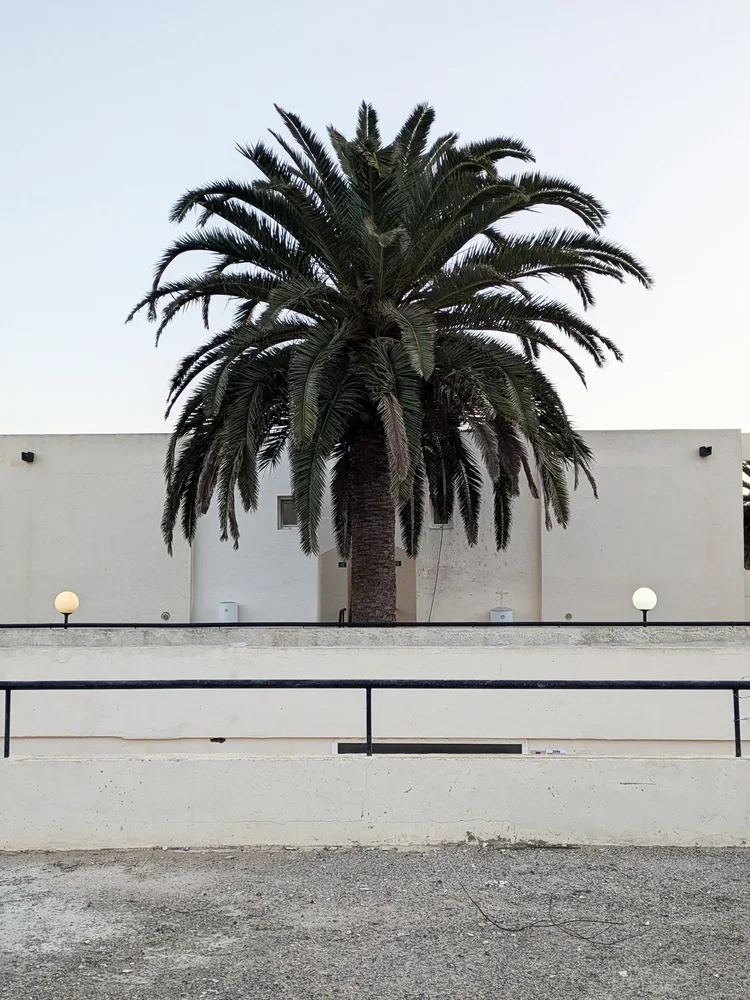
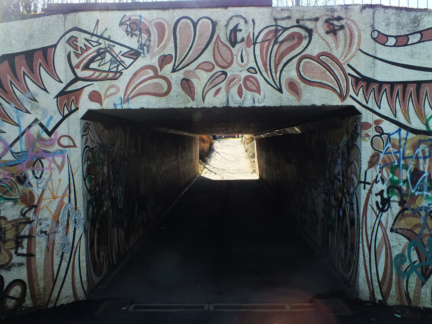
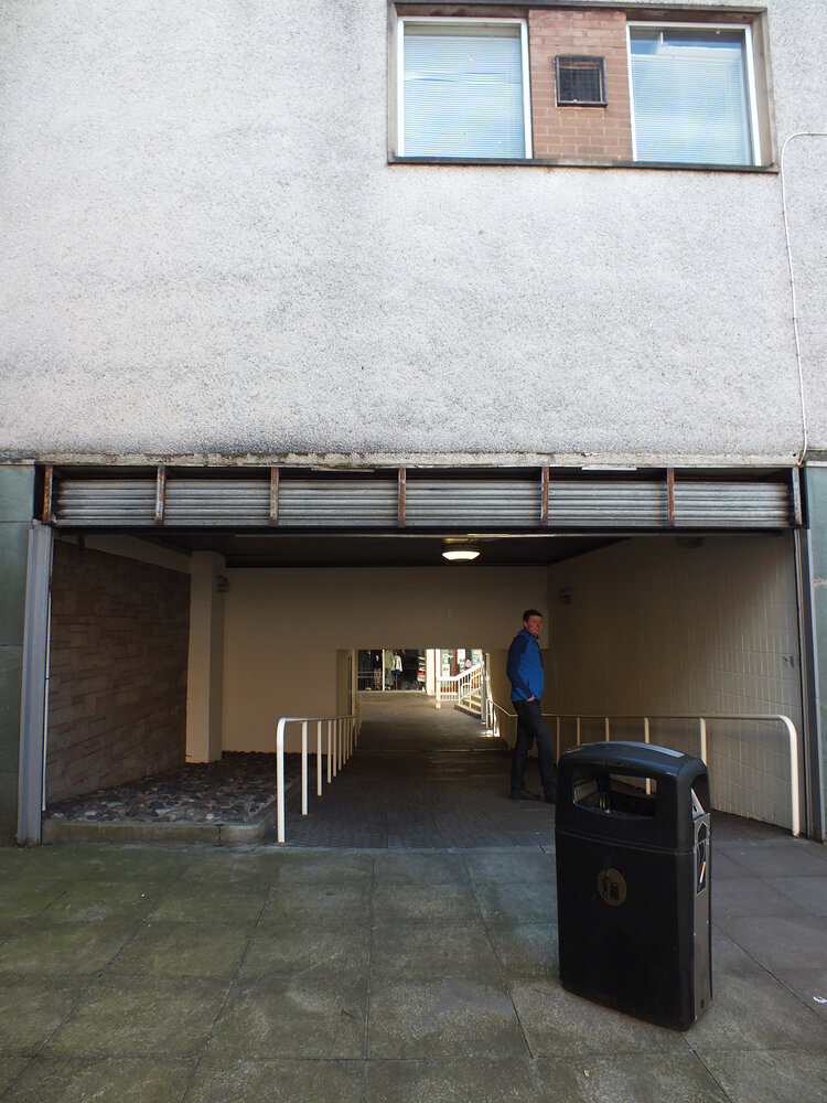
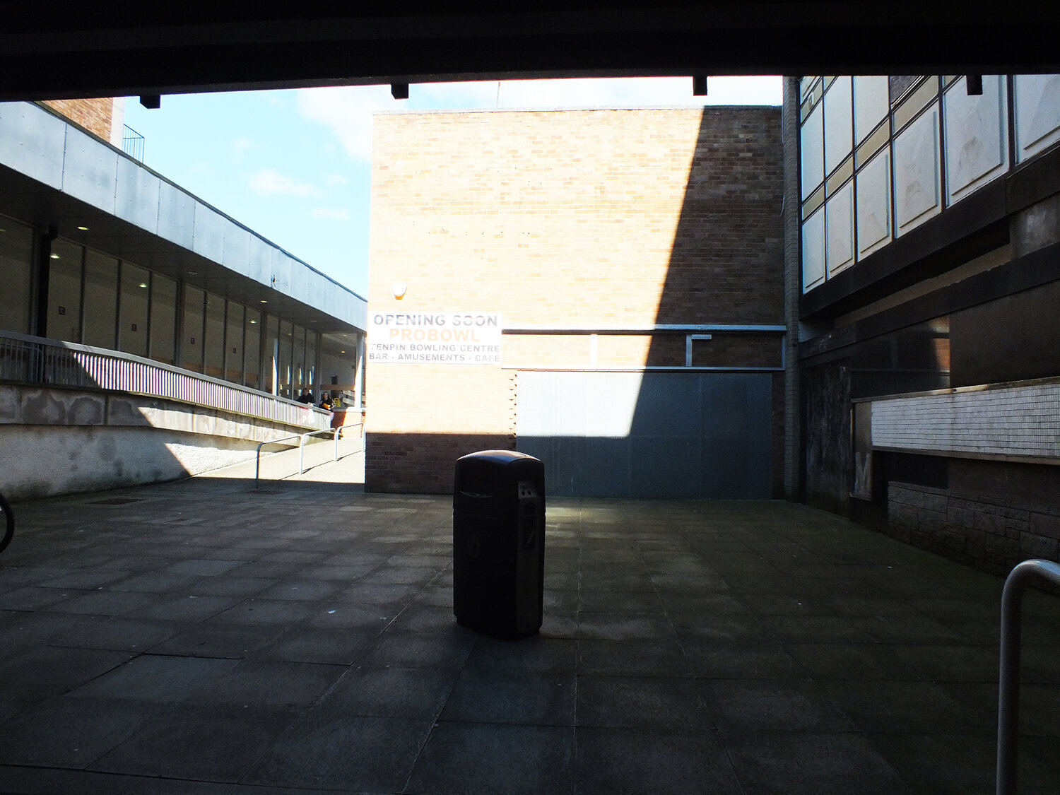
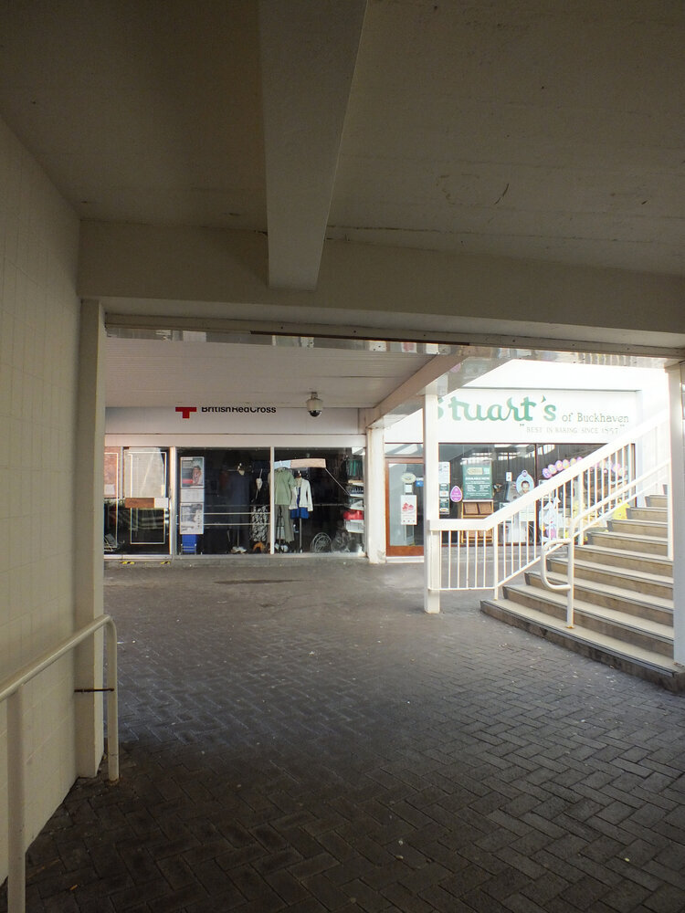
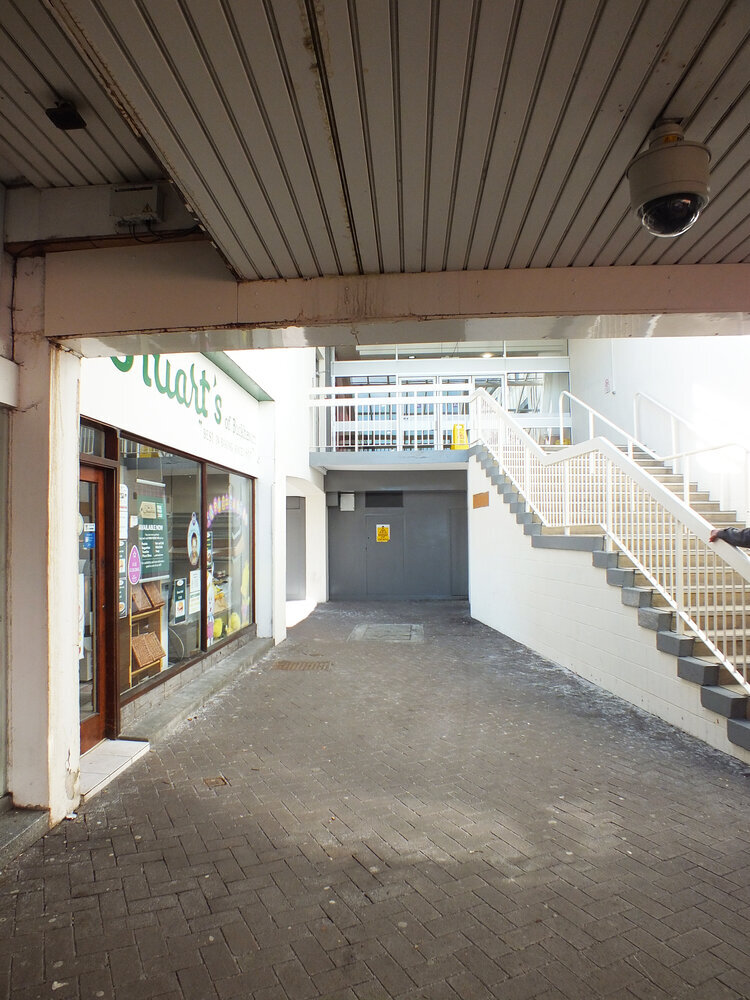
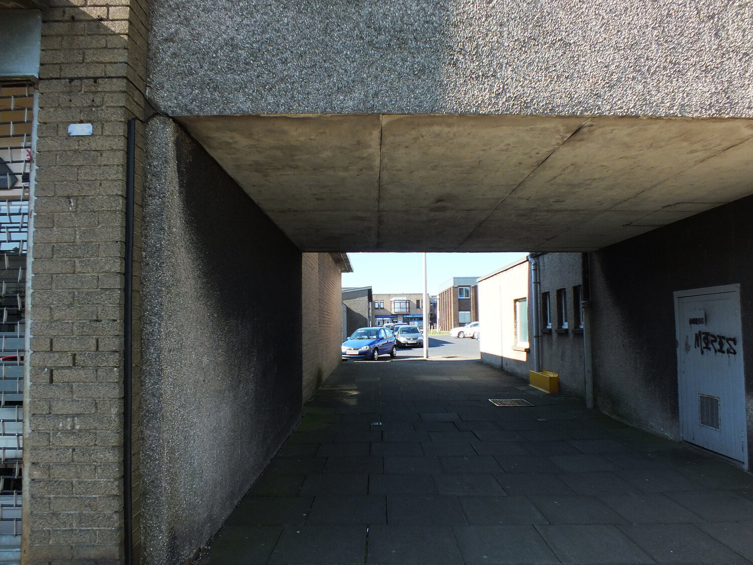
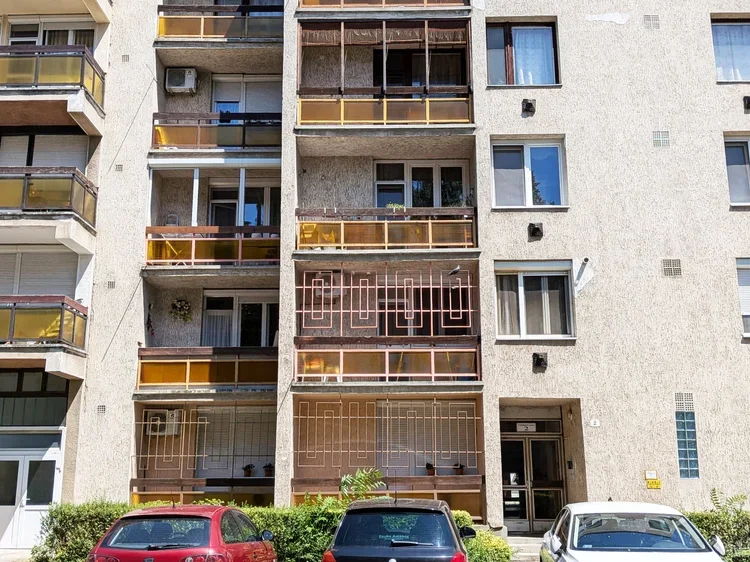
a spontaneous communal space for sharing evening moments with neighbours - haarlem (photo by zita)
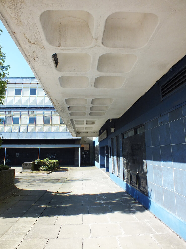
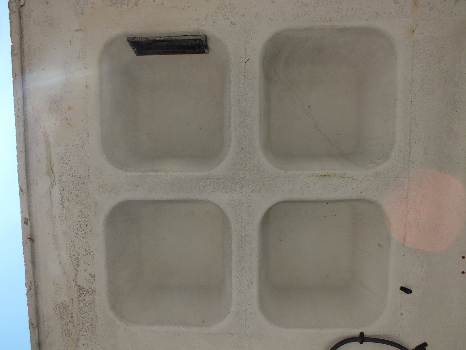
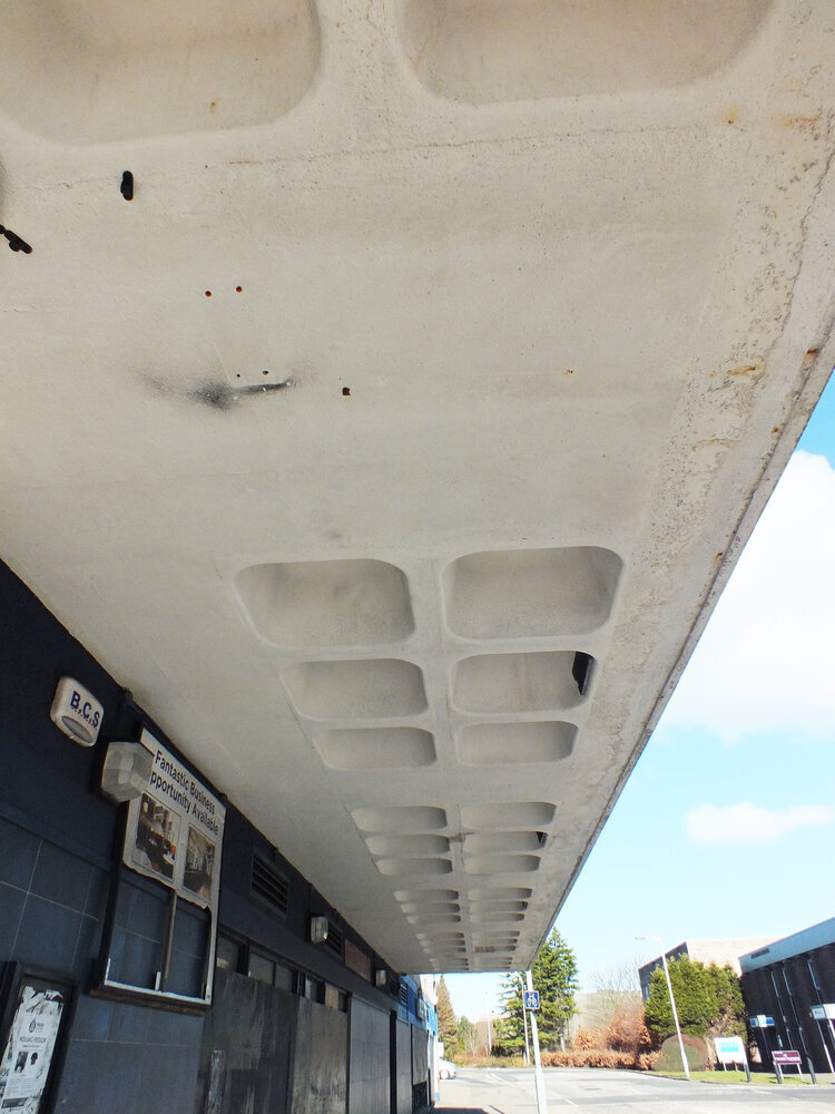
in that kind of hijacked-by-design sense, gezellig is as down to proportion as well as sentiment. it’s the pleasure of spatial logic functioning well - which explains why it appears so naturally in dutch design. you can think of the quiet, picturesque side streets off the main canals, but it’s a concept modernists take on too. think about gerrit rietveld’s schröder house, where planes slide and pivot to create a sense of adaptable intimacy. or, if you prefer a touch of the post-modern and you’re not afraid of a bit of the old cliché, you can also consider piet blom’s cube houses in rotterdam, which literally tilt domestic space into new geometries - but still feel surprisingly humane. these are environments that invite curiosity and domesticity at the same time.
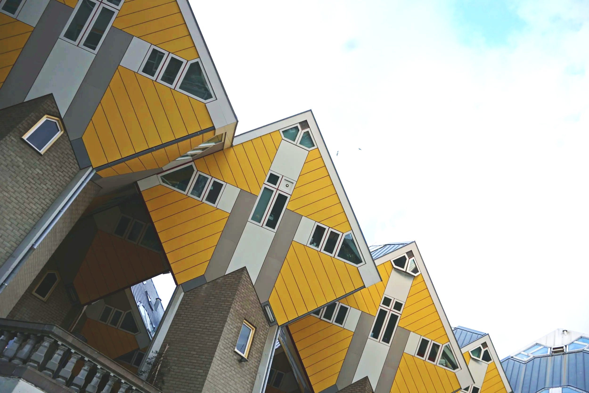
the kubuswoningen in rotterdam (photo by zita)
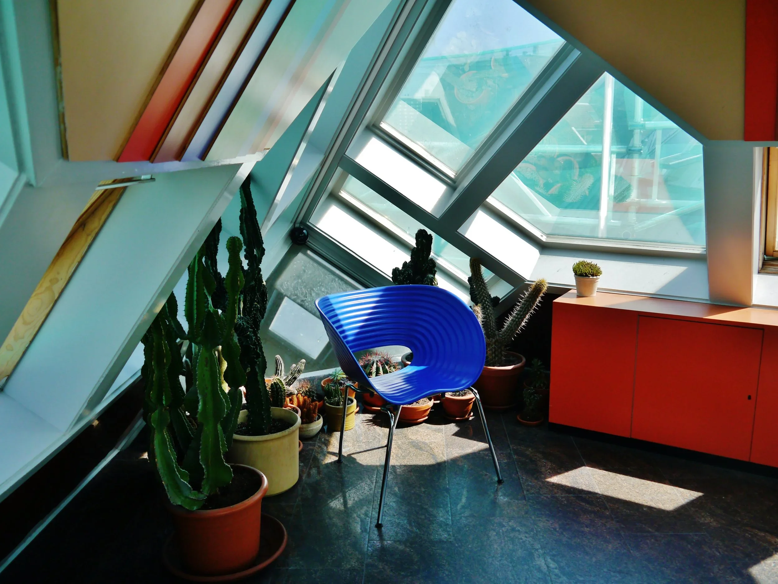
an interior scene in the kijk kubus (source: wikimedia commons)
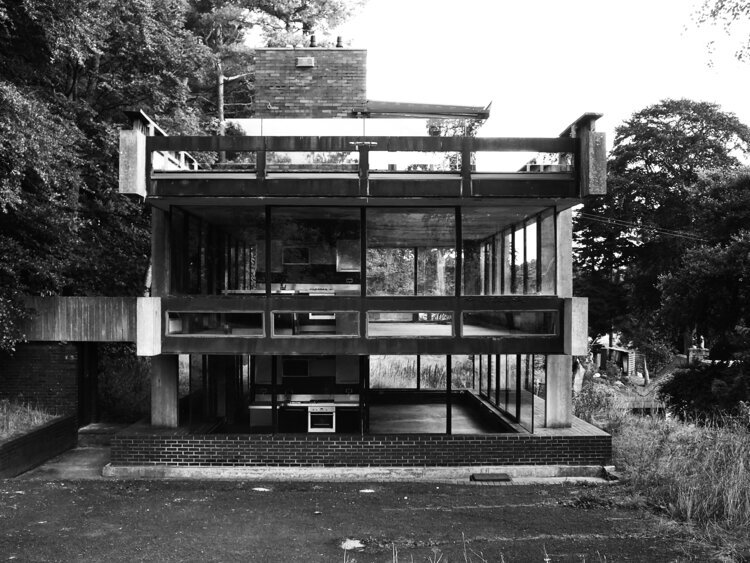
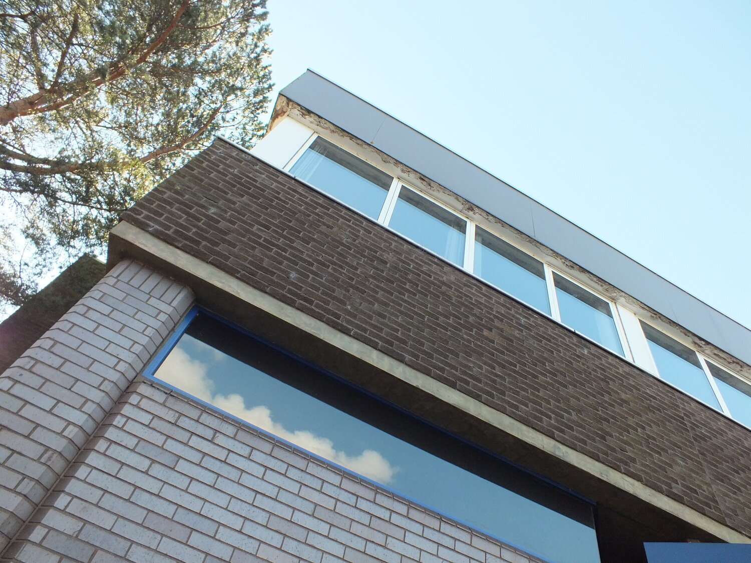
the cultural reading of modernism has long painted it as cold, austere, emotionless and rational. yet many dutch and also nordic designers work from the opposite principle: that good order is itself empathy. a well-proportioned chair, a clear grid, a balanced room: these are not emotional voids, but frameworks for care and joy. if form follows function, and the function is living well, then it is good design.
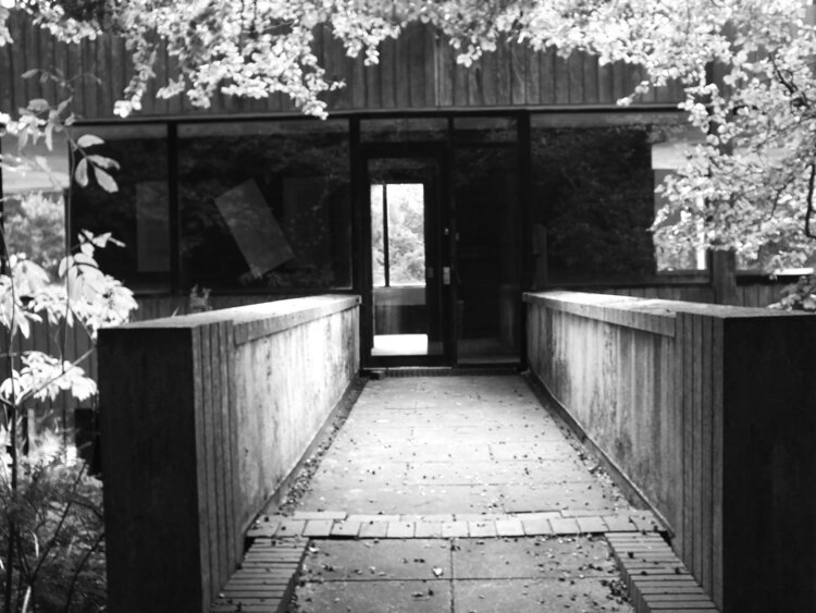
in that sense then, a modernist space can feel completely “gezellig” (even though it isn’t inherently a design term and much less a decorating one.) yet, if you are surrounded by order in the right proportions, with room for the right company around you, you can completely feel this way.
we like to think warmth comes from softness — fabrics, string lights, cushions — but gezelligheid is rarely about clutter. it’s material honesty that makes a space feel grounded, and room for those shared moments.
this is where gezellig quietly overlaps with what i sometimes call cosy rationality in my love for modernism, and also my textiles. zitozza patterns begin with logic: a block, a grid, a plan. but through touch, repetition and imperfection, they turn structure into atmosphere. the pattern is so much more than surface decoration; it’s rhythm and proportion given a physical surface.
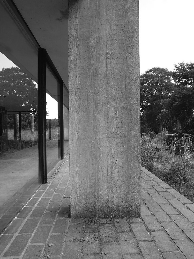
modernism understands this perfectly. warmth is achieved through light and material rather than ornament — brick, textile, tiles, all exist to give room to inhabit, rather than overwhelm. it’s why concrete in the right context can feel as gezellig as oak.
comfort in modernism - békéscsaba, hungary (photo by zita)
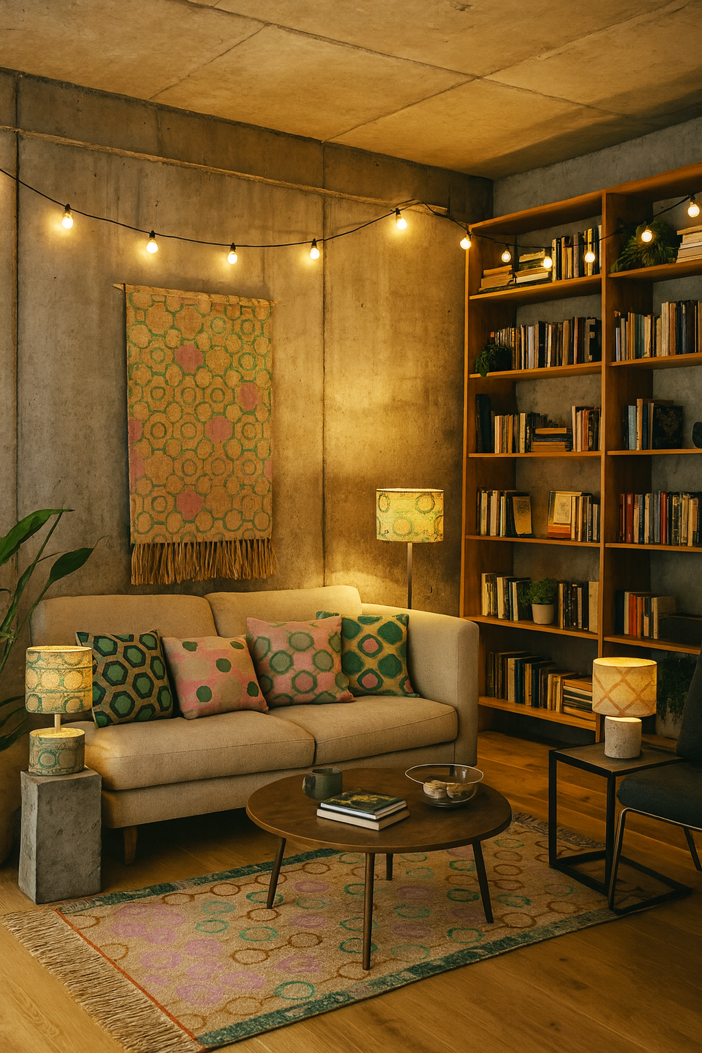
AI interpretation of a “gezellig” interior using zitozza textiles
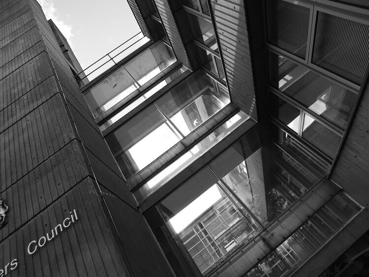
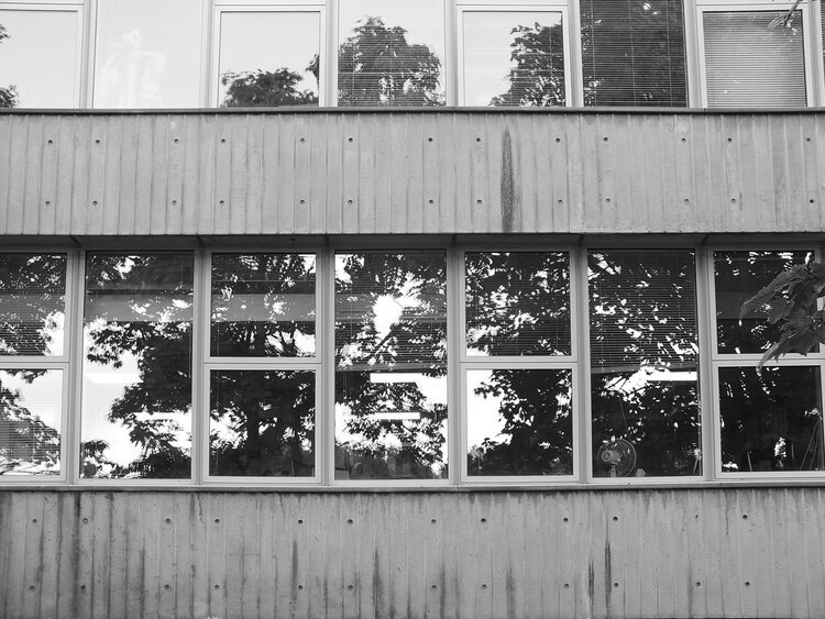
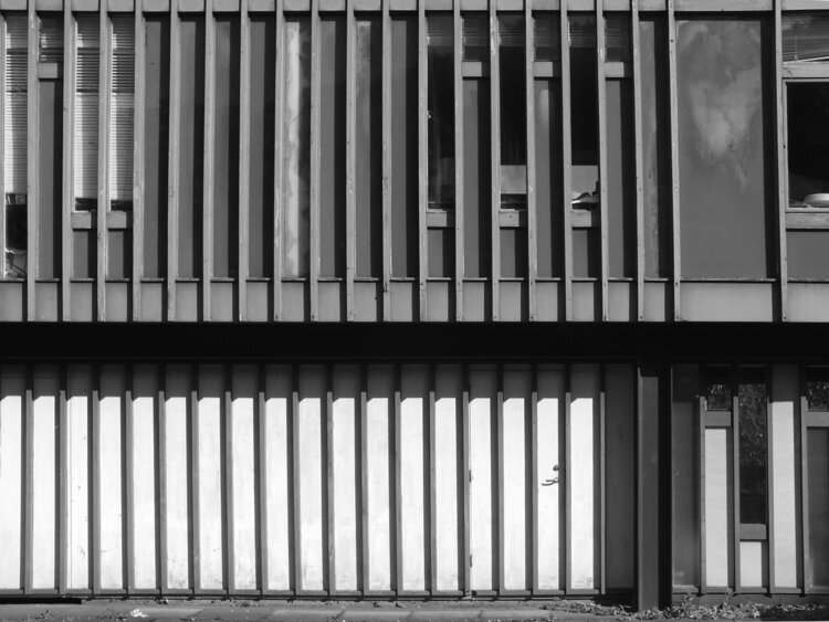
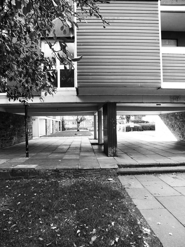
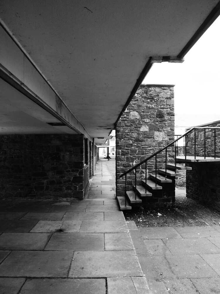
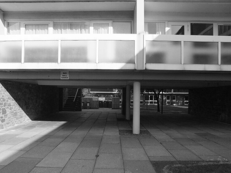
perhaps gezellig offers a way to rethink modernism’s reputation. not as a style of severity, but as a practice of calm. the neat repetition of façades, the modular rhythm of housing blocks, even the shadow of a stairwell — all contain a kind of order that feels peaceful, if not “cosy” in the conventional sense.
in textile design, that same impulse translates into repeat, rhythm, and scale. a pattern that repeats just so, aligning form with material, becomes more than visual — it becomes spatial. maybe that’s where architecture and textiles quietly meet: in the shared pursuit of gezelligheid through proportion.
to me, gezellig sits somewhere between company and peace. it’s not emotional in the ornamental sense, but in the human one: proportion, care, attention to the tactile. it’s what happens when design supports life rather than dominates it. so perhaps it’s time we reclaimed gezellig from the coffee-table clichés (although i’m partial to one too many string lights). it’s not a moodboard, but a method. a spatial feeling built through light, texture, and structure. and if that sounds suspiciously modernist — well, maybe modernism was never as cold as we thought.