printing

BEHIND THE SCENES, DESIGN CONVERSATIONS, INSPIRATION, MODULAR SYSTEM, WORK IN PROGRESS

the joy of modular design - a few thoughts ahead of our new collection launches

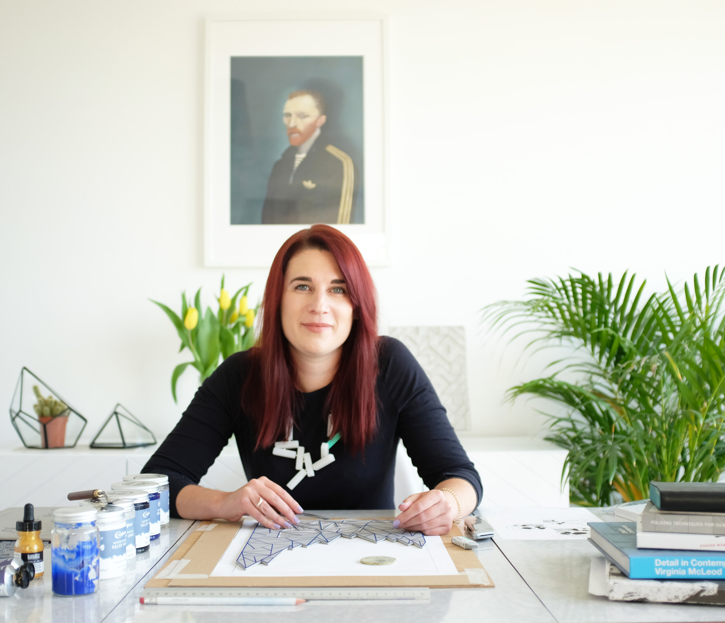
ahead of our new collection launches, i want to revisit a core idea behind zitozza: the joy of modular design. it’s at the heart of how we create patterns — and why our textiles bring so much flexibility, structure, and character to modern interiors. we talked about this before, in our very first blog post - but we’ve come a looong way since then so it’s perhaps time to revisit these thoughts because i feel like it’s at the core of everything here, yet there is so little written about on these pages.

there’s something quietly satisfying about a system that lets you build from the ground up — pattern by pattern, block by block. at zitozza, modularity has always been at the heart of what we do. it’s more than a method; it’s a mindset.

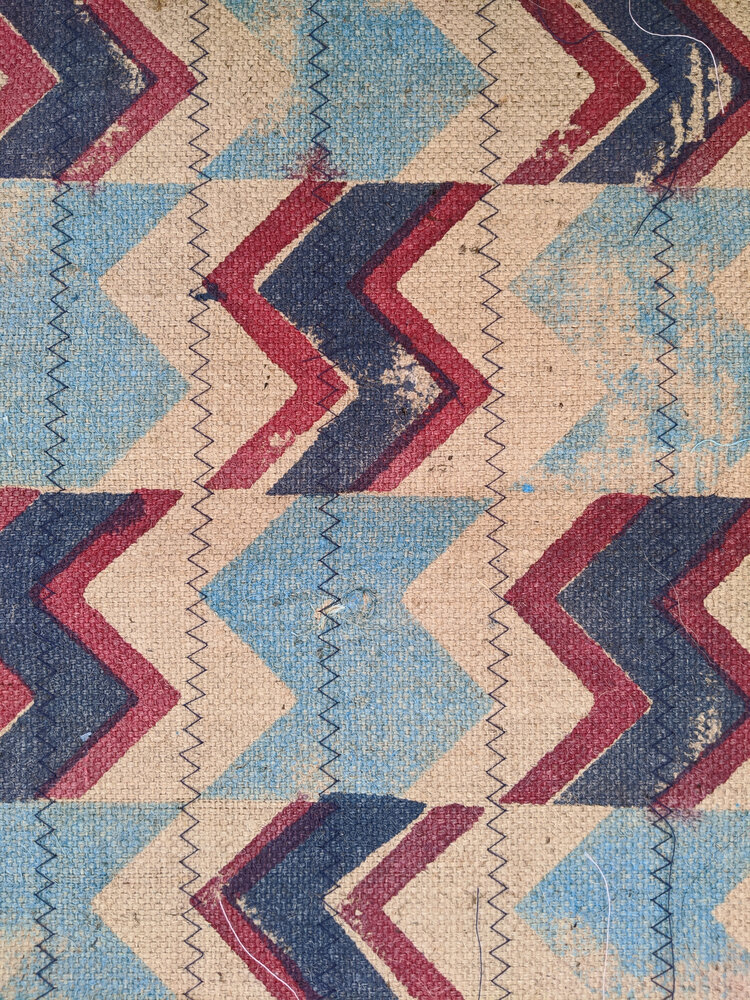
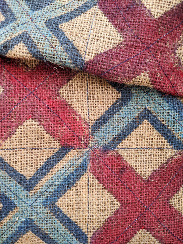
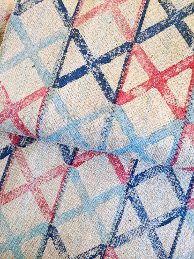
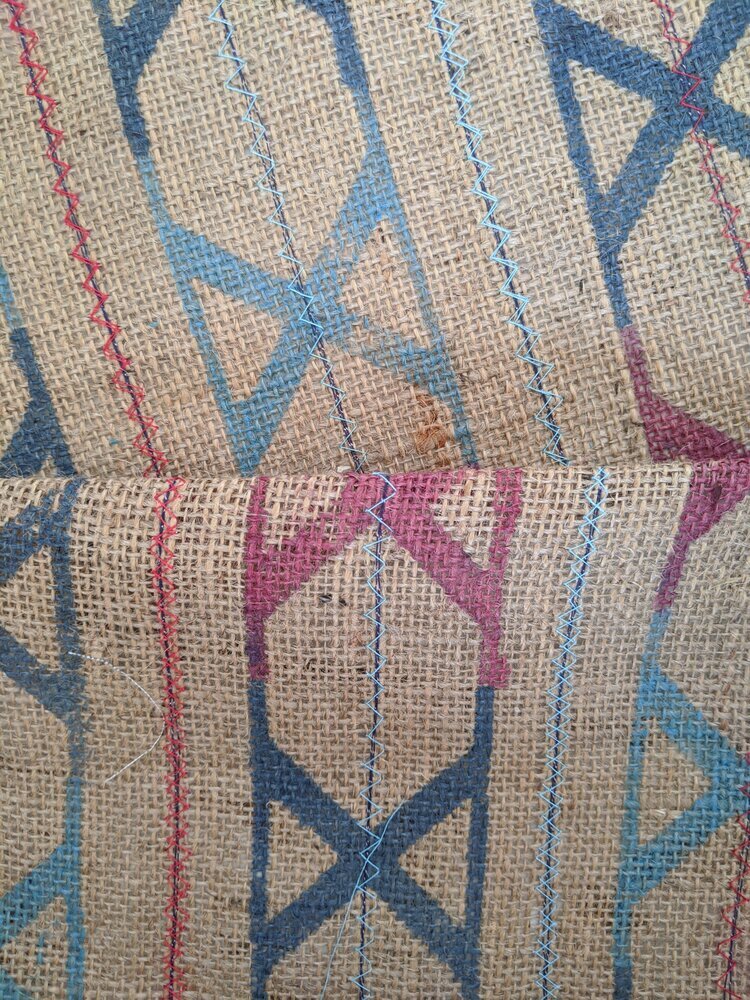
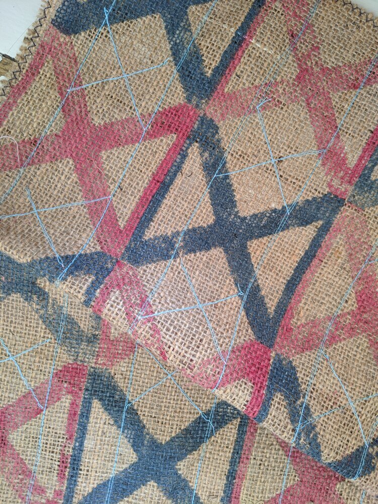
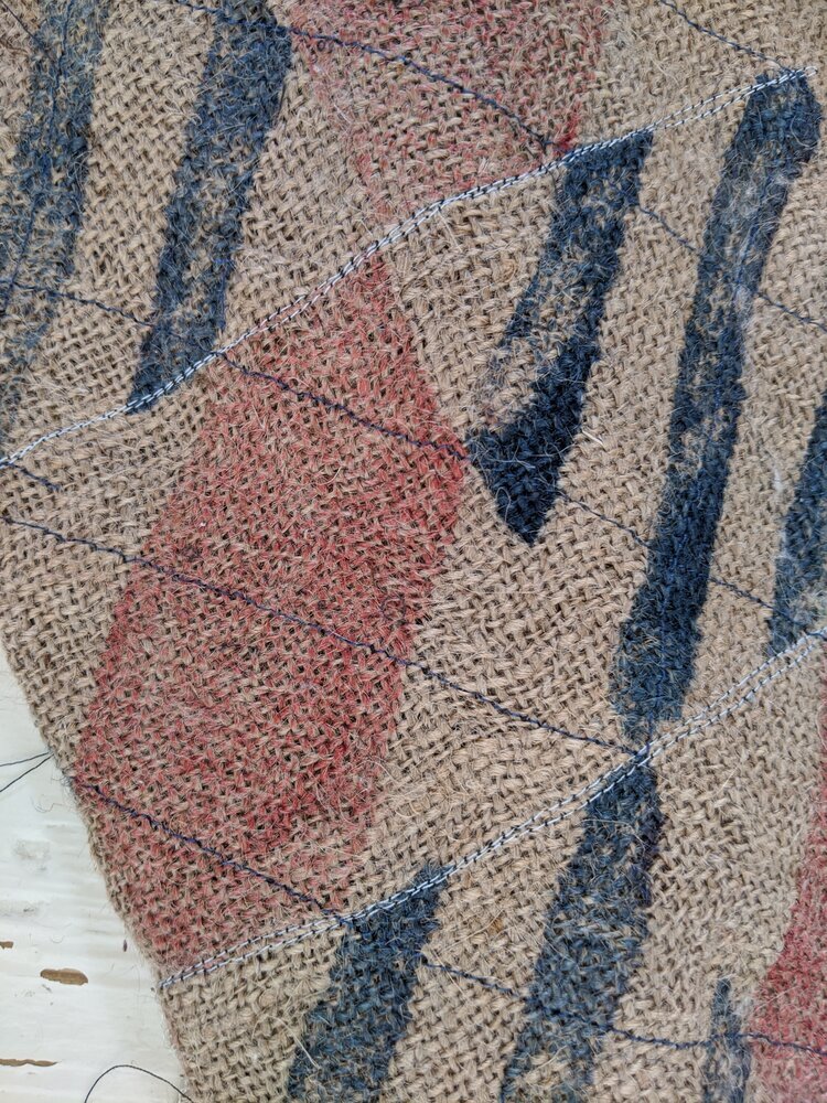
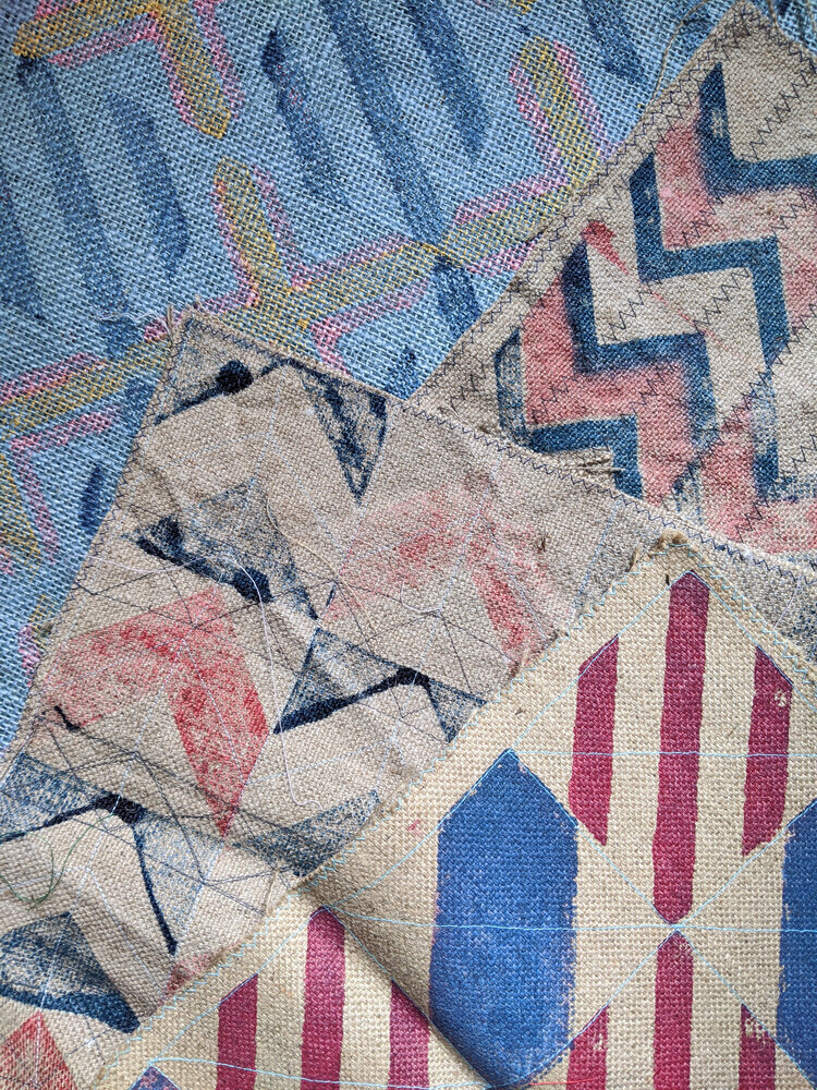
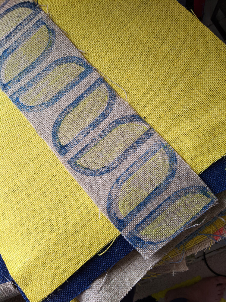
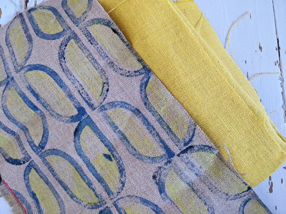
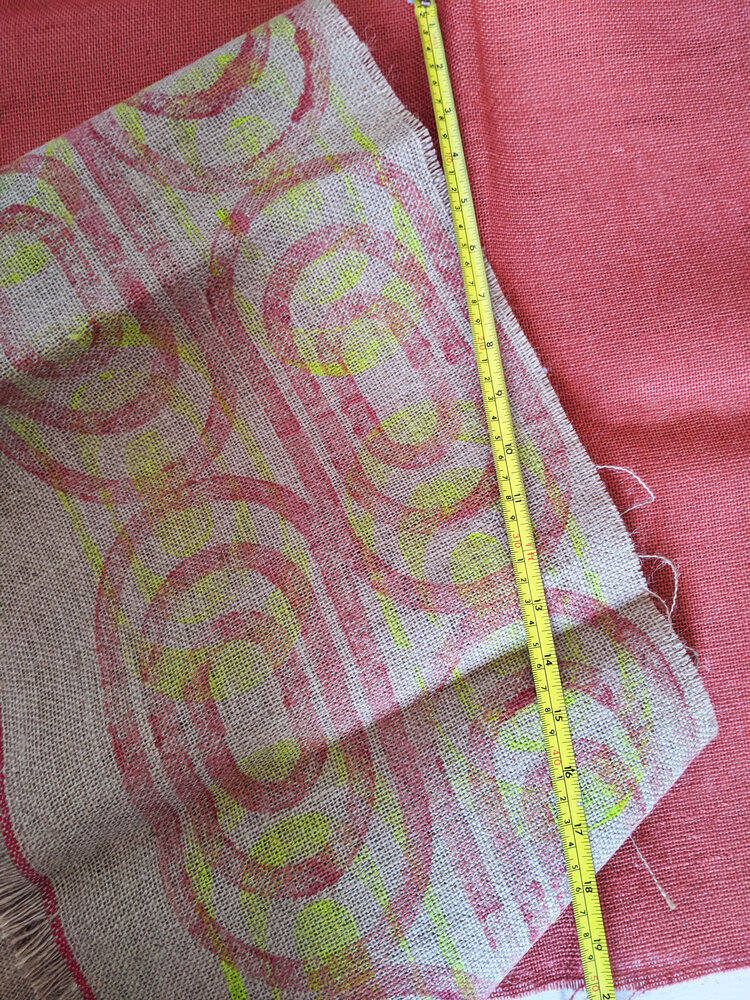
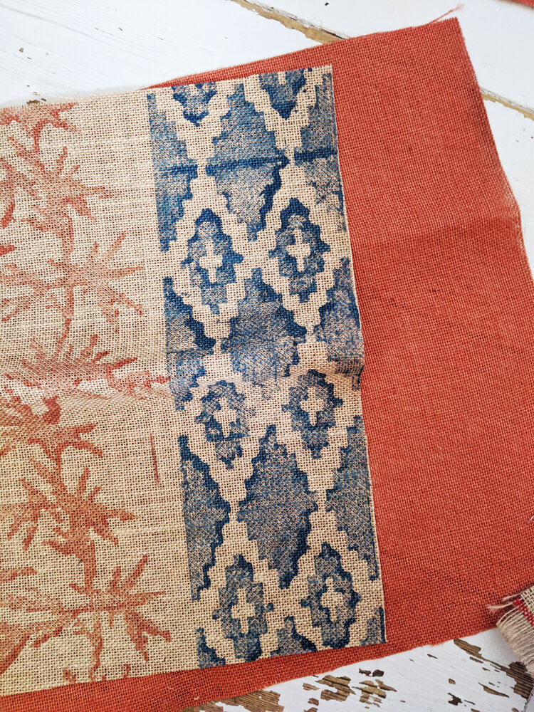
the act of printing by hand using custom-made blocks invites a kind of architectural thinking. each motif becomes a unit — a brick, a tile, a module — capable of being repeated, rearranged, or rotated to form something larger. the process echoes the very structures that inspire our designs: functional, concrete, geometric. it’s a design language rooted in the modernist ideal that beauty comes not from decoration, but from clarity, rhythm, and purpose.

and yet, there’s so much play in it too.

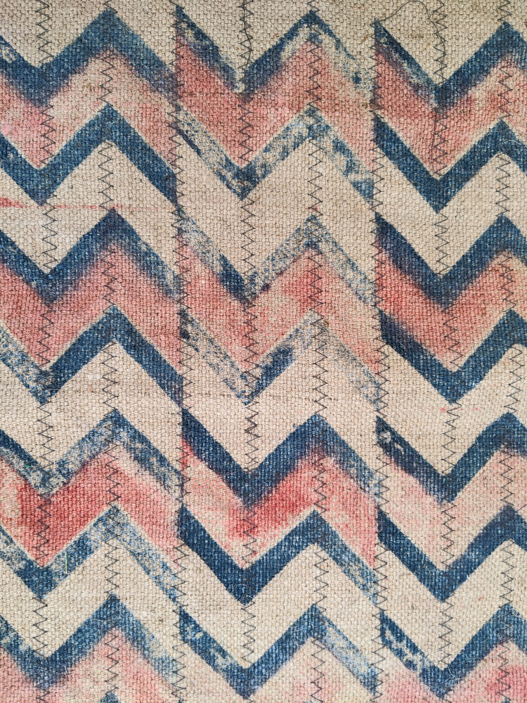
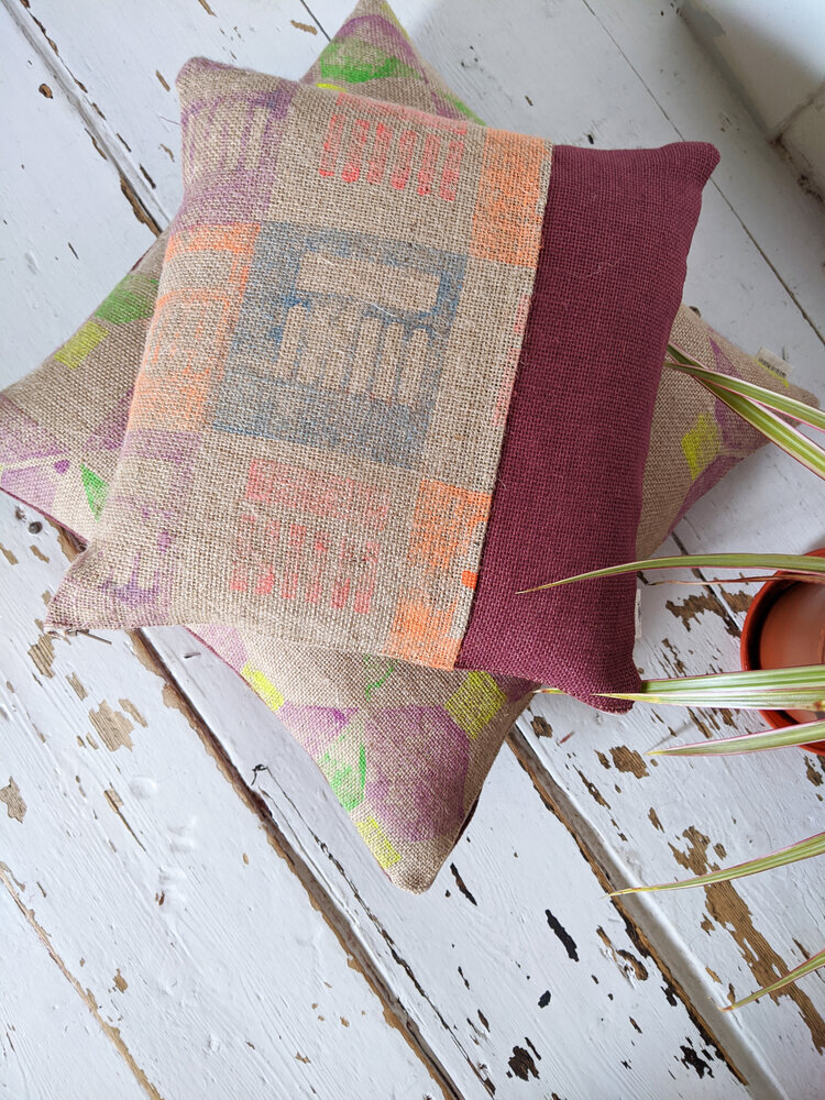
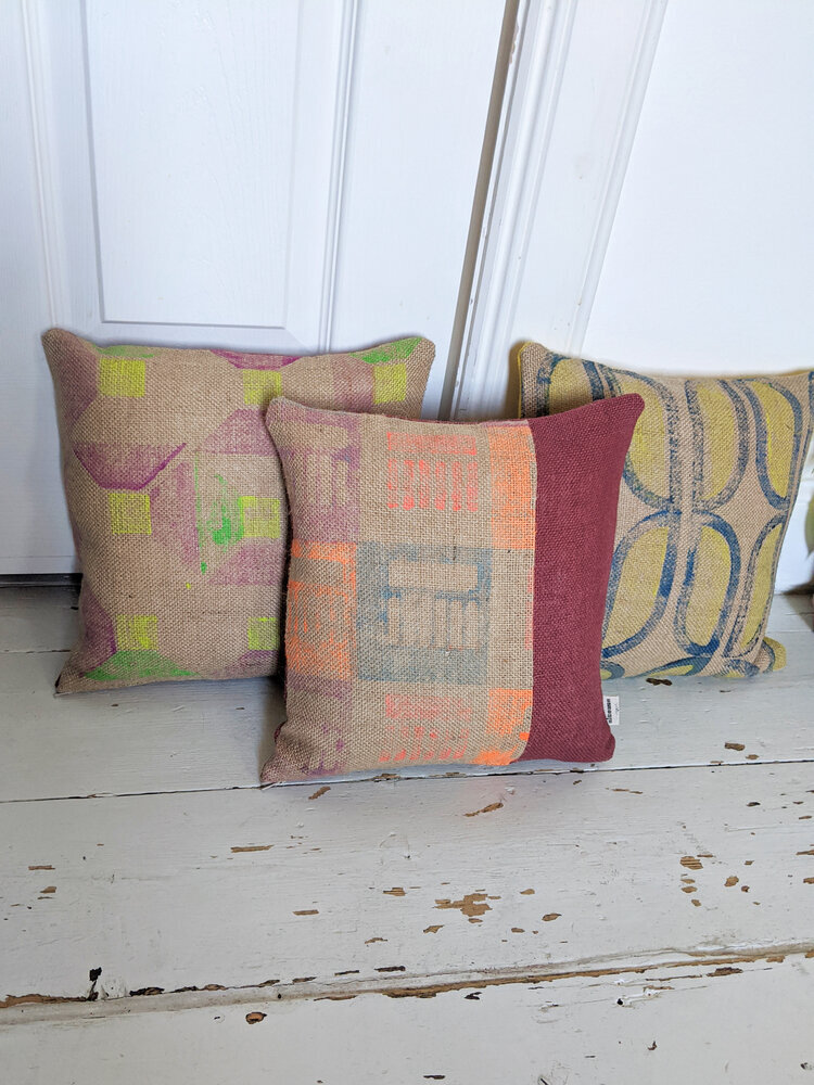
modularity allows for variation — for reassembly, surprise, even subversion. every print starts with a simple shape, but it rarely ends there. colours collide, edges misalign, and new patterns emerge unexpectedly. it’s not about perfection, but about the whole picture, richness that comes from composition. the hand-printed surface becomes a space of improvisation. each textile becomes a landscape, or rather, a cityscape with buildings and structures.

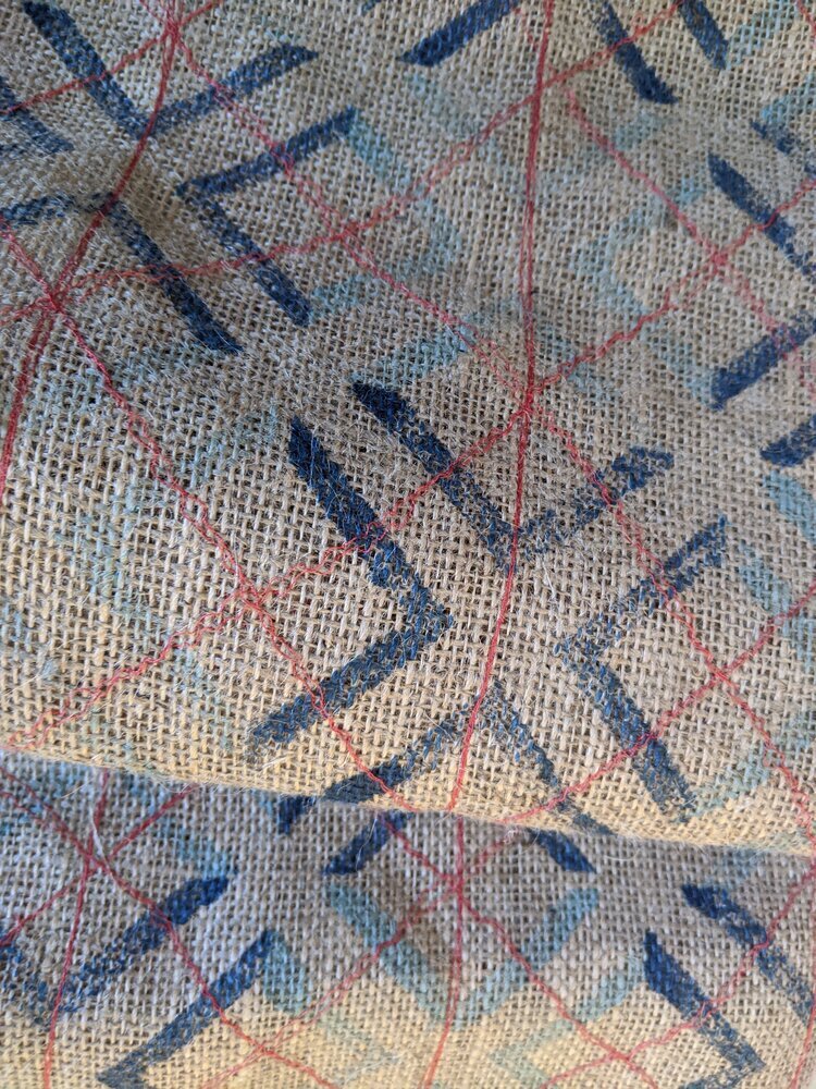
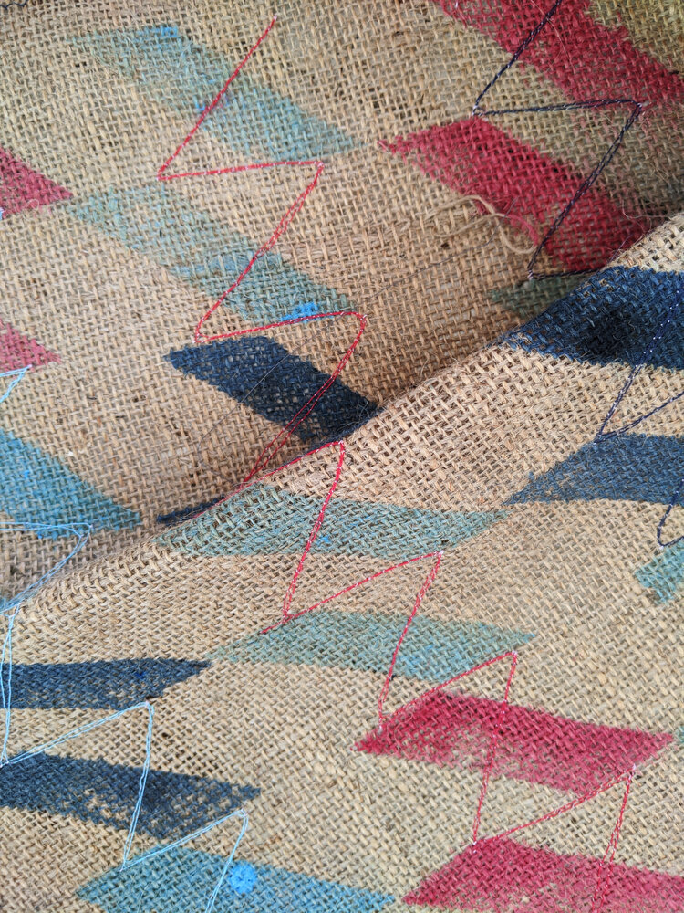
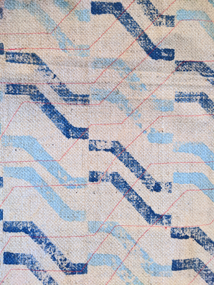
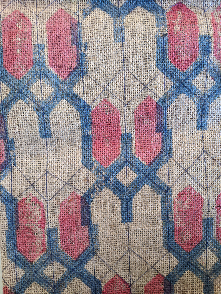
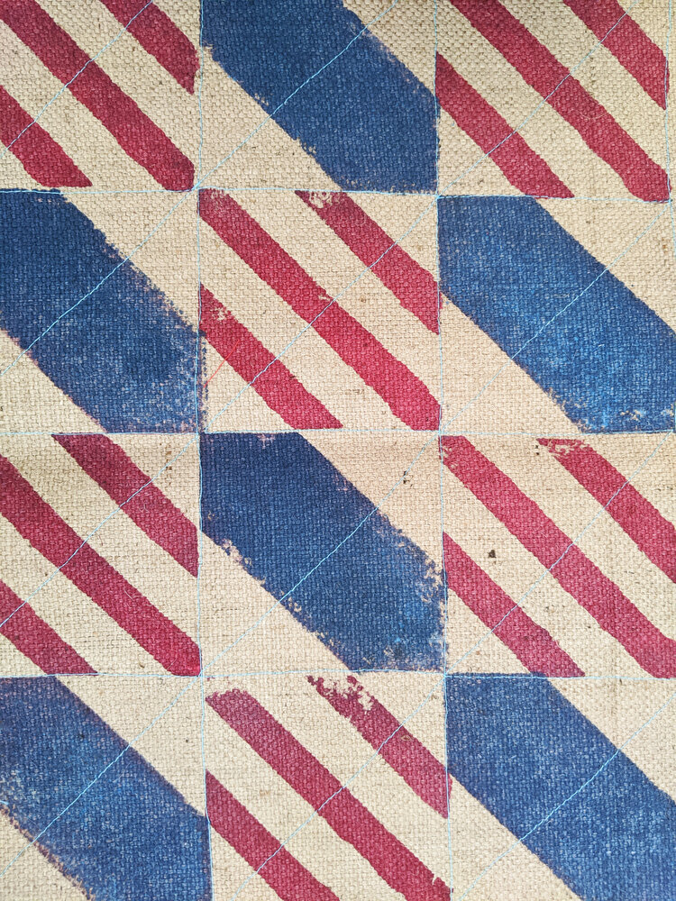
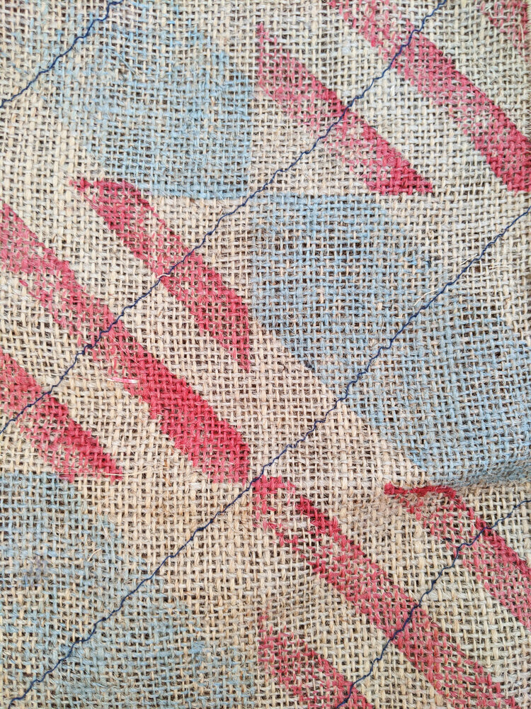
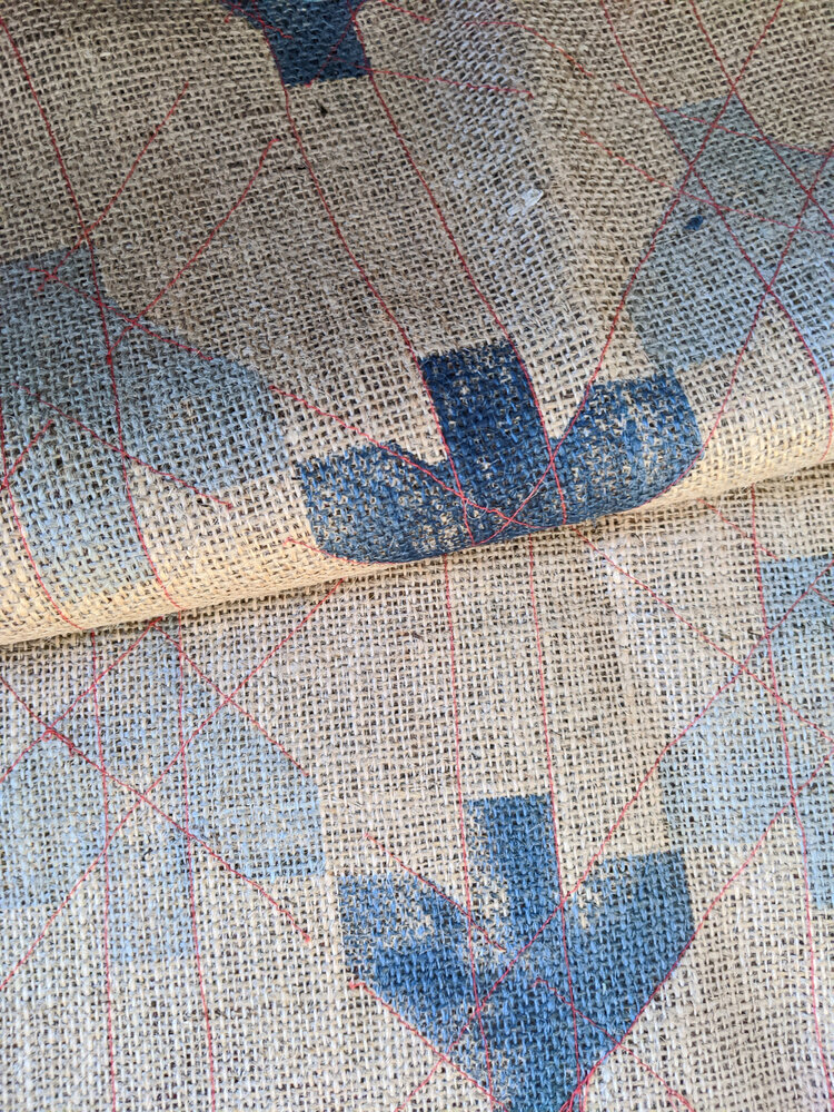
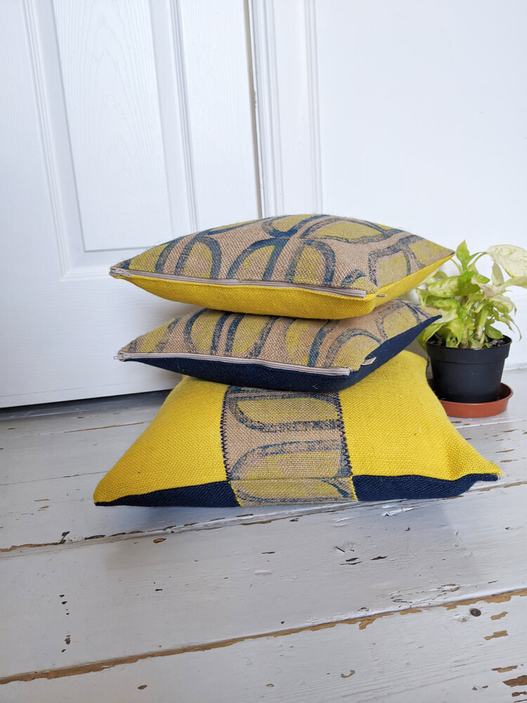
our new tiles, the RAJZ set (to be released soon!) takes this even further. designed for modern interior spaces - we printed this on wallpaper for the first time ever! - and inspired by the abstract logic of architectural plans and schematic drawings, these blocks are designed for movement and multiplicity. they're not just shapes, but visual cues — arrows, intersections, corridors, walls. they suggest flow. they ask to be built with. as part of the MODERN set of course, these will go seamlessly with other blocks, allowing you to create even more patterns.

the upcoming TOYTOWN and AGGREGATE collections (also coming in may) are just our way of creating with our existing sets. they embrace this philosophy in different ways — one playfully, the other structurally — but both grounded in the joy of repetition and reconstruction. you’ll see echoes of grid systems and city plans, the raw tactility of concrete, the subtle logic of elevation lines. and you’ll also see softness, colour, and warmth. because modularity doesn’t mean rigidity — it means possibility.

i designed these two very different new collections for this summer, to emphasise the variety of moods, colour schemes, looks that you can create with the same handmade process, the same handmade texture, yet very different interiors can be achieved. i love this kind of versatility and if you want to create your own look with these systems, start here.

in an age of ready-made looks and fast consumption, there's something refreshing about design that invites creativity and such freedom of thought. modular design is never final. it welcomes revision, addition, and layering. it lets people participate in the pattern.

and that’s the joy of it.

if you want to be among the first to browse our collections when they’re released, sign up below to our newsletter. it comes with a free downloadable poster every month. stay tuned for our release!

ARCHITECTURE, DESIGN CONVERSATIONS, INSPIRATION, SCOTLAND

in conversation with ciara mcinnes

happy autumn! we’re back to work, back to school, back to looking ahead and also back to talking to people so i’m really pleased to announce tha after a long hiatus, t the design conversation series is continuing with a new arist! ciara mcinnes is an architect and fine artist based in glasgow. i discovered her fabulous prints on instagram during lockdown when i was craving to see beautiful buildings - some of them are the exact same buildings i’m also fascinated by, such as the netherdale stadium of peter womersley – so i was really keen to know more about the background about these beautiful works.

ZITA: hello ciara! first things first - could you say a few words about yourself, what you do and how you got there?

CIARA: hi there, thank you so much for having me! i'm an architect and fine art printmaker based in the west end of glasgow. i work in the medium of lino print, combining traditional handprinting techniques with contemporary, urban subject matters. inspired by the city, street art and general urban chaos, my work typically documents lost landscapes, urban spaces and historic buildings.

ZITA: i can see your architectural background  - it comes across beautifully on your urban prints. i’m always glad to find other people who also see the beauty too in the things that often get a bad press. could you share a little bit about what inspires you about these landscapes?

CIARA: for me, the built environment is so inspiring, constantly changing and evolving. i love to document the city in my work, taking tiny snapshots of a place in time, knowing that it will never look exactly the same again. the light will be different, the graffiti will change, it will eventually be lost for good and exist only in print.

in architecture, it has always been the case that the styles of the previous generation are undervalued because they are seen as dated but not yet historic. In glasgow, there has been a huge cull of brutalist architecture in recent decades, a style that is only now starting to gain recognition. i'm really drawn to document these buildings in particular because of they represent an important era in history, when architects and designers were tearing up the rule book.

ZITA: that’s fascinating. i do love that era too, and the ideas they represent! do you have a favourite place, a city or a building you go like regularly going back to? Or do you continuously look for something new?

CIARA: i am always on the lookout for somewhere new, i love to travel. at the start of 2020 i visited mexico city which was such a vibrant and energetic city. the architecture is so diverse from pre-hispanic to cutting edge contemporary and everything in between, it's somewhere I'd love to go back to.

ZITA: that must have been beautiful. you mentioned brutalism before, but is there a particular school of architecture or style you’re attracted to more than others?

CIARA: i'm a fan of minimalist, contemporary architecture. there's a few places really leading the field such as scandinavia and japan but it's not something we have really embraced in scotland yet. there's an architectural practice called SANAA who create some truly breathtaking work.

ZITA: thanks for the tip, i will make sure to check it out. so what is the next cityscape or building you’re turning into a print? can you tell anything about any work in progress?

CIARA: i'm currently working on pair of prints that explore the temple gasworks in the north of glasgow. the structures of the old gasholders are still in place and create these skeletal figures in the landscape which you can see for miles around. i'm going to be integrating some more natural imagery in the prints which is a new direction for my work so i’m excited to see the finished pieces.

ZITA: sounds really exciting, i’ll be looking forward to seeing the finished prints. i’m also interested in your technique. your prints are very photographic! how are you working them into your prints? can you explain a little bit about your process as well?

CIARA: i always start a print by creating a master pen drawing which i then trace using carbon paper onto the lino block. i will usually combine elements from several photos or images into a final composition, all with a little artistic license. i often make little tweaks at the carving stage too, with a lot of natural elements freehanded as I go. the prints evolve through the printing process so i never fully know what the print will look like until the very end.

ZITA: that is really interesting! and your colour scheme is very minimalist and together with your ukiyo-e inspired technique, it reminds me a bit Japanese influences. it is very consistent throughout your work and it works to a wonderful effect – could you tell more about this? do you have a process of deciding about the colours in your prints? 

CIARA: japanese printmaking is certainly an inspiration, particularly the dedication to craftsmanship and technique. my colour palette is typically very tonal which allows me to focus on the form of the print, then I create focal points by picking out details in metallic. i typically mix my inks with extender to create a more translucent effect, i love how this gives the prints an almost watercolour like finish. 

ZITA: it does! the results are really beautiful. and now the questions i ask from everyone - can you recommend a book or an artist or a maker whose work is worth looking into? something that keeps you going?

CIARA: i recently discovered an artist called claas gutsche who's based in berlin, a fellow lino cutter, his work is so precise and his technique is definitely something to aspire to. in a totally different direction i’ve always loved the work of a painter called maurice utrillo who was a contemporary of the impressionists but worked in quite a different style. he has a really fascinating story, using painting as a form of therapy. he painted the world around him, focusing on the built environment and often unloved corners of paris.  i only recently found out that the kelvingrove museum holds one of his pieces but it's currently in remote storage. 

Mac House.jpg

ZITA: sounds like someone you would have loved to met! i will be definitely checking them out. and lastly but most importantly, where can we see your work next?

CIARA: well, i do have a few exhibitions on the horizon but sadly i’m sworn to silence until the official announcements! all i can say for now is that i have an upcoming show in a glasgow gallery this autumn, which will feature some specially created pieces. i'll also be popping up at a few art and design fairs across glasgow later this year, so keep your eyes peeled!

ZITA: very mysterious! i will keep an eye on your social media! thanks a lot for your time.

-

links:

ciara mcinnes website

ciara mcinnes instagram

SANAA

claas gutsche

maurice utrillo (on artnet)

INDUSTRIAL HERITAGE, JUTE, SCOTLAND, TEXTILE INDUSTRY, SUSTAINABILITY

jutefest is coming!

oh hello (limited, face-masked) general public! zitozza are excited and proud to announce to be a founding participant of JUTEFEST dundee! this is a brand new initiative with three makers working with jute differently (that’s - jist jute, knotty but nice, and zitozza) and our aim is to bring this wonderfully versatile and sustainable fabric back to its city where it once came out of in the tons.

the three of us work with jute in different ways - you can read our design conversations with jist jute already - there is a great deal of research and local history in alison’s work and she will also be signing her book “if these wa’s cuid talk” at the event. maite of knotty but nice is a crocheter who uses twine from nutscene to make strong and colourful bags and accessories. so there will be jewellery, fashion accessories - and cushions, rugs and lampshade by zitozza also for sale. but apart from setting up market stalls with our things, we will be making live at the event and demonstrate our crafts as well as preparing some exhibition materials on the history of jute in the city as well as some modern takes on the golden fibre.

jutefest logo full.png

there’s certainly a lot of heritage to celebrate in dundee but we also believe in embracing the present and we have our modern-day reasons why we work with it - one of these is of course sustainability, because we recognise our responsibility and we want to promote materials with less of a carbon, chemical, and water footprint. however, there is also a more artistic take on it - jute is a very utilitarian material, and when it was mass produced in dundee, it was fully to serve other industries and agriculture with its sacks and ropes. the three of us don’t use it this way though. we inject it with colour, design and individuality while keeping what’s good about it - the warmth, tactility and environmental qualities. there’s a lot to discover and play with and we want the locals to join us to celebrate that!

zitozza are preparing with a special launch of mini-tapestries as well, an initial 8-piece exhibtion will be set up for visitors - all wall-art will be available to be purchased online soon as well!

so when is this is happening? this is going to be a series of pop-up fairs stretched out between june and september on the first saturdays of each of these months. so that’s 5th june, 3rd july, 7th august, and 4th september.

and where about? at the artantics building (many thanks to scrapantics!), that’s right across from verdant works. the address is unit 2, anchor mill, west henderson’s wynd, dundee, DD1 5BY.

this is going to be a real-life event which is why it’s a big deal to those of us having been confined to our studios and council areas and whatnot. even though we are super happy to be finally free to meet you and celebrate, we still have to be careful and be aware of the spread of coronavirus. we want to be as safe as possible, so please note we will require face masks to be worn and we may still limit the number of people indoors in order to be able to keep a safe distance. thanks for your understanding and see you soon!

-

links:

jutefest instagram and twitter

jist jute instagram and etsy shop

knotty but nice (instagram)

scrapantics (website)


BEHIND THE SCENES, WORK IN PROGRESS

stitched patterns

ok so this is going to be another more visual blog post and i might have to share a little bit more of the history behind these prints. (if you’re interested in the full origin story, you can visit my other website where i have already written a blog post about it here, however i’m quite willing to write more if you want to read!)

anyway, one of the base of zitozza was a uni project called “anthropocene” where one of the three collection called “GRIDS” consisted of block printed jute (now the SOROMPÓ, TRANZIT, FÁZIS and a small part of the SKÁLA tilesets). however each of these also had an extra “haptic” layer over the print and on the “GRIDS” collection these were stitches.

the main inspiration behind these initial patterns were of course actual grids, transport networks, cranes, gas tanks, industrial architecture, signals and signs, that kind of stuff. so naturally, more lines, straight and zigzag stitches were applied for that kind of “wiring” effect.

i’m going to put some products with these surface effects up for sale in the coming weeks to test and see how you’d like them. below then is the picture gallery of these older ideas. these are all from that old project (hence the aligning colours) with the more grid-like tiles, and linear or zigzaggy stitches that complement the surface. the colour inspiration came from industrial signage too at the time but i just love the nautical effect of these.

as for the future, i’m especially interested in this effect on the lampshades for the potential contrast against the illumination. what do you think? would this work on a rug? or a cushion?

and about the other, more brutalist, blocky patterns… combining embroidery with these is also possible, even with different colours and bolder areas, however these will be an entirely new category of haptic, tactile rugs and lampshades and cushion. see also the BRUTEJUTE project and watch this space….! :)

BEHIND THE SCENES, WORK IN PROGRESS, ZERO WASTE, SUSTAINABILITY

cushion stories (inside the scrap bag)

ah september, we’re well and truly open, and getting into autumn already (crazy). i hope you’re enjoying browsing the shop so far - thank you for the many follows on social media! we will always have regular updates in this blog too, and there’s an exciting product pipeline in the works i’d love to share news about. i’m going to attempt a picture blog this time and i’ll let the photos do the talking. the first of this kind is about our new cushions - some available since monday, some you’ll see a sneaky peeky of here first!

about the ones available: thank you so much for all the positive feedback on the two NOMÁD ones. feel free to purchase, i’m going to make them again, and if it’s out stock, they will be available in the made-to-order section. i personally also love this pattern and i’m thinking of trying it out in a few different colours and printing it as a runner rug as well. would you be interested in it?

about the cushions in general… you might have noticed, only one at the moment is purpose printed with both sides, and most are backed with a pre-dyed piece of jute. this will not always be the case as some printed fabric is waiting to be made into cushions. but the truth is… the scrap bag is a little bit too distracting and it is just so much combining remnants from lampshades or other cushions with all these colours (and with each-other in the future too!)

using the scraps is also a creative way of going zero-waste. i’ve become religiously obsessive about this and i want to be honest with it. scraps and remnants in our production line don’t just happen with pattern cutting, but i use up the dye as well if it’s a mixed colour and can’t be put back into the jar. if it’s enough for a small area, it gets printed and used up! this makes some cushions a truly unique, one-off piece. i hope you come back frequently for them!

but anyway, enjoy the pictures!