system

MODULAR SYSTEM, INSPIRATION, ARCHITECTURE

designing with grids: a short history of order

a short while after we discussed our love for modular systems, we are talking about grids again. this isn’t just a graphic-designer-turned-textile-person’s obsession — they structure our cities, inform our screens, and quietly underpin almost every page layout and pattern we encounter. but beyond their role in organising space, grids can be a springboard for creativity, allowing designers to build complexity from simplicity. this post explores the grid not as a constraint, but as a tool of liberation — from early modernism to contemporary practice, including how zitozza plays with modularity in its textiles.

The Grid as Modernist Foundation

grids found their spiritual home in early modernist movements. bauhaus, and de stijl artists in particular, like piet mondrian reduced visual language to the essential: horizontals, verticals, primary colours. continuing the idea after the war, the swiss style emerged in the mid-20th century, with designers like josef müller-brockmann using grids to create visual harmony in posters and editorial layouts.

this was design as a rational act — about clarity, neutrality, and structure. the swiss grid system created a framework where typography and imagery could be arranged with precision. it was less about decoration and more about logic, a way to strip back the unnecessary and design a hierarchy of information.
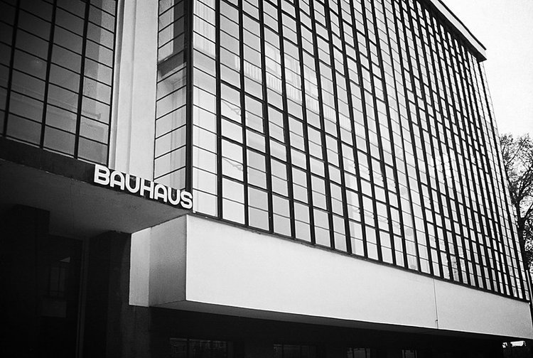
Le Corbusier: The Grid as Urban Ideal

speaking of the swiss — we love brutalism here, so now is the time to mention le corbusier, one of the most influential figures of architecture in the 20th century. in his seminal work towards a new architecture, 1923), he argues for a new visual order grounded in function, technology, and standardisation.

le corbusier's urban visions, particularly the ville radieuse and the controversial plan voisin, proposed cities built on a grid: modular, repetitive, efficient. these were not just aesthetic gestures but ideological ones, attempts to impose order on the chaos of industrialised life.

the city becomes a machine for living. blocks of buildings aligned on rigid axes, roads intersected at clean right angles (and roundabouts - think about glenrothes!), and light, air, and greenery were prioritised through geometric planning. the social and emotional consequences of these ideas are still felt today, but their influence on modern urban environments is undeniable.

the outskirts of bratislava, by SI Imaging Services / Imazins (source: getty images)

the outskirts of bratislava, by SI Imaging Services / Imazins (source: getty images)

Grids in Graphic and Interface Design

in contemporary graphic design, the legacy of the swiss grid lives on in everything from magazine layouts to responsive web design. grids provide consistency across platforms and allow for flexibility within a rational structure.

this is something i have less experience with but it has translated on from print to digital, and in UI/UX design, it is the grids that make digital interfaces feel coherent and navigable. the hidden scaffolding of columns and gutters supports typographic hierarchies and interactive elements, creating experiences that are intuitive without drawing attention to their structure.

The Balance Between Structure and Creativity

but the grid isn’t just about order. it can also serve as a space for subversion. architects and designers often use grids to set expectations — then disrupt them. breaking the grid, or the grid itself, can both become a statement - think about the iconic tables of superstudio.

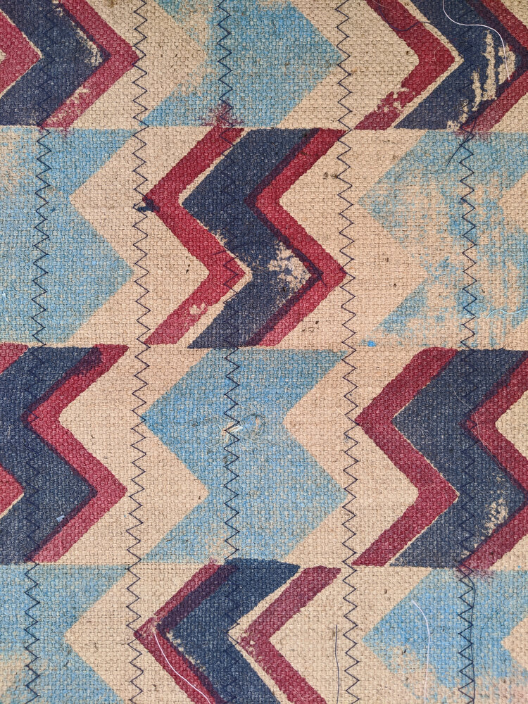
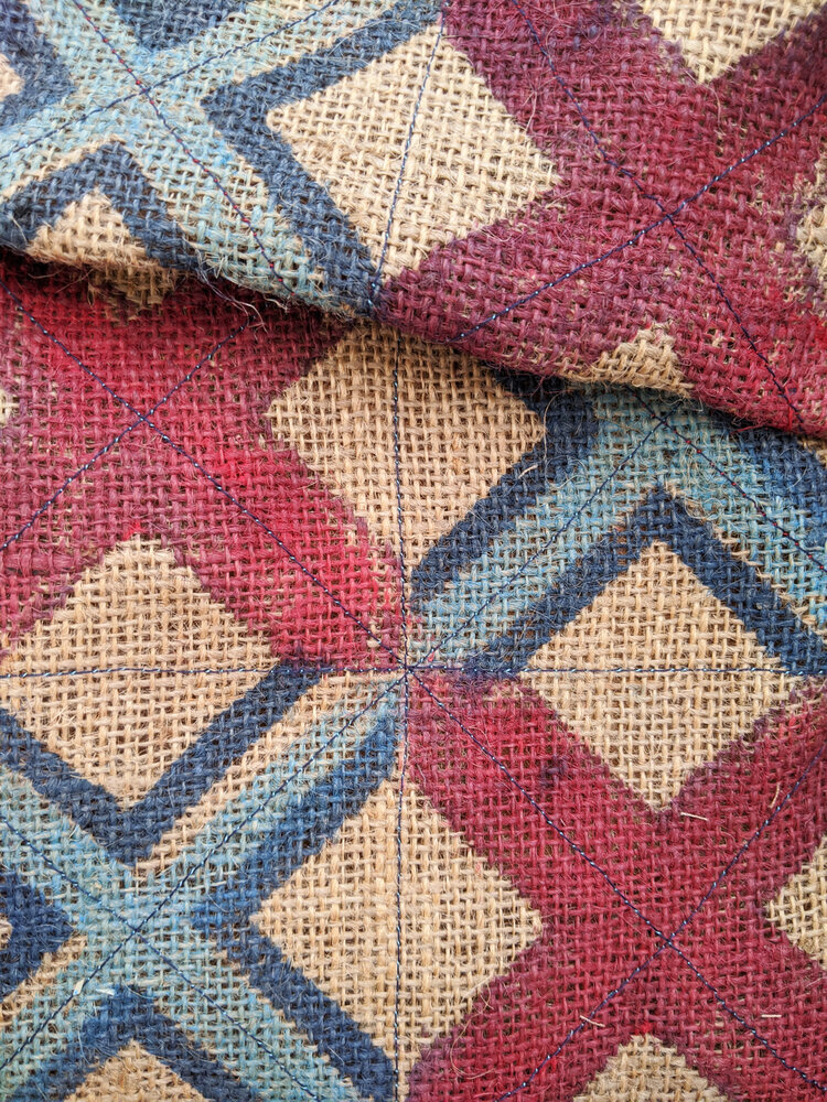
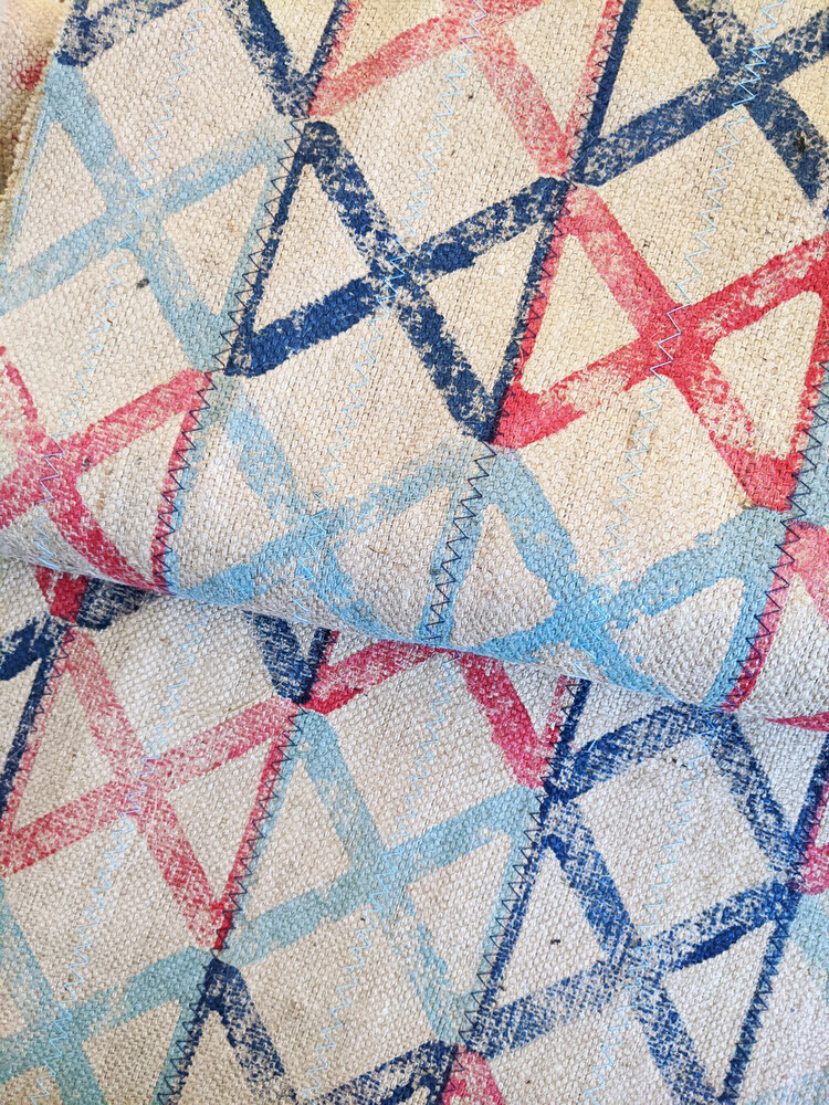
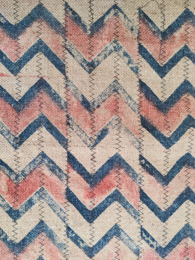
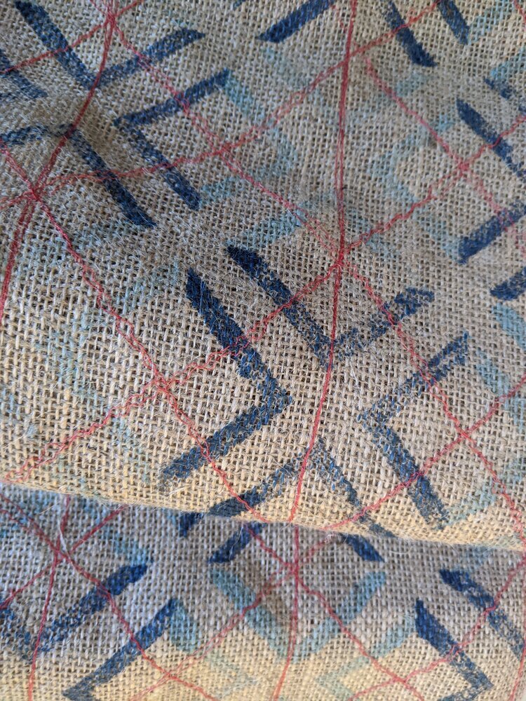
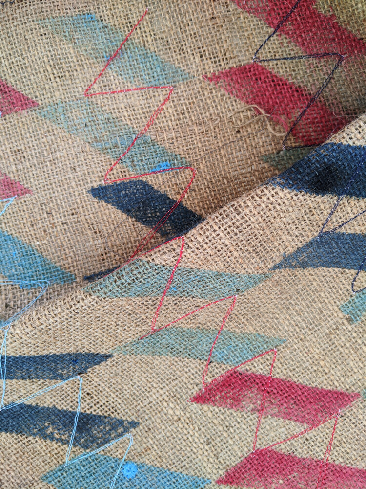
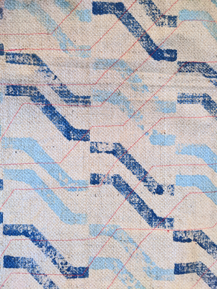
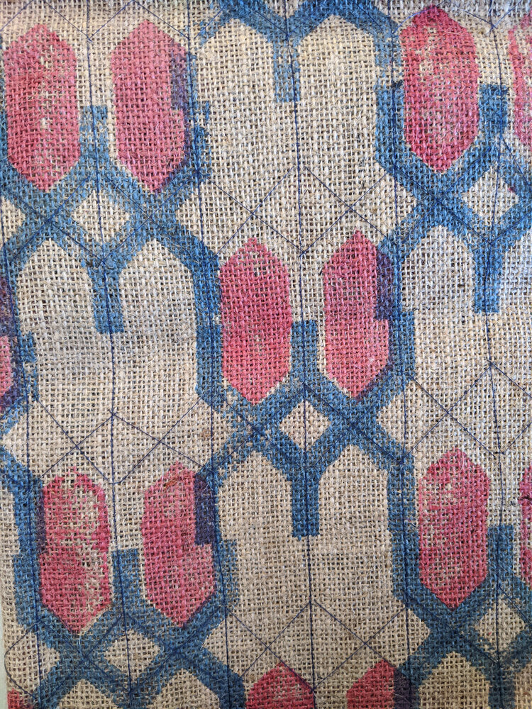
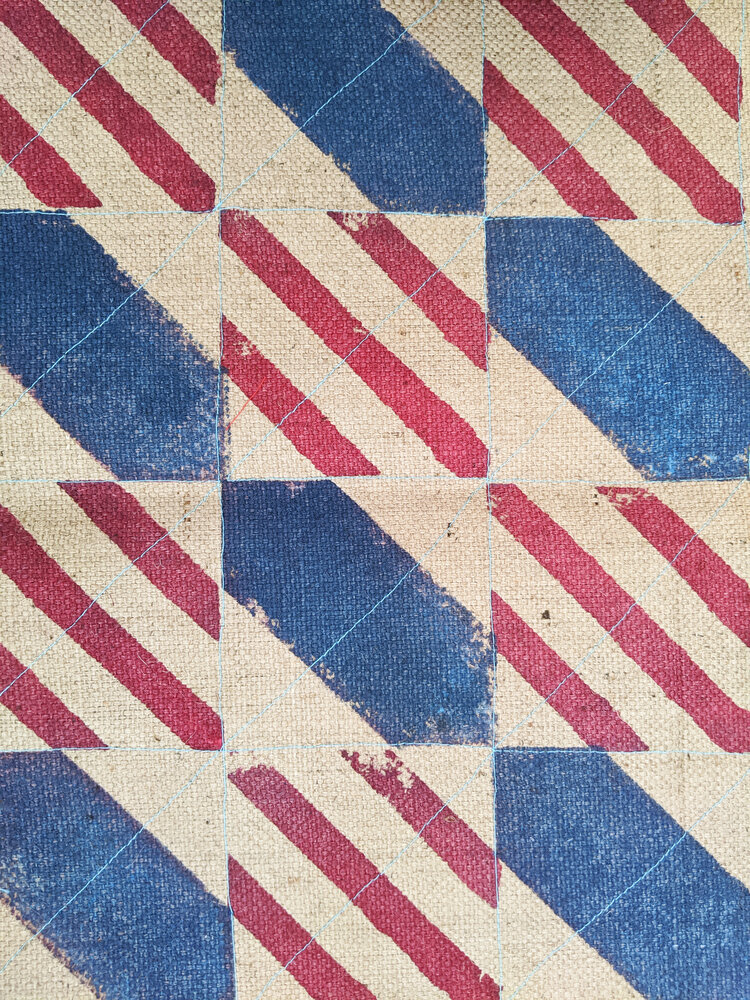
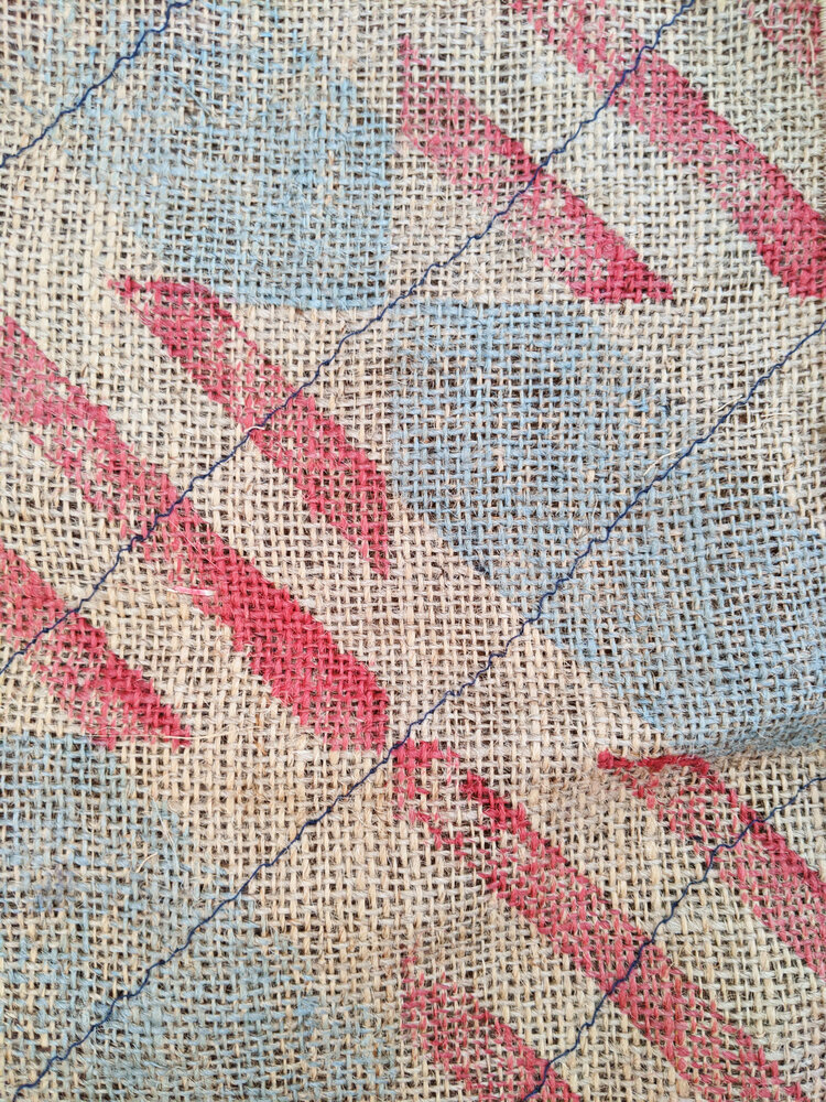
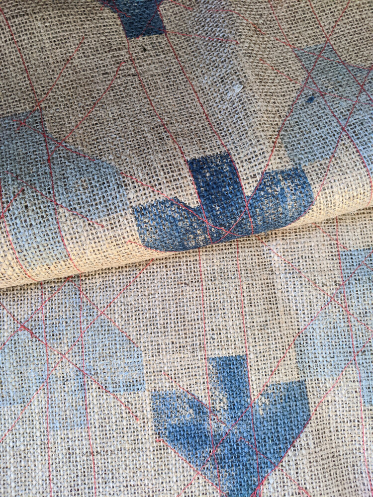
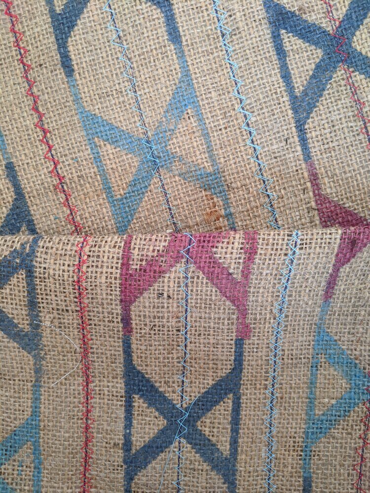
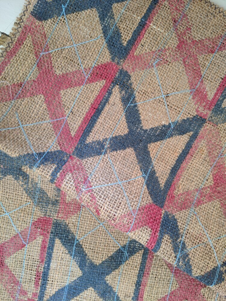
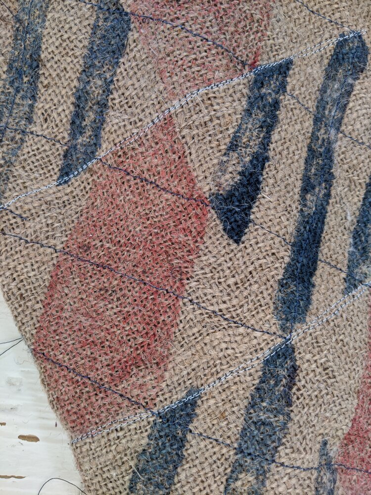
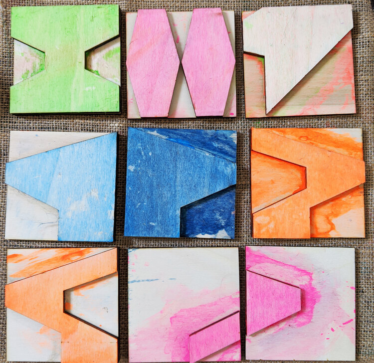
in textile design, modularity offers a similar tension. zitozza's approach to block printing starts with fixed elements—repeating tiles, geometric forms — but introduces variation through placement, layering, and colour. a grid may begin the composition, but it rarely contains the outcome. it's not unlike building a city out of toy blocks: rules exist, but imagination ultimately dictates the layout.

Grids as a Living Language

grids, like language, evolve. they provide a shared syntax for designers, architects, and urbanists, but are constantly reinterpreted across time and context. from the pure geometry of modernism to the playful modularity of contemporary practice, the grid remains one of design's most enduring tools.

at zitozza, we embrace this legacy. our new collections explore grids as both framework and provocation. they are starting points, not boundaries.

after all, there is joy in structure. and sometimes, the most surprising creativity begins with a line drawn straight.

BEHIND THE SCENES, DESIGN CONVERSATIONS, INSPIRATION, MODULAR SYSTEM, WORK IN PROGRESS

the joy of modular design - a few thoughts ahead of our new collection launches

ahead of our new collection launches, i want to revisit a core idea behind zitozza: the joy of modular design. it’s at the heart of how we create patterns — and why our textiles bring so much flexibility, structure, and character to modern interiors. we talked about this before, in our very first blog post - but we’ve come a looong way since then so it’s perhaps time to revisit these thoughts because i feel like it’s at the core of everything here, yet there is so little written about on these pages.

there’s something quietly satisfying about a system that lets you build from the ground up — pattern by pattern, block by block. at zitozza, modularity has always been at the heart of what we do. it’s more than a method; it’s a mindset.

the act of printing by hand using custom-made blocks invites a kind of architectural thinking. each motif becomes a unit — a brick, a tile, a module — capable of being repeated, rearranged, or rotated to form something larger. the process echoes the very structures that inspire our designs: functional, concrete, geometric. it’s a design language rooted in the modernist ideal that beauty comes not from decoration, but from clarity, rhythm, and purpose.

and yet, there’s so much play in it too.

modularity allows for variation — for reassembly, surprise, even subversion. every print starts with a simple shape, but it rarely ends there. colours collide, edges misalign, and new patterns emerge unexpectedly. it’s not about perfection, but about the whole picture, richness that comes from composition. the hand-printed surface becomes a space of improvisation. each textile becomes a landscape, or rather, a cityscape with buildings and structures.

our new tiles, the RAJZ set (to be released soon!) takes this even further. designed for modern interior spaces - we printed this on wallpaper for the first time ever! - and inspired by the abstract logic of architectural plans and schematic drawings, these blocks are designed for movement and multiplicity. they're not just shapes, but visual cues — arrows, intersections, corridors, walls. they suggest flow. they ask to be built with. as part of the MODERN set of course, these will go seamlessly with other blocks, allowing you to create even more patterns.

the upcoming TOYTOWN and AGGREGATE collections (also coming in may) are just our way of creating with our existing sets. they embrace this philosophy in different ways — one playfully, the other structurally — but both grounded in the joy of repetition and reconstruction. you’ll see echoes of grid systems and city plans, the raw tactility of concrete, the subtle logic of elevation lines. and you’ll also see softness, colour, and warmth. because modularity doesn’t mean rigidity — it means possibility.

i designed these two very different new collections for this summer, to emphasise the variety of moods, colour schemes, looks that you can create with the same handmade process, the same handmade texture, yet very different interiors can be achieved. i love this kind of versatility and if you want to create your own look with these systems, start here.

in an age of ready-made looks and fast consumption, there's something refreshing about design that invites creativity and such freedom of thought. modular design is never final. it welcomes revision, addition, and layering. it lets people participate in the pattern.

and that’s the joy of it.

if you want to be among the first to browse our collections when they’re released, sign up below to our newsletter. it comes with a free downloadable poster every month. stay tuned for our release!

BEHIND THE SCENES, WORK IN PROGRESS, MODULAR SYSTEM

new year, new tiles!

happy belated new year i guess, many apologies for making an appearance so late in january - as you know it is an admin-heavy, busy time of year so i will be short and to the point: we’re working on a brand new tileset! i’m so excited to show you these work in progress materials and the launch will be rather special… coming with another exciting news announcement soon! (sorry to be cryptic a bit!)

these tiles will be part of our MODERN collection, to fit seamlessly into the whole system of modular prints with our usual bold colours and our abstract, universal, architectural style - coming soon onto sustainable fabric near your home.

if you’re interested in anything bespoke, please do get in touch, we’d be delighted to hear about your project and print fabrics for your interior schemes.

BEHIND THE SCENES, WORK IN PROGRESS, MODULAR SYSTEM

new tiles coming soon...

it’s been a while since we made a blog post about anything happening at the studio, because, well, it is a well oiled machine now of things getting designed, printed block by block, then made up and sold… but even with our modular system and infinite possibilities, it’s good to refresh things from time to time and add new ingredients to the well-liked recipes. so we’re working on a brand new tileset - see a little glimpse below!

we’ll be working on some brand new prints with these in the coming months - of course, these tiles will be part of our MODERN collection, not just creating a beautiful collection on their own but working well with more than a hundred of others, extending the possibilities for ever more varied patterns.

if you’re interested in anything bespoke, please do get in touch, we’d be delighted to hear about your project and print fabrics for your interior schemes.

if you got curious about our new stuff - just bear with us while we are putting them together please, you can be sure they’ll arrive in beautiful, bold colours and our signature architectural style! do watch this space…!

BEHIND THE SCENES, WORK IN PROGRESS

stitched patterns

ok so this is going to be another more visual blog post and i might have to share a little bit more of the history behind these prints. (if you’re interested in the full origin story, you can visit my other website where i have already written a blog post about it here, however i’m quite willing to write more if you want to read!)

anyway, one of the base of zitozza was a uni project called “anthropocene” where one of the three collection called “GRIDS” consisted of block printed jute (now the SOROMPÓ, TRANZIT, FÁZIS and a small part of the SKÁLA tilesets). however each of these also had an extra “haptic” layer over the print and on the “GRIDS” collection these were stitches.

the main inspiration behind these initial patterns were of course actual grids, transport networks, cranes, gas tanks, industrial architecture, signals and signs, that kind of stuff. so naturally, more lines, straight and zigzag stitches were applied for that kind of “wiring” effect.

i’m going to put some products with these surface effects up for sale in the coming weeks to test and see how you’d like them. below then is the picture gallery of these older ideas. these are all from that old project (hence the aligning colours) with the more grid-like tiles, and linear or zigzaggy stitches that complement the surface. the colour inspiration came from industrial signage too at the time but i just love the nautical effect of these.

as for the future, i’m especially interested in this effect on the lampshades for the potential contrast against the illumination. what do you think? would this work on a rug? or a cushion?

and about the other, more brutalist, blocky patterns… combining embroidery with these is also possible, even with different colours and bolder areas, however these will be an entirely new category of haptic, tactile rugs and lampshades and cushion. see also the BRUTEJUTE project and watch this space….! :)

BEHIND THE SCENES, WORK IN PROGRESS, MODULAR SYSTEM

it’s all about the system

printing-block-set-brutalist-geometric-design.jpg

hello! and welcome to zitozza. we are now open and this is our first blog post. introductions are always awkward so let’s get it quickly over with. the intention of this blog is to keep it updating regularly, with all the latest research into our processes and thoughts that drive our designs, and of course news and developments around our studio. also, of course, to give a chance to look behind the scenes from time to time, share some inspiration and sneak peeks of up and coming products. so let’s start with a short introductory post.

so what is exactly do we do here at zitozza? first and foremost, surface pattern design. however i understand that’s a little generic, given that the “surface” at zitozza is made exclusively of jute, for its amazing, tactile texture and incredibly sustainable qualities. we mostly cover surfaces in the modern home such as rugs, lampshades and cushions and these products showcase the variety of patterns possible with the printing blocks. (although you can, for sure, make bags and other things of our fabrics too (and if you do, please share!)

and yeah, well, pattern design must be specified further too. we don’t just offer separate patterns in defined colourways, no. here’s the interesting bit: the zitozza look is all one system! not individual designs, not separate collections (okay, a little bit), but it’s all about the system. our patterns are made of (mostly) uniform sized, square shaped printing blocks, creating the system of interchangeable, infinitely combinable designs, and you can make it as simple or as complicated as you want. they are separated into MODERN and HERITAGE, the former consisting of brutalism-inspired, geometric elements and the latter a bit more organic and tradtional, but all arranged in an orthogonal geometry that’s unique and defining our look.

this system allows us to create an infinite number of pattern with the same printing blocks in individual colourways, suited to your taste and surroundings. because of the flat, square shapes of our blocks, we call them tiles, and instead of collections, we call them tilesets, because they are not a collection, and it’s all one system. we don’t have collections in the sense of metres and metres of the same pattern and even samples are made to order because the hand printing makes a deep level of customisation and exclusive designs possible.

apart from having immense fun making them, we want to be able to offer unique designs and something that can be varied further in a single room but remains in the same modern, hand printed style of course that we define as the “zitozza aesthetics”.

what we want to offer to the modern home is colours, play, and nice, durable things that didn’t cost the earth.

so why don’t you browse and discover for yourself what’s available? explore our “collections” or make up your own design with these blocks.