february is a strange month. nothing is quite new anymore, yet nothing has properly begun. it’s cold, functional, slightly grey, all a bit blergh but at least short. and for that reason, perhaps the best time to reassess what a studio actually consists of.
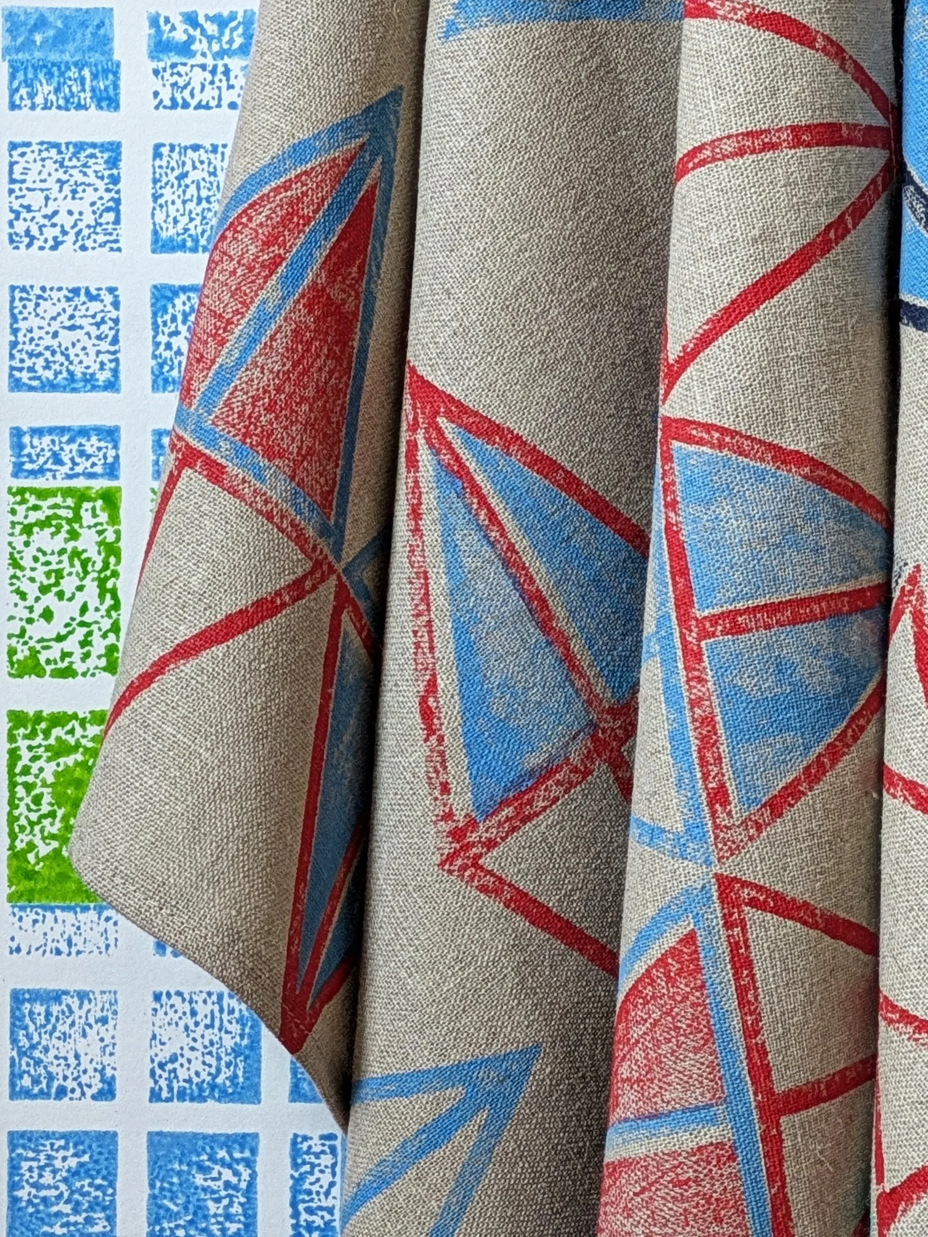
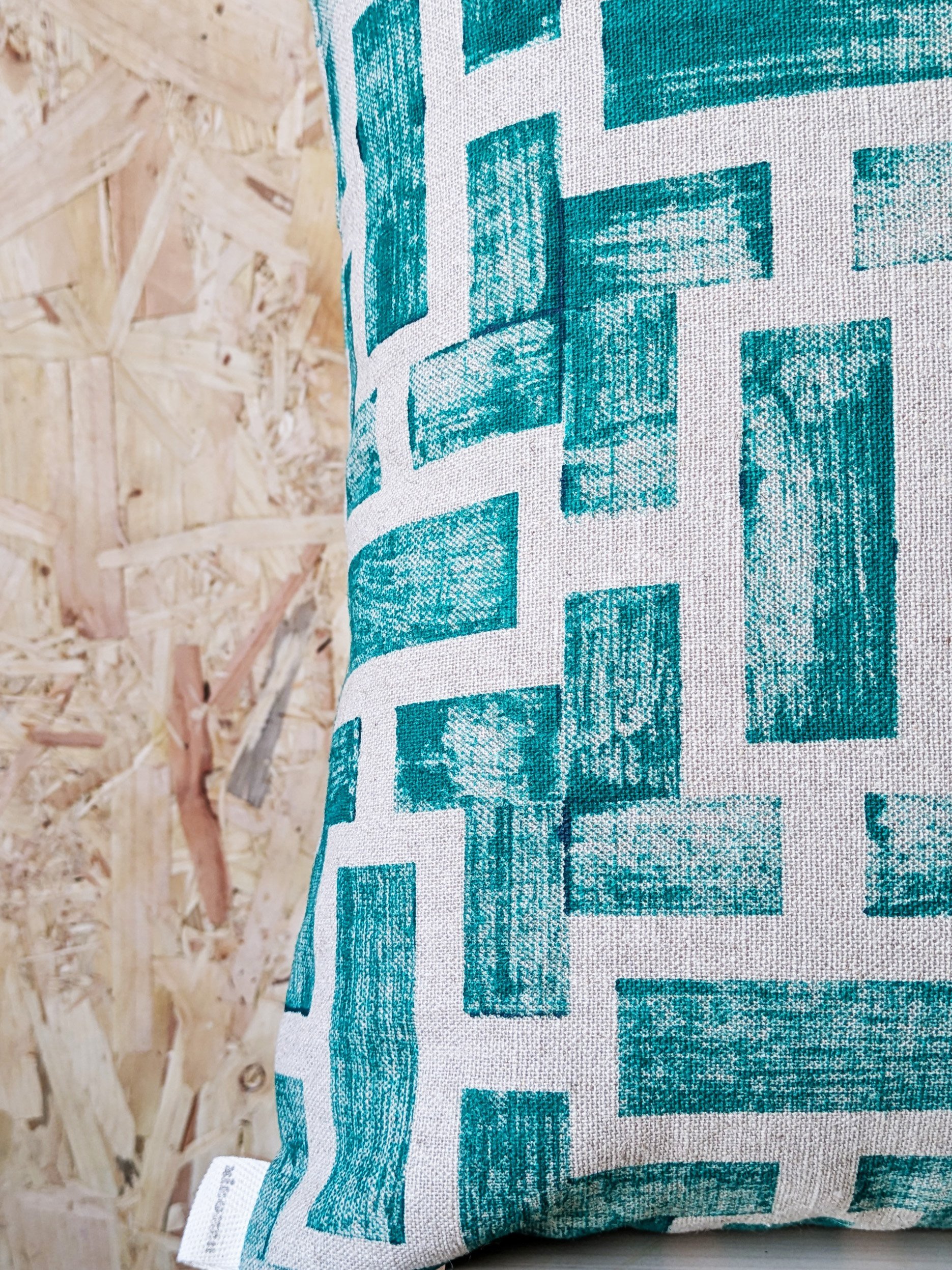
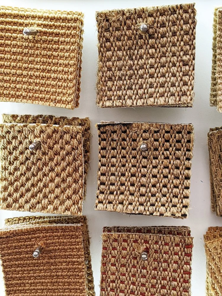
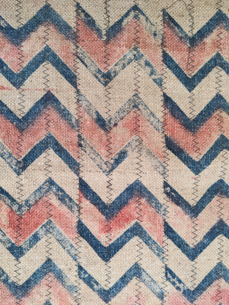
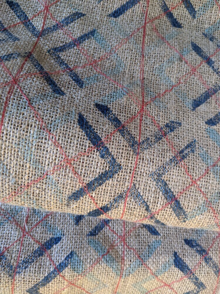
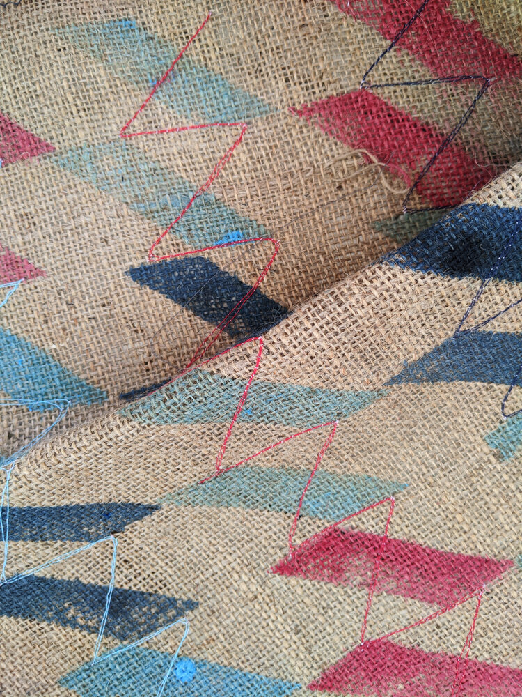
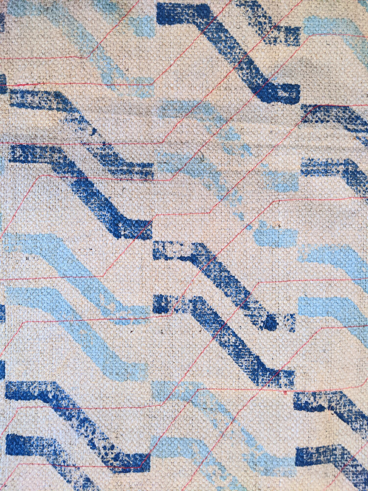
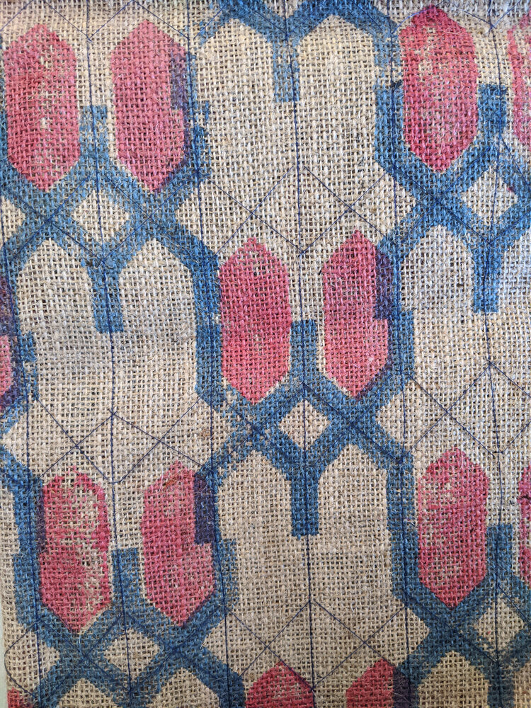
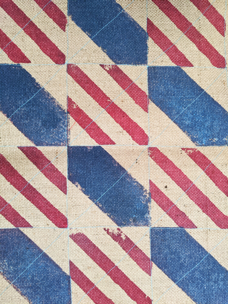
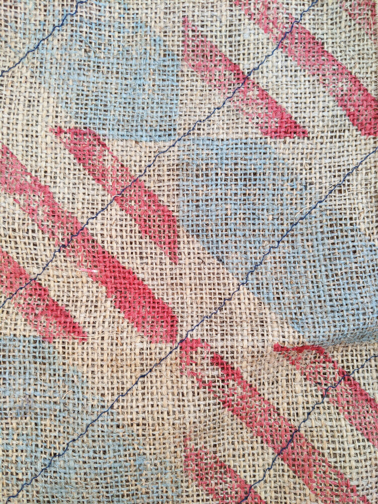
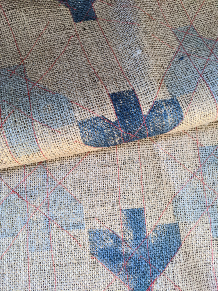
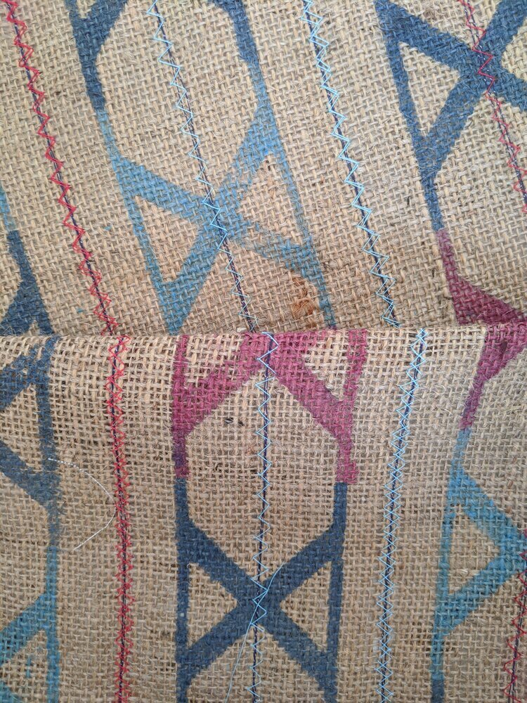
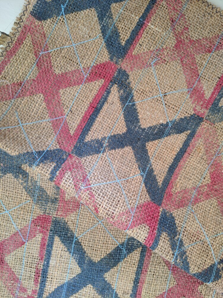
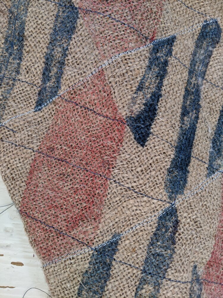
over the past few years zitozza has accumulated many layers. new collections, experimental colourways, limited runs, market editions, trade show pieces. each one served a purpose at the time. each one taught me something about scale, proportion, colour, texture. but accumulation on its own did not necessarily create clarity or systems much and accumulate, it did. so a studio spring clean felt very well due.
i’ve also been thinking more deliberately about who this work speaks to most fluently. architects and interior designers have always recognised the modular logic immediately: the fact that every block is the same size, that patterns are assembled rather than illustrated, that rotation and proportion matter more than motif. that shared language of grids, ratios and repetition makes specification natural. the textile becomes another layer of construction rather than an afterthought. architecture works because it is resolved. because decisions are made.
that realisation does not change my work itself, but it sharpens the framing i think. when the system is clear, it becomes easier to see which pieces belong at its centre and which are better understood as experiments along the way.
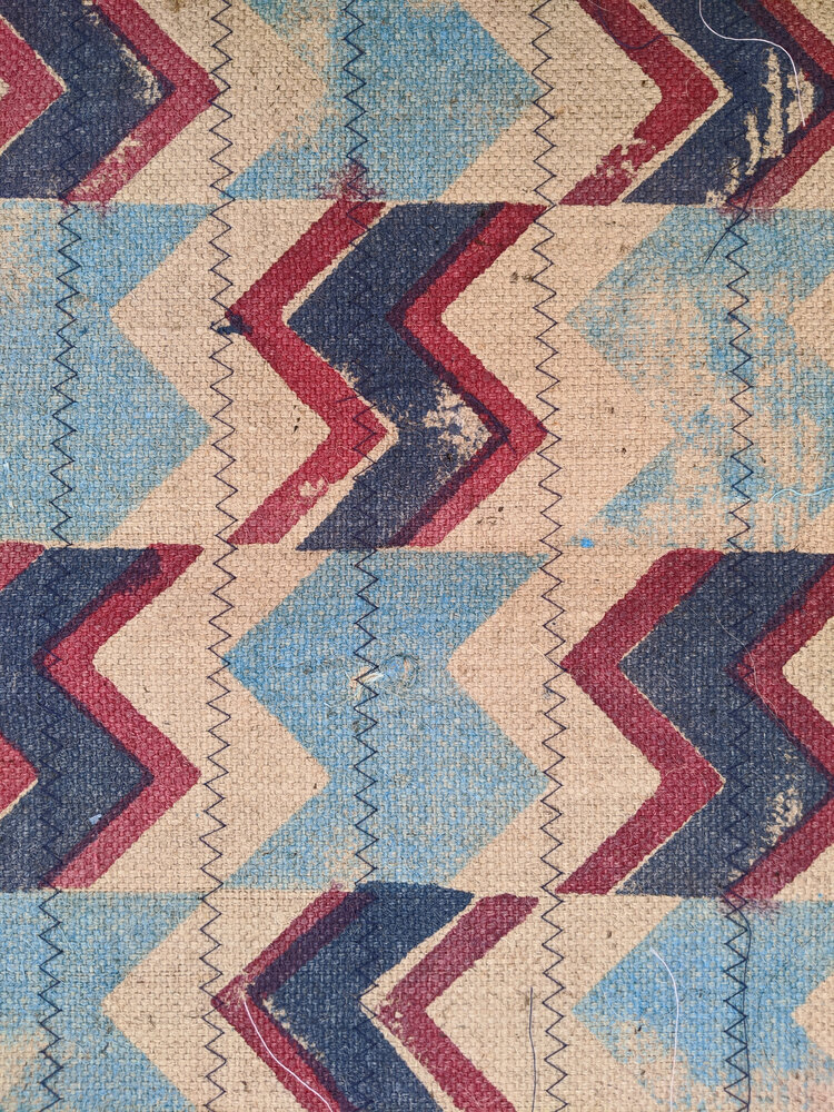
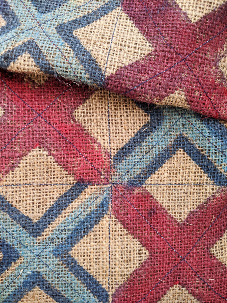
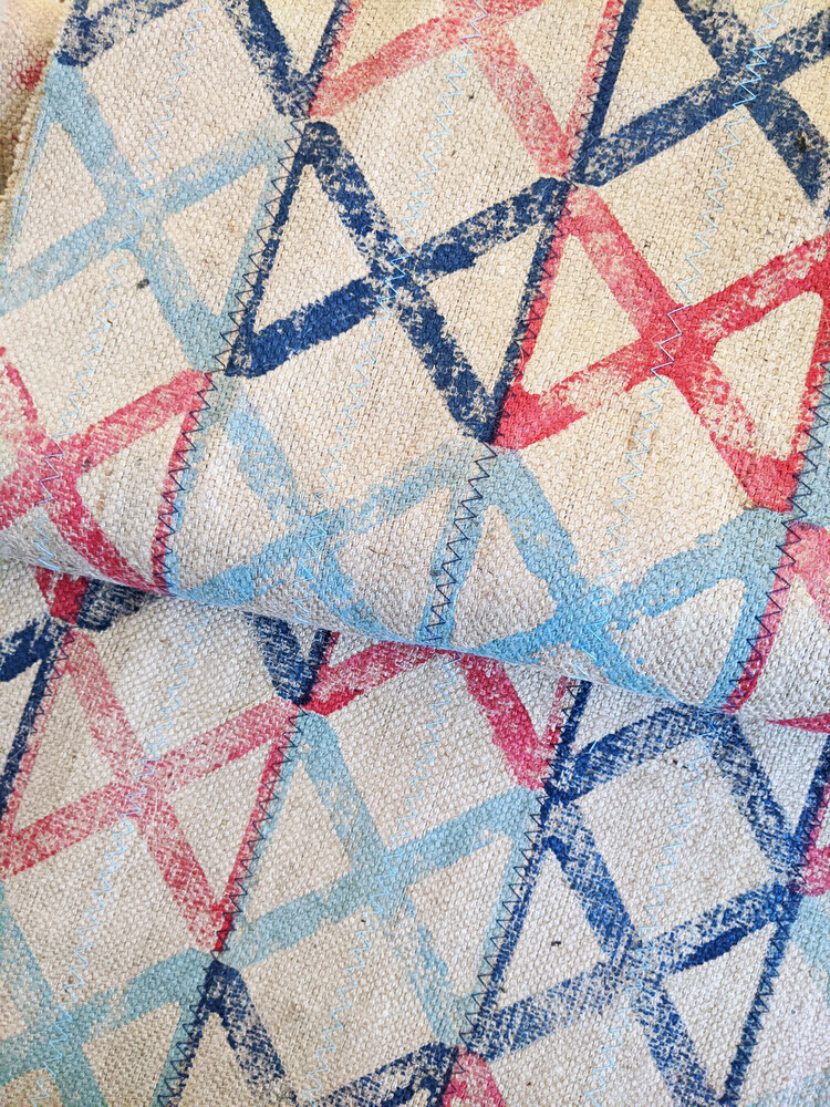
a studio like ours benefits from rationalisation. there are lengths of fabrics, sample runs, end cuts and test prints that still carry the same hand-printing and material weight, yet sit slightly outside the current direction. many, many pieces that were printed perhaps at the very start of our journey, many years ago have become somewhat peripheral to where the structure is tightening. so, opening a material library clearance felt like the most honest way to let those pieces find their context - whether as framed studies, upholstery panels, or small interventions within larger interiors.
this kind of editing has less to do with tidying shelves and more to do with aesthetic durability. i have written before about resisting the constant generation of new desire. durability comes from coherence. from collections that can sit comfortably in a modern interior without announcing themselves too loudly, yet holding their own against concrete, timber and steel.
what i am aiming for this year is not expansion for its own sake, but refinement. a clearer system. stronger alignment between architecture and cloth. patterns that feel placed rather than applied. and the pleasure of knowing exactly why something is there.