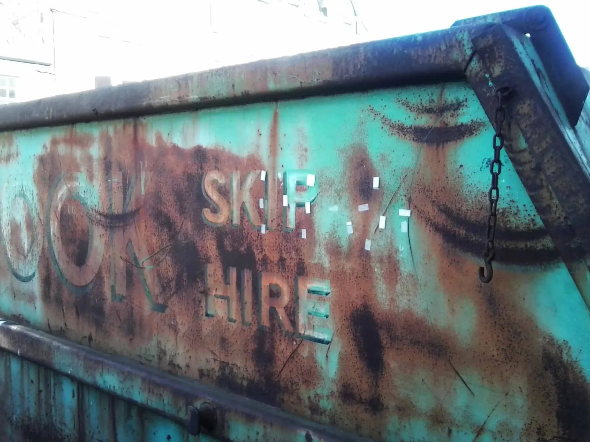
as yet another year closes, i think a lot about time, i guess that’s part of getting older, but some things only get interesting once they’ve stopped pretending to be new. a façade darkened by rain, a jute fibre frayed at the edge, paint softening on steel - marks left by time. designers often call this patina, but that word is a little superficial to me, what time does isn’t decoration. it’s participation.
materials in conversation
the modernist world has always been oddly conflicted about ageing. le corbusier spoke about architecture as a “machine for living,” yet machines rust, fade, and require care. in japan, the concept of wabi-sabi embraced this truth long before modernism tried to streamline it: finding harmony in imperfection, dignity in transience.
ernő goldfinger’s trellick tower, denys lasdun’s national theatre, even the modest housing blocks of glenrothes all share something accidental yet profound: their surfaces record weather, pollution, human use. they’ve become topographies of touch. the stains, the moss, the soft greying - proof that buildings are not finished objects. they are ongoing negotiations with the elements.
the hand of time, or of the maker
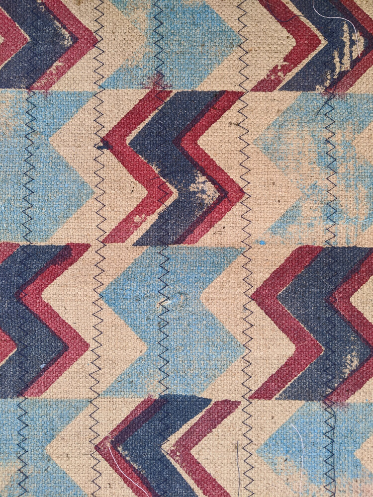
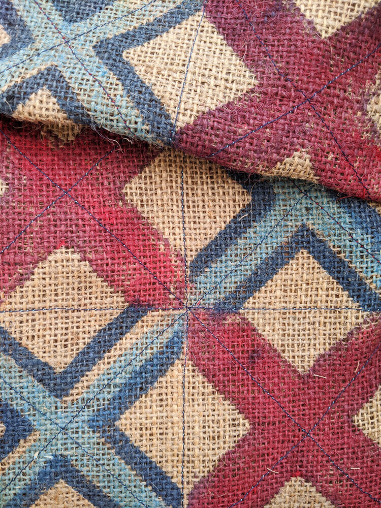
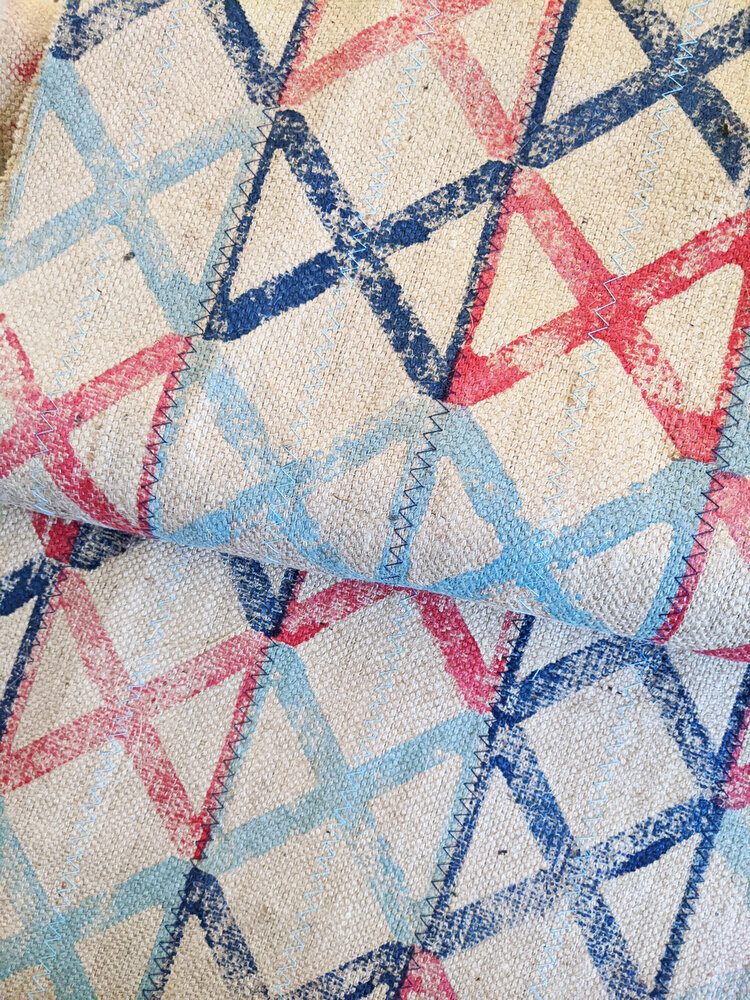
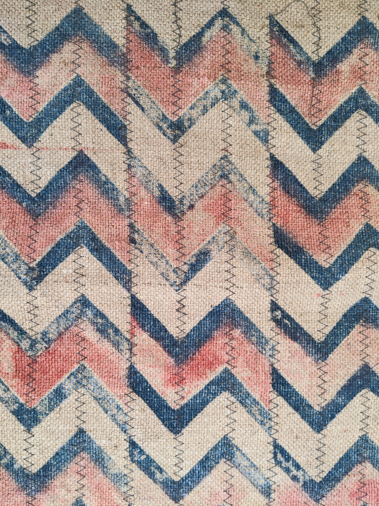
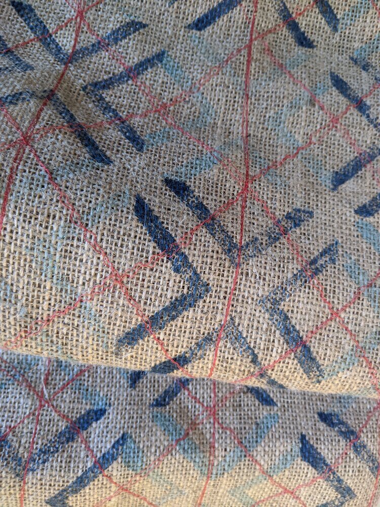
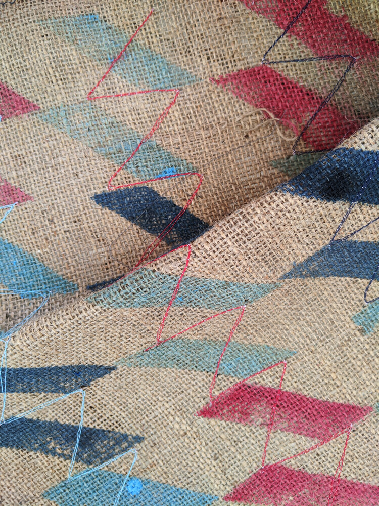
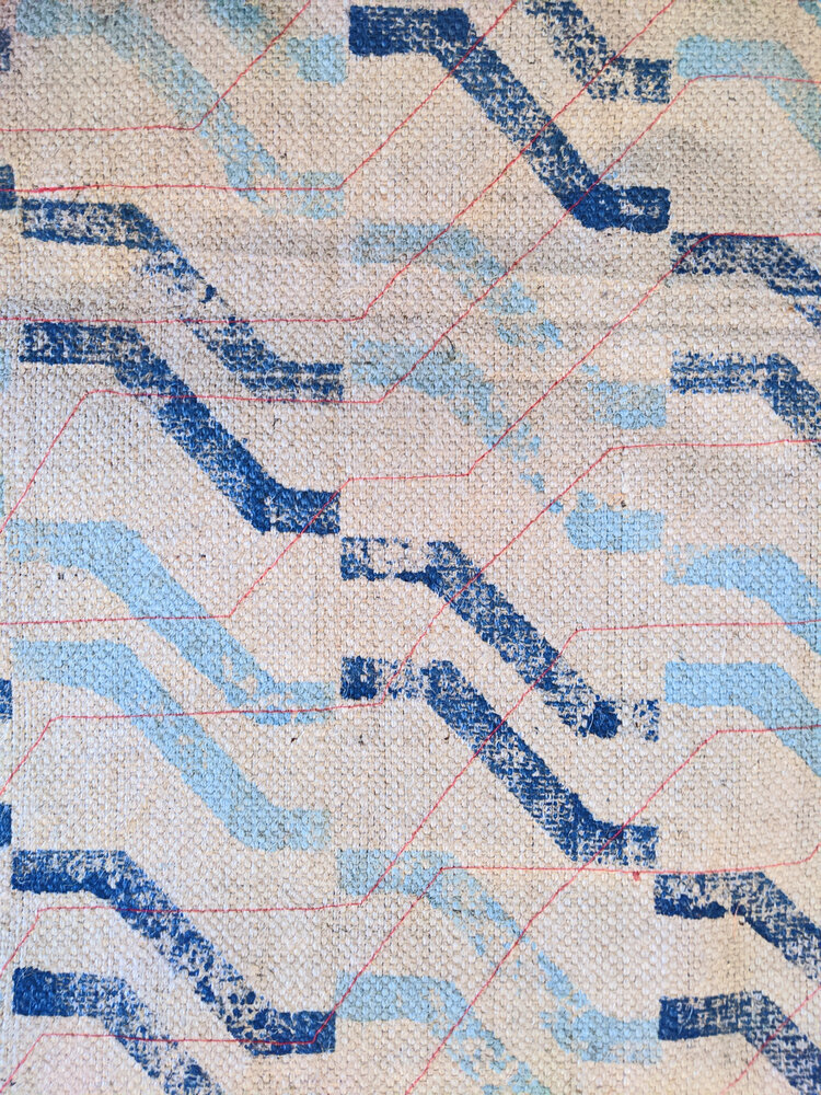
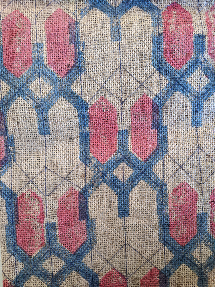
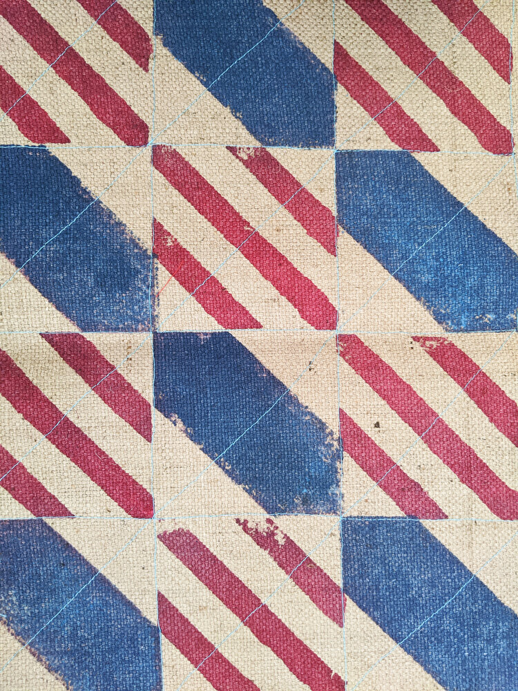
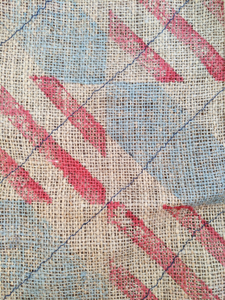
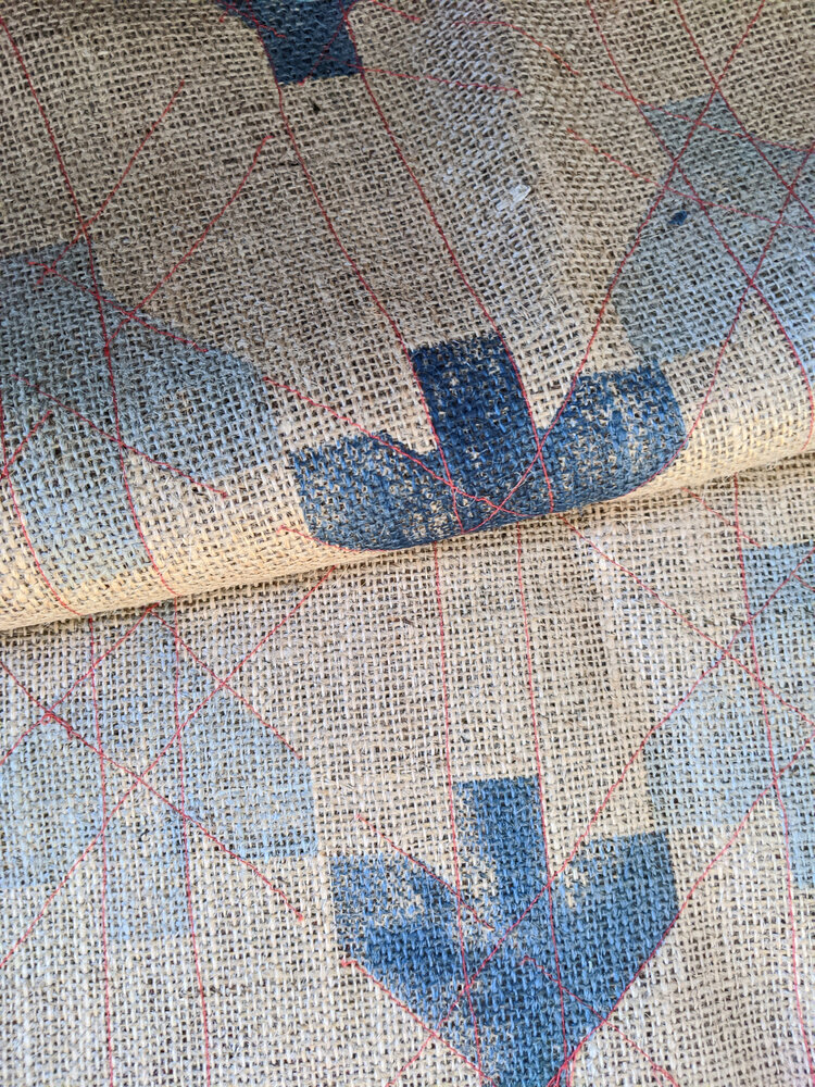
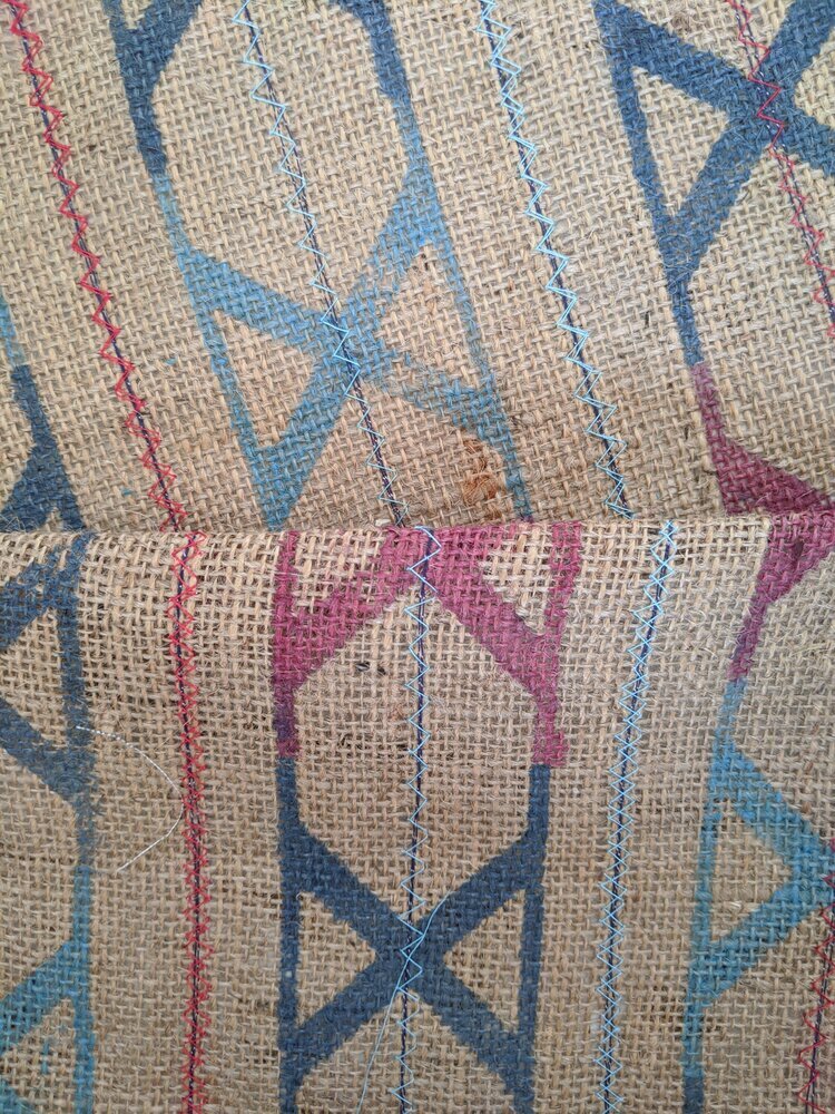
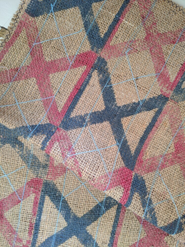
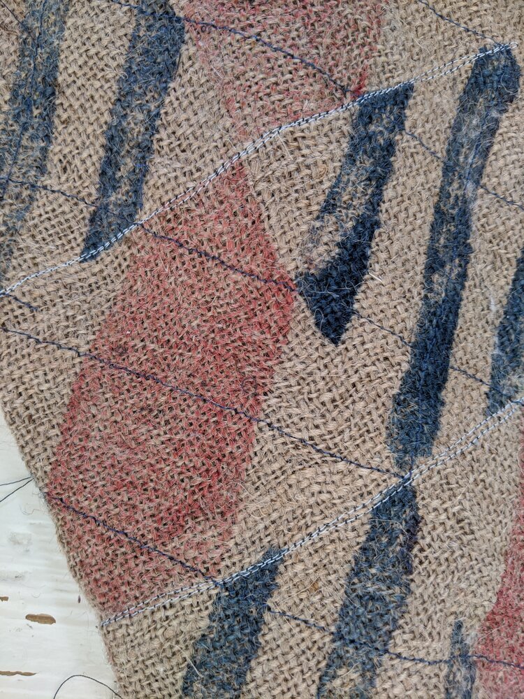
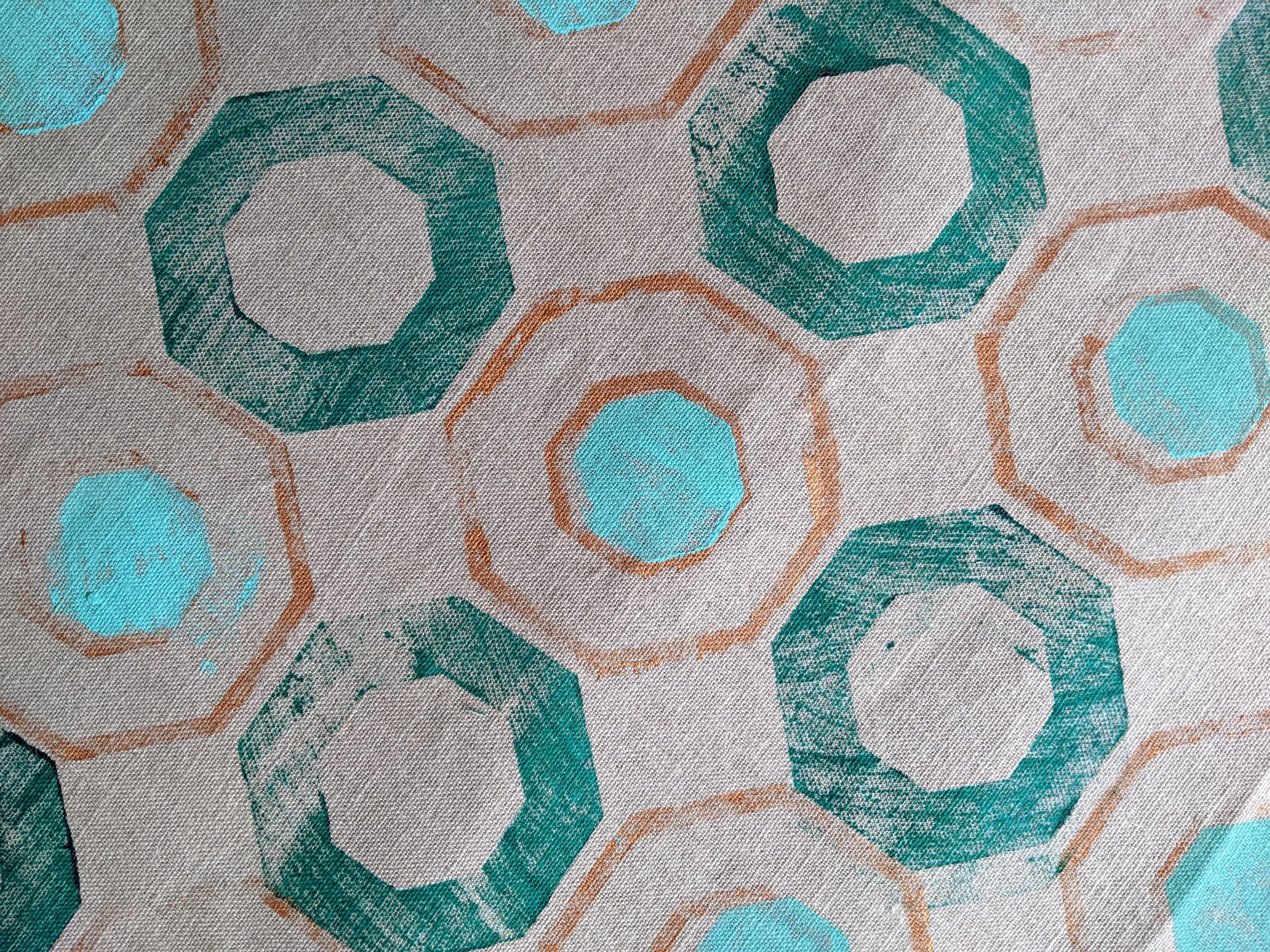
when i print, i think about this a lot. the brushstrokes i add to my blocks are deliberate interruptions, these are of course not so much about decay but adding individuality. the texture of ink brushed by hand can never be repeated twice. the smallest movement alters the weight, the rhythm, the outcome. each print becomes a fragment of time in its own right: unrepeatable, slightly imperfect, quietly alive.
there’s a strange comfort in knowing that a surface can’t be copied. the same logic that makes an old wall fascinating makes a textile human. both bear traces of their making (of process, not perfection.)
the industrial sublime
as much as i’m obsessed with the new, and its constructions sites in ambitiously high-reaching cranes, i do also like a bit of the odd demolition. scaffolding, half-poured concrete, peeled paint - this choreography of decay and regeneration, particularly because it’s difficult to build in new. there usually was something else before. perhaps it’s the same impulse that drew me to brutalism in the first place: the beauty of things in progress and the kind of resistance to polish.
artists like rachel whiteread or gordon matta-clark come to mind in a way, cutting, casting, or revealing voids as a form of understanding architecture through absence. they teach us that every layer removed or revealed is part of a story of use.
in design, as in cities, change is the only constant material.
designing for impermanence
this is why i find the idea of “timeless design” slightly absurd. nothing is timeless, nor should it be. what matters is whether something ages well - whether it accumulates life gracefully. good materials evolve rather than resist.
printing by hand is, in a way, a small rehearsal of that truth. each block presses its own memory; each brushstroke leaves its mark. what results is never uniformity, but rhythm, the same kind of rhythm that time itself applies to architecture.
texture as memory
so perhaps the goal isn’t to preserve perfection but to let things breathe. to allow colour to fade, surfaces to soften, patterns to settle. the beauty of impermanence lies in that generosity in letting the world contribute to the design after you’ve stepped away.
buildings weather, fabrics crease, and the hand that made them is long gone, but the marks remain. it’s not nostalgia. it’s continuity.