back in february, i wrote about why i find the term “storytelling” so exhausting when applied to pattern design, and i really do believe that a pattern doesn’t (and shouldn’t) guide you through a linear narrative; rather, it surrounds you, as in, all of it exists all at once. i wanted to expand on this thought a little bit further and make the case for curiosity, something that’s at the core of zitozza.
the explanation is actually not mine, it lies in a concept coined by the japanese designer kenya hara: exformation.
in his book designing design, hara argues that our modern world is entirely obsessed with information, with throwing broken pieces of knowledge at people until they feel they "know" everything. we see this everywhere in contemporary interiors. spaces are styled to look like a specific narrative, a carefully curated scrapbook of a person’s supposed lifestyle. the design leaves nothing to chance, forcing a pre-packaged biography onto the inhabitant.
“basically, knowledge is no more than an entrance to thought (...) to know something is not a goal, but a starting point for our imagination. (...) the information-dispatch side is engrossed only with throwing broken pieces of information at the recipient, and the recipient has begun to consider catching information as the goal. (...) i wonder if this is where the problem of stagnating creativity in communication lurks?” (hara, 2007)
“exformation” is the exact reverse of this process. it is the art of making something known not by over-explaining it, but by awakening the viewer to how much is left to be discovered. it is about converting the known back into the unknown, creating an entrance for curiosity.
“the “in”, of “information” is an affix. attached to the beginning of a word, sometimes it adds a negative implication. but in most cases, it intensifies the root meaning, or adds meanings like “directed within, on and toward”. this is the case with “inform”. the word “form” means to shape, organise, or arrange in order, but implies the movement vector involved in taking a definite shape. accordingly, “inform”, with the background meaning, “giving a certain form”, carries meanings like, “to make known”, “to tell”, “to imbue (with a feeling)”. then, in noun form “information”, it takes on meanings such as communication, knowledge, information and scholarship, and further refers to the service of giving information, as in “information booth”. in the word “exformation”, the prefix is changed from “in”, to “ex”, reversing the meaning of “in”. the meanings of “ex” include “not”, “out of”, “outside”, “eliminated”, “prior”, and others. this is the source of the concept of converting the known to the unknown. Notice that “exterior” is already widely used as the counterpart to “interior”, so my coined term, “exformation”, may well make sense to the general public.”
so by his logic, when we apply this to the spaces we live in, the implications are profound. an interior does not need to communicate a story; it needs to create the conditions for experience.
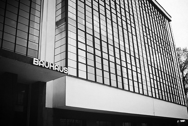
this is where the architectural grid and the repeating textile system come into play. to some, a modular grid might seem cold, rigid, or overly rational. but in reality, the grid is the ultimate tool of exformation.
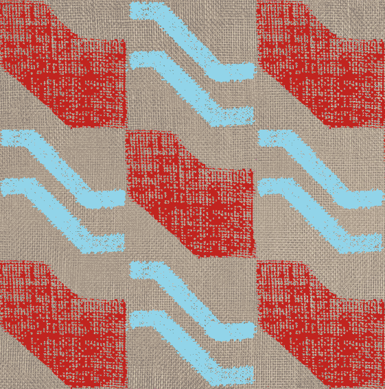
the grid does not dictate a narrative. it doesn't tell you how to feel, nor does it demand that you admire its personal history. instead, a repeating system establishes rhythm, scale, and tempo. it sets a clear, visual boundary line that provides stability, and then - crucially - it stops talking.
by remaining emotion-free and focused purely on proportion, a modular textile system leaves what kenya hara calls a "productive emptiness." it creates a framework that waits for the inhabitant to fill it in. the meaning of the space isn't prescribed by the designer; it is constructed by the person moving through it, watching the light shift across the floorboards, or holding a conversation over a table.
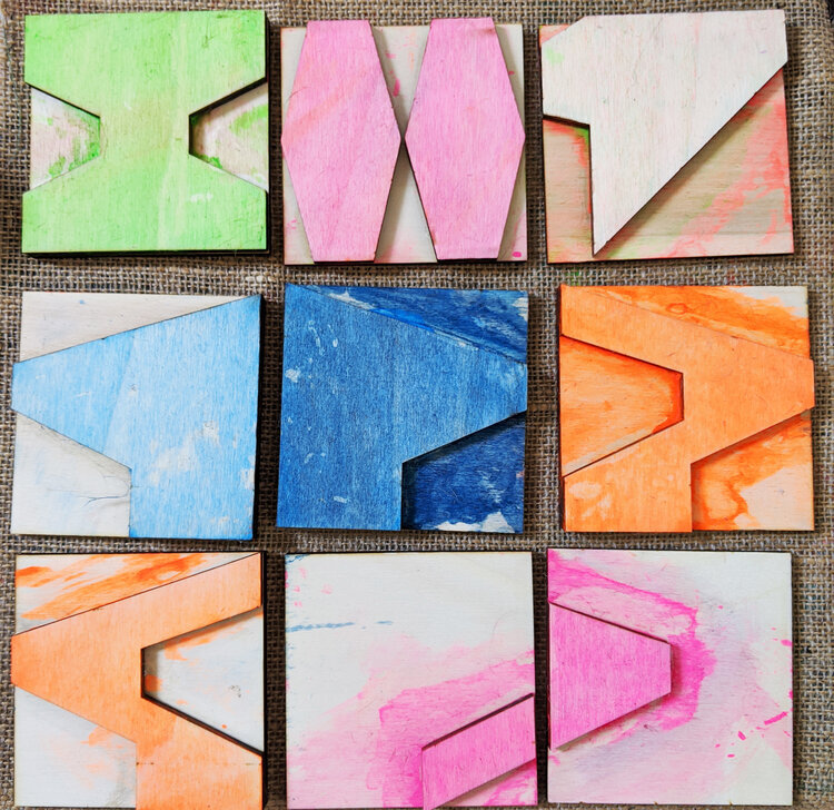
this philosophy is the exact blueprint behind the digital pattern design tool i’ve been developing for zitozza. when i design a printing block based on an architectural reference, i am not trying to narrate the building's “biography” as such. i am extracting its spatial logic. when a designer or architect uses the tool to rotate, repeat, and configure those blocks, they aren’t receiving a finished story from me. they are using a language of forms to create their own framework.
losing the compulsive forcing of stories in design is nothing to fear. stripping away the sentimental fluff doesn't make a room cold; it makes it spacious. it shifts the designer's role from a loud storyteller to a quiet translator of rhythm.
after all, a rug shouldn’t be a biography. it should be a foundation. it should simply clear enough visual noise out of the way so that life has enough room to happen inside it.