for those of you in fife this will be the familiar - yup, this one will be about glenrothes. i’m really into this town (the only new town on the east), so much so that i’m going to split my photo blogs into groups and go through this in more than one tour - please come with me for the first one through the town centre.
glenrothes is a new town in scotland, designated in 1948 and built and developed throughout the following years. the area has a history of industry in paper mills, and the new town was largely built for workers of a new coal mine, which, only after 7 years of operation had to close in 1965 due to technological difficulties. some industrial presence continued in the town though and fife council also moved their headquarters there.
as one of the earliest new towns in scotland, glenrothes was built and developed with a mixture of ideas leaving their visual impacts on its surfaces. the town won the disputed “carbuncle award” muiltiple times however glenrothes also received multiple awards in the beautiful Scotland competition - perhaps as a response to the negative publicity (and because the many open spaces and roundabouts are indeed quite floral)
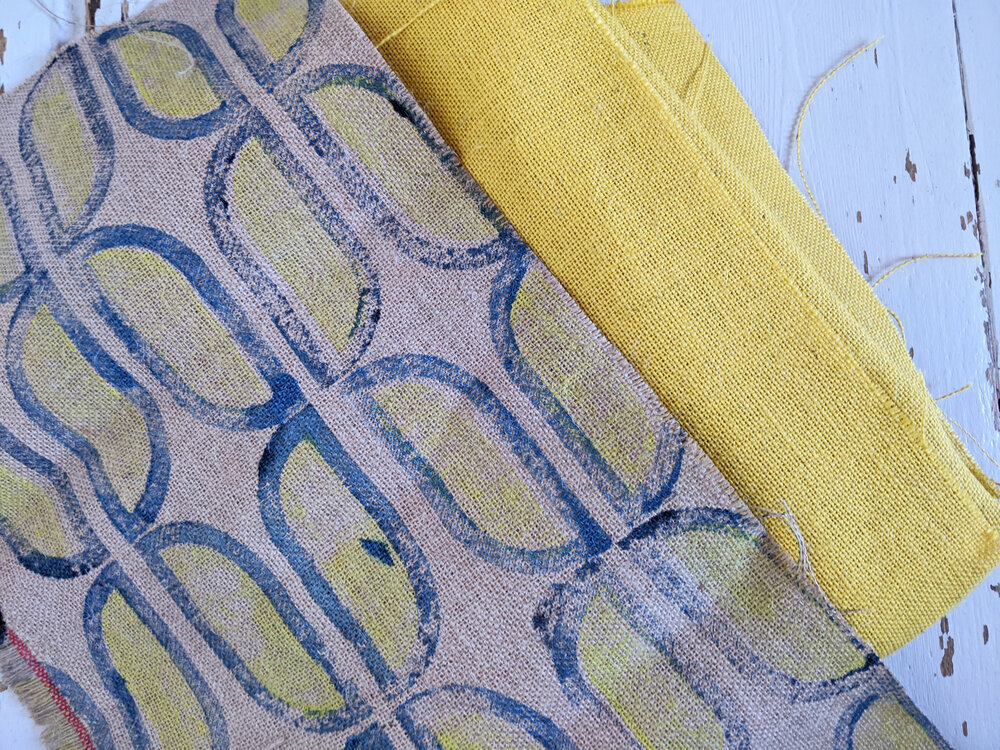
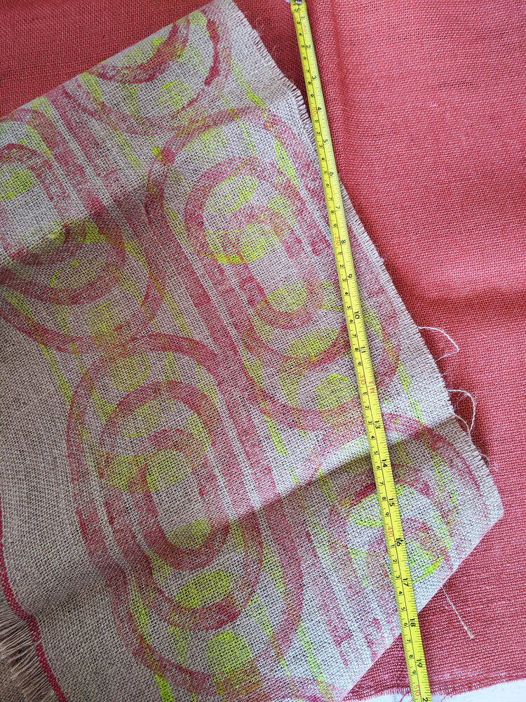
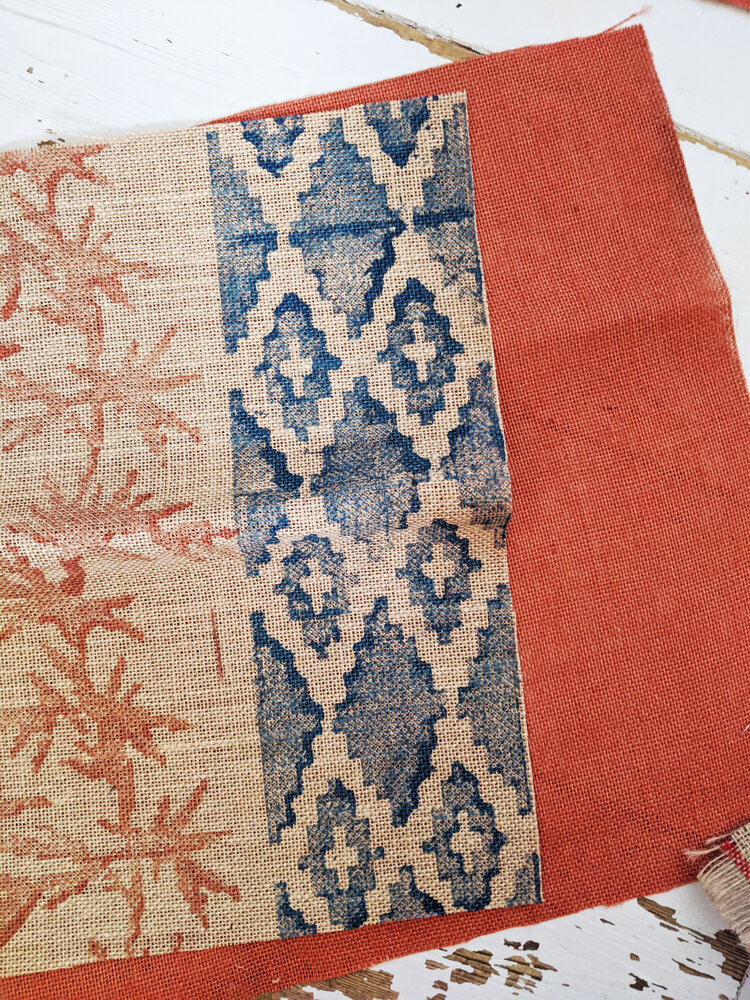
these architectural walks often feed directly into my textile design practice – especially the bold geometry and surfaces that define many post-war buildings in the UK. i know a few locals, who find humour and affection in their upbringing in this setting and i basically just aim to show the fabric of this place in a positive light. i have a lot of material though so i’m going to start right at the centre.
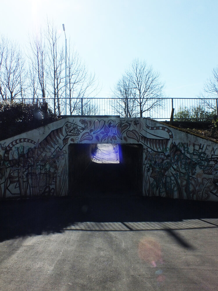
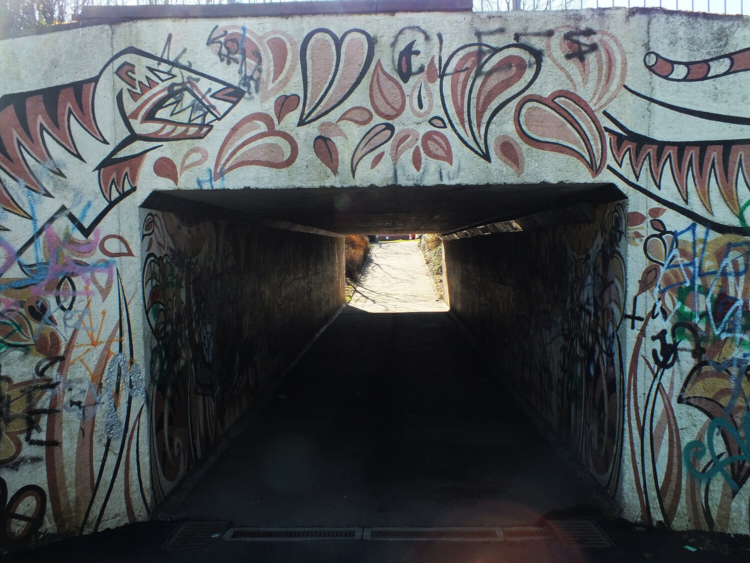
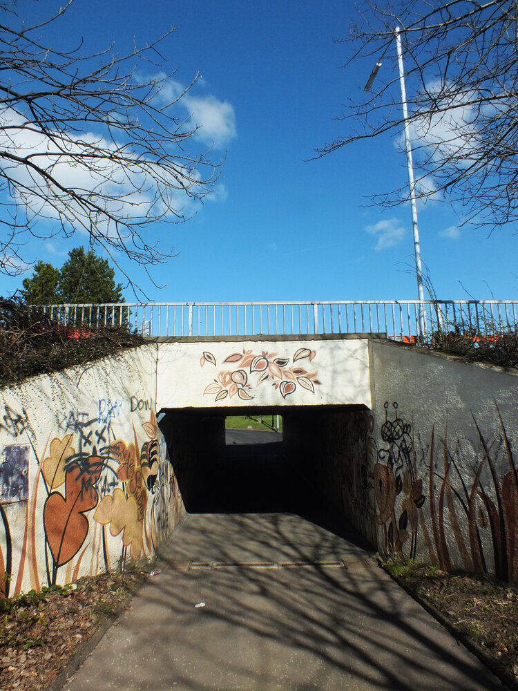
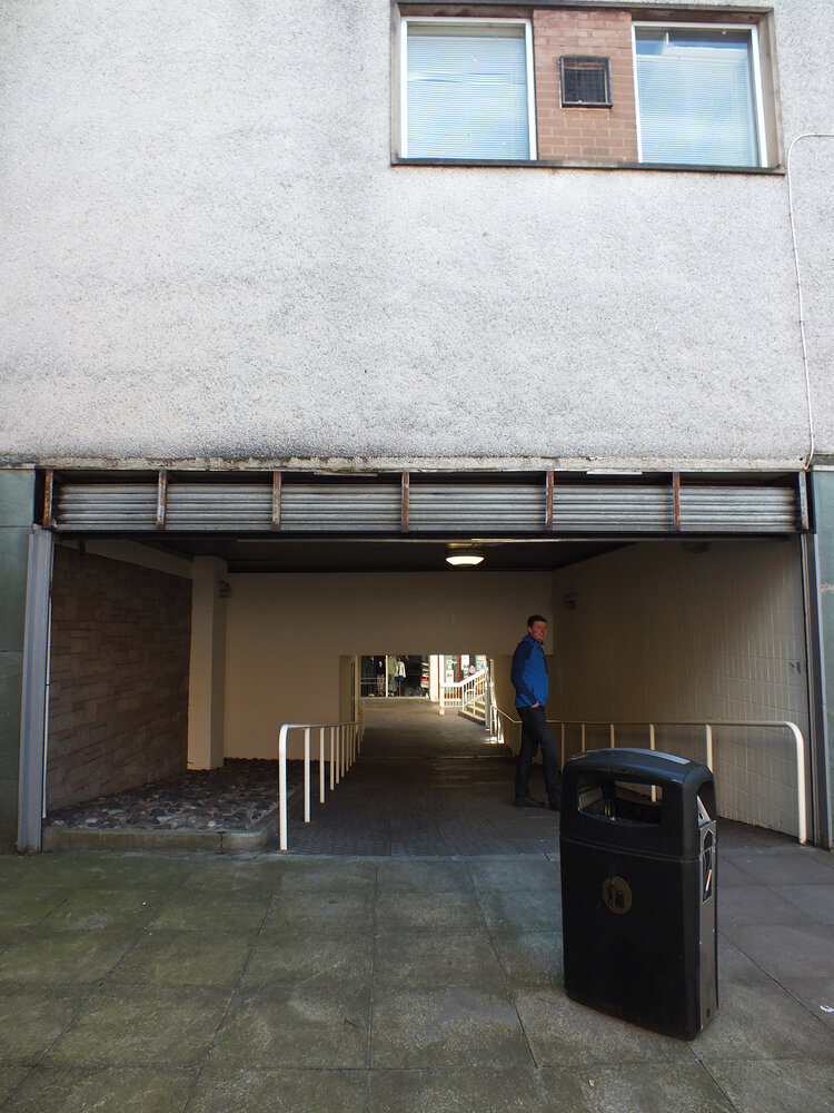
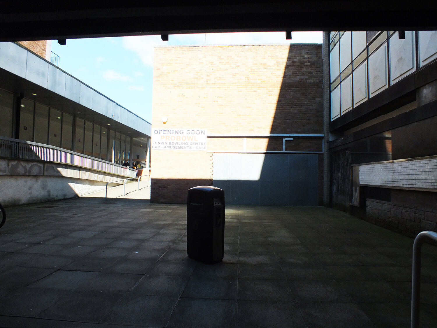
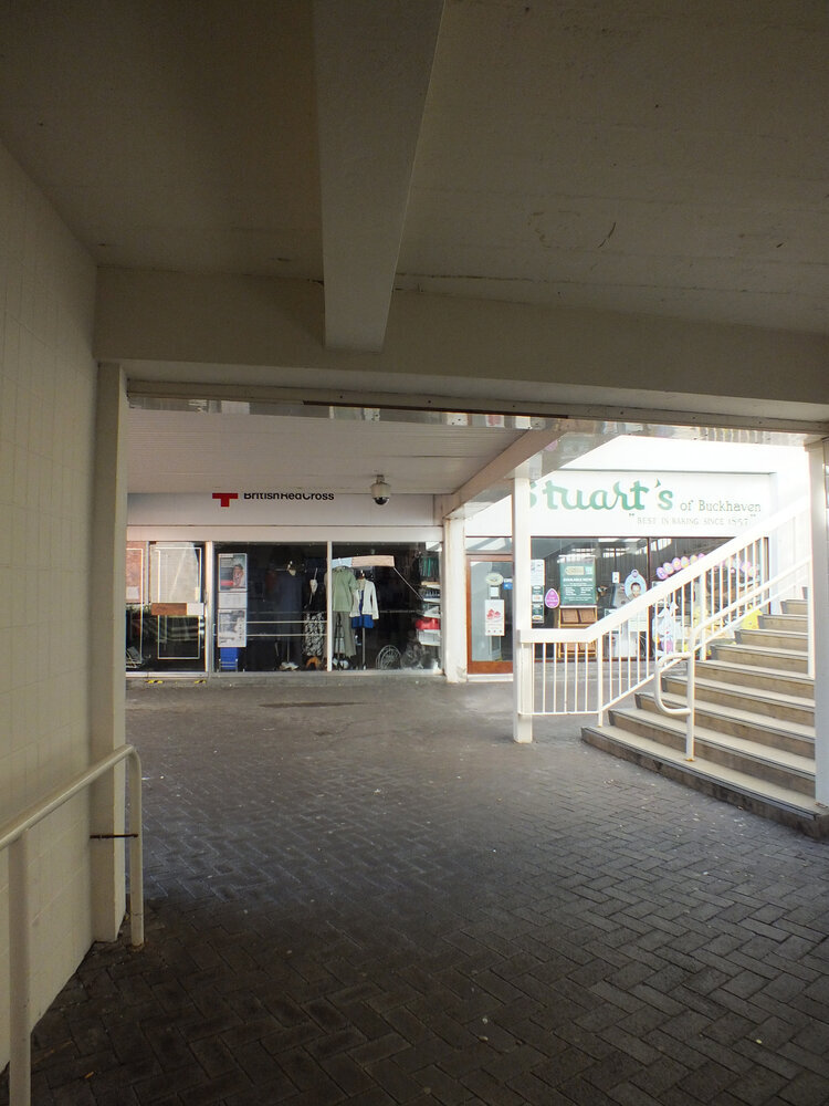
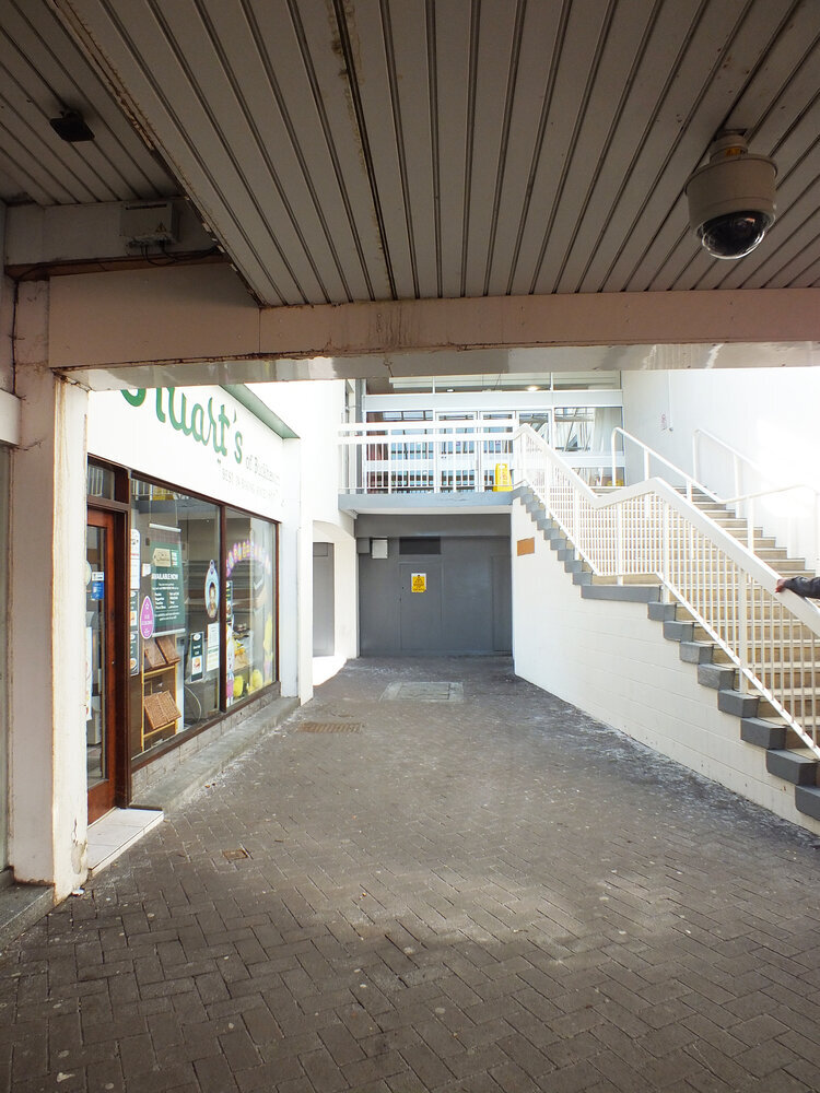
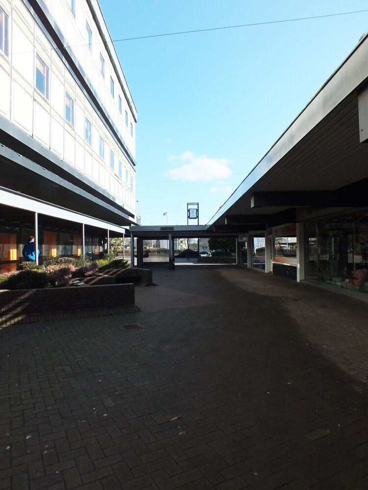
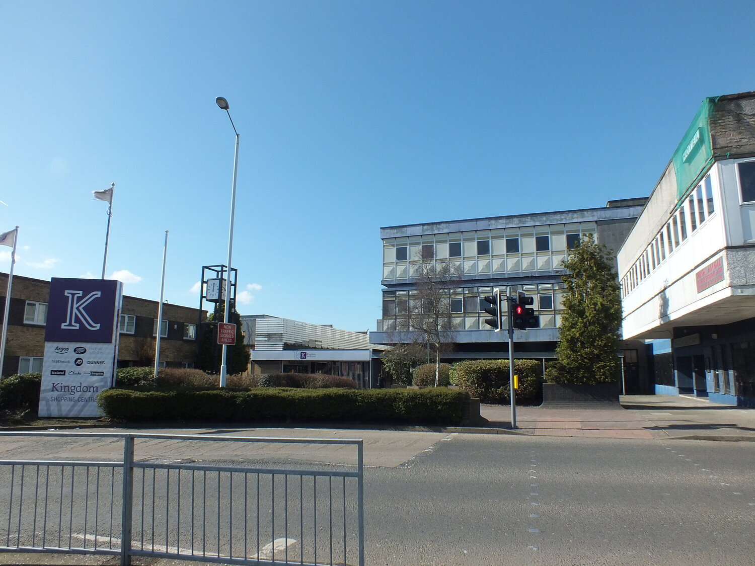
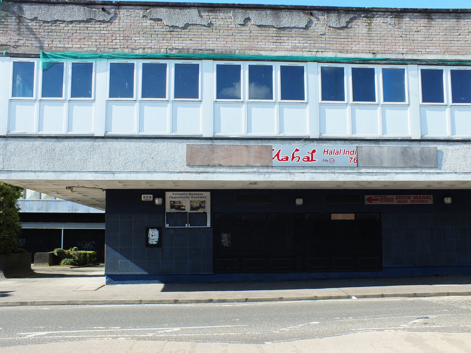
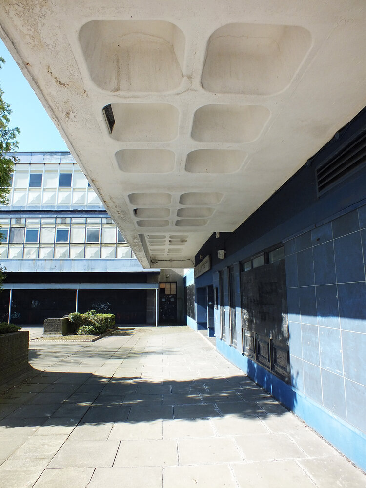
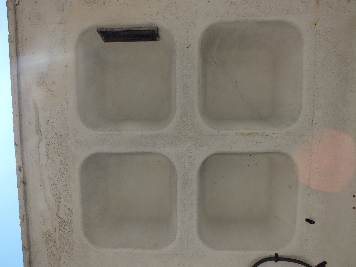
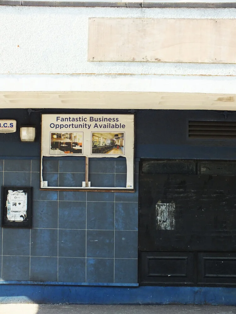
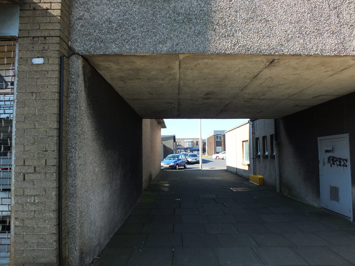
the town centre itself is a small pedestrianised area for shopping named “kingdom centre”, consisting of concrete alleys and arcades. the “old” town centre was once busier with shoppers, however, many of the premises today are unoccupied - like everywhere else, glenrothes has welcome suburban supermarkets on its outskirts and the car-friendly layout of the town has infact probably made it more attractive than elsewhere in the area. as in most brutalist new towns, roads for motorists and pedestrians were consciously separated, which resulted in many roundabouts and underpasses (the latter now a canvas for artists - official and unofficial ones alike).
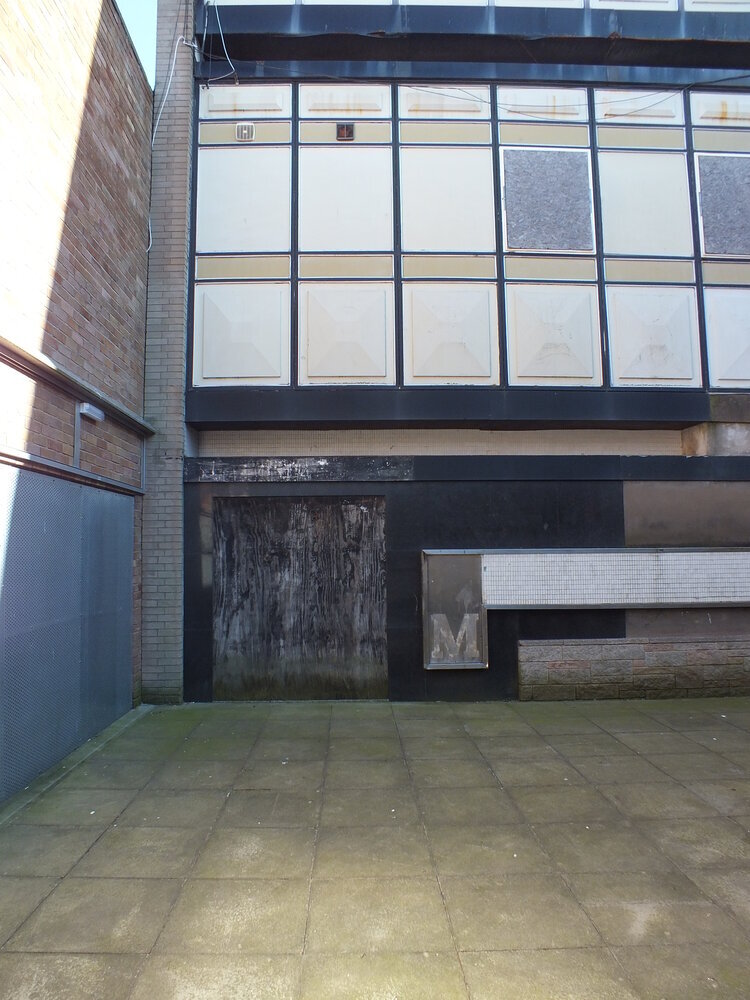
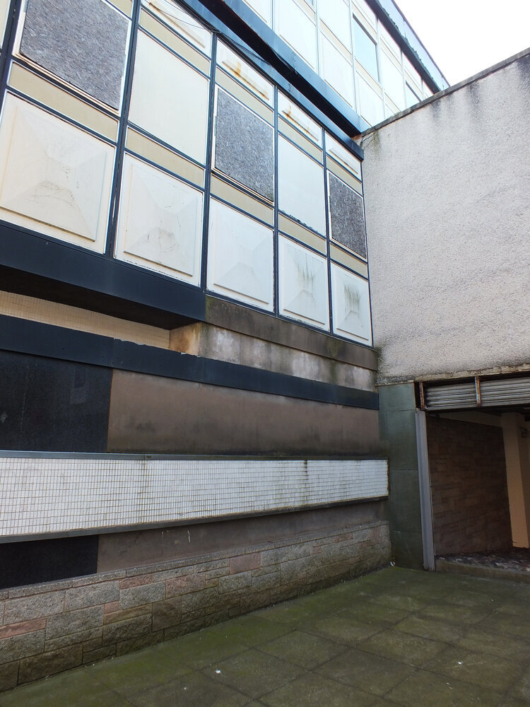
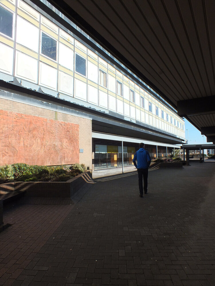
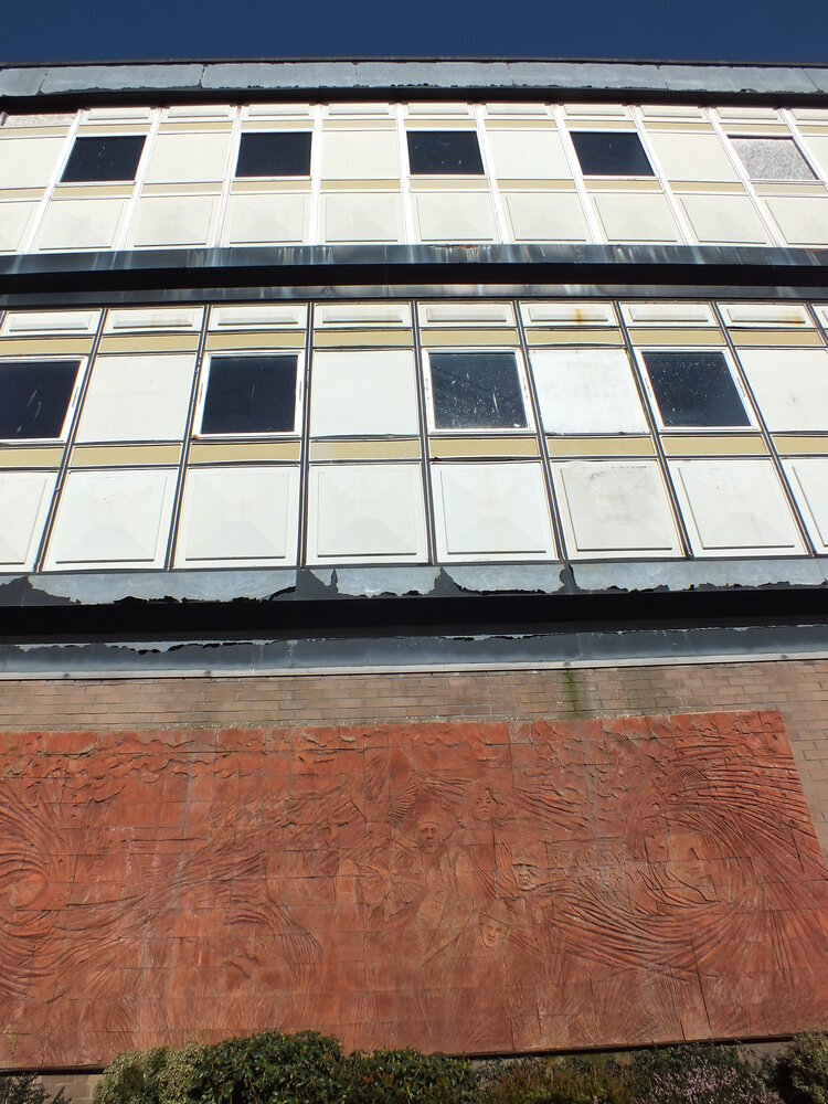
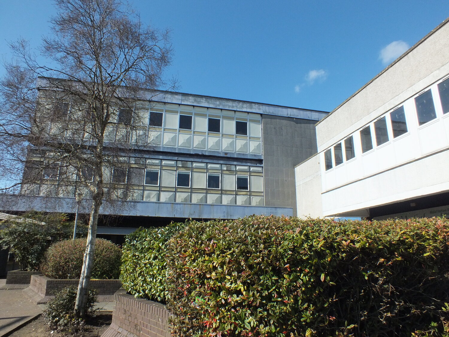
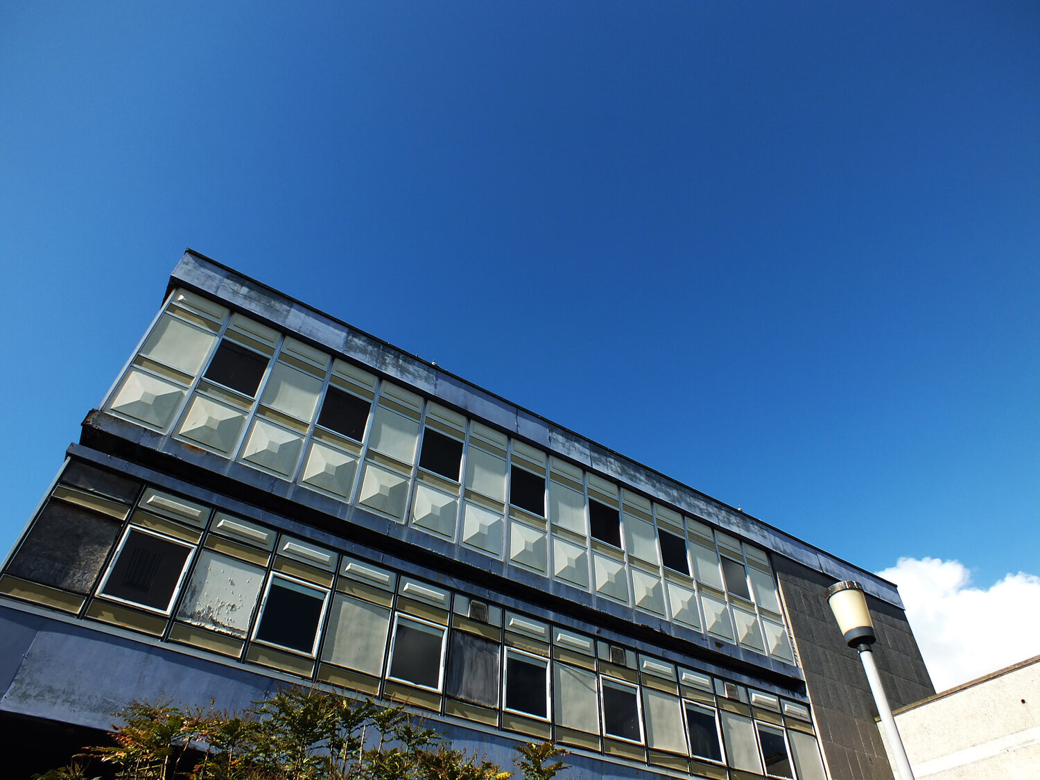
out of albany gate at the main street of the kingdom stands the co-op building, an old department store opened in 1964. i’m not sure if this was built by separate architects or not - the kingdom centre and much of the town’s architecture is a product of the glenrothes development corporation which employed many architects at the time (with glasgow-born peter tinto as chief architect.)
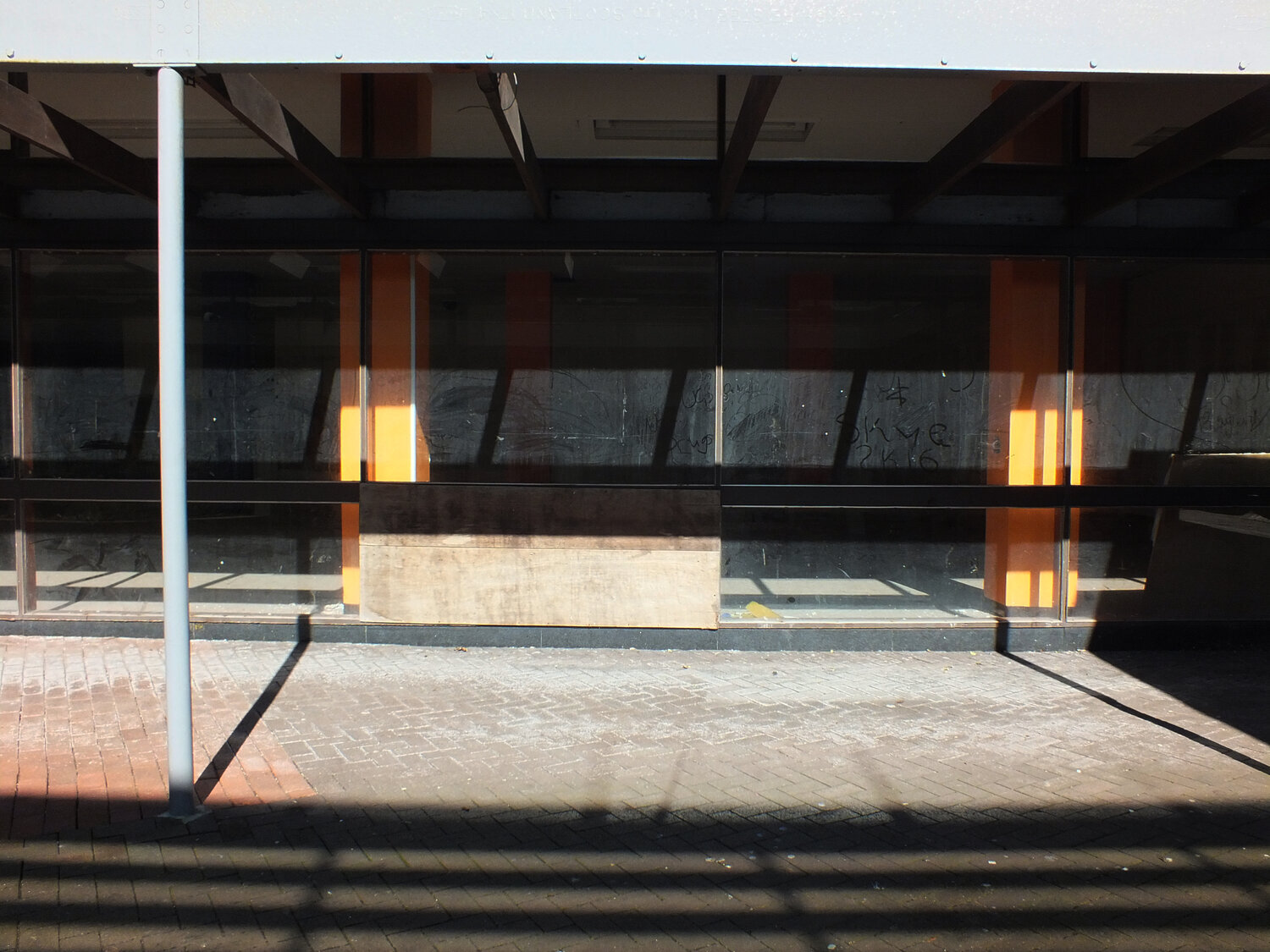
the co-op this is also now empty and is destined for demolition although the plans were scrapped later. partly because of its asbestos problem (it’s now unsafe to enter too.) it’s also really interesting (in an obviously bleak way) to look at the decaying surfaces and imagine what they may have been like in the past.
it’s not my past and these are not my memories, yet i think i would miss this building a little bit, because i find it genuinely and objectively beautiful. (lord knows i hate the word “eyesore” and i find it so insulting and cheap.)
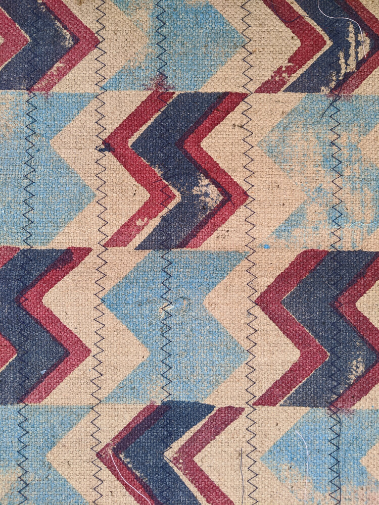
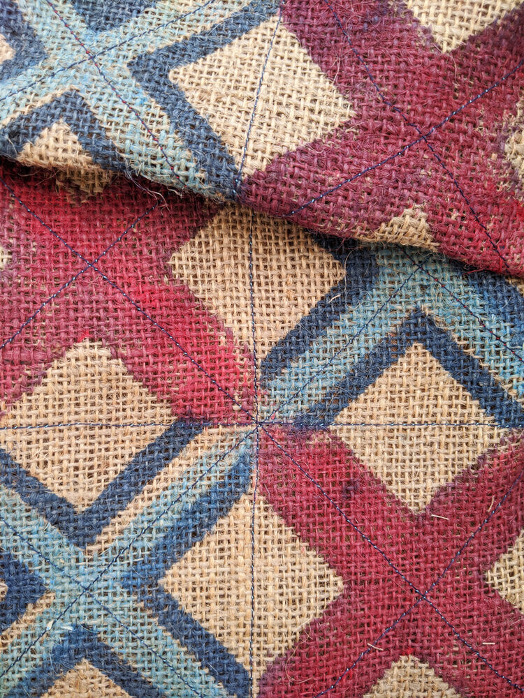
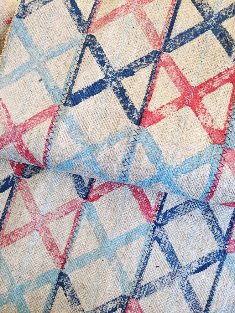
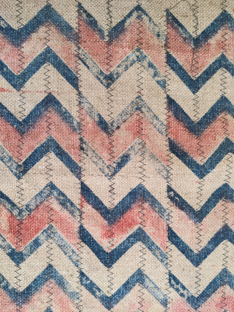
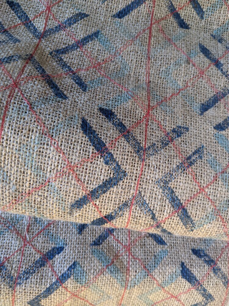
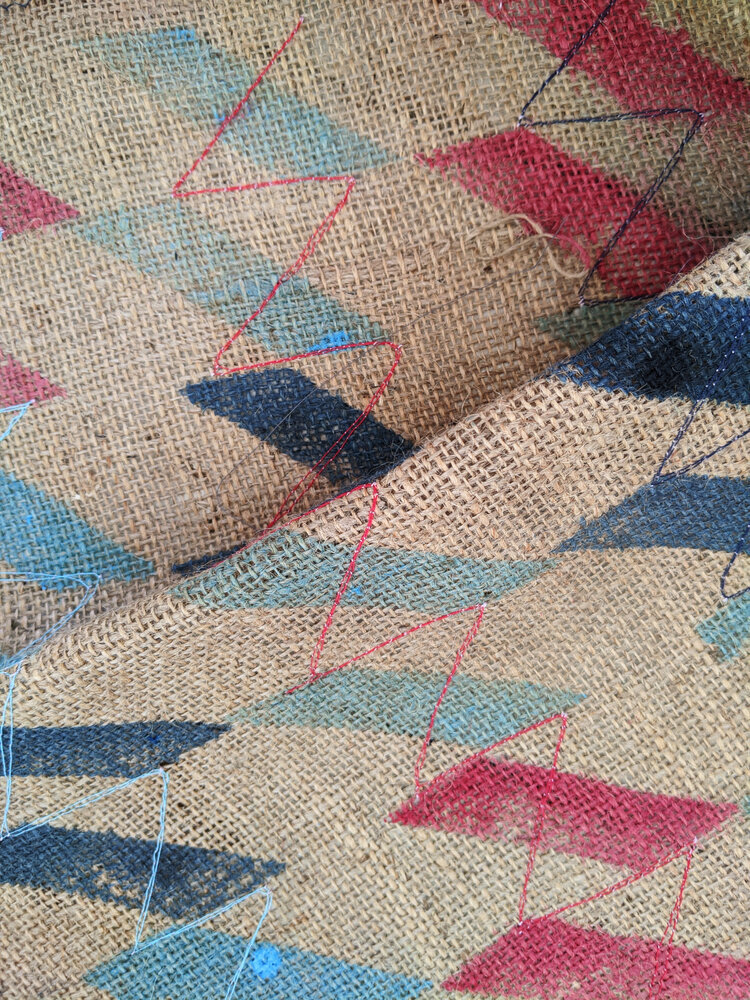
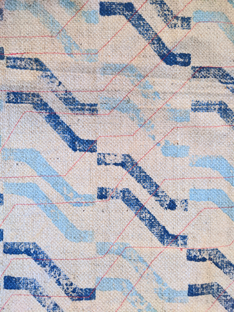
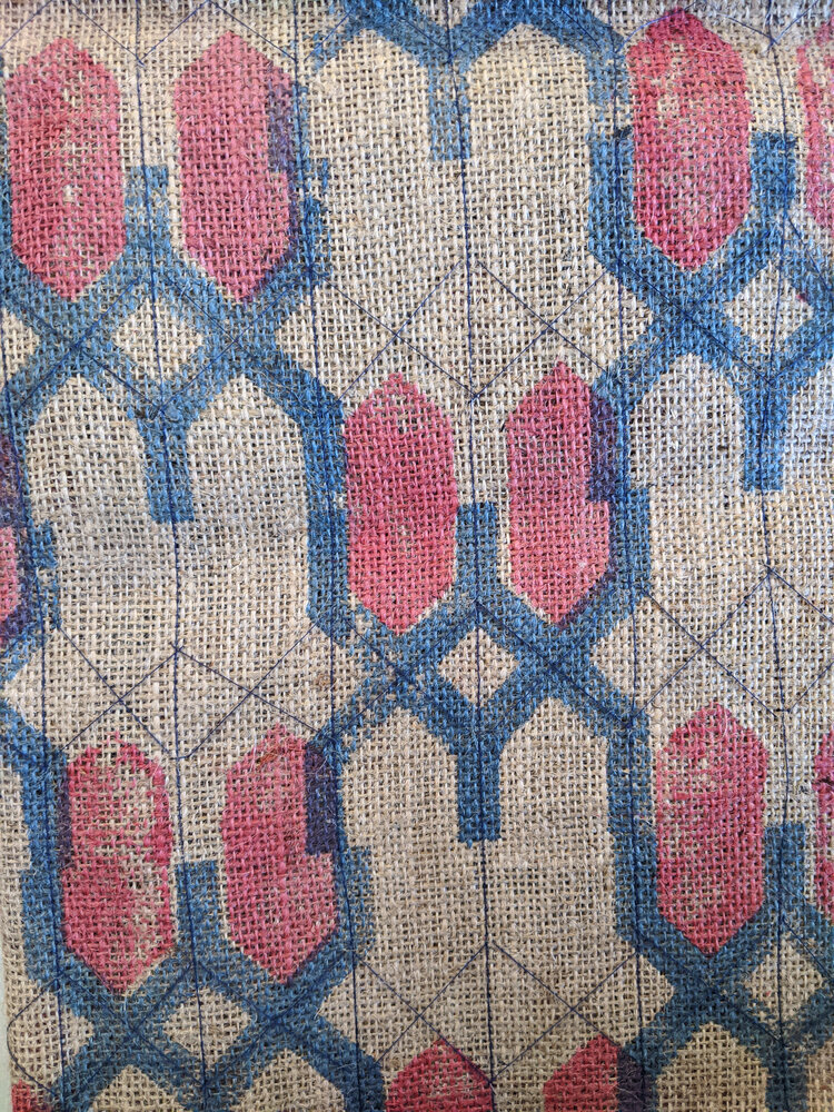
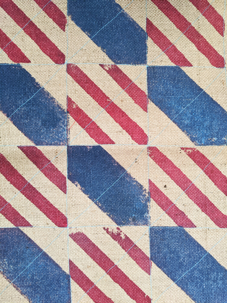
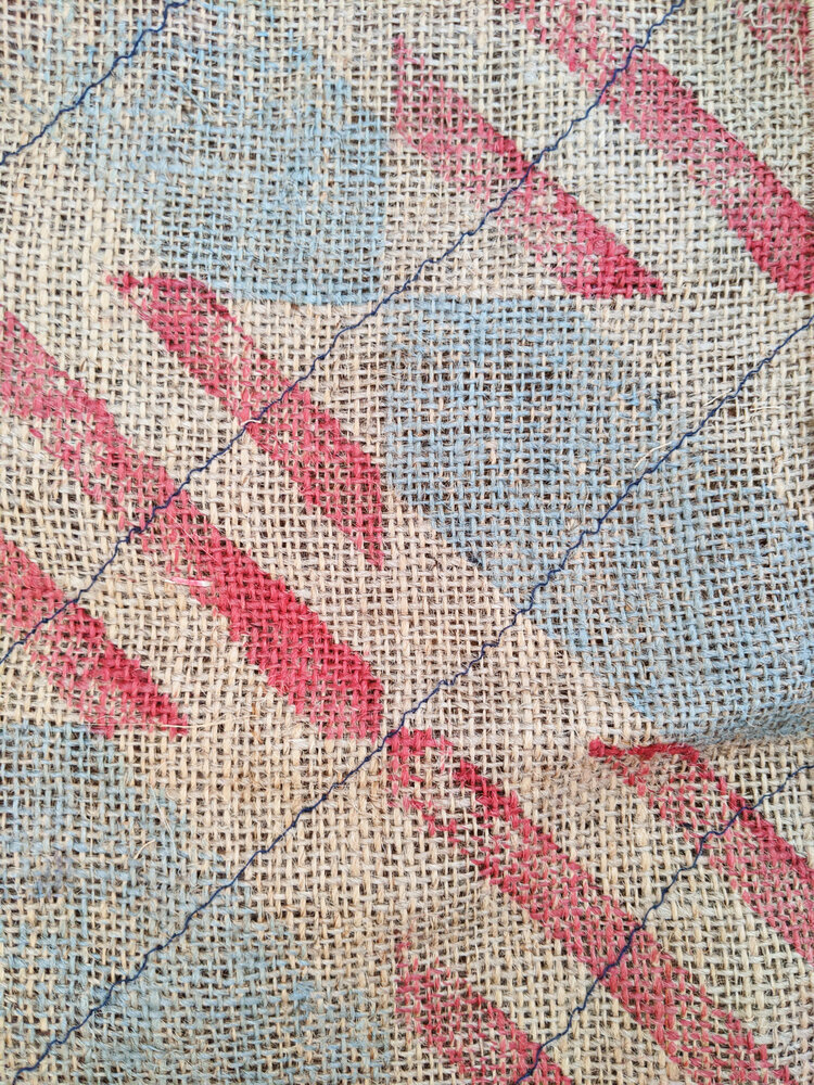
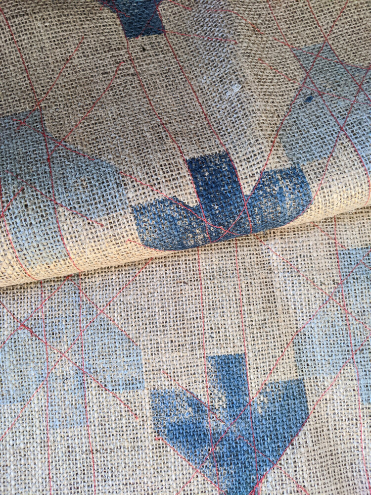
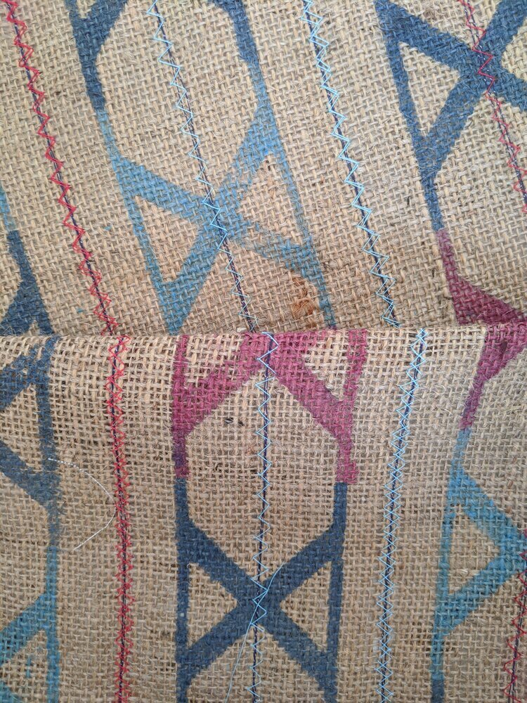
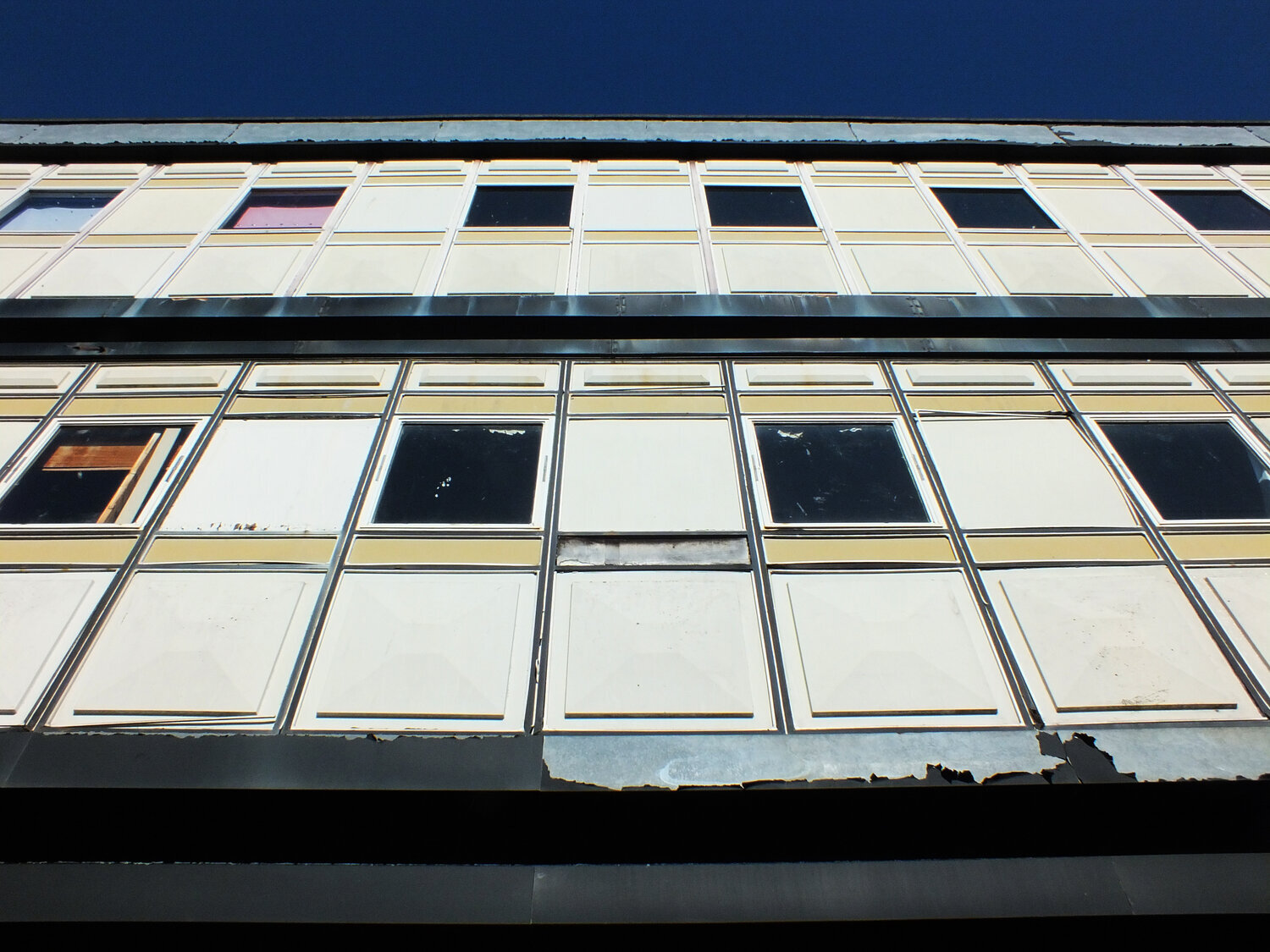
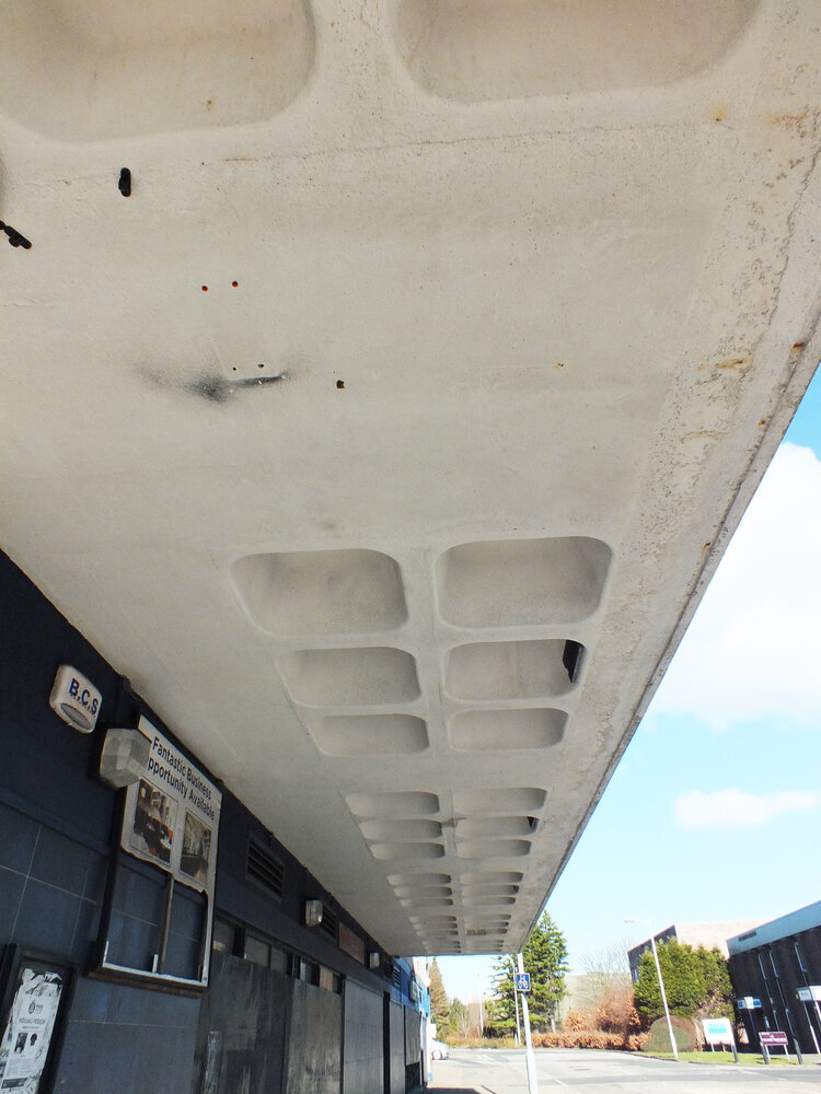
hey look here instead - the coffers on the concrete ceilings of the arcades was what inspired the co-op tileset. it’s a futuristic and human centred pattern with those edges rounded down. and the geometry of its upper facade is shiny and colourful, busy and geometric - playful and orderly at the same time. it was built for this town and its people and somehow these buildings still radiate the optimistic vision of its creators some decades later. i’m not a preservationist though and i believe in embracing the present - if it’s unsafe and unsuitable now to how we live, we can change it or make something else of it. but even if the building itself isn’t worth saving, perhaps the ideas that built them should be.
with the demolition halted, the future remains to be seen. there are now calls to use the building as murals for public art - something glenrothes has form on (i might just have an idea of a future blog post) for now, some works have begun on improvements to the exterior to make it safer while the long-term future remains to be seen. i hope you are now curious to continue this walk - stay tuned for the next tour!
-
links:
co-op demolition plans spark regeneration hope for fife town (by the newsroom, 15 march 2017, fife today)
planned £1m demolition of one of fife’s worst eyesores scrapped, leaving its future in limbo (by neil henderson, 20 dec 2019, the courier)
get involved with discussion about the future of glenrothes (by the newsroom, 11 february 2020, fife today)
work to finally address one of fife’s worst eyesores set to begin (by neil henderson, 2 july 2020, the courier)