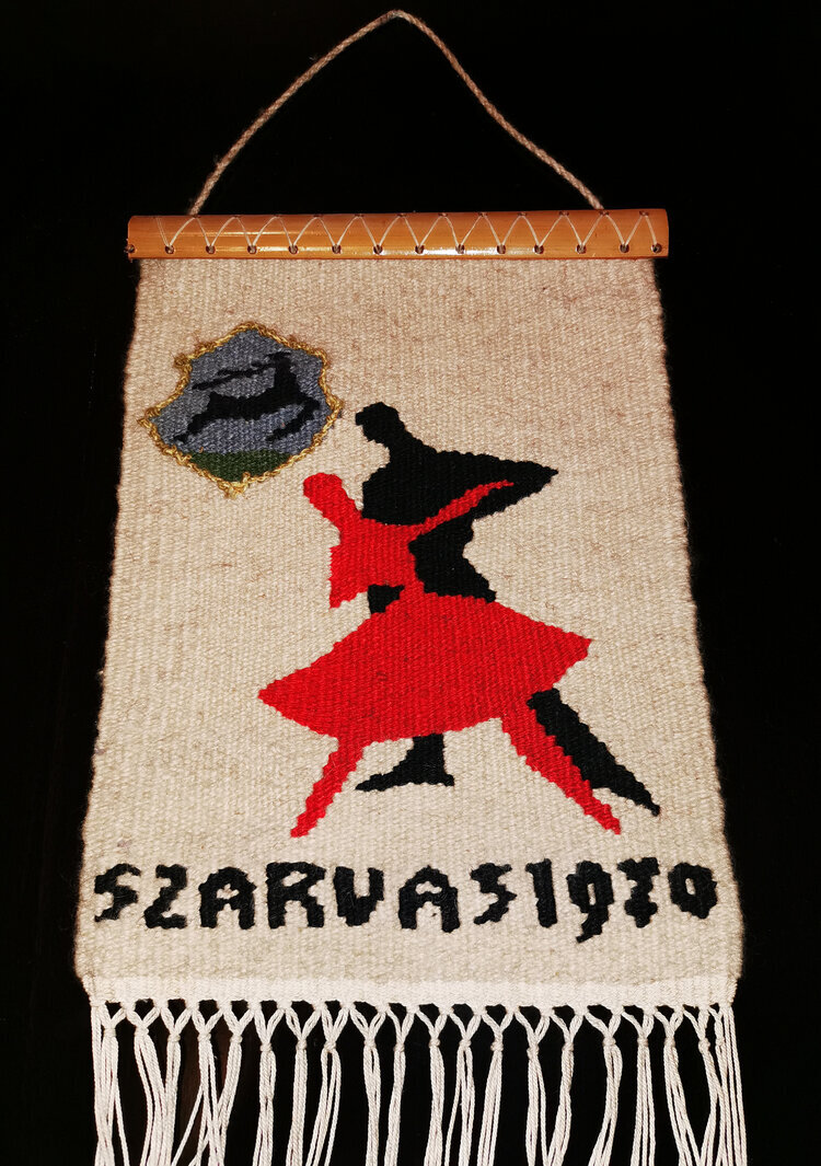
the era of "take it or leave it" design is over. we are currently living in a period of hyper-customisation, but most of what is offered is superficial, like changing a thread colour or adding a monogram. at zitozza, we wanted to go deeper. we wanted to give you the blocks.
we built our online pattern designer because we believe that the person living in a space should have the ultimate agency over the rhythms within it. i do always call it the "LEGO of pattern design" but it isn't just a catchy tagline; it is a genuine commitment to a modular way of thinking.
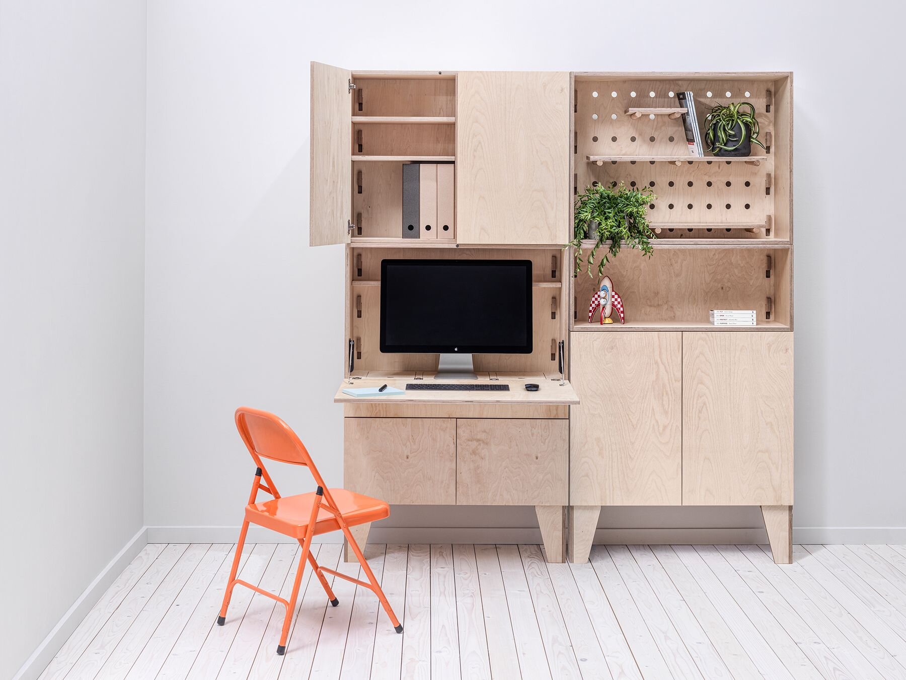
from passive consumer to active builder
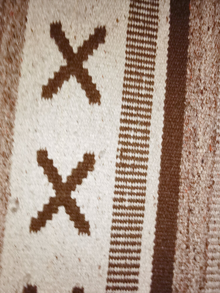
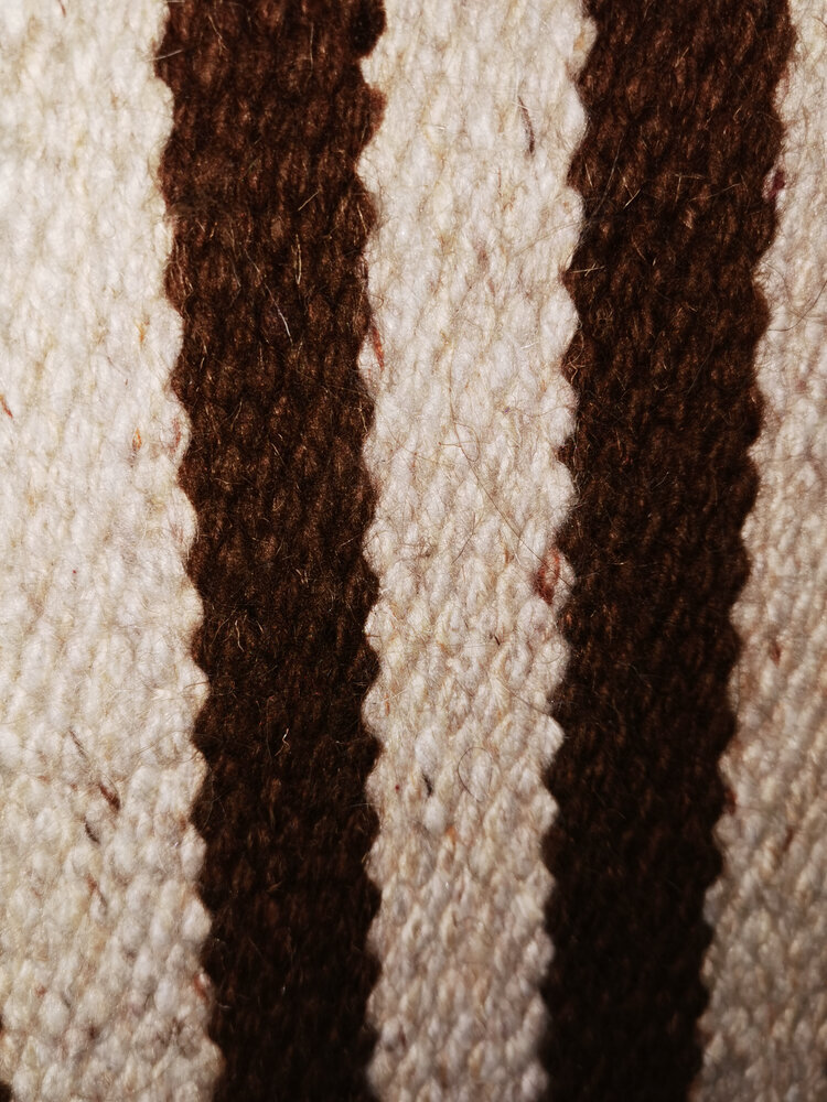
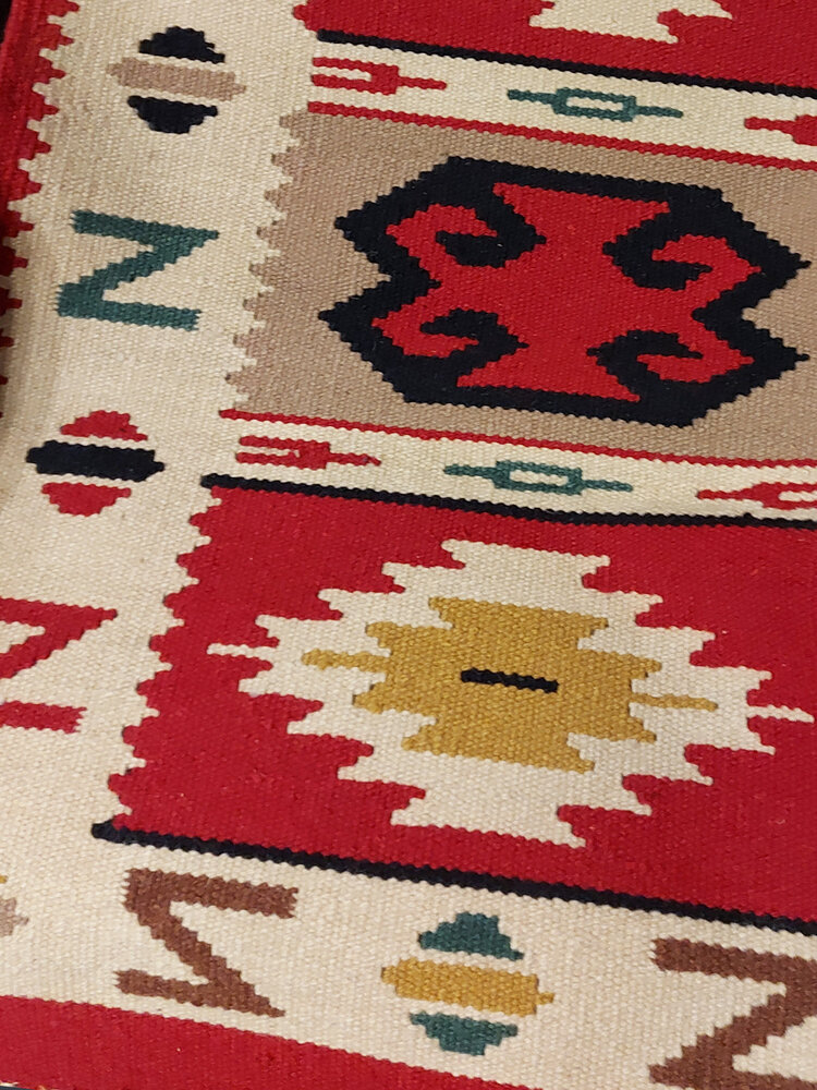
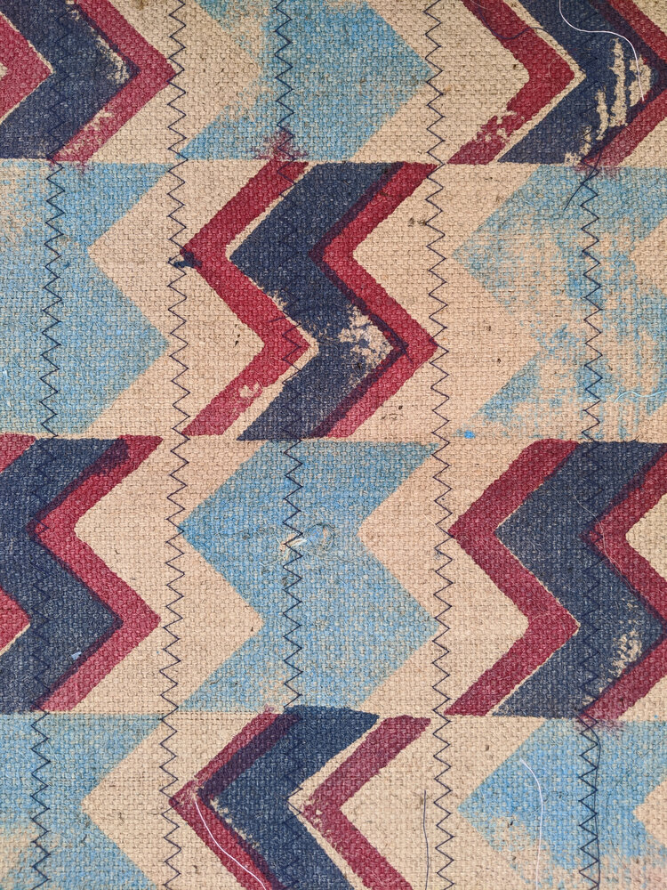
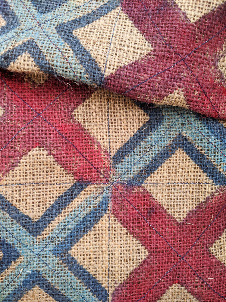
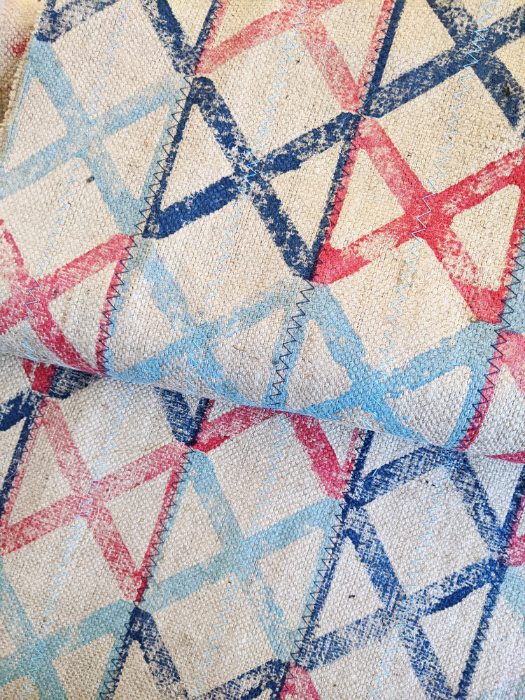
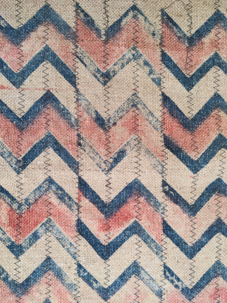
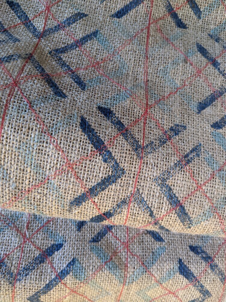
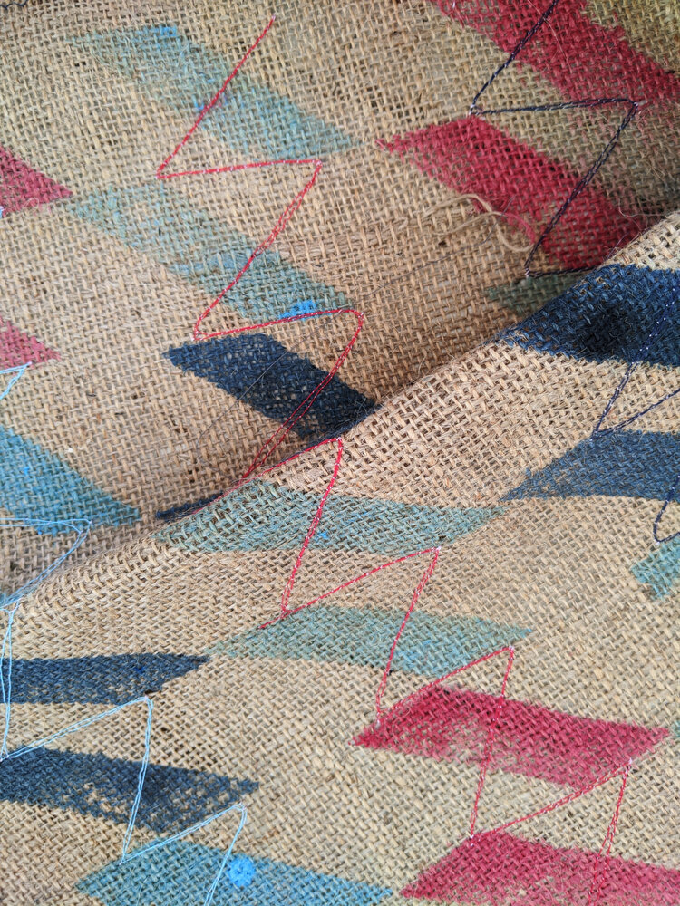
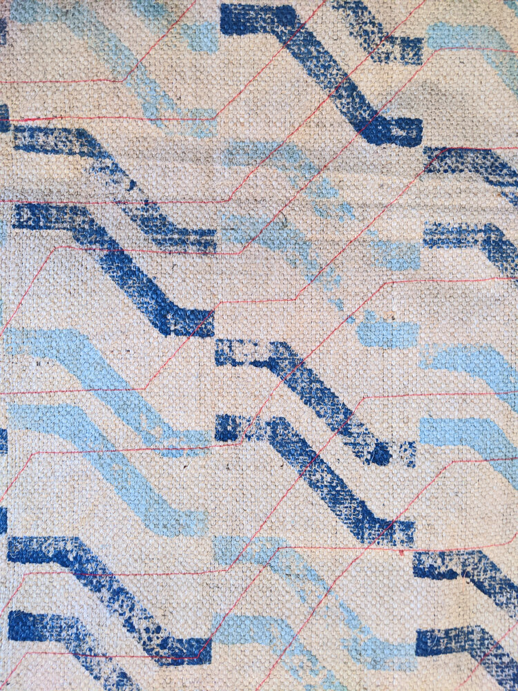
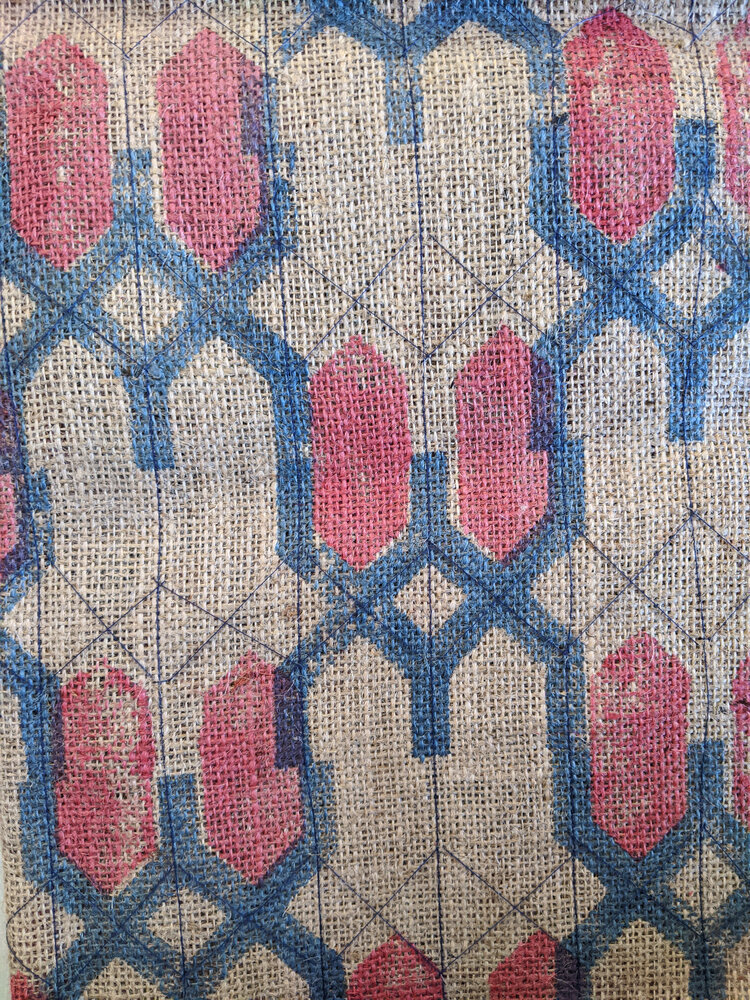
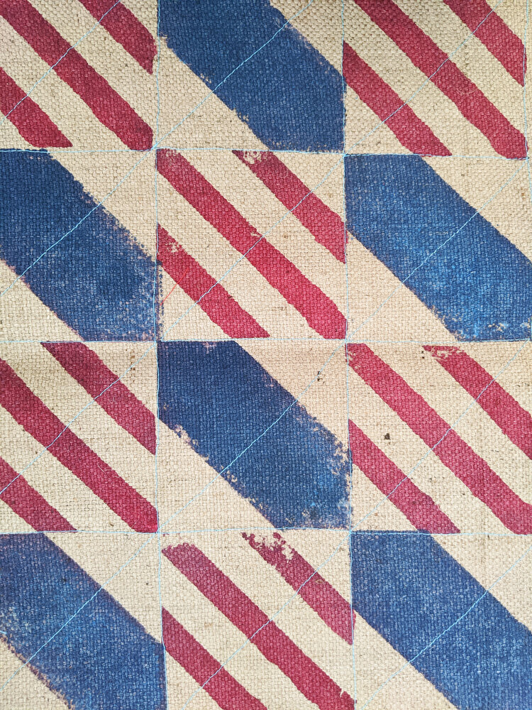
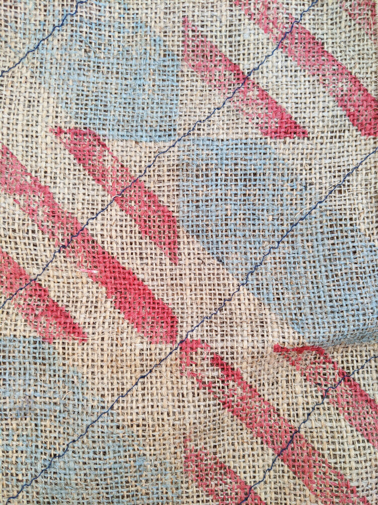
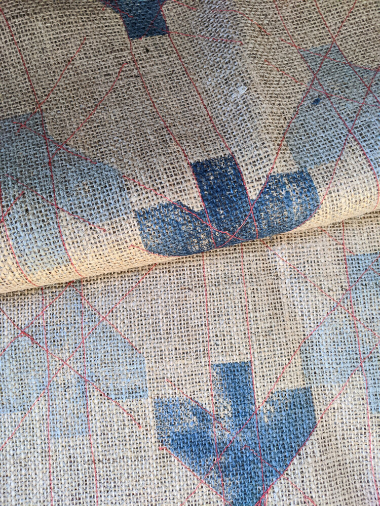
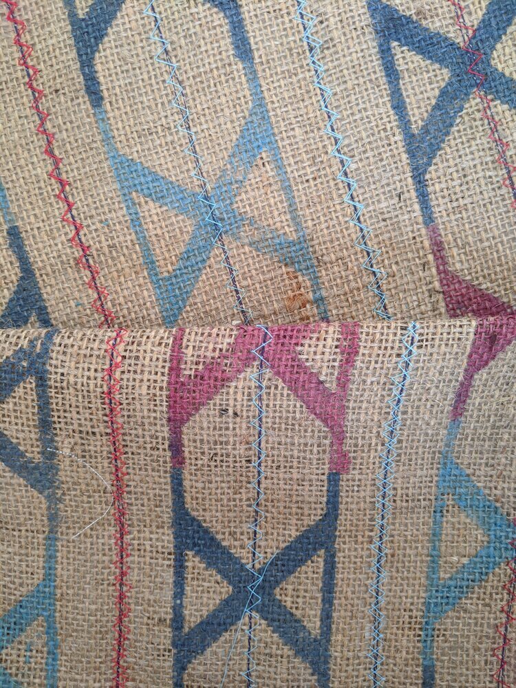
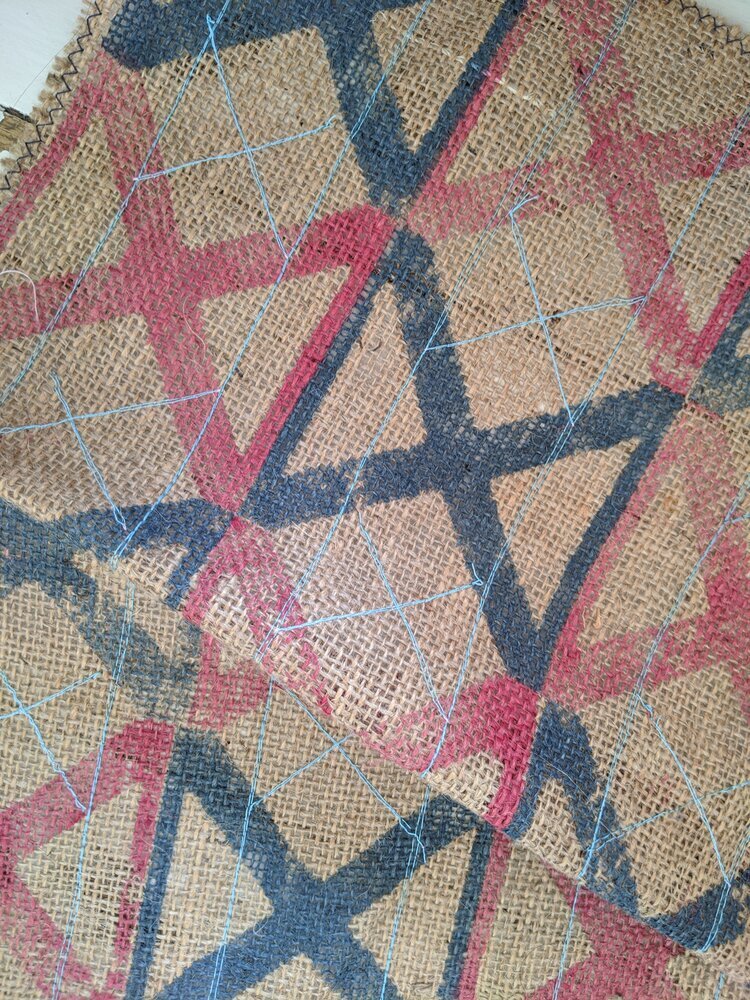
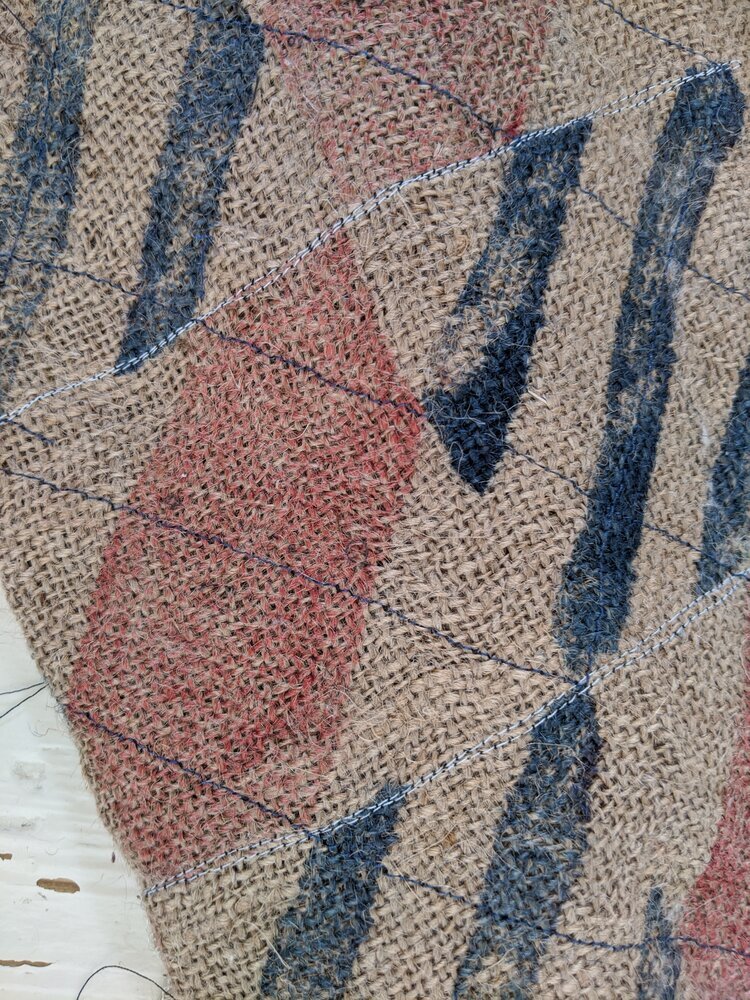
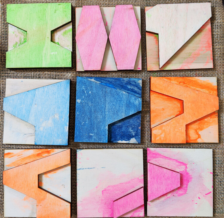
when you enter the bespoke designer on our site, you aren't really "shopping", you are essentially prototyping. by using our original physical printing blocks (digitised into a precise javascript tool) you can test the limits of a grid before we ever touch ink to fabric.
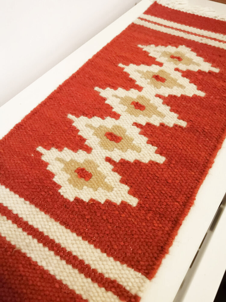
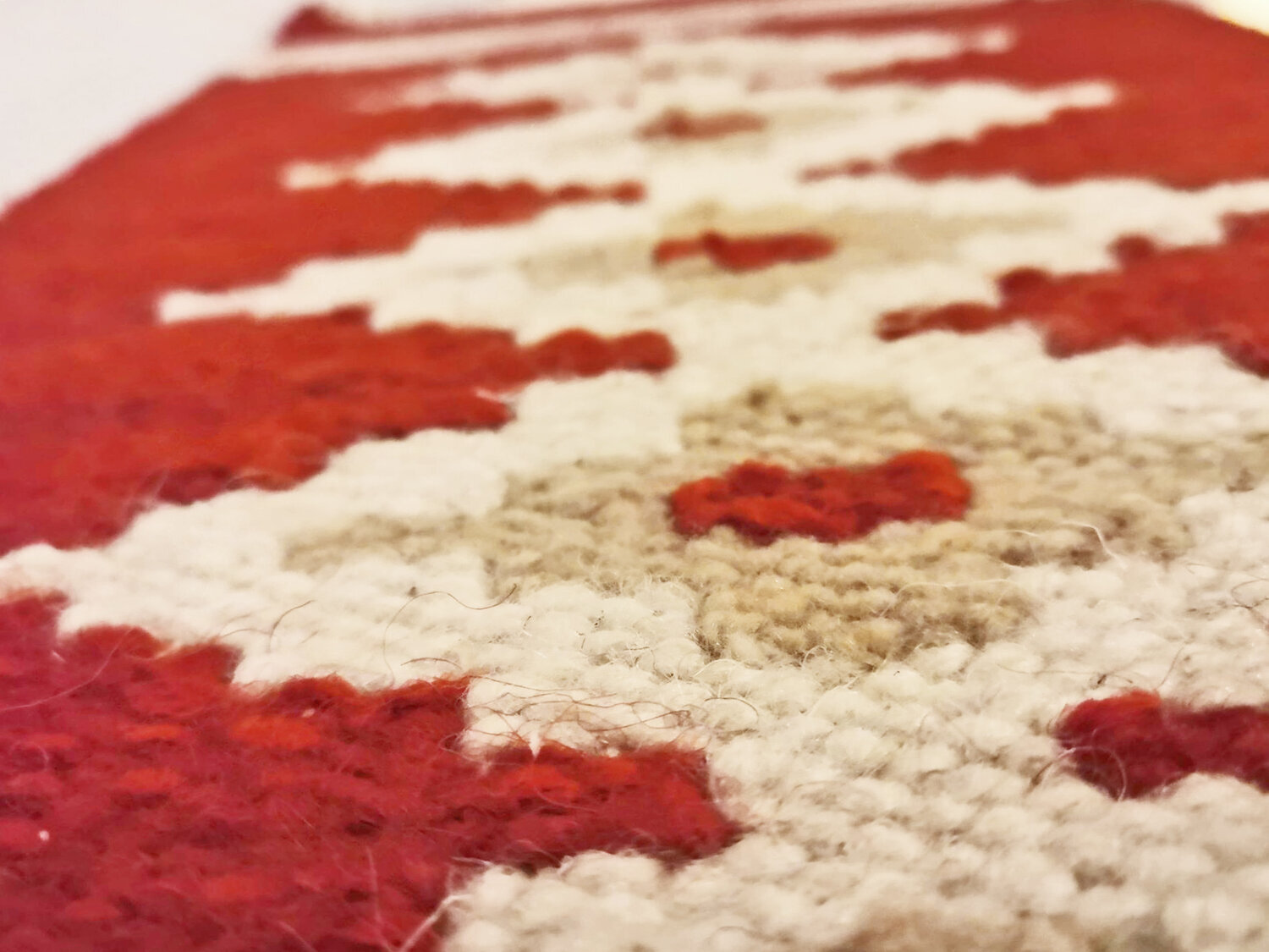
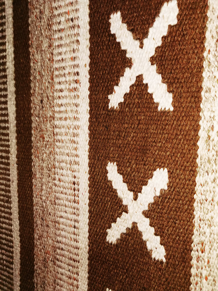
there is a specific, freeing joy in building a pattern. it starts with one tile. a single decision. then a repeat. then a shift in the palette. suddenly, you aren't just looking at a rug; you are looking at a system you constructed.
the logic of play
i do remain the main designer at zitozza and the collections, curated looks will not stop. however i have always struggled to limit the system of printing blocks into commercially neat packages and trying to pre-made and pre-guess what clients want. so the answer to this problem is quite simple: we’ll let you play. play is the most efficient way to discover logic. by "playing" with our modular sets (and remember, they’re interchangeable between each-other too), you will find the proportions that feel right for your specific architectural context.
how to use your agency:
construct: use the grid to build a sequence that responds to your furniture, your windows, your light.
play: iterate. download the PNGs. put them in your digital moodboards. see how the "logic" holds up.
decorate: once the digital grid is perfect, we translate it back into the physical world using our machine-cut blocks and sustainable fabrics.
customisation shouldn't be a luxury add-on; it should be the starting point. the grid is waiting. go play.