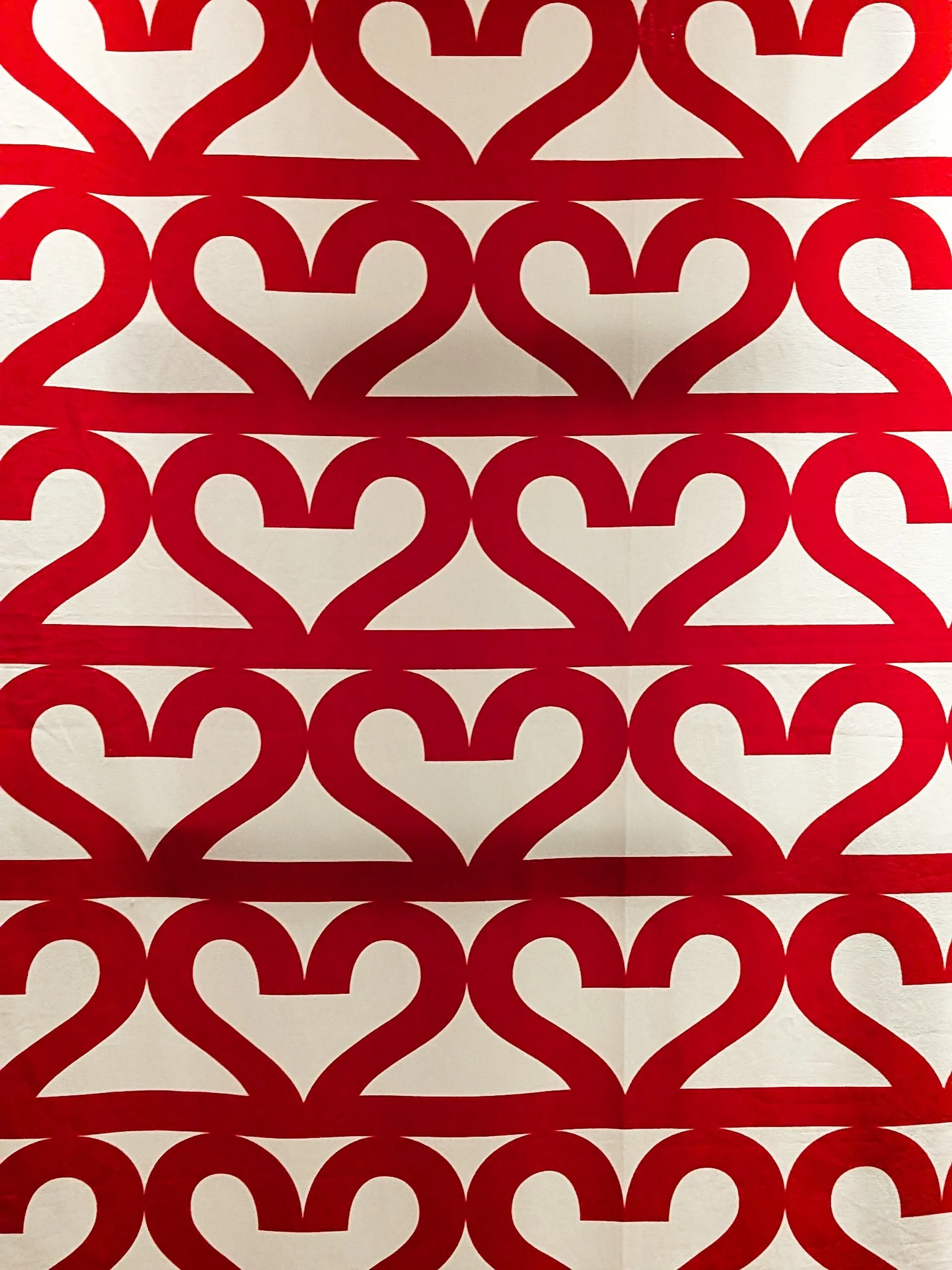
pattern design

INTERIOR DESIGN, INSPIRATION

at home with the scandinavian style

new month, new blog post! wow, didn’t april just sweep past way too fast. it has been a busy month, and to our pleasant surprise, we have discovered our cushion in simply scandi magazine (which i was not aware before) but it’s a wonderful publication and it inspired a new blog post series - architectural tours are all well but i feel that for a homeware brand we neglect writing about interiors so we'll be doing that a bit more often.

in the first of this series then, we’ll have a look at how you can tweak the “scandinavian style” a bit to add some colours into it and make it uniquely yours. i don’t want to dwell too much on what even defines the “scandi” style, but it is often associated with clean lines and lots of natural light. but looking at the iconic mid-century designs coming from scandinavia, i also believe that it’s a mistake to see this style as anything too white or beige, and it’s really not that far from the modernist zitozza looks (and hey, brutalism!) so yes, yes, you can absolutely incorporate colours and patterns into a scandinavian style. while the traditional scandi aesthetic tends to emphasise light, airy spaces with a focus on white, grey and natural wood tones, there are lots of room to introduce some more colourful homewares in various ways.

pops of colour

the scandi style is not about using colour throughout the entire space, but that doesn’t mean it can’t be colourful! think about it more like using accessories of vibrant or bold colours as accents. this can be achieved through colourful accessories like cushions, throws, rugs, or artwork. select a few key pieces in complementary colours to add visual interest and create focal points in the room.

pastel tones

obviously, this is one of the more associated qualities of the scandi style - just pleasant and cosy! soft, muted pastel colours can work well within a scandinavian-style interior. pale shades of blue, pink, mint, or lavender can bring a subtle hint of colour without overpowering the space. use these colours on walls, textiles, or smaller decor items to maintain a light and airy atmosphere.

natural textures and elements

scandinavians are surrounded by some fantastic nature and they do like their outdoors, i think. so another way to introduce colour is through natural elements. incorporate plants and flowers to bring vibrant greenery and pops of natural colour into the space. additionally, consider wooden furniture or accessories with warm, natural wood tones that add warmth and texture while infusing the room with earthy hues.

patterns

scandinavian design can also feature patterns with colour (do you remember early 00s ikea huh?) so yes, my favourite advice - consider using patterned textiles, such as curtains, upholstery, or rugs, that incorporate colourful geometric or nature-inspired motifs. this can inject visual interest and personality into the space while still maintaining the overall scandinavian aesthetic.

statement pieces and fabrics

yes, this can mean the jacobsen chair, or anything else you may have in that category but there are lower-budget versions for this too. introduce a bold, colourful furniture piece or artwork as a focal point in the room. this can be a vibrant rug, a sofa, an accent chair, or a large colourful painting or wall hanging. by keeping the surrounding elements more neutral, you allow the statement piece to shine and bring a lively touch to the space.

overall, i guess the key is to maintain the finely tuned balance between colour, pattern, texture but in a calm, nordic manner, with the minimalistic, clean lines typically associated with scandinavian design. select colours that harmonise with the overall palette and aim for a cohesive look throughout the space, and don’t worry about a bit of clash - remember the colourful, contemporary looks of nordic brands like marimekko or hay - all is well with a splash of colour! by strategically incorporating bolder patterns, you can infuse your scandinavian-style interior with a touch of vibrancy and personal style - and we’re here to help you with that!

BEHIND THE SCENES, WORK IN PROGRESS

ZITOZZA ON TV!

we have been waiting to announce this news for a while, but we’re finally allowed to say it out loud: zitozza will be on TV!

i am absolutely thrilled to have had the chance to participate in a new project for the BBC titled ‘make it at market’, filmed in beautiful leicestershire earlier this year. the idea of the show is to explore how some talented makers and crafters are turning their hobbies into a business with the help of being mentored by an expert designer - and i got selected to be one of these, to be mentored by the wonderful piyush suri of handmade in britain!)

the challenges were a lot of fun, and obviously the business mentoring has been a huge help, all this while also having met all these amazing and talented people completely flourishing from all kinds of creative disciplines made this a really, really inspiring experience. it will be definitely worth a watch, if not for some “zitozza-behind-the-scenes”, then for the variety of creativity and the immense amounts of talent that this show will cover.

the show is finally confirmed to have an airing date: 3rd january 2023! save the date and do tune in…. eeek!

edit: if you want to learn a bit more about how the experience went, read our next blog post about the episode!

SCOTLAND, ARCHITECTURE, BRUTALISM, INSPIRATION, GLENROTHES

the co-op and the kingdom (an architectural journey through glenrothes pt. 1)

for those of you in fife this will be the familiar - yup, this one will be about glenrothes. i’m really into this town (the only new town on the east), so much so that i’m going to split my photo blogs into groups and go through this in more than one tour - please come with me for the first one through the town centre.

glenrothes is a new town in scotland, designated in 1948 and built and developed throughout the following years. the area has a history of industry in paper mills, and the new town was largely built for workers of a new coal mine, which, only after 7 years of operation had to close in 1965 due to technological difficulties. some industrial presence continued in the town though and fife council also moved their headquarters there.

as one of the earliest new towns in scotland, glenrothes was built and developed with a mixture of ideas leaving their visual impacts on its surfaces. the town won the disputed “carbuncle award” muiltiple times however glenrothes also received multiple awards in the beautiful Scotland competition - perhaps as a response to the negative publicity (and because the many open spaces and roundabouts are indeed quite floral)

the intention of my walks here is usually to find source of joy and inspiration for my textile designs. i know a few locals, who find humour and affection in their upbringing in this setting and i basically just aim to show the fabric of this place in a positive light. i have a lot of material though so i’m going to start right at the centre.

the town centre itself is a small pedestrianised area for shopping named “kingdom centre”, consisting of concrete alleys and arcades. the “old” town centre was once busier with shoppers, however, many of the premises today are unoccupied - like everywhere else, glenrothes has welcome suburban supermarkets on its outskirts and the car-friendly layout of the town has infact probably made it more attractive than elsewhere in the area. as in most brutalist new towns, roads for motorists and pedestrians were consciously separated, which resulted in many roundabouts and underpasses (the latter now a canvas for artists - official and unofficial ones alike).

out of albany gate at the main street of the kingdom stands the co-op building, an old department store opened in 1964. i’m not sure if this was built by separate architects or not - the kingdom centre and much of the town’s architecture is a product of the glenrothes development corporation which employed many architects at the time (with glasgow-born peter tinto as chief architect.)

the co-op this is also now empty and is destined for demolition although the plans were scrapped later. partly because of its asbestos problem (it’s now unsafe to enter too.) it’s also really interesting (in an obviously bleak way) to look at the decaying surfaces and imagine what they may have been like in the past.

it’s not my past and these are not my memories, yet i think i would miss this building a little bit, because i find it genuinely and objectively beautiful. (lord knows i hate the word “eyesore” and i find it so insulting and cheap.)

hey look here instead - the coffers on the concrete ceilings of the arcades was what inspired the co-op tileset. it’s a futuristic and human centred pattern with those edges rounded down. and the geometry of its upper facade is shiny and colourful, busy and geometric - playful and orderly at the same time. it was built for this town and its people and somehow these buildings still radiate the optimistic vision of its creators some decades later. i’m not a preservationist though and i believe in embracing the present - if it’s unsafe and unsuitable now to how we live, we can change it or make something else of it. but even if the building itself isn’t worth saving, perhaps the ideas that built them should be.

with the demolition halted, the future remains to be seen. there are now calls to use the building as murals for public art - something glenrothes has form on (i might just have an idea of a future blog post) for now, some works have begun on improvements to the exterior to make it safer while the long-term future remains to be seen. i hope you are now curious to continue this walk - stay tuned for the next tour!

-

links:

co-op demolition plans spark regeneration hope for fife town (by the newsroom, 15 march 2017, fife today)

planned £1m demolition of one of fife’s worst eyesores scrapped, leaving its future in limbo (by neil henderson, 20 dec 2019, the courier)

get involved with discussion about the future of glenrothes (by the newsroom, 11 february 2020, fife today)

work to finally address one of fife’s worst eyesores set to begin (by neil henderson, 2 july 2020, the courier)