furniture

ARCHITECTURE, ARCHITECTURAL HERITAGE, HUNGARY, INSPIRATION, MODULAR SYSTEM, BOOKS, BRUTALISM

from steel tubes to concrete dreams: tracing marcel breuer’s modular vision

we’re back and finally able to sit down with our thoughts after having watched (and somewhat forgotten about) the brutalist movie. in that review i encouraged the research into the work of the real-life hungarians and brutalists whose lives the fictional story was based on - and i decided to start with marcel breuer since i received a great book about his work for last christmas.

those into design will know this already but i always like starting with the facts, he was born in 1902 in pécs, southern hungary and was one of the youngest students (and mentors) at bauhaus. he went on to establish his own practice in berlin, and after a two-year stint in london he moved to the states in the 1930s, first to teach architecture at harvard, then later to new york city where he continued to practice until the late 1970s.

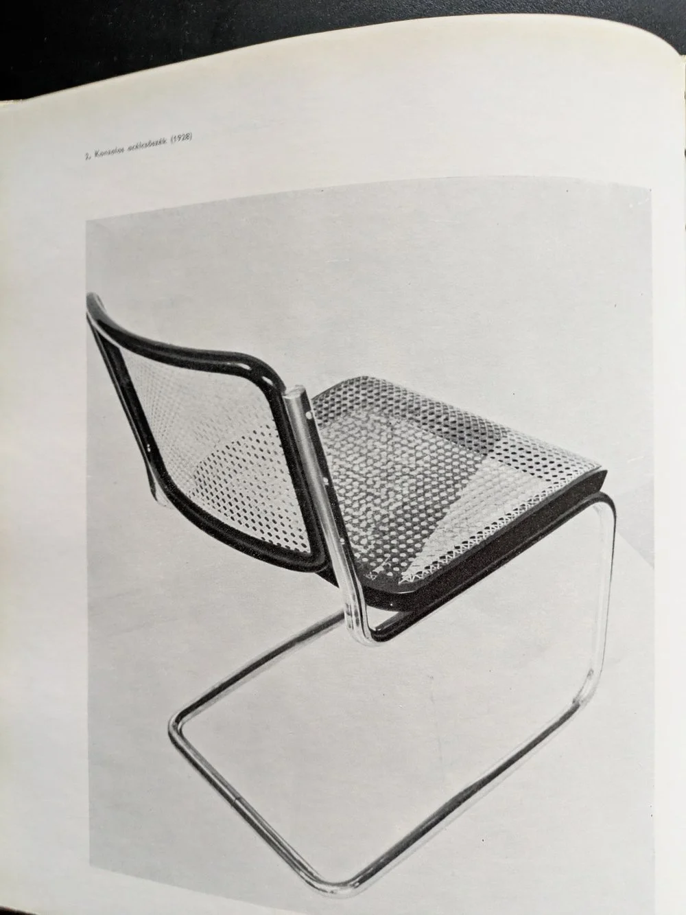
the cesca chair, 1928

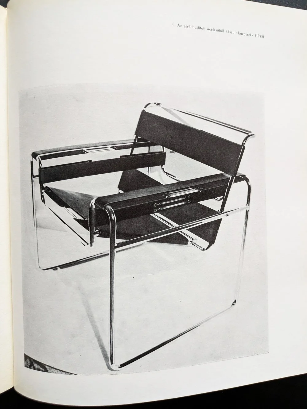
the wassily chair, 1925

for those into design, it’s also easy to recognise the heavy concrete masses of marcel breuer’s brutalist buildings — the hulking cantilevers and deep shadows of the 1960s and 70s that have since become icons of modernist architecture. but what’s more compelling than their visual impact is the thread that connects them to breuer’s earliest work. his design logic didn’t emerge suddenly in béton brut — it evolved from an obsession with functionality, structure, and modularity that was evident from the very start.

before architecture of course, there was furniture. in the 1920s, as a young bauhaus student, breuer designed the wassily chair using steel tubing — a radical departure from traditional craft at the time. lightweight, repeatable, and industrial, the chair wasn’t just functional: it was a system. breuer’s approach treated each part as a modular unit, capable of being assembled into something greater than its parts. this thinking didn’t just define his early designs — it forecast an entire architectural philosophy.

IBM research centre, la gaude, france

IBM research centre, la gaude, france

UNESCO headquarters, paris

UNESCO headquarters, paris

fast forward a few decades of immense architectural output (his practice designed more than 100 buildings), and the same logic manifests on a much larger scale. buildings like the UNESCO headquarters in paris (1951-1958), the IBM research centre in la gaude (1960-1961) or the iconic whitney museum in new york (1963-1966) carry the same DNA — modular systems, articulated forms, and a deep respect for material honesty. breuer’s concrete isn’t decorative. it’s structural, expressive, and fundamentally rational.

the book i’ve been reading — published in 1970s, written by máté major, long out of print, with that peculiar warmth of faded paper and sans serif fonts — documents this journey. the photographs, drawings, and models inside don’t romanticise his work; instead, they reinforce the relentless clarity of his method. whether designing a chair or a cultural institution, breuer asked the same questions: how can material, form, and repetition serve both function and expression?

whitney museum, new york

whitney museum, new york

as someone with a hungarian background myself, i’ve always felt a connection to breuer — not just because of the cultural context of course (despite our country being somewhat late and reluctant to recognise him), but because of how he saw the world through systems. that kind of thinking, for me, translates into surface design: building pattern from modules, constructing rhythm, shaping repetition. of course, my materials are softer, but the logic is not so different.

breuer reminds us that beauty can be found in structure — in the clarity of parts assembled with intention. whether it’s furniture, architecture, or textiles, that modular imagination still resonates.

-

links:

the marcel breuer digital archive

bauhaus official profile

dezeen profile (bauhaus 100 series)
ARCHITECTURE, BRUTALISM, INSPIRATION

the brutalist review

hello again! we have some news for you, or more like, a review. not a building or a book this time, but a fictional story which i’m not that used to. however when something titled “the brutalist” came onto the scene about a hungarian, of course i felt obliged to visit the cinema for the third time in the decade and i thought i’d share my thoughts with you.

i want to emphasise though, that i am not a story person, it’s probably personally my fault that cinemas are dying, i can’t keep up with any series and, despite loving books and reading, the last piece of fiction i read was probably in high school. i am not proud of this, i am just providing some context for this review so you can safely ignore my take and go view it yourself. the first thing i want to say that it is beautifully made and you can tell that everyone involved in the making of this film took their craft extremely seriously. it is rather spectacular, filmed with a 1950s technique called vistavision, and it’s quite something i recommend watching in the cinema. there is an interesting score throughout, the writing moves at a decent pace despite the long runtime and the actors all do a fantastic job (with a bit of ai enhancement - the hungarian did sound fluent mind you.)

the second thing i want to say about this film though that if you were expecting to see a lot of cool design and beautiful architecture, you will be disappointed. when i first read about the story, following a hungarian-born brutalist architect finding his feet in america after the war, i was hoping it would be more closely inspired by icons such as marcel breuer, lászló moholy-nagy, or even ernő goldfinger but it is a different story. most crucially, our fictional hero, lászló tóth (adrien brody) was unfortunately not able to escape the horrors of the holocaust and moves to america only after having survived it, in 1947, having to start his life and career all over again.

the long runtime is split across two halves, and in the first half, taking place from 1947 to 1952, we see him taken in by a relative (alessandro nivola) who gives him a job in his furniture shop in a small town in pennsylvania, where he meets a wealthy businessman (guy pearce) who will later hire him to design as a sort of memorial to his family for the community, a cultural and sports centre with a library and a church (yes, all that in one building.)

watching this half of the movie i thought this film should be titled “the modernist” instead, as we see him in a quite contemporary struggle of being radical and different in a somewhat more conservative environment. this would be fairly relatable to any millennial i’d imagine, but i’m not sure how true to the depicted age it really is. at one point he creates a steel frame furniture set, reminiscent of something by marcel breuer, only to be met with indifference and rejection. in real life the cesca chair for instance, was a huge hit that would influence furniture design for the rest of the century and further, and, by 1948, it was already a 20-year old design. i’d imagine even in small town pennsylvania it would not be seen that unusual - this is still the country of charles and ray eames. for more context, the new bauhaus, founded by the very real lászló moholy-nagy, was already open in chicago for about a decade by then.

instead of joining them, his supposed ex-colleagues, our hero shovels coal until he gets hired by guy pearce’s unscrupulous character - if this is a metaphor of the loneliness of the average 2010s creative trying to get by in a foreign country with an evening job whilst on an unpaid internship in the hope of securing their first temporary contract at a big-name studio surviving on lawsuit payouts over half-built vanity projects, then i guess it works - i can assure you that an entire generation got the t-shirt.

however as a believable story set in a golden age of industry and building, it does not work as much, although i only have the word of art history books as i was not alive at the time. i do accept that cutting edge modernism wasn’t ever truly “mainstream” as such, but during the time the film was set, it was at least desired, aspirational, and, i’d imagine, decidedly cool. the second half of the movie picks up in 1952 - modernism is massive in the states by now, and for a bit of global context, despite still the rationing, festival of britain is already happening across the atlantic, chandigarh is being built by le corbusier in india and the plans for brasil’s new capital will also be drawn up in a few years time. the film completely forgets about this enormous, global movement of hope and optimism. eyewatering budgets are approved for huge projects to be built, celebrated for generations afterwards. this is a unique era in history of unmatched ambition and prosperity, with a real creative buzz in the air - and this context, this positive mood is entirely, and sorely left out of this miserable story.

then it falls apart a little bit more and there is a revelation in the epilogue that i will spoil below, so please do not read further if you have not seen it yet and want to.

it turns out that the main concrete building (which we never get to see in full) is a replica of the architect’s and his family’s suffering in the concentration camps. no, it is not explained as some kind of visual metaphor, we are explicitly told that it is a near-exact representation. now i understand why a filmmaker, a storyteller might think it works - of course, there are many stories of awful, unimaginable suffering that are told beautifully. but i do not think that spatial design can be like that and i struggle to accept that you can physically recreate the worst known hell on earth and offer it as a sanctuary and place of relaxation and learning for the community. if you really believe that form follows function, then you simply cannot take a building where the function was the extermination of people and give it a different function, especially not of recreation. in fact i find it really quite distasteful towards the memory of the holocaust. i also think it is strengthening this lazy and misunderstood idea about brutalism, that it equals brutality and that the raw surfaces and austere interiors can only come from a place of oppression, imprisonment and suffering. this is quite damaging towards this style of architecture and it might not help the celebration and preservation of these buildings - although if the movie wins awards hopefully it becomes a bit more recognised.

so despite all the miserable nature of the film, i hope that you will still get inspired and will want to explore the work of the real-life hungarians and the real buildings of this era - and find the hope and optimism in the works along the way. i have just got my hands on a hungarian book about marcel breuer from 1970 (when he was still alive) and i will write about this next. subscribe below to be the first to read about this and more brutalist wonders.

DESIGN CONVERSATIONS, INSPIRATION, INTERIOR DESIGN, MODULAR SYSTEM, SUSTAINABILITY

in conversation with matt maurer of mr.m ideas studio - designer of arnie.m

good morning december, how did we get here again? i can’t quite believe how fast this month has gone again but with all the busy festive preparations, i hope there is a little time left for inspiring stories and interesting conversations - and i really did bring a good one for you this time, as i managed to get a few words in with matt maurer, designer of the smart and sustainable home office system of arnie.m, featured in our post about interior trends at the start of this year.

ZITA: hi matt! first things first, can you say a few words about yourself – what you do and how you got there?

MATT: i’m the founder and creative director of mr.m ideas studio. mr.m specialises in brand identity, visual communication, digital design and environments. with over 50 design awards and 20 years’ experience i collaborate with creative people in many fields to make great ideas happen.

my journey before arriving at mr.m was studying graphic design at university and spending my earlier professional career working for some of the most renowned design agencies in manchester.

ZITA: and about your product - would you say that developing arnie.m was a long-held dream of yours, or was it something that evolved over time? can you give a little insight into the birth of your business?

MATT: birth is the key word! my studio is based at our small home and when we found out my wife, angela was expecting we also knew that we were presented with a spatial challenge.

life and work need to be in balance especially within the home environment. the limited space presented a challenge but that is what led us to thinking about creating a workspace that could accommodate all my design paraphernalia, yet still be compact enough to shut up shop of a working day and become an attractive piece of domestic furniture.

so, with the help of friends and contacts in the creative and craft industries in and around manchester, we took our design ideas and skilfully translated them into a for-real form – a workspace.

we were swept away as new parents when arnie arrived but once we started to get our heads around everything including sleep deprivation, we began to see how the workspace really helped. when friends and family complimented on the complete ‘office’ it led us to start out on our adventure. it took just under two years of developing and tweaking to turn our workspace in what it is today — arnie.m. (we had to name it after the little man who inspired the idea!)

ZITA: how lovely - and impressive! i actually discovered your furniture in search of home office trends which obviously blew up since 2020 and the pandemic. how has this experience been so far for getting your range known?

MATT: we only truly launched arnie.m at the end of december / january 2021, we are very much still in our infancy. we want arnie.m to be a family adventure for angela, myself and arnie plus the amazing network of skilled people who are part of a wider, very support arnie.m family. i have to say we are still finding our feet but the response and support we have received has been amazing! the highlight for us has been getting arnie.m featured in variety of well-known/high end publications which has raised our profile.

ZITA: modular design systems in general are a smart way of working but there’s also a lot of play in it for your clients. can you expand a little bit about the possibilities or how your furniture can be built up? are there any limitations to your systems or can it be theoretically expanded to huge environments (e.g. contract?)

MATT: we know creating your perfect working environment is personal, so by making arnie.m modular makes it adaptable. arnie.m starts with a frame, and you basically hang the units that best meet your needs on the sturdy (yet elegantly formed) frame. currently arnie.m has a range of different modular units which include a desk unit to several storage and display unit options, this gives you the flexibility to create your very own arnie.m

each arnie.m is handcrafted with pride and attention to detail, we only make to order. this means with the support a small but talented collective we can customise and be creative with the modular design if required, individual unit designs, sizes, even colour can all be considered. this way of working gives arnie.m the flexibility to work in different ways and look at opportunities in different environments.

ZITA: that’s really clever! i think handmade processes always allow a lot of custom tweaks indeed. can you tell a little bit more about the material choice? how important are sustainable qualities for you with regards to both materials used and your working processes?

MATT: we are not, nor do we want to be a mass-producer, having to use cheaper materials like mdf. we love ply it’s basically a ‘green’ product, its beautiful, durable and long lasting. we designed arnie.m to be easily reconfigured to meet your needs over a lifetime, individual hand-made, built to last in natural birch plywood that is FSC certified.

arnie.m has some clearly defined ambitions which focus around sustainability. we want to grow arnie.m carefully for everyone’s benefit, as mentioned we are a family not a vast global corporation. we want to support our small collective. we use only what we need in materials and packaging, avoiding waste and keep production local. by building a sustainable business we want our boy arnie to benefit from the work he’s inspired.

ZITA: this is very inspiring! i love plywood in general, i even print with it - it’s so universal. and beautiful too. what were the aesthetic driving principles of your product? do you follow any particular design school or style, or was it purely driven by function?

MATT: function was at the heart of the idea. simply our brief was to create a practical, adaptable and functioning workspace within a small space, that could also be aesthetically pleasing.

ZITA: it makes perfect sense! and now a question i ask from everyone - can you recommend a book, or another designer, artist or a maker whose work is worth looking into?

MATT: angela was the really driving force for developing the workspace into arnie.m but we were inspired by the books produced by the do book co we highly recommend taking a look at them.

ZITA: i definitely will, thank you! and last, but not least, where can we see your products at the moment? and what next for arnie.m? are you looking to grow your range?  

MATT: you can view arnie.m on our website but we also currently have one arnie.m displayed in a house by urban splash show home in new Islington in manchester.

next year we look to continue to build the arnie.m brand. we are also going to explore adding new units designs to our range. and most importantly enjoy the adventure!

-

links:

arnie.m

mr.m ideas studio

house by urban splash

paul moffat photography

the do book co