
first of all, happy new year everyone! i guess we have all agreed not to talk about 2020, so i don’t want to say too much apart from how much i hope you all have an amazing new year with many well deserved, happy moments. for now, it seems as though we are stuck indoors for a little extra time again, and it’s all a bit grim. but here at zitozza indoors is what we’re good at, and with that in mind, you are invited to look through the interior trends of 2021 with our research glasses!
1. ECO CONSCIOUS DESIGN!
i was hesitating whether i should really call this a trend at all, when in fact it should be the standard really, but it’s just a fact that eco-consciousness has not been high on many agendas until recently. from the design industry’s perspective this has been imperatively rising though - and i’m 100% certain that it will be the most important one for decades to come. personally what i’m most excited about is the revolution collection by vondom - the first part of it (called “ibiza” by eugeni quitllet, made of plastic waste in the mediterranean) came out last year - read a little bit on design milk.
and this year we’re expected to see sustainability in many more ways - not just in durability and reusability but also in more innovative material choice such as foresso - the timber terrazzo, this beautiful surface. i love how it looks - texture within texture! made in the uk (birmingham) with bio-resin and timber waste, their sustainability credentials and transparency with their products and traceability are truly exemplary.
image and product design by foresso.2. EARTH TONES AND TEXTURES
warm is the new cool, and interpreting a luxurious space as a kind, bracing cosiness has been growing and growing in recent years, resulting in a beautiful play with many textures and organic designs. clay, woodwork, boucle, velvets… this is very much about tactile qualities combined with warm colours and round, cocooning forms. coleur locale illustrates a rich, well-travelled take on this - below in the styling of the brilliant cleo scheulderman. it’s the comforting hug of mother earth that we crave!
photography by Jeroen van der Spek. styling by Cleo Scheulderman,
client: Coleur Locale.
3. FRESH, OPEN BLUES
remember what free, open spaces used to be like? remember the summer breeze under the bright wide sky? remember the beach, the colour of the ocean? it’s hard to imagine it right now, scooped up inside in the midst of an ugly, grim january but those amazing blue hues are being brought indoors with rather spectacular results. as a fan of this colour i’m really excited about benjamin moore choosing it to be colour of the year. if you’re familiar with nicola harding and co. then you’ll know that she is an expert of using these shades for cool, thoughtful spaces with lots of charm and character. the below snippet is from this project (published in house & garden last year) - can we please take a moment to note the rugs too!
design by Nicola Harding & Co, photography by Paul Massey4. ONE ROOM, MANY FUNCTIONS
hands up, who’s surprised at this one? since we have spent pretty much all events of our life at home recently, this trend has risen perhaps out of necessity, but it’s here to stay because it’s immensely practical. while it has really been simple reality for many people, 2020 has certainly brought it to the surface and the market for functional solutions might expand as a result. expect to find space dividers and lots of clever home office furniture - the personal pick is this super smart, modular home office by arnie.m - the brainchild of angela and matt maurer. british made (in manchester), masterfully skilled, fully customisable and it’s sustainable too - made of 100% natural plywood (with beautiful wood pattern on the surface) and none of that awful mdf stuff.

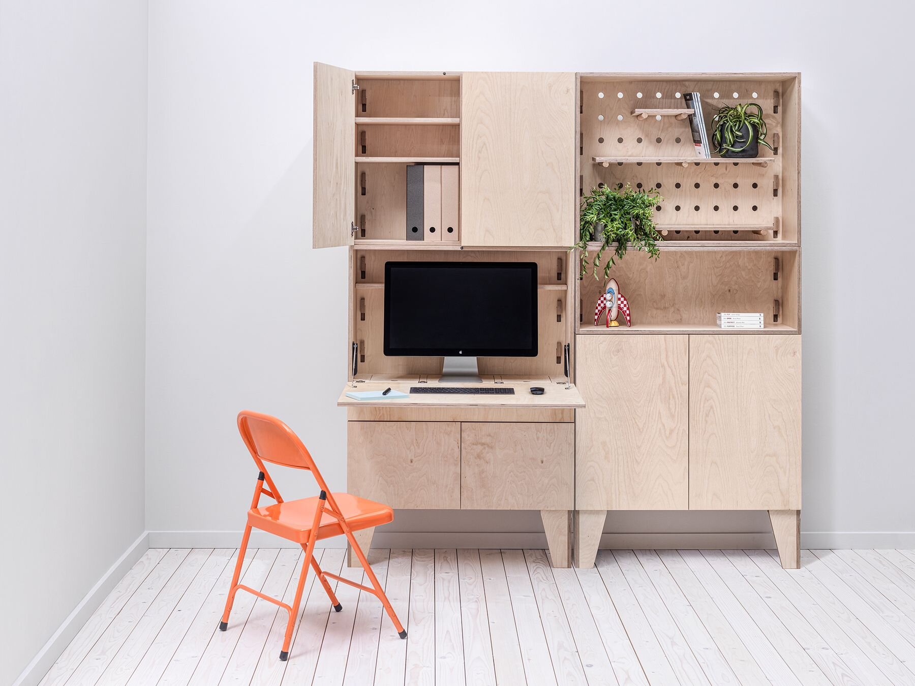
design by Arnie.M, photography by Paul Moffat Photography. 5. FUNKY ACCENT RUGS
the one i’ve been waiting for! this one is for the pattern lovers out there and it’s just become barefoot-friendly. we have been layering upon layers upon layers for the past few years now, but increasingly we’re doing it to the floors as well and i’m 100% here for it. rugs outside, rugs in the kitchen, rugs on rugs, everything goes with everything. it’s the floor that makes the statement in 2021 so give it the love it deserves. london-based floor story always has some of the brightest and most exciting collaborations to look forward to - a great start to the year with the mediterranean collection by adam furman.
image by Floor Story, rug design by Adam Furman. 6. NORDIC WABI SABI
minimalism has also taken a more inviting, warmer form in recent years. it’s still quite rustic and sparse but with plenty of thought-provoking richness in texture and imperfect, natural form. it still seeks that delicate contentment, and it still finds it in the peaceful serenity of warm, monochrome hues and natural surfaces, worked with the most skilled craftsmanship. but recently, it has all taken a more hugging, cosy, organic form in a somewhat scandinavian manner - or dutch as seen on this take by cleo scheulderman for vtwonen. it’s an artful creation of an unfilled but stimulating space where we want to go to to feel better about everything again.
photography by Jeroen van der Spek, styling by Cleo Scheulderman,
assistance by Mette Sophie, client: vtwonen
7. VINTAGE LOVE
classic styles become such because they work, there is nothing new about that. however there are always new and ever more inventive ways to widen the boundaries and take braver, bolder twists on our cherished favourites. and if sustainability is chic, then surely, the glamorous way to do it is to give our vintage treasures the love and attention they deserve. it’s all about expression, maximalism, individuality and all the personal stories each object bears. i chose another take from nicola harding & co to illustrate this - a fabulous, opulent space that feels inviting and familiar at the same time.
interior design by Nicola Harding & Co, photography by Paul Massey8. NATURE AND GREEN (and all the other colours)
maybe houseplants are not a “trend” so much, we just collect them because they are great and we love nature. but those of you with gardens and balconies have really hit the jackpot and a new appreciation certainly grew out of last year’s events. outdoor spaces are being increasingly valued as an extension of the living space and they’re now getting their rightfully earned, fully saturated upgrade with appropriate cosy cushions and floor covers. this one by mimi forrest is obviously not an outdoor rug but first of all it’s too beautiful not to be shared here and secondly, the styling might just give you the right idea - it is exactly the type of indoor space we want to see more of in 2021.
i hope you will all have an amazing, productive and successful 2021 with lots of colour and pattern - and more importantly please stay safe and healthy! although the start to the year feels worrying and sad, i’m hoping that it won’t be much longer until we can work more closely again and i’m looking forward to seeing more of your creative projects. happy new year!
image by Floor Story, rug design by Mimi Forrest-
further reading
interior design trends 2021 – the 20 top looks for the new year (jennifer ebert, homes & gardens, 01/01/2021)
the biggest interior design trends for 2021 revealed (jacky parker, livingetc, 23/10/2020)
living room trends 2021 - top styling tips and trends to inspire (ruth doherty, ideal home, 09/10/2020)
pinterest predicts 2021’s interior trends: how to add them into your home, according to experts (eva waite-taylor, the independent, 15/12/2020)
interiors trends that will be big in 2021 :how to update your home for the year ahead (prudence ivey, homes & property, 31/12/2020)