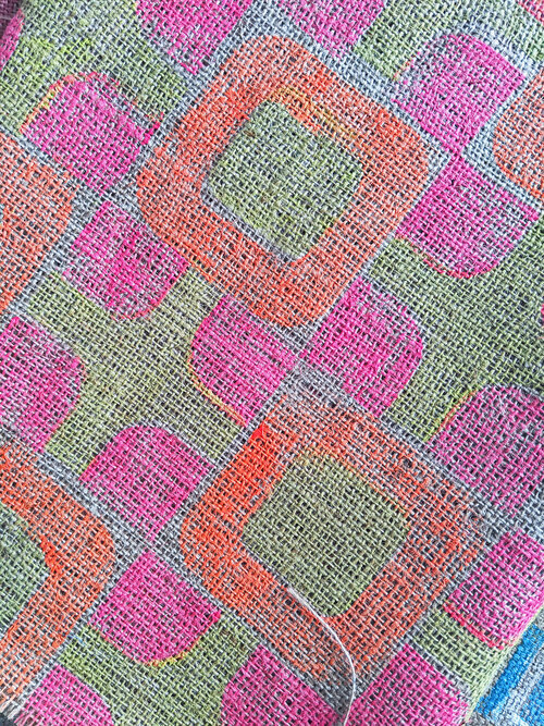
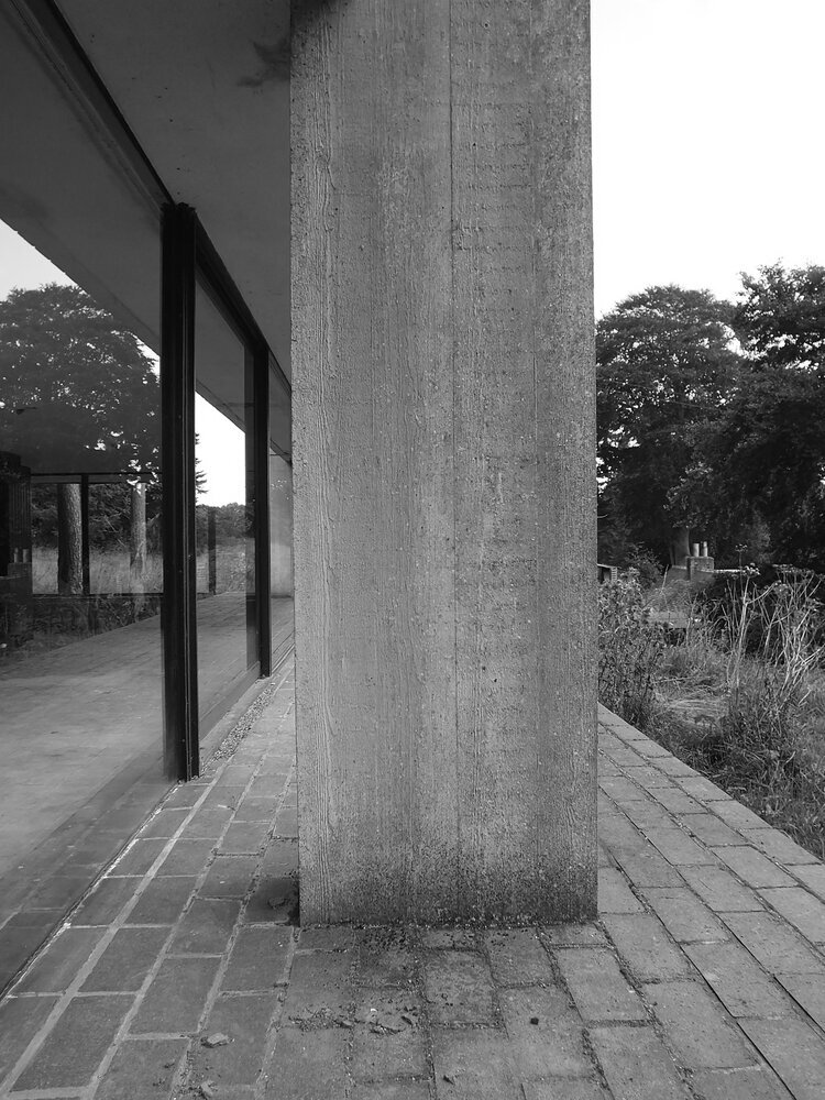
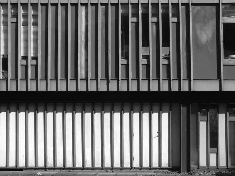
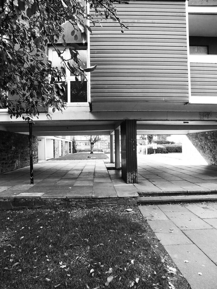
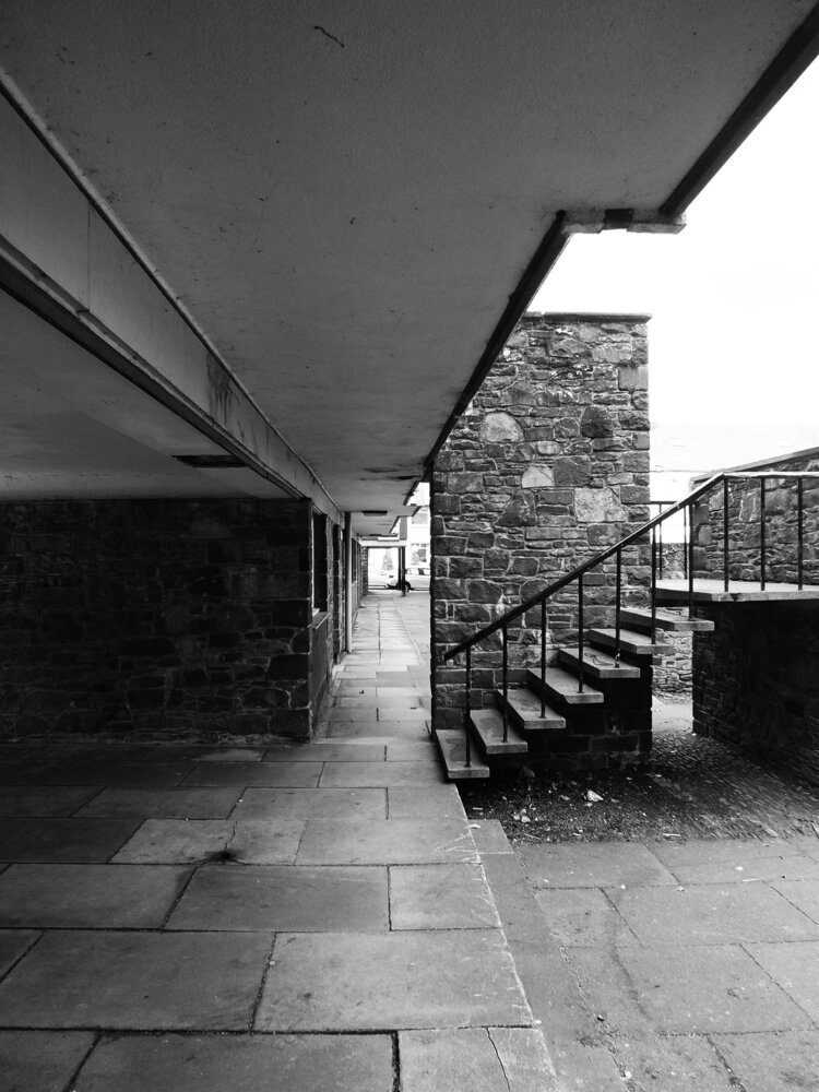
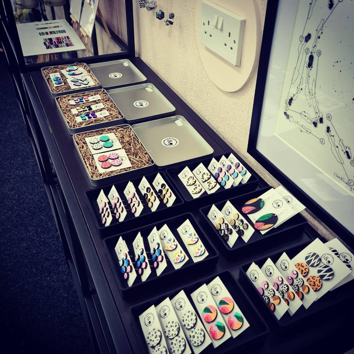
first of all, i apologise for the late post on interior trends, since we’re well into february already. to keep this post concise and focused, i’m going to concentrate specifically on colour and material trends that you might find easy enough to implement in your home (maybe with some zitozza stuff!) and i will expand on the current round-up suppliers and designers offer with a further post after having visited the scottish interiors showcase in a few weeks time. i’m really excited to visit (it’s been two years without trade fairs!), and i thought i’d share a little bit of research of the colour and material trends i expect to see.
1. RECYCLED & RECLAIMED
okay, sustainable design choices are not so much a “must-have-trend” but a pressing, urgent and permanent imperative change, so i shouldn’t really include this in the list but i do because it is getting embraced by more and more, and it may give some ideas to look further and think about what useless old thing you can turn into something cool. for us, it means, patchwork rugs and zero-waste, for others, this could be reclaimed wood, a bit of DIY upcycling, granny’s old nightstand-turned-houseplant shelf? all good and here to stay!
2. EARTH TONES
you may have observed that terracotta was kind of a big deal in 2021 - i hope you liked it, because it looks like it’s going nowhere, just growing and growing with many shades of earthy browns. expect to see plenty of fabulous, warm schemes usually paired with tactile surfaces and interesting shapes and textures, for a cosiness and warmth. it’s all about keeping it natural and down-to-earth - and it can result in a very serene, calming, loving home.
3. GREENS WITH GREENS
it seems that greens with greens in all possible shades are absolutely go this year. it may come in the form of breakfast room green by farrow and ball as one of their 2022 colour of the year, or a paler, more sagey october mist by benjamin moore. or you may achieve it simply with even more houseplants. or why not do all of them! the more green, the better. pale with deep jungle, dark teal with mint, dark olives with sage. they’re all in, and there is very little to go wrong with green!
4. WORLD PATTERNS
this is a very nice one - lord, how i missed travelling! but we are able to do so again so the travel-inspired details are back, with all the patterns from all the cultures and crafts of the world. of course there are more exotic interpretations of this trend than others, but the idea is to show off the individualities of the handmade, crafted details of traditional techniques. embroidery, print, weave - if inspired by experience and seeing the world, all good!
5. MIX & MATCH
the personal favourite has to be always the one that allows the greatest freedom. if you want to match geometric patterns with organic, modern with heritage, everything with everything, then you’re free to do so! this could mean all-out maximalism, colour blocking with bold, bright colours or perhaps cold, metallic details contrasting warm, earthy tones. or, my personal favourite, layering rugs with more rugs! there aren’t many rules here, it’s all about striking the right balance. it might take some brave choices and a little bit of thinking to pull it off, but it can result in the best looks!
this compilation was put together using the sources below, and the images illustrate zitozza’s interpretations, i hope we can show you that whichever way you wish to implement these trends in your home decor, we’ll be able to offer something useful. happy decorating in 2022!
happy new year! and so sorry it has been such a slow start, this is a bit of an admin-heavy time of the year with an ever-increasing to-do list. it is also a time to make new plans and reflect a bit on the past. in that spirit, i wanted to continue my series on books, but looking through my bookshelf and my past influences, i decided to go a little bit more personal, and share some of my graphic design inspirations.
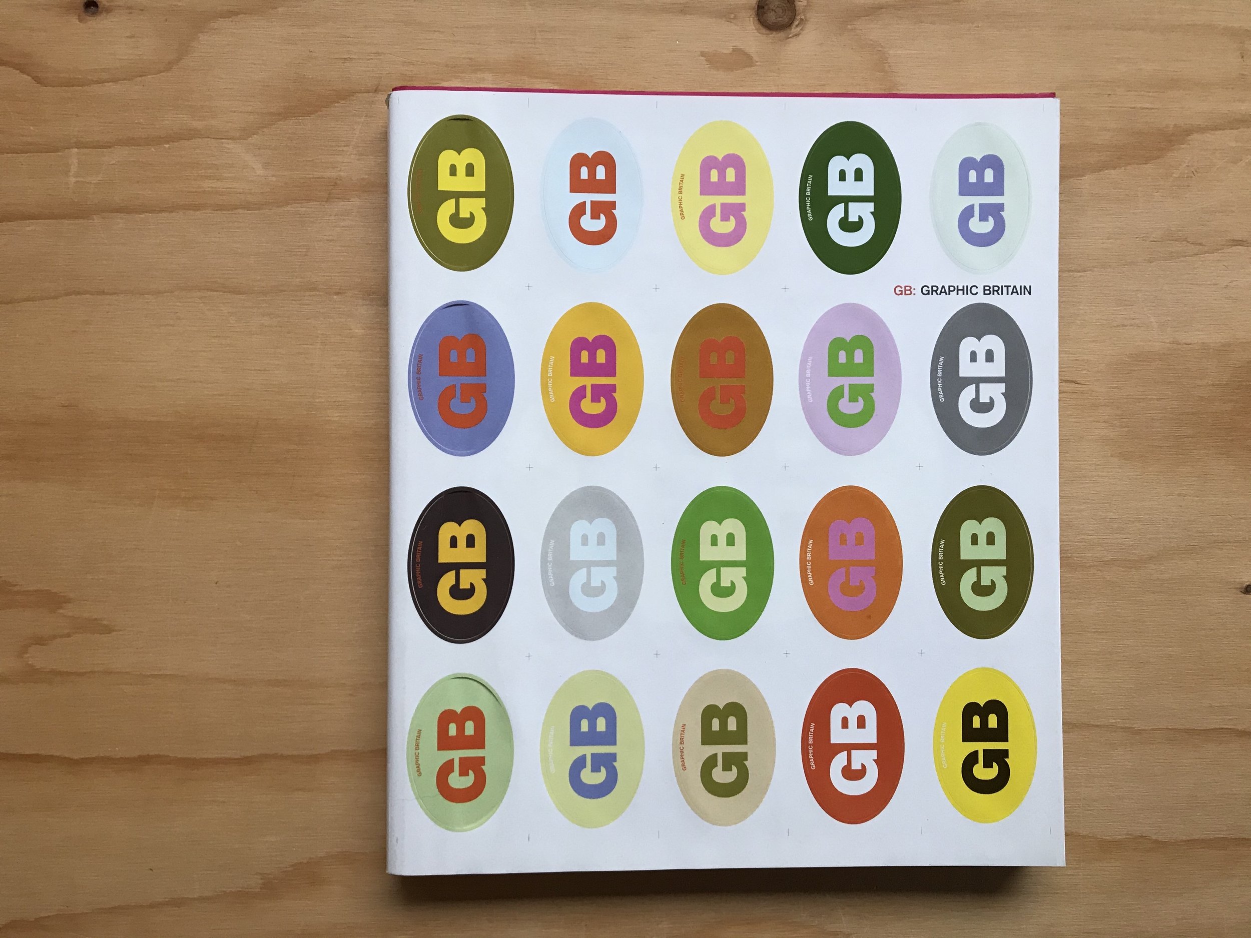
yes, i am also a graphic designer, and as far as skills and interests go, i certainly got into typography before i got into patterns. let me take you back 20 years, as continental european high-school student, it was also the time i was trying to master english and soak up as much of uk culture as i could. to combine these two main interests, a convenient place to go to in budapest was the book shop where they stocked some of the great coffee table books. today i’d like to talk about in particular titled “GB: graphic britain” (burgoyne, p. 2002 laurence king, london) with the aim to line-up some of the coolest up and coming graphic design works produced in the uk at the time.
the book was designed by a london-based agency called bark, founded by tim hutchinson and jason edwards and i used to really hunt for their bold and colourful work and i did find them - in another book, “graphic originals: designers who work beyond the brief”(austin, j 2002 rotovision, mies) they talk a little bit about their process through a prospectus they designed for portsmouth university where hutchinson was a lecturer. the project itself was a map, a clever visualisation of the course journeys, but what really caught my eye was that it wasn’t just an raw information graphic, but focused a lot on using a lot of photographs of the built environment, the documentation of very mundane things that reflected on everyday life at the university. it was the first time i’ve ever really seen anything like that but that really was speaking my language. it was just inspiring to see real, successful people in the industry do this - take the built environment, and create a feeling of home and belonging in it by graphic, “2D” means. that’s exactly how i wanted to do design and it was a great contemporary example, right in front of me.
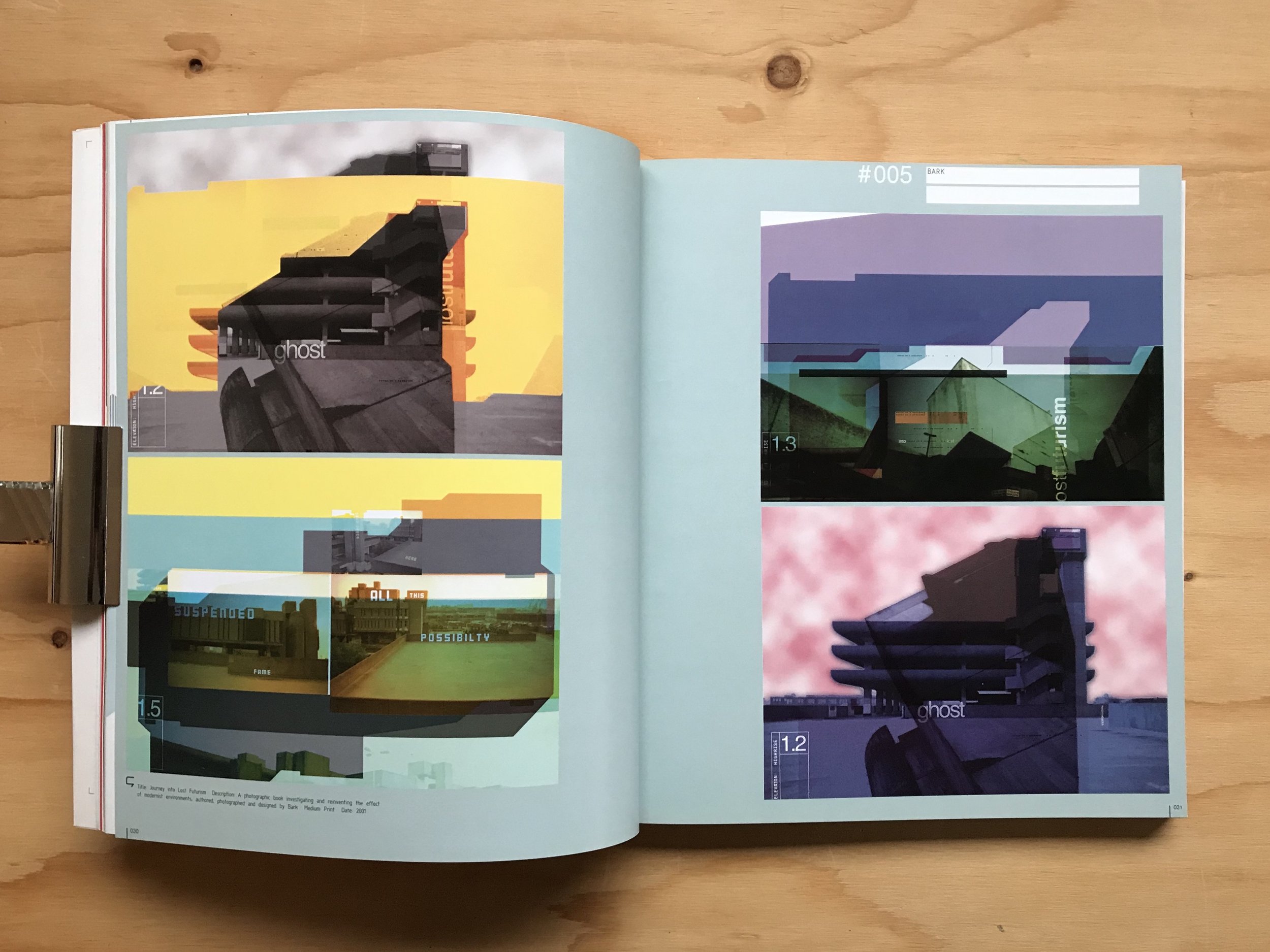
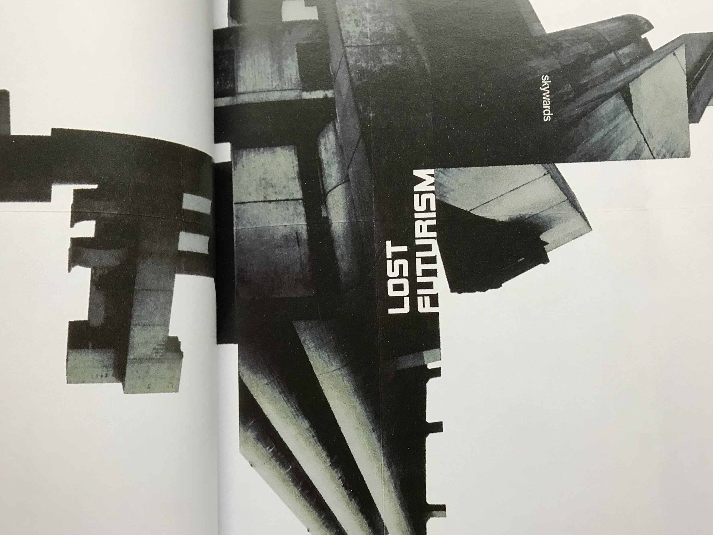
but there is another project of theirs that i would like to show you - i’m still hunting it, i believe it must have been self-published at the time. it is one titled lost futurism (according to the caption in GB: graphic britain, it is a book that was printed in 2001 - please do get in touch if you know anything about it.)
the project examines brutalist architectural heritage in a graphic design language - having mentioned portsmouth, this obviously means the tricorn centre, mostly, which i have never seen in real-life but somehow in this graphic interpretation, felt nostalgic and futuristic, alien at the same time. i used to stare at these pages for ages. it was really fun discovering about the building itself but also the graphic representation of it - it was just really, really cool and simple, and it spoke my language of taking a three dimensional form and reducing, or rather, deconstructing it to its image and basic form.
to this day i’m still obsessed with that sort of thing. i used to do a lot of my own experiments with my own photos of my favourite buildings when practicing my computer skills (a useful habit to get into) but it also transpired to other work and i firmly believe they have a place on textiles too. obviously, graphic design is different, it is visual communication, but if the result is decorative, then why should it not be used on textiles too?
so i hope you didn’t mind learning a little bit about this background behind the architecturally inspired textile patterns of zitozza. and if you know anything more about this work, if it exists on its own as a separate book, please, please do get in touch, i think i want a copy! thank you!
-
links:
GB: graphic britain - by patrick burgoyne, 2002 laurence king, london, uk (on worldcat.org)
still can’t quite comprehend how fast it’s been, but thank you so much for keeping up to date with us throughout our first full year. we have a lot of exciting things planned for 2022 and we hope you do too! until then, we wish you a very, very happy christmas and see you in an amazing new year!
good morning december, how did we get here again? i can’t quite believe how fast this month has gone again but with all the busy festive preparations, i hope there is a little time left for inspiring stories and interesting conversations - and i really did bring a good one for you this time, as i managed to get a few words in with matt maurer, designer of the smart and sustainable home office system of arnie.m, featured in our post about interior trends at the start of this year.
ZITA: hi matt! first things first, can you say a few words about yourself – what you do and how you got there?
MATT: i’m the founder and creative director of mr.m ideas studio. mr.m specialises in brand identity, visual communication, digital design and environments. with over 50 design awards and 20 years’ experience i collaborate with creative people in many fields to make great ideas happen.
my journey before arriving at mr.m was studying graphic design at university and spending my earlier professional career working for some of the most renowned design agencies in manchester.
ZITA: and about your product - would you say that developing arnie.m was a long-held dream of yours, or was it something that evolved over time? can you give a little insight into the birth of your business?
MATT: birth is the key word! my studio is based at our small home and when we found out my wife, angela was expecting we also knew that we were presented with a spatial challenge.
life and work need to be in balance especially within the home environment. the limited space presented a challenge but that is what led us to thinking about creating a workspace that could accommodate all my design paraphernalia, yet still be compact enough to shut up shop of a working day and become an attractive piece of domestic furniture.
so, with the help of friends and contacts in the creative and craft industries in and around manchester, we took our design ideas and skilfully translated them into a for-real form – a workspace.
we were swept away as new parents when arnie arrived but once we started to get our heads around everything including sleep deprivation, we began to see how the workspace really helped. when friends and family complimented on the complete ‘office’ it led us to start out on our adventure. it took just under two years of developing and tweaking to turn our workspace in what it is today — arnie.m. (we had to name it after the little man who inspired the idea!)
ZITA: how lovely - and impressive! i actually discovered your furniture in search of home office trends which obviously blew up since 2020 and the pandemic. how has this experience been so far for getting your range known?
MATT: we only truly launched arnie.m at the end of december / january 2021, we are very much still in our infancy. we want arnie.m to be a family adventure for angela, myself and arnie plus the amazing network of skilled people who are part of a wider, very support arnie.m family. i have to say we are still finding our feet but the response and support we have received has been amazing! the highlight for us has been getting arnie.m featured in variety of well-known/high end publications which has raised our profile.
ZITA: modular design systems in general are a smart way of working but there’s also a lot of play in it for your clients. can you expand a little bit about the possibilities or how your furniture can be built up? are there any limitations to your systems or can it be theoretically expanded to huge environments (e.g. contract?)
MATT: we know creating your perfect working environment is personal, so by making arnie.m modular makes it adaptable. arnie.m starts with a frame, and you basically hang the units that best meet your needs on the sturdy (yet elegantly formed) frame. currently arnie.m has a range of different modular units which include a desk unit to several storage and display unit options, this gives you the flexibility to create your very own arnie.m
each arnie.m is handcrafted with pride and attention to detail, we only make to order. this means with the support a small but talented collective we can customise and be creative with the modular design if required, individual unit designs, sizes, even colour can all be considered. this way of working gives arnie.m the flexibility to work in different ways and look at opportunities in different environments.
ZITA: that’s really clever! i think handmade processes always allow a lot of custom tweaks indeed. can you tell a little bit more about the material choice? how important are sustainable qualities for you with regards to both materials used and your working processes?
MATT: we are not, nor do we want to be a mass-producer, having to use cheaper materials like mdf. we love ply it’s basically a ‘green’ product, its beautiful, durable and long lasting. we designed arnie.m to be easily reconfigured to meet your needs over a lifetime, individual hand-made, built to last in natural birch plywood that is FSC certified.
arnie.m has some clearly defined ambitions which focus around sustainability. we want to grow arnie.m carefully for everyone’s benefit, as mentioned we are a family not a vast global corporation. we want to support our small collective. we use only what we need in materials and packaging, avoiding waste and keep production local. by building a sustainable business we want our boy arnie to benefit from the work he’s inspired.
ZITA: this is very inspiring! i love plywood in general, i even print with it - it’s so universal. and beautiful too. what were the aesthetic driving principles of your product? do you follow any particular design school or style, or was it purely driven by function?
MATT: function was at the heart of the idea. simply our brief was to create a practical, adaptable and functioning workspace within a small space, that could also be aesthetically pleasing.
ZITA: it makes perfect sense! and now a question i ask from everyone - can you recommend a book, or another designer, artist or a maker whose work is worth looking into?
MATT: angela was the really driving force for developing the workspace into arnie.m but we were inspired by the books produced by the do book co we highly recommend taking a look at them.
ZITA: i definitely will, thank you! and last, but not least, where can we see your products at the moment? and what next for arnie.m? are you looking to grow your range?
MATT: you can view arnie.m on our website but we also currently have one arnie.m displayed in a house by urban splash show home in new Islington in manchester.
next year we look to continue to build the arnie.m brand. we are also going to explore adding new units designs to our range. and most importantly enjoy the adventure!
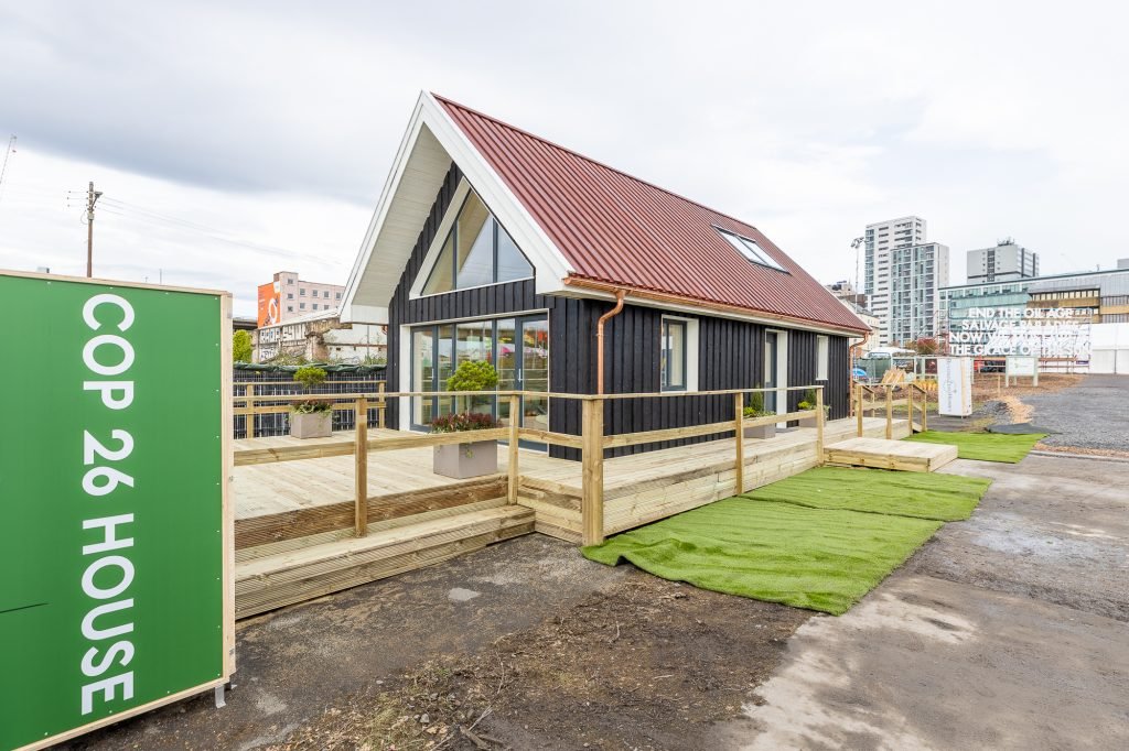
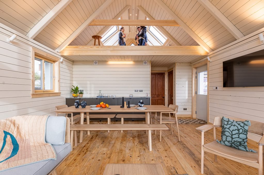
hello! first of all, apologies for not having posted anything for ages, zitozza have been very, very busy in the last few weeks with making stuff and taking them to events… but we haven’t yet shared the best news on the coolest (probably ever!) project - the COP26 housein glasgow. this is a sustainable model house built at the broomielaw for the COP26 climate conference and as an obsessive architecture and sustainability geek, i was eager to learn more about this and with a huge thanks to beyond zero homesi managed to put together a little bit about this.
the house itself is a project of many contributors, designed by peter smith of roderick james architects, developed bymembers of beyond zero homes - a collaboration between developers, architects, suppliers and industry bodies with the single aim to demonstrate how beautiful, affordable, healthy and comfortable homes can be developed with minimal impact on the environment, throughout their lifecycle.
photo by fourfifteen, with thanks to beyond zero homes
there’s an important thing to mention here before delving into the details here - i’d like to emphasise that this house isn’t some kind of futuristic concept, but designed for the present and built using materials and technologies that we have available today and it is very much a present imperative to use them across our building projects if we take our climate goals seriously. so what exactly are these materials and technologies and what makes a building sustainable?
according tothis assessment by daniel doran of circular ecology, the house is an exemplar of embodied carbon. most embodied carbon emissions come from the supply chain of construction products – the extraction of raw materials, processing, transporting and manufacturing and then there’s transporting products to site, installation, repair and replacement during use, and their end-of-life deconstruction and disposal. what makes the house actually carbon negative, beating RIBA’s own carbon target by large, is largely thanks to the material choice of locally grown timber. the uk is one of the largest timber importers in the world which is not only an unnecessary addition of shipping-related carbon, but growing them locally also supports reforestation and capturing carbon.
photo by fourfifteen, with thanks to beyond zero homes
the house is of course eco-conscious in using responsible heat sources and airtight insulation - it is using infrared heating which works by heating the house itself rather than the air in it, so it is much more efficient, comfortable, space saving, and perhaps the biggest benefit in a wet country such as scotland is reduced moisture. of course the insulation is achieved with triple glazing and even theinsulation and the cladding is using timber.
i’m not an expert on construction and structure, but it really amazes me how many places in the design uses timber even where we’re not that used to seeing it and it is also designed to dismantle easily - this will be demonstrated live after the conference, when the house will be disassembled and re-built in aviemore to join an affordable housing scheme of 12 of such houses. i’m going to be honest, i was a little bit sceptical about how much of these houses we can build efficiently in a city though - after all, timber is not known to be hugely scaleable, and in a climate-stable future, we want to spare as much land as possible, don’t we? however, talking aboutRIBA’s operational carbon targets, the architect peter smith said “for larger houses using this same build system, the target is significantly easier to achieve” which leaves me hoping it would work with multiple households too.
photo by fourfifteen, with thanks to beyond zero homes
last, but not least, we should talk a little bit about the decor - the house was styled by roddy clarke who made conscious decisions to continue the use of sustainable and natural materials inside with wood furniture and locally sourced soft furnishings - which is why i’m so proud and pleased to loan one of my jute rugs to the project. (while we cannot grow jute here locally, it is still one of the most sustainable textiles in the world in terms of carbon capture and water footprint.)
it really is a wonderful project and i hope that in the past few weeks, all the important people in the sector has visited and learnt from this model because we need to implement these practices right now if we want to keep our future liveable. it is easy to get into a negativity spiral about climate change, because we are undoubtedly on a depressing course and we are definitely going to feel the effects of our ignorance for a long time. however, it’s not true that we haven’t done anything or that we are unable to. we do have affordable solutions at hand with which we can limit some of this damage and we are able to use them. i do believe we are smart enough and projects such as this house makes me feel hopeful and positive for the future!
well, i hope you’ve had a lovely time visiting the scottish borders scouting for modernist icons by the wonderful peter womersley, because this is the very last stop! we arrived in the town of melrose, on the outskirts, in what seems to be a quiet, residential area, and are standing in front of the boiler house of the demolished hospital that used to be known as melrose district asylum. it is no longer there, except for the boiler house, designed by peter womersley.
built in 1977, it is another one of his award-winning works, for industrial architecure. it is a highly functional building and perhaps much more “brutalist” than the previous ones we visited so far, but it is really far from raw, in the sense that everything is finished to a great quality and the details are smart as always on his buildings.
i’m aware that hospitals use a lot of steam not just for heating the buildings but for keeping things clean and sterile too, however i’m obviously not exactly familiar with the ins and outs of a boiler house, so i cannot write too much about what functions certain parts do. what i can certainly tell (as the most prominent feature of the side of the building) that there are three hoppers on its side, which were used to store the coal and they form a great rhythm of what i call these “upside down pyramids”, built into a wall of horizontal layers and it has inspired some great geometric patterns, so even if i don’t quite understand how it works, i still find a lot of joy in the aesthetic of the building.
aesthetic it is indeed. the concrete is smooth and not worked to timber patterns this time, but the almost minimalist surface is put together from narrow slabs, forming an even, soft pattern on the surface. the joins follow this pattern, somehow it’s so easy on the eye it’s almost a source of tranquility, which is a funny thing to say about a boiler house i guess.
a the time of visiting, it was not in a great state and the concrete was visibly aging. but we’ve left this our last station not just because it really was physically the last stop of the day, but also let’s finish on a positive note: this building’s fate is no longer hanging in the balance, it is being salvaged by being developed into flatsby studio DuB. the plans look amazing, contemporary and also preserving almost all forms (they’re even keeping the chimney!) and i hope it will work out in a residential function. it’s funny to see that something that was designed to sustain one particular function could be turned into something else so beautifully but i suppose it’s always possible if you work with what’s left behind by a genius.
i’m sad to say that even though there are many more buildings around in the uk (and even worldwide) by peter womersley, we’ve come to an end of our tour. i hope you’ve enjoyed it and we hope to join us on the next one - we might have to be taking a little break as we’re getting busy with all things festive, but we’ll find time to immerse ourselves in great architecture and will definitely be back!
we’re pleased to gather you around today, ladies and gentlemen, with a few more announcements to make. zitozza has been selected for the line-up of this year’s tea green festive market at the v&a dundee. zitozza will be there for one day only, on the sunday 7th november, but the event itself takes place on the whole weekend with a whole bunch of brilliant designers and i can hardly contain myself! it will be amazing to be exhibiting at this most prestigious venue and meet fans and makers of high quality contemporary design made in scotland. really cannot wait!
but before that, i’m going somewhere much more local, finally here in the east neuk of fife, at the bowhouse market (also thanks to tea green events) also on sunday only, on the 10th october. there will be three of these in total though, with weekends also in november and december, all with a fabulous line-up of scottish makers, music and all sorts of great stuff here which i love and as a fifer, close to the heart! (and oh my god, the food! THE FOOD!)
so we’ll be looking forward to meeting you all and showcase the latest hand block printed jute stuff to you - please think about christmas in advance to ease the pressure on the poor delivery folk! let’s make shopping an event, treat your home (and yourself) to some beautiful decor and at these fairs - shop local, discover an army of local creatives, and… did i mention the food?
happy autumn! we’re back to work, back to school, back to looking ahead and also back to talking to people so i’m really pleased to announce tha after a long hiatus, t the design conversation series is continuing with a new arist! ciara mcinnes is an architect and fine artist based in glasgow. i discovered her fabulous prints on instagram during lockdown when i was craving to see beautiful buildings - some of them are the exact same buildings i’m also fascinated by, such as the netherdale stadium of peter womersley – so i was really keen to know more about the background about these beautiful works.
ZITA: hello ciara! first things first - could you say a few words about yourself, what you do and how you got there?
CIARA: hi there, thank you so much for having me! i'm an architect and fine art printmaker based in the west end of glasgow. i work in the medium of lino print, combining traditional handprinting techniques with contemporary, urban subject matters. inspired by the city, street art and general urban chaos, my work typically documents lost landscapes, urban spaces and historic buildings.
ZITA: i can see your architectural background - it comes across beautifully on your urban prints. i’m always glad to find other people who also see the beauty too in the things that often get a bad press. could you share a little bit about what inspires you about these landscapes?
CIARA: for me, the built environment is so inspiring, constantly changing and evolving. i love to document the city in my work, taking tiny snapshots of a place in time, knowing that it will never look exactly the same again. the light will be different, the graffiti will change, it will eventually be lost for good and exist only in print.
in architecture, it has always been the case that the styles of the previous generation are undervalued because they are seen as dated but not yet historic. In glasgow, there has been a huge cull of brutalist architecture in recent decades, a style that is only now starting to gain recognition. i'm really drawn to document these buildings in particular because of they represent an important era in history, when architects and designers were tearing up the rule book.
ZITA: that’s fascinating. i do love that era too, and the ideas they represent! do you have a favourite place, a city or a building you go like regularly going back to? Or do you continuously look for something new?
CIARA: i am always on the lookout for somewhere new, i love to travel. at the start of 2020 i visited mexico city which was such a vibrant and energetic city. the architecture is so diverse from pre-hispanic to cutting edge contemporary and everything in between, it's somewhere I'd love to go back to.
ZITA: that must have been beautiful. you mentioned brutalism before, but is there a particular school of architecture or style you’re attracted to more than others?
CIARA: i'm a fan of minimalist, contemporary architecture. there's a few places really leading the field such as scandinavia and japan but it's not something we have really embraced in scotland yet. there's an architectural practice called SANAA who create some truly breathtaking work.
ZITA: thanks for the tip, i will make sure to check it out. so what is the next cityscape or building you’re turning into a print? can you tell anything about any work in progress?
CIARA: i'm currently working on pair of prints that explore the temple gasworks in the north of glasgow. the structures of the old gasholders are still in place and create these skeletal figures in the landscape which you can see for miles around. i'm going to be integrating some more natural imagery in the prints which is a new direction for my work so i’m excited to see the finished pieces.
ZITA: sounds really exciting, i’ll be looking forward to seeing the finished prints. i’m also interested in your technique. your prints are very photographic! how are you working them into your prints? can you explain a little bit about your process as well?
CIARA: i always start a print by creating a master pen drawing which i then trace using carbon paper onto the lino block. i will usually combine elements from several photos or images into a final composition, all with a little artistic license. i often make little tweaks at the carving stage too, with a lot of natural elements freehanded as I go. the prints evolve through the printing process so i never fully know what the print will look like until the very end.
ZITA: that is really interesting! and your colour scheme is very minimalist and together with your ukiyo-e inspired technique, it reminds me a bit Japanese influences. it is very consistent throughout your work and it works to a wonderful effect – could you tell more about this? do you have a process of deciding about the colours in your prints?
CIARA: japanese printmaking is certainly an inspiration, particularly the dedication to craftsmanship and technique. my colour palette is typically very tonal which allows me to focus on the form of the print, then I create focal points by picking out details in metallic. i typically mix my inks with extender to create a more translucent effect, i love how this gives the prints an almost watercolour like finish.
ZITA: it does! the results are really beautiful. and now the questions i ask from everyone - can you recommend a book or an artist or a maker whose work is worth looking into? something that keeps you going?
CIARA: i recently discovered an artist called claas gutsche who's based in berlin, a fellow lino cutter, his work is so precise and his technique is definitely something to aspire to. in a totally different direction i’ve always loved the work of a painter called maurice utrillo who was a contemporary of the impressionists but worked in quite a different style. he has a really fascinating story, using painting as a form of therapy. he painted the world around him, focusing on the built environment and often unloved corners of paris. i only recently found out that the kelvingrove museumholds one of his pieces but it's currently in remote storage.
ZITA: sounds like someone you would have loved to met! i will be definitely checking them out. and lastly but most importantly, where can we see your work next?
CIARA: well, i do have a few exhibitions on the horizon but sadly i’m sworn to silence until the official announcements! all i can say for now is that i have an upcoming show in a glasgow gallery this autumn, which will feature some specially created pieces. i'll also be popping up at a few art and design fairs across glasgow later this year, so keep your eyes peeled!
ZITA: very mysterious! i will keep an eye on your social media! thanks a lot for your time.
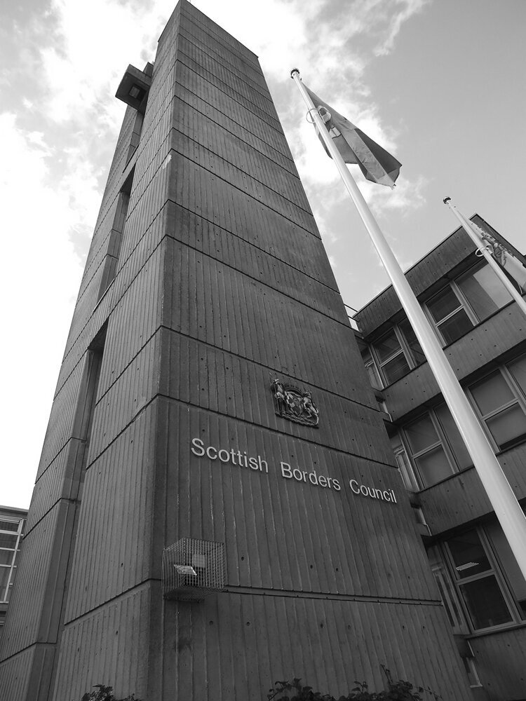
after our somewhat bittersweet stop last week, we’ve arrived to the penultimate station in our tour of peter womersley’s buildings in the scottish borders. we’re in newtown st boswells, where the council for the county of the scottish borders have their headquarters in a concrete and glass office building designed by peter womersley. we have of course seen wilderhaugh and we know what he’s like when it comes to designing office buldings but this one is a few scales up in size, and probably the largest building of our tour altogether.
that means there’s plenty of details to observe although it’s not possible to go completely around it due to the restricted access at the back. nonetheless it’s worth a visit, the building is a striking structure towering on an open green, embraced by its leafy surrounding of the village. built in the late 1960s, originally serving the much smaller administrative unit of the roxburgh county offices - today it employs approx 1000 people and has grown a post-modern extension on its side.
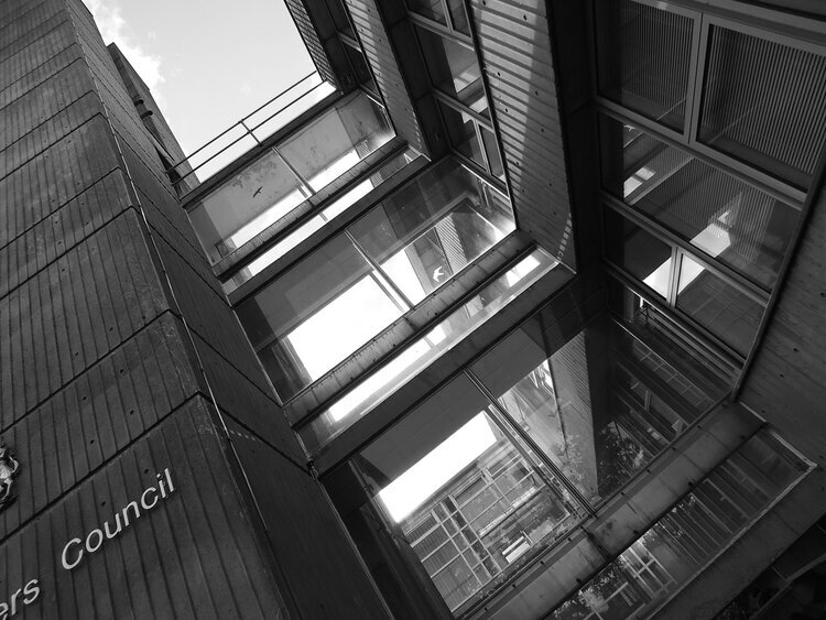
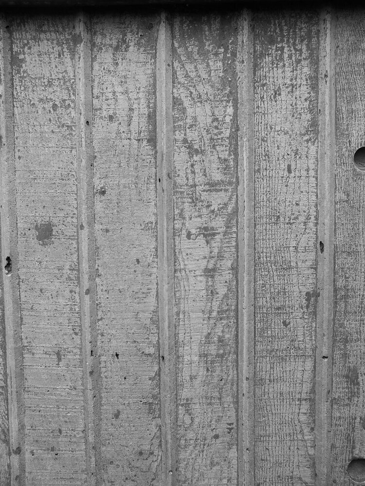
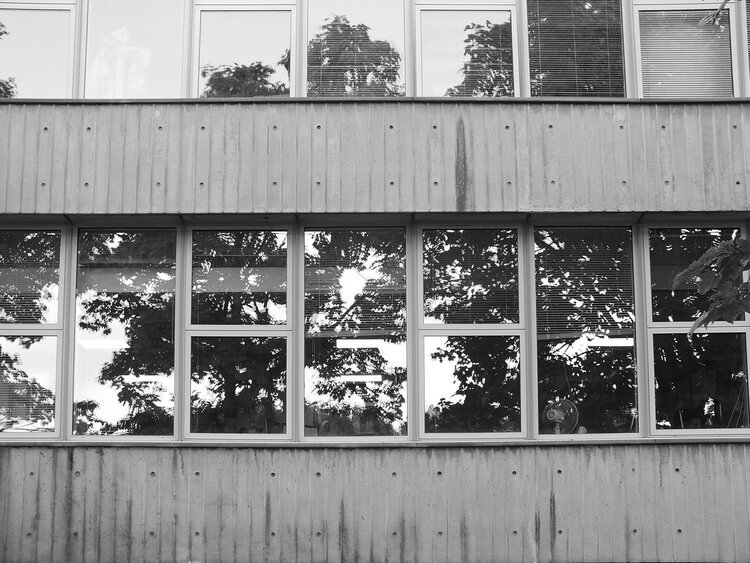
it’s not a brutalist design - the concrete is not raw but shaped with timber with the imprints visible on the facade. the clever use of glazing is also dominant throughout this building and there are a lot of intriguing details. its most striking feature is the service tower of course, cleverly connected to the main office buildings via elevated, glazed corridors with a garden underneath. this kind of biophilic thinking is found in modernist architecture a lot, and in peter womersley’s work too in church square too and elsewhere.
the building is not actually quite at how peter womersley imagined it. he won the competition to design it in 1961 but it was only completed in 1968 after some opposition by the locals. it’s still not really popular - however, even though the structure is cited as a reason, i suspect this could be also due to the amount of people who commute to the village by cars, and less at the fault of the architect. for sure, you can see that it’s dated in some aspects (like its contemporaries it probably is poorly insulated and things like wheelchair access are always haphazardly added to these buildings later.) nonetheless it was innovative and modern at the time, and the office space inside must be light with green views.
this building is the largest scale example of the genius of the fine details womersley could think of and i would have loved to see the what it would look like if it had been completed to his plans. the institution it serves has obviously grown and perhaps outgrowing both the original building and the village it’s in might not be good for its popularity, but i do hope that with time it is getting the appreciation it deserves.
so that’s it for now, i hope it’s not too boring yet to and you’re still excited about discovering the details of this brilliant architectural mind. if you do, then please stick around for last episode - we still have the boiler house of melrose district asylum to visit, so you can subscribe below to our newsletter in order to miss it… it comes a free print and the latest news from us, with pattern designs inspired by brilliant architecture. see you soon!
hello! we’re so sorry to have had to share the bad news with you on saturday, about the cancellation of our last jutefest event. i hope you haven’t travelled to dundee this weekend! if you haven’t heard, the very last jutefest was unfortunately cancelled due to staff having to isolate at the venue (scrapantics, our landlords have been utterly fantastic about this whole venture though so huge thanks to them!). and to be honest, for it only to happen to the last in a series of 4 is not a bad record, so we are celebrating our success and we are also thinking about how to come back with something bigger and better next year perhaps.
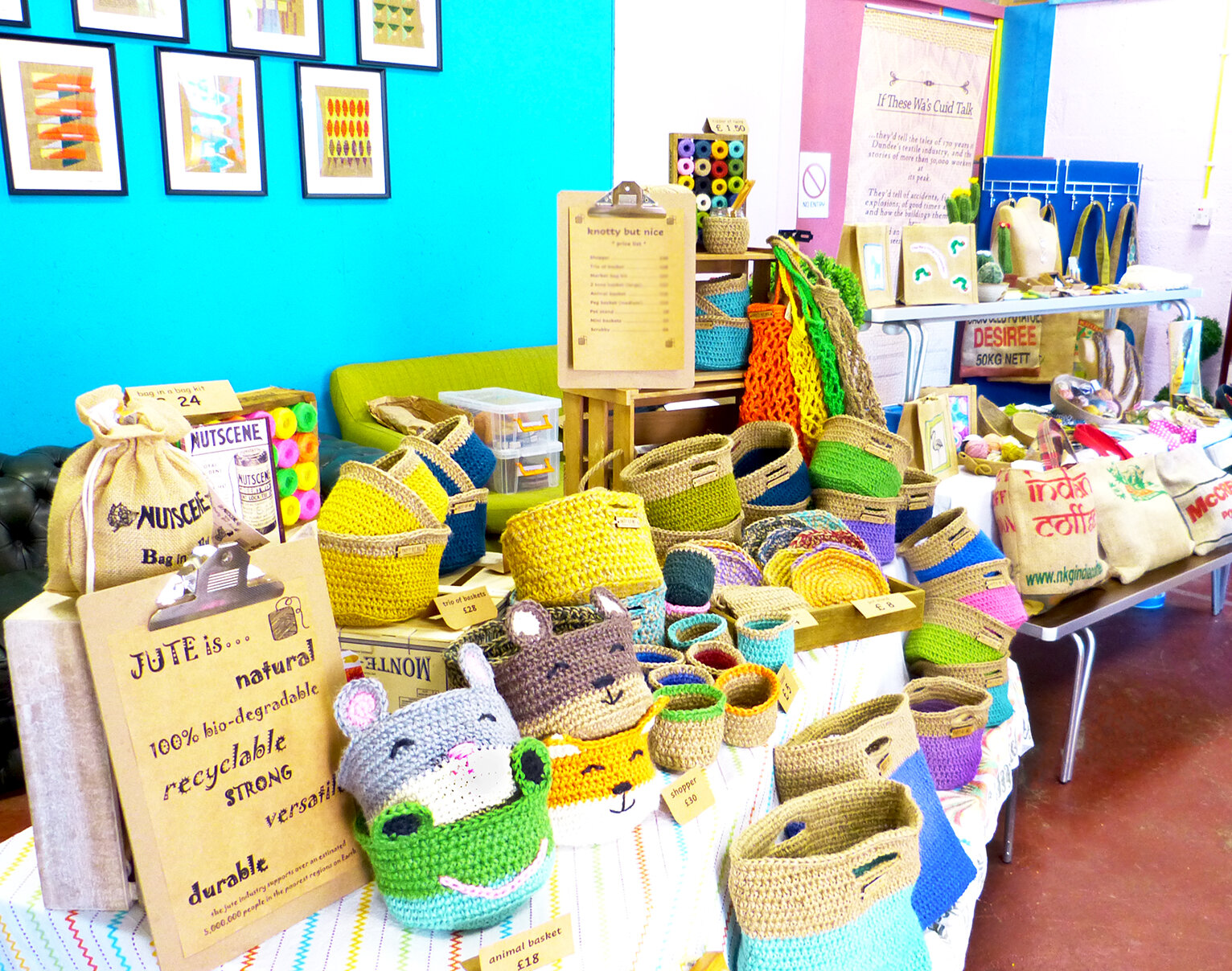
so if you only just heard of us, the best is yet to come. jutefest consists of three of us - jist jute,knotty but nice, and zitozza. because we all work with jute in different, but consistently modern and contemporary ways, we set out to bring the cloth back to its city and celebrate its sustainable qualities - and maybe showing the locals along the way why it’s cool again! while dundee has an enormous heritage to build on, jute is not a thing of the past but very much the future too.
photo by deborah chapman at artantics
photo by deborah chapman at artantics
we’ve done a lot of cool things together and it’s been an achievement in itself, i think, to pull this off on a shoestring with a few weeks notice. indeed there’s a lot of potential in our abilities to do something bigger and better soon! throughout the event series, alison has successfully managed to crowdfund a whole weaving loom and lessons to learn to weave - you can see the progress of all this on her instagram along with the first pieces. don’t they look fabulous? and maite was busy crocheting, unstoppably producing her work live at the fair whilst chatting to visitors about those durable bags! it was fascinating to witness that speed.
as for zitozza - of course, the embroidered wall-art collection also debuted at the jutefest and it did look good on the turqouise wall of the venue! and as a demonstration of our craft, two smaller lengths of fabric were printed live in front of enthusiastic visitors... i think one will become a lampshade, and the other a rug (see the pictures below!) and it’s coming very soon so watch this space and subscribe to the newsletter, to make sure you don’t miss out on any of our new plans (and the nice things made of these!)
save the date! it seems that as life is opening up more and more, we’re coming to pop-up at more events and markets - and this time, at a really prestigious boutique location at the newly opened st james quarter in edinburgh!
the pop-up event series lasts altogether for two weeks, from monday 23rd august until sunday 5th september, and is organised by the wonderful people at women’s business station to showcase some amazing makers from all across scotland and it takes place at sook, a pop-up boutique space at the shopping centre. zitozza will take up two days here, on wednesday and thursday 1st & 2nd september, sharing the space with a few other brilliant makers.
no doubt more posts are coming - and do keep an eye on our social media, but i just wanted to let you all know that this date is also coming! keep safe!
aaaand we’re here! it’s only the 4th station of our tour of peter womersley’s buildings in the scottish borders, but arguably the most iconic one! we are visiting bernat klein’s old studio and house, near selkirk. it’s a famous, grade A listed and most revered building, yet in its fate still hangs in the balance as it has been neglected in a poor state since the 2000s and the more time passes, the more expensive it gets to restore it to its former glory.
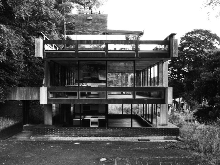
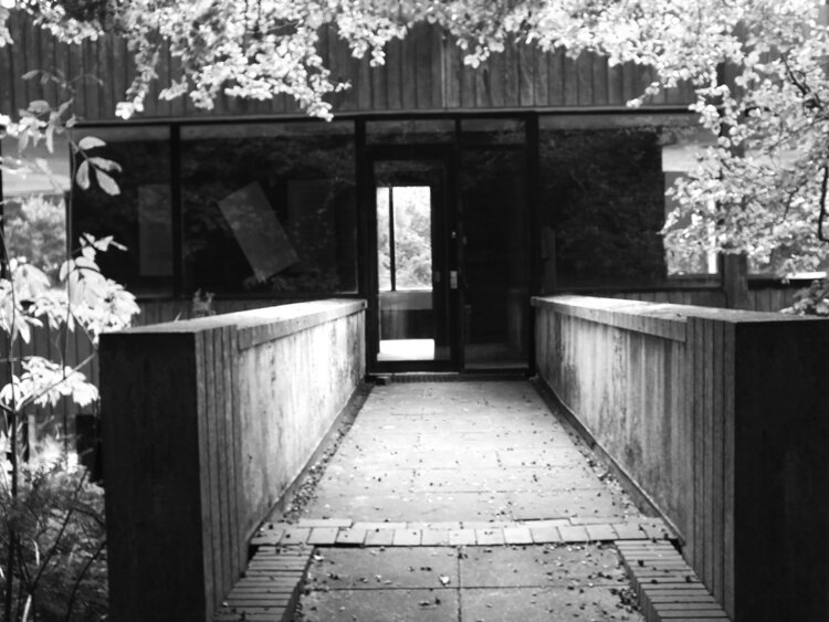
the studio was built in 1972 for textile designer and personal friend of womersley’s, bernat klein (whose work is probably also worth its own blog post later) and it won a RIBA award in the following year. it is a separate building form the family house, high sunderland, which is a modernist masterpiece in itself (built earlier, in 1957), and it is still a private residence so this post is focusing on the studio, which has been abandoned since 2000s. so before we dive in, i’m going to do an unusual thing and this time, and i don’t really recommend to visit in its current state, or at least not to go too close to it. these photos are from 2016, and since then, i’m not sure how dangerous it has become to go close to - i know it’s tempting but i would strongly discourage you to do so. i didn’t either to be honest, most of the close-up work was done by my camera, and i hope it did a good job regardless and you’re able to see why this work is so masterful and why it needs to be preserved.
there are many details and elements that tell you just how much thought the architect put into the building. before i visited it, as a student at university, i attended a guest lecture by historic environment scotland about peter womersley, his life and his work and there was a good few minutes dedicated to an enthusiastic review of this building. a vivid description that got stuck with me was about the flashes of colours one would see through the amazing, huge, frameless glazing - that’s bernat klein using this amazing studio space to make amazing art. their friendship is a great symbol to me that textiles and architecture are really connected areas that can constantly inspire each-other which is really the whole reason of this blog.
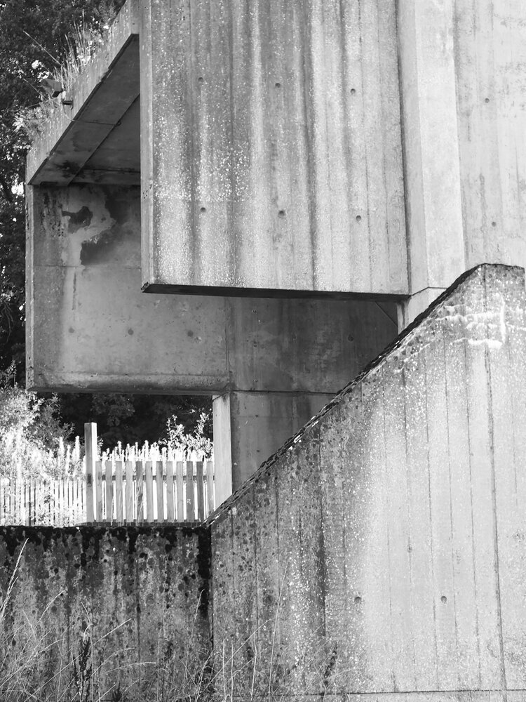
my images are black and white so i’m not sure how much it comes through that it’s surrounded with leafy, lush greenery, with stairs leading up to a bridge to access the cantilevered second floor (he was such a master of gravity - see also his beautiful work of the netherdale roof.) i’m trying to show you on these images the imprint on the concrete - i heard that peter womersley would be mortified to be called brutalist today, and indeed, the concrete is not raw at all here but very much takes the shape of the timber it was formed with, adding an extra tactility to the structure.
so we hope you enjoyed this visit - i hope we can go back when it’s fully restored and the building is put to a great use. if you want to help the cause to preserve this studio, i recommend you check out and get in touch with preserving womersley, a group of dedicated enthusiasts whose aim is to keep the work of this genius architect standing.
if you enjoyed this, do stick around as we’ll stop at two more places at this tour - we’ll visit a the impressive scottish borders council in newton st boswells, and the boiler house of melrose district asylum. you can also subscribe to our newsletter to our forms below (you can get a free print with it) and the latest news about prints inspired by brilliant architecture. see you soon!
***2025 update - this building is going up for auction on 30th july 2025. read our blog post for our vision of its future as a textile studio.***
further update: you can actually donate to bring it back to life, open to the public as a design centre - the bernat klein foundation along with the national trust and the scottish historic buldings trust have joined together in a bid to raise funds to acquire it and you can contribute to the cause.
i hope you’re having a happy summer people, i know it’s not easy to navigate between wanting a sense of normality and being cautious about the spread of the virus, but as we are getting through it all, we are very happy to announce that you’ll be able to meet us again, in real life, at CLOTH#21 in edinburgh, scotland, at the beautiful venue of the dovecot studios.
this will take place on two weekends, and zitozza will be there at the second one, on the 21st and 22nd august, from 10am till 5pm. it’s an honour to be standing amongst many other talented makers and textile designers - so please do come as it will be definitely worth it. not only it’s going to be full of stalls with beautiful stuff but the venue itself is one of the best in scotland, and perhaps one of the only ones catering for tapestries and textile arts at such a level.
and also please don’t forget that on the 7th august, the penultimate jutefest will also be on in dundee (at unit 2, anchor mills, west hendersons wynd from 10am till 4pm) man it feels good to be blogging about physical events and i hope it can continue! see you soon!
that’s another month gone - i can’t quite believe it but here we are, so it’s time to continue our photo blog series looking at peter womersley’s buildings. we are halfway through the series and this is the last time we are in galashiels. it’s a small post as well, of a small building, but nonetheless worth a visit. we are looking at wilderhaugh, the former sanderson & murray offices, built in 1961, originally for one of the many companies that kept the scottish wool and leather industry going at the time. they closed in 1980 and the building is now occupied by cameron associates who are, of course, architects, because of course architects would find home in this building.
this building is really, really cool, in the literal sense of the word too: it’s playful facade is made of shades of blue and grey, but it’s softened by the greenery around. it’s quite small and human scaled but does not want to disappear into the landscape, it’s just there with its defined vertical lines, arranged into a calming, neat rhythm. visited it during an early autumn day and it was quite striking how the facade cast its own shadow on itself. but this image by its current occupants shows it lit up in the late afternoon against the darkness of the scottish winter. light is divided into aesthetically pleasing, narrow sections against the backdrop of the hills. what else can you ask for, really?
with this part, we are leaving galashiels and are ready to visit the bernat klein studio - make sure not to miss it! if you want to stay tuned for news about our architecture inspired collections of rugs, lampshades, cushions and wall-art, subscribe to our newsletter here!
dear friends, i have an important question to you ahead of the new collection launches, concerning the rugs in particular. in a nutshell - would you be okay with improved quality on the rugs at the price of biodegradability? how important is it to you to purchase something that’s 100% jute - as opposed to, say, 67% jute, 33% polyester? it’s a big dilemma at the moment and i need your help to decide!
so if you feel like answering or giving your opinion, please fill out the form below. you will not receive marketing or any other email and we remain fully gdpr compliant - read our privacy policy here.
many apologies for not continuing our architectural series a little sooner. we have been caught up with moving studios (it’s becoming an amazing space!), organising and exhibiting at jutefest, launching our wall-art and working on our new collection launch but it’s time now to continue the tour in the scottish borders to find some more treasures designed by peter womersley.
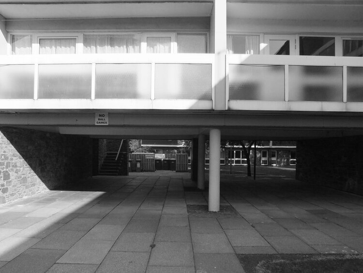
after having visited netherdale, we remain in galashiels and this time we look at the residential block at church square. it’s one of my favourite ones because it is one of the few residential ones and it’s so human scaled and light, which, to me is certainly what modernism was really about - building for people. completed in 1963, it is fashionably modern and revolutionarily, unapologetically puts the residents at the heart of it. there is nothing brutalist here by the way, it’s timber, stone and glass, arranged in neat patterns of basic forms - and with lots, and lots of leafy greens. the resident is at the centre here, everything is designed for people and with great attention to detail.
the two “floating” blocks form the leafy courtyard - what makes it especially embracing is the elevated first floor, a sheltered passage underneath the buildings. i love buildings that stand on legs - they let air and light through its enclosure while providing some shelter at the same time. womersley’s genius is in the detail of course - just look at that airy stairway, how it corresponds with the effortless float in air.
i have never been inside but i imagine the bright glass everywhere and the balconies make these flats really bright. RIBA has a couple of photos in their archive about what it looked like and it’s exactly the modernist coolness you expect. the textiles, patterns, surfaces are right up my alley and i think the zitozza aesthetics is not that far off it in spirit. i hope you’ve enjoyed this small tour and i hope with each of these episodes, you’re getting closer to the feelings i’m trying to evoke with my prints too!
see you soon at the next building and stay tuned for more news and new prints - subscribe to our newsletter here!
oh hello (limited, face-masked) general public! zitozza are excited and proud to announce to be a founding participant of JUTEFEST dundee! this is a brand new initiative with three makers working with jute differently (that’s - jist jute, knotty but nice, and zitozza) and our aim is to bring this wonderfully versatile and sustainable fabric back to its city where it once came out of in the tons.
the three of us work with jute in different ways - you can read our design conversations with jist jute already - there is a great deal of research and local history in alison’s work and she will also be signing her book “if these wa’s cuid talk” at the event. maite of knotty but nice is a crocheter who uses twine from nutscene to make strong and colourful bags and accessories. so there will be jewellery, fashion accessories - and cushions, rugs and lampshade by zitozza also for sale. but apart from setting up market stalls with our things, we will be making live at the event and demonstrate our crafts as well as preparing some exhibition materials on the history of jute in the city as well as some modern takes on the golden fibre.
there’s certainly a lot of heritage to celebrate in dundee but we also believe in embracing the present and we have our modern-day reasons why we work with it - one of these is of course sustainability, because we recognise our responsibility and we want to promote materials with less of a carbon, chemical, and water footprint. however, there is also a more artistic take on it - jute is a very utilitarian material, and when it was mass produced in dundee, it was fully to serve other industries and agriculture with its sacks and ropes. the three of us don’t use it this way though. we inject it with colour, design and individuality while keeping what’s good about it - the warmth, tactility and environmental qualities. there’s a lot to discover and play with and we want the locals to join us to celebrate that!
zitozza are preparing with a special launch of mini-tapestries as well, an initial 8-piece exhibtion will be set up for visitors - all wall-art will be available to be purchased online soon as well!
so when is this is happening? this is going to be a series of pop-up fairs stretched out between june and september on the first saturdays of each of these months. so that’s 5th june, 3rd july, 7th august, and 4th september.
and where about? at the artantics building (many thanks to scrapantics!), that’s right across from verdant works. the address is unit 2, anchor mill, west henderson’s wynd, dundee, DD1 5BY.
this is going to be a real-life event which is why it’s a big deal to those of us having been confined to our studios and council areas and whatnot. even though we are super happy to be finally free to meet you and celebrate, we still have to be careful and be aware of the spread of coronavirus. we want to be as safe as possible, so please note we will require face masks to be worn and we may still limit the number of people indoors in order to be able to keep a safe distance. thanks for your understanding and see you soon!
here we are in another month - and i’m bringing you another exciting entrepreneurial journey to read about. this one is a little bit special, as zitozza has a brand new stockist in scotland - HAYM,located on the high street of carnoustie, and i had a chance to have a lovely chat with the inspiring businesswoman behind it - janice reid. as i’m always on the hunt for new treasures, i feel really hopeful about the opening of new places, especially after such a hiatus. i think there’s a lot of warm and fuzzy feelings about local businesses supporting each-other - with everything that’s been behind us this past year, i wanted to learn more about janice’s journey and get a serving or two of the positivity!
ZITA: hi janice! can you say a few words about yourself – what you do and how you got there?
JANICE: ok, well my name is janice reid but my maiden name was hay which is part of the reason my new shop is called HAYM. i have lived most of my life in carnoustie but was born in dundee and went to university there where i studied architecture. I went on to work as an architect for almost 20 years, laterally becoming an associate with trail architects and i really loved my job and those who I worked with. my decision to change careers was based on my family situation.
ZITA: i see! has the shop been a long-held dream or something that developed through time? did you find it difficult to make the decision to go for it and open?
JANICE: i have wanted to open my own shop for some time now but always thought it was a bit of a pipe dream but many things influenced my decision to bite the bullet and just go for it. I had been off work on maternity following the birth of my 2nd daughter then after a short spell back at work i was furloughed due to covid. times have been so tough for so many because of the pandemic, there has been so many lives lost and so many people have found themselves in financial hardship but if anything positive can come out of such an awful situation it is that it makes you think that life is short and you should do what makes you happy. it made me reassess my life and gave me the drive and ambition to just go for it. I feel with my design background it is not such a huge leap more of a natural progression in a different direction.
ZITA: what a brilliant attitude! and it resonates a lot – zitozza came out of a similar situation. i do wonder, how has your background in architecture influenced your buying decisions, when it comes to finding stock for your shop? are you going for a particular style or feel – and if you do, where does it come from? where do you look for your curatorial inspirations?
JANICE: i have really just chosen what i like, there is no particular style, if i like it, i will sell it, but that said once all the stock is pulled together certain trends do emerge, there is a lot of monochrome and sharp lines which I guess comes from my architectural background. i am also drawn towards designers like yourself, align jewellery, hannah muir, steph liddle and jld designs who all have obvious architectural influences in their work.
ZITA: brilliant. i’ll certainly look for something for my new studio perhaps… obviously this whole period hasn’t been great for retail but people have also been getting more supportive for the values independent businesses represent. have you found it quite a supportive environment so far?
JANICE: i have found the industry to be hugely supportive and have really loved how nice everyone is and how happy they are to help. i have come from quite a harsh environment so that has been so refreshing. my customers have also been super supportive, i have had a huge amount of positive feedback and am being told on the whole that people want to shop local, support local businesses and local artists. there are lots of other lovely shops in carnoustie which makes shopping on the high street a positive experience and a destination visit. there is always the odd one that tells me i ‘must be mad and who gives up a career like architecture to go into retail during a pandemic!?’ i just ignore them!
ZITA: it’s great hearing this buzz around local business. how is HAYM going to stand out?
JANICE: so, we have great plans for HAYM, we have started with the bricks and mortar store and will concentrate on that initially, we offer a carefully curated selection of gorgeous homewares and lifestyle products and have a letterbox gifting which we will be promoting more shortly. once restrictions allow we will also be providing evening workshops including lampshade making and candle making to name a few. once these services are fully established we will be then be taking HAYM online.
ZITA: how brilliant! when it comes to customer attitudes, apart from style (obviously), environmental and ethical responsibility has also been becoming a stronger deciding factor, with regards to textiles especially. has this been important to you throughout your selection? If this was a guiding principle, was it difficult to source these products?
JANICE: this is very important to me. i wanted to keep as many scottish suppliers as possible, not only is this important for local tourism, it supports local businesses and reduces the impact on the environment through reducing transportation. i have also tried to work with designers who are eco-conscious when both designing and making and who are committed to sustainability, where possible using materials which are reusable, recyclable or biodegradable. this has not been difficult, i have found that more and more companies are practicing green procurement, this involves sourcing goods and services that are produced and supplied in a sustainable fashion and sourcing from local suppliers rather than those located far away. we also provide 100% recyclable paper bags and environmentally friendly recycled packaging.
ZITA: amazing. ultimately, what do you hope shoppers will find at HAYM – and return for years for?
JANICE: i hope they will find a friendly, comfortable environment to browse and shop in. i want them to find unique, quality, beautiful pieces for themselves and for others. i want to be that ‘go to’ place for gorgeous gifts.
ZITA: one more thing - can you recommend a book or an artist or a maker whose work is worth looking into? something that keeps you going? this could be an inspiring read or someone else whose product you might stock. I ask this question from everyone, i love getting inspired by everyone else’s influences.
JANICE: the boy, the mole, the fox and the horse by charlie mackesy.
this book is just beautiful in every sense of the word.
ZITA: wonderful, thanks a lot!
JANICE: thank you.
-
HAYM is open since 1st may 2021, at 41 high street, carnoustie, dd7 6ag. open tues - fri 9:30am - 5:30pm, sat 9am - 4pm.
so this is just a short blog post to thank you for bearing with us - we have spent the last few weeks moving everything into a shiny brand new studio space and it’s nearly complete. it’s a much bigger space now to make more brand new rugs, lampshades and cushions and launch my brand new collection - two brand new tilesets are coming soon with prints ready on jute homewares.
as we are coming out of lockdown, there are also some more exciting news and yes, some real-life (yes, still socially distanced, still masked up, but also real!) events coming up soon of which some more news will be shared very soon - this will also serve as a perfect occasion to launch the zitozza wall-art collection (of which, yes, more details will be shared soon)
so once again, thanks for your patience, and hope to see you soon!
the new architecture / photo-essay series is here! indeed there was a modernist-form-shaped hole left on this blog after finishing our tour of glenrothes and i haven’t had yet time to take the trips to the other new towns (although restrictions are lifting slowly and i do have plans.) so while i’m gearing up for those, there are more photos at hand i could share, and it’s unfair to focus on the central belt all the time anyway. so we’re taking a trip to the borders. as a student in 2015, i visited six buildings by the modernist architect peter womersley located at the scottish border and i’m going to share them all in a six-part series in the coming weeks.
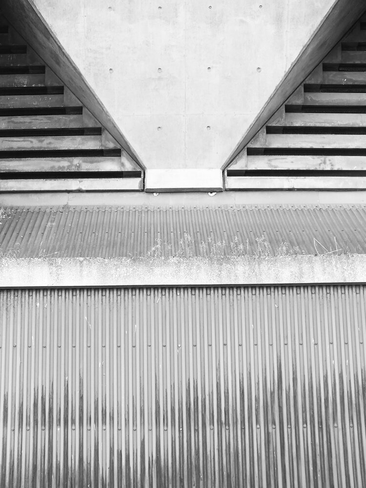
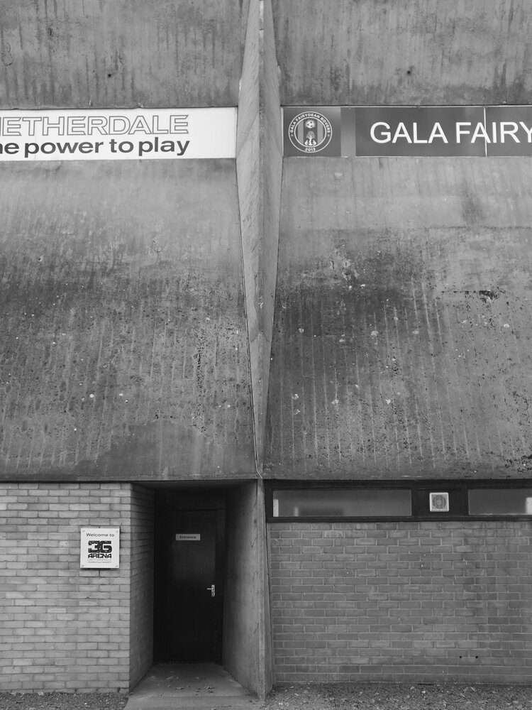
the first building i want to write about is netherdale, the stadium for the lowland league team gala fairydean rovers, in galashiels. i remember when i first parked in front of it and i stopped for a good few minutes admiring it. it was looking as if it was made of paper, a lightweight, pillar-free origami structure with sharp folds and angles. i thought it must have taken a genius to make something massive and heavy of raw concrete appear so airy and lightweight.
it’s now a grade a listed building and i’d rather let the photos do the talking but i also hope that it makes you want to visit in person - currently unfortunately it’s been shut for a while and remains so at the moment as essential repairs need to be done, however there are hopes that funding for its restoration is cleared and the works could begin.
built at the heyday of the brutalist era (between 1963 and 1965) it now stands solid at a friendly, very human scale (of about 800 seats.) it was one of the first of its kind of a pillar-free structure for unobstructed view - just tells you so much about the genius of peter womersley, the architect and the engineers involved. the gap between the seats and the roof of the stand were meant to be made of glass and translucent - today it is covered up in adverts but it would just be so beautiful if light could come through and make the roof float in air.
while the building is not directly referenced amongst my prints (i try to avoid creating monuments and memories) but the geometry of the structure did influence the zitozza prints, perhaps subconsciously too. constructed form and texture play has always inspired textile designers throughout but the optimism of modernism in particular is what makes it so attractive to me and connect to my pattern designs and it’s something that you will see quite obviously in the future posts as well.
peter womersley was an amazing architect who worked with innovative materials and revolutionary engineering solutions, but the scales were always human and the experience of form was always at the centre of his work. if you want to know more about the him, i recommend visiting preserving womersley- a group dedicated to the preservation and celebration of his architectural legacy (and follow them on instagram too.) and please keep coming back for the second episode of our tour too!