ARCHITECTURE

ARCHITECTURAL HERITAGE, ARCHITECTURE, BRUTALISM, INSPIRATION, SCOTLAND

andrew melville hall, st andrews

there’s a building here in st andrews that quietly unites two very different worlds: centuries-old academic tradition, and raw, rhythmic modernism. as a textile designer obsessed with surface pattern, i’m always drawn to the overlooked beauty of brutalism — and this particular student accommodation block is a hidden gem. if you're a design student, architecture fan, or just someone who appreciates visual rhythm in everyday places, this short tour is for you.

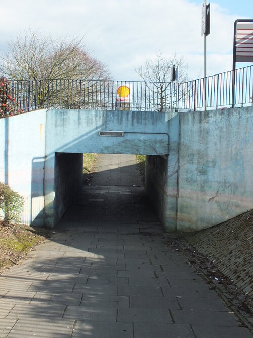
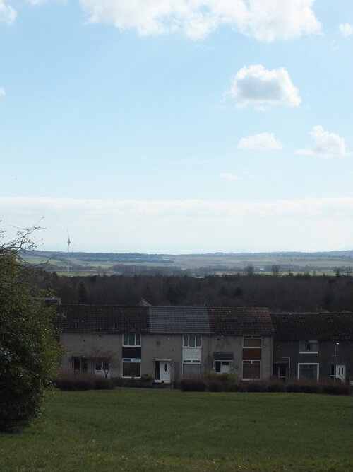
it has been a month since we last have updated our blog and even longer since we last had a little tour of brutalism… so it is time to get out of hibernation now and get the boots on for some well-due concrete hugging. don’t worry, we’re not going very far - in fact, staying right here in east fife, as we visit one of the student halls of the university of st andrews.

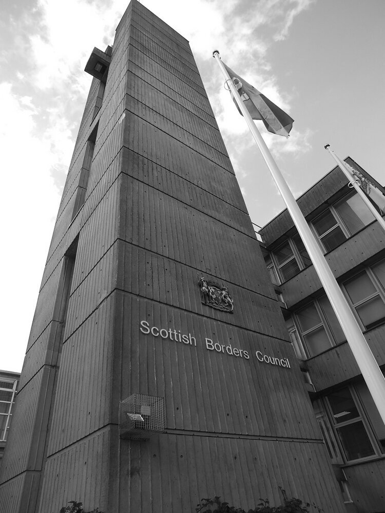
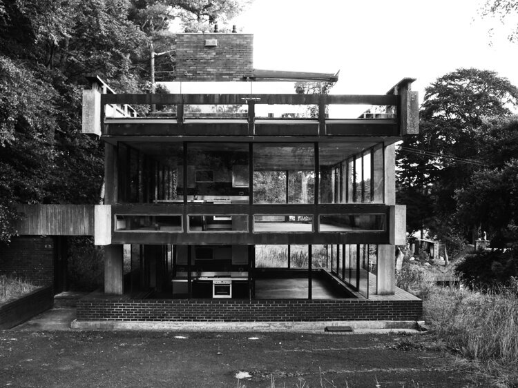
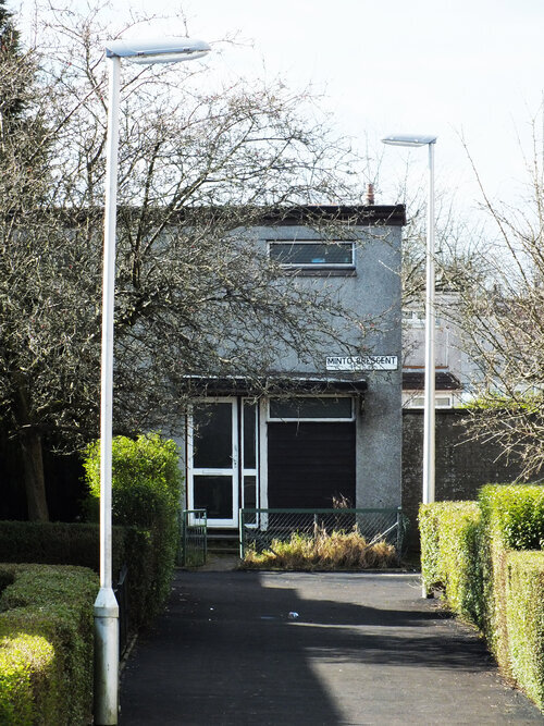
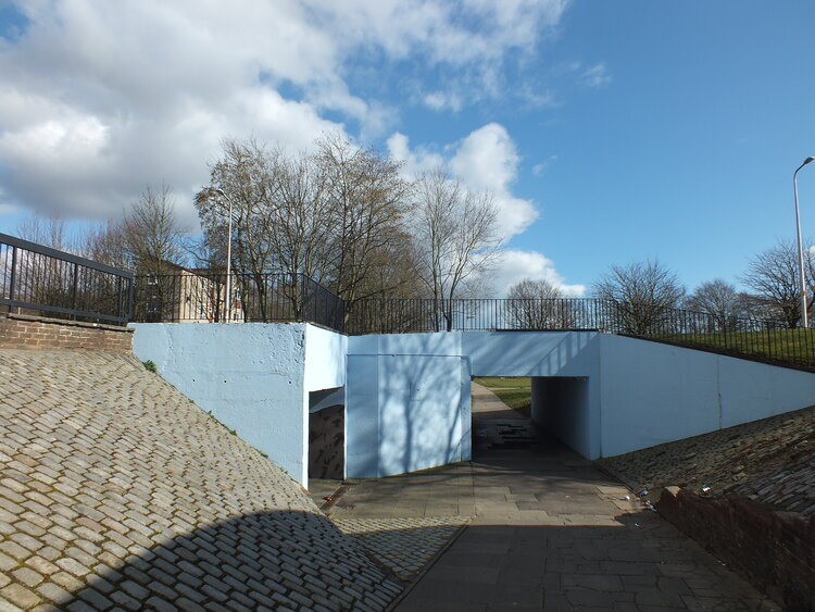
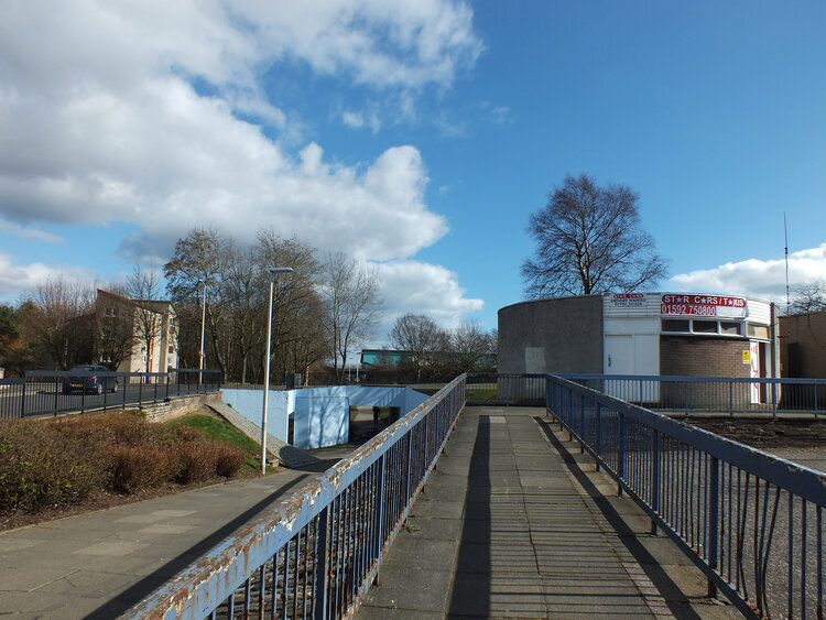
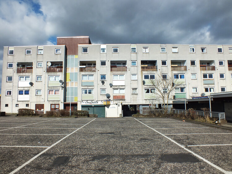
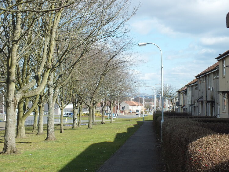
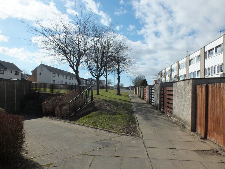
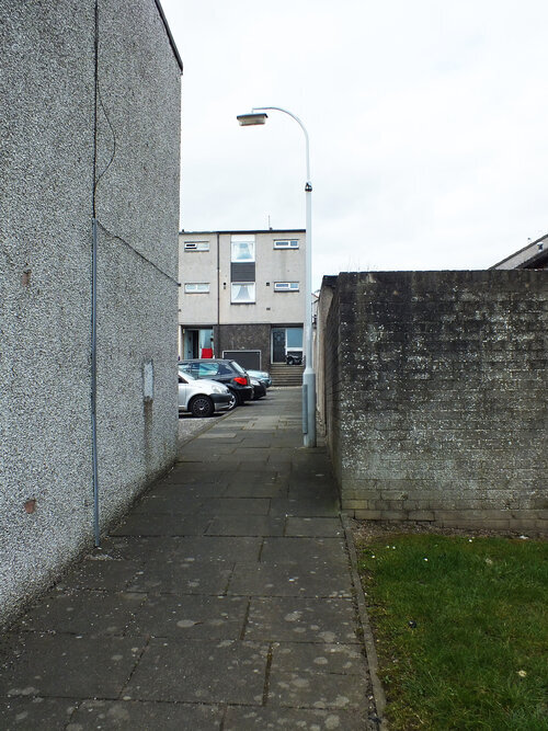
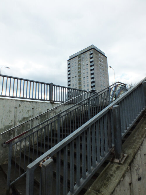
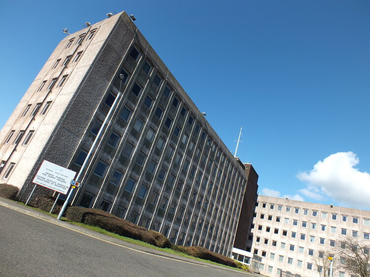
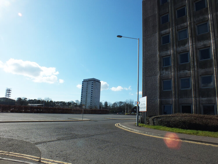
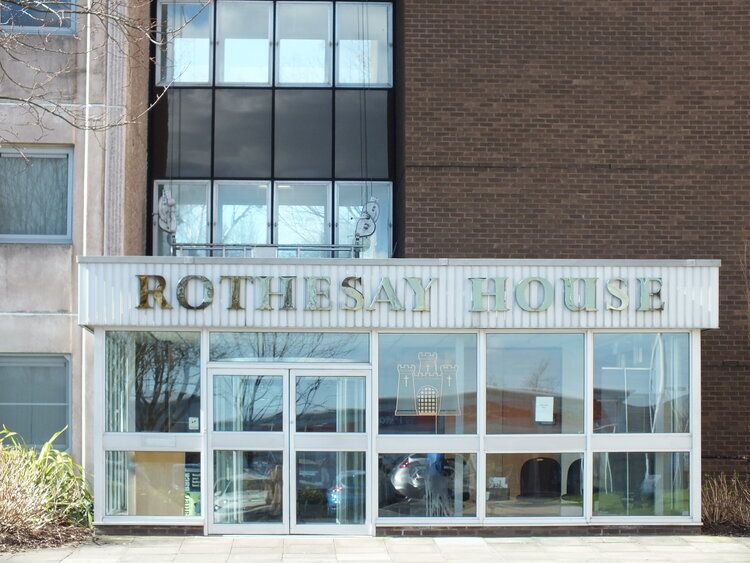
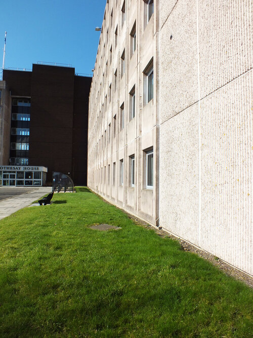
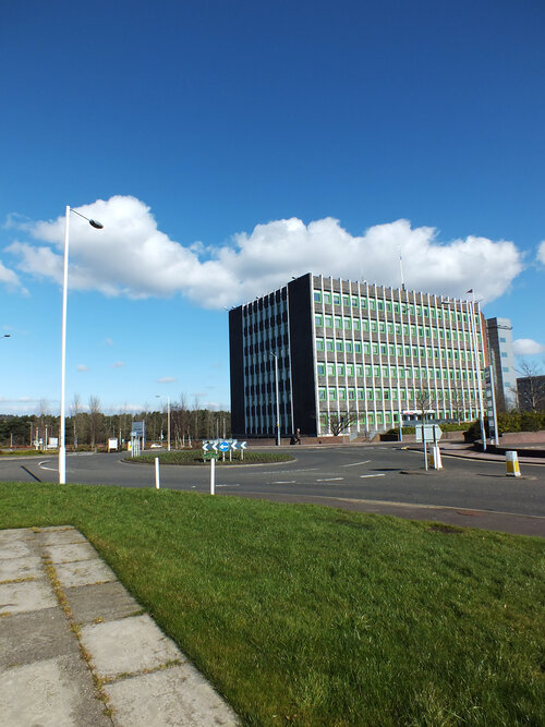
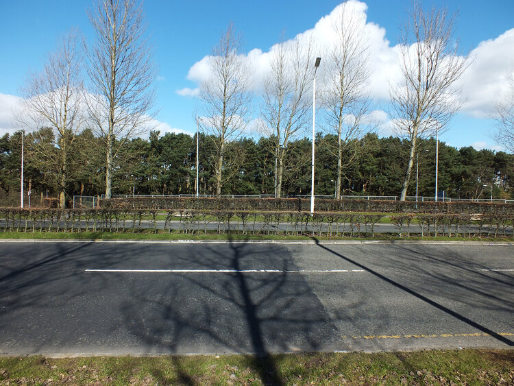
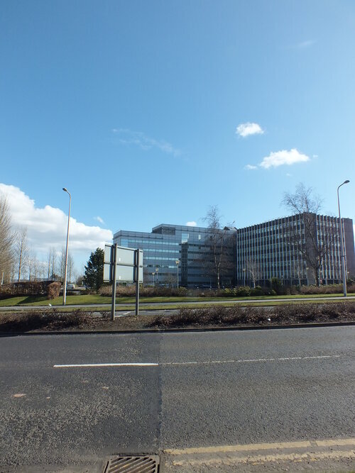
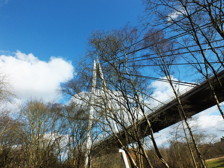
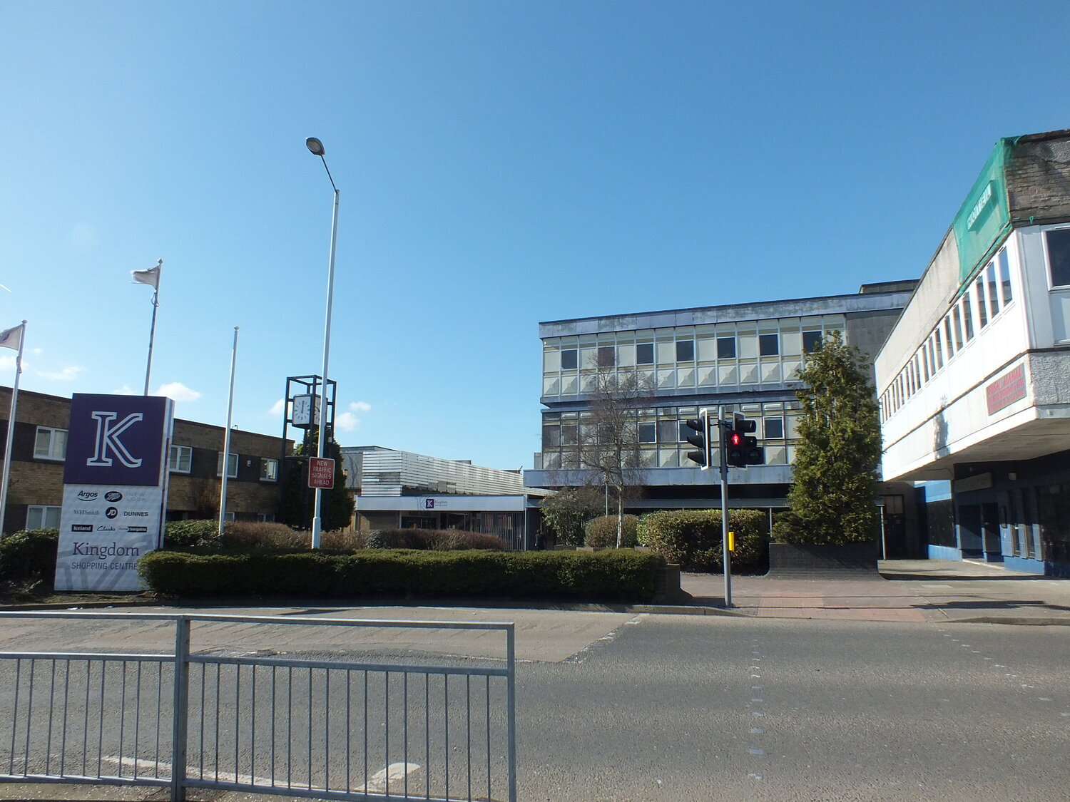
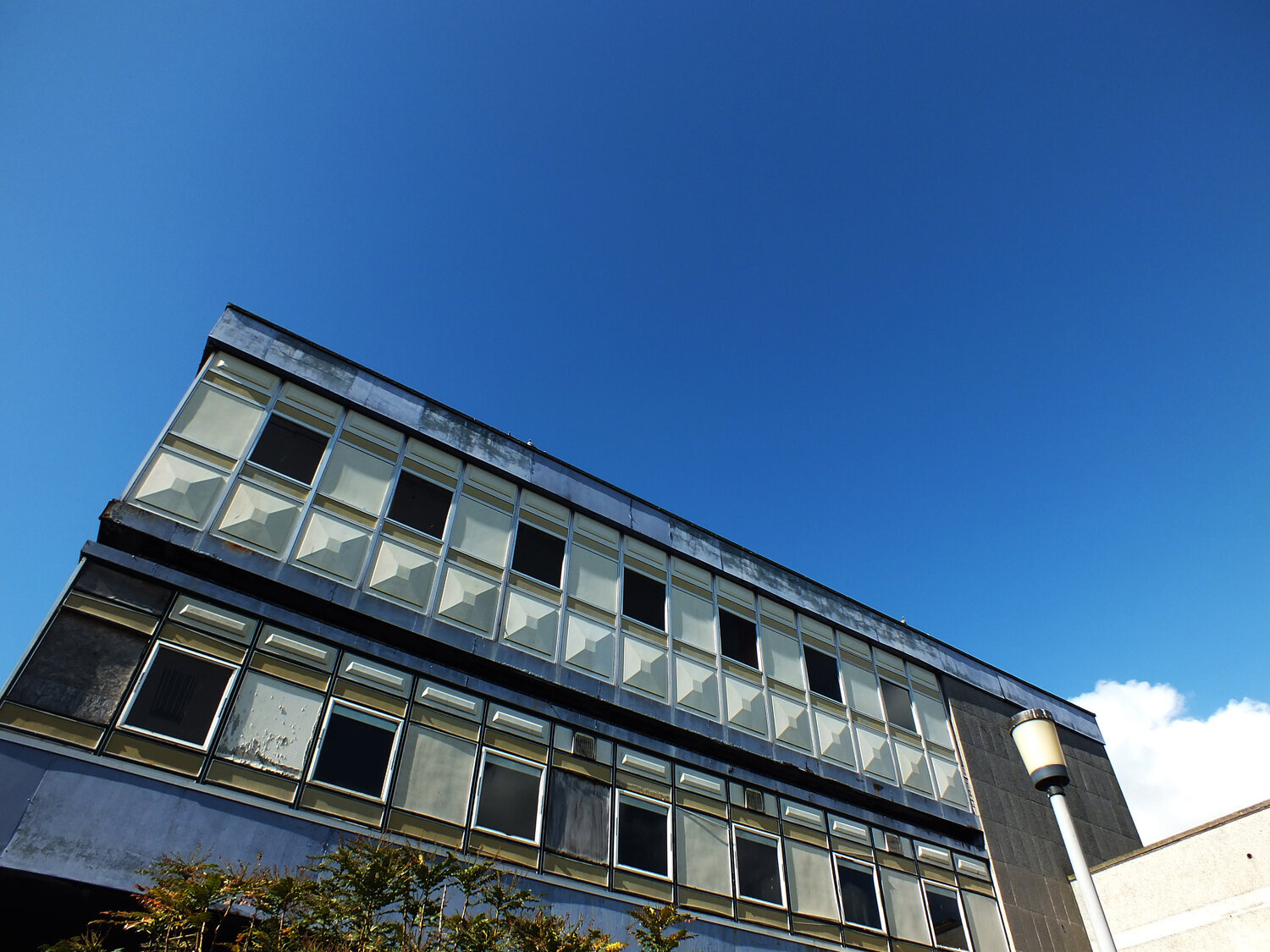
surrounded by lots of greenery in the north haugh, it is a short walk away from the town centre and the golf course. it was designed by james stirling and it opened in 1967 - it is a beautiful brutalist gem in a town and university that’s rather renowned and cherished for its mostly much older architecture going back to medieval times. it was judged to be 12th in urban realm’s top 100 scottish modernist buildings, and it has been category A listed since 2011 - it is a popular building that’s here to stay.

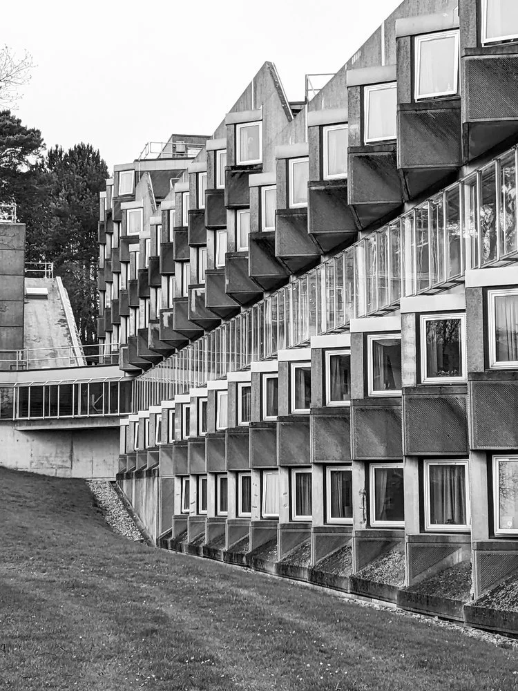
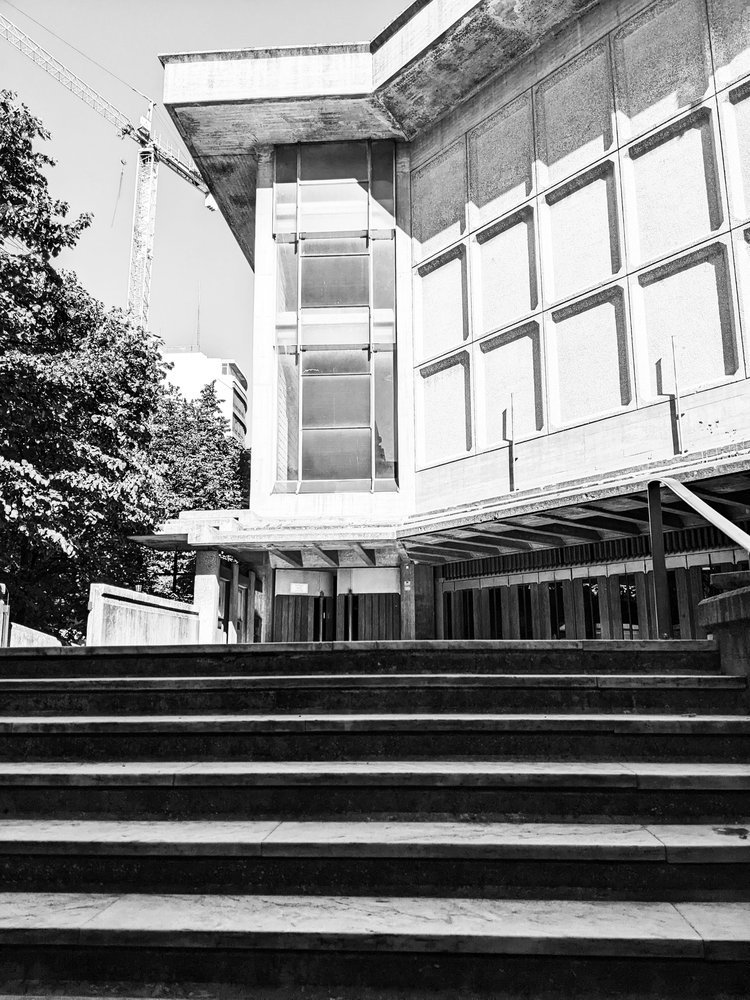
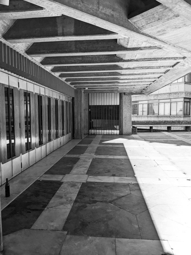
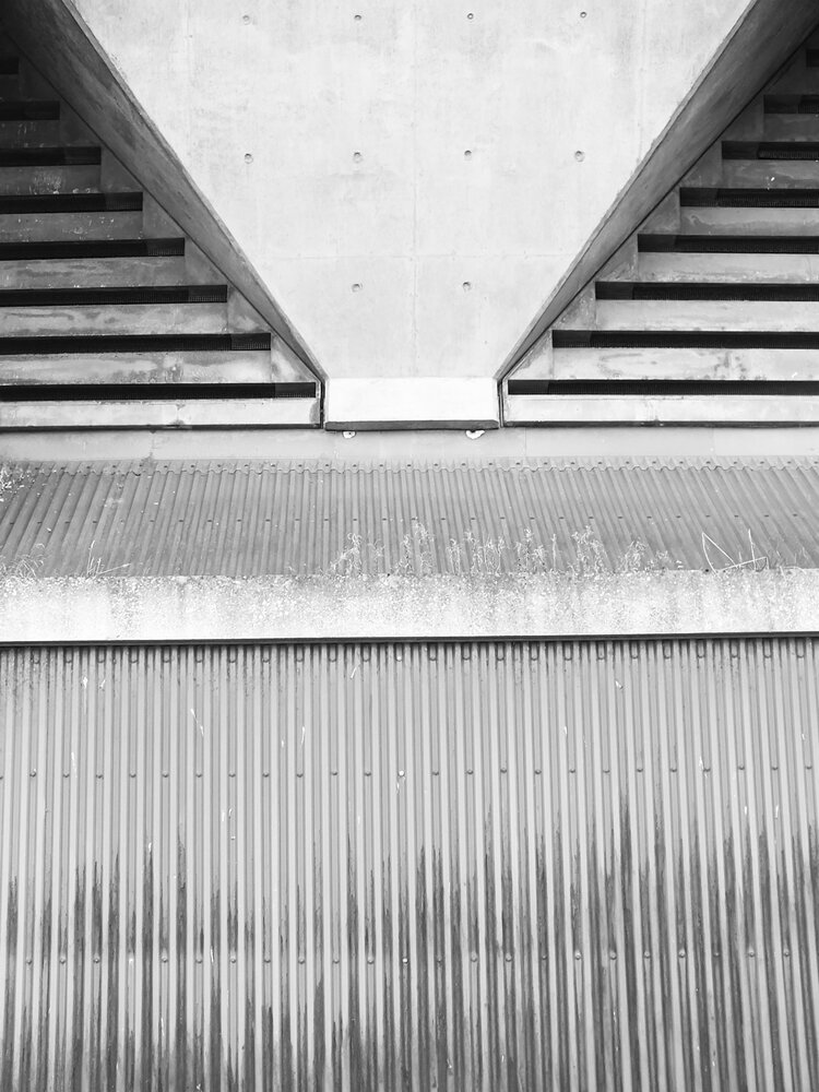
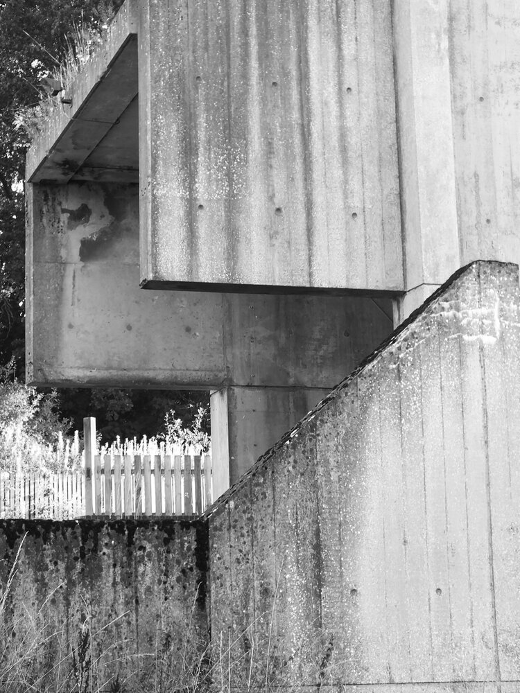
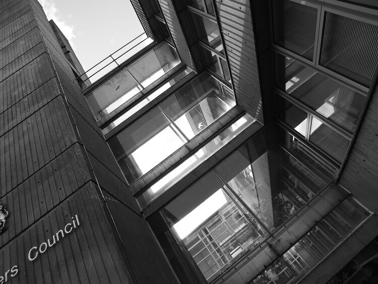
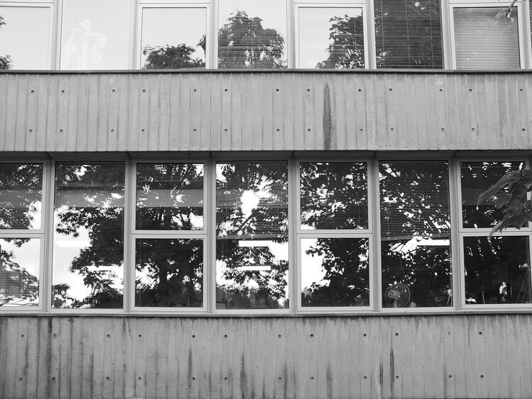
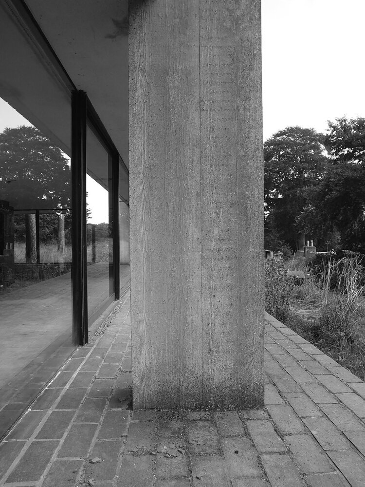
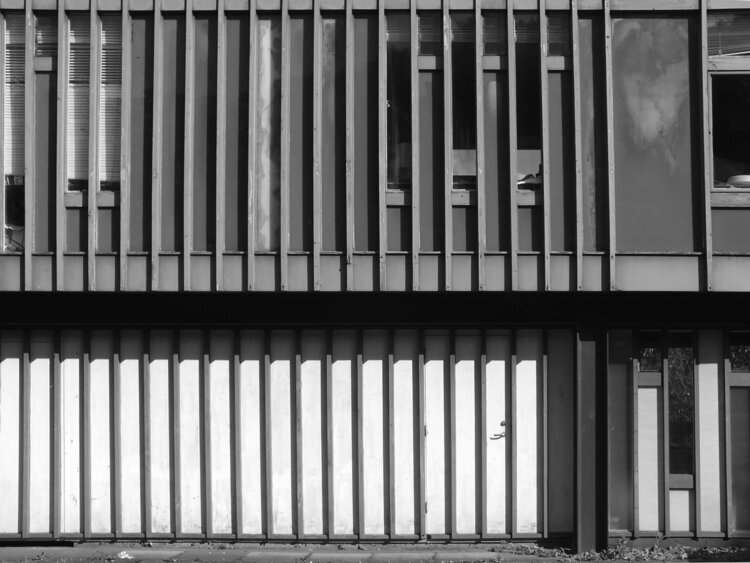
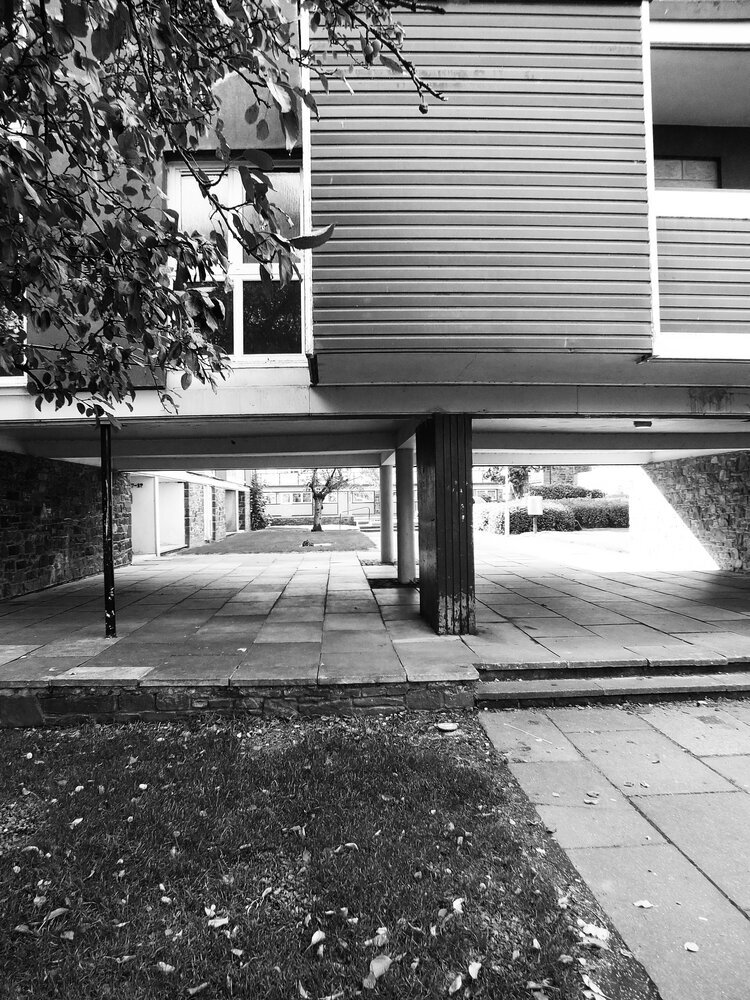
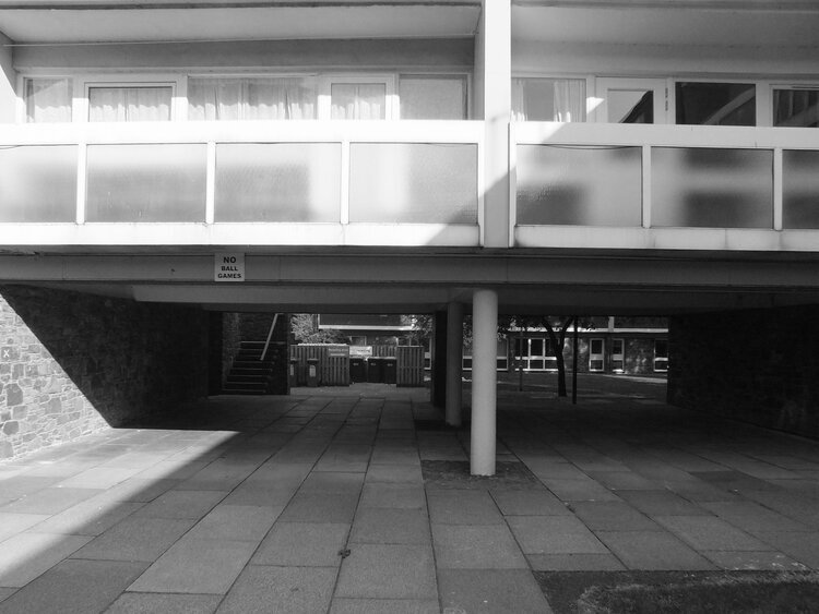
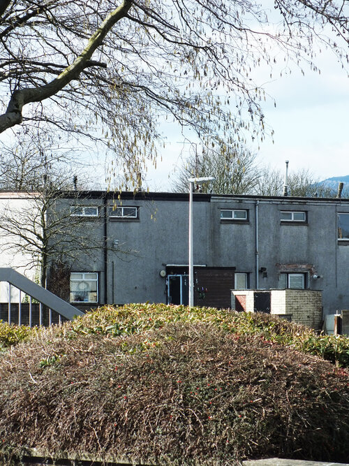
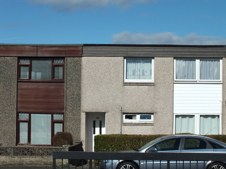
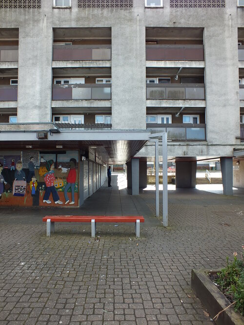
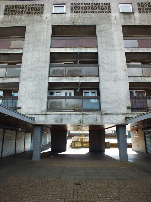
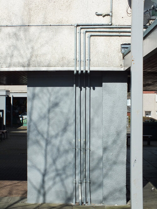
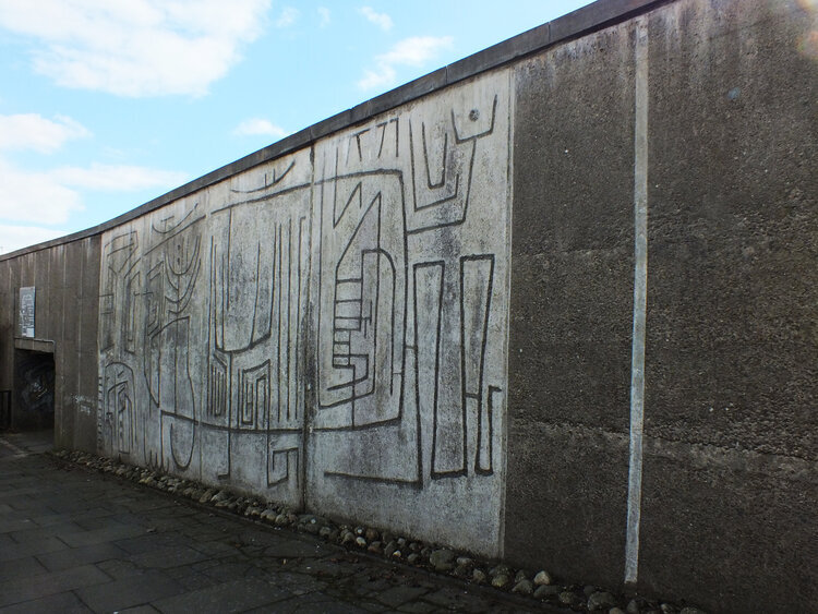
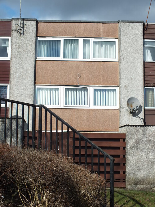
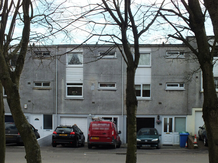
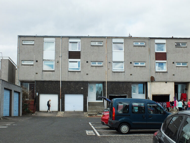
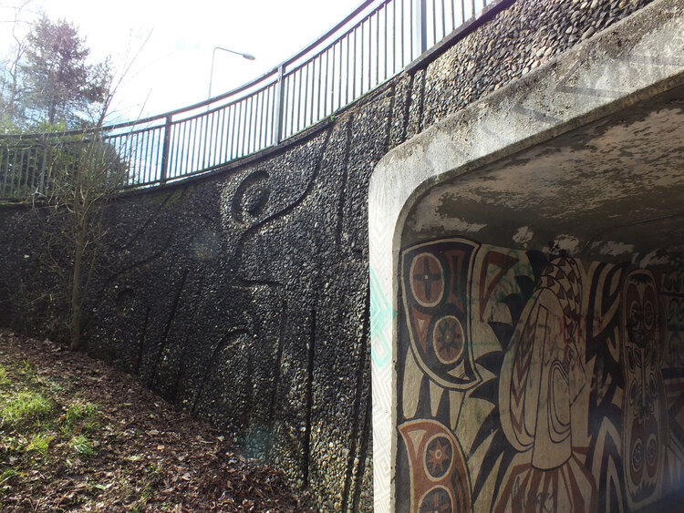
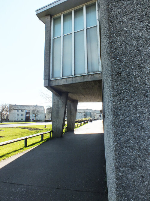
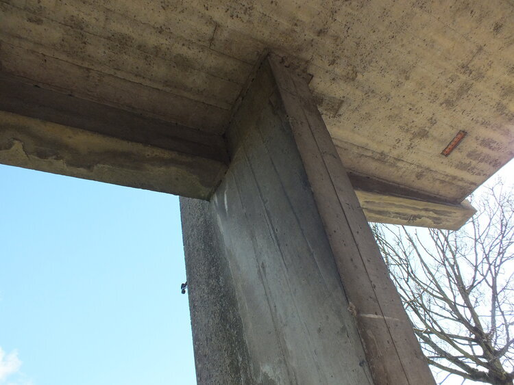
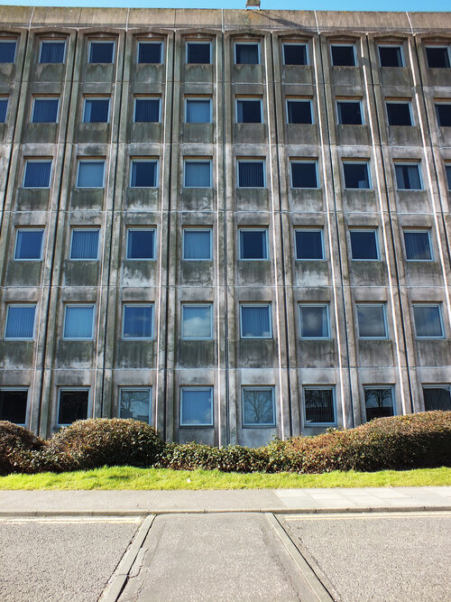
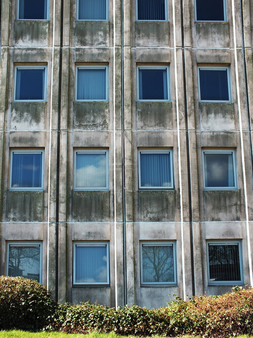
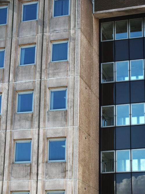
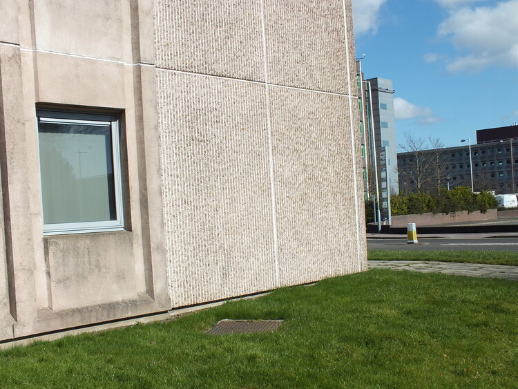
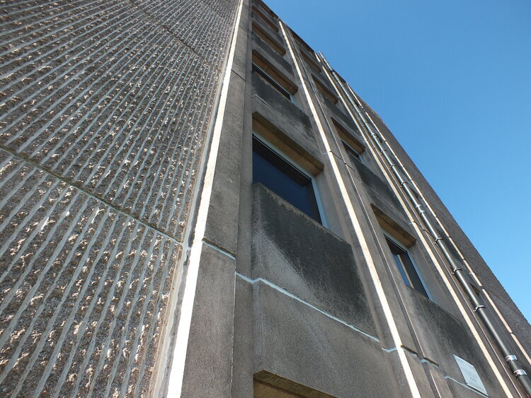
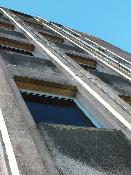
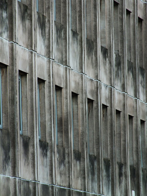
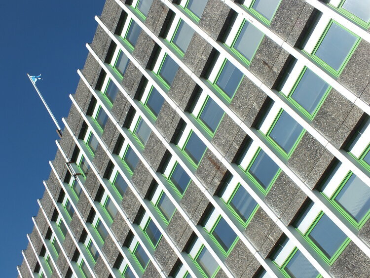
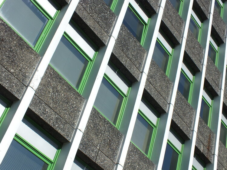
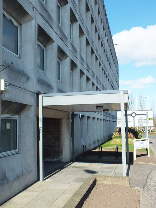
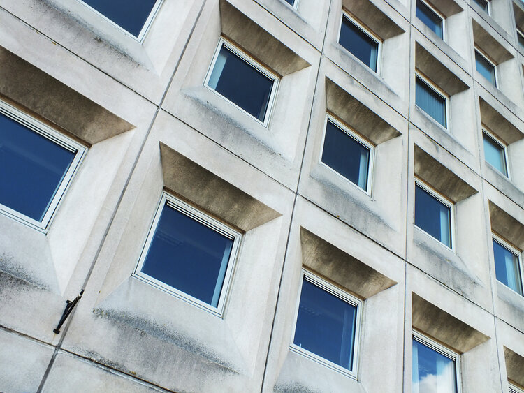
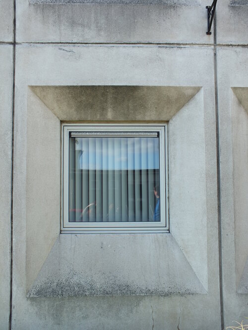
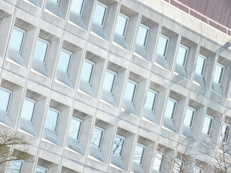
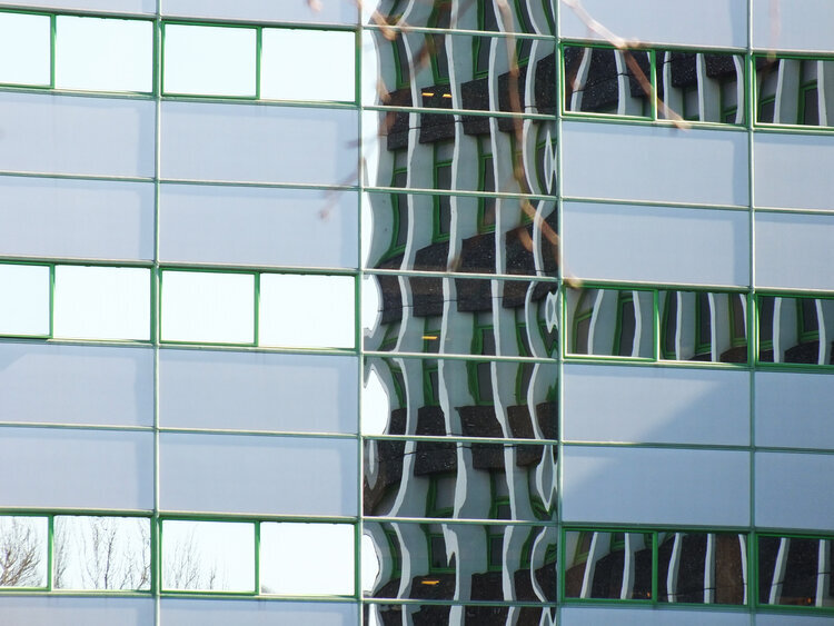
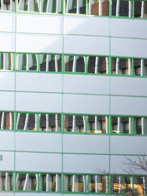
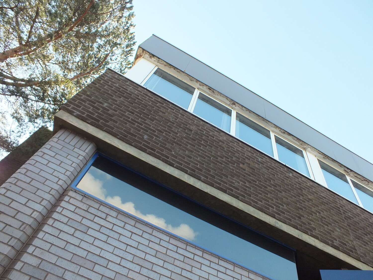
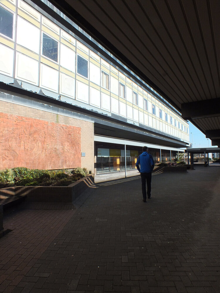
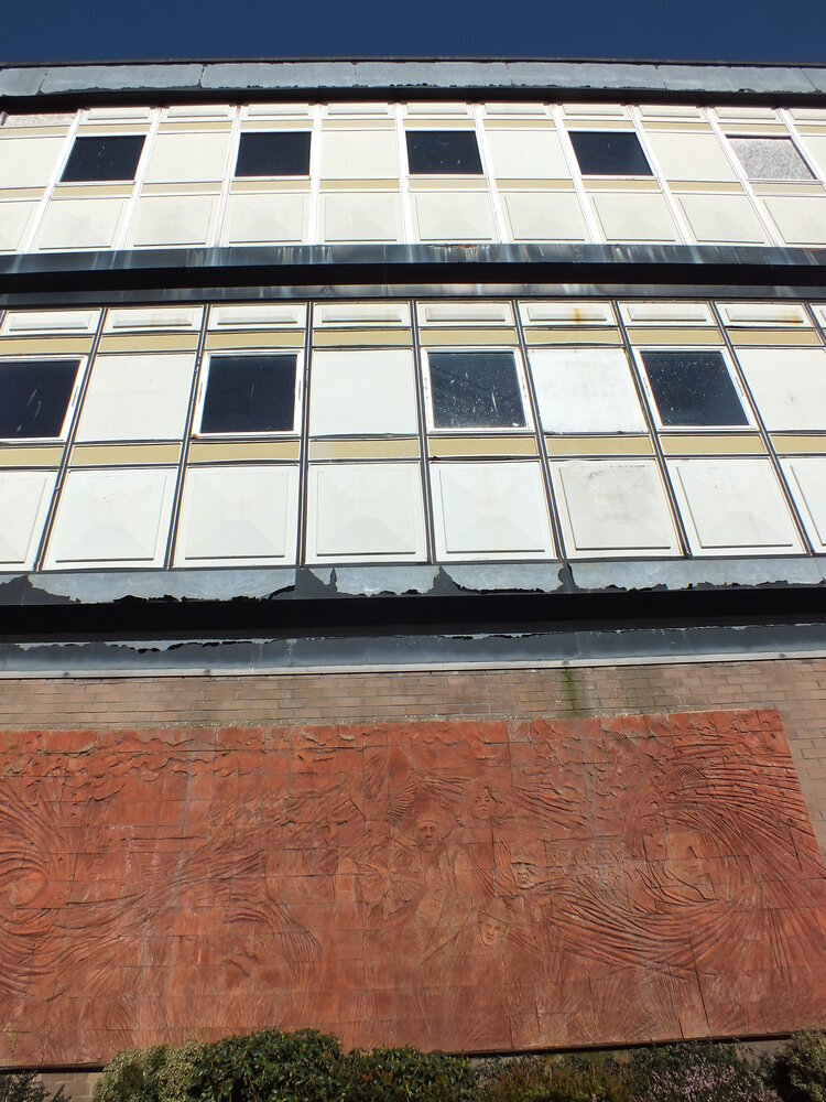
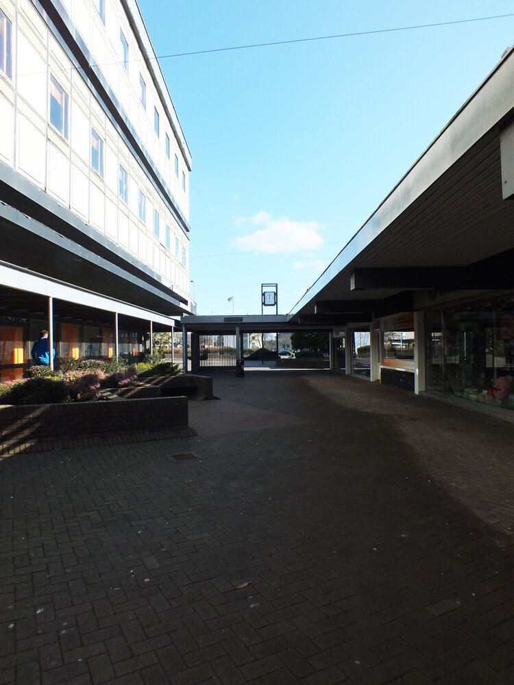
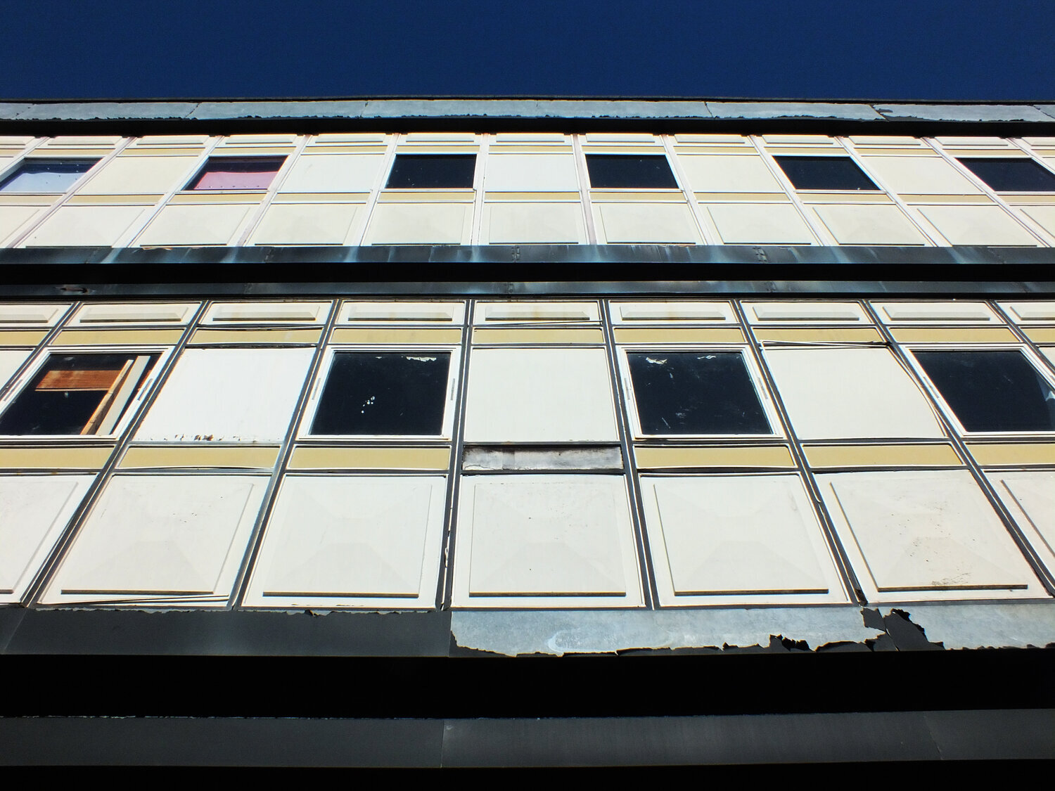
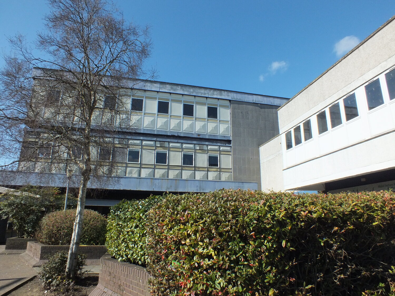
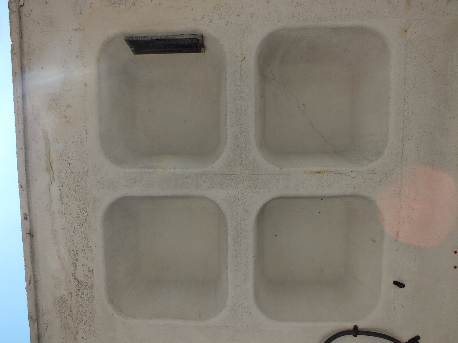
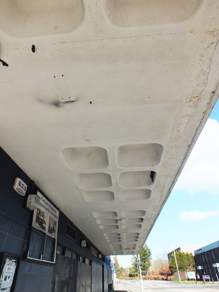
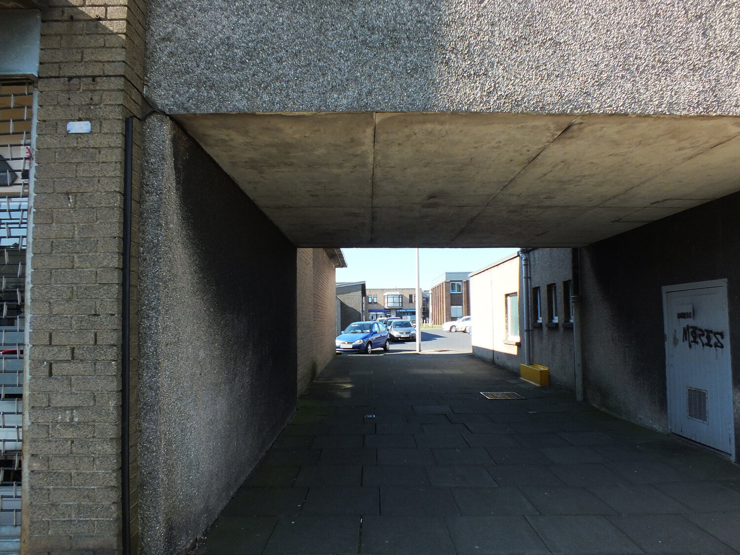
the building has an V shaped plan of two large wings, embracing a relaxing, wide green space in between. brutalism often gets reduced to “grey concrete,” but that’s a shallow reading. here, the design balances sharp geometry with soft landscaping — a vital contrast that creates a calming, grounded space for student life. the elevations of both wings incorporate the increasing ground height as the hill beneath slopes upwards. it has a striking, hypnotic rhythm to the modular facade - the zigzagging row of windows only reveal themselves from the east.

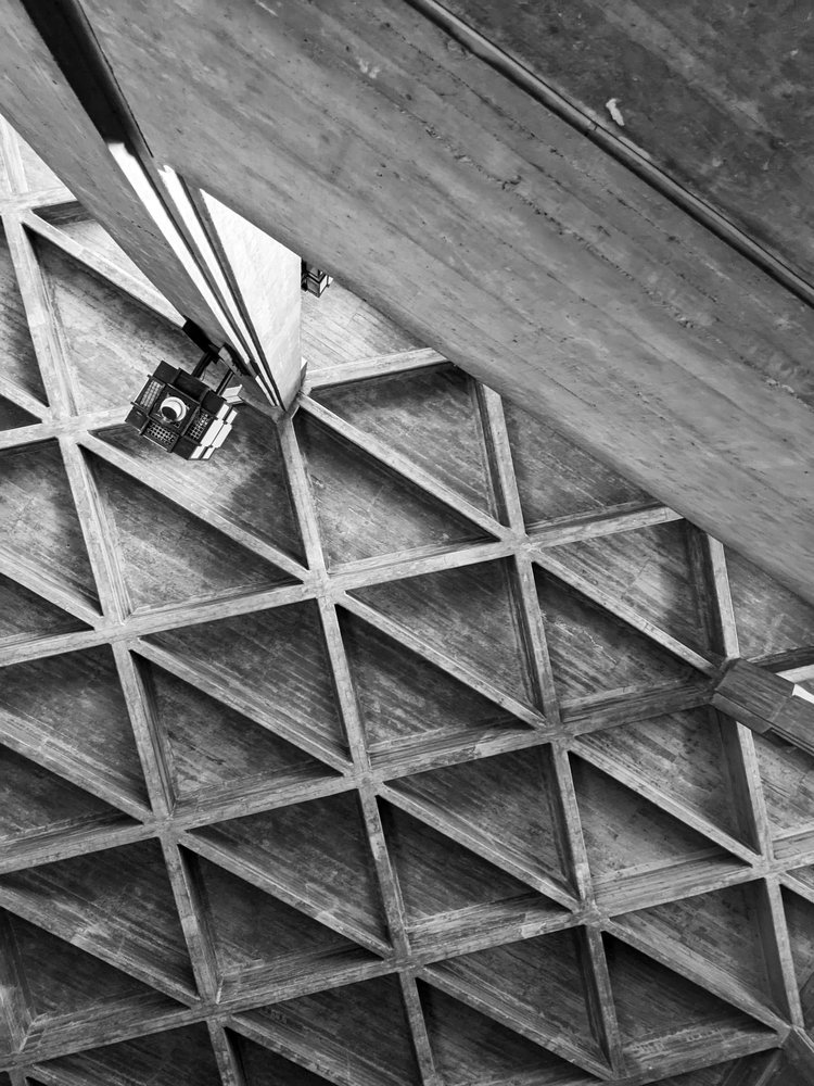
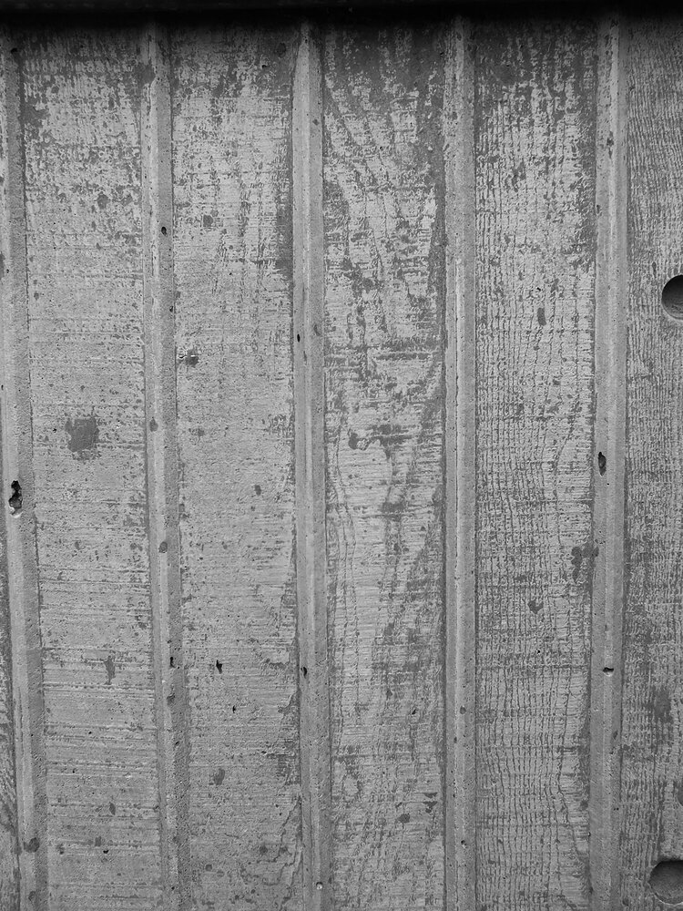
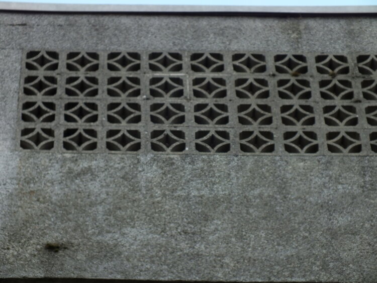
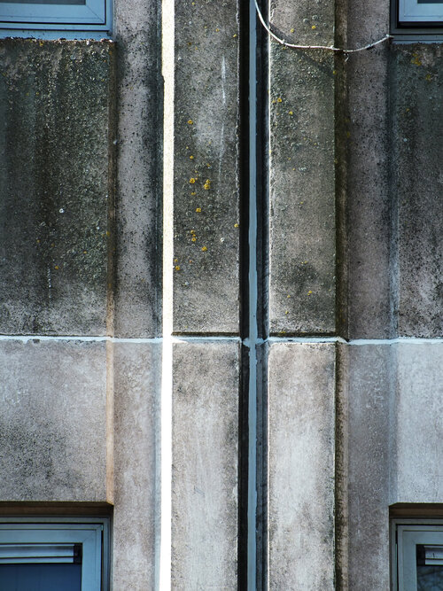
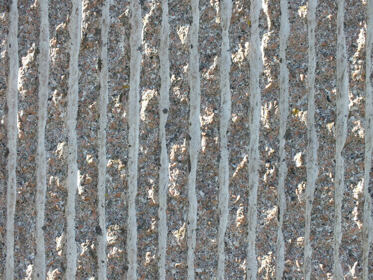
what fascinates me most is the textural patterning: 45-degree diagonal textures rotate across the tessellated concrete panels, forming a two-dimensional zigzag print that almost reads like texture-within-texture kind of printed textile. it’s a modular, repeating geometry — exactly the kind of form reduction that inspires my block-printed designs. apologies for the pre-occupation of the concrete surfaces - this is a textile design blog afterall. i don’t read buildings like an architect; i see them as surfaces. i’m always looking for rhythms, repetitions, and subtle asymmetries that could translate into interior textiles — prints, cushions, even fabric-based wall art. the façade of this residence block, with its directional patterning and textural wear, is a visual goldmine.

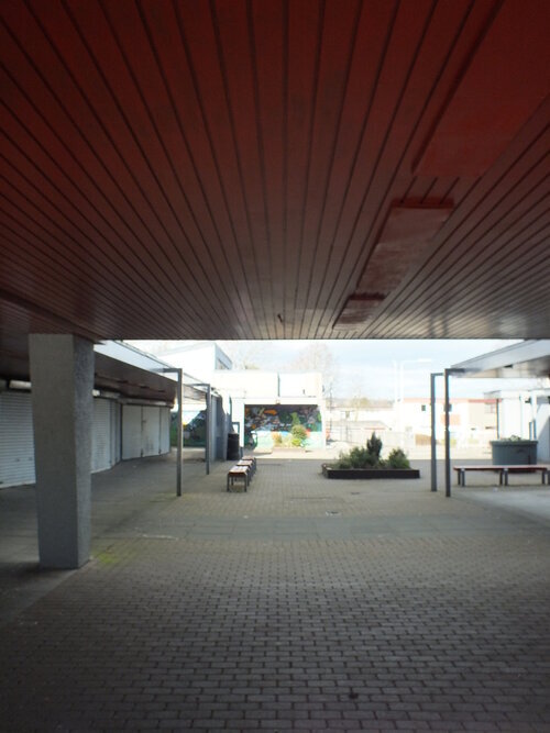
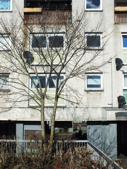
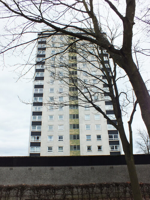
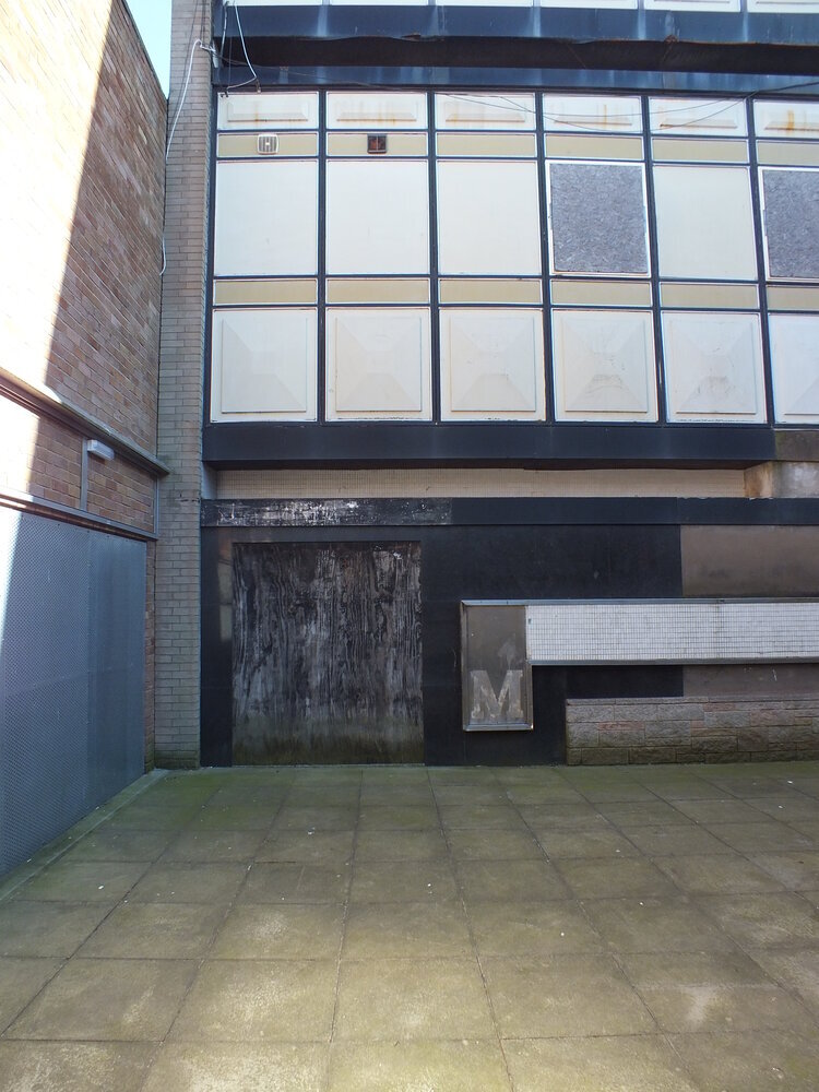
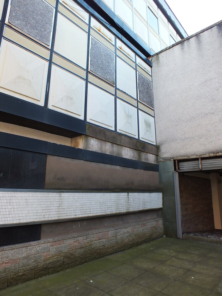
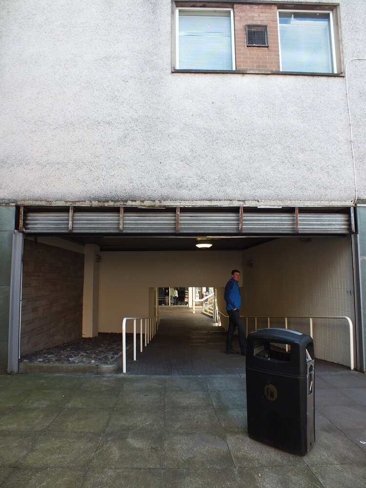
it is a busy-looking unit with lots of life - housing approx 250 students divided across five residential blocks. the original plan was for 1000 students but the other buildings planned never came to be.

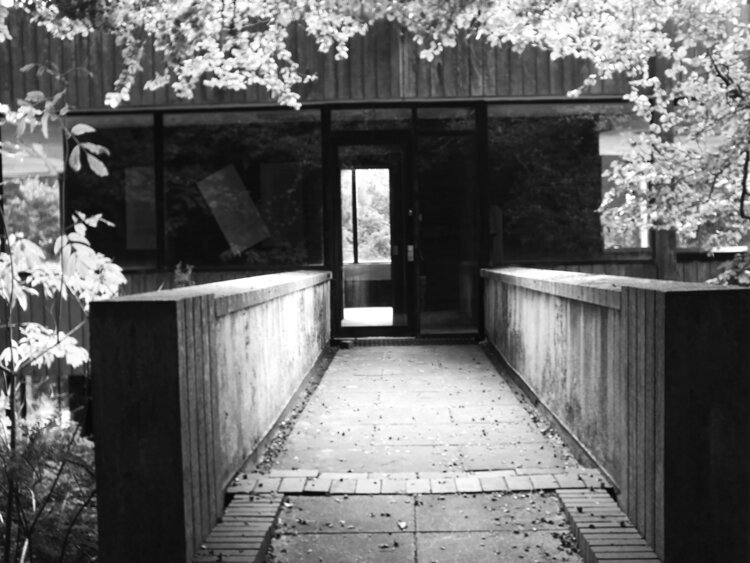
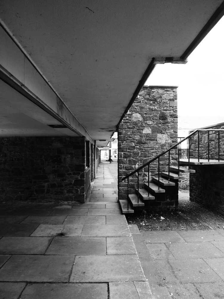
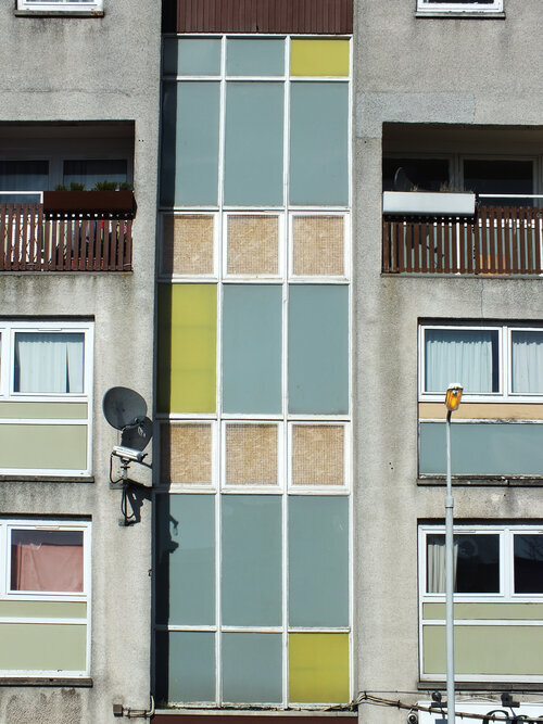
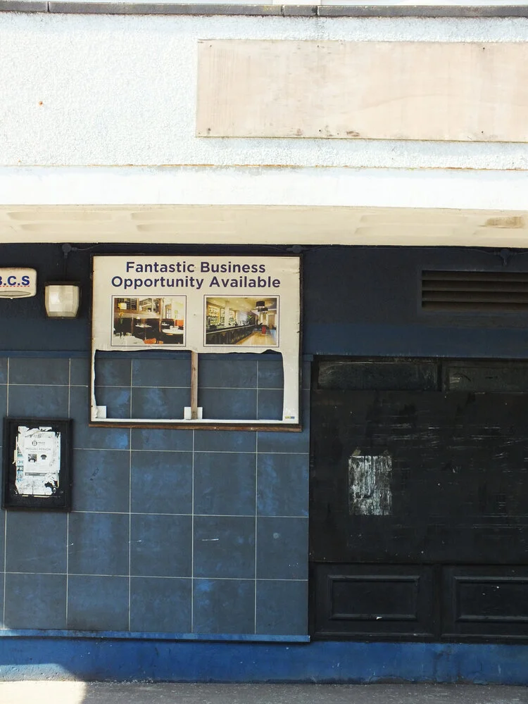
i did not study at st andrews so i have to rely on the university’s own website for a peek inside. it is much loved by students - partly for its rich social life, but also the quirky, octagonal room layouts. the building’s wikipedia page mentions that the stairwells of three blocks have glass enclosures for natural light, student crowd rates it 7th out of 17 halls at the university and i’d like to think that the architecture plays some role in it too.

if you liked this short tour, stay with us for more inspiration as we plan to visit more sites in the near future and bring you more posts and photos about them - and of course subscribe to our newsletter to be always the first to read! until next time!

-

links:

university of st andrews - accommodations - andrew melville hall

urban realm

andrew melville hall on wikipedia


Are you a student in St Andrews?

whether you’re moving into halls or just need to make your flat feel a bit more like home, our handmade block-printed cushions and fabric prints bring bold texture to any space — with a modernist edge.

🎓 10% student discount available

Email us at postbox@zitozza.com with your uni name to get your code. No minimum spend — just good design, made locally.


ARCHITECTURE, ARCHITECTURAL HERITAGE, BRUTALISM, INSPIRATION

church sagrado coração, lisbon

it’s becoming a busy autumn / winter season here for us at zitozza, but we do manage to escape on the occasional break to take an inspirational trip to admire some great architecture and forms. there has been a recent trip to lisbon, portugal, and we have some fabulous brutalist buildings to cover as well as the country’s signature tile designs - surely that requires an article at some point in the future.

but we can start with an easy one, a true little 1960s gem in the heart of the city, a five minute walk from the square of marques de pombal, there is a little brutalist church in amongst the residential buildings - the sagrado coração church, on rua camilo castelo branco. it is hard to see it is a church from the outside, as it stands on an elevated level from the street, with stairs inviting up to a square embraced by offices and some residential units. on the sunny day of the visit, it felt like a relaxing island just off the busier streets, but it was by stepping inside it revealed its wonderfully peaceful and serene atmosphere.

inside, it is clear what the architects - nuno portas and nuno teotónio pereira - were trying to achieve. the use of concrete is consistent, but not in an overwhelming, intimidating way as the material is broken up and softened with textures. the wall has a bricklay texture to it, while the ceiling reveals an even rhythm of the angles of the structure. the ceiling does not seem to be at an uneasy height, yet the smoothness of the columns do make it appear quite heavenly.

it is however the light, that seems to play the main role of bringing the spiritual and the godly inside. the light comes in at angles that must have been very carefully designed and is parallel to the staircases, casting shadows on the textures inside, while at the chapel it comes through unfiltered and in full, as if it was almost ready to listen to the prayer.

this article on hidden architecture has the floor plan (along some sketches by the architects too), and it does reveal the scale of the open space, and the even proportions unlike the traditional aisles. the sketches also reveal the careful planning of lights and shadows - its role in reaching some kind of spiritual peace is universal and not dependent on religion, just think of junichiro tanizaki.

this church isn’t dimly lit, or dark, nor is it overwhelmingly clear and bright. concrete has its reflective quality on light but also has its own texture to break it, which the architects also played with here by adding more, and the artificial lights are also carefully placed to interact with it. atlas obscura recommends a visit during night time too, to experience the different light circumstances.

lisbon is an amazing city and churches are found from every style and era. its famed cathedral is almost a millennium-old and some of its most famous sights are the gothic monasteries and the golden baroque altars - all worth a visit and appreciation. i hope you don’t mind me picking this brutalist gem though, as one of my favourites. the building won the Valmor prize in 1975 and in 2010 it was recognised as a national monument, so it earnt its place on the visitor attractions and please do visit when you get a chance in lisbon.

if you liked this, you can subscribe to our newsletter below and you’ll be amongst the first to be notified of any new inspirational tours (always with plenty of photos!) see you next time

-

links

church sagrado coração on divisare.com

article on church sagrado coração de jesus by ana tostðes on hidden architecture.net

nuno portas on divisare.com

nuno teotónio pereira on divisare.com

church sagrado coração on atlas obscura

ARCHITECTURE, ARCHITECTURAL HERITAGE, BRUTALISM, INSPIRATION

a brutalist stop - forton services

well, it’s been another long pause between blog posts, but it’s not been forgotten, only postponed, due to, uhm, general life happening at a pace, i guess. but when things get busy and exhausting, there comes the need to take a break and go somewhere else to recharge. so let’s take a road trip. let’s go, from scotland, to somewhere nice in the sunny south of great britain. anywhere. if you like going fast, you’ll take the motorway, the m6. it’s not the most scenic of routes, so it gets monotonous, and since tiredness can kill, there will be a time to take a break. and there, you’ll eventually come across a fabulous concrete tower emerging in the landscape with a futuristic footbridge arching over the motorway, and suddenly you feel compelled to indicate your exit to spend some time in this fascinating piece of architecture - we’ve arrived to forton services!

i have always been obsessed with logistics. the excitement of logistics and infrastructure never gets boring – perhaps it’s no surprise that some of zitozza’s block printed fabrics are directly inspired by road signs and wayfinding systems.

i just love it when everything and everyone in the system has its place and function, a well oiled machine itself that can take care of millions of people and things getting where they are meant to be when they are meant to be. but while the architecture that serves this system has to be purely functional, for curious travellers who are excited to be somewhere new soon, the associations fill all of this functional stuff with positive meanings, the typefaces on vans and reg plates, the smell of the handwash soap, the hot touch of the disposable coffee cup are all symbols of the anticipation of getting there. so from this point of view, a well designed, interesting motorway station is a piece of happiness on earth, and ...for someone who makes textile prints of road signs – like SOROMPÓ or any number of grid-based modular patterns – it’s a piece of inspiration too, doubly so if it’s brutalist of course!

forton services today belongs to the moto bk chain, and you’ll find it on the m6 between junction 32 and 33. it opened in 1965, and according to SOSbrutalism, the designers were bill galloway and ray anderson of the architecture firm tp bennett and son. (yes, that’s of the same thomas bennett of the saville theatre, amongst other things - today they do a lot of interesting commercial projects - totally worth a look!)

there are some two-storey buildings on both sides of the motorway with restaurants and cafes, connected by a high-tech looking footbridge forming a light arch over the motorway. to walk across it is a great exercise to stretch the legs a little and the eyes to the distance too. the timber ceiling panels of the inside of the bridge somehow creates a very nostalgic mood in the warmth of this texture reflecting the light directly below it. that just further excites about the travel - i’m not sure how materials do it but’s definitely the timber. the tunnel view of the inside of the bridge has an octagonal frame with the joins at each window panel cutting your corners diagonally. the outside view of course is the endless motorway and the crowds of cars going somewhere.

of course, it’s most distinctive point is the pennine tower, emerging from the landscape on the northbound side with its cantilevered hexagon at the top. it used to be some accommodation and a restaurant - this blog has some archive images of the fabulous decor in its full glory (as well as the whole structure when it was pristine white!) it reminds me of the early decor of the UFO bridge in bratislava a little bit (more of that in another blog post i think…) and i would have loved to enjoy a meal there, the views across then countryside must have been breathtaking on a sunny day.

unfortunately due to the strict fire regulations, it is now closed to the general public and it is now grade II listed, even though it might be hard work to re-open it.

it was intentionally designed to resemble an airport’s traffic control tower and that all i can feel is the anticipation of getting somewhere, perhaps it’s succeeded in its job. it is a cliché to say that we must enjoy the journey as much as the destination, but in the case of how motorway stations ought to be, there is definitely truth in it!

if you enjoy exploring the crossroads of architecture and textiles, you might like our collections – heavily influenced by modernist infrastructure and brutalist forms. see you next time - and don’t forget, tiredness can kill, take a break.

-

links:

SOSbrutalism

forton services blog

tp bennett

ARCHITECTURE, ARCHITECTURAL HERITAGE, BRUTALISM, INSPIRATION

county hall, leicestershire

hello again - long time no see, in an architectural regard at least we haven’t really been able to publish a new post for a while. that’s all about to change as we have visited a few more sites and we’re keen to show you all the photos in several posts coming (as one-off episodes probably, so no more series for now.)

let’s start with the best - the building of leicestershire county council, also known as county hall. it is hiding behind leafy greens in glenfield, on the outskirts of leicester, next to the A50 leading into the city centre. it was built in 1967 and has been used as the county council headquarters since then. names are hard to find, but it was designed by the council’s own in-house architectural team - the RIBA picture database names the architect as thomas locke and the council’s architectural office.

seen from the road, the building emerges slowly from behind the lush trees, showing off its sleek facade. it is only by going closer where the site reveals its enormity - it expands across a huge field, many council departments are located here - but the layout is clear, spatious and airy. from the front, the slightly concave arches on the window frames remind me of a japanese pagoda towering above extending ground floors and an elevated wing standing on v-shaped legs that frame the green view below.

going under these we find a leafy court surrounded by shiny office windows, revealing a cast concrete mural of antony hollaway that depicts the river soar. his style reminds me of the town artists in the new towns of scotland, particularly the art of david harding in glenrothes.

in the centre of the court, there is also an armed forces memorial, added in 2012 titled ‘stand easy’ by kenny hunter - it’s a group of 1:1 life-size sculptures of young personnel. apart from being meaningful piece of art, somehow their placement in the centre also helps reveal the deeply human scale of the surrounding building and how the architects thought about the proportions - you get an inviting, peaceful sense of place here.

there are so many interesting and thoughtful details - the lightwell in the corridor roof above each window section (presumably to maximise the natural light inside) is not just functional but creates a slick, interesting spatial play - it’s a shame the day was not that sunny, i would have loved to see the shadows it creates. the extensive use of glazing overall did make me wonder about the light inside too.

on the left of the tower, there is a relief pattern in the arcade ceiling - here there are two small stairwells that lead to the outer end of this elevated corridor - from here you can take in a nice view of further out of the town, and what i presumed were fountains (i wish they were working that day.) it’s a really beautiful building and i’m happy to see it loved, maintained and functioning as it was intended to - i was not the only photographer on site on the day of my visit indeed!

it is in a remarkably good state compared to many other buildings of the same era i visited and it makes me slightly suspicious that a state of neglect in the case of brutalism could be in some cases a conscious or semi-conscious decision, to have these buildings replaced rather than renovated. but i’m glad that i managed to find one that’s working as it was intended to.

i hope you enjoyed this short visit, there are plans to travel to get out of scotland more often - subscribe to our newsletter to be the first to read about them here! take care.

-

links

vintage documents reveal original county hall plans (leicestershire council website, 28 november 2017)

go behind the scenes at county hall as bosses give the mercury access to off-limits areas (leicester mercury, by dan martin, 5 november 2017)

ARCHITECTURE, SUSTAINABILITY, SCOTLAND, ZERO WASTE

AT THE COP26 HOUSE, GLASGOW (spot the zitozza rug!)

hello! first of all, apologies for not having posted anything for ages, zitozza have been very, very busy in the last few weeks with making stuff and taking them to events… but we haven’t yet shared the best news on the coolest (probably ever!) project - the COP26 house in glasgow. this is a sustainable model house built at the broomielaw for the COP26 climate conference and as an obsessive architecture and sustainability geek, i was eager to learn more about this and with a huge thanks to beyond zero homes i managed to put together a little bit about this.

the house itself is a project of many contributors, designed by peter smith of roderick james architects, developed by members of beyond zero homes - a collaboration between developers, architects, suppliers and industry bodies with the single aim to demonstrate how beautiful, affordable, healthy and comfortable homes can be developed with minimal impact on the environment, throughout their lifecycle.

photo by fourfifteen, with thanks to beyond zero homes

there’s an important thing to mention here before delving into the details here - i’d like to emphasise that this house isn’t some kind of futuristic concept, but designed for the present and built using materials and technologies that we have available today and it is very much a present imperative to use them across our building projects if we take our climate goals seriously. so what exactly are these materials and technologies and what makes a building sustainable?

according to this assessment by daniel doran of circular ecology, the house is an exemplar of embodied carbon. most embodied carbon emissions come from the supply chain of construction products – the extraction of raw materials, processing, transporting and manufacturing and then there’s transporting products to site, installation, repair and replacement during use, and their end-of-life deconstruction and disposal. what makes the house actually carbon negative, beating RIBA’s own carbon target by large, is largely thanks to the material choice of locally grown timber. the uk is one of the largest timber importers in the world which is not only an unnecessary addition of shipping-related carbon, but growing them locally also supports reforestation and capturing carbon.

photo by fourfifteen, with thanks to beyond zero homes

the house is of course eco-conscious in using responsible heat sources and airtight insulation - it is using infrared heating which works by heating the house itself rather than the air in it, so it is much more efficient, comfortable, space saving, and perhaps the biggest benefit in a wet country such as scotland is reduced moisture. of course the insulation is achieved with triple glazing and even the insulation and the cladding is using timber.

i’m not an expert on construction and structure, but it really amazes me how many places in the design uses timber even where we’re not that used to seeing it and it is also designed to dismantle easily - this will be demonstrated live after the conference, when the house will be disassembled and re-built in aviemore to join an affordable housing scheme of 12 of such houses. i’m going to be honest, i was a little bit sceptical about how much of these houses we can build efficiently in a city though - after all, timber is not known to be hugely scaleable, and in a climate-stable future, we want to spare as much land as possible, don’t we? however, talking about RIBA’s operational carbon targets, the architect peter smith said “for larger houses using this same build system, the target is significantly easier to achieve” which leaves me hoping it would work with multiple households too.

photo by fourfifteen, with thanks to beyond zero homes

last, but not least, we should talk a little bit about the decor - the house was styled by roddy clarke who made conscious decisions to continue the use of sustainable and natural materials inside with wood furniture and locally sourced soft furnishings - which is why i’m so proud and pleased to loan one of my jute rugs to the project. (while we cannot grow jute here locally, it is still one of the most sustainable textiles in the world in terms of carbon capture and water footprint.)

it really is a wonderful project and i hope that in the past few weeks, all the important people in the sector has visited and learnt from this model because we need to implement these practices right now if we want to keep our future liveable. it is easy to get into a negativity spiral about climate change, because we are undoubtedly on a depressing course and we are definitely going to feel the effects of our ignorance for a long time. however, it’s not true that we haven’t done anything or that we are unable to. we do have affordable solutions at hand with which we can limit some of this damage and we are able to use them. i do believe we are smart enough and projects such as this house makes me feel hopeful and positive for the future!

-

links:

beyond zero homes

roderick james architects

home grown homes

wood for good

roddy clarke designs

ARCHITECTURE, SCOTLAND, INSPIRATION, BRUTALISM

dingleton boiler house (tour of peter womersley's buildings in the scottish borders - pt 6.)

well, i hope you’ve had a lovely time visiting the scottish borders scouting for modernist icons by the wonderful peter womersley, because this is the very last stop! we arrived in the town of melrose, on the outskirts, in what seems to be a quiet, residential area, and are standing in front of the boiler house of the demolished hospital that used to be known as melrose district asylum. it is no longer there, except for the boiler house, designed by peter womersley.

built in 1977, it is another one of his award-winning works, for industrial architecure. it is a highly functional building and perhaps much more “brutalist” than the previous ones we visited so far, but it is really far from raw, in the sense that everything is finished to a great quality and the details are smart as always on his buildings.

i’m aware that hospitals use a lot of steam not just for heating the buildings but for keeping things clean and sterile too, however i’m obviously not exactly familiar with the ins and outs of a boiler house, so i cannot write too much about what functions certain parts do. what i can certainly tell (as the most prominent feature of the side of the building) that there are three hoppers on its side, which were used to store the coal and they form a great rhythm of what i call these “upside down pyramids”, built into a wall of horizontal layers and it has inspired some great geometric patterns, so even if i don’t quite understand how it works, i still find a lot of joy in the aesthetic of the building.

aesthetic it is indeed. the concrete is smooth and not worked to timber patterns this time, but the almost minimalist surface is put together from narrow slabs, forming an even, soft pattern on the surface. the joins follow this pattern, somehow it’s so easy on the eye it’s almost a source of tranquility, which is a funny thing to say about a boiler house i guess.

a the time of visiting, it was not in a great state and the concrete was visibly aging. but we’ve left this our last station not just because it really was physically the last stop of the day, but also let’s finish on a positive note: this building’s fate is no longer hanging in the balance, it is being salvaged by being developed into flats by studio DuB. the plans look amazing, contemporary and also preserving almost all forms (they’re even keeping the chimney!) and i hope it will work out in a residential function. it’s funny to see that something that was designed to sustain one particular function could be turned into something else so beautifully but i suppose it’s always possible if you work with what’s left behind by a genius.

i’m sad to say that even though there are many more buildings around in the uk (and even worldwide) by peter womersley, we’ve come to an end of our tour. i hope you’ve enjoyed it and we hope to join us on the next one - we might have to be taking a little break as we’re getting busy with all things festive, but we’ll find time to immerse ourselves in great architecture and will definitely be back!

-

links:

the boiler house project (property development)

studio DuB website

dingleton boiler house: melrose building (by adrian welch on e-architect.com)

preserving womersley

ARCHITECTURE, DESIGN CONVERSATIONS, INSPIRATION, SCOTLAND

in conversation with ciara mcinnes

happy autumn! we’re back to work, back to school, back to looking ahead and also back to talking to people so i’m really pleased to announce tha after a long hiatus, t the design conversation series is continuing with a new arist! ciara mcinnes is an architect and fine artist based in glasgow. i discovered her fabulous prints on instagram during lockdown when i was craving to see beautiful buildings - some of them are the exact same buildings i’m also fascinated by, such as the netherdale stadium of peter womersley – so i was really keen to know more about the background about these beautiful works.

ZITA: hello ciara! first things first - could you say a few words about yourself, what you do and how you got there?

CIARA: hi there, thank you so much for having me! i'm an architect and fine art printmaker based in the west end of glasgow. i work in the medium of lino print, combining traditional handprinting techniques with contemporary, urban subject matters. inspired by the city, street art and general urban chaos, my work typically documents lost landscapes, urban spaces and historic buildings.

ZITA: i can see your architectural background  - it comes across beautifully on your urban prints. i’m always glad to find other people who also see the beauty too in the things that often get a bad press. could you share a little bit about what inspires you about these landscapes?

CIARA: for me, the built environment is so inspiring, constantly changing and evolving. i love to document the city in my work, taking tiny snapshots of a place in time, knowing that it will never look exactly the same again. the light will be different, the graffiti will change, it will eventually be lost for good and exist only in print.

in architecture, it has always been the case that the styles of the previous generation are undervalued because they are seen as dated but not yet historic. In glasgow, there has been a huge cull of brutalist architecture in recent decades, a style that is only now starting to gain recognition. i'm really drawn to document these buildings in particular because of they represent an important era in history, when architects and designers were tearing up the rule book.

ZITA: that’s fascinating. i do love that era too, and the ideas they represent! do you have a favourite place, a city or a building you go like regularly going back to? Or do you continuously look for something new?

CIARA: i am always on the lookout for somewhere new, i love to travel. at the start of 2020 i visited mexico city which was such a vibrant and energetic city. the architecture is so diverse from pre-hispanic to cutting edge contemporary and everything in between, it's somewhere I'd love to go back to.

ZITA: that must have been beautiful. you mentioned brutalism before, but is there a particular school of architecture or style you’re attracted to more than others?

CIARA: i'm a fan of minimalist, contemporary architecture. there's a few places really leading the field such as scandinavia and japan but it's not something we have really embraced in scotland yet. there's an architectural practice called SANAA who create some truly breathtaking work.

ZITA: thanks for the tip, i will make sure to check it out. so what is the next cityscape or building you’re turning into a print? can you tell anything about any work in progress?

CIARA: i'm currently working on pair of prints that explore the temple gasworks in the north of glasgow. the structures of the old gasholders are still in place and create these skeletal figures in the landscape which you can see for miles around. i'm going to be integrating some more natural imagery in the prints which is a new direction for my work so i’m excited to see the finished pieces.

ZITA: sounds really exciting, i’ll be looking forward to seeing the finished prints. i’m also interested in your technique. your prints are very photographic! how are you working them into your prints? can you explain a little bit about your process as well?

CIARA: i always start a print by creating a master pen drawing which i then trace using carbon paper onto the lino block. i will usually combine elements from several photos or images into a final composition, all with a little artistic license. i often make little tweaks at the carving stage too, with a lot of natural elements freehanded as I go. the prints evolve through the printing process so i never fully know what the print will look like until the very end.

ZITA: that is really interesting! and your colour scheme is very minimalist and together with your ukiyo-e inspired technique, it reminds me a bit Japanese influences. it is very consistent throughout your work and it works to a wonderful effect – could you tell more about this? do you have a process of deciding about the colours in your prints? 

CIARA: japanese printmaking is certainly an inspiration, particularly the dedication to craftsmanship and technique. my colour palette is typically very tonal which allows me to focus on the form of the print, then I create focal points by picking out details in metallic. i typically mix my inks with extender to create a more translucent effect, i love how this gives the prints an almost watercolour like finish. 

ZITA: it does! the results are really beautiful. and now the questions i ask from everyone - can you recommend a book or an artist or a maker whose work is worth looking into? something that keeps you going?

CIARA: i recently discovered an artist called claas gutsche who's based in berlin, a fellow lino cutter, his work is so precise and his technique is definitely something to aspire to. in a totally different direction i’ve always loved the work of a painter called maurice utrillo who was a contemporary of the impressionists but worked in quite a different style. he has a really fascinating story, using painting as a form of therapy. he painted the world around him, focusing on the built environment and often unloved corners of paris.  i only recently found out that the kelvingrove museum holds one of his pieces but it's currently in remote storage. 

Mac House.jpg

ZITA: sounds like someone you would have loved to met! i will be definitely checking them out. and lastly but most importantly, where can we see your work next?

CIARA: well, i do have a few exhibitions on the horizon but sadly i’m sworn to silence until the official announcements! all i can say for now is that i have an upcoming show in a glasgow gallery this autumn, which will feature some specially created pieces. i'll also be popping up at a few art and design fairs across glasgow later this year, so keep your eyes peeled!

ZITA: very mysterious! i will keep an eye on your social media! thanks a lot for your time.

-

links:

ciara mcinnes website

ciara mcinnes instagram

SANAA

claas gutsche

maurice utrillo (on artnet)

ARCHITECTURE, SCOTLAND, INSPIRATION, BRUTALISM

scottish borders council (tour of peter womersley's buildings in the scottish borders - pt 5.)

after our somewhat bittersweet stop last week, we’ve arrived to the penultimate station in our tour of peter womersley’s buildings in the scottish borders. we’re in newtown st boswells, where the council for the county of the scottish borders have their headquarters in a concrete and glass office building designed by peter womersley. we have of course seen wilderhaugh and we know what he’s like when it comes to designing office buldings but this one is a few scales up in size, and probably the largest building of our tour altogether.

that means there’s plenty of details to observe although it’s not possible to go completely around it due to the restricted access at the back. nonetheless it’s worth a visit, the building is a striking structure towering on an open green, embraced by its leafy surrounding of the village. built in the late 1960s, originally serving the much smaller administrative unit of the roxburgh county offices - today it employs approx 1000 people and has grown a post-modern extension on its side.

newtown-st-boswells-scottish-borders-council-peter-womersley.jpg
service-tower-borders-council-1960s-architecture.jpg
scottish-borders-council-building-postwar-architecture.jpg
peter-womersley-glazing-joint-1960s-architecture-detail.jpg

it’s not a brutalist design - the concrete is not raw but shaped with timber with the imprints visible on the facade. the clever use of glazing is also dominant throughout this building and there are a lot of intriguing details. its most striking feature is the service tower of course, cleverly connected to the main office buildings via elevated, glazed corridors with a garden underneath. this kind of biophilic thinking is found in modernist architecture a lot, and in peter womersley’s work too in church square too and elsewhere.

the building is not actually quite at how peter womersley imagined it. he won the competition to design it in 1961 but it was only completed in 1968 after some opposition by the locals. it’s still not really popular - however, even though the structure is cited as a reason, i suspect this could be also due to the amount of people who commute to the village by cars, and less at the fault of the architect. for sure, you can see that it’s dated in some aspects (like its contemporaries it probably is poorly insulated and things like wheelchair access are always haphazardly added to these buildings later.) nonetheless it was innovative and modern at the time, and the office space inside must be light with green views.

glazing-corridor-garden-peter-womersley-postwar-architecture.jpg
concrete-imprint-detail-1960s-architecture.jpg
scottish-borders-council-office-building-modernist-architecture.jpg
modernist-architecture-peter-womersley-1960s-scotland.jpg

this building is the largest scale example of the genius of the fine details womersley could think of and i would have loved to see the what it would look like if it had been completed to his plans. the institution it serves has obviously grown and perhaps outgrowing both the original building and the village it’s in might not be good for its popularity, but i do hope that with time it is getting the appreciation it deserves.

so that’s it for now, i hope it’s not too boring yet to and you’re still excited about discovering the details of this brilliant architectural mind. if you do, then please stick around for last episode - we still have the boiler house of melrose district asylum to visit, so you can subscribe below to our newsletter in order to miss it… it comes a free print and the latest news from us, with pattern designs inspired by brilliant architecture. see you soon!

-

links:

preserving womersley

council hq (blog post on the newtown st boswells village blog)

peter womersley: borderlands (urban realms feature)

ARCHITECTURE, SCOTLAND, INSPIRATION, BRUTALISM

the bernat klein studio (tour of peter womersley's buildings in the scottish borders - pt 4.)

aaaand we’re here! it’s only the 4th station of our tour of peter womersley’s buildings in the scottish borders, but arguably the most iconic one! we are visiting bernat klein’s old studio and house, near selkirk. it’s a famous, grade A listed and most revered building, yet in its fate still hangs in the balance as it has been neglected in a poor state since the 2000s and the more time passes, the more expensive it gets to restore it to its former glory.

the studio was built in 1972 for textile designer and personal friend of womersley’s, bernat klein (whose work is probably also worth its own blog post later) and it won a RIBA award in the following year. it is a separate building form the family house, high sunderland, which is a modernist masterpiece in itself (built earlier, in 1957), and it is still a private residence so this post is focusing on the studio, which has been abandoned since 2000s. so before we dive in, i’m going to do an unusual thing and this time, and i don’t really recommend to visit in its current state, or at least not to go too close to it. these photos are from 2016, and since then, i’m not sure how dangerous it has become to go close to - i know it’s tempting but i would strongly discourage you to do so. i didn’t either to be honest, most of the close-up work was done by my camera, and i hope it did a good job regardless and you’re able to see why this work is so masterful and why it needs to be preserved.

bernat-klein-scottish-borders-studio.jpg
detail-peter-womersley-modern-architecture-scottish-borders.jpg
modern-architecture-concrete-peter-womersley-bernat-klein.jpg

there are many details and elements that tell you just how much thought the architect put into the building. before i visited it, as a student at university, i attended a guest lecture by historic environment scotland about peter womersley, his life and his work and there was a good few minutes dedicated to an enthusiastic review of this building. a vivid description that got stuck with me was about the flashes of colours one would see through the amazing, huge, frameless glazing - that’s bernat klein using this amazing studio space to make amazing art. their friendship is a great symbol to me that textiles and architecture are really connected areas that can constantly inspire each-other which is really the whole reason of this blog.

my images are black and white so i’m not sure how much it comes through that it’s surrounded with leafy, lush greenery, with stairs leading up to a bridge to access the cantilevered second floor (he was such a master of gravity - see also his beautiful work of the netherdale roof.) i’m trying to show you on these images the imprint on the concrete - i heard that peter womersley would be mortified to be called brutalist today, and indeed, the concrete is not raw at all here but very much takes the shape of the timber it was formed with, adding an extra tactility to the structure.

glazing-roof-concrete-modernist-architecture-peter-womersley.jpg
concrete-column-bernat-klein-studio-selkirk-scotland.jpg
abandoned-bernat-klein-studio-peter-womersley-scottish-borders.jpg

so we hope you enjoyed this visit - i hope we can go back when it’s fully restored and the building is put to a great use. if you want to help the cause to preserve this studio, i recommend you check out and get in touch with preserving womersley, a group of dedicated enthusiasts whose aim is to keep the work of this genius architect standing.

if you enjoyed this, do stick around as we’ll stop at two more places at this tour - we’ll visit a the impressive scottish borders council in newton st boswells, and the boiler house of melrose district asylum. you can also subscribe to our newsletter to our forms below (you can get a free print with it) and the latest news about prints inspired by brilliant architecture. see you soon!

***2025 update - this building is going up for auction on 30th july 2025. read our blog post for our vision of its future as a textile studio.***

further update: you can actually donate to bring it back to life, open to the public as a design centre - the bernat klein foundation along with the national trust and the scottish historic buldings trust have joined together in a bid to raise funds to acquire it and you can contribute to the cause.

-

links:

preserving womersley

historic environment scotland

the bernat klein foundation

ARCHITECTURE, SCOTLAND, INSPIRATION, BRUTALISM

wilderhaugh (tour of peter womersley's buildings in the scottish borders - pt 3.)

that’s another month gone - i can’t quite believe it but here we are, so it’s time to continue our photo blog series looking at peter womersley’s buildings. we are halfway through the series and this is the last time we are in galashiels. it’s a small post as well, of a small building, but nonetheless worth a visit. we are looking at wilderhaugh, the former sanderson & murray offices, built in 1961, originally for one of the many companies that kept the scottish wool and leather industry going at the time. they closed in 1980 and the building is now occupied by cameron associates who are, of course, architects, because of course architects would find home in this building.

wilderhaugh-scottish-borders-modern-architecture.jpg
sanderson-murray-building-peter-womersley-1960s-modernism.jpg
vertical-facade-peter-womersley-1960s-modernism.jpg

this building is really, really cool, in the literal sense of the word too: it’s playful facade is made of shades of blue and grey, but it’s softened by the greenery around. it’s quite small and human scaled but does not want to disappear into the landscape, it’s just there with its defined vertical lines, arranged into a calming, neat rhythm. visited it during an early autumn day and it was quite striking how the facade cast its own shadow on itself. but this image by its current occupants shows it lit up in the late afternoon against the darkness of the scottish winter. light is divided into aesthetically pleasing, narrow sections against the backdrop of the hills. what else can you ask for, really?

with this part, we are leaving galashiels and are ready to visit the bernat klein studio - make sure not to miss it! if you want to stay tuned for news about our architecture inspired collections of rugs, lampshades, cushions and wall-art, subscribe to our newsletter here!

-

links:

csy architects

preserving womersley

ARCHITECTURE, SCOTLAND, INSPIRATION, BRUTALISM

church square (tour of peter womersley's buildings in the scottish borders - pt 2.)

many apologies for not continuing our architectural series a little sooner. we have been caught up with moving studios (it’s becoming an amazing space!), organising and exhibiting at jutefest, launching our wall-art and working on our new collection launch but it’s time now to continue the tour in the scottish borders to find some more treasures designed by peter womersley.

after having visited netherdale, we remain in galashiels and this time we look at the residential block at church square. it’s one of my favourite ones because it is one of the few residential ones and it’s so human scaled and light, which, to me is certainly what modernism was really about - building for people. completed in 1963, it is fashionably modern and revolutionarily, unapologetically puts the residents at the heart of it. there is nothing brutalist here by the way, it’s timber, stone and glass, arranged in neat patterns of basic forms - and with lots, and lots of leafy greens. the resident is at the centre here, everything is designed for people and with great attention to detail.

church-square-galashiels-peter-womersley-front.jpg
modernist-residential-architecture-1963.jpg
modernist-architecture-details-stairs.jpg

the two “floating” blocks form the leafy courtyard - what makes it especially embracing is the elevated first floor, a sheltered passage underneath the buildings. i love buildings that stand on legs - they let air and light through its enclosure while providing some shelter at the same time. womersley’s genius is in the detail of course - just look at that airy stairway, how it corresponds with the effortless float in air.

i have never been inside but i imagine the bright glass everywhere and the balconies make these flats really bright. RIBA has a couple of photos in their archive about what it looked like and it’s exactly the modernist coolness you expect. the textiles, patterns, surfaces are right up my alley and i think the zitozza aesthetics is not that far off it in spirit. i hope you’ve enjoyed this small tour and i hope with each of these episodes, you’re getting closer to the feelings i’m trying to evoke with my prints too!

see you soon at the next building and stay tuned for more news and new prints - subscribe to our newsletter here!

church-square-galashiels-modernism-60s.jpg
60s-architecture-windows-modernism.jpg

ARCHITECTURE, DESIGN CONVERSATIONS, INSPIRATION, SCOTLAND

in conversation with janice reid of HAYM

here we are in another month - and i’m bringing you another exciting entrepreneurial journey to read about. this one is a little bit special, as zitozza has a brand new stockist in scotland - HAYM, located on the high street of carnoustie, and i had a chance to have a lovely chat with the inspiring businesswoman behind it - janice reid. as i’m always on the hunt for new treasures, i feel really hopeful about the opening of new places, especially after such a hiatus. i think there’s a lot of warm and fuzzy feelings about local businesses supporting each-other - with everything that’s been behind us this past year, i wanted to learn more about janice’s journey and get a serving or two of the positivity!

IMG_20210501_210342_970.jpg

ZITA: hi janice! can you say a few words about yourself – what you do and how you got there?

JANICE: ok, well my name is janice reid but my maiden name was hay which is part of the reason my new shop is called HAYM. i have lived most of my life in carnoustie but was born in dundee and went to university there where i studied architecture. I went on to work as an architect for almost 20 years, laterally becoming an associate with trail architects and i really loved my job and those who I worked with. my decision to change careers was based on my family situation.

ZITA: i see! has the shop been a long-held dream or something that developed through time? did you find it difficult to make the decision to go for it and open?

JANICE: i have wanted to open my own shop for some time now but always thought it was a bit of a pipe dream but many things influenced my decision to bite the bullet and just go for it. I had been off work on maternity following the birth of my 2nd daughter then after a short spell back at work i was furloughed due to covid. times have been so tough for so many because of the pandemic, there has been so many lives lost and so many people have found themselves in financial hardship but if anything positive can come out of such an awful situation it is that it makes you think that life is short and you should do what makes you happy. it made me reassess my life and gave me the drive and ambition to just go for it. I feel with my design background it is not such a huge leap more of a natural progression in a different direction.

ZITA: what a brilliant attitude! and it resonates a lot – zitozza came out of a similar situation. i do wonder, how has your background in architecture influenced your buying decisions, when it comes to finding stock for your shop? are you going for a particular style or feel – and if you do, where does it come from? where do you look for your curatorial inspirations?

JANICE: i have really just chosen what i like, there is no particular style, if i like it, i will sell it, but that said once all the stock is pulled together certain trends do emerge, there is a lot of monochrome and sharp lines which I guess comes from my architectural background. i am also drawn towards designers like yourself, align jewellery, hannah muir, steph liddle and jld designs who all have obvious architectural influences in their work.

Whatever it is, the way you tell your story online can make all the difference.

ZITA: brilliant. i’ll certainly look for something for my new studio perhaps… obviously this whole period hasn’t been great for retail but people have also been getting more supportive for the values independent businesses represent. have you found it quite a supportive environment so far?

JANICE: i have found the industry to be hugely supportive and have really loved how nice everyone is and how happy they are to help. i have come from quite a harsh environment so that has been so refreshing. my customers have also been super supportive, i have had a huge amount of positive feedback and am being told on the whole that people want to shop local, support local businesses and local artists. there are lots of other lovely shops in carnoustie which makes shopping on the high street a positive experience and a destination visit. there is always the odd one that tells me i ‘must be mad and who gives up a career like architecture to go into retail during a pandemic!?’ i just ignore them!

ZITA: it’s great hearing this buzz around local business. how is HAYM going to stand out?

JANICE: so, we have great plans for HAYM, we have started with the bricks and mortar store and will concentrate on that initially, we offer a carefully curated selection of gorgeous homewares and lifestyle products and have a letterbox gifting which we will be promoting more shortly. once restrictions allow we will also be providing evening workshops including lampshade making and candle making to name a few. once these services are fully established we will be then be taking HAYM online.

Whatever it is, the way you tell your story online can make all the difference.

ZITA:  how brilliant! when it comes to customer attitudes, apart from style (obviously), environmental and ethical responsibility has also been becoming a stronger deciding factor, with regards to textiles especially. has this been important to you throughout your selection? If this was a guiding principle, was it difficult to source these products?

JANICE: this is very important to me. i wanted to keep as many scottish suppliers as possible, not only is this important for local tourism, it supports local businesses and reduces the impact on the environment through reducing transportation. i have also tried to work with designers who are eco-conscious when both designing and making and who are committed to sustainability, where possible using materials which are reusable, recyclable or biodegradable. this has not been difficult, i have found that more and more companies are practicing green procurement, this involves sourcing goods and services that are produced and supplied in a sustainable fashion and sourcing from local suppliers rather than those located far away. we also provide 100% recyclable paper bags and environmentally friendly recycled packaging.

Whatever it is, the way you tell your story online can make all the difference.

ZITA: amazing. ultimately, what do you hope shoppers will find at HAYM – and return for years for?

JANICE: i hope they will find a friendly, comfortable environment to browse and shop in. i want them to find unique, quality, beautiful pieces for themselves and for others. i want to be that ‘go to’ place for gorgeous gifts.

ZITA: one more thing - can you recommend a book or an artist or a maker whose work is worth looking into? something that keeps you going? this could be an inspiring read or someone else whose product you might stock. I ask this question from everyone, i love getting inspired by everyone else’s influences.

JANICE: the boy, the mole, the fox and the horse by charlie mackesy.

this book is just beautiful in every sense of the word.

ZITA: wonderful, thanks a lot!

JANICE: thank you.

-

HAYM is open since 1st may 2021, at 41 high street, carnoustie, dd7 6ag.
open tues - fri 9:30am - 5:30pm, sat 9am - 4pm.

links:

HAYM (website)

HAYM (on instagram)

align jewellery

hannah muir

steph liddle

JLD designs

ARCHITECTURE, SCOTLAND, INSPIRATION, BRUTALISM

netherdale (tour of peter womersley's buildings in the scottish borders - pt 1.)

the new architecture / photo-essay series is here! indeed there was a modernist-form-shaped hole left on this blog after finishing our tour of glenrothes and i haven’t had yet time to take the trips to the other new towns (although restrictions are lifting slowly and i do have plans.) so while i’m gearing up for those, there are more photos at hand i could share, and it’s unfair to focus on the central belt all the time anyway. so we’re taking a trip to the borders. as a student in 2015, i visited six buildings by the modernist architect peter womersley located at the scottish border and i’m going to share them all in a six-part series in the coming weeks.

the first building i want to write about is netherdale, the stadium for the lowland league team gala fairydean rovers, in galashiels. i remember when i first parked in front of it and i stopped for a good few minutes admiring it. it was looking as if it was made of paper, a lightweight, pillar-free origami structure with sharp folds and angles. i thought it must have taken a genius to make something massive and heavy of raw concrete appear so airy and lightweight.

netherdale-stadium-galashiels.jpg
netherdale-galashiels-peter-womersley.jpg
modernist-brutalist-structure-football-stadium-galashiels.jpg

it’s now a grade a listed building and i’d rather let the photos do the talking but i also hope that it makes you want to visit in person - currently unfortunately it’s been shut for a while and remains so at the moment as essential repairs need to be done, however there are hopes that funding for its restoration is cleared and the works could begin.

built at the heyday of the brutalist era (between 1963 and 1965) it now stands solid at a friendly, very human scale (of about 800 seats.) it was one of the first of its kind of a pillar-free structure for unobstructed view - just tells you so much about the genius of peter womersley, the architect and the engineers involved. the gap between the seats and the roof of the stand were meant to be made of glass and translucent - today it is covered up in adverts but it would just be so beautiful if light could come through and make the roof float in air.

while the building is not directly referenced amongst my prints (i try to avoid creating monuments and memories) but the geometry of the structure did influence the zitozza prints, perhaps subconsciously too. constructed form and texture play has always inspired textile designers throughout but the optimism of modernism in particular is what makes it so attractive to me and connect to my pattern designs and it’s something that you will see quite obviously in the future posts as well.

peter womersley was an amazing architect who worked with innovative materials and revolutionary engineering solutions, but the scales were always human and the experience of form was always at the centre of his work. if you want to know more about the him, i recommend visiting preserving womersley - a group dedicated to the preservation and celebration of his architectural legacy (and follow them on instagram too.) and please keep coming back for the second episode of our tour too!

close-up-detail-of-brutalist-galashiels-football-stadium.jpg
gala-fairydean-stand-peter-womersley-brutalism-modernism-architecture.jpg

ARCHITECTURE, HUNGARY, INSPIRATION, BOOKS, ARCHITECTURAL HERITAGE

personal and biased book reviews - hungarian cubes by katharina roters (PARK BOOKS)

with most of us still in some kind of lockdown and limits to exhibitions, events and our travel, it’s time to look at books again for a source of inspiration (well i mean it is always time to look at books, but when we are confined to our homes their value multiplies even further i think.) today i’m recommending another photo-essay book with rich photography and insightful essays by a number of authors.

this book is called hungarian cubes by katharina roters and is a wonderful tribute to the subversive creativity of hungarians occupying these cube-shape units (nicknamed “kádár cubes” after the party leader who ordered them to be built in the 1960s.) these aren’t the stereotypical big tower blocks most people associate with suburban eastern europe - these are detached single unit, single storey houses with gardens, replacing the unsuitable dwellings throughout the countryside and they are everywhere all across the country. what caught the author’s eye, what is uniquely creative about them, is the unique decoration on each facade - a bold expression of individuality on standardised, mass produced form.

i have grown up in the city and i’ve never lived in one of these, yet they are very familiar. these houses from all over the hungarian countryside are ingrained into my memory as well - they have always been the embellishment of the roadside, following all the the roads throughout villages, suburban parts of towns, everywhere you go throughout the country and it’s fascinating to flick through the pages of this book as these memories of all the road trips become one through this imagined village - and a rather large one at that as it’s illustrated with 123 beautiful photographs.

hungarian-cubes-page-spread-with-printing-blocks.jpg

the book has no foreword, we get into the photos right away and there is no location or any other detail specified, it is purely for the aesthetic value of the facade itself. i think this arrangement works because the lack of context helps appreciate the beauty of the house on its own. the page spreads are paired with matching decorations, often with very similar designs or colours and the lack of further specifics, it makes it all the more interesting - we don’t know whether these houses are next to each-other or hundreds of miles apart. it’s impossible to tell because there is no regional, or historic or any other traditional identifying mark. there are no organic forms, but a modern, almost avant-garde geometry mostly with vibrant colours in many case. there is no telling who lives inside, the facades are anonymous and abstract, a modern kind of individuality expressed on the homogenous and uniform, state-provided standard form.

this book is about the buildings themselves obviously and the reader will likely focus on the vibrant patterns of the masonry, however there are glimpses of the metal fences and glass patio doors that are also changing from page to page as well, showing a colourful patchwork of same-sized units as the fabric of the hungarian countryside. perhaps it’s also an insight into the subconscious influence of my modular block prints as well. it is certainly a very inspiring collection from a surface pattern design perspective.

like most periods of recent history, it’s not that well-researched or understood (by those without too many memories of it, certainly), however at the end of the book there is also a wonderful collection of essays that put these photographs into historical and architectural context, and ponder how, perhaps rather surprisingly to western eyes, such a form of self-expression remained to be allowed in a tightly controlled state. there are no obvious answers from either authors (hannes böhringer, zsolt szíjártó, endre prakfalvi and katharina roters) but many meaningful insights into the political, economical, social and personal histories along with the architectural realities and the practicalities of construction - lots and lots of curiosity.

apart from the pleasing aesthetics of the photos, it’s the observing curiosity that’s the biggest value of this book i think. there’s very few things out there that take such a close look at something quite so present, i mean these houses really are everywhere in hungary. they are not landmarks, but everyday homes. yes, i’m biased but i recommend everything that celebrates surface pattern design in the everyday - and let us appreciate our own homes and lives with it.

-

links:

hungarian cubes: subversive ornaments in socialism - edited and with photographs by katharina roters (park books, 2014. - hardback, 172 pages, 123 colour illustrations.)

hungarian cubes: the houses of post-war communism photographed by katharina roters (by amy frearson, dezeen.com, 17/08/2014)

ARCHITECTURE, BRUTALISM, SCOTLAND, INSPIRATION, GLENROTHES

various grey cubes (an architectural journey through glenrothes - pt. 3)

this is it, our architectural journey is coming to an end in glenrothes, the last part will take us through the residential areas - macedonia (yes, really!), the glenwood centre, caskieberran and back to the town centre where we started.

we left at the green riverside park and just out of it, a steep set of steps lead to macedonia, a residential area consisting of smaller individual housing units with gardens. the area has a reputation for being deprived and a bit sketchy, however, on a bright sunday morning none of it is visible, they actually reminded me of holiday homes in hungary around the lake balaton (cube shaped single units were a huge thing in the hungarian countryside by the way, happy to write about them in a later blog!)

all the residential areas around glenrothes also have a number of underpasses and pedestrianised areas, these separated walking paths form bridges, underpasses and all these layers and their railings give interesting patterns and layouts - super inspiring to incorporate into textiles and i was often thinking about them as layered textures on the town - all these geometric, concrete shapes themselves can inspire more large scale, modernist designs.

the vision of dividing pedestrians from the car traffic sounds utopian on paper but have proved to be impractical and has probably contributed to the decline of the retailers in the town to be honest. the big building here is glenwood centre, a residential complex with a shopping centre underneath. you can notice some more of the planning mistakes here - there is an underpass that is filled in due to frequent flooding and there is a huge supermarket right outside the small retail units - guess what happened to these... because of how all these things turned out, the area has a sketchy, deprived reputation - and is now destined for demolition (there was an episode of the bbc’s “the council” (a very good series following the workings of fife council) in which a resident of the area was asked if he’d be happy if the council used some extra money to paint the staircases inside and he answered “what’s the point?”. the answer shocked me, although i understand that the improvement would have been tiny on the grander scale of things and probably temporary, but i also found it quite sad.)

through the underpasses the journey continues to caskieberran with more raised cubical units. while they are uniform in shape and size, there are individual differences and surface details between them. they do seem to have a little personality attached (and another such detail is the shape of street lights that change from street to street.) i always enjoy imagining the life inside such buildings and how different they must look inside too.

on this walk through the residential areas lead us back to the town centre where you could take a closer look to raeburn heights, a single residential tower block in glenrothes, looking tidy and renovated, surrounded by spacious car parks and i can’t help but wonder what the views must be like from the top floor. as we walk past, we come back to the town centre, the roundabouts, the underpasses and the strange layout of this new town.

on a final point, please let me link a study, okay this is not from scotland but norway, but it’s relevant - it was conducted with residents of an oslo housing estate. as the authors point out, the residents’ responses were focused on “what the landscape offers as home”, contrasting with “how experts often describe housing estates as what these landscapes lack”. let this be the concluding thought to this tour through this strange, quirky town! i hope you enjoyed this and please join me through the other new towns - if things go well, in a couple of months we can travel more across scotland and i can’t wait for another walking tour.

-

links:

fife council to commit £1.5m towards demolition of glenwood centre in glenrothes (by neil henderson, the courier, 4 july 2019)

the council (bbc)

modernity, heritage and landscape: the housing estate as heritage (hilde nymoen rørtveita & gunhild settenaa, department of geography, norwegian university of science and technology, trondheim, norway, published online: 3 feb 2015, journal: landscape research)

ARCHITECTURE, BRUTALISM, HUNGARY, INSPIRATION, BOOKS

personal and biased book reviews - eastern blocks by zupagrafika

soooo…. here’s another new blog post series because there are too many forms of inspiration that i want to discuss on the pages of this little journal. i guess it’s only obvious that apart from making things, walking amongst buildings and talking to people, i also like reading books so i’m going to share some of my recommendations and thoughts about inspiring books as well.

i’d like to warn you though that they are entirely personal and biased and every single thought i share about these books will always be heavily from the angle of my own work and what i do and make, so please don’t expect objective, academic reviews because my inspirations are so intertwined with my making. this is going to be more of a series about the thoughts that are influencing my work but let’s start with an easy and visual one - eastern blocks by zupagrafika (2019). this is an absolutely non-comprehensive little collection of photographs of eastern european housing blocks (yes, some from my city, budapest too.)

zupagrafika are an independent publisher/design studio - founded by david navarro and martyna sobecka in poznan, poland and i’m a bit of a fan since they almost single-handedly occupy the niche market for celebratory publications of brutalist architecture in the former eastern bloc and they do it well with a beautiful range behind them - i first got my hands on eastern blocks when it first got published in 2019.

as a predominantly visual work there is very little amount of words, we get a short foreword by christopher beanland from a western perspective and then we can dive right into the photographs, many taken by the design duo themselves. the chapters are divided by locations - we get to visit prefab blocks and estates in berlin, moscow, warsaw, kyiv, budapest and st petersburg. the photography is beautiful work and it’s not from a fixed angle or aesthetics, and that is the greatest benefits i think.

zitozza-reviews-eastern-blocks-by-zupagrafika.jpg

while i don’t completely agree with beanland’s foreword that housing blocks in eastern europe were all about the spectacle, it is true and it applied to all aspects of life, including housing, that image (that of the regime’s) enjoyed the highest priority and it came before any other practicality of real life. for this reason though brutalist architecture nowadays often appears manipulated into either unrealistic, utopian/dystopian depictions of uniformity and scales that never existed, or as exaggerated clichés and close-up metaphors of hardship and suffering. here in this book there is neither, the photographs are simply curious and the reality of the architecture seems to be there as they are - the buildings are obviously the main characters, but the people aren’t invisible. this book is about homes, we don’t get to see inside them but glimpses can be caught of the lives in them and the building’s relationship with the people can also be guessed, neglect or preservation, renovation is all on the photos. we are not to forget that these building blocks aren’t standing on their own but are intertwined with their cities places and people’s lives - there is a human scale and element in even the grandest of scales on all the photos. or perhaps it’s just how i see them because i share the authors’ curiosity about them.

they have another related title that is more connected to my work, panelki. i might reserve a more detailed review for this later but let me just explain how it relates - this book explains a little bit more context on the prefab housing but half the pages are literally a modular set of beautifully illustrated pop-out paper blocks, of which you can assemble your own little prefab house with it. they do have other architectural pop-up books but it’s the one that’s modular and it is very much like how you can create your own pattern here - it’s a bit like how i print so i enjoyed discovering this one.

because of the visible curiosity of eastern blocks though, this remains an inspiring little book after years of looking through it. not only i keep finding new details on the photos themselves, in the close-ups or the facade or the shape, but also it is incredibly well indexed for the architects - all the names are there, the search rabbit hole is ready and inviting to disappear into. there is a lot to enjoy and for those who like my block prints and want to understand more about their inspirations, i totally recommend this book.

-

link:

zupagrafika

eastern blocks (2019, hardcover, 144 pages)

panelki (2019, hardcover, 40 pages)

ARCHITECTURE, DESIGN CONVERSATIONS, INSPIRATION

in conversation with kate mclaughlin of align jewellery

hello february! we are well into the grind of 2021 now - and for an extra dose of creative stimulant i decided on a new series of blog posts. as you know i’m constantly looking for new things to look at, read and new people to know about so i figured you might feel the same after a busy january. therefore i am happy to publish the first in a series of conversations with designers, makers or craftspeople of all disciplines whose values or inspirations i share. my first virtual guest is kate mclaughlin, architect-turned-jeweller of align jewellery.

kate-mclaughlin-align-jewellery.jpg

ZITA: hi! first of all, tell me a little bit about yourself, what you do and how you got there?

KATE: hi! i'm kate, and i'm a jeweller but my background is in architecture. i create architecturally influenced jewellery that is quite minimal, bold and uncompromising in its linear and geometric qualities. i studied architecture - i went straight from school to edinburgh college of art so it was very much "art school architecture" and we were really taught how to design over many many years and this is so deeply ingrained now. we were taught a kind of design process and we were just doing it over and over and over again to the point where i can't not do it.

ZITA: i think i know what you mean!

KATE: and after i studied architecture i went into practice and i realised that commercial architecture wasn't for me and my jewellery hobby kind of took over unintentionally, in a series of happy accidents. i didn't consciously decide to quit one and do the other but one faded in and one faded out. but that "drilling in of a design process" of being really critical, and analytical, and questioning everything - i couldn't make anything in any other way. when i explain to people that i was an architect, they always immediately understand, i guess it makes sense, aesthetically. but i think my process is also very influenced. and some of the tools i use came with me too: occasionally i think the easiest way to do it would be a CAD drawing. sometimes i still think of things as "plan, elevation, section", and i look at the different sides and draw an elevation of a piece of jewellery. i'm fairly sure that regular jewellers don't think like that or use those terms even! so there are layers of how it is architectural. does this make sense?

ZITA: yes, it totally does! and i like how you describe your work on your website and social media, that you call it "wearable architecture" and to me as well it signals that you haven't really shifted from that mindset. or was that not an easy shift? you talk about a gradual change, of one fading in and one fading out. did you find it easy?

KATE: the architect in me will always be there, it’s just how i earn money shifted, one eased in and one eased out. but actually, part of it was really really hard because i spent so long aspiring to be, and in a way fighting for architecture, that it's really, really hard to give up and walk away from all of that. actually, i still do a little bit of practice and a very little consultancy work for a local practice as well. part of it is keeping my hand in, but part of it is a comfort blanket thing... my last ten years strand back to my previous life!

ZITA: i understand that!

KATE: as for "the how easy it is" thing - i did, at one point, in my jewellery tried not to do architecture. at the time i think i was in a huff with it. i thought “nah, don't want to do that anymore”, i’d just turn my back on it and do something completely different. so what i was going to do was freeform and floaty and natural, and i made these things that were all organic and petal-like, and i didn't know how to make them into a piece of jewellery. so i made a box, to put the things in, and by the end of finishing the jewellery, i had kept the box and ditched the organic freeform things and had this really really geometric cage thing. so at that point i thought, oh, okay, so it's not a choice!

ZITA: wow! that's exactly what i was trying to get at, whether you can change your mindset or not. but you explained about your training how that's so deeply ingrained so i was wondering if it's even possible to get rid of that.

KATE: yeah i'm sure it's possible, i believe people and brains have the ability to re-learn but i don't know i if i want to re-learn badly enough to put in that effort.

Align Jewellery 8.jpg

ZITA: i can relate to that! and is there a particular style or school of architecture that you're inspired by or is it more about the space? is there anything very particular you look out for or have a "trained eye" for - or is it just space and form that really catches you?

KATE: i don't like subscribing to a particular school - what i really appriecate and notice are small parts. i’d never say "that's my favourite building" or style, but there are details. either really little, like a window surround, that little. or a specific view, or it's often about how different things meet. how a building meets where it is or how different materials meet each-other or how spaces meet each-other, it's that kind of intersection. and it's interesting and beautiful in really mundane architecture. if you notice those things you can see them all around you all of the time, even in what should be quite uninspiring places.

ZITA: oh yeah, that does absolutely resonate with me. i work like that too, i find patterns, not jewellery in the same forms, but i find the beauty in the same things too. i find rhythm and texture in cityscapes and gas tanks, cranes and places like that.

KATE: yes!

ZITA: and i guess where i find a pattern you find a spatial form?

KATE: yes, flat forms to me feel unsatisfying, i always try and find three-dimensional forms, which is what i mean about wearable architecture. when i'm out and about and looking, i get quite often drawn to textures. the rough, building material textures, do you know what i mean? concrete or things that are cracked or worn.

ZITA: oh yes i get that! me too.

KATE: i know that doesn't translate to my jewellery but when i come home with weird architectural photos it's quite often a textural thing!

ZITA: yes! that's interesting. i was just going to ask about that, would you consider using other materials? right now your jewellery is silver, isn't it?

KATE: it is!

ZITA: so do you look to expand or incorporate other materials in your work?

KATE: i would love to. i'm not sure what form it would take. and, i'm a also slightly wary, because if a new material was going to involve a new skillset, which really excites me and i really want to do, i would also see myself disappearing into a rabbit hole... and never coming back!

ZITA: yeah there’s always that danger.

KATE: but i'm interested in it and also there is a nice thing in taking something that's really common and everyday and making it into something that's really precious. like using concrete. or using found objects but setting them as if they were precious stones and making them feel as if they were really precious jewellery. actually, i've recently commissioned a lady who works with jesmonite to make me little props to take my photographs on, and they all have slightly different patterns on them. they are all super smooth and the texture is beautiful, and there are patterns in the colour - they are not just grey, they are really lovely and looking at them makes me think "woah i see the potential".

Align Jewellery 3.jpg

ZITA: that sounds really cool. so if other materials are not the immediate next step for you, then what is? what can we expect to see from you next?

KATE: so going back to the texture thing, at the moment texture doesn't really feature a lot in my work because i always thought it's about the form. it had to be about form and nothing else so texture hasn't really been in it, so texture is my next thing! it's been ongoing and i have a "shopping list" of some traditional and not so traditional things to experiment with. i don't know what it will look like in jewellery, so my next thing is a non-jewellery experiments on how to create different textures and maybe going back through my architectural close-ups and look into how i can re-create some of that. but step one will not involve any jewellery because it's less of a pressured way to do it! making it into jewellery will be step two.

ZITA: maybe you could exhibit your experiments as sculptures!

KATE: yes i would love my experiments to be a beautiful thing, even if it's only a “sketchbook” of samples. because then you could back to it over and over again and you might end up discovering loads of textures or loads of techniques so it might just be a case of keeping your records - so i would quite like whatever it is to be a beautiful thing to keep and go back to in the future.

ZITA: that sounds like a great plan!

KATE: i think that's quite achievable in lockdown, it's something i can do by myself in the studio so that's the immediate plan.

ZITA: and, having spoken about inspiration - does it find you spontaneously or do you go and actively research?

KATE: it is very spontaneous. when i go out and about and i see something i like i take a picture of it without thinking too hard why i like it or what i'm going to do with that, it's just a photo of a weird thing. i don't think it's any more than that, it's just like a gut instinct. often when i'm making i've been making it up as i go along more. sometimes things just take a turn as you're making, and you see an opportunity and follow your nose. i do have collections that are way more thought out and involved a lot more research. they were a bit more engineered in a way, i thought about how a collection of pieces sit together, but it's been a while since i worked like that and i've been thinking recently that maybe i need to go back to working like that.

ZITA: thinking about research - and this is something i want to ask from everyone i have these conversations with - can you recommend a book, or recommend someone whose work you find inspiring?

KATE: the person i'm going to recommend to you is karlyn sutherland, and she is a glass artist. i studied with her so she also started out in architecture. she did a phd and in it she looked to place and it lead her to glass, she made glass art about place as part of her architecture phd. she is a world renowned glass artist and her work is really architectural. it's really amazing and deceptively simple. you would really have to look to understand - you should definitely, definitely look her up.

ZITA: thanks, that's great! i’ll check her work out. i'm a bit of a design junkie and it's why i want to ask from everyone, i love discovering new work and it also says a lot about the person recommending it i think what they find most interesting.

KATE: that's a good question to ask!

ZITA: and the very last one - apart from your own website, where else can my readers find your work or buy your jewellery?

KATE: right now, a lot of my stockists are shut obviously. hopefully you can find my work at yorkshire sculpture park, as part of their made exhibition - whenever they're allowed to open back. and just yesterday i found out that i've been given a place at the digital craft festival which is happening at the last weekend of march (26th - 28th). so you can find my work through that!

ZITA: brilliant! i think that's an excellent news to close this with! thank you so much for your time, i think it’s been a meaningful and inspiring conversation, and i hope to speak in person some time.

KATE: thanks!

-

links:

A L I G N J E W E L L E R Y

Kate McLaughlin - maker profile on Craft Scotland

Digital Craft Festival

Yorkshire Scupture Park - Made exhibition

Karlyn Sutherland - Heller Gallery

ARCHITECTURE, BRUTALISM, SCOTLAND, INSPIRATION, GLENROTHES

the green and the grey (an architectural journey through glenrothes, pt. 2)

not having forgotten where we left off with our walk in glenrothes (read the previous part here), we are now ready to continue into the new year, aren’t we? let’s be curious and keep exploring our brutalist architectural journey through glenrothes. if i recall correctly, last time we were at the co-op and the kingdom centre, so let’s come out to the end of the street where the council buildings are - this is the focal point of the town and these buildings form one of the most spectacular landmarks of the town, sadly with a few ones already fallen.

there was glenrothes house (demolished in 2012) and kingdom house (demolished in 2020), and there is still rothesay house and fife house standing. together they form the headquarters of fife council, scotland’s third largest council, governing about 300.000 of us. my favourite buildings were actually the ones gone now - they were the original ones from 1967, first built to house the glenrothes development corporation (in 1967), which later became the office for fife council’s architectural services. of course architects will build the best ones for themselves (and of course my taste goes with theirs.) luckily i managed to catch kingdom house in its full beautiful form on my photos and i’m sharing below for you to enjoy. it’s the windows that got me, the sleek geometry, the angles, the smooth concrete and the not quite symmetric arrangement, that makes up a 3D pattern, a large-scale texture of smooth modules. and i also love the vertical blinds behind the windows and the neon lights that come out in a dark winter afternoon. i just love a modern facade and imagining the kind of work taking place behind it. i would have loved to go inside but it’s gone now and the “obituary” is just a dry warning on road closures to expect as the beautiful building gets taken away. so sad.

what’s remaining are the newer additions, the still concrete, grey and brutalist rothesay house and the more colourful-looking, extended fife house. the former is grey and textured, the latter has some white and green accents on the concrete facade which makes it interesting and is an intriguing pattern inspiration. i’m really not a fan of the postmodernist additions though, especially not the clocktower thing - nevertheless it’s all part of the townscape now and at least the mirrors reflect and double up the brutalist surroundings.

it's all very open and bright though, it certainly feels spacious and airy to me with the open car parks and roundabouts at the centre - i tried to emphasise this sense of openness with my photos, it probably helped that i visited on a sunny day. if a postcard is ever made of glenrothes (unlikely i know but why the hell not), i would pick these photos above - raw concrete window patterns and open, spacious roundabouts with tidy green centres is possibly the most accurate summary of this town. everyone who even has heard about glenrothes will mention roundabouts, they’re almost more famous landmarks than the buildings themselves. it’s very typical of the new town layout of course to separate cars from pedestrians and let cars take up the open, spacious roads. they are also perfect to place public sculptures too - glenrothes was the first town to employ a town artist and is known for its public art (and i might cover this in another blogpost because it’s super interesting!)

the sculptures used to be scattered across the town (and some still are of course) but a lot of it now has been moved to riverside park, just across the road from the council buildings. it’s large, spacious and green - if the road is for the cars, this is for the pedestrians, a massive green space for people to enjoy freely. apart from the sculptures and skateboard park, there are flowerbeds and duck ponds and woodlands - this is the largest green area of the town. the river of which its named after is the river leven - with bridges and obligatory philosophical graffiti - the latest addition being the creatively named river leven bridge, built in 1997, leading the B969 road over the park.

not far from the bridge, a steep set of steps lead out of the park into the residential areas where i’ll take you to next time in the final part of our tour. i hope you enjoyed this and are feeling inspired by the rich, deep facades and the open, inviting free space.

-

links:

office block demolition in glenrothes leads to road restrictions (the newsroom, fife today, 07/01/2020 )

when natural cycles turn, brutalist windows can dream of trees (from hill to sea, blog post by murdo eason, fife psychogeographical collective, 17/04/2014)

glenrothes, fife (personal blog by anonymous author)

SCOTLAND, ARCHITECTURE, BRUTALISM, INSPIRATION, GLENROTHES

the co-op and the kingdom (an architectural journey through glenrothes pt. 1)

for those of you in fife this will be the familiar - yup, this one will be about glenrothes. i’m really into this town (the only new town on the east), so much so that i’m going to split my photo blogs into groups and go through this in more than one tour - please come with me for the first one through the town centre.

glenrothes is a new town in scotland, designated in 1948 and built and developed throughout the following years. the area has a history of industry in paper mills, and the new town was largely built for workers of a new coal mine, which, only after 7 years of operation had to close in 1965 due to technological difficulties. some industrial presence continued in the town though and fife council also moved their headquarters there.

as one of the earliest new towns in scotland, glenrothes was built and developed with a mixture of ideas leaving their visual impacts on its surfaces. the town won the disputed “carbuncle award” muiltiple times however glenrothes also received multiple awards in the beautiful Scotland competition - perhaps as a response to the negative publicity (and because the many open spaces and roundabouts are indeed quite floral)

these architectural walks often feed directly into my textile design practice – especially the bold geometry and surfaces that define many post-war buildings in the UK. i know a few locals, who find humour and affection in their upbringing in this setting and i basically just aim to show the fabric of this place in a positive light. i have a lot of material though so i’m going to start right at the centre.

the town centre itself is a small pedestrianised area for shopping named “kingdom centre”, consisting of concrete alleys and arcades. the “old” town centre was once busier with shoppers, however, many of the premises today are unoccupied - like everywhere else, glenrothes has welcome suburban supermarkets on its outskirts and the car-friendly layout of the town has infact probably made it more attractive than elsewhere in the area. as in most brutalist new towns, roads for motorists and pedestrians were consciously separated, which resulted in many roundabouts and underpasses (the latter now a canvas for artists - official and unofficial ones alike).

out of albany gate at the main street of the kingdom stands the co-op building, an old department store opened in 1964. i’m not sure if this was built by separate architects or not - the kingdom centre and much of the town’s architecture is a product of the glenrothes development corporation which employed many architects at the time (with glasgow-born peter tinto as chief architect.)

the co-op this is also now empty and is destined for demolition although the plans were scrapped later. partly because of its asbestos problem (it’s now unsafe to enter too.) it’s also really interesting (in an obviously bleak way) to look at the decaying surfaces and imagine what they may have been like in the past.

it’s not my past and these are not my memories, yet i think i would miss this building a little bit, because i find it genuinely and objectively beautiful. (lord knows i hate the word “eyesore” and i find it so insulting and cheap.)

hey look here instead - the coffers on the concrete ceilings of the arcades was what inspired the co-op tileset. it’s a futuristic and human centred pattern with those edges rounded down. and the geometry of its upper facade is shiny and colourful, busy and geometric - playful and orderly at the same time. it was built for this town and its people and somehow these buildings still radiate the optimistic vision of its creators some decades later. i’m not a preservationist though and i believe in embracing the present - if it’s unsafe and unsuitable now to how we live, we can change it or make something else of it. but even if the building itself isn’t worth saving, perhaps the ideas that built them should be.

with the demolition halted, the future remains to be seen. there are now calls to use the building as murals for public art - something glenrothes has form on (i might just have an idea of a future blog post) for now, some works have begun on improvements to the exterior to make it safer while the long-term future remains to be seen. i hope you are now curious to continue this walk - stay tuned for the next tour!

-

links:

co-op demolition plans spark regeneration hope for fife town (by the newsroom, 15 march 2017, fife today)

planned £1m demolition of one of fife’s worst eyesores scrapped, leaving its future in limbo (by neil henderson, 20 dec 2019, the courier)

get involved with discussion about the future of glenrothes (by the newsroom, 11 february 2020, fife today)

work to finally address one of fife’s worst eyesores set to begin (by neil henderson, 2 july 2020, the courier)