SUSTAINABILITY, TEXTILE INDUSTRY, INTERIOR DESIGN, INSPIRATION

the key interior trends of 2024 - bold prints are here to stay!

it’s february again… and it seems to be a particularly grey one, but that just makes it perfect time to read about decorating trends, colours, patterns and all the fun stuff. and, as we do it now every year, we’ve collected the main trends to focus on so do join us on a trip into the hottest new interior trends.

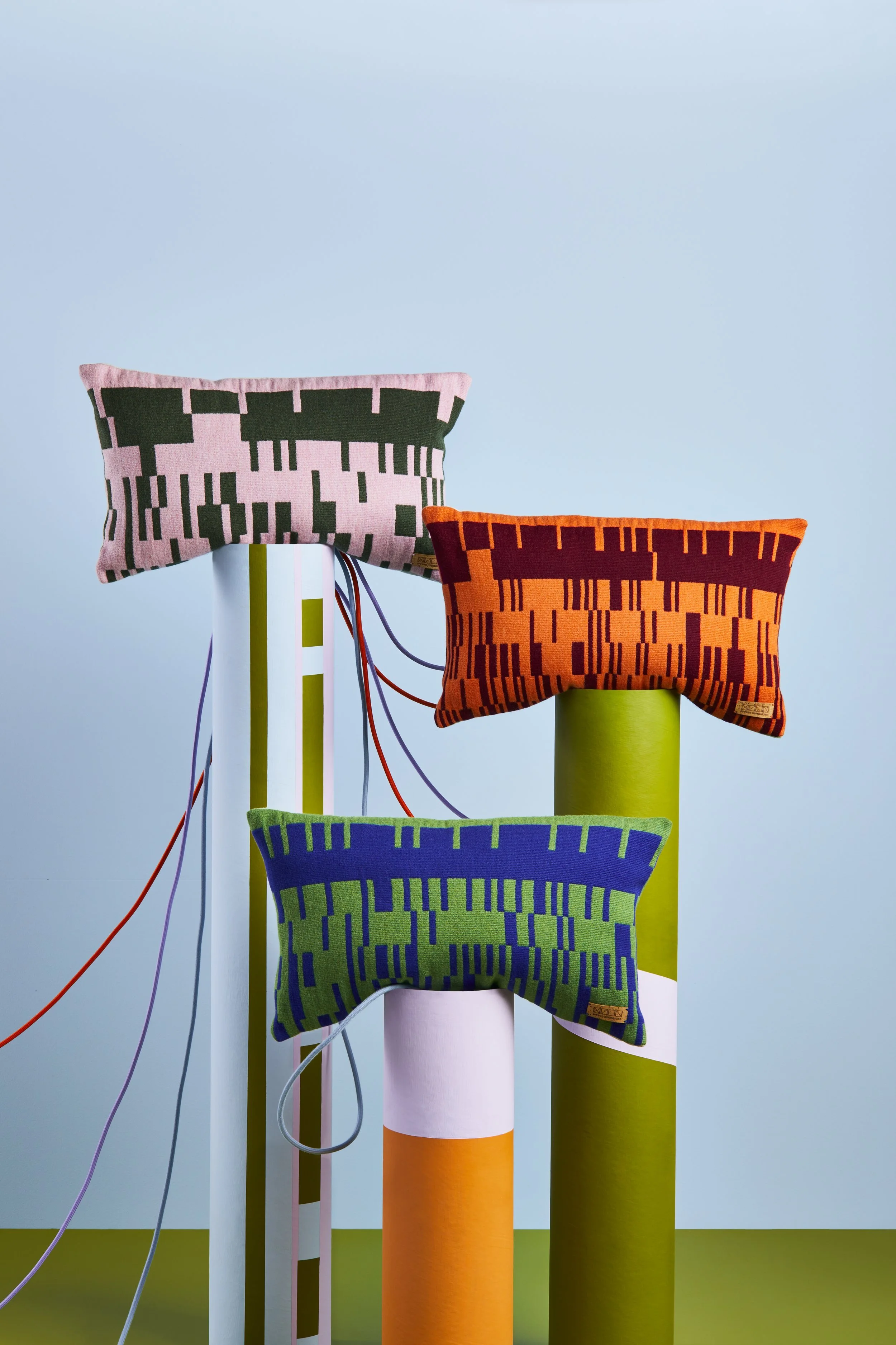
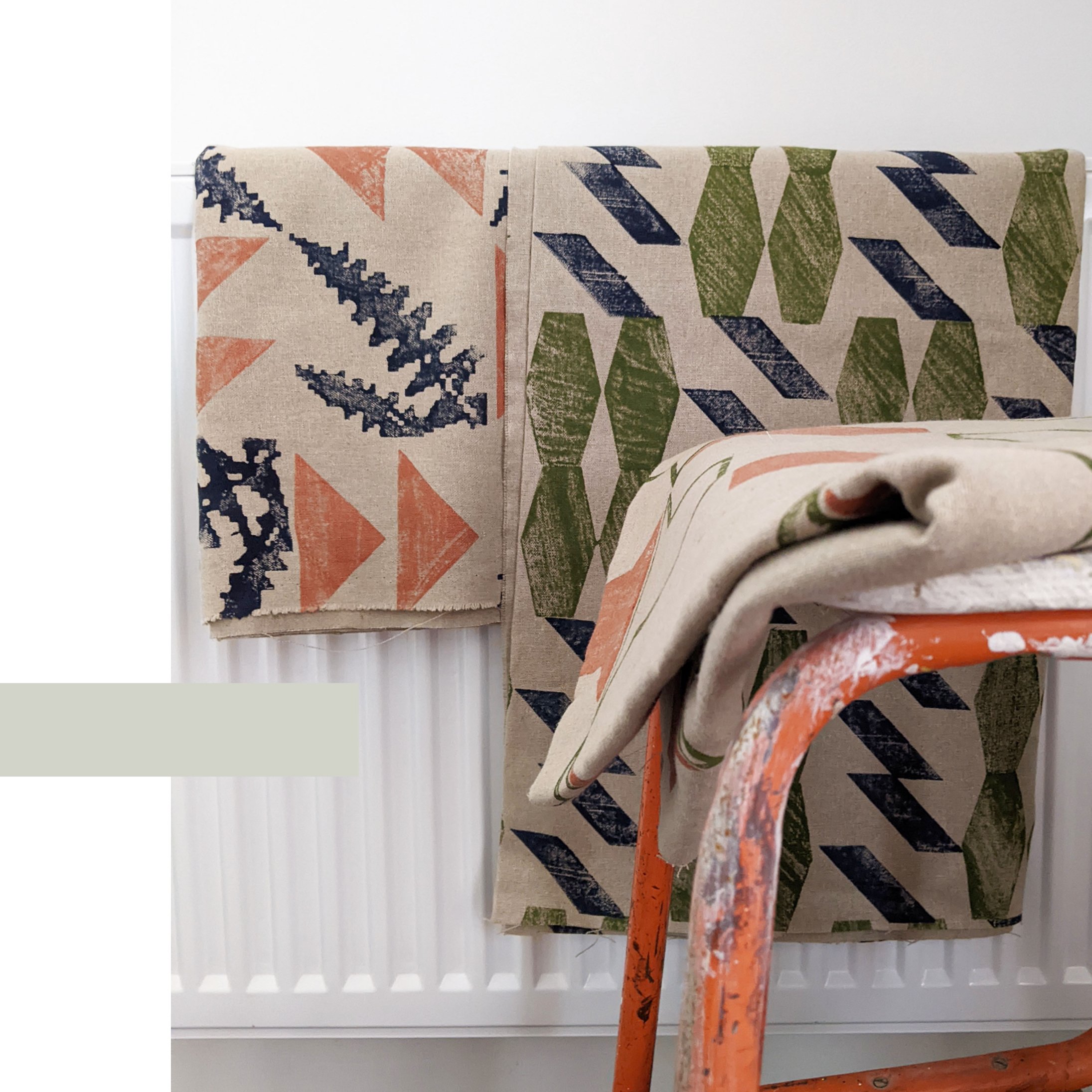
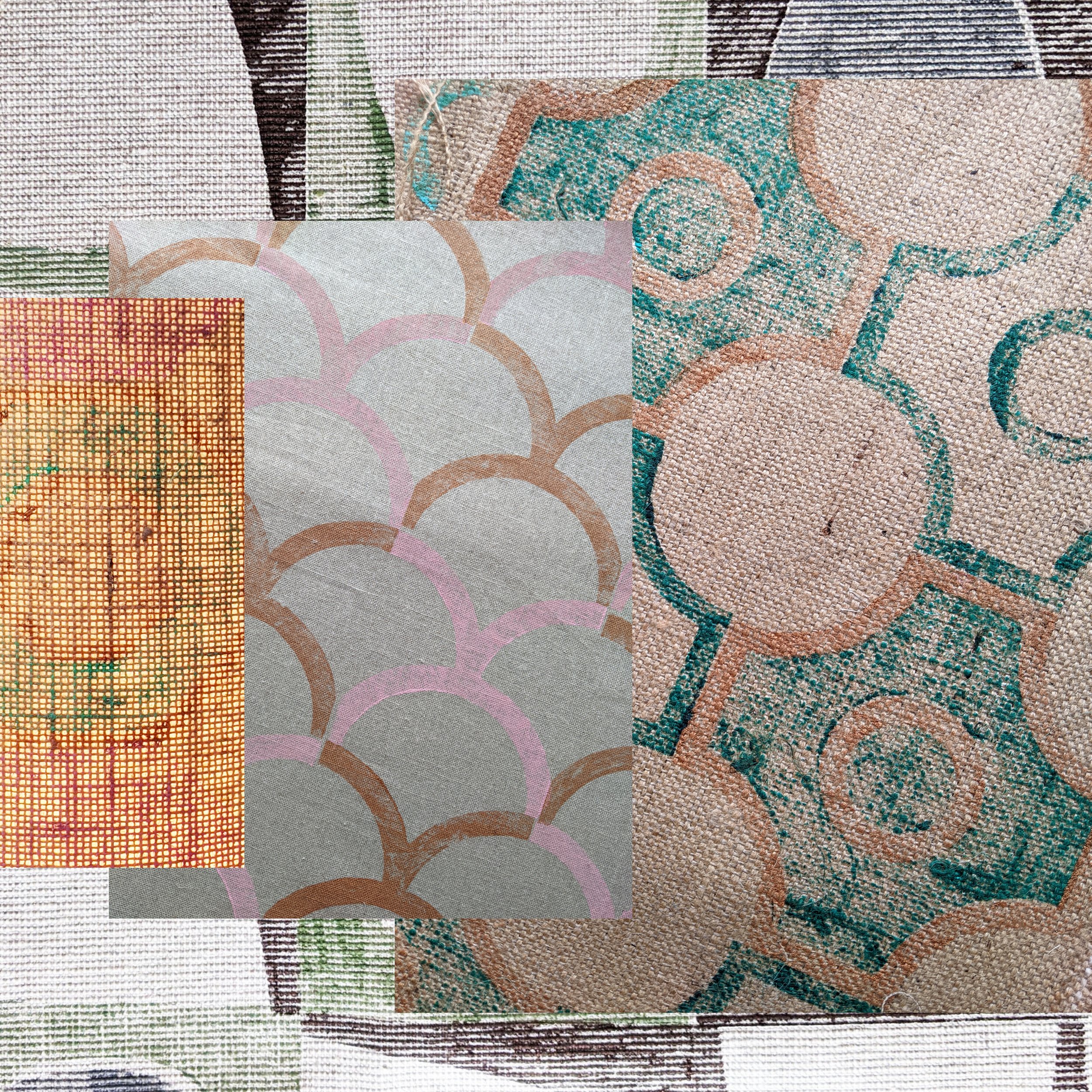
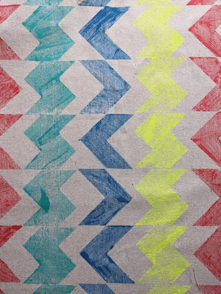
1. bOLD colours and brave combos

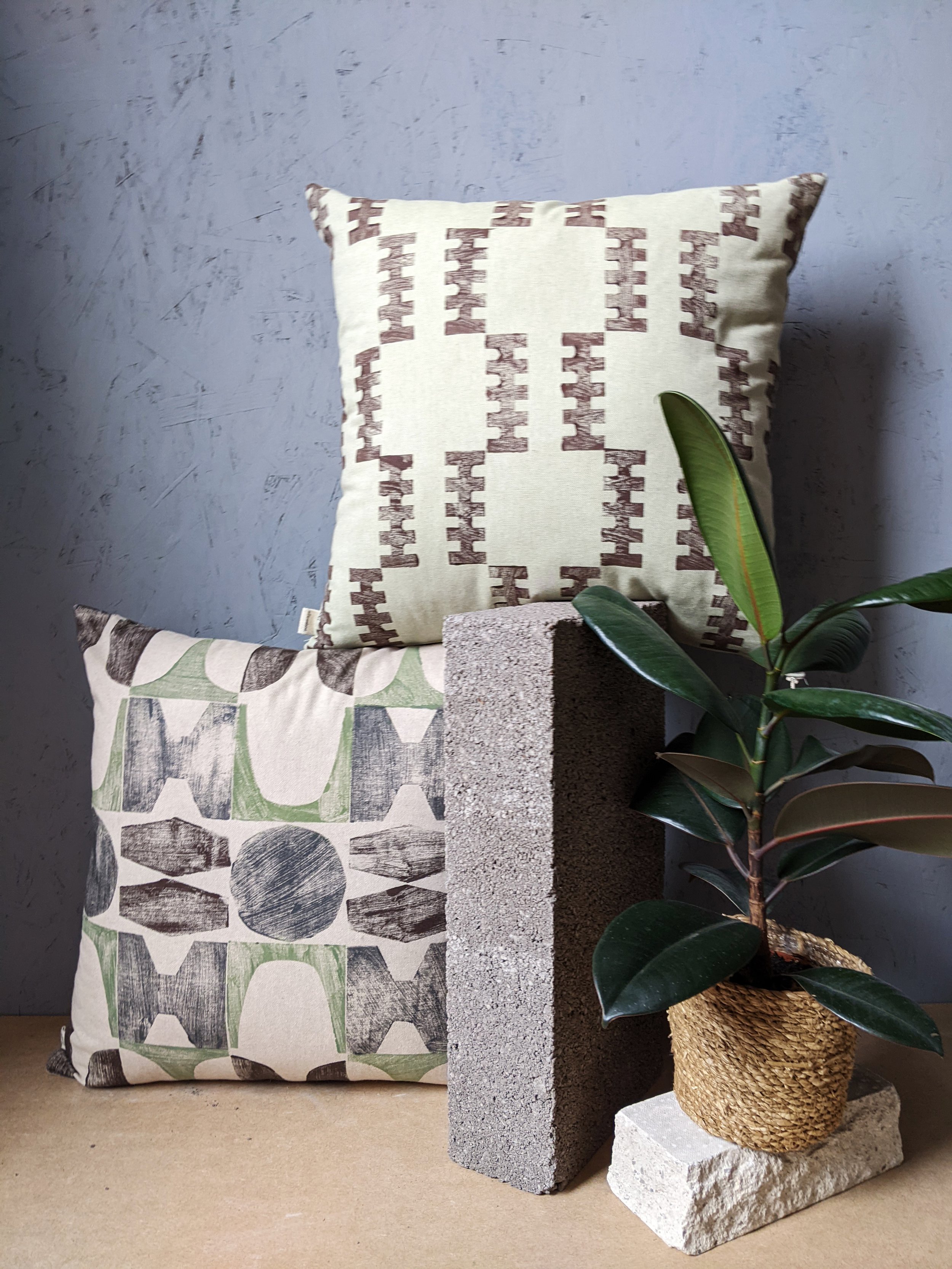
at zitozza, we have been waiting for this moment for a looong time, but even for the minimalists, it’s probably a good time to say goodbye to the all-beige aesthetic and the grey everything. in the mid-2020s, we are in desperate need for mood-boosting colours and the stranger, and more eye-catching, the better. close the itten book, there are no rules, more is more - we’re getting ready to make some bold, wild prints on new interior fabrics and we cannot wait.


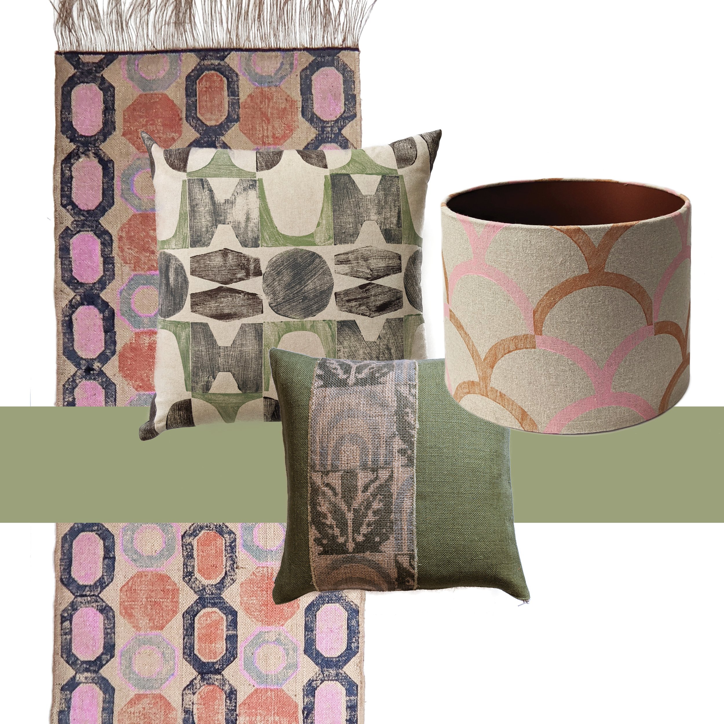
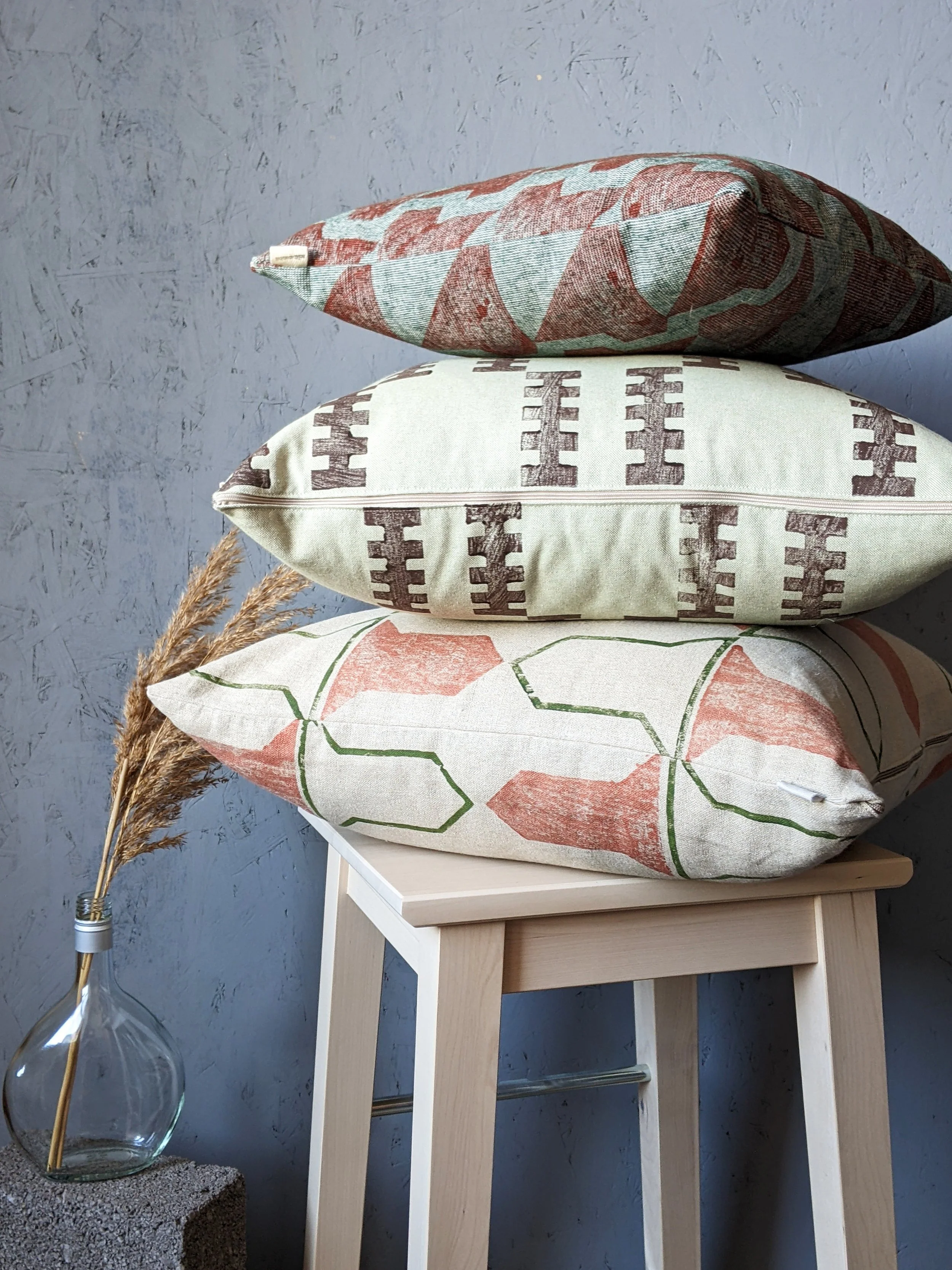
2. hand crafted statement pieces

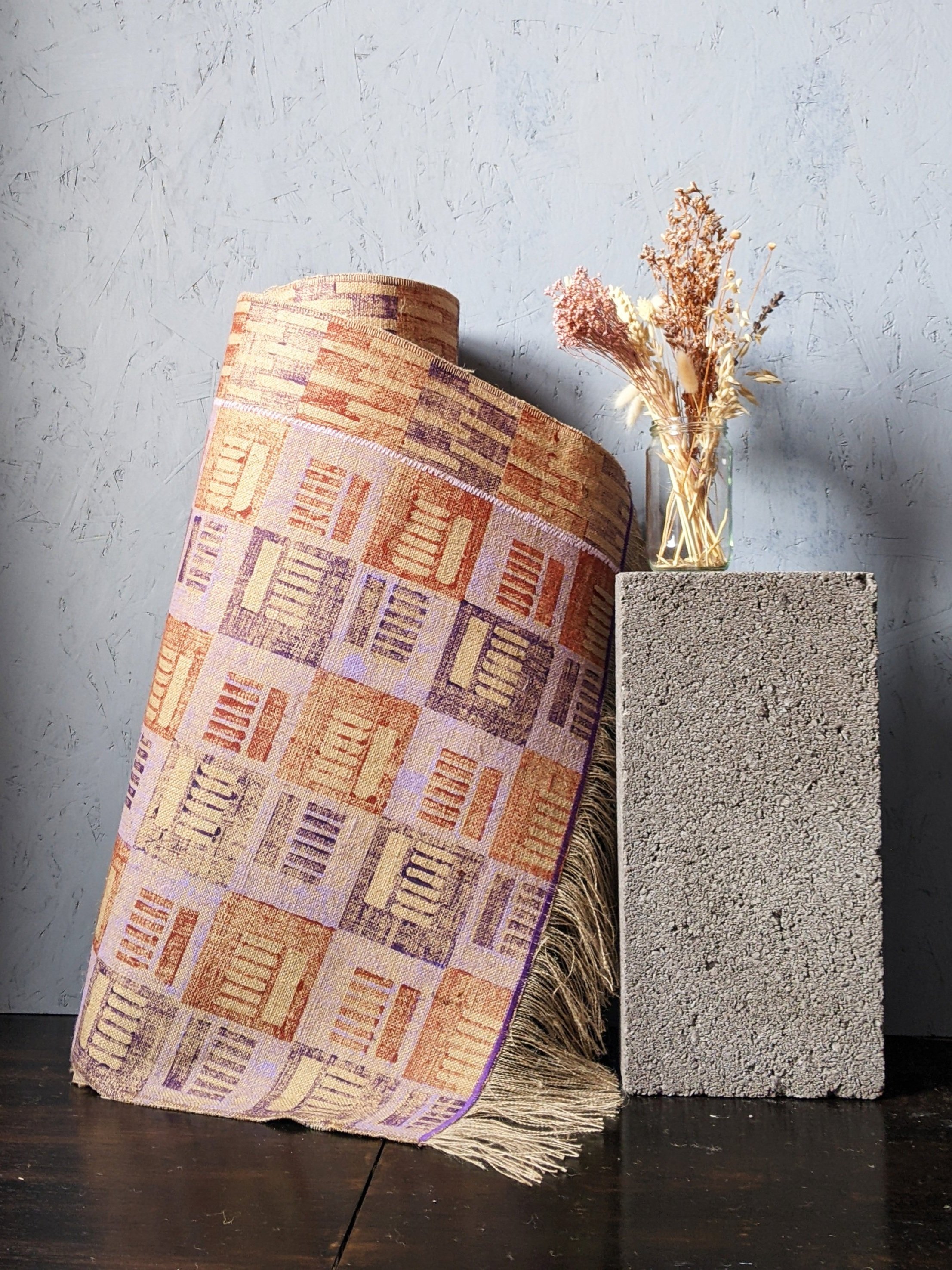
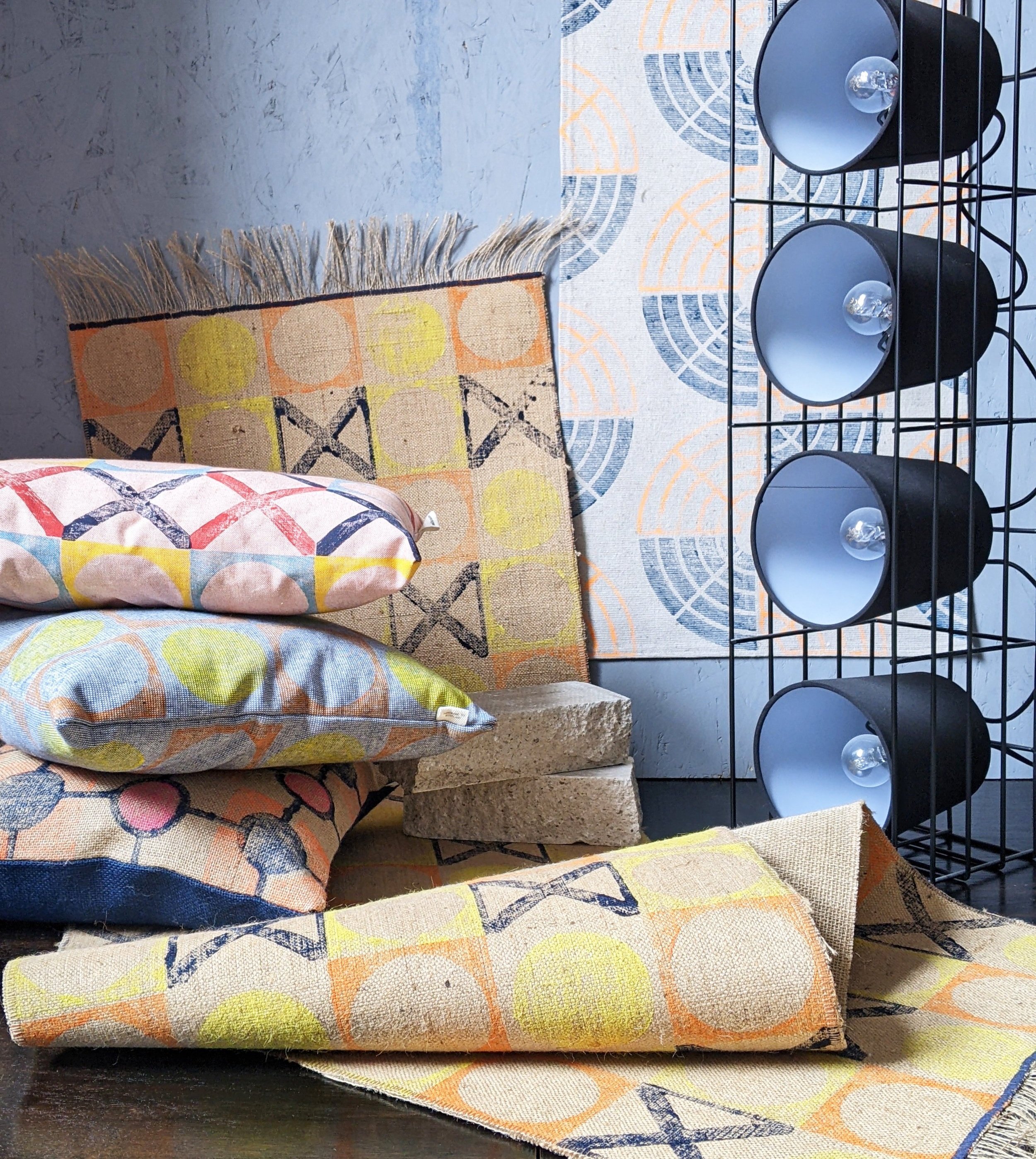
we have discussed this before - sustainability is not a trend, but an imperative for all industries now, as it should be. for sure, sustainable design processes and practices can be interpreted in many interesting ways and many are slowly seeping into interior trends. one that’s here to stay is how the luxury statement pieces now mean the high-quality, handmade objects made by artisans. exquisite hand crafted details, small imperfections, material honesty - what’s not to love and do we have the rugs for you!

3. luxury gezelligheid

this one is an entirely biased inclusion in the list since zitozza are dutch lovers, but that thing that house beautiful calls “cosy, quiet luxury” and those “real and memorable spaces” dezeen refers to - the dutch have a word for it and if you ever went through a bit of a hygge phase, you need to learn to say gezellig.

it means so much more than cosy - it is a social and friendly kind of contentness. in the home, it may express itself in the shape of ambient lighting (think about our jute lampshades!), warm, tactile textures (think of layers of rugs on the floor!), and open, inviting, sociable spaces ready to be filled with warm conversations. naturally, this means high quality, long-lasting materials and finishes as time well spent is the real luxury now!

4. BROWN (FOR real!)

no, it is not the 1970s anymore, don’t worry. that kind of brown is not making a new comeback. this is a grown-up version, evolved from the earth tone trends we’ve seen in the last few years. at zitozza, we’re particular fans of the almost-black kind of espresso browns, and elle decor mentions chocolate hues, but if that’s not your thing, woods and finishes such as shou sugi ban may bring that tone in your home by more natural means.

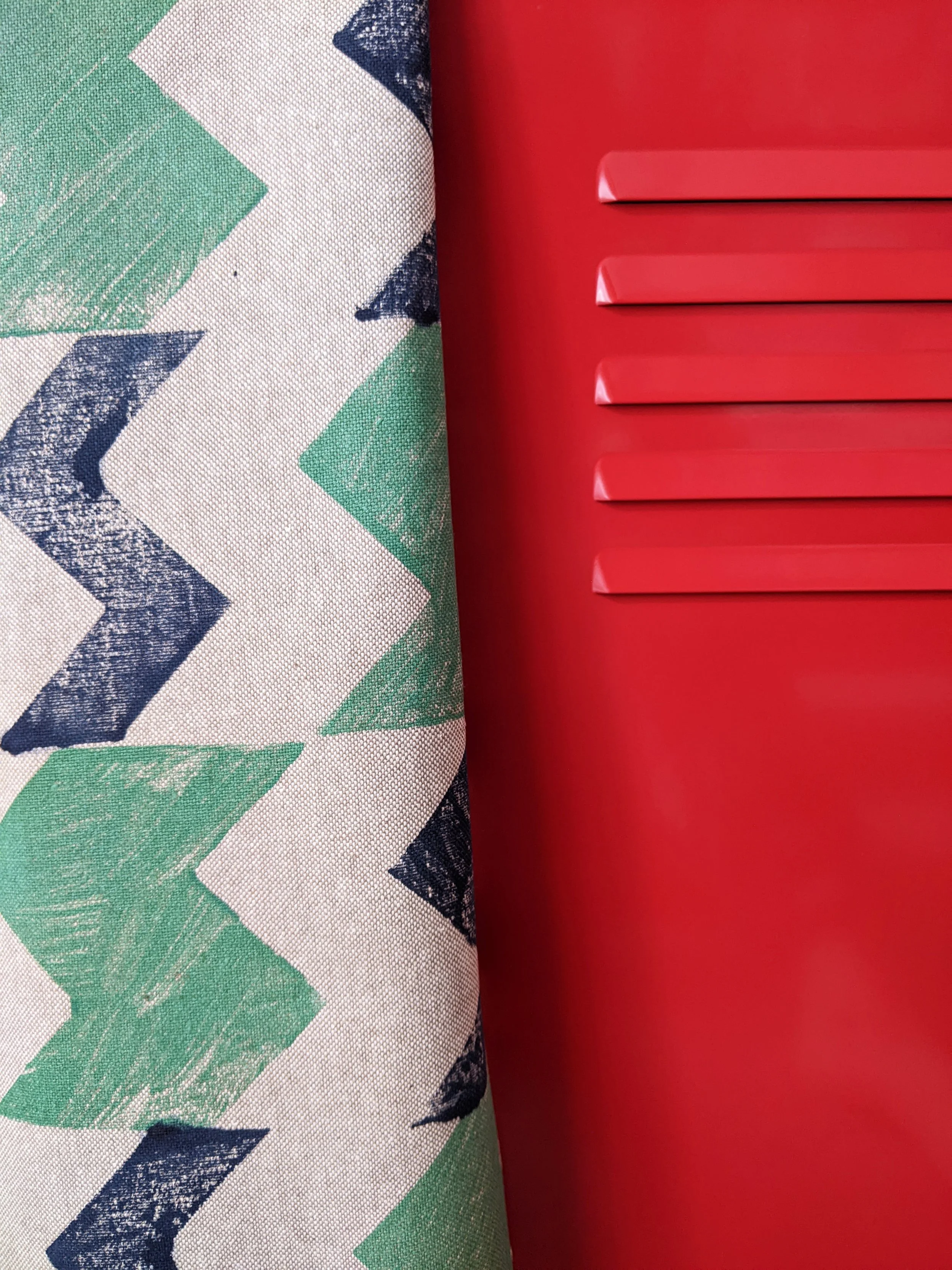
5. stripes and checks

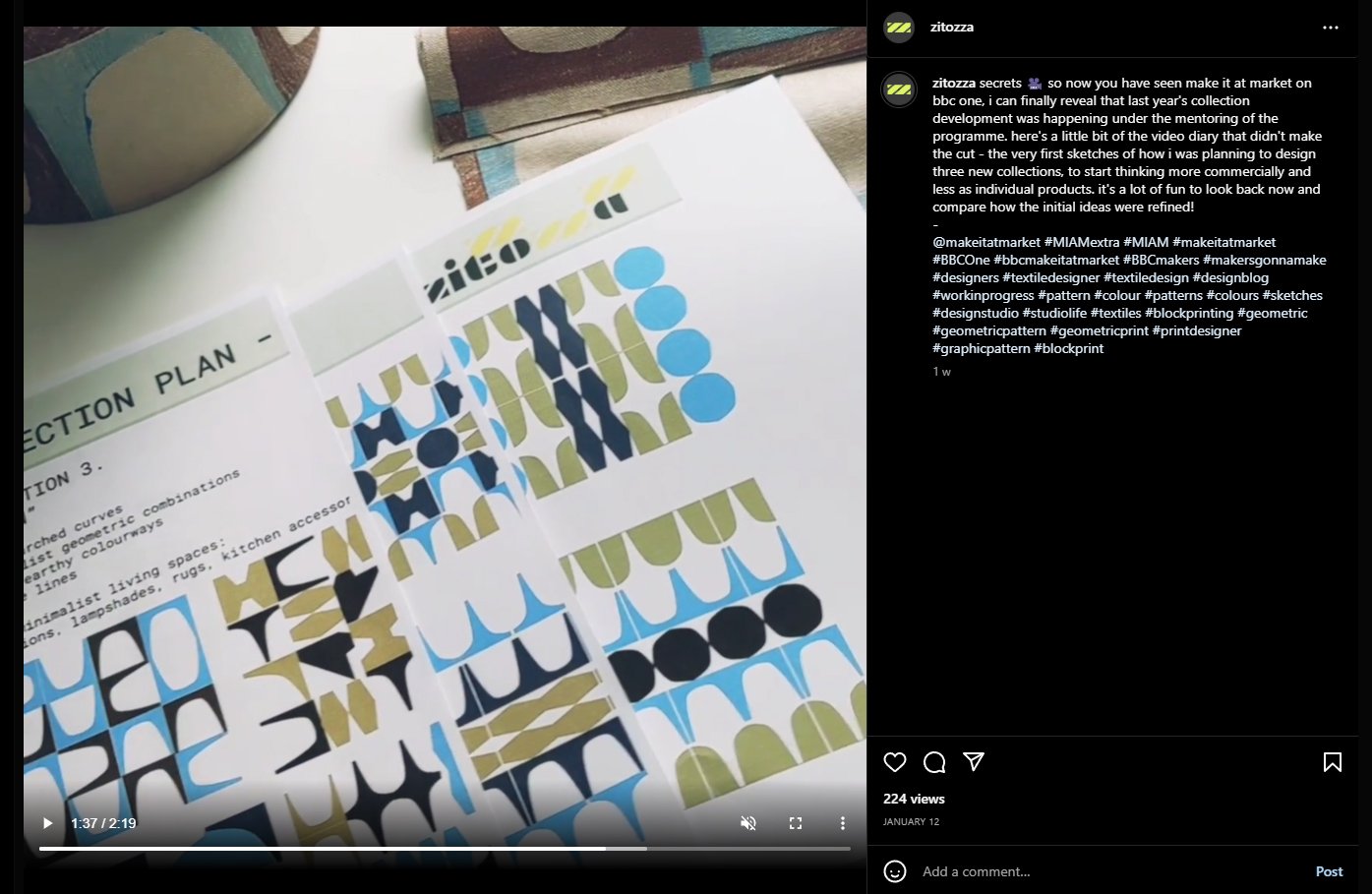
nothing we love more than patterns, of course and we’re so glad seeing them mentioned by vogue. horizontal or vertical, or have them clash and make a chequerboard - that’s right up our alley as our modular system of printing blocks can make up similar effects with that unique hand crafted appeal and we cannot wait to bring more of these prints to life - stay tuned!

6. mix and match

as we are all about tactile prints, we do always embrace a version of this kind of trend, but this year it really means a mix and match of all sorts of surfaces and patterns. textured walls are definitely a thing this year but it means a play with hard finishes - metals such silver and gold accents (and yes, stainless steel!) but also, of course, mixing coarse textiles (such as jute) with some soft linens too. exciting times!

if you’re ready to find something for your home, have a browse through our shop or request a sample to see what we’re able to do for your home!

below the articles we sourced these from are linked for further reading, and if you want to be the first to read about sustainable home decor and textiles, subscribe below (it comes with a freebie every month!)

-

links:

12 interior design trends we’ll see in 2024 (by amanda lauren, 4th january 2024, forbes)

maximalism to make way for “quiet refinement” in 2024 say interior designers (by casja carlson, 5th january 2024, dezeen)

5 interior design trends that will define 2024 (by sarah archer, 26 december 2023, architectural digest)

9 interior design trends to watch in 2024 (by david nash, 4th december 2023)

12 interior design trends you’ll see everywhere in 2024, according to experts (by medgina saint-elien, 9th december 2023, house beautiful)

the interior trends to know in 2024 - and what’s on its way out (by elise taylor, 4th january 2024, vogue)

the interior designs we’ll be seeing everywhere this year (by eleanor cording-booth, 27 october 2023, house and garden)

ARCHITECTURAL HERITAGE, ARCHITECTURE, BRUTALISM, INSPIRATION

the barbican estate, london

as we are cracking on with 2024, i’ve decided that of the many architectural inspiration series we planned, it’s probably best to tackle the beast first and share some images and thoughts of the barbican estate in london. i’m calling it a beast because it’s an enormous, expensive and very well-known icon of british brutalism. for this seasoned concrete-hugger, it then makes no sense to keep postponing this blog post any further (especially as our rug already exits and more stuff might come soon…), so do come with us to explore the place from a textile designer’s perspective.

i guess everyone somewhat interested in brutalism knows some of the basic facts - designed on a 35-acre ww2 bombsite by chamberlin, powell & bon for the corporation of the city of london, it opened its first flats in 1969 but the completion of the construction only really finished in the late 1970s, after a long and expensive process and it is now home to approx 4000 people in 2000 flats. of course the uniqueness of the estate comes from the fact that unlike many other brutalist projects in the uk, it was not built for social housing and the architects were not held by the typical council budget restraints -which resulted in one of the most free and complete architectural visions, achieved by some extremely time consuming and labour intensive processes.

if you want to know about these in more detail, my first recommendation is raw concrete by barnabas calder. quite early on in the book, he has a brilliant chapter about the barbican, with some focus on the social context around it, from conception throughout the whole of the construction process which makes for a very informative and interesting read as it touches on some of the tensions throughout the whole process of building it. he provides an important angle that does not often get mentioned on design blogs like these, as we tend to get lost in the form and the aesthetics - with good reason of course, but without context it would become rather meaningless.

i first visited a couple of years ago and the first thing that really affected my perception was its sheer scale. of course it is at this enormous scale that these visions for the order of forms work the best, and i think this is why it’s such a brutalist mecca here, the complete, intact and vast system of space. i don’t exactly know where my search for a geometric order comes from, all i know is that the deceptively monotonous facade of the terraced blocks (arranged in neat squares of course) gives me a sense of enclosed cosiness and open clarity at the same time. in every one of these blog posts i’m attempting to describe this feeling but it’s so hard to explain - there is just this sense of calm that i only find in places such as this.

the three 42-floor tall tower blocks bring some exciting angles with a lean, triangular layout and column of balconies tightly stacked into the sky. of course, the repeating geometric forms serve a textile pattern designer well. it really helps that i visited on a sunny day and the shadows projected on the surfaces aid the imagination in reducing these sharp angles to two-dimensional shapes. but the surface itself, the slate and hammered concrete texture that really is on every surface, is equally important - i always say that i want the weave of my cloth to resemble the raw concrete itself, and the pattern to play with the form.

to explore a bit more about the material and the techy bits of the architecture, my second recommendation is my favourite podcast series, about buildings and cities - they have a brilliant episode about the estate, touching on some of these details of the surfaces too as they take you on a journey around the estate. they’re much better suited to explore a more architectural angle than i’d ever be able to so do have a listen to it.

what i found the most surprising about it that it was a lot less grey than i imagined - of course, the concrete surfaces are raw and beautifully grey, and the shapes and forms are varied and playful, but the pavements are tiled with maroon bricks all over, and the ponds with the surrounding greenery reflect with a very strong teal and green everywhere. it is surprisingly colourful and stimulating in its order, the “oasis” comparisons do seem to be very fitting - not in small part due to the tropical garden accessible to residents only.

but we can’t quite go away of course without stepping foot in the arts centre, home to a concert hall, cinema and exhibition halls amongst others. seeing how the columns and the concrete coffered ceilings repeat and continue inside is an exciting exploration that i really enjoyed even if some of might not work that well today or may be in need of renovation.

for the last recommendation, i want to bring you an article from the rics blog, as it’s quite fresh and talks a bit about some of the repairs as well as bringing you some amazing pictures that hopefully will inspire you to appreciate it if you haven’t visited already - and if you have, i hope you’ll now see it from a surface pattern design angle too.

if you liked this trip, you can subscribe to our newsletter below - we’re only sending these monthly with a free downloadable graphic print, and you’ll always be amongst the first to notify of a new architectural journey, or new prints inspired by them.

-

links:

raw concrete: the beauty of brutalism, barnabas calder, 2016, penguin books, london - purchase link to the barbican shop

establishment brutalism: the barbican estate, about buildings and cities ep 4, 2021 - youtube link to episode.

brutal or beautiful? the barbican estate, matthew williams, 2023, modus/rics - link to article on rics.org

the barbican arts centre website

city of london corporation website

INTERIOR DESIGN, TEXTILE INDUSTRY, BEHIND THE SCENES

zitozza in milan!

happy new year! i hope you’re all well and had a nice little break in the weeks before. we’re back, refreshed, rested and ready to rock and roll! the year could not start better as in the second week of 2024, we went to milano home - well, our fabric and rug samples did, with huge thanks to british jewellery and giftware international. amongst these rug samples is a brand new material so it’s a bit of a mini-debut of our super heavyweight jute as well, which will bring you some even more exciting rugs this year, so there’s already plenty to look forward to (not to mention all those other exciting things in the pipeline that we don’t want to reveal just yet…)

so do stay in touch - and if you can, please visit fiera milano - the expo closes on sunday 14th. zitozza’s plinth is found at the british pavilion amongst other brilliant designers and they’re manned by the BJGI team. they have order forms and everything so do visit and get in touch with a sample!

image credit: BJGI

image credit: BJGI

BEHIND THE SCENES, WORK IN PROGRESS

time for a break - and see you soon in 2024!

that’s it for 2023 peeps, time to take a well-deserved break after a busy year. we have a lot of new things planned for 2024 though so do stay tuned as we’re introducing new materials, new collections and new tilesets too! we hope it’s going to be a blast - please, no more “unforseen circumstances”, universe, please! - and we do want to keep blogging too, from interior trends to the loved architectural inspirations as well as the design conversations.

but first and foremost thank you so much for keeping in touch with us, reading our blog, messaging us, buying something bespoke or handmade from us. we are grateful for your business and we hope you keep looking back here. we wish you have a wonderful christmas break, surrounded by loved ones and delicious food - and have an amazing and prosperous new year. see you soon!

BEHIND THE SCENES, SCOTLAND

festive market double header weekend!

hello dears, it’s that time of the year again, can you smell the cinnamon and see all the sparkles? it’s festive season time and we do have some nice ones lined up this year again. unfortunately we will not be doing any in glasgow this winter, but for all of you my glaswegian friends, feel free to browse the online selection, we are putting up a lot of the smaller gifts yea as well.

but for those of you in dundee and edinburgh (the first festive one in the city for zitozza!), you can come and get your hands on the tactile goods (and dig into the bargain basket!) as there’s a lovely little line-up of two consecutive weekends.

DCA CRAFTED - 26th & 27th november at the dundee contemporary arts
11:00 - 17:30 (152 nethergate, dundee, DD1 4DY)

the first one is just around the corner, in the city of jute of course, we wouldn’t miss this for anything. this is a fabulous line-up of the very best of contemporary scottish design at a true creative hub. this venue has creative workshops, cinemas and exhibitions so if you’re that kind of crowd, please do come along and have a chat! we really look forward to it.


festive makers market - 2nd december at edinburgh open workshops
10:00 - 16:00 (39-41 assembly street, edinburgh, EH6 7BQ)

this one is brand new, and we’re particularly excited about this one because for the first time for christmas, we’re heading to edinburgh, to leith to be more precise, the new creative hub of the place! i particularly look forward to meeting the creatives who know about and use edinburgh open workshops as i’ll be joined by furniture makers, woodworkers and other craftspeoople and can’t wait to buy something beautiful too!

so i hope you’re able to join and see us in either dundee or edinburgh - glasgow, aberdeen, and fife, i do hope to see you sometime later, but the online shop remains open 24/7.

if you want to buy anything bespoke or made to order, please place your purchase by tuesday 12th december as after this date, we might not be able to send with enough time before christmas to arrive. regular orders will be shipped right up to christmas, but please be mindful of courier services being overwhelmed and give your order slightly more time than usual.

happy shopping and do have a wonderful, wonderful christmas and all the very best for the new year.

SUSTAINABILITY, TEXTILE INDUSTRY

in response to the draft uk fire safety regulations of upholstered products

today’s blog post is going into some fabric nitty gritty, but bear with me because it is an important topic. i wrote about it before - my early blog post on the uk fire safety regulations do get some reads from search results still. i wrote it in frustration with the regulations, and how they stifle product development of more sustainable fabrics for upholstery. even though i tested my jute for treatment to meet the stringent testing criteria, i did really become rather uneasy about the amount of chemicals needed, so i introduced 100% recycled linen in my range, as well as recycled cotton blends with over 75% cotton content in order to be able to at least supply upholstery fabrics as these can be used with a schedule 3 barrier cloth.

these stringent regulations have been in place since 1988 and just like to you, blog readers, elsewhere in the industry it became clear that these are dated and the benefits of flame resistant treatments are eclipsed by the harm they cause in creating toxic fumes and causing health problems. as this has been getting more widely accepted, pressure grew on the uk government to update the regulations which has now reached the stage of a new draft (embedded below) and unfortunately it does not seem to be fit for purpose - while the intention to reduce chemical use is clearly there, it would result in more usage, mainly due to the open flame test requirements.

the simplest solution to the chemical problem would be to drop the requirements for open flame testing, as it has been done in the EU and even the US. instead, the requirements focus on the transparency of materials, treatments of them and robust labelling requirements to list all chemicals used. that in itself is laudable, however the testing and record keeping of all the details throughout the entire supply chain would be put entirely onto the manufacturer of the upholstered product.

the proposed draft regulations published by the uk government in october 2023.

this would most certainly put a huge pressure on a lot of small businesses, disproportionately disadvantaging the re-upholstery industry, upcyclers and small upholsterers of individual products - while producers of large batches would of course find it easier to comply. somehow even more worryingly, anything re-upholstered should either have the 1988 or 1980 safety labels on them making any vintage or mid-century re-upholstered piece basically forced to be removed from the market. this goes against all sustainable principles and against the preservation of design values and ideas of durability.

more concerningly to us (and worse than in the current regulations), any scatter cushion over 45 x 45cm would now also count as an upholstered product, requiring the permanent label and applying the same rules onto them.

it is my view that these draft regulations are not fit to achieve their stated purpose. it would lead to increased use of chemicals, not less and would disproportionally hurt ecologically minded small businesses as well as the entire market of bespoke, individual furniture. it is, in my opinion, also harming consumer health and safety - robust labelling of course would be helpful to make a conscious choice, but while the requirements to pass an open flame test remain, it would be difficult to avoid these chemicals completely.

the government ran a consultation on the proposed legislation, i found out about it on the last day but i did have at least enough time to sign the eco-chair campaign - it’s a very useful site run by delyth upholstery, please sign up and read more in detail of the current problems as well as the potential pitfalls of the proposed regulations. although the consultation is closed now, you can still get in touch about this with your MP if you’re worried about the future of furniture and interior accessories in the UK.

-

links:

smarter regulation: fire safety of domestic upholstered furniture (closed consultation, uk government)

furnitre and furnishings (fire) (safety) - draft regulations october 2023

the eco-chair campaign

do flame retardants increase the risk of thyroid dysregulation and cancer? (hoffman et al. 2017, curr opin oncol 29 (1) 7-13)

no smoke without fire and lower toxicity without chemicals? (8th september 2023 FIDRA website)

INTERIOR DESIGN, INSPIRATION, BRUTALISM

the new brutalism - how to embrace the trend at your own home

hello again, it’s been another month long pause at the blog (sorry!) as we’re trying to prepare for the festive period while juggling a lot of things at the same time, including a new collection that might come before the end of the year and will be our most brutalist one yet! one of our cushions have also been included in a fabulous brutalist selection by gadget magazine t3.com, so the trend forecast was correct and it’s officially in again. i thought that to celebrate this and to get in the mood for the up and coming new collection, it’s time to share some interior tips on how to bring the brutalist forms indoors, with its bold forms and raw, industrial aesthetics. it is more than just an architectural trend; it's a statement. if you're looking to infuse your living space with character and go bold and brave, embracing the brutalism trend might be the answer. in this blog post, we'll take you through some interior design tips to help you achieve that unique, edgy look while maintaining comfort and warmth in your home.

simplify and minimise

this isn’t a call to go full-blown minimalist, but decluttering your space will give the accent pieces the “main character” status they deserve. brutalism thrives on simplicity and clean lines. remove the noise and leave room for your bold furniture pieces and some accent accessories to shine. if you have exposed concrete walls, you’re already there. bring in some stark geometric shapes, and a muted color palette.

hug the concrete (duh, obviously!)

this isn’t exactly breaking news, but concrete is the hallmark of brutalism. if you can't expose your walls or floors, consider concrete-inspired wallpapers or textured paint finishes. you can also introduce concrete furniture or accessories to capture the essence of this trend.

lighting drama

i think this is my favourite. i’m a huge fan of interesting shadows and you can add great depths and warmth to your space by illuminating it with statement lighting fixtures. oversized pendant lights, angular sconces, or floor lamps with sharp lines, and similar. these not only provide ample illumination but also serve as eye-catching focal points and ambience.

honesty to structures and materials

brutalism is part of the form follows function school, so this should be extend to furniture too. choose furniture with structural honesty and that will mean strong, angular designs. consider pieces with metal frames or exposed structural elements. a bit of tactile upholstery will balance the harshness of the concrete and metal elements.

abstract expressions

bare walls need not be alone. if you have room, a few, colourful pieces would both compliment the room and have the art stand out too. brutalism often celebrates artistic expression. large-scale paintings with bold, graphic compositions can add a touch of creativity to your space and celebrate the multidisciplinary nature of the modernist movements.

human touch

a lot of the bad rap brutalism gets comes from a perceived lack of human scale and harshness - but that’s not really what the movement stood for at all. do soften the hard edges, introduce textures and tactile qualities. cozy rugs, cushions, and soft throws in earthy tones can make your space more homely without compromising the trend's integrity. it can also mean hand crafted, imperfect elements against the more pure forms. (yes, i do mean hand block printed textiles, how did you know!)

green up

another misunderstanding about brutalism is the rejection of nature. it is absolutely not. the forms may not be organic, but city planners and architects used to have grand visions for huge parks, greenery under buildings and the like. so having lots of plants in your house is just an homage to that, really.

focus, focus!

in all this starkness, it’s quite a natural wish to have a designated a focal point in the room, like an impressive brutalist-style fireplace or a bold wall covered in textured panels. this draws attention and creates a sense of purpose within the space.

colour it in

brutalist buildings are raw and stark outside, but don’t forget about colours, they do have their role (unité d’habitation, anyone?!) so don't be afraid to experiment with occasional bursts of color. a vibrant artwork or a bold, colourful rug or lamp piece can be a striking contrast against the more stark backdrops.

so there you go, brutalism is certainly not for the faint of heart, but when done right, it can transform your living space into a dynamic, artful haven. it's a trend that encourages self-expression, challenges the norm, and celebrates the beauty of raw, unapologetic design. so, if you're ready to take a daring step in interior design, embrace the brutalist trend, and watch your home undergo a bold and beautiful transformation. we have a lot of things to offer you to achieve that, so do shop around!

DESIGN CONVERSATIONS, INSPIRATION, TEXTILE INDUSTRY, SUSTAINABILITY

in conversation with gina nadal of woven memories

hello again, long time no see - i’ve accidentally become a bit of a recluse recently, apologies. in the midst of all the usual busy things though (with new lookbooks and festive market preparations…), i do want to bring you some great posts to read about so i thought it’s time to have a brand new design conversation with someone truly brilliant – i’ve brought you here gina nadal of woven memories, who i first met last year at the CLOTH market in dalkeith. the geometric patterns on display with a computer screen really caught my attention and i had so many questions, so i thought why not have this fascinating conversation right now. so come sit down with us as we delve into process, materials and inspiration with gina!

photography by roxana alison

ZITA: hello gina! i’m very excited to speak to you today, so first things first - could you say a few words about yourself, what you do and how you got there?

GINA: hi zita, it's nice to speak with you. i’m a handweaver based in manchester, originally from barcelona. i moved to manchester in 2015 to pursue an MA in fashion graphics. during my master's programme, i developed the concept of "woven memories," which combines weaving and digital coding for three primary reasons. firstly, to celebrate the shared history of both techniques. secondly, to produce on-demand and reduce waste, challenging mass-production practices. thirdly, to create products that establish an emotional bond before they are made.

while there are numerous studies on the emotional connection people have with objects during or after ownership, there is limited research on how to design this emotional bond during the pre-ownership phase. this was my primary goal during my MA. by bridging these three areas, i encouraged people to use an online interface to write messages. the text was then transformed into abstract patterns by using binary code, which i wove into scarves.

following my MA, i secured a PhD scholarship to further research this area and contribute to knowledge. in 2022, upon graduating from my PhD, i decided to transition into a full-time venture and adapt my research into a business model. customers can now design their patterns by writing messages, and woven memories' online tool translates them into abstract patterns, which I then weave in my studio.

ZITA: what an amazing journey. i first encountered your designs at the CLOTH market in Dalkeith - as a pattern designer myself, your moving, animated display on your computer screen immediately caught my eyes. could you please explain a little bit about your fascinating process?

GINA: woven memories studio specialises in personalised handwoven homeware and fashion accessories. to personalise these items, the customer plays an active role in the process, becoming a co-designer of the final product. as mentioned earlier, customers can use woven memories' online tool and are encouraged to type a message. this message can be personal, contain the lyrics of their favourite song, or even a poem. while typing, the pattern is generated in real-time by translating the letters into patterns using binary code. once the customer is satisfied with the text, they can further personalise the design by selecting colours, adjusting the pattern repetition, or applying mirroring.

i believe these products are perfect as gifts for celebrating special occasions like birthdays and christmas, as well as for commemorating loved ones who are no longer with us.

photography by lauralaura studio

ZITA: oh yes, it is very giftable and i love the idea of translating words into the language of weaving. that makes me wonder, do sentences always come out as a workable weave or are there ones that work less than others?

GINA: certainly, some sentences result in more visually appealing patterns due to the way they stand out. for instance, the other day, i was experimenting with the online tool and wrote 'i love you' in different languages; armenian and punjabi produced patterns i particularly liked. however, i do have two favourite quotes. one is a quote from ada lovelace that encapsulates my research and the concepts behind woven memories: 'the analytical engine weaves algebraical patterns just as the jacquard loom weaves flowers and leaves.' another quote from victoria mitchells states, 'textile becomes a kind of speaking and for language a kind of making,' which i believe reflects what my products achieve—they convey messages on their own, and language brings them to life.

ZITA: that’s really beautiful, and i absolutely love the play with all the different languages! but did you ever encounter “bugs” in the process or find that certain sentences don’t make a good cloth? or do you ever find that you have to tweak the results in order to make it more aesthetically pleasing?

GINA: i haven't come across a sentence that doesn't work on the fabric, as each carries a meaningful message. sometimes, customers may only want one or two words, and in such cases, i suggest repeating the pattern to create more movement and variation. while i wouldn't say i need to alter designs, there are times when customers choose two colours, and i might suggest variations in colour or hue if i believe their initial choice may not work well.

photography by lauralaura studio

ZITA: as someone whose work integrates programming and computer systems at such a level, i feel i have to ask you, what’s your take on the latest developments in machine learning? it seems all the rage now, do you see it as a threat or do you see yourself in the future using it as a tool to create ever more complex patterns? i mean, are there even any limitations to a two-dimensional woven pattern?

GINA: i don't believe AI is inherently a threat. it's simply another new tool, but we must exercise caution in how we use it. we still have much to learn about AI and its short- and long-term consequences. only time will tell. however, i do believe that, in order for the field of weaving to progress, weavers and designers should explore the potential of AI and see what it can bring to us. i'm eager to see what other creators will develop with AI. certainly, i'll be experimenting with it, and whether or not i ultimately incorporate it into my work remains to be seen. However, i think it has the potential to expand my horizons and foster greater creativity.

to be honest, weavers have historically been early adopters of the latest technology, even dating back to the 19th century with the industrial revolution, which began by mechanising textile production.

ZITA: that makes perfect sense in the historical context of weaving indeed. now, having discussed the hyper-customisable patterns you can make from your client’s memories and words, i’d like to ask you about your own collections, which are very beautiful. were they made using the same way or did you use a more conventional design process to create these? where do you go for inspiration for your own collections?

GINA: when we met at CLOTH, i was showcasing two distinct collections: the "LOLI" collection, inspired by a particular individual, and the "RETRO" collection, which drew inspiration from nature (though interestingly, many remarked that the colours and patterns resembled vintage london public transportation fabric). the creative process for these collections differs from my usual approach, as i employed my small loom and 8-shaft tabletop loom, in contrast to my 32-shaft dobby loom. this shift in equipment imposes certain restrictions, but it's precisely these limitations that i find so appealing when weaving with my 8-shaft loom.

i continue to work in blocks, as I believe this defines my distinctive style. weaving offers an array of infinite possibilities and techniques, but there's never enough time to master them all. consequently, i made the deliberate choice to focus on one style and excel in it while remaining open to ongoing learning and exploration.

photography by lauralaura studio

ZITA: serious food for thought here, perhaps i need to learn making such choices too… anyway, i also want to talk a bit about sustainability as the textile industry in general doesn’t have a great reputation when it comes to that but in your work, you seem to be very conscious – design for durability and zero-waste principles seem to be all over your work. do you find them important for your work? do you see a demand for these from customers too?

GINA: absolutely, sustainability holds a crucial place in woven memories' core values. from the inception of the woven memories concept during my MA, sustainability has been an integral part of the vision. weaving on-demand is a central practice, avoiding mass production and significantly reducing the waste often associated with fast fashion. i believed that if I were to establish a business from the ground up, it should adhere to sustainable principles right from day one, and this commitment drives me to keep learning and improving.

continual research and exploration open doors to new opportunities for minimising our impact on this beautiful planet we call home. reducing waste is a priority, but i also embrace recycling, such as repurposing yarn from other mills after their production, effectively preventing it from ending up in landfills. this practice aligns with the ethos of 'rescuing yarn,' as advocated by shiv textiles. additionally, i recycle materials from previous projects to craft new items for our zero-waste collection. even with threads that can't be repurposed, i store them until they find a new home. just last week, i shipped my first box to sandra junele, a textile artist known for recycling threads to create stunning wall hangings—her work is definitely worth exploring.

i'm doing my utmost to minimise the negative environmental impact of my studio. while i make an effort to use locally made packaging materials with a focus on recycled materials, the next challenge i aim to address is packaging and shipping to further reduce our ecological footprint.

ZITA: it’s very inspiring to see so many textile practitioners making all these efforts, love it! now, there are some questions i ask from everyone – i want you to recommend me a book or an artist whose work is worth checking out!

GINA: that’s a great question! i can offer both a book recommendation and introduce you to an artist.

for a captivating read, i suggest ‘the fabric of civilization: how textiles made the world’ by virginia postrel. this book brilliantly combines the realms of textiles and history, making it a fascinating choice, especially if you share an interest in both subjects.

when it comes to an artist who seamlessly merges music, digital coding, and weaving, you might find the work of beatwoven intriguing. her innovative approach and unique fusion of these elements have made her a significant influence in my own work. exploring her creations could provide valuable inspiration and insights for your own projects.

photography by lauralaura studio

ZITA: fantastic, i will definitely check them out. and lastly, but most importantly, what are you working on at the moment? where can we see your work now and where will see you next?

GINA: i’ll have a busy schedule for the next few months, i’ll be in the london design fair during london design week in september, followed by the great northern contemporary craft fair in manchester in october, and concluding with handmade in chelsea in london in early november. hopefully, i’ll meet new makers, lovely people and see you there!

ZITA: oh i’d love to come to some of those! thank you so much for your time.

GINA: thank you for this lovely time with you.

-

links:

woven memories website

woven memories on instagram

london museum of transportation - the moquette project

shiv textiles website

sandra junele on instagram

the fabric of civilization: how textiles made the world - virginia postrel’s website

beatwoven website

london design fair website

great northern contemporary craft fair

handmade chelsea

SCOTLAND

summer market double header!

hello again, we have a very nice announcement to make - just a quick blog post to announce our latest market round up. and we have a very, very nice double header ahead in our favourite scottish venues in edinburgh and then glasgow! celebrate the summer with some colourful block prints and browse all the loveliness scotland’s designers have to offer.


19th - 20th august - dovecot studios, edinburgh

first up is our bestest most favourite venue in scotland, the dovecot studios in edinburgh. this fabulous venue will be home to a fantastic line-up of local makers, curated by support the makers. the dovecot is also a fringe festival venue with exhibitions and of course, their lovely café and shops so do come along.


26th - 27th august - the briggait, glasgow

and afterwards, our favourite market returns. we absolutely love coming to the wasps studios markets as these markets are always very well organised and lovingly curated with some of the most engaged, creative audience of shoppers. it’s just a great experience all round and i can’t wait to talk to visitors and browse the lineup again. do come along


after all these fairs we will take a little break before we come back in the autumn and winter - but our shop remains online always so do browse our collections and let us know if we can help with anything at all. happy browsing!

INTERIOR DESIGN, INSPIRATION

how to freshen up an industrial interior look with zitozza

oops, another month went past way too quickly… sorry we haven’t noticed, we were too busy with our brand new lookbook, to get it all ready for the height of summer, when our corner of east fife comes to life… we have new nautical looking, industrially inspired home accessories for your summer house! how do you like it?

the thing is, during my research for the yearly article on interior trends, i encountered a few times the idea that he “industrial” (or “farmhouse” or “warehouse” or however-you-wanna-call-it) styles are losing their appeal. but fear not! in this article, as part of our newly launched interior design series, we’re going to bring you some tips on how to revive this look to keep it contemporary and up to date. so what can we do?

freshen up your colours

give the industrial style a burst of energy by infusing colours - be daring, go with primary! it’s an homage to the constructivist movement and the abstract expressionists, a perfect fit for this look. introduce elements of lemon yellow to the nautical theme, vibrant reds, or striking blues to add a contemporary twist. the interplay of bold hues against industrial backdrops creates a visually stunning and refreshed ambiance.

artisanal touches

embrace the artistry and authenticity of artisanal touches. incorporate handcrafted textiles, like cushions with geometric patterns or artisan-made wall hangings, to infuse a sense of human connection. these unique touches elevate your decor, adding a personal and timeless allure to your space and soften the harshness of the industrial look (e.g. if you have any exposed brickwork - hand printed fabrics or wall hangings would be a great way to soften that texture without hiding them!)

green up

breathe life into your industrial-style haven by introducing fresh greens and plants. potted plants, hanging gardens, or vibrant indoor greenery add a touch of nature to your urban oasis. the juxtaposition of greenery against industrial elements enhances the appeal of your decor. bringing the outdoors inside is very much “the thing” to do - so you can do it too. and you can also add green as a colour to your space by simply picking fabrics in these hues.

texture play

ok this is a bit like point 2 but a bit different. you can create a harmonious balance by blending raw and polished finishes. combine exposed brick walls and distressed wood surfaces with sleek metal or glossy accents. the marriage of rugged textures with refined elements adds depth and sophistication to your space.

statement pieces

go bold, go big, go personal. one way to avoid going your interior style out of date is simply make it yours, and yours only. express your individuality captivating statement pieces. add striking art, bold prints, statement rugs or unique sculptures that reflect your personality and style. a well-chosen statement piece becomes a focal point, drawing attention and injecting character into your industrial-inspired space.

cosy up

these trying times have grown the appetite for softness even in those with a hardcore taste in exposed structural beams and raw concrete. but you don’t have to bury it all for a touch of comfort - layer your rugs for warmth and invest in a soft, woolly throw to hug you on a hard day.

so i guess, while there are whispers about the industrial style going out of fashion, the truth is that you don’t have to embark on an expensive adventure of redecorating just yet. you can revitalise the look you fell in love with in the first place with a few well-chosen updates. embrace vibrant colours, add a hand crafted touch, fresh greens, and layer up for cosiness to keep your decor move with the times. let your creativity flow and enjoy the process of reinventing your space with a fresh and invigorated perspective. and i hope you enjoyed these tips - if you’d like to read more of these, subscribe to our newsletter below to be the first to read about our next one.

-

links:

“is the industrial aesthetic going out of style? by kevin phenney, house digest, september 2022.

home trends to leave behind in 2023 by blair donovan, apartment therapy, december 2022.

ARCHITECTURAL HERITAGE, ARCHITECTURE, BRUTALISM, INSPIRATION

palace of justice, lisbon

as a textile designer, i spend a lot of time thinking about surface — how it behaves, what it suggests, and how it feels. when i travel, i often photograph brutalist buildings not just for their form, but for their surface logic — how repetition, rhythm and materiality work together. the palace of justice in lisbon is one of the most quietly decorative buildings i’ve seen, and it’s shaped a lot of my thinking about how concrete and cloth can speak the same visual language.

it’s been a while since we’ve last embarked on an architectural inspiration journey, but holiday season is coming up, so i thought i’d give you a little tip, to visit a wonderful brutalist building in one of my favourite cities. the city is lisbon, portugal, where i showed you a beautiful church before, and this time we’re going to court! okay, nobody’s going to get sued, we are just going to admire the building. the palace of justice stands as a testament to the unique approach to brutalism by the portuguese. join me on a short walk around this gem!

the building was designed by januário godinho and joão henrique de breloes andresen and built between 1962 and 1970. it is in the SOS brutalism database but thankfully it is not currently in danger as it is used as the main court. it stands at the head of parque eduardo VII, a peaceful, green patch in the centre of the city.

it has everything a brutalist marvel should have - the skillful blending of monumental proportions and robust materials - it is a long building with concrete columns supporting its cantilevered facade on all sides. because of that, it looks lightweight that is slightly lifted off the ground, and it does have this uniquely portuguese take on brutalism: the concrete facade here is not raw or imposing - it is incredibly decorated, light and airy, punctuated by geometric patterns and rhythmic textures, corresponding to the delightful tiled surfaces this country is so famous for.

the structure and the shape of the supporting columns create an interesting rhythm, and it is this frequency and rhythm that i find so relaxing. the concrete here is not raw, it is processed and organised into intricate, detailed patterns that pierce through the facade.

obviously it is the patterns i’m attracted to as a textile designer. the tile references in particular have a connection to my favourite way of creating geometric patterns and i love this building for showing that brutalism can be playful and decorative too. my main aim has always been to infuse this modernist spirit into textile designs and create a connection between the realms of architecture and interior decor. i want to bring it inside and bridge the gap between the monumental and the intimate, to translate the feeling of calm i get from these buildings to the feeling of calm at home.

i hope that you get to visit this beautiful building, in the lisbon sun it shines white, with the shadows adding an additional depth to this textured facade. and i hope you’re not tired of my ramblings yet, i always think that every building explains a little bit more about my mission!

if you’re interested in how architecture and surface design connect — or how brutalist texture can inspire calm, not coldness — explore how these ideas translate into our BÉTON collection or get your own block-printed textile pieces. these buildings don’t just inspire what I make — they shape how I think about design altogether.

TEXTILE INDUSTRY, SUSTAINABILITY, INTERIOR DESIGN

zitozza in japan! - interior lifestyle tokyo 2023

hello again, hello june. we’re really due a nice blog post again, but we just have a small, but rather exciting news to share. we’re absolutely delighted to announce that zitozza has been selected by british jewellery and giftware international to exhibit at interior lifestyle tokyo 2023! while we won’t be personally present at the expo, we’re super excited to present a few of our block printed, sustainable homewares to a brand new audience!

the expo is on for three days between 14-16 june at tokyo big sight west exhibition park and the british lounge will be located at stand d015 filled with more than 20 amazing brands offering unique, designer homeware. if you’re in japan, please go and visit and we hope to report back with an amazing response!

image credit: BJGI

INTERIOR DESIGN, INSPIRATION

at home with the scandinavian style

new month, new blog post! wow, didn’t april just sweep past way too fast. it has been a busy month, and to our pleasant surprise, we have discovered our cushion in simply scandi magazine (which i was not aware before) but it’s a wonderful publication and it inspired a new blog post series - architectural tours are all well but i feel that for a homeware brand we neglect writing about interiors so we'll be doing that a bit more often.

in the first of this series then, we’ll have a look at how you can tweak the “scandinavian style” a bit to add some colours into it and make it uniquely yours. i don’t want to dwell too much on what even defines the “scandi” style, but it is often associated with clean lines and lots of natural light. but looking at the iconic mid-century designs coming from scandinavia, i also believe that it’s a mistake to see this style as anything too white or beige, and it’s really not that far from the modernist zitozza looks (and hey, brutalism!) so yes, yes, you can absolutely incorporate colours and patterns into a scandinavian style. while the traditional scandi aesthetic tends to emphasise light, airy spaces with a focus on white, grey and natural wood tones, there are lots of room to introduce some more colourful homewares in various ways.

pops of colour

the scandi style is not about using colour throughout the entire space, but that doesn’t mean it can’t be colourful! think about it more like using accessories of vibrant or bold colours as accents. this can be achieved through colourful accessories like cushions, throws, rugs, or artwork. select a few key pieces in complementary colours to add visual interest and create focal points in the room.

pastel tones

obviously, this is one of the more associated qualities of the scandi style - just pleasant and cosy! soft, muted pastel colours can work well within a scandinavian-style interior. pale shades of blue, pink, mint, or lavender can bring a subtle hint of colour without overpowering the space. use these colours on walls, textiles, or smaller decor items to maintain a light and airy atmosphere.

natural textures and elements

scandinavians are surrounded by some fantastic nature and they do like their outdoors, i think. so another way to introduce colour is through natural elements. incorporate plants and flowers to bring vibrant greenery and pops of natural colour into the space. additionally, consider wooden furniture or accessories with warm, natural wood tones that add warmth and texture while infusing the room with earthy hues.

patterns

scandinavian design can also feature patterns with colour (do you remember early 00s ikea huh?) so yes, my favourite advice - consider using patterned textiles, such as curtains, upholstery, or rugs, that incorporate colourful geometric or nature-inspired motifs. this can inject visual interest and personality into the space while still maintaining the overall scandinavian aesthetic.

statement pieces and fabrics

yes, this can mean the jacobsen chair, or anything else you may have in that category but there are lower-budget versions for this too. introduce a bold, colourful furniture piece or artwork as a focal point in the room. this can be a vibrant rug, a sofa, an accent chair, or a large colourful painting or wall hanging. by keeping the surrounding elements more neutral, you allow the statement piece to shine and bring a lively touch to the space.

overall, i guess the key is to maintain the finely tuned balance between colour, pattern, texture but in a calm, nordic manner, with the minimalistic, clean lines typically associated with scandinavian design. select colours that harmonise with the overall palette and aim for a cohesive look throughout the space, and don’t worry about a bit of clash - remember the colourful, contemporary looks of nordic brands like marimekko or hay - all is well with a splash of colour! by strategically incorporating bolder patterns, you can infuse your scandinavian-style interior with a touch of vibrancy and personal style - and we’re here to help you with that!

TEXTILE INDUSTRY, SCOTLAND

spring markets!

hello spring, hello market season! the days are getting longer and it’s time to go outside, and get your hands on lovely, locally made stuff. visit the spring fairs and support your local, independent businesses. here’s where you’ll find some zitozza stuff this spring:

15th - 16th april - the briggait, glasgow
with wasps studios


6th may - the steeple church, dundee
with the yard


14th may - assembly rooms, edinburgh
with craft & flea


looking forward to seeing you there - bring your friends for a day out and enjoy the fresh air and the local makes. take care!

ARCHITECTURAL HERITAGE, ARCHITECTURE, BRUTALISM, INSPIRATION, SCOTLAND

andrew melville hall, st andrews

there’s a building here in st andrews that quietly unites two very different worlds: centuries-old academic tradition, and raw, rhythmic modernism. as a textile designer obsessed with surface pattern, i’m always drawn to the overlooked beauty of brutalism — and this particular student accommodation block is a hidden gem. if you're a design student, architecture fan, or just someone who appreciates visual rhythm in everyday places, this short tour is for you.

it has been a month since we last have updated our blog and even longer since we last had a little tour of brutalism… so it is time to get out of hibernation now and get the boots on for some well-due concrete hugging. don’t worry, we’re not going very far - in fact, staying right here in east fife, as we visit one of the student halls of the university of st andrews.

surrounded by lots of greenery in the north haugh, it is a short walk away from the town centre and the golf course. it was designed by james stirling and it opened in 1967 - it is a beautiful brutalist gem in a town and university that’s rather renowned and cherished for its mostly much older architecture going back to medieval times. it was judged to be 12th in urban realm’s top 100 scottish modernist buildings, and it has been category A listed since 2011 - it is a popular building that’s here to stay.

the building has an V shaped plan of two large wings, embracing a relaxing, wide green space in between. brutalism often gets reduced to “grey concrete,” but that’s a shallow reading. here, the design balances sharp geometry with soft landscaping — a vital contrast that creates a calming, grounded space for student life. the elevations of both wings incorporate the increasing ground height as the hill beneath slopes upwards. it has a striking, hypnotic rhythm to the modular facade - the zigzagging row of windows only reveal themselves from the east.

what fascinates me most is the textural patterning: 45-degree diagonal textures rotate across the tessellated concrete panels, forming a two-dimensional zigzag print that almost reads like texture-within-texture kind of printed textile. it’s a modular, repeating geometry — exactly the kind of form reduction that inspires my block-printed designs. apologies for the pre-occupation of the concrete surfaces - this is a textile design blog afterall. i don’t read buildings like an architect; i see them as surfaces. i’m always looking for rhythms, repetitions, and subtle asymmetries that could translate into interior textiles — prints, cushions, even fabric-based wall art. the façade of this residence block, with its directional patterning and textural wear, is a visual goldmine.

it is a busy-looking unit with lots of life - housing approx 250 students divided across five residential blocks. the original plan was for 1000 students but the other buildings planned never came to be.

i did not study at st andrews so i have to rely on the university’s own website for a peek inside. it is much loved by students - partly for its rich social life, but also the quirky, octagonal room layouts. the building’s wikipedia page mentions that the stairwells of three blocks have glass enclosures for natural light, student crowd rates it 7th out of 17 halls at the university and i’d like to think that the architecture plays some role in it too.

if you liked this short tour, stay with us for more inspiration as we plan to visit more sites in the near future and bring you more posts and photos about them - and of course subscribe to our newsletter to be always the first to read! until next time!

-

links:

university of st andrews - accommodations - andrew melville hall

urban realm

andrew melville hall on wikipedia


Are you a student in St Andrews?

whether you’re moving into halls or just need to make your flat feel a bit more like home, our handmade block-printed cushions and fabric prints bring bold texture to any space — with a modernist edge.

🎓 10% student discount available

Email us at postbox@zitozza.com with your uni name to get your code. No minimum spend — just good design, made locally.


turkey-syria earthquake appeal

on 6th february we all woke up to the news about the devastating earthquake in turkey and syria. tens of thousands of people died and millions of people are facing homelessness. it is a heartbreaking, hellish situation, to deal with such loss and grief in freezing cold with no place to call home anymore.

zitozza isn’t a huge business with enormous reserves and neither are we influential enough to organise significant fundraiser events, however we also don’t want to stand by doing nothing. small donations can still add up to a lot of help - we are providing the link to the the DEC (disasters emergency committee) turkey-syria earthquake appeal

(organisations such as oxfam, the british red cross and the international rescue committee are all members of the DEC.)

SUSTAINABILITY, TEXTILE INDUSTRY, INTERIOR DESIGN, INSPIRATION

the key interior trends of 2023 - finally, brutalism is in (and sustainability remains)

february is here and if you’re thinking of any decorating work to be done around your home, you’re probably ready to make your plans soon… so to help you a little bit with that, here’s our yearly research into the interior design trends that will dominate the home styling scene this year!

1. BRUTALISM! embrace raw concrete and tactile, industrial materials

hell yeah! finally, raw concrete is in. in a chaotic world, we need clear and calming interior spaces and this is the perfect opportunity of the bare functionality of brutalist forms to make a come back. so, expose the surface, reveal the structure and get a raw, utilitarian jute rug to to match it (we have just the things for you…!) tactile surfaces have been around us for a while but finally it’s time for the raw materials to shine as they are.

“compared to the past, the new brutalist style results in a softer approach that incorporates natural elements like wood, stones, plants and sustainable materials resulting in a warmer and more welcoming aesthetic.” said giampiero tagliaferri for vogue.


2. BE BOLD AND BRAVE! embrace colours and patterns clashing

this is another one we absolutely love at zitozza - we’re all about patterns and colours here too. this is what house beautiful call ‘dopamine dressing’ and basically means just doing what you like, because it’s your home and your castle and who cares about rules anymore, right?!

so it’s time to dive into all the patterns, all the colours, and all the textures! more is more, less is a bore. it’s time to stop fretting about matching and embrace the clashing.

3. TEXTURES! embrace the tactile surfaces

yes, the bold and brave approach now extends to all the interesting textures too. "the recent pandemic deprived us of one of our most 'human' senses: touch. in response to that, i feel it will become increasingly important for designers to make use of materials that bring tactility to the interior scheme and to devise spaces that provoke an emotion in its users." interior designer tola oluojape told dezeen.

at zitozza, last year we have seriously extended our fabric range and we have a range of different textures from the soft and cosy recycled cotton blends to the coarsest jute and some interesting qualities in-between too, with bold, tactile prints too, to suit perfectly with the “hand-formed” textures trend predicted by elle decor.

4. sustainability! embrace the planet

i have always argued that this is not so much of a trend anymore but an imperative and it’s great to see now almost everyone jumping onboard. designers do have a huge responsibility in making products that don’t cost the earth and do last longer which is what we try to do at zitozza by using a lot of jute (one of the most sustainable fibres in the world) and recycled linens and recycled cotton blends (with recycled polyester and recycled polyester cushion inserts too!)

but it’s not just about fabrics, but a whole range of new materials from mushroom leather (by mylo unleather, as seen on dezeen’s selection), but also my personal favourite: bricks made of construction waste by kenoteq (discovered on material district). it’s genuinely exciting to see what the future brings in new materials to use for building and making homes.


5. HANDMADE! embrace the imperfections

and finally, here’s another fashionable decorating trend we can help you with - to embrace the handmade, crafted accessories with all their imperfections and naive charms. that handmade aesthetic is all over zitozza too, since, well, all our interior accesories are made by hand, slowly crafted with love and lots of passion for colour and texture.

“with thoughtful, sustainable design a key focus for 2023, as well as a nod to more nostalgic designs, these 'trends' will not only lead to us shopping more responsibly, but it will also see a rise in 'shopping small', and celebrating handmade, artisan designs and craftsmanship from all over the world.” writes jennifer ebert for homes and gardens and we take this fully onboard. shop small, buy handmade and cherish the object in your home with the same love as they were created with.

and if you want to stay in touch with the next lot of brutalist, colourful, pattern-clashing, tactile textured, sustainable handmade goodies, then do so by subscribing to our newsletter below and follow us on instagram. have a wonderful year and happy decorating!

-

links:

interior design trends to know in 2023 - and what’s on its way out (by elise taylor 13 january 2023, british vogue)

interior design trends for 2023 reflect "anger in the world” and post-covid community focus (by casja carlson, 5th january 2023, dezeen magazine)

interior design trends 2023: top 7 trends influencing our homes (by rachel edwards, 6th january 2023, house beautiful)

10 interior design trends that will shape our spaces in 2023 (by jennifer ebert, 23 january 2023, homes and gardens)

the top 8 home design trends we will see in 2023 (by kristen flanagan, 16 december 2022, elle decor)

a brick made of recycled construction waste (2nd february 2023, material district)

zita in make it at market - on BBC one!

happy new year! here’s to a lovely start and we get right into it! the year couldn’t start better really. our last blog post was about our upcoming tv appearance (in which we got the starting date of the series wrong… so sorry about this!) but we can now confirm that zita’s (my) episode airs on monday 9th january at 4:30pm on BBC one!

it is a lovely, feel-good kind of show, and it’s been a great, if busy experience - compared to which the episode felt rather short! of course it’s rather difficult to squeeze two months of intense work into twenty minutes, so i’d like to share more about the work behind the scenes and my designs - mainly about the origins of the architectural, brutalist influences for my geometric prints. unfortunately my design philosophy has been left out of the show completely, even though it is very much at the core of what i do, it is the main driver of why i do it, (and what i really wanted to talk about….) and this also explains the modular nature of the printing blocks of course.

so, if you’re interested in more of this, do have a read through this blog, you’ll find plenty of photos of buildings that constantly catch my eye and influence my prints. i also have a series on my instagram on sundays where i directly show how i take the inspirations from them. being from hungary, i had a very typically continental design education with all the bauhaus worship and all, so i personally never found modernist or brutalist buildings ugly, but i know they are a hard sell (and it became truly evident when i moved to the UK!) so making them beautiful, and making pretty things out of the unloved and the mundane in general has become my obsessive mission which would also explain my material choice in the coarser fabrics and why i want to elevate the utilitarian with the help of pretty prints!

this fabric choice seems to have been the main focus of the show for some reason… but i promise i did find all of the mentoring quite helpful and i received a great deal of help with the numbers and business-like thinking. we also worked together to create three new collections - i would have loved to have watched our progress back! but instead, the show’s focus was quite heavily on the jute… i don’t think it’s very obvious after the episode, so i’d like to quickly point out that the jute is not so much my “main thing” (the jute cushions for instance were shown as i set them up for a clearance sale, not because i insisted on keeping them!) however i will always keep it in my range for the rugs and some of the lamps.

my own followers favoured the jute lampshades in a poll at the time of filming and the jute rugs have been selling well and getting into magazines. with rugs in particular, it was just simply not viable to research and develop a new product in such a short span of time - especially when every other alternative is less sustainable or much more expensive. jute is actually a fantastic and very earth-friendly material that has been used in rug-making for a very long time (why not read my old blog post about its environmental benefits) but it also connects me to scotland’s local history, since i’m based so near dundee (and the rough aesthetics of the cloth matches the raw concrete look i’m going for too.)

but if you aren't a fan, you can rest assured, i do have recycled cotton blends now, and pure linen too for my cushions and kitchen ranges… so it’s all environmentally friendly (which i think should really be much more encouraged on TV in 2023!)

and finally, and somewhat most tragically, due to the economic circumstances, the wonderful business boost surprise also had to be cut out of this episode… for the last day of filming, the producers invited the chief buyer from made.com and i was gifted an amazing opportunity to sell my homewares with them. i was so grateful, i received beautiful, enthusiastic comments on my work and it would have been an absolutely life-changing experience.

i spent the rest of the summer getting my cushions ready for them, but due to financial difficulties, they went into administration just before our launch, ceased trading completely, and the whole thing just disappeared into thin air. it was quite heartbreaking, and of course my own little lost opportunity here was nothing compared to the loss of jobs for 700 really nice people. it’s also a shame that such a great, mid-market company that genuinely embraced modern design is now gone. (you can spot some props i use for my studio shoots, bought from them… i was a genuine fan as well!)

so yeah, it truly was a rollercoaster ride. of course, the short episode had no scope to tell about everything that’s been happening, but it was definitely a once-in-a-lifetime experience. i hear it’s been receiving warm reviews and rather pretty viewing figures so it’s probably worth tuning in and catching up with the entire crew of thirty talented makers and their successful and supportive mentors who do give some useful, practical, insightful advice.

i’m delighted to share the episode with the fantastic emmy palmer, with whom i had a little design conversation last year about her mesmerising, colourful glasswares. she has some next-level talent and a lovely person too, meeting all these people was probably the best part of the whole thing.

watch every weekday from 16:30 and on iplayer until the end of year! also coming to britbox in february.

edit: repeats from october at 19:30 on fridays!

BEHIND THE SCENES, WORK IN PROGRESS

ZITOZZA ON TV!

we have been waiting to announce this news for a while, but we’re finally allowed to say it out loud: zitozza will be on TV!

i am absolutely thrilled to have had the chance to participate in a new project for the BBC titled ‘make it at market’, filmed in beautiful leicestershire earlier this year. the idea of the show is to explore how some talented makers and crafters are turning their hobbies into a business with the help of being mentored by an expert designer - and i got selected to be one of these, to be mentored by the wonderful piyush suri of handmade in britain!)

the challenges were a lot of fun, and obviously the business mentoring has been a huge help, all this while also having met all these amazing and talented people completely flourishing from all kinds of creative disciplines made this a really, really inspiring experience. it will be definitely worth a watch, if not for some “zitozza-behind-the-scenes”, then for the variety of creativity and the immense amounts of talent that this show will cover.

the show is finally confirmed to have an airing date: 3rd january 2023! save the date and do tune in…. eeek!

edit: if you want to learn a bit more about how the experience went, read our next blog post about the episode!

SCOTLAND, TEXTILE INDUSTRY, WORK IN PROGRESS

festive market triple header!

with the festive season in full swing, we’re announcing our upcoming festive market dates - we’re not leaving scotland for this season but we do come to glasgow twice! so make sure you come to one of these to touch our tactile textiles and leave with some brand new handmade homewares - for yourself, or a loved one!

first date: 19-20 november 2022, kibble palace, botanics, glasgow - from 10am to 4pm
- a beautiful, unique setting with a bunch of talented scottish designers, as usual with tea green events, the line-up is going to be exciting, colourful and sustainable.


second date: 26th november, CRAFTED market at the dca, dundee - from 11am to 17:30pm
- another fab line-up, curated by the team at the dundee contemporary arts themselves, it’s guaranteed to bring you the best of the most cutting edge and contemporary designers. please note this is only a one-day event, not the full weekend, so make sure you come and visit on the saturday!


third date: 3rd - 4th december, wasps studios winter market, the briggait, glasgow - from 10am to 5pm
- this is a brand new one for me, but with the hosts being wasps studios, the talent and the quality is guaranteed, at the fabulous setting of the briggait in glasgow. this will be the last one of the year for zitozza, so please do come.


it sure will be a busy few weeks ahead, but it is always worth to meet in person, and new pieces, not yet listed on the website are definitely coming, curated to fit in with the line-up with each of these events so please visit. and although the live events finish on the 4th december, we remain open online 24/7.

for deliveries before christmas though, please place your order before thursday 15th december. thank you and have a fab winter.