SCOTLAND, SUSTAINABILITY, ZERO WASTE

spring clean - seconds and sample sale!

hello fellow makers, this one is first and foremost to you, however other fans of our block printed textiles and products are welcome to visit our next event - we’re delighted to announce our participation in the spring clean market by wasps studios at the briggait in april.

we are just getting ready to be serious about making our business visible at clerkenwell design week - and we need space! so we are desperate to get rid of old stock, textiles that we will not use anymore, misprints and end cuts. the prices will therefore be extremely reasonable - and this event is so sustainable and zero waste that i even made patchwork bundles of the smallest of bits and bobs (and only a fiver for a well stuffed A4 cello bag!)

so do come along and grab yourself a bargain! see you on the weekend of 12-13 april at the briggait, from 11am to 5pm both days (coffees and cakes on sale too of course!)

BEHIND THE SCENES, ARCHITECTURE, INTERIOR DESIGN, TEXTILE INDUSTRY

zitozza at clerkenwell design week 2025!

hello again - this is a short announcement that we will be debuting our little brand at london’s leading design festival. we are thrilled to announce our participation as we are extremely busy working towards the event where we’ll unveil our brand new tileset, a little summer collection and a lookbook for new patterns and prints. the festival will grow bigger and better this year with even more venues between 20-22 may 2025. visit our stand g3 at platform, 70 cowcross street EC1M 6EJ - a hotbed of emerging talent that gives space to emerging brands about to break into the industry (the perfect place to introduce zitozza to architects and interior designers!)

check out the full lineup and register for your free tickets on www.clerkenwelldesignweek.com today.

ARCHITECTURE, BRUTALISM, INSPIRATION

the brutalist review

hello again! we have some news for you, or more like, a review. not a building or a book this time, but a fictional story which i’m not that used to. however when something titled “the brutalist” came onto the scene about a hungarian, of course i felt obliged to visit the cinema for the third time in the decade and i thought i’d share my thoughts with you.

i want to emphasise though, that i am not a story person, it’s probably personally my fault that cinemas are dying, i can’t keep up with any series and, despite loving books and reading, the last piece of fiction i read was probably in high school. i am not proud of this, i am just providing some context for this review so you can safely ignore my take and go view it yourself. the first thing i want to say that it is beautifully made and you can tell that everyone involved in the making of this film took their craft extremely seriously. it is rather spectacular, filmed with a 1950s technique called vistavision, and it’s quite something i recommend watching in the cinema. there is an interesting score throughout, the writing moves at a decent pace despite the long runtime and the actors all do a fantastic job (with a bit of ai enhancement - the hungarian did sound fluent mind you.)

the second thing i want to say about this film though that if you were expecting to see a lot of cool design and beautiful architecture, you will be disappointed. when i first read about the story, following a hungarian-born brutalist architect finding his feet in america after the war, i was hoping it would be more closely inspired by icons such as marcel breuer, lászló moholy-nagy, or even ernő goldfinger but it is a different story. most crucially, our fictional hero, lászló tóth (adrien brody) was unfortunately not able to escape the horrors of the holocaust and moves to america only after having survived it, in 1947, having to start his life and career all over again.

the long runtime is split across two halves, and in the first half, taking place from 1947 to 1952, we see him taken in by a relative (alessandro nivola) who gives him a job in his furniture shop in a small town in pennsylvania, where he meets a wealthy businessman (guy pearce) who will later hire him to design as a sort of memorial to his family for the community, a cultural and sports centre with a library and a church (yes, all that in one building.)

watching this half of the movie i thought this film should be titled “the modernist” instead, as we see him in a quite contemporary struggle of being radical and different in a somewhat more conservative environment. this would be fairly relatable to any millennial i’d imagine, but i’m not sure how true to the depicted age it really is. at one point he creates a steel frame furniture set, reminiscent of something by marcel breuer, only to be met with indifference and rejection. in real life the cesca chair for instance, was a huge hit that would influence furniture design for the rest of the century and further, and, by 1948, it was already a 20-year old design. i’d imagine even in small town pennsylvania it would not be seen that unusual - this is still the country of charles and ray eames. for more context, the new bauhaus, founded by the very real lászló moholy-nagy, was already open in chicago for about a decade by then.

instead of joining them, his supposed ex-colleagues, our hero shovels coal until he gets hired by guy pearce’s unscrupulous character - if this is a metaphor of the loneliness of the average 2010s creative trying to get by in a foreign country with an evening job whilst on an unpaid internship in the hope of securing their first temporary contract at a big-name studio surviving on lawsuit payouts over half-built vanity projects, then i guess it works - i can assure you that an entire generation got the t-shirt.

however as a believable story set in a golden age of industry and building, it does not work as much, although i only have the word of art history books as i was not alive at the time. i do accept that cutting edge modernism wasn’t ever truly “mainstream” as such, but during the time the film was set, it was at least desired, aspirational, and, i’d imagine, decidedly cool. the second half of the movie picks up in 1952 - modernism is massive in the states by now, and for a bit of global context, despite still the rationing, festival of britain is already happening across the atlantic, chandigarh is being built by le corbusier in india and the plans for brasil’s new capital will also be drawn up in a few years time. the film completely forgets about this enormous, global movement of hope and optimism. eyewatering budgets are approved for huge projects to be built, celebrated for generations afterwards. this is a unique era in history of unmatched ambition and prosperity, with a real creative buzz in the air - and this context, this positive mood is entirely, and sorely left out of this miserable story.

then it falls apart a little bit more and there is a revelation in the epilogue that i will spoil below, so please do not read further if you have not seen it yet and want to.

it turns out that the main concrete building (which we never get to see in full) is a replica of the architect’s and his family’s suffering in the concentration camps. no, it is not explained as some kind of visual metaphor, we are explicitly told that it is a near-exact representation. now i understand why a filmmaker, a storyteller might think it works - of course, there are many stories of awful, unimaginable suffering that are told beautifully. but i do not think that spatial design can be like that and i struggle to accept that you can physically recreate the worst known hell on earth and offer it as a sanctuary and place of relaxation and learning for the community. if you really believe that form follows function, then you simply cannot take a building where the function was the extermination of people and give it a different function, especially not of recreation. in fact i find it really quite distasteful towards the memory of the holocaust. i also think it is strengthening this lazy and misunderstood idea about brutalism, that it equals brutality and that the raw surfaces and austere interiors can only come from a place of oppression, imprisonment and suffering. this is quite damaging towards this style of architecture and it might not help the celebration and preservation of these buildings - although if the movie wins awards hopefully it becomes a bit more recognised.

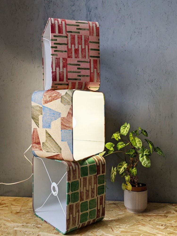
so despite all the miserable nature of the film, i hope that you will still get inspired and will want to explore the work of the real-life hungarians and the real buildings of this era - and find the hope and optimism in the works along the way. i have just got my hands on a hungarian book about marcel breuer from 1970 (when he was still alive) and i will write about this next. subscribe below to be the first to read about this and more brutalist wonders.

INSPIRATION, INTERIOR DESIGN

rounding up the interior trends of 2025

new year, new trends! yes, it’s that time of the year when we survey the home interior decorating trends and pick our favourites, that we simply love or would love to serve. 2025 seems to be the year of big, bold decisions as we move away from overly curated spaces and wavy decor in favour of cleaner lines. is the comeback of brutalism on the cards? here are our picks from this year’s roundup:

indivudalism and creativity

it appears that 2025 might be a year of free-flowing creativity and a definite, distinct move beyond minimalism and cookie-cutter curation. it’s the year to be free and make bold decisions to truly express your individual style. pattern clashing, colour clashing, scale clashing, and bespoke designs - it’s 2025, just go for it! if you want custom printed anything - check out what we can do for you!

statement hallways

yes! it’s confirmed, no more neglected hallways - despite not spending too much time in them, they do tend to be one of the most frequently used, frequently seen parts of the house and it’s time to breathe some life into them, or go all out. make that first impression! and boy do we just happen to have the runners for you!

it’s still earth tones

yes, brown, terracotta, and of course, mocha mousse. jute, clay, warm, soft textures and colours are still very much in. it doesn’t matter what surfaces you use them on they’re all so comforting and calming, a safe haven from the brutal harshness of the outside world. it’s time to use them, really use them bravely and freely!

vintage & retro

this one is a sweet spot at zitozza! we love mid-century modernism and as the brutalist is at the top of the nominations in the award season for movies we keep our fingers crossed this is our time for the style to make a comeback as we have lots of prints to offer. other sources mention the slick, simplified forms of the 1970s and a comeback of vintage furniture - we love seeing it!

at home spa

remember the covid years and the home office? times have changed, we want to rest at home now, and rest fully and in ever-more indulgent ways. the bathroom is a safe haven for the ultimate me-time and if you kept putting off that bathroom renovation or have always wanted the quiet corner, maybe this is the year to do it, and go all-out on the feature tiles, yoga mats and meditation alcoves.

yellow

oh we love this one. aside of the earth tones mentioned above, yellow is promised to make a comeback in 2025 and we are here for it. it is not the shouty, neon yellows we’re talking about here but the soft, inoffensive kind of mellow-yellow that can be applied in large quantities for maximum happiness. we are solar-powered, desperate modernists here who want the bright, cheerful hues here to stay!

-

links:

“yearning for authenticity” central for bolder interiors in 2025, jane englefield, dezeen 24/01/2025

top interior design trends: 15 looks for 2025 - by rachel edwards, house beautiful, 03/01/2025

these 8 interior design trends are poised to be everywhere in 2025, kristen flanagan, elle decor, 09/12/2024

the interior trends to tap into in 2025, kate berrington, net-a-porter.com, 01/01/2025

these colours will be everywhere in interiors in 2025, kerry mcdermott, british vogue, 16/01/2025

BEHIND THE SCENES, WORK IN PROGRESS, MODULAR SYSTEM

new year, new tiles!

happy belated new year i guess, many apologies for making an appearance so late in january - as you know it is an admin-heavy, busy time of year so i will be short and to the point: we’re working on a brand new tileset! i’m so excited to show you these work in progress materials and the launch will be rather special… coming with another exciting news announcement soon! (sorry to be cryptic a bit!)

these tiles will be part of our MODERN collection, to fit seamlessly into the whole system of modular prints with our usual bold colours and our abstract, universal, architectural style - coming soon onto sustainable fabric near your home.

if you’re interested in anything bespoke, please do get in touch, we’d be delighted to hear about your project and print fabrics for your interior schemes.

ARCHITECTURAL HERITAGE, ARCHITECTURE, BRUTALISM, HUNGARY, INSPIRATION

OKISZ offices, budapest, hungary

today is a special day as this is going to be my first ever post about hungarian brutalism. i’m not entirely sure why i haven’t blogged about anything in my home country before - perhaps the pressure to know more about these buildings than i do is too much! but i guess the time has come to present something cool and exciting and interesting - this is one of the more famous ones and as such, an internationally more accessible and digestable example - that is the OKISZ offices in budapest, hungary.

built between 1971 and 1973, this office complex is located in a particularly leafy pocket of zugló, the 14th disctrict of budapest, almost exclusively surrounded by art nouveau villas and churches. the architect is recorded as jános mónus - who won an ybl-award (a sort of hungarian pritzker prize i guess) for the “high quality fusion of structure, technology and form” demonstrated in this very building. the company was ÁÉTV at the time, the state development company (according to the construction archives, operational from the late 50s until the late 90s) tasked to build public-use buildings for budapest: schools, hospitals and of course, offices - this one to house the countrywide union of small-scale industry bodies (the acronym is the OKISZ in the building name) and i’m really sorry that the language of the economic structures of socialist hungary does not necessarily translate too well to my engllish language readers but hey i’m trying my best!

it is a striking, fine piece of brutalism that understands and seamlessly fits into its environment without losing its character, not trying to be imposing without being too modest. a review from 1984 claims - and i’m paraphrasing somewhat, that “it would have been shameless and impolite to try and compete with its surroundings, however you should also live up to such an environment full of notable buildings” and it does do a remarkable job at that.

it has an exciting elevation of five floors stacked upon each-other in a dynamic, stair-like manner and a somewhat L-shaped plan. the facade continues this rhythm of protruding concrete mullions between the slick windows - for those who love this style it’s a bit of a jackpot i think. i went on a freezing cold january day in thick heavy snowfall - the white contrast it created with the concrete was really eye-catching from a pattern point of view too, but it also somehow emphasised the spatial nature of this building.

obviously, this is a textile designer’s blog, so i’m a layperson when it comes to the ins and outs of the structural geniuses of such architecture, but eye-pleasing proportions are, i think, a universal language that can be appreciated by everyone.

brutalism is also not necessarily inherently minimalist, you can notice fantastic details even outside - but this is also an interior textile blog so i was yearning to go inside. even though i could not (in fact, a security guard came out to check what i was up to outside too, haha!) however as a part of othernity, the hungarian project for the venice biennale for 2021, a series of guided walks by the centre of contemporary architecture was organised back in 2020, several bloggers and journalists attended taking amazing photos of the inside. it looks very 1970s, cosy and very socialist (every building in my childhood memories has a similar details or typeface i think!) and it also has one of those ever-moving lifts that we call paternoster in hungary.

i’m going to recommend you two of these articles about this walk in 2020, both with brilliant photography - first hype&hyper (if you don’t know them, please get acquainted with this comprehensive cultural quarterly focused on eastern europe.) and also check out the blog post from welovebudapest, with fabulous indoor shots including of the roof terrace.

for the floor plan and elevations, and an interesting drawing on the accompanying furniture design, please see the previously quoted lechner centre article, it’s very insightful! the reason for this many resources available on this particuar building is of coruse the venice biennale project for 2021 - this building was one of the 12 selected to represent the hungarian pavilion. all 12 were focused entirely on this particular era of architecture and architects of our surrounding countries were invited to participate in their re-interpretation.

despite this celebratory re-discovery happening, brutalism in hungary is quite endangered and none of these buildings are under listed status, however many are loved and used and perhaps the attitudes are changing somewhat. after years of the somewhat over-politicised and emotionally fuelled attitudes the architecture of the socialist era in hungary, it’s refreshing to see it getting more appreciated and putting some of these buildings into a more recognised place. i hope to bring you more examples of hungary in the future.

if you liked this blog post, why don’t you subscribe to my monthly newsletter below to be the first to read our latest musings and updates.

-

links:

bejártuk az OKISZ székházat | othernity - by kitty mayer for hype&hyper, 30/06/2020

megszeretni a szocialista korszak építészetét? – a zuglói brutalista: avagy az OKISZ-székházban jártunk - by dorka bartha for welovebudapest, 01/07/2020

“betonba foglalt álom” – az OKISZ-székház” - by ágnas jancsó for lechner centre 13/04/2024

KÉK - centre for contemporary architecture

DOK - contstruction documentation and information centre


INTERIOR DESIGN, INSPIRATION

5 interior decor tips for autumn – refresh your home with cosy layers and bold statements

it’s been a while since we last shared some interior tips but i do always enjoy this time of year for a good old fashioned clearout. in light of that, as autumn settles in, i think it's the perfect time to look at how to introduce bold patterns, deep colours, and plenty of cosy textures - of course with that flavour of modern architectural twist to seasonal decor. below you'll find some inspiring ideas to create a space that feels both snug and strikingly stylish this autumn—featuring our pattern blocks for a fresh architectural edge.

1. large scale, abstract prints

it's dark, it's cold, it's depressing, boo! i always thought autumn is an ideal time to be daring with your decor, and adding bold, abstract prints can cheer you up instantly. our newest TÉGLA tileset offers a modular way to introduce strong geometric patterns inspired by architectural forms. whether it’s through a statement rug, a striking lampshade, or a patterned cushion, these bold prints can bring a somewhat rigid, yet still very playful vibe to your living space. they’re perfect for adding a contemporary edge to classic autumn decor.

top tip: opt for a large printed rugs to ground the space and provide a stunning visual anchor for the room.


2. warm, cosy hues

cherry red is so in this year! and i don't know about you but this year in scotland we've been really lucky with a dry, sunny autumn that highlighted the rich foilage for us. nature's colour palette is all about deep, warm, earthy tones, and incorporating hues like burnt orange, terracotta, warm ochre, and rich burgundy creates an inviting atmosphere. layering these shades with neutral tones—like warm beige or soft grey—can soften the look while still making a bold statement.

top tip: mix and match textiles in complementary colours and patterns. try adding one of our cushions or kitchen towels in a bold burnt orange print to bring warmth to your space.


3. mix and match your layers

as the temperature drops, layering becomes essential—not only in your wardrobe but in your decor as well. this season, focus on combining different materials for a rich, tactile experience. our latest rugs, made from heavyweight jute, bring a more textured and rustic feel, perfect for the colder months. pair these with softer fabrics like wool or velvet to create depth and contrast.

top tip: place a printed jute runner in a hallway or layer it over a larger, softer rug for an added cosy effect that feels as good as it looks.


4. light, light, light!

the clocks have just gone back and far up north it means very, very early darkness unfortunately. in these circumstances, lighting becomes a focal point in autumn decor. you can create some really dramatic lighting effects with our architectural lampshades, designed to cast beautiful shadows and enhance the warmth of your space (especially the jute ones). look for lighting with warmer bulbs to create a cosy glow, or use your lamps as accent pieces that add a bit of visual intrigue during the day.

top tip: place a statement lamp with one of our geometric-patterned shades in a dim corner to create an eye-catching focal point and add warmth to the room.


5. make a bold statement

so this is something a bit leftfield, but if you really need that mood boost, then this could also be a great time to experiment with printed linen curtains, or even a statement wall. use our TÉGLA block prints to craft your own unique pattern, mixing and matching colours to suit your personal style. every piece in our collection is designed with versatility in mind, so you can coordinate different prints and sizes to form a cohesive look that’s bold, warm, and entirely your own.

top tip: why not try a bespoke wall hanging on our recycled linens? textured walls are so in this year - a large hanging would be simply a tactile way of introducing an exciting architectural pattern on a feature wall.

don’t be shy and bring out the bold side of autumn, and let your home reflect a cosy yet striking style that’s uniquely yours with our prints.

if you want more inspiration straight to your inbox, you can sign up to our monthly newsletter below - it comes with a free gift every month!

SCOTLAND, INSPIRATION, TEXTILE INDUSTRY

festive market announcements!

hello again, it’s been another busy month. i’m so sorry to do this to you in october, but my festive calendar is full and i thought it’d be important to share it for those who might want to come and touch some zitozza goodies. at these markets you’ll find a lot of things that are on the website, but also framed prints, little cards and of course, the bargain basket full of our end cuts, which are only available in person, so it is definitely worth coming.


23-24 november - crafted @ dca dundee

152 nethergate, dundee, dd1 4ea - 11am till 5:30pm

we’ll kick this off with CRAFTED at the dundee contemporary arts. i do absolutely love this venue and i’m delighted to be returning for the third time to this amazing creative hub where i always enjoy meeting like-minded people and it's such an impressive gallery setting too.


1 december - v&a dundee winter design market

1 riverside esplanade, dundee, dd1 4ez - 10am till 5pm

i’ll stay in dundee for one more day - i am absolutely thrilled to be included in this winter's line-up of tea green events or the sunday at the v&a dundee. i had an absolute blast in the summer here, i met so many talented new designers and gained so many new fans that i just can't wait to return for the festive period!


7-8 december - great northern contemporary craft fair - online festive market

this is going to be something completely new to me! i've never participated in anything like this before so i’ll be excited to be sharing more information soon as i’m trying to get my brand known outside scotland and make new friends south of the border!


13-14-15 december - bowhouse winter market

st monans, fife, ky10 2db - open from 2pm till 8pm on friday 13th dec, then 10am till 4pm on saturday and sunday

for the last christmas weekend, it'll be time to come home to east fife and meet my local neighbours here. i can't wait to meet you all this winter! do come, see, smell, touch and buy some amazing brand new prints - old favourites and some new gifts too.

*** important notice *** last christmas orders are to be placed by 15th december. anything made to order must be placed before the 9th in order to be made and shipped. the studio will be closed from the 21st december until 6th january. orders placed during this time will be fulfilled afterwards.

can't wait for it to kick off - yes i am eating my porridge as we speak!

BRUTALISM, ARCHITECTURE, ARCHITECTURAL HERITAGE, SCOTLAND

the savoy centre, glasgow

hello again - long time no see and long time without hugging some concrete! this month we finally brought to you TÉGLA, our brand new tileset (after many, many months of work and preparation). these were all inspired by brickworks and facades found on so i want to show you a building with an interesting texture and facade that reflects that inspiration. besides, i think we do deserve a trip now, don’t we? so let’s go on a short but sweet one, just to glasgow - as we’re visiting the savoy centre on sauchiehall street.

quite a striking example example of 1970s brutalism, it was built between ‘71 and ‘79 and designed by gavin paterson & sons, on the ruins of the old savoy theatre. it now consists of a shopping centre complete with an indoor market, and an 11 storey office block.

obviously, the purpose of writing these blog posts is to celebrate these concrete designs and bust thay common myth amongst the naysayers that these are depressing buildings - on a particularly overcast day in the glasgow winter it does unfortunately seem to be a bit of a task. rain-soaked or not though, the building has an impressive, exciting looking elevation walking up on hope street (connecting sauchiehall street and renfrew street.)

the glasgow weather must have been considered as the concrete clad facade is somewhat protruding, offering a bit of a shelter above head-hight. the cladding features a concrete pattern of narrow vertical rectangles, with a beautiful relief of the centre’s logo (in a typographic design of what i assume must have been, or perhaps inspired by the original 1910s theatre’s.) this logo repeats on the renfrew street side too, painted in blue - a fresh touch of colour amongst the imposing concrete.

the protection from the elements continues as there is a fully sheltered footbridge connecting the north side of renfrew street - taking you right to the first floor of the building. i did not manage to get inside, however i’m told it’s been refurbished and there are plans to further regenerate - not without controversy. you can follow this excellent and insightful timeline from glasgow heritage (who do happen to run a brutalism-related exhibition at the merchant city as well!)

the 11-floor office blocks towers above the more horizontally laying front of the building - the neatly arranged windows do make inspiring patterns (you might discover them on our printed goodies i’m sure!) - it’s a beautiful and interesting building that makes its surroundings a little bit more exciting.

if you enjoyed this trip, go visit yourself and join us on our next trip - subscribe to our newsletter below.

-

links:

glasgow heritage on the savoy centre

SOSbrutalism on the savoy centre

brutal glasgow exhibition by the glasgow heritage trust

WORK IN PROGRESS, INSPIRATION, BEHIND THE SCENES

zitozza turns 4! throwback time...

hello again - loooong time no see! i do apologise for having disappeared quite a bit. the studio has got somewhat busier but all in a good way, with markets, beautiful bespoke orders and of course, the launch of our brand new tileset (it is definitely coming in september, promise!)

what also seemed to have completely past us by, is the anniversary of our website’s launch, on the 15th august, 2020 which was already four years ago would you believe? throughout this time, this blog has grown quite a bit, so i thought it’d be a good occasion to let you in on the origin story if you’re interested.

i actually didn’t have a clear idea what this will all be when i bought the domain for zitozza in 2018, i was just working in the netherlands at a renowned design agency on a huge interior design project with a lot of italians, and one of them used this nickname for me. i thought it sounded fun, italian and designery - i could certainly see the word “zitozza” on a showroom in milan for sure (don’t laugh, it’s okay to dream - it might still happen one day!)

our first ever prints forming a placeholder background for our website before launch

indeed it was a hyper inspiring and stimulating environment and only a year after finishing my masters i was still full of dreams and ideas, although i was not quite sure what i wanted to do yet. something something brutalism, because i’m me, something something jute, because sustainability, and something something block printing because i already had some printing blocks cut for uni and i didn’t want to stop using them (because it’s so much fun)

the interest in jute and block printing came earlier, at uni, in 2016 when i had undertaken a research project about industrial heritage and dundee, because it was easier for me to research locally than to do something at the borders (i was already living in fife and working as a graphic designer.) because i was a graphic designer, i wanted to print digitally on jute, but i was warned it might not work as it is very fibrous and the printing assistant was worried about messing up his printer and that in turn got me worried about not making my project so i had a “plan b” and i quickly designed some printing blocks to get made as that seemed the easiest thing to do at home during an all-nighter should i need to…

digitally printed jute for dundee heritage project

block printed jute for dundee heritage project (created as "plan b")

block printed jute inspired by industrial landscapes

in the end, the digital printing worked out but i fell in love with the block printing process and simplifying designs into a system of elements. i loved this process so much that i used the same material and the same process again for my final masters project, the “anthropocene” treble collection. „GRIDS”, part one of three used a fresh set of industrial and traffic and logistics inspired printing blocks on jute - it was quite successful and i finished uni on such a high that lead to the amsterdam job straight away - yet somehow i still felt that i was not done with these blocks.

then of course, lots of things happened, i came back from the netherlands and found myself in 2020 when we all had to stay at home. i decided to think about it as the perfect chance to do something i always made vague steps towards but never really managed to finalise. first i took a colour and shape research in the form of embroidery, because during those times we couldn’t even travel anywhere to take photos. so i dyed some yarn and i finished an 8-part series of mini-tapestries which you can find today in the wall-art section.

then i organised my existing printing blocks and i decided to complete both the first bit, from the dundee heritage project which became the HERITAGE series, and the smaller 10×10 additions to GRIDS, which became the MODERN series, and with a lot of colours i printed day and night until the house was chocka with jute and we had to move where we now have a studio with an actual printing table (as opposed to the kitchen floor), a website, a few stockists, been on telly and some magazines and hopefully continue growing into something really quite cool and interesting to many more homes! 

anyway, this is kind of the origin story of zitozza. the rest is not yet history because it’s only just started! after just four years, the rest is still the present and the future.

SCOTLAND, SUSTAINABILITY, INSPIRATION

zitozza back to the v&a!

apologies for another long(ish) break between blog posts - it’s worth the wait though as we have a fantastic announcement to make!

we’ll be back with tea green events to the v&a in dundee this summer. you can find us for the whole three days from friday to sunday with the usual high-quality line-up tea green likes to curate.

do come along and treat yourself to something nice - see you soon!

ARCHITECTURAL HERITAGE, ARCHITECTURE, BRUTALISM, INSPIRATION, SCOTLAND

concrete designs to thrive - zitozza at the briggait!

hello again - we have some more exciting brutalism-related news to share! zitozza are proud to be involved with a new exhibition, part of a wider series of events called concrete designs to thrive, exploring how good design can keep a city can fit and well, curated by journeys in design - with city walks, talks, workshops and exhibitions.

you can join the glasgow green and grey walks - sunday strolls around one of glasgow’s favourite parklands, to spaces and places with fascinating heritage, talking en route about thriving in the city (this walk was developed and delivered in 2023 with the help of a small group of guides with experience of homelessness); 2-4pm sundays 16th and 23rd.

we’re thrilled to be a part of the materials and modernism exhibition featuring the work of five scottish creatives, all inspired by modernist architecture, offering key works in mosaic, wood, ceramic, cast concrete and printed textile (that’s zitozza!); open 10am to 4pm monday to friday at the briggait in glasgow, from 12th - 27th june - please do come and visit!

part of this is also design for a city, fit and well - the latest in a series of twilight talks, when an expert panel presents the case for retrofit rather than wrecking ball, remodelling, repurposing, and reclaiming for the better. Extra time and refreshments will enhance the chance for good connection on the evening of thursday 20th june at the briggait.

finally, a call out to help craft healthy city, healthy citizen  ‘zines in a set of wednesday workshops at the briggait, exploring well-being and urban design in ‘zine format, to include use of printed smart phone pics captured by our walk participants, posted using the hashtag  #concretescotland, 2-4pm wednesdays 12th 19th and 26th june.

journeys in design founder dr john ennis said, “it’s a privilege to bring our concrete designs to thrive to the heart of glasgow in 2024 and to collaborate with such a diverse array of designers, artists and producers around glasgow green and the briggait: it’s very clear why this park and this venue are such treasured parts of the city’s culture.”

ARCHITECTURAL HERITAGE, ARCHITECTURE, BRUTALISM, SCOTLAND, INSPIRATION

8 roxburgh place, edinburgh

hello again, believe it or not, it’s been another month and a very, very long time since we posted anything architectural or photographic - things have been busy but actually, we needn’t always go on a long, exotic journey to find some good, inspiring facades. for this short little trip, we’re staying in edinburgh today to look at another student accommodation.

the building is at 8 roxburgh place (on the corner of west adam place), you can get to it by walking up the stairs behind the dovecot (this is very specific but if you’re a brutalist textile lover, it’s a highly recommended double trip to the textile studios as well as this concrete monster!)

the building belongs to the university of edinburgh and i can’t for the love of my life find the architect! if anyone knows, do reach out. i’m guessing it was built in the 1960s and recently renovated. by all accounts it is rated highly among students, mainly for the excellent location and the stunning views of the city, and i have zero doubt it’s an absolutely brilliant experience to stay there for your studies.

this is a textile design blog though, so as usual, we’re here for the patterns and the facade does not disappoint. it’s only five floors tall so it’s not an imposing monstrosity at all, and the human scale is made evident by the large window panels and the even facade - all floors are the same height, there is not a grand entrance or an all important ground floor, the seamless repeat of windows start immediately off the ground.

the near-square shaped windows sit in rounded rectangles with some relief details above them and it makes me imagine it inside in the style of futuristic space capsules. this panelling continues on all elevations, even without windows, the details are there, which is quite obviously a pleasing sight to the pattern lovers.

there is a bit of an extrusion on the front side, and due to that, it looks like there is a bit of an offset to the grid of windows, which breaks the monotony a bit and brings some excitement to the facade. i enjoyed walking around here - there is another lovely brutalist gem right across it, a university teaching centre recently renovated by reiach and hall. surrounded by the medieval churches of old edinburgh, they don’t look out of place at all in this living, breathing city.

if you liked this short trip, why don’t you sign up to our newsletter below to be the first to read these blog posts! (it even comes with a free poster you can print at home!)


if you came here looking for ideas
for your student accommodation,
come and browse our shop!

*** 10% student discount available ***

get in touch to postbox@zitozza.com
to get your unique discount code!


BEHIND THE SCENES, WORK IN PROGRESS, MODULAR SYSTEM

new tiles coming soon...

it’s been a while since we made a blog post about anything happening at the studio, because, well, it is a well oiled machine now of things getting designed, printed block by block, then made up and sold… but even with our modular system and infinite possibilities, it’s good to refresh things from time to time and add new ingredients to the well-liked recipes. so we’re working on a brand new tileset - see a little glimpse below!

we’ll be working on some brand new prints with these in the coming months - of course, these tiles will be part of our MODERN collection, not just creating a beautiful collection on their own but working well with more than a hundred of others, extending the possibilities for ever more varied patterns.

if you’re interested in anything bespoke, please do get in touch, we’d be delighted to hear about your project and print fabrics for your interior schemes.

if you got curious about our new stuff - just bear with us while we are putting them together please, you can be sure they’ll arrive in beautiful, bold colours and our signature architectural style! do watch this space…!

INSPIRATION, SCOTLAND, TEXTILE INDUSTRY

exhibition recommendation: andy warhol's textiles in edinburgh!

hello again, long time no see, another month went past so quickly. of course, we were quite busy getting our new lookbook published, but even amidst the busiest periods it’s important to make time to get inspired. i thought that i’d recommend something a bit different this time - we aren’t going to recommend a building (well, yes, sort of) or a book (well, yes, sort of…!), we’re going to an exhibition - to my favourite venue in edinburgh - the dovecot studios!

if you’re in scotland, and are into textiles, it’s an absolute must to visit this tapestry studio (chances are, we might have met there as it’s also my favourite place to exhibit at fairs here!) and this spring they have prepared something quite special for visitors - andy warhol’s textiles!

it’s not the first time i saw some them in scotland - a few years ago a wonderfully curated exhibition of artist’s textiles took place in new lanark, which included his work as well as fabrics from picasso, dali and miro amongst others. i remember it being quite large and certainly beautiful - a rich journey into textile designs by artists we mostly know for their paintings and sculptures. this one is based on a similar concept - we all know andy warhol the pop-artist but how much do we know of the textile designer?

the dovecot curated it into a smaller and more focused exhibition that goes through his commercial textile designs. if you’re familiar with his logos and other commercial work, you’ll instantly recognise the easily reproduceable, wet inky screen printing style that marks all the exhibited textiles. the exhibition details this process a little bit if you’re not familiar with it, as well as shares some of the commercial background of the textile businesses these were produced for.

it really is a joyful ride with conversational patterns - mostly on 1950s and ‘60s fashion pieces. you might have seen the button prints before, but there are brooms, pretzels and gardening tools too… and it’s also quite interesting to look close-up and see the graphical quality of the designs. it is also a journey into how the textile industry used to work just a few decades ago.

i have not taken many photos at the gallery itself as it’s much better to look at it in person. however i did buy the big book (i do not often do it after exhibitions) to remind myself of these patterns from time to time.

go go go and see this - highly recommended! until 18th may.

-

links:

andy warhol - the textiles at the dovecot studios

SUSTAINABILITY, TEXTILE INDUSTRY, INTERIOR DESIGN, INSPIRATION

the key interior trends of 2024 - bold prints are here to stay!

it’s february again… and it seems to be a particularly grey one, but that just makes it perfect time to read about decorating trends, colours, patterns and all the fun stuff. and, as we do it now every year, we’ve collected the main trends to focus on so do join us on a trip into the hottest new interior trends.

1. bOLD colours and brave combos

at zitozza, we have been waiting for this moment for a looong time, but even for the minimalists, it’s probably a good time to say goodbye to the all-beige aesthetic and the grey everything. in the mid-2020s, we are in desperate need for mood-boosting colours and the stranger, and more eye-catching, the better. close the itten book, there are no rules, more is more - we’re getting ready to make some bold, wild prints on new interior fabrics and we cannot wait.


2. hand crafted statement pieces

we have discussed this before - sustainability is not a trend, but an imperative for all industries now, as it should be. for sure, sustainable design processes and practices can be interpreted in many interesting ways and many are slowly seeping into interior trends. one that’s here to stay is how the luxury statement pieces now mean the high-quality, handmade objects made by artisans. exquisite hand crafted details, small imperfections, material honesty - what’s not to love and do we have the rugs for you!

3. luxury gezelligheid

this one is an entirely biased inclusion in the list since zitozza are dutch lovers, but that thing that house beautiful calls “cosy, quiet luxury” and those “real and memorable spaces” dezeen refers to - the dutch have a word for it and if you ever went through a bit of a hygge phase, you need to learn to say gezellig.

it means so much more than cosy - it is a social and friendly kind of contentness. in the home, it may express itself in the shape of ambient lighting (think about our jute lampshades!), warm, tactile textures (think of layers of rugs on the floor!), and open, inviting, sociable spaces ready to be filled with warm conversations. naturally, this means high quality, long-lasting materials and finishes as time well spent is the real luxury now!

4. BROWN (FOR real!)

no, it is not the 1970s anymore, don’t worry. that kind of brown is not making a new comeback. this is a grown-up version, evolved from the earth tone trends we’ve seen in the last few years. at zitozza, we’re particular fans of the almost-black kind of espresso browns, and elle decor mentions chocolate hues, but if that’s not your thing, woods and finishes such as shou sugi ban may bring that tone in your home by more natural means.

5. stripes and checks

nothing we love more than patterns, of course and we’re so glad seeing them mentioned by vogue. horizontal or vertical, or have them clash and make a chequerboard - that’s right up our alley as our modular system of printing blocks can make up similar effects with that unique hand crafted appeal and we cannot wait to bring more of these prints to life - stay tuned!

6. mix and match

as we are all about tactile prints, we do always embrace a version of this kind of trend, but this year it really means a mix and match of all sorts of surfaces and patterns. textured walls are definitely a thing this year but it means a play with hard finishes - metals such silver and gold accents (and yes, stainless steel!) but also, of course, mixing coarse textiles (such as jute) with some soft linens too. exciting times!

if you’re ready to find something for your home, have a browse through our shop or request a sample to see what we’re able to do for your home!

below the articles we sourced these from are linked for further reading, and if you want to be the first to read about sustainable home decor and textiles, subscribe below (it comes with a freebie every month!)

-

links:

12 interior design trends we’ll see in 2024 (by amanda lauren, 4th january 2024, forbes)

maximalism to make way for “quiet refinement” in 2024 say interior designers (by casja carlson, 5th january 2024, dezeen)

5 interior design trends that will define 2024 (by sarah archer, 26 december 2023, architectural digest)

9 interior design trends to watch in 2024 (by david nash, 4th december 2023)

12 interior design trends you’ll see everywhere in 2024, according to experts (by medgina saint-elien, 9th december 2023, house beautiful)

the interior trends to know in 2024 - and what’s on its way out (by elise taylor, 4th january 2024, vogue)

the interior designs we’ll be seeing everywhere this year (by eleanor cording-booth, 27 october 2023, house and garden)

ARCHITECTURAL HERITAGE, ARCHITECTURE, BRUTALISM, INSPIRATION

the barbican estate, london

as we are cracking on with 2024, i’ve decided that of the many architectural inspiration series we planned, it’s probably best to tackle the beast first and share some images and thoughts of the barbican estate in london. i’m calling it a beast because it’s an enormous, expensive and very well-known icon of british brutalism. for this seasoned concrete-hugger, it then makes no sense to keep postponing this blog post any further (especially as our rug already exits and more stuff might come soon…), so do come with us to explore the place from a textile designer’s perspective.

i guess everyone somewhat interested in brutalism knows some of the basic facts - designed on a 35-acre ww2 bombsite by chamberlin, powell & bon for the corporation of the city of london, it opened its first flats in 1969 but the completion of the construction only really finished in the late 1970s, after a long and expensive process and it is now home to approx 4000 people in 2000 flats. of course the uniqueness of the estate comes from the fact that unlike many other brutalist projects in the uk, it was not built for social housing and the architects were not held by the typical council budget restraints -which resulted in one of the most free and complete architectural visions, achieved by some extremely time consuming and labour intensive processes.

if you want to know about these in more detail, my first recommendation is raw concrete by barnabas calder. quite early on in the book, he has a brilliant chapter about the barbican, with some focus on the social context around it, from conception throughout the whole of the construction process which makes for a very informative and interesting read as it touches on some of the tensions throughout the whole process of building it. he provides an important angle that does not often get mentioned on design blogs like these, as we tend to get lost in the form and the aesthetics - with good reason of course, but without context it would become rather meaningless.

i first visited a couple of years ago and the first thing that really affected my perception was its sheer scale. of course it is at this enormous scale that these visions for the order of forms work the best, and i think this is why it’s such a brutalist mecca here, the complete, intact and vast system of space. i don’t exactly know where my search for a geometric order comes from, all i know is that the deceptively monotonous facade of the terraced blocks (arranged in neat squares of course) gives me a sense of enclosed cosiness and open clarity at the same time. in every one of these blog posts i’m attempting to describe this feeling but it’s so hard to explain - there is just this sense of calm that i only find in places such as this.

the three 42-floor tall tower blocks bring some exciting angles with a lean, triangular layout and column of balconies tightly stacked into the sky. of course, the repeating geometric forms serve a textile pattern designer well. it really helps that i visited on a sunny day and the shadows projected on the surfaces aid the imagination in reducing these sharp angles to two-dimensional shapes. but the surface itself, the slate and hammered concrete texture that really is on every surface, is equally important - i always say that i want the weave of my cloth to resemble the raw concrete itself, and the pattern to play with the form.

to explore a bit more about the material and the techy bits of the architecture, my second recommendation is my favourite podcast series, about buildings and cities - they have a brilliant episode about the estate, touching on some of these details of the surfaces too as they take you on a journey around the estate. they’re much better suited to explore a more architectural angle than i’d ever be able to so do have a listen to it.

what i found the most surprising about it that it was a lot less grey than i imagined - of course, the concrete surfaces are raw and beautifully grey, and the shapes and forms are varied and playful, but the pavements are tiled with maroon bricks all over, and the ponds with the surrounding greenery reflect with a very strong teal and green everywhere. it is surprisingly colourful and stimulating in its order, the “oasis” comparisons do seem to be very fitting - not in small part due to the tropical garden accessible to residents only.

but we can’t quite go away of course without stepping foot in the arts centre, home to a concert hall, cinema and exhibition halls amongst others. seeing how the columns and the concrete coffered ceilings repeat and continue inside is an exciting exploration that i really enjoyed even if some of might not work that well today or may be in need of renovation.

for the last recommendation, i want to bring you an article from the rics blog, as it’s quite fresh and talks a bit about some of the repairs as well as bringing you some amazing pictures that hopefully will inspire you to appreciate it if you haven’t visited already - and if you have, i hope you’ll now see it from a surface pattern design angle too.

if you liked this trip, you can subscribe to our newsletter below - we’re only sending these monthly with a free downloadable graphic print, and you’ll always be amongst the first to notify of a new architectural journey, or new prints inspired by them.

-

links:

raw concrete: the beauty of brutalism, barnabas calder, 2016, penguin books, london - purchase link to the barbican shop

establishment brutalism: the barbican estate, about buildings and cities ep 4, 2021 - youtube link to episode.

brutal or beautiful? the barbican estate, matthew williams, 2023, modus/rics - link to article on rics.org

the barbican arts centre website

city of london corporation website

INTERIOR DESIGN, TEXTILE INDUSTRY, BEHIND THE SCENES

zitozza in milan!

happy new year! i hope you’re all well and had a nice little break in the weeks before. we’re back, refreshed, rested and ready to rock and roll! the year could not start better as in the second week of 2024, we went to milano home - well, our fabric and rug samples did, with huge thanks to british jewellery and giftware international. amongst these rug samples is a brand new material so it’s a bit of a mini-debut of our super heavyweight jute as well, which will bring you some even more exciting rugs this year, so there’s already plenty to look forward to (not to mention all those other exciting things in the pipeline that we don’t want to reveal just yet…)

so do stay in touch - and if you can, please visit fiera milano - the expo closes on sunday 14th. zitozza’s plinth is found at the british pavilion amongst other brilliant designers and they’re manned by the BJGI team. they have order forms and everything so do visit and get in touch with a sample!

image credit: BJGI

image credit: BJGI

BEHIND THE SCENES, WORK IN PROGRESS

time for a break - and see you soon in 2024!

that’s it for 2023 peeps, time to take a well-deserved break after a busy year. we have a lot of new things planned for 2024 though so do stay tuned as we’re introducing new materials, new collections and new tilesets too! we hope it’s going to be a blast - please, no more “unforseen circumstances”, universe, please! - and we do want to keep blogging too, from interior trends to the loved architectural inspirations as well as the design conversations.

but first and foremost thank you so much for keeping in touch with us, reading our blog, messaging us, buying something bespoke or handmade from us. we are grateful for your business and we hope you keep looking back here. we wish you have a wonderful christmas break, surrounded by loved ones and delicious food - and have an amazing and prosperous new year. see you soon!