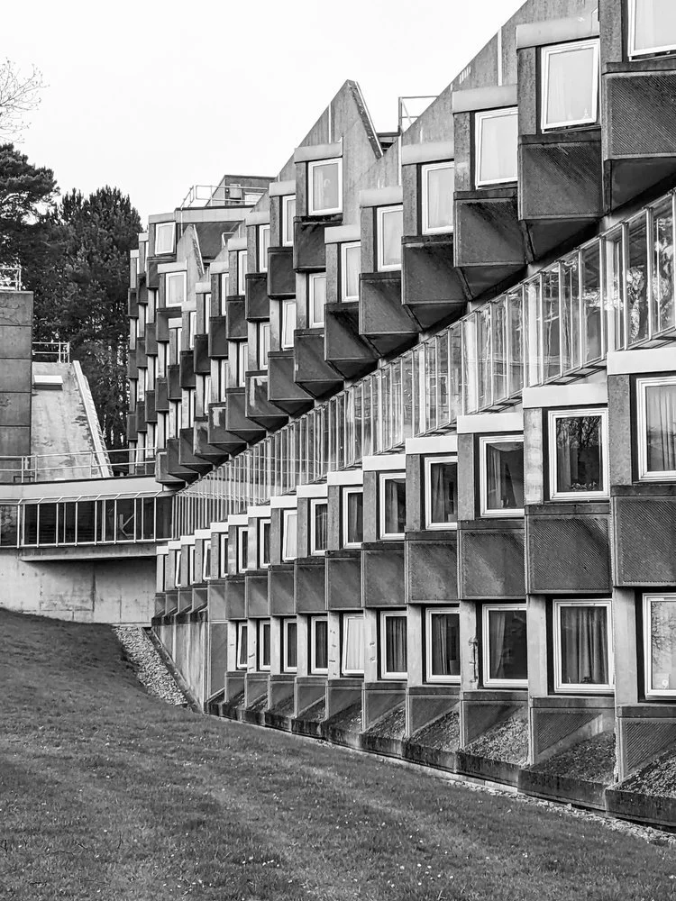
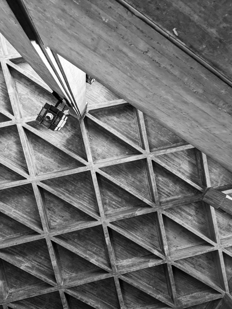
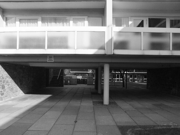
there’s a building here in st andrews that quietly unites two very different worlds: centuries-old academic tradition, and raw, rhythmic modernism. as a textile designer obsessed with surface pattern, i’m always drawn to the overlooked beauty of brutalism — and this particular student accommodation block is a hidden gem. if you're a design student, architecture fan, or just someone who appreciates visual rhythm in everyday places, this short tour is for you.
it has been a month since we last have updated our blog and even longer since we last had a little tour of brutalism… so it is time to get out of hibernation now and get the boots on for some well-due concrete hugging. don’t worry, we’re not going very far - in fact, staying right here in east fife, as we visit one of the student halls of the university of st andrews.
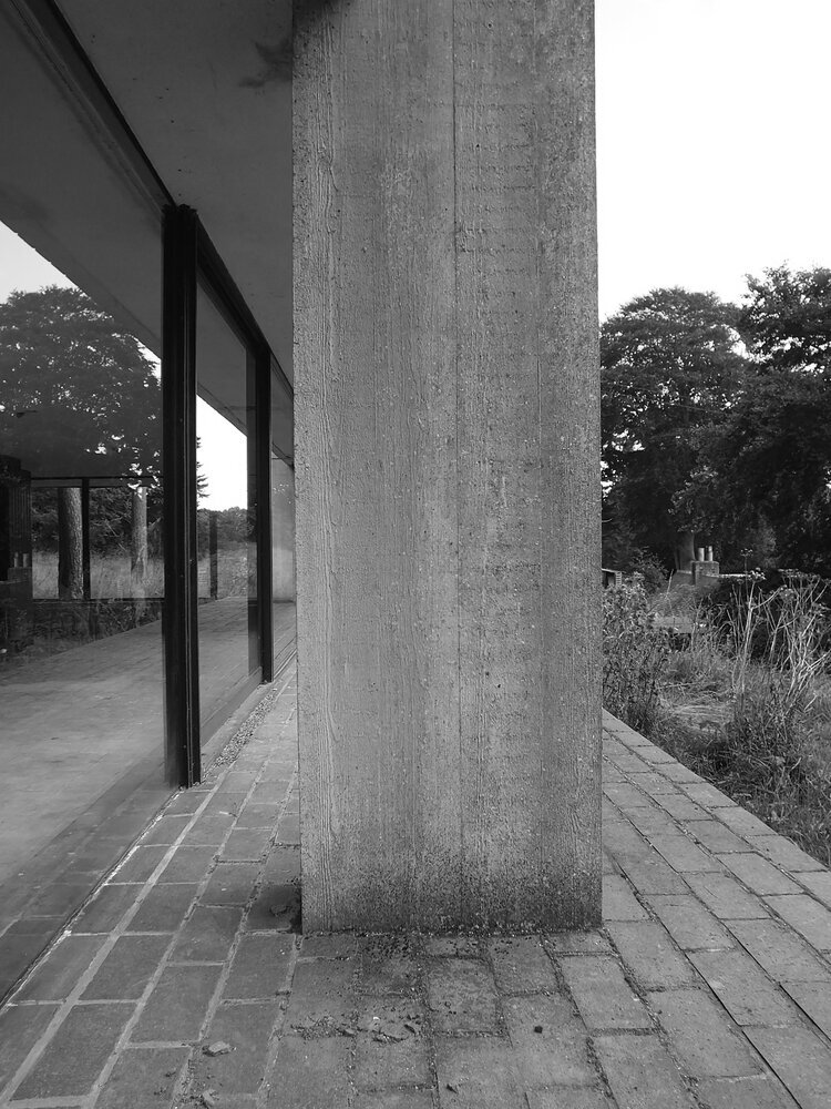
surrounded by lots of greenery in the north haugh, it is a short walk away from the town centre and the golf course. it was designed by james stirling and it opened in 1967 - it is a beautiful brutalist gem in a town and university that’s rather renowned and cherished for its mostly much older architecture going back to medieval times. it was judged to be 12th in urban realm’s top 100 scottish modernist buildings, and it has been category A listed since 2011 - it is a popular building that’s here to stay.
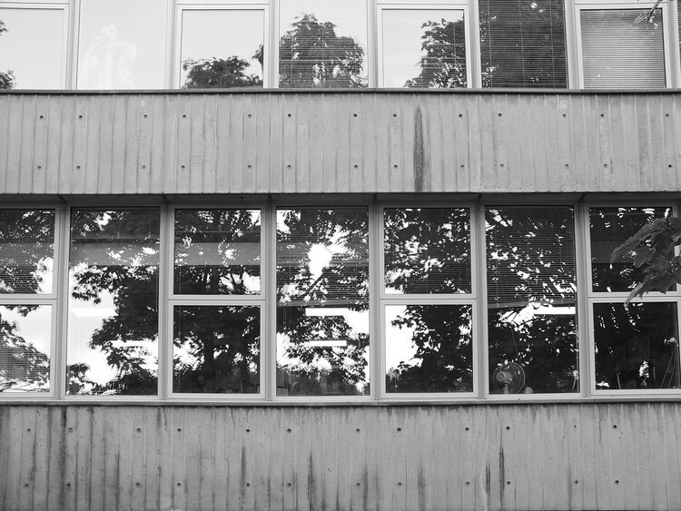
the building has an V shaped plan of two large wings, embracing a relaxing, wide green space in between. brutalism often gets reduced to “grey concrete,” but that’s a shallow reading. here, the design balances sharp geometry with soft landscaping — a vital contrast that creates a calming, grounded space for student life. the elevations of both wings incorporate the increasing ground height as the hill beneath slopes upwards. it has a striking, hypnotic rhythm to the modular facade - the zigzagging row of windows only reveal themselves from the east.
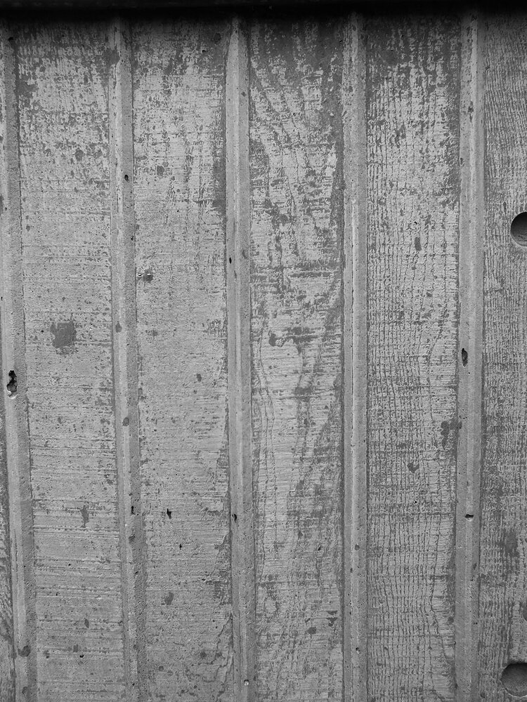
what fascinates me most is the textural patterning: 45-degree diagonal textures rotate across the tessellated concrete panels, forming a two-dimensional zigzag print that almost reads like texture-within-texture kind of printed textile. it’s a modular, repeating geometry — exactly the kind of form reduction that inspires my block-printed designs. apologies for the pre-occupation of the concrete surfaces - this is a textile design blog afterall. i don’t read buildings like an architect; i see them as surfaces. i’m always looking for rhythms, repetitions, and subtle asymmetries that could translate into interior textiles — prints, cushions, even fabric-based wall art. the façade of this residence block, with its directional patterning and textural wear, is a visual goldmine.
it is a busy-looking unit with lots of life - housing approx 250 students divided across five residential blocks. the original plan was for 1000 students but the other buildings planned never came to be.
i did not study at st andrews so i have to rely on the university’s own website for a peek inside. it is much loved by students - partly for its rich social life, but also the quirky, octagonal room layouts. the building’s wikipedia page mentions that the stairwells of three blocks have glass enclosures for natural light, student crowd rates it 7th out of 17 halls at the university and i’d like to think that the architecture plays some role in it too.
if you liked this short tour, stay with us for more inspiration as we plan to visit more sites in the near future and bring you more posts and photos about them - and of course subscribe to our newsletter to be always the first to read! until next time!
whether you’re moving into halls or just need to make your flat feel a bit more like home, our handmade block-printed cushions and fabric prints bring bold texture to any space — with a modernist edge.
🎓 10% student discount available
Email us at postbox@zitozza.com with your uni name to get your code. No minimum spend — just good design, made locally.
february is here and if you’re thinking of any decorating work to be done around your home, you’re probably ready to make your plans soon… so to help you a little bit with that, here’s our yearly research into the interior design trends that will dominate the home styling scene this year!
1. BRUTALISM! embrace raw concrete and tactile, industrial materials
hell yeah! finally, raw concrete is in. in a chaotic world, we need clear and calming interior spaces and this is the perfect opportunity of the bare functionality of brutalist forms to make a come back. so, expose the surface, reveal the structure and get a raw, utilitarian jute rug to to match it (we have just the thingsfor you…!) tactile surfaces have been around us for a while but finally it’s time for the raw materials to shine as they are.
“compared to the past, the new brutalist style results in a softer approach that incorporates natural elements like wood, stones, plants and sustainable materials resulting in a warmer and more welcoming aesthetic.” said giampiero tagliaferri for vogue.
2. BE BOLD AND BRAVE! embrace colours and patterns clashing
this is another one we absolutely love at zitozza - we’re all about patterns and colours here too. this is what house beautiful call ‘dopamine dressing’ and basically means just doing what you like, because it’s your home and your castle and who cares about rules anymore, right?!
so it’s time to dive into all the patterns, all the colours, and all the textures! more is more, less is a bore. it’s time to stop fretting about matching and embrace the clashing.
3. TEXTURES! embrace the tactile surfaces
yes, the bold and brave approach now extends to all the interesting textures too. "the recent pandemic deprived us of one of our most 'human' senses: touch. in response to that, i feel it will become increasingly important for designers to make use of materials that bring tactility to the interior scheme and to devise spaces that provoke an emotion in its users." interior designer tola oluojape told dezeen.
at zitozza, last year we have seriously extended our fabric range and we have a range of different textures from the soft and cosy recycled cotton blends to the coarsest jute and some interesting qualities in-between too, with bold, tactile prints too, to suit perfectly with the “hand-formed” textures trend predicted by elle decor.
4. sustainability! embrace the planet
i have always argued that this is not so much of a trend anymore but an imperative and it’s great to see now almost everyone jumping onboard. designers do have a huge responsibility in making products that don’t cost the earth and do last longer which is what we try to do at zitozza by using a lot of jute (one of the most sustainable fibres in the world) and recycled linens and recycled cotton blends (with recycled polyester and recycled polyester cushion inserts too!)
but it’s not just about fabrics, but a whole range of new materials from mushroom leather (by mylo unleather, as seen on dezeen’s selection), but also my personal favourite: bricks made of construction waste by kenoteq(discovered on material district). it’s genuinely exciting to see what the future brings in new materials to use for building and making homes.
5. HANDMADE! embrace the imperfections
and finally, here’s another fashionable decorating trend we can help you with - to embrace the handmade, crafted accessories with all their imperfections and naive charms. that handmade aesthetic is all over zitozza too, since, well, all our interior accesories are made by hand, slowly crafted with love and lots of passion for colour and texture.
“with thoughtful, sustainable design a key focus for 2023, as well as a nod to more nostalgic designs, these 'trends' will not only lead to us shopping more responsibly, but it will also see a rise in 'shopping small', and celebrating handmade, artisan designs and craftsmanship from all over the world.” writes jennifer ebert for homes and gardensand we take this fully onboard. shop small, buy handmade and cherish the object in your home with the same love as they were created with.
and if you want to stay in touch with the next lot of brutalist, colourful, pattern-clashing, tactile textured, sustainable handmade goodies, then do so by subscribing to our newsletter below and follow us on instagram.have a wonderful year and happy decorating!
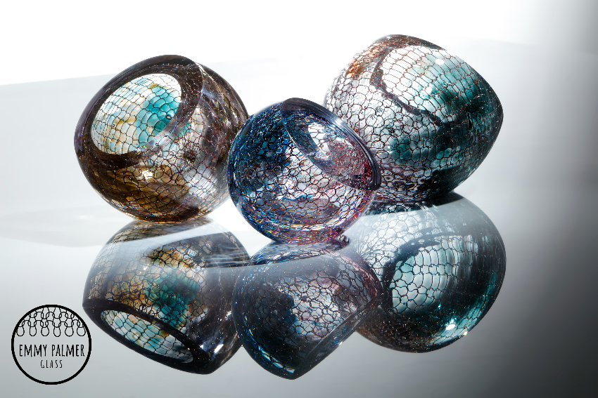
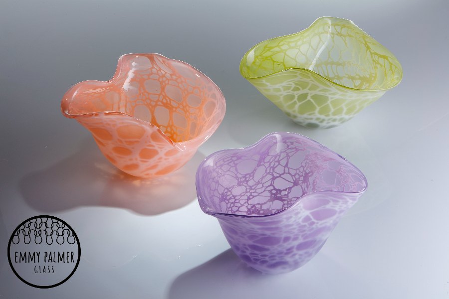
as you may have read before on our socials, zitozza will be on TV soon (i really do hope i can share more information about it even sooner…) and having met so many talented makers from far-away disciplines was really an eye-opening experience - it was only natural to decide to give my design conversation series another boost with all these inspiring people. today we’re going somewhere i’ve always admired but knew very little about - glass! i’m bringing you today emmy palmer, whose colourful and tactile blown glass really caught my eye, and i became really curious about techniques and inspirations.
ZITA: hello emmy, first things first - could you say a few words about yourself, what you do and how you got there?
EMMY: hello zita! throughout my life making anything is where my joy has been, although i never saw my creativity as a career choice until i was in my twenties. this is when i started my journey into applied arts by doing a national diploma in design crafts. i enjoyed trying out a broad range of material practices and learned so many techniques. also during this time i took part in a taster course with a local glass blower...creating my first wobbly glass blobs ignited something in me that has never quenched. in 2004 i moved on to do a foundation degree in applied arts at arts university plymouth (formally plymouth college of art and design). i entered that course very determined to combine large scale metals and blown glass but my learning journey and exploration into what makes me, me, took a slightly different direction, but i'll tell you more about that later. i specialised in bown glass in my second year and followed my foundation with a BA (HONS) applied arts. i was lucky enough during my last year to be awarded a scholarship with teign valley glass studios and have continued a professional relationship with them ever since.
ZITA: large scale metals and blown glass? that sounds awesome, but i do notice you’re doing something different! the very first thing that caught my eye about your work is your use of texture and shadows. i love your use of knitted textiles, i think that’s really unique. can you explain a little bit about your process, what gave you idea for these pieces, and how you work your cloth into the glass?
EMMY: knitting is a huge part of my life not only in my creative practice. i see knitting as a real form of self care, it has gotten me through some really tough times in my life. i love to find new techniques and stitch combinations. you're right playing with light and the shadows is something i love to do. glass bends light in similar ways to water and i love to exploit its refractive qualities. when i moved to plymouth for university, i was so inspired by living by the sea for the first time in my life.
ZITA: i know exactly how that feels, having moved to scotland from a landlocked country… i love glass but i know so little about it - apologies for some of the more stupid questions about materials, but how did you even find out what was possible with this technique? is there anything you have to be really careful with? For instance, can you use anything for knitting, wouldn’t it melt or burn away from the hot temperatures?
EMMY: my knitted work started from very humble beginnings and was a real experimental journey. initially i was combining the glass and knitting by creating cosies for the outside of the glass using different materials. this led me to purposely finding ways of burning those textiles away in the hot glass process to leave residual patterns. somewhere amongst this i started experimenting with oxides and different metals. you're right though, combining glass that in its molten state is 1500 degrees centigrade and metals with a lower melting temperature can be tricky. i had varying results with different types and gauges of wire. my mum has a little collection of wobbly pieces that beautifully illustrate my journey to refining my technique of encasing knitted wire into blown glass. i also use my open lace knits as templates to create some of my work so it appears as if knitting is suspended in the blown glass when in fact the original piece of textile is no longer present. i secretly love how these pieces often baffle people.
ZITA: that’s so clever! i also love the metal bits and i do have a thing for industrial influences – i think my favourite bits from your collection is the ‘del mar’ series, it’s the metallic wires that i’m really drawn to. can you share a little bit about how they were made and what inspired them?
EMMY: knitting and crochet are skills that have been passed on through the women in my family from generation to generation. when i think of my little nanna (who was my mum's grandmother) i see her in her arm chair with a hook in hand and the crochet blanket she is masterfully creating at the speed of light draped over her lap. my foundation degree really made me explore what made me, me, and what i wanted to share with the world. i realised back then how knitting and crochet was actually really fundamental to my creative practice. i also found myself living by the sea for the first time and i was obsessed with the water.
the barbican in plymouth, where all the fishing vessels are docked, with the reels of fishing nets and piles of lobster pots led me to some extensive research into fishermen sweaters. my del mar series was born out of this time in my life. the knitted wire is completely encased between the layers of blown glass and i cut and polish them once cold so that you see a cross section through the piece. it took me a long time to find the right metal and a knitting technique that didn't restrict the glass bubble but stretched with it to a certain extent. they were a real labour of love and were born out of a new and exciting time in my life, so for this reason they are still my favourite pieces to make!
ZITA: theirs is a real success story i think! so is that where you usually go for inspiration? do you have a specific place that can get you in the “zone”, or do you just let ideas find you spontaneously?
EMMY: i'm really in love with plymouth and its surrounding areas, it really is the most beautiful place to live. as a family we spend a lot of time in nature. we have so much around us to choose from and i consider ourselves very lucky and privileged. we live right next to a woodland nature reserve that leads us to the banks of the river tamar. it's a five minute drive to be on dartmoor and only a few minutes more in the other direction to be at the sea. like many of us these days i document a lot of this with snap shots of views and interesting things i see. we live a holiday style life and spend most of the spring and summer months out and about with sand between our toes so i am never short of inspiration. sometimes i find my ideas by accident, i make something and i think of how it could be improved or tweaked and this leads to other ideas.
ZITA: if you were a textile designer, this would be the bit where i’d ask about sourcing sustainable materials but i know so little about glass. what would you say are the biggest challenges of turning your ideas into these fabulous pieces? how has glass blowing been changing?
EMMY: glass blowing has essentially been done in the same way since the romans. the basic equipment and techniques are all the same but the fuel has changed. most studios run on gas and this is becoming economically difficult and unsustainable for the future. very recently glass studios all over the country have been closing down or temporarily shutting down their furnaces due to the rising cost in fuel and with this the idea of glass blowing being a dying craft is seeming all too real. fortunately, with technological advancements there are some great electrical alternatives being produced and in fact the furnace at teign valley glass studios where i work is electric and most recently they have been trialling a prototype glory hole which is the heat chamber that we use to keep a piece warm and workable.
ZITA: i met you at the filming of our new TV show, and for all of us it’s been quite an intensive journey with the help of a mentor. how did you find this process? can you share a little bit about how you have developed your work and maybe about some of the new pieces? (no spoilers, please!)
EMMY: it really has been such exciting times and it was a joy to meet such amazing creative individuals like yourself. the show gave me the kick up the bum that i needed at just the right time. i think we all must have done a year's worth of work within a few months. i definitely felt a tad frazzled at times but hugely empowered by the end of filming. my mentor was a real task master but he is a real inspiration and made the whole process really positive. the show hasn't even aired yet but has already given my business a massive boost. i've already worked on and sent bespoke samples to a retailer and received my first big order!
ZITA: that’s really exciting, congrats. i hope to see your work shared widely! have you got any new ideas you’re working on, or experimenting with, that might turn into your next collection?
EMMY: yes definitely! i have so many exciting ideas that i've been sitting on, i am determined to put a little more time aside to play with colour combinations to expand my KOPO (knit one purl one) range. i'm quite a colourful person and i use a huge amount of colour in the clothing that i knit and wear. i would love to bring some more of that into my creative practice.
ZITA: and now the question i ask from everyone - can you recommend a book? or an artist or a maker whose work is worth looking into? something that keeps you thinking or help us see the world the way you do?
EMMY:richard glass is an aptly named glass blower/designer that i have the pleasure of working with over many years. he is an under celebrated glass maker who designs and makes a huge variety of glass that is sold internationally. his work is often sculptural, colourful and very much inspired by our local surroundings. i love to see him making his ‘waves’, the process is so dynamic and the results are beautiful. richard runs teign valley glass studios where i produce my work and he has been so supportive throughout my glass career and especially since i started back in september last year. not only is he a great glass maker but he is also actively working on sustainability in glass blowing by exploring electrical options. he is also launching his own range of glass blowing irons. he'd be the last person to shout about his own achievements but is definitely an artist to look into.
ZITA: i will do that, thanks for the recommendation! and lastly but most importantly, where can we see your work now, and where will catch you next?
EMMY: There are a few places i can't share because i'd hate to spoil the TV show for you. i have had some busy and exciting times recently. my work is already stocked by a number of wonderful galleries and retailers i will soon have a list of these on my website but you’ll also get to see me with my work at a few places this year and I’ve already planned ahead into 2023! i’ve been working with a wonderful mother and daughter team georgie and tara rowse at curator & maker. i've had the pleasure of making bespoke sets of nutcracker inspired baubles for their christmas pop up 2022. this opens on november23rd until december. i’ve been making some lovely gift size items for the ‘present makers’ exhibition at thethelma hulbert gallery, honiton. this runs from 12th nov to 24th december.
i’m looking forward to 2023 in march where amongst other things you will find my work at the affordable art fair in battersea with BANG blackstone art next generation. and also me and my work at crafts festival cheltenham town hall10th-12th march.
it’s becoming a busy autumn / winter season here for us at zitozza, but we do manage to escape on the occasional break to take an inspirational trip to admire some great architecture and forms. there has been a recent trip to lisbon, portugal, and we have some fabulous brutalist buildings to cover as well as the country’s signature tile designs - surely that requires an article at some point in the future.
but we can start with an easy one, a true little 1960s gem in the heart of the city, a five minute walk from the square of marques de pombal, there is a little brutalist church in amongst the residential buildings - the sagrado coração church, on rua camilo castelo branco. it is hard to see it is a church from the outside, as it stands on an elevated level from the street, with stairs inviting up to a square embraced by offices and some residential units. on the sunny day of the visit, it felt like a relaxing island just off the busier streets, but it was by stepping inside it revealed its wonderfully peaceful and serene atmosphere.
inside, it is clear what the architects - nuno portas and nuno teotónio pereira - were trying to achieve. the use of concrete is consistent, but not in an overwhelming, intimidating way as the material is broken up and softened with textures. the wall has a bricklay texture to it, while the ceiling reveals an even rhythm of the angles of the structure. the ceiling does not seem to be at an uneasy height, yet the smoothness of the columns do make it appear quite heavenly.
it is however the light, that seems to play the main role of bringing the spiritual and the godly inside. the light comes in at angles that must have been very carefully designed and is parallel to the staircases, casting shadows on the textures inside, while at the chapel it comes through unfiltered and in full, as if it was almost ready to listen to the prayer.
this article on hidden architecture has the floor plan (along some sketches by the architects too), and it does reveal the scale of the open space, and the even proportions unlike the traditional aisles. the sketches also reveal the careful planning of lights and shadows - its role in reaching some kind of spiritual peace is universal and not dependent on religion, just think of junichiro tanizaki.
this church isn’t dimly lit, or dark, nor is it overwhelmingly clear and bright. concrete has its reflective quality on light but also has its own texture to break it, which the architects also played with here by adding more, and the artificial lights are also carefully placed to interact with it. atlas obscurarecommends a visit during night time too, to experience the different light circumstances.
lisbon is an amazing city and churches are found from every style and era. its famed cathedral is almost a millennium-old and some of its most famous sights are the gothic monasteries and the golden baroque altars - all worth a visit and appreciation. i hope you don’t mind me picking this brutalist gem though, as one of my favourites. the building won the Valmor prize in 1975 and in 2010 it was recognised as a national monument, so it earnt its place on the visitor attractions and please do visit when you get a chance in lisbon.
if you liked this, you can subscribe to our newsletter below and you’ll be amongst the first to be notified of any new inspirational tours (always with plenty of photos!) see you next time
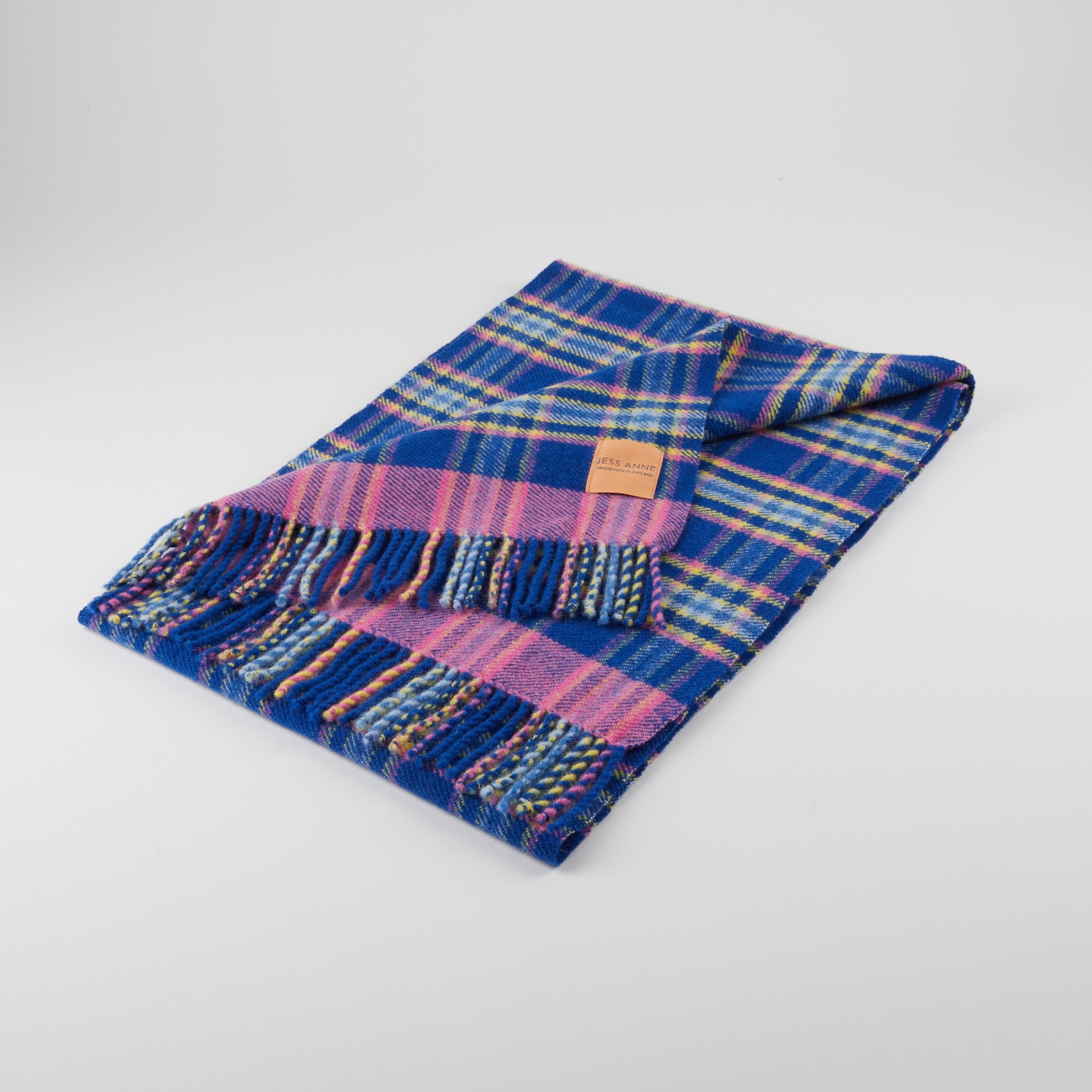
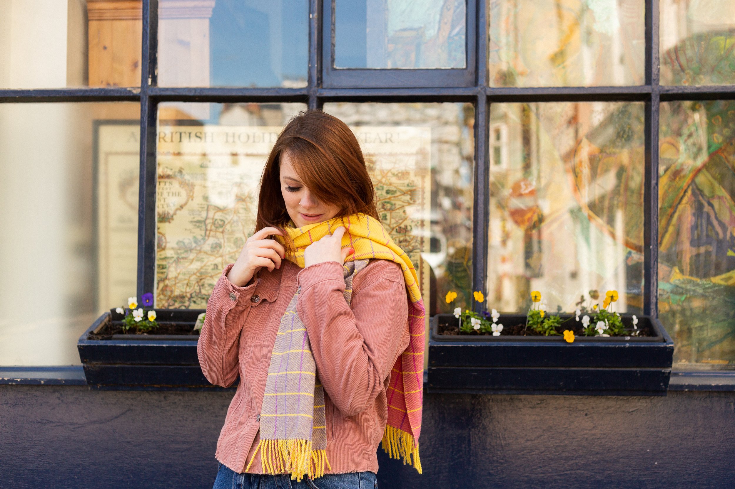
my oh my, it’s been a while since we had a good, deep design conversation hasn’t it! the talent of course has always been there and shining, but we now finally had the time as well, to meet some and explore their fabulous work. i’m very excited to introduce jessica clements of JESS ANNE today. she is a woven textile designer whose gorgeous works, with incredibly bold and bright colourways caught my eye immediately, and we’ve gone into process, materials and inspiration to bring her vibrant textiles closer to you.
ZITA: hi jess! first things first - could you say a few words about yourself, what you do and how you got there?
JESS: of course! so hello everyone my name is jessica, i’m 26 years old and live in broadstairs in kent and i’m the founder of JESS ANNE! i started my brand in 2019, just before the pandemic and i really wanted to create a brand that explores woven cloth featuring bright colours that spark joy!
ZITA: and it’s working i think! the first thing that really catches the eye about your work i think are your vibrant colourways! i just love the high contrasts and the neons so much. could you share a little bit about the thoughts that go into putting your wonderful schemes together?
JESS: it’s hard to explain but typically i don’t have a source of inspiration as such, it’s more of a feeling that i have. when i look at colours i don’t tend to think of trends or “what’s in”. i tend to think do they spark anything within me, do these colours remind me of a pleasant memory or place, or do they make me feel like if i wore those colours, i would feel confident? pretty? bold? i just sense my way through the colour choices rather then trying to have an elaborate explanation behind them. if the colours feel right, it feels right! obviously, every individual will have different tastes or opinions on style, however, the colours i choose express who i am as a designer and just as a human being!
ZITA: as a fellow pattern lover, i find weaving – and your particularly geometric patterns fascinating, i guess weaving is very “mathematical”. can you explain a little bit about the process of designing your patterns? what does it look like when one of your colourful patterns come together – is it a long chain of trials and errors, or do you nail it most of the time?
JESS: so, weaving is definitely not for those who don’t enjoy maths. weaving is one of those processes where accuracy and maths is everything and could make or break a pattern or even the physical cloth. when i begin my design process i always start with the colours (obvs!). from there, i tend to experiment with whatever i feel like i need to personally conquer as a weaver who is always trying to progress. as i’ve said before i’m not too driven by trend or styles, but much rather just expressing who i am as a designer and where i am in my personal development as a young creative. the geometric patterns was a real test for me! however it was one I wanted to conquer and prove that i can push my limits (and my own confidence!). when developing a design, the maths has to be spot on, and the maths can shift/change depending on the types of yarns and patterns chosen. i experiment with smaller samples first, writing every calculation to make sure I have the right amount of yarn ends and that i’m using the correct size of equipment such as the reed for the cloth i desire.
it’s definitely a trial and error thing! i wish i could say i nailed it on the head every time but that wouldn’t be true. sometimes yarns do not want to cooperate, even if you double checked every calculation and detail. sometimes, even the smallest of details overlooked can dramatically change the look and feel of the cloth. however, once the sample is nailed and its something that i feel proud to put my name too, i would then expand on this sample to create a range of products!
ZITA: what a fascinating process. i find the abstract nature of your work very interesting – i particularly love your woven artworks, it’s like you deconstructed your own craft into something else, something a bit more abstract, they feel quite architectural to me but also remind me of op-art a little bit. can you share a few thoughts about these pieces?
JESS: oh the card windings! i love these little pieces. when studying, we were taught that these card windings were used initially as just a development stage, to try out colourways and warp patterns. however, I started to expand on these using different shapes of card and found they deserved to be mini pieces of art in their own right! carefully hand wrapping card with desired colours in any order?! who wouldn’t?! i think the woven structure will always have an element of being architecturally inspired because the typical woven form relies so heavily on being constructed in a way that it will structurally hold together! not only do they help inform the woven cloth designs but they create such dynamic little studies that are interesting enough to want to hang on the wall!
ZITA: i think they work brilliantly, i really love them. now, let’s talk materials! what kind of materials do you work with – do you mix them often, or do you stick to one or two that works? what works?
JESS: oh good one. i’m a typical creature of habit, however as i’ve been designing, i’ve been trying my hardest to break free from my comfort zones. i tend to weave mainly with lambswool, however, in my most recent collection i have really been trying to expand on my products and offer lighter alternatives to the heavier & warmer wools and been experimenting with cotton/linen blends. i tend to use cottons for my card windings and happen to find myself using these now in my newer designs as a supplementary yarn. i’m hoping the more i evolve as a designer, the more i will be adventurous and try more yarns! eek!
ZITA: have you found that sustainability and ethical sourcing has become more of a point with your customers as well as in your supply chain? how do you find this – have you always worked with such materials?
JESS: i think by now most consumers are concerned with the environment, as they should be! it’s so important for people to realise the impact the textile industry has on the environment, and this should definitely be more integrated into our buying habits. as an independent designer and so early on in my journey, i handweave all of my designs, eliminating the risk of buying into any sort of sub par factory conditions or any sort of exploitation (although, it’s of my understanding now these regulations are in place and finally the textile world is shifting into a much more ethical way of producing). the yarns i order are from smaller independent shops in the UK, who also do their own background investigations into where they source their yarns. the company that i purchase my lambswool from and the cottons are very transparent in their processes which makes the selection process much easier. it’s so difficult to navigate through the world of industry, however, i remain conscious of my purchases and in the future when i have built up my brand, i strive to be a designer who is part of the ever so important sustainability movement.
ZITA: i think it’s growing really quite fast, nearly all designers i know are now considering this. i got to know you as a fellow participant of a new TV Show and you’ve also been through some thorough mentoring and an intensive development process i guess! how has it been for you in the last few months? without any spoilers, can you share a little bit about how you have developed your work and maybe about some of the new pieces?
JESS: so the show really helped me become who I am today in just a short amount of time! the mentoring was pretty intense to say the least and it was difficult at times to break old habits and ways of thinking, but it was exactly what I needed to tap in to the potential for my woven designs! before filming i lacked confidence and found my development of designing was very slow, as i was always very nervous of trying new patterns/yarn in case they didn’t work out (yes, i am one of those people that if i don’t nail it first time, i get very frustrated!) however the mentoring on the show really helped me overcome that fear and removed the barrier between me as a designer and creating much more statement designs. the designs that will feature in the show really came from a place of needing to push my own boundaries rather then a specific source of inspiration. i view this collection as a natural progression from my previous broadstairs project and i think there something really lovely about my projects linking this way.
ZITA: this is very exciting and i can’t wait to see al this progress on TV soon. development is an interesting process, have you found any new sources of inspiration? where do you normally go to or look to? have you found it’s changed lately?
JESS: i think my design process and sources of inspiration changes almost constantly. as my practice and skills develop and as i continue to design, i find my inspiration shifts so frequently that’s its hard to even keep up with myself! i was inspired mostly by nature and my surroundings in my home town, however i found that more recently my work is more inspired by my own feelings and the feeling i wanted to provoke in people if they were to wear my design. i’m starting to really explore how fabric design and colour combinations can provoke different emotions.
ZITA: fascinating! and where do you want to see your work most? what’s your dearest ambition, where do you want to take your work next?
JESS: i would absolutely adore to see my brand grow and eventually develop into a fashion brand. the dream has always been to see my fabrics on garments such as beautiful, tailored suits and dresses and feature in glossy magazines (i think most designers have this day dream!), TV, instagram… and just generally see my work being used by all over the world! the sky is the limit!
ZITA: yeah, you go girl! and now the question i ask from everyone - can you recommend a book? or an artist or a maker whose work is worth looking into? something or someone that keeps you thinking forward?
JESS: oh my goodness there’s so many artists and designers that inspire me from across the board i couldn’t possibly narrow It down! there’s so many amazing weavers out there such as margo selby, ptolemy mann, rita parniczky, theo rooden… the list is endless! i think any of these artist would be good start if you wanted to understand more about woven design and what is possible!
ZITA: and lastly but most importantly, where can we see your work next?
JESS: so as i’m typing this i have no current exhibitions or markets coming up, however my products are available through my website and i welcome emails orinstagramDMs enquiring to commission or purchase. i’m currently still in the process of re-branding and re developing my website and i’m communicating with smaller retailers about becoming stockists. exciting! ahh!
ZITA: sounds like you have a lot on your plate, but i’m sure it will work out. thanks so much for talking with me!
well, it’s been another long pause between blog posts, but it’s not been forgotten, only postponed, due to, uhm, general life happening at a pace, i guess. but when things get busy and exhausting, there comes the need to take a break and go somewhere else to recharge. so let’s take a road trip. let’s go, from scotland, to somewhere nice in the sunny south of great britain. anywhere. if you like going fast, you’ll take the motorway, the m6. it’s not the most scenic of routes, so it gets monotonous, and since tiredness can kill, there will be a time to take a break. and there, you’ll eventually come across a fabulous concrete tower emerging in the landscape with a futuristic footbridge arching over the motorway, and suddenly you feel compelled to indicate your exit to spend some time in this fascinating piece of architecture - we’ve arrived to forton services!
i have always been obsessed with logistics. the excitement of logistics and infrastructure never gets boring – perhaps it’s no surprise that some of zitozza’s block printed fabrics are directly inspired by road signs and wayfinding systems.
i just love it when everything and everyone in the system has its place and function, a well oiled machine itself that can take care of millions of people and things getting where they are meant to be when they are meant to be. but while the architecture that serves this system has to be purely functional, for curious travellers who are excited to be somewhere new soon, the associations fill all of this functional stuff with positive meanings, the typefaces on vans and reg plates, the smell of the handwash soap, the hot touch of the disposable coffee cup are all symbols of the anticipation of getting there. so from this point of view, a well designed, interesting motorway station is a piece of happiness on earth, and ...for someone who makes textile prints of road signs – like SOROMPÓ or any number of grid-based modular patterns – it’s a piece of inspiration too, doubly so if it’s brutalist of course!
forton services today belongs to the moto bk chain, and you’ll find it on the m6 between junction 32 and 33. it opened in 1965, and according to SOSbrutalism, the designers were bill galloway and ray anderson of the architecture firm tp bennett and son. (yes, that’s of the same thomas bennett of the saville theatre, amongst other things - today they do a lot of interesting commercial projects - totally worth a look!)
there are some two-storey buildings on both sides of the motorway with restaurants and cafes, connected by a high-tech looking footbridge forming a light arch over the motorway. to walk across it is a great exercise to stretch the legs a little and the eyes to the distance too. the timber ceiling panels of the inside of the bridge somehow creates a very nostalgic mood in the warmth of this texture reflecting the light directly below it. that just further excites about the travel - i’m not sure how materials do it but’s definitely the timber. the tunnel view of the inside of the bridge has an octagonal frame with the joins at each window panel cutting your corners diagonally. the outside view of course is the endless motorway and the crowds of cars going somewhere.
of course, it’s most distinctive point is the pennine tower, emerging from the landscape on the northbound side with its cantilevered hexagon at the top. it used to be some accommodation and a restaurant - this blog has some archive images of the fabulous decor in its full glory (as well as the whole structure when it was pristine white!) it reminds me of the early decor of the UFO bridge in bratislava a little bit (more of that in another blog post i think…) and i would have loved to enjoy a meal there, the views across then countryside must have been breathtaking on a sunny day.
unfortunately due to the strict fire regulations, it is now closed to the general public and it is now grade II listed, even though it might be hard work to re-open it.
it was intentionally designed to resemble an airport’s traffic control tower and that all i can feel is the anticipation of getting somewhere, perhaps it’s succeeded in its job. it is a cliché to say that we must enjoy the journey as much as the destination, but in the case of how motorway stations ought to be, there is definitely truth in it!
if you enjoy exploring the crossroads of architecture and textiles, you might like ourcollections – heavily influenced by modernist infrastructure and brutalist forms. see you next time - and don’t forget, tiredness can kill, take a break.
hello again - long time no see, in an architectural regard at least we haven’t really been able to publish a new post for a while. that’s all about to change as we have visited a few more sites and we’re keen to show you all the photos in several posts coming (as one-off episodes probably, so no more series for now.)
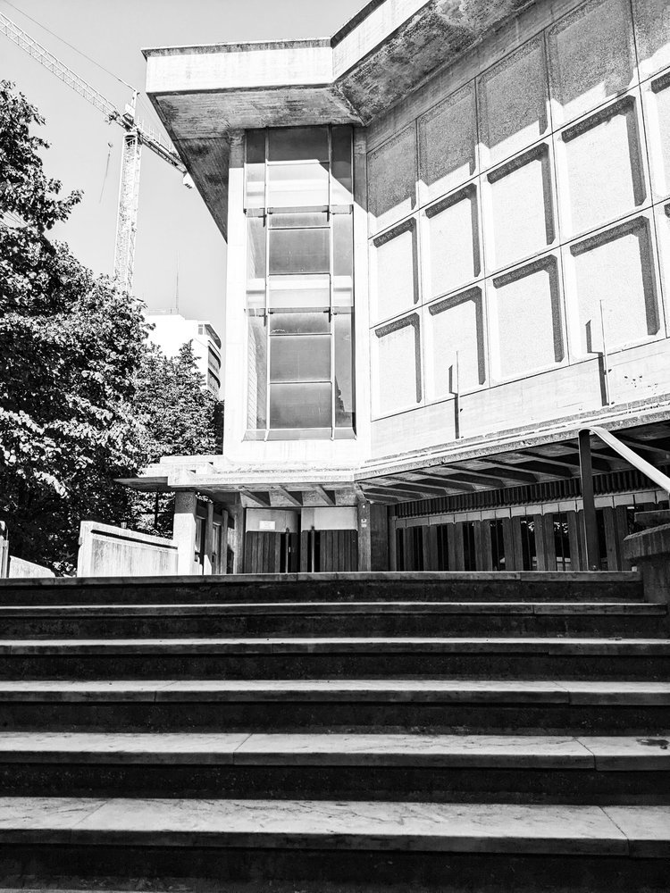
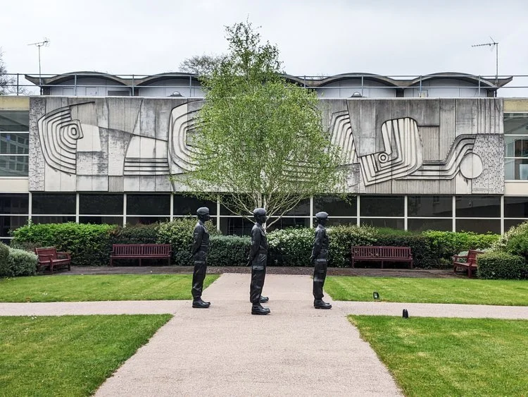
let’s start with the best - the building of leicestershire county council, also known as county hall. it is hiding behind leafy greens in glenfield, on the outskirts of leicester, next to the A50 leading into the city centre. it was built in 1967 and has been used as the county council headquarters since then. names are hard to find, but it was designed by the council’s own in-house architectural team - the RIBA picture database names the architect as thomas locke and the council’s architectural office.
seen from the road, the building emerges slowly from behind the lush trees, showing off its sleek facade. it is only by going closer where the site reveals its enormity - it expands across a huge field, many council departments are located here - but the layout is clear, spatious and airy. from the front, the slightly concave arches on the window frames remind me of a japanese pagoda towering above extending ground floors and an elevated wing standing on v-shaped legs that frame the green view below.
going under these we find a leafy court surrounded by shiny office windows, revealing a cast concrete mural of antony hollaway that depicts the river soar. his style reminds me of the town artists in the new towns of scotland, particularly the art of david harding in glenrothes.
in the centre of the court, there is also an armed forces memorial, added in 2012 titled ‘stand easy’ by kenny hunter - it’s a group of 1:1 life-size sculptures of young personnel. apart from being meaningful piece of art, somehow their placement in the centre also helps reveal the deeply human scale of the surrounding building and how the architects thought about the proportions - you get an inviting, peaceful sense of place here.
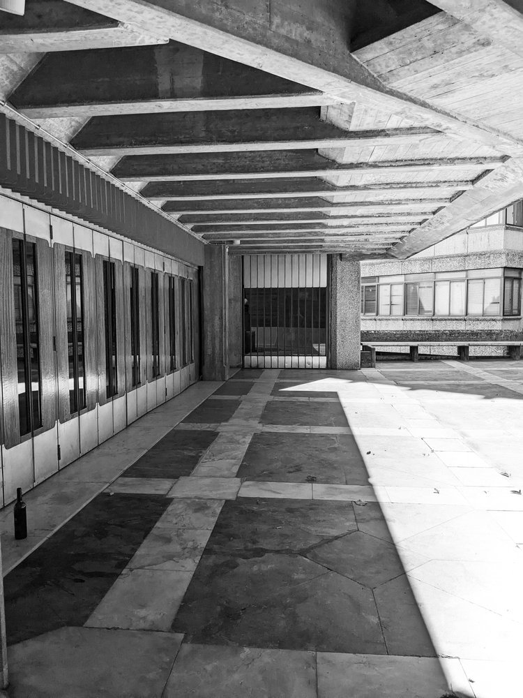
there are so many interesting and thoughtful details - the lightwell in the corridor roof above each window section (presumably to maximise the natural light inside) is not just functional but creates a slick, interesting spatial play - it’s a shame the day was not that sunny, i would have loved to see the shadows it creates. the extensive use of glazing overall did make me wonder about the light inside too.
on the left of the tower, there is a relief pattern in the arcade ceiling - here there are two small stairwells that lead to the outer end of this elevated corridor - from here you can take in a nice view of further out of the town, and what i presumed were fountains (i wish they were working that day.) it’s a really beautiful building and i’m happy to see it loved, maintained and functioning as it was intended to - i was not the only photographer on site on the day of my visit indeed!
it is in a remarkably good state compared to many other buildings of the same era i visited and it makes me slightly suspicious that a state of neglect in the case of brutalism could be in some cases a conscious or semi-conscious decision, to have these buildings replaced rather than renovated. but i’m glad that i managed to find one that’s working as it was intended to.
i hope you enjoyed this short visit, there are plans to travel to get out of scotland more often - subscribe to our newsletter to be the first to read about them here! take care.
first of all, please accept my sincere apologies for reporting on this event so late - as i promised about a month ago, i did indeed visit the scottish interiors showcase in late february and i was really looking forward to telling you all about it! but then, after managing to avoid it for nearly two years, i caught covid, and although luckily i escaped with mild symptoms, it was hard to concentrate in front of a screen for too long. isolating at home with little energy for anything whilst a horrific war breaks out in europe in a place close to my heart really annulled my motivation levels. i’m really sorry that blogging and posting has been a bit neglected.
however, life, and the love of beautiful things must, and will win under any circumstances, i really believe in that. so i’m trying to get back in shape and i’m finally ready to bring you what i promised, with highlights of what i found the most interesting developments from the world of interior design in scotland.
1 - SUSTAINABLE FAVOURITES
so, you know me by now, and as you’d have guessed, the one thing i kept asking every single sales rep that would talk to me was, “how much of this is sustainable?” the replies i got varied, but there was a growing interest and efforts by almost all brands and they mentioned that it’s a question that keeps getting asked. my first focus is on this angle, and here’s my top 3 that delivered:
1.1 william yeoward
the british household name had, as expected, some fabulous products on display. but the best news to report is the launch of a brand new rug collection, from 100% recycled PET. it didn’t look or feel synthetic at all, and the colourways are simply gorgeous. (link to visit)
1.2 designs of the time
i’d say the linen offerings of yvan puylaert’s company was an absolute highlight of the show to me and the tactile qualities of their linens were just a joy to look at. everything is 100% natural and mostly linen. the rep mentioned that they have a hemp line too, but it wasn’t on display as “it’s not popular in the uk - much more so on continental europe”. who’s with me to change that and try to get that here? who’d love more hemp (and of course, jute!) in british interiors?! (link to visit)
1.3 casadeco
the french group has always been one of my favourite supplier at these events, as i do love their geometric pattern designs. their happy surface patterns were no exception this year either. their newest launch is their cushion line, but their wallpapers were also very popular - for good reason too. however, i’m pleased to report on their wide range of plain, natural and recycled fabrics. (link to visit)
2 - SURFACE PATTERN DESIGN FAVOURITES
perhaps unlike other material expos, this particular event tends to be quite fabric-heavy and the vast majority of the exhibits were an eye-popping display of colour and patterns. i really recommend visiting as it really is a total surface pattern feast! for this reason, the next top 3 is selected from this angle, although it was quite a challenge!
2.1 ohpopsi
i have never heard of this company before, but their stand was beautifully arranged and proved to be very popular visitors. they also sent the friendliest reps to the fair, who were very keen on sharing some background info as well on their manchester-based company. they offer a wide range of wallcoverings, not only repeat patterns but also mural-style, non-repeating too, with really impactful effect on interiors. i did like some of the brutalist geometries but they do have some amazingly colourful patterns. (link to visit)
2.2 ian sanderson
now, if you are a regular reader, and you know the kind of homewares zitozza has, you know that it’s not a botanical type of brand at all. however, traditional, rich, heritage-based designs dominate this fair quite heavily, so it wouldn’t be fair not to mention at least one of these brands. i’m picking ian sanderson because they have everything you want, from the meticulous reworking of original block prints, through fabulous wovens and a collection of a versatile, cute range of coordinators that are made in the UK. (link to visit)
2.3 prestigious textiles
the pattern powerhouse delivers again, need i say more? i’ve been to a few fairs before and, as a lover of pattern, colour and texture, the pt display is always my favourite. in line with zitozza’s own aesthetics, i was looking for happy geometries and i wasn’t disappointed. the colourways are inspiring me to try some schemes that could work well with these! (link to visit)
3 - MATERIAL FAVOURITES
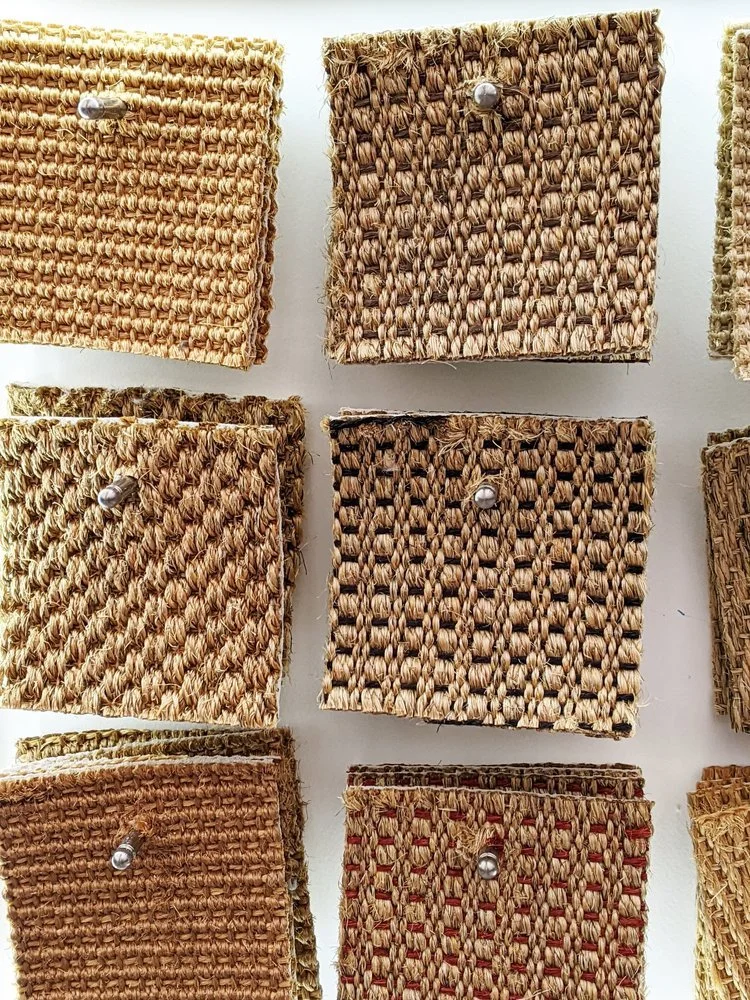
i keep mentioning that this is a very textile-heavy show usually, however, i want to mention a top three of flooring and hard finishes, because they are an important part of home interior styling. i enjoy looking at interesting surfaces and i can certainly get obsessive with where i want to lay my jute rugs.
3.1 crucial trading
this company had a lovely display of sisal floor coverings in all possible textures and colours. sisal is a natural, sustainable fibre that is even more durable than jute. the gold colour is similar and i got really attracted to this abundance of tactile samples. (link to visit)
3.2 miller’s 1893
i’m currently on a mission for hardwood floors in my own house (also home to the zitozza studio) so i was very happy to find this company. my favourite of their offerings were these antiqued hardwood floors that although they looked like they were reclaimed, they are entirely purpose-made for this somewhat industrial look. really, really fell for these. (link to visit)
3.3 la fabbrica
there weren’t many suppliers of stone or ceramics present, so i feel obliged to mention the la fabbrica range that put lovely, lovely slabs on display of some very interesting surfaces, which i’m sure that fellow fans of brutalism would also appreciate. (link to visit)
4 - OTHER INTERESTING FINDS
overall, it was a great experience to visit, and it’s great to see what some of the best of british and international interior design brands are up to, without having to travel too far, so i do recommend visiting again next year. we’re nearly at the end of this roundup, but i want to mention a few more observations.
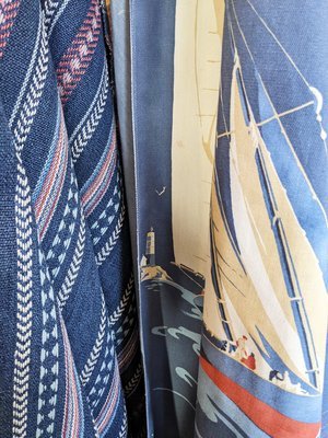
4.1 nautical is in!
this one took me by surprise (a very pleasant one, may i add), as i do have my own range of nautical homewares. i do it because it matches the golden, raw jute materials i’m working with, but it was nice to see that quite a few brands, such as fryett’s (on left) and mulberry(middle and right)also offers interior fabrics and wallpapers to complete such looks. you love to see it!
4.2 ikat & travel inspired patterns
as i’ve written about before in my previous trend-forecasting post, travel inspired decor nand boho chic are going to dominate interior trends for a while. this can take a few interpretations, my personal favourites were from ilivfabrics (left), whose newly launched collection ‘kasbah’ has been evoking the ikat patterns (they also have a sustainable plains range!). for smaller accessories in travel-inspired style, glasgow-based premier housewares(right) had a room full!
4.3 happy geometries
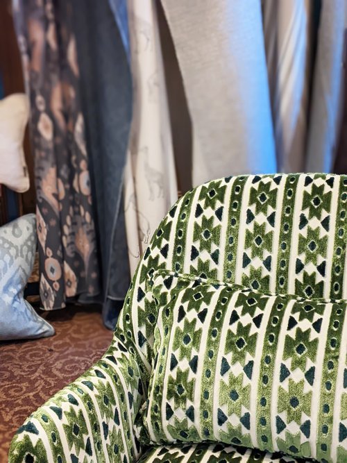
i already touched on a little bit how i was hunting for geometric surfaces in this jungle of floral and heritage-inspired prints, and i think there is a genuine desire for clear-cut shapes and abstract angles. i’m showing you my two favourites here. this wool sample by moon(on left)really made me think of bernat klein, and the geometry reminded me of the architecture of peter womersley. love this pattern and they also released it on throws! the second image is of a print by studio g of the sanderson group(on right) who were present with many collections. it’s the slight handmade, block printed effect on this particular collection that i really picked up on and i hope this proves to be popular!
well that’s it for this year’s roundup! i hope you enjoyed this visit with me, it certainly was a great experience and it’s always a pleasure to take a dip in a pool of pattern, print and lovely interiors.
to keep this already long post slightly more concise, there is no separate section for the links, but you’ll find them all in the text. for further questions, please don’t be afraid to get in touch and for future posts, feel free to subscribe below!
first of all, i apologise for the late post on interior trends, since we’re well into february already. to keep this post concise and focused, i’m going to concentrate specifically on colour and material trends that you might find easy enough to implement in your home (maybe with some zitozza stuff!) and i will expand on the current round-up suppliers and designers offer with a further post after having visited the scottish interiors showcase in a few weeks time. i’m really excited to visit (it’s been two years without trade fairs!), and i thought i’d share a little bit of research of the colour and material trends i expect to see.
1. RECYCLED & RECLAIMED
okay, sustainable design choices are not so much a “must-have-trend” but a pressing, urgent and permanent imperative change, so i shouldn’t really include this in the list but i do because it is getting embraced by more and more, and it may give some ideas to look further and think about what useless old thing you can turn into something cool. for us, it means, patchwork rugs and zero-waste, for others, this could be reclaimed wood, a bit of DIY upcycling, granny’s old nightstand-turned-houseplant shelf? all good and here to stay!
2. EARTH TONES
you may have observed that terracotta was kind of a big deal in 2021 - i hope you liked it, because it looks like it’s going nowhere, just growing and growing with many shades of earthy browns. expect to see plenty of fabulous, warm schemes usually paired with tactile surfaces and interesting shapes and textures, for a cosiness and warmth. it’s all about keeping it natural and down-to-earth - and it can result in a very serene, calming, loving home.
3. GREENS WITH GREENS
it seems that greens with greens in all possible shades are absolutely go this year. it may come in the form of breakfast room green by farrow and ball as one of their 2022 colour of the year, or a paler, more sagey october mist by benjamin moore. or you may achieve it simply with even more houseplants. or why not do all of them! the more green, the better. pale with deep jungle, dark teal with mint, dark olives with sage. they’re all in, and there is very little to go wrong with green!
4. WORLD PATTERNS
this is a very nice one - lord, how i missed travelling! but we are able to do so again so the travel-inspired details are back, with all the patterns from all the cultures and crafts of the world. of course there are more exotic interpretations of this trend than others, but the idea is to show off the individualities of the handmade, crafted details of traditional techniques. embroidery, print, weave - if inspired by experience and seeing the world, all good!
5. MIX & MATCH
the personal favourite has to be always the one that allows the greatest freedom. if you want to match geometric patterns with organic, modern with heritage, everything with everything, then you’re free to do so! this could mean all-out maximalism, colour blocking with bold, bright colours or perhaps cold, metallic details contrasting warm, earthy tones. or, my personal favourite, layering rugs with more rugs! there aren’t many rules here, it’s all about striking the right balance. it might take some brave choices and a little bit of thinking to pull it off, but it can result in the best looks!
this compilation was put together using the sources below, and the images illustrate zitozza’s interpretations, i hope we can show you that whichever way you wish to implement these trends in your home decor, we’ll be able to offer something useful. happy decorating in 2022!
happy new year! and so sorry it has been such a slow start, this is a bit of an admin-heavy time of the year with an ever-increasing to-do list. it is also a time to make new plans and reflect a bit on the past. in that spirit, i wanted to continue my series on books, but looking through my bookshelf and my past influences, i decided to go a little bit more personal, and share some of my graphic design inspirations.
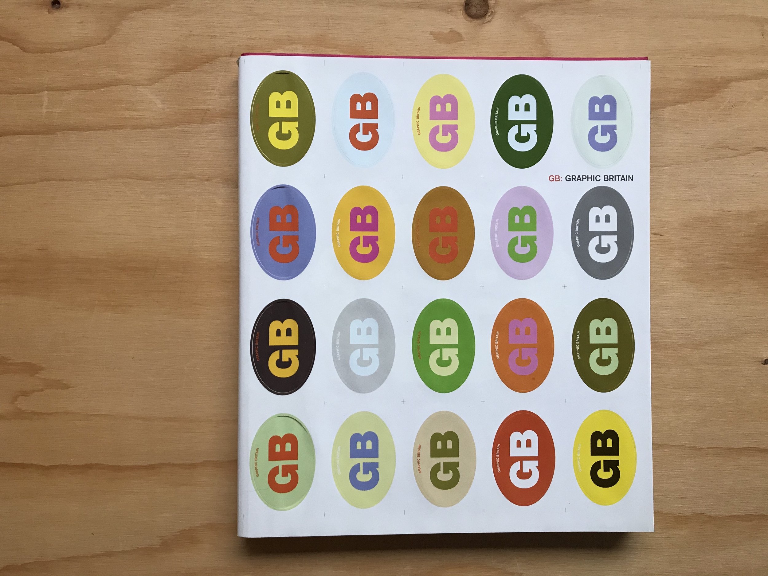
yes, i am also a graphic designer, and as far as skills and interests go, i certainly got into typography before i got into patterns. let me take you back 20 years, as continental european high-school student, it was also the time i was trying to master english and soak up as much of uk culture as i could. to combine these two main interests, a convenient place to go to in budapest was the book shop where they stocked some of the great coffee table books. today i’d like to talk about in particular titled “GB: graphic britain” (burgoyne, p. 2002 laurence king, london) with the aim to line-up some of the coolest up and coming graphic design works produced in the uk at the time.
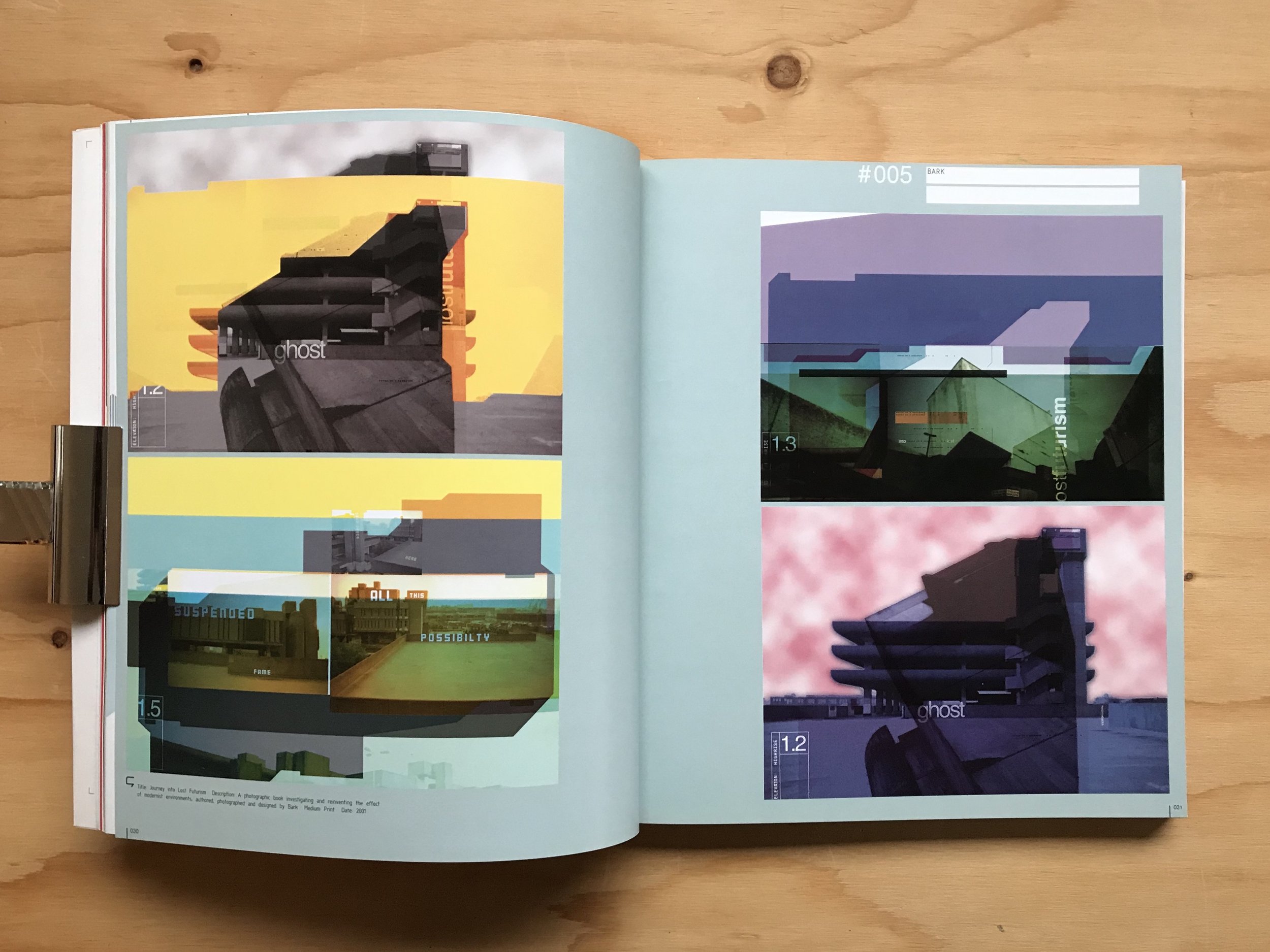
the book was designed by a london-based agency called bark, founded by tim hutchinson and jason edwards and i used to really hunt for their bold and colourful work and i did find them - in another book, “graphic originals: designers who work beyond the brief”(austin, j 2002 rotovision, mies) they talk a little bit about their process through a prospectus they designed for portsmouth university where hutchinson was a lecturer. the project itself was a map, a clever visualisation of the course journeys, but what really caught my eye was that it wasn’t just an raw information graphic, but focused a lot on using a lot of photographs of the built environment, the documentation of very mundane things that reflected on everyday life at the university. it was the first time i’ve ever really seen anything like that but that really was speaking my language. it was just inspiring to see real, successful people in the industry do this - take the built environment, and create a feeling of home and belonging in it by graphic, “2D” means. that’s exactly how i wanted to do design and it was a great contemporary example, right in front of me.
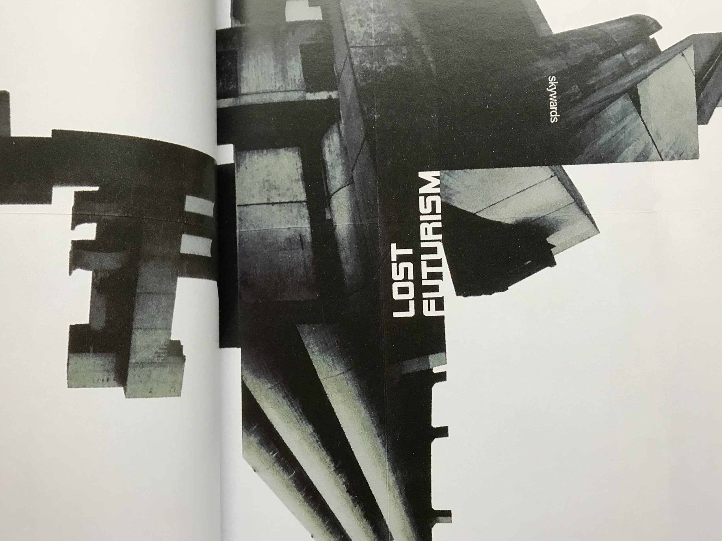
but there is another project of theirs that i would like to show you - i’m still hunting it, i believe it must have been self-published at the time. it is one titled lost futurism (according to the caption in GB: graphic britain, it is a book that was printed in 2001 - please do get in touch if you know anything about it.)
the project examines brutalist architectural heritage in a graphic design language - having mentioned portsmouth, this obviously means the tricorn centre, mostly, which i have never seen in real-life but somehow in this graphic interpretation, felt nostalgic and futuristic, alien at the same time. i used to stare at these pages for ages. it was really fun discovering about the building itself but also the graphic representation of it - it was just really, really cool and simple, and it spoke my language of taking a three dimensional form and reducing, or rather, deconstructing it to its image and basic form.
to this day i’m still obsessed with that sort of thing. i used to do a lot of my own experiments with my own photos of my favourite buildings when practicing my computer skills (a useful habit to get into) but it also transpired to other work and i firmly believe they have a place on textiles too. obviously, graphic design is different, it is visual communication, but if the result is decorative, then why should it not be used on textiles too?
so i hope you didn’t mind learning a little bit about this background behind the architecturally inspired textile patterns of zitozza. and if you know anything more about this work, if it exists on its own as a separate book, please, please do get in touch, i think i want a copy! thank you!
-
links:
GB: graphic britain - by patrick burgoyne, 2002 laurence king, london, uk (on worldcat.org)
good morning december, how did we get here again? i can’t quite believe how fast this month has gone again but with all the busy festive preparations, i hope there is a little time left for inspiring stories and interesting conversations - and i really did bring a good one for you this time, as i managed to get a few words in with matt maurer, designer of the smart and sustainable home office system of arnie.m, featured in our post about interior trends at the start of this year.
ZITA: hi matt! first things first, can you say a few words about yourself – what you do and how you got there?
MATT: i’m the founder and creative director of mr.m ideas studio. mr.m specialises in brand identity, visual communication, digital design and environments. with over 50 design awards and 20 years’ experience i collaborate with creative people in many fields to make great ideas happen.
my journey before arriving at mr.m was studying graphic design at university and spending my earlier professional career working for some of the most renowned design agencies in manchester.
ZITA: and about your product - would you say that developing arnie.m was a long-held dream of yours, or was it something that evolved over time? can you give a little insight into the birth of your business?
MATT: birth is the key word! my studio is based at our small home and when we found out my wife, angela was expecting we also knew that we were presented with a spatial challenge.
life and work need to be in balance especially within the home environment. the limited space presented a challenge but that is what led us to thinking about creating a workspace that could accommodate all my design paraphernalia, yet still be compact enough to shut up shop of a working day and become an attractive piece of domestic furniture.
so, with the help of friends and contacts in the creative and craft industries in and around manchester, we took our design ideas and skilfully translated them into a for-real form – a workspace.
we were swept away as new parents when arnie arrived but once we started to get our heads around everything including sleep deprivation, we began to see how the workspace really helped. when friends and family complimented on the complete ‘office’ it led us to start out on our adventure. it took just under two years of developing and tweaking to turn our workspace in what it is today — arnie.m. (we had to name it after the little man who inspired the idea!)
ZITA: how lovely - and impressive! i actually discovered your furniture in search of home office trends which obviously blew up since 2020 and the pandemic. how has this experience been so far for getting your range known?
MATT: we only truly launched arnie.m at the end of december / january 2021, we are very much still in our infancy. we want arnie.m to be a family adventure for angela, myself and arnie plus the amazing network of skilled people who are part of a wider, very support arnie.m family. i have to say we are still finding our feet but the response and support we have received has been amazing! the highlight for us has been getting arnie.m featured in variety of well-known/high end publications which has raised our profile.
ZITA: modular design systems in general are a smart way of working but there’s also a lot of play in it for your clients. can you expand a little bit about the possibilities or how your furniture can be built up? are there any limitations to your systems or can it be theoretically expanded to huge environments (e.g. contract?)
MATT: we know creating your perfect working environment is personal, so by making arnie.m modular makes it adaptable. arnie.m starts with a frame, and you basically hang the units that best meet your needs on the sturdy (yet elegantly formed) frame. currently arnie.m has a range of different modular units which include a desk unit to several storage and display unit options, this gives you the flexibility to create your very own arnie.m
each arnie.m is handcrafted with pride and attention to detail, we only make to order. this means with the support a small but talented collective we can customise and be creative with the modular design if required, individual unit designs, sizes, even colour can all be considered. this way of working gives arnie.m the flexibility to work in different ways and look at opportunities in different environments.
ZITA: that’s really clever! i think handmade processes always allow a lot of custom tweaks indeed. can you tell a little bit more about the material choice? how important are sustainable qualities for you with regards to both materials used and your working processes?
MATT: we are not, nor do we want to be a mass-producer, having to use cheaper materials like mdf. we love ply it’s basically a ‘green’ product, its beautiful, durable and long lasting. we designed arnie.m to be easily reconfigured to meet your needs over a lifetime, individual hand-made, built to last in natural birch plywood that is FSC certified.
arnie.m has some clearly defined ambitions which focus around sustainability. we want to grow arnie.m carefully for everyone’s benefit, as mentioned we are a family not a vast global corporation. we want to support our small collective. we use only what we need in materials and packaging, avoiding waste and keep production local. by building a sustainable business we want our boy arnie to benefit from the work he’s inspired.
ZITA: this is very inspiring! i love plywood in general, i even print with it - it’s so universal. and beautiful too. what were the aesthetic driving principles of your product? do you follow any particular design school or style, or was it purely driven by function?
MATT: function was at the heart of the idea. simply our brief was to create a practical, adaptable and functioning workspace within a small space, that could also be aesthetically pleasing.
ZITA: it makes perfect sense! and now a question i ask from everyone - can you recommend a book, or another designer, artist or a maker whose work is worth looking into?
MATT: angela was the really driving force for developing the workspace into arnie.m but we were inspired by the books produced by the do book co we highly recommend taking a look at them.
ZITA: i definitely will, thank you! and last, but not least, where can we see your products at the moment? and what next for arnie.m? are you looking to grow your range?
MATT: you can view arnie.m on our website but we also currently have one arnie.m displayed in a house by urban splash show home in new Islington in manchester.
next year we look to continue to build the arnie.m brand. we are also going to explore adding new units designs to our range. and most importantly enjoy the adventure!
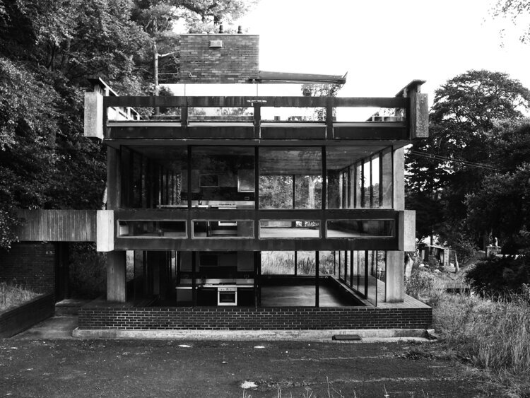
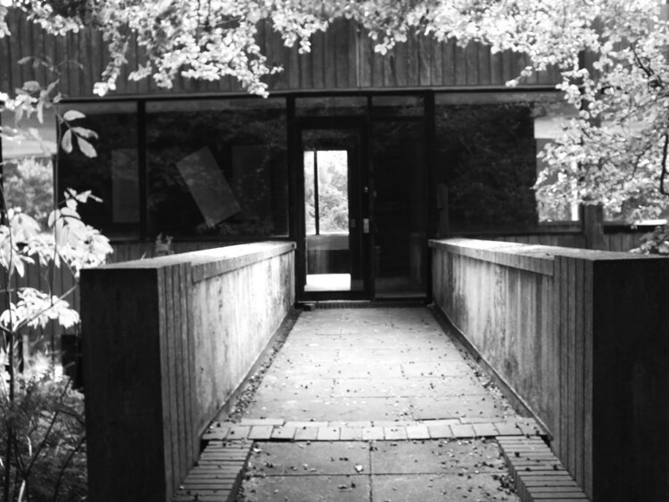
well, i hope you’ve had a lovely time visiting the scottish borders scouting for modernist icons by the wonderful peter womersley, because this is the very last stop! we arrived in the town of melrose, on the outskirts, in what seems to be a quiet, residential area, and are standing in front of the boiler house of the demolished hospital that used to be known as melrose district asylum. it is no longer there, except for the boiler house, designed by peter womersley.
built in 1977, it is another one of his award-winning works, for industrial architecure. it is a highly functional building and perhaps much more “brutalist” than the previous ones we visited so far, but it is really far from raw, in the sense that everything is finished to a great quality and the details are smart as always on his buildings.
i’m aware that hospitals use a lot of steam not just for heating the buildings but for keeping things clean and sterile too, however i’m obviously not exactly familiar with the ins and outs of a boiler house, so i cannot write too much about what functions certain parts do. what i can certainly tell (as the most prominent feature of the side of the building) that there are three hoppers on its side, which were used to store the coal and they form a great rhythm of what i call these “upside down pyramids”, built into a wall of horizontal layers and it has inspired some great geometric patterns, so even if i don’t quite understand how it works, i still find a lot of joy in the aesthetic of the building.
aesthetic it is indeed. the concrete is smooth and not worked to timber patterns this time, but the almost minimalist surface is put together from narrow slabs, forming an even, soft pattern on the surface. the joins follow this pattern, somehow it’s so easy on the eye it’s almost a source of tranquility, which is a funny thing to say about a boiler house i guess.
a the time of visiting, it was not in a great state and the concrete was visibly aging. but we’ve left this our last station not just because it really was physically the last stop of the day, but also let’s finish on a positive note: this building’s fate is no longer hanging in the balance, it is being salvaged by being developed into flatsby studio DuB. the plans look amazing, contemporary and also preserving almost all forms (they’re even keeping the chimney!) and i hope it will work out in a residential function. it’s funny to see that something that was designed to sustain one particular function could be turned into something else so beautifully but i suppose it’s always possible if you work with what’s left behind by a genius.
i’m sad to say that even though there are many more buildings around in the uk (and even worldwide) by peter womersley, we’ve come to an end of our tour. i hope you’ve enjoyed it and we hope to join us on the next one - we might have to be taking a little break as we’re getting busy with all things festive, but we’ll find time to immerse ourselves in great architecture and will definitely be back!
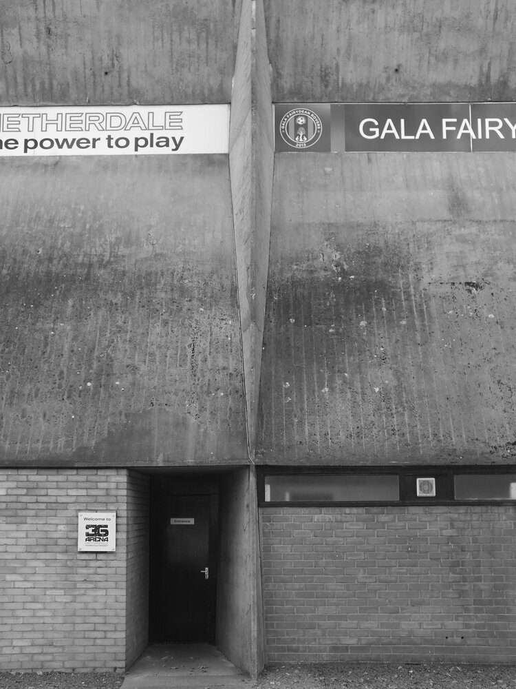
happy autumn! we’re back to work, back to school, back to looking ahead and also back to talking to people so i’m really pleased to announce tha after a long hiatus, t the design conversation series is continuing with a new arist! ciara mcinnes is an architect and fine artist based in glasgow. i discovered her fabulous prints on instagram during lockdown when i was craving to see beautiful buildings - some of them are the exact same buildings i’m also fascinated by, such as the netherdale stadium of peter womersley – so i was really keen to know more about the background about these beautiful works.
ZITA: hello ciara! first things first - could you say a few words about yourself, what you do and how you got there?
CIARA: hi there, thank you so much for having me! i'm an architect and fine art printmaker based in the west end of glasgow. i work in the medium of lino print, combining traditional handprinting techniques with contemporary, urban subject matters. inspired by the city, street art and general urban chaos, my work typically documents lost landscapes, urban spaces and historic buildings.
ZITA: i can see your architectural background - it comes across beautifully on your urban prints. i’m always glad to find other people who also see the beauty too in the things that often get a bad press. could you share a little bit about what inspires you about these landscapes?
CIARA: for me, the built environment is so inspiring, constantly changing and evolving. i love to document the city in my work, taking tiny snapshots of a place in time, knowing that it will never look exactly the same again. the light will be different, the graffiti will change, it will eventually be lost for good and exist only in print.
in architecture, it has always been the case that the styles of the previous generation are undervalued because they are seen as dated but not yet historic. In glasgow, there has been a huge cull of brutalist architecture in recent decades, a style that is only now starting to gain recognition. i'm really drawn to document these buildings in particular because of they represent an important era in history, when architects and designers were tearing up the rule book.
ZITA: that’s fascinating. i do love that era too, and the ideas they represent! do you have a favourite place, a city or a building you go like regularly going back to? Or do you continuously look for something new?
CIARA: i am always on the lookout for somewhere new, i love to travel. at the start of 2020 i visited mexico city which was such a vibrant and energetic city. the architecture is so diverse from pre-hispanic to cutting edge contemporary and everything in between, it's somewhere I'd love to go back to.
ZITA: that must have been beautiful. you mentioned brutalism before, but is there a particular school of architecture or style you’re attracted to more than others?
CIARA: i'm a fan of minimalist, contemporary architecture. there's a few places really leading the field such as scandinavia and japan but it's not something we have really embraced in scotland yet. there's an architectural practice called SANAA who create some truly breathtaking work.
ZITA: thanks for the tip, i will make sure to check it out. so what is the next cityscape or building you’re turning into a print? can you tell anything about any work in progress?
CIARA: i'm currently working on pair of prints that explore the temple gasworks in the north of glasgow. the structures of the old gasholders are still in place and create these skeletal figures in the landscape which you can see for miles around. i'm going to be integrating some more natural imagery in the prints which is a new direction for my work so i’m excited to see the finished pieces.
ZITA: sounds really exciting, i’ll be looking forward to seeing the finished prints. i’m also interested in your technique. your prints are very photographic! how are you working them into your prints? can you explain a little bit about your process as well?
CIARA: i always start a print by creating a master pen drawing which i then trace using carbon paper onto the lino block. i will usually combine elements from several photos or images into a final composition, all with a little artistic license. i often make little tweaks at the carving stage too, with a lot of natural elements freehanded as I go. the prints evolve through the printing process so i never fully know what the print will look like until the very end.
ZITA: that is really interesting! and your colour scheme is very minimalist and together with your ukiyo-e inspired technique, it reminds me a bit Japanese influences. it is very consistent throughout your work and it works to a wonderful effect – could you tell more about this? do you have a process of deciding about the colours in your prints?
CIARA: japanese printmaking is certainly an inspiration, particularly the dedication to craftsmanship and technique. my colour palette is typically very tonal which allows me to focus on the form of the print, then I create focal points by picking out details in metallic. i typically mix my inks with extender to create a more translucent effect, i love how this gives the prints an almost watercolour like finish.
ZITA: it does! the results are really beautiful. and now the questions i ask from everyone - can you recommend a book or an artist or a maker whose work is worth looking into? something that keeps you going?
CIARA: i recently discovered an artist called claas gutsche who's based in berlin, a fellow lino cutter, his work is so precise and his technique is definitely something to aspire to. in a totally different direction i’ve always loved the work of a painter called maurice utrillo who was a contemporary of the impressionists but worked in quite a different style. he has a really fascinating story, using painting as a form of therapy. he painted the world around him, focusing on the built environment and often unloved corners of paris. i only recently found out that the kelvingrove museumholds one of his pieces but it's currently in remote storage.
ZITA: sounds like someone you would have loved to met! i will be definitely checking them out. and lastly but most importantly, where can we see your work next?
CIARA: well, i do have a few exhibitions on the horizon but sadly i’m sworn to silence until the official announcements! all i can say for now is that i have an upcoming show in a glasgow gallery this autumn, which will feature some specially created pieces. i'll also be popping up at a few art and design fairs across glasgow later this year, so keep your eyes peeled!
ZITA: very mysterious! i will keep an eye on your social media! thanks a lot for your time.
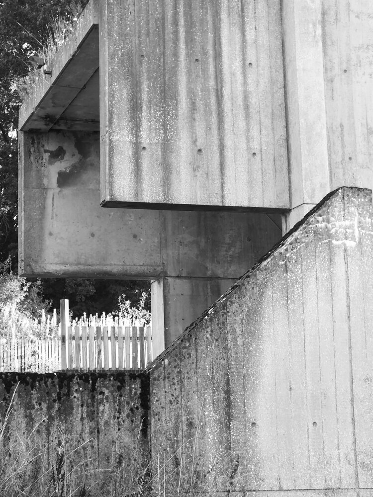
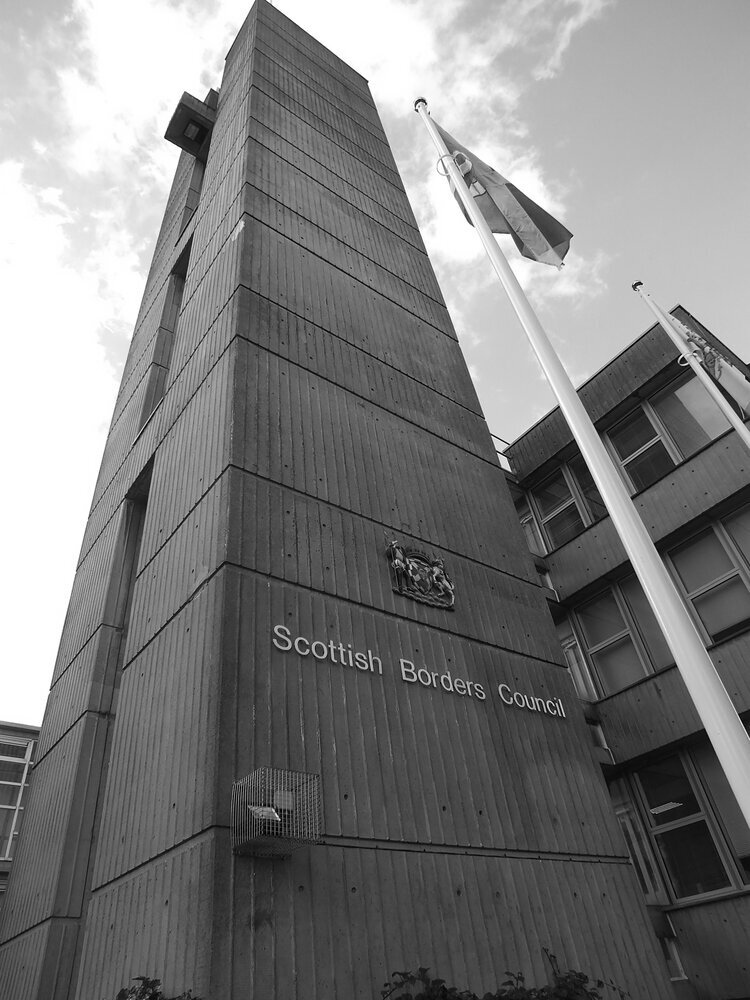
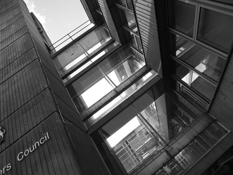
after our somewhat bittersweet stop last week, we’ve arrived to the penultimate station in our tour of peter womersley’s buildings in the scottish borders. we’re in newtown st boswells, where the council for the county of the scottish borders have their headquarters in a concrete and glass office building designed by peter womersley. we have of course seen wilderhaugh and we know what he’s like when it comes to designing office buldings but this one is a few scales up in size, and probably the largest building of our tour altogether.
that means there’s plenty of details to observe although it’s not possible to go completely around it due to the restricted access at the back. nonetheless it’s worth a visit, the building is a striking structure towering on an open green, embraced by its leafy surrounding of the village. built in the late 1960s, originally serving the much smaller administrative unit of the roxburgh county offices - today it employs approx 1000 people and has grown a post-modern extension on its side.
it’s not a brutalist design - the concrete is not raw but shaped with timber with the imprints visible on the facade. the clever use of glazing is also dominant throughout this building and there are a lot of intriguing details. its most striking feature is the service tower of course, cleverly connected to the main office buildings via elevated, glazed corridors with a garden underneath. this kind of biophilic thinking is found in modernist architecture a lot, and in peter womersley’s work too in church square too and elsewhere.
the building is not actually quite at how peter womersley imagined it. he won the competition to design it in 1961 but it was only completed in 1968 after some opposition by the locals. it’s still not really popular - however, even though the structure is cited as a reason, i suspect this could be also due to the amount of people who commute to the village by cars, and less at the fault of the architect. for sure, you can see that it’s dated in some aspects (like its contemporaries it probably is poorly insulated and things like wheelchair access are always haphazardly added to these buildings later.) nonetheless it was innovative and modern at the time, and the office space inside must be light with green views.
this building is the largest scale example of the genius of the fine details womersley could think of and i would have loved to see the what it would look like if it had been completed to his plans. the institution it serves has obviously grown and perhaps outgrowing both the original building and the village it’s in might not be good for its popularity, but i do hope that with time it is getting the appreciation it deserves.
so that’s it for now, i hope it’s not too boring yet to and you’re still excited about discovering the details of this brilliant architectural mind. if you do, then please stick around for last episode - we still have the boiler house of melrose district asylum to visit, so you can subscribe below to our newsletter in order to miss it… it comes a free print and the latest news from us, with pattern designs inspired by brilliant architecture. see you soon!
aaaand we’re here! it’s only the 4th station of our tour of peter womersley’s buildings in the scottish borders, but arguably the most iconic one! we are visiting bernat klein’s old studio and house, near selkirk. it’s a famous, grade A listed and most revered building, yet in its fate still hangs in the balance as it has been neglected in a poor state since the 2000s and the more time passes, the more expensive it gets to restore it to its former glory.
the studio was built in 1972 for textile designer and personal friend of womersley’s, bernat klein (whose work is probably also worth its own blog post later) and it won a RIBA award in the following year. it is a separate building form the family house, high sunderland, which is a modernist masterpiece in itself (built earlier, in 1957), and it is still a private residence so this post is focusing on the studio, which has been abandoned since 2000s. so before we dive in, i’m going to do an unusual thing and this time, and i don’t really recommend to visit in its current state, or at least not to go too close to it. these photos are from 2016, and since then, i’m not sure how dangerous it has become to go close to - i know it’s tempting but i would strongly discourage you to do so. i didn’t either to be honest, most of the close-up work was done by my camera, and i hope it did a good job regardless and you’re able to see why this work is so masterful and why it needs to be preserved.
there are many details and elements that tell you just how much thought the architect put into the building. before i visited it, as a student at university, i attended a guest lecture by historic environment scotland about peter womersley, his life and his work and there was a good few minutes dedicated to an enthusiastic review of this building. a vivid description that got stuck with me was about the flashes of colours one would see through the amazing, huge, frameless glazing - that’s bernat klein using this amazing studio space to make amazing art. their friendship is a great symbol to me that textiles and architecture are really connected areas that can constantly inspire each-other which is really the whole reason of this blog.
my images are black and white so i’m not sure how much it comes through that it’s surrounded with leafy, lush greenery, with stairs leading up to a bridge to access the cantilevered second floor (he was such a master of gravity - see also his beautiful work of the netherdale roof.) i’m trying to show you on these images the imprint on the concrete - i heard that peter womersley would be mortified to be called brutalist today, and indeed, the concrete is not raw at all here but very much takes the shape of the timber it was formed with, adding an extra tactility to the structure.
so we hope you enjoyed this visit - i hope we can go back when it’s fully restored and the building is put to a great use. if you want to help the cause to preserve this studio, i recommend you check out and get in touch with preserving womersley, a group of dedicated enthusiasts whose aim is to keep the work of this genius architect standing.
if you enjoyed this, do stick around as we’ll stop at two more places at this tour - we’ll visit a the impressive scottish borders council in newton st boswells, and the boiler house of melrose district asylum. you can also subscribe to our newsletter to our forms below (you can get a free print with it) and the latest news about prints inspired by brilliant architecture. see you soon!
that’s another month gone - i can’t quite believe it but here we are, so it’s time to continue our photo blog series looking at peter womersley’s buildings. we are halfway through the series and this is the last time we are in galashiels. it’s a small post as well, of a small building, but nonetheless worth a visit. we are looking at wilderhaugh, the former sanderson & murray offices, built in 1961, originally for one of the many companies that kept the scottish wool and leather industry going at the time. they closed in 1980 and the building is now occupied by cameron associates who are, of course, architects, because of course architects would find home in this building.
this building is really, really cool, in the literal sense of the word too: it’s playful facade is made of shades of blue and grey, but it’s softened by the greenery around. it’s quite small and human scaled but does not want to disappear into the landscape, it’s just there with its defined vertical lines, arranged into a calming, neat rhythm. visited it during an early autumn day and it was quite striking how the facade cast its own shadow on itself. but this image by its current occupants shows it lit up in the late afternoon against the darkness of the scottish winter. light is divided into aesthetically pleasing, narrow sections against the backdrop of the hills. what else can you ask for, really?
with this part, we are leaving galashiels and are ready to visit the bernat klein studio - make sure not to miss it! if you want to stay tuned for news about our architecture inspired collections of rugs, lampshades, cushions and wall-art, subscribe to our newsletter here!
many apologies for not continuing our architectural series a little sooner. we have been caught up with moving studios (it’s becoming an amazing space!), organising and exhibiting at jutefest, launching our wall-art and working on our new collection launch but it’s time now to continue the tour in the scottish borders to find some more treasures designed by peter womersley.
after having visited netherdale, we remain in galashiels and this time we look at the residential block at church square. it’s one of my favourite ones because it is one of the few residential ones and it’s so human scaled and light, which, to me is certainly what modernism was really about - building for people. completed in 1963, it is fashionably modern and revolutionarily, unapologetically puts the residents at the heart of it. there is nothing brutalist here by the way, it’s timber, stone and glass, arranged in neat patterns of basic forms - and with lots, and lots of leafy greens. the resident is at the centre here, everything is designed for people and with great attention to detail.
the two “floating” blocks form the leafy courtyard - what makes it especially embracing is the elevated first floor, a sheltered passage underneath the buildings. i love buildings that stand on legs - they let air and light through its enclosure while providing some shelter at the same time. womersley’s genius is in the detail of course - just look at that airy stairway, how it corresponds with the effortless float in air.
i have never been inside but i imagine the bright glass everywhere and the balconies make these flats really bright. RIBA has a couple of photos in their archive about what it looked like and it’s exactly the modernist coolness you expect. the textiles, patterns, surfaces are right up my alley and i think the zitozza aesthetics is not that far off it in spirit. i hope you’ve enjoyed this small tour and i hope with each of these episodes, you’re getting closer to the feelings i’m trying to evoke with my prints too!
see you soon at the next building and stay tuned for more news and new prints - subscribe to our newsletter here!
here we are in another month - and i’m bringing you another exciting entrepreneurial journey to read about. this one is a little bit special, as zitozza has a brand new stockist in scotland - HAYM,located on the high street of carnoustie, and i had a chance to have a lovely chat with the inspiring businesswoman behind it - janice reid. as i’m always on the hunt for new treasures, i feel really hopeful about the opening of new places, especially after such a hiatus. i think there’s a lot of warm and fuzzy feelings about local businesses supporting each-other - with everything that’s been behind us this past year, i wanted to learn more about janice’s journey and get a serving or two of the positivity!
ZITA: hi janice! can you say a few words about yourself – what you do and how you got there?
JANICE: ok, well my name is janice reid but my maiden name was hay which is part of the reason my new shop is called HAYM. i have lived most of my life in carnoustie but was born in dundee and went to university there where i studied architecture. I went on to work as an architect for almost 20 years, laterally becoming an associate with trail architects and i really loved my job and those who I worked with. my decision to change careers was based on my family situation.
ZITA: i see! has the shop been a long-held dream or something that developed through time? did you find it difficult to make the decision to go for it and open?
JANICE: i have wanted to open my own shop for some time now but always thought it was a bit of a pipe dream but many things influenced my decision to bite the bullet and just go for it. I had been off work on maternity following the birth of my 2nd daughter then after a short spell back at work i was furloughed due to covid. times have been so tough for so many because of the pandemic, there has been so many lives lost and so many people have found themselves in financial hardship but if anything positive can come out of such an awful situation it is that it makes you think that life is short and you should do what makes you happy. it made me reassess my life and gave me the drive and ambition to just go for it. I feel with my design background it is not such a huge leap more of a natural progression in a different direction.
ZITA: what a brilliant attitude! and it resonates a lot – zitozza came out of a similar situation. i do wonder, how has your background in architecture influenced your buying decisions, when it comes to finding stock for your shop? are you going for a particular style or feel – and if you do, where does it come from? where do you look for your curatorial inspirations?
JANICE: i have really just chosen what i like, there is no particular style, if i like it, i will sell it, but that said once all the stock is pulled together certain trends do emerge, there is a lot of monochrome and sharp lines which I guess comes from my architectural background. i am also drawn towards designers like yourself, align jewellery, hannah muir, steph liddle and jld designs who all have obvious architectural influences in their work.
ZITA: brilliant. i’ll certainly look for something for my new studio perhaps… obviously this whole period hasn’t been great for retail but people have also been getting more supportive for the values independent businesses represent. have you found it quite a supportive environment so far?
JANICE: i have found the industry to be hugely supportive and have really loved how nice everyone is and how happy they are to help. i have come from quite a harsh environment so that has been so refreshing. my customers have also been super supportive, i have had a huge amount of positive feedback and am being told on the whole that people want to shop local, support local businesses and local artists. there are lots of other lovely shops in carnoustie which makes shopping on the high street a positive experience and a destination visit. there is always the odd one that tells me i ‘must be mad and who gives up a career like architecture to go into retail during a pandemic!?’ i just ignore them!
ZITA: it’s great hearing this buzz around local business. how is HAYM going to stand out?
JANICE: so, we have great plans for HAYM, we have started with the bricks and mortar store and will concentrate on that initially, we offer a carefully curated selection of gorgeous homewares and lifestyle products and have a letterbox gifting which we will be promoting more shortly. once restrictions allow we will also be providing evening workshops including lampshade making and candle making to name a few. once these services are fully established we will be then be taking HAYM online.
ZITA: how brilliant! when it comes to customer attitudes, apart from style (obviously), environmental and ethical responsibility has also been becoming a stronger deciding factor, with regards to textiles especially. has this been important to you throughout your selection? If this was a guiding principle, was it difficult to source these products?
JANICE: this is very important to me. i wanted to keep as many scottish suppliers as possible, not only is this important for local tourism, it supports local businesses and reduces the impact on the environment through reducing transportation. i have also tried to work with designers who are eco-conscious when both designing and making and who are committed to sustainability, where possible using materials which are reusable, recyclable or biodegradable. this has not been difficult, i have found that more and more companies are practicing green procurement, this involves sourcing goods and services that are produced and supplied in a sustainable fashion and sourcing from local suppliers rather than those located far away. we also provide 100% recyclable paper bags and environmentally friendly recycled packaging.
ZITA: amazing. ultimately, what do you hope shoppers will find at HAYM – and return for years for?
JANICE: i hope they will find a friendly, comfortable environment to browse and shop in. i want them to find unique, quality, beautiful pieces for themselves and for others. i want to be that ‘go to’ place for gorgeous gifts.
ZITA: one more thing - can you recommend a book or an artist or a maker whose work is worth looking into? something that keeps you going? this could be an inspiring read or someone else whose product you might stock. I ask this question from everyone, i love getting inspired by everyone else’s influences.
JANICE: the boy, the mole, the fox and the horse by charlie mackesy.
this book is just beautiful in every sense of the word.
ZITA: wonderful, thanks a lot!
JANICE: thank you.
-
HAYM is open since 1st may 2021, at 41 high street, carnoustie, dd7 6ag. open tues - fri 9:30am - 5:30pm, sat 9am - 4pm.
the new architecture / photo-essay series is here! indeed there was a modernist-form-shaped hole left on this blog after finishing our tour of glenrothes and i haven’t had yet time to take the trips to the other new towns (although restrictions are lifting slowly and i do have plans.) so while i’m gearing up for those, there are more photos at hand i could share, and it’s unfair to focus on the central belt all the time anyway. so we’re taking a trip to the borders. as a student in 2015, i visited six buildings by the modernist architect peter womersley located at the scottish border and i’m going to share them all in a six-part series in the coming weeks.
the first building i want to write about is netherdale, the stadium for the lowland league team gala fairydean rovers, in galashiels. i remember when i first parked in front of it and i stopped for a good few minutes admiring it. it was looking as if it was made of paper, a lightweight, pillar-free origami structure with sharp folds and angles. i thought it must have taken a genius to make something massive and heavy of raw concrete appear so airy and lightweight.
it’s now a grade a listed building and i’d rather let the photos do the talking but i also hope that it makes you want to visit in person - currently unfortunately it’s been shut for a while and remains so at the moment as essential repairs need to be done, however there are hopes that funding for its restoration is cleared and the works could begin.
built at the heyday of the brutalist era (between 1963 and 1965) it now stands solid at a friendly, very human scale (of about 800 seats.) it was one of the first of its kind of a pillar-free structure for unobstructed view - just tells you so much about the genius of peter womersley, the architect and the engineers involved. the gap between the seats and the roof of the stand were meant to be made of glass and translucent - today it is covered up in adverts but it would just be so beautiful if light could come through and make the roof float in air.
while the building is not directly referenced amongst my prints (i try to avoid creating monuments and memories) but the geometry of the structure did influence the zitozza prints, perhaps subconsciously too. constructed form and texture play has always inspired textile designers throughout but the optimism of modernism in particular is what makes it so attractive to me and connect to my pattern designs and it’s something that you will see quite obviously in the future posts as well.
peter womersley was an amazing architect who worked with innovative materials and revolutionary engineering solutions, but the scales were always human and the experience of form was always at the centre of his work. if you want to know more about the him, i recommend visiting preserving womersley- a group dedicated to the preservation and celebration of his architectural legacy (and follow them on instagram too.) and please keep coming back for the second episode of our tour too!
with most of us still in some kind of lockdown and limits to exhibitions, events and our travel, it’s time to look at books again for a source of inspiration (well i mean it is always time to look at books, but when we are confined to our homes their value multiplies even further i think.) today i’m recommending another photo-essay book with rich photography and insightful essays by a number of authors.
this book is called hungarian cubes by katharina roters and is a wonderful tribute to the subversive creativity of hungarians occupying these cube-shape units (nicknamed “kádár cubes” after the party leader who ordered them to be built in the 1960s.) these aren’t the stereotypical big tower blocks most people associate with suburban eastern europe - these are detached single unit, single storey houses with gardens, replacing the unsuitable dwellings throughout the countryside and they are everywhere all across the country. what caught the author’s eye, what is uniquely creative about them, is the unique decoration on each facade - a bold expression of individuality on standardised, mass produced form.
i have grown up in the city and i’ve never lived in one of these, yet they are very familiar. these houses from all over the hungarian countryside are ingrained into my memory as well - they have always been the embellishment of the roadside, following all the the roads throughout villages, suburban parts of towns, everywhere you go throughout the country and it’s fascinating to flick through the pages of this book as these memories of all the road trips become one through this imagined village - and a rather large one at that as it’s illustrated with 123 beautiful photographs.
the book has no foreword, we get into the photos right away and there is no location or any other detail specified, it is purely for the aesthetic value of the facade itself. i think this arrangement works because the lack of context helps appreciate the beauty of the house on its own. the page spreads are paired with matching decorations, often with very similar designs or colours and the lack of further specifics, it makes it all the more interesting - we don’t know whether these houses are next to each-other or hundreds of miles apart. it’s impossible to tell because there is no regional, or historic or any other traditional identifying mark. there are no organic forms, but a modern, almost avant-garde geometry mostly with vibrant colours in many case. there is no telling who lives inside, the facades are anonymous and abstract, a modern kind of individuality expressed on the homogenous and uniform, state-provided standard form.
this book is about the buildings themselves obviously and the reader will likely focus on the vibrant patterns of the masonry, however there are glimpses of the metal fences and glass patio doors that are also changing from page to page as well, showing a colourful patchwork of same-sized units as the fabric of the hungarian countryside. perhaps it’s also an insight into the subconscious influence of my modular block prints as well. it is certainly a very inspiring collection from a surface pattern design perspective.
like most periods of recent history, it’s not that well-researched or understood (by those without too many memories of it, certainly), however at the end of the book there is also a wonderful collection of essays that put these photographs into historical and architectural context, and ponder how, perhaps rather surprisingly to western eyes, such a form of self-expression remained to be allowed in a tightly controlled state. there are no obvious answers from either authors (hannes böhringer, zsolt szíjártó, endre prakfalvi and katharina roters) but many meaningful insights into the political, economical, social and personal histories along with the architectural realities and the practicalities of construction - lots and lots of curiosity.
apart from the pleasing aesthetics of the photos, it’s the observing curiosity that’s the biggest value of this book i think. there’s very few things out there that take such a close look at something quite so present, i mean these houses really are everywhere in hungary. they are not landmarks, but everyday homes. yes, i’m biased but i recommend everything that celebrates surface pattern design in the everyday - and let us appreciate our own homes and lives with it.