DESIGN CONVERSATIONS, INSPIRATION, SCOTLAND

in conversation with louise kirby

time flies - it's march now, how did that happen? nevermind, in the quest for constant inspiration i'm pleased to announce that my series of design conversations continues and this time i had a virtual cup of coffee with louise kirby, dundee-based surface pattern designer, illustrator and artist, whose work you might see in and around the city as well as on cards and smaller products. she is a multidisciplinary talent whose work is fabulously colourful and warm and i was really keen to know a little more about her work and inspirations.

louise-kirby-portrait.jpg

ZITA: first of all, thank you for accepting my invitation, i'm really happy to have you here as i'm really impressed with your work. could you tell a little bit about yourself, what you do and how you got there?

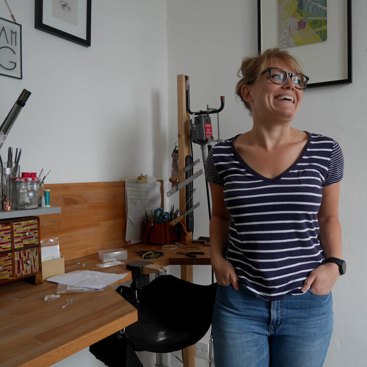
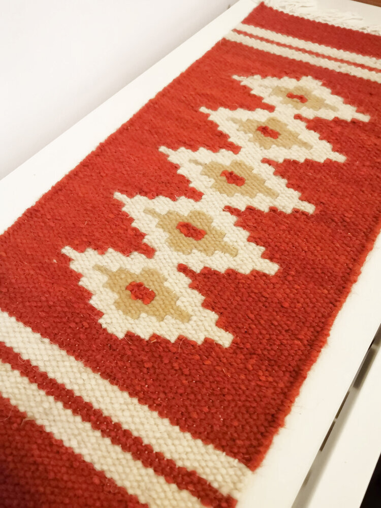
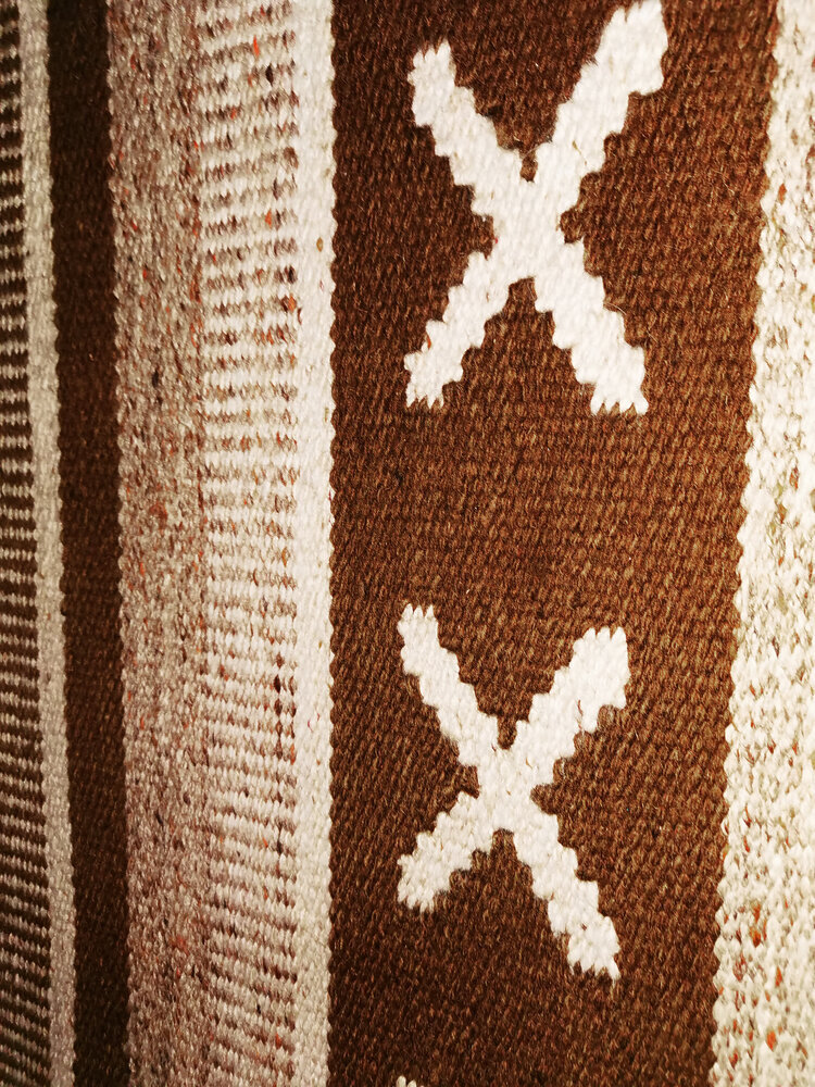
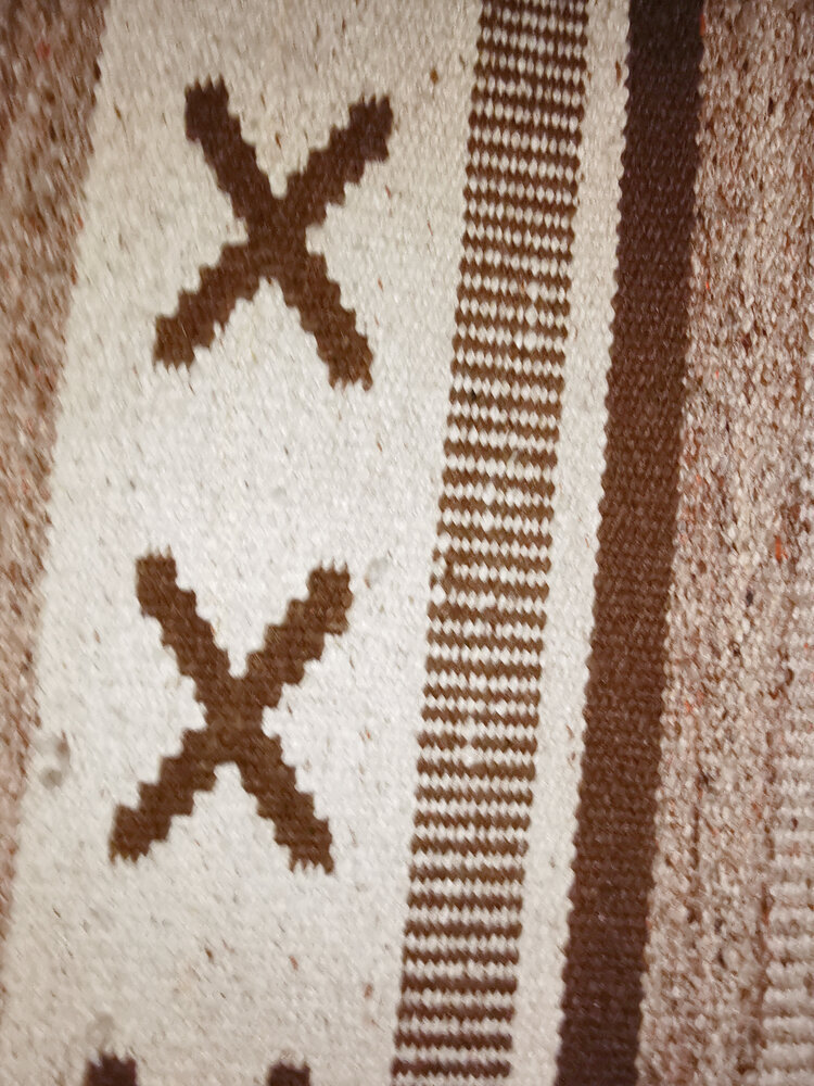
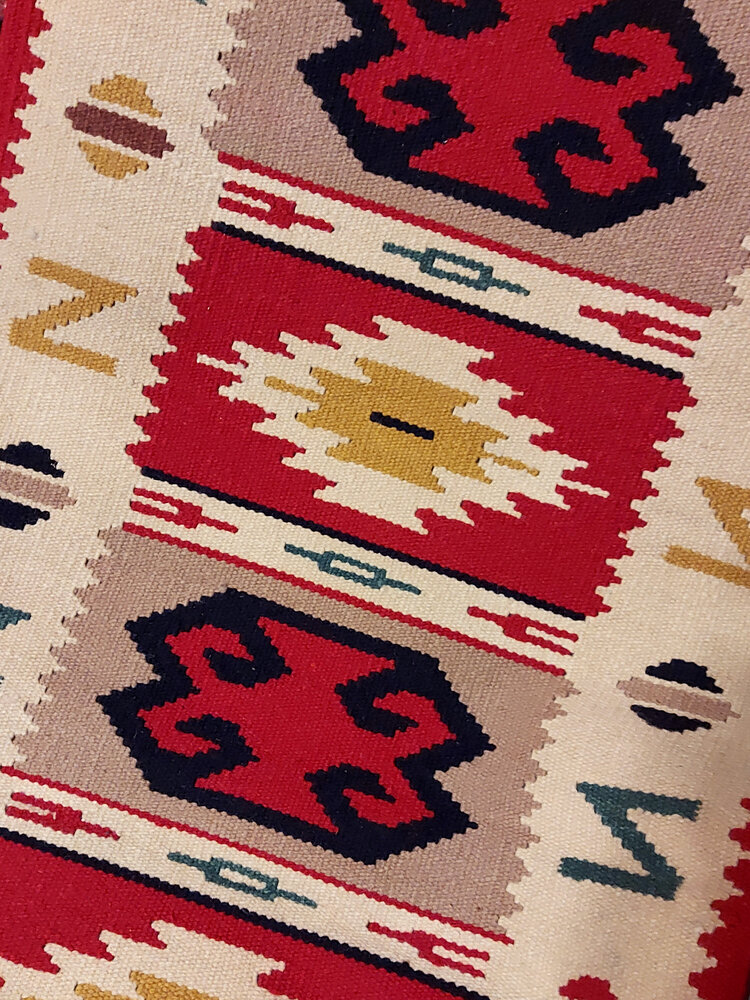
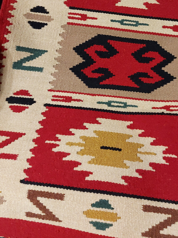
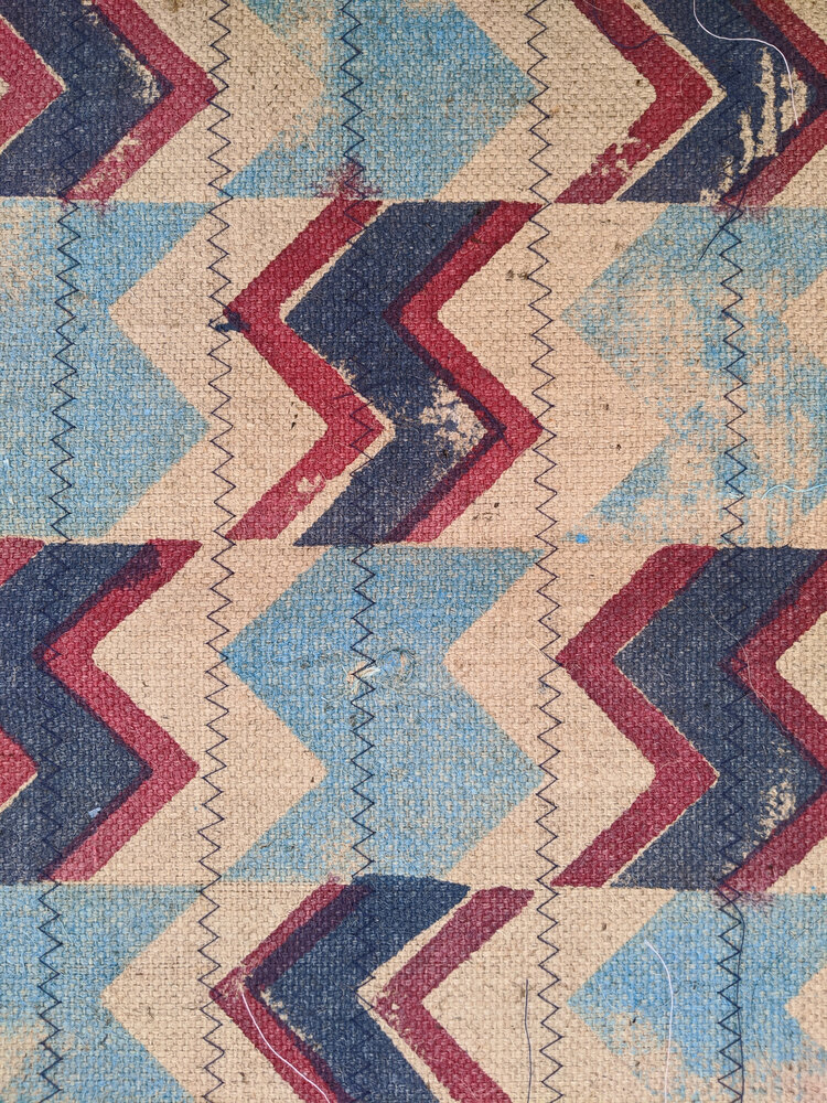
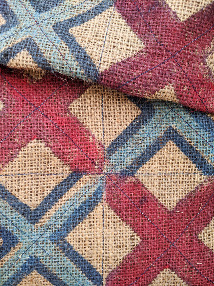
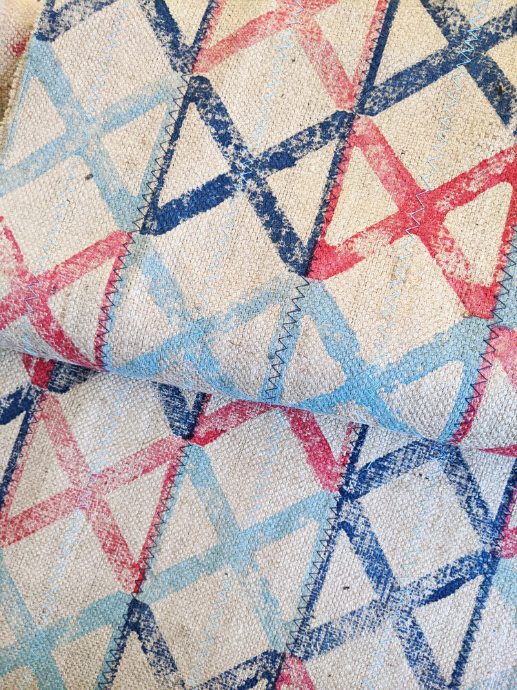
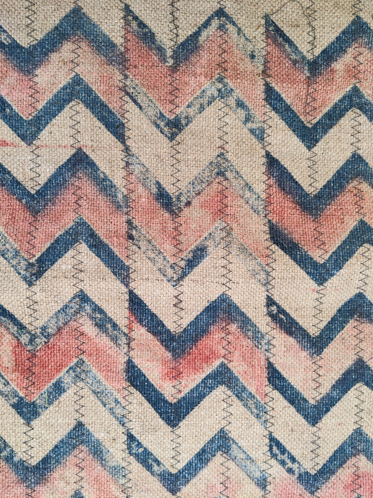
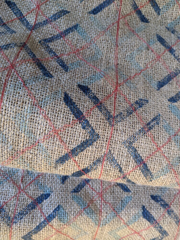
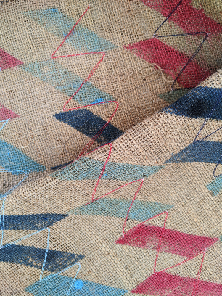
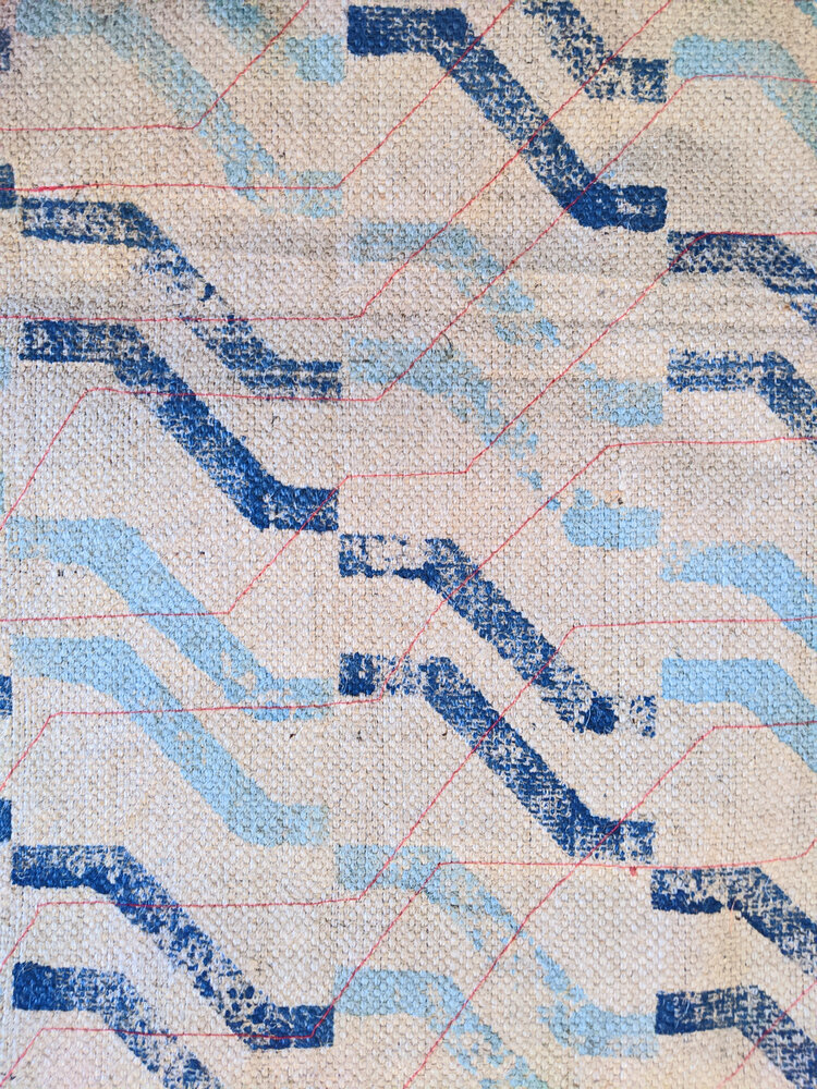
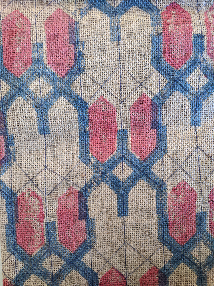
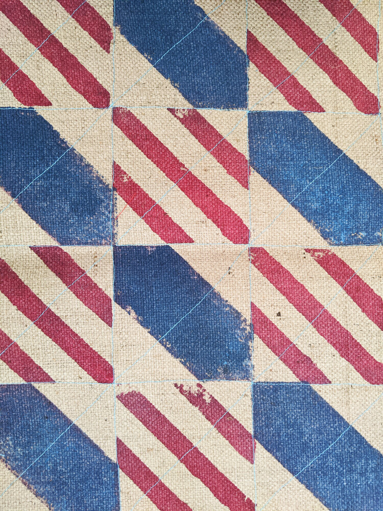
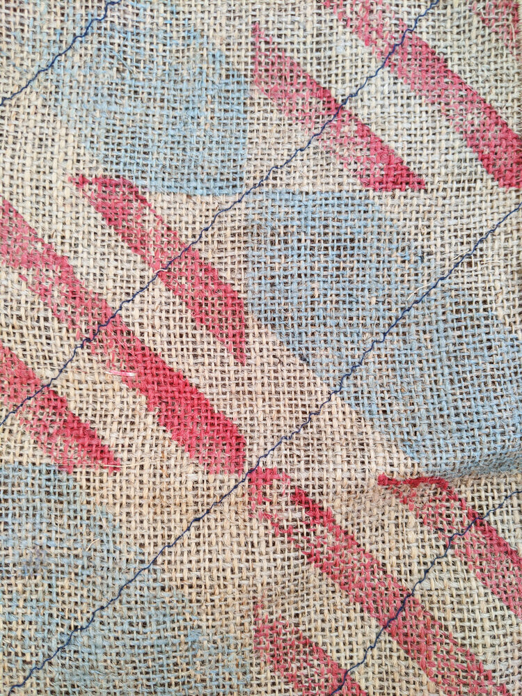
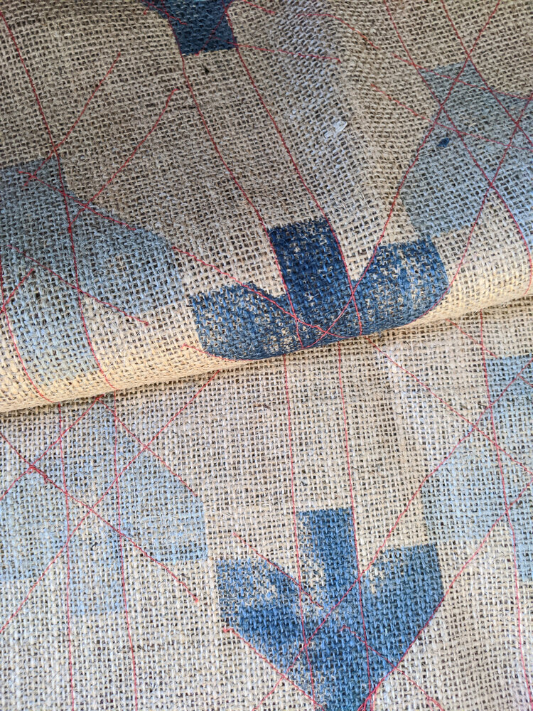
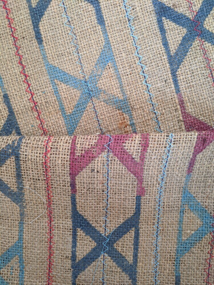
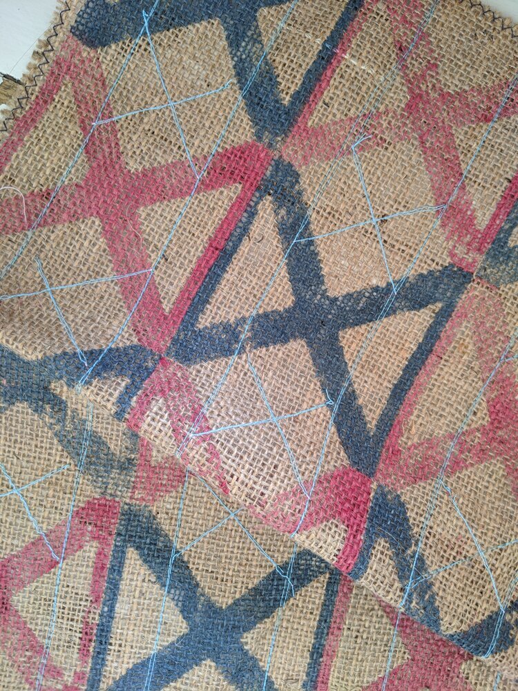
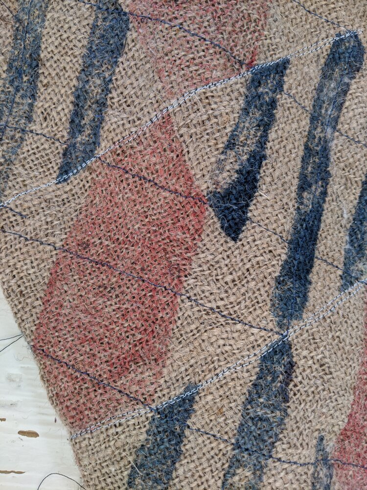
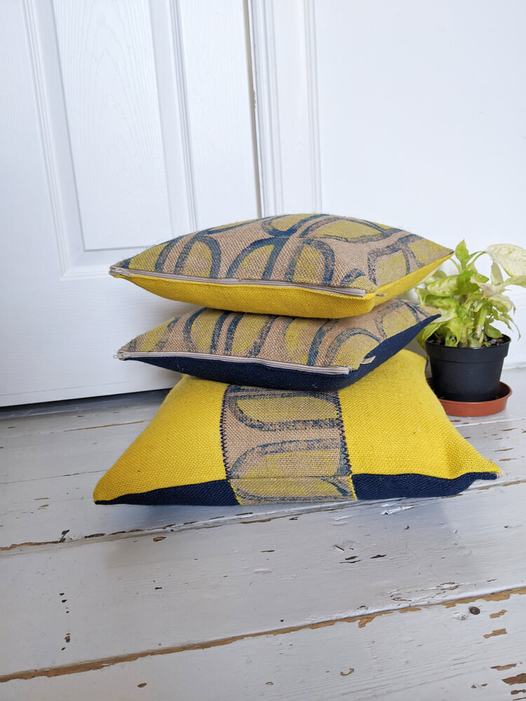
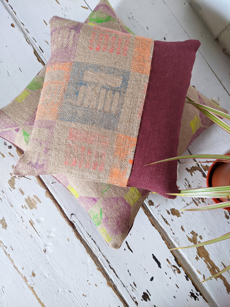
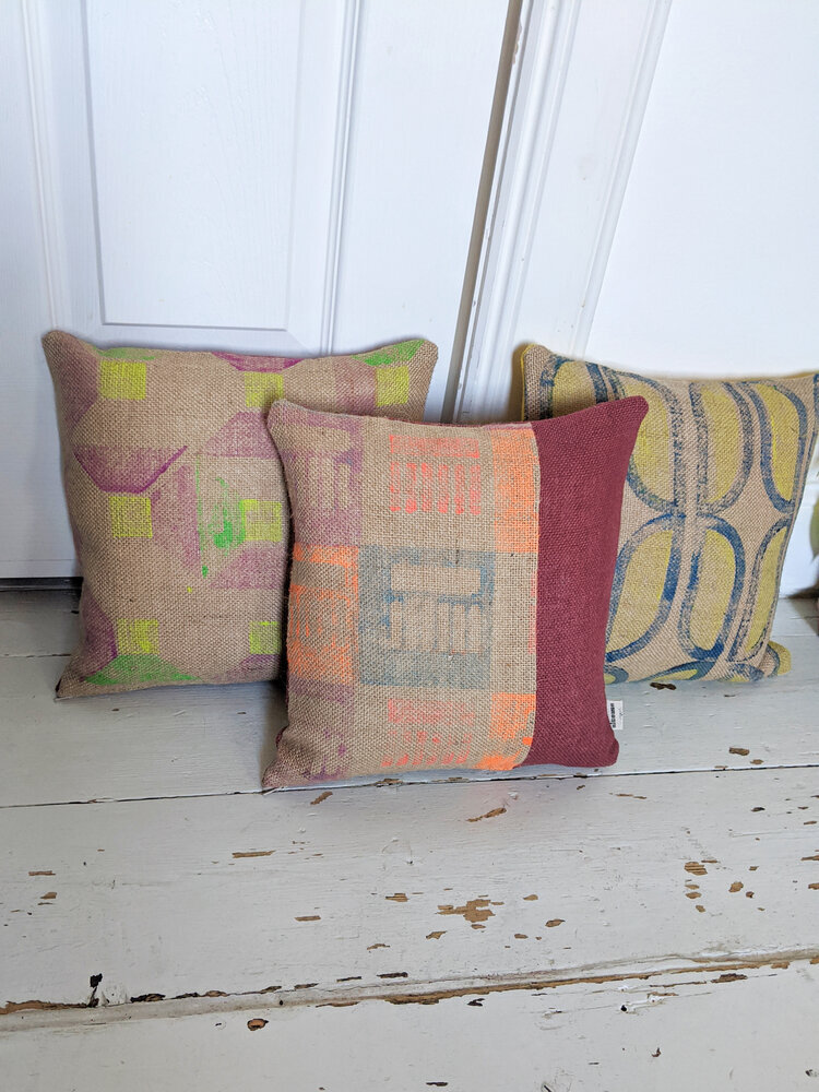
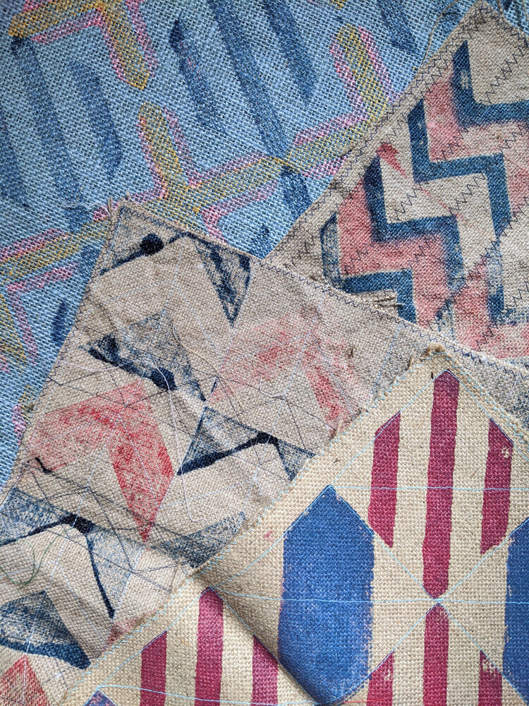
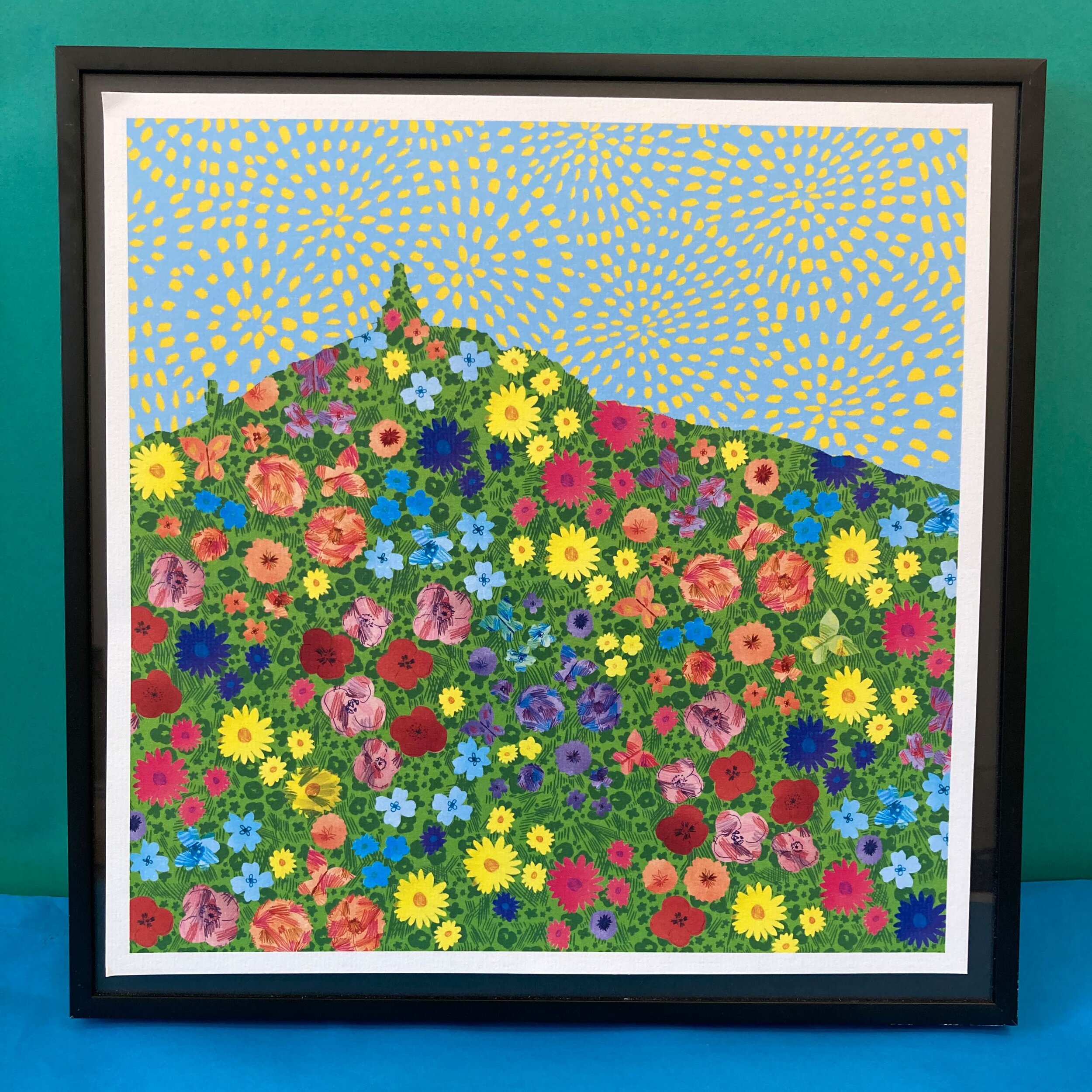
LOUISE: hi! i'm louise kirby, a local designer, i'm based in dundee and i've got a studio in dundee at wasps studios. i create bespoke print and patterns that ultimately captures a sense of place - within in all my work i like to bring out the positives and bring really meaningful and unique imagery that relates to the local spaces or briefs that i'm working on. my work is on quite a range of different things and i apply it to really small scale things as well as larger, public art, mural types of works as well. but in everything i do has this playfulness to it. my background is in textile design so my work has this kind of playful textile influence to it - i try and capture a sense of place with it but also the particularities of the brief i'm working towards. and how i got there..?

ZITA: yes! please tell a little bit about your journey too.

LOUISE: i studied printed textiles at duncan of jordanstone (DJCAD), but i graduated in 1999 so it was over 20 years ago now. i absolutely loved printed textiles and i was completely on fire. from when i started my first block, when i first discovered printed textiles i just absolutely loved it. as soon as i graduated i went to london and worked for a fashion design studio where i was coming up with print ideas but it was following trends and very much fashion related. i really liked working at that fast pace and constantly changing briefs, that we had to constantly come up with new ideas. then i moved back to scotland and just continued freelancing for the same design studio. then i took a little bit of time out and went travelling for a year - which i really recommend to everyone! i was really lucky, when i was in australia i decided to approach one of the design studios so i ended up doing some work for them too, john kaldor fabricmaker ltd. in sydney. i was only doing it for a couple of months but it was a great experience - and the design studio knew my work because they bought my designs before just through the fashion industry.

ZITA: wow!

LOUISE: when i came back i really wanted to just work out what i'm doing and where i'm going, so i decided i wanted to create my own label then. i created printed scarves on silk and wool, hand screen printed or monoprinted, and i would make them myself. this was really high-end, gallery type stuff and i did some shows with that, but i didn't just want to keep making things, and i did another "big review" about where i'm going and what i'm doing, and i got a little bursary to do some research and self development. i was always kind of worried about just making things and keep adding stuff to the world - i didn't just want to do that. i guess what i'm good at is coming up with ideas and working towards briefs, and i wanted to be able to apply that. and that's when i was starting working on more of these illustration type things and different briefs, and also seeing my work helped me think about how patterns can be applied not just onto textiles but murals and different scales. with most of my designs, i guess i really wanted to be purposeful, to be doing a job that improves space, i guess making a difference, in a way.

ZITA: that's really fascinating, and your journey is fascinating! you know it's funny because i took quite the opposite way. ok, i didn't start from illustration but from graphic design, it was more typography and logos, but then it was from that i discovered pattern, and printed textiles. whereas you started with that and then expanded. it's really interesting to see. i really love what you say about the sense of place and it is quite literal in some of your work when you do the murals. i'm really interested in those projects! i'm researching a lot about new towns such as glenrothes and i love the concept of a town artist. when you talk about improving a place and making a difference, i always think about those so i'm really wondering how these projects found you, and where we can see them in your work?

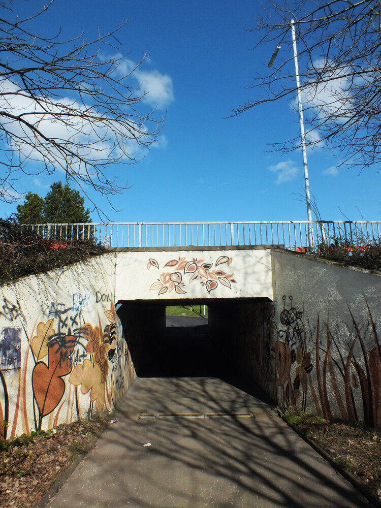
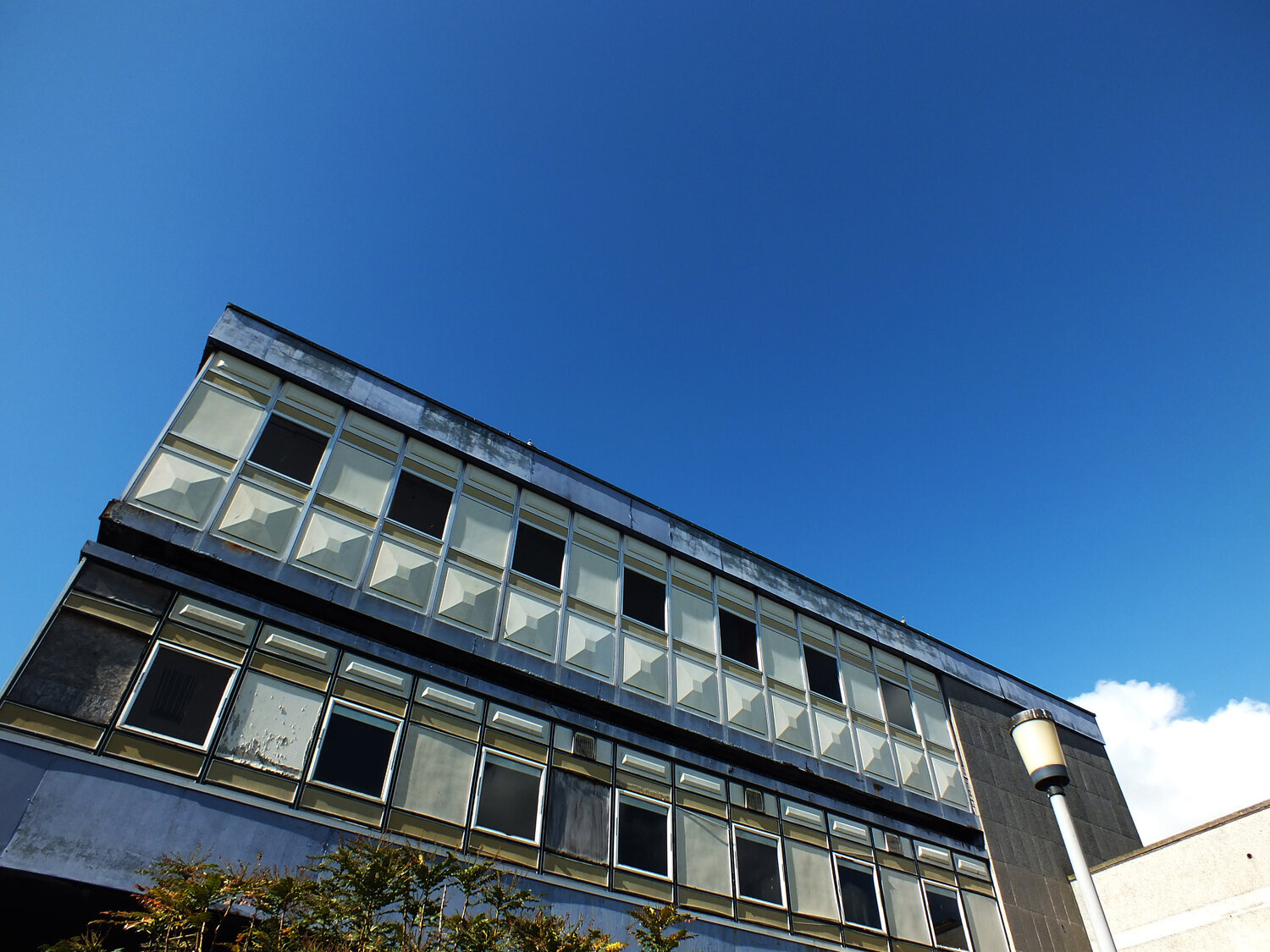
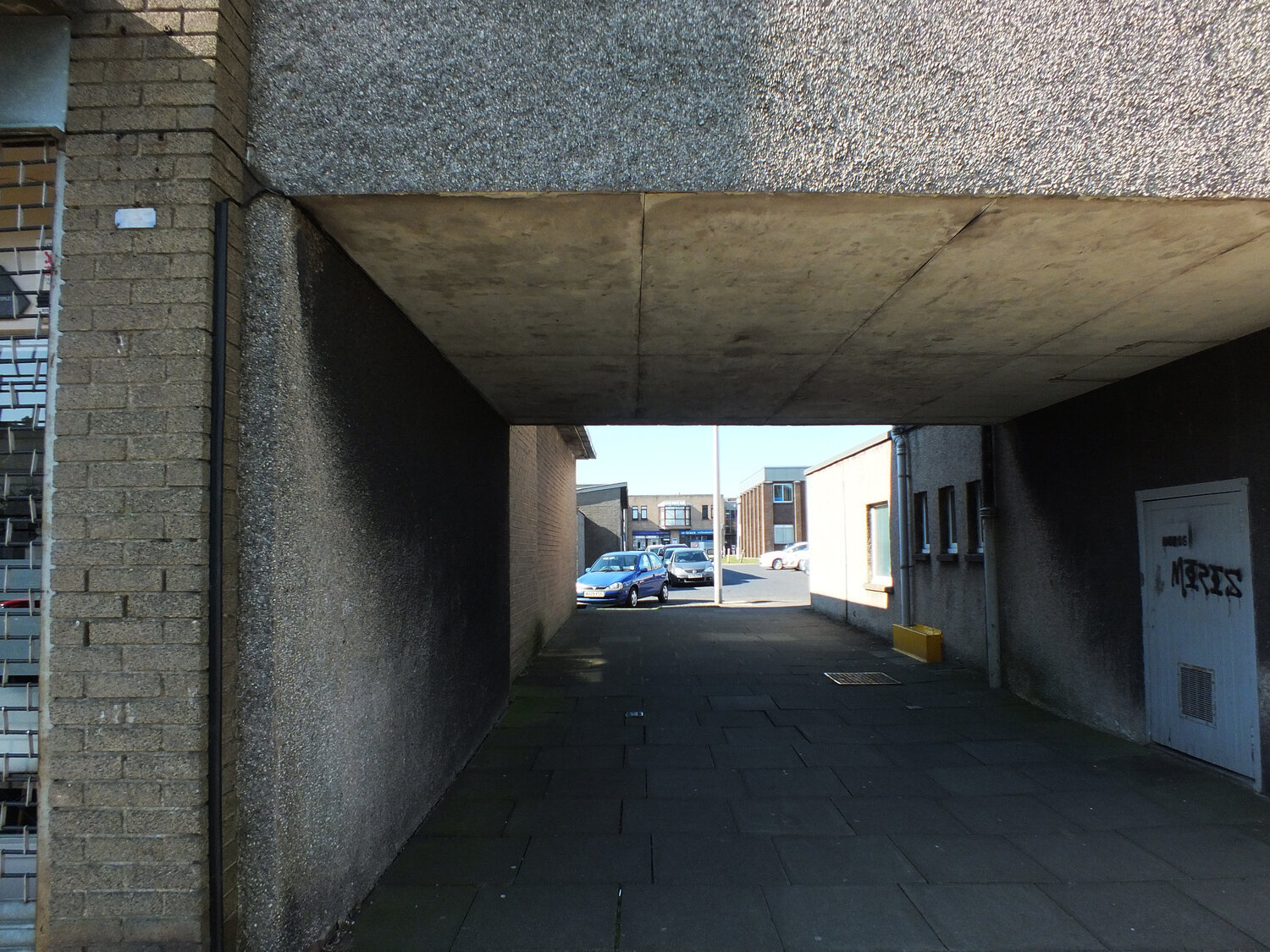
LOUISE: i guess when i come across a brief like that, i always think about, what is meaningful and unique about that particular place and focus on bringing out all those positives. how i found them... i guess it's either through open calls or you just see the commissions advertised, or maybe i've worked with people before and they know my work. an example of this is the scrapantics mural that was an open call for artists, which is on concertina doors - it's three or four metres tall and i had to use scaffolding. for me, thinking about the sense of place was about what that shop was about. scrapantics is a reusables store, a bit of an aladdin's cave of lots of different things. so i used my patterns and layering, that kind of juxtaposition of my style as a metaphor of what's inside that store, that kind of clashing and mixing things together and bring that out to the street, and just bringing some joy into the street.

ZITA: beautiful!

louise-kirby-project.jpg

LOUISE: other commissions i've worked on was the tayside healthcare trust, i worked on three different sheltered housing units, within their corridors to help improve the space and it involved lots of consultations with the tenants there. what's really important is that it's never about me just coming along and decide "hey this is what i'm gonna do", i think it's really important that i get it right for whoever's using that space. i always do the research then arrange consultations to try and really understand and get a bit deeper into what's important to the people. then i develop ideas - then i'll keep going backwards and forwards in order to come up with design solutions that fits the site-specific requirements of the space and works for all the people who will use it. i've only been really recently getting into public art, and i've done some of the wild in art trails - which are really fun to do! because they are so accessible and they're outside, it encourages families to get out and about. i really like the wild in art trail so i've done a few.

ZITA: this is super fascinating. i really admire these types of work - i've never done them myself but i love it. i love it when people adapt and colour in their built environment. it's really interesting to see how that works and responds to people.

LOUISE: yes when i was physically there and painting the scrapantics mural, people were stopping in the street and someone actually came up to me like "wow you're responsible for actually bringing some joy to the street?!" so it does make a difference! there were three commissioned by scrapantics and the whole area around it actually feels more vibrant and more - it kind of reflects the area i think, by just adding some murals to the street.

ZITA: i love that you told this story, that people stopped and talked to you. i love it when a place creates conversation in the community. this is really cool! having started from fashion though, and with printed scarves and the like, do you find it difficult to work to such different scales? i know that you do cards as well and then you say that you worked on a 3 or 4 metre tall mural... is there a lot of change in your process to adapt to that?

LOUISE: not really. i mean i love the challenge of working to a huge scale. the biggest thing i've ever done was ten metres by four metres, and I did an A4 or A3 sketch. it's still the same process, i guess i have to think about the shapes and the scales it's going to go on, how it's going to look or how it's going to be worn, so you're always just considering the end product, i guess. but it's the same process of research, development, testing ideas, playing, drawing skills, colour... all that kind of work. it's still the same process. i find it quite easy to move from one to the other actually. i guess the challenge gets me quite excited, in a way of "oh i've never done this before!". i tried to once put my designs on aeroplanes.

ZITA: really? wow, what was that like?

LOUISE: it was part of a competition, quite a long time ago now, and i got to the top ten selected designers to put my designs on british airways aeroplanes, but the idea of even just doing that brief helped me visualise the scale, like "oh wow, what could it look like?", what kind of scale it needed to be, how it would work from a distance and just understanding of how it would be seen by different people.

louise-kirby-painting.jpg

ZITA: that's really interesting. your work is quite multidisciplinary - i love it that you went from scarves to aeroplanes and you take the same approach! is there an easy switch from project to project? how do you even start?

LOUISE: so i guess i'm just starting with a sketch of what the shape needs to be, if it needs to be a card or an aeroplane or a mural or whatever, i'm understanding proportions first. then i guess i just throw myself in! and i'm always learning, all through my creative career, i always find myself googling things and watching youtube videos if i need to, so definitely there is always a learning process. and that's exciting! and it helps develop my work as well, pushes me further and makes me think. it's important to use the brain! but yeah i do find it fairly easy to switch between scales and briefs.

ZITA: and does inspiration find you spontaneously or do you have to go after it a lot?

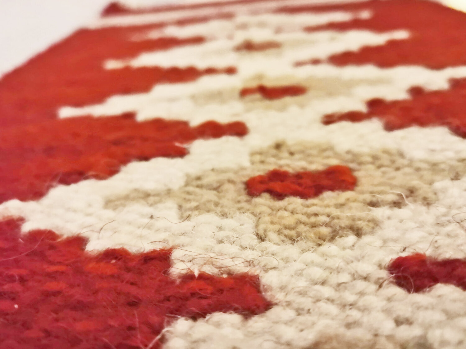
LOUISE: i'm always out and about so i'm always looking and noticing things, and it might be something really simple, like stripes, or lines or something that i can make connections with. or it might be some metaphors, something i can find meaning in and play with the ideas. it generally happens when i'm out, i have my phone with me to record little bits. my phone is full of something like 23.000 photos or something. obviously if there is a brief and a specific project, i will go out and look for inspiration that's relevant to the project. but generally i just love being outside and noticing texture and surface and lines, stuff like that. just stopping and looking closely at something.

ZITA: that's the creative way of seeing i guess! what is it in specifics you're discovering when you're out though?

LOUISE: i love looking at different textures or surfaces together, in close-up, i like that kind of juxtaposition of colour and pattern that sit together and layer up. going for a walk i think is one of the best things to do. if you tried find inspiration forcefully, it might not always be the best.

ZITA: i agree with that.

LOUISE: i guess finding your own things as well is really important. to find your own inspiration. the stuff you're taught at art college of using your own work and not using someone else's photos etc. to find what's important to you and your practice.

ZITA: that comes from your own eye i guess. apart from developing your own language, your output, you must develop your own eye, your input as well. to train your eye to see what you're really looking for. talking about others and inspiration from them though, here's the bit i'm always going to ask from everyone - can you recommend a book or another designer who might be worth looking up?

LOUISE: i think the whole series of the austin kleon books are really good, the show your work!, steal like an artist, he's got about five of them i think. and they're short reads and pictorial as well so they're really good, motivational little books. the simon sinek stuff, relating to finding your "why" as well, i've read that recently. as for artists... i'm going to recommend you someone from dundee, her name is nicola wiltshire and she paints on patterned fabric. her work is really interesting and she uses really really interesting colour combinations. some of her recent work has been about landscape and places - and some of it is more like portraiture or still life.

louise-kirby-project-1.jpg

ZITA: that's cool, i will definitely check her work out. the simon sinek book has actually been on my list for a while as well. good recommendations, thank you!

LOUISE: listen to the ted talk first, there is a ted talk. there's a whole process to go through, it's really worth it. you're about to look back on your life and find the things that are really important, to find out what ultimately is driving you. and it's not always what you think it might be!

ZITA: ooh that sounds interesting, i look forward to getting into that! and to finish this conversation with even more useful information, where can we see your work, what can we expect to see from you this year?

LOUISE: you can see my work in dundee and the dundee delights collection that i create, which is a range of greetings cards, prints and products. currently only really available on my etsy shop as most of the stockists are closed. out and about you can see my stuff, i guess the scrapantics mural is one and you can also see my penguin from the maggies penguin parade in jute cafe bar in dca (dundee contemporary arts.) as for what's to come later... i'm working on an amazing project just now, it's called spaces for people. it's quite exciting and i'm getting to do all the things that i wanted to do! it's about improving space for people in an area and we're creating temporary interventions to try some ideas out. but i'm not going to say too much about it because it's not out there in the public yet!

ZITA: oh that sounds super exciting though i wish i could ask you more about that.

LOUISE: i know! and i've got more of the wild in art sculptures as well - i've already created the lighthouse trail so the lighthouse trail is going to happen this year, but that's going to be in the aberdeen - shetland - moray - orkney areas. and i've just been told that i'm getting to do another one! but i cannot tell you what that is yet.

ZITA: amazing news! very exciting.

LOUISE: i'm also doing a project with dundee rep theatre, i got one of the micro-commissions, to create a piece of theatre. something completely different for me! i'm collaborating with a drama artist called amy hall gibson, and we're creating a piece of children's theatre called "dundee delight dice". this is based on what i do, highlighting all the positives about dundee but bringing it to life. using a giant "story-cube" type idea. that is going to be coming out later this year as well. we're having to adapt it because it's not necessarily going to be in the same format that we pitched originally due to the circumstances just now. but this is quite exciting, because i really like seeing my work in a new context and it's making me think about how my designs can work in different ways as well. and who knows what else! i will keep applying for things and see what happens.

ZITA: this is very exciting. and what a journey! from fashion through murals and aeroplanes and now children's theatre. this is an amazing creative journey and just really shows how a particular way of seeing and working and applying patterns and colours can be applied to so many things. thank you so much for sharing with me.

LOUISE: it's been great!

-

links:

louise kirby’s website

louise kirby etsy shop

scrapantics

wild in art

nicola wiltshire

dundee rep theatre

ARCHITECTURE, BRUTALISM, HUNGARY, INSPIRATION, BOOKS

personal and biased book reviews - eastern blocks by zupagrafika

soooo…. here’s another new blog post series because there are too many forms of inspiration that i want to discuss on the pages of this little journal. i guess it’s only obvious that apart from making things, walking amongst buildings and talking to people, i also like reading books so i’m going to share some of my recommendations and thoughts about inspiring books as well.

i’d like to warn you though that they are entirely personal and biased and every single thought i share about these books will always be heavily from the angle of my own work and what i do and make, so please don’t expect objective, academic reviews because my inspirations are so intertwined with my making. this is going to be more of a series about the thoughts that are influencing my work but let’s start with an easy and visual one - eastern blocks by zupagrafika (2019). this is an absolutely non-comprehensive little collection of photographs of eastern european housing blocks (yes, some from my city, budapest too.)

zupagrafika are an independent publisher/design studio - founded by david navarro and martyna sobecka in poznan, poland and i’m a bit of a fan since they almost single-handedly occupy the niche market for celebratory publications of brutalist architecture in the former eastern bloc and they do it well with a beautiful range behind them - i first got my hands on eastern blocks when it first got published in 2019.

as a predominantly visual work there is very little amount of words, we get a short foreword by christopher beanland from a western perspective and then we can dive right into the photographs, many taken by the design duo themselves. the chapters are divided by locations - we get to visit prefab blocks and estates in berlin, moscow, warsaw, kyiv, budapest and st petersburg. the photography is beautiful work and it’s not from a fixed angle or aesthetics, and that is the greatest benefits i think.

zitozza-reviews-eastern-blocks-by-zupagrafika.jpg

while i don’t completely agree with beanland’s foreword that housing blocks in eastern europe were all about the spectacle, it is true and it applied to all aspects of life, including housing, that image (that of the regime’s) enjoyed the highest priority and it came before any other practicality of real life. for this reason though brutalist architecture nowadays often appears manipulated into either unrealistic, utopian/dystopian depictions of uniformity and scales that never existed, or as exaggerated clichés and close-up metaphors of hardship and suffering. here in this book there is neither, the photographs are simply curious and the reality of the architecture seems to be there as they are - the buildings are obviously the main characters, but the people aren’t invisible. this book is about homes, we don’t get to see inside them but glimpses can be caught of the lives in them and the building’s relationship with the people can also be guessed, neglect or preservation, renovation is all on the photos. we are not to forget that these building blocks aren’t standing on their own but are intertwined with their cities places and people’s lives - there is a human scale and element in even the grandest of scales on all the photos. or perhaps it’s just how i see them because i share the authors’ curiosity about them.

they have another related title that is more connected to my work, panelki. i might reserve a more detailed review for this later but let me just explain how it relates - this book explains a little bit more context on the prefab housing but half the pages are literally a modular set of beautifully illustrated pop-out paper blocks, of which you can assemble your own little prefab house with it. they do have other architectural pop-up books but it’s the one that’s modular and it is very much like how you can create your own pattern here - it’s a bit like how i print so i enjoyed discovering this one.

because of the visible curiosity of eastern blocks though, this remains an inspiring little book after years of looking through it. not only i keep finding new details on the photos themselves, in the close-ups or the facade or the shape, but also it is incredibly well indexed for the architects - all the names are there, the search rabbit hole is ready and inviting to disappear into. there is a lot to enjoy and for those who like my block prints and want to understand more about their inspirations, i totally recommend this book.

-

link:

zupagrafika

eastern blocks (2019, hardcover, 144 pages)

panelki (2019, hardcover, 40 pages)

ARCHITECTURE, DESIGN CONVERSATIONS, INSPIRATION

in conversation with kate mclaughlin of align jewellery

hello february! we are well into the grind of 2021 now - and for an extra dose of creative stimulant i decided on a new series of blog posts. as you know i’m constantly looking for new things to look at, read and new people to know about so i figured you might feel the same after a busy january. therefore i am happy to publish the first in a series of conversations with designers, makers or craftspeople of all disciplines whose values or inspirations i share. my first virtual guest is kate mclaughlin, architect-turned-jeweller of align jewellery.

kate-mclaughlin-align-jewellery.jpg

ZITA: hi! first of all, tell me a little bit about yourself, what you do and how you got there?

KATE: hi! i'm kate, and i'm a jeweller but my background is in architecture. i create architecturally influenced jewellery that is quite minimal, bold and uncompromising in its linear and geometric qualities. i studied architecture - i went straight from school to edinburgh college of art so it was very much "art school architecture" and we were really taught how to design over many many years and this is so deeply ingrained now. we were taught a kind of design process and we were just doing it over and over and over again to the point where i can't not do it.

ZITA: i think i know what you mean!

KATE: and after i studied architecture i went into practice and i realised that commercial architecture wasn't for me and my jewellery hobby kind of took over unintentionally, in a series of happy accidents. i didn't consciously decide to quit one and do the other but one faded in and one faded out. but that "drilling in of a design process" of being really critical, and analytical, and questioning everything - i couldn't make anything in any other way. when i explain to people that i was an architect, they always immediately understand, i guess it makes sense, aesthetically. but i think my process is also very influenced. and some of the tools i use came with me too: occasionally i think the easiest way to do it would be a CAD drawing. sometimes i still think of things as "plan, elevation, section", and i look at the different sides and draw an elevation of a piece of jewellery. i'm fairly sure that regular jewellers don't think like that or use those terms even! so there are layers of how it is architectural. does this make sense?

ZITA: yes, it totally does! and i like how you describe your work on your website and social media, that you call it "wearable architecture" and to me as well it signals that you haven't really shifted from that mindset. or was that not an easy shift? you talk about a gradual change, of one fading in and one fading out. did you find it easy?

KATE: the architect in me will always be there, it’s just how i earn money shifted, one eased in and one eased out. but actually, part of it was really really hard because i spent so long aspiring to be, and in a way fighting for architecture, that it's really, really hard to give up and walk away from all of that. actually, i still do a little bit of practice and a very little consultancy work for a local practice as well. part of it is keeping my hand in, but part of it is a comfort blanket thing... my last ten years strand back to my previous life!

ZITA: i understand that!

KATE: as for "the how easy it is" thing - i did, at one point, in my jewellery tried not to do architecture. at the time i think i was in a huff with it. i thought “nah, don't want to do that anymore”, i’d just turn my back on it and do something completely different. so what i was going to do was freeform and floaty and natural, and i made these things that were all organic and petal-like, and i didn't know how to make them into a piece of jewellery. so i made a box, to put the things in, and by the end of finishing the jewellery, i had kept the box and ditched the organic freeform things and had this really really geometric cage thing. so at that point i thought, oh, okay, so it's not a choice!

ZITA: wow! that's exactly what i was trying to get at, whether you can change your mindset or not. but you explained about your training how that's so deeply ingrained so i was wondering if it's even possible to get rid of that.

KATE: yeah i'm sure it's possible, i believe people and brains have the ability to re-learn but i don't know i if i want to re-learn badly enough to put in that effort.

Align Jewellery 8.jpg

ZITA: i can relate to that! and is there a particular style or school of architecture that you're inspired by or is it more about the space? is there anything very particular you look out for or have a "trained eye" for - or is it just space and form that really catches you?

KATE: i don't like subscribing to a particular school - what i really appriecate and notice are small parts. i’d never say "that's my favourite building" or style, but there are details. either really little, like a window surround, that little. or a specific view, or it's often about how different things meet. how a building meets where it is or how different materials meet each-other or how spaces meet each-other, it's that kind of intersection. and it's interesting and beautiful in really mundane architecture. if you notice those things you can see them all around you all of the time, even in what should be quite uninspiring places.

ZITA: oh yeah, that does absolutely resonate with me. i work like that too, i find patterns, not jewellery in the same forms, but i find the beauty in the same things too. i find rhythm and texture in cityscapes and gas tanks, cranes and places like that.

KATE: yes!

ZITA: and i guess where i find a pattern you find a spatial form?

KATE: yes, flat forms to me feel unsatisfying, i always try and find three-dimensional forms, which is what i mean about wearable architecture. when i'm out and about and looking, i get quite often drawn to textures. the rough, building material textures, do you know what i mean? concrete or things that are cracked or worn.

ZITA: oh yes i get that! me too.

KATE: i know that doesn't translate to my jewellery but when i come home with weird architectural photos it's quite often a textural thing!

ZITA: yes! that's interesting. i was just going to ask about that, would you consider using other materials? right now your jewellery is silver, isn't it?

KATE: it is!

ZITA: so do you look to expand or incorporate other materials in your work?

KATE: i would love to. i'm not sure what form it would take. and, i'm a also slightly wary, because if a new material was going to involve a new skillset, which really excites me and i really want to do, i would also see myself disappearing into a rabbit hole... and never coming back!

ZITA: yeah there’s always that danger.

KATE: but i'm interested in it and also there is a nice thing in taking something that's really common and everyday and making it into something that's really precious. like using concrete. or using found objects but setting them as if they were precious stones and making them feel as if they were really precious jewellery. actually, i've recently commissioned a lady who works with jesmonite to make me little props to take my photographs on, and they all have slightly different patterns on them. they are all super smooth and the texture is beautiful, and there are patterns in the colour - they are not just grey, they are really lovely and looking at them makes me think "woah i see the potential".

Align Jewellery 3.jpg

ZITA: that sounds really cool. so if other materials are not the immediate next step for you, then what is? what can we expect to see from you next?

KATE: so going back to the texture thing, at the moment texture doesn't really feature a lot in my work because i always thought it's about the form. it had to be about form and nothing else so texture hasn't really been in it, so texture is my next thing! it's been ongoing and i have a "shopping list" of some traditional and not so traditional things to experiment with. i don't know what it will look like in jewellery, so my next thing is a non-jewellery experiments on how to create different textures and maybe going back through my architectural close-ups and look into how i can re-create some of that. but step one will not involve any jewellery because it's less of a pressured way to do it! making it into jewellery will be step two.

ZITA: maybe you could exhibit your experiments as sculptures!

KATE: yes i would love my experiments to be a beautiful thing, even if it's only a “sketchbook” of samples. because then you could back to it over and over again and you might end up discovering loads of textures or loads of techniques so it might just be a case of keeping your records - so i would quite like whatever it is to be a beautiful thing to keep and go back to in the future.

ZITA: that sounds like a great plan!

KATE: i think that's quite achievable in lockdown, it's something i can do by myself in the studio so that's the immediate plan.

ZITA: and, having spoken about inspiration - does it find you spontaneously or do you go and actively research?

KATE: it is very spontaneous. when i go out and about and i see something i like i take a picture of it without thinking too hard why i like it or what i'm going to do with that, it's just a photo of a weird thing. i don't think it's any more than that, it's just like a gut instinct. often when i'm making i've been making it up as i go along more. sometimes things just take a turn as you're making, and you see an opportunity and follow your nose. i do have collections that are way more thought out and involved a lot more research. they were a bit more engineered in a way, i thought about how a collection of pieces sit together, but it's been a while since i worked like that and i've been thinking recently that maybe i need to go back to working like that.

ZITA: thinking about research - and this is something i want to ask from everyone i have these conversations with - can you recommend a book, or recommend someone whose work you find inspiring?

KATE: the person i'm going to recommend to you is karlyn sutherland, and she is a glass artist. i studied with her so she also started out in architecture. she did a phd and in it she looked to place and it lead her to glass, she made glass art about place as part of her architecture phd. she is a world renowned glass artist and her work is really architectural. it's really amazing and deceptively simple. you would really have to look to understand - you should definitely, definitely look her up.

ZITA: thanks, that's great! i’ll check her work out. i'm a bit of a design junkie and it's why i want to ask from everyone, i love discovering new work and it also says a lot about the person recommending it i think what they find most interesting.

KATE: that's a good question to ask!

ZITA: and the very last one - apart from your own website, where else can my readers find your work or buy your jewellery?

KATE: right now, a lot of my stockists are shut obviously. hopefully you can find my work at yorkshire sculpture park, as part of their made exhibition - whenever they're allowed to open back. and just yesterday i found out that i've been given a place at the digital craft festival which is happening at the last weekend of march (26th - 28th). so you can find my work through that!

ZITA: brilliant! i think that's an excellent news to close this with! thank you so much for your time, i think it’s been a meaningful and inspiring conversation, and i hope to speak in person some time.

KATE: thanks!

-

links:

A L I G N J E W E L L E R Y

Kate McLaughlin - maker profile on Craft Scotland

Digital Craft Festival

Yorkshire Scupture Park - Made exhibition

Karlyn Sutherland - Heller Gallery

ARCHITECTURE, BRUTALISM, SCOTLAND, INSPIRATION, GLENROTHES

the green and the grey (an architectural journey through glenrothes, pt. 2)

not having forgotten where we left off with our walk in glenrothes (read the previous part here), we are now ready to continue into the new year, aren’t we? let’s be curious and keep exploring our brutalist architectural journey through glenrothes. if i recall correctly, last time we were at the co-op and the kingdom centre, so let’s come out to the end of the street where the council buildings are - this is the focal point of the town and these buildings form one of the most spectacular landmarks of the town, sadly with a few ones already fallen.

there was glenrothes house (demolished in 2012) and kingdom house (demolished in 2020), and there is still rothesay house and fife house standing. together they form the headquarters of fife council, scotland’s third largest council, governing about 300.000 of us. my favourite buildings were actually the ones gone now - they were the original ones from 1967, first built to house the glenrothes development corporation (in 1967), which later became the office for fife council’s architectural services. of course architects will build the best ones for themselves (and of course my taste goes with theirs.) luckily i managed to catch kingdom house in its full beautiful form on my photos and i’m sharing below for you to enjoy. it’s the windows that got me, the sleek geometry, the angles, the smooth concrete and the not quite symmetric arrangement, that makes up a 3D pattern, a large-scale texture of smooth modules. and i also love the vertical blinds behind the windows and the neon lights that come out in a dark winter afternoon. i just love a modern facade and imagining the kind of work taking place behind it. i would have loved to go inside but it’s gone now and the “obituary” is just a dry warning on road closures to expect as the beautiful building gets taken away. so sad.

what’s remaining are the newer additions, the still concrete, grey and brutalist rothesay house and the more colourful-looking, extended fife house. the former is grey and textured, the latter has some white and green accents on the concrete facade which makes it interesting and is an intriguing pattern inspiration. i’m really not a fan of the postmodernist additions though, especially not the clocktower thing - nevertheless it’s all part of the townscape now and at least the mirrors reflect and double up the brutalist surroundings.

it's all very open and bright though, it certainly feels spacious and airy to me with the open car parks and roundabouts at the centre - i tried to emphasise this sense of openness with my photos, it probably helped that i visited on a sunny day. if a postcard is ever made of glenrothes (unlikely i know but why the hell not), i would pick these photos above - raw concrete window patterns and open, spacious roundabouts with tidy green centres is possibly the most accurate summary of this town. everyone who even has heard about glenrothes will mention roundabouts, they’re almost more famous landmarks than the buildings themselves. it’s very typical of the new town layout of course to separate cars from pedestrians and let cars take up the open, spacious roads. they are also perfect to place public sculptures too - glenrothes was the first town to employ a town artist and is known for its public art (and i might cover this in another blogpost because it’s super interesting!)

the sculptures used to be scattered across the town (and some still are of course) but a lot of it now has been moved to riverside park, just across the road from the council buildings. it’s large, spacious and green - if the road is for the cars, this is for the pedestrians, a massive green space for people to enjoy freely. apart from the sculptures and skateboard park, there are flowerbeds and duck ponds and woodlands - this is the largest green area of the town. the river of which its named after is the river leven - with bridges and obligatory philosophical graffiti - the latest addition being the creatively named river leven bridge, built in 1997, leading the B969 road over the park.

not far from the bridge, a steep set of steps lead out of the park into the residential areas where i’ll take you to next time in the final part of our tour. i hope you enjoyed this and are feeling inspired by the rich, deep facades and the open, inviting free space.

-

links:

office block demolition in glenrothes leads to road restrictions (the newsroom, fife today, 07/01/2020 )

when natural cycles turn, brutalist windows can dream of trees (from hill to sea, blog post by murdo eason, fife psychogeographical collective, 17/04/2014)

glenrothes, fife (personal blog by anonymous author)

INTERIOR DESIGN, SUSTAINABILITY, TEXTILE INDUSTRY, INSPIRATION

the 8 interior trends that will define 2021 - and the good news is, eco-conscious design is growing!

first of all, happy new year everyone! i guess we have all agreed not to talk about 2020, so i don’t want to say too much apart from how much i hope you all have an amazing new year with many well deserved, happy moments. for now, it seems as though we are stuck indoors for a little extra time again, and it’s all a bit grim. but here at zitozza indoors is what we’re good at, and with that in mind, you are invited to look through the interior trends of 2021 with our research glasses!


1. ECO CONSCIOUS DESIGN!

i was hesitating whether i should really call this a trend at all, when in fact it should be the standard really, but it’s just a fact that eco-consciousness has not been high on many agendas until recently. from the design industry’s perspective this has been imperatively rising though - and i’m 100% certain that it will be the most important one for decades to come. personally what i’m most excited about is the revolution collection by vondom - the first part of it (called “ibiza” by eugeni quitllet, made of plastic waste in the mediterranean) came out last year - read a little bit on design milk.

and this year we’re expected to see sustainability in many more ways - not just in durability and reusability but also in more innovative material choice such as foresso - the timber terrazzo, this beautiful surface. i love how it looks - texture within texture! made in the uk (birmingham) with bio-resin and timber waste, their sustainability credentials and transparency with their products and traceability are truly exemplary.

image and product design by foresso.


2. EARTH TONES AND TEXTURES

warm is the new cool, and interpreting a luxurious space as a kind, bracing cosiness has been growing and growing in recent years, resulting in a beautiful play with many textures and organic designs. clay, woodwork, boucle, velvets… this is very much about tactile qualities combined with warm colours and round, cocooning forms. coleur locale illustrates a rich, well-travelled take on this - below in the styling of the brilliant cleo scheulderman. it’s the comforting hug of mother earth that we crave!

photography by Jeroen van der Spek. styling by Cleo Scheulderman, 
client: Coleur Locale.


3. FRESH, OPEN BLUES

remember what free, open spaces used to be like? remember the summer breeze under the bright wide sky? remember the beach, the colour of the ocean? it’s hard to imagine it right now, scooped up inside in the midst of an ugly, grim january but those amazing blue hues are being brought indoors with rather spectacular results. as a fan of this colour i’m really excited about benjamin moore choosing it to be colour of the year. if you’re familiar with nicola harding and co. then you’ll know that she is an expert of using these shades for cool, thoughtful spaces with lots of charm and character. the below snippet is from this project (published in house & garden last year) - can we please take a moment to note the rugs too!

design by Nicola Harding & Co, photography by Paul Massey

4. ONE ROOM, MANY FUNCTIONS

hands up, who’s surprised at this one? since we have spent pretty much all events of our life at home recently, this trend has risen perhaps out of necessity, but it’s here to stay because it’s immensely practical. while it has really been simple reality for many people, 2020 has certainly brought it to the surface and the market for functional solutions might expand as a result. expect to find space dividers and lots of clever home office furniture - the personal pick is this super smart, modular home office by arnie.m - the brainchild of angela and matt maurer. british made (in manchester), masterfully skilled, fully customisable and it’s sustainable too - made of 100% natural plywood (with beautiful wood pattern on the surface) and none of that awful mdf stuff.

kor0WWiQ.jpeg
WIuJk_Qg.jpeg
design by Arnie.M, photography by Paul Moffat Photography. 


5. FUNKY ACCENT RUGS

the one i’ve been waiting for! this one is for the pattern lovers out there and it’s just become barefoot-friendly. we have been layering upon layers upon layers for the past few years now, but increasingly we’re doing it to the floors as well and i’m 100% here for it. rugs outside, rugs in the kitchen, rugs on rugs, everything goes with everything. it’s the floor that makes the statement in 2021 so give it the love it deserves. london-based floor story always has some of the brightest and most exciting collaborations to look forward to - a great start to the year with the mediterranean collection by adam furman.

image by Floor Story, rug design by Adam Furman. 

6. NORDIC WABI SABI

minimalism has also taken a more inviting, warmer form in recent years. it’s still quite rustic and sparse but with plenty of thought-provoking richness in texture and imperfect, natural form. it still seeks that delicate contentment, and it still finds it in the peaceful serenity of warm, monochrome hues and natural surfaces, worked with the most skilled craftsmanship. but recently, it has all taken a more hugging, cosy, organic form in a somewhat scandinavian manner - or dutch as seen on this take by cleo scheulderman for vtwonen. it’s an artful creation of an unfilled but stimulating space where we want to go to to feel better about everything again.

photography by Jeroen van der Spek, styling by Cleo Scheulderman, 
assistance by Mette Sophie, client: vtwonen

7. VINTAGE LOVE

classic styles become such because they work, there is nothing new about that. however there are always new and ever more inventive ways to widen the boundaries and take braver, bolder twists on our cherished favourites. and if sustainability is chic, then surely, the glamorous way to do it is to give our vintage treasures the love and attention they deserve. it’s all about expression, maximalism, individuality and all the personal stories each object bears. i chose another take from nicola harding & co to illustrate this - a fabulous, opulent space that feels inviting and familiar at the same time.

interior design by Nicola Harding & Co, photography by Paul Massey


8. NATURE AND GREEN (and all the other colours)

maybe houseplants are not a “trend” so much, we just collect them because they are great and we love nature. but those of you with gardens and balconies have really hit the jackpot and a new appreciation certainly grew out of last year’s events. outdoor spaces are being increasingly valued as an extension of the living space and they’re now getting their rightfully earned, fully saturated upgrade with appropriate cosy cushions and floor covers. this one by mimi forrest is obviously not an outdoor rug but first of all it’s too beautiful not to be shared here and secondly, the styling might just give you the right idea - it is exactly the type of indoor space we want to see more of in 2021.

i hope you will all have an amazing, productive and successful 2021 with lots of colour and pattern - and more importantly please stay safe and healthy! although the start to the year feels worrying and sad, i’m hoping that it won’t be much longer until we can work more closely again and i’m looking forward to seeing more of your creative projects. happy new year!

image by Floor Story, rug design by Mimi Forrest


-

further reading

interior design trends 2021 – the 20 top looks for the new year (jennifer ebert, homes & gardens, 01/01/2021)

the biggest interior design trends for 2021 revealed (jacky parker, livingetc, 23/10/2020)

living room trends 2021 - top styling tips and trends to inspire (ruth doherty, ideal home, 09/10/2020)

pinterest predicts 2021’s interior trends: how to add them into your home, according to experts (eva waite-taylor, the independent, 15/12/2020)

interiors trends that will be big in 2021 :how to update your home for the year ahead (prudence ivey, homes & property, 31/12/2020)


SCOTLAND, ARCHITECTURE, BRUTALISM, INSPIRATION, GLENROTHES

the co-op and the kingdom (an architectural journey through glenrothes pt. 1)

for those of you in fife this will be the familiar - yup, this one will be about glenrothes. i’m really into this town (the only new town on the east), so much so that i’m going to split my photo blogs into groups and go through this in more than one tour - please come with me for the first one through the town centre.

glenrothes is a new town in scotland, designated in 1948 and built and developed throughout the following years. the area has a history of industry in paper mills, and the new town was largely built for workers of a new coal mine, which, only after 7 years of operation had to close in 1965 due to technological difficulties. some industrial presence continued in the town though and fife council also moved their headquarters there.

as one of the earliest new towns in scotland, glenrothes was built and developed with a mixture of ideas leaving their visual impacts on its surfaces. the town won the disputed “carbuncle award” muiltiple times however glenrothes also received multiple awards in the beautiful Scotland competition - perhaps as a response to the negative publicity (and because the many open spaces and roundabouts are indeed quite floral)

these architectural walks often feed directly into my textile design practice – especially the bold geometry and surfaces that define many post-war buildings in the UK. i know a few locals, who find humour and affection in their upbringing in this setting and i basically just aim to show the fabric of this place in a positive light. i have a lot of material though so i’m going to start right at the centre.

the town centre itself is a small pedestrianised area for shopping named “kingdom centre”, consisting of concrete alleys and arcades. the “old” town centre was once busier with shoppers, however, many of the premises today are unoccupied - like everywhere else, glenrothes has welcome suburban supermarkets on its outskirts and the car-friendly layout of the town has infact probably made it more attractive than elsewhere in the area. as in most brutalist new towns, roads for motorists and pedestrians were consciously separated, which resulted in many roundabouts and underpasses (the latter now a canvas for artists - official and unofficial ones alike).

out of albany gate at the main street of the kingdom stands the co-op building, an old department store opened in 1964. i’m not sure if this was built by separate architects or not - the kingdom centre and much of the town’s architecture is a product of the glenrothes development corporation which employed many architects at the time (with glasgow-born peter tinto as chief architect.)

the co-op this is also now empty and is destined for demolition although the plans were scrapped later. partly because of its asbestos problem (it’s now unsafe to enter too.) it’s also really interesting (in an obviously bleak way) to look at the decaying surfaces and imagine what they may have been like in the past.

it’s not my past and these are not my memories, yet i think i would miss this building a little bit, because i find it genuinely and objectively beautiful. (lord knows i hate the word “eyesore” and i find it so insulting and cheap.)

hey look here instead - the coffers on the concrete ceilings of the arcades was what inspired the co-op tileset. it’s a futuristic and human centred pattern with those edges rounded down. and the geometry of its upper facade is shiny and colourful, busy and geometric - playful and orderly at the same time. it was built for this town and its people and somehow these buildings still radiate the optimistic vision of its creators some decades later. i’m not a preservationist though and i believe in embracing the present - if it’s unsafe and unsuitable now to how we live, we can change it or make something else of it. but even if the building itself isn’t worth saving, perhaps the ideas that built them should be.

with the demolition halted, the future remains to be seen. there are now calls to use the building as murals for public art - something glenrothes has form on (i might just have an idea of a future blog post) for now, some works have begun on improvements to the exterior to make it safer while the long-term future remains to be seen. i hope you are now curious to continue this walk - stay tuned for the next tour!

-

links:

co-op demolition plans spark regeneration hope for fife town (by the newsroom, 15 march 2017, fife today)

planned £1m demolition of one of fife’s worst eyesores scrapped, leaving its future in limbo (by neil henderson, 20 dec 2019, the courier)

get involved with discussion about the future of glenrothes (by the newsroom, 11 february 2020, fife today)

work to finally address one of fife’s worst eyesores set to begin (by neil henderson, 2 july 2020, the courier)

TEXTILE INDUSTRY, INDUSTRIAL HERITAGE, HUNGARY

a soft, wool-carpeted walk down memory lane

first of all, many thanks for following the sunday inspiration series on instagram, i’m really enjoying sharing those thoughts with you. however, you will have noticed, it has so far featured the MODERN collection only. so i want to do something different today, and i’m going to share with you some of my inspiration of my more traditional (HERITAGE) collection. some of this is obviously inspired by the rich textile heritage of scotland (and more of that later) but there is of course also the influence of hungary and this post will focus on the latter - specifically, the flatweave “torontáli” rugs, particularly those made by this one factory in the south east of the country, in a town called békésszentandrás (yeah good luck trying to pronounce that one).

the art of weaving rugs came to hungary probably with the ottoman empire in the 15th-16th centuries and slowly evolved from those oriental, turkish patterns into folk motifs suited to the hungarian taste (torontál, where this type of flatwoven rugs are thought to have come from, was a county in old “big-hungary”, today it is partly in hungary and partly in serbia.)

the rug which we understand under this name today is always a pure wool flatweave with bold colours (reds, yellows, greens, blacks), with sharp contrasts and interesting, geometric folklore patterns which have been popular from the 1880s until today. at the late 19th - early 20th century they were made by a few manufacturers for a newly emerging middle-class, however, by the middle of the 20th century it conquered the world all thanks to this one factory. this archive news report from 1955 talks about exporting it to many countries (and wrongly names békéscsaba as the town where it’s made but in reality it is békésszentandrás.)

this factory in békésszentandrás has celebrated its 100th birthday a few years ago, they started producing carpets after the first world war starting with traditional hungarian and transylvanian folk patterns. by the mid-1920s they expanded their range to oriental, persian-style rugs and became known for their quality, by then they were exporting to many countries and were a major employer, mainly of women in the region, and they kept working during the world war, after nationalisation and they even escaped the devastating de-industrialisation of the 1990s.

i genuinely believe this is at least in part thanks to these torontáli flatweave rugs that remained quite popular throughout the times. i do not remember a single house i have been to as a child, which did not have at least one of these beautiful, “pixelated” patterns, although my family does come from the region too and it was an easy access. below is a collection of some of these family treasures - the brown one was on the wall around my bed when i was a kid - it was custom-made to order with the creativity of the weavers and i think it has a variety of mottle yarns as well as natural and brown wools. the geometry of these rugs is present on the KAKTUSZ tileset in the the most obvious way, but it’s safe to say that these rugs have influenced all of it, perhaps sub-consciously.

at the end, there is also this mini-tapestry, as memory of a dance competition in the nearby town of szarvas (which has a stag in the town crest). this woven, “pixelated” graphic is quite reminiscent i think of my floral prints that also have this effect to them even though it’s printed. i think to have this woven effect emphasises the heritage influence that drives this whole collection.

apart from all these family treasures, there are plenty more. the factory store sells most of these in unchanged form, to this day, and they are all really beautiful (and exactly how i remembered) here, see all this colourful range for yourself.

i hope you enjoyed this little trip onto soft, woolly surfaces. i’m sharing with you one more archive news footage from 1972, which is about the christmas anticipations of the design trade, and it showcases not only a whole lot of beautiful (and praised) rugs by békésszentandrás-based rug artist margit szabó, but also features a lot of great design from czechoslovakia and east germany, this is truly a gem! i hope you’re enjoying getting christmas ready too despite everything.

SUSTAINABILITY, TEXTILE INDUSTRY, INTERIOR DESIGN

how the UK's fire safety regulations make it difficult to bring eco-conscious materials into your home

first things first, i have some excellent news to share. zitozza fabrics can now be treated to domestic & contract upholstery and curtain fire safety standards, meaning it can now be used as upholstery fabric (yes, the heavyweight jute has the rub count too for general upholstery use!)

this is fantastic news and watch this space because some new products are currently planned to launch next year - and in the meantime, please do enquire about any bespoke projects, we’re here and happy to help and print for you!

now, i’m going to write a little bit more about this though because it feels that the issue of fire safety regarding eco-conscious materials is not often discussed - it’s probably because it is not the most exciting of topics, nevertheless it is very important and people in our trade must be aware of all of it anyway.

it is important, because it is estimated that in the uk, 37000 house fires happen claiming 200 lives every year. textiles in the home no doubt play a huge role in how these fires spread and the UK has one of the strictest regulations in the world in place called the furniture and furnishings (fire) (safety) regulations 1988, to make sure that all parts of furniture, filling materials and covers too should be fire resistant for domestic environments as well as contract ones. there are different standards for different environments and materials, but the bottom line is, all cover fabric, even in domestic environments, must be cigarette and match resistant as well. these are uniquely strict regulations and testing regimes that the rest of the world does not match, perhaps for good reason - the problematic chemicals required to achieve fire proof status. watch this excellent newsnight report on the topic, aired in 2017, soon after the devastating grenfell tower tragedy.

there are exceptions though in these regulations: for cover fabrics consisting of over 75% natural fibre, it is enough to pass the cigarette test only, if it is used with a fire resistant interliner cloth that passes a more comprehensive fire resistance test (schedule 3.) it is quite common for cotton and linen blends to be used like this, without excessive chemical treatments. the regulations specify what they mean by “over 75% natural fibre content” - that is cotton, flax, viscose, modal, silk, or wool. not a very comprehensive list, is it? and because other natural fibres such as jute and hemp are not specified, those of us working with these fibres must treat it further to pass the more stringent match test too. luckily, zitozza jutes can be treated for these standards. the treatment does not seem to damage the print or the fabric in any way, and we’re happy to supply it for you to even contract standards.

i am however quite disappointed that in the case of jute (and hemp - probably the two most sustainable fabrics in the world), chemical use is the only route to compliance. i don’t know whether the treatment itself can be made more environmentally friendly, but at the moment it certainly does not seem to be health friendly - many of the chemicals used for such treatments have been found to disrupt hormone function and increase cancer risk. while the EU are moving towards banning many of these chemicals, in the UK the presence of chemicals in the dust remains a huge concern (and a particular worry with jute because it’s such a fibrous material.) it is argued that due to the toxicity of the fumes, these chemicals on the fabrics can actually make house fires more dangerous - the very thing they are meant to improve.

of course, i’m aware that jute in particular in its natural state is flammable. it’s a dry, woody fibre and dundee was notorious for fires starting at the jute mills. it was worse in the past because of the batching oils, but the amount used by the industry today is a lot more reduced, and i’d like to think, or at least test it to confirm, whether its behaviour would be any different from flax or certain types of cotton. these are specified in the regulations as exempt from the match test (with a schedule 3 interliner) and it disappoints me that jute and hemp are not. this makes it difficult for such sustainable textiles to enter the UK market, at a time when there is a huge pressure to make the environmental switch.

currently these regulations are so strict that even floor cushions count as furniture, therefore, while small, decorative cushion covers don’t have to be treated, for cushions over 60 x 60 cm the cover fabric must also pass. personally, i think this is overkill and while i fully trust my supplier with the safety of this treatment, i’m still being cautious with this product range because i’m worried it reduces the eco-friendly nature of these products.

it’s been a tough situation for many businesses trying to promote eco-conscious design, although i’m aware that there is a lot of research into better, less toxic treatments and i have no doubt that things will improve. i just wish the pace of these changes to be in line with the urgency of the environmental situation.

-

links:

FIRA flammability guides (UK domestic) (UK contract)

furniture and furnishings (fire safety) regulations 1988 (UK government)

testing & standards explained (maureen whitmore, interior designer)

house fire facts (first alert, smoke alarm company)

background briefing - flame retardants (breast cancer uk, charity)

the EU’s quest to ban toxic flame retardants (cool products, ngo)

the use of toxic flame retardants and their effects on health (question for written answer by MEPS to the european commission and their written answer)

britons and their unborn children at risk (the independent, newspaper)

why the uk fire regulations are killing eco-design (e-side, furniture business)

JUTE, TEXTILE INDUSTRY, SUSTAINABILITY, ZERO WASTE

10 reasons why jute is one of the most sustainable textile in the world (including one huge potentiaL)

i have always wanted to write about this, because it is one of the main reasons i got interested in jute at all - apart from the amazing aesthetics, that sort of fibrous, raw, utilitarian, functional, “textile brute” appeal (which is worth another blog post at some other time). but right now, it’s time to talk sustainability because the textile industry is one of the worst offenders in the world when it comes to pollution and the responsibility is ours, designers, to find alternatives that are friendlier to our environment. jute is an amazing choice for this use too, and below i listed the main reasons of its sustainability benefits.

jute-plant-growing.jpeg

1. SMALL WATER FOOTPRINT

the jute plant grows in the tropical regions, in countries such as india, bangladesh, pakistan, thailand and southern china and it is also cultivated in many south american countries. it relies on natural rainfall, reducing the need of complicated irrigation systems and require fewer freshwater sources.

2. SMALL LAND FOOTPRINT

the jute plants grow very densely to each-other and crops are produced very efficiently, a decent crop can be cultivated on a smaller piece of land that doesn’t take a lot of space away from natural habitats or other agriculture.

3. REDUCED NEED FOR CHEMICALS

this density by which it grows leaves little space for weeds or other pests, and as such, it’s grown without a huge amount of pesticides. they also don’t need a huge amount of fertilisers either (typically less than 20 kg per hectare is applied)

4. SOIL HEALTH

growing jute plant leaves the soil with more nutrients than before the process. this is because their leaves drop often, creating organic matter that is feeding the soil with nutrients. growing jute can be used in poor quality soils to regenerate waste lands and help with food agriculture in some of the most impoverished regions in the world.

5. CARBON CAPTURE

the jute plant binds carbon dioxide faster than trees and it’s good at releasing oxygen (one hectare of jute plants can consume about 15 tons of CO2 from atmosphere and release about 11 tons of oxygen in the 100 days of the jute-growing season)

6. fast growth

jute plants reach growth in 4-6 months, meaning crops can be harvested a few times a year, this is not only highly economical, but also a sustainable pace and more in line with demand.

7. recyclable and biodegradable

while some of the jute plant is not used at the moment, all production waste is recycled and all of it is biodegradable in its natural form.

8. under-utilised potential for the paper industry

the inside fibres of the jute plants (jute sticks) are still considered waste and are recycled, however, research is ongoing into using it for paper production. it could potentially supply the paper industry with pulp, reducing the need for cutting down trees.

9. production

jute is a utilitarian, industrial fabric, usually woven to lower quality standards requiring less energy-heavy processing and a reduced amount of chemicals. most of the industry uses it in its natural, unbleached form.

10. long life-cycle

jute is a strong and durable fibre, often used for ropes, rugs, heavy duty bags and tarpaulins. it has a long life-cycle before it breaks down (and when it does, it is fully biodegradable and recyclable)

jute-plant-processing-drying.jpeg

it is clear that jute is a wonderfabric which, if we could accept it being used more widely, could help our living situation on this planet. having said all of that, it is also important that we don’t brush over the inconvenient truths as well - jute is a hard fibre, and to soften it enough to make it spinnable, the industry killed a lot of whales for its oil in the last centuries. this is now replaced with other oils such as paraffin and palm oil which bear their own negative effects, however the industry is continuously working on reducing the necessary amounts of these materials. there is also research that the retting process (also used in flax and hemp production) can also be damaging to aquatic life which is yet to be resolved - unfortunately the textile industry remains an environmentally impactful one.

all in all though, when compared with other materials, jute comes out as one of the best ones. (according to the higgs index of sustainability and impact, natural jute has an overall score of 40, while, for instance, dyed cotton has an impact score 101. jute's water scarcity impact is 10 times less of cotton products.) when it comes to the responsibility of the textile industry, it is absolutely imperative that we use materials that cause the least possible harm to our living environment.

for me, jute and its industrial, raw, functional nature brings also an immense aesthetic value that fits into my design values - i think great parallels can be drawn with the raw concrete as the preferred external material and the functional architecture that is a great source of inspiration of the designs themselves - perhaps it’s worth expanding on that in another blogpost. nevertheless, i hope that in the future, we will see more and more of jute coming into the cosy, warm homes, bringing us the tactile comfort and the environmental benefits - for a more content home, inside and in the wider world too.

-

links:

the sustainable fashion collective

better meets reality

down to earth

the higg index

images: adobe stock photos

BEHIND THE SCENES, WORK IN PROGRESS

stitched patterns

ok so this is going to be another more visual blog post and i might have to share a little bit more of the history behind these prints. (if you’re interested in the full origin story, you can visit my other website where i have already written a blog post about it here, however i’m quite willing to write more if you want to read!)

anyway, one of the base of zitozza was a uni project called “anthropocene” where one of the three collection called “GRIDS” consisted of block printed jute (now the SOROMPÓ, TRANZIT, FÁZIS and a small part of the SKÁLA tilesets). however each of these also had an extra “haptic” layer over the print and on the “GRIDS” collection these were stitches.

the main inspiration behind these initial patterns were of course actual grids, transport networks, cranes, gas tanks, industrial architecture, signals and signs, that kind of stuff. so naturally, more lines, straight and zigzag stitches were applied for that kind of “wiring” effect.

i’m going to put some products with these surface effects up for sale in the coming weeks to test and see how you’d like them. below then is the picture gallery of these older ideas. these are all from that old project (hence the aligning colours) with the more grid-like tiles, and linear or zigzaggy stitches that complement the surface. the colour inspiration came from industrial signage too at the time but i just love the nautical effect of these.

as for the future, i’m especially interested in this effect on the lampshades for the potential contrast against the illumination. what do you think? would this work on a rug? or a cushion?

and about the other, more brutalist, blocky patterns… combining embroidery with these is also possible, even with different colours and bolder areas, however these will be an entirely new category of haptic, tactile rugs and lampshades and cushion. see also the BRUTEJUTE project and watch this space….! :)

BEHIND THE SCENES, WORK IN PROGRESS, ZERO WASTE, SUSTAINABILITY

cushion stories (inside the scrap bag)

ah september, we’re well and truly open, and getting into autumn already (crazy). i hope you’re enjoying browsing the shop so far - thank you for the many follows on social media! we will always have regular updates in this blog too, and there’s an exciting product pipeline in the works i’d love to share news about. i’m going to attempt a picture blog this time and i’ll let the photos do the talking. the first of this kind is about our new cushions - some available since monday, some you’ll see a sneaky peeky of here first!

about the ones available: thank you so much for all the positive feedback on the two NOMÁD ones. feel free to purchase, i’m going to make them again, and if it’s out stock, they will be available in the made-to-order section. i personally also love this pattern and i’m thinking of trying it out in a few different colours and printing it as a runner rug as well. would you be interested in it?

about the cushions in general… you might have noticed, only one at the moment is purpose printed with both sides, and most are backed with a pre-dyed piece of jute. this will not always be the case as some printed fabric is waiting to be made into cushions. but the truth is… the scrap bag is a little bit too distracting and it is just so much combining remnants from lampshades or other cushions with all these colours (and with each-other in the future too!)

using the scraps is also a creative way of going zero-waste. i’ve become religiously obsessive about this and i want to be honest with it. scraps and remnants in our production line don’t just happen with pattern cutting, but i use up the dye as well if it’s a mixed colour and can’t be put back into the jar. if it’s enough for a small area, it gets printed and used up! this makes some cushions a truly unique, one-off piece. i hope you come back frequently for them!

but anyway, enjoy the pictures!

BEHIND THE SCENES, WORK IN PROGRESS, MODULAR SYSTEM

it’s all about the system

printing-block-set-brutalist-geometric-design.jpg

hello! and welcome to zitozza. we are now open and this is our first blog post. introductions are always awkward so let’s get it quickly over with. the intention of this blog is to keep it updating regularly, with all the latest research into our processes and thoughts that drive our designs, and of course news and developments around our studio. also, of course, to give a chance to look behind the scenes from time to time, share some inspiration and sneak peeks of up and coming products. so let’s start with a short introductory post.

so what is exactly do we do here at zitozza? first and foremost, surface pattern design. however i understand that’s a little generic, given that the “surface” at zitozza is made exclusively of jute, for its amazing, tactile texture and incredibly sustainable qualities. we mostly cover surfaces in the modern home such as rugs, lampshades and cushions and these products showcase the variety of patterns possible with the printing blocks. (although you can, for sure, make bags and other things of our fabrics too (and if you do, please share!)

and yeah, well, pattern design must be specified further too. we don’t just offer separate patterns in defined colourways, no. here’s the interesting bit: the zitozza look is all one system! not individual designs, not separate collections (okay, a little bit), but it’s all about the system. our patterns are made of (mostly) uniform sized, square shaped printing blocks, creating the system of interchangeable, infinitely combinable designs, and you can make it as simple or as complicated as you want. they are separated into MODERN and HERITAGE, the former consisting of brutalism-inspired, geometric elements and the latter a bit more organic and tradtional, but all arranged in an orthogonal geometry that’s unique and defining our look.

this system allows us to create an infinite number of pattern with the same printing blocks in individual colourways, suited to your taste and surroundings. because of the flat, square shapes of our blocks, we call them tiles, and instead of collections, we call them tilesets, because they are not a collection, and it’s all one system. we don’t have collections in the sense of metres and metres of the same pattern and even samples are made to order because the hand printing makes a deep level of customisation and exclusive designs possible.

apart from having immense fun making them, we want to be able to offer unique designs and something that can be varied further in a single room but remains in the same modern, hand printed style of course that we define as the “zitozza aesthetics”.

what we want to offer to the modern home is colours, play, and nice, durable things that didn’t cost the earth.

so why don’t you browse and discover for yourself what’s available? explore our “collections” or make up your own design with these blocks.